Transcripts
1. Course Introduction: Indesign is one
of the best tools help architects
create portfolios, professional,
communicate the work. Whoever knowing the
right workflow can make the difference between a
few hours or few days. I'm Brandon and I'll
be your instructor in this InDesign follow
guy for architects. In this course, we will
plan, design, export, quality portfolio and
InDesign, ready to share. What a lot of people don't
know is that there are basic ingredients to
a good portfolio. In this class, we start
with those ingredients, preparing our project
for the portfolio. It can be neatly
organized, setup for various project and ready
for future updates. This class is for
architects and designers, basic knowledge of
Adobe software. I'm an award winning
license architecture that made several
portfolios for myself. And I'm also done for
furlough reviews, colleague candidates for jobs. This everyone loved the work. But I know what firms look for, what candidates to aim
for in a good with fully in this class, I aim to share that
knowledge with you. So you have a portfolio of
breath and just shrink. It makes a great impression. This class exercise
will involve creating your own portfolio
with simple setup of images and information. At the end of this class,
you'll be equipped to design portfolios that
express your qualifications, your best work colleagues, and potential hiring managers. If ready to get started
making a great portfolio. Now let's go.
2. InDesign Concepts: It's really important
for those who are creating resumes or portfolios to really
have a strong sense of principles that guide
them to make it easy. So you don't just start randomly changing things here and there. Everyone wants a
great portfolio, but there are some
standardized ways to keep getting consistent quality and results when
you're making one. So that's what we're
going to talk about now. Here is the principles I have for making great
portfolio designs. We're going to first start
off with key principles. You want to be targeting your
audience, pretty critical. You want to be using outlines. You wanna be
developing templates, simplifying your
text and graphics, and exporting and viewing
often get into those. In just a little
bit of portfolio is not just simple tool, but it's not this
artistic thing either. It's something that you'd
have to plan and develop. And when you do it properly, it's gonna get those
type of results. Here are pretty much a
guide map for using, for that I have
this old diagram. And it starts off with visuals, the message, and the narrative. All these things working
together on the inside, I prefer that will
make sure that it looks good, represents UL. It's serve that purpose
with that message. And that narrative brings a sound of quality that
people will resonate with it. It's what is needed to get great results from
a great portfolio. So all these are going to be principles that help guide
you to this great portfolio. So let's get started. The first thing we'll talk about is
targeting audience, okay? So a lot of people make
portfolios and they say, Okay, this is made in school. And it's going to be made to maybe teachers or
to get into school. Then there's one that's going
to make your first child then this would have made
to your your junior level. So the idea is it's important to know what the auditors
for that portfolio. And so this is something that
you're gonna be thinking about on the level
that you are creating, or you just showing diagrams. I've tried to show
built projects. It's important to your level of development based
on your audience. Don't try to put things that
are in the wrong place. Don't give a student
portfolio if you're looking for a job as
a senior architect. We also have to consider things like what are the
proper images to show? It's, it's, it's obvious
that your images are going to resonate with the audience or not
based on not it's, and that's part
of the reason for having that clear message. And that's going to
determine those graphics. And finally, you wanna make sure to know what is the
narrative that's needed. That means you writing words telling your position
or you just showing images. Artists, if you're just artists, what maybe art
commissioner something, you might just show images. But this one is where
you're showing words for the most part that
work with the purpose. So if you're tiling, if you're describing
your senior position, that's what you're gonna do when you're targeting
your audience. The next thing you're
going to need to do is to get used to making outlines. Make outlines. I wanted essentially
you're going to structure your content
before you do it. So you already have
those. Yeah, okay. I'm sure this project, this
project, this project. And you even outline out
that particular images. It's a born because
it will help you define those sections early on. You won't be getting to your portfolio and then
coming up with ideas. You want to have that early. You also are going to be
able to set a proper order for your outlines based on this. And finally, you'll
be able to estimate the proper time needed
because you say, okay, look, I have ten images. Like I need to be developing
those ten images. It's going to be
communicating best. So this is gonna be a
really great thing to be putting into your
workflow for making portfolio so that you'll be on the way very, very early off. Next thing you want
to be thinking about is developing templates. This is both templates
you can find, but also tendons you can
start creating for yourself. And it's a really
powerful skill. It will help you be
very effective and make your work look
very consistent. It helped you
standardize sections. The idea is you're gonna
put your name, your title, and that it's gonna be
helped right from the start, will help you utilize a similar format when
you're making it. And I'll also just
really be targeting you to be effective overall. Because you're just, every time you're
going to update it, develop it, you're
gonna go straight back to a template or
setting up a template. So you'll be just
working on the template and simple pizzas of content. You're not gonna be randomly
coming up with everything. That's going to really help your workflow and
making portfolios. The next thing you're
going to really find valuable is the act
of simplification. You'd be simplifying
the text and graphics. Where the point of
communication, the idea, you're not just
showing people, oh, this is cute project. The idea is you're
trying to focus different graphics that
till particular story. This also will make you think about just like
that piece of cake. Something is simple. You want to avoid excessive
imagery, excessive texts. Anything that helps avoid
blurring your message, you're gonna be aimed at
that and that takes effort. That's something
that you're gonna be pushed that and that's going to make a difference if you
just keep that going. So that's gonna be
some of the principles for simplification. Finally, it's important to be exporting and
reviewing often. This is where
you're going to be. First of all, your outline, you've put them
into z and in fact, you want to put your
images and rather quickly so you can
export it started reviewing hated these images
really work with a friend. You find out, does
this really work? And then as you go
back in your computer, you keep coming out versus
having a persistent error. And it's also good to separate
those times that you're working on Peter versus off where you may be reviewing and saying ideas because it helps you fix errors without
being in the work. Sometimes it's easier
to be in the work and miss a lot of things. The next thing it's going to help you refine your message. That means if you
have a good message, double down on it, make it even simpler, make it even more precise
techniques that are distracting away from your main
portfolio message and the message of
each of the projects. So those are some
critical ways to help you as a architect, as a designer with
the portfolio. Portfolio design is made
in essentially two. It can be something
that is putting you in a place for communicating
your work the best. It will require
you to definitely see that maybe you haven't had such great portfolios and
maybe you had some great ones. You're trying to
figure out, replicate it with your current work. It's gonna be based off you
being more systematic and structural and you'll have a great reserve by
putting in that effort, taking it through
the whole process. And as you are developing
and finalizing it, making sure that you're getting the goals for your portfolio.
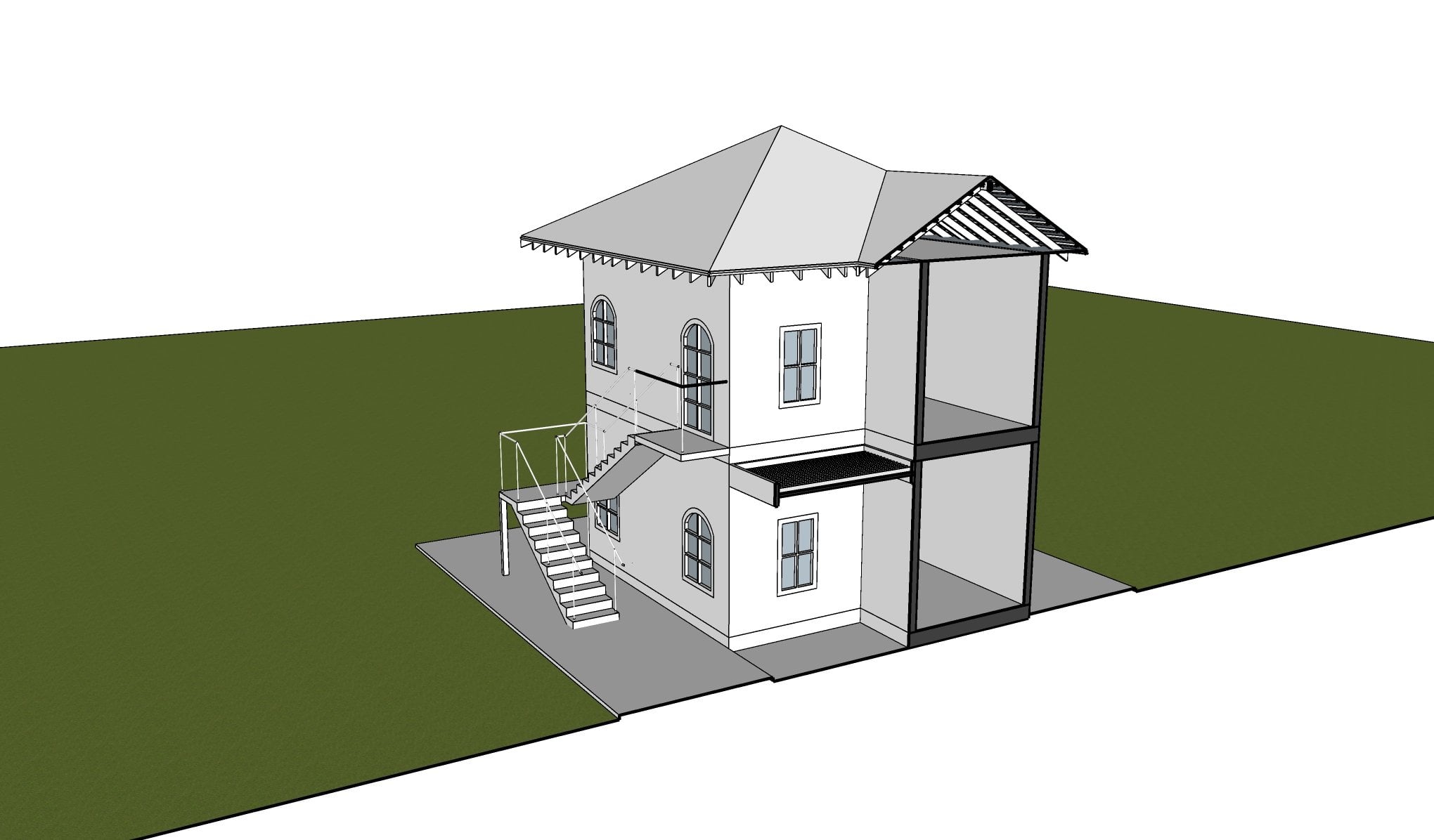
3. Example Portfolio: Let's take a look at a portfolio that will be making
for the class. I've already sort of
pull it together. It's essentially
a base portfolio. And it's gonna be
several pages that are pretty much
communicating the architect. The ability for an architect at a more of a junior
to senior level. You will see a page where it talks about the candidate name, no place for resume. And then we'll have section
for a little bit of studies. And also place just
maybe two page for each project that's
going to be shown. And this is going to be done showing you
different workflows and methods that you can
be putting into you. And you're working
with InDesign and all the Adobe sequences that are available as
you deal with this. So if you're ready to
get started, Let's go.
4. Folder Structure: We start our project off
by having a very clear set of organization and
our main folder. So essentially, we're gonna make portfolio and we only really need the images
that are going in. And we'll have our
InDesign file. So these are just placeholders right here and
maybe archive file. We have some old
things that we need to change our image folder. I've made a folder
for each project. I will also add some
major images are sort of base images that I
put in the main folder. But inside of these folders, either I've put a PDF
from the project, I put like a render. And the same thing happens for
this other modern project. And the idea is,
these are gonna be all sort of splice
into my presentation. You can, of course,
can also import Photoshop files as well. There's a variety of logic can
be placing into your file. So this is where we're starting. And we just need to make
sure that we are staying along the lines of keeping
this structure intact. So if we're going
to add new images, we just replace these. We can make an archive
folder within one of these. If replacing an image, just keep it simple so that we can keep our project concise.
5. Chapter 2: Starting The InDesign File: To get started with
our InDesign project. When it go ahead and go to New, we're going to create a
print format for this. Obviously you can use
A3 or other sizes. I want a typical tablet
and I'm going to use a horizontal orientation. All the rest of these
are pretty fine. They're going to be facing pages because you don't
want to print out. It'd be really nice to
have those organized in that way so that there are some templates
that are usable, but we're just going to make
everything from scratch, so really get the
best from that. So the first thing I'd
like to do is like you can go into outline
mode or presentation mode. I really want to just put a little
outline of things I'll put in this portfolio. I'm going to start off, let's make it so
I can read this. I'm just going to make
this little outline. So I'm gonna do my cover page. My resume says Statement page for Turiel studies,
low research-based. Then I'll do project
one, project two. And so that's going
to be this format for what we're going to make. I already have an idea ahead. What sort of images
we go on each one. So I'm going to start off with just really choosing
things like my font. And I'm going to
organize the project. So knowing those pages, I already know I'm going to have my general no cover page. I'd like a master and I'm
going to have a B master. Now let's put that
there. So what's gonna be for the main page
once could be the next page. And I'm going to go ahead and
start inserting few pages. So right now, I'm going to just go ahead and
do five or four. So it will be total five.
6. The InDesign Interface: Before we get started, I
definitely want to talk about a little bit the interface
order for InDesign. So again, it's pretty
much similar if you've done with any other
Adobe product. And your five opening, closing. And now the edits
important, obviously, we'll go into some things
that we can use with edit. Layout will help you
organize how you're going to go to your page. Navigation there for things like your margins,
we will alert. Your type will help you figure
out things for your text. Object obviously is between what a lot of objects
in your drawing. We also can create tables and change the view and the
window or get help. But one important thing is obviously working on the window. That's gonna be
like our main thing of working with this
InDesign project. We want to have a good workspace and it gives you the ability to sort of tile or Shoo, Shoo how you arrange your workspace if you
have multiple documents, we're going to only
work on one document. And I think we're going to
first look at advanced. Because the idea is I'm
going to be working with some types of texts in
different alignment. So it is going to be important to see little more information. There are other
popular workspaces for if you're working on a book. They'll just give
you a little of the different tabs for different things you would
work with in the book. There's a, there's tabs for
all the way from essentials. The classics is actually
pretty good as well because it includes
all your menu and different than these. But also you have for if
you're printing and proofing, that'll help you figure
out the right colors. So you have every type
that's available for you. Again, we're focusing more on either advanced or
Essentials Classic. So we can be working
on our book. And we're just going to
be making sure we follow the outline and start
putting things into place.
7. Setting Up The Portfolio Cover: So right now we want to start
setting up our project, so be ready for
everything we wanna do. We wanna make a
layer for a title. You want to make a layer
for some formatting. And then with that
a little bit lower. You want to make a
layer for graphics. And then we also want to
have just a layer for text. And we are keeping
these as our layers, so we will pretty much
make sure nothing is below a layer of it
needs to be on top. For instance, a title that's gonna be really critical
for this project. The main pages where they
just gonna be like a cover. So we'll have just like
some text and a main image. So it's not gonna be
that complicated. We're going to go ahead and
start by tiling our work. And instead of just going
straight into titling, we want to make sure if it's
not put in our project yet, that our type and our texts
are gonna be available here. So having our character, we're just going
to, and this here, adding our character and
adding our paragraph, help us organize some of the things we're
about to put it into the document that was obviously very easily just add
it from your window. So I want to make sure to use
for tour in this project. However, my main title that's going to really need
to be a little bigger. So I'm gonna go ahead
and choose my BT, B, D, C and B t. Is we think that's going
to be like pretty large. And I want to make
sure that that's gonna be nice and readable. And I'm actually going to use the set guide to sort
of organize with that. It's gonna go here. And I might even
change the color. And the idea is I'm gonna
make it work with the image, but I'm going to just start by laying it out and
I'm going to use out as I drag this
text just to copy it. And I'm going to put
the name Robert Smith. And that's gonna be
the starting point. I can come back,
select both of these. And the text is
set in the image. I'm going to make that text
and then double-click on it. I really wanted to be white. You can set the color and several ways you
can set it here. We use scroll up
and set that color. You also can set the color. Here. We can just choose
paper, it's color. Now, one of the things that I'm sending it
that way is because I really want to create
a background image. And we're going to add that
image using a rectangle. So we'll get to, when we
place the background image, it'll go ahead and fit
straight in there. I'm going to make
sure this background doesn't have any border. When it closes. The press Control D,
I'm gonna be placing the image and then go
to my images folder. And the project I want to have really in the
portfolio background is gonna be this one is
the standard stock image. What I'm going to do
to make sure that it's properly fitting
into the window. I'm going to click on fitting. And I'm going to start with
feel content proportionally. So that's going to give a little bit of a
space on the side. There's also options
to Content Aware Fill. And that's what this letting
us to be closing the edge. But I think the best
way to do for me just scale this image and I'm
selecting the inside image. You see that ClO,
I'm just going to be making sure to
press Alt and Shift. And I'm just going to
scale that image inside. So that's a nice
little image press Tab to get like a full-screen. Okay, so now we
want to make sure, sure that this is going to
be on the proper layer. And I'm going to put this on. Make sure I'm selecting
outside objects. So you see it's blue. I'm going to put that
into the graphics layer. And so I'm going to make the Arctic's portfolio
texts also white. And so it obviously read a
little bit better because of this being white
over this color. Right now, we want to have
something to bring out the title and the name of the architect for
its portfolio cover. So I'm going to
create a rectangle. And the way we're going
to add a gradient, this is a basic rectangle. That menu. You want to make sure that
it doesn't have any border. I haven't, like it's black now, but I'll click now the
Gradient Swatch tool. That'll let me choose how
this swatch will work. I'm gonna go to Effects so that I'm going to add that
from the window here. Put that in our little bar here. I'm going to make sure
that it's multiplying. I see it's a lot
better adding this. I'm going to make sure this
on the appropriate layer, the graphics layer above
the bottom graphic. And I'm going to go ahead
and copy it and rotate it. Do the same thing at the top. So great with this. Gonna be in that
graphics layer and I'm going to go presentation mode. We see it's coming out
a whole lot better. We're starting with our cover. We've just been very simple. And I think we're ready to go
into our subsequent pages.
8. Setting Up Page Templates: Now we are looking to make sure to get the templates for
our following pages. The critical thing
I'm turning off presentation mode is that
we need to have a title. This is for Robert
Smith portfolio. And you can see here from the cover and then go
back to the master. Now what I want to
put is on one side, we Robert Smith, once that'll
be architects portfolio. So I'm gonna put architects
were followed over here. I'm going to make sure that
I have the right font. This font, it will be
the same for this. I'm going to use a couple of
different apps for Torah. This is gonna be black
and it's going to probably be closer to 18. I'm going to put
architecture port folio. I might just increase
that just a tad. Come off a little
bit from that top. I'm going to make sure
that this is going to be an appropriate layer. I'll put it on the tidal layer. And I'm going to drag it with the l or out buttons, make copy. And I'm going to go and
put Robert Smith EIA. And so I'm going
to just drag it to the edge, come back off. There, we have a little graphic. This will work nicely. So below here, I'm going to
go into the layer formatting. And I'm going to go ahead
and make a little box. This is going to
actually be a white box. Go ahead. So that all up here, Custom. Now this little white box here. And then the formatting
layer, you can't see it now. But I'm going to make
it to be 50% opacity. And we'll just copy it here. Bring it into this
page here as well. So we're gonna go ahead
and have that as our base. And I want to have a
similar starting element for an unplanned on a guide
by clicking on the ruler. I'm going to have it in the
same place for all the pages. So they all my text is
going to begin here. And that's gonna be
really useful to have that common graphic. Though my first, second page is there gonna
be a little different? Alright, so I'm going to press tab and go to the full mode. I'm going to go
back to our pages. I want to make sure that our
mass was applied to Beijing. She'd AAA. So you can see it's already
set up right now though. I'm going to have a B
for the pages below. That's going to require
me to come back up here. All these little items
that I've set up here from my title
and my guides. Now go to the B
master, copy those. And those of course, should also still be in the same layer. Now, somehow this title to the form any layer but wouldn't make sure
it's coming back. Staying in the right
layer. The little spacing is going to inform my own layer. Make sure here it's on
the right layer and is now my architects portfolio. I have appropriate
tiling on each page. Now I'm going to create a layout for how this page
is going to look.
9. Importing Images: We're now going to
start by adding some more unique things
to our, our pages. We're going to start with
filling our placeholders. And where you're going to
press Control D to place. And what I'm gonna
do, I actually, I'm not going to really even touched a lot of
these, but I'll explain. For these sort of imports, you have options to import. In particular ways
you don't have just important to us as it is. And I'm going to also
make sure to include an image that will handle it. Now we're going to add the placeholders for
this resume page. When to start here. The first one we're actually
going to do is a pitcher. And I have done is of course, this made it fit inside
of the place holder. Now I'm going to expand it
by holding Alt and Shift. So it's proportional
centered up on here. So that's nice, sorry just
getting that set up here. And for my second placeholder, I'm going to do a close-up
of a, of a project. So this again is whichever
project you'd like to show. Or even if it's a model, you want to make sure to sort of highlight some
of your best work. So this is something to sort of go along with the theme
of the architect. And what I also like to do here, we're sort of doing like
a background image. You know, maybe make it a seventy-five percent
or something. And just maybe two some
of the negative space. But even just do like a picture of a small project or something. But we're going to just keep
going from some of the basic of this to build up the project.
10. Setting Up The Resume/Summary Page: So now we're going to work on our second page
of our portfolio, which would be the resume page. I'm sort of a little bit about me grading and place holder box. And I'm going to make sure it doesn't have it can be full. It is going to be replaced
when I get the proper imagery. Pretty much I'm going
to just duplicate it and have one on each side. So now we have our two
placeholder box on both sides. For the resume, I'll
just sort of block out the areas where I'm
gonna be placing text. I'm going to start
here with the name. Name is gonna be a
little bit larger. This will be the same
use for other sections. So that would be really helpful. Robert Smith, AIA. So just come down and drag different textbox and just sort of do the
different sections. So this would be more like
14 And I'll do summary. You got to remember the size. This is gonna be tabloid, So it's not gonna be that small. The other font I will be using, It's gonna be a
few Tura, be kBT. You can see here now that I'm adding a little
bit of texts, that this is our textbox work. So we've added our title, going to come down and add
some of the other texts. We can sort of identify where it's
located to help us out. Make sure that's gonna be
12 when to use futuro, be kBT, be writing a summary. Then we're going to scroll down and really just
saying experience. And the way I could
do it, of course, it's just have these to
be a little bit larger. Then come underneath with
a little bit of a section. Now I'm not really
going to be doing too many complex things
with texts right now. So I'm just going to
make a title for these. And then I'll make
a content area. I'm just dragging and
duplicating these. And I'm gonna make the
summary a little bit taller. Then come back in
here and make it about 14 and make this one to be more involved in when it
comes down to the second one. So, you know, maybe talented architect seeking to
create beautiful spaces. And something like
that would be like a nice little sort
of method and are, in fact, I'll just go back to presentation mode
to see how this looks. Looks pretty nice. I'll just duplicate that
for my experience section. Leave a presentation mode. Press W for experience and
do a little bit different. Because we're gonna be
making sure that they know. Beyond this, there's
going to be like a time. And I'm going to move this far. So when we put in
the experience, there'll be like the years
maybe 20162, 2020062016 to 082022. So for experience wouldn't
change this section. I'm just a little bit
because I'll have a title. Maybe I'll put like
project architect. They don't have the
company. And I'll put this all in the same texts. This bill, little easier. This the name is Olivia
little bit different. Xyz architects. Then we'll make a description. Now, I just want to
highlight a couple of bullet points for
the description. And it's very simple to do that. You just will go up to type and make sure you just put
bulleted or numbered list. But adhere. Code research, developed
construction documents. And I'm adding a third
one now is a little bit just say administered, instruction administration. So I have just a simple
set of information here. Even now. Basically when they
were that role. I want this to stand out. The wave futuro can work. They can just look
for more bolder font within the Fedora collection. So I can use heavy. So all I need to do is be
like grab all these. Just add another one. Alright, next, write down. And so that would just
be the second one. Then I can create
my next section which is education. Education. And I just gonna put Notre-Dame and just put b Arc. I actually can just take off these bullet points.
Pretty simple. You can also if you want. But this area, you're going to just remove the
bullets here as well. But I'm trying to lead that Notre-Dame and
I could just put B arc Presidential Scholarship. And go ahead and put
here another role. In turn, architect,
ABC Architects, schematic design, rendered project entries. Just change the date to go
before that previous date. So maybe this was
62012 to 052016. For here, graduation
could be 201252012. And so this can this up. We have our summary or
experience education and we can now just add a final
section of skills. To help organize
this project better. We're going to make
use of the Gap Tool. The Gap tool really
helps us organize different words just
as well as spaces. One of the things we're
going to start here, as well as to add appropriate
guides to make sure that this section is going
to come out the way I want it right now. And I'm seeing things were
a little bit not aligned. And orange to do to get
things aligned is really, of course could just click
on the line command, but definitely want to make sure I'm keeping things together. But you could also just
come and click on a guide. And you just saw. Make sure that it's even. You say, This needs
to align left. Here's my line menu right here. Same thing is here. You just want to be of course, just conscious that aligning might work by several
other things. For instance, why Allied these, you know, it will put all
things at the same edge. I don't need that. So really my line, it would be maybe
selecting all my titles here and just making
my Align to left. But I also have the
ability, of course, align to the middle. I'm also I could align something to the
middle of the page. So right now I just want
to have this at the top. But if I wanted to maybe
make this centered, I always could just come and
not just make a copy of it. You see that it's nicely
underneath that level. These are all in the
wrong layer right now, so that'd be something to
adjust as well as the fill. These are all definitely needing
to be on the text layer. Now we're going to go
ahead and take this, this one to x and this undo. Have any issue here. So we're going to
make this centered. And what we're gonna do now is we want this to be
centered on the page. If we wanted that option, you just come here and make sure we're
wanting to the page. Now that's gonna be
centered in the page. What we're going to add now is before we finish our section, what we're going
to add our skills. I'm just going to be
dragging that down, Alt copy of that. And like that it's gonna
be just this section. And I will just be these. And I'm going to turn it into a bulleted
or numbered list. I'll say SketchUp Photoshop. So that's adding my basic set of knowledge for the
resume. Look pretty nice.
11. Adding Page Numbers: We want to add a page
number, this section. And it's going to actually
edit the template. So the template where we can take out of
presentation mode. I'm going to just add
a little text box. And we're going to add first, make sure we're using the
right font for Torah. And we want to make
sure that it's for Torah became a book. And it's gonna be centered. And we're going to use is a special character marker,
current page number. And so it's just
listed as a there. And we're going to add
just a little bit of a box behind it. We get a neat going
to be too big long. So what I'm gonna do
it, both of these is make sure that they're gonna be centered and that the
sintering is going to be on the page. So there it is. I want to make sure
that the color is white and it's going to be 50 per cent right now. And this, this actually
can go the text, can go on the tidal layer, and the box itself can go
into formatting layer. Okay. So when I take this one and now you remember
we have multiple pages. We're going to drag that similar elements
to my next page. And I'm gonna make
sure to hold out, copies it and make sure
that it's doing the same, aligning to the
horizontal center. So I'm going to take both of
these both of these pages. I'm going to comment on
the go to the B master. And I'm going to press
Control Shift Alt V. It's copied one, but I
need to cap the other one. Copy of this. Do
that same thing. Now, one thing that's
for sure that's important is needing
to make sure these are all going to be
the title formatting layer. It'll be fine if these are
both on the formatting layer, but the texts of course
has to be above the box. Elaborate that a little decision that's gonna be the
requirement, okay? These are that way. You can also just
turn it into a group. That's one way to make sure
that that doesn't change. I'm making things on
one layer the other. But the idea is as long
as they're together, that's the critical element. So now we can just go back into the document and see now
we have our page numbers. So we see that on T3
for when we start adding your images and
that will of course make a bigger difference if we
have a color or something.
12. Chapter 3: Setting Up The Case Study Page: First, second page or third
page of our portfolio, we going to be really aiming to bring the same sort of language, but it has a different purpose. So moving on a copy, that original texts line, what this is going
to be is showing a material search study. And what I'm gonna do. He is going to first create boxes that are going to really sort of show
where things are gonna be. I'm gonna have like four boxes that are going to be a raid. Click Alt and drag this box. I'm going to click
my right arrow. Griddify this object. You see it made for
equal plus boxes. And these are all
just placeholders. I'm going to make sure that I'm having them as placeholders. And what I'll do is now go into each one of these
and just replace them. Now there's other
ways of course of doing this, and I'll
go ahead and show it. Go variation. What I can always
just do the course, just make sure to try
different types of get, make these Phil's work. So Content Aware is pretty nice. I can have things all
filling out these spaces. And I always zoom
in using my out. Things are not too big. So essentially, these are
some material studies.
13. Linking And Populating Paragraphs With Gridify: And what I wanna do is give a
title to each one of these. And this is again, sort of showing a little
opportunity to maybe do some sort of research presentation
within your portfolio. This is just for an option. Again, you can choose the
order that you would like. And I'm going to put this
to be a little bit larger. Just material study. And when
it come down below here, now I'm going to do
one thing a little bit different and I drag
that and copied it. I'm now going to
do the tour light. Now this is going to have
a little more text to it. Now, what sometimes we
will do because of saying, Hey, look, I want this
to be in four places. Maybe I want to actually
continue sort of a narrative versus really talk about each of
these individually. So maybe this is
like a little bit of a report and you just want
to add multiple columns. So what I could do
for that is there's, there's always this ability to drag a text box to
another text area. And what I'm gonna do here
is just duplicate this. Now this texts. I am doing very simple
thing I'm going to be dragging and duplicating
maybe the title. And that's fine because that
just changes for each one. But if I wanted to
have four columns, there are two ways to do that. I could of course, just
duplicate one of these. And then click this little box. And I'll be linking
these things together. I could just go
ahead and just use my type and fill with
placeholder text. And you can see these are
all connected already. You also could just start your textbox and use that same arrow just
to the right arrow. And do that same hole
filled with classic texts. And just make sure
that of course, set it to your desired font. And I'm doing for tour light. So these are both same
methods only for this method, I didn't have as much
control as ever, the ones where I
just set the size. But I still can come
down and operate with my gap tool to align
these areas of corn. Again, you will be mining
if you are pressing out. And then this area is a little
different from that area. So I can always because there can be
shifting the whole image. That's one thing of having control by creating it
and then linking them. So those are different methods for getting the similar result. Then again, you just
want to make sure it's using the right size. So I'm going to actually
take away these Griddify. And I'm actually going
to just duplicate these. And what I'll do is make
sure to link these. So now they're all linked. And it will identify if you
go over set any of these. But essentially, this actually might be a little bit
confusing because you're trying to make a
dialogue to talk about a few of these
Vs talk all these. You can always just come
back and take these and just sort of
expanded out here. And it's just saying I'm
talking about the whole things. So that's this nice
little research partner you can put in. We go into presentation mode
and see it comes out nicely. And will we also can do shoes
and a material research. That can be one of our ways of presenting that
particular area.
14. Importing With Gridify: Now there's another way
I wanted to show you for making these textbox. So I wanna go ahead
and show you that. And I'm just going to go ahead and create a little
bit of a hidden layer. I'm going to make sure this
goes on the graphics layer. So it'll make a little
temporary layer. So the idea is when you're wanting to
import several items, it is actually made
pretty simple. In design. You can make that
placeholder text, but you can do that same. You click right. You see that actively
spaces them. So I can have my four
images and all I need to do is going to fit in. I could say fit the
frame proportionally. That'll get the same thing. Only difference, of course, is you don't control
that spacing. My end. What do you want to do
for spacing if you're trying to do that? Well, first of all, as
it's already connected, when you do something like this, it doesn't really
get what you want. It, It's sort of moves things. But if you press
out when you are spacing and it will resize it. If you press control. When you're spacing out. It will just change
that little m between these couple of different ways of how you can get
similar result. But I really wanted to
keep a particular link between and that's
one of the reasons why I did it the way I did it. So I just wanted to
show you that that a thorough way of
getting these in here, obviously that this
way is quicker. You just don't want
to come back in later and set up your spacing. And also I want to perfect
some of the spacing here. I'm just going to
align these things. Obviously it's, it's also a nice sometimes to have your texts to go in here. Have your texts justified. These things can be
placed in that way.
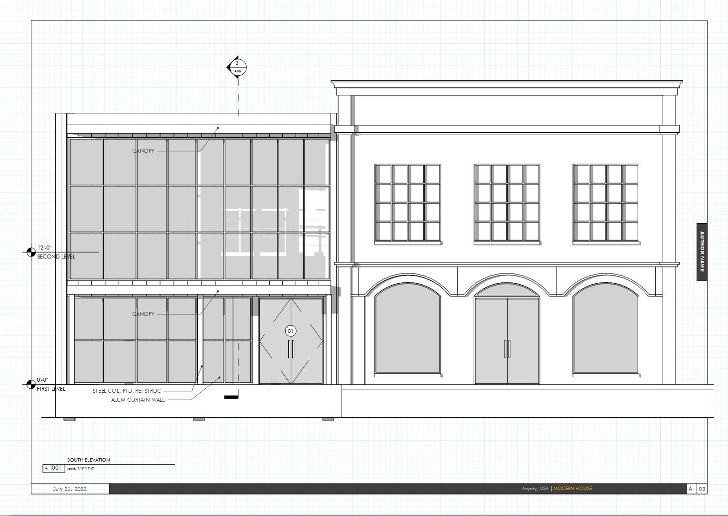
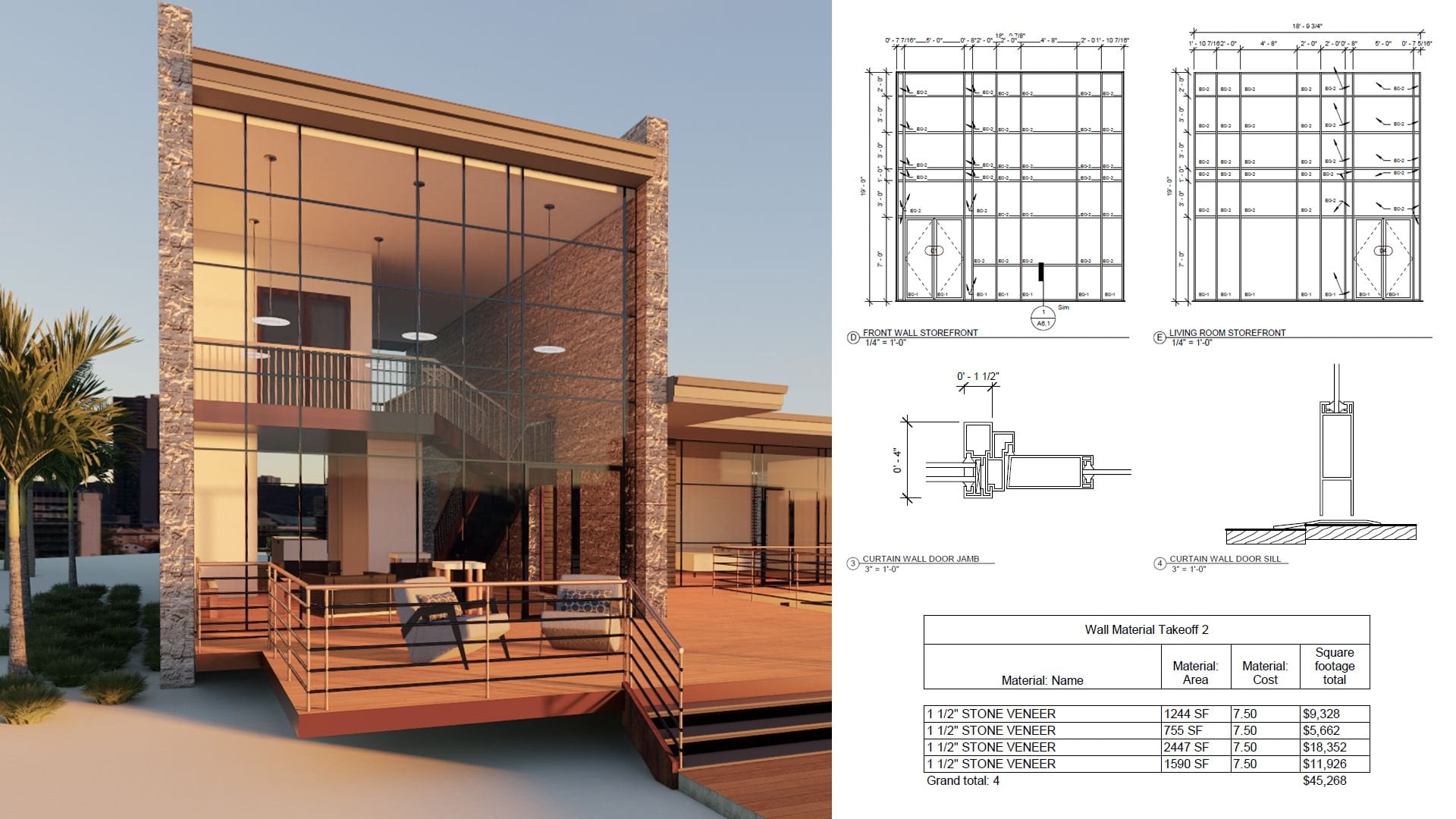
15. Chapter 4: Setting Up A Project Page: Our project pages are
going to need to be a little more organized than the pages that we had
for just looking at the resume because obviously you can do several
project pages. And one of the things I
would be informed by this is making sure that I'm going
to have a project title, maybe a cover image,
teach project. And then like a description
area and a title. For my initial starting point
of time during the project, I'm going to make sure
that I'm using my Futura. Did my BT or B, D, C, T. I'm just going to make
sure that's pretty big. And I'll just say this project
is to be modern house. Now, I'm doing this
in the biomass, which is to locate everything. I'm going to actually
copy the text style. But I was just wanting to locate where my text is going to be. I think maybe 36 is fine. So I would be fine to just leave it sort
of in this particular area. So since I'm going to
use that particular way, I'm going to just locate where
I'm going to be happening, things meshed and
go back in here. Now in here, paste to the same
place, patrol, shift out. That's what I'll be tiling that. And now I'm gonna go to my my, my section for my title. Again, I'm thinking about
how my pages relate. This obviously has to be
a little bit smaller. Make sure I have the
right font setup for it. So this would be heavy. And the way I'm organizing
this section is gonna be the title for the candidate. What did we do in that role? And then underneath it, I can just put a little
bit of placeholder text to describe maybe my role or
something or what I did know. This all can be very
easily done in the light. And so Project Architect, level description,
maybe the project. Then down here, this could
be going into bullet points. Several bullet points
is each one talking about how great you were
in something for this, you could just delete
everything else. So placeholder is really fun, obviously to help you
organize where things are. But okay, so I've organized,
that's worrying them. My title, this is where I'll have a description
for the project. Since mike over image, there's a possibility
of putting a white behind it. Right now. I'm just going to leave
it where it is and I'll put my locater there. I'm going to go back
into the image, pasted the same place. Now, we're going to be
ready to be putting images that we'll be
working with these. So I'm going to make sure
that these both are on the right layers, both contexts. So now I'm going
to be shifting to my graphics layer and
importing images. Now for our modern project, we're going to first put in, I'm going to a modern project
folder or cover image. Now again, I don't just click anywhere
because I want it to be a certain size. And I could just go to here. Now it's a little bit
bigger than my page. So what I'm gonna do
that actually crop it. And it's pretty
much works for me. We have our page number
here and we have our title. So I think it's pretty readable. Now here we're gonna be putting
in plan and elevations. Other company here for
my first set of these, I know that I have
plans, elevations, and they're all
sort of big pages. So what I wanna do is select these two and the thing is I want them to be
at the same scale. And so I'm just going to select these two
out. Press Open. And I'll do that same element of Griddify or just look at it. And I click the right
directional arrow. And the thing about it is, even if it's this way, both of these are going to
have to be increased in size. So my way of working around
just that limitation is you can just simply be working on that bounding box by just
clicking those edges. Now, the thing about it is it's, it'll move these, but it won't. Change the image, which is great for what I'm trying to do. Then I'm going to resize it
to fit better on the page. I'm going to bring them a
little bit closer together. Bring them close to the
edge of this project. Make sure I'm selecting
the outer box. And I'm going to press Shift and Control to scale
it out a little bit. So now as I go in, I can start to take
off parts of them into one or one way, of course, to make sure I'm
seeing everything to my scale and change that display performance,
high-quality display. And I zoom in, you know, it seems a lot better. And what we can do here, you see that maybe
we can be doing some alignment to make things look a little
nicer together. So there we have it. Just simply placed her
are items in here. We might want to take out maybe a particular part
of the graphic. For instance, if we want to
separate these elevations, we can simply do this. This copy it, paste
to the same place, and then just pull it up. This drawing will not be including any of
those little titles. So let's take a look at our spread for this
project number one, we have our timing and what we did probably want to move the plan to come
out a little bit more. That obviously we have
lots of room to grow. I think we can add
some more detail to show like some more
advanced part of this project. So we have some room to grill and they
go ahead and select all these presser
Shift and Control. C shift and control
should only do that. This makes sure we're going in the right direction, I guess. Pull him down and now
shifting to draw. Just have a little
bigger footprint. In terms of adding some
other elements to this page. I wanted to add a detail. I'm going to go on this page. I'm going to make sure to show that I'm on the proper
layer, graphics layer. Here I'm going to
press Control D. Now I'm going to
select the section. Now, the thing about
this is again, I'm going to go ahead and just show some of the input options. Were fine with sort of
how the preview is. I did want to show you
like you have the option to choose different color
profiles and et cetera. We're fine with how
it's coming up. We didn't have it as this size. This is going to fill the page. However, we're just going to
crop and choose to these. Define the project a little bit. And what we're gonna do
for presentation wise is just turn both of these into a multiply. Because you still
want to read it. I think adding a
white box is the way to go in this scenario. I'm just going to put
in that box there, making sure here clicking
the white swatch and making this to be 50 per cent, 50%. And the way I want to
do is make sure that goes to the bottom and do
the same to that image. And make sure the, the drawing, it's
gonna be on top. And we've just select that.
Let's go ahead and look at the high-quality display. And we see here, you know, it's, it's just
reading the detail. It's not getting
too much into it. Maybe it can close off
the callout tag. Okay. So we just had a
simple way of just making sure to show some of
that detail on this page. I think that it definitely
gets the message across. And I'm not putting
too much on this page. Again, there's different
ways that we might do it. You might, you know,
it's a built project. You can put some photographs, maybe a little collage
or something that I feel this describes some of the key
things that are happening. Another thing you of course
could do is the project. We have some details. Maybe this little area could be for showing some
of those details. And so I could just
come in here from here and also show everything. But it could be selecting that
area that I want to show. I put that it's
feasible and I can just go into the display performance. And then you had
to keep the title. I can just drag. And now just really
focused on getting maybe another interesting
section from projects. So obviously, to see
the type of project, it is interesting to see
what's happening on the roof. Showing this as a useful. So that's filling a page, not being too much in the page. But that's our first project. And as it looks like it's not
fully and filling the page, we can always just come down. Scale it up a little bit more. Okay, That's our first
page for our project.
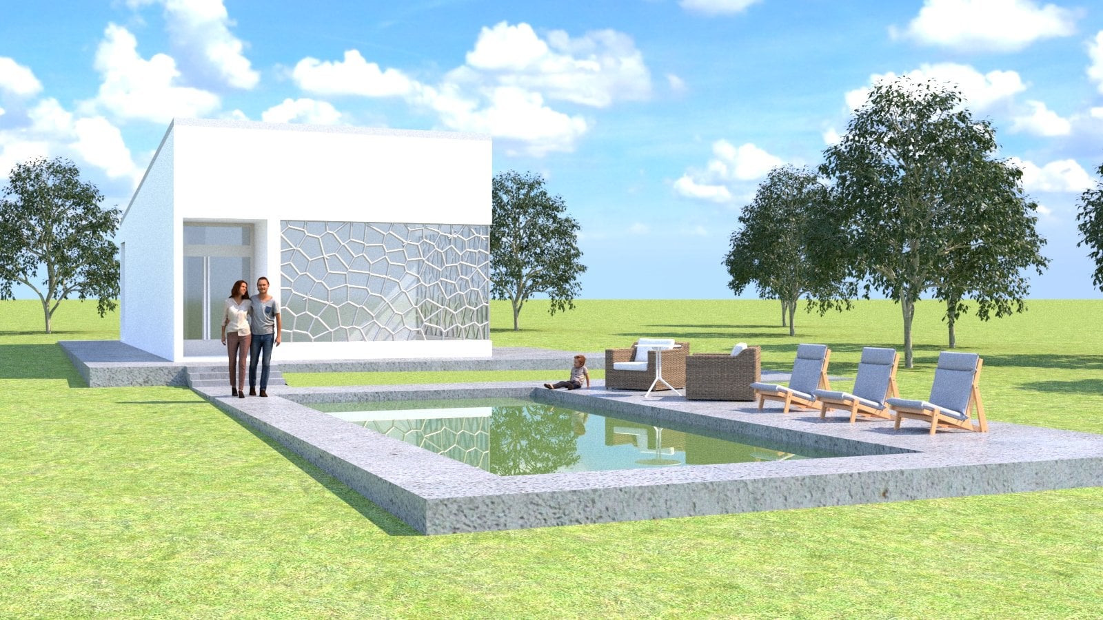
16. Project Page 2: So now we're going to add our next project
to its portfolio. Weird, we're not really
having too many. Wanted to show you, definitely get one and they're
pretty nicely with you. Our second project, a
little bit different when I go to the pages. You know, what we could
do is duplicate spread. I think maybe more effective
ways is maybe just create two new pages and just maybe copy the similar texts. This come down here, paste that to the same place. And maybe put that right title. It's an architect
and this is gonna be our traditional house project. And I'll make sure that
I'm on the right layer. And I'm also going
to make sure that I have the right template, AAC, it's already
set to be masked. So that's great. And again, you can always come
in here actually and change the name of these. You don't have to leave it as B can have it like
vertical scale or anything. You of course, can even put some of the other
information in there. You could change it instead
of master to template. That's also possible and we
can have multiple pages. It can be based
off another view. For instance, if
it's based off of a, will be using some of the
similar elements from a. But i've, I've not
done that because of its focus on different
elements in each page. So I just left it that way. But you can inherit an element
like a page number from our template page item. And so that's always
a useful thing to be putting your projects. What we're gonna do now
is my graphics layer. Come in here. And now I'm going to the
traditional project and just put that render and give me
those options that come out. Scuttled bigger than the page. Then just crop it right here,
and crop it right here. So now that we have that little effect where it's doing black on these pages. That's fine. If it's not
reading well enough, you can always add a little
bit of a gradient swatch. Okay, so we have that cover. Now, we're going to add
those drawings of the house, like about the graphics layer. Now, the way things
are worked in this file is that everything
is all in one place. So we have the choice of
which layers will bring in. Just bring the whole thing in. And I'm just going to crop
out things that I want. So I'm really just going to take the plan and the front entry. So what I'll do to get that
is I'll just copy, paste it. Just deflated. And be trimming that to get to the view that I
want from that project. And the great thing
about it is it, it's gonna be the same scale. So I'll just be
holding on these. Make sure that the high-quality display so I can see
what I'm saying. So do is obviously just that similar effect
for this this one. This copy, paste, copy. This. Make sure I'm getting that. So now I have my insuree. My biggest concern
right now is that there make sure to press
Control Shift same time. My biggest concern is
that they are matching. Though of course it's, it's nice to have
the ability to get the precise scale that you're
going to be working from. But for the purpose
of this presentation, you have the ability to
either import that skill in. Right now. I'm just trying
to put them in here for the basic organizing them neatly. And I will try to probably keep the same format of
plan on the left. So this be moving these
things in that, that wise. This project doesn't have a
lot of the details for it. But they sent me it
gives me what I'm trying to get and basic, so that's, that's useful. And obviously if you look
at these and say, Hey, maybe that's not the most
interesting view of the house. You can always say you bring
another one M. So I have several views in this file. So if I wanted to come
and get that one, so this is what
happens when you have them on the same page. But the fact these are the same scale is
really important. So this is our second project. Keeping a similar aesthetic. One is a more
developed projects. Obviously one is the
earlier project. So it's not trying
to do too much. Obviously, we can show some more information
that's gonna be important. These elevation tags are
not showing fully here. So we want to this so we can get that will make sure that these images are
not overlapping. You see that there is
an overlap right here. So we're coming in
and change that. And this one, this actually
lower overlapping this. So it's sort of funny. But I can move this
out of the house. Edges are not the same. It'd be nice to have
a little closer. So that's a nice way
of just getting out a basic set of plans.
17. Adding Diagrams: It's now one thing
that can be done. Of course, there's
maybe add some more intrigued to this project, is maybe even just
making a little diagram. And 11 thing I could do now is this versus that one could
create a diagram layer. So this is where
you're starting to add some things in InDesign, you're saying, oh,
maybe the project could really use some interesting
things like this. So I could just come in here, maybe in the built space. And they could be saying, Okay, this is a
diagram of the house. That's a mirror that makes it useful to get this
done even quicker. You take that and
come over here. And maybe even just do
that 50% of the scale. And instead of gray, instead of black,
make it a gray. Even just do that
from the color menu. Now you see this is more the
private and public spaces. So you can always
just added a diagram to add to the communication
of the project. Just add our text records in
my right to be k BT private. And I could just make
sure that this is centered the paragraph and
just centered on that object. And I'm just copying
it over here. Public. And I'm just going to
center that on this object. Already know, noting that makes sure that these
are at the same level. I'm just going do a
different level of gray for this house organized. So that'd be something
that could be very useful. People watch it. Hey, look, this is how it's organized and you can
also use a similar system and you can see
it's very simple to make diagrams right
off your projects. You can even start
saying how we see here that this part of the house is the part that is public and this part
is the part that is private. I can just always as
come back in here and do a similar sort of thing. So diagramming it,
we just scale that. So most lot of study here. Just going to use
the eyedropper tool. Press I for that. This, drag these over here and make sure that these
are gonna be at the front. So some of these all up adding some diagrams
to express some of the, the way this has organized. Obviously it's not
an academic project, but if that's something
that's useful would be adding
that information. And also of course you
could in your your, um, your program, you
could always be taken out and just showing the plant and just
showing the titles. So all these things
are things that decided to bring
into the project. So this is the
interesting way of just adding that information
that's valuable.
18. Adding Labels: One thing we can now add
this project as of course, the meticulous to add the imagery is to
really start putting in proper titling
to these images. And that's something that
is not too difficult to do. Right now I'm even
looking at the fact that now I have my
fire safety plan here. So obviously, that's a great
reason to your titling. You can go ahead and just make sure you're using
the right image. We just would come in here, click on right image, and slowly, There it is, That's the floor plan. And I could just create one
set of texts to describe. Maybe the salted be
few Tour became vt. And I would just try to create a similar aesthetic
to each of these. And then just carry that through my just
be dragging this, making sure that everything
is coming out right. So like I said, for like, if you're showing a
based on the principles, like what are you going to
show right now we've seen that this is looking
at an elevation. That's why everything going on. Maybe I'll switch to elevations. The way in the project. This view right here
is where I'm really saying is sort of the Southern Northern view is really what I would want this to be really deal based off that. This being a Northern view. I'm going to really want to
see instead of the East, I want to really look
at the West view. So I'm going to say
west elevation. And because of the way
these drawings are, I'm just going to Control D and I'm actually
going to replace the image with a
drawing that I want. Click it and then took
over the same position. So that's obviously
really great. Okay. So my my west elevation
is what I'm using. Come back up here. I'll put this for
my north elevation. And it's interesting for sure because I also want to see what's happening
up toward the South. That's really feature. If these views on what
they have too much. Maybe I'll just actually
go ahead and cut them out. You do that is this
roll that down. Lonely, interesting views
are really the North and the South for the type of
information that's seen. So you'd just be shown up there. And this project is
using like stone panels. So it's interesting to
definitely highlight that the details and I could just put here is a
particular type of details. So this detail right here is
of course, our IV detail. And I can make that a
little bit smaller. Again, I think it's
nice to always have this aligned with
something in the image. I just have enough detail. Just have a parapet detail. And obviously if the left
justification works here, but it doesn't work here, There's no reason not to. Changes to now be centered. You detail, purpose, detail. Maybe give some space to, it, goes up a little bit. And so in presentation mode, having those titles
does look a lot nicer. We can go ahead and just
duplicate some of these to label the wall section. And this to make sure these
are on the same location. And just very simply actually sort of even rotate it. We don't need that. We can align it back
to being straight. And now that's good for that. Let's add these labeled
down to a project here. And we get this field
labeling our plan. Plan. And again, you can add it. It'd be centered on
something in the image. And then you can of
course have described this diagram for diagram. Just lower that here. Even this, pull this,
all this area all up. Let me hear. You say this is more of
an elevation diagram. This spread it out. We could say the clearer
view we're looking at here. We can say this one is
our south elevation. In this view here will
lift us up again. Just drag it is. Match that spacing. Always just create a
little box to make sure precisely that
it's the same spacing. This right here. East elevation.
19. Chapter 5: Reviewing and Exporting The Final Portfolio: When we finished adding all our information
to our project, we're looking presentation mode we just reviewed right through. This is this was
done pretty quickly. I'm just getting the
ideas into the project. We definitely are not seeing the things
we want to change. Like this template being
overwritten to the front page. That's something we probably
don't want to have. We can make some of
those initial changes. Just go here, makes sure the first page does
not have any template, just comes out as it is. And then we can just go
ahead and export it out. Then we can review
it afterwards. I'm going to save the project. And let's go ahead
and export this. Exporting the folder and projects from InDesign
is pretty simple. Just sort of choose a location. We're going to just
choose this name, save it, and then we will
get a bunch of options. Now this is a better way though. You could print your Adobe
InDesign projects to PDF. This is best because
it's just a lot quicker. It will take time obviously, depending on what's
images are there. I typically always check and make sure that it's
doing my proper range. You can choose which
pages you want to print. I have it as a
high-quality setting. So the presets,
presets pretty good. Obviously, if you want
the smallest size, if you're gonna be
sending my email, is one way you can
do it right here. You also can do that
through Adobe Acrobat. And you of course can if you're trying to
get it printed out. So these IOPS, you won't
have them printed. I can add the marks
to be printed out. But typically, it
would be going to a place to have them doing that. And you can make sure it's
choosing the right colors. Advanced. I think
we're all good to go, so we're gonna go
ahead and export.
20. The Final PDF: Now we're looking at that
printed out portfolio, which tend to look pretty good. The images are
coming out in ice. This organization
between each one. What I would suggest
to do is just going and getting it printed out. So you could also look
at it one at a time. And then you just
sort of see what you could do doing to each page.
21. Packaging The InDesign File: Now that this project
has been exported, there's something that's useful, of course, for continuing
in this project. And that's going to be
actually going into this project and making sure that you can
work on it again. Because if you change locations, some things could
get out of place. So one way to do that
is to package the file. And you go package
from the file menu. And it will give you some options about
what do you do with fonts and show you what's in
the file, the lakes, etc. Ideas. You want to internalize
it to the file. And you also can get some
problems if there's an issue. So it gives me an error
immediately by saying that it is not really giving too many issues
is just gives me like this, this here that there's nothing modify, messenger
and accessible. So everything should be there. And think everything should be good from this report and I'm little
headedness package it. The way I do it is
it just tells us where I can put the
new patch file. It actually will
create a folder, but I'll just to make
a folder despite that. And it's going to make it into the portfolio one, Packaged. That's gonna be the name. You give me a couple
of options here. I'll copy the length fonts, etc. So these are all
going to be in here. Let me go ahead and package. It, will look at that folder. It says there's some issues
from some of the fonts. So be mindful of your, your font might be copyrighted. And you have that option. You just open it afterwards. When creating a PDF in
addition to all the files. And you just open that. Now in this package folder, you see that it
actually is taken everything organized it in
two particular folders. And it has a InDesign
file, a portfolio file. And also like this IDML file, which is the markup
document language file. So you can find
all the drawings. It doesn't have as much
organization of the IPv4, but it's nice to have
that all set up there. So if I ever needed to send
to someone else to work on, it's easily accessible. So that's a great way to when working with
other people or if you're sending it to a recently it to someone to
print out your file. You can just send them
this package document. They can deal with everything
directly versus just sending a PDF which might
give them the font.
22. Refining The Layout: To better look at our rebellion and give me an organized thing. We're going to have to
clean up a little bit of our organization and that's what we're just going to be going through and cleaning up
a little bit right now. Maybe add a little bit
of a roof pitch to this, which this can now
just very dry and they're just subtract
this using the pen tool. Subtract this point
as I add these. In other Pen tool allows you
to subtract and add points. I could even just make sure that this point is going to get where I need
it to be. Lower. This we have our labeling here. And this needs to probably come up to match where this is. So let me go ahead and now for this to get
out of presentation mode, I'm lower a guide
where this lower level is and this coming there. Now, we'll take care
of that. Again. There's too much crowding over here where all the
information as we go, Let's just come and take
some of these down, maybe make them into groups. So it's not
overcrowding the image. Make it a group, drag
it out over here. The same thing. Sure, It's just this
area, this a group. Maybe this makes sure that
the ICC and then I'm taking these these items and have the ability to
I just move this up. These are moving up
at the same time and matching the location, the edge of the wall on these. So that's how I'm getting those. Okay. They're just little organization to be adding to the project. So now we have all of
our drawings title, we have our numbers on the page. I think this is looking
like a good portfolio.
23. Conclusion: Congratulations on completing this InDesign portfolio guide. In this class, you took the time to set up and
complete equality. For further, you'll
learn how to organize the project and
present your work and then officials play. If you have any
questions or comments. This course, feel free to leave those in the comments
and messages. This has been Brandon, I
appreciate being are structured. See you in the next class.
 Brandon A Gibbs, Architect & Innovator