Transcripts
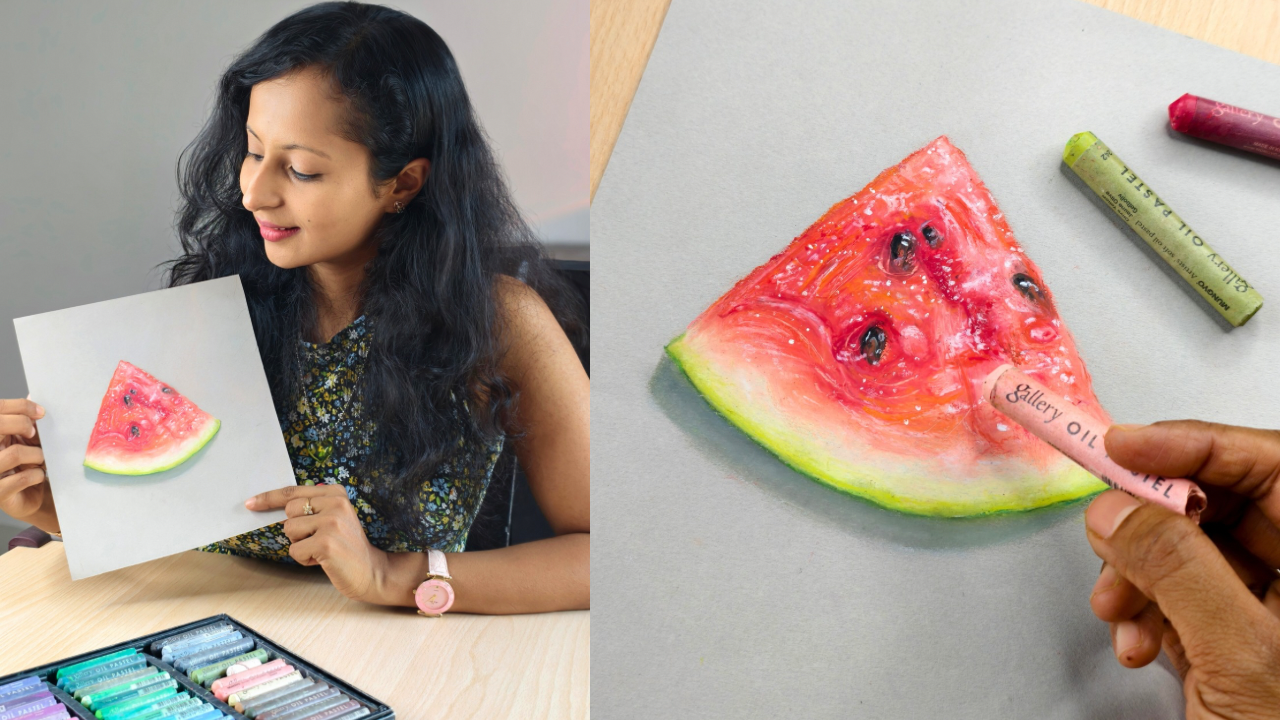
1. Introduction: Oil pastils are versatile, simple and relatively
inexpensive medium that require
minimal tools. You can produce
vibrant bold artworks that resemble a painting
with this dry medium. Let's learn to draw a
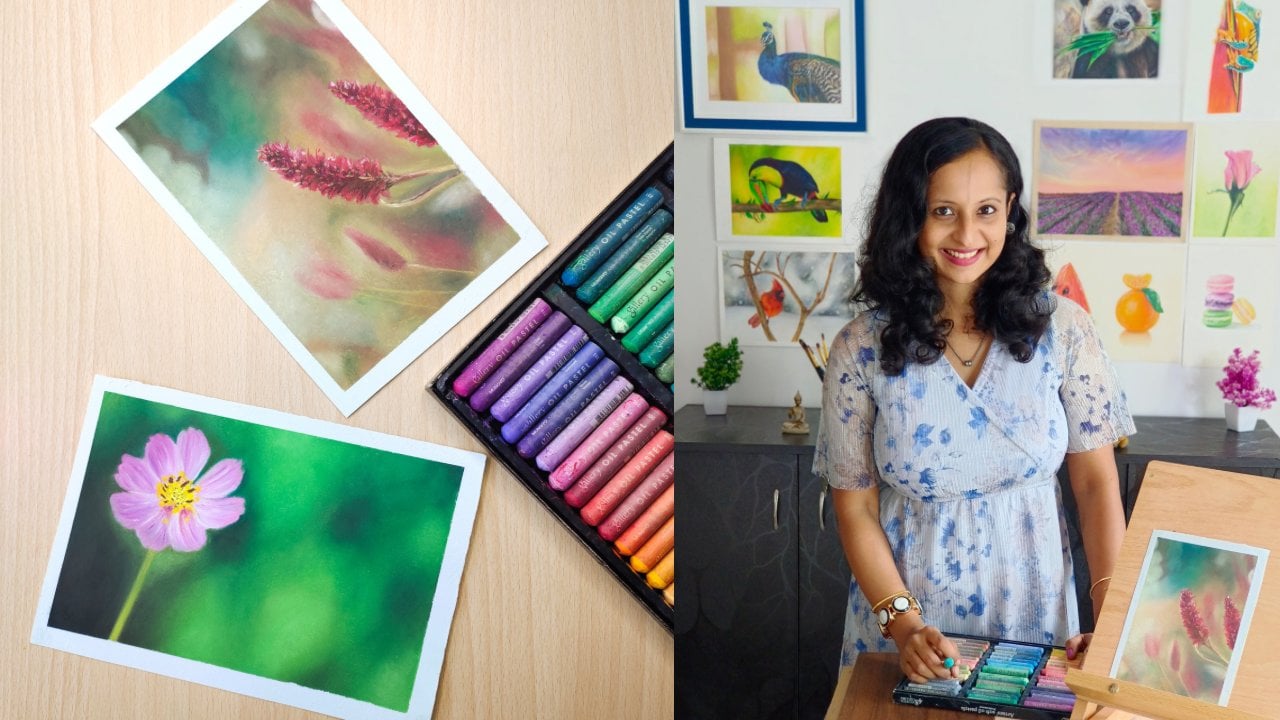
realistic watermelon with oil pastels in this class. Hi, I'm Smitha, and I've been
teaching art since 2020. I work primarily with
colored pencils, oil pastels, and soft pastils. I have published classes on both colored pencils and
oil pastels on Skillshare. You can find me on Instagram and YouTube as art underscored
by Underscore Smitha. Realistic drawings can be
quite daunting for some, but with a right approach, you can simplify the process and produce stunning results. Let me show you those
techniques in this class. I will first show you how to analyze the reference photo and break it down so that it's easy for you to
identify the colors. I will take you through
the process that I follow before starting
any realistic drawing. After that, I will demonstrate how to layer with oil pastels, how to use blending tools like
tips and blending stumps. I will show you how to
make your drawing look realistic by gradually
building up layers, adding textures, details,
highlights and shadows. All these techniques,
along with other tips and best practices will be
explained step by step. As I draw this watermelon, which will be your
class project as well. By the end of this class, you'd have learned some
new pastel techniques and improved your skill level. You will be able to tackle realistic drawings with
a newfound confidence. If you have tried oil
pastels before and want to learn to draw
realistically with this medium, then this class is
perfect for you. If you are an absolute beginner, you can still take this class, as I have explained in detail all the steps required to
complete the class project. But if you'd like to
first learn in detail about the medium and do
some practice exercises, then I suggest that
you first watch my earlier class on oil pastels. You can watch the
initial few lessons of this particular class
where I covered the basic techniques
and dos and don'ts. All you need now
is an pastel set, a paper suitable
for this medium, and a couple of blending tools
to join me in this class.
2. Class Structure and Project: Let's quickly have a look
at the class structure and project so that you know what to expect in the
upcoming lessons. First, I will list
out the materials required to complete
the class project. The class project includes this realistic
watermelon drawing. Before we start the drawing, we will study the
reference photo and break it down to
identify the colors. We will also do a quick rough
sketch so that you have an idea as to what shades of
oil pastels are required. The materials list, reference
photo, color chart, and all other relevant
details will be uploaded in the projects and
resources section so that you can
download the same. I will show you how to
layer with oil pastels, how to blend with tips,
and blending stumps. You can follow along with me
and draw this watermelon. You will also learn
to add details, texture, and how to make
your drawing look realistic. Once done, you can
upload the drawing in the projects and
resources section so that I can give feedback. You can post your questions in the discussion section
of this class, and I will try my
best to help you out. Let's get started and gather the materials required
for this class.
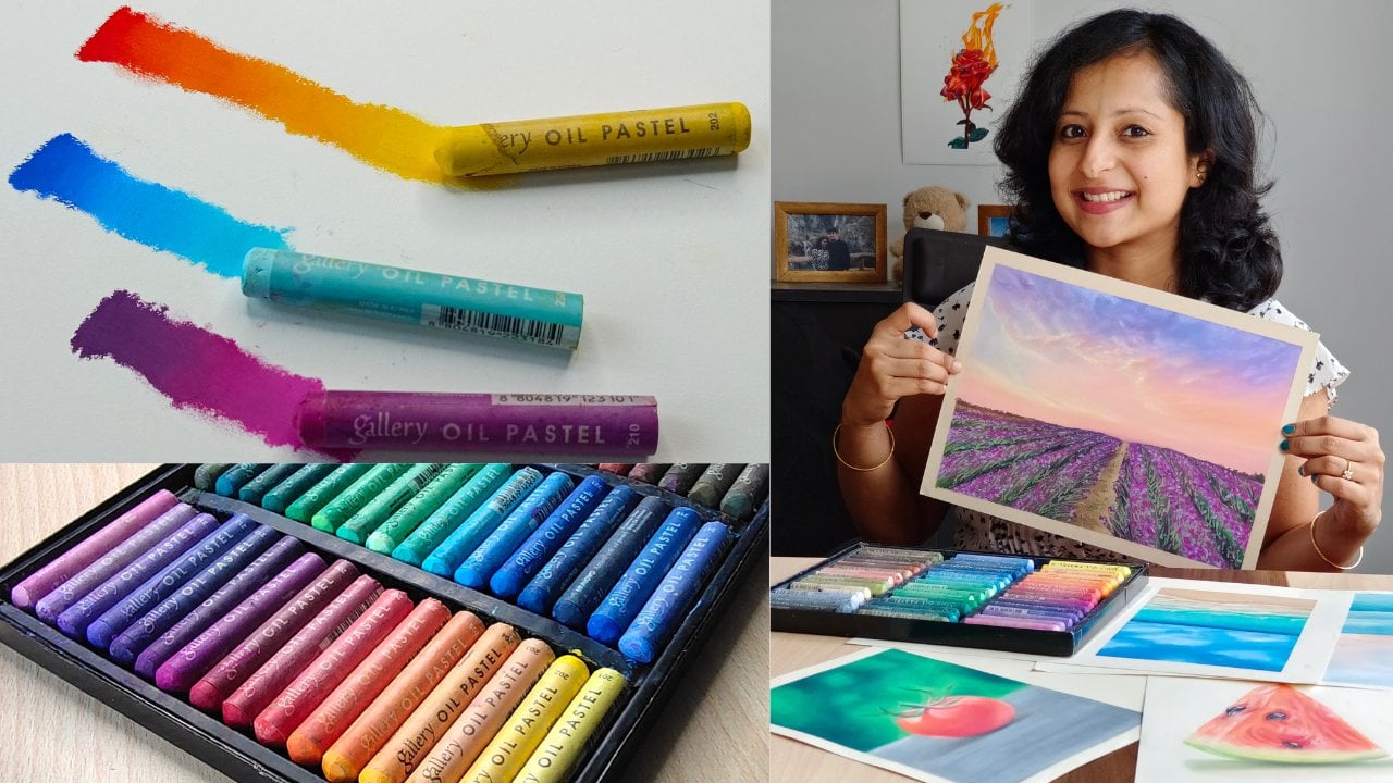
3. Materials Required: You will need oil pastels, set of 24 or 48. I will be using the
gallery soft oil pastels. You can use any brand
of your choice. As for paper, I will be using
the Ksenmtans pastel paper. It has a honeycomb texture on one side and a smoother
surface on the other. I will be working on
the smoother side. It comes in a wide
variety of shades and I have chosen the pearl
gray shade for this drawing. You can use a mixed
media paper or any paper that is
suitable for oil pastels. You can also use a white paper in case you don't
find a toned one. For blending, you
will need either tips or blending stumps. You can also use
fingers for blending, but then as it is
a smaller drawing, it's better you use
blending tools. You will also need
a paper towel to clean your fingers
and oil pastel. In order to get the texture
on the watermelon slice, you can use any scraping
tool that you have. You can also use the edges
of a metal ruler or a sharp, light colored pencil
to get some texture. If you have a white gelpen
or a white acrylic paint, you can use them for
additional highlights. This is optional. A white oil pastel is more
than enough for highlights. Alright, let's
start by analyzing the reference photo
and understand what colors to use
in the next lesson.
4. Reference Photo Analysis and Color Chart: This is the reference photo, and you can download it from the projects and
resources section. Throughout the class,
you will need to zoom it in and
carefully analyze it. Hence, it's best that you keep it handy on your
phone or laptop. Before starting any drawing, I always make such
rough sketches to understand the colors. In this case, I have tested it out on both
sides of the paper, and I felt comfortable
with the smoother side. You can draw on a slightly textured surface as
well if you like. Let me now quickly
take you through the process I followed
to choose colors. Please note that
we are just doing this exercise to
get a rough idea, and while doing the
class project later on, you can always tweak or make changes and choose
slightly different shades. When it comes to oil pastels, I prefer to start
with a mid tone. There's no hard and
fast rule to do so, but I find it easier to start
with mid tones and then add the darker tones and highlights and also
make adjustments. In this case, the mid tone looks somewhat like a
blush pink or peach. Just observe the reference
photo carefully, especially near the
highlights and towards your right inside to
identify the mid tone. If you would like to
learn more on this topic, then I do have a Skillshare
class on how I break down a reference photo and identify the
colors for my drawing. But for now, I will
help you identify the colors based on
this reference photo. In order to get that
peachy undertone, I will mix a salmon
and a vermilion. Block in the entire area
with a salmon first and then a vermilion on
top with light pressure. Towards the right inside, you can skip adding vermilion as we have very
light tones there. Blend them gently and then add vermilion again wherever
it is slightly darker. More details on how to blend or how much pressure to apply will be explained in the
upcoming lessons. For now, let's just focus
on identifying the colors. For darker tones, you
can use a scarlet. Also at certain places, you can see hints of orange, so you can add orange as well. For the seeds, you can use a raw umber or
a Sepia or a dark brown. Only if required,
add hints of black. And for the highlights, you will need a white and also a salmon pink
that we used earlier. For the darkest tone, you can
use a carmine or a crimson. For the lower section,
use a very pale yellow or a cream along with a white and then a
couple of greens. Something like a lemon
green or olive yellow and a moss green. You can use any shade of green that is
available in your set, but make sure that you use a light shade and
then a darker one. For the shadow, use a light
gray and a dark gray, or you can also use burnt
umber or darker browns. So I have used all these colors. Please consider this as a guide and use the colors that
are available in your set. You need not use
the exact shades or the same number of colors. The line drawing
is quite simple. Just draw a triangular shape
this way and then modify it. Keep the sketch as light
as possible so that any harsh graphite marks are
not visible while coloring. In the next lesson, let's get
started with the coloring.
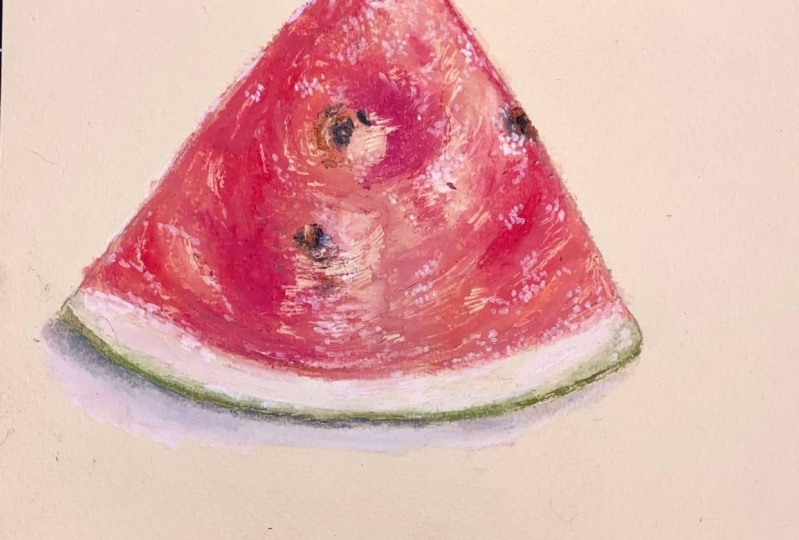
5. Adding Base Layer: Let's start with the base layer. With the salmon, cover the entire area gently,
except the seeds. On top of this layer, add a layer of vermilion, again with light pressure
and make sure to leave some gaps here and
there like I'm doing. Don't cover the entire area. We want to blend the vermilion
with the salmon pink. As the right hand side
has more light tones, don't add a lot of
vermilion there. Observe the reference
photo again carefully. If needed, you can again
add a layer of salmon pink. After that, you can
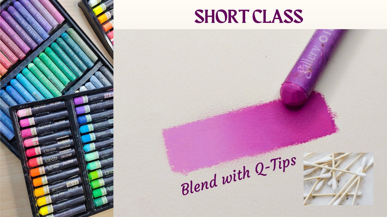
start blending. You can use tips or blending
stumps or your fingers. I started blending with a tip, and I felt that there wasn't
enough pigment on paper, so I added some more
pink and vermilion. Please note that although
you need to shade gently, you must ensure
that you have added enough pigment on the surface so that you can
blend them easily. Use circular motion to blend. If using Q tips, remember to switch sites. When you move towards
the lighter area, use a cleaner sight to avoid carrying the
darker color over there. Similarly, if using
fingers to blend, use a different finger
for different tones. Avoid pressing too
hard on the paper, else you will end up
lifting the pigment. Now that we have a nice mid
tone bass layer to work on, let's add the darker
tones in the next lesson.
6. Adding Dark Tones: Before adding the darker tones, let's first refine the drawing. Once again, use vermilion
and add some texture. Add hints of orange too. This step totally depends
on your judgment. Observe your drawing and
compare it with the reference. Add salmon pink if you want
to make an area lighter, vermilion if you
want to darken it. Now, let me demonstrate how to blend with
a blending stump. Start with a clean tip. You can rub it over a piece of paper until it comes out clean. Then start blending circularly. If you're using it at the edges, use it like a pencil
to get crisp lines. For other areas, the process is similar to blending
with a Q tip. However, I feel blending
stumps give you more control. Now, let's add the darker
tones with a scarlet. Just add some scratches and swirls to replicate the
watermelon texture. You don't have to blend
too smoothly now. The biggest advantage
of oil pastels is that you can add light
colors on top of dark. Let's explore that
in the next lesson.
7. Building up Layers and Textures: As I told you earlier, you can easily add
lighter colors on top of darker ones
with oil pastels. Continue adding more layers and textures with a salmon
pink and an orange. For darker tones, use
vermilon and scarlet. Only blend slightly to
avoid harsh strokes. You don't have to blend
smoothly now as we already have a nice base layer and we
are just adding texture. I have mostly used blending
stumps and tips for blending. I haven't used fingers as
this is a small drawing. I prefer blending with fingers for larger subjects
and backgrounds. Now, all you have to do is
just repeat these steps and add few more layers until you achieve a
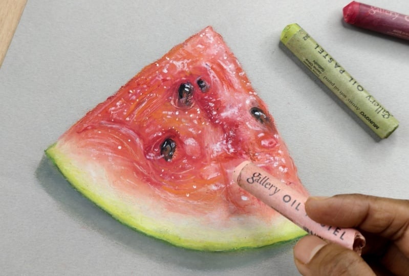
realistic result. Remember to periodically clean the tips of the blending tools. Mm. I added about four layers and then decided to
add the highlights. Adding too many layers
or over blending will damage the paper and also
make the surface slippery. For the highlights start with
a clean white oil pastel. Add dots or small
strokes this way. Wherever the highlights are
quite bright, use white. For other places you can add a salmon pink on top of
white to dull it down a bit. In the next lesson,
let's add the seeds.
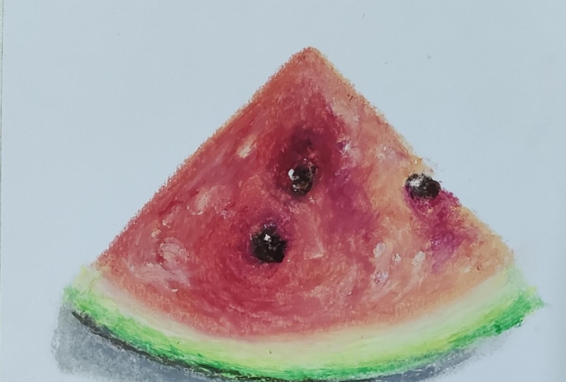
8. Adding Details and Seeds: For the seeds, use a dark
brown or a raw umber. You can also mix it
with a light brown. Adding a black
directly will make it look too dark and unnatural. So add hints of black on top of browns and then lightly smug. Add highlights on the
seeds with a white. M observe the reference photo and you will notice
that the area right next to the seat is
quite dark on one side. If your set contains a
carmine or a crimson, you can use the same
to darken that area. You can also use
the same shade at other places where it
needs to look quite dark. Once you're satisfied
with the way it looks, you can add some more texture
with a scraping tool. I have used this
palette knife to gently scrape off some pigment and
reveal the initial layers. This adds some more
depth to the drawing. Now, moving on to
the next section, I have used a pale
yellow and a cream, along with a white
here, like earlier, add a couple of
layers and blend. We don't want this creamy
section to look abrupt. So what you can do is add some salmon pink
and orange where the reddish section ends and then gently merge it onto
this bellow section. Refine the edges with a
blending stump or a cue tip. In the next lesson, let's complete the green
area and the shadow.
9. Adding Shadows: As I mentioned earlier, I used a couple of greens here. I have used a lemon green and then a moss
green for the edges. For the shadows, I initially used a
darker gray closer to the watermelon and then a
lighter gray overlapping it. Afterwards, a little
bit of white, and then I blended the same. You can redefine the green
edge if it gets smudged off. You can stop it at this.
However, in my case, I wasn't satisfied
with the shadows. I added a little
bit of raw umber on top and then blended it
to make it look warmer. If you have a white gel pen, you can add some
more highlights on the watermelon to
make it look glossy. I tried doing that, but
it was quite hard as the tip of the pen started getting clogged with
the oil pastel. So I decided to experiment
with nado medium. I had some white acrylic
paint lying around. I used a very thin brush and added a few dots
here and there. As I already mentioned earlier, you can skip this
step and just add the highlights with a white
oil pastel and call it a day. In the next lesson, let's see
how the drawing turned out.
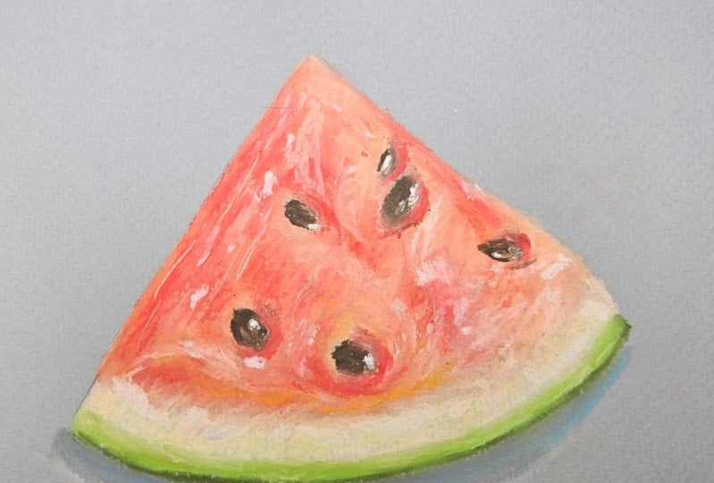
10. Analysing the completed Drawing: This is the video
of the drawing. You can see the different tones, textures, highlights
and shadows. This is a photograph
of the drawing. Obviously, it looks a
little bit different here, and I think this looks more natural and closer to
the drawing that I made. This may not be 100% replica of the reference,
but that's alright. Remember to focus on the
values and textures. It can be a bit tricky with
oil pastels while doing realism because you will
need to judge when to stop. It is still hard
for me sometimes, as I'm primarily a
colored pencil artist. I'm used to adding
a lot of layers, getting those crisp
edges and fine details. Each medium is different, and it will take some time and practice to understand them. I'm excited to see how
your drawing turned out. In the next lesson,
I will let you know how to upload
your drawing and we also do a quick recap of everything that we
learned in this class.
11. Key Takeaways and Closing Thoughts: Congratulations on
completing this class, and thank you for your time. I hope you enjoyed the class and learned
some new techniques. Here's what we learned
in this class. We started by analyzing
the reference photo and made a quick rough sketch
to understand the colors. We learned how to layer
with oil pastels, how to blend with tips,
and blending stumps. We also learned how to
add different tones, textures, highlights
and shadows. Applying all these techniques, we completed this
watermelon drawing, which was a class project. If your aim is to
draw realistically, focus on blending techniques, try different blending tools and see what works best for you. Also, experiment with
different types of papers and choose one that suits
your style and skill level. Avoid the urge to overblend. Your drawing may not
be a perfect replica of the reference photo. Learn to be okay with it. Most importantly,
Practice regularly and give it a few months time. And you will notice a huge difference in
your skill level. I'm looking forward to
seeing your drawing. Please upload it in
the projects and resources section of this class so that I can give feedback. This will also help
you connect with fellow students and see their interpretation
of the drawing. You can tag me on Instagram if you post your drawings there, and I will be glad
to reshare the. You have any queries or you
feel stuck at any point, please start a thread in the discussion section
of this class. I will try my best to guide you. If you enjoyed this class or if you have any
feedback for me, please consider leaving a review in the review section
of this class. This will not only be
encouraging for me to come up with even
better classes next time, but will also make this class
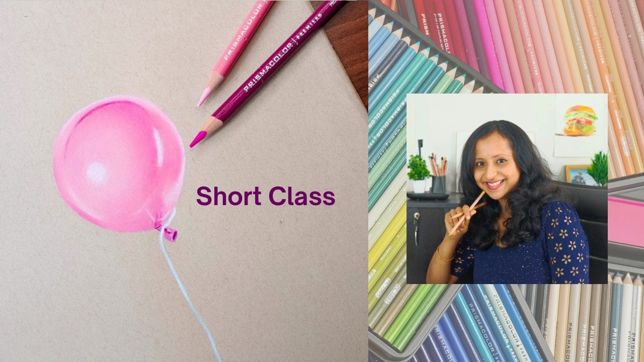
reach a wider audience. If you want to try
another dry medium, say colored pencils, then you can start with
these short classes of mine before jumping
into detailed ones. Lastly, don't forget to follow my Skillshare profile to get notified about future classes. That's all for now. Thank
you and see you soon.
 Smitha Rao, Pencil and Pastel Artist