Transcripts
1. Introduction: What I love about
watercolor pencils is how vibrant and
versatile they are. But I think at first, they can seem a little bit
overwhelming to work with. I want to show you
today that if you get the right materials and
follow a certain process, it isn't as difficult
as you might think to make beautiful art. My name's Jemma Chambers
and I've been making online art tutorials since 2020. I've helped tens of thousands of people improve their art
on my Youtube channel. But today in this course, I want to show
specifically how to draw realistic objects
with watercolor pencils. If you're an absolute beginner, this is the course for you. I will show you all of the
materials you'll need, as well as some of
the basic techniques. We can then cover
the full process you need to draw a picture. And I'll talk you through those steps by
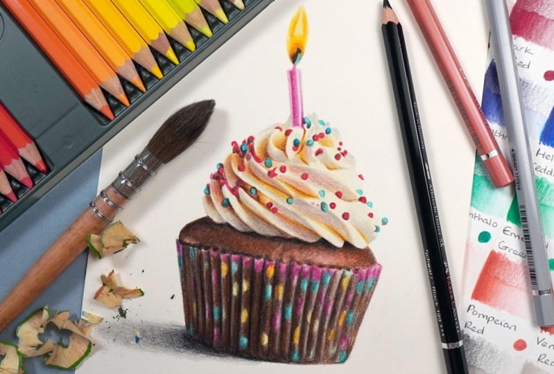
drawing this cupcake. Let's get started.
2. Class Project - Drawing the Cupcake: The class project, we'll
be drawing this cupcake. Now, we've picked this drawing
for a couple of reasons. First up, it's just really fun who doesn't want
to draw a cupcake. But also, it's a really
nice mix between detailed, but not too detailed. Not too complicated. But there is enough going
on to make it interesting. Now I will show you everything you need to draw this cupcake, including how to
make the sketch. But if you want to use my sketch is available
in the class resources. I've also included all of the colors you'll
need to draw this. They're also available
in the class resources. When you've finished
your drawing, please do upload it to
the class projects. I would love to see
what you've done. All right, let's talk about the materials
that you'll need.
3. Materials for Watercolor Pencil Drawings: Let's talk about some
of the materials you'll need to draw with
watercolor pencils. Not getting the right
materials is one of the main mistakes I
see people making. So let's start off
with the most obvious. First up, you'll need
some watercolor pencils. Now I'm using the Faber
Casta watercolor pencils. I find that they are a very good quality and create some really
lovely, vibrant colors. Now, you don't need to use these specific pencils, I'd say. As long as you've got
a decent sized set. So say at least 36
pencils, that'll be fine next up. And probably the most
important thing that you'll need is specific
paper for watercolor. Getting the paper
right is going to make such a big difference between a really good drawing and
a not so good drawing. It's not going to be possible
to build up the pencil and activate with water on
the wrong type of paper. So generally speaking,
for watercolor paper, you can get it in either hot
pressed or cold pressed. This is just a difference in the way that the paper is made. Cold press generally
is quite textured. Hot press tends to
be nice and smooth. Now, because we're
going to be working pencils here at the end, we're going to be
adding in a lot of detail with the pencils is going to be so much easier if you do that on
hot press paper. So that nice and smooth
paper where it's going to be easy to
control the pencil. Another thing that
I've found makes a massive difference is getting paper made
of the right stuff. So I specifically like
working on 100% cotton paper. I do find that when you
activate the pencils, they're much easier to
control on this type of paper is more expensive than some
other watercolor papers, but I do think it is
definitely worth it. Next up, you'll
need a paint brush. I have a couple of
different paint brushes of different sizes, although I generally
use the smallest one. I'd recommend getting
a round brush. And again, a brush that is specifically for working
with watercolor. We'll be using this to
activate the pencils. You'll also need just
a cup for water. I just use a cup
from the kitchen. Thankfully, with
watercolor pencils, it doesn't get
particularly messy. Next up, you'll need a weight
of sharpening your pencils. Now, you don't need any sort
of fancy pencil sharpener, as long as it creates a
nice and sharp point. That's all you need. If you're using Faber caster watercolor pencils like I am, you'll probably find you
need a pencil sharpener with a slightly larger diameter. So I've got this
pencil sharpener here, it doesn't fit in
the smaller hole. I sharpen with the bigger hole. The next thing you'll need
is something you can't buy, Something you're going
to need to make. I always do this no matter what material I'm working with. This is color swatches. So the only way to
truly know what all of the colors look like is to
mark them down on the paper. If you're trying
to work out what the color looks like by
the barrel or by the lead, it's just never going to be as accurate as putting
them down on the paper. Even more so with water color
pencils because they're a completely
different color when they're activated to
when they're not. So what I like to do is draw out a grid and then shade
in every single color. Generally, in color order, I go from as light as I can make each color to as dark as
I can make each color. And then I make sure
that I label them. And then once I've
done that, I want to take some water on my
paintbrush and activate half of this so that I can
see what the color looks like when it's
just plain pencil. But I can also see what it looks like when it's been
activated with the water. You can see what a massively
different color this is. Now when you activate this, do you make sure that you
go from the lightest to the darkest or you'll end up just making the whole
thing really muddy. But we'll cover that a little bit more in the next section. Once you've got all of
your swatches laid out, you can see really clearly exactly what you're
working with. And I'll cover in the
next few sections exactly how you use this. Next up, the last
thing you'll need is some way of looking
at a reference photo. So because I always focus
on drawing realistically, the best way to do that is from working from
a reference photo. We need a way to look at
that reference photo. Now, I like doing this on my
ipad specifically because I can zoom in if I want
to see any extra detail. If you don't have
something like an ipad, you could of course,
print the picture out. So you will need a set
of watercolor pencils, the right kind of paper, a paint brush, a water glass, a pencil sharpener, a ruler, graphite pencil, and an erasor. Some swatches and some way of looking at the
reference photo. Let's have a look at
the main methods you'll need to draw with
watercolor pencils.
4. Basic Techniques: Now let's have a look at some of the main techniques you'll need to draw with watercolor pencils. And the absolute
most important thing is that we're going
to work in layers. If we were to just put down
some watercolor pencils, activate it, maybe add some detail over the top,
and then we were done. It would just look very flat, it wouldn't be a very
interesting or deep drawing. What we want to do
is work in layers to build up some of the
pencil, then activate it, Then build up some more
pencil, activate it, and so on until we've mixed
these colors together and made some much richer,
more interesting colors. Now you'll see a bit better later on how this actually
works in practice. But essentially it is one of the main ways that we can mix
colors with these pencils. Now, because we're going
to build so many colors, one on top of another, we need to work
very, very lightly. If you just pressed
really hard with the pencil and
then activated it, it's just never going
to look as good. You're not going to be able to build up that color
in the same way. So whenever you're working
with watercolor pencils, you want to focus on
pressing lightly. And there's a few ways
that you can do this. First off, if you hold the pencil further back
than you might expect, it will stop you from being
able to press too hard. Holding it near the
tip is very good. If you want to add
in some detail, have some really good control over where the pencil's going. But generally speaking,
we're blocking in some quite large areas and we don't need to be that accurate. So holding it back
here just gives you that extra security that you're not going
to press too hard. Another thing that will help
stop you from pressing too hard is to have a really
nice and sharp pencil. The pencil goes down
so much easier. If you have a sharp pencil, I do find to get the same amount of color down with
a blunt pencil, you would have to
press a lot harder. And that's obviously
not what we want to do next up. Generally speaking, we do want to get
the pencil down in as smooth a way as possible. Even if we were adding a lot of detail or a lot of texture, we'd still certainly
to begin with, want to be putting down
some really smooth color. And the best way
to do this is to work in what I call
circular motions. So rather than scribbling back
and forth with the pencil, if you work in circle
or oval motions again, the pencil goes down in a much smoother, more consistent way. It is well worth
practicing this. It gets a lot easier after
a bit of experience. Now, next up, something
to be aware of with water colored
pencils is that you need to get a reasonable amount
of the pencil down on the paper before you can even think about
adding any water. If you put down a tiny amount of the pencil and then
try and blend it, it's just not going to do
anything you want to build up. Not necessarily loads of pencil, but a reasonable amount so that when you activate it with water, it is as vibrant
as it should be. And I think again, this
is a bit of experience, you get used to how much
pencil you need to put down. Again, I'll show you the kind of levels that you
need to get to. Now, when I do activate
this with water, there's something
quite simple I do. So you don't want to put absolutely loads of
water on the pencil, but you also don't
want to put none. You need to have a
happy middle spot. So what I like to do is dip
my paint brush in the water. Just brush the paint brush against my hand a couple
of times, just like this. And I find that that
tends to be pretty much the right amount of water because the water
is nice and clean. It's not a very messy process, You just get a wet hand. And another thing to
bear in mind when you do activate
this with water is you want to work from
the lighter colors towards the darker colors. So if you blended from dark
to light, you can see here, I'm just pushing all
of that pigment into the light area and
it's no longer light. If I start from the light areas and work
towards the darker areas, you can see that we end up with a much more consistent
gradient here. And every time I activate
my drawing with the water, this is what I'm thinking about. So those are the main
techniques that you need to know to draw with
water color pencils. Let's cover the process
that I always use.
5. The Process: Every time I draw with
watercolor pencils, I always follow
the same process. So let's take a minute to cover that process before we
work our way through it. For the cupcake, first up, we need to look for
a reference photo. So as I mentioned, when we
were looking at the materials, I always work from a reference. As I've said, I think it is the best way to create
realistic drawings. Now, there's a few things that I'm looking for in
a reference photo. First up, I want to have a
really lovely clear photo. I don't want something
that's really blurry. It's gonna be very hard to create a good drawing from this next up. Probably the
most important thing is I want a photo
with good contrast. I want really good light lights and really nice and deep darks, and a good range of midtones. Something like this
is never going to create as good drawing
as something like this. And I've selected the
cupcake reference vote because it's got such good
light to the right hand side. Once I've selected
my reference vote, what I then want to do is
sketch out the outlines. So I want to have all of the key shapes marked in really
lightly with the pencil. Now the way that I like to do this is by using
the grid method. This is where you put a grid on your reference photo and you draw a grid on your
drawing paper. And then just work through
one square at a time, drawing what's only in
each individual square. This will make sure that
all of your proportions are correct and give a really clear
framework to work with. Once I've drawn out everything, I then erase all the grid lines and make sure the sketch
is really nice and light. It's at this point I can start putting down the
watercolor pencils. Now, I always work from
here in four main steps. First off, I want to put down my absolute lightest colors. So I want to compare
my reference photo to my color swatches
and think about what the lightest
color is in each area. I then block in those
lightest colors using those circular motions and then activate it with the water. Now, the most important
thing to take away from this section is you need to
wait for everything to dry. If you try and move on
to the next section from here in the pencils aren't
dry, it's not going to work. So give it at least
half an hour. From here, I block in
all of the mid tones. So once again, I can
compare my drawing to the reference photo,
to the swatches. Think about what all of
the mid tone colors are. What needs to go where. Map in those mid tone colors. Just blocking in all
of the key shapes. I can then once again activate
this with water, Again, wait for it to completely dry, and then I can move on
to the darkest values. So comparing that reference
photo to the drawing, to the swatches, looking
for those darkest values, filling those in really
nice and lightly, activating it with water and letting it dry one last time. That is the last time that I'll add any water onto the drawing. From here, I have all of the basic shapes and
basic colors marked in. I can start refining
this with the pencils. So it's at this
point I kind of use the pencils as color pencils. So really refining
all of the details. If an area needs to be
made a little bit darker, I can do that at this point. And just adding in
all of those details, it is the longest
part of the drawing, but you can see what a
massive difference it makes from when we added in those
darkest values to the end. It really makes the drawing. So that is the full process I use for every watercolor
drawing that I make. Let's start working
through that process.
6. Studying the Reference Photo: I've already selected
the reference photo, making sure that I've
got a reference photo that's really detailed
and has great contrast. Before I start creating my sketch or start
any of the drawing, I'd like to take
a minute to have a really good look at
the reference photo. Really see the key shapes and the key colors
that are here. So let's take a minute to
look at this together. So first up, probably
the main bit of the cupcake is the icing. Now, icing, particularly when it's a lighter icing like this, tends to be something that
people struggle with. The key here is that we
want to draw the shadows. So I'm noticing that
in here, for example, even though the icing looks maybe not
white but off white, kind of a light cream here, This is quite a shadowed
area, that's almost orange. It's quite a dark
orange around here, it's a brighter orange. And there's some very dark
lines in here as well. So we're going to need
to draw in all of these shadows to
build up the icing. I'm also noticing that there's a lot of sprinkles on here. These are all quite brightly colored but generally
reasonably simple. Generally just circles. But I'm going to want to try and get all of these in
the right place. Probably what I think is the trickiest area will
be the cupcake case. Mostly because of
all of these dots, it's going to be important to get these in roughly
the right place. But more importantly,
don't get the brown here on the pink for example, or the blue because it'll
end up looking really muddy. The main thing I'm
noticing is that this is all corrugated. It's got all of these
dark shadows in between, and they're going to be key to creating the effect down here. Last thing, looking
at the cake section, this has quite a light patch,
particularly around here. So generally speaking, this
side is more in shadow. The light is clearly
coming from the right, and here it is
really, really light. This almost looks
like a light pink. So it's worth remembering
that the cake isn't necessarily solely
made up of brown. It might be a bit more
complicated than that. So those are the
main things that I'm seeing in the
reference photo. Let's create our sketch.
7. Creating the Sketch Outlines: Let's create our sketch
for this cupcake. And I want to do this
using the grid method. So I've already created a
grid on the reference photo. I will leave a copy of this
in the class resources. I now want to work out how many squares wide and tall I need
to make on my drawing paper. So a little bit of maths to work out what size the
squares need to be. So I'm going to make two
centimeter squares here. You don't need to make
the same size as me. That's just what I'm finding
fits nicely on my paper. It might be that you want
to draw a bigger cupcake. Now, I'm pressing
quite hard here. Whilst I'm drawing
out this grid, you want to press a
lot lighter than I am. I just want to make sure
that this can be seen clearly on the
camera in actuality, because at the very end, you're going to want
to erase your grid. You want to make it as
light as you possibly can, so it is much easier to erase and you can't see
the grid at the end. So once I've drawn out my grid, what I want to do is work out where my starting
square is going to be. And then from here I just
want to focus on this square. So let's start on
this square here. And I'm going to start off by focusing on the
icing on the top. So what I want to
do is look at where this icing is crossing
the grid line. So this here, I would say is about a quarter of the
way from the bottom. And then this line here, this is maybe a third a long. So I can mark a line
here, mark a line here, and then try my best
to follow this line. So you can see I'm
marking a line here about a quarter
of the way up, and then marking a line at the top about a third
of the way along. And then I want to try and copy the shape from the
reference photo, so I end up with something
roughly like this. I then want to look
at the cupcake. So the cake top is about
maybe a sixth of the way up, and then it's going to
join to this point here. This is roughly halfway along the square and just
under half way down. So I can mark the edge, I can mark where I'm
going to join it, and then I can draw that line. Then there are some
sprinkles in this square. I'm not going to be as precise about where these are going, but I can just draw a circle where they look like they
are within the square. And then from here
I will be able to move on to the next square. So on this square
here, for example, there are a number of shapes that I'm going
to want to draw in. There's this line
here from this fold, this line here, this here, this here, and all
of these circles. And I want to look
at where any of the prominent marks are once
again crossing the line. Now to a degree,
some of these will already marry up with what
I've done on the bottom. For example, there's
a circle right in this top right hand corner. And then this meets about here, just short of the corner. And then it's coming
round and going down to, if there's a circle here, but if it went all the way down, it would meet in the corner. So I can start drawing in some of the marks
that I can see here, just trying to see
where these lines are crossing the edge. And I'm literally
going to go through and do that for
every single square. Now the goal here is to end
up with a drawing that is in good proportion that I'm confident that I've got
everything in the right place. It's going to make
the whole rest of the process so much easier. It's a good opportunity
for me to get my bearings. Now I'm working here
with, I would say, some kind of medium
sized squares. It could be that if you're
finding this really difficult, you could make some
much smaller squares, you could maybe do
half this size. Or if you're finding
it really easy, you could stick with
bigger squares and then it will be faster.
It's completely up to you. I've drawn in the whole sketch. I'm happy that I've got all
of the key shapes marked in. What I now want to do is erase
all of these grid lines. Now, as I said earlier, this will be ten times easier if you have pressed much
lighter than I have. As you can see, the lines
aren't really fully erasing. All I would do is erase all of those grid lines so that I
have a nice clean sketch. And I want to make sure that
the sketch is as light as possible so that when I put the watercolor
pencils over the top, it's not really standing out. I want it to be so light
that I can just see it. Now that we've got our sketch, let's start adding
in some color.
8. Draw the Lightest Colors: Now that we've got
everything prepared, we're ready to start drawing. And I want to start off by
drawing the lightest colors. So I want to start
off here by filling in only the absolute
lightest colors. I want to put something down
that's very, very light. That will then be able
to build on as we go. So I'm looking for
the lightest color that I can see in each area. So let's start off by
looking at the icing area. And the lightest
color I can see in here is a very,
very light yellow. So check my swatches, and the closest color I have
to that is the cream pencil. What I want to be
doing is putting this color down over the whole of the icing in as smooth and
consistent way as possible. So you'll notice that I'm not holding the pencil
really close to the tip. I'm holding it
reasonably far back. And what that does
is it stops me from being able to
press too hard. So there's a few things
I want to be doing here. First off, I want to
make sure that I'm pressing really
nice and lightly. I don't want to
be pressing hard. I want to gradually
build up a small amount of color that we can
activate in a second. And then I can build other
colors over the top of it in order to help me
not press too hard. I'm holding the pencil further
back than you might think. And the next thing I'm
doing is trying to get this down in as smooth
a way as possible. So I'm working in
circular motions rather than just going back and
forth in the pencil. And that helps put it down in a
more consistent way. So now I've blocked in
that whole first area. I ought to be looking at any other light
colors in this area. So I'm particularly looking
around here and around here. And generally around
here, for example. This color to me looks
like a warm gray. A very light warm gray. So I'm going to use
this warm gray to it's called to map out a
lot of these creases. So the icing is made up
of a number of folds. Each of those folds
creates a shadow. Some shadows do look a
lighter color than others, but if I can map in where all of the shadows are going
to go with this color, that's going to make my
life a lot easier as we go. So I can still see
my sketch here. It is very light, but I
can just about see it. And I'm going to work my
way along the lines of the sketch whilst
also looking at the reference photo on my ipad. And I want to just use this as an opportunity
to get my bearings. Now you may notice that the cupcake top here has a
lot of little sprinkles, a lot of brightly
colored sprinkles. I'm not actually
going to worry about adding any of those
in in this section. Mostly because I'm focusing on the general kind of
underlying colors, the general look of the icing, But also I'm focusing right
now on the lighter pencils. And generally speaking,
I'd say a lot of those sprinkles are
really quite bright. So you can see I'm
taking my time here just gradually filling in the
shapes that I can see. It looks a little bit odd and scratchy at this point, but
don't worry about that. Once we've blended it and built
more colors over the top, it will look much better. Now in areas like
this at the top, that is this fold
here, for example. Now this fold,
you'll see I spoke about it when we looked
at the reference photo. It is quite a earthy kind of orange here as well
as here and here. Even though they're so much
darker than this pencil, I am still going to map this in this pencil and then
in the next chapter, when we're looking at
more of the mid tones, we can fill that over the top and gradually
build up that color. But I think it really helps to know what is supposed
to be going where. So by the time that you
filled in all of the folds, it should look
something like this. As I say, you don't expect it to look amazing at this
point, and that is fine. So let's carry on looking
for the next lightest color. And I'm particularly looking at this very light pink strip along here. And this
light pink strip here, I want to find the
closest match to this, so I'm going to use a
reasonably bright pink. And I'm just going to block
in the whole of this area, even though it had
that light strip, both the lighter one
towards the right and still quite a
light one to the left. I'm not going to worry
about that at this point. I'm just going to block
in the whole area with this light pink and then we can build up some brighter pink over the top of it
in a little while. But once again, I want to be pressing really
nice and lightly, and just gradually building up a very small amount
of the pigment here. Let's have another
really good look at our reference photo. And I want to be thinking about any other lighter
colors I can see. And I'm particularly
thinking about this lighter color here. So as I said, when we were looking at the reference photo, I think this is a
kind of pinky tone. But I wouldn't say it's the same pink as the
pink of the candle. This is more of a
kind of earthy pink. So I'm using the coral pencil
here and I'm just going to block this in over the
whole of the cake area. I'm not going to worry that it's mostly focused on
the right hand side. I think it will look
better if this pink is over the whole
of the cake top. So once I filled that in, let's just go back
to that cream. I want to put something in
on the candle at the top, and then I want to get
some sort of color, both a little bit more on the
cake to the left hand side, and also some color
on the cupcake case. So this is Van **** Brown. It's a reasonably dark brown, although I'm using it
very lightly here. I'm just going to add
a small amount of this color to the
left hand side, but leave it on the right. I want the right to
be more of that pink. And then I'm going to
fill this color in on most of the cupcake case. Now, it's important that I miss out any areas that are
really brightly colored. So where, for example,
there's this light blue or this bright pink or this
very light creamy color, I want to avoid these
areas for now and just fill in all around
them with that brown. Now, this is made a lot easier because I put down such
a detailed sketch, so I'm really just working
around the blobs I marked in. The reason, as I said when we were looking at
the reference photo, that I don't want to put the brown on
these areas as well, is because I don't want to
end up with a muddy color. I want to have a really nice and bright color here where I add these spots in which we're not going to worry
about at this point. But maybe in the next couple of chapters we'll need
to be adding those in. So I want to be pressing
really nice and lightly, and just gradually
building this up. And you can see it
looks a little bit messy right now,
but that's okay. Once it's been blended, it
will look a lot more uniform. And certainly once
we've built up all of the different colors, all of the different
layers here, it will start looking
much, much better. So I find it easiest
to kind of draw around the spots and then shade
up to those areas. I find that the easiest
thing to do here. You'll notice that what
I'm doing looks so messy. But honestly, it's fine. It will all come
together in the end. You really don't need it to
look perfect at this point, I've worked generally
across from left to right. Let's just fill in
the bottom area. And then that's all of the pencil that I need
to put down for now. That's our first layer complete. What we need to do now is
activate this with some water. So I've got a nice
clean paint brush with just a small
amount of water. And I'm going to go through
each area one at a time. So I'm generally starting in the lighter areas and working my way towards the darker areas. So I'm starting off here, so I've activated the
yellow on the candle. Let's now activate the
pencil on the cupcake case. And I kind of want to
blend this reasonably well right now. The gray areas
particularly look a bit odd. They look a little bit too
separate from the cream. I want to activate
it and it's going to help blend these
colors together. I usually wouldn't want to blend in quite as thorough a way, but because they're
both very light colors, it's not really bleeding too
much from one to another. So now I'm happy with
the icing section. I can clean my paint brush, get a fresh part of water, and then go very carefully
over the candle. Here you can see
that it's making the candle a little
bit brighter, but it's also smoothing
everything out. Now I do like to work
one section at a time. So now I've done the candle. I can wash the paint brush
again and then start working on the cake section. Now, it's particularly
important here that you start on the lighter area and work
towards the darker area. I added some of that brown to the left hand side
and I don't want to move all of that brown over onto the area on the right that I want to be a lot lighter. So I can just carefully
go over all of this. And then once I'm
happy with that, I can wash my paint brush and start working on
the bottom section. Now, I just need to be
reasonably careful here that I'm once again going
around those lighter spots. I don't need everything
to be perfect here, but I do want to try and avoid going on
those light spots. As I said, I don't want this
to end up looking muddy now as I go here. I
can't stress enough that you don't expect it to
look perfect at this point. There's a lot more color
that we're going to be building up on top
of this right now. I just want to be getting
some very rough light areas marked in and then we can
build upon that as we go. And then this is all there is to it for this first section. We've filled in the
lightest areas, we've activated the color, and we've got something that we can work off of and build upon. You can see how much
darker this is, making the brown at the bottom. But even that is still
a nice and light color. We're going to go
much, much darker with some of the other colors. So this is a good first layer, but that's it for
this first section.
9. Draw the Midtone Colors: I want to start working my way through some of
the mid tones now, and I want to start
off by, again, looking at the cupcake icing. So still, right now, not paying attention to the sprinkles, we're going to do that
in the next section. For now, I'm looking
particularly at these areas. So all of this orangey brown that I've talked about before, I want to get all
of this marked in. So I would say the
closest color that I have to this is the
burn ochre pencil. So I can use a nice
and sharp pencil to start marking in all of the
shapes that I can see here. Now, just like before,
this is reasonably simple in that I can
still see my sketch lines through the pencil
that we've put down and I've got the
marks that I made with the particularly
warm gray pencil that are giving me a little bit of a guide on
what's going to go. And I'm literally looking at this like it's a
series of shapes. I don't need to think
about drawing the icing, I just want to look at
which shapes are where. Some of the lines on
here I would say are a lot more prominent
than others. So in this area, for example, I'm putting a lot
less pencil down. Whereas there are some
much more prominent lines where I need to build
up a lot more of it. So you can see that still has this kind of
orangey tone to it, but it's not as
prominent as here, or this line here, or this line here, for example. And I find it easiest to work
reasonably systematically. So I'm starting at the top
and I'm working my way down. Just looking at the lines I can see and what
needs to go where. So I'm putting
down, I would say, a reasonable amount
of the pencil. It is always worth remembering that when you
activate it with water, it's going to look
a lot brighter. So you don't want to
put absolutely tons, particularly if it's quite
a dark pencil like this. This is, it's not
really a bright orange. It's orangey brown, I would say. So I don't want to
put tons of it down. I don't want to make really
dark lines, but I do want to reasonable amount down.
I want it to stand out. So after going over
most of the lines, it should look
something like this. It's still not at this
point looking that much like a swirl of
icing, But that's okay. It will build up as we go. I think it will all
make a lot more sense when we've done the sprinkles, But I don't want to
do the sprinkles at this point specifically, because we're still
building up the general icing and it'll end up bleeding from one color into another. So let's also use the
same color just to fill in this section of the flame. The flame is generally a bit darker towards the bottom
and lighter towards the top. Now let's move on to
quite a bright orange. Firstly, I want to brighten
up this flame here. I use that quite
brownish orange, but I do want to make it
a little bit brighter. And I'm also going to
use this bright orange to go very lightly around
the edge of the flame. And then I'm going to use this
same orange on some areas, so some areas of where we put that burn ochre to
brighten it up, but not all of them. When you really look at
these orange patches, some are quite a bright orange and some are a bit more earthy. So this has a real bright
orange look to it. This very prominently does as well as it does around here. But here it has a little bit
of kind of the burn ochre, but not really a bright
orange, I would say. So I can go over some of these
lines, brightening it up, but I don't want to be putting a huge amount of
the pencil down, and I don't want
to be putting it on every single section. I would say that this can be a reasonably quick process though. I'm just quickly and
lightly going over some of these areas that
need to be more orange. Now, before we move on
from this orange pencil, it's a good opportunity
to see if there's any other areas that do have
this orange tone to them. So in this chapter,
we're particularly focusing on the midtones. I would say the mid tones on the cupcake case are
now all of these spots. What we need to do to
get the cupcake case looking correct is draw in
all of these dark lines, which we're going
to want to do in the next section once this
pencil is completely dried. So in this chapter, we
want to focus on marking in all of these dots so that we have something a bit
better to work with. Now, as I say, all
of those dots on the cupcake case are a
variety of different colors. Let's use this orange to fill in where those orange
spots are going to go. And in theory, you should have gaps relating to the spots on the reference photo and you just got to work out which spot is which so there's
not a huge amount of the orange spots on here. I think there's only
three. So let's lightly fill these in. And then I'm going
to take a minute to focus on the candle. So I'm using exactly
the same color that I did in the last chapter, but I'm just going to fill
in a strip down the middle. This is literally
all I'm going to do. This darker strip along here. I want to leave the very
light area down the side and this white strip here and
just block in this strip, It's a nice and easy
part of the drawing. Once this is activated, it will have a darker pink
strip going down the middle. So I still want
to be building up these dots along the bottom. Let's now move on to
the bright blue pencil. And I'm literally going to
go over each of these spots. So in terms of how
I'm going about this, it's very similar to what
I did in the last chapter. So I want to be pressing
nice and lightly. I want to be holding the
pencil further back, which helps allow me
to not press too hard. And I want to be working in circular motions to try and get this as smooth as possible. Of this bluey green color. There is quite a lot
of these colored dots, so I can just work
my way along from left to right looking
at the reference photo, trying to work out
where they go. So because we're filling in so many dots on the
cupcake case in this chapter is going
to feel a little bit like I'm just
flitting through colors, but I'm literally
just trying to get these dots reasonably accurate. We will be tidying all
of this up though, in the very last chapter, so don't worry if
it's a bit messy. Mine looks a bit messy
and that's okay. So once I'm happy I've got
all of the blue dots in, I'm actually going
to use the same pink that I used for the candle, and I'm going to use that to
put all of the pink dots in. There is a dot here
where I've realized I haven't left a gap,
but that's okay. I'll just hopefully it
doesn't look too muddy. On the most part, we
haven't done that. There's just the odd one
that I think is missing. Now I've worked my way along all the dots around
the top here, there's a bright pink kind
of edge to the cupcake case. You can see this bright
pink all along here. Then this little gap and then
all along here along here. I'm not going to worry about any of the details of
this right now, but I do just want
to get that pink in. And then let's just keep working through these colors
on the cupcake case. So this is quite
a bright yellow. I've literally compared
my swatches to the reference photo
to try and find the closest color to
each of these dots. It doesn't need to be perfect. I can't stress that enough, but I do want it
to be reasonably accurate, reasonably close. Now that I've added
in the yellow, let's just go back
to that same blue. Some of these areas are
like a very faint blue, so I'm going to very lightly put a color of this blue down. And they also want
to put some of the blue down along
the top up here. So now I'm generally happy
with the cupcake case. Let's think about
the cake at the top. So as I mentioned before, the left hand side of
the cake is pretty dark, the right side is much lighter. So let's really try and get the darker areas marked
in a little bit clearer. I'm not trying to go to its
kind of maximum darkness. That's what we want to be
doing in the next chapter. But I do want to get a lot more of these mid
tones marked in. So this is the same brown that I used in the last chapter,
the Van **** brown. And I want to be filling this
in over mostly as I say, this left hand side, now I am leaving a
patch a lot lighter. This patch here, I want to
leave that so I can add some color over the
top of it a bit later and then I can
work my way around. I can really start defining
the edge of that icing again, just following the sketch
that I can still see. And once I draw on the
line around the edge, I can add some light
shading coming down. I also want to be drawing the edge of the cupcake
case at the bottom. As I have said before, it doesn't need to be perfect, especially not at this point. But I do just want to
kind of get that general bumpiness mapped in. It's worth noting that these
aren't all the same size, they're wider here
because we're looking at it head on where we
get to the sides. The sort of loopy shape is smaller over here and then
larger and flatter over here. So just bear that in mind as you're marking in these shapes. But as I say, it doesn't need to be perfect at this point. And you can use the sketch that is already there as a
little bit of a guide. So, once I've gone
particularly around the edge, because that's the darkest
areas with the Van **** Brown, I now just want to warm
it up a little bit, so I feel like the
actual cake color is closer to the
burnt sienna color. So let's go over the top of that brown with
the burnt sienna. Particularly on the
left hand side, kind of staying a bit clear of that lighter pink area that we were looking at
in the last section. Just working my way along and adding in some of
this sienna brown. And that's just
going to warm up and darken the cake a little bit. But as I say, we
will have to make it quite a bit darker than
this in the next chapter. Before we move on to start
activating this pencil, let's just put something down on the shadow to the left here. So I'm using the cold
gray, the darker, cold gray that's in my set to add a very light
shadow over here. And we can see on
the reference that because the light is
coming from the right, the shadow is going
over to the left. So I want to map
this rough shaping. So once I got that gray down, I'm just going to
add a little bit of this kind of earthy
yellow to the top. I think it's not looking
quite bright enough. And then we can think
about activating all of this with the water. And I'm generally going to start at the top and work my way down. So starting with the candle
up here, just lightly, going over this with
the paint brush, I want to be quite
careful not to touch the pink area because ideally this color wouldn't
bleed into that one. I want to go over just that rectangular block that I
mentioned down the middle here, and then I can start
carefully working my way over each
of these shapes. Now you'll see that that's got quite an abrupt edge and
I'm not happy with that. So I'm going to get a
nice wet paint brush and then use that to just
gently blend that out. It doesn't need to be perfect, but I do want to
get a softer edge on this than just
really harsh lines. So you can see here,
I'm going over all of it and it has got
some harsh lines. But then what I can do is again, wash the paint brush and
just blend that out, smooth that out so that
it isn't as harsh. And I pretty much want
to do that over all of the orangey brown
sections on the cupcake. I can then move on to the
cake itself, and as usual, I want to be starting on the lighter patch and then working my way out
to the darker areas. So I'm just working my
way around the edge here. I think that's the
easiest thing to do. But working all around that
very light pinky patch. So going all around
here and then once I'm happy that I've gone around
the edge of that pink patch, I can kind of approach
it in a similar way to what I was doing on
the top section. Getting a nice clean paint brush and just smoothing that out, blending out the lines. As I say, it doesn't
need to be perfect, but I do want to get
it reasonably smooth. We will, at the
end, be adding in all the details and
covering up some of this, smoothing some of this out. So it can be quite forgiving, but I do want to try and make it as smooth as I can
at this point. So let's go over the
rest of the cupcake to the left here you can see what a massive difference it makes
to the color of the cake. It's so much darker and richer. Once it's been activated, just carefully go
around that white spot or that light spot there. And then I'm just going
to use the paint brush to go over all of these
dots and I'm going to go one color at a time so
that I don't need to wash the paint brush as frequently or more frequently
than I need to. So going over all of the
blue ones to start with literally just putting
a little bit of water on it to activate it, then I can do the same just working through one
color at a time. And I can't stress enough, this looks a little bit
odd, but that's okay. It will all come together. Do be careful when
you go around the top here because you don't
want to accidentally bleed the pink particularly into the cake area because the
cake area is so much darker. And be careful if you've got, for example, a yellow dot
right next to a blue dot. Again, ideally those colors wouldn't bleed into each other. It wouldn't be the
end of the world. But it'd be better if
it could be avoided after going over
all of those dots. The last thing to do is
activate this shadow here, giving it a general
sort of blend. And then I just want to be quite careful going around the edge, trying to make it as smooth
a gradient as possible. So by the end of this chapter, you should have a cupcake that
doesn't look quite right, but we're starting to
get some darker values.
10. Draw the Darkest Colors: Now let's focus on adding
in those darkest values. But as well as the
darkest values, we also need to add
in the sprinkles. So I'm going to work through
this one color at a time. And actually there's
not that many colors in the sprinkles. So starting off with
the turquoise blue, the same color that I used on the cupcake case at the bottom. And I'm just working my way around really looking
at the reference, seeing where these
sprinkles are. Now I'm getting these in the right place
through a mixture of still being able to see
the lines of the sketch, so being able to see where I marked these out when
I created that sketch. And also by looking at the reference photo and
seeing where they are. So I can focus initially on all of this bluey green color. And it's quite easy to kind
of focus on just one color. And then I'll be
able to focus on all of the pink and all of the red. As I say, there's
not a huge amount of different colors
in here, actually. So as for how I'm
actually doing this, I'm once again pressing lightly, using circular motions, and
making sure that I've got a really sharp
pencil so I can be nice and accurate on
where these are going. I will be using the
water to activate these, to make them more solid. So although they
don't necessarily look perfect at the
moment. That's okay. Before I move on,
a couple of these are a slightly different blue. I'm just going to go over
some of them to just adjust that this is quite a bright
blue I'm adding in here. And I'll probably
use a bit more of this in the next
chapter as well, but I don't need to
add a huge amount of this color just on the
odd few sprinkles. So you'll see how
this sprinkle, this, sprinkle this, and this are a slightly different
color to the rest. So let's move on now to
quite a bright pink. This is the same pink that
I used on the candle. And I'm again just going
round marking these in. There aren't a huge amount
of this color pink. And then I can move
on to the red. The red there are
by far the most. So I'm just going
to take my time, work my way round once again, working reasonably
systematically. So generally speaking, starting at the top and
working my way down, just marking in where all
these need to be, some areas, there are clumps of quite a large amount
of these sprinkles. So for example, around
here and around here, I'm not actually going
to worry in these areas about drawing in every
single sprinkle. That's more something I'll
do in the next chapter. For now, I just want to get the main overall shapes
and colors marked in. So get the red
patch marked in and then I can adjust it a
bit in the next chapter. So I'm happy that
I worked my way around and get all of
these sprinkles in. I can start looking at some
of the much darker colors. So I'm going to switch
on to the walnut brown. This is the darkest
brown I have in the set. And I'm going to start off by marking in the wick
of the candle. So I'm particularly looking
at the shapes here. It's kind of split
into two shapes. There's the wick shape here, and then there's this kind
of triangle on the top. So let's draw that in. And that's already looking much better, much
more realistic. And then let's focus on putting this brown on the darkest areas, so where the darkest
areas will need to be. Now this is primarily in these, I'm going to call them grooves, so it's much darker in
between these sections here. Particularly darker
around here and here. But generally speaking,
I want to add some of that walnut brown all
along this line here, as well as around the edge
and on this bottom edge here. Not so much on this
right hand side, but a lot of it, particularly around this left,
I can just, again, wind circular motions lightly build up the color and that's looking a bit closer in a
match to the reference photo. And then I'm going to start
on what will probably be the most time consuming
part of this drawing. I want to go back over all of these lines of the
cupcake case now. It's very simply a
case of going over, I can still lightly
see my sketch lines. They're getting a
bit hard to see now, but I can still just
about see them, so I can go over them. And what I want to be doing is drawing a straight line here. And then I want to shade from that line to kind of fade
it out a little bit. So you can see me
doing that there. All of these lines, depending on which way round
they are here, there's a straight line here. And then it kind of fades
this way to the left. Whereas on this side they're
going the other way. So there's a straight line
here and it's fading this way. Also notice how the
lines get a lot closer together as it gets
towards the edge. And then I can start again going from this left hand
side towards the right. Drawing in all of these lines, this is where it all
starts coming together. So as I say, this section
is quite time consuming, but I do think it is where
it all comes together. I work my way the
whole way along. What I then want to focus
on is along the bottom. So right now I've only been focusing on drawing
in these lines, getting them in the right place and shading a little
bit around them. But I also am noticing along
the bottom of the cupcake, particularly on the
left hand side, it is really quite dark. So let's add some extra
shading down the bottom, just avoiding those
colored spots to the pink spots
and the blue spots. I still want to add
some shading as they get towards the
right hand side, but I don't need to add
anywhere near as much. It's generally not as
dark on the right side. And then once I'm happy
with how that's looking, I'm just going to make some
of these lines a bit darker. I was going over
this pretty lightly, but now that I'm happy that
they are in the right place, I can just go a
little bit darker, not a huge amount,
and I'm mostly focusing this color
towards the bottom. Now, before I move
on from this pencil, I'm just going to tweak some
of these areas at the top. Looking at it, I think
this area is a little bit too high and it just needs to come a little bit lower. Just the top of the cupcake
looks a little bit wanky. And then also, before
I move on from here, I'm going to go back
to this pink pencil. This is the candle pink. I'm just going to brighten
up along the top again. It just looks a
little bit too muted. It doesn't look bright enough. Now from here, the main
thing that's sticking out to me about the photo is
that the cupcake case, the brown areas look a
little bit too light. So actually I'm
going to go over, particularly on the
left hand side, the brown areas with the
burnt sienna pencil now. So that's the kind of
reddish brown that we used on the cake section. I think there are
definitely aspects of this color in this section
that needs to be added. But notice how lightly
I'm doing this. I'm not going to want it to
be a really prominent color. I just want to add
a little something to what I've got here. And then before I move on
to activating these colors, I'm just going to go back to
the same gray that we did in the last chapter to add a
bit more of a shadow here. I just want to start
building this up. It looks a bit too, again, a bit too
muted at this point. So I'm adding a bit more
of the pencil here and I'm particularly
going to focus on building up the color closer to the cupcake. So around here. And I think that that's
going to look a lot more realistic if it's a
bit darker in this area. So now I'm happy with all
of the colors on here. Let's once again
activate and I'm going to start at the top
and work my way down. So very carefully
going over that wick and then giving my paint brush a really good wash
before starting off. So I want to stick with all
of the colors of one type. So let's start off going
over the blue dots. I'm literally just
dotting this on. I just want to add a tiny bit of water to activate this color, to really brighten it up. But I don't need to take
a long time doing this. It's a pretty nice
and quick process. Once I've gone over all
of those blue ones, I then want to go over
the red dots again. Just literally putting the tiniest little
bit of water on here. And you can see that's
really brightening this up. And then once I'm
happy with that, I can start thinking about
working my way through, particularly the top of the
cupcake and the cupcake case. So I'm lightly going
along the edge here, just activating
that very dark line where the icing is
meeting the cake. Again, you do want
to try and get this as smooth as possible. That said, I
wouldn't worry about it too much because
we can smooth it out in the next chapter if anything just
needs tidying up. And then once I'm happy with
the top of the cupcake, I then want to focus
on the cupcake case. So I'm going to go along
each line like this, You can see how much
darker that's making it. And then very gently adding
a little bit of water to the side of that
line so that it's also activating the color
in between the lines. Now I am trying where
possible to not go over those colored dots, but it's not always possible. I literally working
my way along here, going along the lines, and then adding a little bit
of water in between as well. As you can see, I'm not being massively neat and
tidy about this. I don't think I need to. As I said, a lot of this will
be tidied up in a second. And actually the very bold
lines that I added in, even where I'm blending
away from those lines, you can still see the lines, which is the most
important thing. This is really just a
case of trying to get a solid background of color that we can then add details
in with the pencils. So once I've gone all the way along from the
left to the right, I just want to add
a little bit of extra water along the bottom
just to tidy this up. It's not looking massively
neat at the moment. And then let's
also not forget to blend those pink areas up here. And then the last part
that I'm going to want to focus on is once
again that shadow. So starting off by going around the edge
nice and carefully. And then once I've
gone around the edge, I can start blending
towards the middle. So by the time that you get
to the end of this chapter, you should have a
cupcake fully marked out that is ready to have all
of the details put onto it. But certainly everything is
very clearly mapped out.
11. Add in the Final Details: Now we've built up the
three layers of pencil and we've activated each
layer. I at this point. Want to focus on adding in all of the details
with the pencils, kind of using them
as just pencils. So what I'm going
to do is I'm going to start at the top
and work my way down. And I'm going to begin by
focusing on the flame section. So I've initially
used the black pencil to just slightly
tidy up the wick, and now what I want to do is brighten up the orange section. So right now, if I compare my drawing to the
reference photo, the main difference
I would say is that the reference photo has a
really bright orange section, particularly around that wick. So I'm going to use this
quite bright orange to just lightly add that in. And you can see that's
really brightened it up. Now I can add a pretty bright yellow over
the top of this, just to brighten that up
a little bit further. So let's take a minute to
have a look at the flame, and you'll see that
there's a bright orange. It's a kind of browny orange
close to the wick down here. Then it turns into
quite a bright orange. Then a bright yellow. But around here there's a blue. So we will want to add
that in in a second. And then generally speaking, there's this orange glow
either side around here. So I can add some of that yellow over the orange at the bottom. And I'm also going to
add some of the yellow around these areas
to the side as well. Try and give it that glow. And now let's move on to
an orangey brown and just make it a little
bit darker towards the bottom as we saw
on the reference. So just lightly adding some of this pencil and you can see I'm still using
circular motion, so it's nice and smooth. And then I'm going to use the sienna brown right
at the bottom. This is quite dark brown, just to really add in that
contrast at the very bottom. And I think the flame is now
looking much closer to the. I don't want to forget to add in the blue section though,
on the flame here. This is the bluish
turquoise pencil that I used earlier on some of the sprinkles
And then I'm just going to put the white
over the top of this, just to blend it out and
smooth it out a little bit, as well as towards
the top up here, maybe slightly light in
this area a tiny bit. Now, pretty happy with the flame, let's gradually
work our way down. So I'm moving on
now to the candle. And the first thing
I want to do is really make this line, this sort of block towards the middle a little
bit more prominent. So this is a pinky purple. This is a slightly
darker purple than the pinky purple I
was using earlier. And I'm just going to add a neat and tidy line
down in this section, so you'll notice
it's really quite dark here and I really
want to fill that in. It kind of gets a little bit
wider towards the bottom, so I really want to
be filling in a lot of the pink in this rectangle and that's making
it look a lot more vibrant Just adding in
a little bit of this. Also add a little bit up
this right hand side. I want to leave the gap in the middle because that's
an almost white line. And we can brighten
that up in a second. And I'll just add
a very light line up this left hand side as well. And then let's go back
to that lighter pink, the same pink that we used or we have been using on the
candle up until now. And I'm just going to
go over lightly down the left hand side
before switching onto the white to
go over the line, that bright white line
I mentioned along here. And I think quite quickly, the candles looking
a lot better, I don't think it's the main
focal point of the picture. To be honest though, let's go
back to that brighter pink. Maybe just add a
little bit more color. So do remember you can keep going back to these same colors, just building up a
little bit more of the color as it needs it. So I'm adding a bit
more down that left side and a little bit down
the bottom here as well. And now I'm generally
happy with the council, I want to move down to really
focusing on the icing. We want to add a
lot more structure and a lot more detail
into this area. So I want to be
comparing my drawing to the reference photo
and thinking about the main colors that
I think is missing or the main differences
between these two objects. So right now, I think
the main thing is that on my cupcake here,
the darker areas, the kind of orangy areas
that I've spoken about before aren't looking
quite dark enough. So I'm using the burn
ochre pencil to just go over this in exactly the
same way as we did before. And this is the same
color we used before. I think it's got a little bit diluted when we
activated it earlier, and I want it to
be a firmer color. I'm just going to go over
most of these sections, particularly towards
the left hand side. A lot of these lines are
quite deep, quite dark. So I can go over these really looking at if an area
needs extra shading. So for example, if we look
around this area here, actually we need to add
in quite a lot of color. You can really see how sort of bright orangey
brown this area is. It extends quite far. Same here. It's more muted in this area, but it's still quite
a large area and I'm still just working my way
along all of these strips. So I already think that
that looks a lot better. It's looking a lot more
defined from here. I once again, want
to be comparing my drawing to the
reference photo and the swatches and really thinking about now the most obvious
color that's missing. So now the main thing
I'm noticing is a lot of the very light areas don't
have a lot of detail to them. They all look like they're
missing the extra shading. So this is the lighter
warm gray from my set. It's the same color that I used right at the
very beginning. And I'm going to
put this anywhere that has a little bit
of light shading. So let me show you what I mean. So there are a lot of quite light and quite
dark shadows on here. So for example, you can see a very prominent line
along here and along here. And this whole section is actually quite dark,
the same here. This is quite a dark gray going
all the way up and around here as well as along
here, this line. And along here, this isn't
a particularly light color. It's actually more
like a mid gray or and the same all along
here as well as here. So those are some of the
more obvious shapes. But you'll see as I'm
working through here, I actually need to build up
quite a lot of this gray to begin giving the icing
a bit more structure. Now as I think I've said before, a lot of people are I find concerned about
drawing white icing. Or maybe this is more
like cream icing because it feels like it would be really difficult on white paper. But if we actually look at
the colors that are there and really look at how light
an area actually is, you'll realize that it is
made up of a lot of shadows. So I'm working my way round
here one section at a time, I think because this is kind of split into
a lot of sections, because the ripples mean that this is split in a lot
of separate areas. It makes this much, much easier. You can focus on
one area at a time and if there's any shading
that needs to be added. Now, do you remember
as you're going here to keep a nice and sharp pencil? It's going to be
ten times easier. If you do have a sharp pencil. It'll not only be easier
to control the pencil, but I find it'll go down in a much smoother and
more consistent way. So once I've gone over
the whole of the cupcake, I want to be thinking about the next most obvious thing
that's missing from here. I feel like the darker areas where we added their
burn ochre a second ago, they're still not quite
looking dark enough. I want to add in a
little bit more shading, but not too obviously, so I don't want to go in
with something really prominent like the black pencil. I'm going to use the
burnt sienna pencil, which is kind of
a reddish brown, to lightly go over some of these more shadowed areas here. So you can see I'm
just building up a little bit more
color on the shadowed, the areas where we
put the burnt ochre. But I can also use
this pencil to add a little bit of shading
on some of the sprinkles, on some of those little bauble. So if you look at all
of these little dots, you'll see that they're
not all necessarily consistently the same color. Some of them have more shading
than others, but here, for example, it's a little
bit darker at the bottom. On this one, for example, it's a bit darker on the left hand side and
towards the bottom. And a lot of these around
here are a variety of different colors I want to work around still working from
the top to the bottom, but I want to really
be looking at some of these sprinkles as well
as some of the shadows on the ripples here to
think about if there's any extra color
that I want to be adding so I can go over
some of these darker lines, really make them a
bit more defined. You can see that
the burnt sienna is making a big difference
in terms of the contrast. But it's not so harsh
that it looks odd. I wouldn't want to be doing
this, as I say with a black. It would be way too much. Now, most of this burnt
sienna needs to go down on the left hand
side, generally speaking. As it is the more shadowed area, that's where it will need to
be. You can see that here. I can work around
that blue sprinkle, adding in a little bit of
extra shading and then I can carry on around here working
around the bread sprinkles. So quite quickly I think that this is looking a lot better. All of a sudden we're getting
some really good shadows on the left and it's still looking nice and
light on the right. Let's move on to
a darker pencil. Now I'm going to move
on to the walnut brown, and I really want
to be looking at the darkest areas within the drawing,
particularly the icing. So as I said, some of these sprinkles are
darker than others. I want to be really focusing on getting those darker
values in nail. Now, I do apologize,
it's not easy to see in this specific
part what I'm doing. You may notice that unlike
much earlier in the drawing, I'm holding the pencil much
closer to the tip nail because they need to be so accurate about where
the pencil is going. That's why I want
to hold it so much closer to the end,
But I do apologize. At some points, I have
blocked the camera. But I am just working my way around each of these sprinkles, adding in shading as needed. And maybe adding a
little bit of shading on the sort of folds of
the icing like here, for example, just adding a
little bit of extra shading, particularly where it gets
closer to the cake section. I'm just lightly going around these sprinkles with a
nice and sharp pencil. Honestly, it is so important to have a sharp pencil for this. It is going to be
much, much harder. If you don't, you're
not going to be able to control
where this is going. And then once again, from here, I want to be thinking about the main color that I
now think is missing. So looking at
particularly the Ic and comparing it to my drawing, comparing it to the
reference photo, what I want to now add in
is kind of earthy yellow. So on these folds, on these orangy yellow folds, I think I've added quite a lot of orange and quite
a lot of red. But they just need
brightening up a little bit. So I'm literally just quite quickly going to go over
all of these folds, brightening and adding a
little bit of the yellow, mostly on the left hand side. There's not a huge amount that
needs adding to the right, and I think it's
looking much richer from here. Let's go
back to that warm light gray just to really smooth out some of
these areas where I added that walnut
brown a second ago. Adding this color over the
top of that walnut brown is making this look
like a darker gray, which I think is a good thing as it's close to the bottom of the cupcake or close to where the icing meets the cupcake. And I am pressing
quite firmly here because I want to start
blending this together. It's quite a bit. I'm not needing to add
any more color on here. I can press a bit firmer, so let's keep thinking about the most obvious
color that's missing. And now when I look at
my reference photo, particularly around
here, for example, it's got this hint of pink. You can see it here as
well as here around here. It's generally and
here the reflection, I think from these
red sprinkles. So let's add some of the coral pencil over
the top of that grain. It's just going to brighten
it up a little bit. I don't need to
add a huge amount, but I do just slightly
want to lift the color. So now I would say that I am happy with the icing section. What I want to do is move
my way down the drawing. So at this point,
I want to start focusing on the cake section, and actually I'm going to use the black pencil to start with. So some of the areas
where the cakes meeting the icing is
really quite dark. So around here, for
example, this triangle, this triangle all along
here is really very dark. Particularly around
these two, though now I had already built up some dark colors
around this area, but I think it could
use some more. So I can start off by
using the black pencil to just lightly fill
in these areas. As I go here, I will be putting some other colors
over the top of the black. Although I want the full
darkness of the black. I think it can sometimes
look a little bit harsh, but if I put brown
over the top of it, it'll end up looking a
lot smoother, softer. It'll look a lot less harsh. Also work our way along
these little dips. So notice that
there's a shadow in each of these dips along here. So I want to add
some of this in, as well as adding in a couple
of the details around here. Again, the cake isn't
perfectly smooth. It has the odd line in it, like here, for example, this little clump here. Some of these shapes. So let's start to hint
at marking those in. Then I can move on
to the walnut brown and go over a lot of this black as well as any other area that I generally
think needs darkening. So that is most of the cake. I have already got a
dark color on the cake, but if I add some more of
this brown over the top, you can see I'm working in some quite loose
circular motions. I just want to make the texture of the cake a
little bit less kind of patchy. Let's also fill in some of
those lines that I mentioned, like around here, for example. And then add a bit of
shading up until that point. You see, I'm not adding
a huge amount of color, but I do think it's
making a big difference. I want to be careful
as I get to around this light spot, the pink spot. I don't want to add too much
of the pencil around here. And then I'll add a little bit towards the left hand side, but I don't want to add
anywhere near as much. And I already think that that looks like it's
toned down, the black. Let's keep building some
more brown up on here. So just like we did when
we were building up the cake section before
we activated it, I want to be filling in
some of the burnt Ena. So really giving this a
slightly more reddish tone, just making the color
look a little bit richer. I can use circular motions again and lightly go over this area, as well as lightly going
over that patch of light. I don't want to add a lot, but just a little bit to the left. And then I'm going to keep
working my way along here. Just adding a little
bit of the pencil. Just brightening this up. Once I've done this,
I once again want to think focusing on
the top of the cake, what the main color
is that's missing. So once I've tied
up along this line, maybe added a little bit of extra shading on this pink
light area. Not a lot though. Let's move along to the
coral pencil again. That's that pink that I used for this section at
the very beginning. And I'm just going
to lightly put some of that pink along here. It's kind of making this area
look like a light patch, but it blends in better
with the rest of the cake. And I'm going to use
the white to go over this patch here as well as
some of this light patch. Just give it a little
bit of a blend. So now I'm generally
happy with all of the cake down to
the cake section. I want to focus on the
wrapper on the cake case. So I'm going to start off
with the black pencil. And what I want to
do is go over all of these lines that we
have drawn in before. So where we've blended
it with the water, it's just got a little bit lost. So I can, like we did before, draw a straight line and
then blend from that point. Now what I'm doing here
is quite time consuming, but I can't stress enough. It is exactly the same
process as we did before. Draw the line in and blend
to the left on this side. And as we move to the right
hand side of the cupcake, we'll need to draw a
straight line on the left or a sharp line on the left and
blend towards the right. And we need to add a lot less of this color as we get
towards the right. So I'm using the black
here just because it needs to be such a strong dark color. But we will be
going over this in time with a lot of
brown at the moment. The brown of the cupcake case isn't looking anywhere
near strong enough. And we're going to need to
add to that quite a lot. We want to make
sure that we keep those colorful dots there. I think they're a really good
part of the cupcake case, gone all along the lines. I can then add a little
bit of extra shading, particularly in this
bottom left hand corner. I still want to add
some towards the right, but nowhere near as much. And then let's start
brightening up some of these patches so they look a little bit muted
at the moment. Let's go back over them and really make them look
a lot more vibrant. So I'm starting off with the pinky purple that we used up the top a
little bit earlier. And I'm focusing more on putting this color on one
side than the other. So on these purple dots
here, for example, you'll notice that
it's a lot darker on the right and
lighter on the left. And that's because this half of the purple spot is in the shadow created here that we were drawing a second ago. Same here. It's darker on
this side, lighter on this side, same here. And then when we get
over to this side, it's lighter here
and darker here. So I want to be adding more
of this darker purple in the areas that I want to be darker from what I can
see on the reference. And that's going to help make
this look a lot more three D. So you also need to add a lot of this color
up towards the top, it's got this really
bright purple edge. And then I can carry on working my way through these dots. So this is all part of
the process of making this cupcake case nice
and bright and colorful and kind of matching the
sprinkles on the top. Once I've gone through
with the pink, I can do exactly the same
with the bluey green looking at each dot and really thinking about where I need to
add the extra shading. And then once I've done
it with this color, I can do exactly the same
with the bright yellow. And those spots are
looking far more vibrant. So now I want to focus
on the brown section. As I said, the brown is
looking much too muted. Let's go back to
the walnut brown. And I really want to be
putting a lot of this color specifically on the side
where the dark shadow is. So I don't need to
add too much to the left here, those
lighter strips. But I do want to be
adding the brown to pretty much where
we put the black. I generally want to make the whole thing
look a lot darker, but I also want to
tone down that black. As I've said before, I think
black can look quite harsh. And I could just keep
building this up bit by bit, adding more of the
brown gradually now. Don't worry, it looks a little bit scratchy at this point. We are going to add
some more to this. And remember, we don't need
to add as much of the brown to the right hand side in comparison to
the left hand side, just because it isn't
anywhere near as dark. So I want to carry on from
here building up those browns. But I'm going to move on now
to the more reddy brown. This is again that burnt sienna. And I'm just going to lightly
put a covering over most of the remaining brown areas so I can use it to tidy up
the edge along here. It looks a little bit
rough and ready right now, and I'm going to add
some light shading over all of those areas that
look a bit scratchy. And you can see
it's just kind of warming up the
whole cupcake case, it's such a light covering, but I think it's making such a massive difference from here. Let's start blending
those lighter areas with the white pencil. So really putting this down, all of those light strips
down the side like here, for example, and here here with a nice and
sharp white pencil, you can see what a big
difference that's making, making the whole thing
look a lot more, three D. So from here
I'm noticing that the shadow isn't looking
quite strong enough. So I'm going to go onto the cold gray, quite a dark, cold gray like when we
filled in the shadow before. And I'm just going to build
up with circular motions. This shadow just go over everywhere where I've
previously put this, making the shadow look a little bit more kind of organized. She, let's add a bit of extra shading with the black
pencil really close to the cupcake case
'cause I think that's gonna help make this look
a bit more realistic. The shadow generally would be darker when it's
closer to an object. Now remember to be working in circular motions when
you're doing this. And then whilst I've got this, I'm also going to use
the black pencil to just once again go over
some of these lines. They look like they've
got a little bit lost, it looks a little bit too muted. And then I'm going
to go over it quite firmly with the burnt
sienna pencil again. So we're very much getting
into the final details now, just trying to finish
off this cupcake case. I am pressing quite
firmly now I really want to be smoothing
out this pencil, getting the last parts down. And I can keep working my
way towards the right, but gradually putting a
lot less of the pencil down as I get to this side
because it is so much lighter. So let's finish this off by putting some of this white
down the edges here, just like we did
on the other side. I think it will look a lot
neater with this down here. And then let's add one
final finishing touch with this black pencil, and then that is the
end of the drawing.
12. Summary: All right, that is the end of this class. I hope
you've enjoyed it. And watercolor pencils are a little bit less of a mystery, specifically if you
follow some key steps. So first up, the
most important thing is that you have the
right materials, specifically the right paper. From there, you want to
take the time to get the best reference photo
with really good contrast, and then take the time
to draw out your sketch. Once you've got your sketch, you can work with
those lightest colors, marking all of those in and then activating with the water. Then wait for that
to completely dry. Do the same with the mid tones, activate it, then do the same with the
darkest tones again. Once that's completely dry, you can then start adding in all of the details and really refining all of the colors with a nice sharp pencils.
You have great control. Now please do upload your drawings into
the class project. I would love to see what
you've done and I'd really appreciate it if you
could review this course. Al right, I hope you
found this course helpful and I'll see
you in the next course.
 Gemma Chambers, Pencil Artist