Transcripts
1. Introduction: What I love about
watercolor pencils is how bright and
enrich they are. But they're not
generally thought of as a material that it's possible to create a lot of detail with. I want to show you
today that actually, if you follow a certain process, it is surprisingly easy to draw high detail with watercolor
pencils like drawing animals. My name is Jemma Chambers, and I've been making online
art tutorials since 2020. I've helped tens of thousands of people on my YouTube channel. But today, I want to be
a bit more specific. I want to show you
in depth how to draw a fair with
watercolor pencils. I'll show you all of the
materials you'll need, as well as some of
the key techniques. I'll then talk you
through the step by step process from creating the sketch outlines all
through adding the color, building up the layers, and building up that
texture. Let's get started.
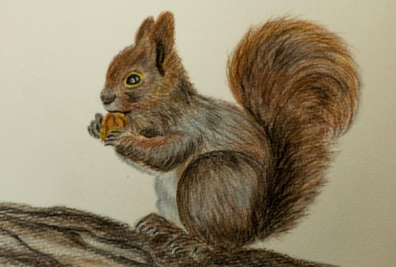
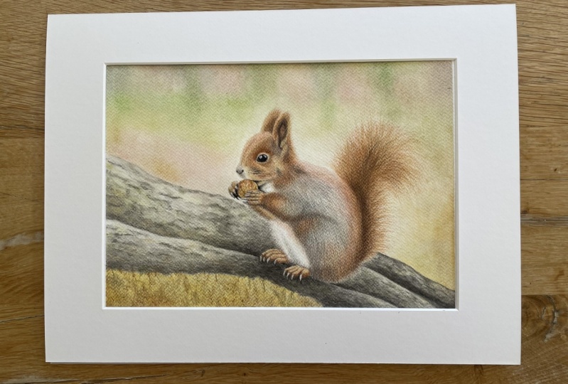
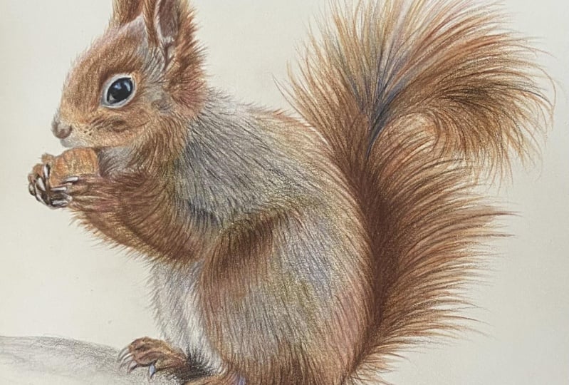
2. Class Project - Drawing a Squirrel: I have selected to
draw this squirrel. And I've picked this for
a few different reasons. First up, the fur is made up of a number
of different colors. It's not just one set of colors. There's some grays on the
back of the squirrel, as well as quite a lot of reds and browns generally in the fur. So it'd be good to show how to build up a few different colors. It's also got quite a few
different kind of types of fur. It's got some longer fur, particularly on the tail, as well as above the ears. It's got some
midlength fur around the body and some much
shorter fur on the face. So I can show you
how to build up all of these different
lengths of fur. I will show you everything
that you need to know here, including how to
create the sketch. If you want to use my sketch, I have included my own
in the class resources. Now, once you finish
your drawing, please do upload it. I would love to see
what you've done. Let's talk about some of the
materials that you'll need.
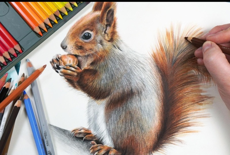
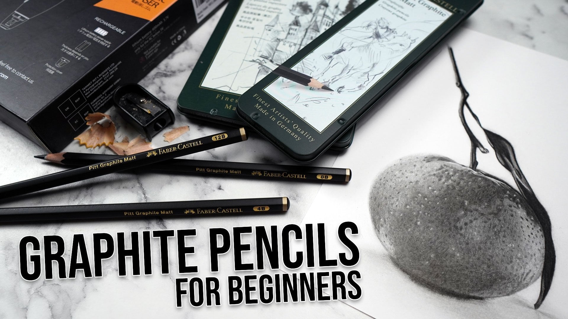
3. Materials for Watercolor Pencil Drawings: Now, let's talk about the
materials that you'll need. And the first material is the most obvious
watercolor pencils. Now, I like to draw with the faber Castor
watercolor pencils. You don't need to use
these specific ones. But I do find them to be
particularly good quality. Generally speaking, as long as you have a decent sized set, I think it's much
easier if you have a set of at least about 36. Then it'll be simpler
to select the colors. I'll be completing this
drawing with the set of 60. The next material you'll
need is some paper, and you want specific
watercolor paper. If you tried to
draw and activate the watercolor pencils on just printer paper,
it's not going to work. Now, watercolor paper generally comes in two different types. Hot pressed and cold pressed. This is a difference in
how the paper is made. Generally speaking, though, hot pressed paper
is much smoother. Cold pressed has a
more textured finish. We'll be drawing on
the hot pressed paper because it's smoother, at the end of the drawing, we'll need to add in a lot of details, and that's going to be much easier with the smoother paper. Now, another thing
to note is that I always draw on
100% cotton paper. Again, find that it just responds much better to
the watercolor pencils. It is a little bit
more expensive, but I do think it makes
all the difference. Next up, you'll
need a paint brush, some way of activating
the watercolor pencil. I just have a standard
watercolor brush. It's a nice round brush.
It's not too big. And you'll also need
a cup of water. I'm just using a cup
from the kitchen. Next up, you will need
a pencil sharpener. Now, as I said, I'm using the faber castell
watercolor pencils. These are a little bit wider than a standard colored
pencil, for example. So I find that I can't use a
standard pencil sharpener. I've got a pencil
sharpener that has a smaller hole or
a standard hole, and then a slightly larger hole and I sharpen in this one. But it might be if you've got a different type of
watercolor pencil, you can just use a
standard pencil sharpener. Now the next material
that you'll need is something that
you're not going to be able to buy, you're
going to need to make it. This is a set of color swatches. Now, in order to draw with
the watercolor pencils, we need to know what the
colors actually look like. I don't want to rely on the color of the
barrel or of the lead. I want to see how it
looks on the paper. And this is even
more important with watercolor pencils than
with color pencils, for example, because they become such a different color when you activate
them with the water. So what I do is I
draw out a grid, and then for every color, I put the pencil down as light as I can go to
as dark as I can go. I then make sure
that I label it. And then with just
the bottom half of this little gradient, I activate it with the water. And you can see how different the color looks when
activated versus not. Now, do you make sure that you
go from the lighter end to the darker end or you'll end up with just a big smudgy mess. I'll show you a bit later exactly how I use
these swatches, but these are honestly so important to see what the
pencils actually look like. Now, the final thing
that you'll need is some way of looking at
the reference photo. Because I focus on
drawing realistic items, I always work from a reference. Now, I like to look at the
reference photo with my iPad. I particularly like it because I can zoom in to see
the finer detail. But you don't need an iPad. You just want some way of
looking at the reference. So you will need a set
of watercolor pencils, the right kind of paper, a watercolor paint
brush, a cup of water, pencil sharpener. If you're
creating your own sketch, you will need a ruler, a pencil, and an eraser. Color swatches and some way of looking at the
reference photo. In the next section,
we'll talk about the very basic techniques
that you need to know.
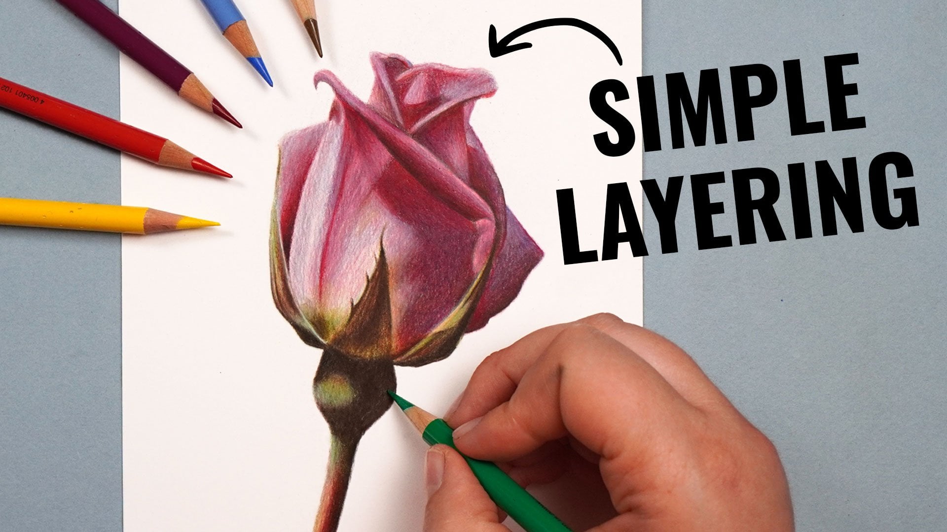
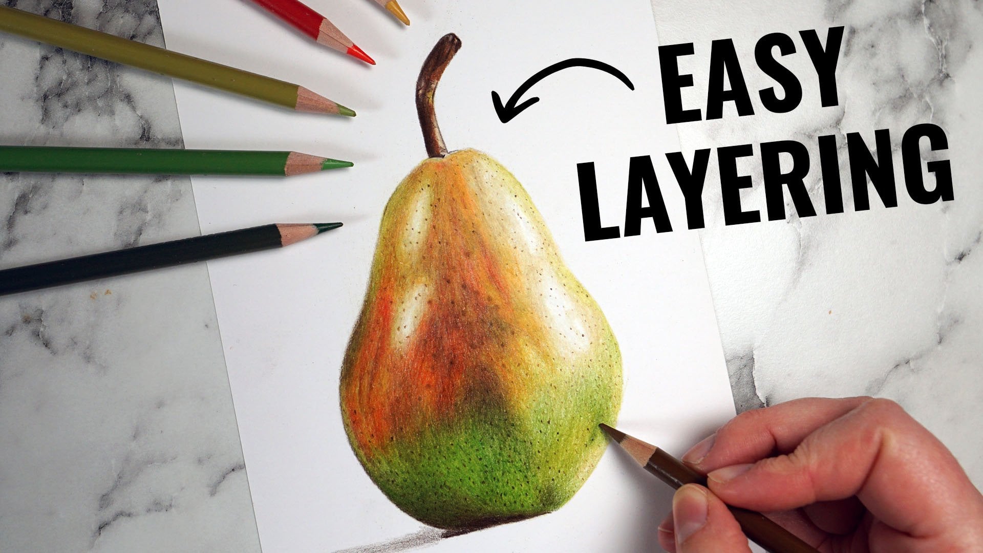
4. The Key Basic Techniques: Let's talk about some of
the key techniques that you need to know to draw
with watercolor pencils. And the first up, most important
technique is layering. In order to create
realistic looking drawings, we need to gradually build the pencil up in a
series of layers. If we just put all of the pencil down in one go and
then activated it, it's never going to
look as rich as if we build up the lightest colors
and then activate it, and then the mid tones,
and then the darker. Building those colors
on top of each other. And that is exactly
what we're going to do. So I'll talk you
through this process in a bit more detail
in a little while. But essentially, everything
that we're doing is focusing on building up this color gradually
in these light layers. Now, the most important
part to this is that we need to put down the
pencil nice and lightly. If we press really
hard with the pencil, we're just not going
to be able to build up a lot of this pencil
on top of each other. Now, there's a few
different ways that I put this pencil down lightly. First up, I hold the
pencil further back, generally speaking
than you might think. Most of the time,
when putting down, particularly my first few
layers of the pencil, I hold the pencil roughly here. What this does is it stops me from being able
to press too hard. I can still hold the pencil closer to the tip
in some situations, but I do have to have a
lot more pencil control. I also want to have nice and
sharp pencils at all times. I find that if I
have a sharp pencil, it kind of removes
the temptation to press too hard because the pencil just goes down in a much easier and cleaner way. So you do want to be frequently
sharpening your pencils. Now, in terms of how
I put the pencil down on the paper,
generally speaking, I focus on working in two different motions,
I'll call them. Circular motions and
flicking motions. So circular motions,
I focus on using if I want to put down the pencil in a really smooth and
consistent way. I will use this a lot, even though we're drawing So what I want to be
doing is working in small circles rather than
scribbling back and forth. Working in the circular or
oval motions, puts it down. You can see how much Nita is
going down onto the paper. The other method that I
use is flicking motions. So this is what I use to
build up the fair texture. All I want to be doing is very lightly brushing my
pencil against the paper. Very, very lightly. I don't
want to be doing this hard because I'll end up making some really thick, scratchy lines. I can make some smaller
flicks that I will use for shorter fair and I can create some longer flicks
that I'll use the longer So it's well worth
practicing both of these, they are so important, and you'll hear me
referring to them a lot. Next up, it's important to
note that you do need to put down a reasonable
amount of the pencil. If we put down a
really light layer, but also barely any pencil. You can see that when we
activate it with the water, it just doesn't do a
great deal of anything. If we put down still
with light layers, but more of the pencil, build up a reasonable amount. When we activate
this with the water, you can see how much
more vibrant it is. So do bear in mind
that you want to get down a reasonable
amount of the pencil, particularly if you want to have a nice vibrant color
when you activate it. Now, in terms of
activating the pencil, obviously, we want to
activate it with the water, and you do want to make sure
here that you don't have too much or too little
water on your paint brush. So, I always do the same thing. What I always do is dip my
paint brush in the water, and then I just lightly brush it against my hand
a couple of times. And I find that,
generally speaking, that is the right amount
of wet on the paint brush. You certainly don't
want it so wet that it creates a
puddle on the page, but you don't want it
so dry that it's not consistently activating
the water color. The last thing to particularly
be thinking about, and I'm always
thinking about this whenever I activate
watercolor is you want to be working from the lighter colors towards
the darker colors. So if I activate here the water color
from darker to lighter. You can see it's
just pulling all of that pigment into
the lighter area, and I've lost my lighter value. Whereas, if I activate
the pencil from the lighter colors towards
the darker colors, I get a much better gradient. I really keep those
nice and light values. So do bear that in mind with
any water color drawing, but particularly
when drawing fair. Next up, we'll look at the general process
that I always use, and then we can start
working our way through it.
5. The Process: Let's talk about the
general process that I always use when drawing fair
with watercolor pencils. And the first thing I want to do is select a reference photo. So, as I've mentioned
a few times, because I focus on
drawing realistically, I always draw from a reference. But I do want to make sure that I get the right reference. So there's a few
things to think about. First up, you want to have a
really nice and clear photo. Because we're going
to be drawing in all of this fair texture, it's so important that we can clearly see what we're doing. You don't want to be trying
to draw from a blurry photo. You also want to select
a reference photo that has really good contrast. We want really nice lights
and really nice dark So you want to use
a reference photo like this rather than like this. If you're wanting
to take a photo of your own animal at home, I highly recommend
taking a photo by a window because that generally just gives
really good contrast. The final thing that I generally like to do when selecting a reference photo is have the photo taken at the
animal's eye level. So you can see
with the squirrel, it's very much taken at
the level of the squirrel. I always think it
looks a little bit peculiar if you're looking
down on an animal. Particularly when it's
translated into a drawing. So once I've selected
my reference photo, what I then want to do is take the time to really look
at that reference photo. I want to be looking at anything particularly obvious that I'm going to want to bear in mind. So maybe any key colors within the drawing,
any key shapes. I'll show you a bit better
what I mean by this. We'll look at the squirrel photo together before
we start drawing. Next up, I want to
sketch my outlines. I want to have a basic
template that I can work from. Now, I like to work with
the grid method to do this. I draw a grid on my drawing paper and a grid
on my reference photo, and then I just draw what's
in each individual square. Once I've drawn
out every square, I can then erase the grid, and I'm left with a really
accurate sketch outline. From here, I want to gradually layer and build up the pencil, and I want to start off by
working on some base layers. So I'm not worrying about any of the fair texture
at this point. I just want to be putting
down those underlying colors. So I start off with the
absolute lightest colors I can see in each area. Put down this in a really
smooth and even way. So working in those
circular motions. And once I've got something
down all over the drawing, I can then activate
this with the water. And this gives me a really
rough outline of my animal. Now, I can't stress enough. You don't expect it to
look good at this point, or for quite a
while, to be honest. But we certainly should have a rough squirrel in this
case that we can work on. So, I now do the same thing, but looking at the mid
tones in each area. So it might be that
in some areas, I don't need to put any pencil because it is just
the lighter pencil. But if it's a mid
or a darker area, I put some of the pencil down, add in those mid tones, and then again activate
it with the water. And then I do exactly the
same with the darkest colors. So there's not necessarily a huge amount to add
of the darker colors. I can add those in and
activate those with the water. Now, it's so important
to wait between each layer for the pencil
to completely dry. So, generally speaking,
I leave it for at least half an hour and come
back to it when it is dry. At this point, what
I then want to do is add in some of
the fur texture. So generally working through
the same colors that I've already added in in
those initial base layers, I want to be using
flicking motions now to build up some
of that texture. And there's a few things that
I'm thinking about here. First off, I want to be thinking about the length of the fur. I want to be really looking
at the reference photo. Making smaller flicks where
there is shorter fur, longer flicks where
there's longer fur, working my way
through these colors. I also want to be particularly thinking about
the direction of the hair. Generally speaking,
it doesn't all go in one consistent direction. It's going in all sorts
of different directions. And I can see this on
the reference photo. I want to be trying to
follow that direction. Now, make sure that you have a really nice and
sharp pencil for this. It is so important to create some really
good detailed flicks. I built up all of
that fair texture, I once again want to activate this with the water
one last time. And I do want to be making similar kind of flicks
with my paintbrush. So making light flicks going in the direction of the
pencil that I've put down. So kind of keep that texture. And what I have now is a really good but very rough
and ready looking squirrel. What I want to start
doing now once it's again completely dried is add
in all of that detail. So I'd like to focus
one section at a time. So starting off on the head in this case and the front paws. Working through those
same colors again, really just focusing
on the detail. I'm not focusing
too much on getting the color looking
absolutely perfect. I just want to get for example, the paws marked in. There's so much detail
with the claws. I want to get that marked
in and then the same for the bottom of the squirrel with the
back legs as well. And then at this
point, I do have a nice and detailed
watercolor pencil squirrel, but it's not looking
particularly smooth. The final step, I want to go back over all of this fair now with circular motions
to smooth it all out and make it look much
softer and fluffier. I can also at this point, use this as an opportunity to maybe adjust
some of the colors. If I think it's not
dark gray enough, for example, I can
add more dark gray in or add some extra
browning on the face. I can just generally
adjust these colors. Now, I'll talk you through
this whole squirrel in a lot more detail, but that is the process
that I always use. So let's start working
through that process.
6. Studying the Reference Photo: I want to begin here by having a really good look at
the reference photo. I want to be looking for
the most obvious colors and shapes that are within here. So, the first thing
that I'm noticing about this is the colors. Generally speaking, I would think of this as a red squirrel. But if I look at
the actual colors that are here, it's quite gray. First off, looking at
the squirrels back here because there is some
light falling on the This looks like a light to mid cool gray all along
here and round here. And actually, there's a
number of areas of gray. I'm noticing a light
gray round here. This is white fair,
but it's looking gray. There's also some gray
underneath here in the tail. And a lot of gray around
here and around the nose. This is a bit of a darker gray. What's making the squirrel look red is the few little
sections of red. So there's a little bit
of red fair around here. I would say this is kind
of an orangey brown color, a little bit of orangey
brown around here on the feet and around
the bulk of the tail. But there's also quite a few
areas of pink, actually. It's particularly prominent
around here and around here. Now, in terms of the fur, as
we all know about squirrels, they have a lot of
different lengths of fur. So the fur on the
face is pretty short. The fur on the body is
a little bit longer. It's a little bit
longer around the ears, and then it's really
fluffy on the tail. So we're going to want
to make sure that we map in the underlying colors and then really build up the texture of
these areas of fur. We want to be looking at things like the direction of the fair, so the direction
of the tail fur. It's generally going up until we get around here
when it's going both this way and some of the fur is going this way because
there's the bend in the tail. So those are the
main things that I'm noticing to begin with, particularly this gray is
really standing out to me. So now that we've had a good
look at the reference photo, let's think about
drawing out our sketch.
7. Creating the Sketch Outlines: I want to think about
drawing out my sketch now. And as I said earlier, I want to draw this out
using the grid method. So what I want to
be doing is adding a grid onto my
reference photo first. Now, I've done this
using photo shop, but you could use an
app on your phone. I also want to create a
grid on my drawing paper, so I want to work
out how many squares I need to fit onto my paper. So I'm going to make each
square 1.5 centimeters wide. And then once I've
measured it all, I can draw in the lines. And I now have a grid on both the paper and
the reference photo. So now, what I'm going to do is work one square at a time. And I'm going to start with the square in the
top left corner. So you can see I've counted which square I want
to be working in. And then what I want to
do is look at the square, particularly look at
where the lines around the edge of the squirrel are crossing the edge of the square. So this line here, I would say that this is maybe two thirds
of the way along, maybe a little bit less than
two thirds of the way along. Here. And then this where this line is crossing the
edge of the square here, it's maybe two thirds up. So I can draw a mark
here and mark here, and then I want to follow
this line and join them. So you can see I'm
putting the lines either edge of the square, and then I can just
join these two lines. And what I'm going to do
is work one square at a time doing this for
every single square. So let's take a look
at the next square. So let's look at
this square here with the top of the
squirrel's nose. Now, here where this line is crossing the edge
of the square here, it's maybe a third of the way And I've already got
where this line is crossing here because I've
got it from this square. So what I want to be doing is thinking about this is a
slightly more complicated shape. It kind of bends around and
then goes almost straight up, maybe a little bit to the side. So where the end
of this bend is, it's pretty much in the middle
of the square. So I can do that with my
pencil, I want to go round and to the
middle of the square, marking the middle of
the square and then creating the rounded shape, and then I can go
up from that point. And I also just need to
add a little notch here for where the nose
is curling round. Then let's do the same
for the next square. So this square is
particularly easy. It's only a little sliver. Although it does have the eye in the bottom right hand corner. When I'm drawing the
ye, I want to not only draw the edge
of the eye here, but I also want to be adding
this line around the edge. I always want to make
sure that I'm adding in any prominent lines
for my sketch. I want to get really all of
the key shapes marked in. So pretty much
just going to work my way around one
square at a time, trying to follow the
shapes that I can see. Now, because I'm using the
grid method to do this, it means that this will be in proportion because the squares are helping me keep
it in proportion. Now, if I was drawing
an area that's really, really fiddly, for
example, the pores. I could put an even smaller grid in that area if
I'm getting stuck. So once I've drawn out the
whole of the squirrel, what I now want to do is erase
all of those grid lines. Now, I'm doing this
with the putty erasor. You don't have to
use a putty eraser. You could use a standard eraser. And in actuality, you will be doing this with much
lighter pencil. So you should find that
the lines are much, much easier to erase. Now, what I want to
end with here is a really nice and light sketch. I don't want it to show through all of the
watercolor pencil at the end And if I feel like it is
looking still too dark, I can always erase the actual sketch outline to really lighten
that up as well. Remember, by the end of
drawing your sketch, your sketch should look
something like this. So very, very light. You want it to be so light,
you can barely see it. So let's start
adding some color.
8. Draw the Lightest Colours: I want to begin
here by drawing in the lightest colors that I can see within the
squirrel spur. And as I mentioned, I would say that
the lightest color is a very light cool gray. So what I want to do is block
in the background colors. I want to put in this
light, cold gray. Anywhere where I
can see this color really nice and smoothly. So let's take a
minute to have a look at the reference photo and really point out those
main gray areas. So I'm starting off
here on the eye, drawing in both the light
patches on the eye itself. This area, this part
of the light patch does maybe look a
little bit more blue. We can add that in later. For now, I'm want to be
just adding in the gray. And I also want to be
adding in some gray around this outer
corner of the eye. And then with this lighter gray, I'm also particularly noticing along the edge of the
back around here, as well as this little
tuft of white fur, this area here, and some of these claws and around
the top of the p I'm just going to work
around those areas. Now, as far as how I'm
putting down the pencil, you want to be making sure that you're pressing
nice and lightly, working in these small
circular motions to try and get it as
smooth as possible. And I just want to be really looking at the sketch and trying to map things out
reasonably accurately. So one of the main things to think about whilst mapping in these lighter colors
is that we want to be building up our
initial base layers. We want to be mapping out the general shape
of the squirrel. Kind of get our bearings. Now, it's hard to
see on the camera, but I can see my
sketch really lightly. I don't necessarily
need to get all of the patches of fur exactly
in the right place, but I can use my sketch to get them in roughly
the right place, and then we can tweak it as we work towards the darker colors. But this will all start making a lot more sense as I
put more colors down. So you can see here I am putting this lighter gray over
the whole tummy area. Still trying to get
it nice and smooth. You'll see it's a little bit
scratchy, but that's okay. It'll all come out
as we activate this. So you also want to be
drawing in the claws on the feet as well
on the back feet. So just lightly mark these in these feet, I really only
need to mark in the very end. You'll see that this
is the only area that is that very light gray
just towards the end. Then I'm also going to use
this gray to just very, very lightly mark in the log. I want the log to
kind of fade out. I don't want it to be a
really harsh line down here, but I do want my squirrel to
be standing on something. Do you see I'm
really not building up a lot of color
here by am building up more around the
edge of the log and then kind of fading out
as we get from there. So now let's move
on to this area on the back around the outline
edge of the squirrel. Then I'll also add some of
this gray a little bit lower. I will be adding some of the
darker gray here as well. I think that there's kind
of a mixture of the grays. But let's just mark in roughly where this needs to go for now. Again, you want to be
pressing nice and lightly. And then before we move on, I'm just going to
add a little bit of the gray around
between the ears. So just a little bit
of gray round here. I think this is primarily
a more pinky color, but I think there is an
underlying gray here as well. So I'm reasonably happy now with my absolute lightest color. I want to be generally working through any other light colors
I can see on the squirrel. So we're going to move on
to the darker cold gray. And again, I want to
put this anywhere where I think there is
a slightly darker tone. So starting off
here on the nose, which is really quite a
dark gray, I would say. It's a mid gray round here. Which is quite a bit darker
than this gray around here. So I want to put some
covering on this area. But what we'll actually
do is build this up as we get towards the mid
tones and the darker colors. But I want to put something down so we have something
to build off of. So really, following the outline of the nose here, using again, those circular motions,
nice and smooth, and then I can kind
of fade it out. Let's also add a little bit of shading around the
front of the eye. So around here, this is
still that gray color, but it's just a bit darker than around the
back, for example. And then I'm going
to work my way down really looking for all of these areas where I need to be adding
in some of the gray. Now, a lot of it is just
adding to the lighter gray. You can see I'm going
over the back here, but not so much
towards the edge. I'm going a little bit
closer or a little bit further into the
body of the squirrel. I'm really bringing
the gray patch down. There is a lot of gray on this back as the
underlying color. And I really want to have a lot here that I can then be building the texture
on in a little while. I filled in a lot of the body, I again want to be looking for any other major areas where
I need to add this color. So particularly looking around
the top of the tail here. So, there's this
underlying gray. But then there are all of these more orangey brown hairs
that are coming out of it. So I want to be drawing in
that underlying color that we can then add orange fair
to a little bit later. Now, it's worth bearing
in mind that I'm not taking this all the way to the edge of all
of the fluffy fair. I want to be only
drawing the area where I can't see any of the
background poking through. So this area, for example. Now I'm generally
happy with the gray. Let's move on to as I mentioned, I've seen a lot of
pink in this squirrel. So I want to move
on to the most kind of earthy pink I have in my set. This is the coral pencil. And I want to be putting this
over the top of the head. Again, I've pointed out a number of times that I can
see some pink here. Also seeing a little bit of pink around the edge of the ear. So a little bit around
here and around here. And then I'm also noticing an ever so slight kind of
pinky tone around on this nut. So I add a pink base here
that I can build some of this more orange color
on similar to the fair. There's a lot of pink
around this edge here all along here in the fair and a little
bit around here. All in all, I would say
that there is a lot more pink than you might
expect on this squirrel. And it all looks a little
bit harsh at this point, but once we activate it and build the other
colors over the top, it will really tone down a lot. It won't look as prominent. To be making sure
that I'm going over the gray area as well. I want these two areas, the pink and the gray to
kind of blend together. And again, you'll see that I'm working reasonably quickly. I want to get
everything mapped out, but I don't need it
to be super accurate. I just want to use this as
an opportunity to start to get my bearings
on what's going on, particularly with
the colors in the Now, as I have said a few times, do make sure that you're
pressing nice and lightly. If you start pressing too firmly with the
pencil at this point, then it'll just mean
when you activate it, you can see all of
the pencil marks that end up looking
very scratchy. So, nice and soft
circular motions. And then we'll end up with a much smoother underlying color. In actuality, though, we
don't need it to be perfect. We will be, as I say, building a lot more colors
over the top of this. I'm just going to switch
back to the darker gray. I just want to smooth
out a few areas. Particularly around
here, I think it's looking a little
bit too scratchy. So I can add a light
layer over the top. And I also think
that I want to add a little bit of gray around
the edge of the face here. There's a little hint
of a darker gray around here that I haven't
drawn in at the moment. So the last color I'll use
for now is an orangey brown, and I'm pretty much
going to use this color. This is the burn ochre to put something down on the
rest of the squirrel. Now, in actuality, this is more of a mid tone color I would say, but because I'm using it so lightly and because
it's the first layer, it's not going to look mid tone. It is going to look
nice and light. So I'm still looking at my
reference photo to check that there is orange in all of the areas and
putting this color. But I'm pretty much
just working round and putting something everywhere
else on the drawing. So working round nice
and lightly putting some color on the ears so
that when I activate this, it'll look a bit more
like a squirrel. It'll be a bit easier for me
to be getting my bearings. And that's really
all there is to start with with
these base layers. You don't expect it
to look perfect. In fact, I would
say that this is looking a little bit
peculiar right now, and it's not going to look
better when we blend it. I think it will look
even worse once we activate it with the
water, but that's okay. This is just the first layer we want to be getting the
general shapes and lightest colors of the squirrel marked in that we will
then be able to build on. Once I've gone around
the whole squirrel, I've got everything marked in. What I want to be doing is activating this with the water. I like to work quite
methodically with this. I'm going to start
in the top left around the face and gradually work my way towards the tail. Now, I've got a medium
sized paint brush here. I put a little bit of water
on it, not a huge amount. Now, generally speaking, I
want to activate the pencil working from the lighter colors towards the darker colors. But actually, I would
say that all of these colors are
reasonably similar. I don't think that
the burn ochre is much darker than the pink. I'm not too worried
about the mixing. I do, however,
generally speaking, want to activate the light gray before activating
any other areas. In terms of how we're
activating this, I do want to try and make
it as smooth as possible. But I do know that it's
never going to be perfect. Particularly with the
first layer of pencil, I always looks a
little bit patchy. I find that as I said, working from the lighter colors towards the darker
colors helps also helps if you can try and
work quite methodically. You don't want an
area to completely dry until you've
finished that area. So you can see it's starting
to look a little bit patchy around here because I have
had an area that dried. But that's okay. It will be covered up and we'll build
it up a little bit later. I also find that working in circular or oval motions blends this out in as
smooth the way as possible. So you can see on the tail here, I'm starting on the gray
section on the kind of corner. And then I can work
out from there. And I'm also starting with the top half of the tail and then working towards the
bottom half of the tail. So by the end of
this first section, what you should have is something that
resembles a squirrel. We've certainly got everything
mapped out roughly. We've got the general shape. So we'd say that it
looks like a squirrel, and we're going to be able to build the mid tones and refine the overarching shapes a
little bit more from here. That is the end of
the first section.
9. Draw in the Midtone Colours: A the lightest layers marked in and a very rough framework. I want to start in this chapter, filling in some
of the mid tones. Now, first up, before you
get started on this chapter, please do make sure that your
pencil is completely dry. You don't want to try
and put this over the top of even
slightly wet paper. I've left mine for about half
an hour before carrying on. So I want to again, think about these
mid tone colors, and I'm going to start
off with actually the same gray that I used
in the last chapter. The difference here being I'm going to use
a bit more of it. It's still the cold gray, but it's the slightly
darker cold gray, not the lighter cold gray. Want to be putting this
anywhere where I can see a hint of the
slightly darker gray. So actually, it's a lot of
the same areas as before. So I'm staying off
here on the nose. You can see that this is
more of a mid tone color, and I want to be marking
in the shape of the nose, looking at this little bit
of extra shading here and generally adding more shading
around this whole patch. I then want to move on to any
other areas that has a hint of gray so I'm
particularly looking at around here and around the edge. I can also use this pencil to begin to mark in
the shape of the eye. Now, most of the eye is actually much more of a black color. I think it's good
to get it marked in initially with a lighter
color, so using this gray. Just in case I make a
little mistake or I want to adjust the shape
lightly, maybe. It means I would be
able to do that, which I wouldn't necessarily
be able to do as easily if I go straight
in with a darker pencil. So after drawing in the eye, I can then start working my way over all of
these gray areas. So I want to be
working around and avoiding that very light
area around the eye. And then shading out from there. Now, once again, you
want to make sure that you're going over this
really nice and lightly. I don't want to be making
really heavy marks. Work lightly so that
when I activate this, I avoid seeing all of
those pencil marks. That said, on areas
like on the ear here, I do want to be building up a reasonable
amount of the color, but I can go over the area more times rather than just
pressing really hard. So here I'm drawing in these
shapes in the inner ear. So along here and around,
there's this shape here. I'm going to leave this
area for now and then fill in these shapes around
the bottom round here. I get something marked in in these areas, and then
I can gradually work This isn't looking
completely right right now. It looks a little bit peculiar, but don't worry about that. A lot of the reason that it looks a little bit odd, I think, is just because we're drawing something that
should have fair, but we're not drawing
fair on it at this point. So obviously, at the moment, we're just drawing
a smooth squirrel, and I think it looks a bit odd. Still following the shapes
that I can see here. I'm just slightly adjusting
the shape of the arm here. Sort of around, I'm going to
say around the elbow area. I think what I drew in the last chapter looks a
little bit too pointy, so I can begin just
adjusting that shape. And it'll look a lot better once I've activated this with water. Then I want to go over all
of the shadows in between the toes of the leg here to
get these roughly marked out. Remember, we will be
redefining all of this when we get to
the final chapter. When we add in all the detail, it'll all get a lot clearer. I'm happy with these paws. I'm just going to carry
on working my way down. I don't need to add a
huge amount of the gray, particularly along the
back of the squirrel. Because as I said, that
needs to remain very light. You can see how quickly the patchiness is
improving though. It'll obviously improve
a lot more as we go. But I think already it
looks much much better. Let's also go between the
toes on the bottom here, just adding in where
these shadows need to be. And I can really rely on my sketch for this because
they did take the time to draw in all of these sketch outlines and draw
in all of the little toes. Also want to add a little bit of gray along the edge of the tail, not a huge amount
because I would say that this area is more
of a reddish brown. But I do want to add some sort of darker gray
along here for now. I do already think that
this looks a lot better. It's still got a lot more to go, but I think it's looking much, much closer already to
the reference photo. So let's just drawing the few little shapes that
I can see on the tail. So this sort of V
shape of darker here, and then there's a couple
of lines here and there, I think will just benefit
from being added in here. I'm generally happy, I would
say with the gray section. Let's move on to the
next most obvious color that's missing on the squirrel. And what I want to do here
is use the burnt sienna. So this is a reddish brown. And actually, if you look if you've made yourself
some color swatches, you'll see how
different this looks when activated in comparison to when it's left
is just pencil. Once it's activated,
it is so much redder. It's going to look much
redder than you can see here. So I do want to bear
that in mind and kind of picture what it's going to look like when it is
that much redder. So maybe I don't need to
add as much of this color to certain areas when I bear in mind how
red it's going to So let's really look at
the reference photo. Here, look particularly
on the head on where most of the reddish areas are. I'm particularly looking on
this side of the ear here. Most of this ear here, particularly around the top around here and all around here. This all looks much redder to me than around
here, for example. Add a little bit of light
shading into these areas, making sure that I avoid that lighter patch around the eye. It looks a little bit peculiar, I think at the moment,
but that's okay. I think with watercolor pencils, it very much all just
comes together at the end. So do bear that in mind. We just need to carry on working our way through the process. Let's go over this arm area here that is particularly red, and I can just go over
where I put the gray. I still want to slightly change the shape of the arm here. I want it to be a
bit more curved. It just looks quite
pointy as it is also go over some of
the finger areas. And then there's not
a huge amount of this red on the general back. It's mostly along the side
and front of the squirrel. I add a very soft amount here, but really not a huge amount. But most of this color needs to be around the bottom round here, and will also be adding
a lot onto the tail. So, particularly around
the edge around here, but there's just a
lot in this section. I want to forget to add a little bit at the end
of the tail as well. So now, I think that that
is pretty much all of the mid tones that I want
to be adding in for now. But the main area that's particularly standing
out to me is that maybe it's a little bit too light in some
areas on the back. So just go back to that cold
gray, the cold gray four. Add a little bit more here, or a huge amount, and
not over the whole back. I don't want to be going near the sort of top of the back. Because as I say, that
is much, much lighter. I also want to be adding a reasonable amount of
this gray down here. It is just generally a
lot darker down here. And this is going to help
really smooth out this area, make it look a bit less patchy. Before we move on, let's just add a little bit of shading, a very small amount
to the nut here. This is the burn acre. I would say it's
the closest color right now that I
have to this nut. So add a really light covering
and add a little bit of extra shading back
with that gray onto the tree that the
squirrel is standing on. I'm not going to add loads
of detail into the tree down here because I think I
want the main subject, the main thing you're
noticing to be the squirrel. But I don't want it to be
just standing on nothing, so I'm just going to give it a nice smooth sort
of tree to stand on. Now that I'm happy with
that, I'm going to once again activate
this with the water. I'm starting off here with the same size paintbrush
as I used before, it's a medium sized paintbrush, and I am starting off by going around the eye
very, very carefully. Activating that so it
looks a bit bolder, and then I can start working my way over the rest
of the squirrels. So going over the nose here and then moving on to the red areas. And you can see
how much brighter that I want to be very
careful when I get to an edge of an area
like here because I don't want to have really
abrupt lines around the edge. I want to gently blend it
into its surrounding areas. I'd say the key is, you can see here, I've
got it up to this point. I'm going to get some clean
water on my paintbrush, and then I'm going to very, very carefully,
just smooth it out, get a little bit
more clean water on my paintbrush and smooth
out the edge here so that it's a nice and clean
transition or as clean as I can get
with these pencils. Worked my way in the same
way that I did before, starting at the top generally the top left and
working my way down. And you'll also see that
I'm starting on the head, and I'm gradually working my way towards the rest
of the squirrel. And you'll also see that
I'm generally focusing on a more reddish area and then moving onto
a more gray area. I am trying to avoid the areas from
blending together too much. I say, you expect it to be a
little bit kind of patchy. I don't expect to be able to get perfect blends on everything. I am trying my best to make
it as smooth as possible. Now as I work down here, you can see how much better this arm is looking now that
I've activated the pencil. I say it stops you
from noticing as much where the previous pencil, where I marked the arm in a
slightly the wrong place, it stops being as noticeable. Notice that I'm
really only having to activate down
the left hand side, and I'll also need
to do the tail because the back section, the right hand side
of the squirrel is that really light area where we haven't actually put
any of the pencil. So I would say that it is quicker and easier
this time around, and actually in
the next chapter, when we do the darkest values, that's probably going
to be the easiest and quickest of all of
these sections. Go along the edge
here and then blend this into the rest of
the body like this. Then I'll just go over the
feet and the tree here. There's not a huge amount of
I need to do to the feet. I didn't add a huge amount
of pencil in this chapter. Then let's go over the tail. You can see on areas
where I've built up more of the watercolor pencil, how much more vibrant it
is when you activate it? This area is really quite
a bright red, I would say, so I do want it to look as vibrant as
possible around here, and I'll be adding
more to this area again in the next chapter
with the darker pencil. At the end of this chapter,
you should have both the lightest and the
mid tones marked in. In the next chapter, we can move on to those darkest areas.
10. Draw the Darkest Colours: In this chapter, let's add in the absolute darkest values. So I'm going to start off
here with the black pencil, and I'm going to go
over the eye again in exactly the same way
as I did with the gray, maybe slightly
adjusting the shape because I think it's looking
just a little bit out. But again, this is where it's good that I filled
it in previously with the gray pencil because it means I can adjust
it with the black. So you can see I'm just
making it a tiny bit bigger underneath and maybe
rounding it off a little bit. Now, this is the only area that I'm going to want
to do with the black. I think the rest of
the darkest areas are more like a dark
brown rather than a Do you remember as
well that when we activate this black
with the water, it is going to get
much darker again. So even though it looks
very dark as it is, it will be even darker. Once I filled in the black area. I'm going to move onto
the walnut brown. So, as I say, I think most of the very dark areas are more
of a brown than a black. And I'm going to use
this walnut brown. This is the darkest
brown in my set to just really define
those key areas. So if we have a look
around the face, the darkest areas, I would say, is this patch of ear here, this strip along here, the inner ear section here, a little bit around here and
this section around here. And I'm going to go
over these same areas again, blocking these in. This is all made a lot easier because I've already
got this framework now. Go over these brown sections to make it a little bit darker. It won't make it
too much darker, but hopefully it will just
help this area to pop a bit better so that when
we put other colors over the top it it'll
stand out a bit more. And let's also go
over this strip here. I am going to add
a little bit just around the edge of this
light section of the eye. I'm not adding a huge amount of the pencil at all here
there you'll notice. Just a tiny little covering. And then I also want to fill in this area where
those whiskers are. It's worth remembering.
Although the background may still look quite
light at this point, we will be building up a
lot more pencil over this in the next chapter with
all of the fur texture. So there is still
a lot more pencil that will be added to here, even though it looks quite
muted at the moment. So I'm going to once again work my way from the top
and gradually down, and I'm really filling this
in over the darkest areas. So I want to be
making this area of this little curve here a little bit darker underneath as well, really defining this
edge. And around here, And then also in between all of the I'm going
to call them fingers. I know they're not
fingers, as well as this shadow around here. But beyond this area, the only real other areas with particularly dark shading is along this line here of the
tail and around the feet. So let's fill in these areas, fill in this little
dark patch here. It's not a huge amount
that I need here. And I can start filling in
this area around the bottom, this kind of it's almost
a triangular patch that's particularly dark here. And I'll go up the tail. So I do want to fade out, add a little bit less color
as I get towards the right, and then I want a
little bit more of the brown closer to the body. Now, I'm generally
happy with the tail. I can just work around the feet here really
looking at the shadow, thinking about, if
there's anything that I want made a little bit darker. It's very similar to
what we did before. I just want to be adjusting the shading here and making this area a
little bit darker. I'm going to move on to
that darker cold gray that we've used a
lot throughout. And I'm going to build up
a bit more of this color on the log that the
squirrels standing on. I just want to be building
up a bit more color. It's looking too
muted right now. As I've said before,
I don't want this to be one of the main
focuses of the drawing, but I do want a bit more here than what we
have at the moment. I'm just going to switch
back to the walnut brown, add in a few areas that
I think I've missed, like around here under
the bottom of the face. And I'm also going to add a little bit of
gray to this patch, this patch is just
looking way too light. These are just some
minor adjustments from what we've done before. Now I'm generally happy with these darkest values
that I've put down. Let's once again activate this with the water in exactly
the same way as before. So I'm starting off with the eye just with a small amount of
water on my paint brush, and I want to be very slow and precise about
where this is going. And then I want to make sure
I clean it really well. Before moving on to the darker shading we added on
the nose to start with. Really trying to blend that
into the rest of the face. And then I'm going to
work around anywhere else where I put some of
that darker brown. A lot of what I've added
here is reasonably light. I didn't add a huge amount
of shading on the face here. I'd say that a lot of the darker shading that we're
going to add on the face is going to come with the fair texture in a second. What's be going over
the ears as well, and you can see how much
darker it makes the pencil. Really helps it to
pop and gives us a really nice solid base that we're going to be
able to build off of. I'm going to work down
in exactly the same way as I have done up until now. Really activating all of that pencil so that we
have a really solid base. Now, don't forget when you get to the end of this chapter, to make sure that everything
is completely dry, we don't want to try and draw over the top of paper that's still a little bit damp. Just try and smooth
this out as much as possible and then activate
it down the bottom here. I can start working
my way between the toes and then
activate the log area. Just smoothing it all out
and giving it that nice wash The last area that
we're going to need to activate is the tail. And I once again, starting from the lighter areas and working
towards the darker areas. So I'm starting at
the edge here to try and get it as
smooth as possible and then working towards
the darker area that I built up a bit
more towards the body. You see that that does
look smoother than if I started on the darker area
and work towards the light. So at the end of this chapter, you should have a squirrel
that looks like this. It still looks quite muted
and it's got no fair. But we now have a
really good template that we can build all
of our fair text uron.
11. Add in the Fur Texture: In this chapter, I
want to think about adding in some of
the fair texture. So I'm going to start here by focusing on the gray section. And I'm once again going to use that darker cool gray
to add these in. Now, what I want to be
doing here is making flicking motions going in
the direction of the fair. And the fair on the body is
actually reasonably long, so I need to make
reasonably long So let's take a minute to
look at the reference photo and really see where
this fa is going. So do you see the fair on
the body is reasonably long. And I would say it's going in
pretty sensible directions. It's going down this
way and to here. This part is going
round and round here. Along the back,
it's going along, up and down in almost
like an S shape, a very mild S shape. And then the only bit
that's a little bit different is there's a bit
of a kind of wiggle here. You can see the fare is going in a kind of
S shape here as well before going again in the direction that you
would expect in this So those are the main
things that I'm thinking about whilst adding
in this fair texture. Now, I selected the
gray pencil because the bulk of the body
is very much gray. And although we've already put the gray down and
then activated it, it's been a series of
light layers so far. And I'm pressing still lightly, but the pencil is going down in a slightly darker way because
of how I'm flicking it. So remember, you want
to be gently flicking the pencil against the
paper in that direction, and in this part,
reasonably long flick. Now, I would say that this is a reasonably time
consuming process. You don't want to
rush it and then end up making really thick lines. No, around the edge here, I am easing up with the amount of flicks
making as we get to that top section because that's where the fur
gets so much lighter. And probably one of the
most important parts is to have a really sharp
pencil. Do remember that. If you end up with a blunt
pencil as it wears down, it'll just end up making really thick lines, and
that's not what we want. When we activate
this with the water, we are still going to be able
to see all of these lines. Now, remember as you
get towards the edge, you want to make flick slightly going off of the body as well. Because we don't
want our squirrel to have a really neat outline. That's not how squirrels look. And then before we move
on to another section, I do want to add a little
bit of the gray on the body here on this
white patch of fair. If you look at this section, particularly up the middle here, there is some really
quite dark fair, and it's all going in
generally this direction. So we do want to follow this. And again, I want to use
the same gray to just add some light flicks around the edge of the
body here as well. So that's already
looking much better. It's not by any means a finished drawing or
finished fur texture, but it's certainly looking
a lot more textured. But there's still
other areas that I want to be using this gray. So I'm pretty much
going to use it in any area where there's
white hairs poking out. So I'm particularly thinking of all around the edge around here, some around here and a
lot around the tail. You can kind of see some light gray underneath
particularly here. Once again, I want to be lightly flicking my pencil
against the paper and really looking at
the direction of the fur and the length
of the fur here. It's actually probably
longer than you might expect around the legs here. And I'd say the same
around the ear as well. So, I'm happy with most of that. Let's add some flicks
around the tail, and I need much longer flicks. Obviously, the hair on the
tail is really very long. So really long gentle flick, and I'm really looking at the reference photo really focusing on the
direction of the fair. In some places, it goes a
little bit all over the place. So it's going in a generally
outward direction around here until we get round
to the bottom where it is curling round like this. But there's also some hair, you can see coming
in this direction, and they're kind of
crossing over each other. So we want to make sure
that we mark this in, and it's going to be a good
way for us to start getting our bearings before moving on to the kind of
more red color. And then along here,
note that it's a little bit sorted
intersection. So there's a bit more fur here, a little bit more fur
here, a bit more fur here. And they're kind of sorted
into almost some clumps. So when I'm marking this in, I don't want to be evenly
spacing lines all along here. I do want to put the hair
into almost like sections. As you can see, all looks a little bit peculiar right now. Certainly, the tail
is not looking great. But that's okay. We will
build upon this as we go. My goal is to just
get something down on the tail here trying to get
them in the right direction. Then I want to be
thinking about if there's any other areas where I
want to put this gray. So I'm particularly thinking
about this little area here. Area here has some
pretty prominent fair, I would say, and it is
very much a gray color. So on the most part, it is going in this
direction, up here, it's going around and
up and down the bottom, it's going in this direction, and it's very, very short hairs. So let's make really small
flicks around the head, particularly copying
those directions. Now, again, do make sure that you have a really
sharp pencil for this. It is so so important. So now that I've got all
of the gray marked in. What I'm going to do now is do very similar but with
the black pencil. So I'm really just focusing
on the body itself, and I want to add just a
few little black flicks. So when I look at the
body of the squirrel, it looks kind of patchy with some lighter gray hairs and
some darker gray hairs. So the best way to add
this in is to just add some very light flicks
with the black. Now, this is all made
a lot easier now that I've already
added in the gray because it's very clear to see the direction that these
flips need to go in. Now, we've added
a few more flips around the dark
patch in the middle. This darker patch here,
is not hugely black, but it is certainly
darker than the rest. I'm really only focusing
on putting the black. So more towards the
front of the squirrel. I don't want to
add a huge amount at all near the top
of the back because, as I've said before, it's
just so light there. Let's just add a
few flicks around here for where the whiskers
are with the black. And then I'm going to move
on to the burnt ocher. This is this kind
of orangey brown. And I need to add quite a lot
of this color, I would say. So first off, around
the edge of the ears, you'll see that it's got all of these little hairs coming up, and they're quite
long on the top, but much shorter,
but there's still this kind of orange
color around the side. So it's add flicks on the top, and I'm also going to add
some really small flicks around the edge of the
head, around here. Now, there's no point
in adding too much of the orangey color onto the
actual body of the squirrel, sort of where there's
already that orange color, 'cause it would just
get a bit lost. So really focusing on putting this around the edge
more than anything else. So around the edge of the ears, around the edge of the
arms here as well. And around the
bottom around here. And from here, I want to
start focusing on the tail. So again, I want to make
some really good flicks, nice and long light
flicks going in the same direction as that gray I added a
little while ago. Again, this is made a
lot easier because I've already marked in the
direction of those gray hairs, which is kind of
giving me a clue on the direction that this
orange needs to go in. Now, I don't need to
add a huge amount of the orange around the top. The top of the tail
just gets so so light that I really don't need
to add a lot in this area. It's that more gray
color, I would say. I do want to add the orange
all the way down the side. And this is just part of slowly building up the texture
around the edge of the tail. I will be adding some much darker colors around
here as well. It looks a little bit kind
of washed out at the moment. It is worth remembering, though, that when we activate
this with water, which we'll be doing
for the last time, it is going to get a
lot darker once again. So let's move on now
to the burnt Senna. This is this reddish brown. And again, I want to be
building up some of the flicks, particularly in this
area behind the ear. This has a kind of
reddish tone to it. And this is another area
with the smaller flicks. And I'm going to literally work my way round one
color at a time. I'm only using colors that I've previously used in this section. In the next section,
it may well be that I use other new colors. But for now, because
I'm really just wanting to build up some
sort of texture. I want to focus on using the
colors I've already used. Let's add some of these flips around the edge of the tail. And particularly
with this color, do remember how much brighter it gets when it's
activated with the water. It gets so much brighter. I think it's one of
the ones that gets the brightest in comparison
to its original color. And then I can
again think of what the next most obvious color is that's missing
within the fair, and what I haven't added yet. And I'm thinking about
the walnut brown now. So I just want to be adding
this in in the darkest areas, the darkest areas where I
want to add some fur texture. Which are very much
the same areas that I built up
this color before, this time, I am
adding those flicks. So really building up
a lot of nice flips down the bottom here where
it is so much darker. And I also want to be making some flicks
going from the tail up into the body to try and make this line a little
bit more kind of f On the tail itself, I
want to be adding most of my flicks close to the tail or close to where
the tails meeting the body. So, along here, this is
a pretty dark brown, but it's not a very dark brown
on the edges of the tail. So I want to be
adding flick going just past where we filled in
all of those base layers, but not a lot past it. Now, you may be thinking
from looking at the tail that it looks
very, very sparse. Remember that we will be
activating this with the water, and it will get so much darker and it will look so much fuller. Now, I'm generally
happy with all of the fur texture that I've
built up on the squirrel. Remember, it's not about making everything perfectly correct. Right now, we just
want to be creating that really good base layer so that when we add the water, we can in the next chapter really start adding
in some details. So I've got a slightly
smaller brush than what I was using before, and you'll see that I am
making flicking motions again, but with a small
amount of water, which is just softening
all of the edges. So just lightly flicking
the paint brush, following that same
direction as all the fur, and it's making a
really lovely soft Look, you can still see all of the pencil strokes
that I added in. It's just softening them and making it look a lot
fuller and a lot richer. So once again, I'm
going to start at the top and work my way down, and I'm literally just lightly with these flicking motions
going over everything. Now, you'll notice when I get to going over these gray areas, how much darker the black
goes than the gray section? It's really creating
a good fur texture and making it look very nice and kind of patchy but
patchy in the way that I think the squirrel looks
on the reference photo. And this is really
going to create a good base that we're going to be able to
build up a lot better. So you'll notice that, as I say, you can still see all of the
texture that we built up. This is just softening it and
making it so much darker. So I can add my flicking motions all around the edge here, as well as flicking
up into the top area. Don't worry if it's not absolutely perfect
because as I say, we will be going over this and using the watercolor pencils as sort of colored pencils to tweak and adjust anything that
is needed after this. Really add a lot
of extra richness. Now let's go along the tail, make those flips going up
and into the body first. So all along this line, making
these gentle little flips, and you can see how
much darker it looks. And then I can once again
start making flicking motions with the paint brush
from the tail out. Now, it's so important
that I gently flip because you can see that it is moving some of the pigment, and I don't want to
make any big smears. I want to really
keep that texture. It's amazing how much thicker
all of the fur looks here. Just from going over this reasonably small amount
of pigment, I would say, Now, as I say, I am
going to want to build up more color on top
of this as we go. But this is certainly
a much better basis. It looks like a much nicer and softer tail in comparison to what we had not
very long ago. So, by the end of this chapter, you should have something
marked in for the fur, as well as some really
good base layers. What we're missing is
all of the details, which you can particularly
see in the feet. We need to add all
of those details, which is going to add
that life like look. And that's what we will start
doing in the next chapter.
12. Add in Details on the Face and Front Paws: Now in this chapter, I
want to really start refining the shapes and
adding some detail. We're now done with
activating the pencil. And I'm really just going to use these pencils like
standard pencils to, as I say, define the shapes. Things like the squirrels
hands at the moment, are not looking great. So, I want to start here with the most obvious
color that's missing. And I would say the most
obvious color within the fur that's missing
right now is a gray So I'm going to use
the darker gray, the same gray that
I used before. And I'm going to begin adding
in these flicking motions. So starting off from the top
and working my way down. And on this chapter, I am really only focusing on
the head arms and the nut. So let's start at the top
of the head and work down. Now, there's a few things that I'm particularly doing here. First off, I want to be making flicks going in
the direction of the fur. So I really want
to be looking at the directions on
this reference photo. Around the edge, it's
reasonably simple. It's generally pointing sort of up and away from the
head a little bit. As we get round the
rest of the face, there's some areas
that are going in, I would say, a reasonably
obvious direction. But around here, for example, you can see it kind of
curves round and flips up. That's a little
bit less obvious. And here it goes straight on
and then flips round here. Here it's going round and up. And then when it gets
round it under the face, it's going round and then round. So that's what I particularly
want to be noticing. I'm also really looking at
the length of the fair. So around where I'm working now, this is particularly short fair. So I want to be making
really, really small flicks. Again, going in that
direction of the fa. Whereas, as I work my way around the bottom of
the face, for example, I want to be making
much longer flicks because the fair is
going to get longer. So let's take a minute to
look around the eye here. I'm noticing that around
the edge of the eye, there is this gray line. So at the moment, we've just got the black shape blocked in. In actuality, there is
this line around the edge, which goes to around
here and then comes in. It's also going around
the top to about here. So let's mark those shapes in. And then once I'm happy that
I've got this general edge, it just helps blend that black, I think, into the
rest of the fair. Then I can carry on building
up this fair texture. Now, probably one of the
most important parts of drawing this fur is to
have a really sharp pencil. So I am frequently
sharpening the pencil. I do find with
watercolor pencils. They tend to wear down
reasonably quickly. So I do need to
sharpen them again and again just so I can get
that really nice crisp fur. It's not as important when just building up sort of a
more smooth texture. But if I want to
be accurate with the pencil or make these
really good flicks, I do want to be sharpening
really frequently. So that's all there is to
it for this first section, just working around and
building up these flicks, particularly while I'm
working on the face. Now, I think this
whole section is made a lot easier because we've already got such a detailed sort of framework that
we're working on. So I can just be looking at one section at a time
without worrying about the overall shape
and just look at the fine details
within each section. Now, it might be that I want to slightly change the
shape of the ear, for example, or the shape
of the squirrels fingers. But they're really
minor adjustments, I would say, at this point. Make these curve flips
around and under here. And then I'm going
to start building up some flicks on the body. So as I mentioned before, the fur on the
body, particularly around here is very
much a gray color. There's the odd red patch, but on the most part, it's gray. But it just looks a little bit too light to me at the moment. So we will build up some more color underneath
it a little bit later. But right now, I just want to be building up these flicks, going in the directions
that I've already marked in and just making this
look much, much darker. Add the odd flick around the
ear as well around here. Again, looking at the direction of the fur, as I mentioned, here, it goes in some pretty
random directions, I think. And then I'm going to carry on building up some
more of this gray. Now, I'm not going to go down
too far in this section. I'm really only focusing on the face and just the top
little part of the body. We can focus on the body more generally in the next chapter. Don't forget as you
get towards the top, you do want to fade
up on the gray. On the top sort of
edge of the squirrel, it is much, much lighter.
So I am easing up. I want it to be much darker, build up, much more
of this fur texture. Closer to the squirrels
arm. I guess. You can see, as I get up here, I'm getting lighter and I'm building up
less of the color. So now I'm generally
happy with the body. Let's take a minute
to focus on the paws. And you can see here, I've drawn around the edge of the nail. So I can draw around the edge
of the nail here as well. Really look at the claw shape. Draw that in, and
then I want to be looking at the shapes
surrounding it. So there's a claw here, and then there's these flicks going generally up
in this direction, and it's generally darker
around here and around here. And much darker around the bottom and then much
lighter around the top. So I can add these
flips really looking at the direction of the
fur on the poor here, and then draw around this claw, make these flips going
up in this direction, and then this claw and make the flips going up
in this direction. Now, again, this is made
a bit easier because I already had marked
in the key shapes. I think it's all very rough, but I had marked in the darker fur
where that's going to be a little bit
higher up around here. So, just want to tweak and
add in some fur texture here. When I built up the fire
texture in the last chapter, I didn't build any on the claw, just because it needs
to be quite detailed. So although it's still not
looking amazing at this point, I do think it's
looking much better, has a little bit
more definition. So let's do the same to
the other poor here. So again, mark in
where those claws are. And then I need to mark in the edge of the I'm going
to call them fingers. I don't think they're
fingers, but I want to mark in the edges here. I'm also noticing that there is the odd gray patch
so around here. There's a gray
patch where again, I'm going to call it
a finger, the finger dips in here. A
bit of gray here. And along this edge, this shadow has quite
a gray tone to it. So let's add in these areas. I don't so much need to worry here about adding
in the fur texture. I just want to build this area up with a series of
circular motions. I want to mark in
this overall shape. It's not so much
obvious with the fur, I would say, on this board. Now, before I move on
from this general area. Let's use the same
gray to fill in some of the really
obvious folds on the nut. So the nut isn't
perfectly smooth. It's reasonably
subtle, but it has the odd kind of
dip kind of fold. So like these odd
lines around here. I don't need to mark
them in perfectly, but I do want to get
something in because it's just going to help that nut look a little bit
more like a nut, make it look a bit
more detailed. Now, I'm generally happy at this point with
the gray sections. What I want to do now is, again, think about the most obvious
color that's missing. So let's move on now to a
particularly dark color. I really want to get
these dark values marked in a bit better. This is the walnut brown. It's probably the main darkest color I'm
going to be using. I have used black before, and I probably will again
to further define the eyes. But this brown is a really good dark value
that isn't too harsh. And I'm going to start off
by focusing on the nose. So I think when adding in
these really dark areas, I find that reasonably
easy because you're just looking for these
really dark areas that do particularly stand out. I'm looking at
around the edge of the nose here really
defining this line. And there's also a kind
of backwards tick, it looks like to me,
shape on the nose. Also, these little whiskers, these lines around the
whiskers and dots. These are particularly dark I want to build up some
of the walnut brown And then there's under the
chin here around where the arm is meeting the nuts around this area and all
around the ear. And I want to be looking at these areas one
section at a time and just trying to fill in this brown where it
needs to be made darker. Now, generally speaking,
I would say that this is made a lot easier because
a lot of these areas. I had already marked
in with the gray. So I do feel like I already
have my bearings quite well. So I can work around
the top of the eye here where there's a
particularly dark shadow, build up those flicks
using the direction of the fair that I've already
got from that gray. In some areas, I don't
want to be adding a huge amount of color
like around here. I do just want to be making
it a tiny bit darker. Now, it's always
worth remembering that we're always
pressing lightly. I don't want to be going really hard with the pencil
at any point, even if I want it to
be particularly dark. Go over the area more
times and you'll get a smoother and
more consistent color. Otherwise, I think
it just ends up looking a bit kind of scratchy. Now, you can see as I'm
going over the ear here that I am slightly
changing the shape. I just think it
looks a little bit different from the
reference photo. I'm just going to make
it a little bit wider, and I also want
to be making flix going into the lighter first
surrounding. I'm so sorry. It's not hugely clear
what I'm doing, but I'm just making
flix going into the areas outside of this
darker inside patch. And then once I've done that, I can add some light flicks. Anywhere else that needs to
be made a little bit darker, particularly around
this area here, I just want to be adding
some light flicks to adjust the color and the same around the top of the
ears, around here. Just some light flicks
and quite long flicks, because remember, the fair
on the ear is quite long. Let's use this brown to go over the darker areas
around the claws. So again, on this area, I want to be looking for
those darkest parts. So particularly under
here and around here, this whole claw here and
around the edge of this claw, as well as a little bit of light shading around in this
sort of v of dark fur. Really all I'm doing is looking
for these darker areas. In these parts here, because I don't need to be adding a huge amount
of fair texture. I can just use circular motions. And you can see that
that's just building up a nice smooth and
consistent color. I don't need to worry
about adding in a lot of fair detail necessarily
down the bottom here. Let's look at adding
in any darker shading on the nut as well. I don't need a huge amount. And then I can really
start refining and adjusting the claws here using the basic framework that I
already built up with the gray and just refining particularly
between the fingers. Making those shadows a bit
deeper and then adding some flicking motions going
into the next finger. So you see how bit by
bit we're building up this color and adding
in those details. Now, around the bottom
of the hand here or paw. You can see that it is a
bit darker around here, and there's also a darker patch of fur that's
coming around here. So let's add that using
the flicking motions, and then I can carry
on building up f between the fingers as
we work our way down. Now that paw is looking
much, much better. Let's add some extra
flicking motions around the leg here. We get a little bit
better contrast going in this area as well. Before I can then
once again think of the next most obvious
color that's missing. So when I'm getting towards
the end of this now, I think that the squirrels, face and claws are looking
much, much better. Now, at this point, the
most obvious color that I would say is
missing is the pink. The pink that we used before. This is a kind of earthy pink, and I don't need to add
a huge amount of it. I just particularly want to add around the top of the
head around here. I think it's really
missing that color, as well as around
the top of the ears. I can add some really
good big flicks here to just make the edges of the squirrel a little
bit more kind of wispy. And then I'm just going
to use the pink to add a light little bit of
shading on the walnut, and again, on the pores. So I would say that there
is a kind of pinky orange, so we're going to
start with the pink, particularly around the edge here around here
and around here. And on some of the little
fingers of the squirrel. Now, I say it's more
like a pinky orange. I don't have the kind of color that I actually
think it is in my set. I would say that the color
that I want to make is a mixture between this
pencil and the burn ochre. So I can add a light little
layer of this color. And then in a second, I will put the burn ochre over the top just to mix these
two colors together, and hopefully it'll
get a little bit closer to the reference photo. Now, I don't need to get
it absolutely perfect, particularly not at this point, because we are going
to adjust all of the colors a little
bit later on. So now that I am generally
happy with the pink, I'll add a little bit
more around here, but not a huge amount more. Let's switch to the burnt ocher. And as I said, let's
just put this color over the top of all of these areas where I put the
pink a second ago. I think that I am happy for now with the face and the pores. I want to do the same. The back feet are not looking
brilliant at this point, so let's really refine
the shapes there as well. And then we can start looking at the squirrel a bit more as a whole and start thinking about adding in
those final details. But this is it for this chapter.
13. Add in Details on Back Paws and Tail: Section, I want to start really refining the back legs here, as well as generally the bottom half of the body and the tail. So I'm going to start off in a similar way to how I
did in the last chapter. I want to begin with
that darker cold gray again and just start building up a little bit of texture on the white fur on the front here. I have already mapped in very roughly some of the
general shapes and colors here. Let's just take a
minute to look at what's here on the
reference photo. And what I'm particularly
noticing about this patch of fair
is that along here, the fair is a little bit
darker in this corner. You can see it's still white, but this is a shadowed
area of white fair. There's then a darker strip running through the middle here. With still that fair texture. And then there's a little
bit towards the edge. This is generally, I
would say quite light, but I am going to draw it
in with a darker gray. So I want to be particularly
building up the gray. As you can see, I've done
in the corner up the top. I also want to be filling
in some light flicks where the gray of the body is
meeting the white fair here. Just to soften that line
a little bit better. And then I'll also need to add some flicks on this gray
section of her here, else, it just looks a
little bit too different. I'm also going to use the
same pencil to build up some extra flicking
motions along here, really get this line
a little bit better. Now, once again, you
want to be just very lightly brushing your
pencil against the paper. Also, having a sharp pencil is going to make this look
much, much better. And once again,
just like before, I do find that I have to sharpen my pencil reasonably frequently. Else, it just ends up looking the marks look a
little bit too large. I filled in that middle section, I can then go around
the edge again and really build up some of
the texture around here. One of the main things
that helps fur look realistic is having a good
and realistic edge to it. I think just having
a really sharp edge is never going to look right. So now I'm happy with that
white fur on the stomach. Let's use the same gray pencil. To try and really accurately
mark out the feet. So once again, I want to
be approaching this in the same way that I
did on the upper legs. I want to be using a really
nice and sharp pencil, and I can start
off by marking in where the claws are and
then really look at the light and dark
shapes anywhere where I can see a hint of gray and
build upon it from there. So let's take a look at
this foot on the left. So here I'm seeing, there's a reasonably subtle claw here, and the top, lighter area is much more prominent
than this bottom section. Then there's a line
that goes along here. There's this lighter
strip on top. So I'm going to need
to add a lot of extra shading on the side here. Then I can see three claws
really close together here. These two are pretty much
on top of each other. And this claw, you can
see the underside of it, which has this pink tone. And then this claw at the back is a little bit more spaced out, but it's still pretty
close to these two. And then on top, there's
this large side dark patch which I have already
roughly marked in, and then there's a couple
of lines for the toes here. So, you see, I'm following that, and I've marked in and mapped in roughly what the side of that first toe is
going to look like. Let's draw in the claws
for the other three toes. And then once I've done
that, I can start thinking about adding a little
bit of shading to the log that the squirrels on and generally marking
in the lights and darks. So now that I've got those
three claws drawn in, let's just roughly mark in these lines of the
toes that I mentioned. I'm also adding light shading down the bottom,
because right now, I think the log the tree here is just
looking way too light. I want to add a little bit
of light shading underneath. And then I can start
focusing on the other foot. So, as you can see from
that foot on the left, you don't expect it to look
amazing at this point. A lot of it's going to
come together a lot more when we add in the darker brown. But I'm certainly beginning
to map out my bearing. So let's once again mark in where the
claws are going to go. And then once the
claws are mapped in, I can once again look at where
the light and darks are. So on the most part,
I would say that this foot is reasonably simple. There's the four main claws. This toe is going up and over, and then there's a shadow here to the left
of this section. You can also see a line along
here going around and down. Then beyond that, there's
shadows in between the toes, but that's about it really, as well as underneath down here. I can start off by mapping in those claws and
then just mark here, for example, that line where that toe is just
above the other one. Also going to mark in a few
of the general gray shadows, but there's really
not a huge amount that needs marking in at this. But the main thing I want to
focus on is adding something underneath the foot
to just make it look a little bit
more realistic. I am following the reference
photo for this to see where those shadows lay so that hopefully I can get them
looking reasonably accurate. I can't stress,
though, you don't expect the feet to look
good at this point. These are not looking at all realistic right now.
But that's okay. Whilst I've got
this gray pencil, I'm going to now move on to the body of the squirrel,
and once again, like we did above, add some
flicking motions here to really build up a
bit more texture and a bit more
color on the body. So just some medium length, I would say, flicks going in
the direction of the fur. But I don't want
to be going right to the top because once again, the top is a much
lighter color of fur. So once I'm happy with the back, I want to be thinking about
the next color to add. I'm going to move on now to
once again, the walnut brown. And I want to be putting this in just the darkest areas and
really refining those shadows. Now, this is very much where I put the watercolor pencil
when we activated it, but we're just refining those
shapes a little bit more. Now, before we get too far in
with it, you can see here, I've put a nice crisp line
along the edge of the toe, and then I'm making flix up
into this light section. You'll see that that
is how it looks here. There's this dark
patch down the bottom, and then it's kind of
jaggedy because of the fair, so I can make flix up into that light section to kind
of smooth these two areas. I have added some flick in here. I can really focus on
putting this walnut brown, anywhere that needs to be
made darker on the foot. Now, as I say,
because everything's now been mapped
out a lot clearer, it's much easier to work out where I need
to put this color. I'm once again, just refining these shapes and then
shading from that point. Now, generally speaking,
along the bottom of the foot, I would say is much darker, just the shadow from
underneath the foot. I'd say that's the
case on both feet. Also between the toes on
both is reasonably dark. So now, this isn't
looking perfect, but I do think it's
looking much, much better. Let's think about
any other areas where I need to add
the walnut brown. So let's focus on this area
down the bottom down here. This is just a really
dark patch of fur. You can see that I
did fill it in with the watercolor pencils a little bit earlier
when we activated with water in the
first few chapters. I just want to go
over that a bit more, really build up more of
these flicking motions. Making sure they get
a really good edge. I want to have a nice crisp edge where the body is
meeting the log. I also want to have a nice kind of furry edge at the bottom Then let's also use
clicking motions to add a little bit of extra shading
onto this strip here. So this is a bit darker
and this strip along here is where I want to be particularly adding
the walnut brown. And then I can also be adding some extra walnut brown where the tail is meeting the body. So making flicks
up into the body. And then I can also make some flicks coming
out from the tail. Just build up the tail
a little bit more Now, I haven't touched
the tail whatsoever since we completed the darkest
colors and the fur texture, and we activated
that with the water. So right now, it looks
very water colory and I just want to add a little bit more kind of definition to it. So it's add some
flicking motions following that same direction
that we built in before. I really want it to look much, much darker, as I say, where the tail meets the body. So I can just build up those
flicking motions bit by bit. Do you make sure,
again, you have a nice sharp pencil for this, you'll get some
much nicer marks. And I'm building up quite
a bit of the pencil close to the body because it does really need
to be pretty dark. And in fact, once I've built
up the flicking motions, I'm going to go over
this stretch here, which does need to be pretty
dark with circular motions, just nice and likely to build
up a bit of extra color. Now, I'm generally happy
with this darker area. Let's carry on working through the same colors that I
did on the top section. So I'm going to
move onto the coral now, that earthy pink, and I want to be
adding it anywhere, particularly to the feet that needs brightening
up a little bit. So, we're once again trying to match this kind of color here, which I still think is a mixture of the coral and the burn cha So I want to be
putting the pink all along the top of the toes here. I do want to build up a
reasonable amount of the pink under here around the
bottom of the claws. I also want to be building
up a reasonable amount. Again, here on the top
of the toes around here and around here
and on the top here. And I'm once again not worrying about texture at this point. I just want to be working
in circular motions to put down a nice smooth and
even amount of the color. But you can see that I'm not
putting down a huge amount, and there aren't
a huge amount of places that I want to
put this color for now. Now, on the feet,
I also want to be adding the pink to a
couple of other places, particularly down the
bottom down here. And you'll see that
I'm once again adding circular motions
just to build up some more of this
underlying color all around the side
around here as well, as well as a tiny bit
around the bottom. And then I'm once again, like I did before going
to take that burn ochre and go over the same
places exactly the same. Just to tone down
the pink a little bit and just slightly
adjust the color. Now, this has left some
of the feet looking a little bit too bright
and muted, I think. So I'm going to go back
to that cold gray, and just any areas that I think are a little
bit too light, go back over them
with this color. And maybe add a little bit of extra shading with
the walnut brown, tone down some of the areas that are a little bit too light. But it's odd little
tweaks right now, and we will be tweaking this much more in the next chapter. We certainly don't need to
get it perfect at this point. Now, let's focus a little
bit more on the tail now and add a bit of extra detail here. I'm really going over this in the same way that I did before, just more, more of
these pencil strokes. So I'm starting off here
with the worn up brown, and I really want to build
up a reasonable amount of color on the edge
of the tail here. Now, you might
remember from when we looked at this before, this area here is
quite a bit darker. So I want to be building up some of the worn up brown here, as well as generally down the
main section of the tail. Now, make sure
that you're making really nice and long flicks in the direction of that fair with once again a nice
and sharp pencil. Now, this is all made a lot easier at this point
because we can see all the marks that were made previously when we built up the fair texture
to begin with. I'm going to add a little
bit around the top, but I don't need to
add a huge amount. I'm going to switch on
to that cool gray again. And just mark these
few gray sections. You'll remember that we
added these in before. It's almost like a
series of V shapes. All of these gray sections,
there's a v here. There's a line here. There's quite a lot of gray
all around this section. I want to be adding
that back in with these flicking motions with
this darker cool gray. What we're going to do now is work through
quite a few colors really building up
some of the texture and adding to the tail here. Now, I might add a little
bit more later on, but right now, I'm trying to get the tail reasonably accurate. So once say I'm happy
with the flicking motions they've built up with
the gray pencil, I can think about the next most obvious color
that's missing. So let's add in some
of that coral pencil, really add in a
bit of pink here. I can see quite a lot of pink, particularly around
the top of the tail, and I think that that is
already looking a lot better. I can now move on and define the gray parts a little bit
better with the black pencil. I don't need to
add a huge amount. Just a few subtle
flicks on top of that gray on the darkest areas, some areas of this tail are pretty dark in
that gray section. And then I can move on to
the burnt sienna pencil. This is the reddish
brown and build up a lot of the flips
around the top. Do remember that it's generally a much lighter color
around the top and a bit darker
around this area, for example, and generally
lower down on the tail. So I'll be working away, adding these flicking motions, building it up gradually. Before going back to the
walnut brown and adding a very light covering of this pencil just to make
it a little bit darker. So I'm going to keep
working my way through. I probably will add
a little bit of extra color on here
in the next chapter. I do want to build up a
reasonable amount of color now. So here's the burn ocher pencil. I'm doing a mixture
of flicking motions. I'm mostly doing
flicking motions, but as I work my way through, sometimes I do add some
light shading as well. You can see me doing here. Just to bulk out the
color a little bit, if I think it's looking a bit too sort of weak, a
little bit too light. And I think that that's
looking much better from adding a light shading
of this color. I think that's
looking much better. It's looking a bit thicker. Let's just add a bit
more of the gray. Go over that gray
area one more time. And then I'm generally happy at this point with most
of the squirrel. What I want to do in the next chapter is really add in the absolute
final details. Look at any areas that need
to be made more vibrant or any areas that need
any final tweaking. But that is the end
of this section.
14. Add in the Final Details: In this chapter, I want to
add the final details and really adjust all of the colors and brighten
everything up. So what I'm going to do is compare my drawing to
the reference photo, and I'm looking for the
most obvious difference. Right now, the most
obvious difference between my drawing
and the reference, I would say, is that the gray area isn't
looking dark enough. So what I'm doing is going
back to the darker cold gray, and I'm just lightly using
circular motions going over, particularly the left hand side. I don't necessarily
at this point, need to worry about
adding in any texture. I think the texture that I've got here is looking pretty good. I just want to brighten
it up a little bit. And you can see, even just
with a little bit of pencil, how much of a
difference it makes, it stops it from looking as bright and really just
tones it all down, makes it look quite a
bit softer as well. Now, whilst I've
got this color out, I also want to be
having a look at any other areas where I think it would benefit from
a bit more gray. So I'm going to be adding a little bit round
the top round here. It just looks a bit
too light right now. I'm also going to add
with flicking motions instead just a little bit of
detail around the edge here. As I said before, there's
some light hairs, particularly under the legs here that have white hairs around the bottom that are
showing in the light. I don't really have a huge
amount here at the moment, so I'm just going
to add some light flicks with this pencil, not too long, not too short. Just to give it a little bit of something
extra rounder here. It also makes those arms
look a little bit fluffier. And then let's just add
a few extra flicks, particularly around
the top of the tail around here and along
the back lightly. So now I want to once
again be looking for the most obvious
color that's missing. Now I've added in that gray. And I think the most obvious
color now is a brown. I think in some
areas of the fur, particularly the
more reddish areas. There may be looking
a little bit too red and they're
lacking some contrast. So I'm going to pretty lightly use the worn up
brown over the top here. Again, using circular
motions, as I said before, it doesn't take away all of the texture that
we built up before. It's just slightly adjusting the color and making it
look a little bit softer. And I want to be adding
this to any areas that I think would benefit from being made a
little bit darker. So I'm really just comparing this drawing
to the reference, seeing that there
are a few patches on the face or around here, for example, that
should be a little bit darker and slightly
adjusting this. And then, whilst I've
got this pencil, I'm also going to use it to make this arm here a
little bit darker. So here I am going to use
some flicking motions, just because it's particularly
those darker hairs around this section that I think will benefit from looking
a little bit darker. Flicking back and
forth with my pencil, going over the direction of the fur that I've
already marked in, so this is made a lot easier because I've already
marked that in. I'm also going to add some
extra flicking motions with this walnut brown down a
lot of the squirrels body. Just use now, in
comparison to the arm, I think the body's
looking a little bit too sparse on some of
these darker hairs. I'm going to work my
way down the body adding in a few extra hairs. It's really not very different to what I've
been doing before, just gently flicking my
pencil back and forth, taking my time to add a
bit more detail into here. And then that brings me
on to the next color. So I want to be once
again thinking about the main color that's missing in comparison
to my drawing. And particularly when I look
around this strip here, this has a slight
hint of yellow to it, kind of a yellowish brown. So I'm going to
use a color that I haven't used up until this
point in the drawing. This is raw umber. I do think of raw umber as a kind
of yellowish brown. And I think just adding a little hint of this
color in some areas where it does look a
little bit yellow is going to add a little
bit extra to the fur. I don't necessarily want to use a yellow pencil because I
think that would be too much. But the underlying
yellow tone of this color I think is a really
good kind of compromise. So I'm literally working my way through looking for anywhere
with the hint of this color, and I am, once again, on the most part, working
in circular motions, I am adding a few flips over
the top of the ear here. The most part, I'm wanting
to just put a little bit of this color over the top
of what's already here. Just with nice light
circular motions. It is so important to be working lightly because
we do want to be able to build up the color and see what's
underneath this color. As I said, I don't want to lose everything that I have
built up up until this Let's add a few tweaks onto the poor, but
not huge amount. And maybe a little
bit onto the nut, just over the top of particularly where I
put that pink before. And then I'm going to
keep working my way down. So once again, I like to work
reasonably, systematically. As I've said before, this strip here has an extra bit of color, and I do think it has a
little bit of yellow to it. And I also think
there's a little bit of a kind of yellowy brown coming up quite a lot higher than where I've put
the color before. So let's bring it around here. And then I'm also going
to use this color, this raw umber to slightly
go over the feet. Just on those more sort
of light brown areas. I can just use this to tone down that pink
color a little bit. And maybe add a little bit
extra to the tail here, really more light
shading so that the tail looks like it's thicker fair rather than adding in a lot more of
flicking motions. Now, at this point,
I think it's missing a little bit of a kind
of reddish brown. So I can move on to the
burnt sienna and add particularly some of this color around here, around this leg. And as you can see,
I'm just working through slowly
building up the color. I'm not necessarily adding
in any major changes here. It's just a gradual builder. Partly to brighten
the squirrel up, but also to slightly
smooth out the fur, so it's not looking
as kind of wiry. It just helps to make
it look a bit softer. Now, this point, I want
to focus on the eye, which right now is
looking way too light. Now, when I look at the eye, it's not as clear in its shapes as what I
have at the moment. So first off, the
underlying color here, I wouldn't say is
actually white. It's much more of a blue. It also has a series
of kind of lines going up and into
particularly this section. So I'll add those
areas in in a minute. Start with I'm going to
change this color, the white, tone it down with
this light blue so that it's just not
as kind of garish. I'm also going to
add a little bit of this blue to the body. I think because we've used a cool gray a lot
throughout the drawing. There's very much a kind of cool or bluish tone to the body. And I think it's just a little bit too muted
at the moment. I want to add a little
bit of extra blue. Just to brighten up that body. You can see because I'm
working so lightly, it's not a huge difference
by any stretch. But I do think it's one of
those things that you'd notice if you didn't
add in the extra blue. As always, I can see the
blue, so I will draw it in. And let's just use
the darker gray to adjust that line around
the outside of the eye. I've talked about it before,
around the edge here. It looks again a
little bit too muted. And I'll also use the lighter
cool gray again to just make the transition to the surrounding areas
a little bit better. Little bit smoother. And now I'm going to use the black to start really perfecting
what's here on this eye. So I haven't actually
used the black yet for any of the
fine detail work, particularly H penny,
the black on the eye, since we activated
it with the water. So putting the black
over the top now, it is a much darker
color because I'm pressing a bit firmer
with the pencil to really get a decent
amount of this down. It's just looking
much more jet black. So I want to be
looking at the eye, and maybe some areas
are darker than others. So this whole section
down the bottom, I would say is a lot darker
than this strip in here. And maybe I should be adding
a little bit of extra black, particularly around the edge. But I don't need it right
in the corner of the eye, but I do want a little bit
of it down the top here. So with a nice and sharp pens so I can just start
perfecting that So once I've gone
around the edge, I can start drawing in those details on the reflection
here. And I'm so sorry. I'm holding the pencil
cats so close to the tip that you can't
really completely see. But in a second,
you'll see here, I've literally just added a few lines going
to that top corner. It doesn't need to be perfect, but you just want it to
look a little bit more interesting than
just a white space. So now I've done that. I want to be again, going over the darkest areas
with this black. Now, I am going to be going over a lot of these areas
with the brown, so don't worry if it
looks a little bit harsh. I can start off by going over this section with the whiskers. I can then move on to
the corners here where it's just looking a little
bit too muted at the moment. I want them to pop a bit more. And then I can add in, again, over the darkest areas
on the ear here. Just some light shading
with the black. I just want to be toning down anything that I think
isn't looking dark enough. So let's do the same
with the darkest areas around the claws. Once again, do you make
sure that you have a nice and sharp
pencil for this? It's going to make your
life ten times easier. And I'm literally working
my way from the top down, looking for any areas that need to be made quite a lot darker. So around here, I don't
think that this part of the leg is
looking dark enough. So I can make those flicking motions back and
forth for this area. To really add in and
brighten up that darker. And then I'm going
to generally add some extra flicks around here. Just add in a little bit
more preferred texture, but with a darker
color this time. It's once again, exactly the same as what we've
been doing before. I just want to build up a
little bit more of the color. And then I can do the
same with filling in those darkest areas around
the feet at the bottom. Maybe tweaking the shadow and the log down
here a little bit, just slightly
adjusting the shape. As I said, I don't
want this branch that the squirrels standing on to have any sort
of detail to it. So I just want to
make it a little bit darker and make it look. Maybe a bit smoother, as well. Add a few more flicks
to the body here, and then I'm going to
go over the same areas, most of these same areas
with the worn up brown. So just shading over these areas lightly to tone down that black. I'm not doing this
with the eye, though. I do particularly want the eye to be a
nice and jet black. I'm getting near the end now. I do want to be adding a bit of the worn up
brown onto the body, not a lot you'll see here. I just think it's
got a little bit of a brown hint on the bulk of
the body as well as the g Now that you've built
up all of the gray, I think it is what's missing. Particularly, actually,
along this line here, it's not really looking
dark enough the gradient from where the tail
meets the body into the body isn't
looking quite enough. Maybe I'll add a little bit of extra tweaks around the feet. Here again, where
I put that black, as well as on the log. It just tones it down a
little bit. Not a lot. I still want all
of that contrast. But maybe what I have
here is a bit too much. And the main area from
here that I think needs more adding to it is this little section at
the end of the tail. So I'm going to build up with the walnut brown using circular
motions to begin with, really building up a lot more
of this color in this area. And then I'm also going to add some flicks with my
pencil here as well. So at this point, I'm pretty
happy with the squirrel. You can still see some of the watercolor marks from
right at the beginning, which is good. I want that. We don't need it to look
absolutely perfect, but I'm happy it is looking like a realistic fluffy squirrel. Let's just use the
white pencil now to add in some final details. So to lighten this area
around the eye, which to me, is looking maybe a
little bit too dark, and the white does go
over the top quite nicely and brighten
what's here quite nicely. I'm also going to use the nice and sharp white pencil to add in a couple of whiskers. Now, it's not going to
look really bright white, but it is going
to add some white over the top so that
you kind of get a nice, subtle look of whiskers. And then let's finish
off by adding a tiny bit more red with
the burnt sienna. But that is the
end of this tutor.
15. Summary: Alright, that is the
end of this course. I hope you found this helpful, and I hope it takes
the mystery out of drawing fair with
watercolor pencils. So you want to start off by
getting the right materials, including selecting the
best reference photo. From here, you can take
the time to really get a nice and accurate sketch and then start building
up the base layers. So starting with
the lighter colors and then activating it, then the mid tones and the darker colors
activating in between. And then you can begin marking in some of this fair texture. Making longer flicks for the longer fair and shorter
flips for the shorter fair and really focusing on
the direction of that fair. You can then activate
it one final time, making sure that it's completely dry before adding
in the details. Then focus on getting everything marked in really
nice and clearly, really getting all of those
fine details mapped in, working one section at a time, before finishing off
adjusting the colors and adding some nice smooth coverage over the top to
really soften that Now, I hope you've
enjoyed this course. Please do review it if you have. I would really,
really appreciate it. And please do upload your drawings into the
class projects. I would love to see
what you've done. Happy drawing, guys, and I'll
see you in the next course.
 Gemma Chambers, Pencil Artist