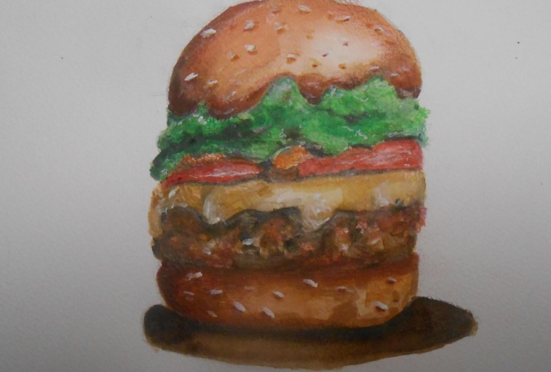
Transcripts
1. Introduction: [MUSIC] Hi.I'm [inaudible], artist from Coimbatore India. I've been a portrait artist
for almost two years now, and a YouTuber for
almost 7-8 months. I've decided to create in-depth courses for my
viewers so that they get to know all the techniques
that I'm using to create beautiful
color pencil artworks. Not just color pencils, it's going to be mixed media. I'll be teaching
you how to combine various mediums together and
create a beautiful artwork. When you use mixed media, it's actually time-saving, and also it enhances
the drawing a lot. Watch the full class
and get to know all the techniques and create a beautiful burger at
the end of the class, and don't forget to share it. [MUSIC]
2. Materials: Hey guys, thanks for
jumping into the class. Now let me show
you the materials that I'll be using
for this project. I've got a pencil, aqua brush pen, and
Tombow Mono Zero eraser. These are my pismacolor
premier pencils. Here, I've got touch
Touch cool markers , and garden markers. These are water-soluble markers, so you can use any watercolor paints or
water-based markers too. The paper that I'll be
using for this artwork is Strathmore Bristol
300 series model sheet. The other materials that
I'll be using later in this class are white gel pens. This is from a particular
brand called Uni-Ball Signo. Then this is the
acrylic white paint and the glass marking pencil.
3. Choosing a Reference & Sketching: Now let me take
you to the process of how I choose a reference. I have downloaded a few
images from Pinterest. You can choose any
search engines. What I usually do is select each ingredient from all the three or the
four references. If it is a food drawing, I mix and draw like creating a new dish with your
choice of ingredients. [MUSIC] Looking at this image, I like the green portion
in this, and the tomato. Then in this, I like the
toppings and the spinach. [MUSIC] The top bread will look empty if I don't add those and the spinach
also looks good. Let's see the other image. We should also add these
mushrooms from here. It looks juicy. I've chosen the
spinach from here. This is how I chose
a reference image, so these are the things
that I'm going to draw: tomatoes from here, spinach, cream, and the
toppings from here. The spinach I'll be combining
the first and this one. The color looks bright
in the second one, so this contrast
looks very good. This particular image as
a whole looks very good. The background color, the
bread, and everything, so let's combine all
those important features and draw our reference. I'll be drawing here. First, initially mark where to start and end your drawings. This is a mistake that
every beginner does. We don't leave enough
space surrounding the drawing so make sure you mark where the image
has to start in. Leave equal spaces on all the
four sides of the drawing. [MUSIC] This is the basic outline
now for our drawing, so make sure you keep it rough and also very light
because if you daze it, you shouldn't see the
pencil markings there. You can change the outlines later too with the
color pencils, so need not worry much
about the detailing here. Just have a rough
outline of what are all the things that you're
going to add in your drawing. The sketching is almost done, so let's jump into the next class that is
choosing your color palette. Let me show you how to select
colors for your drawing.
4. Choose Your Colour Palate from Reference: Now it's time for us to
build our color palette. First observe the colors from your reference and the
colors that you've got. I've got these browns
that might go well with reference for the bread
and the patty portions, then here I've got greens. [MUSIC] I'll be using this for the spinach and
then a skin shade that might suit for us
in the green portions. Then let me select the
colors from the markers. Why I'm choosing
the similar colors in both the Caron markers
and these markers is because Caron markers will be acting as a base layer
for our drawing. Whereas these
markers, I'm going to use it for the final touches. This actually has the capacity to enhance or
brighten the colors. When we color it with the
color pencils it looks dull, so upon this we can shade
off my touch cool markers. [MUSIC] These browns
and the mustards, I'll be using as
a base layer for the top portion and the bottom. We can also use
the same shade for patty and the mushrooms as well. The markers as I've told you, I'll be using it to
enhance the darker tones. It'll give a polished look to
our color pencil drawings. That is why I'm using
the dutch gold markers. The green shades I'll
be using three spinach. [MUSIC] This is how you have to choose colors
for your drawings. Now, we should also select colors from our colored pencils. [MUSIC] Let me show
you how I do that. [MUSIC] First, pick all the colors that you see from the
reference image. Pick all the similar
colors of browns, oranges, and whatever you
can see from the image. [MUSIC] You won't need all
these shades, but first, you have to choose all
the colors that will [inaudible] and then we should
limit our color palette. [MUSIC] These are all the shades
that I've chosen. Now to make you
understand better, let's segregate the shades. [MUSIC] Now in the process
of segregating, I have also neglected
few colors. Here I've got the dark tones, then the mid tones, and then we have all
our light shades. This is how you have to
choose a color palette. Have the dark tones, mid, and the light tones. Similarly, do the
same for the greens or red colors for the
tomatoes and everything. I have the dark tones, light tones, and the mid tones. [MUSIC] These are the shades that I've chosen for the tomato, dark shades, light, and the mid tones. The dark shade for a tomato will obviously be
brown and black, so I've got that also.
5. Base Layer: Now that we have
chosen the colors, and we have our outline, let's start doing the basic. There are two ways to
use these markers, either giving it
directly or use it like a paint by applying it on a pallet and then
add water to it. When you need a darker tone
of that particular shade, use it directly on the sheet, and when you need
the lighter tone of that particular shade,
use doubled water. This is the process of
using these markers. Since I need a lighter shade, I'm going to apply
mixing it with water, add how much of a
water is required, and then use it like
a watercolor paint. Suppose if you have
not got these markers, you can use any other
water-soluble substitutes, or you can use
watercolor paints too. Use it mildly, do not use a lot. Only then you can either
color pencils upon it. If you think you have to add a darker shade, add that also. I've got these brown shades
on the reference image here, so I'm adding a little
bit of brown to that. [MUSIC] Now, for the top bread, we actually have dark tones more when compared to the
lower part of the bread. I'm giving this shade directly. Then let's blend it with water. [MUSIC] So use a lighter shade of this color, and then mix it. Why we actually go for this method is you
can save a lot of time instead of
directly giving it with the color pencils and
layering it a lot. You can give a base
shade in this, a mid tone or mid layer
with the colored pencils, and then a finishing touch with the markers of pens
that you have. This process is actually saving a lot of time and also enhancing the drawing when you use
only colored pencils. I have already tried that, so I thought this will be
the best method to use. That for food illustrations. It actually gives you a brighter
and a neat drawing with a little less time when compared
to only colored pencils. So, almost our base
shading is also done. [MUSIC] Using the
similar method, color these spinach as well. Actually the colors look
vibrant in the spinach, so I am directly using the
markers on the drawing. I'm not mixing it with water. [MUSIC] Compare the
reference image see variable the
greens are lighter, darker, and then
give the colors. Don't just randomly
start giving the colors, compare the tones from the reference and then
apply it on your drawing. [MUSIC] These are the portions that
the colors look vibrant, so for the rest, I'm
going to mix it with water and apply to
have a lighter shade. [MUSIC] See, now you
also mixed those tones, also you've got
the lighter shade wherever it is required. [MUSIC] Now, our base shadings almost done for the
burgers in the spinach. Now what I'm going
to do is enhance the bugger with a little
bit of orange shade, because our reference
has a little bit of a low and orange
shade in the burger, so for that I thought this color will go
well with the drawing. [MUSIC] So, here and there
just apply a bit of orange. Since I don't have
this particular tone in the current markers, I'm using this, whichever colors is suiting well for
you, you can use that. Then I've already told
you before that I'll be using these markers to
enhance the dark tones, now I'm adding a bit of dark
brown to these drawing, later we can also enhance the drawing at the final
stage with these markers.
6. Building layers: Now before giving the base layer for the veggies and cream, I'll show you how to color the bread and the spinach using colored pencils
about a base layer. First, I'm using the dark tones and smoothly shade it along
with the marker shades. Next, I'm using a lighter brown. Use this shade only where
you have a darker tone. Use dark shades wherever
it is required. The next color I'm using
is pumpkin orange. I'm using it to blend and smoothen the darker
shade with the mid-tone. So try to blend the dark shade using a
lighter brown like this. Lastly, I'm blending
the whole shading with a cream yellow. [NOISE] You can see now as we blended
with the cream yellow, it gives a smooth
finishing to the drawing. Then to enhance the darker tone, I'm using a dull brown, or you can use these markers. Whichever you feel is giving the darker tone,
you can use that. [MUSIC] Then going for the toppings, actually it looks in white
color or half white. That means a little
bit of white and then brown and cream. But we need a brighter white. If you use color pencils, it will not give you
a very bright tone. Initially, I'm using colored
pencils and doing it. Later we can use acrylic white colors and
enhance the brighter tones. Now we are done with the
top part of the bread, let's repeat the same
for this portion. Here in the reference image of this lower part of the bread, there are no dark tones in it. It's just called the mid-tones
and the lighter shades. I'm using lighter browns and creams alone to
shade this portion. Depending upon the
reference image, you have to choose the colors and give the contrast
accordingly. If it has a high contrast,
use dark shades, if it has very light
shades, go accordingly. [MUSIC] Here again, I'm using the same cream yellow
and blending it. Here and there where
you require darkness, just add it a bit. Also, refer to your
reference and then add. [MUSIC] Always when you add
a darker shade, use a lighter shade of that and try to blend it
with the light shade. Only then it will give
a smooth finishing. If you leave it just like
that with the dark shade, it will not mix with
the light shade. [MUSIC] Finally, as usual, you should always blend
with a light shade pencil. Either it can be white
or in this case, I used the cream yellow
to blend everything. Try to use a lighter color
and blend everything.
7. Greens & Veggies: In this next class, I'm
going to show you how to add the details
in the spinach. To start off, I'm starting with the high contrast values, and then gradually let's
reduce the sheath. First, the dark tones, I'm starting with black. Then you can use dark green
and then light green. Now, after the black, I'm using kelp green. Whatever it is,
choose the color that goes well with the base color, and also with your reference. Now you have to mix the
dark and the mid tones, so slowly render it, or try to fill in all the gaps. Use different shades to
bring out a realistic look. Do not just use a single
pencil because it will give you just a normal
shade or a normal color. When you use different colors, it will give you a better look. I'm shading with a
light green now. You can also use a low or any
other greens that you like. For the white shades, I use both the glass marking pencil and also
Prismacolor white pencil. Whichever you think is best suiting for you,
you can use that. Don't just leave it
as a pure white, shade green color above it
so that it'll give a mild green with a lot of
highlight in it. Once you're done shading it, you can draw the veins in it, and then according to the
partition of the veins, you can detail it again. Here in my reference, I had a white vain, that is because of the
reflection of the light so I'm using the
white pencil for it. It's not just enough
to give the veins, you have to give the
depth near the veins. Try to add darkness
next to the highlights. Always there'll be
a bit of darkness near the highlight
so try to give that. Actually the realism lies in all these minute
details only. When you put effort and try to fulfill the details
in the drawing, you will get the
realism naturally. In this part, the veins have a
light green tone, so I use a green pencil
only instead of white. Depending upon the reference and wherever the shape changes, you have to use the colors. For the dark tone, I'm using a marine green. It's from Prismacolors. All the color pencils
that I'm using in this video are
Prismacolors only. We've done all the fine
details in the leaves, and then draw that. I already told you that you have to give
the depth near to the veins, so only then it will look
like a real spinach. You can see I used a bit
of yellow here and there, and again, I'm adding white to make it
even more lighter. This is almost done. This is how I'll be drawing the rest of the
spinach portions, you can watch that as well. Following that, I will be
shading the tomato slices now. I'll start off with the
dark tones actually. Now I'm just outlining
it with a mid tone. Later, I'll start the
shading with the dark tone. I usually prefer this method, a dark tone, then the
mid, and then the light. Whichever is
comfortable for you, you can go in that order. Even if I follow this
particular order, at final stage, I have to
give the dark tones again. That'll be a two step
process in this. After giving a layer
of a dark red, I'm using a normal bright red. Then I'll be using pinkish red and orange-shaded
red everything. I'm not sure about
the exact names of the colored pencils. I just see the tone and
just explain it to you. A tomato will not just
look in a plain red. It will have orange shade, and pink shade, and
the yellow shades too. Here and there, give
a little bit of pink, brown, or orange or
whatever is required. All these are just
for the tomato shade. Coming to contrast
and highlights, you have to give a darker shade and lighter shade as usual. The highlights will usually
be white or yellow, and the dark shades
will be brown or black. Depending upon the image and the place the object is located, you have to shade accordingly. You can see I'm shading
now with an orange color. Followed by that, I'm using a partly pink red, so combine all the shades
and blend it together. Only by layering you
can achieve that. Now I'm using a darker red, and then the dark brown. To define all the edges, I'll use a black color to
define the shape of the tomato. No need to worry because
the below portion that is in-between the cream and the tomato,
that'll be mushroom. All in the in-between
gaps it'll be dark only, so you can use black or
darker brown shade for that. Mix and use all
the colors and try to bring a colorful drawing. Finally, for the highlights you have to use the white shade. Now again, for these lines, use
the same technique and the same process. Use different reds,
oranges, and pinks, also browns for
the high contrast and white for the highlights.
8. Base Layer: Cream & Patty: Following that, let's give the base shading for
the cream and body. Depending upon the shades, you have to give the markers directly or mixing
it with water. Here and there, there is a
lot of dark shade in green. I am giving it directly instead
of mixing it with water. Later I shall blend
it with water. [MUSIC] Now for the rest of the portion to
make it light and mixing it with water, I'm using the same color
that I used initially. [MUSIC] These are the two shades
that I used for this. For laying dark for the patty, I'm using the brown color. [MUSIC] Once giving the marker directly, you can now blend with water
and fill in the white space. [MUSIC] There's a little bit of darkness on one side of the patty. For that, I'm using black color. [MUSIC]
9. Depth in Cream & Patty: To give in-depth
shading for the patty, I'll be using dark
and the light browns. Also a pumpkin orange. These are all the colors
that I'll be using. Try to blend all
the marker shade and the rest of the portions. With the color pencils, combine all the various
shades together. [MUSIC] There is no particular order
in shading all these colors. Just use [inaudible], you think this
color is required. See the reference. I'll
draw all the process. Pick whatever color that
you think it is required for that particular part
and use it accordingly. This is how you
have to process it. There's no a sequential order or something that
you have to give it. [MUSIC] Moving on to the cream. Remember the cream should
have a juicy texture. Also, it should reflect
the color of the cream. Remember to shade all the colors that you can see
from the reference. I'll show you it
in a slow process. I can see an olive green
in the reference image. I use that as the dark tone. Then I use cream color for
the mid and the light tones. Later for the highlight
you can use white. Wherever you see a dark shade, give the olive green. [MUSIC] Now blend the olive green
with the cream shade. This light cream also has
a shade of olive green. Another color that I'm using has a pure
shade of cream color. [MUSIC] This part is almost done. For the rest of the cream, the same procedure follows. You can watch that as well. I use the same three colors
that I chose for that part. The colors are olive
green and then a cream that has this
light shade of olive. Another color that is
purely of cream color. Then finally, white
for the highlights. [MUSIC] Now to draw
the mushrooms, use the same colors
that you used for burger and the patty. [MUSIC] Sketch it first and
then shade the mushrooms. I have started off
with a dull brown. This will be the
darkest value that I'll be using for the mushroom. [MUSIC] Use always the various
shades that you can see when you look at
the reference image. Then finally, you have to blend them with the lighter shade. [MUSIC] Then finally, fill in all the space
between this tomato and the mushrooms with the dark
color, that is the black.
10. Depth: In this next class, I'm
going to show you how to give the depth to all
these wedges here. You have given the black
shade surrounding that, now near to the black shade, you have to enhance the depth. For that, use darker
tones like dark brown and black on the edges of the
mushrooms and tomatoes. If you're not doing
this particular step, it might look very
flat so try to make the background black
color with the mushroom, not only the mushrooms
we're going to do it for the tomatoes as well. Our aim is actually to make
the mushrooms pop out. [MUSIC] Now see, I've completed that one
particular mushroom, and it looks
literally popped out, so that's what we
have to do it for the rest of the
mushrooms as well. When you give the
depth surrounding the object it looks real, so this is the key
point for realism. Let me do the same thing for the rest of the
portions as well. You can use any dark
brown or black color, but make sure when you mix
with the black on the edges, it should also have
the same dark tone. Just enhance the dark
tones on the edges alone. Now we can do the same
for the tomatoes. I'm taking a color
that goes well with the red as well
as the dark tone. First I started out
with a reddish brown, then we can go with a
dark brown and black. Now you can see the difference, so similarly, do for the rest
of the portions as well. [MUSIC] There is a little bit
of cream portion, we should also do that. I'm not using many colors there, keeping it very mild, and here in there I'm just
smoothening all the colors. I think here it needs a little bit of depth,
so I'm adding it.
11. Adding a magical touch: In this next lesson, I'm
going to show you how to add a beautiful
magical touch. It's nothing but enhancing your drawing a little bit more. [MUSIC] To make the
toppings look very bright, I'm using acrylic white paint. Apply slightly wherever
you need the toppings. [MUSIC] Now to give a little bit of depth to those, I'm adding a small line
of brown surrounding it. Use other browns as well do not stick with the same color. Like this, just finish
all the toppings, it's just nothing but
the sesame seeds. I'm doing all the steps to
enhance it a little more. This is how you give
depth and realism. The key points is the
darkness and the highlights. As I finished the dark dots, I have also corrected
the highlights. To give a rotundity
to the burger, I'm shading with
the brown tones. Also the sesame
seeds doesn't appear white color it also has a
sandal or a brown tone in it, so give a bit of
other shades as well. [MUSIC] Following that, I saw the reference image has a white highlight on
the top of the bugger. For that, I gave a glass
white marking pencil, but I thought it will do very
well with the white paint, so I'm applying a bit of white paint and I'm going to mix it with the
rest of the portion. These are all the
things that I'm doing to give the rotundity , the bulged look. [MUSIC] Now let's do the same process
for the bottom as well. Following that, I'm using markers to give a finishing
touch to the spinach. [MUSIC] That's not
a very big process, I just smoothen it out with the markers
with the same tones. [MUSIC] Then for the
highlights on the tomatoes, I'm using the same white paint. Give the whites according
to your satisfaction. If you feel it is more, just reduce it by adding color pencils on the top
of it or even markers, whichever sticks
to the paper and whichever gives you
better results, use that. It's not like that
you have to use the same materials that I use, you can use any
materials that you have, just to have to experience it and make it a
trial-error process. [MUSIC] If you feel that the
white stands alone, you can try to mix
the red color on top of it, like this. I felt the whites were dominating so I reduced
the tones a little. Next, we shall do the same
for the creams as well. For the cream, you need
a lot of whites in it. Only then you'll get a
creamy finish to it. [MUSIC] After adding the
whites don't forget to blend it with the
rest of the colors. For that, I'm using the
small, little brush. [MUSIC]
12. Final touches: [MUSIC] From the previous class, I think you understood the meaning for depth
and realism and also the difference how it made all those little
things that we did. Now it's time to just
give it a little bit of finishing touches wherever
you feel it needs. Wherever I think it needs a depth and smoothening effect, I'm just doing it. This last process completely depends on your satisfaction. If you feel that
white has to be more or the depth has to be
more you can do that. Now as I've already told you, I'll be giving the finishing
touches with the markers. I feel the markers give a
polished look to the drawings. I am giving that on the edges
wherever the depth is more. You saw me giving it for
the spinach as well. Now I'm doing it
for the vegetables. Try to use the same color, if you don't have that particular
color, don't go for it. I had the same round
so I'm using it there. Then I've also got a
light brown with me, so I'm using that too. Next, we should enhance
the patty a little more. I'm using the combination of
markers and color pencils. I'm not using any other color. I'm just using the same
colors that we used for the base layers for
the patty, black, brown sandal,
mustard whatever you used it before itself
use the same tones. I'm trying to use all the
whites because white gel pen gives bright look and it
is also very pointed, so I'm not able to use
it for a wide area. Wherever I need the whites
more I'm using white paint. Whichever is suiting
you, you can use that. Now again, the same process
for the rest of the patty. You can see the difference
before we enhanced it and now. Now adding highlights to it. Always when you finish
a particular portion do not forget to check the
darkness and lightness. That is what matters
in a drawing. If you're satisfied with
the darkness and lightness, it will really give you
the realistic effect. Now for the final touch, I'm adding a shadow to it. I actually began this process thinking of giving
the shadow to it. But then I turned it well
little base for the burger. Also, I wasn't satisfied, this color, so I use
markers instead. That's it for our class. I hope you learned a lot of
new things in this class, also learned how to
use mixed media, along with colored pencils
as the main thing. Thanks for watching this class.
13. Final Thoughts: That's it, guys. We are done
with our burger drawing. Hope you learned a lot of
fun things in this class. Also, try to apply all
these techniques in various different artworks, and don't forget to
share it with me. Once again, a big thank you, and I'm winding up
the class here. Let me meet you on the
next class very soon.
 Ritika Sridhar, Artist, Illustrator