Transcripts
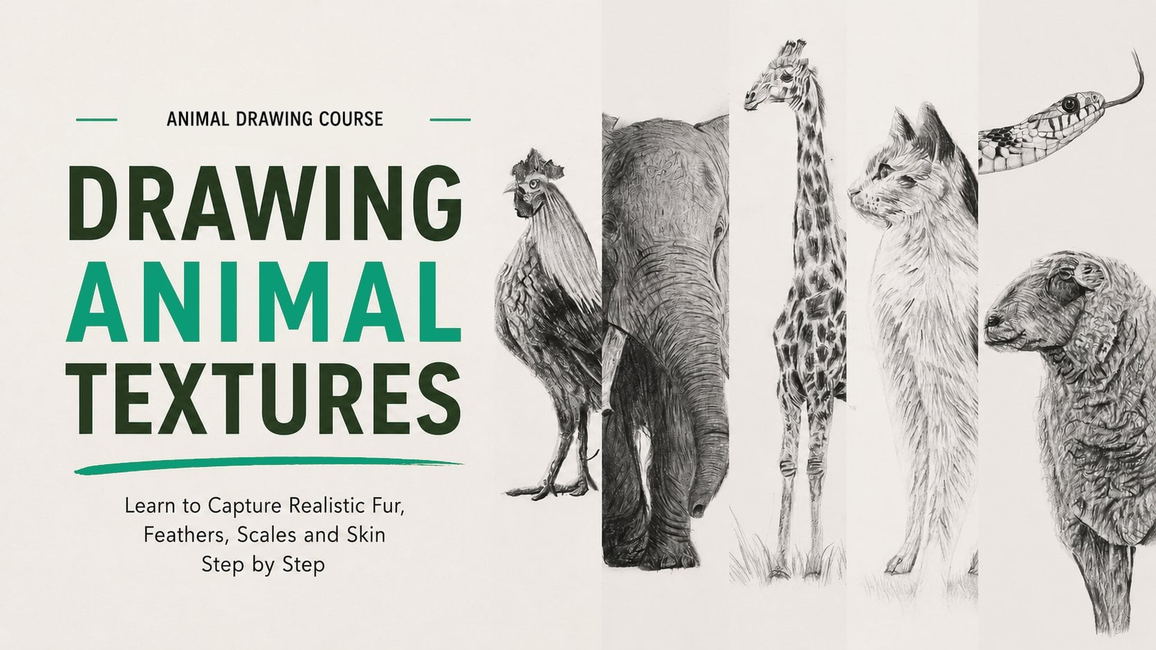
1. Introduction: Hello, and welcome
to this course. I'm truly happy
to have you here. You have already completed my fundamentals of
animal drawing class, this course is the
perfect next step. We will put these
techniques into practice by creating a series of
complete animal drawings, always starting with
simple shapes before adding structor
details and texture. Together, we will draw
a horse and eagle, a bear using simple shapes and a tiger and a Labrador using the grid method to accurately transfer your reference before
developing the drawing. These projects are designed to reinforce everything
you've learned while helping you gain confidence with a wide
variety of animals. Let's get started right now.
2. Drawing the Horse – Sketching the Basic Shapes and Shading: This is a new final artwork with the realization of this
beautiful white horse. So this horse is going to be a fantastic subject to
put into practice again, everything that we've
seen during this course. Work on the basic shaves, the work on the proportions, the shading and the creation of the white fur is
going to be a little bit challenging because
creating a white animal isn't just letting the page
blank, letting it white. We will have to work on
some very subtle shadows to be able to create
some volume with it, and also to work
on the texture of the hair that is very short
and very subtle, as well. So this is a really
nice subject to make some progress again and to help you becoming
a better drawer. So take your time, observe it
carefully, and most of it. Enjoy the process because
when you enjoy things, it will help you to make
some even more progress. So grab your pencil and let's
draw this horse together. Let's get started on
this final project, working on this
magnificent white horse. This drawing will be
done on an A four sheet, approximately 20
by 30 centimeters. So let's begin by identifying the shapes before sketching
them onto the paper. Just like we did in the
exercise on shapes, I will give you 10
seconds to try and identify the main shapes of
this horse. So here we go. So here are the shapes
that I observe, a large oval to represent
the entire body. Rectangle, I think,
could work as well, but the oval is more
representative of the horse form. I could draw another
oval for the head and also another oval for the neck. With a small rounded triangle to link the head to the neck. The legs, you can mostly be
representative by rectangles, except for the hind
leg where I also see a small trapezoid
at the top. For the front leg,
it is very straight, so it can be drawn
with a long rectangle. And the over leg, this
one can also be drawn with rectangles with a small
triangle at the joint. So this is how I've broken
down the structure. Of course, that could be other
possible interpretations. For the proportions,
the width of the body is roughly equal
to the height of the neck. And the length of the
horse appears to be about 2.5 times the
length of the neck. And finally, another element of proportion
that I noticed is that the leg's length
is approximately equal to the width
of the horse body. And so with all these
elements in mind, we can now try to draw the horse as accurately
as possible. Let's begin with
the basic shapes. I'll start by drawing the oval that represents
the horse body. I'll go over the shape
multiple times until I am satisfied with the
proportions of this oval. And among all the lines
that I have drawn, I identify the one oven
that looks best for me. A useful tip before
actually drawing the oval is to pretend
to trace it in the air. This helps strain the motion before committing to the sketch. And finally, any unnecessary
lines that don't contribute to the final shape can be
erased to clean up the drawing. At the end of my oval, I see another oval
that defines the neck, and we remember
that its height is approximately the same as
that of the horse body. Then in the corner, I can draw the oval
that shapes the head, and I notice that it reaches about half the
height of the neck. By using these elements
as reference points, I can progress step by step. Finally, I will be able to
close this structure with the rounded triangle we
identified earlier in the corner. At the end of the
oval for the body, I can start working
on the hind leg. We remember that there
was a trapezoid, and then I continue by drawing the rectangles to complete
the leg to complete the leg. Then I continue
with the other leg, drawing the rectangle
that defines it. I had started sketching it, but I felt it wasn't long enough because I compared it
with the one on the left, and I saw on my reference
photograph that this rectangle stops on the same line
that the ones on the left. So I did it, and then
I can pursue with another rectangle to come
to complete the shape. Now let's move on to
the remaining legs. The bent leg, as you remember, is formed by several
rectangles with a triangle for the
joint while this leg is partially overlapped by
the fully extended leg that I can draw right now. And at this point,
I would say that the base structure is complete, and now we have a solid
foundation to start refining the contours and shaping the horse
more precisely. I continue now by outlining
the contours using the blocking technique to define the angles of each
elements precisely. This approach makes it easier to achieve an accurate outline. I started with the
horse body and initially planned to
move to the edge, but then I decided to
focus on the legs first. Why this sudden change well, because the head is more
complex and requires, sorry, careful attention
to proportions. Even after years of practice, I still prefer to begin
with the simpler part. It helps build confidence, and once the easier direct
sections are in place, the remaining elements become easier to position correctly. So now I continue with the
line defining the front, this lay that is on
the left, on the left. And the other one, this one, the one that is a
little bit more on the right, will overlaps a little with
this first one that draw. Okay, so I proceed
with this one and one thing important to keep in mind and that I wanted
to share with you, even though it may seem like I'm drawing quickly
and smoothly, I still pause at times
to analyze my work. I'm taking my time to think
about the different angles, the length of each line, thinking also about
the proportion and how everything
connects together. It's crucial to avoid
rushing to ensure accuracy. Of course, in the video, I won't show every pose I take. It wouldn't have much
value to this course, but I want to share this with
you to emphasize that it's completely normal
to take your time when decided on
angles and lines. Precision matters
more than speed. And so I continue and
little by little, we move toward the
head area with the base becoming more
and more established. This block in
technique is really useful because it
allows us to focus on the overall directions rather than trying to draw
each curve directly. Here we are really
trying to analyze the general movement
of the horse and translate it
into straight line. Also prioritize the main angles. Instead of getting caught
up in small details, we focus on the
breakpoints in the shapes, for example, where the
neck meets the body, where the leg connects with
the lower belly, and so on. This approach prevents over precision too early
in the process. Right now, we are establishing a solid base which
will help us refine the contours later rather than aiming for a perfect
outline on the first try. It's completely normal to
adjust lines along the way. Even after a year of practice, you'll see that achieving
a perfect outline in one is very difficult if
not almost impossible. Even for me, I constantly find
myself making corrections, realizing that one
element is misplaced, another appears too
large or too small or needs to be adjusted up
down, left or right. So this blocking
phase and shape study really help us create a solid
foundation for our drawing. Here, I have just noticed that I forgot to had the horse tail, so I can go ahead
and draw it now. There's also one leg
that I forgot to sketch, so I need to include
that as well. And there it is. My blocking
is almost complete. I have finished this technique
to establish the outline. Now I will take
the midpoint razor to remove all the guidelines
that I have drawn, and then I will
move on to refining the final contour of the horse. Now I can finalize the contour of my horse working
lightly once again. However, as usual, I
apply a bit more pressure than normal so that it's
visible on camera for you. I refine the outline smoothly, adding all the curve lines that help define the
shape of the horse. I can also start incorporating
details in their contours. For example, you may
have noticed that I have added the horse man. I can also add his ears,
and progressively, I will include all the
necessary elements before moving on to shading. I always emphasize the
importance of the contour. It serves as a guideline to help us achieve
our final result. If we need to mark
multiple elements inside the outline,
we should do so. Some artists may
prefer to sketch all the facial details
while others while others may feel comfortable with just the basic contours
before starting the shading. For beginners, it's reassuring to mark as many
elements as possible. Personally, I like to
outline a few key features, especially those that are easily recognizable and highly visible. In the end, it's the shading that truly brings
the drawing to life. So now I continue by
defining the muzzle, and I also had the levers
straps on the horse face using over elements
as a reference point. For example, I make sure that the strap begins
where the main ends, and I observe that the
round buckle stops at the same height as the angle separating
the neck from the face. It's like we could
draw an imaginary line going from the buckle
to this angle. So I have placed the
strap at this place, but after taking a step back, I realized that it's not
at the right position. So I adjust it and place
it at the correct eye. Next, I want to
position the eye. To do this, I use
reference point by comparing elements
to one another. First, I see that the
eye is approximately at mid height between the
ear and the lower strap. Then I noticed that the right
corner of the eye aligned with an imaginary line extending to the
ring of the strap. And finally, the eye
closes at about the point where an imaginary line would extend from the ear downward. And thanks to these
reference points, I can accurately sketch the eye. These imaginary guidelines
help me position it correctly by analyzing spatial relationships
between elements. You may also have noticed
that I have refined the lower part of the horse hail as the angle wasn't quite right. I made a slight
adjustment to improve it. And as I mentioned, the
contour isn't final. We can always make
modifications as we refine the precision
of our drawing. I have now added the
last facial details, and with that done, I can move on to refining
the rest of the line, which should be a bit easier and require less precision
than the eye. Even though the eye doesn't
look like much yet, once I will shade it, it will take on a completely
different appearance. So now I continue with the leg carefully tracing the angles
that define its shape. These angles help create the subtle curves that give the leg a sense of
elegance and majesty, reinforcing the graceful
nature of the horse. And the drawing is really
starting to take shape now, so we are on the right track. A small clarification
regarding the eye area. When I mentioned that it aligns with the
ring of the strap, I actually meant that it
almost reaches the ring, but it's positioned
slightly to the side. However, it can still serve as a useful reference point for
placing the eye accurately. I had forgotten to mention
this detail earlier. Taking a step back, I realized that something was
off with my horse. In fact, its body is too long. In terms of height, Eva said
that everything looks fine. However, the length of the
horse is too extended, and that throws off
the overall balance. So I will adjust and
correct this mistake. I estimate that it's about
one extra centimeter, which isn't a huge error, but it was noticeable enough for me to feel that
something was wrong. By stepping back and
analyzing the drawing, I was able to identify the issue that the
body was too long. Rest, including the leg
height, looks good. So to fix it, I will redraw everything
exactly the same way, just shifting all the
elements slightly to reduce the extra length
by about 1 centimeter. Now to help myself before
starting the shading, I'm going to mark the main
shadow areas in the drawing, at least the most
noticeable ones. One of the most
obvious shadows is located on the lower
part of the horse belly. Then there are several shadow
areas on the neck as well. And I can see that this region
will be slightly darker, and marking these
areas now will make the shading process
much easier later on. I also notice some shadows
on the back of the horse, and I will continue marking
this until I feel I have outlined all the necessary areas before moving to
the actual shading. I'm going to start with the eye, as it's an old habit of mine to always begin with the
eyes and the head. First, I lightly shade the brighter area of the
eye using a four B pencil. Then with a 12 B pencil, a 14 B would also work. I go over the darkest area
to enhance the contrast. One of the deepest shadow is in the lower part of the eye, so I apply a strong
pressure with the 12 B pencil to
darken it properly. It's important to note
that I sharpen my pencil beforehand as this step
requires a lot of precision. I also use the 12 B to
refine the contour of the eye entering that the upper section is
properly defined. However, since the horse
is relatively far away, there isn't much shading required to achieve
a realistic eye. And so that will be basically
it, the eye is over, and all the elements around it will help to create
something better now. Now I am going to
shade the horse head. I started by applying a light HB base to
establish even tone. At this point, I also erase the outline of the head because this line I originally drew is darker than
the fur in this area. Since I don't want
it to be visible, I prefer to remove it
before proceeding. With the HB base applied, I can now refine the shading. I noticed a slightly darker area extending from the corner
of the eye downward. And it's only a little darker, just like the shadows
found under the horse eye. Because of the subtle shading, a four B pencil seems to be
a good choice for this area. I also had slightly darker
details along the edges of the strap using the side of my pencil tip for a softer
and more delicate results. This technique helps create a smooth transition and keeps the shading
light and natural. We can also notice some
slightly darker areas along the edge of the horsehad in the section that meets
the main strands. This might actually
be the shadow cast by the main creating
depth and volume, which gives this part a
slightly darker up appearance. However, when I draw from
a reference photograph, I don't necessarily ask myself
this type of questions. Instead, I simply observe
darker areas reproduce them focusing on capturing
the correct values and contrast in the
different areas. In the lower section
of the head, I also see that it is
generally darker compared to the upper part that
we just worked on with very few highlights. Because of this, I apply a
four B pencil as a base for this area before adding deeper shadows later
to refine the shading. Here you can see that in
this area of the horse face, I have lightly shaded
with a four B pencil. As for the rest, we can now
move on to the nostrils. On this nostril, which
is on the right, you can see that it is
extremely dark along the edge. I apply a 14 B pencil all around the contour
or almost all of it, pressing down firmly to
achieve a deep and dark tone. Inside the nostril, the
shading is lighter. So I use a much gentler touch. And in this adjacent area, there is a prominent fold that will likely
be well defined. However, this fold
is not as dark as the nostril that we
have previously shaded. So while I am still
using this 14 B pencil, I press much less firmly. And as I move away from
the edge of the head, I gradually reduce the pressure, making my strokes
lighter and lighter. You can see that along
the entire line, I started quite dark and
then it gradually faded. So I softened my pencil
stroke just as I did in the area
above the nostril. Finally, between these different
elements I have drawn, I will apply a six B pencil to achieve a slightly
darker shade than what I had done with the
four B. I will also start working on the shadow
just below this strap, where we have a
slightly darker area. So I can begin
refining that right away once I have finished
with this six B pencil. And gradually, by adding
elements one after another, this horse hail will start
to take shape nicely. Next, I observe my reference
photograph and compare what I see in the photo with
what I have in my drawing. I take note of small details
that I can still have. For example, between
the nostrils and the contour of the head, there are some additional
elements, so I add them. Above the nostril, there is also another dark detail which
I will include as well. And little by little, I incorporate all these
elements until I am completely satisfied with
my work in this area. And finally, I will also use
my eraso pen to highlight the lighter details found in different areas
of the horse head. These highlights will help
enhance the contrast and make the darker elements I previously worked on
stand out even more. I continue adding the final
details to this area, but it is almost done. We'll soon be able to move
on to the upper part. Looking at the lower
part of the head, I noticed a few
missing dark elements, but overall, there's
not much left to add. Now I can start
focusing on the straps, especially by lightly
defining the ring here. But before that, I
want to finalize the eye because I've been feeling that something
is off with it. Upon closer observation, I realized that the lower
eyelid was missing. Along with a few small
details above the eye, that will be essential to
making it look realistic. So I had some slightly
darker touches above and below the eye, which will help
enhance its realism. And once that is done, we
can move on to the straps. For this part, it is crucial to use a well sharpened pencil, since the straps require a
high level of precision. For the horse's straps, this area is extremely dark, so I will work on it
using a 14 B pencil. As I mentioned earlier, it's important to have a well sharpened pencil to maintain precision and avoiding
going outside the lines. Since I am applying
a lot of pressure, erasing mistakes will
be quite difficult. So that's why you need to be
very accurate and to focus. Next, I have added
some shading around the ring using a slightly dark
tone to define its edges. Then I'll continue working on the other straps in
the same manner. There's nothing particularly
complex about this step, except that it requires a lot of precision to achieve a
clean and accurate result. With the work on the
straps completed, we can move on to other areas,
starting with the ears. I begin by shading the ears with a very
dark tone at first, as this area is quite
deep in shadow. However, on the right side
of this dark section, you can notice that I
apply less pressure with my pencil to create a
slightly lighter effect, as this part has a
subtle highlight. For the rest of the ear, I carefully shade
with an HB pencil since this area contained
particularly light elements. So I create a soft base
layer and also erase the initial guidelines as some parts will be
lighter than those lines. Now, using a 122
B pencil, sorry, I start adding darker details in certain areas of the ear. There is also a nice tuft of
hair connected to the man, which I begin to define. I then outline the second he, which is slightly darker. Well, the outline
is a bit darker. And then a few
carefully placed lines should be enough to create a realistic texture for this group of hairs
around the horse head.
3. Drawing the Horse – Final Shading and Texture: Now that the work on
the head is complete, we can start shading
the horse's body, beginning with the
neck and working our way down to the
upper part of the thigh. Even though this
is a white horse, we are not going to leave it
purely white in our drawing. If we observe closely, the shading and gray
tone in its coat show that it's not actually as
bright as the blank paper. To create more realistic effect, we need to work
with subtle gray. So I start creating
the base layer, and I created by applying
a light HB layer, which gives me a slightly
darker tone than the pure white of the paper for the lightest area
of this section. However, there won't be many spots that
remain this light, but I still need to
establish a base layer. Once the base is applied, I blend it smoothly
to create a soft, even surface to work on. I used the brush for
this step because using a blending stump would
have been too slow and wouldn't have produced such
a soft and seamless effect over a large area. Now I'm going to start to
add depth and contrast. Now that the base is blended, I can begin darkening certain
areas to create depth. Observing my
reference photograph, I notice several regions that
need to be slightly darker. So I apply a light shading
with a two B pencil. This creates a
subtle shadows that contrast against the HB layer, making the creases and contours of the neck
start to appear. Even at this stage,
we can already see a more realistic
effect compared to just a few minutes ago with just this little shading that
we have started to apply. And I continue to shade with
the side of my pencil tip to apply a broader shading and also a shading that
will be pretty soft. We have a four B pencil now, I will begin to mark
darker details, especially along the sides
where deeper shadow appear. And it's like I'm building up the gradient from light to dark. So to achieve a
smooth transition, I work gradually
from light to dark. I scan the reference photograph to locate the darker spots, and then I had them carefully, building up the
shading to enhance the relief and contours
of the horse neck. And by layering the
shading, step by step, the structure and realism of this area start
to take shape. And still using
my four B pencil, I continue adding
darker elements, laying them over the areas I previously shaded
with the two B. The two B shading created the base of slightly
darker tones, and by carefully working
over it with the four B, I enhance the depth and
volume in the area. One thing to notice
in shading is that dark areas rarely consist
of a single flat value. Instead, there are subtle
variations in tone, a lighter dark layer
underneath with more intense darks headed on
top of it in certain places. This layering technique helps create more realistic
and dimensional effect. Since I'm already
working in this area, I continue shaping the main. I start by applying moderately dark tones
along the edges. Then I will gradually
lighten my strokes to define the rest
of the main while keeping a soft transition. However, at the very
edge of the main, I notice that some strains
appear slightly darker. To emphasize this, I switch to an eight B pencil using the tip to add even
darker accents. And as I mentioned earlier, some parts of the main have very lighter strength
at the outer edges. So I make sure to leave
those area less shaded. Thise contrast helps
separate the strands, making the main look more
natural and well defined. So we continue with
this area just below, and we will try to shade it
in the same way as before. Often, when I work with
the side of my pencil, depending on the
area, of course, I try to use some
circular motion, slight circular motions to avoid visible marks and achieve
smooer rendering. In general, working
this way allows for a more natural
transition between light and dark areas
without harsh separations. Here I am applying light
layers to gradually build up the density and avoid making the shading too intense
right from the start. This approach lets me adjust the shadow's intensity
little by little. Rather than having to correct overly strong contrast later on. If I press too hard
in certain areas, it will not only create
an unwanted contrast, but also make it harder to
erase and adjust later. In this part of the horse, there aren't many details. The shading here
is more general, not necessarily blurry, but it's a relatively simple area. However, its role
is important in maintaining the overall
harmony of the shading. Even though it
seems less complex, it still helps to add
volume and reinforce the coherent consistence of
the lighting in the drawing. In general, less textured areas like this one are very subtle. That is to say, if I make
them too light or too dark, they don't match the values found throughout the
rest of the drawing, and the overall balance of the
artwork could be affected. That's why it is essential to find the right middle ground, gradually adjusting the
shading intensity to ensure a smooth and
natural transition between the different areas. So this section is done, and we can move on
to the bent leg, which will be very
interesting since it contains many
folds and creases. For this bent leg, I start by applying
a base layer, adding slightly darker
elements on the lower part. From here, it's all about carefully observing the shading. Every time I notice an area that is darker than what
I already have, I make sure to mark it. For example, in this spot, there is a subtle
circular shading pattern that helps define the
direction of the fold. I have emphasized it, and over this base, I have added darker details.
Along the fault line. You can also see that
on the lower part, there is a light line
running along the crease. I continue shading around
my initial base shadow, making sure to respect the strong contrast in
this well defined area. And as I work, on the shading, I prefer using slightly
darker strokes, which helps bring out
all the elements. And I knew my strokes
are some kind of lights and not some circular
motions like I did before. And this shading is really
crucial in illustrating how the horse muscles are all actively contracting
and in motion, giving the form of a sense
of tension and realism. Typically, so this type of
shading is characterized by dark lines at specific points which emphasize the contours of the muscles and the folds. And so that's exactly
what I'm focusing on to shape the
crease effectively. And I will gradually continue
this work until I reach the hoof area where I will
have an especially dark lima. I would start shading
it with a 12 B pencil. Whether it's a 12 B or 14 B doesn't really
matter in this case. I apply my 12 B shading, but I make sure not to create a completely uniform tone
across the entire hoof. It's important to maintain some subtle variations in value. For example, if
you look closely, the leftmost part of the
hoof is slightly lighter, so I adjust my shading accordingly to preserve
that difference. At this stage, I also use my 12 B pencil to
reinforce certain details, particularly some fold
and creases that need to be slightly darker
than they were before. This is what I consider my control and adjustment
phase where I fine tune the contrast and
refine the details to make sure everything looks
balanced and natural. We can now continue
working on the second leg. I start by applying a four
beep shading to establish a slightly darker base as
this leg is mostly in shadow. You also see that I have already shaded the
hoof since it wasn't particularly difficult and I felt that it didn't
require much explanation. Next, in the upper section, there are darker elements, so I reinforce my base
using the naightB pencil. This leg will be less
complex than the bent one, as the bent leg has more muscles under tentro requiring
greater precision. Here we can see that
the upper part of the leg has some
darker elements. Darker areas, as well
as near this hoof, the hoof of the bent leg. Additionally, there are
a few dark details on the lower section right next
to the hoof of this leg. So there are some
final details to have, but this section
shouldn't take long. It's not one of the most
complex areas to shed, but it still needs to be
done with the same level of care and precision as
the rest of the drawing. Once this leg is completed, we will move on to shading the belly and central
part of the horse body. The video is playing
at double speed since this step is fairly simple and similar to what
we have done before. However, don't rush. Take your time to apply
the shading properly. I start with an HB pencil, working with the
side of the weed. The central area of the
belly is quite light, which is why HB is a good
choice to begin with. Next, I will take my eraser pen and
erase the per outline. Just like before, the shading in the upper section of the horse is even lighter than
this guideline, so it's best if the line
disappears completely. After that, I lightly shade the area using a
very soft HB layer. In the lower part, we have a shuttle area that gives
the horse body more volume. Since this section is darker, I apply a four B base to
create the necessary depth. Once all these
elements are in place, I blend them with a brush, as this is a fairly large area. This ensures a smooth and
even shading transition before refining the details
with more precision. Now, let's work in detail on the belly of a horse
and bear the shading. So we can start with this
shadow in the corner. It will help define the belly while also as we
extend the line, establishing the volume of the bent leg that we
have shaded before. With this line that I am
beginning to sketch, this leg, the bent leg is starting to
stand out more clearly and seems even more
muscular and even more bigger than
what we had before. So the horse belly that we are shading is a
very large surface, and it requires a smooth shading to properly convey its volume. When we look closely at this area in the
lower belly area, we can see that the
shadow is not uniform. There are some subtle
variations that will help us achieve a more realistic
effect with our drawing. It is important to pay attention to the pencil strokes
that we apply. I go back over these areas
with my four B pencil, especially on the section that I had previously
blended with my brush, and I darken the area near the leg as it should
be slightly darker. Similarly, in the upper part, the shading is more pronounced, so I adjust my pencil
strokes accordingly and constantly observing my
reference photograph to refine the shading. Just like with the bend leg, the shading in this area helps define where
the leg begins. There isn't necessarily a strong defined
edge for the leg, except in the lower part
in the upper section, where the leg curves upward, it's actually the
shadow that determines where the muscle
of the leg begin. I would say that I
have done most of what needed to be done with
the four B pencil, so I will repeat
the same process, but this time using
an eight B pencil. I will refine the
different areas within the shadow
section at the bottom, carefully observing and
adding these darker details. There aren't many dark
accents in this area, but it's still important
to mark them properly. There are just a few
slightly darker elements that need to be emphasized. And another thing that I
want to focus on is moving the transition by adding lighter touches in
the upper section, entering a seamless blend
with the shadow above. And so that's pretty
it with this area. I can look up and look at the upper part of the horse
belly and notice that some areas are actually
darker than what I initially shaded
with the HB pencil. And so to adjust this, I go back in with
my four B pencil, applying very light strokes
and using the side of the lid for a soft and
control shading effect. One interesting observation
about this horse is that its hair is so short that
it almost looks like skin. There's no need to focus on
texturing individual hairs in this area as they are not
visible in the reference image. Unlike the man and the tail, where the hair is
clearly defined, the rest of the body
appears very smooth. So I continue working delicately with the
side of my pencil, adding slightly darker
elements where necessary and always keeping the
shading slow and natural. With my pencil, I'm
going to slightly enhance certain areas that
need to be a bit darker. Right now, I am fine
tuning some details. I had already created elements
that look quite good, but I feel they could be
improved a little more. For example, in the corner, of the leg, I want to bring
out the fold a bit more. So I observe the area carefully
and notice that within this relatively light
section in the middle, also, there are still some elements that need to
stand out a little bit more. And so to emphasize them, I darken them slightly
with my eight B pencil. Another thing to note is that where the belly
and the leg meet, the shadows are slightly darker. So I'm going to reinforce this
contrast in a few seconds to make sure the
connection between these two elements is more
defined, just right there. Whenever you work on shading, don't just assume the area
is finished and move on. Take a moment to step back
and analyze your work, compare it with your reference photograph and ask yourself, are there any missing details? Could some areas be
improved or refined? These posts for
observation analysis is very important
before continuing. What you can also do is put and look at your
image in the mirror, and clearly the mistakes, the things that could
be corrected will be a you will see
them in the mirror. It's really a great tool.
Additionally, in this area, I added a few lighter details
to enhance the contrast, and of course, I use my
eraser pen for this. And I will also use my
needed eraser to dab and soften certain areas afterward. And overall, my work
here is almost complete. Just a few final
adjustments remain, and after that, it
should be fully refined. Let's move on to the
last legs of this horse. The shading has been created
using an eight B pencil, and now I'm going to darken it further and refine the details. Here, the shadow is very pronounced and it plays
an important role in showing that this
leg is positioned behind the one that
is on the right. That's why it is
crucial to shade it properly and to create
a clear sense of depth, darkening it very
hard with the pencil. These legs, I think, are very interesting to work on because
just like the bent leg, the muscles and tendons
stand out very well, and to make them
stand out properly, the shading must be
done with precision. Now I have extended this line
a bit further because it also helps define the length of the leg which I
now start to shade. Along the edge, the
shading is quite dark, which also suggests that these horse has strong
and well defined muscles. This area contains
several small shadow, each with slight variation, so it's very important
to carefully refine each one to achieve a realistic
and structured look. So my approach to shading this leg will be
very quite forward, like I like to get straight
to the point I always do. I started by applying a dark
base, and over this base, I will had even
darker elements using my eight B pencil or even
darker tones, if needed. For example, in this section, I noticed that I can draw a pick and bold line right there with my eight B and
right above it, I can add another one, and I will continue
this process until I'm fully satisfied with
shading in this area. To finalize the shading, I will use my eraser
pen to create highlights and add
lighter details to balance the contrast. To effectively shade this
kind of complex area, I think it is useful to visualize
it as layer of gratons. Start with the lightest
base layer at first. Secondly, apply a slightly
darker layer on top. Three, add an even darker layer, and then refine the
darkest details to enhance depth and erase
some of it if you want to create
even more contrast and make certain elements stand out to bring
out the highlights. And so for complex
areas like these legs, where there are multiple
muscle and tendon structures, I think this layering
method helps a lot in achieving a realistic
and accurate result. It allows us to progress step by step while maintaining
control over the shading. On this leg, we can see that the hoof
is very well defined. So I'm going to shade
it with precision and clarity to make it
stand out properly. However, this won't
be the case for the other hoof, but don't worry, we will find a way to suggest its presence while keeping
it partially hidden. So we'll figure out
the best approach at the end to ensure that the hoof is certainly visible without being
fully outlined. Finally, on the overlay, I will be able to
apply shading and follow a similar process
to what we just did. The key here is to make sure that on the left
side of this leg, we preserve the highlights, those very bright
areas to stand out. These highlights are
essential because they allow the shading to create a sense
of free dimensionality, effectively showcasing
the muscles and tendons of the horse. And that's about
it for this step. There's nothing
particularly complex about this leg compared to
the previous one. It has the same
level of difficulty, so everything should
go pretty smoothly. So I'll see you again once
this part is finished. Let's continue our shading
work with the horse tail, and for now, I'll be
using a four B pencil. In this area, I can start by defining the slightly
darker section, then move toward the left. The key to creating volume in the horse tail is to carefully identify and emphasize
the dark elements that shape its form. For example, I can see a V shaped shadow,
which I will mark. These darker section are
crucial because they really enhance the depth and free
dimensionality of the tail. So to start, I apply a base
layer with the four B pencil. Later, I will be able
to add the texture of the hair by working
with individual lines. However, before jumping
into detailed hair strokes, it is important to establish
a solid shady foundation, just like we did when working
on the cat's fur texture. Now that the base is in place, I can start adding some
darker hair strands, making them stand out against
the lighter background. This step helps to
gradually build up the realistic look of the tail. Now that we have established a solid base for the hair
texture in this area, we can refine and enhance it by adding lighter strands
using the eraser pan. I will apply this technique
throughout the tail, especially in the upper
part where we can see lighter hair section
that I will carefully mark. One challenge here is that the background of the reference photograph is extremely dark, but I don't intend to
shade the background. I want to leave the horse
on a white background. Because of this, the
white hairs visible in the reference photograph won't appear naturally against
the white paper. So how to make the hair stand out against the
white background. Instead of leaving the
strands completely white, I will shade them very lightly with an HB
pencil to create a soft and light tone that differentiates them
from the background. The small and fine hairs
will remain lighter, and I will make sure they
stand out by carefully erasing thin highlights
with the eraser pen. I also erase the outline of the tail that I initially drew as the outline appears
darker than the hair itself. Instead of a hard contour, I will create the illusion
of individual strengths to keep the edges looking
more natural and soft. If you prefer to create a slightly darker background
to enhance contracts, you can absolutely do that. In that case, you can use the eraser pan in the end to lift out fine hair strengths, giving the tail a
realistic flooring effect. At this point, the left
side of the tail is really taking shape and
the same techniques and level of detail now
need to be applied to the right side to ensure balance and consistency
in the drawing. Now that the work on the
horse tail is complete, I'm going to add
the final details, particularly some grass
around the horse leg. Thise will serve two purposes. First, it will help
make it look like the hoof is partially
hidden by the grass, blending it naturally
into the scene. And secondly, it will
emphasize that the horse is in motion appearing to be
trotting or lightly bouncing, as we can clearly see that
three legs are in contact with the ground
while one is lifted. So I will add these
brass details, and once that's done, the
drawing will be complete. And with that, this marks
the end of this tutorial. I truly hope it has
been helpful for you. Feel free to let me
know your thoughts, and if you have any questions, don't hesitate to share them. And now here is
the final result.
4. Drawing the Eagle – Establishing the Outline: Now it is time for
another final artwork with the drawing of an eagle, a symbol of strength of majesty. So this is going to be a really fascinating
subject that will help you to make some
beautiful progress because thanks to this eagle, we are going to work on
many different aspects and trying to put into practice many things that we've
seen during this course. There is, of course, the work on the contoro using
the basic shapes, the work on the shading, the work on the texture with this beautiful favor and
within this entire animal, we won't have to
have we won't need the same approach
for all the favors because some fevers are really different
from one another. So it will be interesting
to see how to approach the fevers differently depending on where
they are located. There will also be
a very nice work on the texture of the beak, which is very
specific and also a beautiful work on the
eye of this animal. So it is a technical
and demanding subject, but a really rewarding one. You will have to observe
a lot to take your time to make sure that you capture the beauty and the
strength of this animal. So take your time and practice. You have all you need to do it. You have all the skills that
are necessary to do it. I will guide you through
the entire process. So practice along with me. And yes, practice. Again, that's all I have to say. It is the most important part. So now, grab your pencil and let's draw this
eagle together. Welcome to this new tutorial. We will learn how to work on the favors using this photo
of a magnificent eagle. For this tutorial, I will be working on an A four size sheet, approximately 20
by 30 centimeters. So let's begin with analyzing the subject and the different shapes
that compose it. And as usual, I'll give
you 10 seconds to analyze and try to visualize the shapes
that make up the animal. At the head level, I can clearly see a circle that will
encompass the entire head. Then we could imagine a
trapezoid at the neck, which we would enclose
within this circle. For the beak, why
not draw a pentagon, this five sided shape. It looks somewhat like
a trapezoid here. And finally, a triangle could be good to close off the beak. For the eye, we could start with a circle that we would
then shape as needed. And here, why not had a rectangle to encompass the entire dark fevered
area around the eye? And finally, I can very
easily close of the eye. Now, regarding the proportions,
if we take a look, I would say that this area is
the same size as this one, and the one below is slightly
larger than that one. So this can serve as
a reference point. Likewise, it seems like
the eye really seems to be positioned at the center of
the head. In the circle. So before starting,
I had to adjust the brightness of the
video because otherwise, the lines I had drawn were too light and not
visible enough, so I apologize for that. The lighting, sorry, is now slightly adjusted for
this part of the video. Now I begin by drawing this circle for my head's
ear, for my eagle's head. As you may have noticed,
before drawing it properly, I first mimic the movement
a little on my paper. This way, I can anticipate
the trajectory in advance. And honestly, doing
this is quite helpful, especially since I'm
working on my eagle at a larger scale than it appears in my
reference photograph. You could see that the
printed photo was smaller than how I am representing
it on this sheet of paper. So that really helped me a lot. From there, I was able to
draw the trapezot like shape at the bottom with the left side being lower than the right side, which rises a bit
toward the head. Then I can draw
the pentagon shape we discussed for the beak, which is positioned
roughly at mid high. Here, I notice that the
width didn't look right. It was too extended, so I reduced it
slightly and erased the initial line I had
drawn for the big. After that, I continued my work by placing
the other elements. As we observed earlier, this section is about the
same length as this one, while the lower section
is slightly longer. Then I can draw the rectangle
visible on the image, which takes up a large
portion of the width. From there, once this
rectangle is in place, I can position the eye. As I mentioned at the end, I feel like the eye
circle is roughly at the center of
this larger circle. So I can place it right in the middle inside
this rectangle. Now I have most of the
elements well positioned. From here, based on
what we've done, we can use the
blocking technique. If I wanted to ensure the
proportions are correct, I could also apply the proportions techniques that are covered in the basic course, such as using the ruler or the pencil to
measure the length, measuring angles with a pencil or with the other tool that we created in the course and
all the other techniques that I shared in that
course for proportions. So now I can move on to
my blocking technique. This means I will focus on drawing the rest of my
sketch more precisely using straight lines to calculate and estimate the
different angles present. At the head level, we
can see that there are some well defined angles. It almost looked like this eagle has a pointed hat at
the center of his head. So I draw these
two straight lines that intersect properly. Using the same technique, I can now outline the
beak more precisely. It has a very pronounced
curve acture, so I break that curve down
into smaller angular segments. Next, when I look
at my drawing and compare the different elements
relative to each other, I notice that I can
extend the beak to approximately the area
right below the eye. There are also some
distinct shapes beneath it that define
the big structure, and I can now sketch those in. Very important point. Before drawing each of my lines, I spend a lot of time observing
the angles carefully. I measure them before transferring
them onto my drawing. I use my pencil for
this measurement. Then I replicate the
angles on my sketch. But you want me see
me thinking on you won't see me thinking
or those moments of inactivity on video. I edit those out to avoid unnecessary delays as they
wouldn't be very interesting. So let's continue and take your time with this
blocking step. It's very important. So now I move on to working on the eye. There is a web defined line near the eye that helps
determine the shading, and I can now sketch
the eye itself. This eye has a very intense, stern expression, and
we'll try to capture that. Up to this point, it has
a fairly rounded shape, by comparing the different
elements I can see that the eye is correctly spaced in relationship to
the beak below. As I mentioned, the eye remains rounded at
the lower part, then it angles off to the left, forming a small indentation. Now I outline the orange
area surrounding the eye, which is quite visible. Finally, I will close off the eye shape by adding
the detail that gives it that strikingly fierce look that is so characteristic
of this eagle. Now I can start refining
the eye in more detail. First, I work on the
black edge found at the outer part of the
eye, adding it slightly. Next, I place the pupil. Positioning the pupil
correctly is crucial because it plays a major role in
making the eye look realistic. To ensure I place it as
accurately as possible, I compare the different
elements with one another. One key observation is that the spacing between the
pupil and the lower part of the eye is greater than the spacing between the
pupil and the upper part. In other words, there is slightly more space
below than above. The same applies when comparing
the left and right side. There is a bit more space
to the right than the left. With this understanding,
it becomes easier for me to position
everything correctly. Knowing this distance
helps me make sure the pupil is placed
in the right spot. Next, using the rectangle I
previously drew as a guide, I can define the contour of this dark area more precisely. This allows me to clearly
mark the boundary between the lighter favored region and the darker favored area
found near the eye. With this blocking technique, I would say that I
have established the most important elements. Now I will start working on the favors inside the drawing. I felt that the blocking
technique was less necessary for this part,
for the lower part. As while the favors
are important, they are slightly less critical than elements
like the beak and the eye, which really defines
the eagle's identity and make it recognizable. If some favors are
in place exactly in the same spot is not
much of an issue. Now I have erased all the construction lines I drew during the blocking stage, and I will focus on refining
my lines more precisely. I will emphasize the curves and small irregularities
along the edges, something I hadn't done
earlier since I was mainly looking for
the primary angles. At this stage, I defined
these lines more carefully, and when working on
the contour I keep my strokes fluid to
ensure they look natural. This also allows me to So I continue by outlining
the head properly, and I can start also placing the internal elements right now, and I'm going to mark
the different areas where the favors are located. For example, I noticed one particularly
prominent favor that stands out and I want to
position it precisely. What I did was wrong. And I observe that
it aligns with an imaginary line between
the eye and this favor, which helps me
place it correctly. This sharp favor is quite
noticeable in the central area, so I sketch it carefully. I'll keep making the other
feaors as realistically as possible and finish the drawing before moving on to shading. While it's true that
without shading, it's harder to visualize
the final result. Even with just the contour
work we have done so far, the eagle already has a fierce, aggressive expression.
That's a good side. We are on the right
track, and we are already conveying some of its emotion
with just the outlines. So I will continue refining the lines in interior contours. I also notice that
under the beak, there's a distinct fever
area, dark fever area. Since this is a well
defined feature, I mark it accordingly, and I am also outlining a few other key
details that stand out clearly and will be important reference point
when begin shading. And finally, I outlined the dark feathers
in the lower area, which are clearly visible and require a well defined boundary. You may also notice that
I haven't done much in the upper area
or almost nothing because this section
is so light that I will simply add a few dark
details here and there later. I don't feel the need to
mark them at this stage. However, if you prefer to unline them for better guidance, feel free to do it
if it helps you. Et's begin the shading process with normal lighting this time. As usual, I start with the eye. You probably know
this about me by now. I love starting with the eyes because they express so much. And when I was younger, they used to put a lot
of pressure on me. I always felt that if I
didn't get the eye right, the rest of the drawing
wouldn't work either. But on the flip side,
if I did get it right, everything else would follow. So that's a habit now. I'll always start with the eye, and this eagle is no exception. So the first thing I do with the eye is mark the
very dark areas. One thing we can observe is that the inner corner
is extremely dark. So I start by working on that, pressing firmly
with my pencil to get as close to pure
black as possible. Now, I know I might be putting
a little pressure on you, but if you're pressing
hard, precision is key. Otherwise, it will
be very difficult to erase any mistake.
That's your warning. Now take a deep breath
and do it carefully. Another dark area is the pupil. When shading the pupil, we need to be aware of that. While it's mostly dark, it also contains highlights. So I make sure to shade
around these highlights, leaving them untouched so I can work on the lighter areas later. Looking closely at
the highlights, we can see that one of them right in the middle
is extremely bright while the other two at the top
are slightly more grayish. This means I will have to adjust my pencil pressure when I will blend them when I
will shade them, sorry, accordingly to
render them correctly.
5. Drawing the Eagle – Developing the Head: Now, let's work on the
inside of the eye. To start shading
this inner area, I use my six B pencil. The pressure I apply varies depending on the
different sections. For example, on the left side, we can see that it's lighter
compared to the upper part. So I press a bit harder
on the upper section. Meanwhile, the lower
part is extremely light, so I apply very
minimal pressure. This is what makes
graphite pencil so great. You can easily control the pressure to achieve
different values. However, for certain small details that need to be darker, I switch to my 12 B pencil. With this, I define
the tiny details and texture found on the lower part of the eye and
around its contour. Right near the black line
we had previously marked, there are some darker elements. So using the 12 B pencil seems
like a good choice here. And little by little, the eyes takes shape, and as we introduce
different shades of gray, it starts looking even
more intense and fierce. Just next to the ilight
we worked on earlier, there are slightly
lighter marks, and I apply them carefully, ensuring that my highlight
remains brightest, the brightest part,
making it stand out. To fine tune this,
I will also use my eraser to make small
adjustments when it's needed. For instance, right here, I felt like this was too black, and it's important to be honest with yourself
when drawing. Sometimes you have
to acknowledge that the part
doesn't look right. And when that happens, I erase and rework those areas until I am
completely satisfied. So now I move on to shading
the area around the eye, which is quite dark. Here, I apply medium
pressure, not too strong, but not too light either, because I want this section
to stand out properly. Even with just these
few additional details, the eye is already looking
good, much more refined. I will now add the
final touches. I carefully observe my
reference photograph, compare different elements, and make small adjustments
to ensure that my drawing looks as close
to reality as possible. And from now on that
I am almost finished, we are going to work on
the beak of the animal. Now, let's work on the beak. As you can see, I slightly
modify its shape, making it just a bit taller. I adjusted the line
and also added this very dark
element visible here. To position it correctly, I notice that it
begins at the start of the beak and it is roughly
aligned with the eye, which served as a
useful reference point. Next, I will apply base
shading to the beak. I'm using a two B pencil because this area
isn't extremely dark, but also is not as light as
the upper third section. The two B seems
like a good choice. I also erase my guideline, any guidelines that
are in the middle of the shaded area as they might become visible later,
which wouldn't look good. So I shade the entire beak
evenly to create a base layer, which will allow me to add all the fine details that
give the it's unique texture. And to ensure a smooth
texture for adding details, I will use my blending stump
to soften the shading. I will make small
circular motions with the stump to prevent any
visible stroke marks, which is important for achieving a clean and polished look. Once this is done, I will
also refine the control line, erasing it so it no longer stands out as that
wouldn't look natural. So I erase it with
my eraser pen. And from now on, I can start adding darker details
across the beak. One thing I notice is a dark band running
through the center, which I shade with my pencil. This instantly adds more volume and makes the beak
look more realistic. Within this dark band, I also observe an even darker
edge along the border, so I emphasize it
by pressing a bit harder with my pencil
to make it stand out. That's what you are about
to see just right now. Also, what I see right
here is a lighter area. So I lighten it with my needed eraser and I
just tap a little bit with it to remove a little bit of graphite and make this area
just slightly lighter. So right here, it's good, and I then continue
refining the beak by enhancing the central dark
zone I worked on earlier, and I notice a diagonal dark
line that I have added, and it run upward. So I have added it as well. And additionally, I see
that the edge of the beak is slightly darker than
what I had drawn before. So I go back and
reinforce that shade. Two sides of the
black element I had previously marked also
show some dark shading. So I enhanced those as well. And little by little, the big takes shape
and depth and volume start emerging
in the area. Right now, I continue adding the base
shading for the beak and gradually we'll move on to detailing and
refining its texture. The beak has a hard texture, but it's not completely uniform. Unlike what one might think, the surface isn't
entirely smooth. It has a slightly grainy texture with small cracks and
variations in tone. To capture this,
I will alternate between soft strokes and
more defined details. I will start using my eraser pen to create
realistic details. I will erase the brightest
areas precisely. I'm not using my needed eraser here because I need
something very precise. So I will have micro reflections on the beak with my eraser pen. These small details make
all the difference. They had subtle
nuances that bring the drawing to life and make the eagle look more realistic. In some areas, you can see irregular lines going in different different
directions, while in others, there are small scattered
dots that I will had as well, and bit by bit, the beak takes shape and becomes
more realistic. So now the details I am adding
won't be blended anymore. Blending was a great tool
for creating a smooth base, but it must be used wisely. If I continue
smoothing everything, I risk losing the
textures richness. So at this stage, I will keep my details sharp and
won't blend them further. With my six B pencil now, I go over the areas next to the highlights I
created just before, this contrast makes the
eyelight stand out even more adding depth and
realism to the beak. And these are the final
details for this area. And in a few seconds, we will move on to
shading and detailing the lower part of the beak. This lower part of
the beak will be much simpler and less
texture to work on. As you can see, I first
drew a dark line, and now it's just a matter
of applying basic shading without necessarily needing
to blend in this area. One key observation is that the left corner right here
is significantly darker, while as I move
towards the right, the tones become much lighter. Additionally, along
the bottom edge, there is a dark line with a few small darker
details on top. But overall, that's pretty
much it for this section. It's a fairly simple area, so we go over it
relatively quickly. Et's move on now to the favored
area on the upper part. This section is
extremely light with some areas that are
literally pure white. So here, I will do
something I rarely do. I won't shade the entire area. Instead, I let the white
of the paper remain visible in certain places
without adding any shading. I will only use
my HB pencil very delicately in specific
areas, but not everywhere. The goal is to preserve the
bright section and ensure They stay as light as possible. Another thing I'm going
to do in a few seconds is erase the contour line because it appears darker
than my shading, even in the shaded areas, and even more so in the white areas where there
is no shading at all. However, I won't
erase it completely. I still want to see
a faint outline to help me know where to stop. And since I'm keeping
the background white, I won't have a very dark
outline around the instead, I want the edge of the head to blend naturally into
the background, like a soft transition,
a flight of fors. That's why I erase the
contour, but not entirely, just enough to keep a
subtle boundary visible. And now, it really feels
like the contour is melting into my white background as if the edges of the favor
are softly fading. I can refine this effect later. Around the eye, we will
also have a darker area, but I will refine that later. As we move toward the right, the favors become
progressively darker. So I will need to adjust
both my pencil strokes and possibly switch to a darker
pencil for better contrast. One thing to notice
about the shading in this area is that the favors
are not sharply defined. Instead, the shadows appear
soft and somewhat undefined, moving toward the right in a pattern resembling
small rectangular shapes. So instead of trying to
draw each individual favor, I'm focusing on shading
the area as I see it. The shapes in the reference look geometrical and irregular. So I replicate that by shading with unusual geometric strokes. Might feel unnatural
to shade in this way, especially when it
doesn't seem to represent any clear
object at first. But in the end, by
following this method, the overall drawing
will come together. And this favored area will
look completely natural. The key is to trust the process, even if the shading seems
abstract in isolation. When combined with the
rest of the eagle, it will make sense
in the end and blend seamlessly into the
rest of the drawing. So trust yourself, and
you'll see that in the end, the outcome will be fine. I can continue my work, and now I notice that
in the right section, the light areas are not as
bright as those on the left. So here, I will lightly shade this area with my HB pencil, applying it very delicately. And this will be my light base. My light base will be a
little bit darker than the one on the left because
I shade it with HB, whereas on the left, I
didn't shade at all. Shading details I
added earlier in this section on the right
were slightly darker, so they already stand out more. But if I want to enhance
the contrast further, I can reinforce some areas with a two be pencil making the darker elements
even more visible. This increased contrast will add even more realism and
depth to the area, making it look more
three dimensional. At this stage, though, I already feel that the shape
is well defined. And imagining the next step, I think it's coming
together nicely. So I am working now on this area upper the eye because I noticed that
on the left section, there are some slightly
darker elements. And so I shade a little
bit above the eye, and this help to intensify the eagle spears
expression while also making the drawing
more realistic by adding more depth to
the upper eye area. Then I refine more
subtle details like the light markings
that we have next to the beak and the ones
on the right right here. I'm really fine tuning all I have done
here and then we'll be able to move to the
next area from now on. Now let's move on to the
favored area around the eye, which stands out strongly
and it's quite dark. The first thing I do is apply a base layer in this area
using my two B pencil. While some part of these
sections are quite dark, I also notice that there are lighter areas
scattered throughout. So instead of starting
with a dark base, I prefer to begin with a slightly lighter foundation
because it's easier to darken areas later rather than trying to lighten
them afterwards. If there were only one
or two light details, I would have gone
for a darker base, but since there are quite
a few lighter sections, it makes sense to start with a softer tone and gradually
build up the darker details. So working on the eye corner, now I focus on shading
the inner corner of the eye where I see some
slightly darker element. And therefore, I use
my four B pencil, which is darker than the base, but not too intense, as this area still
retains some mid tones. Looking at my
reference photograph, I notice that these
dark elements consist of irregular lines
running in different sections. So I carefully replicate this irregularity to capture the same texture around the eye. To enhance the
contrast and depth, I switch to an even
darker pencil, especially around the edges of this section near the beak. These areas require stronger and well
defined dark stroke, so I confidently
press harder with my pencil to make
sure they stand out. In areas where I had previously
shaded with the four B, I will also add even
darker details, alternating between
different shades of gray. This variation of tones that
I am applying is what makes the shading look more realistic and accurate to the
reference photograph. By carefully layering
different values, I enhance the depth
around the eye, making this hollowed out area look more natural
and pronounced. And as usual, I will
refine the area by adding small eyelights
with my eraso pen. These subtle touches will
improve the depth of the shadows and enhance the visibility of
lighter elements, making the contrast
even stronger. This final step ensures that the favored region around
the eye feels detailed, natural, and true to the
eagle's intense expression. Now we are focusing
on the eye area, and before working on the surrounding elements
that we observe, I am making a very
slight modification to what I had previously done. My eye contour was not right. The black area was
not round enough in this section and was
also slightly toothck. So I don't hesitate to make adjustment when something
doesn't look right. Here I am using an
electric eraser to remove these very dark black marks
because they are quite difficult to erase due
to their intensity. Now we can work more
confidently around this eye, and I begin by marking some medium dark
elements all around it. We can see that this area surrounding the eye is
characterized by small, fairly light marks, fin lines that more or less follow the
circular shape of the eye. These lines I am adding
will be slightly curved. It doesn't take much to define this eye contour
area effectively. And now I am going to add a few more darker
elements to further enhance the realism by
introducing variation in values. Now let's move on to the
favored area on the right. This section can feel a bit intimidating because it contains multiple elements
with varying levels of darkness and a
lot of details. So what I do is start
by marking the areas that seem the most obvious
and the easiest to define, those that stand out when
you first look at the area. In this case, I can see that in this darker region
around the eye, there are a few marks like
these that are slightly dark, so I go ahead and define them. I carefully observe their
direction and shape then I refine with the right shade of gray that best
fits this area. It's similar to the upper
section we worked on earlier. These shapes don't
really resemble anything specific at first. They don't immediately
look like favors. But as I keep adding elements, the overall shape will take form and look
exactly as I intend. Once the entire
area is built up, the eagle will be
easily recognizable. Sometimes when
drawing, we create elements that don't seem to
make sense on their own, but they are essential
to building blocks for achieving a
realistic final result. Now that I have done this, I can slightly darken the
initial elements we worked on. By the way, I forgot to mention earlier that
on the right side, I felt that my bay shading
wasn't dark enough, so I went over it with
a slightly darker tone. Now using my 12 B pencil, I am marking the darker
elements visible in the shape. Earlier, we drew some loosely
defined shapes and shading. Now I am refining them by adding a few well
defined dark elements. This helps enhance the
realism of the area. The combination of
different shades of gray also helps create volume, making this part of the favors appear more
three dimensional. So with my pencil, I am adding small details
here and there. Then over this, I will introduce some slightly
lighter elements, which will mainly take
the form of lines. And so to add these
different lines that I am about to add, I carefully observe
my reference image to identify where
these lines appear. Some of them are slightly curved and extend in
multiple direction. And as I work on these details, the area gradually takes shape, and I won't need
to add much more. So a few more lines now, and I will also reinforce the lighter areas
using my eraser pen. This tool allows for
precise adjustments, helping me define
bright highlights. And overall, I would say that we are in a good place
now and I'm going to proceed with I'm going
to proceed with this step.
6. Drawing the Eagle – Adding Texture and Final Details: I am also slightly reinforcing
the area on the right. Even though this section
is lighter overall, there are still some
darker elements, and so I am adding
them with my pencil. However, in this area, we can also see
some lighter marks, some slightly brighter bands
across this right section. And so for these,
I won't be using the precision as,
the eraser pen, but rather the needed eraser, since the areas that need
to be lightened are larger, the needed eraser seems more
suitable for this task. I Now we are moving to the lower part. We will he shading
elements to give volume to the head and create a clear distinction between
the animal's neck and head. To start, I am shading
with a medium pencil over the darker areas visible
between the feathers. These elements are crucial
for creating depth. I am using the side
of my pencil tip to achieve my pencil lead to
achieve a soft rendering, which will later allow me
to a darker details on top. Right now, I am laying down
a base with a four B pencil, but I'll go over it with
a darker tone later. Using a lighter pencil, the HB, I would also work on this very light area that we
have just above right here. So while it is quite bright, it's not as light as the
upper part of the head, which is why I am
shading it with HB rather than leaving it
completely untouched. And now returning
to normal speed, I'm going to refine the
area near the beak, which Ian worked on much earlier when I was focused
on the beak itself. I wanted to wait until the surrounding areas
were more developed, like I am doing right now. This section is quite similar to the right
side of the beak, where there was less texture. However, in this area, there are many small
flavors and fine details. So I am adding them now, mostly in the forms of line and slightly
thicker elements. Working on this will enhance
the realism of the area, but it shouldn't be complicated or take too long to complete. Right now, I am going to work on the darker elements
in this area. The first thing I do is identify the spots that
need to be darkened. My approach is quite simple. I carefully observe the
different elements present, and whenever I see
the details that appear darker than
what I currently have, then I had it. I continue this process progressively until the
entire area is complete, and I achieve a
satisfying result. Similarly, for the areas I previously shaded
with a four B pencil, I'm going to back over
them to intensify, sorry the darkness and create more depth within this area. And for that, I press a little
bit harder on my pencil. So I emphasize these favors, these darker elements,
and gradually, this section gains more
volume and realism. Another thing to note about these darker areas is that to convey the texture of favors, there will be multiple
line extending upwards, sometimes leaning to the
left, sometimes to the right. This technique helps reinforce
the favored texture. In this section,
the favored texture is becoming more pronounced and visible compared to the upper part we
worked on earlier. To further enhance the
contrast and volume, I am using my eraser pen
to add small highlights. These lighter strokes that I'm going to have will stand out against the dark areas creating even more depth in the area. Continue working. And in
the area below the beak, we can see that the elements
become increasingly dark. This region is overall much darker than the others
we have just worked on. Using a darker pencil, I am emphasizing the deep
shadows in this section. And so I begin by
laying down a base similar to what we did
earlier with other elements. However, since this area
is significantly darker, I had plan to refine it later in the process,
which I am doing now. So now the base
here is noticeably deeper and darker than
what we had done before. And I keep progressing heading the elements little by little, and as I go, the
neck becomes more defined and better separated
from the rest of the head. And in this new dark area, I can apply the same technique I used earlier in the
slightly lighter section, adding small lines primarily
extending to the left. This line will help reinforce
the favorite texture in this area and enhance their
sense of realism and depth. This area is really
taking shape. And to complete my work, I am switching to a slightly
lighter pencil, the six B. I'm using it to draw lines in the
same way as before, but this time, these lines
will be slightly lighter. With the dark area
we have just headed, the head now appears much
more three dimensional, giving the strong impression that it is firmly
set on the neck. That's a great
result. So I'm going to finalize this section
with a few additional lines, and some light strokes made with the eraso pen will also
add the finishing touches. Once this area is complete, we'll be able to move on
to the section below where the plumage will be even more pronounced and
significantly larger. Et's move on now to
shading the lower area, which consists of
increasingly large fevers. To begin, I am applying a light shading with my pencil
using a medium tone, two B to establish a base
that isn't too dark. Now that the initial
shading is done, I will define the fevers in
this area more precisely. I am using a darker
pencil to outline the edges of each favor
ensuring they stand out. One thing to note is that along the edges
of these favors, a slightly darker line
naturally appears. It's important to
emphasize this line while adjusting the pressure
on the pencil to create variations
in darkness. This helps give the favors more volume by creating
depth and relief. So I am focusing on defining each favor as
accurately as possible, referring to both my drawing
and the reference image. At the same time, I am
maintaining the shading to enhance the texture and
volume of the area. The goal is to
position them well, this favor, but there
is some flexibility. If a favor is in place
with absolute precision, it will still work as long
as the shading remains consistent throughout
this entire plumage. Now, using a darker pencil, I will refine the
faber edges further. For instance, in certain areas, the border blends almost seamlessly into
the black section. So I reinforce these darker
elements to ensure clarity. A key feature of these fabris is the fine lines along their
edges and shadowed area. So I'm carefully adding these fin lines to
enhance the texture, and step by step, the favored
area starts to take shape. Since this is a large section, maintaining consistency throughout the
drawing is essential. I know that long and
detailed processes like this can sometimes
feel tedious. So it's important
to stay patient. If needed, taking short breaks helps maintain focus
and precision. I'm also adding
small defining lines to the edges of the fevers, reinforcing the darker
details along the borders. Some of these lines are slightly lighter than
the previous ones I added contributing to the
overall depth of the drawing, so I decide to adjust my
pencil to use a lighter one. And little by little, this is how we bring
the plumage to life. To create even more volume, I am erasing certain parts
with my pencil eraser, and if I feel that some
areas will be too light, because, yes, I think
right now I have erased too much of
the graphite, well, I won't hesitate to shade again these areas with the
right value of the gray. Before moving on to
the area on the right, I'm making a few adjustment
to this section near the eye. Upon re examining it, and now that the surrounding
elements are in place, I feel that it lacks
some darker details. So I'm going to back over it
very lightly to refine it. Always remember to
take a critical look at your work before moving
on to the next section. I am speeding up a
bit the video for this right side plumage
section because we'll be following the same process
as we did on the left. It's a large area,
but don't worry. I will work out fine, and the approach
remains the same. That being said, there are
a few important lessons to take from this process when
working on white plumage. First, if you observe closely, you will notice that
in realistic drawings, white plumage is never
completely white. It always contains soft
shadows and tunnel variations. These shadows are what
help create volume, separate the favors and
avoid a flat effect. Thanks to this shading,
the neck appears three dimensional rather than
just a blank white space that is completely flat. Also, when shading,
I work lightly, even with the
plumage right there, and especially since
it's very light. And so to do that, I
always use the side of the pencil tip first to create a base before adding
fever details. And for the details,
I typically use the pencils point to
add those details, which consists mostly of small lines scattered
throughout the area. Another key point, I avoid overloading the fevors
with too much details. Neck fevors are generally
soft and flow naturally. Instead of individually
detailing each faber, I suggest their texture through shading variations and subtle
separations between them. Then I had a few
well placed lines to suggest finer details, but overall, the goal is to keep it natural and
not overcomplicated. I said I do that for the neck, but basically, with all kinds of fevers, it works that way. The main thing to focus on is the variation in gray tones, balancing shadows and highlights to create depth in the plumage. Don't hesitate to
adjust the pressure on your pencil rather than constantly switching
to a different one. This adjustment on the pressure helps achieve a smooth
gradient from light to dark, allowing for a natural
transition of values. So we'll continue working
on this white plumage, which isn't actually
white before moving on to the much
darker plumage below. This lower section will create a strong contrast
between the two areas, enhancing the overall
realism of the drawing. Now, let's work on
these dark feathers, which are going to look
stunning and create a striking contrast with
the lighter fevers above. For shading these favors, I will be using a 14 B
pencil because it allows me to achieve extremely dark
tones very close to the black. However, it's
important not to shade the entire faber
with the same value. If we observe carefully, we can see variations in tone, most notably in the lower
part of the fabers. The upper part is very
dark most of the time, which helps create volume, making it stand out from the fors above,
which is very light. The lower part a
slightly lighter area, so I adjust my pencil pressure to make this transition
more natural. And finally, the lightest part usually near the for tips can be refined with an eraser to enhance contrast and increase
the sense of volume. So once the first fevor is done, I can move on to the next
one next to it on the left. And I will follow
the same process. Just like in the upper section, we have a very long process ahead as this is a
large feored area. So again, it is
crucial to take breaks when needed to manage
fatigue and stay focused. Staying fresh and
focused is important to avoid getting
distracted or fatigued. Over time, repetition
can lead to a sense of boredom
or frustration, even with a subject that
initially fascinated us. That's why it is essential to step back from time to time, clear your mind, and come
back with fresh eyes. Creative fatigue is an
artist's worst enemy, so managing your energy is key to maintaining
quality and motivation. Now that this fever is complete, this one on the
left, I am moving on to a larger and more
intricate feather. As I work on these
dark feathers, I will also refine the transition into the
lighter fevers nearby. At the boundary between the
light and dark feathers, you will also notice
some delicate details, tiny overlapping lines that subtly extend from
one zone to another. Adding these details create
more natural transition, blending the two areas smoothly rather than
making them look separate. So this is essential for
achieving a cohesive, consistent and realistic look, ensuring that all the
elements come together to form a single and unified
subject or eagle. With the erasopen, I can fervor refine my faber
and add more details. For instance, on this
particular faber, we can see small and
tolline that stand out, and I realize that the erasopen is a great tool for
achieving this effect. However, in this case, the erasopen remove
too much graphite, making the area
appear too bright. To correct this, I
use a blending stump to redistribute
the graphite from the surrounding
area and darkening the overly bright spot and restoring a more
natural balance. As I mentioned earlier, interconnecting the
different favors is key to achieving
a cohesive look. By adding darker elements
over the lighter areas, I create subtle overlaps that make the plumage feel
more natural and unified. This technique ensures that the favors don't appear
as separate elements but instead blend harmoniously into a realistic and
consistent texture. This central fever is
quite interesting. Before working on it, I outlined its contour with a fairly
dark value, as you can see. What makes this fever
particularly interesting is that it has a different
lighting effect compared to the others. It's large and highly visible, which means I need to adjust
my approach accordingly. So since this fever has
a unique lighting setup, I start with a
lighter pencil than before to define the
bright central area. And as I gradually work toward the edges
and the lower part, the fever becomes darker. So there are two ways
to approach this. You can either switch to a
darker pencil as I'm doing right now or apply more pressure with the same pencil to build up the shading. That's basically what we always do when we are shading
the different area. And so I adjust my technique to achieve a progressing
darkening effect. However, I notice that on
the lower edge of the fiber, there are areas that aren't
the darkest but match the distan from the section I have just shaded
with the pencil. The deepest shadows are
found between this area, so I'm going to switch. I switch to an
even darker pencil to emphasize those
strong contrast. One important takeaway
here is that you shouldn't apply the same shading method systematically
across all fabers. Each favor has
different lighting depending on its position
and orientation. So it's essential to analyze the lighting
before starting. If the lighting matches
the previous fabers, you can follow the same
technique, but if it differs, like in this case, you
should adjust your shading accordingly to make
sure that you have the right value at
the right place. Using my eraser pad now, I had some brighter details to make certain parts stand out. One useful technique is
to create the illusion of tiny favor tips
overlapping the dark areas, making the transition
looks more natural. I mean, tiny fever tips from
these light fevers above. And so with the eraser, I am able to achieve
this effect, which works quite well. Now this fevor is complete, and we can move on
to the next one. Finally, let's take a look at some of the fevers
in the right section, which are quite interesting. For this favor, as you can see, I have chosen a slightly
different approach. This time I first
mark the light area along the edge before working
on the darker section. This method works just as well. I wanted to share it with you as an alternative technique. So now I am going to add some small overlapping
lines that extend into the upper
area, the lighter one, ensuring a smoother
transition and making elements appear more
natural because, yes, I also felt
that these favors above felt a little
bit too light. To make this favor stand out, I am emphasizing
the very dark tones around it using my 14 B pencil. And this contrast will help enhance the volume and separate it from the
surrounding fabers. Just below the fabers, we encounter ones
that are a little bit lighter than the
previous one we worked on. These ones are dark
but not as dark as the ones we have just
worked on before. So I am working with the six B pencil to have
something a little bit lighter, but I will follow the same
general process as before, adding darker elements,
enhancing some lighter details, and refining the shading
to create depth. This approach ensures that each favor has volume
and dimension, just like the rest
of the plumage. The only challenge with these lower feathers
is that they are positioned next to a
very dark elements that I have just shaded. These extremely
dark feathers above slightly alter the way we
perceive the surrounding tones. As a result, the favor
I initially shaded with six B now appears to light when placed next
to this black area. To correct this, I will go
back and adjust the shading to ensure it blends naturally
with the surrounding tones. This is an important trap to watch out for in this section. You need to be mindful of how contrast affects perception. Beyond that, everything now
comes down to patients. The rest of the
favors need to be shaded just as we
have done before. It's not more difficult, just a bit time consuming. But I believe in you,
and I'm sure you'll do an excellent job on
the remaining favors. And so this is the final result. I hope this tutorial
was helpful for you. Feel free to share with me the result and show
me what you did.
7. Drawing the Bear – Creating the Initial Sketch: Here is the bear we
are going to draw, and before we start drawing it, let's try to break it
down into simple shapes. Of course, there are several
possible interpretations, but here is the one that
seems the most natural to me. We can first imagine a tall vertical rectangle that includes the chest
and the front legs. Then we overlap a large circle at the back to represent
the hind quarters. And for the back legs, we can break them down into a few smaller
rectangles like this. For the head, there are
different ways to approach it. We could imagine a simple circle or a more angular structure. For example, a
rectangle for the base, then a kind of parallelogram
for the muzzle, and at the top of this, a small square and a
small triangle on top to form the upper part of
the head and the hears. That's just one
way of saying it, but it helps to understand the general structure
of the animal. And now to keep the
proportions accurate, we can also use the site
measuring technique. And by observing carefully, I can see that the
total length of the bear from the hind
quarters to the head is about 14 centimeters and its height is around
11 centimeters. And these measurements
I am using will serve as guides to help draw it with the
balanced proportions. Now I am going to draw the simple shapes that
help build this bear. And I will start by
sketching the circle. I can first mime
it on the paper, and when I feel
ready, I draw it. I'm going to make this bear a little larger than in
my reference image. And by the way, I am using a four B pencil so that the lines are clearly
visible on camera, but you should feel free
to use a lighter pencil, since these are just
construction lines that will be erased later, so they need to stay very light. And I'm simply using
four B to make it easier for you
to see it on video. So here we go. I've got my first circle drawn, and now I am finishing
this rectangle. And next, I can draw the small kind of square rectangle that
we have at the top. And to determine where the next rectangle for
the head should go, I noticed that it starts roughly in the middle of
the circle I just drew, and that tells me that
the bear's head will be positioned around here at
the middle of the circle. And by comparing the elements
with one another like this, it becomes much easier to
place everything correctly. And now I've got my base that is almost finished,
nothing impressive yet. We are still far from
the final result, but little by little, with the simple shapes,
we will get there. We are creating a
solid structure. Next, I will check with my ruler to make sure the
proportions are correct. Using the ruler is like applying the site
measuring technique. Yes, I'm kind of doing this
as if the bear were right in front of me and
we were trying to capture it
accurately on paper. So I measure the width, and I see it's 19
centimeters and the top, the height is around 14, and it's kind of the proportion seem very coherent with what we measure because I wanted to get something a little bit bigger, and the ratio is really close to the one that we
measured before. Now that I have my basic shapes, I'm going to use the
blocking technique to move toward a more precise
and realistic outline. To do this, I will break the
bear's contour into angles, identifying all the
different changes of directions along its curves. And by simplifying the curves into a series of straight lines, I will gradually get closer
to the final outline, and I will repeat this process over the entire
figure of the bear. Let's move on to this new step. We are now going to break the outline into
different angles and try to get closer and closer to the real
contour of the bear. Here I notice something
quite interesting. At this particular angle, we are roughly at the
same height as the head. That is an important
reference point to mark on my paper
because it helps me align these elements and keep the proportions accurate. And by constantly
looking for points of comparison like this
between different angles, it becomes much easier to build a realistic and precise outline. This method is extremely useful because we
actually use it a lot in the rose tutorial for the basic
course, for example. If you have followed that one, you might remember
that the contour of the rose is quite
complex to draw. That's why it is such
a great exercise. It forces us to analyze all
the small angles and compare them to one another in order to place each petal correctly. And it is the same idea
here with the bear. I had noticed that alignment earlier and it really helped and finding the small
reference points like that helps a lot in achieving
a realistic outline. I also realized right here that the small gap between the
two front legs, well, between the front leg and this back leg was too
narrow in my drawing, which showed me that I needed to move the back leg a
bit further back, and that is exactly what I did. And when you are
working on the outline, using this blocking technique, take your time to
carefully observe where each angle and each element of your drawing
should be placed. Having a solid contour
is extremely important. It is what ensures that your drawing has a
strong structure, and it is the very first step towards something realistic. So don't rush this stage. Really take your time
because it is thanks to this process that you will end up with a beautiful drawing. A well built structure is the foundation of a
realistic drawing. Here, for example, I have drawn the outline
of the bear's leg, but as I look more closely, I realize that it
is far too thick, so it doesn't look
natural at all. So I adjust the contour
to make it more accurate. Something that really matches the shape we are aiming
for with this bear. I am continuing to
work on the head, but here I'm going to stop for a moment because
remember earlier, I mentioned how much
I like to compare the angles between different
parts of the drawing. And right now, by comparing
the angles on my paper, I noticed that the
one at the tip of the bear's head lines up almost perfectly
with the line a draw earlier for where
the legs cross. That tells me that the
head should actually be shifted slightly more to
the left than it is now. So there are a few
parts I need to extend, especially around
the muzle area, it wasn't quite
long enough before. And looking more closely, that was the mistake I
made because of that, the line I drew didn't align
properly with the lace. And now that I have
corrected the muzzle, I can finalize the blocking
and the outline of my bear. Next, I'm going to erase all these construction
marks to soften them, so we are left with something
very light and clean, and from there, I can start tracing the more
refined final contour. That's what I'm going to do, go back over all my lines
with a lighter touch. And even though I still want to see the final outline clearly, I will keep the
stroke more fluid. I don't want the bear to
look stiff or robotic, so I'm drawing the final contour with softness and flexibility. Now I am going to start placing some of the
facial features, in particular, the mouth. I noticed that the mouth extends slightly beyond this
imaginary line. I can trace at this angle. The one that defines the
position of the back eye and the tip and the tip
of the animal's nose. And you can see that
the mouth or rather the bear's smile goes just beyond that line,
a little more beyond. And that gives me a
good reference point once again for placing
it accurately. So I can go ahead and draw it, paying close attention to
its shape and thickness, doing my best to
make it precise. This is an important
element of the animal. Everything related
to the head is usually what people notice
first on your artwork. So it is worth taking the
time to get it right. And so I outlined
the mouth carefully. It is a small detail, since my bear isn't very large. I'm working on an A for paper, and as I mentioned earlier, the total width is
about 19 centimeters. So the head itself
is quite small. All the details we will
have are fairly tiny. And what will really make
the difference here will also be the careful shading
on these features later on. Next, I can sketch the
end of the muzzle, and we don't see
much of it, also, but just these few
shapes I am adding are enough to suggest
a believable snout. As for the back eye, it will just be a small, slightly dark mark to define it. I won't focus on
the main eye yet. I prefer to leave
it for the end. I want to mark a
few other features like the ears that will serve as landmarks and make it easier also to position
the eye accurately later. And so I can draw the air, and I can see that its
height roughly matches the height of the hump
on the bear's back, and I position it along
this upward diagonal, close to the end of the line, but not entirely at the tip. And that helps me place
it quite precisely. And for the second hair, I can use the angle formed by the intersection of
the control lines as a guide for placement. And I estimate that it reaches about the same
height as the eye, that little dark spot we marked earlier near the
tip of the nose. And this ear, as I
mentioned earlier, really lines up with the
eye right around here. Now we can move on to
drawing the other eye. This eye, in the end,
isn't very visible. It's mostly about suggesting it rather than
fully defining it, because both the eye itself
and the surrounding fur are quite dark with very
little contrast in value. It's not very detailed
either since it is such a small feature
in the overall photo. So I start by placing
it carefully, making sure the
position is right, and I can see that it sits slightly lower
than the first one. And then I draw its outline giving it that slightly
rounded shape. Next, I will add the
shadow areas around it, the darker and lighter zones to help create a sense of
depth around the eye. And I start marking a
few of these areas. And as I look more closely, I realize that what
I have drawn so far mostly corresponds
to the iris, which is the most visible part. But just beside it, we can also see a bit of the
white of the eye, even though it is
still rab dark. So I will add that as well. It should make the eye
look a bit more realistic. Later, once we start shading, we will see whether it needs
further adjustment or not. But for now, just adding the small element
seems fine to me. I will now move on to marking the main shadow areas
across the face, then do the same on the body. And once it is done,
we'll be ready to start working on the shading
and texture of the bear.
8. Drawing the Bear – Building the Fur: Let's start working
on the shading, and I will begin with the head and more specifically
with the eye, since that is what lets
us quickly recognize the animal and see whether any adjustments need to be made. And what I notice
about the eye is that the lower part and the
right side are very dark. So I start marking those area. And then I apply a
dark base tone on the iris and a lighter one
on the white of the eye. And on the iris itself, there are a few slightly darker
marks that I also add in. And overall, that's
all about it needs. There is no reason to
overwork this part. What will really help determine
whether the eye looks realistic is the
shading we'll do around it as well as the
work on the fur and texture. These elements will show us if further adjustments
are necessary or not. Now using my four B pencil, I'm using my four B pencil to
apply a medium base layer, something I can
build upon later, adding darker or lighter
details as needed. The four B works
quite well here. I would say it gives just the right mid tone
to start with. You Now that my base layer is applied, I can start working a bit
more with a bit more detail. The first thing to do is
identify the areas that are darker than the
medium base I just laid down and I start
adding them in. These darker marks
represent strands of fur, so it is a good opportunity
to begin suggesting texture. The fur on the head
is quite short, so I make small and precise pencil strokes
to reflect that. And these few marks
are enough to start creating both
texture and volume, since it is really
the combination of dark and light elements
that gives a sense of form. I keep going adding all the darker areas I can spot in this part
of the drawing. Later on, I will use my eraser pencil to bring
a few lighter touches, these subtle
highlights that will enhance the sense of
volume even more. And because this
area is quite small, there is no need to
overload it with detail. You can see that I have just
added a few pencil strokes, a few darker elements
shaped like short hairs, and that is already enough to make the area look realistic. So at this stage, I am quite satisfied
with how it looks. So I will move on to
the next section, the area above, around
the nose and forehead. So the first thing I do is I begin by laying
down a light base, a first layer of shading. This part is a bit more
exposed to the light, so I keep my pencil pressure lighter to get a slightly
brighter mid tone. And once these
tones are in place, I can blend them gently to get a smooth base ready to build
on with additional texture. What I also notice, and this is very important, is that the outline I had drawn is darker than the shading
on the bear itself. This doesn't work at all
because it looks natural. So it's really important to erase this outline
and soften them. Otherwise, the drawing would lose its realism, part of it. So that is exactly what I did. I erased the outline in this area, and now
I can keep going. Next, I move on to working on the fur in this
area of the head. And when drawing fur, one of the most
important things is to pay close attention
to the direction of the hair because it
changes depending on where you are on the
head or on the body. So observing that
carefully is essential for giving the fur a
natural sense of movement, and that is what makes
drawing feel realistic. In general, when I
work on fur texture, I think that there
are three things to focus on the
length of the hairs, their direction,
and their value, meaning how light
or dark they are. And it is the combination of these three aspects that
creates realistic fur. And as you may have noticed, I added a small mark to
suggest the second eye. Nothing more is
really needed there. The nose area is
now finished and so I can move on to the
next section, the muzzle. And when I start a
new zone like this, I like to begin by
marking the darkest area, the blackest tones
because they serve as reference points for positioning everything else more accurately. Once these dark
elements are in place, it becomes easier to locate and compare all the
surrounding areas and to judge the values of what I add in relation to
that deep black. And on this muzzle area, I can keep adding a few darker touches in
different spots. It is quite a dark zone overall. So what really helped bring out the relief and the
different volumes here are the lighter accents. And I will add them afterwards
with my eraser pencil. These few highlights will
make all the difference, adding depth and
realism to the muzzle. So it is really important
to add them once you have finished with these dark
elements I am adding now. Now this area is finished and I can move on
to the next one, the last this part on
the left of the head, and I start by shading it, and when you shade, make sure that you are working with the side of
your pencil lead. This way you are way this is way better because it blends
more naturally later on. It's easier to blend everything to create a
better base on your drawing. And so when I'm applying
my shading, like in here, I try to be very precise also with the different
values that I am applying. I really look for
the best mid tone that we can have in this area. So that all is left
to do afterwards is to improve the texture to
have something realistic. And when it is dark, just switch to a darker pencil so that you don't apply
too much pressure on your paper when you are applying this baston in the
different areas. So now I've blended everything, and when you blend, make sure
to use circular motions. It gives a smoother
and more even result. Now I'm going to
finish this area by adding the different
texture details. And what I like to
do at this stage is start with what
stands out the most. I look at the area, I compare
it with my reference, and I ask myself,
what is missing? What stands out
the most visually? And in this case, it is
the darker detail areas. They are not quite
strong enough yet. So I start adding those
darker texture marks, the short and dark
strands of their. And here I don't hesitate to press a bit harder
with my pencil, working with the tip
for precision because I want these marks to be
deep and well defined. Since this is the
detailing phase, we can afford to
apply more pressure. And at the same time,
I am looking for all the darker hairs in the area that I can have to
strengthen the contrast. And once that is done, I will come back with
the eraser pencil to add a few lighter strokes. This will help
create more volume and make the texture pop. Also, when you
work on this area, especially the lower
part of the head, make sure the edge
isn't too regular. Let a few strands of fur go past the outline just like I
did here at the bottom. It gives a much more
natural result. And in this case, I didn't need it to I didn't need to erase my original contour because the shading and fur
texture I applied, sorry, is much darker
than the initial outline. So it is completely hidden. For the ear area, it's not a particularly
difficult section, but it still requires
care and precision. So I approach it in the
same way as before. I start by creating a
light base of shading, which I blend smoothly then. And after that, I work
on the texture by adding a few pencil strokes here and
there to suggest the fur. We are now moving on
to an area that also requires a bit of precision,
the animal's mouth. And the first thing
I notice is that the entire lower part
has a rather dark base, so I start by laying that down. Then on top of it, I add
the darkest elements, the deep black areas
that are easy to identify that already helps
me make some progress. And as usual, I begin with
the most obvious features, in this case, the
strong dark tones. Because once those are in place, I can add a few lighter
highlights where I see them. And on the upper part of the I notice more dark areas
that I also mark in. Working this way, starting
with what stands out the most makes it much easier to position everything
else afterward. When you are dealing with a
complex area like this one, which can seem a
bit intimidating, there is always at
least one element that looks clearer or
more obvious to you. Start with this one. It will help you position it correctly. And from there, you can use
it as a reference to place the next element
and then another until the whole area
comes together naturally. And for the mouth itself, I have added a few
small highlights and light marks to
suggest the teeth. I also noticed some very
light fur around the area, so I will make sure to
bring that out a bit more to give the whole section
a realistic finish. Now, let's move on
to the second ear, and I start by laying
down a fairly dark base, since as we can see, this
ear is overall quite shadow. Once that base is in place, I will work around it with
slightly lighter areas. What will really help make
this ear look real is they and give a texture on the
eraser pencil strokes. Once again, I use my eraser pencil more like
a drawing than an eraser. I don't think of it as
something to correct mistakes, but rather as a pencil that lets me bring out
the lighter areas. And that is exactly what
I am going to do here. Since this base is quite dark, I will gently lift a bit
of graphite here and there to reveal the subtle
highlights that we have. But before that, though, I refine a few other parts
within this dark base because even inside the
shadowed area you have created, there are places that
are even darker. So I emphasize these
deeper tones first before adding the lighter accents that will complete the
texture of the ear. So here I am adding these small hairs coming
out from the darker area, and then by working on the fur, I'm going to define this
little highlight area that we can see right
next to the ear, which will help make the ear appear more free dimensional. In this area, we had applied
a rather light base. Now on top of it, I am
adding some darker elements, a few details that will
enhance the texture and also make the whole thing
look more free dimensional. I also realize that
on the first here, there are a few parts
that I could improve, especially the darker areas
that don't stand out enough. So I'm going back
to adjust those. It's really important
to always keep a slightly critical eye on the areas we have
already worked on to make sure they remain realistic and that we maintain
the same level and precision on the new parts
as on the previous ones. We don't want an area. We don't want one area
to stand out negatively, as in, oh, that part looks
less worse than the others. That is exactly the kind
of thing we want to avoid. Now, I am going to
apply some shading over the entire neck area and try to identify the
main dominant values. So here I'm creating
a base that is rather medium and moderately
light, let's say. I will blend all of that, and once it is done, I will refine the lower
area a bit more precisely, since it is actually
somewhat darker. So now with my pencil, I'm adding some
darker elements to rebuild a deeper base
than what I had before. You can see that these
lower part is clearly darker overall than
what I initially had. So I am reworking
that a little bit. We can now start working a bit more on the
details of the fur. In the upper area,
the fur is overall, much darker than
what we have here. So I am reworking that part. Then what is interesting and one of the specific features of this bear is that there are areas where the
fur is very thick, almost as if it were wet and the dump hairs that clumped together into something
quite dense and heavy. So that is something
we need to focus on, and it is quite different from other furry animals we have drawn in other tutorials
like the cat or the tiger, where the fur was much finer. Here we are dealing with dense, compact patches, especially
in this lower section. To create that effect,
you can see that I have added some quite dark elements, so some strong contrasts
that represent clusters of hairs grouped
tightly together, giving that thick
and compact texture. This will also appear in some of the lighter parts of the
bear's fur in other area. But in here in this
lower area of the neck, it is especially noticeable and distinctive with these
darker elements. On the upper part, however, we don't get that same sense
of thickness or volume. So I have added some
smaller touches to create some finer hairs. And with my eraser pencil, what I will do also is draw
out little strands and sort of highlights to suggest a lighter and softer
texture in those areas.
9. Drawing the Bear – Refining the Texture and Contrast: Before continuing the
work on this front leg, I'm taking a moment to
redraw and add a few details to the clause which I
overlooked earlier. So I am refining them now. Then we move on to
shading this front leg. I'm spinning up the video a little here, since
for this part, I'm simply marking
the shadow areas first just like we did earlier. There's nothing particularly
new or complex in here. It is worth noting that on the upper part of the
leg, it is quite dark. So I am making sure
to emphasize that, and don't hesitate to work on the darker areas and
really push the contrast. When it is necessary. Some drawings really lack
depth because beginners often hesitate to add stronger dark accents where
they are needed. In this case, the upper area of this section is very dark, so make sure to emphasize
that properly as well. From the fur, I am now adding a few darker
strokes here and there. For example, to ensure smooth transition between
the neck and the front leg, it is important to add small
hairs like the one I am drawing now because they help connect the two areas naturally. So it is essential to
mark them as well. Next, I am going to introduce slightly different values
from what I had before. On the lower part of the leg, I had created a
moderately dark base, but there are some much darker
sections on top of that. So I am not hesitating
to add them in order to build volume
and realism in this leg. Here, the fur is
less compact than the thick clumps we saw
earlier on the neck. It's closer to the type of fur we worked on in
previous tutorials. You just need to make sure to draw the fur going downward and to maintain a certain
irregularity along the edge. The outline shouldn't be
sharp, shouldn't be regular. For now, you can see that my contour is still
quite defined, but I will soften
and rework it later. There are also a few areas
with sort of highlights, lighter spots that
help create volume when combined with the darker
tones we are creating now. And this section isn't
the most complex one, but it helps reinforce and enhance all the work
we have done so far. What's really
crucial earlier was the head what was really
crucial earlier was the head. That is where most of the
detailed word happened. Now, everything we are doing on the body serves to
support the head, both literally and
visually and to create harmony with
what we built earlier. So everything we work on
now should be done with the same care and attention to detail as we apply
to the bear's head. That's it for this
section of the leg. Now we will move on
to the next one and focus a bit on the goal
behind this stage. The approach we are
going to use here on this beautiful
area of the body can also be applied to the rest of the body and so the
entire back area. So what I am starting
with is a basic layer of shading to determine the different gray
values we will have. In other words, I
am trying to place the right tons of gray
in the right spots. The goal of this first
step is to begin creating a sense of
relief and volume in the area simply through
proper value placement. Later on, the
texture and fur work will be the finishing touch that really brings Aber to
life and this entire section. But for now, the focus is just on getting the right
graze in the right place. To do that, you can play with the pressure you
apply to your pencil and make sure to use
the right pencil for the right areas. And there is actually
a great tool for that. Make sure to use it if you struggle to pick the
right pencil grade, and that is the value scale, which we cover in
the basic course in the section on
light and shadow. So take a moment to
look at the area you are working on
and ask yourself, if I had to represent this
section with just one value, which gray would it be? Which one is the dominant gray? And thanks to your value scale, you can select the appropriate
tone for each zone. Sometimes it is not
easy to determine the dominant gray when you are looking at the
reference photo, especially like
here with the bear. There are so many tiny
lighter and darker touches that it can be hard to find
the overall dominant tone. A technique that really
helped me at the beginning is to squint your eyes
because when you squint, the details fade away and only the main shapes and
values remain visible. This way, you can more easily identify the dominant
gray of each area. It is a simple but
very effective trick, whether you are working
on an animal or portrait or even with an object. Humans, humans, humans. I have now blended all the
areas I previously shaded, and now we are really going to focus on the
texture of the fur. This f is quite similar to the
area we worked on earlier. We are dealing with
thick and dense fur, where the hair appears
coarse and compact, and that is exactly the
effect we are aiming for. When I add these strokes, I slightly tilt my pencil
so that I'm not working with the very tip of the lead
but rather with the side. This helps me get
broader, softer marks, thicker than if I were trying to draw individual
hairs with precision. Goal with this
technique is to make the fur look compact to give the impression that
each pencil stroke represents several
hairs stuck together. I'm doing this across the entire area starting by
defining the darker sections. You will notice that
this dense compact fur appears mostly in
the darker regions. That is what I am
emphasizing here. Also, make sure to
carefully observe the direction of the fur in
each part of the drawing, that is crucial for making the coat look
realistic and natural. And now we keep going like
this throughout the leg, gradually moving upward,
still with the goal of building this slightly
thick, compact texture. And once I have marked
the denser areas, I will also refine certain
spot with final strokes. The key point to remember
is that what applies to one part of the body doesn't necessarily apply everywhere. Always stay observant and use good judgment when
working on each section. Just because one area looks a certain way doesn't mean the whole body should
be treated the same. Sometimes it is,
sometimes it's not. And that's why that is where careful observation
really matters. So now this area is really starting to take
shape, which is great. And I'm going to keep going. But this time by adding some finer hairs that
are a little less dense, a little less compact than
the ones I did earlier, there are parts where
the fur isn't as fick as in the sections
we worked on before. Next, I will focus on the paws. On the reference photo,
the clouds are actually not very visible because they
are hidden by the grass. But in our drawing, we are not going to include that grass. I don't think it really adds anything valuable
to the composition. And that is one of the
great things about drawing. You have the freedom to adjust, simplify or modify the scene to make it work
better artistically. So instead of drawing the grass, I'm going to fully
draw the pile. You will notice that there is one cloud that is
clearly visible, and what we do for that one, we will be able to
repeat for the others as well because they
have the same lighting. It is the same across
all the clouds. So once we've done it
correctly for the first one, we can apply the same
method for the rest. And so for the cloud, we can see that there is a strong
shadow next to it, and it is an important
one because it helps to create some
volume with the clouds. Now, using the eraser pencil, I'm going to finalize
this area by adding small marks here and there
to create sort of highlight. These little touches
will help bring out even more free dimensionality
and volume in the fur. For the rest of this tutorial, the video will be slightly sped up simply because the
work we'll be doing on the rest of the body is exactly the same as what
you have already seen. The same principle apply, carefully observe the
direction of the fur, play with values, and
alternate between the denser areas and
the finer hairs. So I really encourage you
to take your time with each section to work calmly and patiently at your own pace. It is a slightly long process, but it's also what
gives your bear its overall harmony and realism. So don't worry if the
video goes faster, it's only because the
explanations will be identical to the ones
I've already given. The most important thing
is to keep applying the same methods with
patience and consistency, and you are
absolutely capable of doing that just as you have
done up to this point. Um you oh k. And And so here is my finished bear to complete the drawing and makes
it look even better, I'm going to add a few
quick pencil strokes to suggest some grass
at the bear's feet. And that will conclude
this tutorial. I hope that you enjoyed
it and that you have created your own
beautiful bear, as well. Don't hesitate to share
a photo of your drawing. It's always a real
pleasure to see your work. And thank you so much
for following along, and I will see you very
soon for another tutorial.
10. Drawing the Labrador – Sketching the Outline: This final artwork,
we will be drawing a Labrador and this time
using the grid method. This is a method I
really developed in the course on the basics, and the grid tool is really an excellent tool because
it will help you to get the right
proportions very easily. And so we will skip the part and the work on the basic shapes because thanks to the
grid, we don't need that. We can work on the
final contour at first. And this is an excellent tool, and I felt that I
wanted to share it with you with this
course on animals drawing because you
can definitely use it with the drawing
of animals as well. So thanks to this, we
won't have to focus on the contour and on
the proportions because it will help
us to get it right. And instead, we will
focus even more deeply on the shading on
the work on the texture, and on the beautiful expression of the eyes of this
beautiful dog. So with this drawing,
you already have all the tools and all
the skills to succeed. You can definitely do it. So I want to practice with me. I want you to practice with me. Of course, watching the
video is really great, but practicing is what will help you to
make some progress. So watch and practice as well. Or if you want to
watch it at first, first time before
practicing the video, then you can definitely do
that. Watch it the first time. Then watching a second time
while drawing with me. And the most important
is for you to practice. So grab your pencil and let's draw this
beautiful dog together. Let's get started and welcome
to this new tutorial. In this video, I'm going
to show you how to draw this amazing Labrador
using a grid. This technique is
very useful for achieving precision when
working from a photograph. We're going to also use a
grid to draw from real life, whether it's animals,
humans, or objects. I explained this method in detail in my complete
course for beginners. I won't go over that again here, but we'll see how with the grid, we can easily draw this
dog from a photograph. You can see the
reference photograph displayed on the side, and I've also added colored letters and numbers to make it more
visible in my video. I am using an A four
size sheet of paper. To begin, I look for
a key intersection, a point where elements meet at the crossing of
lines and columns. In this case, it's at the
line between E and F and 3-4. From there, I can
start my drawing. So I carefully analyze what
happens in each square. I notice that starting from
this point and moving left, the line slope down slightly. By the time I reach the column, C, it drops even further, and I continue towards the
squares four and five, making sure to observe
each section closely. By following this process, I progress step by step, carefully determining the
direction of each pencil stroke to maintain accuracy and
navigate from square to square. With the grid, the challenge of breaking down complex
shapes disappear as we are simply using spatial recognition to
correctly place elements. This provides a solid and realistic foundation
for drawing, ensuring that the proportions
that we are drawing remain as accurate as
possible thanks to this grid. I continue, and I was 9-10. I noticed that on my paper, the line slope down until
around the line 11-12, corresponding to the body. Then the body curves back up, following a line
approximately 10-11. And I keep moving up 9-10, and I make sure to shift all
the way over to column I. When you become more comfortable and familiar with
this technique, it's possible to progress by moving several
squares at a time. Here, I observe I notice that the line moves up
by about 3.5 to four squares and shifts approximately two
squares to the left, and I draw my line accordingly. My first step when using
the grid method is to start with the outline as it is
the easiest to define. Then I had all the
internal details which makes the
process even simpler. Once the outline is drawn, I find it much easier to focus
on each facial features, the eyes, the muzzle, the mouth, et cetera. Next to position the
different facial features. I can use the letters
and numbers as guides, but I can also rely on the
elements I have already drawn. For example, I
noticed that the I is lined with the ear
at position five. So I can use this as a reference
to place it correctly. I know that the I should be on the same horizontal line as
the top part of the ear. Using the grid, I observe that the I reaches about halfway
through the square, and the same applies when
I move to the right. It extends roughly to the
middle of the square. This helps me accurately
sketch its placement. At this stage, when
drawing the eye, I focus only on its
black outline without worrying about the
brown areas yet. Now that I have
drawn the outline, I can start adding
the internal details. Here, I can see that there is a clear separation
within the eye, meaning that different shading
values will be applied. So I mark this distinction. Looking at my
reference photograph, I also notice a dark band at the top of the eye
while on the left side, there is a strong highlight, very pronounced light area. These are key elements that
I will also mark and a. To ensure accuracy, I continue
using the grid as a guide, specifically the column
between C and D and the row 5-6 to determine the
approximate location of these details
before sketching them. If I wanted to be
even more precise, instead of using two
centimetro squares, I could have made them
one centimetro squares, essentially doubling the
number of rows and columns. This will provide even
greater accuracy. However, it's
really up to you to decide how you want to
structure your grid, whether to use larger
squares or smaller squares. So how to choose it? Well, larger squares, like the 2 centimeters
ones that I use, make it easier to navigate
the drawing and reduce the risk of getting lost
in too many details. Smaller squares,
increase precision, but come with a higher risk of getting lost in the
complexity of the grid because the more the more
your squares are smaller, and the more squares you have, and so the more you
risk to get lost. Another technique will
be to only subdivide the grid in specific areas that require more
precision like the eye. So instead of using two
centimeter squares everywhere, I could create 1
centimeter squares just in the detailed areas like the eye while keeping the
rest of the grid larger. On my drawing paper, I will apply the same logic, adding extra line, well, on my reference
photograph, sorry. In my reference photograph, I will apply the same logic, adding extra line within
the key zones to achieve even greater accuracy while maintaining
simplicity elsewhere. This can be a useful alternative for artists who want more detail without overwhelming
the entire drawing with a very dense grid. I continue progressing
with my drawing, carefully tracing the
elements while using my green lines and columns from the reference
photo as a guide. I also occasionally use other
elements for reference. For example, I notice that
on my reference photograph, the muzzle aligns roughly at
the same height as the ear. Well, the area on the side. And so this helps me
position it correctly. And I also see
that the muzzle is about 1.5 squares
away from the ear. And so I can use that measurement
to place it accurately. And while constantly
checking and locating features
relative to others, I ensure precision
in my drawing. I personally think
the grid method is absolutely fantastic, and I'm a strong
advocate for it. I've used it for many years, and I still rely on it, especially when creating
large scale paintings where extreme
precision is required. Despite what some
people say, like, using a grid is chilling or
real artists don't use grid. In reality, is just another proportion
technique like any other. If we didn't use grid, then measuring with a
pencil or breaking objects into geometric shapes would
also be considered cheating. But all of these are
valid artistic tools. In the end, the best method is the ones that helps you
to get the best drawing. And the grid method
is just one of many techniques that help
artists achieve accuracy. For me, the grid
technique was really A game changer. When I felt stuck in my drawing journey,
it really helped me. I used to struggle with
precision when I was a teenager. There was always
something slightly off. And by using the grid, I could focus on
other aspects of my drawing and making
progress with shading, texture and fine details without constantly worrying whether
the proportions were correct. Because this felt quite
discouraging to feel that, oh, there was always something off because
of the proportions. And so the grid method is really a powerful
tool for beginners, especially for those who
struggle with proportions. When starting out, getting the right proportions can be one of the biggest challenge, and it's even harder
when you are young. When I was a teenager, proportions was one of my biggest difficulties
in drawing. And so using this grid helped me overcome
that frustration, allow me to progress faster
without getting discouraged. That's why I firmly believe that for any beginners
who wants a quicker, more satisfying result, the grid method is really
an excellent solution. And on top of that,
when drawing animals, they are almost always
in constant motion, making it very difficult to capture a pose that
is both accurate and precise unless you have a very strong memory
or that you have drawn these animals dozens
if not hundreds of times from photograph
or from real life. In that case, it becomes easier, but reaching that level
takes a lot of time. With the grid method, you
can train and practice repeatedly drawing animals
more and more often. Over time, you will improve your understanding of
their proportions. That was exactly my experience. I used the grid for years, and when I finally decided
to draw without it, my proportions were
already much more precise. By constantly drawing,
using the grid, I developed a better
sense of proportions. And since I was repeatedly working with accurate
measurements, I trained my eye to recognize when something
looked right or when an element was off and
to know what element was off. And finally, another big
advantage of the grid is that it allows us to capture
unique animal poses. For example, in this
Labrador drawing, the pose is quite a typical. It's really rare for a dog to stay in this exact
position for a long time, giving us enough
time to sketch it. With a grid, we can
study and recreate these unusual poses
with precision. And the same applies
to animals that we don't commonly see
in everyday life. If you only draw from real life, your subjects are
often limited to cats, dogs, birds, or small
pets like hamsters. But if you want to draw wild or exotic
animals like tigers, elephants or even
marine creatures, you'll inevitably need
to rely on photograph. And this is where
the grid method become especially useful, allowing us to analyze and create our new drawing
from this photograph. All right. After this
long explanation, I hope I've helped you
understand and appreciate the value of the grid method
and now back to the drawing. At this point, I
realize I need to adjust the eye because the
proportions were all right. It was too disproportionate
compared to the left eye. These just go to show that even with the grid,
mistakes can happen. That's why it's always important to step back and double check your work to ensure that everything is well balanced
and correctly sized. Just a few final details left, the pause, and then the
drawing should be complete. After that, I will be
able to move on to shading my paper and bringing
the Labrador to life. Before adding shading, the
first step is, of course, to erase all the grid lines so that only the
drawing remains. I'll do this using both a kneed eraser and
a traditional eraser, trying to remove as
much as possible. If some lines remain visible.
It's not a big deal. I'll do a final cleanup later
with an electric eraser, which allows for even more
precise and intense erasing. I won't necessarily
erase everything all at once because erasing can be time consuming and sometimes tedious. Instead, I might erase
gradually doing it little by little to avoid spending too
much time on it in one go. My lines are now erased and I can begin the next
step of the drawing. I start by working on the pupil, which is quite large
and noticeable. However, the pupil won't necessarily be the
darkest element of the eye because there are
several slightly lighter areas, so I will use softer shades
rather than pure black. To begin, I'm using
an eight B pencil, carefully building up the tones. While working with
this A B pencil, I ensure that the upper part of the pupil appears slightly lighter than the lower part as there is a subtle
difference in value. Now with a 12 B pencil, I'm going to add to darker
elements of the eye. The darkest details
include the A. The darkest details in this area include the
outline of the I, which is nearly pitch black. Although I'm using 12 B, I could have used 14 B as well, but I had 12 B
readily available. At this stage, I focus on precision in my stroke
since working with a 12 B pencil makes erasing more difficult
if I make a mistake. Additionally, because
I need precision, I'm using the sharp
tip of the pencil, which means I have to
apply firm pressure, marking the paper strongly. This makes it even
harder to erase later, so I need to be as
accurate as possible. And as I continue, I
make sure to leave enough space for the
lighter areas of the iris. At each step, I take the time to carefully think
about my placements, ensuring that every element
is positioned correctly. Finally, still using
my 12 B pencil, I go back to refine the pupil as my initial shading was
too light overall. This approach allowed me to first establish the first area, ensuring it remained slightly lighter than the
rest of the pupil. Continuing with the 12 B, I now work on shading the entire pupil with
a softer gray tone. To achieve this, well, I apply less pressure on the
pencil carefully marking the area of the iris
without making it too dark. Lastly, one of the
darkest elements I need to apply is the outline
surrounding the eye. I make sure to
carefully define this contour while also
remembering to leave a clear space
for the eyelight the bright reflection
that stands out prominently in this area. It's really crucial to
preserve this highlight. As without it, the
eye wouldn't have the realistic depth and contrast needed to make
it stand out properly. I have noticed that this
very light area that we are here is a little
bit too dark. Therefore, I'm going to readjust
it a little bit and add some a little bit more of the
black of this 12 D pencil. On the side. So I refine
it using the tip of my pencil to make
sure I am accurate and reduce slightly
its thickness. Sometimes even after
elements are drawn, they need small adjustment
to perfect them. Now that this
correction is done, I finalize the
shading on the side, and then I will also
refine the highlight area, ensuring they stand out more. At this point, I will
also use the eraser to adjust certain parts as some
appear slightly too gray. However, that's just
a minor detail. The most important highlights
are already in place. Now I can start working
on the second eye. But when I compare the
left eye to the right one, I realize that the right one
is a little bit too small. So to fix this, I carefully analyze my reference photograph and notice that the right
eye doesn't go high enough. Correct this, I slightly modify the pal line
while applying shading. Instead of making
a drastic change, I simply raise the line
by a few millimeters, not an entire centimeter. It would be too much,
just enough to make the eye look more realistic. At this point, the proportion
seems much better. So I decided to leave
it as it is for now. Later, once all the other
elements will be added, I will re evaluate
the drawing and make any necessary final adjustments to ensure everything looks
balanced with my drawing. For the eye, I now
focus on the pupil, which is extremely dark, especially on the left side. That's why for this section, I use my 12 B pencil, making sure to apply firm pressure to achieve
the deepest black. However, I need to be careful not to make
a common mistake. Many people assume that because the pupil is a single
part of the eye, it should be uniformly dark. But in reality, we can clearly see that
in this dog's eye, the pupil gets lighter as it
moves toward the right side. Another important detail is to make the pupil large
enough as this contributes to the joyful expressive look
in the dog's eye, a bigger, well defined
pupil, enhance that effect, making the expression
more leafy and warm. For the lighter
section of the pupil, I simply adjust
my pencil choice. Instead of continuing
with the 12 B pencil, I switch to a six B to create a softer and more
gradual transition, entering a more natural and
realistic shading effect. And all around the pupil, I want a much
lighter transition. So for this part, I use an A B pencil while ensuring that I don't
apply too much pressure. The difference in value is already visible, which is great. For the rightmost section, I switch to an even
lighter pencil four B, allowing for a smooth
and natural gradient. This gradual transition helps
create depth and realism, making the eye appear
more lifelike. The eye is now well
defined, which is great, but I still want to make
a few final adjustments before completing my work. First, on the right side, I noticed that some areas
need to be slightly darker, so I go over them with my
pencil to enhance the contrast. There are several darker
elements in the upper section, so I will also reinforce those. Next, I refine my highlights, making them stand out
more with my eras of pan. Additionally, the
left side of the iris appears too dark and blends
in too much with the pupil. I want to adjust that so the transition is clearer
and more natural. Finally, I had a darker accent in the inner corner of the eye, giving it more polished
and realistic look. These are the last details I'm having making small
adjustments until I am fully satisfied with how the different elements
interact and stand out. Well, unfortunately, I
erased a bit too much, and now I need to readjust the dark areas using my pencil. When I go back and
darken these areas, you will see that I might
press too hard in some spot, making certain areas too dark. This means I'll have to adjust again using the eraser
to bring back balance. And this is just
part of the process. Sometimes while trying
to improve one area, we unintentionally
affect another requiring further correction.
That's how it goes. It's a continuous
cycle of refining and adjusting until the
result looks just right. To raise effectively in
this very dark area, I use an electric eraser
which has more precision and power compared to
traditional eraser. This allows me to lighten the
spots that have become too dark without affecting the
surrounding details too much.
11. Drawing the Labrador – Rendering the Fur: Now we can focus
on the dog's fur. The first step will be
to adjust the outline. Before working on
the fur itself, I need to erase the
upper control line because it's too dark
compared to the fur. If I leave it as it is, it will distort the final result and make the drawing
look unnatural. So I remove this outline. Then I can create a
base for the fur. On the left side, we can see that this is the lightest area. And so as it is very light, the fur needs to be very light. And to achieve this,
I use an HB pencil, which allows me to create
a soft and subtle shading. The gray is barely visible, making it perfect for maintaining a bright
and natural look. All around the eye, I'll
have a darker contrast. I want to create a clear
contrast around the eye, as this area is
significantly darker. That means my base
should also be darker, so I use a four B pencil. This choice helps define
the shadow effectively. The middle section between the two eyes is also quite dark, so I shade it with the four B. At this stage, I work with
the side of my pencil, applying light
pressure to establish a base before adding
detail first rocks. For now, the goal is not
to draw individual hairs, but to lay down an
initial layer of shading. Once this base is ready, I will define I will find for details on top of that to
create realistic texture. This upper part is also
a little bit dark, but a little less than
the ones we created. So I still use my four B. I still use my four B at first, but then I use an
intermediate pencil, the two B for this area
between the top and the eye. Now that the base
shading is applied, we can start working on
a detailed fur texture. In the middle area
between the two eyes, I noticed that some
hairs are darker than the base shading
I have applied so far. And so since there is a ceiling in significant
value difference, I carefully shade this
section using an A B pencil. I apply my strokes
very delicately. Making sure not to
press too hard, as that could make the shading look too harsh or unnatural. At this stage, I
also observe that the fur has a slightly wave
to it, some kind of a curve. It's not completely straight, but instead it follows
a gentle curve. Before drawing each hair, I take a moment to
analyze its direction, ensuring that my strokes follow the natural flow of the fur. This step is crucial for
creating a realistic texture. In the central
section, I observe other slightly darker hairs
scattered throughout. Still using my eight B pencil, I carefully darken
these areas while slightly increasing the pressure compared to the
previous strokes. These allow certain
strands to stand out more, adding depth and
variation to the texture. Also, I'm moving
to the area above the eye because I see some
slightly darker masks, though they are not
overwhelmingly dark, and I use the HB pencil to add subtle shading to
emphasize this variation, ensuring that they
integrate smoothly. And finally, I refine the upper section where we
initially applied an HB base, and it needed to remain
relatively light. However, when you look closely, I notice that some elements appear slightly darker
than the base layer. To enhance this area
without overpowering ring, sorry, the lighter base, I use a two B pencil. This allows to create
a gentle contrast, ensuring that these details
stand out enough to add dimension without
darkening the entire area. If the erase open, I can erase certain
areas to make specific zones stand out
and create more volume. This tool is truly magical for refining and enhancing
specific details. Of course, when I
say finalizing, I don't mean that these areas are completely finished yet. We still have more work to do. So now I move on to working
the contour of the eyes, adding darker elements that
will help define them better. This deep contrast will make
the eyes stand out even more and contribute to making them look
much more realistic. Using my eight B pencil, I work around the eye contour, applying an even darker base than what I had previously done. I make sure to press slightly harder to deepen the contrast, but still keeping control
over the shading. Next, I switch to an
even darker pencil, the 12 B, which I used to a very fine dark
hairs around the eye. These additional details help
to enhance the eye contour, making it appear more
refined and realistic. All these tiny dark hairs are placed on top of
the eight B base, adding texture and dimension. Finally, there's
just one last detail left to complete this eye. After finishing
these final strokes, I will use the erasal pen also to slightly lighten part
of the eye contour, making it stand out even more. Additionally, you
can see that I have added a few extra pencil
strokes in the central area, refining the details to achieve an even more
polished result. The work I did on the left eye, I will apply to the
right eye as well. Once again, sorry, I start by defining the
contour of the eye, ensuring that it is well
darkened for strong contrast. Then I had even darker
strokes within the area to make the eye appear as
realistic as possible. Since the fur around the eye consists of very short hairs, I will use tiny pencil strokes to create the right texture. Except for a few
slightly longer strands, most of the area are very short and closely
attached to the eye. Since they are also quite dark, I press firmly with my pencil to enhance its
realism even further. However, I will do
this later when I work on the fourth
texture in that section. For now, I continue
refining my work, adding a few extra
darker strokes in an area where the contrast
wasn't strong enough. For instance, in
this upper area. Now we are moving on to
the ear area on the side, specifically this right ear. The first thing I am doing
is working on the edge properly because we can see that between the eye
area and my ear, there is a slight relief. And to create this relief, I need to this volume. I mean, I will need to work
on the shading in this area. For that, I am using the 12
B pencil and we can see that this shadow becomes increasingly darker as we move
toward the lower part. So I adjust my pencil strokes and the pressure I
apply accordingly. Next, I will start
working within the area, the ear area itself. Initially, when I
worked with the grid, I only outlined the ear without
focusing too much on it. Sometimes it's true that
when I use the grid method, I just apply the
contour and move on. Then once I begin shading, I go back to mark the
internal elements. That's what I did here. I marked the different shadow
areas inside the ear. Because I admit I sometimes get a bit lazy when
using the grid method. I quickly want to move on to the shading so that my
drawing starts to take shape, and it's the same with painting. Sometimes I just
sketch my drawing on the grid and immediately
want to start painting. So I skip a step. So here, I went back to redraw, and now I can begin shading. What we notice about
this here is that there are very dark areas
along the lower edge, as well as a fairly dark
shadow on the upper part. I mark them well, and
between these areas, I shade with a
much lighter tone. Only once I have done this, I do I start working on the first texture by
adding small lines here and there with
my eight B pencil. These lines will be slightly
darker than the base. I apply, so I make
them stand out more by ensuring they
have a deeper value. I apply this technique
throughout the areas where I think certain
elements need to be darker. Once this will be done, I will use the eraser pen to highlight even
brighter details. For example, underneath the very dark areas
in the middle, we can see a slightly
lighter line. This contrast will help enhance the volume within the ear area. Now that I have
worked on the ear, I am returning to the central
part of this dog and we'll start by marking the different shadow areas that we will find. Here, I am using an
intermediate pencil, the four B to establish
a medium base, since this area is not
particularly bright and there are shadows of varying darkness. I mark them carefully, working with the side of my lid. Keep in mind that I am not
shading as fast as it seems. This video is slightly sped up, as we have already seen the shading process
multiple times. So I define these
areas precisely. And among the sections
I mark with four B, we have the areas below the eye, above the muzzle and
some small elements in the central part that
I am currently shading. Next, I will adjust my shading and work a little bit
more lightly with the four B for the small shadows
that we have right here. It's very subtle, so I
apply less pressure. However, in the middle section
between the four B areas, there is a noticeable
difference in value. So I used a two B pencil, always applying light
pressure to achieve a soft and blendable
result that I can easily modify
or erase if needed. On the left side, where
the area is even lighter, I'm going to apply an
extremely soft shading with my HB pencil. This ensures that
I have a good base before truly working on the
texture of this section, and I will do the same
on the right side where we also find
relatively light elements. Now I will truly start working on the texture
of the central area. Just like in the other
section we have worked on, the fur here is short, and this will generally be
the case for the entire dog. So I continue working
with the four B pencil, but since I am using the tip, I can press a bit harder
to make the details stand out more than the
sheding I did earlier. In the eye area, there
are many small hairs, but I will work on them later. Right now, I am focusing on the short hairs that help
create volume in this section. Be careful because the fur does not all go in the
same direction. In the center, we see a slightly curved line
formed by the fur, and in the area I am
currently working on, the hairs tend to go diagonally
upwards and to the right. So it's very important to pay attention to the
direction of the strokes, especially in the zone where there is a significant volume, which will help define
the nose and muzzle area. And as I move towards the left, I adjust my pencil strokes, making them lighter and softer. The shading gradually
becomes lighter because the fur on the side is meant to appear brighter
due to the light. To emphasize this effect, I switch to a different
pencil with a lighter value. Again, I work lightly
and with flexibility, keeping a soft wrist movement to achieve smooth and
delicate pencil strokes. The same principle applies to the area just above the muscle, where there are many
sold contrasts. Dark elements are next
to the lighter ones, and so make sure to pay close
attention to these details. And once again,
there is no need to overload the drawing with
excessive fur details. The elements we
are adding will be enough to create a solid
and realistic vase. I continue adding details to
this area, but this time, I use a slightly darker
value with a six B pencil. This helps create
even more depth by emphasizing the slightly
darker elements. And little by little, we can see that this area which initially
seemed quite complex due to the many small
rounded sections become much easier to handle
when we take our time, observe carefully and
break it down into smaller zones to
work on one by one. This method makes it
much more manageable to bring a realistic touch
to the drawing of this dog. In the area around the eye, I feel like it's missing
some darker elements. So I will go over that
again and a more contrast. And then as usual, you probably can guess what
the next step will be. Using the eraser pen to create lighter details that will
stand out in the area, and particularly
on the left side, we can see that there are quite a few lighter areas
and I want to create the illusion of
white air standing out in this section
due to the lighting. I will use many
small eraser strokes to lift some of the graphite
and refine the texture, making the area even
more realistic. And finally, to
perfect this area, I will work under both eyes, and this is where the will
truly become highly realistic, making it feel as if the dog
is right in front of us. At this stage, I start by adding a darker base
around the eye, and we can already see how
much it changes the area. This dark contrast
enhance the depth of the eye and make it
stand out even more. Then using my dark pencil
and working with the tip, I will begin adding the small
hair surrounding the eye. These darker hairs
will really stand out, especially in this area where the overall shading
is relatively light. These fine details help to finalize the work on this area, and it's quite satisfying to see how it all comes
together beautifully. So these are the final touches
to add around the eye, and once they are in place, I would say that this
eye area is complete. And once again, it's
essential to carefully observe the direction of
the fur before drawing it, ensuring that each
stroke is placed correctly in relation to the
overall texture and volume. Now, let's start with
the muzzle area. So the muzzle, when
you look at it, you can feel that it's quite complex because there
are many details and quite unusual texture and some great variation
in values of the gray. So it may be a little bit confusing at
first, but as always, I start with the most
obvious element, which are these
very dark nostrils. And to apply them, I use my 14 B pencil making
sure I press quite hard on the pencil to have something very dark and
very close to the black. So I shade these
nostrils with it, and I will also shade
with the 14 B pencil, this line in the middle
that we can see. And with the 14 B, and I think that
will be it because the other elements don't seem
to be as hard as this 14 B. So I adjust my pencil and
use now a ten B pencil. And now that I have
shaded the nostrils, I feel like, why not pursue with this area just underneath,
just below it. So the ten B seems like a
good choice for this area, and the same will apply on
the overside of the muscle. And then I will
also be able to use the ten B to work on this upper left part where
it's also pretty dark. And one thing I didn't
mention about this subject and this dog that we are drawing is that it's also a
very good subject to practice to see how to draw the different
elements of the face with great precision
and in details. Because when we have
drawn this other dog, the one that is sit
with the long hair. Well, it was a really
good subject to work on, but the elements of the face, eyes, and muscle,
tongue, et cetera, were quite small, and so we
couldn't work on it with great precision and
see how to work in details this element like
we are doing right now. So that's why I also think it is a great subject to work on. Now I have switched to a
lighter pencil, the eight B, and I'm going to shade all these areas where I
feel like the eight B. Will be the right choice. And that's something I really like to do to progress and use pencil 14 B and shade all the elements
I see with this value. Then I do the same
with the ten B, then with the eight
B, et cetera, and step by step, my entire area will be shaded with
the right gray values. Now I have switched to the six B pencil to define
the different areas. On the left side, it is even lighter than what I
initially applied, so I simply softened my pencil strokes to
match the correct values. Now, for all the areas
in this section, I can start shading
with the six B. It seems to be the right
gray value for this part, and overall, this will already provide a
solid shading base. With this foundation in place, I can now begin working on
the texture of the muzzle. The muzzle has a rather
particular texture, so let's see how to achieve it. It's essentially a
matter of adding small dark or light touches
in different areas. For example, I now take
my 12 B pencil and start adding small marks
wherever I observe them. For instance, I notice some small marks on
the lower parts, so I add them. I also see some next
to the nostril, so I add them there as well. And I approach this as if I wear a predator
searching for its prey, except in this case, my prey is the small details and marks that I can enhance
with the 12 B pencil. I will continue this method
throughout the entire area. Whenever I see an element dark enough to be emphasized
with the 12 B, I add it. And so I progress
across the zone. After that, I will do the same process with a
lighter pencil and finally, refine certain areas
with the eraser pen, creating highlights
and enhancing contrast in specific spots. At first glance, this might seem like a complicated texture, but in reality,
the muzzle is not. As with any drawing,
breaking it down, starting with the
dominant value and then adding details on tops makes
the process much simpler. You just need to
observe carefully, assess the values, and
add them progressively. In the end, the texture of the muzzle can be
achieved with small dots, tiny strokes, and scribbles placed strategically
here and there. These small marks build
up a realistic effect. Now, I believe
that I have marked all the dark details that needed to be emphasized with the 12 B. So I will now at
some with the six B. This will be slightly
darker than my base, which is exactly
what I want because I've been working with
the tip of my pencil, allowing these details to stand out more on my six B base. As you can see, I tap tiny scribbles and
continue refining the area until I am
fully satisfied. Finally, I apply the
last touches with my eraser pen here and there
to highlight certain parts, and just a few more
adjustments and the texture of the
muzzle will be complete.
12. Drawing the Labrador – Finishing the Portrait: Now I will work on the
area of the muzzle. First, under the muzzle, sorry. First, I apply a very light
shading using a two B and an HB pencil since some areas
here are extremely bright. For now, the shading will
be quick and very soft. Well, quick because the
video is slightly spatter, but in reality, take your
time when doing this step. The shading needs to
be light enough so that the pencil marks
are not too visible, allowing for better
texture work later on. Now, with a slightly
darker pencil, I will define the entire edge. This is the area
under the muzzle where the base is much darker. I observe the details and realize that I will need to make some areas even darker later on to make them
stand out properly. This step is essential
for creating a solid base onto which I will later
add smaller details. And so to reinforce
this bay is even more. I'm going to use a
12 B pencil because some parts are even darker than what I
previously applied. And this area just right next to the muzzle is
actually pretty dark. I refine this by
pressing lightly more in these areas
closest to the muzle. And once this is
done on both side, I can start adding
small hairs and working on the
texture of this area. And in this area, we can observe a
gradient effect. It starts very dark
near the muzzle, then gradually gets
lighter and finally become extremely light towards
the outermost part. And now I can start working on the fur details more
precisely by adding small lines here and there with my four B pencil creating
texture in the slidoson. And finally, I will
refine everything further by adding even darker
details in some areas, ensuring they extend
out properly, and give the drawing a
truly realistic finish. So with the four B pencil, you can see that I continue
working on the third texture. I apply slightly more pressure than what I initially added. Here, we can notice
that there is a certain irregularity
in this area. It's important to create
and not to create, sorry, entire uniform lines. For example, drawing
a full line with four B then another
full line with B. If we do that, the result
will look unnatural, and we will need to
make corrections later, wondering what went wrong. Now that I have worked
with the four B, I can move on to another pencil that will be darker, the ten B. It is very dark, though, though not as intense as
the 12 B I used earlier. And with this, I had
dark fur details, particularly along the edges. Some of the air
will extend a bit further while others
will remain shorter, creating a natural
irregularity in the fur. For example, I had
a dark touch here, then more fur details on
the lower part and so on. I will repeat this process
across the entire area, ensuring that the fur
patterns remain varied. Finally, I will use my eraser pen to highlight
a few lighter details, making certain parts
stand out more. Once that is done, this section will be complete
and we will be able to move on to another
really interesting area to work on the tongue. Now, let's work on the tongue. The first step is to
define this slide area. At the top section, we can
see a very bright space where some from the previous
area remains visible. To make sure the path
stands out properly. I have outlined it
using my 14 B pencil, and I started by applying some very dark elements
with the 14 B. So there are fewer dark areas here compared to the
previous sections, but that will be fine. Next, I begin dividing the tongue into
different shadows area. On the right side of
the central line, I notice a strong
shadow, so I add it in. And I originally
started with a six B, but it wasn't dark enough, so I switched to an eight
B for better contrast. There is a strong shadow
on the left side, so I add that as well, along with another shadow
at the bottom using the eight B. I continue searching for areas where
the eight B is appropriate, adjusting pressure depending on the variation of the shading. Shading, sorry. Then I had some slightly
lighter elements, and for that, I switched to a four B pencil marking
additional details. Breaking the area into
different shading sections is essential for building
a proper base across the various elements. On the edges of the tongue, the four B seems
like a good choice, so I use it here as well. Then I will highlight the bright areas that we
can see in some area. I will do that in the end. First, I want to finish
these areas with the four B. So here I use the four B, but I'm going to
switch to the six B for this area just right
here because well, it's a little bit lighter
than what I did with eight B, but a little bit darker than
what I did with the four B. So six B felt like
the right choice. And finally, these last elements that remain the HB
is the right choice, I think, because they
are very, very light. So I apply my HB very
lightly as well. And the zone will be complete
and ready to be detail. Then now that I have applied this base and the different
elements of the area, I will refine them
with more precision. For example, right next
to this dark element, there is another dark element, but slightly less intense. So I mark it using
a ten B pencil. However, in some areas where I previously
worked with the eight B, I can go over them with the ten B adding
slightly darker details. And this is something
I always mention. In the beginning, we
apply the dominant graton but that will not be the
only element in the area. There will also be darker
touches layered on top. So when creating the Tongue, the goal is clearly to define
the different volumes, reliefs that we can
observe here and there. We can work with some detail, but not excessively
because the tongue is composed of thousands
of tiny papelia. Not sure how you spell it, but little dots, you
know, on the tongue. And we are not trying to
reproduce each one individually. Instead, we aim to highlight
the small and the roof ness and small imperfections
of the tongue by adding slightly darker
touches here and there. I create subtle irregularities
by scribbling lightly. Then as I'm doing now, I slightly highlight
certain areas making them brighter using small
touches with the erasopen. This process is sufficient to achieve a realistic
texture for our tongue. There's no need to spend
hours and hours to create it. And you can see right there, it is already starting to
look in three dimension. What will really
improve my tone will be the elements that I will be
drawing in a few seconds, the elements all around. Now I can start working
on the jaws of this dog. To do this, I will first take my 14 B pencil and mark the
extremely dark contours. Under the tongue, we will
have a completely black area, and I use the 14 B
and don't hesitate to press firmly on the pencil
so that it stands out well. However, at first,
you can see that I apply it lightly along
the edge of my line. This way, if I make a mistake, I can correct it more easily. Most importantly, I do this very delicately to
ensure great precision. Just just above, this j will also be very
dark but not entirely black. So I use the 14 B pencil applying a very strong
pressure at the top part. Then I adjust my
pencil stroke to make it slightly lighter
in the lower part, creating a subtle
variation in value. Inside this dark area, I go back with my pencil to mark a few even darker
details here and there. And then with my eraser hand, I will remove a
few highlights to create volume and texture,
and that will be it. There will be no need to
overcomplicate the process. Drawing this element is actually simpler
than it may seem. M I continue working
on the lower section, but here you might already
see the problem unfolding. My element is misplaced compared to the
reference photograph, so it doesn't align
correctly at all. And on top of that, I
press quite hard with my pencil since this area
contains very dark element. But no worries, this is where the electric eraser
becomes my best friend. It is highly effective at erasing even the
darkest graphite marks. So I correct the mistake, readjust the contour, and refine the shape,
no need to panic, even if we make rose
mistakes in 99% of cases, we can always modify our drawing as long as
we have the right tools. Now with the 14 B pencil, I'm going to start refining
the lower jaw area. I carefully defined the zone, keeping in mind that this area will feature multiple values. So I start lightly
with the 14 B, as you can see, and to
establish the base layer. And over this, I gradually added darker elements
to build death. When there are only a few
small lighter details, I sometimes prefer to
erase them afterward. However, since this area
contained many lighter spots, I first kept my
strokes lighter and then added layer darker
elements over them. So I have continued using my 14 B to emphasize
this darkest area, but it's crucial to observe the sole differences in value. Over time, your eye will
naturally develop to recognize even the smallest
differences in shading. So as you progress in shading, your perception of the gray
scale variation will sharpen. You will see that in the future, you will start to
notice contrast more clearly even in daily life. Everything around you, whether in black and white or color, has shadows, highlights, and mid tones that
define the volume. And even now, as I am
filming this tutorial, I glance at my desk
and immediately notice all the different value
shifts even black and words on my black
and white keyboard. And so with time, you, too, you will naturally begin to
see the world differently appreciating light shadows
and depth in everything. So back to the tutorial, I finished refining
the droll area, adding the remaining dark
details on the upper section. And on the lower part,
we had a well lit area, so I used my eraser pen to lift some graphite
and create highlights. Right there, the electric
eraser will be, again, super helpful because I have to adjust an imperfect
shading right here. That wasn't completely right. So I'm drawing to refine this area just
like I did before, keeping an eye on the solo
gray scale variations to ensure proper
volume and realism. And at this point, the
section is nearly complete, and all that's left is minor refinements to
perfect the overall look. Now let's move on to the body. As you can see, I've applied
a very light shading and I did that with my HB pencil before refining it
more precisely. So here I use the HB to
mark lighter elements, and now I'm going to work on the slightly darker areas that
can be found on this body. The advantage of working
on the body here is that this area appears a bit
blurrier compared to the head, meaning the details
will be less visible. As a result, we will spend much less time working on
the body than on the rest of the head because
we won't need to refine every little detail
in this area as much. So what I'm doing now is marking the slightly darker
elements over what I previously did with the HB before refining them a
little bit more precisely. Now that I have done that, I'm going to take my brush, a flat brush and sweep
over the entire area to blend out all my pencil marks so that they are
no longer visible. Since this area is
slightly blurry, all these marks will appear
much less noticeable. That's why the brush is very useful here to make
them disappear. As you can see, it
didn't take too long to achieve a smooth and
well blended area. Using a blending stump for such a large section of the body wouldn't have been the best tool as it would have
taken too much time. The result wouldn't have been as uniform over
such a broad area. So the brush team like
the best choice here. I sweep over I have swept over the area and I also made
some small circular motions. Next, I refine the
fur a bit more because although the area
appears slightly blurred, there are still some tufts of fur that remain
quite visible. I mark this using a two B pencil to hat the
slightly darker elements. One thing to notice
is that the fur in this area is longer than
the fur on the head. So make sure to pay
attention to the length of the fur to maintain a realistic appearance
in this section. I will continue working
on this area in this way, observing my reference
photograph and assessing whether additional
details are needed, checking if any elements
stand out clearly or not. Finally, to complete
the work on this area, I will darken certain
parts by going over the elements I worked
on with a two B pencil, but this time using a four B. These are really the final
details to give the torso more volume and to make the different folds in the
dog's fur more visible. Another important step is
erasing the control lines of this area as they are
darker than the actual fur. I don't want the control
line to be too prominent, so I will erase it accordingly. As I usually do to create a more realistic
effect and add volume. In the end, I will use my eraser pen to
highlight small details, adding lighter elements in different areas. And
that's about it. With this torso, with this, the torso will be complete
and we'll be able to move on to working on the legs
to finalize our drawing, the legs and also the tail. Before moving on to the legs, there's one element I forgot the shading at the edges
of the dog's lips. I'm going to work on this
with a four B pencil, and it will really
brighten up its face. It's almost like giving
the dog a nice smile, making it look even friendlier. I apply the shading
on both sides, and once that is done, we can move on to the legs. Before shading the pale, I first need to refine its
contour more precisely. Initially, I had sketched it quickly while working
with the grid, and to be honest, I was a bit lazy about drawing it
properly at that stage. I told myself I would do it later during the
drawing process. And now the time has
come to adjust it. I'm using my HB pencil to
redefine it more clearly. Now I delicately shade the pow, applying a light
base since there are many bright elements
in this area. Then I analyze where I
should darken it further. For example, on the aprio part, I notice some darker areas that seem to be around
the four B in tone. That makes me decide that four B is the right shade
of gray to use there. The same goes for the clouds. I I feel that four B
will work well for them. From the clouds and
the tip of the pile, there's a line extending
inward and around this line, there's a slightly
darker shading. I work on this with
the four B pencil, but more delicately, since this area are a
little bit lighter. The paws aren't anything too
complex or extraordinary, but they are essential to
get right because they contribute to the overall
credibility of the drawing. As I mentioned earlier, for another part of the drawing or another drawing.
I don't remember. If one element is
properly executed, even if it's not
the most important, it will stand out and make
the whole piece look off. It will be a shame to compromise the result just because
of a dog's paw. Another important detail is the small shadow
surrounding the paw. The areas around the paws
are slightly darker, and adding this cast
shadow is crucial because it enhanced the three
dimensionality of the drawing. So don't forget to include it. Finally, some edges will remain
visible with this shadow, so I won't need to erase them. However, others will
require some erasing. I also erase slightly next to the dark lines
extending from the claws, adding highlights that further enhance the relief and
volume of the pow. Overall, that should
do it for this leg, and I will follow the same
process for the others, once I will have finished
to erase some highlights. Now, I am going to do the same work on the
other middle paw. It won't be any
more complicated. The main difference here is that the clause will
be slightly darker. As for the shading
of the p itself, it has the same tunnel
values as the previous one, so there won't be any major
challenges in that aspect. What will be more
pronounced, however, is the cast shadow of the pw, so I will make sure to
emphasize it a bit more. Other than that, the process remains pretty much the same. Once this leg will be done, there will be just
a small part of the dog's tail tail peking
out that needs shading, which will be very quick. Then I will need to shade the
left ear and the left paw, which I haven't
been worked on yet. But since these follow the same process we
have done so far, I haven't recorded
that part in detail. You've got this.
I have no doubt. You will make it
without any problem. And after that, we will reach the final result and the
drawing will be complete. And finally, the
work on the tail, as I mentioned earlier, I am using a four B
pencil, and for this tail, there will be simply slightly darker edge on the left side, and that's all there is to it. As I said, is a pretty
simple part to complete. And so this is the final result. I really hope this tutorial was helpful for you and that you have drawn this
labrador with me. So feel free to share
with me your drawing. I really like to see
what you've done.
13. Drawing the Tiger – Creating the Initial Sketch: Alright, let's get started with the drawing and the
outline of this tiger. So I've begun by
making the same grid with the same number of
squares on my paper. What we are going to do first is draw its outline,
its silhouette. That's what I like
to start with. And I can see that
it begins in B 20, so I place myself
accordingly and do the same. I notice it goes up
two squares until it reaches a point where a
line and a intersect. I'd like to progress this way
by identifying these knots, meaning the spots where
a line crosses a column. That's why I am absolutely
sure about the placement. And I am showing you these
points with the blue marker. And at those intersections, I know I am 100% accurate because the contour passes
exactly through them. I don't have to guess
whether it's halfway through the square
or around one third. I know it goes through the knot through
that crossing point, and that makes it much
easier to draw precisely. When I draw the outline of a furry animal like
this, at first, I don't worry at all about
the shape of the fur or the fact that its contour
is very irregular. I start by drawing
straight line, and it's only later when we work on the shading on
the texture that I will focus on creating a
more accurate outline that reflects the
texture of the fur. So for now, it
doesn't matter to me that the edges are uneven. I just sketch fairly
straight shapes, and you should really take your time when working
with the grid. Sometimes you need a
few seconds to properly locate yourself to make sure you know exactly
where you are. It's better to take that time now than to realize
later that you drew a line one square too high or one square
too far on the right. I'm now going to move
on to drawing the eyes. To be even more
precise with them, you can see that on the
corresponding squares of my reference image, I have drawn small crosses, and I have done the
same thing here on the same squares
on my drawing. This way, I can be
even more accurate, and that level of precision is really important when
it comes to the eyes. The eyes are the first
thing we notice. Whether it is an
animal or human, so getting their placement
right is essential. And since we might as
well make things easier, these little crosses are a great extra guide to
help with accuracy. So I start by outlining
the shape of the eyes, and then inside, I can place
the iris and the pupil. And so I use both the
lines that define my squares and the
intersection of the cross, the center of that cross, which is a great reference
point for positioning, for instance, the pupil. I know that the pupil is located very close
to that cross, and that will allow me to place it with much
greater precision. And so I can place the pupil right at the
center of my cross. I know that the
placement is correct, and I can see that it's
very close to my cross. It's not exactly in the
middle of the cross, but just a little lower
and slightly to the right. And for this eye, that's fine. I don't think it's necessary to add more details to the outline. You could, if you wish, add the shadow areas to position
them more precisely, but personally, I feel I
can manage without them. However, if you find
it helpful to mark those shadow areas around
the eye in the eye, sorry, using the grid, don't hesitate to do so. Whatever helps you go for it. By the way, as I am working
on the grid and the outline, I'm pressing a bit harder on the pencil than I
normally would. Usually, I would
go even lighter so that everything can be
erased easily later on, especially in the fur areas
that are quite light, but I press a little harder
so you can see my outline. And it is important that the outline isn't
too dark because if your outline ends up darker than the shading
you will add afterward, it would look off and unnatural. So make sure to keep
your lines very light. For the eye, it's fine
to go a bit darker, since the shading is
naturally very dark. It will be darker than
the outline later on. But when you move on to defining the shadow areas or the
firm markings afterwards, try to keep your pencil
pressure as light as possible. All right, that's
it for the eyes. Now I can move on
and start marking the tigers markings and stripes and try to
define them all clearly. For this work on the stripes, we need less precision
than we did for the eye. I will, of course,
try to be accurate, but I can allow
myself a bit more looseness and less
precision than for the eye. And just like with the
animals overall outline, for these markings and stripes, I am not trying to define all the little irregularities
created by the fur. I give the edges rab straight, and it's really later
through the shading that I will work to capture
their irregularities. So as soon as I see a stripe
in the area I am working on, I add it and I will
keep progressing like this until I have
marked all the stripes. Marking one stripe then
another and so on, gives me reference points, and placing the other stripes
and other elements and overshadow areas become easier and easier as I
add more elements. So take your time,
and little by little, we will end up with a very
precise outline for our tiger. Alright, so now what I have just done here with
these first stripes, I'm going to keep doing that across the entire
area above the eye. And once that is finished, we will meet again to work on the lower part
of our drawing. Now I am going to continue with the muzzle to position it. Rather than counting every
square along the sides, what I do is use the I
as a reference point. For example, I start from the
corner of the I and count how many squares down
and how many squares across the muzzle is
in relation to the I. And then I do the
same on my drumming. I find this method
faster than checking the exact row number and
column letter each time. This way, you save
a bit of time once you've already placed a
few key reference points. These are little tricks
that come with experience. As you get more comfortable
with the grid method, you naturally want the outline
work to go a bit faster. And with small tips like this, you can speed things up
without losing accuracy. At this point, I notice
that this element of the muzzle is located roughly
halfway through the square. So I'm trying to do the same
placing it about halfway. Sometimes there are elements like this that aren't exactly in the middle nor exactly on the intersection
of line and column. So placing them can
be a bit trickier. In that case, I just
estimate their position, and if it's not
perfectly placed to the millimeter, it's
not a big deal. The s are really where you need the highest
level of precision. For the rest of the features, it is less critical
if you are not perfectly accurate down
to the smallest detail. As long as you are within the
right square of your grid, your placement will still be
correct and precise enough. But if you were to shift
into the wrong square, then the proportions
will start to be off, and that would be
more problematic. The muzzle is now
finished and I am moving down to the area of the
chin and the whiskers. What we can see here
and it is a bit tricky to notice is
that on the side, right here, I am marking it
with this purple marker. That is where the tiger's
mouth is defined. It is quite subtle, and later we will need
to handle this part with delicate and light
shading to make it clear that the tiger's
mouth hands at this point. For now, I am drawing a line
to use it as a reference, but in reality, there isn't an actual visible
line on the tiger. It is mostly through
shading that we will make this
separation understood. And then I can continue with
the chin area, the goatee. And as before, for
the other fury zones, I keep my lines rather
straight and don't focus too much on small
irregularities yet. At this stage, I
am barely marking any shadows or light
areas on my tiger. I will add a few of the most obvious and
strategic ones later, but I don't think
it is necessary to go too far with
that right now. However, this particular area we are going to work
on is quite important, and that's the one
I'm going to mark. Run the Tiger's nose,
the central zone, the shadow areas I am
marking in green are really essential because
they help create volume and show the viewer, as you will see in our drawing that this area is
slightly raised. That's why I am
taking the time to carefully mark these
two shadow zones, since they will play
a key role in giving three dimensional depth to
this part of the drawing. These ones are very important. Above that area, we also
have some shadow zones, but I think that they are less important than the
two I just marked. Of course, we will
work on them later. But for now, I don't think it is necessary to draw the outline as precisely as I did for
the two main shadow areas. Those will be handled later on. Here, we also have some
small spots that are really important because they help to build the
sense of volume. So make sure to add them. There are the little
markings I have just drawn that go slightly downward. And so I will now keep
going adding one stripe of the tiger at a time until the entire drawing is complete. And that is exactly
what I'm going to do for the rest of
this outline work. That is why the video will be slightly sped up
for the section, but it's the same process
as what we have just done. So take your time, carefully
observe each area. It's always better to
go slowly than to make a mistake and end up
misaligned with the grid. Even though the main features
are already in place, everything else still
needs to be clearly defined so that the overall
drawing remains consistent. So I will keep adding all
these elements one by one, and once that is done, we'll move on to shading the tiger and really bring the drawing to
life on the paper. And the work done on one
side will be carried out in exactly the same way on the other side of the tiger. Let's begin our shading, and now we'll start
with the pupil area, which is very dark. So I am using a 14 B pencil and pressing firmly
to get a deep black. It is important to
remember to leave out the small
highlight in the eye, that bright reflection area, try to outline it clearly and
avoid shading over it with the 14 B because it will be very difficult
to erase afterward. Next to the pupil, there
are some dark area as well, so I make sure to
mark them properly. The closer we get to the
center, the darker it becomes. So later, I would switch
to an even darker pencil. But before that, I need to erase the small guidelines
I used earlier to place my cross because, yes, I don't want
it on my shading. And then I can continue
shading the iris in this area, the iris of the tiger. You can see that the lower
part is much lighter, so I work on that carefully. And when shading, I use
the side of my pencil to create a smoother gradient
that blends more easily. And now I start blending
with my blending stump using small circle motions to create a softer surface that will
be easier to build up later. And for the upper part,
which is quite dark, I'm using a ten B pencil to get strong and well
defined tones in that area that is very close to the value
of the pupil itself. I am now going to work
on the edge of the iris. You can notice that there
are some areas that are a little darker but not as dark as the truly black parts
we have next to them. That's why I added them to keep a good balance
in the values. As for the highlight in the eye, it's not completely white. There is a slightly grayish tin, so I don't leave it pure white. That's why you saw me add a
few small marks in this area. And finally, to
complete the iris, we can add a few
darker touches within the lighter area to create
a bit more contrast. That's also what I did. And next, we can work on the area right next to it and
to add these dark touches. Right here, I am adding some elements with some
kind of pure black, but be careful because within this entire area around the eye, it won't be black everywhere. On the right edge, the
tone is very deep, while on the left side, there are still some
lighter variation. So you will need to
pay attention to those differences to keep all the richness and
depth in the eye. So on this left side, as I mentioned earlier, I am working with a lighter
touch and I am using something like a ten B pencil
to get a softer result than one I previously
achieved with the 14 B. I'm also applying less pressure with the pencil to keep
the shading lighter. And now the grays that
I have just applied, I'm blending them to
create a smooth base. And on top of that,
I will then add a few slightly darker
details in some areas and lighter ones
in other so that the contour of the eye
looks truly realistic. For example, on the
left edge of the eye, you can see the
small darker mark. So I am adding it. And here, too, in the corner
of the eye on the left side, there are these tiny dark areas that I am including as well. It's really these small
touches added one after another that make
all the difference in the final look of the eye. It doesn't seem like much, but it creates something
richer and more realistic. You can also notice
this fin black line that is very dark that doesn't
actually touch the iris. So that's why I have left a small lighter space between that line
and the iris itself. And at this point, I would
say this e looks good, and I'm going to move
on to the second one. Later on, when I add all
the surrounding elements, they will give me more
context and help me see whether the eye
feels right as it is, or if I should add a few more details to
refine it further. For the second eye, the process will be
exactly the same. So that's why I am spinning
up the video a little, but make sure to take your
time and approach it with the same care and attention
as you did for the first eye. Just because I am spinning it up doesn't mean you should
rush your pencil strokes. So take your time and keep
observing how I do it. It might still help you. And as before, I am starting with the pupil because
that deep black gives me a reference point for comparing the values of
all the surrounding areas. I can look at the nearby
grays and ask myself compared to the is this
too light or too dark, and that's how I find the
right balance in my grays. Once that base layer of
gray is applied to the eye, I add a few small details. Not too many, though, since this particular eye
isn't very detailed. Then just like earlier, I move on to all the
elements around the iris. So take your time with
this eye and make sure your result looks
clean and polished. Then give it the same level of care you did with the first eye. Now we can move on
to the fur area, and now we'll start with the
zone just above the eye, the one we might be
tempted to call white. But when we really observe
it with an artist's eye, we notice that it is
not pure white at all. It is actually slightly grayish. So using my HB pencil, I am shading this whole
area very likely to create a soft gray base
that I will later build the fur texture on top of. There are two important
things to remember here. First, this area
isn't pure white, so we apply a light gray base. And second, we don't start by drawing all the individual
hairs right way. The work on texture
comes at the end. We are not going to
draw every single hair. Then in the same area, you can notice that
some parts are a little darker than the HB base
I have just applied. I am going over those with a tube pencil to a some
slightly deeper tones. And as you can see, I am
working with the side of the pencil tip so that the
shading blends easily, and the pencil marks
don't remain visible. I don't want them to
show at this stage. Right now, I am just
creating my base layer, and those marks will
fade away later. What we want to
see in the end are the pencil strokes
that define the fur, the texture, and the
direction of the air. And so now that the
entire base is in place, I am softening my strokes
using a makeup brush. And why you make brush
instead of a blending stump, well, quite simply because
this area is large. And for broad
surfaces like this, a makeup brush gives
a smoother and more even finish than
the blending stump. So now I have created my
base for the lighter areas. Next, I am going to establish the base for the tiger stripes, which will of course be darker. But here again, there is a common trap that many
beginner artists fall into. They tend to draw
all the stripes using the same shade of gray, making everything
uniformly black. In reality, that's
not the case at all. Some stripes are noticeably
lighter than others. Another thing to keep in
mind is that the airs making up these stripes all have
a specific direction. Even though I am just
creating the base layer for now and not yet working
on the texture itself, I am already trying to follow that natural flow to capture
the direction of the fur. This helps make the area look more realistic
right from the start. And for all these stripes, I am starting with
a mid gray tone, not too dark and not too light. This way, when I move on to
the detailed work later, I will be able to easily darken certain areas
by layering over. While keeping others lighter, and if I ever need
even lighter spots, I can simply lift a bit of
graphite with an eraser. And finally, I am blending
these darker areas as well because I don't want
the pencil marks to remain too visible
at this stage. Now that the base is done, I can start working on the
texture and adding details. Just above the eye, we can see a few slightly
darker errors, so I am adding them in. And what you really need
to pay close attention to, and this is very important
when working on fur is both the direction and the length of the
airs you are drawing. Here, you can see that
they are fairly short, and you can also notice the way they curve and flow
just above the eye. What matters also a lot is the values of
the different airs. Some are darker,
closer to a deep gray, while others are lighter. And these small variations are what make the result
look natural. So take your time and
observe carefully. And so as I continue, you will notice that this
area becomes a bit darker overall right here with a
higher density of dark hair, so I am adding more of them. And you can also see that they go in slightly
different directions, and that is exactly what
I am reproducing to make the fur look as
realistic as possible. At this point, I have added
quite a few light hairs. Now, in the areas
that appear whitish, you can also notice a few individual hairs
that are slightly darker. So I am adding those as well because this variety
in tonal values, the small subtle differences is what helps make the fur
look more realistic. So I am adding them carefully, always paying attention to both the value of each
hair and its direction. For example, on the right side, you can see that the air
direction changes slightly. So I am following that as well. Next, I am going to work on the stripes because right now they don't stand out enough. I will have individual
hairs to form the stripes, since the stripes themselves are made of hair. They are hair. So what we want to avoid is
having patches that look flat with the same tone everywhere and a perfectly straight
and clean edge. Because if you look closely
at the reference photo, if you zoom in on the stripes, you will see that the edges
are not sharp at all. They vary in value. And within each stripe, you can spot a few lighter hairs that break up the dark areas. The edges are
uneven because they are made up of many
individual hairs. And so by working this way
the way we do right now, you achieve two things. You create irregular edges
that look natural and you allow a few lighter highlights to appear within
the dark stripes, just like in the photo and
in the tiger's real fur. So I am now adding those darker individual
hairs which help define the stripes more
clearly and give the whole area a much
more realistic texture. Okay. And finally, to complete these stripes, I'm going to add
some darker details, since some areas of the
stripes are truly black. So I am adding a few dark
touches here and there, always drawing them in the
form of fine air like lines, just as we have
been doing so far. And then using the eraser pen, I will bring out a
few lighter areas by gently erasing to draw
individual hairs. This will make these
zones look even more realistic as it recreates the natural highlights
within the fur. And once that is done, we can consider these areas finished and move on to
working on the upper part.
14. Drawing the Tiger – Rendering the Fur: This time for the tiger, I'm going to start
with the darker areas. Previously, we did the opposite. We began with the lighter zones. But it is important to
see that in reality, when it comes to the
tiger and its fur, the odor doesn't
matter that much. What truly matters is
the consistency of the values and the patience
that you bring to each step. And patience might be just the greatest
virtue in drawing. We often want the result
to take shape quickly, especially when a subject as
long as detailed as a tiger. But every little
stroke that you add, every shade, every air
plays an important role. It is by moving slowly and
observing carefully and refining each area that you achieve a truly
realistic result. Drawing is a bit like
building a house. You can't put the roof on
before laying the foundation. So take your time, enjoy the process and
remember that it is often through slowness that precision and realism are born. In the central area, the fur is a bit lighter
than the stripes. But compared to the whitish
zones we worked on earlier, it is still noticeably darker. So here I am darkening
my base because even though we will later add fine individual
hairs on top, they need to sit on a
slightly darker foundation. So that's what I am doing
now with my pencil. I am using a darker
tone than before. Earlier, I used an HB for
the very light areas. But here, I think we are
closer to a four B to create a deeper base that better matches this
part of the fur. And for the lighter
zones on the left, I will go very light to
have something well, very bright, just as we
can see on our reference. I am going to
continue building up my base up to the
area of the ear, and then I will stop there. We will work on the ear later. Now that all my main
elements are in place, I will take a brush
and start blending everything to create a
smooth and even surface. This will give me a soft
base on which I can later add the texture and all the
fine details of the fur. And in this central area, I can start working
on the details. If you look closely at
the reference photo, you will notice that the airs
follow a certain curvature. It is as if they curve inward before flowing
back outward. That is exactly the effect
I want to create here. So I am giving that
same direction to all the small strokes I am adding in this
part of the drawing. Okay. And in this area, I am
going to keep working by adding some airs that are even darker than what I
have done so far. So basically, we started with a first layer that was our base. Then we added medium
dark airs on top, and now I am adding
another layer that is slightly darker by pressing
a bit more with the pencil. After that, we will also add lighter hairs using
the eraser hand. It is really this variety
in tonal values that helps create realism and makes the fur look natural
and coherent. And so that's why it is so important to take your time and carefully balance all
these different shades you can see on the animal. Now with a very dark pencil, I'm going to start deepening the stripes that we
can see in this area. Just like before, I am doing this with small pencil strokes. These are individual
hairs that I am adding here and there to make the
stripes look more realistic. What is interesting
about these stripes is that the gray or black
tones aren't uniform. Because we started
with a lighter base, that base still shows through when I add the darker
details on top. I am not covering the entire
base with dark shading. I am adding fine irregular
hair strokes here and there. And these small marks, let the lighter layer
underneath pick through. And this mix of lighter tones
beneath and darker strokes above helps make the stripes look much more natural
and consistent. I am continuing to work
on the stripes here, and I might repeat myself a bit. But one of the most
common mistakes people make when drawing tigers is making all the stripes uniformly dark and black, when in reality, they are not. So be careful with that. Focus on creating
irregular edges by adding small strokes, little individual hairs
along the stripes. I know it takes more
time and patience, but the end result is
absolutely worth it. So take your time,
stay precise and work each hair
individually like this. That is what will
give your tiger beautiful and realistic
looking stripes. And I am continuing here adding a few more hairs in this area just slightly
darker than before, to improve the overall look. It is important to
stay mindful not to fill every single
millimeter with strokes. You want to let some of the lighter areas
underneath show through because that is what makes the fur look believable
and realistic. The goal is kind of to simplify. When I add these airs, I am not trying to place each one with
absolute precision. I am not looking at
the reference through a magnifying glass to find the exact same spot
for every air. Instead, I observe
the general pattern, the length of the airs, their direction,
and their value. And then I add strokes
here and there, following that natural flow to make the area look
coherent and lifelike. With this stripe, the
dark areas are generally deeper in tone that on
some of the other stripes. These particular
stripes also appear. This one, it appears a
little more uneven at the top than that is the
case for some other stripes. So when I will finish
it, the top part, I will work on this to
create something very, very irregular at the top, going on the left,
going on the right, to create something very irregular and just like
it is on my reference. So that's what I'm going to
work on in a few seconds. The work we are doing
here on the Tiger can actually be applied
to any other animal with stripes like a
zebra or even to spotted unspotted animals like
leopard or Jaguar. The process for working on the spots would be
exactly the same. And again, for
leopard or Jaguar, you shouldn't just draw
perfectly round or clean spots, but instead take
the time to observe these tiny individual hairs
that extend from the edges Of the spots and create
a bit of irregularity. These little details
are really important. So I'm going to keep
working on this area, finishing up the fur by adding a few more small
strokes here and there. After that, I will also
add some highlights, those very light
hairs that I will create using the eraser pen, adding small touches
here and there to make the area look
even more realistic. Let's move on to
drawing the ear. The ear can look a bit
confusing in places, especially in the
central part where a lot of light and dark
airs mix together. For now, what we are doing is
simply laying down a base. I am shading according to the dominant values in
each part of the ear. For example, on the left side, it is rather dark to medium, so I use a two B pencil there. In the central areas, I am marking the lighter
zones with an HB. And for the very
dark central part, my base will be darker as well. So I will later go over it with an Atb to create
a deeper shading. One common mistake when drawing the ear is to make its
outline too sharp, creating a strong separation between the ear and
the rest of the head. In reality, the ear blends naturally into
the surrounding fur. There isn't a hard edge, so we shouldn't draw a clear line dividing
the ear from the head. Instead, we'll need to
build that connection later through careful
work on the fur. So now that I have
applied my base, I'm blending everything smoothly before moving on to the
detail third texture. Now I can move on
to the details of the ear and start working
more precisely on the fur. I am beginning by marking
the darkest areas, those black sections
around the edges. I'd like to start with
these because they are the most obvious and
easiest to identify. Whenever I see a simple and
well defined area like this, I add it right away. It helps create
visual landmarks, making it easier to place the
other elements around them. And you can notice that the outer edge of the ear
is very dark, almost black. And as we move toward
the center area, the tones gradually lighten. So with my pencil strokes here, I am applying some
slightly less pressure when I go towards the center, keeping the marks softer and lighter than
at the very edge. Now in the lighter areas
I worked on earlier, the ones where I
lay down the base, I'm also adding a few
slightly darker strokes to create variety and a
sense of fur texture, just like we did in the
other parts of the tiger. And as I go along, I'm
gradually adding more details. For example, on the left side, I notice some darker marks that stand out clearly in
the reference photo, so I am adding them here. This section is
quite dark overall, and you can see that the irs go in many different directions. So I am reflecting that
as well in my strokes. What will really help these darker areas
stand out and look more realistic are the small eras of strokes I will add afterward, those lighter irs that weave between the dark ones
I am drawing now. And overall, the approach
here for the ear is pretty similar to what we
did above the eye area, except that the airs here
are a bit more scattered, going in various directions
to the right to the left, and that is exactly the effect
I am trying to reproduce. Um, humans, humans The ear has really
taken shape now, and to make the darker
area stand out even more, the ones that still don't pop
quite enough for my taste, I'm going over them
with a darker pencil, something like a 14 B, 12 B, or even ten B. Here I am working with
the pencil tip and applying strong pressure so that the dark tones
really come through. And at this point, I would say the ear is detailed
enough and looks good. So we can move on to
the next section, and we will start
working on the area just below the eye and gradually
progress toward the right. For this next area, I'm going to work in
exactly the same way as we did on the upper part. So that's why I'm speeding
up the video a little here. The process is identical to the work we did
above the eyes, except this time we are
working underneath. So once again,
take your time and pay close attention to the
different tunnel values, the direction of the
airs and the stripes. Avoid creating hedges for the stripes that are too
sharp or too regular. Instead, focus on irregularity and subtle
variations in value. Not everything should
be pitch black, as we have seen some areas are slightly lighter
or more grayish. It is important to notice and
respect those differences. Other than that, this section isn't more difficult than
what we have already done. The method is the same. So I start by applying
a solid base, then blend it smoothly
with make a brush. And after that, I move
on to building texture, adding small strokes and touches here and there
to suggest the errors. Especially under the eyes, you can notice a
few short errors. So I'm going to add
them carefully to make the result look
much more realistic. Humans humans, human Now, let's move on to the
area around the whiskers. As you can see, I have already created my base and blended it. This time using a
blending stump instead of a brush because I needed more precision for
these small spots, which are quite tiny. For these little stripes
around the muzzle, we once again start
with a light gray base, then layer slightly
darker gray or even black tones on top to make
the texture look realistic. Here, too, we are not drawing perfectly round shapes
for these elements. The forms are created by
small individual hairs, just as we have been
doing from the start. In This area, there is
a section that is a bit darker above these marks,
these black marks, so I am pressing a little
harder with the pencil to get a deeper gray before moving down toward
the lower part, which is whitish
but not pure white. In this section, you can also see a few fine and distant hairs in the whitish area that we will need to add carefully
afterwards. But overall, when
working on the tiger, once you understand the logic behind creating the fur
texture and the stripes, the same principles apply
to nearly the entire head. There will be slight variations. For instance, on the side
areas where the fur is longer or on the central part above the muzzle where the hairs
are very, very short. But the general approach
remains the same. It's really a matter of patience and consistency
from start to finish if you want to result that feels realistic
and coherent. But Once again, when working in this area, it is really important to pay close attention to the
direction of the airs. You can see that there is a slight curve going
toward the muzzle. Now I can add the
final touch that will make this area
even more realistic. A few strokes with the
eraser pan to lighten certain spots and make the
texture stand out more. Along the edge of the muzzle, you can also notice some
slightly darker airs that extend from the muszle
into the whitish area. They are fairly
short and subtle, but adding them is
essential to avoid creating a hard straight
edge along the muscle. Keep that in mind as you work. And now we can move on to
the entire right section. It is a larger area, and here the hairs are
noticeably longer. So I will start by shading the area to establish the base, and then we'll see how to
build up those longer hairs. The goal is to create the
most accurate base possible, one that we can then refine. This base will also include the dark stripes I
will be marking in. And in this part,
you can see that the stripes are
overall much darker. So I'm going to mark
to make this base correspondingly deep and
dark as well for my stripes. So now that I have
applied a solid base, I'm going to refine
it a bit more, meaning I will try to
make it more precise. For example, next to
these dark stripes, I noticed some slightly
darker touches overall than what I had before. So I am enhancing those areas. I also see that in the
lighter and whitish zones, there are small clusters of hairs that appear
darker as well. So once again, I am adding a few darker elements to
improve and enrich my base. And all these new
details I have added, I'm going to blend them with my blending stump
because it will give me more control and
precision than using a brush. And this way, I get a smoother and more refined
base to build upon. Now that my area
is nicely blended, I can start working on the
stripes with more precision. So I am adding small
and very dark elements, truly black strokes,
and you can see that these irs are
irregular again. So go to the left
or slightly upward. They don't all follow
exactly the same direction, and that is what I
am recreating here to make the stripes look
convincing and solid. I am doing this first
on the large stripe, and then I will repeat the same process on all
the other dark stripes. And on these stripes
are properly refined, you really really start to
see the area come together. Because it is true that for now, the lighter and whitish part of this section still look
very messy and unfinished. And that's totally
normal at this stage. It often happens when you are still laying the groundwork
of your drawing. The beginning rarely
looks promising, but it is through all
these little additions, these careful strokes
here and there that everything starts to take
shape and come to life. At times like this, it is easy to think that your drawing
doesn't look like much, but you have to
trust the process. That is part of it. And as you keep layering
these small touches, one after another, that is how your drawing
truly comes alive. Now we are going to work
on the lighter errors and start creating texture
in this whitish area. This part isn't really any more complicated than what we've done on the overlight sections. The only difference
is that here, the strokes need to be a lot
longer because the fur in this area is longer than the sections we
worked on ayer hub. Otherwise, the method
is exactly the same. Carefully observe the values of the hairs in these areas and adjust depending on
whether you want them slightly lighter or darker. Pay close attention
to the direction of the fur before
adding your texture. Then a few small strokes
with the eraser hand will really help bring out the
volume and add realism. So take your time here, keep your pencil precious light to achieve a sense
of softness and fluidity in the strokes so the hairs look
natural and flexible. Now I am really going to spend some time working
with the eraser pan. I will be using it for at
least a good minute to add all these lighter
airs that overlap and extend over
the dark stripes. In some areas on these stripes, this will slightly
brighten the stripes, making them look
even more realistic. And when I am adding these lighter strokes
in the whitish zones, I'm paying close attention to the direction and flow
of the other airs. I want them to follow the same natural curve we created earlier with
the pencil strokes. The technique here is exactly
the same as with a pencil. I'm working softly and fluidly to draw fine and delicate air.
15. Drawing the Tiger – Final Details and Contrast: Now we are going to move
on to the tigers whiskers. There are several ways
to approach them. One method I won't be
showing here is using a white gel pen to draw
the whiskers on top, simply because I have run
out of it, and honestly, I find the result not
quite natural enough, so I don't really
use that technique. The second option is
to use the eraser pen. With this one, we can erase directly on the paper to
bring out the whiskers. Method works fairly well,
but as you can see, its limitation is
that on dark areas, it doesn't show up much. It is hard to get
something uniform and consistent along
the whole length of the whiskers. So it's decent. The result is okay, but it's still not my
favorite approach. Is another technique
I'm going to show you now that gives a
much better result, but it requires some
planning ahead. That means that before
shading the area, you need to do what
we are about to do. We will use this stylus. You can see that it has
a rounded metal tip, and they come in
different sizes. You will want to
choose the one that best matches the thickness
of the whiskers. And with this stylus, we are going to
press firmly into the paper to mark the
whiskers in advance. It takes a bit of confidence because you can't see
the result right away, but you can practice the motion beforehand
by maiming the stroke. And you can see I have
several tips here, and I will pick the
one that feels right. And once you have practice, press firmly on the paper in the places where you
want the whiskers to be. Then when you shade
over it later, the graphite won't adhere to these lines that
we have created. And the whiskers will
appear almost magically. So carefully observe
the direction and spacing of each whisker, then mark them with the stylus, and then you can start shading. In my opinion, this gives the most natural and
consistent result across the whole length
of each whiskers, producing those bright
and clean lines that stand out beautifully on the tiger's face
just as we want. All right, let's keep going. We are now moving on
to the lower area, a fairly large section, but not a very complex one. So I'll speed things up a
little, and at this point, we are no longer
working on the phase, so there is less need to focus
on all the tiny details. The goal here is
mainly to maintain good overall consistency and
build up the larger shape. So stay focused and keep going. It is often during these longer and
less exciting stages that the drawing really
gains its strength. It is thanks to these areas
to the foundations you are building now that the
tiger will truly come to life. So keep working patiently
and with determination. The final result will
absolutely be worth it, thanks to all these efforts
that you are putting in. For these stripes right here, it is important
to make sure they slightly overlap
onto the upper area. These parts actually blend
into one another a bit, and by allowing the stripes from the upper section to merge
slightly with the area above, you create a smoother and more natural transition
between the two. That's why this
step was important. Now we can move on
to the got area. But before that, I'm going to make a few small adjustments here because I felt that some hairs needed to
stand out a bit more. The edge look too
straight and unrealistic. And through this got section, you can see that there
are many very light hairs extending over the area below. So I am anticipating that by using the stylus to
press into the paper, marking these spots where the
lighter hairs will appear. This will allow for those
whitish strands to stand out nicely later on once we work more precisely
on the got area. In the GT area, the upper part is quite dark. So I am using a black pencil around 14 B to make it
stand out very well, and I am not hesitating
to press firmly on the paper to get
deep and rich tone. You can also see that
I had previously made a few small marks
with the stylus, which now allow these
lighter individual hairs to show through nicely
against the darker areas. For the rest of the GT, I'm doing a fairly light shading using a two B pencil
in some areas. You can notice that
with the two B, the tone is just
slightly darker than the whitish part, and
that's all we need. Then I will blend everything
using my makeup brush. The graphite that is
already on the brush will spread slightly
over the lighter areas, which is enough to turn them down so they are not
completely white. And this is actually a
useful little trick for certain parts where you want
to keep things very light. Just using the leftover graphite
from your blending tool or brush will give you a
subtle and soft gray tint. And now I am going to draw the individual dark hairs that
you can see in this area. This will help create a
realistic fur texture in the goatee and make the whole section feel
more natural and alive. Now I am adding some
very dark elements that can be seen in
different parts of the got. On the sides as well, there
are darker hairs that help define the edge and give it that natural and furry border. I will also add a
few darker strokes along the lower part
a bit later that will really help the lighter
hairs I previously marked with the stylus
to stand out nicely. And to finish off this section, I'm also going to use the razor pen to add a few
light strokes here and there. These highlights will bring out the brightest hairs and give the fur more depth and realism. And as always, I'm being careful to follow the
natural direction and flow of the hairs to keep the movement of the fur
believable and consistent. And now I can add
the darker elements located just beneath the GT. It is as if some of the errors extend inward into
the GT itself, and creating that overlap
is what helps make the result look more
believable and realistic. So that is exactly what I'm
going to do for this area. You Now that I am adding these darker marks, it also helps bring out the lighter elements I previously created
with the stylus. They stand out much better
against dark tones, and with that, this part
is pretty much done. The next step will be to
start working on the muzzle. For the muzzle, I'm
starting by marking the darkest areas
the black parts because they will serve
as reference points, and having those in place
makes it much easier later on to compare and judge the values of the
surrounding areas. So I'm going to add those dark
spots on both sides first. Next, we can see that there are slightly lighter
areas just below, so I am marking those as well, even though they are
still fairly dark. It's not as black
as the sections, we already shade, but these parts still need
to have a strong value. So I am darkening
them accordingly. And after that, I
will blend them to soften the tones and prepare for adding small
details here and there to make everything
stand out nicely. What I also want here is
for this area to connect gently with the section of the whiskers we worked
on earlier on the right. So as I blend, I am letting the tones
overlap just little, allowing for a smooth transition
between the two zones. For now, of course, I haven't worked on the left side
yet, but on the right, I make sure that everything merges solely by slightly extending the blending
strokes with the stump. In this grayish area, we will have quite a lot of small details that really
make the difference. And I am adding a few
dark touches here, and then I will also use the eraso pen to bring out
some lighter highlights. And it's all these cellar
additions that will make the muszle look realistic and bring the whole
drawing together. It is important not to think of any section as less
important as the others. Every part contributes
to the final harmony. So take the time to
work each area with the same care and attention
from start to finish, even though some areas
have less details. For instance, the lower
part had less details, but still it needs to be
worked on fairly well. Now I am going to work on the
upper part of the muzzle. You can see that it is
fairly light overall. So the base I am applying here
will also be quite light. I am adding a soft
layer of shading, and then I will blend it. And afterward, it's really
the small details we will have here and there that will make the difference
in this area. You can notice that
there are lots of small spots and
subtle variations. And in some places,
a few slightly lighter touches that we
will also need to include. As you progress in drawing, it is important to
learn to notice all these subtle
value shifts that appear even within a
simple base layer. Here, for example, I started
with a very light gray base, but I will also had small darker marks in some spots and lighter
ones in others. Those little
differences are truly what bring the drawing to life because they help
create a sense of depth and volume within each
part of the subject. A small but important detail is the set of little marks
just above this area. So I am adding them carefully,
but with my pencil, they are quite dark, so I am making sure they stand
out clearly, as well. Even subtle touches
like these help reinforce the realism
of the whole drawing. And finally, I can add the very dark marks that
appear in the muzzle area. Be careful with this, though. Even though they are
quite dark overall, the value isn't perfectly
uniform across each mark. You will notice small variations with some parts slightly
lighter or darker. For example, on the
first one I did, it is quite noticeable. The upper and right
sections are very dark, while the left side
is a bit lighter. And I use that contrast intentionally to make
it look more realistic. And so now the muzzle
is finished and we can move on to the upper
area just above the muzzle. For this area, I am
starting by marking the darker zones we talked about later when
working on the outline. These areas are quite
dark and they really help create a sense of
free dimensionality here, giving the impression
that this central section is raised compared to the
areas around the eyes. Then in the central section, you can see that the values
aren't uniform everywhere. There are lighter patches and
some slightly darker ones. Just above the muzzle, for instance, the tones
are fairly light, so it is important to
pay close attention to all these subtle
variations in value. They are what truly
contribute to the realism and the
depth of the drawing. And from the start, we are
building a solid base here, one that is well structured and faithful to what we see
in the reference photo. This careful groundwork is what will allow the rest
of the details to sit naturally and
enhance the sense of volume in this part
of the tiger's face. O You now we have got a solid
base of the central area, and I can start working a bit more on the section
just above the muzzle. This part is slightly darker and more detailed than the
base we had before. So I am using a two B pencil to a small strokes,
fine little hairs. What you can notice in
this central section, and what will really be the
focus of our work here as we refine the texture is
that the airs are very fine, very short, and they go
in multiple directions. It is really important
as you work on each area to ask
yourself which way the airs are flowing
and where to add those tiny strokes to keep everything coherent
and natural look. So I am adding those with a two B and for the
area just above, which is slightly darker, I'm switching to
a four B pencil. Again, I'm always paying
attention to the direction, whether the errors go more
to the left to the right or another angle to get the best and most
realistic result possible. And little by little, it is starting to take shape. It is true that this part is a bit long and quite repetitive, but you have to stay focused and keep adding those small
strokes here and there. Remember that every
single mark you add contributes to the
realism of your piece. So I am continuing patiently. And once I have worked
this area thoroughly, I will come back over it to
add a few darker details, as well as some lighter touches
using the eras of hand. Those highlights will really enhance the whole section and make the area look even
more refined and realistic. In the end, everything
is relative because it may seem like
a lot of pencil strokes, a lot of tiny hairs to add, but it really doesn't take
an excessive amount of time. I've been working on this area for maybe five to 10 minutes, and already, it's really
starting to take shape. So take your time and enjoy
the process, as they say. Little by little, our tiger
is truly coming to life. In this bal section, you can also notice right here, the airs follow a gentle curve moving from the outside
toward the center, which gives a beautiful and
natural flow to the area. So I will keep going
in that same way, and this part will be almost finished in
just a few moments. This area has really
taken shape now, and to refine it a bit more
and make it even better, I'm going to add a few
slightly darker marks. These will enhance
the overall look and make it feel a
bit more believable, a bit more realistic. So just a few extra
pencil strokes, a few more minutes of
work on this section, and it will be complete. I'm going to refine this
area carefully right here. It sits between the
first section we worked on above the eyes and the
one we have just completed. So I'm adding a little bit
more darker elements here to create a nice transition
between these two areas. Right here, I want to
create a better transition. Now, using the eraso pen, I am adding a few lighter marks to make everything
stand out nicely. And after that, the rest of the tiger will be
done off camera, since the left side is simply the mirror image of what we have just
completed on the right. It is exactly the same process and you already
know how to do it. The key now is patience. So take your time and
work carefully so that the left side looks just
as good as the right. You are absolutely
capable of it. And once that is done, we will meet again to start working on the
background of our piece. So here is my finished tiger. For the background, we
will start it together, and then part of it will
be done off camera again, since the process will be exactly the same across
the entire surface. So I am working very, very gently with my pencil using the side of the lead
rather than the tip. What really matters
when working on the background is
maintaining evenness, keeping your pressure
consistent throughout so you don't end up with some
areas darker than others. Of course, it's
not easy to apply the exact same pressure
from start to finish, but try your best to keep it steady so nothing
stands out too strong. So I will continue like
this over the whole area, and once it is done,
we will blend, sorry, everything using a
tissue. I will show you how. Before adding the final touches, that will make our tiger
look even more convincing. Now that the background has been applied evenly everywhere, I have wrapped a tissue
around my finger, and I am using it to make small circular motions across
the entire background area. It doesn't matter if it slightly
overlaps onto the tiger. The goal here is to go Oh, to go over, sorry,
everything gently, making circle movements
all over the surface until I get a smooth and even result
across the whole paper. So I am making sure to keep those circle
motions consistent. And when I feel that the texture looks soft and well blended, I can move on to
the next section. And if I think it
still can be improved, I simply go over it in
the same way again, and I will continue
doing this across the entire background to achieve a clean and uniform finish. I am going to add
the final touches. These are small, whitish airs that slightly extend
beyond the edges. I don't want the border to look too straight or too sharp, so I'm letting some
of these lighter airs overlap onto the background, both at the top and
along the side. And with that, our
tiger will be complete. So congratulations if you
have made it this far. This drawing required
a great deal of patience, precision
and consistency. Every tiny air, every shade and every value you have worked on contributes to the realism and strength of this
tiger's portrait. So I really hope this tutorial has helped you progress and better understand the logic
behind first stripes, tunnel values, and texture work. So keep practicing, keep
observing and most importantly, enjoy every pencil stroke. This is how you develop both
your eye and your hand. So thank you very
much for following along and see you very
soon for another drawing.
 Tristan, Teacher and Artist