Transcripts
1. Skillshare Trailer: Name is Hendy Chevron. I'm a three D freelance
artist for NVDA, and I will be your
instructor for this course. In this 15 plus hour course, I will teach you everything
that you need to know about the texturing and
rendering process of a realistic video game asset. There will be various topics that we will cover
in this course, but the main ones
are as followed. Preparing a ready made asset for baking and explaining
the baking process, creating our prop textures
in substance to the painter using various techniques like base color and
roughness generation, anchor point usage,
custom alpha usage, creating realistic material
response, and much more. Discussing and showcasing
proper storytelling within the texture of our asset, and finally,
lighting, rendering, and presentation of our final
asset in MarmosetTolbag. Of course, next to
these core topics, there is a lot more
we're going to cover. We will start by
explaining how to bake a three D asset and how to fix common errors and problem
that you may face. We will then move
on to substance three painter and
start by setting up our additional height details
so that we can make use of anchor points in order to add details
to those heights. After that, we will
move on to making our base materials while
keeping in mind storytelling, attention to details, and, of course, our references. We will be making use
of custom alphas and grunges to paint in
details like scuff marks, dirt, dust, and many more
details big and small. Lastly, we will go
over to MormosetTolbg, to light and making
showcase renders of our asset for a portfolio. You will also learn a lot of tips and tricks that I use in my workflow when I texture to
achieve the desired result. At the end of this tutorial, you will know exactly
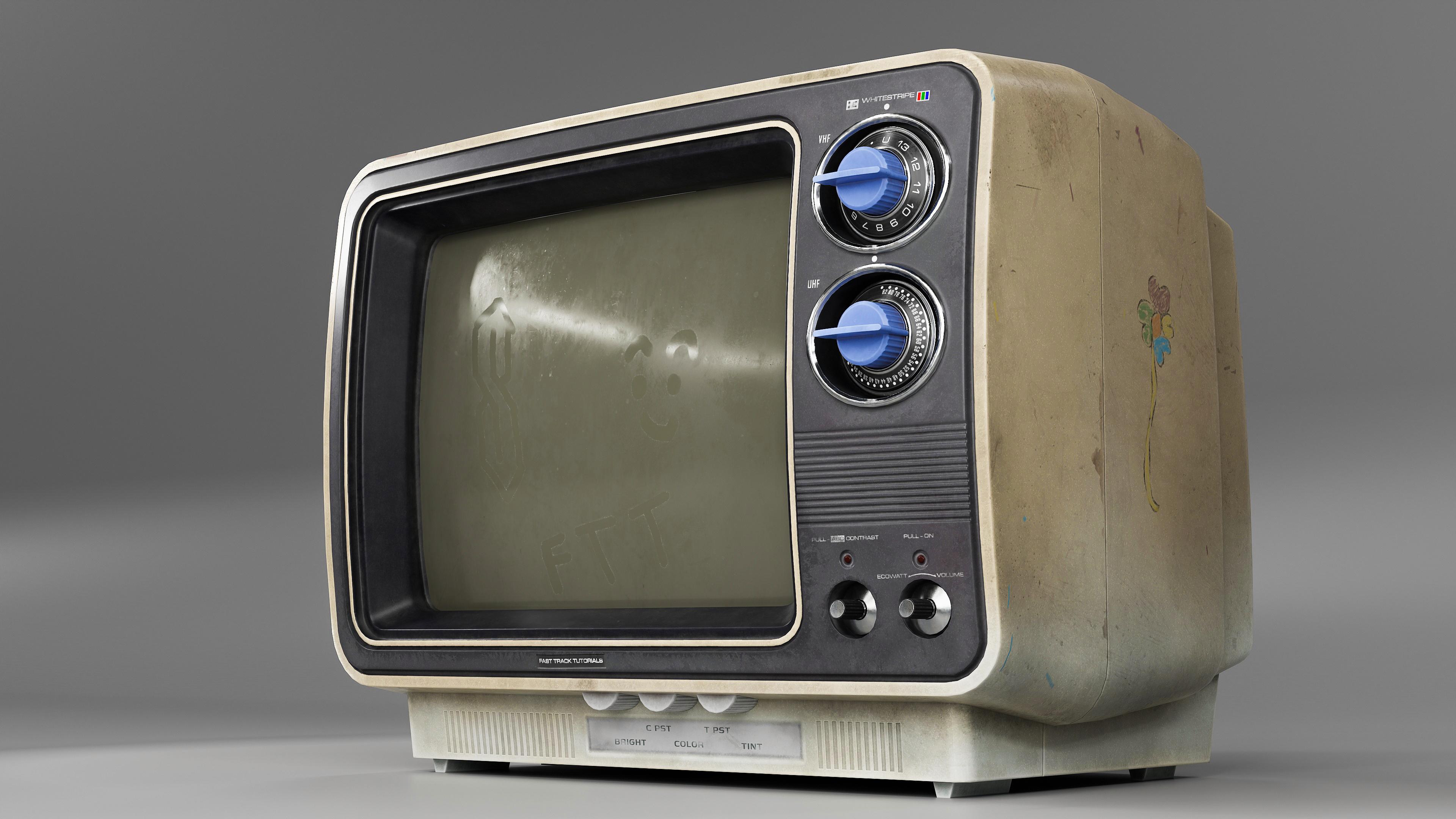
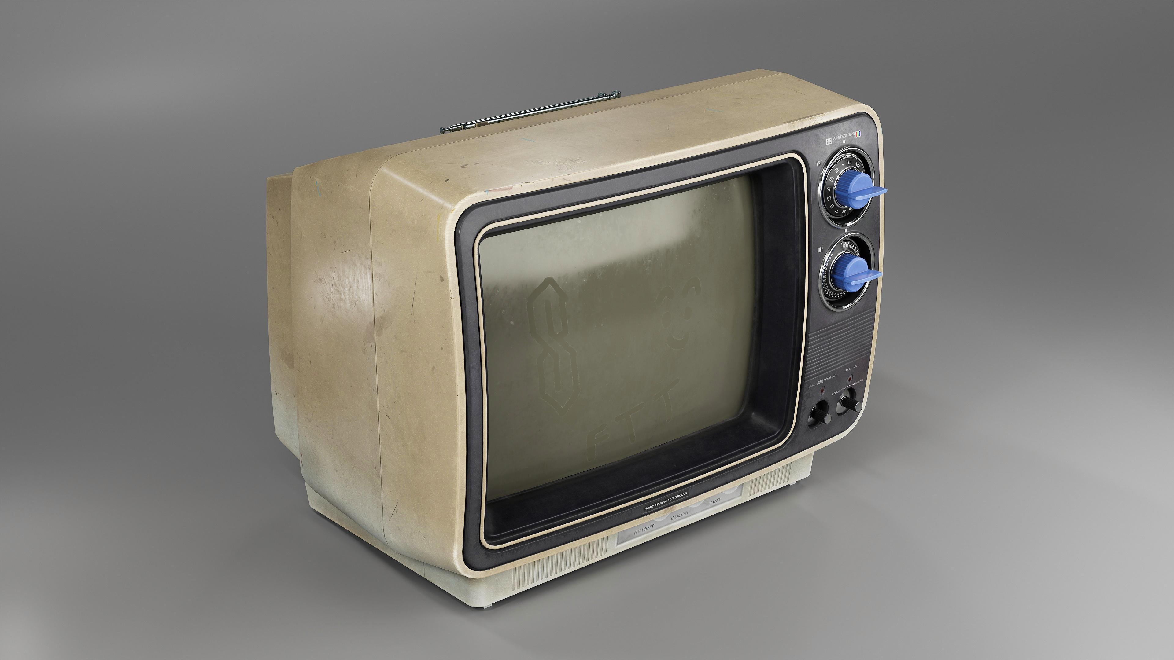
how to texture this vintage TV asset and
how to present it properly. With the knowledge and workflows you gain from this tutorial, you will be able to
texture any type of motto you want and make them
stand out from the rest. For texturing, I will be using Adobe substance
TV painter. For custom Alphas, I will
be using Adobe Illustrator, and for the rendering, I will
use MarmosetTolbag four. With a total of over 15 hours recorded in real
time with narration, with just a few time laps
doing very repetitive parts, I am confident you
will learn how to take your textures
to the next level. As a small disclaimer, though, you will need some
kind of understanding of the different software
that we'll be using. This tutorial also comes with auto generated subtitles in English, Chinese, and Spanish. All the source files,
including the final scenes and assets will be included
along with the videos.
2. 01 Going Over Our Bakes: Okay, here we are in Marmoset. I want to show you
two things that you may run into two
problems, I guess, that you need to keep in mind
when you're baking in here, or when you're
baking in general. So first thing, as you can see, right here, this is my antennas. I have two. They go along here. I split them. I separate them. And that's because if
I didn't split them, let's say they were
going to be animated, extended, be able to
extend as an animation. I don't want them to have ambient occlusion
casting upon each other. Let's see something like this. So if I were to bake them
while they're like this, I don't want AO to
be casting onto here and this one casting on to the next to
the next and to the next. Reason why I don't want that it's because if they're
being animated, you will see this really
dark AO right here, which wouldn't make
too much sense. Like, let me show you.
So if we have this, this obviously can be animated. It would be able to
rotate up and down. But I dictate and it's like, I guess, default position. And let me show you what happens when you
bake it like that. So as you can see right here, I have the AO that's coming from the TV and all that
stuff casting onto this. And we don't really want that because if we're animating this, it would be really ugly
to show this like this. When you're when you're
going to render your model, if you want to pose
it really nice, you kind of don't want
this to look like that. It looks pretty bad. So what we do is we split everything away from
the main model. Except for these, these they can never move away from
the model, really. They always stay here. So we don't really need
to play with them. But these things like these, I also split them away from the model because
they cast a really, really dark AO right
here onto these. And I don't want that.
So I split them up, and I'm going to click BC Remind that this isn't
really a baking tutorial, so I'm just gonna go
over this real quick. We click Bake, and
we'll see what happens. And here we go. So now if we want dirt here, we can always do
it in substance, paint it manually
and all that stuff. And here, everything is nice. Everything is nice and clean. Second thing I'm going
to show you is this, let me turn this off, as you can see right here. You have this nice ao well, kind of nice ao going
all the way around. But when it gets
here, it cuts off. When it gets here, it cuts off. And I think the reason
for that is because of the normal map
is kind of skewed, so I'll just show
you how to fix that. So you go to your TV, click on Low, and I'm going
to click on Paint skew. What that's going to do is, I think it's going
to recalculate. Let me clear the canvas. I think it's going to recalculate
the normal directions and recast based on
the new calculation. So we're going to
paint full black, a small size brush, full flow full sharpness. We're just going to paint around where the damage is like, so just paint full black. Right now I'm doing
it with a mouse, so I don't have the
steadiest hand, but it should work. Like this. Like this, make sure your brush
is small enough so it doesn't bleed over
to the other side. So there we go. Something like
this. This should be fine. And we can close this
out. And you go to bake again and just quickly
bake it, and we'll see what's Here we go. As you can see, now it recalculates
everything and cast a really nice AO the way you
would expect it to behave. And here we go like this. And that is it. Now we can move on to substance and start setting things up.
3. 02 Adding Height Details Part1: Here we are in substance, and here are our references. So this will be our main base
material, our main look. The TV itself is pretty white, but as it ages, I guess, it starts
getting really yellow. So we'll have a combination of both, especially right here. You can see it's really white, and as it goes higher
up where you would see more of the wear and
stuff, it gets more yellow. So we'll try to have that look, and then we'll move on to
these ones right here. And get some details
out of them. Alright, so let's get started. Uh, let me make sure I close Marmca Yes, it's closed. We're going to go to File New, template, stay by
default, as it is. Go to select, click our Low and Document resolution on four K. Everything
else is default. We're going to go to
Import Bake Maps. We click on AD and we drag in on all of our maps that we baked from
Marmoset and click Open. And click Okay. Okay.
And this is it. Real quick, I'm
just going to go to orthographic view because
I don't really like to texture and what is
it? Perspective view. So I am This is our texture
set list right here. I have it closed. That's
because I use a shortcut to toggle between
the different ones. So now we have the screen
if we solo it out. This is the screen,
and this is the TV. But I use a shortcut for both. So if you do Control
Alt, right click, and you click on the part of the model that you
want to work on, you will toggle between
them. So this is the screen. This is the TV screen TV. And just the same if you want
to isolate a texture set, you just do Alt Q, which will isolate the
one you're working on. And if you go to your screen, control all the right
click and you Alt Q, and this will be your isolation. So we're just going to go to
the TV for now and this out. We go to texture set settings. Size four K is fine. We can always lower it if we want if substance
is getting slow. Let's do a clear search, go back to project,
and here you go. So I'm just going to
drag TV normal in our normal map or material
ID in our ID map. TV AO in our ambient occlusion, and this is it for now. Now I'm going to go to do
Control right click on the screen and just drag the ambient occlusion
right here. All right. And this is how it looks. Everything looks fine.
No issues. All right. I'm just going to go
to bake mesh Maps, output size four
K. Turn off Whoa. I think this is on 16. Yep. I'm just going to deselect all. I'm going to do the
world space normal, the curvature,
position, thickness. And that's it. We don't
need to do AO and ID and NB and a closion again because
we already have them. So yes, bake, selected textures. Alright, that's it. Just
go to bake everything. Wait for it to bake,
and we'll get started. Alright, here we go. So, how I like to work? I like to do all my well, most of my main height stuff that's on the main height
that's on the model. I like to start them first because I use an
anchor point to, like, start targeting
them whenever I use something like a
generator or whatever. So that's what we're going
to do. I'll just show. First of all, I'm just going
to make a folder, name it, height, A, and drag this
filler inside of it. I'm gonna name it. Let's see. Which 1:00 A.M. I
gonna do first? We'll do these first,
like these round ones. I'm just gonna call them circle. We'll Black. Mm hmm. That works. And right here, if you alt click on any
of these channels, it will isolate the
selected channel. So I only want height on this. I'm just going to
do click on height, and everything else is closed, and I can just have the
height to play with. I'm going to do right click at a black mask and right
click at a paint. Yeah, I think this will do. I'm going to give this site a random random value
and go to paint. So by default, your brush
should be like this, by default, but I
don't really like to use it that
much or not often. I usually go here
and do crosshair, and that shows me what I'm actually clicking on instead of a full preview of the brush, and it shows me the middle
of the brush as well, which is really nice. But for now, we'll
keep it default. So let's see. We have a reference right here. I'm just going to click Tab
to make this full screen. If you click Tab, it will toggle between full
screen and not full screen. So click tab for now. And if you control, right click hold right
click left to right, I I will size your brush. If you do right click
control up and down, it will soften or
harden your brush. And if you do control
left click left to right, it will play with the flow. As you can see, the flow
right here, control, left click slide left to right, and you will have the flow. All right, so let's get started. We're just going to just keep painting some holes right here. We have one right here. Let me make sure I
frame this so I can kind of see something like this. Well, I'm in the wrong. I think I'm in the wrong
texture set. There you go. I'm just going to paste leg
So this is fine right here, but I'm just going to
erase it and start over. So if you click one, one is your brush, two is your eraser. Three is your I think
stencil or projection mode, and four is your
different selection mode. So I'm going to
click two to erase this and let's start over. We'll click right here. And if I click and let go of the mouse and
I do Control shift, I can snap between
different angles. I'm just going to go
straight down something like this and let go of control
and shift and click again. Now I have two straight
straight holes. Well, two holes, like
you know what I mean, right under the previous. And right here, I have one
that could be right here. And I'm doing
Control Shift again. Click on this, Control
Shift again, let go. And actually, I don't
really like this. I'm going to do the
middle one first, which is I think somewhere here. And then I'll do Control Shift. Let go of it.
Control Shift again. Let go of it. Yep.
Yep. This looks good. Alright, right now, they
don't look like much. That's because we don't
have the black color yet. So to do that, above everything, make a new fill layer, turn off, normal
turn off, height. We're going to make the
base color fully black, roughness, fully roughness,
metallic, fully metal. And this is how it's gonna look. And we're just gonna
call it holes. And that's it. We're going to do a right click
at a black mask, right click at a fill. But before we can do anything, we need to make an
anchor point for this. So if I go back to
the circle black, where we have these,
we painted these. We're just going to do right
click at an anchor point, which is going to target everything under
the anchor point. So if we have like 300 little
paint layers right here, it will target everything
and instance it to this. So when we click on fill Grayscale anchor point,
we find it right here. And now everything that's on the holes layer in the
properties right here, it will be driven by
the anchor point. So we can have multiple
anchor points, but that's something
we'll do in a later time. So now if we don't want the
holes to be black anymore, we can do this, you know, change the color
however we want. But we want black. And that's what we'll
go for. Alright, so I think I'm pretty
happy with this one. I'm just gonna make
this one right here. I'm gonna scale my brush just
a little bit with control, left right click, slide
it left to right, and do like this. There we go. Alright. I think
for this one, this is fine. We might be we might want to adjust the height
just a little bit, because right now it's getting jagged. I think it's too deep. 0.15. Mm. I guess my
point too is fine. Really don't matter. You
can't really see it. Yeah, I think that's fine.
And on the reference, it's kind of sharp, like, sharp angle, so we'll
leave it like this. So now we can do this one. For this one, I'm thinking
we do another layer. We can just duplicate this, right click duplicate layers and do another
black mask on this. We'll rename it something like slanted. Holes. The reason why I
call it slanted is because as you can
see right here, it has a little slope, and I think I'm going
to try to make this as well because cause why not? You never know. The holes might be like, at a steep angle. So we'll try to have
this effect as well. And right here, I'm going to
do right click add a paint, and I'm going to scale my brush, go to full screen
mode again with tab. Scale my brush,
something like this. And, this is fine. Right here, and there's a pretty big distance
between these two. I'm going to go maybe here Oh, that's too long. Nope. Too long again. It's gonna take some tries to get it right. Yeah,
I think this is fine. Yeah, this is fine. We can
have our text down here. Or is it too high? Let's see
if the text is like here. Yeah, I think this is fine.
We can always go back to it. Now we're going to
go here and here. Nope, here and here.
Too long again. Click Control Shift, click I guess let's try again. Click Control Shift, then hold, and click again.
Yep, this is better. There's one more right here. Click Control Shift, then hold. Wow. This is good. And one more. Right here. Three in a row. I like that. Okay, so if we click on this, we can go to two D view, which will bring us
the U V view of it, and we'll go onto
this one right here. You can see the AO. So I'll use that as my reference point. I'm going to go here and put in my cross air view
for my brush and then scale it up a
little bit and stamp. Maybe that's too little, something like this and
stamp it. There you go. I'm going to go back to my
three D view. Maybe not. I'll do 3d2d, just to
make sure I get it right. It's too big. Nope. Yeah, this is fine. As you can see, the brush is bleeding onto the
little thing right here. We can fix that many ways. So one other ways I'm just
going to fix it is if I press four to toggle
the selection mode, and I'm going to go back to my three D view not full screen. Right here, you can
see I have a slider. White one, I guess, white is to reveal
and black is to hide. I'm just going to click
on drag it to Black. Or if I press X, I can toggle between
them as well. I'm just going to put it on
mesh fill or mesh selection. This is for the UV. If you have a UV chunk, you want to fill or deselect. But I'm going to do mesh because this is a
little mesh by itself, and I'm going to click
and now it's gone. There we go. Alright, so just as before, I'm going to do
at an chor point, and I'm going to
go to the holes. I'm going to add another
fill Click on Grayscale, anchor point, find
slanted holes, and this is it. But the problem is now, we don't have our holes anymore. That's because this
field we just put is overriding the one below it. To make them blend together, we're just going to do click on normal and put it
on linear Dodge, and now we have both of them. One thing I want to do, I'm going to go back
to circle black, and I'm just going to paint. Click on one to bring
up the brush again. And I'm just gonna paint here, as well as a black hole. The thing is, I don't
think this has any height, so I'm just gonna I'm just
gonna make a new fill for it. Um let's see. How do I call it? Well, we'll just
circle black extra. That's fine. We don't
need any of this. We just need to
add a black mask, add a add a paint, and we'll click right right here because the normal
map is already a height, and we don't need to have
an extra height on it. We're just going to add anchor
point again. Go up here. Add a fill, put it
on linear Dodge, and find this one. And here you go. Yeah. That's how I like it. Mm hmm. Yeah, this is good. It's looking good.
It's getting there. So for now, let's see. What else can we do? I guess we'll continue
with the back. We'll just do these ones. For this, I'm going to make a new fill, turn off everything, but the height, put it down to a random value
because we can always fix it. And I'm going to call
those back the vet. Right click at a black mask, right click at a fill. And for this, I'm just
going to go here and type stripes, all libraries. It's now here. It's in here. So we're just going to
use this to be able to create these events right here. So if I put on click on it
and drag it onto Grayscale, and you can see it
starting to take effect. But we don't want
it all on this. I'm just going to go back to my 2d3d view and for here
where it says UV wrap, I'm going to put it on none
because if it's on repeat, every time I scale it, it's just going to keep tiling,
and I don't want that. So I'm going to put it on none, and now there is no
longer any tiling. Let's see. I'm just gonna
actually hold shift when you're scaling so that you can scale
proportionately. And I'm gonna drag
it to where is it? Here, down down here. So now that it's here, I can play around with the
shift to be able to rotate it. But it goes only 220. You can type a random number, but that keeps adding onto it. I don't want that. I'll
just keep it at zero and rotate it like this. And I'm just going to let's see, sk it like this a
little bit. Let's see. It goes to somewhere like here. Find a better way to place this. Yes, there we go. Something like this, scale it
down a good bit like this. And I'm going to put
it stripes on 20. Let's see. It's not that close
to this hold right here. So I'm gonna squeeze
it like this. What do you think? Not. I think this is fine. Yeah, it goes slightly past
this back piece right here. So yeah, I think
this looked good. Yeah. So now I'm just going to duplicate this right click, duplicate, put it on
linear Dodge again. And now I'm going to if you
press Q, let me show you. Go to two D view. If you press Q, you
can see there's little this little
rectangle thing. That means you're in move
mode in the UV view. And if you press Q again, you just keep toggling
on and off on and off. So now I can't grab it. Now if I press Q again, I can grab it and
move it around. So now I'm going to
move it up to Hmm. This one, I think. Yeah, I'm
gonna do two, three D again. Yep. This is it. Right here. So for this, we don't
need as many stripes. Let's do, like,
half of it, maybe. Maybe we'll keep it 20 for now. And we'll go here and Hmm They're also shorter. So I'm just going to
scale them like this, maybe a little bit longer.
Something like this. Yeah, I think this is fine. What I'm going to do
now, I'm going to add a right click add a paint, and I'm going to
put this paint on multiply. What's that gonna do? What that's going to do is
whenever I paint you see here, it's painting with white. Let me put on my preview again.
It's painting with white. It's not going to do anything
because everything is already white under the paint. But if I paint with black,
since it's on multiply, it's only going to affect these layers under the paint
because it's on multiply. So if I do something like this, right, and I'm like, Oh, shoot, I didn't
mean to do that. Since it's on multiply, I can just press X to Tagle to white, and
I can bring it back. There you go. So if you
did this by accident, you can always press X to bring it back as long
as you don't multiply. So I'm just going to
remove I wanted ten, so I'm just going to go
ahead and remove one here, one here, one here, one here, one here, one here. Let's see. One, two, three, four, five, six, seven,
eight, nine, ten. One, one. Actually, this
looks pretty good. I almost want to leave it. Let's see, two,
four, six, eight. I got confused. Two, four, six, eight, ten, 12. I think I can live with ten. Let me Let me see how ten looks. I mean, I guess I
can live with 12. Yeah, I think I'll do 12. And I guess I'll scale
it just a little bit. Just a little bit, go
back to our paint and get rid of this. Yep. That looks good. Alright, now, all we have
to do is right click at an anchor point
and go to our holes. Right click at a
fill, linear Dodge, and Anchor point, find
what is it called B vent? Right here. And here we go. We're starting to have a lot
of cool little details on. Which is nice. So I guess now it's
time for this. I was really avoiding it,
but we got to get to it. So for now, I'm just
gonna do the 2d3d split, so I can see both
at the same time. I'm going to make a new
fill layer, call it top. Vent. This is fine. And yep, that's it. Just give it a random
height like this. Do a right click at Black
mask and right click at fill. We're just going to
do the same thing at the stripes and UVnWap UV wrap, put it on none, so
it doesn't tile. Now in the pattern,
if we click on Shift, we put it all the way to
zero so that we don't have the we have it straight, and we can rotate it as we like. But I guess this is fine. Is it? Yeah, yeah, it's fine. I'm just gonna skel it
inwards just a little bit. Really quick, though, I'm just going to add an anchor point and add a fill up here just
so I can see what I'm doing. Top vent, and there we go. And where are we
going? Like this. Yep. I'm just going to scale it, make sure I place it
to wherever I like it. And actually, maybe I
do need to rotate it. Yeah, maybe I do need to rotate. Yeah, I'll rotate it like
this and at the anchor point again on here. Top vent. There we go. Yeah, for this, let's see. Let's try 50 and skelet. Scalet, something like this. Mm. Maybe this is too
much because on here, I think this is
slightly too much. Let's try 30. Yeah,
that's better, but too little. Let's try 40. Yeah, I can live with
this. Yes, yes, yes. I can do this one. Alright, I'm just going to extend it
out just a little bit. Extend out. And this is fine. And this is for the top. I'm just going to
do a right click, duplicate and bring
it to this area, this one right here,
which is right here. And if we stay on the top
view in the three D view, we can try to align them. Something like this looks good. It doesn't have to
be too perfect. Well, to me, it does. But yes, there we go.
That looks really good. Alright, now I'm just
going to scale it so it doesn't bleed onto
too many other UVs. Something like this, I
reckon is fine. Alright. Now I'm just going
to do a linear dodge just in case, because why not? And now, what I'm going
to do is add a paint, which is going to
be on multiply. Again, just so when I paint, I can only affect
these on the bottom. So I'm going to go to four to my selection mode
and go to U VhunkFll. And with a black brush, black paint, whatever
you want to call it, black color, I'm going
to get rid of these. Like, everything that's not
the the UV that I want, I'm going to get rid
of them or, like, deselect or select
them, I guess, with black. Yeah, I
think this is fine. It should be only on
here and on this. So I'm going to get rid of Oh, if you alt left
click on the mask, it will give you
a preview of what the mask looks like, and
that's what I just did. So now I'm going to deselect
these Deselect this, this. What else needs deselecting? Yeah, I think that's it. Yep. That's it. So now, as we stay in the paint brush, we can click one to go
back to our regular brush. And for this, I'm
gonna get rid of the alpha because I
want it to be square. I want, like, a square alpha. So get rid of this circle,
and now it's square. Okay, now I'm going to
paint with black to get rid of everything
that I do not want. So first of all, I guess I can open this a little bit more. Alright. Let's see. First, I'm going to try to
get rid of most of this. I'm going to click here, Control Shift, click here. Oh, this looks pretty good. Hmm. I'm going to click Control
Shift, click here again. Yeah, I guess this is okay. Let's see. Let's look
in the three D view. Press tab to go to full screen. I want it to be right past
this edge right here. You see? If I go onto display mode
and show mesh wire frame, I want to erase right past
this straight edge right here. So let's just do
that go to 2d3d, and I'm going to keep
painting with black. I'm going to get rid of this gonna get rid of this one. As you can see, I took
a little chunk of this. I can click X to bring up the white selection and
paint this back in. Now go to black paint
this out like this. Keep painting it out. Like so. And right here I want to
get rid of maybe this. Like, the model itself
isn't one to one to this, so I'm just kind of going by what I think would look okay. Alright, something like this. And Let's see. We have one here, so I'll just do like this. Alright, now, if we go
back to our three D view, you can see it's starting
to look pretty good. And I think in the next video, we will continue
with this and maybe start with the base color. Okay.
4. 03 Adding Height Details Part2: Alright, welcome back. Let's continue with this. Last we left off, we were working on this
top part right here, so we're just going
to continue that. I'm gonna get rid of these. They serve me. No purpose. Right here like this. Actually, I'm going to let
me do it in two D view. I'm going to click Control Shift and click here and
just get rid of this. There we go. Actually, let me
do it like this. I'm going to do
click Control Shift. No, like this. Click Control Shift, like this. And Get rid of these get rid of these also
make sure you on the black, you paint it with black, okay? And we're just going
to click X and bring back to paint with white and
bring this back like this. And just like right here, we're going to do the same, bring it back like this Yeah, I guess we can bring some
more of this back as well. We're just going
to do click here. Control Shift right, click here. And yeah, and now we can
paint with black again, get rid of these. Like so. I'm gonna get
rid of just a tiny bit. Alright. This is
fine. This is fine. I'm just going to bring this
back in the three D view. Let's see where my
reference is at. Like this, where is okay, right here, you can see it doesn't fully go
into the corner. At least mine's not going to be. So I'm just going to
try to do the same. I'm just gonna cut
it off somewhere here and here as well, which should be pretty
easy if we go to to this, I guess, let's try to do this in the three D view Orthographic. Bs on the orthographic view so you can snap directly
at the top view. And with black, you can paint. Let's make sure this
is centered like this. Maybe this is too much. Some thing like this. Yeah, I guess this is fine. And I want to take
some of this, as well. I'll do that in the two D view. I should have done that
before we move on. But I'll just take a
chunk of this like this. Mm. There we go. I
wonder what this is. It's paint with just a
little bit of white. Yeah, I don't know
why it does this, but I guess if we paint with
just a few pixels of white, it should fix it like this. There we go. And yeah, I think this is okay. Yeah, now we can go back
to this one and paint out these And let's see. 3d2d. Now that I did this. Hmm. How many do we want
to get rid of from this? I'm gonna try to get rid of
this one, paint out this one. Yeah, I think this is fine. Let's see. One,
two, three, four. I'll keep it three. Maybe. Yeah, this is fine. We'll
keep it like this for now. And for this, get rid of
this one and this one. And just as last time, we're just going to get
rid of go to two D. Get rid of all this
right down here. Cut it nice.
Something like this. Alright. So as you can see, we have these little spots
where there is no grill. We can just bring them back with painting white, all white. So let's go back
to our 2d3d split. Let's see. Actually, all black, I mean. So if we do something like this, maybe one more like this. And we go paint all black, here, all black to here, and we just get
rid of these ones. Yeah. Yeah, that look really good. And just like here, we have one, two, that
doesn't have the grill. We'll try to do the
same, and they're like, right next to this
little spot thing right here, Antenna holder. So I'm just going to
do the same thing. I'm going to do try something like Maybe that's
too much too much. I'm just gonna go
like this for now, just so I can have a
nice straight line. And if I paint with white, I can bring back whatever
I erased by accident. So now I can There's
one here as well. I can just paint with black and bring these back like
this. Maybe one more. Let's see how that looks. Hm. It's kind of big. I guess we can bring
it back with white, and maybe this one. No, I think we'll
leave it like this. Like this is fine.
Doesn't really. But do I like it, though?
That's my main thing. I don't know if I like
Let me take a chunk off of this. Mm. Let's see. I'm
still fighting on, like, the unevenness of this. No, no, no. Yeah, I think I'll
leave it like this. And for this, I'll just bring
back these ones because we kind of want this to be Let's see. Something like this. Well, let's try that again. There we go. Yeah, I think this is fine. Should we add one more? I don't think I'll add one more. I think actually, maybe
I'll add it here. Yeah. This pot has
too many grills, so I'll just try to
reference it from here and onto here,
something like this. And I'll just get rid of these. Yeah. And then with white, I'll just paint these back. Here we go. And There we go. Like this. I like this. This is fine. Yeah, it gives a nice
little silhouette break. I guess it's not
really a silhouette, but turn off if you go
back to display settings, turn off the wire frame, and this is what we have. Yeah, do you like it? I
hope I hope you like it. Let me go back to actually, I'll say on three D for now. I'm going to click Tab to
bring back the layers. I'll just do I'll click
on one and duplicate it, and I'm going to the name
these stripes horizontal. There you go. So now if I go back to my 2d3d split press c to
bring back the manipulator, I'm just gonna see my stripes, I'm going
to put it on the one. Let's see where is
it. It's right here. Okay. And if you hold Shift
and go to this little corner, you'll see the arrow changes. You can rotate it again. And now I'm going to try to have these ones going the
other way, the opposite way. So for that, I am
going to scale it, squeeze it Like this, let me make sure I have I'll squeeze it. A little bit like this.
Yeah, this looked fine. And then instead of
leaning a dodge for now, I'm gonna leave it on normal, and I'm just gonna
duplicate it again. Alright, click
Duplicate and move this one down to maybe here. Let's see. Hm. Maybe here. Something like this, maybe
even slightly lower like this. I'm just gonna
Yeah, this is fine. Like, right. And I'm
gonna control D, duplicate this one, and
bring it up onto here. And we'll do the
same thing. We'll do something like this, maybe. Yeah. And we do Control D
again and drag this Whoa. I guess right click Duplicate. Sometimes Control
D doesn't work. I don't know why. Maybe
it's my keyboard, but I have my doubts. Press X to doubt,
something like this. Now, what we have is
the is the stripes. The horizontal stripes are also being used for the height. And we want that, but we also don't want that. The thing is, we kind
of don't want these. So what we're going to do is unlike multiply that
targets the layers below. This one it subtract
from the layers below. So if you go on here
and put it on subtract, you can see it takes the white and cut out whatever is white. Well, use the white to cut
out whatever is below. Is what I mean. So I'm going to put this also on subtract. As you can see, it's
using the white to cut out the shape. Put this on subtract
and put this on subtract. Now you can see. You can see nothing
is really happening. So I'm just going to try to I'm going to take these
up here. Let's see. I'm doing Control C, and I'm going to bring them
up onto this like this because we don't
want the holes we don't want the black holes
to be affecting these. So we use this. We get rid of them
from here as well. Let's see, maybe there's
an easier way to do this. Let's see. What if
I take my this. Yeah, this is good. So if I put my anchor point up
above everything, it will do the same effect as if I put the layers up here. So keep that in mind. Right now, I don't want
it to completely cut out the holes because as
you can see right here, it's kind of like inside
the vertical ones. So what I'm going to do is
lower the opacity for them. So like strike 30? 35 40? I think 40 is five. Let just do 40 on all of them. But I think now my
problem is that I feel like this layer, the hose layer is still
kind of affecting this. So let me just quickly test out my previous assumption. Yeah, I think it's
still the same. Yeah, I believe it's still
the Actually, I like this. So if we keep these below the anchor point and we go and copy them and paste
them up here again, it will completely
cut out this layer, this black dark
black holes layer from the horizontal one. So I think this is fine. It's a little bit
of a tricky thing, but I think I think it's fine. Yeah, I think it's fine.
Now I'm looking at this. I kind of want the
horizontal one right here to be
flushed with this one. So we'll try to do that. Let me see which one is it? It's not this. It's this one. So the second one right here, I'm going to go to my two D. I'm just going to
push it up like this. And I'm going to just copy it. And go to holes right here. This is the one.
This one right here. We just duplicate it and
paste the other one. Like so. And for this, I kind of want I kind of want to bring back some
of this because I want it to be
flushed with this. So I'll just press X to bring back to kind
of hide the effect, the black effect like this. Yep. Looks good to me. And go back to our three D view. This is really
nice. There we go. All right. So I think
we have two more to do, but these are very simple, so we're just going to
breeze through them. For the first one, it's
just going to be this. Let's see if I find
it's going to be this. So for this, I'm just going
to do a new fill layer, call it front panel. Same
way we've been doing. Close out everything
except for height, right click black mask and
right click add a fill. I think a fill will
do. So for this, let's try to type rectangle. Whoa. Rec table. No. I think this will do
square shape squeeze. I never remember the name. That's why I typed rectangle. So if we go back
to our two D view, we can go here, make sure we put it on none so
it doesn't tile. Let's see. Where is this one. I'm assuming it's this
3d2d. Yeah, it's this one. Right here. Let's see. What does the hardness make it harder and the
squeeze right here like this play with the
squeeze a little bit and Yeah, this is easy. We've got to make sure it's
in Is it in the middle? I don't think it's
in the middle. I think it's, like,
slightly off center. Or maybe the screen
is off center. Yeah, but this is
the middle. Alright. But I think we got
it pretty spot on. I hate this 'cause it's, like, off center to this. It's so annoying, but
I model the TV to be centered Me or less. Hmm, maybe not. All right. And for the height, we're going to do like negative 0.15 or something like
something like that. Yeah, that's the good stuff. Maybe it's too wide. We can try to squeeze it
left to right a little bit. So if you're doing like this, but you don't want to do it proportionately, you
can hold control, and it's gonna squeeze it on the opposite
side for you as well. Maybe that's too much. Just a little bit like this.
It's really good. Alright, we'll
leave this for now. I think this is fine for now. Now I'm going to do
a new fill layer, call it front vent. Turn off everything, but
the height, right click, add a black mask, add a
right click, add a fill. And I'm going to put
the stripes again. Stripes. And they were here. And bam. They're still going to be on
this little spot right here, and I need to give
it some height. And with the stripe,
we're going to go here, put the shift to zero, so we can rotate it ourselves, put the UV wrap to none, and let's scale like this. I'm going to do
something like this. But for now, I'm
just gonna give it a quick color so I
can see what the heck I'm doing because this
is really hard to see. So I'm just gonna squeeze it
real good like this. Yeah. Now, let's play with
the stripes amount. Let's do 50. Hmm. Uh, 60? 'Cause these are really
small, really thin. Where a Where's a photo of them? They're like, fairly thin.
So I'm trying to see if there is you see that? If we can try to mimic that. Yeah, I think I'll keep a 60. And if I go to add a paint, put it on multiply, so
we can only target. If we accidentally erase, we can always bring it back. So I'm just going to cut out paint with black,
cut out everything. Let's see. It's fairly flush with this, so we'll try to
keep the same look. Cut out everything like this. Let's do it again. Yeah. We keep painting it out, like so. And this one, it's a
little bit of distance. Let's see. We'll cut it
maybe something like this. Yeah. Yeah, this is fine. So now, as you can
see right here, there is a pretty
big distance between this and this has less
of a distance with this. So with this side, there's a little distance with this side from this to
here is a bigger distance. So we'll try to
keep that in mind. We get rid of this, this one. Maybe it doesn't need
to be that accurate. This one, this one. I think I'm going to add
more stripes as well. For this, I'm going to
do one, two, three. Maybe, let's see. Maybe four. Maybe five. All right. And I'm
just going to get rid of the middle ones. Always make sure
you paint it with black cause if you erase this, you can't really bring it back. So it's better to
paint it with black. So I'm just going to scale
this up a little bit. Something like this. I'm
going to get rid of this. It's too close, too into
its personal space. I'm going to bring back maybe maybe this bring back, cut out this one. Like this. And let's try to play with
the stripe amount now. Let's do 70. Mm, 75. That's not really
doing anything, is it? Let's do 80. Well, yeah, I think 80 is good. We can just go back to paint
and paint with black again. Get rid of the stuff
we don't want. Like this. I guess we can try to bring this in. Maybe not. We'll get rid of it here and
we'll bring it back here. Yep, this looks good, and we can just go and
turn off the color. Now in three D view,
this is what we have, and I am pretty happy with it. Yeah. Yeah, I think that's
all the height for now. And if there is any other
ones we need to make, we can make them as we go. So now that we have all this, we're going to make
one more fill layer, and we're going to call this
height all and that's it. And maybe to confuse us less, I'm going to call this folder, and this is height all layer. So now, what we're going to
do is turn off everything. All the channels change
from base color to height, and we put the height
on pass through. What's that going to do
is it's going to take all the height information that we made from all
the layers below it. And put it onto this
layer as its own. So every height
information that's here, now it's on this
one, pretty much. So now we can do right
click at an anchor point, and this anchor
point pretty much holds all the height
informations from this. So this is done for now, and in the next chapter, we can continue with the colors. We can fix this as
well in the next. Actually, let's just do it now. Like, if we go to
holes, it's this one. You got to put it on
linear Dodge. There we go. Now we can move on
to the base color. This one doesn't need any type of holes because it's
pretty it's blocked. It's just dirt. Yep. Yep, looks good. Alright. See you
in the next video.
5. 04 Creating Our Base Materials Part1: And we're back. I
was thinking before we start the colors and
setting up the folders, the materials and everything. I was thinking maybe
for these right here, you can still see how
these lines right here, they kind of are still black. So I'm thinking I'm
just going to make the opacity 100 real quick, just to completely there we go. Just to really remove
this black from there. And now we have this. All
right, we can move on. I'm not going to
do the text yet, because if I do them now, it's going to be pretty
hard because I kind of want to set up the colors first, at least the base colors before I put them,
but we'll see. But we'll put the
texts eventually. And I did not get my references. Let me get them. TV. Here we go. No. We're sloting. Alright, sick. Um,
that is the wrong one. I got the wrong one. Whoop. Alright, we don't
need it right now. I'll get it in a second. Alright, so I'm
going to go here. I'm gonna make a
fill layer and call it base well, base color. And I'm going to put it in
a folder that's gonna be the big group folder holding
everything in for this part. Then I call it main Okay. In Maine is fine, I guess. And yeah, maybe I should find the I should find
the references. There we go. All right. Perfect. And I'm going to get
this right here. I'm going to take a
color sample from here. So I'm just going
to Yk. Right here. I forgot they changed it, so I don't have to hold
anymore, apparently. I can just click and I think
this is a little too white. Let's see. I'll just dial it down just a bit.
Something like this. Maybe this is more of a better, more natural color.
New. Let's see. Yes, there we go. Yeah,
I think that's fine. And we reduce the
green. Alright. That looks good. Okay, so I'm going
to do no height, no normal, no metal,
just roughness. And for the
roughness, we can see the roughness is pretty high, which is why it's pretty
challenging to get a good material or good
looking material out of it. So I think I'm going to
crank this to, like, 0.1. Yes. Let me see. If I go here and I
click on roughness, I can see just the roughness, and that's really not
telling me anything. So press M to go back
to material mode. Yeah, 0.1 is fine for now. Maybe 0.15. Set. All right. Now I'm going
to make a new fill layer, and I will call
it discoloration. I'm not really sure
how to write that, but this will do. And this is where we're going
to add our yellow color. So I'm just going to click on color to turn off
everything else. And let's get it from here. There we go. This looks
pretty good. Yes. And I'll just give it a
little bit darker value. Let's see. Something like
this is fine for now. So we turn off the roughness because it's pretty much
the same roughness, the yellow and the white
that's underneath. So we don't really have to mess with anything else
here, just the color. And I think I'm going to give the color this part,
like this section, one color and this
one lighter color because you can see right here, this might be just a reflection, but it looks interesting with this being lighter
than the back part. So let's do that. I'm just going to
give it a white mask, and I'll add a paint. So the white mask is holding everything in the layer
for now until we take out, which is going to be
easier than telling the mask to what to use. So I'm just going to press
four to go to Selection Mode, and I'll do UVchun and I think I should
be able to get it. Yeah. I'll just paint
with black or you can tap X to invert the color, and I'll just press Tab to go
full screen, and maybe not. Let's do a polygon. Something like this. Yep. Let me just get rid of all of these. All of these. Yeah,
I think that's fine. Mm. Let's see. Yeah, but the bottom Yeah,
I think I'll add this back, so I'll press X to
go back to white, and I'll just Can I
do a fill with UV? Yeah. Yeah, this
will do. Like this. Yeah, like this, and I'll
click here and get rid of this one, this one. This like this. All right. Like this. Mm hmm. Mm, hey. I really wish substance
had an option to, like, rotate the environment on
the I guess the X axis, so we could, like,
see under the model. But I guess we'll
have to manage. Mm. Yeah, I think this
is fine for now. Either way, we're
not really gonna see down here, so that's okay. Yeah. And I'm just gonna duplicate it, and I'll do discoloration. Yeah, copy one is fine. And I'll just add a black
mask and add a paint. Now I'm just going
to paint with white. Let me change the color
before I move on. If you hold shift before
you move the slider, it's going to give
you a smoother, like, transition
or sliding motion. So I'm just going to
undo that real quick, and I'm just going to hold shift and drag just a
little bit higher. Something like this
should be okay, and I'm going to do
same polygon fiel. And I guess I'll go
full screen mode. I'll do, like,
like this for now. I'll do all of these. Mm. I really don't like this. I'm going to take these two
and put them in a folder. Who, Control G to put
them in a folder. I'll call them yellow
discoloration. There we go. And for now, I'll just randomly change this
color to, like, a yellow pink just to be able
to see what this is doing. And this look kind of cute. Alright. I like that. Yeah, I think this is fine. Let's go back here. Make
sure we get everything. All of these. Make sure
we get them. Like this. Maybe not down. This one. This this. Maybe we get rid of these. And maybe we get
rid of this right here and we'll put
it back in here. Yeah. We'll go to this layer and press
X to paint with white to add this back right
here. I think that's fine. Again, we're not really
going to see down here, so I'm just being
pretty nit picky. And I'll just remove this one. So I'm going to paint
with black on this layer. I'm going to put it back
with white on this layer. Yeah, that's fine. Alright. Okay, so for this, we're just going to
put the color back. We're just going to copy, go to the main layer right here
and just copy the code, Control C, and go back here. Control V. There you go. And now I guess I can kind
of, like, lighten it up. Something very subtle,
but noticeable, that if that makes sense. Yeah, that's the good
stuff. There we go. Well, I guess we can
continue and get rid of them from this part, this part, and that would be it. So let me put this right
here so we can see. We don't need it. I'm
going to paint with black. We don't need it here. For this, I'll do the UV fill, get rid of these, get rid of this, and this
definitely this one right here. Yes. And this side. This Hold on. This and this. Yeah, this look fine.
Yeah. This would be bluish or black. Yeah, we don't
really need to worry about those, to be honest. We'll get rid of
them in another way. Maybe a faster way.
Get rid of this one. Get rid of this. Yeah, I think this would
be good. Let's see. Yeah, this is literally
like just one stripe, so I think this will be good. Yeah. If there's anything
else we miss, well we can easily fix that. So now that we have this, we can kind of we'll try to
do this effect. Where is it? I saw it somewhere. Yeah.
So like the bottom, the lower side of
the TV is like, kind of white, really white. And as you go higher, it starts getting yellow. I forgot where I
saw this effect. But trust me, it's there. I can't see the image right now, but we are good. Here it is this one. So
yeah, this is white. Like, the lower side
of it is white, and as we go higher, it gets more yellow.
So we'll try. We'll do that. Let's see. I'll put this right here. All right, so I'm just going to add a white mask, actually. And I will add a paint, and I will press one
to go to brush mode, and I'll find I'll find a brush. I'll do something like subi one. Yeah. And I'm going to paint with black,
yeah, yeah, yeah. So control, left click and scroll side to side
to mess with the flow. And I don't think
this has hardness, so we don't have anything
to do with that. We can just mess with
the flow a little bit. We'll go here to
the brush settings, size jitter, turn it to, like, ten, I guess. Angle Jitter really
doesn't matter. Position. We'll move that. All the way to like three. I guess that's fine. Tangent
warp we'll do camera. Actually, let's leave
a default. All right. So now we're just going to I'm going to paint with
the mouse for now, but I do have a tablet. So if you have a tablet you can paint
with, that would be better. But for now, I'll
paint with the mouse. So again, if the
flow is too high, you can lower it or
you can just go here, lower it yourself,
and I'm just going to do maybe a little bit
lower, something like this. Just keep messing with the
flow as you move as you paint. And, the higher you go, the lower the flow should be, just to have that nice
transition, something like this. Yeah, we'll go all around. Like, down here
should literally be almost pure white or
whatever the base color is. Honestly, I can even do, like, press four and just get rid of the bottom as, like, a color, like this yellow color because
it's really not going to be not going to be yellow, so just get rid of
everything down here as part of the yellow. Again, we don't really
actually, yeah, let's just do that
for the feet as well. Go here as object mode
and just click them. And yeah, let's continue.
Press one to go back to brush mode and keep on brushing. Keep brushing and keep brushing. Hey, there we go. Something
like this, keep painting. You know, make sure you mess
with your flow a little bit. Yeah, let's see where is my down here is, like,
slightly yellow. You know, just make
it look organic. Just paint random
randomness randomly. And you'll have a
pretty good looking TV. Let's see. Inside here, it's pretty Where is it? Okay. Yeah, it's pretty white yellowish, so we can make it
look however we want. But I'm just going to increase my brush size a little bit. Just go like, you know, just slightly move
remove some yellow. There you go. And again, as you get higher, lower your brush flow. Make sure you move your light
to see what you're doing. And yet, Let's see. And if you press X, you can always bring back the yellow
if you go too far up. So something like this. Yeah, I really like this transition
I'm getting here. So I'm just gonna
keep on painting, bring back, take away. Like, the more you paint,
especially with the mouse. Well, I guess it
really doesn't matter, but the more you
paint, just, you know, keep doing back and
forth between white and black just to get
that nice randomness. E, let's see. Let's bring
back some of that yellow, take away some, bring back some. Uh, take away some, here. There you go, I'll
just like right here, I'll just do just a little bit. That's why not. Like right
in the middle, right here. Just to give it that nice
little variation with, like, a really low flow. Whoop. Mm. Yeah, even here. I'll just go random,
random, random. I think I took out too much, press X, paint white,
white to bring it back. And yeah, I think
that's good for now. Again, if we don't
like it later, we can always come back to it and take away more or add
more to the randomness. But I think for now, let
me just get rid of some of this like this. You know, give it a
little bit of yellow, take away some yellow, just to give it that
nice randomness. Yeah, there you go. Something like this.
Alright. So this is done. What I'm going to do for this, I'm just going to
quickly make actually, I'll just duplicate these. I'll put them in a group first. I'll call this box Mine. I really don't know names. Like, I should give these, so I'm just going
to duplicate it. Duplicate, duplicate. And for this, I will
give it a black mask. We're just going to give
is this Am I frozen? Am I not moving? Let me save. I'm not moving.
I'm not sure why. Bro, why not? Okay. I'll be back.
Let me fix that. Maybe I'll restart, actually. Let me save again
and then close this. Hopefully it doesn't we
don't have to do this again. It would suck if we have
to do want to update. There we go. Alright, so shift
all right click to take us to the main TV and go here. We wearing this box and, again, a black mask and a a paint. And for this, we will
just do Press four. My brain went blank
for a second. Press four, and then we'll
click only click this. That's it. Just in the
mesh selection mode. And we'll just click this
for now, and for this, we'll add a white mask, add a pink, press four,
paint with black, and we'll only click
this to get rid of this box as part of this layer content,
if that makes sense. So now we can have this
whole layer to ourself, just to play around with this. So as a start, I'm
just going to make it. I guess the base
can stay as it is. And for this, I'll
turn this off. We don't really
need it, the leaf. And I'll make it just a
little bit lighter as well. Yeah, I think because,
yeah, you see, it's really like, compared
to the rest of the TV. It's like a different color. So yeah, we're just
going to replicate. So maybe something like this. I feel like my something
feels weird with my lighting. I'm not sure why. Maybe
it's my roughness. I think I'll just do instead
of 0.15, I'll do 0.2. I really don't like
how the Stem looks. Like, why is it so shiny? Alright. So we can go here
and start painting again, go back to our cement brush. There we go. Same deal,
position, size, angle. I guess, again, angle is
fine. And we start painting. We're going to do
something like this. You see the bottom
is really white, and up here is like,
slightly white again. We're just going
to try to do that. Paint with mainly white.
I mean, mainly black. And when we're
satisfied, we move on. So lower your brush
flow and keep painting. Something like this. And bring back some yellow with white. Something like this. Let's see. Do we like that? I almost like that. Let me just go here and look
at the base color. Let's get rid of some of this
yellow, lower the opacity. I mean, the flow of the brush, bring in, take out,
bring in, take out. Like, that's how I paint
without without a tablet. I just really, like, keep messing with the
flow, the hardness, press X to switch the color
of what I'm painting. You know, bring in, bring out, bring in, bring out. I guess bring in
takeout would make much sense. Something like this. Yeah, why not? We can always mess with it. So let's see. Hmm. I'll leave it
like this for now. And this should be
all sherote for this main base for now. I think this front
side is a little bit too even with
this back panel. So I'm just going to go here and make it a little
bit brighter, again. Whoa, wrong one. Um, Hmm. Yeah, here it is. It's this one. And my brain is so
quick to just, like, go completely like,
what am I doing? There you go. Now I
can see them better. Let's go back to base color. We can clearly see there's
some good stuff going on. Something like this.
Again, we can always go back to mess with it some more. Yeah, I think this is good. So as for this, I'm
just going to this is the main folder
that's going to hold everything for the,
you know, main body. So I'm just going to do a
black mask and add pink, press for it to go
to selection mode. I'm just going to
actually, yeah, I'll just click
on this and this. And the feet. Like this. Yep. Yeah, that's
the good stuff. That's the one. Alright. Yeah, so now everything we do
inside this folder is going to only be done onto this
main box right here. So let's move on. I guess we can try
a new fill layer. I'm going to add
some noise on this. Even if you can see
it, it's usually nice to add some white noise, some little, you know,
little variations. You can really see it on here, but let me see if I find a photo that has
something similar. But either way, this is our TV. This is not EBay guy 64 TV. You know what I mean? So we'll just make it however we
want, but still look good. So yeah, we'll just
add some noise, right? So I'll just call this noise. And I'm going to turn off
everything but color. And I'm gonna add a
black mask and add a fill I'm gonna type noise,
and I'm going to go here. I'm looking for, here
this white noise. It's always the white noise. Oh, man. What did
I do? Viewport. I don't know how to
bring this back. Windows display note, toolbar. We set Y. That's fine. There you go. Put it back here. I think I clicked
it and I panic. I probably went down here
somewhere up here, I guess. Alright, so for this, I'm going to reduce the balance. And let's put it
on triplanar just because if you
click on the mask, you get to see what
the mask is doing. And let's see. Let's do
something like this, 0.5. That was probably default.
No devolve is one. So yeah, something like this, is it still on
four k? Let's see. Whoa, my quality is on low. I want my quality on
medium. There we go. Um, texture set. Yeah, still on four K for now. We might reduce it later the
more layers we start adding. So I think this is
too let me go back. It's too small. I
kind of want it, you know, just right,
something like this. Yeah, 0.0 0.15. Maybe 0.2 was fine. 0.23. Yeah, that's the one. So now I'm going to put this on overlay, and you see that it disappears. That's 'cause this is more
towards the gray area. So if we bump it
up a little bit, you start seeing the
little noise variation we have in here, Hmm. Maybe it's too big. So let's
go back and make it 0.5. Whoa. No, wrong one. 0.5, like this, maybe 0.4. And let's see. Contrast.
Let's bump that up like this. Yeah. Yeah, this is
good. Maybe not. Maybe a bit more balance. Let's see, 0.3. 'Cause I want to see them,
like, you know? Maybe when we do, like,
our closes up rent there, I think this is
fine. This is good. Yes, that's good. Alright.
Yeah, yeah, I'm liking this. Okay, so we're going to do some color variation
or is my reference? We have some if you zoom in real close, you
see this spot right here. You see this? This
is color variation. We'll have some
color variation like this a little bit of everything. So let's see. I'm going to do this.
I'm going to call it color there one. Why not? And I'm going to
leave it on default for now. I'm just going to turn
off everything but color, again, we use the
same roughness. This is still like a base
color type of material setup, so we don't really
need to mess with, like, roughness, height and
all that stuff just yet. So I'm going to do a black mask, right click, add black
mask and add fill. And for this fill, I'm going to get rid of noise right here. I have so many of
these let's see. First of all, let me type
procedural roll. Like this. And m. Stone. Let's see what that gives us. What if we lower. And we do triplanar and we do like a 0.5
tiling. Do you like this? Let's see. Then we're going to move change the blending
mode from normal to overlay and change the color from gray to white ish,
something like this. Honestly, that's not too bad, but I don't like it, and it's also too
tool up in my face. So I think a 20%, let's press. Let's go to base color mode. Mmm. I don't like
this. I'll change it. Let's put it back on 100. Uh, let's see. Let's see this. Let's bring it back to one
and see what it's doing. I don't completely not like it. Yeah, I like some of the
stuff it's doing here. It's giving me some
not so bad results. Hey, hey. Yeah, I don't
really mind this. I'll try one more thing. I'll add a fill again. And let me try moisture. Um Moist moist Moist. There you go. I guess it
didn't really change anything. All right. And for this, I'm
going to do like this. Make sure it's tried plainer. Tiling's leave it
default for now. The balance. Maybe
tie it to three. Low contrast, noise
noise parameters. Let's go to disorder. There you go.
Something like this. Does it really do anything? Let's see. Go back to
the base color and see. And I guess it's
doing something, and we changed the
blending mode from normal to linear dodge so these
two could blend together. Yeah, I guess it's
doing something. We can probably go, like here and brighten
it up a little bit more. Well, just the right amount. Something like this. Yeah, why not? This is good. Yeah, you can see it like this. You can see it from
here, I think. So if you turn it
on, turn it off, you can clearly see there is some attitude going on to TV. So yeah, I like this. We'll do one more Control D, color variation two, and I'm going to add a new black mask to
override everything. And I'm going to add a new fill. Oh, man, my back is killing me. And we will find some
more proceed jewels. And I think this for
this is gonna be, like, a little more a little
more in the darker side. I can't really find a reference, but it's gonna be, like, a darker version
of what we just did. Um, let's see. Concrete? Yes. Maybe. Let's see. Balance. Can't see it yet. Let's do it full white for now. And m I don't like this. What about this one? Yeah, I don't mind
this, I think. Put it on triplanar. Tiling 0.5. Yeah, let's see.
Balance too much. And we're going to lower
the value really low. It's gonna look like this,
and we're just going to mess around random mode. Yeah, I like this. I like this. And let's see. Balance again. Let's click Invert. Is there an invert?
There you go. Yeah, I think this is good. Maybe it's too big. 0.8. Yeah, that's better. And now we can try to lower the opacity greatly
tremendously. Yeah, I don't mind this. It's already looking good. Let's see. Ten, maybe 20 was fine. Let's also make this really
white and then put it on 20. I like 20, and we'll
push the white. Just a bit more. I think that's too much.
Lower it a little bit. And m. Yeah, I think this is doing something. Yeah, I think it's
this map right here. I'm gonna know where
it's so pasity. Something like this. Yeah, 'cause I want
it to be subtle enough to not look stupid, but good enough to
be, like, noticeable. You know what I mean? So yeah, let me do 15 on this
and turn this on. Yeah. Yeah, this is looking
better. Let's try 15. Yeah, so now if we
go to base color, we already have some nice
variation of colors going on, and we still haven't
messed around with, like, roughness or
anything like that. So yeah, I think I think
this is where we stop. In the next video, we'll continue with the different roughness
variations and all that. So yeah, I'll see you in a bit.
6. 05 Creating Our Base Material Part2: Okay. So here's
the thing, right? I forgot to get rid of this part because this
is going to be metal, and I forgot to add this one. So we're just going to
do this really quick. So go to UV mode,
paint with black. Just click and click click Oh, that's one. I was like, Did I make
a UV mistake, but new. Alright, click, click and
click, and there we go. And we go here, press X to paint with white, and we just go to object
mode and click. Here we go. But I don't want
the noise on this, so I'm just going
to get rid of it. Add go to noise right here. You see, this is a noise. Just right click add a paint. We'll put it on multiply I don't understand why it keeps
going to my other screen, but just know if you click this, it will like the little dialogue will pop up and you
just choose multiply. It just keeps going on my other screen.
I don't like that. And we go here and
just take it out. Let's see. Paint with
black, and that's it. Just to give it some variation. I assume this would be like
a really I don't know. I think it looks good
without the noise. And also, it's really small, so the noise looks stupid on it. So All right. I guess we can move on. We also have this we need to
get rid of UV mode, get rid. Get rid. While we here. Let me make sure
there's anything else. Now, we could get rid of this, but nah we need it. We actually need
it. Leave it here. Yeah, I think for
now, this is fine. Yep. Yep, that's it. Okay. So I think now what
we're going to do we're going to make a new fill
layer and call it base, and we put it in a folder. Call it front plate because we're going
to give this a color. And we're just going
to right click, add a black mask and add a fill. And for this fill, we're going to go to grayscale,
instead of, like, putting one of these
images or Alphas, we're going to go
to anchor point, and we'll find what
do we call it? Let's see. Front panel. Yep. And since there
is no anchor point, that's why we couldn't
see it up there. We're just going
to go here, right click add a anchor point. And so, whatever
whatever we do here, like say we want to change
the height and everything, it will update as well. But I don't think we'll
need to do anything. So we'll just add anchor point, go back to front plate, the fill, and right
here, front plate mask. And if you click on the mask
view, this is it right here. So now, whatever we do
we can change the color, and that would be
the color for it. So I think for this,
we'll probably do. Maybe pretty rough,
so 0.5, maybe. And as we dark ish 0.5. Yeah, I
think that'll work. Yeah, just to kind of
make it stand out. Let's see. Yeah, I
think this is good. Hold on, give me 1 second. All right. Yeah. Okay, yeah, I think
this is good. And again, we'll add all
the letters and stuff in soon in a different video. We'll have a dedicated
video for that. And yeah, I think this is fine. We might come back to add some more stuff to it.
But for now, it's good. We'll move on to what
else can we add on this? I don't really see
anything we could add. I guess we can do a fill. We'll call this Edge highlight. I usually like to put some slight edge highlight just to make it
pop a little bit. I'm going to add a black
mask and instead of fill, we'll add a generator. And let's see, where's
metal Edgewre. When I do my edge
highlights though, this is one of the
few instances where I do not really paint too much, but we might have to. We'll see how it looks. I'm just going to go to mask view. I'm going to lower
the grunge amount a great deal,
something like this. The edge smoothness, maybe
a little bit like this. 'Cause why not? I use triplanar is fine. The contrast, let's make it 0.4. Go back to material view and. And now we're just going
to go here and put the color on overlay and we'll do Something like this. Let me go to Base Color view
so I can see it better. Yeah, it's not really edgewaar just like just a
little highlight to give it a little pozaz.
You know what I mean? It's little that's the one. Yeah, let's see. Yeah, so you can see
here, kind of, like, from a distance, you
really see the edges. And that's what we're looking
for. We're not doing, like, major edge damage
or anything like that. Something is wrong.
We need to get rid of this. Alright, let's do that. I thought I already did that. Yeah, this goes like this but
doesn't go in. Yeah, I really thought
I did this already. Let me go to this
view. Go back here. Yep. Like this. Okay. Yeah. There you go. Now I don't have Edge highlight on these parts. Okay. Perfect. So
yeah, Edge highlight. Maybe I'll make it just
a little bit more rough, maybe 0.25, the TV is 0.2, just to give us
some, like, light variation, something like this. But again, it's not edge really edge damage,
we'll do that later. It's just to give the
edges just a little pop. Let's see. Around here,
how is this looking? But there's places that I maybe don't want
too much highlight. See. But I think this
is fine for now. I mean, I have this
song stuck in my head. It's really hard not to
just, like, start singing. Hmm. But yeah, I
think this is good. This is good. Yep. So
now what I'm gonna do. I'm just going to quickly
add a layer that's going to control the whole like
the whole color together. So I'm gonna call this
color correction. Yeah, we're just going
to turn off everything and put the base color
on pass through. And what that's going to do, it's going to take
all the colors from below and inherit it as its own. So we're just going
to do a filter. And again, just in
the base color, we'll do H SL, I
think it's called. Let's mess with the
contrast a little bit. Let's see, should we make it? Let's do the lightness. I don't think I want it
darker or too much darker. Let's mess with the contrast
a bit. Something like this. Yeah, not bad. And then
I'll do another filter. I'll call this
sharpen. Here we go. I guess 0.1 is too much. 0.7. 0.0 0.1. Yeah, I guess 0.1 is okay. Yeah, let's see. With
before after before, after. Sharpen of sharpen on 0.150 0.12. Whoa, 0.12. Yeah. So this before,
and that's after. Before, after. I guess I'll do 0.15. Yeah, I'll call this I'll call this done for
this part for now. Again, we can always go back and mess around with
some other things. But for this, I think
we'll come here and again, do I want I don't
want noise on this. I'm changing my mind on this. Let me get rid of
the noise here. Just. Just to give
it some variety. Because I honestly,
this doesn't feel like it's the same material, like, the same type of
plastic, but who knows. But either way, I
don't want it for now, because I think it looks
good without it. Alright. So now, Let's see, do I want this in this folder. I'll call this main
case just to Yeah, I'll put these buttons in the main because I'm gonna have, like, since they're all pretty much the same color, it's fine. I'm going to do
paint with white. You know, press for it to go to the selection mode and press the little cube and tap them in. Yep, that's it right here. So this is what
it looks for now, but looks like for now.
I don't want that. I kind of want it to
be up here by itself. So I'm going to do base, make it put it in a
folder and dials. Bottom. Yep. And I'm going to go
here, add a black mask, add a paint, so I can select these like
this. There we go. The reason why,
once I select this, these are also selected is because these are
the same UV as this, as you can see right here. Let me see where would it be?
Yeah. So if you see here, I just take the same UV. I just duplicated the model. This model duplicate it and move the UVs
to one tile over. So whatever texture
goes on here, tiles onto here, and everything
is textured the same. Because we're not really
going to see, like, like, oh, look at this,
different textures. We're going to pretty much
render it like this anyway. So it's really going to be hard to tell this is sharing
the same textures. So hmm where is my photo? Yeah, I'll do this one, and
I will turn off everything. I'll do a 0.0 0.3
seems fine. 0.35. Let's see 0.3 again. I can't I can't
really see anything. Hold on. Let's see. Let's get this color. Like this. Maybe like this. No. I'll get this, call it, like, there we go. It's the same as the other one, but we can make it work. Get rid of some of the yellow. Make it a bit
darker. Less yellow. Something like this.
Yeah, why not? 0.4. I mean, I can't really tell what the rough nes is doing yet. It's fine. I'll leave it at 0.4. And I'll quickly do, like, a color variation bar and turn off
everything but color, and we will add a black mask, add a fill, just to give
it that little randomness. You know what I mean?
Procedure will do something like this Let's see. I'll do triply. Yeah, I like how it looks
already, to be honest. Maybe some contrast
'cause it's so small. I'll put it on again, I really don't understand why it's going on
my other screen, but I'll put on multiply. Let me see. Something like this seems fine. I'll just lower the
opacity a little bit. I really don't like this colour, though. It's so yellow. Let me see. Can I get
from, like, this? Maybe this You know what it is? I think it's Am I
even using Aces? I feel like something looks off. I can't really tell
what it is, though. Color. There we go. Man. Oh, that looks so
much better. Let's see. Jesus Christ. Oh, I was going nuts. All right. Now I can see my colors better. Wow. So if you have
the same problem, just go to your display
settings and again, go to tone mapping function, change it from linear to Aces. I don't know how that get
reset, but that's okay. All right, so now I
can really mess with the colors to see
the heck I'm doing. And I'm going to lower
the opacity on this. But yeah, that
looks fine. Mm hmm. Again, this is small. We really don't have
anything to do. Like, too much to do on it. So I'm just gonna
do another edge highlight disable
everything but color, same thing at a quick
metal edge where on it. Put it on overlay. Wow, that's really annoying me. Let me see if I click here. Yeah, it's still going
on my other screen. I don't understand that. I really don't get it. Oh, well. Alright. But on overlay and give it just a little bit. See now from far away, you can clearly see
what it's doing. Let me see. Maybe
it's, I can see it. Right? Let's see. From here, Yep. Yep, that looks good. I think now I'm just gonna paint just a little
bit of color. Color colored dirt, maybe. Yeah, that's fine.
I'm just gonna put the edge highlight
above that, though. Actually, I'll leave the dirt up and do a black mask
and add a paint. For this, gonna turn
off everything, but color and roughness. Gonna put a 0.6. It's gonna be pretty high, and put it on. Let's try overlay for this,
and I start painting. So, again, I still have my
cement brush activated, so I'm just gonna let's see. Maybe that's too much.
The flow is too high. Just quickly paint just
a little bit like this. Yeah, something like this,
you probably would see some dirt down here in
the crevices of it. And I'm going to lower it, maybe give it some color. Maybe that's too yellow. Yeah, something like this. Yeah. I think I'm gonna mess
with the base color again. I feel like it's too too light. Yeah, I like that. And
maybe in here. Yep. The edge highlight, I guess we can probably make it
a little more rough. How much was this 0.4? Probably put it default 0.5. I guess 0.3 is a
default, but put it 0.5. Yeah, that's fine.
Let's see if we far something like this.
Yeah, that looks good. Man, I like this so much better. I really don't like linear. Like, do yourself a favor. Every time you're texturing, put on Aces or something
that looks like Aces, but never use linear. Okay, yeah. Yeah, I'm liking
what's happening here. Okay. So I guess we can go to here. We'll add a new fill layer. Call it base. Put
it in a new folder. Call it back Black. Man, I really hate my namings. I need to be more
creative. Let's see. Add a new mask and
add a new paint. We're just going to press for it to bring up our selection mode. Go to UV chunk and
just click this, and this should be
all she we for. And I'm going to turn off color, turn off everything
but color and maybe roughness should be. Yeah, I'll put the
roughness to 0.35, move it from the default. And the base will be
Black. Like this. Yep. Maybe a slight
bluish, that's so black. Let's see. Something like if you're looking at
this from far away. Yeah, I like this. You have some slight
blue in there. Let's look at our base color. Yeah, just slightly blue. Stick give it that little it nice color variation
on it. Mm hmm. Yeah, that looks good. And again, just do these parts, they're so small,
we really don't need to go too crazy on them. So we will do a color variation. And I'll do a black mask, and I'll do a fill. So let's see what we find. Like, there's really
not much on here, but I still want to add
some little detail. Let's see. I know I saw one
that looked pretty good. Yeah, this has some, like, dusty type of look on it. We can do that. So
where's the top one. Again, some dust like things. But for now, as we're
just setting up the base material for it,
we're just going to do, like, a little color variation, little roughness
variation with it. Alright. So Color. We will find something
pretty grungy, I guess, 'cause this is black. We kind of really need
to push the contrast and everything to make it
look like it's different. So, let's see. Maybe? Why not? Let's drag it
in and see what it does. I almost don't mind the default, but should I tie it again? Let's put it on
triplanar cause why not? Well, like this.
This is not too bad. Alright. Instead of
overlay, though, I'll try to put it on
soft light because I feel like whenever
I use, like, dark values like this black, putting stuff on
softlight would give me a good variation my if
I boost up the value. Whereas if I put it on overlay, I probably won't see as much, especially if this is,
like, not a bluish color. Say it was like
this, you probably wouldn't see as much, you know? So yeah, whenever I work
with dark values like this, I just put it on
soft light. Mm hmm. Let's play with the
color a little bit. Yep. Yeah, that
looks fine, I think. Let's give it some
roughness, though. Make it pretty rough. What's the roughness for
this 0.35 I guess 0.45, we could try to give it that little Like you can tell
there's some stuff there. Maybe we lower the
base color a bit. Yeah, why not? Let's see. Before roughness. Maybe the roughness is too high. Let me check. If we go
here, go to roughness. Yeah, I think it's too high
for what I'm looking for. 0.4. Yeah, I'll leave it at 0.4. For now, it should be okay. Yeah. And while we added, honestly, like this, this really
needs no type of detail. We might just copy this the black part we just
did, name it switch. And instead of this, we just delete this
pink and add a new one, and we'll just go to mesh
mode right here and click it. But it's not working because
it's not in the main case, so we're just going to go and put that in here before
it was like this, so we're going to
go and put it here, and now it's included
in the same folder, like this overall folder. So now I'm just
going to mess with the color a little bit. Just slight
difference, you know. Yep, it's all coming
together. Yeah, let's see. Alright, let me save.
Make sure you save because this app really
tends to crash sometimes. So yeah, I think we're
getting something. Yeah, I like what's
happening. Hey. Alright, it's looking
good. Let's go. Okay, so in the next video, we will continue to
work on some things. Um, what can we work on? Oh, probably maybe
this. We'll see. Either way, whenever
I come back, I'll try to figure
something out, or before I come back I'll plan it out, see
what I'm gonna work on. Alright, so see you
on the next video.
7. 06 Creating Our Base Material Part3: Okay. And we are back. So last episode episode. Last video, we did some
work on this on the body, started adding some
edge highlights. Wait, is that what
we did? I already forgot. It's been like a week. But whatever we did last video, we will continue from that. But one thing I'm noticing I forgot to include the edge
highlight onto these. So remember in the
very first few video, we set up this whole layer stack with this anchor
point to be able to, like, whenever we want to call these, like the height, we can
do that pretty easily. So we are going to
do that. Let's see. So if we go back to the
edge highlight layer, go to Medo Edge were and we
scroll all the way down. Let me push this
up a little bit. Scroll all the way
down to micro height. Click on it and
type Anchor point. Well, click on AnchorPoint, and we will find height all because we
pretty much want to include the edgeware onto most
of the height we painted. And we are going to get it
from the height right here, change base color to height, and click on Microdtail
turn height on. And what you're going
to see happening if I go to mask mode, you can start you can see that this is getting
some edge height. Like, before, it
used to be like this where you don't see the
height that we painted, but now it's looking like this, and we're just going to
adjust that a little bit. So let's see,
curvature intensity, we can play with
that a little bit. I guess we don't
really need the AO. Yeah, we don't really
need to mess with the ambient occlusion
or anything. But I reckon this this is
fine. Something like this. Um hm. I think we can do
let's try levels. Why not? Why not? Let's see. Yeah, I don't
think you really do anything. Let's click on Reset, and let's figure out
a different way. I think what I'm gonna
do, let me see something. In the Let me try it
in the back then. Yeah, let me try it on this. Uh, and Actually, I'll try it on these ones. Top top top. Where
is it top vent? And let's see. Yeah, so if we keep it fairly, if we mess around with the
height a little bit, I mean, you can still see
the edge highlight, but I think I will
lower the height just a little bit -0.50 0.15, I'll try -0.81, three. That's not really doing much, but you can see now we have some edge highlights that's making the height
pop up a little bit. Kind of like wrong one. Where is Edge highlight? Okay. There you go. Off. And
this is on off on. So now even from faraway, you may be able to see it. Just a little bit better. Again, we have edge highlight around all of this, all of this. We have around these, but we might not really need to have it in
there because this is, like, so deep inside. I don't think you would
have edge highlight. So I'm just going
to add a paint, and again, with
this blending mode, keep popping up on my screen. And I'm going to change the
blending mode to multiply, and let's find a brush. Uh let's see. I'm
just going to go back to my cement or dirt brush. I one. Fine. There you go. And I'm gonna be painting
with black and lower the make the flow a little
bit thicker, I guess. And we're just gonna
paint some out. Not everything. Just give it some irregularity. Yeah,
something like this. Let me mess around
with position. The size, the angle, definitely. Alright, we're just
going to paint some out, paint some in, paint some out, just like we've been doing. You know, this
one, there you go. Actually, it maybe
maybe up here. Yeah. Something like this. This one just a little bit. For this, I don't
think we would see too much edge
highlights on these. So I'm just gonna lower it
a little bit 'cause it's, like, really inside there.
You know what I mean? So let's keep going.
Let's see up here. But these are so thin. I don't think we'll be able to, like, really see them, especially with the
color of the TV. So we might have to mess around with that
just a little bit. So, kind of, like,
just, you know, keep painting in, paint out, paint in, paint out to give
it some nice irregularities. Again, this isn't
supposed to be edge wear. It's more of a edge
pop up type of effect. So you can really see
your edge is really nice. Um, so let's see. I think I want to mess with
the color again a little bit, which should help us
see things better. Yeah. Yeah, yeah, I like
this better. There we go. So just a little
bit brighter color, and this should be it. Yeah. There should be a
hole right here. So I guess I'll just
do this really quick. I don't know how I forgot that, but if we go back to
our height layer, just make a quick fill,
turn off everything. But the height, and
we will do wire hole, and we add a black mask
just like we've been doing. That's why I'm going
a little quick on it. And we'll add a paint. I guess, Yeah,
paint will be fine. Just go back to the default. Okay. Felt basic hard, and we will paint it. I'll go to the two D view instead because
it's easier to see. And right here, I will I think there is one
more thing I could do. I think if I put this on UV, it will not overlap with
the wires. I think. Either way, let's check it out. I'm going to go here and make the height lower down the
height a little bit and paint. Just Let me put my
good little brush. We'll do it one more time, just a little bit bigger. Something like this
should be okay. Maybe it's too big. I'll do 2d3d and check it
out. Let's see. Yeah, that's better. Like this. Mm. Maybe like this. Yes. Painting small
things like this is always annoying 'cause
you need to find the right balance
between everything. Man, this is almost
good. Let's see. Yep. There you go. That works. Okay, so just again, add an echo point and
go back to the holes, add a fill layer. I'll just add it above this. I don't think it really matters, but add a fill, put it on linear dodge
and what do we call it? Wire wire. There we go. There you go. And you can see it also has the edge
highlight that we did. So whatever we do down here, anything that we
do here we inherit the edge highlight because it's being driven
by the ca point. All right. So, I mean, I think this is too strong. Now I'll just paint out
paint it out a little bit. Let me go back to my cement. Here you go and
position angle size. I'm gonna paint with
black a little bit. Just lower it down just a bit. And if we want to bring it back, since we're painting
with multiply on, we can just paint back over
it and it will come back. Yeah, I think it's kind of
too strong and it's looking very procedural. And
we don't want that. We don't want somebody to
look at at work and be like, I know how you did this. Well, they can know
how you did it, but, you know, you
know what I mean? Like, some work, you can
look at it and be like, I know exactly what, what textures they used, whatever they used, smart
materials, anything. And you kind of want
to be away from that. You kind of want
to be different. Give yourself the
natural look that you would find on a real
life prop, you know? Mm. Yeah, maybe you don't take
out everything. Let's see. And I will add smoothness. Let's see. Did I
use triplin yet? Yeah I think I think with
something with my color, it's making it hard to see the
to see the edge highlight. It's not really even because
of the paint that much. But let's see if we bring back the paint just a little bit. Yeah, I guess you can see it.
I think in the next video, we will start setting up a marmoset file
scene to be able to see what this is looking
like with actual, like yeah. Alright. Alright, we'll
carry on from this. Yeah, I think this is
adding a nice little touch. I forgot I forgot to
add it, but yeah, so up here, up here, I will put up a new fill layer. I'm gonna call this
First dirt cavity. Alright. And we will put
Color and roughness. There you go. My
brain just went. Alright, we'll put
on multiply and add a black mask at a generator. Yeah, and we will find dirt. There we go. And from here, we will just lower the dirt
level just a little bit. Actually, I feel like we
could use a mask for this. Let's do triplanar
and grand scale. Play with the edge
masking a little bit. Something like this. Hm. Yeah, this will be the first, like, dirt pass to the cavities. So we kind of have to
go a little light, so we'll paint it
out a little bit. But for now, just seeing how
it looks, looks pretty good. And I'm going to do a roughness of maybe 0.6 or something. Yeah, that's got a
roughness channel. Yeah. Yeah, why not? Okay,
we can start painting. Add a paint and put
it on multiply. I will use a dirt
brush for that. Uh dirt one. We can try. Alright, let's see. I'm going to paint with full
preview this time. Let's see how does
this brush work? Only flow, flow and hardness. Alright, so we'll start
painting with black, paint out. Actually, let me mess with the position a little
bit. The angles fine. The flow, I guess, is fine. The sides jitter, lower that. Alright, 'cause we
kind of want it to, like, be visible but
not too extreme. Let's see. Probably
would be able to get some out of that like
this, bring some back. Paint in, pan out,
paint in, pan out. I think I'll put the
flow jitter a little bit up. Yeah, here we go. So, like, this is moments
like this where you would just put on some tunes, you know, and then just
zone out painting. It's really good,
really good feeling. Let me lower this a little bit. Yeah. There you go. Where's my references?
Let's see. Let's see if we find
anything interesting, kind of like the look
we're going for. No. No. Maybe this, something like this, but I guess this is, like, deep deep height,
deep, like, dirt. We'll come back to this, or
I guess keep it in mind. Yeah, I think we're doing
something more like this. Mm hmm. Yep. I will paint it right up here
and carry on just as, like, a first little paint. Like, you see, right
here, this is too much. That's where we would paint
it paint some of it out. Like, right here,
paint some out. Right here, paint some out. I really do like
down here, though. I think it can stay
mostly down here, because that's where,
like, the dirt would really sit, you know? We'll get rid of definitely
get rid of up here. If you press C, it will target the last channel you visited. So like, since I last
visited the roughness, I press C, it brought me back. But if I was in mask and
then I press M for material, now I want the mask quickly, press C. Now I'm back. Something like this. Yeah. Yeah, that's looking
good. I think. I'm just gonna get rid of
some of these right here. Again, we don't want it to be, like, too strong, you know? We want it to be just the
right amount of visible. We can bring some
back, take some out. Again, when you're doing these, it's always really a process
of keep pressing eggs to, like, flip between white and
black and keep painting. Right here, I really like this, so I'll just probably just
remove one stroke like this. Yeah, like this,
I can remove some of it in the back,
bring some back. Just remove some. Like, you would
really find some, like, nice little
dirt around here. Let's see. Bring some back. Yeah, that's looking good. Take some out. I think this is going out too
much to the side. I kind of want to isolate it. Just down to the
corner right here. And definitely get rid of this. Kind of don't want
it to be that much. Especially if this is being
constantly touched to, like, hold the TV. I guess it wouldn't
be moved that much. But still, it looks ugly to me. Now, something like this is more like Yep. It's looking good. Get
rid of some of this. Definitely this the side. There we go. Mm. Let's see. I think I really
won't be able to tell until I take
it to Marmoset, which we will do probably the next video just to start
seeing how things look. Yeah, I think down
here, I quite like it. It's a nice contrast
between the white. So I'll just leave it. Let's see here,
get rid, get rid. Again, we can't really see,
so I'm just going to go here and paint with black. I have another song
stuck in my head. R annoying. Let's see. I'm just gonna
lower my flow some more and then get rid of just a bit of this cause again, like, you would really
see dirt start, like, chilling down here. So where they are. Let's see. Again, really try to, like, take your I guess,
really doesn't, but try to take your time
to get the result that you want because at the end, it will really pay off when you see your props start
coming to life, you know. So again, these we don't
really bother with them because they're not
part of the folder, so they're not
gonna show up here. Okay. Okay. Definitely this Mm. See. Get rid of some of this. I'll just leave this like this, definitely get rid
of the front ones. Like the front looking faces. Definitely paint them out. And the sides, as well. Yeah. Yeah, this
is fine. Mm hmm. Yeah, this is good. It's looking good. Alright. I think for now, we can do one more
layer, and we'll do, like rough sides, I guess, is gonna be mainly like
some roughness on the side. And 'cause the front here, it will have its own
different roughness values. So I'll just leave that to
do when we get to this area. But for now, I don't
even think Rough one. Yes, that's a better. It's more accurate for what I'm trying to do. So let's see. Hmm. Okay, kind of like here, you can see, sure,
this is very shiny, but it's having some like
stripe like roughness, some really dark, well, not really dark, but, you know, different colored value
roughness right down here. So we'll try to do
something like this, but with our own creative mind. So let's see. So what I'm going to do,
turn off everything, but height and maybe give
it some color. We'll see. Add a black mask and add a fill. Now, if we go to procedurals, something like this, we can start finding
whichever one we want. But like I do like
the procedures more than this c these I think they're better
for Alpha painting. So let me just type procedu I got paint,
something, something. Let's try this, maybe. What about this one? We'll
see. I want to try this. Alright. Well. There we go. B. There we go. Okay. So first, gonna put
it straight away to try plainer and do tiiling
of Let's try five. No, definitely not.
Let's try three, maybe. Maybe that's passable. You know what? I know
what I'm gonna do. I'll just take this and
mix it with another fill, and we'll have a better result. This by itself, I don't know. Alright, so let's do multiply
to this one multiply. And I think my tiling, I want it to be
two or something. Yeah, why not? And we'll
do a higher roughness, maybe 0.6 again, 0.7, maybe. Hmm. Balance. I'll keep
the balance pretty high. And I'll just lower the
opacity of it. Yeah. Man, I really don't
like how this is tiiling, but that's okay. I'll just add a new fill. And let's see. This looks cool. No. What about this? Let's try this one. Oh okay. All right. I'm gonna
put it on triplanar. Oh, yes. Yeah, that's
the good stuff. Let me see. Try three
tiling, maybe not. Try two. Yeah. No,
that's not bad. I see potential.
Alright. And I'm gonna put it on
linear dodge just to bring whatever was below it. To mix them up together, I'm just gonna put
it on 30 real quick. And then this and
lower the opacity. I really think I really
don't like this, but it on 15. Why not? Yeah, now let's check
our roughness channel. Yeah, I really like I really like how it's looking so far. Did I put on
triplanar? Yes, I did. My triplanar hardness, I will lower that
although it's zero. Because if it's 0.5 or
all the way to one, you start seeing where
everything meets, which is another seam
kind of like this. So if you make it zero, it kind of blends in together. So I like it like this. Maybe let me play with the
contrast a little bit. Hmm. What I'm going to do
is live it to 0.5, right? And I'm gonna do I'm gonna add a paintbrush,
paint layer right here. And I'm gonna put
this on multiply. And I'm gonna do the same for H, that's gonna be a tricky
thing to pull off. Let's see. If I do
this on linear, Hmm. Yeah, what I'm gonna do, I'm
gonna keep this up here and put this on normal. Man, that's kind of Hmm. Like, I was hoping here's
what I was thinking, right? I was thinking of
keeping this like this and put this on multiply. Now I can go ahead and paint. Again, I'm gonna go
back to my cement. Gonna do position size
a little bit lower. And now I can paint
where I want the where I want the Hold up. Something's not
right. There you go. Now, I could paint
where I want the, the wear to take effect, or, I guess, the roughness. So I'm just gonna go like this. There you go. Yeah, that's not too bad. You can paint it out the
same way you painted it in just with a black
brush instead of white. Okay. Paint and
paint and paint out. Yeah, this is looking
a lot better. Again, it's going to be a
constant back and forth. There we go. Yep. I'm going to do a dirt brush
now to give it some variety. Lower angle, lower position. Flow pretty high. Flow jitter. Something like this. Now when the light
hits just right, you can start seeing that you
have some stuff going on. Yeah. There we go. Okay, so let's see how can
we mix these together? Instead of linear lighting,
maybe multiply too. Put it on 100? No. Hm. I think what we can do, let
me keep cycling through them. That's on disable divide. This is a cool effect. No, it's not never I guess I can't. So what I'm going to
do, I'm just going to right click and cut this, and I'm going to
duplicate this layer. Rough one copy is fine. And I'm going to control V, put this on multiply, and delete the other one. And put this on 100. And I'm just gonna I don't
like how soft it is, so I'm gonna add A levels. Let's see. Can I mess
with the contrast a bit? Yeah. Yeah, that's good. I'm gonna add up quick
levels, though. Let's see. All right. Yeah, this is fine. So now let's see your roughness. We have this. Something
like this for now. I really like how
this is looking. Alright, so let me let's
mess with the color. Something like this, sure. I don't know how much I
like this. Let me lord. Just 69. Something like Yep. Again, we will go to
Marmoset and test it out. So if it doesn't look right or if it doesn't look as
good, we can always fix it. All right. So next video, we'll start setting up a marmoset scene to test
this out and we'll carry on.
8. 07 Testing Our Roughness Variation In Toolbag: Okay, so before we carry
on with the texturing, I just want to go to my
first dirt layer that I did, and I'm just going to include the height all anchor
point so that I can mainly include these
in this to the layer. So you can have at
least some dirt because right now
there's nothing in it. So I'm just going to go here, Micro height again,
click on Hight A, reference the hike
channel and go up here, Micro Detail and click on Troop and now it should
have something going on. It's kind of, like, hard to see right
now, but that's okay. I just want to include it. And if we go to Micro Detail again and we mess around with the let's see, radius, maybe? Yeah, let's lower
the radius down just a little bit.
Something like this. And that should be all
she wrote for this. Alright, so now now
if I do turn it on, turn it off, you can
see the difference. Even as light as it is, you can still kind of see what
it's supposed to be doing. So yeah, I think I'm going to export this right now and then we'll we'll see what it's doing. But I guess before I export it, I'm going to make this
rougher than the actual body itself just because they kind of all look
the same right now. So I'm just going to
go to, let's see. Yeah, I'm going to
go to this layer for the back, like this thing. I think it's this layer. Yeah. And I'm just going
to make it slightly rougher to like
0.3 or something. Yeah. Yeah, I think that's
better because now it's like slightly different values than the uh then the
rest of the body. Okay, so I'm going to go
to File Export Textures. I'm going to turn off screen
because we don't need to export the screen textures right now because there
is nothing on it. And in global settings, I'm going to choose
the destination here, which will be in my desktop, TV, and des test folder. The final folder is
probably not going to have this in it, but for now, you can just right
click New and make a new folder and
and name it test. So select folder, PNG, eight bits plus dir. And I think everything
else is fine. I'll put this on four K, and I think that should be it. So click Export. And that's it. All right. So here we are in
MarmostT bring in the TV, I'm going to go File and port, and I'm just gonna go to TV. And let's see models, TV Lo. Alright? So to bring
in the textures, I'm just going to drag
them in like this. Alright, so the base
color, let's see. The base color is gonna go
to the lb though, the Whoa. Actually, I don't want that.
I don't want it like that. I want it to be instead
of metallic roughness, I want it to be unreal engine
pack 'cause it's, like, less less maps to be
text to be exported. Okay. So if you go here
in your output templates, you click on U four Pack, you will see right
here you have RGB, which is going to be
the packed channel or map or whatever
you want to call it. And you're going to
see it occlusion, roughness metallic in this order is going to correspond to RGB. So occlusion is roughness is G, and B is the metallic. So I'm just going to
click Export again, and should that should be. There you go. All right. So again, base color
in the base color. The normal in the
normal channel, this is the packed RMA channel. So I'm going to do roughness, metallic, or I guess metalness. And if we scroll down here, we turn on occlusion and we
do occlusion. There you go. So now we just have to
change the channels, again, because roughness is in the green channel and metallic
is in the blue channel, roughness is in the R, so we don't have to change it. So that's what we have for now. And next, I'm going to change the tone mapping from linear to Aces because that's what
we're texturing in. And that will give us
the more accurate look as we have in substance. Okay, so I'm just gonna
change my field of view to something like
20 personal preference. Uh, what else can we do? For the sky, I'm going
to change the sky image to to this indoor fluorescent. But I think this is
from Marmoset three. I'm upgrading 3-4. So
that's why I'm using that, and I really like it. But I don't think
I can share it. So if you don't see
it in the folder, that is why you might have
to go online and find something that kind of
looks like this, I guess. So next we're going to go here, turn on ray tracing. To turn on ray tracing,
you can do Control R, and it will turn it
on or off. Let's see. I'm going to write
click in the outliner, add a shadow catcher like this. In the sky, I'm going to change from ambient
sky to color. Yeah, this colors I
guess this is fine. And what else we need? Okay, now I'm just going to
add some light. So I'm going to go
something like this. I'm going to go really close, and I'm going to add a light. From type, I'm going to
change it from spot to omni, and then I'll make
the value up to six. I use six a lot because I
think that gives me, like, the best look five is too
low and seven is too high. So I use six usually. But we'll have to see. And
I'm going to do the same. Gonna go really close. Add a new light,
change it to Omni. Put it on six. That's
fine. Go here. Same thing. Omni.
I'll do six again. That is fine. And I guess
we'll do the top as well. Put it to Omni like
this, that's fine. So now what I want to do, I want to take all these
lights and make them a child of the sky because
whenever I rotate the sky, I I want the lights to rotate
with it, 'cause right now, if I want to to change this, let's see, to take this
light right here and, like, put it back here. I will have to do it manually. I don't want to do
that. So I'm just gonna drag this down here. And now, whenever I rotate the
sky, these rotate as well. Alright, so I'm just going to turn on the what
is it? The tracing. And yeah, let's have a look. Oh, man. So there we go. So as we can see right
here, let me see. We had some stuff going on
here in substance like this, but we can't really see
them too much here. So we might have to do
something about that. Yeah, you can kind of see
it just a little bit. Give me 1 second. Let me close
this cord. There you go. Okay. Yeah, I mean, I guess you can kind of see it. But I think we'll have to
do some more work on it. You have this. No. No. I think this is too bright. I'll bring it back here. No. We'll have to do
some work on this. I think this is fine
for the most part. Let's see. Oh, there is one more
thing I forgot to do. As you can see right here, like, the edges are really
hard, just like this. That's because in
the normal map, you need to click
the flip Y button so that the normals
work properly. Now that looks good. Yeah, I think I like
what's going on here. Let's see. Yeah, I think we can do some
more with the roughness. So one thing I want to do. Let me see. What was
this. This was the color. This was this. So I'm gonna make a new fill layer,
just duplicate it. And I guess the name is fine. And for the paint, I'm just going to add a new
paint and delete these. And let's see. Now I'm going to add a fill. There's this white wipe
look I want to have on it. Where is it? I can't type. There you go. I want this.
This is really nice on it. So I'm just going to take it. It's gonna look like this, and I'm going to put
it on triplanar. And I guess I'll leave it on
this. Lower the hardness. And let me see. Contrast.
Yeah, the balance is fine. Thank you. Yeah, I think
I'll keep it flipped. I like what's going
on here like this. Let me see the top. Yeah, the
top can have some of these. I can use some of this. Yeah,
we can definitely use this. So now I'm just going to change the blending
mode to multiply. So now, whatever we paint on this is what's
going to show up. So something like this, as you can see, the more we
paint, the more it shows up. All right. Let's see. Oh, what am I looking for? Yeah, I'm looking for the color. Yeah, let me see
if the color could probably be a bit darker. Maybe a bit brownish. Yeah, something
like this. I'm just going to delete and we're
going to paint it properly. Alright, so I'm
going to go back to my trusty cement
brush like this, and we can start painting. Again, we're just going
to paint at random. Keep in mind, X is your best friend when
you're painting like this. So X to take out painting white to to add in X take
out like this. So that's what we're
going to do, and we're going to make
it look really nice. Alright, so I'm
just going to lower my flow just a little bit, something like this, and I'm
going to start painting. So like this, take out, take in. Maybe the color is a
little too strong, but we can deal with that later. There was some stuff I
wanted to get from here. Yeah, something like this. Especially when
painting with a mouse, it's really good to, like, keep playing
with your flow. Actually, I kind of do
like it being this thick. I'm gonna go here. I
guess that's not helping. I'm gonna make the brush pretty big. Keep painting like this. I'm gonna lower my flow, paint it out a little bit, paint in, paint out. Yeah, I don't mind this
how this is looking. I'm gonna go back here, paint in some. Take out. Again, hand painting
like this is really what's going to
make your textures, your models stand out, along with your renders, of course. You can have really
nice textures, but if your renders isn't the
best or isn't looking good, then you might as well have not textured
anything, you know? Because sometimes the
ambient occlusion looks better than the
textures, you know? I got the shreck that I started
painting with only black. Yeah, I think the colors
a little too dark. So I'm just gonna stay here
and lower the opacity for it. Yep, that's good. So do some of this like this, take some out, leave some in. Let's go to the Mask look. Let's make this a bit darker
and take out some of this. Again, you don't have to
paint exactly where I paint. You can just, you know,
go with the flow, put on some music or something, and just let your
imagination go crazy. I think for this, Yeah, this is fine. Like this. I'm
gonna do some maybe up here. All right. I think that's fine. So now
if I go to my roughness look, I'm gonna let's
see. This was 0.75. I guess I could leave
this point I'll put this 0.7 and this 1.75. Yeah, something like
this should be fine. Okay, so I'm just
going to go File, Export, and click Export. We'll see. Alright. Go to Marmoset. Everything should be updated. Something doesn't feel right. Let's see. I'm gonna put
my bounces on three. I'm not sure what it is, but something feels slightly off. Maybe my light is too bright. Alright. Yeah, I like
what's happening here. Yeah. Maybe let's see. Maybe this is too bright. Yeah, there you go.
Yeah, I don't mind this. Alright. Maybe we can push
it a little bit more. And for that, I'm just
going to add a levels and crush down the
black a little bit, maybe something
like this and give this just a little bit more
contrast, just a little bit. Alright, now we see
it better. Okay. And next, I'm just going
to paint some areas, like specific areas where I want to have some nice
roughness and color variation. So I'm just going
to do a new layer, name it painted roughness. Gonna close everything
but color and roughness and add a black mask, add a paint, and that's
how we're gonna paint it. Like this. Yep. Let me turn down the size, turn down the angle,
turn down the position. Perfect. Let's see. Yep. That works. So, Hmm. I'm trying to think. I want it to be darker, so I'm gonna put on multiply. Yeah, something
like this, maybe. And the roughness
probably 0.6, 0.65. I don't want everything to be the same roughness, you know. So yeah, now I'm just
gonna again, same thing. Paint where you feel like
it makes sense, you know? Maybe not as much as
up here would be dark, but maybe along the
sides just a little bit. Yeah, maybe something like this, paint in, paint out. Paint in, paint out. Again, you can make
your brush bigger. Paint in paint out. I'm going to go to
the color channel just to see what I'm doing. Maybe back here, I could
make it a little bit darker. Maybe there's some, like,
slight burn marks or something. Yeah, maybe it would
look like this. Even darker maybe.
Something like that. Myb that's too much, can
lower it, paint with black. There you go. Like this. Let's see. Yeah, I
think this would be fine. Let me see something. Yeah, I'm looking for things like this is kind of
what we just did, right? This type of this type of look. So right now I'm looking
for something maybe like this, you know, kind of, like, slightly different in
color and in roughness, and maybe something like this. Where did I see it?
Something like this. You see different in color,
different in roughness. So that's what we're
trying to go for. Maybe we could use some stencils for this as
well. But we'll get to that. From here, play around
with it a little bit. You know, I'm going to
go to my brush settings, and I'm gonna instead
of warp, I guess, wrap. I'm gonna do camera. So that doesn't it doesn't, smudge around the model. I think that's what that's for. Yeah, something like this. Like this. They get
paint in, paint out. Down here, maybe not
as much down here. Maybe in here. A little bit. Maybe here, I'm going to
go something like this. Yep. Maybe here. That's why not. Maybe some year. Again, it's really
up to you where you want to paint things at. For me, I'm just going for, like, where I feel like it would bring
some interest or it would make sense, whatever. I'm just going with
the flow, really. Maybe in front like this. Yeah. Right now we're having
some interesting. Look, if we go to the
roughness channel, you can see, like, some parts are
rougher than others, and that's kind of the interest
we want to bring to this. I don't really mind this
top being dark like this. I think I think it looks nice. Yeah. Yeah, I think
it looks fine. And there's one more
thing we'll be doing, so I kind of don't
want to overdo it. So I'm just gonna take
out some of this. Again, if it turns
out it's too dark, we can just come back to the
layer and lower it down. But for now for now, I think this is okay. Maybe not this. I'm just
gonna get rid of this one. Yeah, something like this. Yep. Yeah, this is fine. Alright. So I'm just
gonna explore it again and see what
it's ing like. All right. There we go. Nice. Let's see. Is it too light? I can
see this right here. Let's see. Should we
put it on 0.7, maybe. And for the color, let's see. Base color, base color. Maybe the color is too light. Okay. Maybe something like this. Actually, I like the
color it was before. And I'm just going
to add a levels. I'm going to go to
my roughness and do something like this. Bring it up slightly,
and the color should also update differently. We'll see how I feel about this after I inspected it,
Mamas. All right. Explore it again. All right. Not too much difference. Is it 'cause the light is too bright? Yeah, it seems like it. All right, we're seeing
we're seeing some stuff. Let's see the top. Did
I put a light on it? Okay. It almost feels like
nothing is here. So maybe we can push it a little bit further. Maybe. Yeah, I'll just do,
like, just a little bit further, and
then we can move on. Levels Something like this? Just one more export. All right. Okay, good.
Now we're talking. I can see what's
happening up here. Let's see the sides. The sides should
be fine, as well. Yeah, I can see what's
happening here. So stuff happening here. If we have a render like this, it's looking really
good over here, along with these
showing like this. Yep. I think this is good. Maybe this is a little too
much just a little bit, so we can lower this
spot specifically. So in order in order to do this, I will add one more paint, add it on multiply, and then I'll just paint
like that instead. There you go. Something like this is fine. And there's one more just
one more thing I want to do. Where is it? Let's see.
Where's the photo? So here, you can see that it's probably hard
for you to see it. But here there's, like,
some stripes going on. It feels slightly rougher, kind of, like, like this. I hope you can see
it, but there you go. Something like this,
we're just going to do that really quickly. And it shouldn't
be a lot of work, but it should be making this
look better or really good. Let's see. Control D. This is insane.
I'm just going to over the override the mask, and I'm going to do add fill. And for that, I'll use let's
see, directional direction. I'll use this. Maybe
I like this better. We'll use this one.
And let's see. I'll lower the roughness
to like 0.555. Yes. And maybe no color. I just want it to
affect the roughness. And here, I'll put
it on triplanar. Play with the contrast a bit. Something like this. Okay. And I'm going to go to my roughness view just to see maybe
that's too much, so I'm just going to What's happening? There you go. Um let me
put this on maybe 0.70 0.8, no, 0.5, maybe. And I want the angle
to stay straight. Yeah. A balance like this. Something like this,
maybe go to my roughness. Yeah, that looks fine. Maybe. Yeah, I really like what's
going on here. Should I make it go Let me see. If you press on triplanar, where is my There you go. If you press Q, you
bring up the manipulator and press E to
rotate, E to rotate. And you press if you hold down Control, wait, Is it shift. If you hold down Shift, you can snap to, like, I guess, four to five degree angles, and I'm just going to make
it go like this instead. Because it makes sense. Everything is going
around like this. I'm gonna lower the hardness, and let's see. That looks good. Maybe I'll lower the
roughness down just a little. Let's see. Well, I
didn't mean to do that. I'll leave that 100 and
lower this instead. Maybe put it on 50. Yep. 50 is fine. I'm
gonna go back here. I really think this is too much. Yeah, like this seems better. And I'm gonna export
the textures. And, this heat wave, man, is driving me crazy. There you go. Make sure you're drinking water, some nice cold water. Yeah, I think this is
looking promising, I think. Let me try a different
background color. Something like this. I really
hate the shadow caches. Like, why is it
casting like this? Yep. It's looking good. I guess we can move. Yep, yep. Alright. What I'm going to do, I'm going to put the
one we painted on top of the stripes that we just did just because it
makes sense to me. The TV itself probably came
with the stripe roughness, and then the painted would
be like everything that's, like, laid on top of
the TV, you know? Maybe like hand
greases or whatever, you know, but, you know,
opposite, not glossy. I can't think of anything
that would make this rough. Yet. But for now, this is fine. Yeah, I think that's
fine. Yeah, why not? Maybe I can lower it just
a bit. Oh, let's see. Maybe lower this just a little bit. All right. Okay. So now let's see. What else am I going to do next? So right now, I'm going
to try to work on these. These will be like,
really super easy. Same workflow we've been doing. We're just going to add some,
like, black spots on this. And I know, like, you know, like this,
like this, maybe. And like this, yeah,
so let's just do that. I'm going to do a new filler. I'm going to call
it black spots. And I'm going to turn off everything but color
and roughness, just to give it some
interesting look. For this, I'm going to do
a black mask, add a fill, and I'm gonna type spots on this because I know this
substance comes with a lot of different like
little some of these. Let's try the pebbles. Pebbles. I haven't
seen this before. This looks promising. It's looking good. Alright,
I'm gonna put it on triply style it by two. It's 25. Yeah, two seems
cool. Yeah, why not? And for the texture, I'm going to for the color, put it on multiply,
and I'm gonna lower lower it down just a bit. Maybe something like this. Maybe I can tell this one more. 2.3, 2.3. Why not? Alright. Now I'm going to right
click add a paint, put the grunge above the
paint and put the paint, put the grunge on multiply. So now, whatever we
paint on the paint, we'll show the grunge above. Alright. So we're just
going to do that. Just here and there.
Honestly, I don't know how much I like this
pebbles one, but we'll see. I think I think the white is throwing me off.
Which one was it? Was it this? Yeah, I think for the color, I'm just gonna Whoa. For this, I put the
roughness on multiply. I want it to be the base color. The base color will be multiply. All right. And for the side, I want the color to
be maybe a little bit lower 'cause it's really throwing me off and
I don't like that. Alright, go back to paint,
paint in, paint out. Paint and paint out. Maybe I won't do a lot of this, but I'll just keep it in anyway, and I'll kind of, like, blend it with another one. Maybe back here, let's see. Back here on the sides. There's not a lot, but I think I've seen
some more on this. You have some of
this some of these. Alright. All right. I'm going to do let's see. I'm just going to duplicate
this. Black spot. Copy one is fine. And I'm just gonna
get rid of these. Add a new paint, add a
new fill or add fill. I'm going to try where is it? Let's type. I'll try this one. And I'm going to put
it on triplanar. Let's see. Maybe
two tiling, 1.5. Alright. I'm going to
put it on multiply. There you go. So I'm just
gonna try to paint some in. Like this you don't want it
to be too much, you know. But you do want something there. Yeah, I think I
like this better. Yeah, this is looking fine. Maybe like this.
Maybe like this. Yeah, I think this is good.
All right. Let's see. Should we give it some What
kind of roughness do I want? Low or, I'll do 0.7 again, 0.750 0.75. Yeah. Yeah, maybe that's good. Maybe I want some over here. Uh, yeah. Something like this. Okay, now I'm just gonna
take it to Marmoset, test it out, and then
maybe call this part. And we'll continue to
the next one. Let's see. Yeah, I like what's happening. I don't mind it. Mm. Maybe I'll put my sky all the
way to to black. I don't understand what
this is. What is this? And why is it doing
that? There you go. I might know what it is. Please update. There you go. Yeah, I like how it's looking. I think it's looking fine. Yeah, yeah, why not?
Yeah, it's looking good. Again, if we need to
push anything further, we can always go back to
the layer and play with it. So I think this is good for now, and when we come back,
we will carry on. And then very soon we'll start putting on the letters,
right? Alright.
9. 08 Working On Material Details Part1: Okay, so it seems like I want these dots to be these black spots to
be a little bit bigger. So I'm just going to go here
and scale them down to one, and I'll see let's see
what the result becomes. I'm going to put it
on normal for now. Yeah, I guess this is fine. And I'm just going to
paint them in like this. Yeah yeah, that looks better. I wonder why this is suddenly taking longer to load and stuff. There we go. Especially here. I guess I want some
more details on here. 'cause this is in the back.
Like, it's further back, so it's probably going
to gather, like, more grunges, more everything
you could throw at it. More dirt, more What
else could be here? Spider webs. Yeah,
stuff like that. Let's go here. Maybe I should save
I'm not sure why this is loading my strokes
all of a sudden. There you go. I think
that's looking good. Yeah. Yeah, that's
the good stuff. Okay. Yeah, let me save. I don't think I saved yet. Alright. So now I'm going to make I'm gonna make
a stain layer with, like, some really
thick, obvious stains. It's gonna look probably
something like this, but a lot more and a lot bigger. So it's gonna have some
height, maybe some roughness. What else would it have? Yeah, some of this
stuff right here. You can see some of the edges. Some of the edges,
some like this. Yeah, that's what
we're going to have. Did I make a fill layer yet? No, I didn't. So
I'm going to name this stains and I'll
turn down the color. I mean, I'll leave the
color and the roughness. I'll leave the roughness
at default for now, and I guess the height
would probably be like 0.005, why not? Hmm. Alright, so I'm going
to make a black mask. And instead of a generator or, like, a fill or whatever, I'm going to add a paint. And for this, I'm just
gonna paint some decals. So let's see. What can I
find that looks interesting? It's gonna take a minute 'cause
I have so many of these. Let's see. Maybe
something like this. Sure. Why not? If you take this, by the way, you take this and you drag
it into your stencil, that's how you get this
little overlay right here. And if you hold, whoa, hold down S, right click and
drag up and down, it will scale scale the stencil, right click and left wait, No, S, hold down S and left
click drag up and down. I will rotate. So Right
click, we'll scale it. Left click, we'll rotate it. And if you hold Shift, while
you're doing all that, it will snap at 90
degrees interval. Yeah. So as right
click we'll scale it. As left click will rotate. As left click and shift
will snap the rotation. And if you want it to be a
little bit less visible, you can go to your display
settings right here. Where is it? It should
be should be here. Uh, yes. Oh, here you go. Stencil
display opacity. So you can go like
this, make sure to make it less visible
or more visible. Or the height stencil
when painting. So whenever you're
painting, it will hide it so you don't
have to see it. But maybe you don't like that. You don't want to hide
it when you're painting, you can turn this off, and
then you paint like this. But I'll keep it at default, and we're going
to start painting some We're gonna start
painting some stains. Alright. So I think
for my first stain, I'm going to go right here. Here it looks like a nice
little sinable spot. So I'm gonna close this, and I'll paint with full
flow full of everything. The color is white for
now, but that's fine. I'm just gonna go like this. And let me see. Put the color on Probably, like, a brownish type of color.
Something like this. So the stencil is
brush dependent. So right now we're
in the brush brush, like the painting brush. If you go to your eraser,
it's not gonna be there, so you have to go
back to your brush and and play with it there. So if you want a sushi eraser, it's the number
two as a shortcut, or you can go here and
click it right here. So one is paintbrush, two is the eraser, three is projection mode. Four is selection mode. Five is the smudge
and six is the clone. Pretty easy, pretty easy
shortcut, one, two, three, four, five, six. Done. P. Let's see. I think I'm
going to erase this, and I'm gonna take out
the sensil for now. I'm just gonna do
something like this. So what I'm thinking of doing, maybe I'll go with
something more like this. Yeah, what I'm thinking of doing is having some kind of texture, like, some kind of
grungy texture on this. But instead of doing
it in the mask, I just want to the mask, I just want to paint with it. I don't want to do
anything else on it. Just it's not really
any, like, big reason. It's probably going
to be more work than what I'm about
to do right now. So instead of doing, like, add fill in the mask,
I'm going to do it here. I'm going to add a fill, and it's only going
to hold the color. And for the color, I'm
going to add maybe a cloud. Cloud one. Let's try it. I'm going to put it in the
base color right here, and it's going to look
something like this. Let me turn off the
mask for a minute. If you hold down Shift
and click on the mask, it can turn it on and off. So I'm going to do this for now, and I'm going to put in
triplanar projection, and let's see, turn down the
hardness of this what else? What else can I do? Wait, wrong one. Try planar
projection right here. Turn down the hardness. Let's see. What if
I tire it by three? Maybe two. Sure. The balance seems fine. Can I invert it? No,
I think this is fine. This is fine. So now what
I'm going to do is I'm going to multiply
this onto this color. It's gonna look a
little bit darker. Yeah, there you go.
But now you have some nice variation
for the stain. So the stain doesn't have to
be like just that one color. It can have some kind
of detail on it. So let me see. I'm going to make it a little
bit brighter. If you hold down shift
while using the slider, you can have some
really fine control. So something like this,
maybe Yeah, and let's see. Maybe I'll lower the
opacity to like 70. Yeah, why not? Okay, so now I'm going to go
back to my stain. See, now, whenever we paint, we paint this texture. Okay? So I'm gonna erase. Erase it. Alright, now
back to my stencil. The cloud work really good. Uh let's see. What can I use? I'm going to use this. I already forgot the first one that
I chose, so that's fine. I'm just going to use
this and maybe do something something like this. Oh, and if you hold S, if you tap S and Meadow mouse will help you move the
stencil to wherever you want. So I'm going to go
here and I'm going to do something just a
little bit like this. Yeah, something like
that feels right. Let's see if I lower
the opacity, maybe not. Maybe make it lighter
to kind of blend in. Maybe. Let's see. Should we multiply it? I'll keep it on normal. Mmm. Let's try overlay. I think I'll keep it on
normal and lower the opacity. Something like this. And I think the next thing
I'm going to do is make the roughness to
maybe something like 0.8. Make it pretty rough. Hmm. Maybe that's too
rough. Maybe 0.7. I can't really see a difference. Maybe 0.6. Let's look at the
roughness value right here. You know what I think? I
think since this is, like, a pure white stencil, it's giving it that really
thick colored look. So I'm just going to
lower this a little bit. Something like this. So go back here to the paint and we
can continue painting. It's gonna be the same opacity, but we'll have some layers
of paint to play with, so that's fine. I'm
going to go here. Let's see. For this, I like this line right here. I'm gonna paint maybe something
a little bit like this. Maybe somewhere right here. Maybe that's too
much, so I'm going to erase it just a little bit. So I'm going to go
to the eraser brush, lower the flow and lower the hardness and
just go like this. There you go. Yep, that looks good. I'm going to go back to
the paint brush again. Let's see. I'm going to
just paint this one. This one looks good, and
I'm going to erase it just a little bit.
Maybe paint it again. Maybe my brush is the
flow is too much, so I'm just going to erase
this and do it again. It's still too much.
What brush am I using? It is a cement brush. So I'm just gonna lower
the floor really low. Yeah, something
like this. Maybe we can do some more before
we switch stencil. Maybe I'll do one,
like I don't know. Something like maybe here. Maybe like this.
Yeah. Yeah, that looks good. That looks good. Then we're gonna do
one more before we get a new stencil.
Maybe this one. Just a bit and go
to lower it down a little bit with the eraser.
Something like that. Just give it some
nice color variation like this. This is nice. I'm gonna give one more here. I can't make up my mind,
but I think this needs to be to have a lot more
things going for it. So I'm gonna go here. Give
it a little bit of this. Ya. That's the good stuff. And maybe lower this. Hm. I'm going to lower
the value just a little bit to see
what it gives me. Yeah, I think I like
this better, like this. Okay, so I'm just gonna
make a new paint, and I'll add a new stencil. The same stencil stays between all the paint
all the paint layers. So I'm just gonna do a new what can I use? Et's see. Can we use this? Sure, maybe. This looks okay. Maybe I can have some nice nice little variations
come out of it. Maybe something like
this that will go here. Let's see. Something like this. Yeah, that looks good. Yeah. And then I can lower
it down. You know what? I think this is fine. I don't
want to lower it too much. I kind of like what's
going on here. Again, we'll go to we'll
go to Marmoset and see. Put it on 90. Yep, that's fine. Let's go back, find
something another spot. Maybe I'll I'll take this, give it this little. Again, I don't want my
alignment to be on wrap. I want it to be
on camera because then if I paint here again, it's not going to smear as much. You see, there's
a big difference. So I'm just going
to I'm probably even going to take this and
erase it and do it again. Something like this. Yeah, that's looking good. Maybe I'll with the
eraser brush to, like, a flow of three, I'm just going to go
over it slightly. I'm not sure how
I feel about it. Maybe not. Maybe I'll
leave it like this. I'm gonna paint some more, maybe something something here 'cause you probably be
touching here a lot. So something like
here, maybe here. Probably here, you
probably would touch this spot a
whole lot as well. Probably put something
on it, maybe coffee, a coffee cup or something. We might even try to make a little coffee spot right here. Uh, let's see. Maybe
we can rotate this, do something like
maybe right here. Actually, I'm going
to do this on a new layer, add a new paint. Let me put them on linear dodge so that I make sure they're
blending with each other. Make a higher flow and then
paint this right here. I can lower its
opacity if I want to. Alright. Let me do the
back just a bit more. I'm going to use a new
thing, a new stencil. Let's see what is this.
That seems kind of small. Um let's see. Maybe this. Stencil, please. There you go. So I'm just going to take this. Again, you don't have to have
the same stencils as I do. Just use whatever you
find, whatever you have. It will be I'm sure it will be dressed
as good, hopefully. So I'm going to go like,
just a lower flow, maybe a little bit lower,
something like this. I like this one because it has this little black in the middle. It will be pretty
interesting. There you go. Something like that. Maybe here. Maybe stuff, like, somehow
found its way there, and then they pretty much
just get stuck there. I'm probably going
to do this one. Something like this. Maybe that's too
much. I'm going to do a new paint and just linear
dodge and go like this. And I'm going to
lower the opacity. Maybe this should
be lower. Yep, yep. I'm gonna make a new paint. When I'm doing this,
I'm always making new paint because if there
is one thing I want to, like, change, it's gonna be hard if I do everything
on one paint layer. So yeah, I'm gonna
do this right here. Gonna lower the opacity.
Yeah, that's looking fine. Maybe this one could use I'm going to use a
smudge tool to just, like, what layer was this one? I'm just going to
smudge it. There we go. Smudge it again. And maybe lower the opacity. Yep. Looks good. Looking good. Maybe here is missing something. Maybe we'll leave this
for some other details. Maybe here maybe the
height is too low. Wait 0.01. 0.007. Yep. Maybe I'll do something one more fill. Mm What can we use? I
might use this one? Wait, I'm still in the smutt. I'm gonna go to my main
brush and add it right here. Maybe something like this. Yep. Looks good. Maybe one Right here. I need some kind of edge. Maybe like this. And then
I can erase the inside. I'm gonna lower the
flow of this and I'm gonna give one more. I'm gonna do this. I, I really don't know
why it's smudging. Go to erase it a little bit. Yeah, that's good.
That's good. Yep. Okay, so now I think everything is looking
pretty good together. What I'm going to
do, I'm going to start adding some,
like, light edgeware. It's not going to
be edge highlight. It's gonna be like
actual edgeware. So I'm going to make a new
fill name it Edge were. I think I'm going
to keep the color, and the height, I'm going
to turn off everything. Roughness can also stay. It's going to be pretty rough. So 0.8 and lower the
height, that's good. I'm going to add a black
mask and add a generator. And for this, I'm going to do a metal edgeware
something like this. And that's really thick. Maybe something like
this. Let's see. Put the wear level
up a little bit. Maybe grunge mount, lower that. We don't need a lot of grunge. Maybe, you know, micro height, we're going to do
this, the height all. We're gonna click on
Anchor point and height A. The reference will
be the height, and the microdtail will be true. So now everything
we painted will have the edgeware like this. And we can always paint
them off if we need. Alright. So now what I'm
gonna do I think what I'm looking for is something
more like where is it? Where is what I'm looking for? Let's find something something good. Let's see. Hope. Something like this. There you go. I'm looking
for something like this. Okay? So if it's not going to be the whole edgewas not going to
be around everything. It's gonna be like,
very specific spots, very nice and it's not going
to look procedurally made. Alright? So I'm going to do anisotropic
directional direction, where is it? This one? I'm going to put this one in a new ado fill and put it here. Then I'll put it on
triplanar and make sure I'm gonna make sure
I rotate it to my liking, maybe something like like this and something like this Yeah, it should be fine like this. Harden. Let's see. Can we scale it scale
it to, like seven? Use want it to be like,
really, really fine. Something like this, probably. Smoothness sure I don't
know what this does. X amount. Now we don't
need to mess with this. Okay, so now I'm going
to put it on multiply, which is going to affect these, so it's going to give
us this type of effect. And I'm going to add a paint, put it under everything
right here and also put the metal
letra on multiply. But before I do that, let
me make sure it looks good for most of the parts that
I probably will want it. So I'm probably going to want some right here. This
is looking good. Uh, again, right
here, right here. Yeah, I think, for
the most part, maybe I'll have some here. Yeah, for the most part, it
should look pretty good. So, I'm going to put the
metal edgeware on multiply, like so, and now I can paint. I want edgeware to be here while I'm painting
with the eraser. Go press one to go
back to your brush. I'm gonna have some edgeware
like this right here. Again, it can be as dense or as, like, pronounced as you want. It's up to you.
Et's go like this. Maybe something like this. Let me see. Yep. Like this, I'm going
to do some right here. This is like a nice
little edge to have maybe not on the stain. So maybe here. Like this. Yeah. Maybe here. And I really don't
know why he does that. Maybe not here. This is probably protecting this part
just a little bit. So we're gonna go
here, add some. Add some here. Maybe here. Just a little bit. Mm hmm. So and fat
right here like this. Just like that. And let's see. For the roughness,
0.80 0.8 is fine. The height seems to
be also okay for now. I think. Let me play around with
the color, though. I'm going to put it on overlay, and I'm going to make it really white and see what
the result is. I think the edge
highlight we have down here is a little strong on this. I also think I should probably
go down to two K. Yeah, it seems like the edge highlight is a little strong on this, so I'm just gonna paint it
down just a little bit. Uh, let's see. Just a little. Go back to your Yeah,
that looks better. Because now I can
go to my edgewaar again and keep painting. I think what I'm
going to do is add a levels and bring it up, bring up the values just a bit. So something like this to
really bring out the corners. There we go. And here, if I go back, I
think these are too much, so I'm just going to paint with black on the paint
layer right here. Like this. Uh, I think
these are too much. You're gonna go here. Paint like this, maybe
something like this. And then paint with black again. I think these are too much. Take it out, have
some here only. Why does it do this?
I have no idea. I think here is fine.
Just to give it that other color variation
that we may be looking for. Let's see. Yeah, I
think this is okay. I'm just going to
save real quick because I don't know why this is bugging out so much
and export textures, we're going to export
and test it out. Why do I have it missive? Huh? All right. Let's check it. There we go. Yeah, everything is
coming together. We have our little stains. Back here is looking
pretty good. Something like this.
This is looking nice. All here is looking really good. There we go. Yep, yep, it's looking nice. Even up here. We can see a nice roughness
that we painted up here. We see our stains right here. Maybe this could be a
little bit more pronounced. Yep. Yep. I think it looks good. So in the next video, we are gonna continue
with some more were, and then we'll move
on to this part, and everything will probably
start falling into place. Uh, I'll see you there.
10. 09 Working On Our Tape: Okay, so in this video, we're going to try to make something a little
bit like this, kind of like a tape type
type thing right here. I think we're going
to go for this. Look, not this one. Nah, we're just going to go for
something basic like this. So to get it started, I'm going to make a fill layer. I'm going to name that mask, and I'm going to put it
into a folder really quick. And I'm gonna name it
tape and that's it. So for the mask layer, I'm going to turn
off everything, color, height, everything. And I'm just going
to right click add a black mask and add a paint. So for that, I'm
just going to do a quick test paint like this. Let me turn on the color. Okay, something
like this is fine, and I'm going to add
an anchor point. Actually, let me
call it tape mask. Okay. I can add
the anchor point, and we'll just leave
it like this for now. So first, we're
going to kind of, like, dissect this tape
texture right here. You have the little dots.
They may have height. They may not, but I don't
think I'll put height on mine. We have the little
stripes going on. Like, these scratches are
probably under the um the tape, so we might have to change the layer
of the tape later on, but for now for now,
I think it's fine. And we have these
little white patches and some kind of dark areas
around the white patches. So we're going to
try to do all that. All right. So first, we have the
little black spots. We're just going to
make a new layer, call it black spots. And I am going to turn
off everything but color and add a black
mask, add a fill. And for this, I am going to use something like let's see, I like the spots texture
thing they have here. Maybe something
like grunge spot. Yeah. Alright. As you can see right now, this is this new layer is not
taking effect in the mask. That's because this we need to add a black mask
to the folder we made and add a fill and
then find the anchor point. It's called tape mask. Now everything we do
is going to be here. So now we can turn off the
color, and here we go. Alright, so, obviously,
we need to tile this. I'm gonna put it on triplanar, and then let's see, tile by 20. That's too much.
Seven? Maybe, maybe. I don't hate this. And we are going to Let's
put it on multiply. Okay, something like
this. So right now, whatever color we have in here, whatever blending
mode we have is not blending to
the layers below. That's that's because these
sub layers are in the folder. So to have the base
colour also blend with the layers below
like we wanted to, we're going to take
the tape folder and change the base
color to pass through. So now everything
will blend together. So as you can see
before and after. So if we did something
more obvious, like, I'm going to put
it on normal again. If we did something more
obvious, like, white, and we put it on overlay, you can see it's not
really doing anything. And whatever it is,
it's not accurate. Whatever it's doing, it's
not really accurate. So when you change that tape folder to pass
through, there you go. Now it's accurately blending
with the layers below. All right, so I'm going to
leave it on pass through and then put this back on multiply. So I'm going to do
something like this, maybe, and maybe tile it some more probably ten Yeah,
ten seems fine. So now we can do the I guess we can do the stripe type
thing it's got going on, like, the little
vertical stripes. So to do that, we're going to
call this stripes. And turn off
everything but color, and we're gonna do a
black mask, add a fill. And for that, we're
gonna do let's see. This is not bad. Let's see. Scroll scroll scroll.
What is this? Let's try something
like this. I like the little dot variations
it's got going on. Gonna put it on triplanar
and then tie it by five. It's not too bad. Yeah,
that's not too bad. Okay, so gonna put it
on multiply again. And then let's see. Let me see. Yeah, I kind of want it to be like you see kind of like these. Maybe I should add some, like, light green color to it, kind of, like,
it's showing here. So let me see, multiply. Maybe a greenish
that's too much. Something like this, probably lower lower down the opacity, maybe something a
little bit like this. And now we can do
the little patches, like the white
patches like this. I'm going to make a new fill. I'm going to name it patches, turn off everything
but color and add a black mask, add a fill. And for this, I think we
can use the other spots, this one, right here. And I'm going to put it on
triplanar and tie it by. Let's try ten at first. Nah, maybe seven. Sure, why not? Alright, something
like this. And I'm gonna put it on overlay. And I'm gonna make it a little
bit something like this. I don't know if I like
the stripes down there. So I'm gonna try another one. Let's see. Type stripe. No. Grunge. Mm. Let's see. Let's try something like this. Yeah, I think that's better. Let's tie it a little bit more, maybe play with the balance, something like this. Yep. And for the patches, I'm gonna
make it slightly bigger, so tie it by five instead. Yeah, that should be good. Okay. And I think the little
grains are we'll see. We'll see. When we start
doing the tape, we'll see. And now I'm going to do, like the actual color of this and like the
roughness and everything. So I'm going to call this color. So I'm going to have color on height and metal and roughness. Well, color height,
roughness metal. There you go. So I'm
going to add a black mask and add a Life and need. I don't think I need this. No, I don't I don't need
the mask, actually. I can just remove
mask like this, and I'm going to put it on
something like actually, I don't even need the color. I can just leave it like this, give it a little height, right? So maybe something like 0.005 and then give it a
roughness of 0.250 0.2. Yeah, I like this better. And a little bit of
metal like 0.15. Yeah, to give it that
plastic type look. If you've seen
tape, they're like, very crankly and very,
like, metal like. That's why a little bit of
metallic value **** I hurt. So now I can just go
back to my mask again and erase it like this. And I'm going to try to paint where I want to where
I want the tape. So I'm going to go
something like this. You can see this
looks really good. I think, maybe a
little bit like this. All right. All right. And I'm gonna paint
with black now. And just cut this cut this out. You can paint with
whatever brush you want. I'm just doing it like
this because I know I can just make the edges a little
bit jagged with this brush. So what I'm thinking is
the little black dots are really annoying me. They're not blending
the way I want them to. So I think that's
because of the color. So let's make the color
a little less obvious. Maybe something like
this. It's not too bad. Maybe I don't want
it over the seam, so I'm just going
to paint it out. Maybe I want it somewhere, like, let's try here. This body is pretty empty. Uh, Let's look to perfectly placed. I actually don't hate that. Alright. Yeah, I like this better. So what I'm gonna do is make
my brush a little bigger and then go like this. And then now if I paint with Oh, there's one thing
I forgot to do. If we go back, like,
right above patches, we can actually go back to
the mask of the patches, like the little white
patches we had. We're going to add anchor point. So now, remember we had to do the little dirt marks
around the patches. So that's what we're
gonna do. I'm going to make a new fill. Call it patch dirt. And I'm gonna turn off everything but color
and then black mask, add a fill, and the
anchor point will be patch, patch, patch, patch. Where is it? Patches.
Uh patches mask. Okay. There we go. So something like this, right? Now it's taking into
account all of these. I'm just going to add a
filter and add a blur. What the blur is going
to do is it's going to take all the little patches and blur them out a
little bit, right? So now I can take this fill
again and duplicate it above the blur and do something like subtract, put
it on subtract. So what that's going
to do is going to take out all the all
the little spots, subtract it onto itself,
and just leave the blur. So now we can put
this on multiply, put the layer, the patch
dirt layer on multiply. And then if we go like
a little darkish color, something like this, yeah. Maybe the patches
layer is too bright. Maybe let's do something
like this, maybe. Yeah, I like that.
That looks good. Yo, that looks so good. I think. Alright,
so let's go back to the tape mask and we paint
paint out what we don't want. Maybe I should try a new brush. I'll try the ink brush. Something like this. Let me
turn down the size jitter. The angles fine. The position is what
I really don't want. Position jitter,
something like this. And I can just Man, this brush is really
really something. So now I'm going to go here. And bring some back. Maybe like this. Yeah, this looks good.
This looks good. Uh let's see. We're
going to add the dirt. Like, you can see there
is, like, dirt around. We're going to add that in the
sec. I think this is nice. Yeah, I like this. Let's see. Maybe we can make
the patches a little bit. L t just a little bit
more. Let's try six. Maybe 6.5. Mm maybe seven. I think that's too much. I
think 5.5 Yeah, that's fine. Let's see. Balance. Maybe lower the
balance a little bit. So now I can just go
to the tape mask. Let's see. And then we can paint, go back to my basic
hard right here. And we probably could
paint one maybe over here. Maybe something like this.
That doesn't look right. Maybe something like Damn. Maybe something like this. Yeah, I'm just gonna make
it a little bit bigger. Something like this.
Alright, epic. And I'm just gonna press X to paint with black and
just cut this out. Like this. Yeah. Maybe
this is too glossy. Maybe we can do uh, 0.25. Yes. Yeah, I like this better. Maybe the height could
go 0.0 oh three. Yeah, that's better. Maybe 0.04. Alright. So now Hmm This has a okay. So now what we can do
outside the tape layer, outside the tape folder, we can go we can actually tape put it into a
new folder, actually. I'm just going to put
it in a new folder called tape all caps. And then we're just going to put the base color back to multiply. I mean, to pass
through, like this. There you go. So now above this, above the regular tape folder, I'm going to make a new fill. I'm going to call it tape dirt, something like this, like, turn off everything but
color and turn on roughness. So I'm going to do add
black mask and add a fill. For this fill, we're
going to go get the mask the tape mask anchor
point we had down here. So I'm going to gray
scale, anchor point, tape tape, right.
So now, same thing. We're gonna add a
filter add a blur, and that blur may be too blurry, something a little
bit like this. And then we just going
to if you hold alt and click on the layer
and you drag it, you will make a new
copy of that layer. And now we're going to
copy the fill down here. We're going to put it up here
and put this on subtract. So now we have to
all we have left is the little outline of
dirt, which is what we want. Now we're going to go
back to the main layer. Change the color
down a little bit, actually put it on multiply so we can really see
what's happening. The roughness down to, like, maybe 0.6, it's fine. Let's see. Something like this. Can't really see it yet. Is it because let me
do like this and see. Let's see what if
I put on normal. Oh, let's try darken. Let's try to add
the levels to this. Something like this
and like this, there we go. That's better. So I'm just going to blur it
out just a little bit more. Alright. Something
like this seems good. And I think if I go back to the black spots
instead of multiply, let's strike darken and
then make it darker. Hey, I like how it
was. I like multiply. What about stripes?
Where is darken? And then I don't
fully hate that. Let's look at what the
base color is doing. Let's look at the mask first. Let's do a higher
contrast, maybe. Something like this.
Let's go here. Let's try a brush pattern. What does that? I don't I never know what this
does. All right. I guess we'll leave it
on darken and maybe Lori Yeah, I think this is fine. Let's see, multiply. Mm. Darken. It's
almost no difference. Let's look at the base color. Dark multiply 100%. Let's see. Darken Darken is slightly gray. I think I want multiply
and put it back on, like 42 that it was? Yeah. And then just make it the little slight green that it was
something like this. Yeah, maybe a little less. Yep. That looks good. On second thoughts, though, I don't think I want
this one anymore. So I'm just gonna erase
out and then put one. Let's see if we
can put one here. Yeah, let's try that. And then cut, cut,
cut, cut, cut, something like this. I don't mind that. There's one more
thing I want to try. I'm just going to make
a big mask, right? And then if I do something like I kind of want to try
to see if I can get the little height going around. The tape. Maybe that will be
too much. We'll just see. I'm not even going to name this. I'm just going to
turn on height, put it up a little bit. Black mask and add a fill. And I'm going to put
back the tape tape mask, this, and then I'm going to
do the same thing maybe Hmm. Actually, maybe not. Maybe just, like, paint, paint it out. Or, I guess, paint
it in, I should say. See, how would that look?
No, that doesn't look good. Granted, it is fairly high, but Like, yeah, you can have, like you can spend
more time on it, 'cause like this, it
almost looks kind of good, but now I don't
think it's worth it. Yeah, this is fine. Alright,
we can get rid of this. Alright, so this is a take. Next, we will probably, we'll probably do some, like, some of the crayon look like little marker
things on the body, and we'll move on to, like,
some scratches and stuff, and then we'll call this done. So, yeah, I'll see you
in the next video.
11. 10 Working On Our Crayon: And we're back.
So we're going to try to make something like
this, something like this, not necessarily the
umbrella or whatever this is, but something crayon, like, try to get these
textures going on, you know, these little
whatever's happening here. We can try to
capture it kind of. Alright. So to do that, we're going to start
with the new fill and name it base. What
color should we do? Let's do blue, base blue. And I'm going to put it in a
folder and call that crayon. Yoin crayon, like this. Alright, so base
blue gonna turn off everything but the blue,
something like this. I guess these are fairly rough, so I'm going to give it a
roughness of maybe 0.5. They're like, waxy. I wonder how. I'll do 0.4. 0.5. Okay. So now what I'm gonna do, I'm going to add a black mask, add a paint, and I can just
paint right here like this. Alright, so now, what
kind of brush do I want? Maybe the ink brush. The one that I barely
used last video. Drag down, please. Alright.
Maybe something like this. It already has some nice
little texture on it, so we can we can do some nice thing.
So nice things on it. Alright, si, maybe I don't
like this blue, actually. I like paint, please. Let's mess with the colors. Uh, Ooh. I like that. So this is like yellow ish. So yeah, purple look
pretty popped on it. Yeah. Alright. I'm just
gonna erase this. Perfect. Alright, so maybe maybe I
should do a black first. I'm going to
duplicate this layer. Sure call it. Leave
it as base blue. But for the first layer I'm
going to call it outline. Yeah, I think this is better. And then I'm going to
make it Black ish, maybe something a
little bit like this, and I'm going to pink. Let's see what should
we do? We can do some kind of Flour. Yeah. Maybe something
very small. Sure, before I do that, I
want to add the texture. Man, I need a basic brush. Alright. I'm gonna
right click add Phil. And I'm gonna try one of those cloud textureslou cloud clouds Cloud here. I want Let's Let's try this one. This one has more contrast. I'm going to put it
on triplanar and do like maybe five tiling, 20. That's fine. You're not
really gonna see it. The contrast is too
much, but yeah. And then I'm going to
put it on multiply. Yep. That looks fine. So now I'm just going to erase. And now if I paint, you barely see the repetition. Yeah, that's fine. Let's see. What about
the noise parameters? Let me make a big
noise parameters, scale. That's not bad, actually. Disorder. Disorder.
0.5. Yeah, balance is fine. Alright, sick. Now, let me just erase this. Maybe you'll do something
like I don't know. Oh, yeah, I was saying
a flower earlier. Maybe a nice little flower. I'm gonna go back to the ink. Oh, this chair is very squeak. Oh, there we go. Yeah, this is better.
So I'm gonna do maybe something like this. Yep. And we're just gonna yo yak Yuk. Wow. Let's see.
Flower like this. Like this. Like this. Yeah, yo, that's a W flower. All right. Okay, and then we
can probably just take this down like this and like this. Yep. Maybe. There's probably
gonna be, like, some grass right
here, 'cause why not? Maybe the kid doesn't
know how to draw, 'cause It's a kid. So maybe, actually, we
don't need that yet. Alright, let's see, there Well, I guess we'll call this
a flower. Alright. Epic. So for the outline, I'm gonna put it on
50%, like the paint. I'm gonna put it on just
half of it. Alright, sick. So now I'm going to
duplicate it and call it outline thick, right? And then, actually, if I go
here and add an anchor point, let's see, add anchor point. Now I can go here,
add a black mask. Add a paint, and then I'm going to add
a fill with the fill, we're going to put
the new anchor point, which is outline mask. Where is it? This one, and we're going to
put it on multiply. So that's going to
do whatever we paint here is going to
show what's up here. And we're going to go here actually and give
it some height. Maybe 0.005 will be fine. So now we can just go at
random random spots and, like, kind of, like,
darken it at There you go. Maybe the height is too little. Zero point oh seven. 0.01. There you go. Mm. Alright. I'm just
gonna paint random. Something like this. Like this. Like, why not? This is fine. This is fine. So right now, we only
have this painted. Actually, I'm just going to
get rid of some of this. Make it a little
bit more organic. Yeah. Give me 1 second. Forgot
to set up my timer. There you go. Alright, perfect. Maybe like this. Yeah, this is fine. And maybe make it a bit darker, maybe. Yeah, why not? This is good. Okay, so for this, now we can bring
back the base blue. We're just going to
do the same thing. Maybe it will paint in here. Man, this is This is thick. Maybe we'll do
something like this. I really don't like
this colour, though. And I don't like this. Oh, man. Maybe a more muted color. All right. I actually
don't like this very much. Maybe something like this. And we're going to
put it on 50% again. And I'm going to do
at Anchor point, duplicate the whole layer. Blue thick, name the layer. Blue tick. And now I'm just
going to add a new paint, add a fill with the fill, I'm going to anchor point
where it's blue thick, blue, blue, blue, base blue, thick. Alright. And I'm going
to put it on multiply. Now I can just same
thing. Let's see. 0.01, we'll do 0.01
right here as height. 0.01, Alright. Now we can just go
over some of this. Kind of like that. There you go. And if we go here and
paint just a bit, should be able to
paint back in here. All right. Yeah, I think this is
good. This is good. Now we can probably
probably do like a red ish. I'm just going to
copy these two. Actually, I'm going to put them in a group and call it green, and I'm going to duplicate
it, call it red. So now I can just go
in here and let's see. Let's just change the name
of the layers to red. And uh the anchor point to red. All right. Epic. Let's see. Yep. All right. So now we can just erase what So what it was is
since we duplicate it, we still have the this folder, this layer occupying
the green right here. So we're just going to delete and we're going to
paint here instead now. Let's get a new color, maybe red, like I said,
something like this. And maybe draw and side the line. There we go. This heat is killing me. Now we can just go here, and I think we can
kind of get actually, I'm going to go back
to this layer and then just copy the hex code. And then we go
back to the thick. We're going to
change this to red. And then paste. I
guess it did take it. Alright, sick. So now
we can just paint here. A little bit of this,
little bit of that here and there. Yeah. Yeah, I like that. It's not
like popping up too much. Then we would have to lower
the saturation anyway. I guess now we can do, like, a yellow, let's see,
orange and yellow. Yeah, let's do a yellow. Let's duplicate this,
name it yellow. We go back in here, name it base name the layer base yellow. And in here as well, I'm going to name the anchor
point to base yellow. And right here, too. Epic. Alright, so change the color
to something yellowish. Maybe this yellow is too muddy. We'll have to change
that. All right. So now, again, the mask is occupying the last
thing we painted. So to do that, to get rid of it, we're just going
to erase it out. Now we can paint here, maybe. This is not a good yellow.
We're gonna change that. Let's see. Yeah, something
like this, it's better. I'm gonna go here. Alright. So right here, you see this
little eyedropper right here. That is for you can kind of, like, eye drop anywhere
on your screen. Or if you have a double monitor, you can eye drop anywhere. So you just click it and
eye drop the color simple. So if I want this
blue right here, I can just simple it and that
will be what is affected. Uh we can go back here
and eye drop this color. And now we pay. Yeah, why not? Something like this.
Maybe it's too much. We can just paint out some maybe like this. Yeah. Alright, now we need an orange, which will probably
be the middle. Yeah, we'll do the
middle as orange. Orange. Again, base orange, the anchor point,
name it orange. And up here orange as well. I I'm going to make it
something like this. And then, again, we
got to erase it. So we just go erasing
it right here and then paint with
white right in here. Maybe something like this. And here we simple
the base color from the layer below
it, and we paint. Is too big. Something like maybe the height is too high. What resolution are we? Let's see. We're
still at four K. Mm. We won't get that close. We'll probably just have
a n there like this. Yeah, this is nice.
This is fine. Yep. Alright, and maybe
now we do the blue. We name it. Blue base blue, base blue again, and
then the anchor point. All right. Now we go
back to our main paint, erase out whatever
this mask was holding, and now we can change the
color to a bluish color, something like this is fine, and we paint this one. Yeah, this is good. And
I'm gonna go here and ike. And now we paint. Perfect. All right. So I think instead of having a whole
new layer for this, I'm just going to
paint it yellow. So we can just go back here
in the yellow folder and then paint paint like this and go back to the thick yellow
paint it like this. And here we go. I'm just
going to save though. Alright, Epic. Yeah, I don't look too bad. Okay. Si. Now, I just want
one folder. Let's see. Let's make a new folder
and call it dabs. I call it dabs because it's
going to be like little dabs of crayon spots on the TV. So I'm just going
to call this red, whatever color we had before. Let's see, we're just going
to go to the red right here. And the color and then add
a black mask, add a paint. For this, I think
I'm going to do a different different brush, maybe Maybe Maybe this one. Maybe what soft? Yep. So I'm just literally
gonna just, like, do some stuff like this. There we go. Maybe something like
this. Actually, I'm going to make a new paint. We can keep these, but
what I'm gonna do, I'm going to make a new paint. Put it on linear dodge, and we'll do maybe
something like this, and we'll grab the smudge
and maybe slightly smudge. Maybe like this. Yeah. Maybe if we go back to the main paint up here,
maybe there's one. Let's go back to our paint. There's one that goes
across like this. Maybe something like this. Maybe that's too much. We'll
do that on a new paint. Yeah, there you go. Yeah, and maybe one here. Okay, so now we're
going to do just duplicate it, call it yellow. Add a new black mask, add a new paint, whereas yellow. Let's simple the
color like this. Something like this is nice. I can't really see it, but in the base color, it shows up. You always want, like,
color variation on your on your textures. So I guess something
like this, maybe. What roughness were they 0.5. Let's do that here too. 0.5. Uh 0.5. Like so. There you go. And maybe now we
just do the blue. I don't want to do every
single one of them. I'm just going to duplicate
this call it blue, overwrite the black mask, and add a paint. Let me simple the blue
color right here. Let me make a new paint. Actually, no, we don't
need a new paint. We over rolled the black
mask, so that's fine. So now, kind of go
like, there we go. Listen, no, just dab,
little dab dabs. Yeah. Something like this. Maybe here. Like, I'm not using
stencils for this because it really
doesn't matter much. Maybe run above this
one. Why not the back. You never know. Kids
get everywhere. Maybe that's not even a kid. Maybe it's just
the grown adults. You know, they like
drawing everywhere. Epic. And maybe not these too, maybe just something like this. Yeah, I'm just gonna
save real quick. 'Cause imagine this
thing crashes, I would lose lose my head. Epic. So I'm just
gonna save again. I think this is it for this
one in the next video. Hm, do we have time? I think I'm just gonna go
ahead and do the scratches. Yeah, I think I'm just
going to do that. So for this, I'm just
going to keep this quick, make a new fill layer, and name it dark
scratches like this, and I'm going to put it in a
folder, call it scratches. Why not? Alright. So for the
for the blending mode, I'm going to make it multiply. And again, just like the one we did down
here for the tape, we're going to put
the folder on pass through for base color because we want the multiply to be affected to be affecting
the layers below it. So that we have this, I'm going to do a black
mask and add a fill. And the only scratches
that we need, we're just going
to type it here. Scratches. It's this one. Bam, drag it in. So put it on triplanar
and tie it by, let's see. It's three, okay. Maybe two. Yeah, two seems fine. And for the balance, balance balance is fine. I'm going to get rid of
the scratch dirtiness. No, that's not what I want. I think I'm looking for
something like dirt, dust intensity, the
spots, let's skip some. Double scratch, not really. The dirtiness is fine. The masking doesn't
do anything, really. The length keep it
fairly short ish. Let's give it a 0.5 scratch quantity. Et's see. This is fine. Let's
try 1.5 as tiling. Yeah, I think this is better. Okay. Uh let's lower the multiply a bit and
give it some height. Negative height, maybe 0.005. Let's see. Yeah, that's fine. So now I'm going to make a
paint layer in the mask and then put the grunge
above the paint and put it on multiply. So now what we're
gonna do is just find our basic brush basic hard, and we're just going to
paint like random places. And wherever the
scratches show up, that's gonna be
where they show up. We have some right here, some
like this, maybe like this. Right here is nice. Like this. Yep. There you go. Is this good? Maybe the quantity
could be a bit more. Oh, I like that. Now we go back to the paint
paint some more. Yeah, I like this. There we go. Maybe the back of this Yep. All right. So in my reference, right here, there's where is
this TV I was looking at. There's this. You see, it has, like, dark edge damage. Let's just do this really quick. Should be pretty easy. So what we're going to
do is make a new filler, call it edge damage. And I'm going to
put it on multiply but give it like a really dark color, maybe
something like this. And I am going to
make a black mask, add a how do I want to do this? Let's see. Yeah, I'm going to add
a generator and do a metal edgeware which is
this right here, right? So this doesn't even make sense anymore.
Look at the tape. Alright, so now I'm
going to add a fill. For the fill, I'm just
going to type Spots. Where's the shavings? Yeah, this one.
That's what I want. So for this, I'm gonna put
it on triplanar tie it by, like maybe too much
by, like, three. Maybe let's play with
the balance a bit. Mm. Maybe do like two. Yep. And now we're going
to put this on multiply. So that's going to do, it's going to be only affecting the metal edgeway and that's
where it's going to show up. So let's move on. Let's see. Ware level. I'm going to put this also on
triplanar ungia Mount. Were level. Like this. And as for height and roughness, roughness will be pretty rough. So 0.06 is fine, and the height will go down. Maybe negative 0.025. Yep, something like this, right? Uh, let's see. Now I
think what I'm gonna do. I'm going to add up
paint and put the metal edgewarePut the paint under the metal edgeware and put metal edgeway on
multiply blending mode. So now I can just
paint where I want my little edge
damages to show up. I think I'm going to take
my cement brush, though. Uh let's see, angle position, lowered, all those.
Side jitter, yeah. I really like this brush. Actually, I don't
want it I don't want the dark edgeware to be like anywhere that's,
like, like this. You see these edgeware
we did earlier. I don't I don't want
the dark edgewad to be, like, right on them. So we kind of have to
avoid it. Alright. So maybe some like this. Again, it's not gonna be a lot, 'cause this TV doesn't
have you just have like, a few scuff marks,
and that's it. So that's what we're gonna
do. Yeah, some here. Yeah. Maybe some at
these. Maybe not. Maybe like maybe like
this. Yeah, why not? Maybe here. Maybe here here. These are giving a
different look. I don't even want them. Let's see. Roughness. Well, I mean 0.6. Why did I do 0.06? Now we're talking. Yeah.
Yeah, that's the good stuff. Okay, so I think this
is done for now. We still have to add, like,
overall dirt and stuff. But in the next video, we're just going to move on to this part, start painting this. It should not take too long, so I'll see you there.
12. 11 Working On Tv Front Material Part1: All right. Before we
move on to the front, something I want
to do real quick, I noticed when I was
going out my door, there is a tape kind of
like this on the door. I noticed that it has
a lot of wrinkles, so we're just going
to try to do that. And maybe try to add
some lent under it, but that is hard maybe. And right now, the height, I think it's still a
little bit too strong. So we're going to lower that. I think it's starting to look
a little bit stylized when it's that high. Let's see. Roughness, No, height 0.002. Please. Yeah, that's fine. And
maybe the dirt is too much. Yeah, this look good. I think the dirt is a little bit much, so we'll just add a paint and add it on multiply
and just paint with, like, a low flow brush, something like this, maybe. Just paint out some maybe keep the edges and paint
out these areas a bit. There you go. I think
this is better. Remember, keep the
edges like this. Okay, so let's see if we can
add the wrinkles. Let's see. I'm going to add
it above colour. So I'm gonna call
this wrinkles new. Like this, and I'm
just going to keep the height channel turned on, had a black mask,
and add a fill. So when the procedures, let's see, rang Coles. What's this night. That's not what I'm
looking for. Paper. New. Let's do like fold. Yes. Maybe. Let's try this one. I don't know how much
I'll like it yet, but no, I'm definitely not gonna
like this. Let's try this. This looks good. I'm gonna put it on
triplanar and tight it by, like, let's see, ten? No, too much. To little. 20? Yeah, maybe. And then I'm just gonna give
it a little bit of height. Just a bit to, like, give it that
little wrankly look. Uh let's see. What's
right right now, 0.008. Maybe 0.1, 0.01. Yeah, something
like this. We can probably tile it by, like, 25. Yeah. And let's go
on the high channel and lower it down just a bit. Lower the opacity down
just a little bit. Yeah, I think this looked good. This is a Yeah, this looks good. I think there's one more
thing I would like to do. Remember when I said
don't put color? Maybe I do want some color. I'll just put it on, like
Hmm Let's try soft light. I don't know how
that's gonna look. Uh maybe overlay. Okay, so before color. Let's look at it from here. So after color, before color, there's not much difference. If anything, it should
be like slightly darker. So maybe something like this. Maybe multiply. Mm. No, I think I
like overlay better. Yeah, it looks fine.
Where else did we have tape at up here? Yeah. Yeah, that's good. Alright, sick, if there's anything else we need to do,
we can always come back. So I'm just gonna
save real quick. And let's see. Do I want, I'll make a new folder. So for this, I'm going
to call it front outer. I'm going to just call it base. I'm just going to call it
base like this and then put it in a folder and
name it front outter. Alright? So now
we're going to add a black mask, add a paint. And if we press for it
to go to selection mode, we're just going to go to
the UV like UV chunk fill. And we're gonna actually, let me give V a color first. Uh Hmm. Where's my we're going to give
it this color right here. This is I simpled
it earlier 'cause I don't want to go
through this to find, like, it'll be a
time wasting thing. So I sampled it. This
is the color I want. So I'm just gonna
yike like this. And now I'm going to Let's see. It goes all around
like this. Take this. Take this. Take this one. Take this. This one. I really could have
just maybe not. You know what?
What's done is done. I'm not even gonna look
at my UV right now. I just want to want to go back
to Maya and start it over. Uh, I think we got everything. Let's see. Seems like it. Seems like it. Okay, perfect. Uh Yeah. Yeah, so that's what
we have for now. Next, we're gonna do some color maybe some
color variations, kind of like this right here. These, yeah, we're
gonna just do that. Epic. Alright, S. So let me push this a
little bit up here. Um, we're gonna
actually, roughness, let's put it on point
seems very glossy. I can't really tell
what's going on. Maybe 0.4. I can't tell if it's really
this glossy, but to me, I won't make it as glossy
the body is already shiny. Like, super glossy. I'll just keep this at
0.4. Yeah, that's fine. Alright, so now we're going
to do color I'm going to call it white color variation. Alright? So I'm gonna do just the color and
maybe some roughness. Actually, no roughness. We just want color
variation. That's it. Uh, put this on, like, overlay. Yeah, I like to use overlay for my color variations
and add a black mask, add a I'm going to add a generator because
the way this is, let's see, you can see
the border of it is, like, pretty pretty dark and
right here is, like, white. So if we add a metal
Edgeware generator, we can invert it to
get this type of look. So that's what I'm going to do. I'll show you. So generator, metal edgeware Like this Yep. The thing we're gonna
make this super white. So really white like this. And then, hmm. Maybe we need to put
these inside, like this. Let's take it. Go back to the folder and click
paint and just include it. Just like this. And maybe
this as well. Alright, cool. Um, go back to the metal Edgeway
and I'm gonna play around with the levels a lot. So something like this is
probably what I'm looking for, maybe a little bit less
rough contrast. Hmm. Do I want triplanar? No, I think no triplanar
is fine for this. Grunge amount, grunge
amount is fine. All now if we click Invert, it's going to be mainly, you can see right
here, the same way this is darker than the rest
of it. That's what we want. We want it like this.
So let's play around with there's some more. And I think I'm going
to lower the opacity. Let's see. Mm. All right. Yeah, I think I can
work with this. Alright, sec. Let's go above the
metal edgeway. We add a paint, and then we drag the metal edgeway
above the paint. Put it on multiply.
You know the drill. We just go. I'm going to
get my cement brush again. Damn it. There you go. And I'm just gonna
click on one to bring back my brush tool and click
on cement. There you go. And now I'm gonna I'm just
gonna paint where I see the, the white so around here, around here, down here. Hey, we'll just paint
randomly, pretty much. So, kind of like
this. Let's see. Some here. It's pretty, um something like this. Let's see. Maybe not
as much up here, but this is really
a really bad photo. We kind of just have to
make it up ourselves. Alright, we'll just do that. Maybe that's too much. Um let's see,
position, angle, size. I think I want it
more down here. Yeah, showing up more here. Down here is kind of like this. And I bring back some like
this. Like, you could do this. Maybe stencil is not
the best for this. Uh, I think right now some random paint strokes,
paint in, paint out. X is your best friend
when you're doing this. I'm just going to lower
the flow a little bit. There you go. Yeah, something
like this. Alright. Cool. We can come back to this. I don't know how I feel
about it yet, but we'll see. Then let me see. We have some green
some greens going on. Like this, we can just
again, same thing. Probably like you see
some green right here, meadow ledge wear
invert it and painted. Alright, let's duplicate. Please duplicate. Where are you? Uh, green color variation. And for this one, let's see. I'm going to do the green. Yeah, maybe something like this. Put it on 100 for now. Keep it on the overlay. Let's I'll just
make a new paint, little paint layer, and then
delete the old one. Alright. What do I see green? Some here. Maybe some Like, I know this is most likely because of the
quality of the camera, but I'm going to use
that to my advantage. And then not the camera, but the quality of the photo.
You can see some here. Alright. Uh, please. There you go. Alright. You're going to do some
low flow to start with. Maybe some here, maybe some
up here. Maybe some here. Do we have all the way
up here? Maybe not. So I'm just gonna get rid of that Uh, just paint. See, when you're
painting like this, you want to take your time and think about where the
details are going and stuff. Maybe that's time you
put on some tunes, maybe have your AC on so you
don't die of a heat stroke, 'cause right now I'm
really struggling. But, yeah, put up some
tunes and then vibe out and paint away, you know. What I'm going to do, I'm just
gonna let's see something. If I put this on normal,
just real quick. I kind of want it to
not have the same. Can I randomize
this Grange amount? Maybe I'll put this on trip. It's not gonna do
anything. Grand scale. Yeah, I'll use ground scale. Smoothness maybe. Yeah, this is fine. Alright, I'm going to put it
back on multiply, and then we're
gonna paint again. All right. I'm going to lower
the opacity of this to, like, maybe this is fine. Maybe like 60. And maybe paint a little less. Maybe some of this like that. Let's see. Some here. I'm going to go to the
base color channel and just try and paint. I'm going to go
back to the white, maybe do something
like this right here. There may be something. Maybe the green is too much. Maybe here, I can just dial it back a little
paint it with black. Yeah. Alright. So now let's see. What other color do I see? I see some orange brown
reddish type thing going on. Some reddish gonna go
around towards the edge. So here. We're
gonna do all that. I'm just gonna duplicate it. But, up, but, d d. Uh, and I'm gonna get this. I'm going to make
a new paint like I did last time and
to lead the old one. Alright. Now I can
start painting. Actually, let me make
the color a little bit, a little bit more brown reddish. Ti should do it.
Yeah. Let's see. Is this the same roughness? They look rougher down
here than they do up here. I don't know what that's
what that's about. Hmm. Maybe I'll put the green
on a different roughness. Maybe something like 0.5. Let's look at the
roughness channel. Yeah. Let's see before, after. Yeah, like this. And then the red. Let's change the name.
Red colour variation. Maybe we'll put that on
I think maybe we'll do 0.6 on this and then 0.5 on whatever else we're
going to paint. Alright. So we have some red
like up here to the side here and maybe we'll paint some
random ones over here. All right. Let me see. Ground scale again. Maybe I'll dial it down
like this to like 0.3. Yeah. And maybe the
color to, like, 50%. All right. Maybe some right here. Man, this screen is
really popping up. Mm. I don't know how I
feel about this yet. I guess we can go to Marmoset
later and check it out, but maybe the grand scale. Yeah, I think this is better. Maybe on this, we'll do
the same mess around with the scale a bit.
Yeah, that's fine. I think I'll change the red to, like, an actual red. Hmm. And Uh let's see. Actually, I don't think
it's looking too bad. I'm just gonna keep
painting. Paint some here. Do I need some greens, maybe? Yeah, like how they're
mixing right there. Oh, quickly. Add some
white, remove some reds. Remove some greens,
remove some reds. Maybe add some red. I'm still trying to figure out this spot may be too much green. And this spot a
little bit more red. The thing is, this
is, like, more melty. Let me look. Yes. Yeah,
I think this is better. And now we can paint,
paint out the parts we don't want. Just
like for the green. Something like this, I guess. Yeah, that looks better. Alright. I think now we
probably need some, like, bluish type of color. But before we do that,
I will be right back. I will be right back.
13. 12 Working On Tv Front Material Part2: Well, certainly hasn't been a week since I said
I'll be right back. So we just kind of continue
like nothing happened. What I'm gonna do,
I think I kind of want to revisit how I painted these because I don't know
how much I'm feeling them. So, oh, God. Where's my reference reference? Uh, I think it's this
one. Here you go. Yeah, I don't know how much,
I like what I have so far, so I'm just going
to quickly go back and try to paint some
over or paint some out, I guess, I should say, gonna get my cement brush right here. And I'm gonna size jitter, angle jitter, position jitter, put them all down
just a little bit. Alright, so what I'm gonna do? I think I'm going to
remove some of the white that's here 'cause then it becomes too white,
you know what I mean? I'm just going to
get rid of some just maybe that's too much. Maybe something like
this. Alright sick. So a little bit of cleanup. Maybe we won't have that
faded color as much. Yeah. I think that's what
I'm I'm not liking. Maybe we'll do a bit here, get rid of some over here. I just we'll make that later. I just kind of want
to randomly go around and take some out, add some in. I don't think I like how white
everything was becoming. So again, don't
forget, you know, when you're painting
X is when you're painting in the mask,
X is your best friend. So, um, yeah, I always go
back and forth between, like, paint in paint out. So right now, I'm just trying
to see to look at the mask. Well, I guess I should say that C is not always like to look at the mask is
not always the case. It's based on whatever you
last click on like here. So since I was in mask view, initially, so when I press C, it will go back to mask view, or I could just go here, scroll down to mask, and it
would do the same thing. But if I was in base color, and I go back to M,
once I press C again, it will be the base color. So keep that in mind. Alright. Something like this. Yeah, I'm I think I'm
liking this much better. I think maybe down here
down here is Fine ish. There you go. Lower the flow a little bit and paint some out. Like this. There you go. All right. I don't mind this.
Alright, so now I'm going to go to actually, let
me look at something. Yeah, I think this is
fine. Alright. So I'm going to go to the
green channel, to the green layer, and we'll
do about the same thing. Uh let's see. Where is my
pink? All right. Let's see. Um, I can't really oh,
my mouse is stuck. Can't really tell where
there is green, really. So let me go to my base color. There is a bit here. I think it may be just a bit too much. Alright, so I'm just gonna
go here and paint some out. Paint with, like, a
30, a flow of 30. Just I kind of want it, like lightly there, maybe
a little bit lower flow. 'Cause I want you to
be able to see it just just sometimes, you know? Like, you don't want your
whole thing to look green. I'll just add it some places, remove it some places. Add it, remove, add, remove. And that's how
well that's how we construct this let's see. Maybe not on the white, maybe somewhere where
there is no white. It's too much right here. I hope you can see
that, so I'll go to the mass view again so
you can see it better. Yeah, I kind of want
it, like, very pale. You know, maybe in the middle, I'll have a little bit more. Yeah, around here, there's, like, a little bit more green. Again, this is the quality
of the photo, I believe, that's looking like that, but we can use that to our
advantage, like I said. As I think I said that. So yeah, Yeah, maybe something like like this. Well, that's too much. Again, like when
you're hand painting, especially like organic
things like this, you kind of just want to, I guess, like, let your
hands do the work, you know, just zone out,
paint and paint out. Don't really worry too
much about, oh, man, is this a perfect stroke
or whatever, you know. So yeah, just vibe out,
put on some music, and just like that, you will, um, you will see really good result. Well,
more often than not. Well, it's too much, way too much. Alright. Yeah, I think that's
looking a lot better. Yep. Now, let me
see if I can mess around with the war
level just a little bit. Uh, Yeah. Maybe it's a little
bit too green now. I'll lower that to
something like 35. Yeah? Let's go to base color. Yep, seems about right. Alright, now I guess
we can go to the red. We'll just look. Uh, that's almost as
bad as the white. I don't want this much red. So we're just gonna
paint out some. Alright. Mm mm, let's see. A little bit just a
little bit of red. You have whatever this
may be right here. This might be like, a different
roughness. Let's see. This red right here. Yeah.
It's more like a stain, but we'll put it
in the base color. Um, let's see. I kind of want to try the
dirt brush, to be honest, but let me see this grand scale. I like this. Yeah, I like this, actually. That's probably what it
was on already. Oh, well. Get rid of some right here. Mm There we go. Remember that little spot
that was like somewhere here. Go maybe too much here. I can always play
with your flow, the hardness of your
brush. Very important. 'Cause ultimately
what you want is for your work not to look
procedurally made or textured, I guess, you know. And that can be
very annoying to, like, try to get used to. Yeah, I think I want a little bit more red, as
you can see here. It has some greens, too, but, like, there is
a lot of red here. Yeah, look at that. That
looks so good. I think. Maybe I'll go back to the white and lower this
down just a tad. Alright. Yeah, that
looks about okay ish. And I think what
I'm gonna do now, I'm gonna try to have, like, a darker blue, I'm going
to duplicate this. Put it above everything. And I'm going to call it blue. Actually, we're going
to just delete this, duplicate the red, name it blue. Color. Are, like
this one need a R. Alright, so for the base color, I'm just gonna go here and, you know, like it like this. Alright. I'm just gonna make a new
paint and delete the old one. Alright. That should be
that should be good. So now I'm just gonna go here. Actually, let me make
it darker first. So I'm gonna hmm put on 100 for now. Let's see. Put it on normal as well. Let's just make this
like slightly darker. Maybe something like this. Does it go darker, though? Yeah, I don't think
I want it lighter, so I'll just do darker. And then let's paint real quick. Mm, let's see. Let's put this on normal for now. Play with the war level. We can try I kind of like maybe something like this. Well, I like that. Alright. Yeah, let's put
this back on multiply, and now we can start painting. The thing is, I don't
know if I like Hmm. Maybe the wear level is too low. Not the level, the grand scale. Alright, let's start this. Let's storm 70. Hmm. I try the different
blending modes. Hm. I think I like
darken. Alright. Now, we're just gonna paint
it just in a few places. Just looking at the mask.
Yeah, that's way too much. It's covering all the
work we did below. It's not good. I kind of want to just just
like hints of it. You know, kind of like this. I would almost say that's fine. It could it could
be interpreted as, like, stained or something. Maybe the white you see right here is a little
bit too perfect. So we're just gonna we're just gonna fix
that. There you go. There is, like, many
different ways we can paint this out. I'm gonna paint with the dirt. Where is it? Dirt?
Dirt dirt one. Yeah. Lower the flow just a
bit and go like this. Yeah, why not? Again, I
can't tell if this is, like, super glossy or not, so I'm just gonna give
it whatever I feel. I feel like goes well
artistically with this, which I think comparing to
the body being so glossy, I will make this less glossy. Well, I guess, keep
it the way it is. Yeah. There you go. This should be, this
should be good. I'm gonna let's see. If I go to roughness,
are they all on normal? Yeah, they're all Alright. I'm just gonna put these in, like, actually, I don't think
I'll put them in a folder. This is starting to get slow. I'll just save 'cause
if this crashes, I'll probably just cry. It's saving. Alright, sec. Let's see. I'm going to make a new layer, call it noise, 'cause I
want some noise on here. I don't want height. I don't want any roughness.
None of that. I'm just gonna add a
black mask, add a fill. And I'm gonna type noise. We're just going to use the
same noise we've been using, which is the white white noise. Should be down here. Yeah. Put it on, try playing. Let's tie it. Actually, before we do that, play with the balance and
tie it by, like, half. Maybe 0.7. All right. Maybe 0.25, maybe too much. 0.0 0.4. Let's try that. I'm going to
go and put it. Let's see. Should we put it on overlay? That's not going to do anything because this is not pure white. There you go. Oh,
let's see. 0.5. As much as I like I don't
think I'd like it to be like, like this pronounced, you know? I think I'll keep
it on, like 70. Again, we can always
come back to this if it's It's too much. But I think looking at this, I can definitely see a
lot of noise and stuff. So yeah. I'm noticing we
haven't we didn't do the little hight
thing for the logo. So we'll do that
in a little bit. Alright. Yeah, I think for now, I like what this is. I'm just going to export real
quick to Marmoset and see. Export textures, TV, everything should be
the same and export. Alright, sick
MarmosetFle, where is it? I don't remember which one
it is. Let's just go here. Please open. Alright.
Marmoset there. That's the wrong
one. I'm gonna cry. Test. Yo, I am where is it? Yeah, where's my test scene. Alright. I'll go
figure that out, and I'll be right back again.
14. 13 Working On Tv Front Material Part3: Okay, so it turns out I
never saved the scene, so I'm just going to
quickly do it again. It will most likely
be a time lapse, but you should already
know how to do this. Oh, you should already
have the scene. I'm just gonna do it now, and I'll see you when I'm done. All right. Well, I think this sets it up, so we're just going to start
looking at what we did. Since the tape, I think
we haven't been here yet, so we're just going
to kind of, like, inspect and see what we can
change, what we can add, what we can remove, just
like we've been doing. So I'm looking here. Let's see. Obviously, this has no
roughness variation, but I quite like the color. You can see the little blue. 1 second. Yeah, you can
see the little red, the little blue right here, just like the reference. The red, the little
blue green ish thing going on. Let's look up here. Same thing. You can see the
discoloration really nicely. And I also think that
maybe the noise is fine. Again, we can always come back, but I feel like for
now, it's fine. Let's look at the tape.
The tape scrumptious. But we will do some
more work on it because I think I think tapes like this, they have less height and more like a
little fold on them. So we'll add that maybe in a little bit or in
a future video. Just like this one, I think
the height is too much, man. I almost want to turn it off. Maybe even the dirt
around it is too much. So we'll fix that. And I might also take it out from here and
put it somewhere else, 'cause I kind of
would want this to be the tape to be floating. On this, like, you know,
because there's a dip, but I don't know how
that would be possible. Maybe I would have to test it
out and see if I can do it. But for now, I think everything is looking good minus the tape, and we can move on to, like, the roughness variation
and stuff like that on the front side. Yeah, I think I think
everything is good. Oh, one more thing I want to do. I want to add this
onto the folder for the body so we can cause I don't think it
would be that much different. You know, we can always
hand paint some stuff, but I want to add the handle
onto the body folder. Yeah, but I think
it's looking good. Everything is looking
scrumptious, I would say. Let's look at our flour. Like it could be
kind of less rough. Maybe not. Maybe not. But I think it's good. Again, I'll revisit
if I have to, but for now, I think it's fine. Yeah. And when I was doing it, I missed the opportunity to make a Bob Ross happy little
tree type of thing. But, maybe next time. Yeah, so we can continue on. We'll do some roughness now. So, for roughness, I'm
just going to I'm just going to add a new fill layer
and call it roughness One. I think that should be good. And we're gonna turn off
everything but roughness. And I'm gonna add a black
mask and add a fill. So let's see. What can we use? I'm gonna delete
the noise thing. Mm. Let's see. Um do you think it's a
load fast e? What is this? Could we try this? No, I kind of want a
procedural, actually. You have sand plaster. This might look interesting. 'Cause why not? Let's see. Is this frozen? Oh, God, no. Let me save,
actually. All right. Put it on triplanar
and let's see, tie it down, maybe. Maybe not. Let's
leave it 0.5 for now. Hm. Uh, balance, play with the balance a
little bit. Let's see. Hmm. I don't let's see. Play with the
roughness. Not bad. Not too bad. Let's try 0.5. Maybe that's too much. Yeah. Hmm. Maybe 0.4. Hold on. Let me see something. I'll keep this
like this for now, and we'll just be able
to see what I'm doing. I think I'll use a different
a different one instead. Let's see. Um, I can try this. I kind of want to put
this on default again. Let's see. Um Uh Maybe the tiling is the default is one. I don't know why I put it
on two. Maybe the tiling is too much 0.7. Maybe. Yeah, why not? Alright, so I'm gonna put
this maybe a bit more. Let me turn off
the color for now. Yeah. Let's see. That is too much, but I
think, I'll keep a 0.7. I'll lower the opacity for it. Okay. So I'm gonna man, this is Let's add a paint. Let me put on multiply. Put put the fill layer on
There's a spider next to me. I put the layer on multiply
and we'll just paint. What's my cement brush? Cement, brush. Alright. Flow, lower the flow, lower the angle,
jitter position. And I guess the size
is fine as well. Let's see. I'll actually
paint like this. Just in random places. I still think it's too much. Like, obviously, like, I'm gonna I'm gonna
lower the opacity, but for, like, for the
start, I don't know. I don't know how I feel about
how I feel about it yet. Mmm. Maybe something like
this. Let me see. I'm gonna go to the roughness right here and
I'm gonna lower the opacity. And let's see. That's a lot. Let's see Hmm. I think what I'm gonna do. I'm gonna turn this
off right now. I'm just gonna name
it roughness two. And I'm going to just duplicate this or just duplicate layers, and I'm going to
name it roughness one and put it in
respective order. So I'm going to get
rid of this mask. Let's see. Remove
mask. There you go. And for this, I'm going
to find something to put right inside the
roughness channel. And I think that will serve me better as, like, a head start. I guess head start
is not the word. Hm. Let's see. I want something with,
like, nice contrast. Maybe this it's not
really that nice, but we can look into it. Put it on triplanar. Oh, so we drag it right
into the roughness channel, and I'm going to put on
triplanar just to see how it's looking cause I don't
know how much I like it. So right now what is happening
is wherever it is black, is, like, really
glossy and wherever it's white, it's really rough. So I think I'm
going to mess with the mess with the
blending modes. Division, divide. Let's see. Oh,
let's try overlay. Oh, man. Lower the opacity. I guess I can kind
of go with this, but I don't know if I like if I like all the little
splatches of roughness. I want something different. So I'm gonna put this
back on normal and we'll find another one. Let's see. Ah I can tell. I guess I'll just
have to choose one. This, maybe? No, that's
that's not good. Let me type. No. Hmm. Maybe this? Let's try something like this. This has zero contrast. It's almost gonna be, like, very glossy, which I guess
kind of look like this. But again, I'm not going for this L I'll lower the opacity again and
put it on overlay. Let's see. Go to the
roughness channel. It really doesn't do anything. Actually, I actually hate this. Put it back on normal. Alright. Let's find
one. That's good. Hmm. Um Let's try this way. Let's see. Some
stuff going on here. So here. Alright,
let's try this. I'm gonna put it back on
overlay and lower the opacity. Just just a little bit much. I guess I could put, like, a levels right here and
target the roughness. Right click Add levels. And in the affected channel,
just put roughness. Let's see. Turn down the white. Just a bit let's see, roughness. I can also go back in here and lower it really, really down. Yeah, something like
this is not too bad. But let's try five. Yeah, I'm going to
take it to MarmosetNC because right now I'm really
not liking any of this. I'm also going to save
before I go over there. And let's see. I mean, you can kind
of see things, right? Maybe. Yeah, I can
kind of see things. I guess you can call this main the first roughness variation. Because I don't know if I, I can kind of see
what's going on here. When the light hit it nicely, it will look very good. Yeah, so we'll call
this a start for now. Yeah, I think it's
fine for what it is. Alright. Let's go back. Turn. I wasn't even on tracing.
Can we still see it? Yes, yes. Alright. Yeah,
I think it's fine. For what it is, like, for a first roughness pass,
I think it's fine. Yeah. Nick, I wish
it had more, like, a contrasty type
of texture look, but for what it is as, like, the first roughness
layer, will be okay. All right. So for
the second one, we can try something similar, but I'll just turn this one on just to see what's happening. This one is more
contrasty, obviously. So it should look
slightly better. I think so yeah, let's see I want it to
be a higher roughness, so maybe not that high, 0.65. Mm hmm. Yep. Yeah, I think this is not
looking too bad. Maybe here. I'm going to remove whatever
is here because I want this exact pattern going
on this, like this. So I'm just gonna do it with a stencil so we can
have this look. Alright? So I'm just going to remove it from
here for now and just put it
elsewhere, like this. Let's see. Yeah, I believe this is fine. I think. Yeah, that should be okay. Yeah, I think I was hating it, but for now, I think it's fine. Yeah, I like how
it's looking here. Let's see. Is it this
layer? It's this layer. Maybe we'll put
it on like seven. Instead, that's too much.
I think five was fine. Alright. Uh let's see. Yeah, I think that's fine.
So now I just got to find the good stencil that
we could use for this. I mean, I have so many of these. Let's see, this look like no. Maybe that's new. Uh let's see. Maybe something from this, this. We might be able to use Alright, let's see, add add a new paint. And I'm just gonna drag
this into the stencils. Let's see. Can we
find something? I don't maybe. These are very low reds, though. Et's try it. So it
goes like this. I'm gonna paint with white. Yeah, I can almost see it. So I'll save this layer for now, and I'll make a new
paint just to test out a different thing. A different stencil. Maybe something like this. No. Yeah, I think I think for now, I think for now, we'll
just keep what we have. We'll keep what we
have. Let's see what Yeah, I'm gonna keep it. And then I'm going to go and
add a new filter and add a sharpen just to bring
everything out just a little bit. Yep. Yep, that looks about right. And I'm going to add levels. And let's see what
can we do with that? Maybe turn off sharpen first. Make the whites a bit more
white, more contrasty. I'm going to turn on sharpen. Yep. Not too bad. I kind of want this
to be a bit darker. So what I'm going to do
is add a color to this. And let's see, go back to the base color
and try multiply. Multiply is usually nice. My two favorites is multiply
and what's the other one? Overlay. Those two are nice. So I'm just going to
lower the color just a bit Something like this. Yep. Alright, I'm gonna paint
out what's going on here. So, let's see, paint
get rid of the stencil. I'm just gonna go
like this. Yeah. Yeah, I think that's
fine. Si. Alright, I'm going to test it out and see and see what it looks like in Marmoset
before we end this video. And I'm gonna save as well. Alright. I'm going to
turn on ray tracing. And let's see. You can see the change in color, but not too much
in the roughness, which I don't think
I'm a big fan of. I kind of want the roughness
to, like, show up more. Yeah, so we might do a little bit more work
on this. This is nice. I think I like this,
but down here, I kind of want more, at least
for this part, you know? So for now, I'll
just call this okay, and in the next video, we'll come back and try to try to make it
look better. Alright? Alright, sick.
15. 14 Working On Material Details Part2: Okay, there isn't
much left to do here. I'm just going to revisit
these just a little bit, and then we'll move on to fixing the tape and including this, and that would be
all for this part. And in the next, we
can continue with these little pieces. All right. So I think I'm going to try
to let me close this one, this layer up here, and
I think I'm going to try to play with this
a little bit more. Please load. Alright. I don't mind what
it's doing right now. Let's go to our
roughness channel, but I feel like I
kind of want to try another grunge just to
see what it's doing. Alright. Uh, let's see. Please scroll. There you go. It's this one. I
kind of want to try this one just to see. Right now, it's not
doing too much. But if we go back to our
roughness, let's see. Can I tie it? By like three. Maybe one is fine.
Can't even see it. Alright let's turn on the
levels and play around with it. Maybe something like
this. Let's see. Uh, Let's go back to the roughness. I'm trying to see how
much it's tiling. Yeah, I'll leave it at four. And let's go back
to the roughness. I don't know why this
is suddenly slow. Alright, we'll go put
it on 100 just to see. And I'm gonna put it on normal, as well, just to see
what it's doing. Alright, sick. Yeah, I think I
like the pattern. This is creating better. Nice. Not bad. Yeah, I think I
like this better. I don't even think
I need to put it on overlay, but let's see. Yeah, it seemed like
it did something. Let's go back to our roughness. Let's see. Yeah, we'll
leave it on overlay. And I guess I'll lower. Before I do that,
let me make sure. Let me turn off the
levels just to see. Alright. Let's see. Yeah, that's not too bad. Uh let's put that 15. Maybe 20. It's not much of a difference. 20. Let me turn on the levels again. L let's see what it's doing. I almost like it, but Yeah, let's give a dress a little
bit of contrast like this. Let's see. Roughness. Yeah, I think I
like this better. Maybe we could paint
some of this out. So I think I'm gonna
paint some of this, so just make a white mask. So what the white
mask is gonna do, it's gonna hold
out everything we have in the layer
until we remove some. So instead of the black mask, that would the black mask would hide everything until
we make them show up, but the white mask is
gonna do the opposite. It's gonna show everything
until we like paint them out. Alright, so I'm going
to add a paint, and then where is my cement. So actually, I'll use
the dirt dirt one. Alright, I think he's see. I guess this is fine. Actually, I don't even
think. I'll remove the mask. I don't think I like
what it's doing. I think I like this better
than what I was doing. Alright. So I'm going to go here to the next layer.
Let's see what we did. I do like this, cause again,
where is my reference? There's this thing going
on, but we'll see. I'm gonna leave this
right here. Okay. So I'm going to go back to my to this and see if
I can just make it. Actually, before I do that, I kind of want it to be
a little bit darker. So let's see. I'm gonna go to my base color. Make sure I keep it on multiply, and then I mean, I really don't know why
this is loading so much. I wasn't doing that earlier. Alright, let's see. I'm gonna lower it down maybe
something like this. Yeah, I think I'll
like that. And the the sharp and I really don't
like it. It's too much. 0.5. Yeah. Yeah, I think 0.3 maybe 0.35. Hmm. I think I'm going to get rid of not all of it,
but just, like, just like little dabs
just to get rid of some some of the roughness here. There you go. I'm
gonna play around with the position chatter a bit. And I guess everything
else is fine. That's fine. Let's see. I'm gonna tie it some more. Let's try the default one again. Strike two, four. It's really not doing
anything too crazy. I think 0.5 was what I had. I think I'll leave it 0.5, maybe even, like, Yeah, I think I had 0.7, actually. Either way, I think I
think this is better. I think this is
better. So I'm Aah. I mean, I really can't tell. Maybe we'll do
some, like, grease, like, grease painting
and stuff on here. But for now, I think
I think it's fine. So you can see right here, especially down here,
this is still going on. It may just be the
roughness that we that we painted,
the one right here. It may just be that,
but do I want it to? Okay, we'll make it that. I was thinking of doing
some edge highlight, but this edge is very sharp, and, yeah, we'll
just do it as this. Hmm. How will I do that? I think I'm going to make
a new layer. Not even. I'm going to make
a new paint layer, actually, right under this. Add a new paint. And I'm
going to add a new generator. The generator is gonna be the is gonna be the
metal edgeway generator, because I kind of just it's
gonna be pretty basic, like, something go
along this right here. We Like we could hand paint it. We could use tensil for it. But let's test this. Let's tri play because why not? Wear level a little
bit. Grunge amount. Yeah, I'll do a high
grunge grand scale, I'll scale it down. Yeah, I'll scale it down to two, and I'm gonna put
it on multiply. Alright, so I'm assuming if I paint here, it
should work, right? It's sick. Yeah, so I'm
gonna paint with white here and then There we go. Something like this. Again, painting, same routine, painted with black,
paint with white. I think I'm going to use
my cement. There you go. Alright. Lower the
flow, the position, the angle, the size,
jitter, all that. And I'm going to make
it kind of like this. Yeah, this is good. Let's see. Am I painting
anything else off? All right. Yeah, I
think this works fine. Yeah, there we go. Even here, I could
probably add a little bit. There you go. Maybe I'll make the grand scale
tie it by one. Let's try seven. Nah, I think two was fine. Okay, cool. I think I think I'm gonna
remove some of this, actually. I'll
leave it like this. I feel like my
rough my sharp end is affecting it too much. Yeah, I think I'll leave
the sharpen under it. Mm. Let's see, point to sharpen. Let me just turn it off and
see what it looks like. Doesn't even change anything. Yeah, I'll leave
at 0.3. All right. Okay, I'm gonna export
it export the textures and export textures, export. And hopefully hopefully that
looks better in Marmoset. Alright, I'm gonna put
my quality back to full quality and right. I don't think it's too bad. Although it's kind of hard to see 'cause my light
is so bright. It's, like, right in front
of in front of this. I can kind of you see right here I like
what's happening here. I like what's happening
here around this area. But and here as well. I could have
resembled this more, but honestly, this is fine. Yeah, yeah, it's fine. I think. Yeah, I think now I'm
just going to add this to the body folder, and then we'll do the tape. And I'll call this
done for this video. So let's just do that right now. Actually, let me put
this back on no texture. Alright. If we go to the main
case and we select this, press four to go to selection
mode and just do the, what is this polygon mesh fill. The mesh fill, we just
add these in there. We might have some little
cleanup to do we have, like, a dirt texture on
there that we'll have to actually, it
doesn't look too bad. I can almost leave
it. But it's me. I'm still gonna go and mess
around with it just a bit. Uh, where would that be dirt? Dirt? Yep, that's it. I'm gonna go here,
press one to go back to my brush tool and
paint with black. Oh, let me use my dirt. There we go. Maybe
that's too much. I'll lower the flow
a bit and make the brush just
just a bit harder, but I'll lower the
flow like this. Maybe lower it even more. One is fine. Yeah, I really don't mind this. That's like the default. Down here should have
the most of the dirt. And I think the edge highlight is also very strong on this. We're just going to get
we're gonna fix that. With a low flow, we're gonna we're gonna paint
with black in here. I think I have one
more thing here that's I have something here
that's affecting the edges. Which layer would that be? Would it be this? No. It's got to be the edge highlight. It looks very odd to see it
so pronounced. Let's see. Edgeware maybe. Yeah, I think it nice
not even this one. This is for the back. I guess I can name
this back case. And for this, let's
see. Discoloration. Uh It has to be the edge I like.
Now I lost it. Hey, it's got to be this. There we go. That's better. Maybe
just a tad bit. But this is annoying. So much. Alright, fine. And I'm going to go and
paint out the dirt again, 'cause I think there's too
much around here, maybe. So we just paint out
just a little bit. O Alright. Yeah,
that looks better. Okay, so now I think I
can move on to the tape. It's really nothing too crazy. We're just gonna go
here and where is it? Cool right here. I'm going to turn
off the height. I think the height is too much. Cool. And then for the dirt, I'm going to get rid
of this as well. Man, this make such a big
difference without it. Yeah, I think I'm not
even gonna have it, or at least not as much. So I'm gonna paint
most of it out. It makes it look like
it's elevating so much. I think in here is probably
the most I'll have for dirt on the tape
right inside here. Even then I want it to be like, very Very faded. Yeah, something like this, I
already looks a bit better. Yep. Alright. So the thing
I'm going to do, I'm going to try to have some air bubbles type
of effect on the tape. So I'm going to make a new fill layer and
call it air bubbles. I'm gonna give it some color, some height, no roughness. No metallic, no
normal. That's it. Yeah. I'm gonna
make a black mask, and the thing I'm going
to use, please load. I'm gonna add a fill.
The thing I'm gonna use, I think it's right here. Did I use it before? I feel like I did. And that's which one is this? Yeah, I think we're gonna
use the same thing. I thought it would
be named wrinkles. Fold. Let's try this
one. I'm gonna use this. I'm gonna tie it a whole lot. It's fine. It's I'll put
it on triplanar, okay? And then we'll tie it by, like, let's say, 20. I'll make it red so I
can see what's going on. Okay. So now if I give
it a high contrast, maybe something like this. Balance. I guess that's fine. You know what? I think
for the wrinkles, I'll just I'll use it. I'll use the wrinkles layer. I'm going to give the wrinkles some color, something like this. And let's go back
to material view. I'm gonna put it on overlay. And let's make this white. Maybe overlay is not the way. Yeah, I think linear
dodge is the way. Something like this, maybe. It's almost look good, but at the same time,
I think it's too much. Can I lower the opacity
and maybe that'll work? Not too bad. Let me give it just a little
bit more height, maybe 0.02. And one more thing, the
contrast would be higher. Like, if you're thinking about
a thin transparent tape, that's, like, crumpled up. The contrast for the
fold would be higher. So maybe instead of doing
this, I'll add a levels. And I'll go something
like this, maybe. Yeah. Yeah, something like this. And then I'm gonna
lower the base color. Just a bit. Like that. Uh as much
as I don't mind this, I also feel like
maybe the color. Something down here. I think
it's too dark under this. So I'm probably gonna
try to try to fix that. Like here, it's too dark. So I'm gonna let's see. Color If we turn
this off like this. Yeah, I'm going to go here on stripes on the stripes layer, and then I'm going to add
a paint and put it on multiply so that it only affects the
grunge right below it. I'm going to go to my mask. I guess my mask it's
not gonna help. And I'm gonna paint with black. I'm gonna paint right in here. Because if I want this to
look kind of like it's floating just a
little bit, you know, we can't really get the effect fully like this as
like the texture, but I think this might
help just a little bit. Yeah. I'm just going to erase this, alright. Let's see the black
spots as well. I'm gonna add a new paint, put it on multiply again, and then paint paint out everything from inside
the little dip. Yeah. Okay, and now I'm going
to go to the color. As you can see, the
color also bring out a lot in the in how this looks. So we're just gonna
let me see something. Yeah. I'm going to
add a white mask, again, to hold out
whatever is in the layer. And I'm going to add a paint and the thing is the color Hmm. Okay, let me remove the mask. I think I have to do
it in a different way, 'cause I do want the metallic
to still be in here, but the color
should be separate. So what I'm gonna do, I'm
gonna duplicate this layer, call it Uh, it's fine. Color copy is fine. And from this, I'm going to this first color layer
and turn off the color, and up here, I'm gonna keep it. But I'm going to turn
off metal and roughness. So now I only have
the color here. And I'm going to
add a white mask. White mask, please. Add a
white mask. There you go. And I'm going to add a paint, and then here I'm going to
paint out the color. Okay. There you go. Something like this.
Because I don't want the color to be affecting
the bottom that much. And then here, let's see, go back to my wrinkles. It delete the air bubbles layer. Just keep the wrinkles. I think I want to I think
I want this to tile more. I think the level it's at
right now is really big. Let's try 40. 50 and the balance
go back to 40. A bit more on the
balance like this. Yeah. Alright. Let's play
around with the blending modes. I'm just going to scroll
through all of them. That almost doesn't look bad. Oh, never mind. It was the
angle. Let's keep going. Whoa. I think I'll leave it
on I'll leave it on overlay. And that's kind of a hard
choice because on one hand, I almost don't want
it to have any color, but on the other hand, I'll
leave it on overlay and then just a little
bit of opacity. Something like this. I know I said I was gonna
move the tape, but I like how like,
where it is right here. I feel like it's interesting. But what we can do,
we can add more tape. Let's see. Where's my tape. My mask is right here. Okay, I'm going to go
back to my basic brush. Basic. Please show.
There you go. Then I'm gonna let's see
if we can add one here. The tiling is too much. The tiling is a lot on this. Okay, what I'm gonna do, I'm going to go
back to wrinkles to the wrinkles folder layer and I'm going to paint some out. I'm going to make a new paint
and put it on multiply. Let's see my dirt. Actually, I'll
just use this with a really low flow and hardness. Something like this. Yeah, 'cause I really don't want the tiling to be this obvious. Yeah, maybe something like this. And here you could
have a little bit, and here I could remove.'ll
do the same for the back. Maybe here I could remove
some of this, maybe in here. And then I'll keep
the ones here. Maybe even this one.
Maybe this is too much, I'll just there you go. And again, the dirt's
really annoying me. Yeah, I think no dirt
is how I'm gonna go, to be honest, unless I put this, like, really low on opacity. Yep. Yep, that's it. Alright. So in the next
video, we will continue on. We might even tackle this inside or these things or
even the metal, 'cause we have a bunch
of little metal piece that will go everywhere. So we might even do the metal just to be done with
it. So we'll see.
16. 15 Working On Material Details Part3: Okay, so to continue, there's a couple of things
I want to do before I start adding making the letters. First, I want to add
a little height, a little bit of
height and color. For this, I want to
do the lights for this part and this
thing right here. I want to do that before I
can make the text for it. So we're just going to
do that real quick. So I'm going to go to height, my height folder that we
did at the beginning, and I'm just going to any of these and I'll make
a new fill layer above it. And for this, I guess
we'll call it logo. Let's see, Logo, please. And I'm going to turn off
everything but height, and I'm going to add a black
mask and let's add a fill. Let's see. I'm going
to go to my Alphas and let's type rectangle. Yep, this will do.
We'll drop it in here. And I'm going to go to my
two D view so I can see it. Make sure instead of
repeat in UV rap, I put it on none so that
it doesn't keep tiling. And I'm just gonna
scale it down. Let's see. Where would
this thing be at? What I'm going to do
since I can't really see, I'm going to just make a
new layer really quickly, and I'm going to give it a red color just so I can
see what's happening here. Please load. I think after we're
done with this, I'm gonna It's not showing up. I think after I'm
done with this, I'm gonna put it on two k so that I can see what
I'm doing faster. Okay, I don't know why
this isn't working. Whatever. We'll go back to the two D view.
Let's just find it. Here it is. All right. So I'm gonna sce it all
the way down. Let's see. Something like this. I kind of want it to be in the
middle of the screen, kind of how it is now. And for hardness, let's see. I'll make it kind of hard. A little bit like this. I'm just gonna I know I can
squeeze it with this, but it's really not a problem. Let's see, this is fairly wide. I'm going to try to
make the same thing. Yeah, we can make it longer. If you hold control,
it will scale it from both sides, both ends. So I'm holding control. Oh, actually, I don't
have my thing turned on. There you go. Now
you can see what I'm clicking on the bottom left. Okay, yeah. That's
not looking too bad. I'm just gonna hold control
again and scale it up down. And for hardness,
Something like this. Yep. Let's see if we go here and put down the height maybe
by, like, negative 0.2. Yeah, that seems okay. And it's fairly in the middle. I don't understand
why it's, like, slightly crooked,
but that's okay. We're not gonna like we're
not gonna render it, like, right here, so it's fine. Maybe negative 0.1
would be better. Negative 0.05. Why not? Negative 0.1. Yep, that's fine. Okay, so what else? The lights. We kind of want the lights to be
right above this. So let's do this. Let me put my reference
right here like this. And I'm gonna make
a folder, color it, light dip 'cause
we're gonna make this little the whole first before we make the
actual light itself. Alright. And I'm going to
turn off everything but the height and add a black mask, add a I think we're going to
do it with just the paint. Actually, before that, let me
go back to my logo and add an anchor point because we're gonna reference it
later to give it color. Alright. So back
to my light dip. I'm gonna I think I'm
gonna do it here. I'm not gonna go to
the two D view for it. I'm just gonna put my
height down to, like, -0.2. Yeah, that should do
it. Okay. So let's see. It's a little bit of distance. Something like this.
And if I hold Shift, I'll redo it.
Something like this. And I'm trying to calculate
the distance for the text. Maybe I'll do that one first. So if I do it, right
here, should be fine. Maybe a little bit bigger. Yep. I click, I hold down
Shift and control, and I let go, and
now I paint here. Perfect. Alright,
that should be good. And I'm going to add a
filter and add a blur, and I'm going to
lower tremendously. Let's see. Something like
yeah, something like this. Not too bad. Maybe point 0.1. Yeah. Yeah, that's fine. And then I'm going to put
the light dip in a folder, call it light. There you go. And I'm just going
to duplicate this. Come in D, duplicate
the dip layer, and we're just going
to or duplicate. Duplicate there you
go. That's not bad. Maybe I could go lower
with the height, maybe -0.4. Yeah,
that's not bad. I like that. Okay,
so for my light dip, I'm just going to rename
it, call it light. And as you can see right here, it still has the previous
mask that we did. So I can either paint
with X or I can paint with the eraser to erase
it. It's up to you. Alright. Now I'm going to
go back to my actual brush. And let's see. I'm going to make this
0.2, the exact opposite. We'll see. So if I make
my light like this, something like this
should be okay. Yep. And right here. I think I think the bottom one could be
a little bit bigger. So I'm just gonna I'm
just gonna do that. Erase it, and we'll
stamp it again. I'm going to go to my
little preview off option, and I'm gonna stamp
it right here. Maybe a slightly too
big a bit smaller. Yeah, that's fine. And then I'm going to hold control and shift, let go of it when I get to
where I want to stamp it at, and Yeah, that's fine,
do I have space. I have enough space for
this for me to write this. Yeah, it should be okay. Yep. And maybe maybe now
I kind of want to. I'm just gonna erase these, make them a little bit better. Hopefully this is good. Yeah, this looked good
and same as here. Yep, looks fine. Okay, so I'm just putting my preview back
up again from my brush, and I'm gonna make
an anchor point. Let's see. Is this too
blurry? Nah, it's fine. Let's see, 0.07, maybe. I like it how it was. Yeah. Okay. Now I'm going to go back to the folder that's
containing this texture, which is the front outer. And I think I think
above the roughness, we'll do the lights 'cause there's nothing special
about the lights, so we can just make a new fill. Call it. I guess they'll
be both the same color. I'll just call it light for now. And I'm going to make it
you put it in a folder, and I call it light Yep. So for this, I'm going to
turn off everything but color and roughness and I
guess metallic, as well. I'll give it just a
slight bit of metal. I'm going to add a black mask and add a fill with this fill, I'm going to call
out the anchor point we did for it, which is light. There you go. Now you're
starting to see it's giving some kind of whatever
color we have here. And I'm going to drag
this here and we'll take a nice red color
from the reference. Maybe something
like this is fine. And I'll do like 0.1 metallic. Yep. Yeah, that's
not bad. Let's see. Maybe we could make it a little bit darker and maybe
more rough as well. Let's see 0.5. Maybe 0.45. Maybe 0.4. Yeah, that's fine. Yep. That's good. Let's see if there
is dirt in it. I'm going to go back to my to my first dirt layer
we added, or is it? Where is it? Dirt, dirt. Uh cavity? There you go. Yep. It has some wait, that shouldn't be part of it. We can take care of that later. It really doesn't
matter right now. We'll have some overall
dirt when we're like, almost done or about to be done, and it will do the same
thing, pretty much. Alright. And what else did I
say I was gonna do the back. This thing right here. For this, I'm going to go
back to my height folder, make a name fill, call it back rectangle and turn off everything
but the height. I'm gonna right click
at a black mask, right click at a fill. What's the rectangle
I use for this? What is the
rectangle? Let's see. Let's try open. Let's try square. This one. I think
we can use this. Again, same thing. Instead of repeat in UV wrap. We put it on none because, again, we don't want
it to start tiiling. And I'm going to go
back to my toole view. Let's see. It should
be back here. All right. So let's see. I'm gonna scale it all the way down. Can't see it right now. Let me put on the height. I'll do, again, another, like, point too, because
it's popping out. We need it to come out, as well. Where is this? There we go. Alright. Let's see. Border with. Let's play around
with that. All right. This already looks good. So
I'm just going to scale it. Let's see how is this looking? It's almost right in the middle. When I'm oh When I'm scaling, I'm going to hold control so
it can move side to side. And then I'm gonna
hold control again. Scale it up and down. That's too much. I'm
just gonna squeeze it. Mm, does this look good? You can see there is a
pretty big gap between this, so we kind of have
to do the same. Maybe something like
this. I really wish Hmm. I think another
way we could do this. Let me see hardness. No, I think it's not the
hardness that I'm looking for. Let's look how it looks
in in three D. It doesn't look too bad in three D.
We'll just a some more width, maybe 0.04 or zero. Hmm. Let's add a paint
right above this. Maybe we can paint it and I'm gonna go back
to my Tut view. Maybe I can add just
a little bit on here. Like so. Yep. Looks good. And I'm going to do the
same for down here. Like so. Alright. Perfect. Yeah, that's fine. And maybe just a little
bit on this side. Alright. Looking good, I think. Yeah, I think this look fine. And it should have some
color do we want that? Yeah, I think I'll do the
color right now, actually. So I'm going to go
back to my main box. Yeah, and then I'll do
What do I want to do that? I guess it don't
matter. I'm going to put it right above the noise. Actually, should I do
it above the color? Yeah, I'm gonna do it
right right in here. I'm gonna rename the front plate front
plate folder. Let's see. Why should I name it?
Uh, I'll name it plates. There you go. Yeah, that's fine. So instead of base, I'm gonna name this base front, and I'm gonna make a new fill. Actually, I'll just duplicate it 'cause they're about
the same material. Duplicate, duplicate. Where is it? Duplicate. And I'm gonna name
this base back. Let's see from plate. So as you can see right here, we don't have the
we don't have the, what is it, the anchor
point for this? We're just going to add a fill. Well, we didn't have
an anchor point down here as well, either. So what did we name
it? It's not logo. It's back rectangle. I'm just going to go here
and make a new anchor point. And we go back up here and
we find back rectangle. Where is it? This one. Alright, so here's
the thing, right? We don't want the
color to be on this. We kind of want it to
be painted inside. So I'm going to add a paint
layer right above this, and I'm going to
just paint it in. Let me turn this
off. Yeah. And I'm going to show you the trick. Maybe we could go to two
D view to see it better. Okay. Now, don't mind going over the line. Yep. This looks good. Okay, so now I'm going
to put the paint layer. I'm going to put
it on linear dodge just so I can have the
front side as well. Yeah, just like this. And now for the fill we have above it, we're going to use that as a border or whatever
you want to call it to close off the color
from spilling over. So I'm going to turn it back on, and instead of normal, I'm going to put it on subtract. So what that's going
to do is it's going to take this fill. It's going to use that as it's going to
subtract whatever is white from this fill layer to the layer below it,
if that makes sense. So now we're left with this. And there's one last
thing I want to do. Did I do it? No, but
we can quickly do. Okay. The last thing I
want to do is I'm going to make I'm going to make
a new fill in here. I'm going to call
it antenna hole. And again, turn off
everything but the height, put the height down to
about negative 0.2 is fine. Add a black mask and add a fill. And I'm gonna instead of square, I'm gonna find a
circle. Let's see. This is fine. Border circle. That's
fine. It will do. So I'm going to go
to my 2d3d view and then go back to UVRap, put it on none so
it doesn't repeat. I'm just going to scale
it all the way down. Like, so keep scaling it. Like this. Let's see. Where is the's the
wrong one. Supe. I'm just gonna keep scaling. So what I'm trying
to do, I'm trying to give the illusion that there is a hole in here that the antennas
going inside of, right? So for my border width,
let me lower it. Let's see. Yeah, that's fine. I'll just put it really high up. We're not gonna see the
middle of it anyway, so it doesn't matter. I'm just gonna skel
it down like this. And I'm gonna put it right
here and scull it up a bit. Yep. Maybe push it. Push it up a bit. Maybe one more pixel. I might sce it.
Yeah, that's fine. Now, you can kind of see that it's going
somewhere, you know? It's not just There you go. This looks better. Maybe
the height is too much, but we can deal with that. Now I'm going to duplicate. Right click Duplicate effect, and I'm just going to push it up. I'm going to hold Shift. Let's kick pushing Hold shift. Uh Maybe something like this. Yep. That works. Now,
from a distance, you can see that it's
going somewhere. Alright. I almost want to
give it a little bit of blur, but I think lowering the
height is also fine. 0.1. Let's see. Yeah. Even 0.05 maybe. Not as too much. 0.07. Wait, no. I meant negative 0.07. All right, sick. You can see it has the little
edge highlight. It has the dirt
going inside of it. Everything is looking good. So I would say next
video, it'll start. Yeah, I'm going to
give this the color. This the color, and just a random color on
here, just as indicator. So we'll do this
really, really quick. Go to front out. And I'm going to make
a folder called logo. Let's see. Base. Make a put
it in a folder, call it logo. And as base, let's
see. Where is it? I'm going to turn
off everything but color and give it
something like this. Alright, so in the folder, I'm going to make a
black mask, add a fill. And let's see what
did we name it Logo. We name it Logo, something. Uh, where is it? Logo mask. Here we go. Maybe it's too dark. We'll give it just a little bit of something like this. Yeah, that looks
good. All right. Yeah, so the reason why we make the fill or the mask onto
the folder is because everything in this
folder is going to be restricted to this spot so that we don't have to
keep making masks and stuff. Yeah, yeah, that's it. And for this, I'm going to make a quick folder again, of fill. I'm going to name it dials. And I'm going to give
it a black mask, add a paint, and I'm going to press forward to
my selection mode, and I'll just select
this, select everything. Let me give this the color so
I can see what's happening. All right. I'm going to
select this, select this. And for this part where it's
going to have the text, I'm going to give it
a different color. So I'm going to just
duplicate this name it. Ah, I don't matter right now. Uh, I'll just give
it a black ish, maybe blue so I
can see it better. And I'm going to add a
black mask, add a paint. And instead of polygon, or is this mesh fill, I'm just gonna use
a UV chunk and then select this UV and this UV. Alright, now I'm ready to
export to Illustrator, and then we can start doing
the letters. Should be fun. So I'm gonna go to File
Export Textures again. Now instead of instead
of dilation infinite, I'm going to do no padding
because I don't want the dilation to confuse me
when I'm doing the letters. So it's gonna be no padding. And yeah, that'll be fine. And instead of instead of
metallic normal and amissive, I'll just export the color
right here and export. So yeah, see you
in the next video.
17. 16 Creating Our Alpha In Illustrator Part1: Okay. Well, here we
are in illustrator. We're about to make the alphas for the letters and
stuff like that. And yeah, we'll move on to we'll go back to substance fainter to
apply everything. I will say, though,
this is probably the more tedious part of the
whole texturing process, but we should get to it
fairly, fairly quickly. So I'm going to this
is illustrator, go to go to file new, and I'm going to make
a four k texture. For this. I guess a four k file. Instead of inches,
I'm gonna put it on pixels. Whereas pixels. There you go. So
40 96 by f t 96. You can also do 4,000 by 4,000. That's about
the same thing. And I'm going to
click on Create. Wait, board, we only
want one, which is fine. And click on Create.
And here we are. For starter, I'm going to
go to my layers right here and I'm going to just
make a rectangle, and I'm going to
color it black with no outline like this. Let me make sure it's
snapping. There you go. Like this. Here we go. And here we go. Where is this side? Yeah, I think this is fine. Sick. Alright. So now I'm going to just lock it
because we don't need to, like, do anything
with this anymore. So in the layers, I'm just
gonna click here and lock it. So let's find the base
color that we exported. I'm going to go to File, Place, Place Worst Place. I guess make a new layer first. Okay. File Place, and
this is it right here. We get the base color, and I'm going to click Place, and just click and put it here. And I'm just going to
snap it into place, so let me turn off the
background just so I can see. There you go.
Something like this. Perfect. Alright. I'm going to also lock this, but that's mainly because I'm
going to type stuff here. I kind of don't want to
ruin everything, you know? So let me find my reference
sheet, my reference board. Alright. There we go. So, I have a sheet in front of me that I wrote all the like everything
I'm gonna be writing because as
you can see here, it's kind of hard to kind of hard to see what's
happening here. So figured it out.
I wrote them down. I'm just going to that'll help me speed up the process just
a little bit. So let's go. I think for starters, I'm going to start
with this, the biggest part of the whole thing. I also wrote down what
font I'm going to use just so we don't have to
waste 3 hours on here. But it should also
you should also experiment with whatever kind of font you want
and all that stuff. So make it up to you. Like, it's really up to you
what font you want to use, but for me, I wrote down
the ones I'm going to use. So yeah, let's get started. So this is supposed to
be this TV receiver manufactured by I think
was manufactured by Oh. Alright. So it's here
somewhere, okay? It's going to go right here and I'm going to make a
new layer real quick. And let's see. It goes to be almost right under right at the base of this, so we're just going to make
a new new text. Here we go. Something like this and
maybe like like so. Okay. Alright, let's
get to typing. It's gonna be all caps. This TV. Let me put my
reference board here. There we go. This TV Oh, I'm realizing I don't have my thing turned on. Here we go. Alright, now you can see
what I'm clicking on. Again, like the
buttons I'm pressing. Okay, this TV receiver, we're gonna press Enter. Yeah, to go to the next line. This TV receiver
was manufactured. Whoa, was manufactured. Press Enter. By. I'm gonna press Enter twice now because there's a space
between these two, like a pretty big space. Alright. Bye. I'm going to
put Fast Track actually, I'm just going to put FTT F T dot Electric Co. That's
my name for it, okay? Electric CO. Kind of like this. Maybe I should put Fast Track.
Let me put Fast Track. Fast Track Tiles. Hey, I hope I get
the name, right. Tutorials. Let's see. Skip a line electric
Uh, what is it? Why do I keep doing this? Electric CO. We have a wait
period, LTD, period. And it's gonna be what
the heck is this? Alright, it's gonna be a random number three
dash dash dash eight. Um, we're just going to type this thing the
way it is right here. So Ginza what do I
keep pressing caps? Ginza five Chrome Cam again, skip a line. Qua. I'm not really sure
how to say this word, so I'm just gonna I'm
just not gonna sit. WsKUmTkyo one oh four. And I'm gonna skip a line
and type Japan like this. Alright. And I think what I'm going to do is click on this little thing, this selection tool,
and I'm just going to actually, I'm gonna
leave it like this. And where it's my font, I'm gonna go to
Properties, like so. And instead of Myriad, I'm going to use my, what is it? Bn Whoa. There you go. BAH and my semibld
this one. Alright. This is what I have. And if there is a font that
you don't have here, like, most of the
fonts that I have, they're from Google fonts. You can just look
up Google fonts, and you'll most likely
find all of these. Um So let's see. Let's see. I'm gonna
scale up the font size. 14, maybe. Let's see,
one night breaking. Alright, 14 and Hmm Let's see how can I edit
this? Two spaces. I'm gonna put two
spaces between these. Fast Track Totoyos electric
CO. All this gonna have, like, more space in front of it. Like, so Alright. Let's see. Do I want to Hmm. Maybe not. Maybe not yet. I'm just going to
hold Alt and click on the text and drag down so I can make a copy
of it like this, and I'm going to write the rest. I'm going to double click
actually drag on everything, and I'm going to type the rest. And is double space actually is certified Maybe this does not have double
space because it's actually whatever.
We'll fix it after. Certified, buy, go to the
next line, the manufacturer. And why do I keep go to the next line to comply with DHEU rules, 21. Go to the next line CACFR subchapter J, next line and FCC rules 47. Next line, CFR, part 15. Next line, applicable at date, next line of manufacture
period. Okay. Let's see. I think I only
have one space here. I'm gonna double
it. One space here, double it, double
double double here. And just just the regular stuff. So, I think that the thing
with this is you don't have to do this you'll
have the Alpha anyway. Like, you really can
just see the process, and then I'll do the hardwork. You can just take the
Alpha and do what you want with it or use
it to follow along. I think that probably
would be easier. So again, let's see. I kind of want the
text to be bigger. Maybe I'll put this
a little bit higher. If I hold shift while moving, it will constrain it to,
like, a straight line. Like so. Yeah, I think I
want it like this instead. Let's see. I think 18 font size would be fine. Maybe this one I'll do 16. Yeah, for the bottom
one, as you can see, it's smaller than
the top. I'll do 16. I'm just going to drag it down just a bit. And maybe this. Instead of 16, I'll do 17. And for this instead
of 16, I'll do 15. Yeah, I think I think that's
better. Kind of like this. Comply Oh, I missed
something here. It's comply with. Next slide. Okay. Like, so we're just gonna push
it up just a bit. And for this one, what I'm gonna do
you see how, like, the letters are
close to each other, like the gap between them,
and not on this one. What I'm gonna do, I'm gonna go here and adjust
the what is it? Leading or kerning,
Whichever one. I forget I forget the name. I'm just gonna use
this to kind of, like, squeeze the
letters together. Something like, so
I think 17 is fine. Let's do 18. 17. Yeah, this will do. I should be fine. Yeah. And then I'm going
to write this one, which is probably almost
the same font size as this. Alright. So I'm just gonna
go again and copy this. Actually, before we
do that, let's make all the text white because
we kind of want it's gonna be a black it's gonna be
a white on black type of thing where the white
is what we will see, and the black will
be transparent. So white text on black
background. Let me push this up. I'll make this white as well. There, it'll be like this. I think I think I'm
gonna push this again, a little bit more to the right. Like, so. Yeah, this
would do just fine. Yeah. Alright, now
time for the warning. If you hold Alt and scroll
wheel, you will zoom in. If you hold Control and
scroll wheel, you'll do left, right, and shift scroll
wheel is up and down. Alright. Took me a second
to get used to that, but when you do it enough,
you'll be used to it. Alright, warning warning Colin to prevent fire. Oh, why do I keep doing that? To prevent fire or shock hazards Coma don't expose
this appliance. To rain or moisture.
There you go. This should be fine. And as you can see,
it kind of lines up with the grill right here. So we'll just do the same thing. It's pretty big distance. So it'll be like this for me. Yep, like this right here. Oh. Yep. I think it's looking good. And for the focus, I
think it's the same font. Yeah, why not? Yeah, let's see. Did I have in my notes for it? Did I have a different font? No. No. I don't think so.
So I'm just gonna hold Alt click and drag down, and just type focus. Like, so. And for here
for the alignment, I will put it straight
in the middle and scale. Like this. I really think this is a different font though. Let's see. I'm gonna give it some space
between the letters. Like this. I know I wrote I wrote this
somewhere about the focus. Uh, let's see. Did
I write about it? I was gonna bother me. Alright,
let's find a fountain. Mm. Uh, Let's see. Is it the micro? Yeah, let's try this one.
Yeah, I think it's this one. Yeah. Yeah, it's this
one. It's this one. I'm going to click on Oh, where is it Micro gamma? D medium extended. Sure. Like this, and bold
it up a little bit. No. Maybe? Nah, that's
fine. Focus like this. What we can do this is obviously thicker than this.
This is so thin. What I'm going to do,
I'm just going to duplicate just to make a copy of it and go to my layer
and turn it off. If you want to see
what's selected, check for the little icon right here to show
you what's selected, and I'll just turn it off. So for this, I'm
going to go here, click on it and go to
Object. And let's see. What's the option
I'm looking for. Is it text? It's not type. Yeah, go to type and
create outlines like this, so it's gonna make an outline
of letter of our text. And for here,
where's the strokes. Yeah, I'll give it
a stroke of white. Now it's already
looking looking better. And for the thickness of it, I'll give it maybe 0.25. Yeah. And it'll be
right on this, like so. Maybe it's too big. I'm
just going to scale it down just a little bit. And like this, maybe it's
too close to each other. Instead of the selection tool, I'm going to do the
direct selection tool, and I'm just going to drag on the S UCO and slightly move it. And I'm going to do
SC, slightly move it. Slightly move it and S
slightly move it like this. Alright, that looks better. And this is how we will do
everything from here on out. Everything from these to these, we will Let's carry on. Alright, I'm just going
to do these ones, and maybe we'll do a small
time lapse of me typing these so I don't have to lose my voice trying
to read all the text. But yeah, we'll see I'm gonna
go find where this goes. Uh, where is it? It's up here. Si. All right, so we have
G Drive, B drive. Uh let's see. I'm just gonna copy the
textbox that we have here. Let's see. Copy it.
Copy it like so. Alright. We have G Drive. G dot Drive. For the font, I'm going
to use my Franklin. When I say M, I
don't mean, like, my own font that I downloaded, because I don't really know
what font I've downloaded or not, but let's see. I'm pretty sure this
comes with Yeah, I think this came
with Adobe. Franklin? What is it? Franklin
Gothic Medium. Alright, sick. Yeah, this will do. We could also use the microgamma thing. Where is it? Where is it? Yeah, we could also
use this, actually. Medium, extended, bold. I know how much I like the bold. Let's see. Uh maybe Hmm. Maybe the medium extended again. Actually, maybe the normal. And we'll just put it
right in the middle. Like, so Yeah, G Drive. And we have I'm gonna hold
Alt to drag a copy of it, hold Shift to drag it
straight down like this. And instead of G, I'm gonna do B, B drive, and let's see where is it. Why don't I see it? I did not. Type B, did I let
me delete this. Make a new copy. Where
does the bee go? Where is the bee? Huh.
That's interesting. It's kind of weird how the
letter keeps disappearing. You know what? It's whatever. I'm just gonna find a new copy right here and I'm going to type B D Drive and one cool trick I
think should work for this is if I go to the
Eyedropper tool, where is it? I think if I click I,
it's for Eyedropper, no. It's this one. And I would click on this
letter right here. It will get the properties
of whatever font this is and give it to
the bottom one. So crisis averted. I don't know why you
wouldn't let me type this. Alright. Something
like this is fine. Yep, B drive like this. Let's see. Now you have BScar, G scar, R scar. Where's BScar. It's up here. I'm gonna scroll it up. Types car. I do not understand
why this does that. Ah, interesting. Okay, then I'm just going to
drag a copy of this again. And let's see, B that's car
I have a space in between. And then I'm gonna get my
eyedropper tool again and Yuk. Where is it? Eyedropper.
Yuk like this. And I'm gonna place
it right here. Maybe I'll push these back
a little bit, as well. And, um like so. Alright. Sick. And we have Oh, my God. Come and C, come and
V. Let's try this. Hopefully, it works. G. I don't understand
why it's not typing. Maybe I'm just being dumb, but I don't see why the
letters just disappear. That's actually insane. Let's see, is it my layers? It may be Maybe. I'm actually I have no
idea why it would do that. Whatever, though. I'm just
gonna do the same thing. Let's see. G SCR, actually, it's
not even SCR. It's SCR. Like this. And I'm just going to
duplicate this and do R that SCR. Like so. And I'm going to eyedropper
them Yk and click on this. Yk like this, and I'm
going to play some. Scald, like so. And yeah, this is good. It's good. It's good. All right. So in the next video, we will continue on with
this the same workflow, the same way we've
been doing it, and we'll just write
for everything else. Alright? I'll see you there.
18. 17 Creating Our Alpha In Illustrator Part2: Okay, this is just a small
little time lapse of me typing out everything that's
gonna go on the TV. Like this, again, like we
were doing in the last video. So I'm just gonna
do that right now, and then I'll see
you in a minute. No. So right now, what
I'm trying to do, I'm just trying to test out
how this is looking so far, but we'll go over the steps to bring back the Alpha in here. So for me, I'm just testing it out before
I continue, okay? Alright, everything
looks pretty good. I'm just gonna bring
these down just a little bit in Illustrator.
This seems fine. It goes right in the middle, kind of, kind of like this
one does. So that's good. I think these are also fine. Yep. Everything else
is pretty fine, so I'm just gonna
keep working on it. Alright. Back to the time laps. Okay, so for this, I think right here, my front panel is a
little bit too wide, as you can see right here. So I'm just gonna squeeze it in a little bit and then
export my base color again, and I'll just continue. Nothing special that I'm going to do that you
don't already know. So I'm just gonna
do it real quick and continue with the letters. All right. Now that I think
I think I like how this is, we will fix this later on. But for now, I'm just going to make a new layer real quick. Just to add some
slight indicators of where these layers
are going to be, right? Let me make some kind
of red brush like this. And then this will
be for the bright, this right here will
be for the CPST. This is for color. This is
for TPST and this is for ten, like this right here. Alright, sick. Yeah,
I think this will do. Alright, I'm just
going to go back to file export texture, TV, only the TV and the
base color with no padding. Alright? And I'm just gonna
click Export. And that's it. And when we go to Illustrator, it should ask us to update
the file, and there we go. Now it's updated. Where is it? Here it is right
here. Alright, sick. Now we can continue to type
the letters that go here, and I'll see you in a second. And I a Do
19. 18 Creating Our Alpha In Illustrator Part3: Okay, so for this one, we're going to use a
different technique, which I'll show you
live like right now. And we'll do the
same for this one. It may look a little tedious, but it should be done pretty
easy. So let's get started. For this, I'm going to
make a whole new file because if I do it on
here, where's my layer. If I do it on here,
where would it be? Alright. Let's say
I do it on here. It would kind of be like a
small like too small for me. So I'm just going to do it
on a new on a new file. So I'm going to go
new. I go to keep the four k and click Create. I'm going to turn
off the outline and give it a black
color like this. I'm going to click and hold on this icon right here
and find the rectangle. And I'm just going to drag
a new rectangle like this, and just make sure it's snapped. If I click Control Y, I'm going to go to Outline View. And I'm just gonna as you
can see, it's not snapping. So I'm gonna go to
view, Snap two. Well, it should be snapping. Hold on. Let's see.
Ah, it is snapping. Alright. There you go. Like this. Like this. And like this. Sick. Alright, now I'm gonna
go back to Control White, and I'm gonna lock the layer
because I don't want to be dragging on it by accident
or dragging it by accident. I'm gonna make a new layer, click and hold the rectangle
and find the ellipstool. Gonna click and drag
hold Shift to make a new new circle like this. And maybe that's
too big. Let's see. If I keep it here, I'm gonna scale it
down just a bit. Maybe like this. All right. And I'm gonna I
can't see anything. Let me make sure
this is actually, I don't want it
to have any feel, but I do want it
to have an outline so I can see something
like this, alright? I'm gonna hold out and
drag out a new one. And I'll put it maybe here. Why not? I'll scale both
of them just a little bit. Like this. And I'm gonna
move. There you go. Now they have plenty of space to roam around so that they don't
really touch each other. There you go.
Alright. So for this, I think it goes, you
can't really see the, but I think it's behind this
little thing right here. It goes, 13, 12, 11, and so on. So that's
what we're gonna do. Let's see. So I'm going to click on the T and click on the
Type on a Path too, and I'm just going to go
here and click on the path. Wow. So it's you actually, let me make sure I put
in the white color, and I'm just going to put on the font real quick, microgamma. Like this and maybe
this type of point. And I'm gonna go 13, 12, 11, ten, nine, eight, seven, six, five, four. Three, two, and I
think after the two, there is a dot symbol like this. It's called an Interpunk. I don't know the code for it. There is usually like
some kind of number after to bring to bring something like this
up, but I don't know it. I just looked it up and
copy and pasted it, which you can do the
same for. Alright. So for this one,
I think I'm gonna Hmm Let's I don't think the scaling
is what I need. Let's keep this 90, though. I think what I need is
this one right here. Is it? Maybe. I'll keep this 100. We're just gonna have
to play around with it. I Hmm. I don't know how I
feel about this. I think let's do something
like 20 for now. No. Can I scale this? I'll have any if I scale it. I and I think, let me keep it 15. And I'm just gonna
scale this. Keep it 15. I'm just gonna keep scaling it and go back to maybe
that's too small. Mm Let's see. What about scaling this one? 20 should be fine.
Scal it down again. Maybe scal it. Uh Something like this. Maybe. Alright, I'm just gonna
make a duplicate of it and go to the layer and
hide it. I like this. Alright. I'm gonna do type, create outline real quick. And first, I'm gonna test this out. Alright, this is fine. If I go to Object and
transform and click on scale, I'm going to make sure
I have scale corners and scale stroke
effect on like this. What that's going to do
is if I have a stroke, it's going to uniformly scale
the stroke with the object. So if I have something like like this with a stroke of
I hope that works, but I think that's how
that's what it does. Actually, let me make an
actual thing like this. And with a stroke of
ten, if I scale it, the stroke would also scale
uniformly with the object. But if I go to scale and turn
these off and click Okay. Yeah, yeah, when it's
getting smaller, like, the stroke gets thicker, and when you scale it up, you see, the stroke
is getting thinner. So that's why we do it. For a second, I thought
it wasn't going to work. So I'm just going to
put it back to scale and make sure I do
this and click Okay. And now, if I scale, it will not get thicker
as we scale it, thicker or thinner. Alright. So I'm just going
to scale this up. Like this. Uh, I don't think I like the
space between them. So I think I'm just
gonna delete this, bring back the old one, make a new copy of it
again, turn it off. And let's see. What I think I want to do is
give it a double space. But before I do that,
let me lower the font to like 81 space, one, one, one, one, one, like this. And let me make sure I give it some some space like this between them.
And let's see. Maybe one more. And I'm just going to lower the space. No. Okay, cool. Yeah, I think this
is good. I think. Yeah, so I'm just going to make a quick copy so I can
save it. And where is it? This one. I'm just
going to go to type, create outlines, and
I'm gonna skele it. Yeah, I think this looks better. All right. We'll do the same
for for this one, except that this one goes, man, this one has a lot
of a lot of numbers. I think it goes 80 What is
I think this is that's 50. It goes 82 80, 78 to, like, I don't
know, 14 or something. Alright, let's do
it. And these dots, I'm just gonna put
them manually. I'm not too sure how I would. I guess there is a way, but
I'll put them manually. Let's see. Go back to my type on a path. Click on this and I'm
going to do let's see, my microextended, color white. I'm going to give maybe
something like this. Alright, so it's 828-078-7674. You know what? I'm
just going to type all these, and I'll
be right back. Alright, cool. So we are back. And same thing. I'm just gonna play around with the font size. And the Actually, this don't look too bad. Mm hmm. Let's see. Uh I'm gonna give
it a light stroke. Maybe a 0.50 0.75. Maybe, I didn't think
it was working. Maybe one like this. Let's see, should I give it
one more two more points as well, 76 maybe. I think 72 maybe 74, like it was. Mm, not too bad. I will have to test it out. So let me turn on substance. I'm gonna test it
out. In the meantime, I'm going to make a quick
little dot like this. Thank you. Substance. And I'm gonna go place it
where's my rough rough roof. Uh, it's gonna be, like, right in between both. L two numbers. So what are we gonna do? Gonna place one here, place one here. Place one here. Same thing. I'm going to make a quick time lap so
I can place all these, and I'll see you when I'm done. Okay. So here we are. I think it came out pretty good. And we're just going to test it out in substance and
see how it goes. All right, so I'm
gonna go to File. Let me do Export As, and I'm going to
call it Alpha Dio and click export. Yeah. Alright, so for this, I guess I'm also going
to show you how to import on your own things
here into substance. So I'm gonna find the folder, and I'm just going
to click and drag. Whatever you want to put in
here, you can click and drag. It's the faster way to
do it because I think you can also go here
and import resources. But clicking and dragging
is always better or faster. So I'm going to click
on Alpha Dio and Alpha. Drag them in here and I'm going to do it as a texture
because if I do it as Alpha and I
accidentally clicked on it while I'm using
a brush or something, it's going to use this as my brush Alpha, and
I don't want that. So I'm going to use
a texture instead. It really doesn't matter. You can put it in
an environment, but obviously that don't
really make any sense. So keep it as texture, and we'll do project TV. Yeah. Alright, click on Import, and there should be
them right here. So as a quick test, I'm going to make a new fill
add a black mask like this. And I'm gonna let's see. Yeah, I'll add a fill. And for this, I'm
gonna do my 2d3d only, and I'm gonna drag it in here. Like so. Alright, it's loading. And where is this? I'm gonna make a quick Here it is right here.
Just gonna delete. Again, I don't want it to tile. I'm gonna go to UV Word or
wrap and click on none. And let's what I
keep doing that? Hmm. It seems kind of small. It's not like that
in the reference. It takes the whole
the whole this. I think we might
have to now amen. Alright, I think we might have to make it on the on
the other folder, other file that I told you we probably don't have
to do it on there. We might have to do it
like this, but I'll see. I'll see first. Yeah, 'cause the space between
this is pretty big. And I would want it to
cover the whole thing. Okay, so I am going to fix
it, but before I do that. This one's pretty good. Yeah, this one is really good. I think. I get that. Yeah, I think, I
really like this. Okay. Yeah, this one's not bad. Should I rotate
it? A little bit. Yeah, I think I think I'm
gonna I'm gonna do this on Oh, where is it? My other. Yeah, I'm gonna
do it on here just so I can have the right the right
proportions or whatever. But it should should
I assume it's not gonna be too annoying,
like, too hard. Or I guess that's not the word. Like, too pixelated.
There you go. I don't know how
it got hard from pixelated, but it
should be good. Should be same process, same type on a path,
same everything. I'll just go fix it real
quick, and I'll see you there.
20. 19 Creating Our Alpha In Illustrator Part4 Timelapse: Mmm. Mm. I
21. 20 Using Our Alpha In Substance Painter: Okay, so I think I fixed it. All I did was change
the font to agen CFB. I think it looks pretty good because these
fonts are pretty long, just like this one. So
I think it'll match. I'll match pretty nice. And this we already
concurred that it was fine. And yeah, all I did was
file export export as, and I overrode whatever we
exported before like this. Click Okay, and it
should export it. All right. And then I go
to substance painter, right click on it, and click Reload. Here we go. Now I can just click
this and close it out and we can
continue on texturing. So remember, I said
that we would fix this to better match
whatever we have here. Because as you can see, this
is a lot more than this one, anyway, so it should
look okay still. Alright? So I'm going to go to my height folder. Let's see. It's front, this one, and then I'm going
to paint with white. And yeah, I'm going to go to my mask
mod though, so I can do. I'm going to go like this. Pretty soon I'm probably
going to keep painting on paint on two k instead so that I don't
have any slowdowns. Alright, so now
that we have this, we can get rid of this
one and this one. Okay. Now I'm going to click here, Control Shift, and
click at the other end. I'm going to do it
again. Click here. Control Shift.
Yeah, that's fine. I'm going to click here. Control Shift. That's fine. I'm going to do this
again. There we go. Something like this. We have
event space on each side. All right. Yep,
that should work. One thing I want to do the edge highlight on this is pretty even, and I don't
think I like that. So I'm just going to go
here back to my main box. Let's see. Now it's right
here, edge highlight. And I'm going to go
for my cement brush. Right here, and I'm just going to paint it
out just a little bit. Nothing too crazy. Ma go to mask mode. Yeah. I'm going to right click, turn down the position
jitter. It's fine. Alright. There you go. Maybe
there this is very black and down here is where the edge highlight
is more pronounced. Now, if I click Play. If I click, we should go
back to your material. I think this looks better. Yeah, something like this. Yeah, something
like this is fine. Alright. Now we can start
putting in the text. Okay? So we're going to put the front ones first because
they have no height, and then we'll go to the
back and do the same. All right. Actually, I guess, right. Yeah, we'll do the
front ones first. We're gonna go to front Outer, the front outer folder, and let's see, Logo. Mm hmm. I did want to change this to a better color.
Something like this. Yeah. Yeah, this is better. So where am I going
to put to put these? Hmm. I think I can put it before
the roughness variations. Let's see, we have
color, color, noise. Uh, I'll put it after
after the noise. Yeah. All right. So I'm
going to right click. I'm going to click
on the fill layer. I'm going to name
it text like this. And I'm just going
to give it color. Click on Black Mask
and add a fill. And where is our thing. Gonna go here and find. Let's see if I type in port New. But if I go to
project like this. And I drag this right here. Like so it should update. Please update. All right. Yeah. So I'm
going to put the text in a folder by itself name
text again. And yeah. I think this looks pretty good. I'm going to give it a wider
color, something like this. Our thing here is missing. I'm going to get rid
of the logo folder. Actually, I'm just going to
copy the base. Not even copy. I'm just going to drag it
under the text like this. And for the mask, I'm going to right click
Copy mask. Where is it? And I'm going to right
click on this. Black mask. Right click on the
color, Black mask and then pay Stento mask. Like this. It should update, no. There we go. All right. For some reason, the anchor point broke or
whatever you want to call it. All right, sick. So
we can continue. Everything looks good. I
think this looks fine. The pull on looks fine. Maybe it could have been
a little bit longer, but I think it's fine. Yeah, we have this is fine. UHF, VHF. This one is fine. Everything looks pretty good. So yeah, let's see
what else can we do? We're just going to add
the red, green, and blue. Thing right here. All right. So for this, I'm going to make I'm going to
just make a new fill. I'm going to call it red,
and I'm going to put it in a folder called RGB. Okay. So only color, I'm
just going to go here. I have the red, green and blue. Right here, I'm just going
to click and eye drop. Like this, duplicated
click and eye drop, call it green duplicated
call it blue. Click eye drop. Like so. Alright.
So for this one, let's see, how do
I want to do this? Uh Okay, I'm going
to turn these off. I'm going to right click on red, add a black mask, and I'm
going to add a paint. For this paint, I'm going
to find my basic brush. Basic hard like this, and then I'm going
to paint the red. So like, don't worry if
it goes over the line. Yeah. And I'm going to do the same for green black mask at paint. Green. I'm going to go to blue, Black Max, add a paint. Like so. Okay. So what I'm going to do, I think I'm just going to take the RGB and
put it under the text. There we go. And now I can go to red
and paint out, whatever. Whatever is spilling
over. And the green, same thing, which I don't
think anything is spilling. But yeah, this is
fine. Like this. There we go. Mm. That
looks nice. Okay. Yeah, let me see if I can make the text just a bit whiter. Kind of like this. Okay. Alright. Now, what I want to do? I want to make the text just
a little bit faded a bit. Kind of like these. You
know, they're down here. You probably would
kind of like this, you probably would touch
them a lot. You never know. So for this, I'm going
to go to my text folder, my text layer, right click
on the mask and add a paint. And I'm going to put
the paint on multiply. Like so I'm going to find my cement brush and right
click turn down the position. For this, I'm just
going to paint with black just slightly. I put it on multiply
and not normal. They would have the same effect, but the difference between that is if I ever want to bring back the full full
fill layer below it, I can because it's on multiply. But if it's on normal, I'll just be painting out everything. You see, like this. Multiply is just going to affect
only the layer below. Kind like this. There you go. Like, so I I even want to put the text
under the color variations. I think I'm going to
try that. Maybe this not so much. Maybe a little. Just a little bit. Yeah,
something like this. Maybe this even less. Who would come here, you know? There we go. Maybe I want the on to
show a little bit more. And the logo, why not? We'll get rid of some of it. Yeah, like this. Okay. Looks good. Alright, let me try putting it under the colors. Yeah, I think that
looks a lot better. Yeah. So before and after. Yep, I'm gonna keep it on this. Hmm. I'm gonna take the green. I'm gonna paint it out
'cause I don't like how it's looking on here. Yep. Just like the red. I don't really have
any reds in here. I'm gonna paint it anyway. Okay. And as for the noise, there shouldn't be
any noise in here, so I'm just going
to right click on the noise and add a paint, and I'm just going to paint
out the noise from here. There you go. Just like this. Cool. Sick? Uh, let's see. Where's my I don't think I have
any dirt on here yet. So everything else should
come together pretty nicely. I think really quickly we can start putting the height
for the back of it. So let's do that right now. I'm gonna go to my height
folder and make a new fill. I'm gonna call it text. Height. Uh let's see. No color, no roughness, no
anything. Only height. Right click add a black mask, right click, add a fill. And I'm gonna go to my
project and find this. Now, let's see. If I give it a 0.1 Alright. That's already looking good. The thing is, we only
want it in the back, though, kind of like this. We don't want it to
be affecting this. So we're just going
to paint those out. We also don't want it
to be affecting these. We're gonna paint those
out. Should be pretty easy. Yeah, what I think
I'm going to do, I'm going to right click on
the mask again, add a paint. And for that, let's see. I'm gonna go to four, click four and go to
my UV chunk fill, and then I'm going to get
rid of this UV chunk, actually painted with
black, selected with black. And sele like this part. Now it's no longer here. Let's see where else do we not want? I think it's fine here. I'm just going to instead of clicking selecting
with polygon here, I'm going to click one, and I'm going to press
X to paint with black, full roughness, full flow, and I'm going to get
rid of this part. Like, so If I go to my mask view, I think it'll be easier. Alright, paint this up
completely like this. Okay, press M to go
back to material, and this is what
it's looking like. We have our edge highlight
that took action. We have our dirt that
also took some action. We might not even
have to edit too much because I think I
like how this is looking. This may be a little too strong. So maybe I'll make a new
paint, put it on multiply. And instead of my cement brush, I'm going to use
the basic brush, and with a low flow, maybe something like 20. I'm just gonna Maybe
that's too much. I want. Something like this. There you. Yeah, that look good. Everything else looks
fine. Let's see the back. Yeah, they're pretty
thick like this. Yeah. Alright, cool. I would say I would take the edge highlight off of this and put some dirt. So let me try that real quick. I'm gonna go back up here. Let's see. Tape. Let's see. Where's my dirt. Uh, Edge highlight. I think the edge
highlight is fine, 'cause without it, everything
would look pretty even. Where's my dirt? Uh This one. Where is this at brush
position like this. I don't think What if I go to my text
and turn this off? I'm going to put it back on. All right. I think I know why. Since this is, like, pretty ao with the ambient
occlusion map, it's looking like this,
so I'm just going to paint paint it myself manually. Yeah. I think this
is nice. Yeah. Let's try 0.170 0.07 here. 0.07. Yeah, I think it looks like 0.080 0.085. 0.085. Yeah, I think I'll
keep it 0.085 for now. Yeah. One thing we can try, we can try to put the tape over these. Let's see how it would look.
Have a little fun with it. Where's my tape mask right here? What's my basic brush? I mean, I guess it looks okay. I don't think we
need it, though. Yeah, nah, it
doesn't look right. We would have to
do a lot more work on the tape for it
to look better. Yeah, 'cause it would be like, floating around here like this. But, yeah, that would be
like a lot a lot more work. I think how we have
it right now is fine. Maybe we can add one here. Yeah. And the tiling is crazy. I don't want I don't want the
tiling to to be like that, you know? Yeah, they
all just leave. Okay, cool. Yeah,
I think for now we are done ish with
this. Let's see. Is there anything we need to do? Next, I think we'll tackle this. I think first, we'll
tackle the metal part, so we can just apply
metal to everything. Like, we'll tackle this metal. We'll apply it on this and the antennas and
then we'll do these. Yeah? All right. Cool. Okay. I'll see you in the next video.
22. 21 Working On Small Knobs: And here we are. So like I said, last video, we're going to work on
the metal for this, which will be applied to the rim right here,
the antennas, and the back of this, these little screws right here. And yeah, so let's get started. So first, I'm just going
to make a new filler. Again, I'll name it base and Control G to make a new
folder, name it small. Knobs, like this.
Yep, that's good. And I'm going to
make a right click, make a black mask and make
a right click at a paint. I'm going to click four
to go to selection mode, and I'm just going to click
on this, which I think. Yeah, I'll just click on
this part and this part. Are they the same mod? Yeah,
yeah, yeah. Alright, sick. Okay, so I'm gonna
give it full metal. One for full metal, and maybe something like 'cause you see this
is really glossy, so probably gonna try to
go for the same same look. So let's see, maybe point 0.1. The thing is with
this environment, it's kind of hard to the
environment is so dark, it's kind of hard to tell how much roughness
we got on here, but maybe 0.20 0.25 point. And we'll leaive it
like this for now. Alright, so it's going to
be here and here as well. And this will have,
like, a different, like, hard plastic material. But we'll take care of
that, you know, sec. And let's see what Like, when you work with metal, you really want to
be able to, like, play with the colors of the metal metal is
usually pretty flat. So if you work with
anything raw metal, you kind of want to give
extra attention to, like, the roughness variation
and the color variation. So for this, I'm just going
to call it color variation. The one. And I'm just gonna just
add color, colour. Let's see. We will give it a maybe bluish type of
color, something like this. And I'll probably add a
black mask and add a fill. For this, I think a cloud
will work just fine. Let's go here to the
procedures Cloud. I just use Cloud two. And, this thing is
so small, like, you really can't see
what's going on on here, but just we'll just do it maybe maybe it'll show up
in the renders, you know? So I'm gonna put
it on triplanar. Standard practice.
I'm gonna tie it. Actually, there's a
scale button here. I'll just use that.
Yeah, I like this. The reason why these
are tiling like this is they're occupying
the same texture space, so which is fine? Let's see. Yeah, I think
I'll leave it like this. Maybe the randomizer. 02. Alright. Yeah, this
is fine. Let's see. Contrast, maybe.
Yeah, this is fine. Maybe we'll tile it some more. Maybe like four, two, three, play with
the contrast a bit. Maybe less balance,
higher contrast. Yeah. That's fine. And we can just lower
the opacity for it. Because we don't want it to
be overbearing, you know. We just want to slightly, if we go to the base color, we can kind of see
the blue right here. You see what I mean? So I
think this will be fine. We can maybe Nah, I think I think this is fine. We can make another. Actually, we can just
duplicate this, call it Whoa, call it duplicate,
call it variation two. And it'll be a slight
yellowish type of color. That's kind of how
I like to make my raw metal, like
a slight blue, slight yellow, maybe some red, but honestly, yellow
would be fine. Just some, like, light
yellow, something like this. And I'm just gonna play with
the randomizer. Like so. Like this is fine, and I'll lower lower the
opacity like this. Yep, that's fine. So now if
we go to the base color, now you have some
blue, some yellow. Again, if you want to
put some red on there, just make sure it's
not like crazy, obvious that it's, like,
red, you know what I mean? So here's the yellow
before and after. Here's the blue,
before and after. Alright? And for right
now, we have this. It might still be a
little bit too much, but when we go to Marmoset
we'll check this out. So for the for this, I'm gonna I'm going to put these in a layer like these
these three layers, I'm going to put
them in a folder. Control G is not working. So I'm just gonna right
click group layers, and I'm going to name it Metal. Met hold up. Metal.
There you go. Do I want to give it? I think I'll give
it a black mask, and I will add a paint. And for this, I'm going to use the UV chunk fill
instead for now. I'm going to click on this part. I'm going to click on this. Click on this. Let's see. How does Yeah, I think
the rest is plastic, starting from under
here, maybe on here. Alright, everything
else will be plastic. I'm gonna go click one, so I can have my brush mode, and I'm just gonna
let me see if I can do that in this mode. Let's see. Let's see. Let's see. Should be here. All right. I'm going to go to my trusty
crosshair preview. Cross view and just make sure
I scale it nice like this, maybe one more scale, please. Like this. Alright. And like, click Well, wrong
wrong wrong layer. Let's do it again. Right here. Click. Just like this. Let me go back to
my three D view Peppers. That looks fine. I think Yeah, I
can't really tell. I'll try it again. Go to my two D view
and paint it out. Try it one more time, but I'll do it in the
three D view instead. Here we go. Yep, this is fine.
Again, I think I think it'll look fine
when we when we make the, um, when we export
everything out, yeah, it'll look fine. So now I'm going to make a new fill layer outside
of the metal folder, call it base, again, but this one is for a plastic. So something like this,
I don't need normal. Actually, let me do
the same for here. I don't need normal, and I don't need height. So that's fine. Base plastic. I
don't need normal. Do I don't need height. I will give it a black
color black ish, maybe, like, dark gray. Maybe something like
this. Yeah, let's see, from far away. Let me see the base color. Yeah, this is fine.
Something like this is fine. And I think the roughness. This is pretty rough.
I look at this, I can feel what it feels like, if that even makes sense. Like, sometimes you
look at a picture, you can kind of feel what the material feels
like. I look at this. I can feel it's pretty
rough, for the most part. Maybe it would have some
kind of grease or anything, like, you know, 'cause
people are touching it. But for the most part, I
would say it's fairly rough. Let's see. The metal, I'll make sure I have the metal turned on because if
I have it turned off, if there's any metal below
the black, it will show up. So I'm going to keep it
metal turned on on zero. All right. So I'm going to put this base plastic in a
folder, call it plastic. Like, so, add a black mask. And add a paint right here. I'm going to press four to
go to my selection mode, and I'm going to select
this and select this UV, and there's the back. I can't really see
it. You know what? If I go in non
perspective, I mean, non orthographic, I might
be able to clip behind it. Like this. Here we go. And we select this.
Alright, cool. So I'm going to go back
to my orthographic view. Oh. Like this. And what I
think I'm gonna do, I'm gonna put the metal
above the plastic. Yeah, something like this,
that should do nicely. Yeah, yeah, that's the
one. Alright. Cool. So we can see there is some, like, stripes on here to give it grip to give the
knob some grips. I don't know if you can
even really see it. Do I have a better photo for it? Uh, let's see. Yeah, you see right
here, there's, like, some stripes going on. Maybe we won't
have as much cause the resolution for
this is pretty small, but we'll have it there, just as a oh, hey, it's their type
type of vibe, you know? So I'm going to call
this height, like so, turn off everything
but the height, add a black mask and add a fill. Alright, so for this, I'm just going to use the same procedural I use for the top. Speaking of the top, I think I want to make a slight
adjustment to it, like like two click
but like thing to it. So I think it'll look better. But anyway, I'm going
to go back here and type stripes and put it
right in the fill layer. Oh, let's see. Let's see. Uh, try player. I guess UV is fine. If I go to the two D mode, I'm going to my mask mode
by clicking on the mask. And the rotation. I want to W is rotation? The shift, I want it to be
straight like this, right? Then I'm gonna tie it
by, like, maybe ten. Uh, sure. We'll see. We'll have to see. I'm going to make sure it doesn't tile. And let's see,
where's this thing. Let me see where is
I think it's this. Yeah, I think it's
this, so I'm gonna go on my stripe again,
bring it up here. Like so. This is fine. And if I go to my height, I'm gonna give it just
a little bit of height. Let me go to my three D view
like this, 3d2d. Yeah, yeah. And I'm gonna rotate.
Rotate like this. Yeah. If I go to my mask mode, you'll see like I want to rotate it to be vertical instead of horizontal so that it's the way the UV is laid out
pretty much either way. It should be like this, and I'm gonna tie it some
more. Let's see. Can I even do it here, give it some more stripe? Yep, this look real nice. Let's do something like 70. Do I even need to tie it? Yeah, yeah. Yeah, I should
tie it. Alright, cool. Um, to make sure it stays on this and
doesn't bleed on the on the other layers. I mean, on the other UV
UV shells right here. I'm going to add a paint, and I'm going to put
stripe right above it. And on that paint
on that stripe, I'm going to click on normal. Again, it's I'm not sure why it's showing up on
my other screen. But when you click on the
normal blending mode here, put it on multiply. And when you go back to the paint to the paint
layer right here, click for it to go to your selection mode if you're
not already there. And just click this
UV while you're on the white mode right here. So now, even if the shripe is like this
big over all the shells, it's gonna it's not gonna show up on anything
else. Alright, cool. So I think this looked fine. It's a little noisy, I feel. How do I feel about it? I am not yet sure. I think it's fine. Let me see. 75. It might look even noisier. I think 70 is fine. And for my height, I
think my height is also a contribution
to the noisiness. Let's do, like 0.04. I don't know why I type 0.4. But yeah, I think this is fine. We'll quickly take it to Marmoset and check it
out. Export textures. Again, if you go
back to your TV, make sure you have
metallic normal and emissive turned on because remember when we were
making the stamps, like the Alphas in Illustrator, we had to only export
the base color, so now we can just
export everything else. And let's see, four K, a bits, that is fine. Just click Export. All right. So, where's my marmoset? Here it is, please. Alright. Yeah, I think this is fine. I'm thinking my metal is
kind of What is that? Where is my medal dark? Hold up. Something's right. What I will say, I think it's because this is
reflecting on it. Yeah, I think that's why. Where is Marmosi. Here we go. I'm going to turn on I
realize that when I turn on the when I turn on
the ray tracing, the quality kind of drop, like, the quality of the video, but obviously that's just
ray tracing doing its thing. So we kind of What
is all This Oh, oh, oh, I know why
it's doing that. You remember when we had
File, Export textures. When we said no padding, yeah, that's why
it's doing that. So I'm going to go to
Dialation infinite again so it can kind of expand out the
textures on every shell. So I'm going to click
Export one more time, and we'll see it updated here. Hopefully, that's the
issue. I think it is. But right, sick. Here we go. Now, it's gone. Genius. Alright, let me turn
on ray tracing, just to see. Again, like, the quality of the video might drop
just for a little bit, but we're just inspecting. Yeah, I think this looked fine. This looks really good. The knobs, I think, also look fine from here. Yeah, and we'll have
a different light, a different setup for
the final render anyway. So it's r not a big deal. Not a big. Alright, let's
see. What is this say. It's not opening my occlusion
roughness. Why not? I feel like it is,
but let me make sure. Where is my TV
folder. Here it is. I'm gonna go to my textures. Uh test? Yeah, I'm just gonna
drag these in again. Uh metallic Occlusion. Why is it in cavity? That's weird. That's
why it was doing that. Okay. Uh, I don't remember
putting this in cavity, but I guess I guess now
we know. All right, cool. So yeah, everything
still looks fine. The metal looks fine. I
guess it wasn't reflecting. Like it wasn't the black
reflecting onto it. But now we know it was
in cavity instead. But yeah, again, the setup the lighting setup for the final will be different again, anyway. So we can deal with this by the way it is right now.
Everything looks fine. I guess I'll move on.
Cool. So, let's see. I think this is
fine the way it is. Maybe I will do some roughness
variation to the meadow. Let's do something like, turn off everything
but roughness. Maybe color as well. What I'm going to do
I think I'm gonna drag something in the
color to give it some, like, contrasty look
between I'll share all say. Alright, if I do something
like this, right? I'll call it rough variation. We'll just test it out
and see how it looks. I'm going to put it on
triplanar and do a three, something like this, it's fine. I'm going to make sure I turn down the opacity really low. So right now, obviously, the black and white is kind of overriding the
color we had below. Let's see if we can mix them
up together a little bit. Let's see. What does overlay do? I think I'm going to
turn off. Let's see. Overlay, maybe soft light. I don't mind soft light. And I'm just gonna go
like this. This is fine. There's also this. Where is it not here. It has this radio look. I think the resolution on this is too small
for this radio look, so we'll just leave it as is. And yeah, let's see
where is the roughness. Roughness variation. I'm going to do I'm
gonna drop, like, a concrete, something
like this in there. And I'm just gonna go to instead of base color,
I'm gonna go to roughness. And let's see. We'll turn down the opacity. We Roughness Opacity? Oh, loading it. Please load quick. Ooh. Make sure you're
stretching and drinking water, by the way, 'cause this
heat is killing me. I'm not sure why it's taking
so long. Alright, cool. There we go. And I'm going
to put the roughness. Right now, if you look
at the roughness, it's very whatever
we just put in it, but I kind of want
it to be mixed with the 50.05 or whatever we did. I'm going to put it on overlay. Yeah, this should be fine. Yeah, overlay is fine,
and I'm gonna put the opacity just a bit higher. Something like this. Yeah,
I think like this is fine. This looks This look real
nice. This look real good. I'll do maybe 15. Yeah, let me just
quickly export. Quickly. Alright. Cool. Where is Marmoset again? Maybe we should make it. I don't know why I
keep saying it's not finding it's not finding my roughness. Let's
try that again. Let me see. Is this even
the right folder for it? Bake maps, no, marmoset, no models. This, no test. It should be the test. So
I'm going to drag it again, right? This is my roughness. This is my metallic
and my occlusion. And I'm going to put
in my base color just to make sure and my normal. Alright, cool. Let's
put it higher, maybe 30, opacity, export. Epic. Alright, let's
shake this out. Yeah, we can kind of I updated, kind of. We can kind of see it. But again, I think
due to the fact that the resolution is so low, it's kind of hard to see it. But yeah, I think, yeah, this looks better. And we'll have the same
thing in all of these, and we'll slightly
tweak them. Okay? So I'm gonna let me make sure
tracing is not turned on. Uh, now we have the
plastic and the metal. Like the plastic, again, everything should
be pretty basic. On the height of this on the little stripes we
made on the knobs, I'm going to add
an anchor point. Let me delete it. Let me
make sure I name this right. Knob height. Now I'm going to add
the anchor point. There you go. Maybe that was a long way to do
it. But it's fine. I'm going to add a new fill
layer because we're going to add some dirt kind of like
in the crevices and stuff. Name it dirt and just
roughness and color. For the color, it's
going to be something like dark gray, maybe. Roughness is pretty high, something like seven,
weight not 0.7. Yeah, this should be fine. I think something
is missing here. What is missing? The metal? Yep, the metal, something
in the metal is missing. I'm just gonna add
it real quick. It's on this one. There we go. Now, nothing is missing. Cool. Alright, go
back to the dirt, and I'm going to right
click Black mask and add a generator. I'm going to do the
dirt generator. Again, this is pretty basic. We really can't do or don't have to do anything too crazy. First thing first, I'm going
to go to my micro height. At an anchor point,
let's find knob height. Where is it? Where is it? I just saw it. Here you. This should be like in either alphabetical order
or some kind of, like, the last one should
be on top, you know? And I'm going to
go to micro detail and I'll turn on micro height. So now we should
have some height in the crevices for this. When I turn on the dirt level, there should be some
dirt in between these. Okay. Something like this
should be fine. And obviously, the dirt
is too gray, right? So I'm gonna let's
see a mask view. Maybe something like this. Something like this. Play with the
grunge mount a bit. Maybe that's too much.
Maybe a bit lower. If I go back to my where is
it microdtails right here? I can do the AO radius
slower down just a bit. Maybe something
like this is fine. Let's see. Yeah, and then we can lower the
base color for this. So maybe something like 20, 30, No, in roughness. We want base color. Now we can lower it down very
low, maybe 25. Yeah, yeah, that's the
good stuff right here. I think one more
thing I want to do. I'm going to add a fill, put it on subtract right away. Actually, no, not right away. I'm gonna find something
pretty like contrasty. Let's see. Black and white spot. M, this is fine. Yeah, and we can put the
contrast really high, put it on triplanar and tile it. Maybe 12. Yeah, that's fine. And I'm
going to put it on subtract. Okay, now it's chopping
up some of the dirt, so it's not so uniform. Let's do it just a bit
more. Kind of like this. Yeah, that's fine. Yeah.
Yeah, I like that better. Like, later on, like, for the last few layers
we're gonna make for the TV, we're going to add some
grease and stuff here. So it's not gonna be so one roughness type thing, you know? So yeah, let me just quickly export it again
just to test it out, and then we'll call it
done, and we'll move on. Nice. There we go. Yeah. Yeah, I think this
is fine. Let's see. Turn on ray tracing real quick. Yeah, I think this is good. It's really good. Alright, cool. Turn on ray tracing. Let's make sure we save. And I'm gonna go here
and do the same as well. Uh, save, save, save. And, yeah, I'll see
you in the next video. The next video, we'll try to texture this inner
part right here, and that's pretty much when everything will
start coming together. After this, we'll do the
knobs, like, the top knobs. I can't even move
this. Yeah. After the inside right here,
we'll do this. And after that, we'll do the antenna and
whatever's behind here, which should be pretty quick, pretty easy because there
isn't much you can do here. And we'll tackle the screen last to make sure it
looks really good, give it its own little
attention, you know? And then, yeah, I'll see
you in the next video.
23. 22 Working On Border Plastic: All right. Well, for
the inside right here, I think what I'm going to
do is put it right above the front outer
folder that we have. So in the middle between
the what did I write knobs like this. There we go. So I'm going to click
on front Outer and make a new fill layer and I'm
going to name it Vase, as I do all my all my base
or at least most of them. And I'm going to control
a to put it in a group, and I'm going to call
it front, why not? Yeah. So for the base of
this, I'm going to give it. Let's try to sample it. This is pretty black already, but let's see if
there is some kind of color we can
output from this. Maybe this black purplish, why not? Something like this. Yeah, maybe even slightly
more towards this. Let's look at the base color. Yeah, yeah, yeah, this is fine. This is fine. Alright, let me
look at it again. Maybe it's too purple,
something like this. Yeah. Oh, may Imagine or
TV look like that. That BN sa. It's ugly. Alright, so I'm going
to go to the folder. I'm gonna right click
at a black mask, right click at a paint, and I'm gonna we're already
in the UV chunk fill mode. I'm going to click this part, click this, click this,
click, click, click. Where else, click, click, click. Click. Like, so click
itty, click ity. And right here. Yeah, I think that should
cover most of it. All of it. Yep. Yeah, I still think
this is maybe too dark. So I'm just gonna go something
like this. Yeah, why not? Yeah, something
like this is fine. We're gonna do some color
variations and stuff a oh, it might be kind of
annoying to make. But yeah, we might do
something like this. This could either
going the dirt, stain, color variation,
really doesn't matter. We're just gonna do
something, I guess, similar to this for now, or even closely to it, I guess. Alright, so new filler, name it color very
for now, like this. And I'm just gonna do actually, what was the roughness on this? I kind of want it to be
pretty rough maybe 0.5. Yeah, 'cause this maybe it's
not as rough, maybe 0.4. 0.4. Let's see. Yeah, I still got that little
bluish type of tone to it. Yeah, I think this
is fine. It matches really nice with this
that we have here. So I'll leave it
like this for now, maybe slightly
darker, like this. Alright. Cool. And I
don't need the normal. It's fine like this.
Alright, so color variation. For that, I'm just going to
right click add a black mask, right click at a fill. What can we use? I kind of want to use the cloud. We've been using that a lot. Let's try. Actually, let me scroll through these to see if there is
something else. With something more like this, maybe this. We'll use this. Yeah, and then I'll
do a triplanar. Maybe tie it by two.
That looks fine. Why not? Alright. And I'm going to instead of I'm going to put
it pure white like this, and I'm going to put
it on soft light, not overlay because then
it will have, like, a lighter, I guess, since this is not, like, black black, overlay is fine, but usually
when it's, like, the black color, I
like to put it on soft light to have
that extra brightness. But I guess it's fine. We can lower the Opacity, 'cause like this, let
me see if it'll work. If I have the base color as, like, this type of black, and I put it on overlay, it's really not
going to do anything even if it's on pure white. You can slightly see it, but with soft light, it give it that extra little
punch, you know what I mean? So yeah, I'm going to lower
the opacity all the way down. Maybe this is fine. I do want
these stripy looks to it. At least I think it has
some stripy look to it. Yeah, this is fine.
Maybe we'll give it some roughness,
slightly rougher. Let's see, this was 0.4. Maybe we'll do like 0.45. Uh, let's see. I'm gonna try to put the
roughness to overlay. Well, then my timer, I need
to reset it. There you go. Let's see. Roughness. So before Uh let's see. Kind of want more black for the roughness.
How can I do that? Should I scale,
tie it some more? Maybe three, maybe
four. Alright. Yeah, I think this is
slightly better. Let me see. Turn off roughness. Uh, 0.4. It's the overlay
that's annoying me. I'll keep it on overlay
and then do 0.45. And I guess I'll lower the opacity just a Cool. I think I think this is fine. Let me try to see if I can get. The thing is, I can't tell
if it has that look or not. Mm, n. Let's see. Yeah, I don't I Let's see. We'll put in the
roughness, okay? Roughness variation. Let's call it rough one. Let's see. I'm gonna
turn off everything but roughness at a black
mask and add a fill. And let's see. What can I
use for this? Directional. Maybe we could use one of these. 'Cause why not?
I'm gonna make it. I'm gonna give it some color first so I can see
what I'm doing. Balance is fine. I'm gonna put it on
triplanar and rotate it. Rotation 90. I think I think
rotate on the y axis. No. I'm going to keep the what is the I'm gonna keep this
rotation like this, and I'm going to
rotate on the Y axis. Like so. Actually, this is fine. Which one is this? I think
this is this is a Z axis. 90 I wonder why. Let me try this. Yeah, that's what I
was trying to do. I'm not sure why it was so hard to do it
with the whatever. But this is fine. Let's see. Tile it. No, I guess we don't need to. Let's play with the
contrast a bit. Maybe. Balance, maybe
noise parameters Cal I guess two is fine. We don't need to play
with the angle that much. Uh let's see. For roughness, I'm gonna
put it on overlay again. Let me turn off the color. Yeah, maybe, maybe
that's too much, right? So just gonna give it
something like this 0.5. And I'm gonna turn on the color
and put it on soft light. Please load. Yeah, I'm
still working in four K, so it's starting to
get kind of slow. Just a little bit, but
I reckon we'll be fine. Okay, yeah, now
we got something. I think one more
thing I want to do. I'm gonna add a sharpen filter, or maybe should I do a levels? Let me try a levels
to make the Mm. I don't think that's doing much. Let me try a sharpen. Yeah, I think the
sharpen is better, and I can go back
to my color and lower lower the color
just a bit like this. Alright, really
quick. I'm going to export it just to see
what it looks like. So we can update it. Alright. The Yeah, yeah, you can see
it, kind of, right? I guess we'll have
to push the color a little bit more to
be more visible, but I think the
roughness is there. Everything looks pretty solid. You can kind of see
the color down here, but not on the sides. I guess you can see
it on this side, but either way, we'll try
to make it more apparent. Mm. Maybe it's fine. Maybe I'll push it.
I can't really tell. Maybe it's the roughness
I need to play with. Let me see something. When
I turn on Ray tracing, you can't really see it anymore. Alright, w I'm gonna do a bit more on the balance. Maybe contrast a bit more. Something like this seems fine. Uh, let's see. Maybe the roughness. I think one thing
that's wrong with my roughness is
it's too uniform. Yeah. So I'm going to go back
to my roughness channel. Let's try normal. Yeah. Let's try and multiply.
We can keep playing with, like, all the different ones. As much as I don't mind this, I don't want it to
be bright, you know? So I'm gonna go back
maybe soft light. Nah, soft light is not
gonna do anything. Maybe linear dodge. That's too much, but we
can lower the opacity. See. Yeah, let's try
something like this. 15. I'm gonna export
it really quick. Cool. Alright. Yeah, I think I think
you can see this better. Yeah, let me see. Tracing. Uh, what do I think? I think the purple is too purple. I think
that's what I think. We got to fix the purp
to a darker color. Like, so Alright, cool. I'll my back. Alright.
Yeah, I think this is fine. We'll test it out
again in a little bit. Um, above the color variation, I'm going to make a noise layer, and it's gonna just have
color and roughness, something like this and do
a black mask at a fill, and I'm just going
to type noise. And we'll find that very
last noise that's down here. Bam like this. Try planar because why not? Not that you can really tell. I'm going to tie it
maybe by half 0.5. Yeah. Contrast. And the balance. Yeah,
the balance really low. Contrast is fine. I guess. We're gonna put the color
on overlay or even, it's doing that thing again. Even soft light, but let's see. What about soft light? Yeah, with soft light, we
can just lower the opacity. Something like this. And
my roughness is going to be slightly lower
maybe let's see 0.37. I can't really see my roughness. 0.35. Yeah, I
reckon that's fine. Maybe like this is okay. And let's see. Can I lower the
balance even more? No, I think how we had
it like this is fine. And as for the roughness, do I want it to be, like, shiny? Because that looks pretty cool, even if it doesn't completely reflect what's in the reference, but the reference is
boring, anyway. Let's see. Should we have it
slightly reflective? Maybe I think my stripes are a little distracting
with the roughness. I'm just gonna lower it. Maybe it's not that.
Definitely is that. Uh let's keep playing around
with this roughness a bit. Maybe something
like this is okay. And for these, the noise maybe something
like this is fine. And we're also
going to have some I'm just going to
duplicate this layer, call it noise height. We're just going to
give it, you know, just some little
bumps. Let's see. I think there was a
photo that showed, like, one grain and
like, Oh, I want that. Let's see if I see it. I probably won't see it. Okay. Let's see. Yeah, you see, this
one kind of has that little look we
were looking for. Maybe I'll make this
even shinier on our TV. Yeah, I think I'll
do that as the base. Mm mm. Let's see. I know I saw Whatever. Either way, we'll have, like, some grains on it,
'cause why not? The color maybe
lowered some more. And for this for the noise, I'm gonna lower a
whole lot more. Something like this
with maybe no color. The roughness maybe on the opposite end and
some height for now. Like 0.005 seems fine. Uh, it seems too much. 0.005. And I'm going
to scale it by one. That's 20.01 now. That feels better,
right? Roughness. Yeah, maybe just give
it just a bit more. 0.015. And the height,
lower the height. 0.00 30.040 0.004, like this. And I'm going to quickly
export it just to test it out to see what we did. There you go. All right. Yeah, I think this is fine. Yeah, I think this looks good. It gives us that little
grainy look we want. I haven't I haven't
made it shinier yet, which I will. Let me see. Turn on tracing
for a little bit. Yeah, I believe
maybe it could be just a slight bit shinier. So let's do that and
then we'll move on. Let's go to the base. Instead of 0.4,
we'll do like 0.35. A, 0.35. Mm mm. We'll do a roughness variation, too. I didn't meant to do that. Duplicate mande and instead
of the directional noise, we'll do Let's see. Let's see. Turn off the noise. Mm mm. Let's try
the concrete thing. I really like these
concretes, like, especially this, and I
think there's one more. Where is it? It's not this. Is it like concrete or charcoal? It has, like, really
nice contrast. Turn off the sharpen,
drop this here. Let's do, where is my roughness? Make sure this is on normal. Alright. Let me tie
it maybe three. Uh four. Yeah. Maybe I'll rotate. Like this. Maybe I'll rotate it. Like this. There we go. Maybe four is
too much. I'll try three. Let's do Yeah,
something like this. Try soft light or overly. I can't really tell
what it's doing. Maybe something, like, so give it some nice
little variation. I think this is fine. Maybe even some more. Something like this. Yeah, one thing I want to do, even if the noise isn't
fully everywhere, I still want to give it a fill. Not anchor point.
Let's do a cloud. I like this cloud to
get rid of stuff, and I'm going to
put it on subtract. Actually, not yet. I'm
going to try player, tie it, maybe play with
the balance a bit. Tie it some more. I guess we
can play with the scaling of it like this and just
lower the opacity for it. And now I'm going to
put it on subtract. Maybe like so. Let's see. Yeah, now, instead
of having noise everywhere, though,
like uniformly, the way we did, we kind of have the cloud getting
rid of some, you know? And one more thing
I want I don't want noise to be at the edges because
obviously it's the edge. Even if it's, like,
protected by these, it probably still wouldn't
be the same all around. So we'll try to get rid of some. There's many ways we
could do that, but, uh, I think Let's see. Is there even some on the? Yeah, I guess we can
try to add a generator. Add metal edge ware and put
it on subtract as well. Maybe like that. Yeah. Yeah, I think this is fine. Alright, now we're going to
add some edge highlight, which I believe this has. Where is the refs. If you can see here, it's catching some nice
highlight on the edge. Kind of here. We will
try to emulate that. Let's see. And I think in
one of these references, it looked even I think glossier than some of
the other references. Kind of like this.
You see? It has this. This might even be, like,
a color difference, but it looks glossier, so we'll go with that as well. I'm going to go back
in my base color, put it like this. I'm going to make a new fill, call it edge
highlight. Like, sew. And for that, I'm just going
to have color and roughness and have black mask
at a generator. And for that, I will
do a metal edgeware. Yeah, something like yeah. Yeah, and then we'll paint out some of the part
or even use, like, a procedural to make sure
it's not so even everywhere. I try planter on grunge
amount, lower that down. Were level, something like
this, I guess, is fine. Uh let's see. Ground scale, smoothness. This is fine. My roughness, like I said, it's pretty, it's pretty glossy, or at least that's what
we want ours to be. So I'm gonna keep it
on, like, the 0.3. Yeah, something like
this. And for the color, do we even need the color? I kind of like how this looks. You see, when you
turn the light, you can really see the well, I thought I did hold
let me lower this. Yeah. Well, since it's black,
you can't really see it, but I'm going to put some
color so we can see it. I'm going to put it on soft
light and make sure it's white white enough for
us to be able to see it and lower the opacity. Just a bit maybe 20%. Maybe less. 5%. Let's see your color. Yeah, the fact that this is, you know, black, it's
kind of hard to, like, go crazy on it, make
it look super dope, super cool, especially
where it's located. So we kind of have to, like, play around with a lot of diff different things
to give it that pop, give it that nice look. Yeah, let's see. I think for this, I want
to say export texture just to check out check out
what it looks like. Like this Yeah, this
is fine, right? Maybe the noise is too small. Maybe we could
have bigger noise. But I would say,
for the most part, this is a W. This is good. Yeah, again, we can
paint out paint some, like, custom roughness on
it and all that stuff. But, like, even
here, you can see the roughness variations
going on here. Let me turn on
tracing like this. Yeah, I think it'll look
fine in the final render. We'll set up our lighting
so we can show up for roughness variation.
Pretty nice. Okay. So one thing I want to
do make the noise bigger. So let me go back to my noise. Where is it? Is this it? No, it's noise height. No tile it by maybe 0.07. No, 0.7. Yeah. 0.6. Yep. Yeah, that's
fine. That's fine. Now I can go ahead and add some light dirt because we don't want to overdo it
because we're gonna have, like, a overall
dirt on everything. So it's gonna be just
a light little dirt and dust, you know? Uh make a new fill, by the way, and
call it like dirt. And I'm just gonna
give it a let's see, a brownish type of color, brown green ish.
So let's try that. It says green, but
we want, like, a brown. This is not brown. Maybe a light brown,
kind of like this. With a roughness of really high, 0.7 0.8 is fine. Alright. We're gonna make a black mask and add a
generator for that generator. Whereas I'm thinking I should
maybe use a smart mask, 'cause we never really use them. I don't personally like
to use them that much. But maybe we could try one. Cavity rust. Let's just drag this one in there real quick
just to see what it does. Uh, it's not. No, I think I'd just rather
do my dirt from here. Here you go. Yeah, we can have it like
this and a lot lighter. Kind of, like, so
maybe even grayish, you know? Maybe
something like this. I'm going to lower
the the level. By contrast, let's
see, grounge amount. Maybe lower that a bit. Mm. Yeah, I think I think this is okay. I don't know how much I
want it to be in here yet, because I kind of
want I kind of want a different type of
treatment inside here. So what I'm going to do is
I'm going to add a paint, put it on a multiply, and press one to go
to my brush mode, and we'll find,
like, a dirt brush. Dirty, dirty This one, and I'm going to have
my full preview cursor, start painting with black. Maybe a lower flow. Yeah, 'cause I kind of
don't want it to be, like, settled and
there's so much. You know, even if it's
black, you barely see it. I still want to remove it a bit. Especially up here. Like, I don't believe there would
be that much dust up here. Maybe there would
be a nobody would probably clean it because
it's so not visible, but maybe maybe it'll
bring some back. Take some out,
bring some back in, take some out.
Bring some back in. Take some out from here. Okay. And maybe it'll make it a
bit of a brighter gray. Maybe something
like this is fine. Yeah. Yeah, I think
this like this is fine. And I'm gonna export the textures and see
what it looks like. And if there's anything else
that needs to be done on it, I'll do it on the next video. But for now, I think
it's looking okay. Maybe okay, there
is a dusty, dirty. Check out the ray tracing. Yeah, I think it looks fine. Let's see. I'm gonna let it calculate and Hmm. Let me go to my camera settings. My sharpen, I'm gonna
put my sharpen on one. Alright. There you go. That's better. Now, let's see. It's kind of hard to see still. I'll have to play around
with that in the next video. But I think for now for now, what we have is okay. But, yeah, I might have to play around with it in
the next video. But, yeah, I think I'm
ready to move on to these. Yeah. Yeah, so I'll
see you there.
24. 23 Working On Dials Part1: Okay, okay, okay. So time to texture the dials right here. Since we already have
this folder called dials, I'm just going to delete everything that's
in it. All right. And I'm just going to click
on the mask just to see. I think that's not
going to help. I'm going to press for it
to go to selection mode, and I think I will
do a UV chunk. Actually, let me put
something back into the folder just to be able to see what I'm doing. All
right. There you go. So if I go to my
mask right here, I can go to the UV chunk
and add these in it. These little parts. Here you go. Like so. And I'll do the
same for this one, this and this one, right here. Because I'm pretty sure inside is a different
texture like this. So we should be able to
recreate that pretty easy. All right. Actually, maybe
I will include this. Yeah, I will include all of it. Alright. Yeah, I think that's
the way to do it. Okay, so now I can start setting up some
subfolders inside this folder. So for fill layer one, I'm just gonna make it in
its layer in its own folder. And let's see what
part do I want? I think I want to do the Hmm. I think I want which
part do I want? I think I want to
do the glass first. Yeah, I'll call this glass. It's not even glass,
but whatever it is, whatever is holding
these numbers like this, I think I want to do
them first, right? So with this folder, I'm going to add a black
mask, add a paint, and in the paint, I'm
just going to choose this this UV chunk right
here and this one. Yeah. Yeah, that should
do it. Let's see. I see that there is a little distance between the edge and where
the glass start, so I'm going to try
to replicate that. So for that, let's see if I
do if I do a black mask here, actually, let me
make it black first. I'm gonna make this black ish with little we
don't need normal. We don't need, yeah, we do need the rest. I'll do a 0.1 metallic, just to give it that extra slightly metallic glass is look. It doesn't look like
it's doing anything, but I feel like it does. Maybe it's still black. That's why you can't
see what it's doing. But yeah, so if it's like this, no metal and a little bit of metal like this makes a
pretty big difference. But we want it to be pretty
black, maybe like this. Maybe something like
Like this is fine. Yeah. Yeah, and I'm going to lower the roughness this seems pretty It seems pretty
smooth, pretty not rough. So let's see, 0.2
maybe maybe 0.15. This may be too much.
I think I'll do 0.2. Yeah. Yeah, 0.2 is fine. So for this, I'm going
to call it base, call the layer base, and right click
Add a black mask, right click Add a fill. Yeah, I'm going to add a fill, and proceed I guess my Alphas, in my alphas, I'll find
something called circle. Let's see. This one. This one should do fine. I'm going to drag it into the fill layer and I'm going
to go to my 2d3d mode. Let's see. This goes here. So we bought First of all, we got a UV unwrap. We got to put it on none so that we don't have any tiling, and we go down here. Like, so if you hold
shift and control, it will scale
towards the anchor, like the middle point of it. So that's what I'm
going to do right here. And I'm going to put it like
like this and scale it. Kind of like this.
This should be okay. I'm gonna go to my
TD view real quick. If you see me accidentally, rotating the UV, it's because
I hold Alt and left quick. And if you hold Shift,
it will snap to, like, different 90 degree angles. Cause I keep doing it
by accident. Yeah. Maybe something like this. And I'm going to go down here and play around with
the border with. So maybe something a
little bit like 0.25. Let's see, 0.26. If I go to my three D view, Yeah, maybe it could be a little bit I think
this part is fine. Maybe we push this towards
the edge a little bit more. Oh let's see. I'm a SkaletHld
shift and control. Scaled up just a tad. Yeah, why not?
Yeah, this is fine. Okay, now, what I'm going
to do, as you can see, right here, it has a
little bit of a bevel. I could just push the height up, but I think what
I'm going to do, let's see, the height, maybe a 0.01 50.015, maybe
something like this. But let's play around
with the hardness, it has a hardness value slider. Let's do some that's too soft. I'm holding shift while
I play with the slider. I think 0.9. 0.9 is
fine. Maybe 0.95. Yeah. 0.97. Yeah, I think I think 0.95 should do. All right, cool. So for this, I'm going to just right click duplicate this
effect, the circle. And once again, I think I think this is the second one, which
is the bottom part. It's this one right here.
We're just going to move it towards this. Like so right here. Yep I think this is fine. Let's see. There we go. Yeah, this looked good. It
looks pretty good. Yeah. Alright. So I think I made
a slight little mistake. Hmm. Let's see if I
put a fill layer here, right, and I color it red, it's going to go over
this whole thing, again, because that's
what the main like the folder is holding
this whole UV chuck. But that's not what I want.
What I'm going to do instead, since I have the
glass base setup. Like, I have these setup. So what I'm going to
do, I'm going to add an anchor point here. Let me call it base glass. Mask. Okay. And
instead of having a paint here where I
selected the UV chunk, I'm going to just that out. Well, my fault. I'm going to just that out
and right click add a fill. And in that fill, I'm just going to find
the anchor point. Was it's called base glass. There you go. Like this. So now, whatever fill layer
I put inside the mask, it will be it will
be tied to this. And if I ever change my
mind with these circles, it will also act accordingly. We act accordingly. So it's a good setup like this, I think. Alright, so now we
can put the text. I think for the text, I'm
only going to have color. So I'm just going to
call it text right here. Have a black mask
and add a fill. I think a fill should do
clear search project. Yeah, I think, I'll
do a fill instead. Maybe I could do
two fills, right. So I dragged the dials
alpha that we made earlier. I dragged it into
the fill layer, and I'm going to go
to my two D view. I'm going to go find it,
no repeat, no projection. Press cue to go to the
transformation mode. Okay. So I'm going
to scale these. I'm going to hold
control and scale them. The thing with this is I feel
like it would be better if we Let me see something. I think what I'm
going to do, you can move the little
anchor right here, so I'm going to
move it to, like, maybe this point and
see if that will help. Yeah, it's helping a
little bit. So let's see. Let's start that
two, three, four. Okay. Alright, this is fine. Let me make sure it's
really in the middle. I'm gonna go to my display
and turn on wireframe. Okay, so I want it to be
A that's not gonna work. Maybe like this. Yeah, I reckon this seems
right. Maybe slightly. The reason why, I
could use a paint, a little paint paint
layer here and stamp it. But one thing with
let me show you. If I right click on the mask and add a paint and I try to paint, right, let's make it white. So let me put in my cross view. So as you can see, the
middle of the middle of my brush is not on a UV
spot, it's not going to paint. So my brush needs
to be literally right on the UV for
it to start painting. So if I go like this,
it's not gonna paint. It's really annoying,
but that's how it is. So that's why I'm trying to use the fill instead of trying to paint it manually with
a little paint layer. So let's keep doing
it with the fill. Something like this.
Let's see, three D only. I can turn off the wire frame. Yeah, I think I can scale
these down just a tiny bit. To the only. I think that should do fine. Yeah, that should do nicely. Okay, now I'm going
to right click on the fill and just duplicate it. And now I can take this
and bring it down here. I'm going to click
on the mask again, click on the little anchor and put it right in the middle. I might have to scale
it down just a bit. Actually, I think this
looks good already. Let me see. Yeah, you have
the little space down here, and these are pretty much touching the border,
so let's try that. Something like this. Yeah, I think this should do fine. Yeah. Maybe it's too high up. We'll scale it down. Just a bit. Okay. Yeah, I think I
think this is fine. Yeah, yeah. I think
this will do. Hmm. Now we just got
to make it white. I will say almost pure white. Kind of don't want it
to be fully white, but for now, every like, when it's made, it's
kind of really white, so we're just gonna add a bunch of roughness variations on it. Okay. I. Yeah, I think it's looking
it's looking good. Hold up. Yep. If you have LCD and you look
at my space right here, it's looking kind
of interesting. Hmm. One thing I'm noticing is that Huh. I think my you can see
this is slightly gray. Like, the Alpha
is slightly gray. I think the reason for that is because it's not on
RGB for some reason. I think it's on CMYK. I will have to fix
that, but it should should be pretty pretty
easy, pretty quick. Let me try to put
this on screen. Hopefully that'll work. I don't think I
don't think it will. Maybe I put a levels and push the black just a little bit until you
can't see it anymore. There you go. This
is fine. Yeah, yeah, yeah, okay, this is fine. Okay. So for that, I
want to remove these. I'm just going to put a paint layer and
put it on multiply. And if I press one, I'm going to go to my full
cursor preview, and let's see, I'm painting with white, so I'm going to switch it
to black or press X to Tago and I'm just going
to paint out these. Like, so yeah, this is
good. This is fine. That is also fine. And for the rest, it should
be pretty self explanatory. Same basic thing we've been
doing before. Let's see. I'm going to add this
metal metal border. So what part did we
have that metal? I think it was this. So the small knobs.
Where's the metal? I'm just going to copy this metal folder from
the small knobs, and I'm going to paste
it inside the glass. No. Okay, I'm going to paste
it inside the dials folder. Let me just make sure I take out take out the
mask, right click, and we can either do remove
mask or we can just shift, click on the mask to disable it, which is pretty much
the same thing. Let's see if I put It
really doesn't matter. So I think we do need the mask. So what I'm going
to do is shift, click on the mask again and override it with
adding a black mask, and I'm going to add a paint. And for that, let's see, I'm going to press four. I'm going to press four to
go to my selection mode, and I'm just going to
and click and click. Just like this one. Like this. Alright, but we
don't obviously this is I don't think
this is as grungy. Maybe it has some
little tiny smudges here here and there, but I think I want it to
be fairly clean for me. If not, just at least
not this really dark contrast between the
different colors. Let me see if I
go to base color. Yeah, yeah, I don't
want it to have, like, all these
variations that much. So let's see if I
turn these off. They look fine. The roughness, the roughness variation is
what I want to play with. So I'm going to keep the colors, and I'm just going
to play with the roughness variation just a bit. So I'm just gonna switch from base color to
roughness right here, and I'm just going to lower
the opacity to like ten. Please update. There you go. Yeah, yeah, I still give it a little bit of roughness
variation, just not as much. Let's see that.
This is without it. With it, maybe we can do 15. Yeah, and it's
slightly brighter. So I'm going to go ahead and make it just
a little bit brighter. Kind of like this.
Yeah, this is fine. Something is bothering me. I
think it's the base color. So in the roughness
variation folder, we have this roughness and
base color thing right here. I'm just going to lower
the base color again. Yeah, we have a texture
in the base color. I think that's what's
throwing me off so much. Yeah, let's see now. Let me turn off color. Maybe it's not the color. Maybe it is still the roughness. Okay, I'm going to go back to roughness and see if I
can lower it even more. I'm gonna do five. I. Yeah. Yeah, maybe I'll do seven, so it doesn't completely
vanish, you know? Yeah, this is fine. We'll test it out in marmoset
in a little bit. Okay, I think this
is a good start. We are getting some nice
nice look going on. There we go. Yep. And before we
end this video, I'm just going to
give the base colors for the dials
themselves, these knobs. I'm just going to do that.
I'm going to call it base, and I'm just going to make
it, put it in a folder, Control G to put it in a folder, and then I'm going to name
the folder turn turn handles. I'm gonna right click
at a black mask, right click at a paint. And instead of UV chunk, I'm just going to
use the mesh feel. And the mesh fiel, I'm just
gonna click on this one, like so, and I'm going to
click on this one as well. Like so. Alright, so let's see what kind of
base color we want for it. I'm just gonna turn off
everything, but base for now. Just for now, though.
Hmm. Let's see. I kind of want to give
it some kind of orange. Orange for Fast Track. Let's see. Would it look good? Yes, but maybe not this orange. Maybe we need, like, a
darker. This is like salmon. That's not what I want.
Okay, so this is yellowish. What if we use a blue?
Maybe the orange is too close to this color. What if we use, like, a blue to complement the
body, you know? Let's see. You know what I'm
gonna do? I'm gonna go all the way down
to the main case, find the main base color, which was this, I think. Hey. Yeah, I'm gonna grab
this copy copy layer. Copy layer. Here you go. Was and I'm going to paste it in the turn
dials folder like this. Oh, wait, why is it white? I thought it was yellow. We
have a yellow one, right? Yeah, here's the yellow.
It's in the discoloration for the very second layer. So I'm going to copy it and paste it
into the turn handles. I'm going to remove
the mask. Where is it? Where is it? Where is it?
Black mask, remove mask. All right. And then what if I take a levels into the base
color and click invert. Let's see if that look cool. It's not too bad. It's not as blue as I
was hoping it would be. Maybe we can contrast
it a little bit. Yeah, Yeah, why not? I just don't want it to be,
like, all the same color. Yeah, this would look fine. Uh let me try the orange again. I think the orange is like grabbing the attention too much. Maybe a really faded orange. No, I really don't like that. I think I'll go
with the blue ish. Maybe a bit more a
bit darker like this. Yeah, why not? Yeah,
so I'm going to export these textures
out just to check it in Marmoset and then we'll
move on to the next video. So we don't have to do
anything, just click Export. And Alright, sick. Here we go. Alright, so again, when
I turn on ray tracing, the video quality because
of all the grains and stuff looks kind of not as good, but it's just the ray tracing. So I'm just I just want
to test it out just for a few seconds and then
we'll go back to regular. Yeah, I don't think
I don't mind I don't think I mind this
too much. Let's see. Yeah, I don't think
I mind the blue. Yeah, yeah, why not? Yeah, the blue seems
fine. Look at that. Yeah, that looks
fine. Alright, sick, I'm just gonna turn
off tracing again, and I will hit Save. And this is where we'll stop. And in the next video, we'll finish out all this, and we can move on to finishing these
little minor details, and we'll finish the screen afterwards. Alright.
See you there.
25. 24 Working On Dials Part2: Okay, let's carry
on with the dials. On here, what I'm going
to do in the metal. Again, I'm just going
to go to my paint, press four to go to
my selection mode. And I think I'm just gonna select this whole
chunk right here. Yeah, I'm going to
select this whole thing, and then I'm going to put
the metal under the glass. Let's see. Please update. Okay. Yeah, so now we have
the Oh. Let's look good. Now that we have the
metal on the whole knob, I'm just going to drag
the glass layer above it, and it should update the
texture we had for it. There we go. Yeah,
that's the good stuff. Mm hmm. Alright, maybe now
we can probably make it. I can't tell if it's rougher or not. No, it's definitely not. It's they're all pretty pretty glossy, maybe
slightly rougher. Maybe I'll play around with the where is it with the roughness a little
bit, like we did last time? Yeah, I'm gonna
play around just a little bit with it to
see what it looks like, and then we can decide whether
or not we want to move on. With the look. Alright. Let's
try something like ten. I am not too sure why it's giving me it's
taking for everybody. Look, maybe I should
have restarted my computer before I started. I'll do that for the next video. Maybe 20. Yeah, I
think 15 would do. And then what I'm gonna do is, uh Yeah, I think I'll leave at 15. I think 15 is fine. So I'm gonna go to
the glass layer and I'm going to make a new fill, call it roughness variation. I guess roughness. It's fine. Just roughness. And I'm gonna turn off everything
but the roughness like this. Make a Whoa. What's happening?
Everything is skipping. Alright. Make a
black mask and add a fill. I guess we can try. We can try the radio
'cause what I want to do Where is it? Where is it? Yeah, I kind of want to give it these tripe looks
on the roughness. Yeah, I think it
would look good. So I'm gonna try that. And the only thing I know that
can do that is the radio. This one. And it's anisotropic radio. There you go. So I'm going to go
to my 2d3d view. Again, we know it goes
up here somewhere. So what I'm gonna do, I guess I can leave it
on like UV projection. And the UV word wrap, I'm going to put it on
none, so it doesn't tile. And then I'm just
going to scale this. Skelet like this. Let me see. Yeah, we can play around
with this just a bit. Maybe Maybe the pattern amount, play with that a
bit, maybe scale it. Maybe by two, three. Two. Yeah, that's right,
too. For now. Uh let's see. I'm going to go back
to my material mode, and yeah, you can kind of
start to see it, I hope. But for this, I
think I'm going to give it some color a little bit. Probably put it on soft light. Remember, if it's black, I kind of want to put it on soft light so that I can
see what's happening. So I'm going to use overlay, you really won't see much. Even if you put it,
like, fully white, you really won't see it as much, but I'd rather put
it on soft light, or is it? There you go. So now I can play
with the color a bit. And the roughness,
maybe I try 0.6. Hmm. 0.7. These
glasses are making me. I'll be able to
see. 'Cause they're like those night glasses, and they're skewing my colors, messing up my colors. Uh, let's see. I'm going
to go back to my radio, and let's put it back on five. Yeah, I think this is maybe
better. Let's try four. Let's do maybe a bit more on the balance and
the contrast just a bit. Something like this
should be fine. But I feel like
it's too perfect. Yeah, I feel like
it's too perfect. So what I can do is either lower the
let me see the color. Now, the color is
not doing anything. I can maybe try to put
the roughness on, like, overlay and see how
that would look. Yeah, I don't think I mind
the overlay, look. Let's see. Multiply. Multiply shouldn't
really do much. Linear dodge that I yeah, that's that's I think
I'll either leave it on I think I'll
leave it on overlay. Let me go to my roughness
channel and see. Yeah, I think this is
a fine. Okay, look. I'm going to give it one more roughness
variation, though. Just one. Duplicate,
duplicate, duplicate. Duplicate this layer. Call
it roughness variation, too. And for this, I
think I'll just use my handy dandy charcoal,
maybe concrete. Yeah, I think I want the
concrete. Which one is it? Um, I don't like these. I think this is probably
the one I like most. It has a nice little balance of black and white and grays. Yeah, I'm just gonna
put that in here. Uh let's see. I want this to be like not
as much of a roughness, so I'm probably gonna do
like 0.5. What's the base? The base is 0.2. Yeah, I think
I'll do 0.5 for this one. I don't want it to be
as rough or whatever. Uh let's play with
the balance a bit. Maybe sketFive Maybe not on overlay. Yeah, I think I'll keep it off overlay. The
roughness, that is. I'm gonna take the roughness for the second
variation off overlay. And yeah, I think
this would be fine. Is. Yeah. And then maybe I can lower
the opacity for this. Like, reason why
we're not going crazy on painting, custom Alphas, custom grunge, whatever,
because these are, like, super tiny, tiny
parts of the motto. Like, whatever we
paint would probably not be able to be seen
that much anyway. So that's why we're
just going kind of easy on it, but hey, I think what I'm gonna do
for the second variation, instead of none in the wrap, I'm gonna put it on repeat
'cause I kind of want it to spill over to the other side
to the other one, like this. Yeah. Yeah, that's looking good.
But yeah, like I was saying, you kind of always want to, like, make your stuff
look unique, you know? You don't want people to look
at your stuff and be like, Oh, yeah, I know what
they use for that. But these tiny parts is, I think it's completely fine, especially since
we're blending it with other grunges anyway. So yeah, I think that'll do. Something like this,
yeah, it should be fine. Maybe I'll play with
the color just a bit. Let's see. Yeah, the cold doesn't really
matter much right now. So it would be only
for the roughness, which if I lower
the mask opacity, it should also
lower my roughness. Yeah, I think this is
fine, to be honest. And for the first
roughness variation, I'm just going to duplicate duplicate where it's duplicated. And if I go to my mask view, I'm going to drag it to
this one right here. For this, I kind of don't
want it to be the same, like in the same center
as the other one. So I'll probably
try something like this, which should be fine. Yeah. Yeah, I think
this is fine. Yeah. Yeah, this looks good. This looks good. Okay,
and it seems like I missed I missed the
medal for this one. So I'm going to do
the same thing. Go to the medal mask,
click on paint, and then with my mesh fill tool, I'm just going to click
this and here you go. That's it. Yeah, I think this is good.
Yeah, this is fine. Okay, so if I go
back to my base, now I'm going to add everything, like all the dirt, the roughness variation, the
grunges, all that stuff. Now I'm going to add it. So I'm going to
make a new fillet. I'm gonna call it
color variation one. If we need one more, we
will see after this. So since this is metal, I don't want it to be
metal for my version, so I'm just kind of
going based on pure, like, how I think
I want it to look. So yeah, all these are metal. I don't want mine to be metal. Then it would look like there is too much metal there, I think. So yeah, yeah. I'm
just gonna do. Just by look. So I'm gonna
turn off everything but color. Oh, what color should we
give the base roughness? I think for the base
base roughness, I didn't give it a roughness
in the last video. Let's try something like 0.4, because it kind of
want it to be pretty rough 'cause everything
else is, like, shiny ish. Yeah, and when we have custom
grease and stuff on it, it it would probably pop
up a little bit more. So yeah, 0.4 is fine. And for the base for
the color variation, I'm going to add a
black mask, add a fill. Let's see. Let's see. What can we use? What can we use? I have so many of
these. I really need to, like, categorize them. I know I do want a procedure. Procedure. We can
try this maybe. We can try this. Let's try this one.
Grunge dirt dry. Why not? Okay, first of all, I'm going to lower the
balance tremendously. Maybe like this. I'm going
to put it on triplanar. And let's see the contrast
is already pretty high. I'm gonna leave it
like this for now. And instead of
having it on normal, I will try some different ones. First, I want some
white ash spots. So yeah, I don't think I
want any dark spot on it. Maybe we could do,
like, a pattern. No I think that's too
much. Color Dodge. This look cool. Let's see. Nah. Call it Dodge or was it? Here. Let's try
something like this and lower the opacity by a lot. Maybe ten. Yeah, that seems okay. Maybe I'll do some
darker values. Maybe I'll try, like, let me duplicate this.
Call it variation one. I'm gonna Ws duplicate. Duplicate make it, call it two. And for my grunge
dirt dry, let's see. Can I make it random? I'm gonna randomize it a bit. Instead of linear
dodge, call it dodge. Let's try burn.
What does that do? That's pretty much the
same. No, there you go. I thought I randomized it. Hmm. Maybe move it a bit. Maybe. What about multiply? I think I like multiply. And I'm gonna lower the
opacity as well for this. Yeah. Maybe the white is slightly. I think I'm going to make
the base a bit darker. No. Mm. New. Let me make sure
I do this right. Okay, so what I'm gonna do,
I'm gonna make a new layer just to get this
color specifically. I'm gonna eye drop it and get the color, and
I can delete this. I don't think I
want this. And what was the roughness 0.4? Yeah. Roughness 0.4, okay. Call it base. Alright. Now if I want to make it
darker, I can easier. Let's see. Yeah, I
think this is okay. Maybe I can blur out
the lighter version, the lighter color variation. I'm gonna add a
filter, add a blur. Let's see what that looks like. We turn off the layer above. Just a bit of a blur. Maybe we can try a 20 now. Let's look at the base Cole. Yeah, I think this is 0.2. Yeah, I think this is fine. Yep. Yep, yep, yep. Okay. This is fine. Hmm. Yeah. I'm still thinking, do I want to move on with this? What don't know. Okay. Let's go make
a new fill layer. Fill. Now, I'm going to call
it roughness variation. Let's just give
it some roughness and see how we feel about it. Turn off everything, but
roughness and color. Yeah, I think I'm going to put some roughness and some
color into this layer. So let's see. I mean, I don't know. This is I don't know how
I feel about it. Alright. I'm going to put something
in the base color. I'm gonna put some
kind of grunge or maybe not a procedural.
And we'll see. 'cause I don't know how
I feel about it yet. Excuse me. Uh, what do I want? Maybe one of these
black and white spots. Mm. Maybe this was this. I don't think so. Oh, I like it. What is this? No. Maybe one of these.
That's right. Something like this. Yeah,
these are usually nice. What do I want them? Hmm. Fine. Let's try this
one. I'm gonna try this. Put it on I'm gonna drag
it into the base color. Put it on triplanar, right? And then let me
put it on overlay. Man, this looks. This looks like something. I can't really tell
what it's doing. It's just darkening it. Which is not necessarily what I want. But we'll see, we'll
see. I'm gonna add a filler under it. Do I want I feel like
I should just put something in the roughness
right here, too. Let's see. Yeah, I think I'm just gonna put something in the roughness. Let me find a grunge. Mm. This not as too white. Grunge, grunge, grunge, grunge. Yeah, this is the
other one that I like. I like this one, too.
Kind of mutes everything. But I'm going to add
right click at the levels under this layer
and I'm going to target the roughness
specifically. Actually, before I do that, yeah, I think I'm going to add the
roughness to a new fill. So I'm going to right click on the roughness variation
fill I have and add fill, and I'm just going to turn off everything but roughness
because I kind of want to be able to
control it by itself. And if I go on the
roughness channel, I can put this on overlay. To bring back whatever
roughness we had under, and, yeah, yeah. I'm gonna keep it
like this for now. And then if I lower the
opacity, let's see. Let me put it on triplanar. Mm. Play with the balance a bit, maybe 0.3. No. Maybe the contrast a bit. And I'm gonna lower the opacity for it. Maybe something like 20. I need a higher contrast. I'm gonna look at the roughness channel by
itself just to be able to see. Let me try to tie this a bit. Let me try three and
then lower the balance. Put the contrast up. I don't think I like this one. I think I want the more
grungy look for it. Maybe something like this, yeah. Yeah, this looks fine. Yeah, there we go. And I can lower the
opacity a bit more. Yeah, I believe
something like this, maybe the color on here
is kind of strong. I can lower the opacity
for that, too. Maybe ten. Let's see. Yeah, this is too rough. I don't like that.
It's so rough. What I'm gonna do I'm going to go to the base of
a base layer for this knob. Instead of 0.4, let's try 0.3. Maybe 0.35. Okay. And then if I go back to my roughness variation folder, if I go to my roughness
channel, let's see, I should be able to maybe
even play with a different. Yeah, it's not really
doing anything. Uh, yeah, this is
kind of what I want. Maybe 15 opacity. Yeah, I don't think I like that. I think ten is fine. Let's see. The color is fine.
It's the roughness. Roughness is kind of rough. Yeah, I think five.
Yeah, I'll leave it five. I think five will do. Maybe I'll play with the color just a bit. Color variations. Maybe for this is too much. Like, the dark blue
is too contrasty. If I lower the opacity a bit
and for the white as well, lower it just a bit. All right. Yeah, for the color, it has
some color information. Roughness got some Yeah, I think we're on a okay spot. And that was annoying. Okay. So now we're
just gonna do some Oh, we're just going to do
some light edge highlight. Edge highlight. Yeah, and you know how this go? We don't really do anything
too crazy cause it's not necessarily edge damage. It's just to make the
edges pop a little bit. So I'm just gonna I make a
black mask, at a generator, and we add a metal edgew
something along these lines. Yeah, maybe a light contrast. And for the base color, I'm gonna put it on overlay
and make it white white ish, a bit to make the edges pop
out a little bit, you know? And let me lower
the opacity a bit. Alright, from far, let's see. You can kind of see
it, but not really. So let me Yeah. I'm gonna try
something like this. Alright, I'm gonna give
it some roughness. Make it slightly rough. Maybe, like, what was
this the base again? 0.35. Yeah, I think
I'm going to go for, like, 0.5 for the edge high. Let me see. Yeah, something
like this should be okay. The color. Should I 40? Yeah, I think this will do. Yeah. Yeah, this will do. Okay. After after let's see. Yeah, after this
edge, highlight, I'm going to do a little bit of wear on this because
if you're constantly touching and you're gonna wear it out a little
bit, you know? So I'm going to just
make a new filler, call it, what is it? Fade wear. Maybe something like this.
We're gonna make height. We're gonna give it not height. We're gonna give it some
roughness, some color. And I'm going to
add a black mask. Add a fill add a paint in the
black mask. And let's see. I'm just gonna paint it with my dandy handy dandy cement
brush right here. Up, frozen. Up, there you go. My position jitter, I'm gonna lower a bit. Angle Jitter is fine. It's really whatever. And I'm
gonna paint it with white. And, yeah, yeah, I
think this will do. Lower my flow a little bit. Yeah, I think this will
be fine. So let's see. If it's being touched, it's probably something
like here, right? Maybe some here, lower the flow. Maybe these really soft edges
are being touched a lot. Let's give it like
one hot spot, right? One hot spot where it's
always always touch. Maybe like here. There you go. Something like this.
And now I don't know which one of these get used the most. I assume
it's this one. Yeah, I think this
doesn't get used as much. It's this with all the channels. So what I'm going to do is maybe don't have this be as faded. So maybe something like
this is fine. For this one. And then this, this is
the one I'm going to give it a bit of a hotspot. Like, you always
touch here, you know, to turn it and then
give it some on the sides right here like this. Yeah, you kind of always
want to think about functionality and usability
when you're texturing. So maybe I'll give it some
right here because why not? Maybe not as much, actually. Yeah, this is fine. I
didn't want to make, like, paint both of them on the
on the same paint layer, so I'm just going to duplicate
this duplicate effect. And for this one,
for this first, I'm just going to
press four to go to my selection mode and paint
out this one with black. Okay? So now I'm going to go to the second one we duplicated. I'm going to paint out
the first one with black. All right, so now if
I take the first one, I put it on linear dodge, it should mix both of them
the top and the bottom. All right? Okay, cool. So if I put my roughness, I think my base
roughness is 0.35, maybe my faded roughness is 0.4, just to give it a
bit of variation. I'm going to put put my base
color on soft light, maybe. We can even do,
like, linear dodge. I feel like, let's
see, linear dodge. Yeah. But I think I'll
just do overlay. Yeah. And then yeah, I think
these are looking nice. So instead of lowering
the base color opacity, I think I'll just do it
in each of the paint. So for this one, we
have this paint layer. I'm going to lower its opacity, maybe something like like this. Yeah, you can still kind of see the difference.
There you go. And for this, we kind of want
it to be more pronounced. So I'm going to
lower it just a bit. There you go. 0.45. That's fine. Yeah, it's looking good. It's looking good. Yep. Let's see the color, base
color. Base color is fine. Let's look at the roughness. Maybe we want it to be I don't know if I want
it to be more glossy. Maybe a bit more dry. Yeah, I think 0.45 is fine. Let me see my roughness again. Yeah, I think 0.45
is the way to go. Now, if you're
touching these a lot, you probably would
scratch them with your nails and all that jazz, maybe a key bang on it,
whatever, you know. Maybe you're reaching
for something up here and you have a lanyard. Whatever the chances
of that happening. And the lanyard
keeps hitting this, you know, just storytelling. So I'm just going to call
this make a new filler, call it scratches,
and I'm going to turn off everything but
color, height, and roughness. And for this, I'm gonna make
a black mask, add a fill, and find the only good
scratch that I know of in the Proc
joules, right here. Uh, where is it? Scratches. Please
make yourself seen. Uh, here it is. Okay. It's called grunge scratch
Rough. Scratch is rough. Okay. So I'm going first of all, I'm gonna put it on
triplanar. Here we go. Everything's looking
nice. I'm going to tie it maybe by two yeah, I think this is fine. Let's play with these
parameters a bit. The balance. I think
I'm going to keep the balance 0.5 for
now, scratch width. I want them fairly
thin. The masking. No. The dirtiness that's not what I think it's
the dust intensity. Yeah, I don't want that.
Yeah. And the randomness, let's, I think I
like this better. Keep randomizing Mm hmm. Not bad. Yeah, I think I like this one. And I'm gonna tie
it maybe one more. Can I tie it by 2.5? And let's randomize
it a bit more. Y, I like this one.
Let's see this. Yeah, maybe we'll get
rid of some of these. Alright, so to carry on scratch with maybe maybe
we'll keep it like this. And then I don't think I
want these right here. Uh I'm going to add a paint above this and
above the scratches layer, and I'm going to
put it on multiply. Now I can paint with black out everything
that I don't want here. I don't think there would
be that much scratches here or anywhere on the
round side of it. Not that much. Let's see. Yeah. And here as well. Like, since
we already established, maybe this is not
touched as much, there would be very
minimal scratches, if any. So I'm just going to paint these out, like, so paint these out. Maybe we'll give it like maybe these little ones will stay. But most of them will go by by. Yeah. Is this tiling? Is this Huh? Well, that's not what I
want. So I'm gonna remove. Why are they? Like
that. Interesting. Alright. Actually, let
me get rid of this. And this. And if I paint
with white somewhere random, I should be able to
find one somewhere. Yeah, I'll keep this one. I'll keep that one. Okay, cool. And I'm gonna try to add maybe a sharpen filter
use since, again, this is very low in resolution, you kind of want to go a little bit extra with the with
trying to make it pop. So yeah. And now if I take the color
and put it on multiply, we can even do either
multiply or make it lighter because maybe there's some fresh scratches
or, like, whatever. You know, we can have both.
We can make two layers, one for light scratches,
one for dark. I think that's
what I'm gonna do. So this is the dark scratches.
Yeah, this is fine. Maybe we lower the
darkness of them. Like this. I truly not showing up that
good. I don't like that. I think what I'm gonna
do is tie it by three. Maybe five. Let's see. Scratch quantity. Scratch with. I think that's what I should
have played with. Okay, I'm going to go back to this and let
me put my scratch with Yeah, that's better. All right. Let me
give it some height. My back. Just a little
bit of height should do. Maybe 0.05 negative
0.05. That's too much. Negative 0.005. That's fine. And I really wish the
scratches were thinner. Maybe I'll have less
dark scratches. Yeah. Maybe I'll have less of these. Like this, right? And I think one more
thing, my edge masking, maybe I want to lower that
completely, scratch dirtiness. Let's see. Double scratch, low Yeah, I think this
could be fine. And the roughness, I want
it to be pretty rough. Maybe we'll do like 0.65. Uh I am not too sure how I feel about about these. Maybe the height is too much. Negative 0.003. Yeah. Yeah, maybe this is we'll try something like
this for now, okay? Maybe the darkness of them
is too much, as well. I don't know if I like it, man. Oh, I don't know how
I feel about it. Let's try to tie it by ten.
That's not doing anything. Balance. Tile by ten. Maybe this is doing something. Like, I really can't tell. Yeah, I think I like
this better. Yeah. Yeah, I'm just gonna paint out
some more stuff like this. Paint out all of
this. All of this. Yeah. Paint all of this out. I honestly, we could have
even I probably would look better if we would have
painted with an Alpha, but we can make it work. Okay, so now if I
paint with white, I can bring some back in. Let me lower the flow a bit. Here we go. Yeah, I
think that should do. Okay. So I'm gonna call
this scratches dark, and we're gonna have
scratches light. And I'm just going to randomize
this just a bit random. Random, random. Okay. And instead of
putting it on multiply, I'm going to put it on
overlay and put it white. Like so. Yeah. I'm just going to
paint paint out some spots maybe maybe
this looks fine here. Maybe I get rid of all
of them on this one. M. And put them like maybe
here, maybe here. Again, the reason why
we can just take out and bring them back
is the paint layer we're painting with
is on multiply. So it's only affecting
whatever's in the layer below. Yeah. Yeah, it looks better. But I don't think I
wanted dislike up. I think this is better. Yep. Yep, yep. Yeah,
this is better. Okay. Now, I'm going to
add a dirt layer on it. Call it dirt. I'm going
to add a black mask. Add a generator and find
the dirt generator. Yeah, dirt level
all the way down. 0.3 seems fine. Maybe the contrast. I think the contrast default
is fine. Try plainer. Yeah, because this is not
gonna be super crazy, dirty. Look, we just want to give
it a little bit of dirt ao. I'm going to give it
some roughness of maybe 0.75, something like this. And for the color, if we do, No difference. If we do let's try a
brownish type of color. Something like this.
Yeah, this seems okay. Yeah, let's see if there is a
different brown we can use. Yeah, that seems fine.
All we have to do really is paint paint the
spot we don't want. So I'm just gonna make a new paint layer and
put it on multiply. And I'm gonna with black, I'm gonna paint
out these creases, maybe lower my flow a bit. Yeah. I don't I don't want
the creases to be, like, fully dirty, you know. But I also don't
want them to not be. Maybe they'll have more
dirt in the corners like this where it's
less easy to reach. You know what I mean? I'm
sure you do. There we go. I'm gonna go to my
base color view so I can see what's happening
here down here. Yeah. Maybe a bit like this. Yeah, maybe a bit gonna
get rid of some of this. Yeah, yeah, this looks fine. We'll do the same for you here. Just paint out,
paint in paint out. It It's better to do it with a tablet, obviously, but I don't think I can find my
pen from my tablet. Or the cable. Yeah, there we go. Nice. Nice. Okay. I think this looks fine. One last thing I want to add
to it before we move on. We'll have to leave this
part for the next video. I'm going to make a
crease grease layer, give it some color and
some roughness only. And let's add a black
mask, add a paint. And for this, what I can do maybe find an Alpha
that looks cool. To make the grease look. Maybe we'll try this one.
Yeah, let's try this one. Let's put it in the stencil, drag this in stencil. Again, if you don't have this, this looks too
grainy, never mind. You can find anything
that you feel like looks cool for what
you wanted to do. Let's try this. Let's
try this smudge. Maybe it'll be fine. All right. I'm gonna look here and
I'm gonna paint this yeah, the texture like the
texture resolution for that part is pretty small. That's why I don't
really paint on small things if they're like, hard to see, you know? I think for this one, I'm going to
duplicate the paint, put it on linear dodge
and paint paint on here, because I don't want
them to have the same to have the same, uh I don't know
what I'm pressing. There you go. To have the same opacity when
it comes to the grease. So we're just gonna maybe
give it some pizza colour. Pizza grease, right? Maybe
something like this. Maybe it's more
red than anything. Maybe a red orange. Maybe maybe like this. I don't know what grease.
Like what grease color is. Okay, this is fine. I'm
just going to lower the opacity for it and give it some 0.1 roughness. There you go. And one more thing we can do, we can just maybe
not add a paint, go to the mask and
smudge it out a bit. So I'm just going to
smudge Yeah, why not? Give it a quick
little smudge around. Yeah, maybe make it smear. Yeah. And then this
smudge it a bit as well. I don't know how I
feel about the I don't know how I feel
about the color, man. Music makes you lose
control. Let's see. Yeah, something like this and
maybe 50% on the look, 30%. Now, but if I do it like
universally in the base color, they both will look the same. So I'm going to
lower this really low because no one
touches it that much. But for the bottom one,
I'm going to do 30%. Right. Yeah, here you go. Yeah, this is fine. We can also go to the bottom right here, maybe paint something random. And then if we go to the smudge tool,
can't really see it. I'm gonna go to my base color. Maybe smudge it around a bit. Same for this one. Smudge tool, smudge it around a bit. There we go. Yeah, honestly, I painted on the same
layer. It's fine. I think this is okay. It looks pink, yo. Maybe I keep it 100 and
lower the lightness on it. Maybe this is fine. And the roughness, maybe
I'll give it a bit of a bit of height 0.001, 0.01. Yeah, why not? Okay. Okay.
I'll leave it like this. And let's go to
Marmoset really quick, export the textures and
check how it looks, and then we'll be done. Cool. Here's Marmoset Yeah, I like the roughness going on. It's not bad. I'm gonna
turn on tracing, Control R. Mm hmm. Yep. I like it. I like I like what I see. Yeah. Yeah, there's some good
stuff right there. Mm hmm. Cool. Like, imagine a little
render like this, yo. That looks so good, I think. Yep. Alright, so
we will continue next with the next part
on the next video. Honestly, I almost don't
want to even texture this. I kind of want to give it
the same look as here, so I'll have to
think about that. But we'll we'll see
in the next video.
26. 25 Working On Material Details Part4: Okay, welcome back. I made the decision that
we'll give this just a quick texture just
to make sure it's different from the rest because that's
how it is on the reference, and I think it doesn't
require a lot of work, probably two or three layers. So let's just do
that. Let's see. This is this folder. I think I'm going to
put it inside Yeah, I think it's fine on
top of everything. So I'm going to make a new
base layer, call it base, and I'm going to control G to put in a folder
and call the folder, maybe dials, In,
that sounds fine. I'm going to right
click at a black mask, right click at a paint. I'm going to press four to go to my UV UV junk fill
chunk fill mode, and then I'm just
going to click this and this one right here. So we have this selection
made. All right. So for the base, I'm just
going to try to I drop this. I don't need height. I just
need color and roughness. So I'm just going to
turn off everything, turn on color and roughness, and I drop this color. Oh, it seems like we
forgot to get the top one. So I'm just going to go
to the paint mask again, click this and click here. Alright, here we go. I kind of fits with the knobs. I almost wanted it to be black or I guess, yeah,
kind of like this. But this bluish color kind
of fits with the knob, and I don't completely hate it. Let's play with it a
little bit, though. I'm just going to duplicate it just so I can have it saved. I'm just going to keep
the same name base just to experiment just a little bit. Maybe I can make it
slightly darker. Yeah, I think slightly
darker is fine. Maybe a tad bit higher. Let me look at the base color. Yeah, I think this is fine. Yeah. Yeah, I'll keep it like this. I'm just going to
delete the I'm just gonna turn this off because
I might go back to it. The first base we made
before we made it, we duplicate it to
make it darker. I'm just going to
turn it off just because I might want
to go back to it. Okay, so for the
roughness, let's see. I think a pretty
neutral roughness, maybe 0.6 would be fine. It's not really that rough. Yeah, I think I
think this is fine. We might even want to
make it just a bit more just a bit darker, a bit. Alright. Cool. Something
like this is fine. Yeah, I think this
turned out okay. I might have to play a
bit with this grease, but we'll see after. Alright, so now I'm just
going to add some dirt. Like, again, really don't need to to go too crazy
for this because, again, there is not
much going on in there. So I make a new fill layer, turn off everything but
color and roughness. And for the color, I
guess I would do, like, a darkish gray
type of dirt dust. I'm going to add a black
mask at a generator. And for the generator,
I'm just going to put the dirt generator. Let's see. If we play with the dirt level, I'm gonna put triplater on
just to see what that does. Is not doing anything
yet. Grunge him out. Dirt level lower that a bit. Let's see, grunge
amount is fine. What do you want? We don't
need the micro details. Can I use custom I'm gonna
try to use a custom grunge. So I'm just gonna turn
on use custom grunge, put it on true, and then
I'm gonna go in here. Let me find a grunge. Let's see. What can we
find that looks good. Let's try this. Let's try this. I'm gonna take the grunge
dirt large and put it into custom
grunge right here. And let's see what that does. I'm gonna go to my mask mode. And that's not doing anything. We could yeah, I think the
custom grunge is fine. I'm just gonna take it out. Use custom grunge, turn it off. I'm going to make a new
fill above the dirt, and I'm going to
put it on multiply. Now I'm going to use my dirt large. Let's see what that does. Okay, I'm going to put it on
triplanar and tie it a bit. Let's try four. Let's
see what that's doing. Let's try subtract. Yeah, I think I like
subtract better. Let's try five. I don't know. Let's try maybe ten. Yeah, this is fine. I'm
going to right click at a paint and pressing one to
go back to my brush mode. And I'm just gonna find my
dirt brush dirty, dirty. Where is it? Dirt one. Alright. So I'm going to lower the I'll make my brush smaller
a bit paint with black, press X to invert the
color of the brush, and I'm just going to
paint out some of this. I don't really like I don't really like how
it looks right now. So one thing we can do
is lower the opacity. I think this is fine. I'm going to lower
the opacity for the grunge at large just a bit. Alright, now we're getting it kind of much more like softer. Here we go. And the dirt here would probably stick to the corner a
lot more, if anything. Let me put my paint on
multiply my paint layer, just so if I want to
bring something back, I can just paint it with white. Here we go. I would assume not
much dirt, maybe. I guess you can't
really rich there. And dirt would be exposed and
laid down here a lot more. Okay, so I think I want to make my dirt just a bit darker. Something like this, maybe a
bit brown or ish, like this. Yeah. Yeah, this is fine. I think it also has
some kind of Hmm. I can tell if this
is some kind of swirly type of
texture, but yeah, I think I think this would be okay for what we need it for. I'm gonna make it a
bit darker, though. I don't I don't like
the color difference. There you go. Yeah, I guess we did make it black
after all, huh? Alright. Cool, sick. I think
this is okay. This is fine. We'll test it out in marmoset
and see how it looks. So for this, I will close all these layers to keep my
layers stacked pretty neat. There's two things I want to do. First, I want to add this, and I also want to add this in the back,
whatever goes here. So let's do that real quick. And when I'm looking at it, I feel like these don't
have enough dirt in them. So I'm probably gonna
take care of that, too. So, let's see. I think this is in my main box
folder, all the way down. I'm just going to go here. Maybe it's in the or
is it front plate? Is that what we called
it? This is for the t Roughness Plates. There you go. It's
this one right here. That's the power of naming your layers once you make them. Okay, so this is for the front. This is the top one is for
the back. Alright, cool. Please load. I think I think down here, I kind of want to bring
back some yellow. I think I'm gonna bring
back some yellow, just to kind of match
this a bit better. I like how yellow this is. Not a lot, just a bit just to make it feel
more interesting, 'cause right now
everything is white ish. And I don't want that.
Alright, so here's the front, and I'm going to
put it in a folder. Let's see. Mm Yeah, I'm going to
put it in a folder, call it front, plates, and I'm going to add a
black mask, add a fill. And with this fill,
I'm going to get the anchor point for
this height, okay? So I think I already did
that here. Let's see. Front plate. Yeah,
I'm just going to copy this copy effect and paste it and actually,
do we even need that? I don't think we
need that the color for this is pretty much the same color for this, maybe slightly darker here, but we can get away with
having the same Mm hmm. Do I want to have the same? I don't think I want to
have the same color. Alright, fine. So, okay, I'm just going to copy this in the plates in
the plates folder. I'm going to copy the fill that has the front panel
mask anchor point, and I'm going to paste it inside this mask
called front plates. Let's see, paste, paste effect. Here we go. So now
only this is selected. On top of base front, I'm going to make a new
fill layer, call it text. And I'm going to turn off everything but color
and roughness, okay? So, let's see. I'm going to right click, add a black mask, right
click, add a fill, and I'm going to find
whatever I imported, all the alphas that I made, which is this one, and
I will drag it in here. So now you're starting
to see the text. And for the text,
I guess we want a slightly You know,
this look nice. I know this isn't
the right color, but it kind of matches
what's going on up here. Okay, so let's make
it slightly darker. Like this. Okay. And above the fill
with the text, I'm going to add a
news add a paint, actually, and I'm going
to put it on multiply. I'm not sure why it's
showing on my other screen, but just put the
paint on multiply, and with my dirt brush, I'm in a really low flow. I'm going to kind of, like, chunk like, get rid
of some of the letters. Okay, just slightly.
There you go. Just so we have some
interesting details. And again, if we
accidentally take too much, since the paint
layers on multiply, we can paint with white
and bring it back, okay? So here you go. Out of all these. I would assume people would mess with the
brightness a lot more. I guess that doesn't
really matter much because you don't really touch
these touch the letters, but just to give it
some interesting look. People don't really
use tent, right? But I don't like, I don't think anybody
knows what tent does. Alright, let's see. Maybe I'm just dumb, but I've never I've never had to
mess with tent and be like, Oh, I see what this does. I'm just being ignorant. There you go. Color, I guess. Yeah, I think the
color is a little too contrasty, too dark. I'm gonna make it slightly Actually. Let's see. Yeah, I
think this is fine. Like, so, that's fine. What I think is this color, the color for the base front. I think it was a
little too dark. So yeah, this look a lot better. Maybe add some blue to it
just a little like this. Yeah, I think since it was
looking more like this, it was looking kind
of kind of ugly. So if we make it
slightly brighter, with a bit of a bluish, maybe that'll look better. Alright, cool. So now I'm going to add some dirt
just around the corner, its own little dirt layer. Uh, it's not gonna be a lot, so I'm just going
to make a new fill layer color and roughness. We'll do roughness, maybe 0.7. Yeah, and add a black mask, add a generator, and we're
going to add a dirt generator. And as you can see, it's not
getting it's not getting anything here because obviously this is a height we painted. We have to go to
the micro height, find the front plate, front panel, anchor
point that we did, and in micro details,
turn on height. And now we should
be able to see it. There you go. I'm going to put this dirt
though on multiply. Like, so, let's see. And then I'm going
to dirt level, turn it down by a lot. Dirt contrast. Let's see. Maybe this is fine. Like this. Let me put I'm not seeing any effect. I'm gonna put it back on. Some things not right. Oh, I think I know
why it's doing that. Let's go back. If I go to micro details and
I find Ao Radius, I guess, Ao depth as well
should probably work. It's going the opposite way. Interesting. Let's
see if I invert it. If I invert the dirt,
something like this, and my dirt level, I
put really high up. Like so. There we go. Now we're talking. So now let's see if I put
it back on multiply, and I give it a darker
color like this. Yeah, this looks
fine. Let's see. If I lower the opacity
a bit, Mm hmm. Yeah, I think this is fine. I'm still not convinced on the color of these for the text, so I'm just going to
lower the opacity a bit. I think they're too dark. Yeah, something like this
seems better, maybe 85. Yeah. And the dirt brings out a nice little make it pop
up a little bit more. So I'm going back
to the dirt layer, right click and add
a paint in the mask, put it on multiply, and I'm just going to paint
out just a bit of the dirt. Like, so maybe make it slightly darker, like this. Yeah. Yeah, there we go. This looks fine.
Okay, now let me mess around with the
base front again. Yeah, I think this looks fine. Maybe for the roughness, I'm going to do 0.4 instead. Let's see. Yeah. Yeah, why not? Okay, I'm going back and
make a new fill layer, call it stains, just
to give it a bit of variation in the 'cause everything right
now is kind of just white. I'm going to make a stain layer, add a black mask,
and add a fill. And if I go find just a
good what is the side? A good grunge map,
maybe could help. Or, we can even
paint it, actually. I'm not gonna add a fill. I'm gonna paint it.
Let's see if that works. I'm gonna give it a random
color for now, like this. And yeah, maybe I'm just
gonna get my cement brush. There we go. Position down, maybe the size jitter
down. Alright. Like this. Okay. Uh, if I put this on overlay, what's that gonna look like? Yeah, I put it on overlay and give it a slightly darker
color. My be like this. Now, let's see before, before, after before, after,
before, after. Yeah, you can see it pop
a little bit more before, from far away, and
after from far away. Cool. Yeah, I think it
looks it looks better. Let me just paint just slightly with a bigger
brush and a lower flow. Paint in, paint out. Like, so Here you go. We can try to find a stencil. Let's see if I'll
find a stencil. Let's try this stencil. I'm going to make a new paint, actually, to use the stencil on, and I'm going to put it on linear Dodge like this
stencil. Here we go. Maybe a nice stain
going across this. You know what I think I'm going to duplicate this whole layer. Sin darker, like this. And I'm just gonna delete all these paints
and make a new one. And for the color,
I'm going to make a darker color with a
different roughness. Should we make it rougher? Let's keep it default
for now and test it out. Okay, back to my paint,
paint with white. There you go. There you
go. Something like this. And if I lower the
opacity just a bit. Let's look at the roughness. Yeah, I think I'll make it kind of like this. Make
it more rough. So, this looks fine. I want to play with
the color a bit. I don't know if
I'm sold with the All right, let's
see this. Yeah, I think I'll keep the stain
how it was like this. Lower the opacity a bit. And what can we do? Yeah, let me let me delete this 'cause we made
a new layer for it. I'm gonna delete this paint. Um, let's see. Yeah,
I think this is fine. We can probably paint one more. What am I doing? There you go. I can probably paint one
more here like this. I keep pressing F one, I think, like this. Yep. Oh, actually, I should
make a new paint for it. Put it on linear Dodge. Yeah, what do I keep
pressing the wrong button? Here you go. Like this. And now, if I lower the opacity, Yeah,
that looks fine. That looks good. Okay, real quick.
Since the video, I'm about to end the
video in a minute. I'm just going to main box. The discoloration. Let's see. Is it this one? Yeah. I'm going back here to discoloration and
stencila enough. Yeah, I'm going to bring
back some of the yellow. So with the low flow, my brush in the yellow
discoloration folder we made in the box main folder, I'm going back to paint yellow, some yellow with the white
brush in a low flow. There you go. A little bit of this a little bit of that. All right. Yeah, I think this looks better. Maybe like this. Yep. Yeah,
I think this looks better. And the back the back is fine. Besides, I like Yeah, I think this looks
better for now. And yeah. Yeah, we'll keep
this one for now. And I think this is
bothering me a bit. I think for my stain
for this stain darker, I'm gonna make it
slightly brown. I think that's what I want. Yeah, make it slightly brown. Bring some interest
to. Yeah, like this. And if I lower the
opacity for this, this darker, thicker
stencil we painted. Yeah, I think it could
look could look better. I'm gonna lower
the opacity a bit. Yeah, that looks better.
I like this one better. Okay, cool. So in
the next video, I'm going to work on this part. And remember a couple
of videos back, I said, I kind of want to try something new with this to see if
it could look better. So we'll just do
that next video. So it's going to be
this, and then this one. And hopefully we have time to start putting out
the metals for this. Like, these are
really tiny, tiny, very low res like, I would say texture
that's gonna be on here, so there's not anything too
too crazy we can do on them, but we'll try our best to
make it look really good. So yeah. I'll see you in the next video.
27. 26 Working On Our Antenna: Alrighty. Let's continue
with this, this right here. It's going to be
the same process as we did for the other one. We're just going to go to base back in the plates folder
we were just working on, put it in a folder by itself, call it back plate. I think, yeah. And we're going to
go to the folder that's carrying all
the anchor points. We're just going to copy Copy
the fill, what did I do? Copy the effect that's carrying the anchor
point from this, okay? And then we're
going to go to base to back plate right here, add a black mask, add a
actually paste the effect. Like, so something's right. Well, I'm not sure
why it's on sub. Oh, oh, I got the wrong one. It's this one. We got
to copy the first one. Copy effect, and let's delete the other one we pasted
and paste effect here. What's happening?
That's the front. This is the back. Copy effect. Paste effect. I
know it's on sub. Let's put it on normal. And then we invert it. Mm. Okay. Alright, then this is. So if we put it on
normal and we invert it, it should look fine.
Alright, cool. So the base back, I guess we'll lower
the roughness as well, the same as we did
for the other one. I already like whatever is going on with the little
dirt and all that stuff, so we won't have to go too
crazy like the last one. I don't mean, I didn't
mean to copy that. I'm going to make
a new fill layer, call it text. You know,
you know what we can do. Instead of doing all this,
we can just literally copy the text layer that we made for the first
one for the front, and then paste it
on top of this one. It should have the
same information. Here you go. But the thing is now we're just going to make the make the opacity 100
and make the text darker, 'cause remember
where's my reference. Remember this is really dark, so we're just gonna make
it darker, and what else? What else can we do? Yeah, I think I should have
made this just a bit thicker, but I reckon there is
no going back now. We got to work with this. Okay. So with the same
paint layer we have here, I'm just going to see should
I reduce There you go. Just a little bit.
Maybe this one. And a little bit
from manufacturing. Not a lot, though. There you go. Something like this. Okay. Hmm. One thing I'd like to
let me try something. I'm not sure how that will work, but if I give these base color
for the back some height, maybe 0.005 like this, and I give it a white mask, and I add a paint with my brush, I should be able to get rid
of yeah get rid of some of the some of the
sticker, like this. Actually, I'm gonna
keep this like so. It's just down
below. Here we go. Maybe I took too much out. Because, technically,
the front would probably be more damage
than the back, right? So I'm just going to just
take out just a little bit. Maybe we'll try the
same for the front, but I don't know. I think the front is made
to last more than the back. Yeah, this is probably
made to last more, whereas this one
is the back one is probably just a sticker,
stamped in there. Alright, cool. So
I'm just going to take the same dirt
folder we have here, copy it and paste it into
the back plate folder. And instead of the micro
height for the front panel, we're gonna find
what did we call it? Back panel, maybe
back rectangle. Here you go. Like
this. Let's see. Now we got our inverted again. Like so, and we lower
the dirt level. Here you go. That's too much. For the back plate,
what I'm going to do, I'm going to add a
fill, add a paint, and I'm going to press four, and I'm going to go
to my UV chunk fill, and I'm going to
deselect all of these. Like this. Deselect all
all of these UV chunks. All of these all of this, this one, this one, this and this And then
I'm going to go to my brush mode and literally
paint out this part. Let me see. Where's my
basic default hard? Basic hard. Here we go. Paint out everything
here except for the inside like this. Yeah, this should
work. All right. So now if I go to my dirt. Okay, and I'm just
going to lower the opacity
something's not right. H. I think what I want to do instead
of the Instead of putting the back plate
dirt in the dirt anchor, we're going to find the I
should be this one, right? The back rectangle. Yeah, it should be the back rectangle. But I think the thing
is with the Aoradius, I think that's
what's killing us. Alright, here we go.
Now we're talking. Something like this,
just a little bit of What about Ao depth? Yeah, I think it's the radius. Alright. It's not showing. Uh, I think I know. I think I know why
it's not showing. If I right click
here and add a fill, and I find the back
rectangle mask, and we put it on linear dodge. So now it would give us
something like this. Let's see if that will make the dirt show up. No. No. Interesting. I guess what we can do,
we can just paint it. I'm not too sure why
it's not showing up, but we can just paint
it, I guess. Wow. Yo, I'm so I'm so
dumb. There is no way. Hold on, let me turn this off. My dirt folder is on 100 is on zero opacity. I
did not see that. There we go. Now we're
looking Okay, ish. Alright. Now I'm just gonna lower the opacity.
Something like this. Here we go. Yeah. And then I can paint
back to my dirt brush. And I can paint
out some of this. Like this. I don't
understand how I did not see this. Here we go. This looks better. Yeah, we're gonna render
something like this. It pops up a little bit more. Let's look at it before, after. Yeah, definitely. Yeah, this looks fine.
Okay, so for top the top vent Let me
look at something. Yeah, we don't really
need this second fill we made for the on top of
the back plate folder, so we just get rid of it. Okay, for the top vent, I want to try to add
just a little bit of blur just to see if
it's gonna look better. Top vent, top vent. Okay, sick. On top of everything,
right here, I'm going to say
first because it's gonna it might take
a minute to load. I'm going to go not a fill. I'm going to right
click Add filters right here and find
the blur filter, which is right here. I think it's already
looking better. I'm gonna lower the
blur intensity. And as I hold shift, I push it. Yeah, that's the good stuff. Yeah, I think this looks better. So before blur after blur. There you go. Yeah, I
think this looks better. So 0.006 blur is fine. And I'm gonna go back to my edge highlight folder that
we made for this box. Where would it be? It
should be right up here. It's not edgeware. Uh, let's
call it edge highlight. Here we go. And
with my dirt brush, I guess I'll try the cement. I like the cement brush. Position jitter low,
size jitter low. I'm just going to paint
out some of the uniformity on these on the vents. Like this. Yeah, the edge has more of a little curve to it
instead of that sharp cut. That was throwing me
off a lot, a lot. There you go. Yeah. Yeah. So if I go back to my front top vent and
blur off blur on. Yeah. Yeah, I think
it looks better. Blur off. Really sharp. Blur on. Nice curvature. Yeah. Let me try 0.09. That's slightly too much.
I think 0.06 is fine. Alright, cool. Okay, we're done with this.
We have everything here. This might be a
little too dirty, but we'll look into
it in Marmoset. Everything here is fine. This is fine. Maybe
for the front, I'll give it a
slightly darker color, whereas the Where's
the folders for it? Plates. Front front
base, slightly darker. While I hold shift, I
drag on the slider. There we go. This is
fine. Alright, cool. Okay. So let me save real quick. And then I'm going to export
file export textures. Everything should be fine. And I'm going to test it out
in Marmoset just to look. Here we go. And
this is Marmoset. This is looking good.
The back is fine. Alright. Let's look in tracing. All right. Let's
see if I go close. Yep, this is good. I think I'm going to give
some height to this, as well. The front, I'm going to give the little paper just a
bit of height as well. Yeah, this one looks good
as well. Looks really good. Let's look at Yeah, I
think this is fine. Maybe a bit less dirt, maybe. But I don't see it
being a problem. Alright, we might have to
remove just a little bit. Okay. Yeah, I'm going to give this just a bit of
height just to test it out. So main case, plates, whereas the plates
folder. Here we go. Front plate, height. We'll give it 0.007. I guess we won't see
much difference, right? Yeah. Yeah, there won't
be much difference. Okay. It's whatever. It's fine. It's fine like that. Okay, cool. I think now we can do the metal.
We'll do the antenna. Alright, so if I go to my dials and grab the
metal folder, Control C, and I'm going to
make a new folder, call it tennis
antennas like this, and I'm going to paste it
in drag it in, like so, and in the antennas folder on the antennas
folder, right click, add a black mask
and add a paint, I'm going to press
four, not f four. I'm going to press four
for my selection mode, and I'm just going to
with the mesh fill tool, and with white color, I'm going to select
all of these. You can't see it
doing anything yet. That's 'cause we have
some mask in this folder. We can just get rid of it.
Black mask. Let's see. Right click, remove mask. Here we go. Whoo, I forgot
to add this and this sick. Alright, something
like this. This is pretty much the whole antenna, but we're going to
edit it out a bit. Alright, so for the
roughness, let's see. The antennas are
more or less shiny. And with just some
stains on them. Okay. So they're not
going to be this black. In the base, we're going to
give it a brighter white. Let's see, something
like this. Okay. For the color of the blue, we're going to lower the
opacity to, like, half. I'm going to go to my
base color just to see. For the color of the yellow, cut the opacity
almost half as well. Alright we still retain the the whiteness of the
antenna and for the roughness, which one is causing this issue? Okay, so it is the roughness. Alright, for the roughness, I'm going to lower
the opacity on it. If I go to my roughness channel
here and for the opacity, I'm just going to lower
it like this, maybe four. It's still there. It's just not as pronounced,
you know what I mean? Maybe six. Okay. Yeah, six is fine. And for the stain, the fact that the UV for this,
where would it be? Yeah, the fact that
the shell is so small with metal roughness, it's going to have
a white white, like, halo around whatever
we do that's not rough. Like, that's not metal.
I'm going to show you. 'cause I kind of want
to put these stains, but I don't think there's
enough resolution for them, but I'll show you what I mean. So if I want to I'm
going to paint this red. I have no metallic, no nothing on this folder. And I go black mask
and paint. Let's see. I'm going to go to my brush, maybe my basic my basic hard. Like, so, let's see.
You see what I mean? If we paint anything, it's gonna have some
kind of weird halo. That's one downside with using metallic roughness that I do not like. I think it's better. It would look better with
what is it? Spec gloss. But I guess we can still try. Yeah, that looks so
ugly. We can still try the stains, though. So I'm just going to name
the stains. Let's see. And instead of paint, I'm gonna add a fill. And let's find a grunge. Maybe this one is tested. I really don't like it. Try play. Uh Tilet maybe three, maybe seven. Okay, cool. And the color, we're
going to put it white. The roughness will be
I don't want height. I do want no met metallics. I'll turn on metal.
I don't want normal. And for the
roughness, let's see, maybe 0.6 and we lower
the opacity of the color. Where is it? Here you go. Go to the base color and lower the opacity. It's still loaded. Some things not
right. Let's see. I'm gonna turn off color. Uh I think if I turn off metal, it'll look slightly better, but still the roughness. Oh, let me see. I go back to my
roughness channel. What if I put it on overlay? Okay. That's better. What if I put the color higher? I don't think it'll
make much difference. But if I give it
some height 0.005. No. 0.001. Yeah, I think this is fine. Let's see. For the color, let me see. Can I put it on maybe multiply? Would that affect anything? The thing I don't think
it'll affect anything because the color of the metal itself is
pretty much white. What can we do to make
this look better? Can we push the
roughness a lot higher? Yeah, I'm gonna make
the roughness 0.7. Yeah, it's fine like
this. I'm just going to export it real quick
just to test it out. Yeah, it has some
information on it. Not a lot, but it's got some. Yeah, let me turn on
ray tracing real quick. Yeah, I reckon it's got
something going on. What I'm going to do, though,
let me turn this off. What I'm going to do is
you see how it's going along the it's going like
this, like the pattern. I want to make it go along
the length of the antenna. So let's see if we can do that. We're in triplanar,
I'm gonna press Q to bring out my gizmo. And let's see if I
rotate this way. Yeah, I think that looks better. Let me export it real quick. Here we go. All right. Cool. Yeah, I might take out the height
of the stains. Let's look at this.
Yeah, this look good. It looks good. Let's
look at the reference. The reference is slightly
smudgier and all that stuff. But again, I don't think we have enough
resolution for this tiny, tiny piece to look like that. Maybe we'll lower the
color to be less shiny. I think we'll we'll do that
real quick and test it out. Base the base color for the metal will
make it less white. Something like this,
maybe. And let's export. Okay. All right. Tracing. Yeah, I think that looks better. Anyway, either way,
in the other video, we'll continue working on
this as well as the rest, these things, these
little tiny ones. And, yeah, yeah, after
that, we should be done, and we just do the screen and we'll be ready for
render. Alright, sick.
28. 27 Working On Material Details Part5: Look at it. We are almost there. To continue on with the antenna, I'm just going to
go Control Alt, right click to this
part of the motto, because right now we're on
the screen texture set. We want to go to the TV. So a quick way to
do that, Control, right click Control
Alt, right click. We can't even take this
out of the shortcut. I don't know if I ever
said that. I hope I did. Alright, now, while all
this loads, let's see, metal, antennas, stain.
This is for that. Alright, cool.
What I want to do, I think I want to make it
slightly darker still, maybe somewhere like this and probably at a bit of a blue, maybe something like, like so. And hopefully that doesn't
completely ruin the look. Maybe it's a little
man, I bit my tongue. Maybe it's a little too blue. I'm gonna, yeah, this is fine. Like this. And as for the roughness, let me see. Oh, roughness. Yeah, we need more
roughness on this. Roughness variation. I believe this is the one. If I go here, switch from
base color to roughness, and let's put the roughness
up just a little bit. And by a little bit, I
mean from six to like 30. Please load. Every time I keep
saying I'm going to turn down from
four k to two K, I never do it, and
then I keep asking the I keep asking why this
is loading for so long. But since we're working
on these little pieces, I think it would be
harder to work with if we're doing a two
K work. Let's see. Let me put it on 15 opacity.
Maybe that'll work. Maybe ten Alright,
let's try that. Yeah, I think this
may be better, especially when we export it. I might not be as apparent
as it is on here, 'cause right now it almost
looks like it's not right. But let me see if I put some metallic on the on
the roughness variation, hopefully that we'll see. Right now we had
metallic turned off, and that's when it's turned off, it's pretty much
taking the metal from the layers below to put it as the metal for
the current layer. But if we turn it on, it will give the
layer its metallic. But I do not think
that's doing much. Reason why it's cause we don't have anything
in the metallic. I think I can take
the roughness. Grunge concrete burnt.
Let's see this. Concrete grunge concrete burnt and put it in the
metallic, as well. Wait, what am I doing? That's
not what I want to do. I think we would have to put like do its own
layer for the metallic, which I'm not gonna do. I think I'm gonna
keep it like this and hope that it
works in Marmset. Yeah, I think that's
what I'm gonna do. Either way, if it
doesn't look right, we'll find a way to fix
it, make it look right. But putting a grunge
in the metallic, no. Do not do that. My brain kind of malfunction for a second. Alright, so we
have the antennas. I think I'm going to
make one folder for all these crews and these little ones that here
that we normal mapped in. Let's see. I'm going to make a new
fill layer, call it base, and put it in a
group in a folder, and I'm going to call it screws. All right. Now I'm going to right click on
the screws folder, add a black mask, right
click at a paint. And now I'm just gonna press for it to go to my
Mesh Select tool, Mesh field to, and I'm
going to select this screw. Reason why I select this is is because as
you can see here, I have some of the UVs offset
by one unit on the UV grid. So now, whatever, say I
have this one right here. If I select it, it will
select all of the other ones that are offset in the same position,
if that makes sense. So yeah, I'm going
to select this because now if we select this or this or this,
I'm going to select. So I'm going to select
this one because that's the actual one that is in the zero to one
space right here, and all the other ones, they're stacked in the same position, but one unit over. Alright. I hope that made sense. So I also want the normal map one, like I said, right here. I'm going to right click
and add a color selection. That is what we would
use the ID mask for. So let's see. I'm going to do pick color, and I'm going to pick
this color right here. The orange. There it is. So with that said, I think that's all we
need for this screws. Mm hmm. Maybe we'll do this one as well. I'm going to go back to my mask, click on the paint layer and click on this
object right here. All right. We did I put my
references? Here it is. Yeah, I think I think I'll give This part is not
on my references, but I'll give it
I'll give it a look. I'll give it a look. Okay.
So what we're gonna do? I'm going to go to my antenna. I'm going to antenna folder, copy the metals folder from that and paste
it in, Control V. And now we should have
some metallic values, some metals, some
metal texture on this. I'm just going to
delete the base. And let's see. What
am I going to do? First, I'm going to change
the color for the screws. Let's see. This is
more of a what do you call it orangy
brownish type of look. So we'll try that. First, I guess I can try to
sample the color. Something like this, maybe. And I'm gonna push it up. The roughness, maybe I'll
do something like 0.4. 0.45. Yep. And for the color, maybe just a slight hand of orange,
something like this. And I don't want this one
to be the same color, so I'm going to right
click on the metal folder, add a white mask. Yeah, I'm going to add a white
mask and then add a paint. And with that, I'm
going to paint I'm going to select with black instead of white to deselect
this one from the folder. Okay. All right. Yeah, I think this is fine. Now we're just going to
add a quick dirt layer. Again, these are really
small, really tiny objects. We don't need to go
too crazy over them. We just want to give
them some information. So I make a dirt folder. I'm going to turn off everything
but roughness and color. Right click, add a black mask, right click at a dirt generator. Generator, generator
dirt, and let's see. I'm going to I'll
click on the mask. Let's just lower this down
very very much so like this. Yeah, let's give it a bit of a darker color and give it turn on the metal as well because we don't want the dirt to be metal. I think these are small enough for the white
artifacts to not show. So, yeah, I think this is fine. Like this. Here we go. Let's see. I still
want to do some work on the back right here because
I think it's too rough. But we can do that
towards the end. I think this is, this is fine. I'm going to do
something on this. The idea I have for this is that it's I don't know what
you call these cables. I think it's C axio cable. I'm not really sure
how to say it, but it's one of those cables, kind of like this where
you plug it you plug in something that will
connect to a VHS player. Let's see if I have an example. No No No. Now, I don't think
I have an example. But that's pretty much the idea. And it's going to
be super simple, super quick, nothing crazy. Kind of like I think kind of like this, it
would be, right? It would have a hole
and a thread like this. So that's what we're
going to do. Alright. First off, I'm just going
to duplicate this folder. The metal folder, what is it? Right click, click on
Right click Duplicate. Instead of a white mask, I'm going to add a black
mask and add a paint, and I'm just going to select this object right
here. Here we go. So for the base of the
metal, the base color, I'm going to give
it something like this and maybe a
bit of shininess. Maybe 0.2. Too much 0.35. Yeah, 0.35 is fine, and I'm going to go into
this folder right here. Let me see which folder. This dirt folder. Yeah, I'm going to go to my roughness
variation folder and turn the opacity maybe
to something like five. It's not really doing
much. I'll leave at ten. And as for the dirt, I'm just going to decrease the balance a whole
lot, the dirt level. Something like this. Yeah,
something like this is fine. Alright, so the right
after the base, right on top of the base, I'm
going to make a fill layer. I'm going to call it
white. White is fine. And I'm just going to
give it color, height, and metallic and
maybe roughness. Alright. So for the color, I'm going to do something
grayish, white ish. Like, so the height, I'm going to push it down
to I don't know yet. And the roughness
maybe 0.5 default. Not default, but, like,
halfway roughness. And I'm gonna right
click add a black mask, right click, add a pink. And with that, I'm
going to press one to go to my brush tool. And I'm just gonna paint a little white spot
right here like this. Alright, here we go. Alright, 'cause didn't
I was saying earlier, if we don't have the metal, it will inherit the
metallic value from below. But now we add the metal to make sure it knows we don't
want this to be metallic. That's why we have it on zero. And as for the height,
like I was saying, I'm going to put the height
just a little bit down minus point -0.4 -0.4, -0.35. Wait, -0.04, I think
is what I wanted. Yep. That's what I want. Something like that. And it has a small little hole in the
middle, almost like this. I really wish I had
a better here we go. I think these are probably
the better examples. Yeah, something like
this, but they have a small little hole where this little pen would go inside of, so that's why
we're going to make. Again, pretty easy, just
a regular fill layer, call it whole and turn off
everything but the height. Half a black mask, add a paint, and I'm just going to put the height down
just a bit first, then I'm going to
go to my paint. Let me turn on my wire frame. And I'm gonna go to my Brush
Outline and cursor preview, and Bam. Here we go. Look at that. Okay, well, maybe I
do want some color. Let me turn off my
wire frame real quick. And I'm going to go to color and give it a darker color,
something like this. Alright. Yeah, we're
not going to render, like, all the way up
here, so this is fine. Yeah, it looks good
from far away. I'm going to add a let's see. Maybe I should add some dirt around the little
hike that's here. So what I'm going to do,
I'm going to take both the white and the whole folder
and the whole layer. I'm going to control G
them, put them in a folder, and I'm going to
do name it height. Hmm. Honestly, we could put them all the way down here in the height folder,
height all folder. Do we want to do
that? Hmm. I think it would probably be
the way to do it. 'Cause I'm thinking
maybe we'll have more anchor point if
we do it from here. Let's see if I have another. Okay, I'm just going to do it. I'm going to take this. No, I'm going to keep
it the way it is. I'm going to take the height above the whole above the
whole layer right here. I'm going to make a new fill, and I'm going to
call it height plus. There you go. I'm going to turn off everything in the layer. Color, height, everything. I'm going to turn
off, and I'm going to add at an anchor
point right here. And I'm gonna go to
my height channel, and I'm going to put it on
pass through. Here we go. Again, if you don't
see the pop up, it's 'cause it's showing if
you don't see this pop up, it's 'cause it's showing
on my other screen sometimes. I am not sure why. Okay, so now all the
height information we have on these two
layers are going to be on this one
layer, single layer. Okay, so now I'm going to go to my dirt my dirt layer up here, and I'm going to
go micro height, anchor point, and we find the
anchor point we just made. We called it plus
something, height all plus. I can't see it. Hi, here you go. Here it is. And from base color, I'm going to switch to height, and I'm going to go up here, micro detail, turn on height. And we should have
some So dirt going on. Maybe. Hopefully. Alright,
sick. Here we go. And for the height, Ao radius, maybe we can play around Ao
depth. There we go. Maybe not that deep, right?
Something like this. We have a little bit
of dirt around it. Yeah, I think that
looks slightly better. Maybe it's too much. Maybe something like
this. Let's see. Now, there is too much
dirt on here in the hole. So I'm going to right
click at a paint, and I'm going to go paint with
black with a low hardness, low pasity, low flow, and then paint out some of
the dirt in here 'cause it was looking kind of too much. Alright. Yeah, I think
this looks good. Oh, one more thing. We need
to add the thread on this. I almost forgot. So I'm going to do the same thing
inside the height folder. I'm going to above the whole, I'm going to make
a new fill layer, call it thread and turn off everything but the height and right click at a black mask, right click at a fill. And I'm going to go
to the procedures, find the thing called stripes. Here we go. Something like this. Oh, let me see something. If I go to my two D view, this is the part
we're looking for. So if I go back to my stripes, we want it to be here mainly. So UV projection,
I guess, is fine. I'm going to UV wrap, I'm going to put it on
none, and then I'm going to scale down this tremendously. Something like this.
Again, we're going to go somewhere here.
Which one is it? Is this one right here. Alright. Now, if I go
back to my stripes, should be something like this. And now I'm going to go to
my three D view and just put the height up just a little bit so I could see
what's happening. I think 0.015 is fine. 0.015. Okay, cool. Uh, let's see. Go back to my stripe, and I'm going to
tie it maybe by 40. Maybe 45. Yeah, that's fine. Also,
it shouldn't be like this. We're just going to go to the
three D view and rotate it. Let's see how we're
gonna rotate. Yep, if we rotate it I
think this is 45 degrees. Yeah. If we rotate it
315, Alright, whatever. If we rot let me see. Yeah, yeah, it's pretty
much 45, I guess. Three, 15 degrees
like this. Let's see. Can we even Can we
til it even more? 70. There you go. Alright. This is missing. I guess we should
leave it on repeat. I'm gonna keep it on
repeat like this. Okay. Let's see,
patterns, stripes. I think 15 stripes is fine. Maybe not. Maybe
that's too much. Ten. Alright, ten is fine. Ten is fine. We're not going
to get that close anyway. And to get rid of this one, I'm going to right
click on the stripes, add a paint, and I'm
going to put the stripes right above the paint and put it on multiply
blending mode. And with the paint, I'm
going to press four to go to my selection mode, and I'm going to go to
the UV chunk fill right here and just click
this UV chunk. Here we go. Right
now we have this and maybe the height is a bit too
much. Let's see something. Maybe we play with the soft
nest a bit. Maybe that's too. The width, I think
we might need to lower All right. Something like this. And maybe we add a
levels. Let's try that. Add levels, crunch down. The black values a bit
and go back to stripes, the width lower down some more, maybe something like this. Yeah, there we go. You
really can't tell much, but I think this is fine. Maybe the height is even
a little bit too high. So I'm going to do 0.01. Alright, this is
better, I think. I'm going to go back to
my three D only view and put my channel
selector to my base color. Like this. Alright, I
think this is fine. This is good. We can export the textures just to test it up. Before that, I'm
gonna save, though. 'Cause if this
crashes, I will cry. All right. And export textures. All this should be the same
Export, W is Marmoset. Here we go. Alright. This looks good. I'm going to turn on I'm gonna
turn on the tracing now. So draft quality
got to be on full. Here we go. Yeah, I
think this is fine. You can see the thread
on here as well. Looks pretty good to me. Yep, this looks good. Looks good. We can now
move on to the wire. Oh, let's also
check the antenna. Yeah, I think the antenna
looks a little bit better, but I'm still I still don't
like the I don't know. I feel like I don't
like the white on it. I might have to reduce that. But for now,
everything looks good. At least this thing we
worked on just now. In the next video, we're
going to do the wire, and then if we have time, we'll do the screen in
the same video. Okay? All right.
29. 28 Working On Material Details Part6: Okay, so we can now
move on to the wire and maybe just maybe we'll be done with the main body
in this video. Maybe. See. All right, so
I'm going to go on top of the screws folder,
make a new folder, same thing as we've been doing, name it base for now and
put it in the folder. And with this folder, I'm
going to call it wire. There we go. Right
click at a black mask, right click at a pink. I'm going to press forward to go to my mesh selection tool, and I'm going to select
this. Let's see. And this one. And I
will also select this, which will select
both of them because they are sharing the
same UV. Alright. So for this base, I'm going to put it in a folder
as well, again. And I'm going to call it wire, and I'm going to right
click add a black mask, add a fill, add a pink, and I'm going to
select the wires. And then I'm going to make a new fill layer
them it base again. Actually, no. Instead of that, I'm going to go to the screws and where is it?
Screws right here. Let's see. Let me name
this coaxial cable. I don't know how to say it, but I hope I'm saying it right. And I'm just going to copy the folder for this
thing right here. I'm just going to
copy come in C, Control C, and Control
V, paste it in here. And I'm just going to
overwrite the mask, add a black mask, add a paint. And with that paint, press four. I guess we already ended. And I'm just going
to click on this. Alright. Now all
I have to do is, I really don't want
to do anything too crazy on this 'cause, like, look at this. It's super tiny, but I will
make it a darker meadow. Here we go. We don't need the hole. We don't need we don't need
the height folder in this. Remember the height
we did for this part? We don't need it for these. So I'm just going to delete it. And for the dirt, it has this little red it's the connection with the
anchor point is broken. So I'm just going to go here. And as you can see
here, it's broken. I'm just going to exit out because we don't
need it anymore. And for the base color, I'm going to make it a
slightly darker metal, maybe something like this
and a bit rougher, as well. Let's see. My reference
references. Let's see. Let's see. Why can't I find them all suddenly? Alright, here we go. Yeah,
they're definitely rougher. So I'm gonna do maybe
something like 0.5. Should we make him gold? I feel like gold
would look nice. Let's try gold. Let me
go to my all libraries. I'm gonna go to my base
materials right here, give them a brass color, something like this, and give it a rougher look 0.5 again. Yeah, that brings out a little
bit more interest to them. And I'm going to make
it a bit of a darker yellow, something like this. Yep. Like, so I believe it's fine. Maybe a bit let's see.
Should it be rougher? No, I think this is fine. Maybe a bit brighter yellow. Maybe something like this.
Yeah. Yeah, I like that. I don't know if I don't know
if it makes much sense. I don't know if there is some
kind of technical reason why the screws and everything
is the same color. But for my liking, I think it brings a nice
little contrast, which, to me, is W. It's
art. All right. So for the wires, again, it's not going to
be anything too crazy. Let me find my reference for it. Here it is. We're going to
start with the base color. I'm I drop it from this, maybe something like so. There we go. Let's see if we can make it
maybe a bit darker. All right. That's good. We don't need height. We don't need metal. We
don't need normal. We just need to maybe
make it a bit rougher. Yeah, I think 0.4 0.45.
Let's right 0.45. That seems a bit too rough. 0.4. It's certainly rougher
towards here more. Or maybe it's the highlight, the white underneath that's
making it look less rough. So I'm going to
keep it 0.40 0.43. Yeah, I'm going to keep
it like this. Mm hm. And maybe give it a bit of
metallic because I can't tell if this is a slightly
plastic like type of thing, type of cable or is
it like pure rubber? So I'm going to give it a 0.1 metal and see if
that does anything. That certainly adds
to the look, I think. So with metal, without metal,
it really doesn't matter. I'm going to keep it with
metal just because All right. Okay, so this is fine.
I'm going to give it a color variation. Maybe we'll do a slightly
darker color of this, maybe some kind of brown. Yeah, maybe something like this. Or maybe multiply.
That's too much. I'm going to lower the opacity. Yep. That's definitely brown. Okay, I'm going to right
click Add a black mask, right click add a fill. Let's see, go to my fill. Again, I don't know why
I have so many of these, but I am going to find
something, something. Let me type procedural
procedural. There you go. Sand? No. I want something
with maybe a high contrast. That's good work. Let's
have some contrast. Let's see this one. Yeah, I think I'll go
with this. Alright. So put it on triplanar just because it's too tiny
to even see the seam, but for good habit, I'm going to tie
it maybe by three. Yeah, three seems fine. Yeah, and I'm going
to put the contrast a little bit higher, just so I can see the
difference before, after. Here we go. Yeah.
And for the base, maybe I'll make it a bit brighter so I can really
see the difference. Something like this. Yeah.
Alright, so before or after? Yeah, I think the maybe here, not as much, but can we
can take care of that. Tiding amount. Let's see. Maybe this is fine. Maybe
lower the opacity a bit. Actually, I'm gonna
keep this 100, and I'm gonna lower the
opacity of the mask itself, of the grunge itself. Maybe something like this. Mm hmm. All right. And as you can see on here, there is less white here. I mean, there's less brown
here as compared to this one. We can also create that effect, maybe with a different
color variation or we just paint it
out, so we'll see. Maybe I want to add a little bit of greenish, dark green maybe. Maybe some like this.
I'm probably reaching, but this definitely
looks green to me. And whether or not
it's an actual thing, it should look pretty good. So I'm going to let's see, make a new fill layer. Actually, I'm just going to
duplicate the one below, Control D, and call it
color variation two. I'm going to overwrite the
black mask and add a paint. Actually, I'm going
to add a fill. We don't need the paint yet. And as for the color, I'm going to eye drop it
from this green right here. This. Let's see if
I can do this one. Yeah, I think I like
this one better. And instead of multiply, maybe I'll keep it on normal. Yep. And then, let's see, the fill, we can do maybe
another one of this. Let's do a lower balance because we want just a few
higher contrast, maybe. Maybe something like this. Here we go. Now we have
some green going on. Let me see if maybe if I
put it on linear Dodge, No, that's not right. Yeah, maybe if I lower the
grunge amount for this one. All right. And now all I'm going
to do is right click on the brown on the first color
variation, add a paint. And for that paint, let's see. I'm going to use my
maybe a dirt brush. Dirt one with a low flow and
maybe the opacity is fine. And I'm just gonna
paint out with black. Maybe that's not
working. Let's see. It is, but what I
think is happening is the color This color is
getting mixed with the AO. I feel like let's see
if there is ao there. A bean occlusion. Yeah,
there is some Ao here. That's why you can't
really see the difference. So what I'm gonna do instead
of having the paint, let's see if I can just
duplicate the base command, and I'm going to do
name it white painted. And put it all the way up. Add a black mask, add a paint. And I'm going to paint
here and then, let's see. Let me make the color
maybe a bit whiter, something like this.
Yeah. Alright. Roughness, keep it
0.5 in the middle. Alright, something like this. Maybe these get super scrunched up against
the edges of this hole. And All right. And then I'm just going to
lower the opacity a bit. Let's see. Yep. Let me look at my reference. Like I was saying, maybe only
one has the white effect. Here we go. Then for this, here we go. Maybe I'll give it a bit more opacity,
something like this. Or maybe even it's on a linear dodge type of
effect or overlay, maybe. No. Maybe soft light. No, not working. Alright,
I'll keep it on normal and lower its opacity like this. And I don't I don't really
like the transition from this from this pure
black to pure white. So I'm going to go
to my cement brush. I'm going to lower the angle
jitter, position jitter, size jitter, and then I'm going to paint
with black a bit. Let's see. There you go. That's a better transition. There we go.
Something like this. Yeah, that gives it a bit
of an interesting look. Uh, maybe we can
add some as well. Actually, I'm gonna
I'm going to make a new paint layer
like this and put it on linear dodge and
paint down right here. Like so. Again,
paint in paint out. If there's one thing
you learn from this is paint in paint out. When you're painting,
X is your best friend. There you go. Maybe paint
this back in a bit. All right. And I'm going to
make this a bit rougher. Maybe 0.55 let's look at the roughness channel.
It's not doing anything. Why is it not doing anything? Here we go. Something like this. 0.8 0.7. Alright. Yeah, that looks good. I think for the connector,
I forgot to name it. Connector. I think
something is not right. The dirt is cool, but there should also
be maybe black spots. That's right. Make a new filler above the second
color variation, and I'm going to name it Black. Spots. Let's try that and
put it in color, and maybe roughness, as well. Roughness will be a lot
higher, something like this. Add a black mask, add a fill, and I'm just going to type. In the procedure, I'm
just going to type spots. Let's see if we find
anything interesting. Maybe this spots too. Alright. Put it on triplanar, and I'm gonna higher
the contrast up a bit. Something like this.
Balance should I guess they fine,
like, the way it is. I'm keep it like that for now. And for the base color,
I'm gonna put it on multiply. There we go. So before and
after, I like that. Alright. And let's
scale it up a bit. Yeah. Yeah, that
looks a lot better. Let's see. What
am I thinking of? Let me look at the
base color by itself. Random, random.
Here's a randomizer. I like how a lot it is on this
in the corners like this. Alright? Let's cool, and let's
lower the opacity a bit. Something like so. Maybe like so. All right. Yeah, we can go test
that in Marmsene. I think for now,
this one is fine. What I want to do
is go to whatever this part is, this part. I want to fix it a bit. So I think it's in the main case layer
folder, hopefully. 'cause that's where
the dirt would be, right? Yep. All right. And the dirt, black
spot, blah, blah, blah, blah. Let's see. Crayon, scratches,
tape, Edge highlight, backcase It's not the plates. Here we go. This one. That's only the color.
We need the dirt. I think it's this one.
Yeah, definitely this one. So what I'm gonna do
in the paint layer, I'm just gonna paint with
black a bit like this, and it should be getting rid
of everything that's there. Please update. Yep. Yep, that's the good stuff. All right. I'm just going to paint with
a really low flow. That's the advantage
of naming your layers and paying attention
to where they're at, naming them properly with a name that makes sense
to what the object is. Let me find the dirt dirt brush. This one. Should be
easier. There we go. That's the stuff. Yeah. Even here, we don't
need all that. Don't be afraid to make mistakes you can always
go back and fix it. Yeah, that's definitely better because now we have the
roughness, all that stuff. And if I go to back
to this thing, right here, let's
see, color variation. Maybe I bump up the color
variation just a bit. Something like this, 85.
Yeah, that looks good. Okay, now I'm just
going to export the textures and
see how it looks. Were MarmosetPlease
load. All right. I do not yet know
how I feel about Maybe all of these should be gold or brass or whatever
you'd like to call it. Maybe they're too rough. I
think that's what it is. It's too rough. Yeah.
Yeah, it's too rough. I'm going to lower the opacity, and it should look better. Not the opacity, the
roughness. I'm gonna lower. Wire connectors in the dirt. Where is it black spots? Yeah. For. In the roughness for it, the roughness channel,
I'm going to lower that from 100, let's see, 20. Let's see how that looks. Maybe also lower the contrast. No, not lower.
Maybe the balance. It's a little bit too much. Maybe something like
this. Roughness. Maybe also the base needs to
go down a bit, maybe 0.4. There we go. All right. And the dirt, maybe now we can put it
the roughness variation, maybe now we can
No, that's not it. The black spot is what I mean. Maybe now we can put
it higher a bit. 50? Okay. Now we can export. Let's try that. All right. Yeah, not bad. We obviously need some dirt and
stuff in here, this looks pretty clean. But yeah, I think
for what this is, I think I think it's
passable, right? Maybe we'll make
the color the color variation a little
bit darker on this. Yeah, I think that's what
we'll do. And the dirt right here is really bugging me. So let's fix that. Let
me go look at the color. Yeah, the color is
almost not not there. Sec at the base
collar Please load.
30. 29 Working On Our Screen Part1: Okay, we're back. Sorry, I had to cut it
pretty abruptly last video. But anyway, one thing
I want to do for this since we were going to
finish it up this video, I want to darken the connectors a bit because I feel like
they're slightly too bright. Maybe I'm seeing things, but I'm going to darken
the color just a bit. Maybe something like this. And hopefully, when it
updates, it looks good. And one more thing I
want to do instead of having these little
normal map things, instead of having them silver, I'm going to have them
the same color as this and keep the screws the way they are because maybe the
screws fell off or something, and they had to buy new ones, and they bought these silver. But the thing that
came with the TV, just like these, they
were both the same color. So just to bring a bit of
interest and things to it, the dirt I don't think the
dirt is doing anything. Yeah, I don't think
it's doing anything. I'm just going to get rid of it. We'll do an overall
dirt pass anyway, so it really doesn't matter. First, in the wire folder, I'm going to right click
at a color selection. And for that color, I
will pick this orange. Same as we did last time, and I'm going to duplicate the connectors folder and
name it connector two. And instead of this paint, I'm going to remove it and right click at another
color selection. And with that, I will pick this orange again.
And here we go. For this, I think I'm going
to make it slightly brighter. Let me see my refs. I know I saw one that were
gold on both of them. Yeah. Yeah, maybe I'll make this
one slightly lighter. Maybe some like
this would be fine. Yeah, I think this is
fine. And let me see. The roughness is pretty. The thing is, these
are very light. Maybe lighten up. Like so. And for the connectors, I'm gonna play with the saturation as well
just a bit like this. Here we go. Yeah, I
think this is probably better. I'm going
to test it out. File export textures, export. Please export. There we go. I think I like this better. Tracing Yeah, yeah,
this is fine. Yeah, it's fine. It's fine. Let's get closes real quick. Something weird is
going on on this. I'm gonna see if it's
the dirt. Hopefully. Hopefully, we can
fix it. Let's see. It might be the AO. I
have something here. It's the whole site. No way. I think I selected
these with UV chunk. I want to select them
with the mesh field. So I'm gonna go to my paint, press four, and click on this. I'm not sure why
it's not. I think I think it's missing a UV chunk. I think it's missing Yeah, you know what? No one will see it.
Let's see, two D only. Mm. Interesting. No one will know. I Alright. Well, we just know we won't
render that close, huh. But either way, I think I'm going to keep it
like this for now. And even though it feels like
something may be missing, maybe some dirt like this,
we might have to add. But we'll do that with the overall dirt pass we
will do towards the end. So for now, I'm just
going to go to my screen. I'm going to control all right click my screen texture set. Make a new fill layer. And for that, I have a
color thing I use here. I think this one
should be more or less accurate because I had
to watch a whole video, pick out the color, a whole
science behind it. Hey. Turn off the height,
turn off the normal. For the roughness, I want
it to be pretty rough. Maybe not zero rough,
but let's see. 0.05 looks good, 0.04,
maybe. Yep, 0.4. All right. And for the metallic, I'll give it a slight
bit of metalness 'cause I feel like
glass and three D. They usually give them metal. Maybe that's just me, but
I think this will do. I give it a 0.02 metallic. Let's see, before, after. It doesn't look like
it's doing much. 0.2, there we go.
Now we're talking. Alright. I like this better. Okay, let's see.
What do we need? Uh, Alright. I'm going to do a
roughness variation. And with that, well I'm gonna turn off everything
but the roughness. And let's see. Let's find a
grunge we can add to this. Ooh. Maybe some procedures. But I kind of want to
use some of these. Procedural. Let's see if we find anything. Now, I think the screen will be a pretty big part of a render. So let's find
something that doesn't look like what
we've seen before. Uh, Maybe, let's see. This is pretty
light. So is this. But these are very
contrasty. Hmm. D, d, let's go with whatever
we had first. Where is it? This one. I'm going to put
it right in the roughness. Now you already seeing
it's looking something. Let me see if I can play around with the blending
mode for the roughness. So maybe multiply, New, overlay, new screen, maybe. But now it just makes
it look frosty. Let's see screen versus normal. Screen normal. I think they're They're
both about the same. I think I like normal better because it brings out more
of the below roughness. So yeah, I think I
like this better. Maybe play around with the
opacity a bit maybe maybe 75. Alright. I'm going to add
a levels just to test out if let's goside roughness instead of in
the affected channel, instead of base color,
we'll do roughness, just to see I don't think
this is doing much yet. No, hold on. Let me try something.
Let me try ten. What does that do? Roughness, it does
absolutely nothing. This is mainly black. Alright. Let me reset my levels. Let's see. Maybe a
bit higher contrast. Maybe something like this. Let's go to my roughness. Yeah, I think we'll try
something like this for now. Lower the opacity
a bit back to 70, go back to my levels, play around with that a bit. Yep. I think this
is okay for now. I'm going to add a new fill. I'm going to call it
dirt, maybe dust. But what I'm thinking, right? Let's see if we find
a good example. Alright, well, maybe
not the screens, but I'm thinking what
I'm thinking is, if dirt is falling or
dust is falling on this, it's gonna have a
light coat of dust. And then as it builds up, it's going to be
thicker, a thicker coat, and then another coat
on top for like, little speckles of dust, maybe grains or whatever. So I think that's how
I'm gonna build it. Alright. Let's see. So we're gonna call it dirt one. First of all, let's
change the color. Maybe two. I'll keep
it default for now. Turn off normal, keep metallic,
keep metal turned on, 'cause since the TV, the main base, actually, we didn't even name it base. Since the first layer
has metal line it, we kind of want the
dirt to be nonmetal. Maybe. We'll see. Alright, so I'm going to keep
the metal turned on. I'm going to turn off
height and roughness. We'll play with that
in a little bit. Alright. So let me
add a black mask. Let me add a fill. Alright. Again, same thing. I'm just going to choose
from these ones I have. Not much of the procedures. So let's see. Let's
try something like this one.
That's too patchy. Maybe we can play with it a bit. All right. Let's
see my roughness. Uh, 0.6 points I
can't really tell. Let me turn off the
color for now. 0.6. Maybe Let me give it some, let me try another one. I don't like this. Yeah, I knew this wouldn't be that good. Uh, let's see. We could probably use some
of these for speckles. Let's try this. I like
what's going on here. Yeah, I like this. I like
this. This is better. Maybe for the roughness, though, maybe we will let's see, go to my roughness channel.
Maybe we'll blend them. Roughness, ten. Roughness, normal, roughness. Uh, overlay, new, soft new
normal. I'll keep it normal. Alright. I'm going to add the levels just to bring it out a bit more a
right now, it's pretty gray. I'm gonna maybe go
like this a bit. That's very much too much. Uh, let's see. I
can lower the Whoa. I can lower the opacity a bit. Maybe something like this. Let me try something. Roughness. Yeah, this roughness is fine. I think it's the color
that's bothering me. Let me go to color, base color. Let's see. Should I
do multiply Neil. It's not doing much.
Lighten. No it's pretty much base the normal. I'm just going to lower
the color just a bit. Something like this. And maybe I'm going
to add a filter and try to sharpen it
just a little bit. It's not doing
anything. It's not doing much to be seen. Yeah, I think this is okay. Yep. Again, we can always go
back and fix things. Alright, I'm going
to just duplicate this layer and call it dirt two and overwrite
the whole mask. So right click add a black mask. And now maybe I'll
use just a bit of the base lighter gray color. Uh let me see. Maybe I need a darker
slightly darker gray. On here. Yeah. Maybe something
like this is better. And this can say
almost at default, maybe something like
this. Alright. Let's see. We'll keep the roughness
the same for now. And let's do right
click at a fill. Let's see what we can find. Uh, I really don't like how now all the normals
and all the textures, like, all these things
are in the procedures. I like the old way better. Let's see. Now, that
doesn't look good. Let's type grunge to filter out some of
the grunges in here. I'm going No, no. Let's try this one. Yep. Hmm. Uh I'm gonna put my color, everything on Max again. Roughness, I can even
see what this is doing. My balance. Hmm.
My contrast, Neil. Maybe my opacity for the
color should be a lot lower. Yeah, why not? Roughness? No. Let's try to add the levels and
lower this a bit. I don't think I like
what's happening. Hm. Maybe let's try a different Oh, let's
try a different one. What is this? It's a scratch isn't it. I don't
know if I like that. It almost looks good, but that's not what
I'm looking for. I want something that's thick enough to be able to look
like dust. I tried this. Hey, that's too, like, all up in your face, obvious. You know, shirt it looks cool, but I don't think I'll use it. Maybe. Maybe, maybe. Alright. Maybe lower
the contrast a bit. Hmm. Yeah, I don't I
don't think I like this. Let me go back to the other
map and maybe Where was it? Which one was it
again? Which one was it? It was this one, right? I put it back, and I'm gonna lower the opacity.
Let's try that. Yeah, I can kind of see that. Yeah. And let's play
with the levels a bit. But we don't want it
to be completely. Let's try planar. Can I tie it? Less? Maybe 0.5. I don't like the swirl
that's happening here. The balance. Maybe something like this and the roughness,
let's see, multiply. No, ten linear dodge pretty
much the same thing. Uh no, no, no. Actually, maybe. Let me quickly add a paint
just to test something out, 'cause I kind of want to, I want to be able to write
things on here. You know what I mean?
And I want it to be thick enough for me to write things and
for you to see it. Alright. Maybe bring
it out a bit more. Something like this. Yeah. Yeah, I can see that. Mm hmm. Okay. Yeah, well I think we'll
keep it like this right now. Let me see. Let me do a right
click, add another fill. Right now, I'm just gonna add
a little bit of speckles, maybe some light, what
would you call it? Dust grains on this. Let me get rid of this paint. What can we find? What
can we find? Let me. Okay. Uh I know I have some nice speckles
grunge maps here. Uh let's see. I don't remember
what they're called. Maybe speckles. Yep. Yep, these will do. Gonna
add this here like this. And as you can see,
I'm going to put it on linear Dodge like this because before it was
overriding, everything under. I'm still not fully set on this. I might have to come back
and play around with it. But for now, we'll
just keep moving. With these put the blending mode on maybe linear dodge,
something like this. We don't need to try planar. Maybe we don't even need to tie it because
then it gets so small. What I'm thinking is maybe
put the levels above. Let's see. Maybe. Or I can keep it like this and
just duplicate this layer, duplicate layers and call it their two specs,
something like this. And then just delete
and delete this, no. Delete the grunge map and put
the levels above the fill. And now we can reset the
levels and just really bring out the little speckles,
something like this. There we go. Yep. Yep, I think we
have this for now. In the next video, I'm
just gonna keep working on this dirt two layer because
I really don't like it. I will, I'll try to make it better before we move
on, okay? All right.
31. 30 Working On Our Screen Part2: It's a new day. I think I
needed to sleep on this a bit because yesterday it
was really bothering me. So let's continue. Now that I'm looking
at it, I don't think it looks that bad. So we can try to make
it better, though. First off, I'm going to put the base color on
100 opacity just so I can try to play
around with these first. So first of all, for the
levels, I'm going to reset it, and I'm just going to slightly push slightly keep playing with the with the with
the little sliders. Uh let's see. Maybe we'll bring this Hmm. Maybe. And I'm gonna lower the color. I feel like that's
the same look we had before. Maybe not. Actually, maybe this is better. Okay, from faraway,
how does it look? Yeah, I think this looks fine. With the fill, that was
the little specs we had, we have it up here instead. Yeah, on the dirt specs layer, instead of having
it on five opacity, I'm going to do maybe 20. Let's try to put it on
linear Dodge, maybe. No, I think I'll keep it on overlay and then put it on 100. Yeah, I think I
like this better. So that's just like
the first little layer of speckles we have, alright? What do we want to do? I do want to have I'm gonna right click add a
paint on the dirt two layer, and I want to be able to
write something on here. Yeah. Yeah, we want to be
able to write stuff on here. So what I'm gonna do? I'm
gonna go in my mask view, and then let's see what
kind of brush can we use? Let's try the guash. Maybe. What about this? Nao watercolor. Maybe. Let's see. All right. Yeah, I'm going to use
the watercolor brush. And then what I'm gonna
do I think I want to do this little thing people
used to do as a kid. I don't know what it's
called, but you would go, like, try to make that cool S, something like this,
one, two, three, four, five, I think it's
six, six, like this. And you would go like
this and maybe like this. And you connect
these two kind of, like, so obviously, you can write whatever
you want on it, right? But yeah. And I'm going to
make another paint and maybe lower the
flow just a bit. And I'm going to make the
eight. Maybe that's too big. Let's see what it
looks like in here. Yeah. Yeah, that looks fine. Maybe I'll put the eight
down here, one, two, three, four, one,
two, three, four. You do a cross like this and I don't think I
like how this looks. Uh let's back up a bit. I do like the S,
but not the eight. So let's make it maybe
smaller, one, two, three, four, and not a straight, one, two, three, four. Make a cross, like so. Yep. Uh Okay, one, one
last try, okay? I'm just gonna make it
maybe slightly longer. Or maybe I guess wider. Here we go. Yo. I don't know why
I'm overthinking this. Alright. Maybe it's 'cause I make
it too big, I think. Yeah, I think it's 'cause
I make it too big, 'cause I need it doesn't
look right to me, you know? Okay. Very close. Like this. And like this. All right. Cool. This looks better. And maybe we'll do one more. And down here we'll do F Like this. Yeah, this looks good. Yep. All right, so I'm just going to take
these three layers, Control C them and paste
them up here as well. Control V. There we go, because we do not
want let's see. Did I Uh I think I would have to flip
flip this. Okay, never mind. Never mind that. I'm gonna
cause since we made this with with a black mask, it's also here since
there is mostly black, it's really kind of it's
really not showing. I believe that's why
it's doing that. Or is it? Is there
a layer under? That's the roughness that's
doing that. Interesting. Uh, should I okay, I'm going to right
click on the roughness, add a white mask, and then I'm just gonna paste paste the effects,
and here you go. Now it's gone. I can do the same for this
one on the dirt. Oh, actually, I think I'm
going to leave the dirt one. Yeah, I think this is fine. Okay. So I'm going
to make a new fill. Actually, I'm just going to
duplicate the specs folder, the specs layer, duplicate
layers and call it dirt three. And what I'm going to
use this for is to have little buildup of dust
around the layers, okay? Because if you're scrubbing
your finger through this, it's going to be like
the dust is going to build up around what your
finger is going through. So that's what we're going
to do. So for dirt three, I'm just going to
override the black mask. And maybe we'll make it slightly darker gray because
if it's building up, it's probably the colors
gonna change a bit. Oh, okay, and we'll
turn on the height. For now, it's gonna stay zero for now, but
we're gonna use it. And let's see. Hmm,
how do we do this? I think I'm going
to use the same technique as the roughness. Instead of a black mask, I'm going to add a
white mask like this. Yep. And then I'm
going to paste. Where is it? Where is
it? Where is paste. Paste all these and like so, right? Here we go. And then I really wish
I could just control G, these three and put
them in a folder. And maybe we can now instead of, now we can add the levels, right, and we can invert it. So now what that's going to do, let me show you. Say
this was red, right? Since we have all the
white around the letters, making the it's giving the color red to everywhere
that's white. But now if we invert
the mask like this, it will put the red inside the letters, which
is what we want. All right. So let me
put this back on gray. Like so and invert it. Alright. Yeah, I think
this is looking okay. Now, what I want to do, I'm going to make an anchor point. Their three mask is fine, and I'm going to
add a blur filter. What I'm looking
for is some kind of edges around the letters. So that's what I'm going to
use the blur filter for. Add a blur, kind of like this. And blur it out just a bit, maybe something 0.6. Yeah,
that should be fine. All right. Now I'm going
to right click add a fill, and I'm going to use
this mask that's controlling all
these layers below. I'm going to use
it as a subtract, and I'm going to be
left with the edges. Okay? So go to the fill, go to anchor point, dirt
mask three, like this. And instead of normal, I'm going to put it on
subtract. Here we go. Now you can already see
there's some kind of dirt build around it. We can also make the
blur just a bit bigger. Like this. Yep. And let's
see what else can we do? Uh, maybe we can right
click at a fill, and we find a
procedural in there. Let's see one of the
dirt procedures. I want something with
a lot of contrast. No, maybe none of this. Mm Let's see. What about this one?
Let's try this. Okay, now that I have this, I'm gonna tire it maybe by Wa, please. Maybe by five. I don't even think
that matters so much. And instead of normal again, I'm going to put it on
Let's try multiply. Yeah. And for the contrast, I'm gonna push it all
the way up the balance, lower the balance a bit. Like, so All right. Oh, and I'm gonna put
the hight up now. Let me see if I can
blur it out a bit more. I'm not sure how I feel
about the height just yet. What I can do, I'm gonna
right click at a paint. And in that paint, I'm just
gonna I'm gonna go get my dirt brush or is it dirt? And then I'm going to
put it on multiply, and I'm going to
paint out some of the dirt effect. Let's see. What would be the most? Maybe none of this. I'm going to lower
my flow a bit. Maybe there is more dirt around the creases like this, right? Yeah, just paint out, paint and paint out, paint and especially want to remove some of
the gradient here. One thing I can try
instead of having the grunge dirt layer on
multiply, let's try subtract. Yeah, I think that's
I was going to say, I think that's better,
but maybe not. Either way, we can carry on. Yeah, maybe it is better. Keep painting and paint out, paint and paint out. In the next video, it might
be your last texturing video. I'm going to make sure I find a reference that maybe we can use to make
this look better. But for now, we can just
keep painting. In and out. I and out. X is your best friend when you're painting on a mask like this. Let's see how it looks. Yep. And maybe instead
of it being darker, we make it a bit brighter. And I don't want the base
color to be on overlay. Maybe I want it to be
on ten or linear Dodge. Nope. I'll keep it on normal and just lower the
opacity just a bit. Like this. Here we go.
Yeah, that looks better. Alright, back to painting. I might even use a different
different map for this. Let me see if I find
a different map. This looks cool. Let's test out this
one. I'm just going to duplicate the grunge dirt layer. Duplicate it, and then
turn off the bottom one, and we can try this one, drag it in here in the
duplicate and see how it looks. Let's tile it by ten. Tile it by 2040. Let's see. I don't think
I like this any better. Let's kip looking to
test it out, you know? Let's try the black and
white spots, maybe. Let's go to our mask view. Maybe I turn up the contrast
really high. Like so. Let's see. Balance. Let's do a 30 tiling. Yeah, I think I
like this better. Alright, we can
continue painting. I like the black and
white spots better. Paint in paint out. Maybe the height is too high,
so we'll take care of that. Where is it 0.004, maybe 0.002. Yep. I like what's going on here. Yeah, paint in paint out. All right. Yep. Maybe this one. Maybe it looks fine like this. All right. And for this, we're
going to have in here, let me get rid of some of this. Here we go. Sorry, I'm quiet. I'm just trying to
just zone out on this. Like, so, I think
this looks so, right? Yeah, I think this looks fine. One thing I'm thinking, I don't believe
it looks correct. It looks good or whatever
you want to call it, that this is so clean. So instead of having all
my in the roughness layer, instead of having all of
them on 100% opacity, I'm going to do 50, maybe 35. 40, 40, 40. Yeah, now it looks
slightly more natural. Just a bit. Yeah. And maybe I'm gonna
paint out some more here. Maybe. Yep. Alright. This looks fine. Uh, I'm trying to think
something I mean, unless we zoom in very close, we won't really have
any problem with this, but I'm feeling like
something may be slightly off with the roughness
being under like this. Maybe I'll do 50%. Maybe 60. Which part is this? 50 60. Yeah, I think 60 works fine. 60, 60 maybe 80. I really can't decide, but I do want just a little
bit of the roughness showing up under the letters. Alright, let's see. I think
I was doing the wrong one. Hold on. On this 100. Okay, yeah, this is fine. I think, maybe I'll put
this back on, let's see. 70. Yeah, I'll put the roughness
on 70 instead. Life so. And for dirt one, I do want to do something
about dirt one. I don't know what yet.
Let's see. What I can do? I'm going to go here above base and then make a new filler, call it anchor for dirt one. I'm going to turn
off everything, color, height,
normal, everything. And then I'm going to
make a white mask and make a what is it? Yeah, I'm going to
add a white mask, and I'm going to paste the paste the paints in there and then right click Add Anchor point. There you go. Anchor mask. And if I go to dirt one, I can go to add a fill, put it on subtract, like so, and anchor mask. I am going to get rid of
it with subtract or is it? Yeah, yeah. Is that
what I'm looking for? Now, because right now
it's only affecting this. I'm going to invert.
There you go. Invert the fill with
this button right here. And now we don't
have There we go. But I can also go
ahead and lower the opacity a bit like this. Yeah. Mm hmm. Because before it
was very much like this, but now we can lower it just
a tiny bit while we still have a bit of the effect
still showing through. Maybe 70. 75. AT. Alright. Yep, this is fine. This is fine. And I want to do one more
layer called speckles. All. Let's just try that. We just want color
and roughness. And for that, I'm going to
black mask, add a fill. And the thing I want to use, it's right here.
I like to use it. I don't know if it's
this one. Uh, might be et's try 21. Here we go. And I'm going to tie
it by maybe five, maybe less, maybe three. Like so. And I'm going to
put the color just a bit up. Actually, I'm going
to add the levels, right click and add
a Levels and bring out bring out the white a bit. Like this. Maybe it's too much. I can go and lower the
opacity for them. Like, so maybe
lower it somewhere. I think the roughness is Yeah, I think I'll keep it. Let me tie it by two instead. Maybe seven. Yeah. And for my levels. I'm gonna play around
with the levels just a bit and maybe turn on the
roughness now. Here we go. Yeah, something
like this is fine. Yeah, now we have speckles
of dust above the kind of, like, their newly
deposited dust speckles. Yeah, let's see this
one right here. Let me look at the base color. Yeah, the base
colour seems fine. It's really nothing too
deep too complicated. Yeah. Maybe we add a metal metallic just so
it doesn't look incorrect. Let me see if I can
tie it one more time. Maybe actually by ten. Yeah, I think I
like this better. Alright, I'm just going to file export textures just
to test it out. All right. And marmoset. In my screen, I'm just
gonna let me try to open. But where the
Where's the folder? Desktop, TV. Alright,
here you go. In my test, it should be in
here somewhere. All right. In my screen material, I'm going to drag the
albedo in the base color, the roughness and here, the metallic in
here, the normal. We don't really
have. I guess we do have normal for the height. Like so. And we need
occlusion. Where's the folder. We put occlusion in here. Perfect. Alright, so roughness, we're gonna switch from R to
I think it's G and metallic. We switch from R to
B, and there you go. And for the normal
map, we flip the Y. Six, something is missing. Wait. Something's missing. Oh. There you go.
Turn on the screen. Oh, man. Now it should update. There it is. Alright, sick. Yeah, I think that
looks alright. I'm gonna turn on tracing, Control R. And let's see if
we do something like this. From far away, it looks fine. Like, let's see, from this
distance, it looks fine. Es. I don't know if you think there is too much
going on on the screen. I believe the eight, I'm probably going to get
rid of the eight. And FTT can stay
and the S can stay. Yeah, I'll get rid of the eight, because I really don't like it. So let me turn off tracing and
then go back to substance. And that's why we made
them on different layers. Which one it is? I believe
it's the middle one. Yep. The middle one. In the roughness, it's
the middle one again. And in base dirt one. I guess in the anchor,
it's the middle one. Again, I think there's
one more that has it. I believe it's the
middle one right here. And I think for the two
specs we can delete. Actually, maybe not. We just turn off the middle one as well. Right now we can test it
out, export textures. All right. Let's test it. Nice. All right. Turn on ray tracing. Yeah,
I like this better. There we go. Yeah. Yeah, I like this better. All right, so we have this. The next video will be your last texturing video
where we'll add some dirt, some overall dirt, grease, and all that stuff in here. And then we'll be done. So yeah, I'll see you there. But but
32. 31 Finishing Our Material: All right. This is the last video we're going
to have for texturing, and it's just going to be
doing some overall dirt, some custom greases, you know, repainting some
little imperfections, make sure everything looks good. So let's get started. First things, I'm going to make a new fill layer, make the base. Again, same thing
we've been doing. Put it in the folder, call
it dirt all, like so. And I'm going to go
back to the base, and I'm gonna let's see. I'm gonna put it
in a folder again, call it, what could we call it? Maybe dirt. Alright? So to do this, I think, first of all, I'm
just gonna change the color real quick.
I don't need normal. I don't I'll keep
metal turned on just because we have
these metal pieces, and I don't want them
to look like metal. I'll keep metal
turned on at zero. Maybe we want height, maybe not. We'll have to see. I'll play with the roughness
a little bit in a second. What do we want? I want some kind of where
are my references at? Uh TV reference. Alright. I want some kind
of maybe grayish, yellowish, brownish type of
maybe something like this. Maybe a bit grayer. Something like this. Yeah. Let's see. Remember we
said we probably would put a bit more dirt
around the back. We can try something
like this. So yeah. Alright. So for this roughness, I'm going to put it 0.8. Yeah. Yeah, that's fine. Alright, I'm going to right
click Add a black mask, right click, add a generator, and I'm going to put
the dirt generator. Alright. This already is
looking interesting, but we're not going
to have it like this. Obviously, what we're
going to do now? Let's see. I think we had some some little height painted. Now, actually, I
think this is good. Yeah, what we're
going to do now, we're just going to
go to micro height inside the dirt generator. Anchor point, we find height, which is the very first
anchor point thing we did all the way down
all the way down here. Let's see, anchor point, height A, right here. Switch it from base
color to height, and we go to microdtail
turn on micro height, turn it on true. All right. So now everything is included in their
generator. All right. So now we're just going to
play a bit with the balance, a bit with the contrast. Let's see. A bit like this. Uh, what else can we can
we play with Triplinar. It really doesn't
matter, I don't think. Lower the grunge amount a bit. Maybe. Again, all this, we're
just playing around with to see what looks right. Maybe I'll change
the color again, from this to maybe maybe
something like this. All right. Let's see. Uh, yeah, I think I
think this is fine ish. I'm gonna go back to the dirt. Let's play a bit with
the grand scale. This always looks the same
to me. I don't know why. Yeah, I think this is fine. Let's see the back. Let
me make it a bit grayer. A bit like this. All right. That looks fine. Alright, so
now what I'm going to do, I'm going to right
click add a fill, and then we're going to put a procedural inside of
it inside the fill. Let's see what can we
use? What can we use? Black and white spots
maybe one, two. Let's try two. And
we're going to put it. Actually, I'm going to play
around with it a bit first. I change it from UV
projection to try planar. I'm gonna tie it maybe by
two. I think one is fine. Maybe 1.5. All right. I'm going to let's
see the balance. I'll keep the balance for now. And I'm going to change the blending mode from
normal to multiply. Let's see what that
does. Alright, now we can play with the balance. I don't think I like I
don't think I like this. Let's keep playing
around with them. Uh, Clouds, maybe? Let's try Clouds.
Put the multiply? No Let's see. Tiel it a bit. What
about subtract? No. I don't think so. Let's see. What is this one? No, no, no. Let's try. Let's try
this moist moisture. I feel like this will
look exactly the same. Actually, no. Mm. Yeah, I think I like
this a bit better, and then I'm going to lower the color opacity,
something like this. There we go. Yep.
Let's see back here. Maybe put it higher
just a tad bit, 50% should be fine. Okay? Yeah, but then I can't
see it around here. Maybe we don't make it
that pronounced anyway. Alright? Alright. Here we go. Yeah, I'm gonna keep it at 50. And let's see, with the back. What can I do? What can I do? Let's try to tie it
some more, four, five. Yeah, I think five is good. And then I'm gonna do
the contrast is fine. The scale. Global opacity. I didn't even know that was
a thing for this. All right. Maybe I want it to be a bit grayer still.
Something like this. All right. Alright, let's see. Around the corners. Cool,
like this. Alright. Okay, so now I'm just going
to right click add a paint, put it on multiply, and I'm going to find
my cement brush. Even my dirt brush could
be Oh, your cement. And then right click size
jitter low angle jitter low, position position jitter low and give it a higher
flow like this, and we're just going
to paint out some of the areas we don't
to be part of this. Because we already half
dirt, you know what I mean? This is just a overall little
touch up, if you will. Like this. One thing I want to do I want to
give let's see something. Maybe maybe something. Let's look at the
base color of this. Something like this and Yeah, this is fine. All right. I'm gonna go back to
my paint, mask view, and we're just gonna
paint out. A whole bunch. Especially here, we really
don't need all this. Paint out most of it. Here we go. Something like this. We don't need anything
here like that. Nothing too deep
in here, either. All right, let's see
what it looks like. Because if we want, you know, we can always press X and paint with white
and bring it in. So we'll try that just in a bit. But for now, we can focus on removing some of
the areas. All right. Definitely not in
here like that. Sure, we can barely see
it, so that's good. Let's see back here,
B here is fine. And here, no. We do not
want this. Back here, no. We're just going to pretty
much keep it where we want it and remove where we don't right. Here, we don't need. We don't want it to be
in here because then it makes no sense in
the crevices in, like, vents that's
open like this, we don't want them
to have dirt in it. Kind of like the top right here. Keep painting. All right. Keep painting out these Alright, here you go. Like this. I'm gonna go here,
paint out some of this, paint out some of this. Again, because we
don't want it to be too crazy on everything. Let's see. I believe this is
fine down here. Not in the holes, though. There you go. All right. And let's see in here. Maybe we can bring some back. Press X. Just a bit. All right. Let's see where
else do we have it up here. Uh, paint out some definitely remove
from the holes. Get rid of the
corners right here. Honestly, the back is
fine because we're not gonna render
the No the back, the bottom is fine
because we're not really gonna render it. So Alright. And here we don't
want any like this. Maybe in the inside,
we would want some. Alright? All right, let's see. I do want to bring back
some of the ones that were at this corner right here. Maybe not like this.
There you go down here. Let's see a before
after. All right. Let me put the I'm going to lower the moisture real quick just to see
what it looks like. Maybe somewhere like
80. Yeah, that is fine. Let's see, overall, we
have we have some dust, some dirt in here. It's fine. Yeah, I would say
overall, this is fine. Again, then the front really
wouldn't be in my opinion, that crazy with, like, deep dirt and all that stuff. It would probably
have a bunch of speckles of dust on it, though. We'll try to recreate that. Let's see, make a
new fill layer, name it dust, specs. Right click black mask, right click at a fill. Alright. And for this, I'm going to go
to my procedural, and I'm going to find the little let's see
what is this one. Maybe. Let's see. Uh Here we go. I'm going to use
this one. Here it is. I like using this one. What I'm going to do, I'm going
to right click, actually, at a generator, and
inside this generator, I'm going to have
the curvature map, and then I'm going to invert it. That's another way
you can make dirt. So when you invert it, you have the creases instead
of the edges. All right. So now I'm going to play with the balance a bit. Something like this. And then I'm going to drag the
fill above that and put it on multiply. All right. Maybe I'll tie it a bit. Put it on triplanar first, I guess, and tie it by two. All right, cool. There we go. I think this looks
fine. All right. Maybe tie it by three. Let me put it on normal
first real quick, to be able to Let me try to
right click at the levels. Bring some of the white. Let's see this. Now, put
it on multiply. Maybe not. I think I like that default. I'll turn off the levels
for now. All right. I'm going to right
click at a paint, and then I'm going
to paint out what I do not want. I like these. I like these like this. Instead of my cement
brush, though, I'm going to use my
dirt brush right here. There you go. I'm just going to paint out some
of the edges of this. Like this. Put it on
multiply. All right. I'm just going to paint
out some of the edges of the cress so it doesn't look too straight
to even, too sharp. There we go. Bring back what you need. You know, don't be afraid to remove more than you actually want because then
you can always bring it back. I can't even see down here, so I'm just gonna leave it. On this side, however, I think we did this side. Yeah. Okay, sick. Let's see. Maybe I want a little more. I'm just gonna Yeah, here you go. Just the edge. All right. And back here, maybe
I'll do something. Like so. I will keep these, however, not as much. Position jitter,
lower that a bit. Let's see, like this. Alright, sick. Well, let's see. Do we want to I'm gonna change this color from gray to maybe that yellowish we
were talking about earlier. Yeah. And then let's
continue to remove. Probably can remove
majority of this. All right. Like this, it's like this. I think I'm gonna
leave down here. Let me make sure I put in
the curvature. Let's see. Is there there's a
microdtail is there? Use micro deetail turn
it on. Let's try this. Uh Where is where is height all. Height all right here.
Turn on the height. One thing I oh, never mind. I stand corrected.
I was gonna say I feel like it's gonna flip
the AO, but I guess not. I guess this is fine. Alright. Again, we're not gonna worry too much
about the bottom, again, we're not gonna I will leave some of the
top, however, on this. You're going to get
rid of all of this. Like so, get rid of some of
the bottom. There you go. Mm. Yeah, let's see. Let's see this. All right. Get rid of them from the holes. I'm thinking maybe I
don't like the brown. Maybe I'll put it a bit
more gray. Like so. Should we do a lighter gray? No, I think the gray
we had was fine. Alright, one more
one more thing. I'm going to do grease, make a new fill, name
it grease like this. And I think just
roughness is fine. Right click, add a black mask. Like this time, we're
going to add a paint because we really don't need. We're just going to
paint out different type of in different areas. So for my paint brush, I'm just going to use the
basic soft should be fine. Let's see. Alright, I'll give
it a color for now, though. Alright, so you probably
would find some grease here. Definitely some here again. Yeah. So like this, a bit here. You find that this
is maybe not here. Maybe these would probably be a tiny bit greasy, like this. Here again, you're not
going to see it that much. But actually, one
thing I want to do go to make a new paint
and then paint this. Yeah, this won't be as
greasy as the rest. You don't really go every day and change colors and stuff. Maybe up here, I'm going
to make a new paint, put it on linear dodge. What could be up here?
Maybe a bit like this. Mm hmm. Nothing much back here, though, back here
is unreachable. So I'm gonna leave it like this. Alright? Now, instead
of the color, I'm gonna go to my roughness, and I'm just going to
put this to, like, 0.2. Let's see. Yeah. And I'm gonna go to my
paint to my paints, and I'm gonna press five
for my smudge tool and just smudge out some
of this just a bit. What else did I paint? Where's roughness. I think I'll do 0.1. 0.15. Yeah, I'll do
something like this. Where's the one for here? Actually, I'm going
to leave this like this and I'm going to
lower the opacity here. Like so. All right. And for this, we already
established this is fine. Okay. Let's see. I feel like I want maybe
one little bit of tape. Let's try it. Where is the tape all in the
tape mask right here. Let's see if I can paint. Let's see. Can I paint something
from here to here and have it look not
like complete garbage? If it doesn't work, we're probably gonna end
up leaving it, but I just want
something, you know? The tiling for this
is not that good, but it might be able to work. Let's see. Maybe make the brush a bit bigger. Uh I'm just gonna cut it not so evenly. This grease is
annoying me up here. Here we go. This one. Yeah. All right. Now I'm
going to go to the wrinkles right here. I'm just going to paint
out some of them. Paint out the edges and just one swoop like this. Alright. Let's see
what else black spot, patch dirt, already have these. Color. Why did I have this? After I turned off this. Let me look at the back right here. I see. We're just gonna paint
it out from here. We don't want it to affect
the color too much up here. There we go. All right. That's better. Alright, cool. Yeah, I think I was thinking
there was one more thing. Alright. Okay. Here's the thing. So every time
whenever you texture, it's a good habit to go
test out your PBR values. So in here, I'm just
going to type PBR, and I think it's in the filters. There's PBR validate filter, you just drag it from the shelf up to
here. And let's see. If it's green, that means
it's not PBR, correct. Wait, if it's green, that means it is PBR, correct. If it's not green,
that means it's not. So everywhere that's red right now is should be fine
because they're holes. They're like, full metal like
full what do you call it? Full roughness. So
they should be fine. You wouldn't be able to
see anything anyway. Yeah, everything seems fine. Even if there is a little green on top of them,
that's also fine. That's part of the
dirt we added. Yeah, everything seems cool. I'm going to do I'm going to right click on this and instantiate across texture set. And the texture
set is TV screen. I'm going to click Okay, and it's just going to take this and take this layer and then take
it to the next texture set. All right, so
everything seems fine. Again, if it's little
things like this, we can fix it. I guess, let's see, connector. I think for this, it's probably the black spots
that's messing it up. Maybe. Let's see if
it's the roughness. I'll show you how you
can fix it a bit. But did we even call
this? Yeah, it's this. I don't think it I think what's messing it up is
the dirt all layer. There you go. In the
base right here. I think it's this I can tell
which one it is. Alright. Well, yeah, this little
things like this, like super tiny is fine. I was going to see if I can fix if I can fix it,
give it a quick fix, but we probably will
take all day trying to trying to figure out
which layer this is on. But normally you
would want to fix. If it's, like, on
the main plastic, it's, like, super red
and all that stuff, you would want to play
around with the colors, play around with the roughness,
especially on metal. And yeah, but I
think this is fine. For now, one more
thing I could say is probably cool to do if you
make a new base, right? That's when you first start
texturing and you can name it rough validate. I guess that's fine. And then
you make it fully black. I learned that from Rison. If you make it fully black, no roughness, no nothing, that can show you your
roughness values pretty nice, so you don't have to keep
doing back and forth. And right now, I think I'm pretty happy with my
roughness values. There you go. Yeah, so just all black, and now you can see your
really nice roughness values. Yeah. Yeah, so that's one
more thing that's cool. All right, so I'm just going to file export textures
for the last time. And instead of
test, I'm going to do I guess I can
keep it. Yeah, yeah. I'm going to keep the test, and then I'm going to click Export. All right, sick. And next
time we see each other, it will be in Marmalset trying to light out this
model. Alright?
33. 32 Setting Up Our Renders Part1: Okay. Here, we are in Marmoset. We I have a basic
little background and my TV imported. This
is a whole new scene. We're just gonna start
everything over, right? For the screen, I'm gonna
go and take my where is it? Uh, substance. Where
did we put it? Alright, it's in
the test folder. I'm gonna rename it, but it's gonna be Textures folder, okay? So for the albedo, put it here, my screen
normal, put it on normal. My roughness, metallic,
and where is my AO. Occlusion, occlusion. And my occlusion right here. Same for the TV.
Let me rename this. I duplicate. Hey,
whatever, doesn't matter. Uh, we go put the albedo, the normal for it,
the roughness, metallic, and the
AO. Where is it? Ambient Occlusion, right here. And we're just gonna drag it. Occlusion. Cool. So now we're going to
flip the Y on the normal. The roughness metallic
AO should be G, B and R. All right. So we're going to go to
the screen, do the same, flip the Y channel, and we'll put it on G, B, and the occlusion
states R. All right. Cool. One thing we can
do, we can go to the sky. I'm just going to switch it
to the same sky that I had. Let me see where it is.
Where did I put it? Let me find it real quick. Uh, it's here Marmoset Sky. I'm not sure why. Alright,
cool. There you go. I have the sky I want. Again,
you can use your own sky. You can use many
different good skies, but me, I'm just
gonna use this one. Alright. For the main camera, I'm going to make a new camera, call it main shot. Alright. And this is going to
be your main render camera. For the fill of you, put it on 20 because
that's what I like. You can also put it on 15
or ten. I think I'll do 20. For the tone mapping,
put it on Aces. For the sharpen, I'm
going to do one. Alright, what else do we need? Let's see. The render bounces. We'll do maybe three bounces. Uh let's see, samples. I think samples is fine. We don't want to
render to look too grainy in the video.
Uh, let's see. Resolution, we do four actually, I'm gonna do 3,500 by 3,000. You can't really see it yet. That's 'cause I don't
have my safe frame turned on for my main camera, alright? Yeah, I think 3,500 by 3,000
usually looks nice for me, and you can zoom in when you put it in an art
station, so that's good. Yeah, I think for what this is, let's find a good camera angle. And see what it looks like. Uh, I'm trying to think
something like this maybe. Alright. This is good. This is good. We'll
only do maybe two shots. So this is fine. Alright. And I'm going to
put this in the folder, put the main camera
in the folder, call it main again. And I'm going to
lock the camera. And from here, I'm going to
I'm going to click on Main, click on cameras,
go to main camera, which is this one right
here in the default one. All right. Let's see. I could go to render instead of Classic and then
switch my bottom came to this one and then
turn on the tracing for it. I feel like in the sky, instead of ambient sky, I'm just gonna have color. I'll start tripping me out. And this lember too is pretty
much for the for the floor. I'm gonna lower the color a bit. Something like this. Maybe I'll turn off for a tracing for now. To now the color a bit
I think this is fine. You can give it a little
bit of roughness. All right. Sick. This is fine. Okay, so
now in the main camera, I'm going to turn
off my safe frame. Where is it? Right
here. All right. Now we can start rendering. I really wish on this to the full quality
for this top one, I'm going to put draft quality and hopefully it doesn't
crash. All right. Now, I'm going to
add a light and put it in the main folder and I'm going to drag
it all the way out, change the spot
angle a little bit. Let's see what else can we do? Turn down the brightness 7-6. Mm hmm. Maybe 6.5 Actually, maybe I'll put it
over here first. Maybe 6.7. Et's see. I think I'll play a bit with
the diameter for the light. What that's going
to do is just make the shadow a bit more soft, but it comes at a cost. If you do it too much, then you start losing details
on your model. So like, play around
with it responsibly. All right? I don't
know if I like this, like here's what I'm
gonna do, right? I'm going to delete
this, delete this, like, turn off the sky. Actually I'm gonna
turn it on for now, and I'm going to add a
light maybe right here. One like this, right? And I'm going to
turn off the sky. And I'm going to play with
the spot angle a little bit. Maybe instead of a spot, I'm going to do Omnilt Alright, and put it on 6.5,
something like this. And the diameter here, you can see what it does here. You see how sharp the shadow is, and if you push it up, it becomes a slightly
softer shadow. But normally that
makes you lose detail, so you got to use it
responsibly, like I said. Okay, so this is okay for now, let me turn on the sky. Maybe my sky is too bright. I'm gonna put my sky on 0.7. Maybe 0.5. Yeah, I think point 0.5 is fine. All right. Let's see. If you click WorldSpace
on any object, it will change the pivot from object space to
worldspace, I guess. Right here, we can really see our roughness coming
through like this. It's going to be a bit
of a back and forth. Alright. This is fine. I'm going to turn
off the sky again. And up here, I'm going to
add a new light like this. And instead of a spot, I think, actually, I'm gonna
keep it a spot for now. And instead of a sphere shape, I'm going to do rectangle and
play around with the width. Why is it not showing? Let's try to change
the spot to omni. No. Keep it on. Hi, here you go. Why was it not showing before? Here you go. I'm gonna give it this type of shape and change the brightness 7-6 0.6,
something like that. And instead of world space, I'm going to do object space. And if you hold control
while rotating anything, it will snap it in
15 degree intervals. Alright, the spot
the spot angle, I'm going to open it up a
bit to maybe 90 degrees. Like this. Alright, I'll turn off the first light to see
what this is looking like. Yeah, I think this is fine. And I'm gonna do one
for this side, maybe. Hold on. Let's see what they're all
looking like together. I think the color of the
floor is throwing me off. Let me turn it off for now. I'm gonna keep it. And
instead of this gray, I'm going to do maybe
something like this. And Roughness really high. Maybe do a bit. Like this. Let me see. All right. Now for my t one,
I'm just going to lower it from 6.5 maybe to six. Let's see. Not the camera, the sky. Actually, I'm going to
duplicate the sky, right? And then I'll keep
one turned off, and then let's see if I can
actually, I like the sky. I'm gonna keep it. Where we go. And one thing we can
play around with is the curves for this. And I think there's
a bunch of presets. For the post effect, I'm
going to use a BW hike. No, that's not the There's
a high contrast one, usually, unless that's not
the one I'm looking for. The curves, I'm going to play with the tone mapping
curves a bit. To Something is looking weird. Yeah, I really think my
sky is still too bright. Maybe it's the maybe
it's the floor. I'm gonna put the floor
in something like this again. All right. Okay, so now I can play
around with the curves. I'm gonna push this up a bit
and push down here a bit. That's the wrong camera.
Main camera. Here you go. My main camera is not on Aces. I was wondering.
Something felt off. Alright. There you go. Now, let me see if I
put my sky on one. Yeah, that looks a lot better. I'm still gonna
keep a 0.7, though. Alright, so for the curves, I'm gonna push this up a bit, something like this
and push down here a bit just to bring up the
contrast a bit more. Like, so maybe too
high of a contrast, maybe maybe like this is fine. Let me see preset. You see the preset, that's
what I was looking for. The high contrast preset. And I can lower it as I wish. Like so. Alright, sick. And yeah, I'm just going
to lock the camera again. And now we can keep
playing with this. For the brightness for this light, maybe
that's too bright. 6.6 was fine. I'm going to turn
off the sky, though. Let's see the light for this. Maybe we can push it down a bit All right. I'm gonna go here. Add a new
light, something like this. Spot angle, widen it up. The intensity, the brightness, I'm going to put it on six. I'm not sure why six
always works for me. It's one of those things
I'll never really get maybe 6.5 Nail 6.6 is fine. All right, I'm going to turn off all the other lights just
to see what this is doing. The diameter. Going to put it up a little bit, maybe something like 15. There you go, maybe
something like this. How does it work
with my other light? All right. And this light. Okay, and now if I turn on the sky and now I can play around with the
color of the floor a bit. There you go. Uh, let's see. Something fills off. Okay. Let's see. I know we have some nice little roughness
up here and over here. What I'm going to
do, I'm going to turn off all the
lights, one, two, three, and one and the sky. And I'm gonna make a new light right here and make it omni. I'm gonna put the brightness
down to, like, four. Maybe five. And I'm just gonna
go real close, real nice. I'll do five. Maybe 4.5. Maybe something like this. Now, let me turn on my sky. Maybe now I can try
five. Nope, 4.7. I'm gonna play around
with the diameter a bit. Yeah, it's starting to show. I'm gonna turn on
the other lights. Or is it this one? Again, lighting, when
you're lighting, you have to be patient. Let's see. I'm going to go to classic just so I can
look at it a bit better. Yeah, I think it could use
a bit more work render. Let's strike three and then
push it towards here a bit. Maybe 3.5. Maybe four again. And the diameter, I'm get a
bit higher. Maybe too much. Not liking how it's looking. Maybe five. All right. Now I'm going to turn on the
other lights just to see. Let's see. I'm gonna
go back to classic. The thing is, I don't
want to zoom in and then mess up
everything, you know. I think, I think I might
keep it like that. And I'm going to put one right
on top of this right here, right on top of the TV. Let's try it to see if it
looks good. Turn off the sky. I'm gonna add one
more right here. Put it on omni and change
the brightness 4-5. Maybe five to four. Turn off the rest of the lights. The thing is with this,
you really actually, I think I'm a dy d. I'm gonna play with
this just a bit more. I'm trying to I'm trying to look I'm trying to look
close to the screen, but let me see 0.1. I think that would be too
much. One is what I mean. Yeah, let's try 0.7. 0.6, Okay, I think this is looking
this is looking right. I'm feeling like this part
right here is looking a little bit too muted. I might have to do
something with that. But yeah, for now, we'll continue in
the next video to see if we can make this
look a lot better. But I would say
it's looking right. Let me go back to
my main render. Let me name this main render. Like this. And then in the curves, I'm going to go back
to my high contrast and then All right. I think this would be fine. I might do just a quick render. Let's go to render,
and then where is it? This if we go to image, put we'll make a
new folder for it. Uh Let me find this. It's desktop, TV. Here you go. I'm gonna make
a new folder called Render. Alright, open. Save actually, I didn't even
name it. We got to name. Instead of PNG, I'm doing JPEG, and we'll just name it render. There we go. Just a
quick test render before we end the video, I'm going to click on Render
Image right here like this. It should render pretty quick. Alright, sec. Let us
now take a look at it. Desktop, TV, render Ha. This is a good example. You see right here how it
didn't render the right angle. I will show you. I forgot. When you go to Render, down
in the render cameras, you will do Add Nu and
click on Main Render. And that is and we're going to turn off
main camera. Alright, sick. Now, if we click on Render Image, Please finish. Please. All right. Now, if
we click on it, here it is like this.
Yeah, I don't mind. I think this light
right here was fine. All these you can
zoom in real nice, and I feel like the normal
map on this is lacking. It's almost like I don't
have a normal map. Should I investigate? Yeah, I'm not sure why
it's looking like this. TV, normal map. Uh Let me see. Yeah, something feels
slightly off with that. I might have to I might
have to investigate. Maybe we need a bit more AO down here just to
bring it out more. Yeah, that might
be what we need. But we'll look at that in
the next video, right? But I think for now,
it's looking okay. We have some stuff
going on here. We're not going to do
like every single render, but we'll do like one or two. I think this is fine. Yeah, we can see our
screen, everything. Alright, yep, this is fine. Alright. I'll see you
in the next video.
34. 33 Setting Up Our Renders Part2: Okay. We are back. We're going to keep
working on this. I have a few things I want to do to the first
render to the first shot, this one, before we move
on to the next shot, okay? For first thing first, I want to put a
light around here, this area to be able to show
the roughness variation that we got here and maybe fix
the one that's here as well. So let's do that.
I'm going to go to my render view and
minimize this a bit. And if I go here and
I click the light, I will add a light right
in the spot right here. As you can see, my
light icon is not on. It's because if you go
to view Show Guides, it can turn on and
off the icons. So that's pretty useful if you don't want to
see them everywhere. So for now, I do
want to see them. And instead of spot,
I'm going to do omni, and I'm going to put it
on something like four. Actually, maybe 4.5. There we go. So let me maximize
this a bit more, and I'm going to play around
with the placement of it. Something like this. Maybe there you go. And maybe I play with
the diameter a bit. Maybe something like five, nice. Let me back up a little bit. Push it forward a
bit. There you go. I keep playing with it
until it feels right, and it doesn't feel so placed all up in your face.
You know what I mean? That's not what I mean to lock. I meant to lock the camera. Alright. Yeah, I
think this is fine. It's showing some good
roughness variation right here. Uh, let's see. I'm going to do my
show guide thing because I don't want Yeah, I don't want it to be
shown on this render. So if you click anywhere on
this side of the screen, and then you go
view Show Guides, it will only turn it
off for this side. Alright. Okay, this is good. And also, I want to do the
same for this side. I'm gonna push it
forward a whole lot. Like so. Maybe down a bit. Keep playing with it
till it feels right. Let me go to my classic view to be able to see
what's happening here. Yeah, I think this is nice. This is nice right
there. Maybe I'll push it back just a bit more. Like this, and maybe I'll
push this back a bit more as well. Okay, this is fine. And let's see. What
else do I kind of Okay, one thing, let me
go to my backdrop, and I'm going to
lower the color a bit because I think since the
light is bouncing so much, it's making this look
really washed out. So I'm going to
make the background maybe a bit grayer like this. And the roughness maybe 0.4. Yeah. Yeah, I think
this is good. Let's look at the
render. You can see some roughness
variations here. This part isn't as
washed out anymore. You see some nice
roughness variations here. Okay, so one thing
I want to do in my render settings over here, I'm going to click
on Ort Existing because we made a
render last video, and I don't want it anymore. So this new render we're
about to make is just going to overwrite that
one as our main render. Uh what else do I
want to do the noise. Instead of one, I
want to put it on 0.8 because the noising kind of washes out or details on
the model on the render. So I think 0.8 usually
works fine for me. Samples, maybe I'll do
something like 1,000. What else? I think this
would be it for now. Let's see. Main render
came. All right. I'm going to click
on Render Image, and I'll be back when
it's almost done. Alright, here we go. This is the render being done. Let's see if I can find it. It should be in desktop, render. Here we go. This is it. As you can see here, we're showing some
roughness variations, so everything is not
uniform and glossy. Here, as well, we're showing
some nice little details. Which I like on here, you can see it's pretty glossy maybe like we wanted to show
maybe people touched it, maybe it's whatever, you know. And here, it's not
as much. Alright. And for your screen, you can see the little dust
build up around it. We have this one, which is
pretty nice, I would say. Alright, now we can work
on the second render. I'm just going to close
out the main folder. And let's see what can I do? I'm going to take
the TV Low model and duplicate it and put it in a folder called render two. And I'm going to do the same
for this camera right here. I'm going to duplicate it, put
it into Render two folder, and I'm going to
name this camera, render what am I doing? Render two. Like this. And I'm gonna switch from
I'm gonna unlock it first, I guess, and then switch from
main render to render two. And what I'm gonna do
is a render like this. Let's see. Let's see. I'm trying to find a good spot to do the render. First of all, let me put
this on draft quality. What's a good spot? I
think this is a good spot. Yep. That's a good one. Let me put it on full quality. Now we can show if
we go back to draft, we can show some of this
going on here on the top. We can show what's going
on on the side right here. Yeah, I think it's
a pretty good spot. Alright. Full quality and I'm
going to turn off the main folder so I
don't have all the lights showing, something like this. Or render like this, I
feel like would be good. And if I lock this camera, and now we can start
adding lights. I'm going to keep the same
sky. I guess it's fine. Actually, I'm going
to duplicate the sky, call it, I think
sky two is fine, and let's rotate it a bit. Yeah, I think, this
would be fine because it's showing some of
the details already. Maybe we'll have
to rotate it back, but for now, I'll
leave it like this. I'm going to click
on it. Actually, I'm going to delete this
and go to render, so I'm able to I'm going
to switch from came, main camera, main
render to render two. And here, I'm going to do my main light right
here. Alright. Play around with
the spot angle and switch from seven to maybe six. Like, so I'm gonna turn
off the sky first, and let's play with
the location of this. Alright, maybe 120
for the spot angle. Maybe something like this. Something like this doesn't
seem too bad. Let's see. We'll keep this
like this for now, and I'm going to
go right up here, right up here, and
I'm going to make a new light and then
turn off the first one. Put this light on Omni. And instead of seven, maybe we'll do something
like 4.5 again. And start showing off maybe
4.5 too big, maybe four. And start showing off our
roughness variation. Like so. Maybe I want to play
with the diameter a bit. Maybe this is fine. Here you go. Now I'm
going to turn on this light and the sky. Let's see how it's looking. I think the diameter
is too much. Yeah, I think I want to turn the sky to not be
so much on the top. So maybe something like this. Let's see. Keep rotating. Maybe something like this, okay? Alright. Now let's turn
back on the light seven. Let's see. Maybe we can play with
Instead of a sphere, we can do a rectangle. I think I'll keep it sphere. All right. This is fine.
We turn on the main light. Let's give it some brightness. Instead of six, we'll
do maybe 6.5. C. And let's turn on
everything and go to classic. Let's see. I'm gonna let it render a bit just to be able to
see what's happening. We have this light,
this one right here. Uh what else are we missing? I feel like we need one bouncing towards the front like this. So that's what we're gonna do. Gonna go back to my render
and just uh Actually, I feel like this is too
much towards the front. Maybe I'll push it
more like this. All right. And then I'll put one here like so and turn it
down to maybe six. There we go. Put the
spot angle maybe to 90, and now we can keep
playing with it. Maybe 120. Hold control to rotate
the light a bit. All right. Let's see. Classic. Maybe I don't want any
shadow on this light. I'm gonna turn off cast shadow. Yeah, I think this
is almost right. Let me turn up the color
for the background. There we go. That's
looking better. Something like this,
maybe. Let's see. Light six. Maybe I don't
want it to be this bright. Maybe I'll go back down
to six, maybe 6.36 0.4. Yeah, I think this is fine. One thing I want to try to do, maybe let's try to do something
a little bit different. In our camera render too, I'm going to do where is it? Where is it? Focus,
depth of field. And if I middle click
anywhere on the model, that's where it's
going to focus too. So I'm going to
middle click maybe somewhere up here like this. Let's see. 'cause I kind of
want to give it a main focus. The Narblur let's play
around with that a bit. The fblur lower down. Let's see how that
works, how that looks. Yeah, I think I think
it's looking right. It's not too blurred out, but we also know the back here is maybe slightly
blurred a bit. This further area up here
is blurred out a bit. I think I'll leave it like this. Uh let's see. What else can we? Let me play around with
the background color. Yeah, I'll leave it as it was. Yeah, I think this
is almost fine. I just want to play play around with this
light just a bit more, this one, this one. Alright, let's try
again. And classic. Yeah, I think I
like this better. It's not too focused
on one area, but also but also it's it's not super blowing out everywhere
else, if that makes sense. There you go. Let's try this. Let's let it render out a bit. Yeah, that's not bad. Let
me make sure it still has let me put these
lights inside the folder. Let me make sure it still has the sharpen Where
is the sharpen? The other one don't have. This one didn't have sharpen. I'm gonna put some
sharpen on it. Sharpen. I'm gonna put it on
one. Here you go like this. And on the other render, I'm gonna put the
sharp end again on Let me unlock it
first. Sharpen on one. Alright, that's better.
Alright, render too. I think everything else is fine. Maybe we can play around
with the curves just a bit. Like this. Maybe
brighten it up a bit. Like, so, yeah, I think
this is I think this is fine. Yeah, yeah, yeah. This is fine. And now I'm
going to go back to render. And instead of main render, I'm going to click on
Add New Render two. Turn off main Render, and we're going to do the same thing pretty
much 1,000 samples, JPEG, everything is fine. Instead of override
existing, though, we're going to turn that off
because we don't want to override the other
render that we made. Okay? So this is going
to be so new thing, and I'm just going
to click Render. Alright. I think I got
distracted right there, but this is the render. I feel like this is better
than the other one, so I'm just gonna re render
the one we just did. Alright? So I'm going to go render, main render, turn this off, turn this on the sky. I think it was sky one is fine. Everything else is fine. The last thing we want to do
is lower the color for this. The There you go. Like this. And I'm just going to delete this main render,
the first one we did. Alright, and then
click Render again. Let me make sure my
camera setting is fine. We have the sharpen. Sharp end is fine. Everything
else should be fine. And I'm just gonna
click on Render. Where is it? Render, Render. Uh No override existing.
Everything else is fine. Just click Render No, no, main render right here
instead of Render, too. I always forget that. Always pay attention to this 'cause then it's gonna render
the wrong camera. Render Image. And, yeah, I'll see you when it's done. All right. So I think this is a better render
than what we had before. Maybe it's just placebo, but the sharpen, I feel
like, looks slightly better. Alright. And I said I wanted
to do only two renders, but I think I'm going
to do one more. I'm just going to
duplicate the render three folder and
name the camera, render three, and
delete the lights, and everything else
should be fine. Just lock. Yep. And I'm going to go to my main
camera draft quality. And for this, let me turn
off all these other folders. For this TV right here, what I'm going to do is
rotate 180 like this. And we're gonna render the back because I really want to
show off the tape, right? Let me go to my
Render three camera, and let's do a nice
little back render. Maybe something like this. Let's see how should we do it? Should we do it like this? Yeah, let me put it on full
quality real quick to see. Let me turn off the
focus depth of field. Yeah, I think this
would look real nice, something like this. Maybe this. Yeah, I think this
would look real nice. Yep, I'm gonna lock the camera, and I'm gonna go
to my render view, and we something's not right. There you go. And I'm gonna start
adding lights. This might be a
little bit harder. I'm gonna duplicate the sky, too, and let's see. I think this already
looks pretty good, but I don't want the skylight
to blow out the top view. Alright, I'm going to
keep it like this. Let's see. Maybe we'll have one main light that is going to illuminate this
backside as our main light. Let's see, 6.5 again,
a 12120 angle. And instead of well space, we're going to go to object space and light this
position it properly. Maybe something like this. And maybe we also want to change the color of
the background a bit. Actually, maybe, maybe. I'll keep it like
this for now still. Alright, I'm going to
keep this like this. And then I'm going to go
to the top view and add a light straight to the top, like so, and a 120 spot angle. Push it all the way up,
maybe 6.5 light intensity, brightness, whatever
you want to call it. Maybe go higher a bit. Let's turn on sky three. Let's see what that looks like. Yes, ish. I think one thing is missing. Let's see. Classic. Uh let me I'm just gonna duplicate the material
for the floor, and I'm going to make this a bit brighter and drag it onto
the floor, just to see. Maybe Yeah, maybe, maybe. I'm not too sure yet. I'll keep it like
this for now, though. For the top light, this top light right here, maybe we have we play with the diameter
and the back one as well. We could probably play with the diameter a bit to
soften the shadows. Let me put the gray
material back. Yeah, cause before the
shadows were too harsh. I think now it's slightly
more bearable. Let me see. 6.7 light resolution. Let me see the sky if
I put it back on one. Maybe a 0.7. Okay, I'll
keep this. Alright. Maybe what I'm thinking is maybe I'll put one more I'll
put one light here. Something like this. And I'm going to put it on 6.5. Again, the brightness is
completely up to you. This is what I feel like usually works for me seven
is too bright, six is too dim sometimes for me. So I just use 6.5. For the spot angle, a 120 should be fine. And let's push this
all the way back here. Like this. And maybe it's not
casting shadow this time. This one is what's
bothering me most. Let's turn off the
sky. Let's see. I didn't mean to
change the name of the light, but that's fine. Maybe something like this. Turn off this, turn this one on. Maybe I'll put this on Omni
instead of spot and just lower lower it to maybe five. Maybe something a bit like I'm not sure
about this one yet. Let me turn this one on. Alright, let me turn on all
of them, along with the sky. All right. I believe this looks okay. Now I'm going to go
back to my spotlight, to my point light. We can play around
with it a bit. Maybe something like this. We don't want it to be
like overexposed, but Here we go. Just
keep playing with it until you find the
right the right spot. I feel like I had it,
but I messed it up. Let's see. Maybe we'll
put it back here. Maybe note. I think let me go
to a bigger screen. Yeah, I think this is
looking good over here. And right now I can play around with the
backdrop color a bit. That's obviously too bright, maybe a bit darker. Something like this
should be fine. Maybe we can even add
a light right here to show to show some of the
roughness we have going on here. And yeah, I think I
like everything else. Alright, one more light.
Let me lower this down. Uh, add a light, put it inside this
folder. Like so. Alright. I'm gonna
put it on omni and lower it to maybe 4.5, 4.5. Now, let's see. Whoa. Let's keep pushing it. Maybe that's not gonna work. Hmm. Skip testing it out. Maybe play with the diameter, maybe five for now. Yeah, let me look at
the classic view. Yeah, I think the reason
why it's doing this it's because It's because of this light we have on the
side. Let me show you. Where is the light? Yeah, this light we have
on the side right here. I think that's why
it's kind of hard to show the roughness variation. So I'm going to turn
it off for now. Actually, I'm going to turn
off all the lights for now. Now I can play with
this. There you go. Lower the brightness a bit. Something like this. Push it back a bit. Push it here a bit. All right. And I'm gonna
turn on everything else. There we go. There we go. Now, if I go to my
big screen view, this is it. Yeah, I like it. Alright, so this will
be our last render, and then I'll show
you one more thing, and we should call
this done. Let's see. Go to render, go to
AdnwRnder three, turn off main render, turn off Render two
if it's turned on. We make sure the denise
strength is at 0.8. Everything else is fine, and
I'm going to click Render. Alright, here we are. I think one more thing I want to show you
is if you want to, for example, show the wireframe, render the wireframe for this, all you have to do is
go to go to Render, Render passes and click on this gear icon and
turn on Wireframe. And you can give it a color. Right now, you can't
see the wireframe, but if you go on this
gear right here, and you click on Wireframe
and you give this a color, maybe something like this, right, maybe black,
and you click Okay. Actually, you click Save, it will save the
color. Click Okay. And you can turn off the wireframe here now
and you go here and you can get the color from this and click Okay and have
wireframe turned on. And if you don't
want the background to show the wireframe as well, you turn this off and maybe in the sky instead of
this darker color, you probably would
want a maybe grayish. Actually, maybe it's fine. The default was fine. And we will do render. And for this, I'm
not going to have 1,000 samples. I'll do 500. And now you can do render Image. Imagine it crashes right
here. I would cry. Alright, I'm going
to file save just because and let's see. Where's my render.
Alright, here we go. This is it. Now it renders
our wireframe real nice. Everybody can see
your wonderful work. Here you go.
Everything looks good. So that's how you would render a basic wireframe. All right? Again, if you don't
want the background, you can turn it off and do all your renders backgroundless. If we go to Render two, turn on Render two like this, it would be backgroundless, instead of having
something like this. If you want the main render to be backgroundless, it
would look like this. What I would suggest, though, is to put a what is it? Let's see. Something
is turned off. What? It's this one. No, it's this. What I
would suggest, though, is to right click and do add the shadow catcher
like this so it can catch the shadows and stuff. But, yeah, you don't have
to have a background. You don't need anything
extra, anything fancy. A nice simple light gray
or whatever I have here, I usually like to use
this as well is fine. And yeah, that would
be all she wrote for this Tutorio. I
hope you had fun. I hope I explained
things properly. And, yeah, I'll see you
in the next one. Bye bye.
35. 34 Inspecting Our Renders: Oh, there is one last
thing I forgot to show. That shouldn't take too long. It's just I wanted to show
the renders that we did. Here you go. This is one render. This is the front render. I feel like it came
out pretty good. When you zoom in, you
don't lose any resolution. You have your nice roughness
variation showing what else. Again, we have this going on. Where's the next
one? We have this. We have the top to
show some details. We have the side. We have
the tape right here. What else? We have we're showing this little
detail we have going on. Again, on the on the dials, we have nice little details, dirt, roughness, all that jazz. And this, we're showing again
some more of this side. We're showing the tape
that we worked so hard on. Yeah, I think
everything is good. We don't have any
resolution issues, and now we have our wire frame. Yeah, yeah, I think
it came out good. Alright. Now we can say
goodbye. All right. Bye bye.
 FastTrackTutorials, Premium 3D Art Education