Transcripts
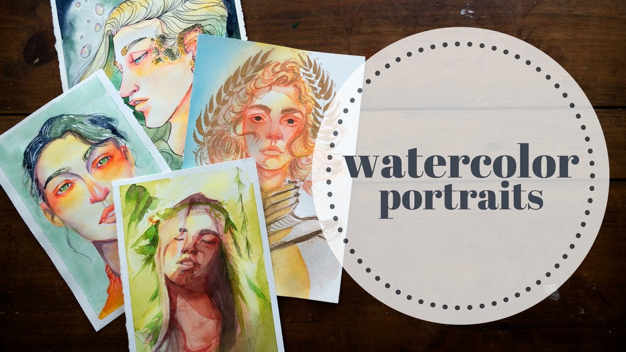
1. Introduction: Hi. My name is Arleesha Yetzer and I'm a watercolor illustrator and YouTube content creator. My work in watercolors largely focuses on portraits, and one of my favorite techniques to employ is the use of a wide variety of tones when painting skin. This has come to be known as "Rainbow Skin" by my loving community. In this class, I want to take you through the whole process. We'll start by talking about the materials you'll need, as well as a few of my favorites. After that we'll break down each individual color. I'm going to talk to you about setting up your own limited palette, as well as how to mix each individual colors from reds, yellows, blues, purples, and greens. We're going to cover all of it, and after that, we're going to go into a couple of project examples. I'm going to show you my process for laying in each individual color. I'll show you how these colors blend and mingle together through wet on wet and wet on dry techniques. I'm so very excited to demystify this process for you. The use of a wide range of colors in skin tones doesn't have to be a scary, intimidating, or unapproachable. I personally find it to be an awesome confidence-building therapeutic exercise. So if you're ready to dive in with using lots of bold colorful skin tones and watercolors. Let's get started.
2. Materials: To get started, we're going to talk about the materials you'll need to get ready to sketch and paint. My favorite supplies include the following: The Canton XL mixed media sketchbook for sketching and preparing, and for our final piece, any watercolor paper that is 100% cotton is going to work really great for your portrait. I'll be leaving links to all of the materials in the about section of this class. For pencils, my preferences are either a mechanical pencil for sketching and getting out ideas, or a colored pencil for the final painting. My two favorite colored pencils or both by PRISMACOLOR, and that includes the PRISMACOLOR colon race in vermilion, as well as the PRISMACOLOR VERITHIN in crimson red. I've got a couple erasers here, a white polymer racer as well as a kneaded eraser. When you're ready to choose paint colors, you're more than welcome to get out your favorite watercolor palette. Something maybe a bit like this one. But it's going to be crucial in this class that we're working with a limited palette. I'm talking four colors max. For me, I'm going to be going through and picking four specific colors from tubes that I'll squeeze out onto a porcelain palette. The only real rules when it comes to choosing colors for your palate is that you start with the primaries. Yellow, cyan, magenta or red, yellow, blue. You're going to want to have one of each in a temperature of your choice, and also an additional color that you think might complement the scheme well. This can be brown or Payne's gray, or for me I'm going to be using this cascade green, as it's a color that I can't really mix from the other colors I've chosen. Once I've got my colors picked out, I'll get a couple of jars for water, some paper towel, and we're pretty much ready to go. Now that you've got all of your supplies together, let's go ahead and talk a bit about why the limited palette is so important and how you can utilize it to mix a wide variety of colors.
3. Getting to Know Your Palette: Let's start by getting to know your watercolor palette. Exercises like these are crucial in developing an understanding of the range of colors available to you, as well as how to mix them into harmonious tones and shades. As stated before, you're welcome to use paints in half paints. They don't have to be fresh out of the tube like mine. That's just my preferred method for this particular brand. For the last color in this range, I decided not squeeze out fresh paint. Instead, I've just removed the part of dried paint from its usual home in my palette for Daniel Smith paints. Let's start with a simple color wheel. I'm going to lay out my nickel azo yellow, quinacridone red light, and manganese blue like this. Between each of these initial swatches, I'm going to be mixing and placing secondary colors referring to orange, purple, and green. These are the colors we get by mixing two of our primary colors together. I'll also place in my cascade green, where it would fall relative to this wheel. I'm not going to be going into tertiary colors, which would be the colors between orange and yellow, red and orange, bred and purple, things like that. We're just going to stick to primary and secondary colors for this initial wheel. Our overall range of colors is much wider than just these six, however. I'm also going to spend a bit of time exploring more mixes with these colors, adding a bit more blue, yellow, or red to create more variety. If we look at both of these sets of swatches side by side, you can see that the colors in our wheel are much more saturated and dense than those from our mixing explorations. This is crucial when working on our actual portrait. If our colors appeared on the portrait as they do in the wheel, everything would be too saturated and too harsh. Our colors would simply clash. Most of my mixes on the right have bits of all three of the primaries in them. This allows for a subtler, more muted colors that will blend together in a much more harmonious way. Our blue still look blue, and our reds are still red, but they have bits of each other in them. This unifies our palette and brings everything together. If you're curious, I would highly recommend exploring other primary sets as well. Try using a cool deep blue instead of a warm greenish one, or maybe a cool lemon yellow to replace the original golden option. Every variation in your initial color selection will affect the mixes you're able to make. Cooler colors are better suited to deep rich purples. Warmer colors can give an earthy organic feeling. Now's the time to explore. Find the combination of colors that flows with the atmosphere and emotion you'd like to convey in your watercolor portrait.
4. Red: During the next few videos, we're going to be focusing on specific colors. I'm going to show you my preferred methods for placing and mixing these colors and we're going to start with red. Right away you're going to notice that I'm not using my red color on its own. I use red for areas of the face that are more prone to: blush, sunburn, or high blood flow, and I usually add a bit of yellow to the mix before I start painting. This gives me a softer, peachy tone. I usually place reds around the eyes, cheeks, ears, mouth, and neck. Here's an example of the relative color zones of the face in relation to portraiture. I found these guidelines to be very helpful when placed in color. Of course, we are simply going to place rectangular blocks of color across our little faces, but we'll be following these general rules. Blushy areas tend to be most apparent around the eyes, cheeks, and ears. When painting in these particular tones, I often blend them out with clean water to create soft faded edges. Already with these first bits of color, I'm starting to think about value, light and darkness. The color may be denser, where there's more shadow and softer in lighter areas. I've found that reds are a great base in portrait painting. This is usually my favorite place to start. Looking at various reference images will greatly increase your understanding of color variation within the face. Look for denser areas of red. They may not be the same for each and every portrait. After we go through each color example, I'll come back and finish off these little practice heads.
5. Yellow: Now we're going to move into the yellows. There can be a lot of variance in this category, possibly the most of all the categories as this is the range that often determines the base skin tone for your subject. While I'll be referring to this category as yellows, it'll also include those flesh tones and brown mixes. When mixing this color, yellow is of course going to make up most of the mix. I'm also going to include a bit of red to get a bit closer to orange. If this color is too orange, I can add a bit of blue to desaturate the mix. If we take a quick look at a color wheel, you can see that orange and blue are opposite one another, adding a color to its complement, or the color opposite it on the color wheel will desaturate that color. While the largest area in our yellow category will be centralized around the forehead, as we talked about in our color zones example. I'm also going to be painting this in various places across the entire phase to reinforce the idea of this being our base skin color. When in doubt, rely on your reference, you can even take a look in the mirror and observe where your skin is the most yellow. These are going to be subtle variations, just know what you're looking for and don't be afraid to experiment. If you're going for something a bit more opalescent or pearlescent in effect, you can leave much more white space in your examples, allowing the color to just touch the edges of the darker areas and leaving more whitespace.
6. Blue and Purple: Blues and purples are some of my most favorite colors to add to skin tones. When mixing my purple, I prefer something on the warmer side with a bit more red than there is blue. Fine tune your color mixes to your preferences. As I've said before, you really can't overdo it when it comes to experimenting and trying new things with these exercises. In a basic ambient light scenario, I'll be using this color foreshadows in the naturally recessed areas of the face. This includes below the brow bone, under the nose, in the areas around the outer edges of the face where the forehead, cheeks, and chin curve away from the forward facing planes that may be catching more light. Purples layer beautifully with other skin tones especially, with a warm purple like this. We'll see more of that example when I come back to this face to color in all of the other tones after we finished our specific examples. The placement of shadow colors is where you'll have the most variation in your pieces as it will change based upon the direction of your light source. You can check out my class on dramatic lighting techniques in watercolor for more examples. My blue tones will serve a similar purpose. When mixing this color, I add a bit of yellow to my blue. This pushes the color around a bit to a green warming it up. We don't want to get too close to green, but I do like to warm up my blue just a little bit. I use blues to communicate translucency and depth. This is often alongside areas of shadow, but it does serve a unique purpose separate from the purples. Looking back on that example of color zones, blues are often focused around the bottom third of the face. This is generally because that bottom chin area is where we see that five o'clock shadow or where the face curves away from the light so things get a bit cooler as we move down towards the neck. Here are few other examples of my use of blue in skin tones. I find that this is the hardest color to place to specific purpose and reasoning behind my use of this color. Hopefully these examples will give you an idea of what I'm going for, specifically in the use of blues in skin tones.
7. Green: It's time to place our greens. Greens are a fascinating color for me, especially in the realm of skin tones. When mixing them, I start with a yellow base and add blue to achieve a warm green. I often desaturate this mix with its complement just a hint of red. I like to keep this mix relatively warm, but as I said before, when we were talking about the painting of our initial color wheel, it's important that our colors have a bit of each other in them to keep things harmonious. I'm going to add a bit of red to desaturate the color as well as to help it blend more with those tones when we add them later on. I don't always use all of the colors we've covered so far in each and every painting. When I decide to choose green, it's usually in place of my purple and acts as a shadow tone. When would you use green instead of purple? That depends on what you desire to achieve through your painting. Green is earthy and much more subtle when layered with other colors as the compliments are red, these two colors will play off one another, making the other seem to pop more when placed next to each other. With any of these examples, the most effective way to see how each tone contributes to the overall effect, is by experimenting with the colors altogether. Now that we've covered a bit about each one, let's go back and finish off each face.
8. Put it All Together: It's time to Put It All Together. This method of laying in one color across the face and then moving on to a different color, it's not something I've done simply for the purpose of this class. This is actually my preferred method when it comes to painting watercolor portraits. With this first one, a yellow tone is a bit closer to brown. Note how the color deepens and becomes more saturated where the yellow shade and the red overlap. I'm constantly making decisions about when to soften edges due to gentle curves of the face and when to leave crisp, harsh edges, denoting light, shadow or form. Experimentation is key. After the yellows I decide to place in some blues, see how we've immediately rounded out and added depth to the face. The blue gives a sense of transparency and dimension to the skin. I'll finish this one off with some purple, this will deepen our darkest shadow areas. Working in transparent layers is absolutely essential for allowing these colors to glaze and blend with one another. We want the color underneath to show through, this will keep the overall look much more harmonious. Let's add some red to the second face. To flow with the overall angularity of these features, I may choose to add more triangular shapes and harsh edges when placing my colors. I've decided to vary the lighting just slightly with the addition of my blue. This color doesn't play an especially strong role in this particular example. Finally, a desaturated purple is going to reinforce the stark lighting. Keep in mind that not all colors want to work together. As complements to one another, the mixing or overlapping of purple and yellow, results in a slightly muddy and pretty dull color. Keep that in mind and remember what it is you are going for. If I, for example, wanted this to look more gray overall, I would definitely say that this is a good way to get there. In this third phase, our yellow tone is much closer to red than any of the others we've painted so far. You'll see that once the red is added, this example appears much cooler overall without a strong yellow tone to pull the color range to a more of a middle ground. Just as a test, I'm leaving most of my edges sharp without blending them out. I'm curious how this will look when compared with all of the other faces. This final example with the green base, ended up being my favorite of the four. I started by adding red to my blush areas. The yellow tone in this example was very close in color to the red and was also applied while the red was still wet, causing the colors to blend with one another and become more difficult to tell apart. The addition of some blue helped to re-establish depth and form, but my reds were still lost. I added a new red layer. In full paintings, I almost always go back to colors I've already been working with to reinforce saturation and depth. You definitely shouldn't feel as though you only get one shot at each of these colors. Watercolors in their transparent nature love to be layered. A final layer of blue added a nice coolness and brought everything together and with that, our four examples are complete. They're all colorful and stylized, but with a relatable amount of color replacement resulting in faces that don't look entirely unnatural. Paint up some little faces of your own. Feel free to experiment with darker or paler complexions by adjusting your yellow base tone or through the use of a cooler purple shadow. As stated before, you can also leave more of the white of the page to make the skin appeal more pale. I can't wait to see you what you come up with.
9. Class Project: Example #1: Now, it's class project time. [MUSIC] I have two specific painting examples to share with you today. We're going to start with a very loose example in my sketchbook, and then move on to something a tiny bit more refined on our cotton watercolor paper. With this first one, I wanted to really show you my sketching process as well, as I find that without a good sketch, you are going to struggle to get something that you're happy with in the final painting phase. I'm working with my red Prismacolor Verithin pencil here, and when I'm approaching my initial sketching, I really think about it more like carving than drawing. I usually start with the outer outline of the head to get the overall face shape correct before I start putting the features in. I sometimes add in some outer lying components so I can narrow down the composition before I get too stuck into the details and then realize that something fundamental needs to change. As you can see at this point, I've laid in some basic shapes for the eyes, nose, and mouth, and continue to move around, jumping back and forth, refining different parts of the sketch as it all starts to come together. This sometimes results in adjustments, like you may have just noticed with the eye, that I thought was a little bit too far out, so I moved it in a bit. I'll later go in and move my nose down as I ended up thinking that it was too high on the face. I was working from a couple of different reference photos for this particular portrait, and if you'd like to work from a reference, please feel free to do so, especially when it comes to practicing and learning the layouts for the different colors when we go into our painting phase. As you grow and develop, you'll be able to do more from imagination and be able to rely on reference less if that's your choice. It all depends on your final goals when it comes to your art. You may notice that I am darkening my lines only to erase them again in some instances. I sometimes end up pressing a bit too hard when refining my details, but I ultimately don't want my lines to be especially dark when I go to paint over them. Colors like this red tend to blend very nicely into skin tones, so I'm not overly worried about it, and I do sometimes like how it looks when those sketch lines show through, but I don't want the lines to overpower the paint when it comes time to actually get into our water color. As we finish off our sketch, I will say one of my biggest recommendations is to start in a broader sense. So lay in large shapes, big forms, settle on your composition before you go into the details. That way you won't have to backtrack later on if something's not placed quite right. As we move into our color, I'm going to start with the background, and I'm going to be using that Cascade green that we picked out. I will say that I made one tiny adjustment to my initial palette before starting this color. I switched out my Nickel Azo Yellow, so the yellow shade, and substitute it instead with a transparent Yellow Oxide, which is the same pigment that's used for yellow ocher, which is a much more desaturated yellow. I decided that I wanted something a bit softer for my final project. Feel free to adjust your colors as you'd like. As we get started with painting, I'm going to go ahead and start with my favorite place in regards to skin tones, which I've mentioned already, are the reds. I usually place red in very large areas, choosing where to blend out those edges and where to leave them a bit harsher. It may seem like I'm adding a lot of red at this point, but as we go on to layer our colors, you're going to notice that that red blends and kind of disappears into the other tones. When working with our blue, I tried to keep it a tiny bit warmer than our background so that it wouldn't blend in too much to that background Cascade Green color. As you can see in this example, I'm keeping things relatively loose and just having fun laying in colors and values. That's one thing I really enjoy about doing pieces like this in my sketchbook is I'm not super worried about creating something super refined or super finished. I can just let loose and have fun, and I really think it's a good idea to balance out pieces like this alongside the more refined finished pieces that you may do on actual watercolor paper. Because this is not cotton paper. I did find in some instances that my colors were lifting and blending together more than they would on an actual watercolor paper. This is just a mixed media paper. But it landed itself to a really nice, loose, kind of carefree experience that was very enjoyable. My plan was to go back in and add more to the skin tones, but I needed to have a better judge of the overall values before I went in and darkened things on the face. So I decided to go in and work on my hair a bit. Jumping around your piece is a really great idea for establishing value and creating a piece that is more cohesive overall. Once I had that base tone in for the hair, I could then go back to the skin and vice versa. After I had done that, I went back to the skin, then made more adjustments to the outer lying elements. It's all a matter of working on the piece bit by bit. You're more than welcome to start with one eye and keep painting until that eye is finished. I find it a lot easier to judge the overall look of the piece and how it's going when I spread things out and jump around. I also decided to go in after I had put in my hair value and add some purple to the face. I feel like this color works really well as a light shadow color. This piece, I kept very light overall and gave it a bit more of a glowing, ethereal look. The shadow color that I'm placing now in the hair also has quite a bit of purple in it. This helps it to blend more with the purple in the skin. You may notice I've been using the same brush for almost the entirety of the piece. I really enjoy this small quill brush. It's a size one, made of natural hair. It comes to a really nice fine point which allows me to work on smaller areas, but it also holds a lot of water and can be pressed flat to cover larger areas, so I find it to be a very versatile option for things like this. I kept my outer lying elements like these flowers very loose because I wanted the face to be the focus, so that was the area where I spent the most time refining the contrast and the details. I spent just under an hour on the entirety of this piece and felt like it was a good warm up exercise to get my hands and my mind thinking on colors, and skin tones, and composition. Now that we've completed this first one, let's move on to a second example.
10. Class Project: Example #2: Now that we're all warmed up, it's time to move on to our second example. For this piece, I've used my same Prismacolor, [inaudible] pencil, but this time on our 100 percent cotton watercolor paper. Similar to our last piece, I'm going to be starting with my reds, and as I mentioned when we went over the specifics for this particular color, I'm already starting to think about value. I layer on more color in the areas that I want to be a bit darker and I soften out and blend the edges out to areas that I want to stay lighter, allowing the white of the page to show through more. I will say that I had wished I'd followed my own advice in the sketching phase. I feel like the mouth for this particular portrait could have been placed a little bit more accurately. I find control of water to be essential when it comes to laying down colors, as it helps me to know when to soften out my edges and allows me to apply it looser and more fluid effects to my colors. I decided I wanted to try something a little bit different with this one. So I went in with a sort of cotton candy effect for the background, laying in bits of our pure red, yellow, and blue into the background. I did end up covering most of this color up with our cascade green when I added in the background, but I absolutely loved to the effect that this gave to the painting. After my reds, I went in with the blues. I find that it's helpful to think of blue's a little bit differently than just being a shadow color. I used them to apply depth to the face as well. It tons down the warmth of the red, and hence more at the three-dimensional form of the head, neck, and shoulders. Layering is one of the most essential tools when it comes to using this particular technique. I lay my yellow color over top of my red in the areas that I want to be very rich and warm. By laying the yellow over top of my blue areas, the color gets more desaturated and leans a bit more towards a greenish gray. Just like with our last portrait, once I had some basic color in for the skin, I'm moved away and moved on to my hair. I like to add loose flowing gestural marks when laying in the form of the hair. I find that this helps to reinforce the overall flow of the piece once it's finished. Keep in mind that every color I'm mixing is all from this same palette, and other than the background, I didn't use the cascade green very much. The colors you're seeing were mixed from our red, yellow, and blue. Introducing a ton of different colors is really what keeps color pallets from being harmonious in a lot of instances. By keeping my palate limited, I was allowing those colors to work together much more cohesively. While they all read very separately, our blues look blue, our reds look red, and our yellow flesh tones read as they should, they're not that different from one another in saturation. I often enjoy adding a hint of red inside the eyes of my characters. It almost makes it look as though the figure has been crying recently, which sounds a little sad, but I love the emotional intent that it adds to the peace with such a tiny subtle hint of color. When working on a portrait, I generally found that the areas that get the darkest are the pupils, the nostrils, and the corners of the mouth. By focusing on one of these areas to be the darkest, for me specifically it's the pupils. It draws the eye to that area when you look at the portrait and allows it to be the focus of the piece, making you feel as though you're actually making eye contact with the subject. More and more loose organic brushstrokes over the course of many transparent layers adds a lot of three-dimensional form to the piece. I usually like to contrast the three-dimensionality of the face with a flatter, fuzzier, more abstract background again reinforcing the focus of the piece. Once I had laid my cascade green over the background, most of those initial colors were covered up, but they did show through in tiny bits. I'm very much looking forward to experimenting more with this particular method in the future. With that, both of our examples are complete. Thank you so much for joining me for this class. The class projects section is a great place to share your art not only with me, but with your other students as well so we can all work to inspire one another. I hope you enjoy exploring the techniques we've covered in this class, and I can't wait to see what you create. Happy painting.
 Arleesha Yetzer, Watercolor Illustrator & YouTube Artist