Transcripts
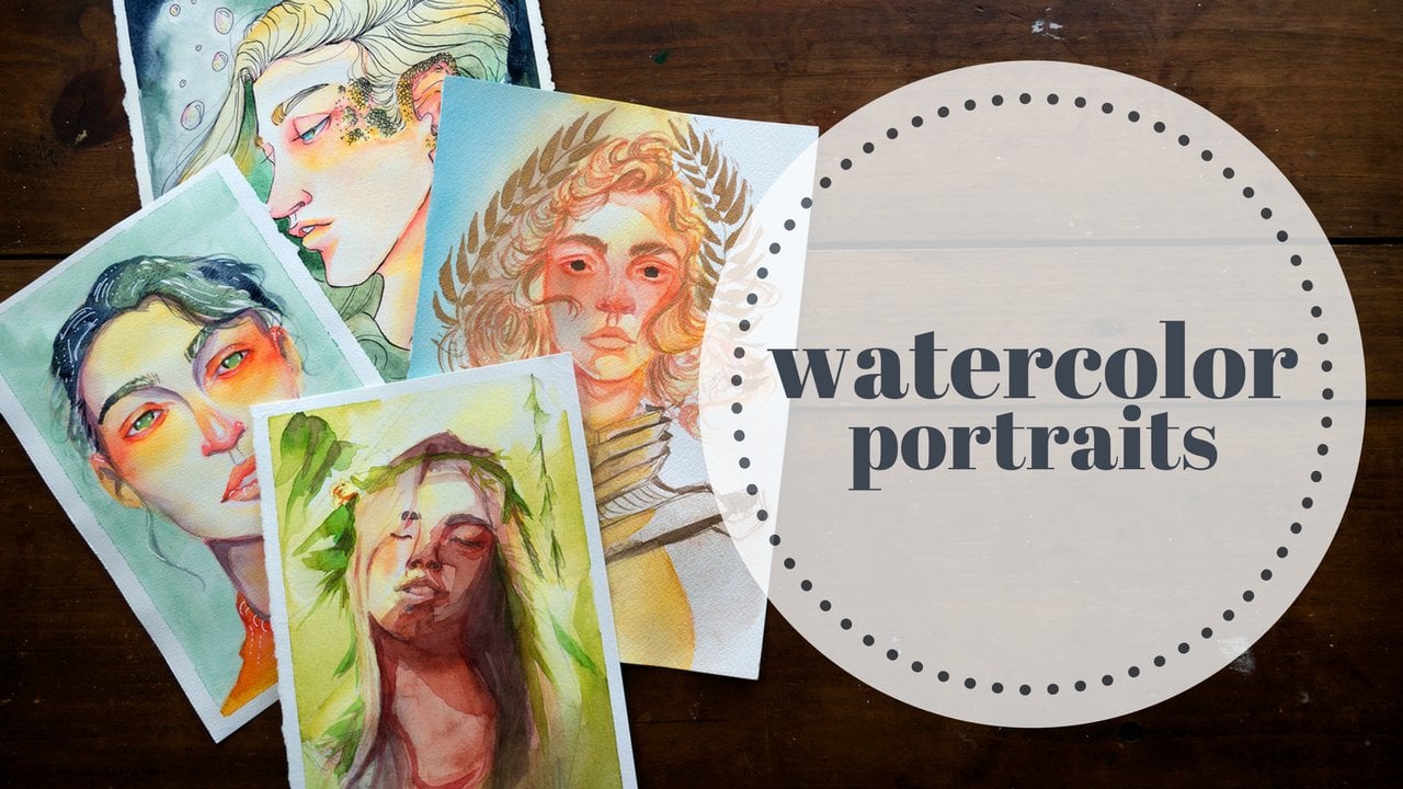
1. Introduction: Hi, My name is Alicia, and welcome to my newest class on watercolor portrait. It's this time we're gonna be focusing on creating beautiful dramatic lighting effects for your portrait. It's we'll start by covering a few basic materials and techniques and then begin applying those directly to smaller practice faces. We'll use various wet on wet and wet on dry approaches to create a diverse range of effects . Were also going to spend some time going over the plains of the head so that you can feel more comfortable creating your own lighting scenarios as well as better understanding what you see in references and from life. Before we jump into our class, Project will experiment with a variety of color thumbnails to get the palette that best suits are subject in our goals. For the peace to finish up, I'm going to show you my class project, applying all of the techniques we've learned during the class. Are you ready to create some exciting dramatic lighting and watercolors and let's get started
2. Materials and Terms: Let's start by talking about the materials and terms will be using throughout this class, starting with, of course, a set of water colors. I have a fairly large set here, but any standard set of 12 or so colors will work just fine. I also wanna have a mixed media sketchbook and some watercolor paper. We don't need anything too fancy to get started here. Just a place to sketch out ideas and then a place to, you know, of course, paint our final class projects. Other than that, you're also going to want to grab your favorite brushes. I've got three different ones in varying sizes, going from smaller toe larger, and we're also gonna want a couple containers for water. I like to have two so that one conserve as cleaner water, and one will stay a little bit dirty for the initial rinsing of our brushes, especially when you're transitioning between colors and in a couple of paper towels. And we're pretty much ready to go for a basic materials and, of course, a pencil for some sketching. I also want to take a little bit of time to talk about some basic watercolor techniques that we're going to be using throughout this course, starting with wet on wet techniques. So usually I use these sort of techniques when I'm laying in my first initial layers in a portrait or when I'm working in the background and I want that background to be more blurred. The basics of wet on wet techniques basically involves making your paper wet before you apply paint to it, so wet paint onto wet paper. So, as you can see here, I've wet my paper ahead of time, and I'm just gonna go ahead and drop in some colors. The benefit of this technique is it allows you to get softer edges, and it's a great way to blend in colors. I use it a lot when I'm laying in those initial portrait layers, and I don't necessarily need my colors to be super separated or to find yet. But if they blend together, it helps to create kind of that seamless transition from one color to the next. Wet on wet painting can be used to refer to you not just adding wet paint to wet paper, clear, clean, wet paper, but can also be used to add wet paint to wet paint. So when I have areas where my paint is still wet and I dropped more color into those areas , especially when it's a more saturated or denser color that's referred to as charging. So if I just were to take this blue area and dropped my yellow directly into that blue, I would be charging that area with another color. And by taking my wet brush and kind of blending out the areas in between, we're creating a similar kind of effect and softening up those edges. Another super common technique that I use in the wet on dry category. So this is now applying wet paint to dry paper where we haven't wedded a ahead of time is just simply fading out or blending out your edges. So once you've laid down a color and then starting from a little bit farther away, wedding your paper and slowly coming up to meet your wet paint to soften those edges. This is a very vital technique. When you're talking about painting portrait, it's especially when you want to get something that looks a little bit more realistic. Those edges tend to blend and soft, especially as shadows and transitions of color and light occur, and the face is curving away from the light or slowly transitioning into a different color . What I've got to show you here are the three brushes that primarily I'm going to be using throughout this course Now, As you can see, these are all round rushes. There also all calligraphy brushes. I really like using Chinese calligraphy brushes for watercolors as the natural hairs hold a lot of water. And this variety of sizes gives me a really good variety when it comes to using the larger ones for the larger initial washes and backgrounds, all the way down to something smaller for details and tiny areas before we get started, I also want to briefly explain the concept of glazing. So glazing is basically laying one layer of paint on top of an already dry layer paint. So I've lied down this initial sort of orangish color, and I'm going to completely dry that or completely let it dry, depending on whether or not you have something to dry your watercolors with. And then on either side of this orange, I'm gonna lay down two different collects. The first is on the warmer side. So we've got this yellow here, and as I lay this yellow on top, the ultimate effect is that this color is going to be warmed and become more yellowish. And on the other side, I'm gonna lay down something a little bit cooler. So a cooler, reddish pink sort of color, and then we're going to see the difference that that makes in the different layers that we've created. And as we look at these two side by side, you can really tell the difference of that glazing makes We're left with the final color being different, depending on which colors are glazed on top of which. And this, of course, is a super useful technique in building up vibrancy and luminosity in your watercolor layers.
3. Mini-Faces: Wet-on-Wet Examples: So to get started with our demonstrations, you can see I've drawn out a page of eight basic head shapes here in this video, we're going to focus on the two up here in the corner. I'm going to be using these two to demonstrate some wet on wet techniques for you and how I use those when applied to watercolor portrait. It's the first thing I do is I want to lay in some basic shapes that you saw in the beginning for the eye sockets, the nose, the mouth of years, things like that by laying in the eye sockets. First, I found that it's extremely helpful for me to remember that the eyeballs themselves will sit smaller and recessed inside the sockets. It really helps me to continue to think about the form of the face overall and to remember what it is I'm actually trying to achieve when im drying the features instead of just scribbling what I think I know eyes look like because this is a wet on wet technique. I'm of course, going to start by wedding the entire area. Now, depending on where you're starting on your portrait, you could choose toe wet, just the area around the cheeks or the nose to add a blush itoen or just the top of the head. If you were trained to do a specific lighting angle and because the purpose of this class is to demonstrate some dramatic and dynamic lighting techniques, I'm going to be focusing on those in terms of these examples. And now that our entire face area is what I'm going to go ahead and start dropping in color , you can choose whether you want to dis first color in specific areas. This is also a really great technique for just laying out a consistent wash across the face . Because the entire area is wet, our color is going to flow more easily, and it's gonna be super easy to get a consistent color across the entire area. We can now use this wet area for two different purposes. In terms of this class, the first thing I'm going to be demonstrating is lifting out areas. So for me, I'm focusing on areas that are going to be in the light in this specific lighting scenario . So I'm going to be lighting areas in the upper right portion of the face. And to do that, I'm just going to take a drive, paper towel and lift color out of those areas as you're going to see in more of our examples, the most effective way to create dramatic dynamic lighting is through contrast. So the darker our shadows are and the lighter highlights are, the more effective our lighting scenario is gonna be. Overall, there's gonna be a lot of variance within that. But while this pain is wet, it's a perfect opportunity to go in and lift out areas that we know we're going to want to be lighter. This wet area also allows us to take advantage of the opportunity to drop in some colors. So here I've got sort of a warmer term that I'm using sort of as a blush so I can go ahead and drop that in in areas of higher blood flow, namely around the cheeks, the nose, the ears and I also like to add redder tunes around the neck as well. For the second faced, we're going to start pretty much the same. I've drawn in my features, but this time I'm gonna lay in some basic planes of the head just so I can better reflect the lighting scenario that I want to go for this time. We're going to talk more about the plains of the head and break those down a little bit for you in the future. Video coming very soon in a couple of minutes. But for this one, I'm just gonna break break it down into some basic shapes so that I can get the kind of lighting that I want, which for this one I'm going to be focusing on as lighting scenario where the light is directly behind the subject, which would make most of the face be in shadow. And the light would be just around the outer edges of the form, using my plainer lines as reference assaulted, laying in a basic shadow value for the face. And you can see that I was using some of those lines where the neck curves away towards the front, as well as where the forehead and cheekbones and jaw start to curve as a place to end my shadows. We'll talk more about all of those planes a little bit later on. Of course, I also started to lay in a darker values in the darkest recesses of the Shadow. And in the case of this specific scenario, that meant that the areas furthest away from the light we're going to be the darkest. And that meant the central nine of the face. After I had laid in the some basics for my shadows. I'm using very stark colors here just to kind of show my point and get the example across. I laid in a sort of yellow value for the light around the edges, sort of room lighting. And what I like to do when I'm doing lighting is to add that value and then, like we talked about, fade out the edges. So the brightest light is where there where that's first touching. And then that sort of fades out as we get closer to a shadowed areas and here you can see, I'm just laying in some general orbs with directions so that I can I know where my light is coming from
4. Mini-Faces: Wet-on-Dry Examples: Now we're ready to move on to some wet on dry applications, Just like last time. We're going to start by sketching in our facial features. And I would recommend, while you're working on this step to remember that the sketching you're doing is really just for guidelines and landmarks. Don't focus too much on a rendering during the step. If your focus is toe, have a finished watercolor painting. You really want to allow the rendering to occur during your painting. But of course, stylistically, it's totally up to you. You can do as much or as little of that, fully flushing out the figure as you want during this step. I kind of tend to fall somewhere in between anyway. So here I'm going to start by laying wet paint onto dry paper, which is the basics of a wet on dry techniques. Once I've got in of specific value in this case, I'm starting with my redder blush. He tones. I'm gonna go ahead and blend that out, so I'm gonna get my brush wet, get it nice and clean, and I'm just gonna start touching the edges and kind of pulling that color out to create nice, soft radiance. Once that layer is completely dry, I can layer another layer on top of it, in this case, something a little bit warmer, and the yellow on top of that red is going to help establish sort of a base skin tone and the areas where the layer sits by itself that yellow. It's going to help us to establish a wider range of skin tones already, because now we've got just read just yellow and the places where those two colors overlap. Once that layer is dry, we're going to continue with our glazing now, starting to think more about light and shadow. In this specific instance, I'm going to go a little bit dramatic and use this sort of turquoise color for my shadows just so I can show you clearly where the light is and where the shadow is. In this specific example, I'm gonna go ahead and place the left side of the face in shadow. When you're working on this, it's important to think about where the shadows will start an end. Don't worry. It will go more into plainer reference and how to use references to help you a little bit in the future. But for this specific example, you want to keep things like the curve of the face in mind, so you'll notice at the top that my shadow isn't necessarily a straight line because the head is round and sort of spherical. Your shadows were curved as the light hits more or less of certain planes of the face, and that's going to apply to all different areas. You'll usually find that the upper part of the eye socket tends to fall in shadow a bit more. And what I'm going to do once I have laid all of my shadows in the eye sockets being a little bit deeper under the nose, under the top lip and under the neck, I'm gonna go ahead and deepen up those specific areas a little bit more, with a little bit more pigment, a little bit more saturation, just to emphasize that some areas are a little bit darker than others. I want to mix things up for this next example and try out a different facial expression to show you how lightning combined with facial expressions can create some really interesting and effective atmosphere. We're gonna be combining a very different sort of lighting and a very different sort of facial expression. So for this one, I want to go with ah lighting scenario in which the faces being lit from the bottom or like an under lit face. I'm going to start also by laying in a different sort of contrast as well. In the past, we lay down a base color and then lay down a different color for shadows. I want to emphasize how important contrast could be in this example. So what I'm going to do is I'm only going to place my skin tones in areas of shadow and allow the areas that are left white to denote areas that are being hit by the light. This sort of technique can be super effective, especially in quick sketches like this, to get your lighting ideas across in a very dramatic way. I'm not necessarily emphasizing that these areas are particularly dark in this first initial base layer, but by leaving the rest of the figure, White were really able to emphasize that lighting scenario. And then I will go to my new areas that are darker the areas where the form turns away, the most and where we've got those harshest curves in the form to darken those up and really sell the idea of this dramatic under lit face. Now that we've covered a few examples, let's go ahead and talk about the planes of the head.
5. Planes of the Head: in order to best understand the planes of the face, I want to start with a couple examples here. We've got as pretty standard forward facing face with ambient light. Can you see the planes? How about now? Planes basically just refers to the breaking down of the face into the different angles that the face faces the different directions that the angles of the face fall into. So as the cheekbones curve away down into the chin, that's a different plane. The areas like the eye sockets, the forehead, the neck. They can all be broken down into several planes as the angles of the face shipped. Now let's talk about how that applies to actual lighting. The example that we have here is a pretty standard ambient lighting situation. Let me show you what I mean. Now that we've got our shadows late in, you can see that the light is very soft and just kind of darkens the edges of the face, the outer edges and the deeper recesses. Let's take a look at a more dramatic example. Our lighting scenario here is very different. We've got a strong light source coming from the left side of the face and, as you can see, is now causing the nose to cast a shadow, and the entire right side of the face is a little bit cooler because our light is fairly warm. Let's lay in the plains and talk about those a little bit. As you can see, our basic shapes are the same as our last photo. The specific. The mentions of those planes may change because every face is shaped a little bit differently, and not everyone is going to be the same. So the cheek moons might be a little bit whiter and the face might be a little bit more square. But the basic shapes are always the same. Let's lay in our shadow shapes. As you can see, that cast shadow of the nose creates a very specific shape as it leaves that plane and part of the one of the cheekbone in shadow as well. Our entire right side of the face is in shadow, where the face curves away from the light source, and if we could see the neck area, we would see something very similar as well. Finding applications or programs like this one can be super helpful and exploring light and reference on your own. This one is really nice, because it allows me to move the light around and change the head of two different angles to see how the light hits those planes in different ways. Let's put these into context with some actual drawing when you're breaking down the planes and trying to figure out how to draw them there yourself. There's a couple different ways you can do this. You can look up references for plainer head models, or you can just look at a reference picture. And if you have access to digital tools, you can draw the planes right over the face. You can even just put your hands on your own face and feel the curves of where things start to change direction. I mean, you can even put your hands all over somebody else's face if you want to. It's totally up to you. I would recommend looking at reference, though there's a little bit of a stigma against using reference in art. But if you think about the masters studying reference photos, whether it's from life or even looking at how other artists use light is crucial, essential and invaluable when it comes to learning for yourself. I'm going to do an example here as though the light were coming from the top left. And I'm just going to use my pencil this time. And as you can see, with our planes already in place, you're basically just filling in the box is looking at the light source and then choosing where to fill in the areas that are in shadow.
6. Experimenting with Color and More: So with your newfound plainer knowledge in place, as well as some information about different watercolor techniques like Wet on Wet and what on dry, it's time to experiment. What I'm gonna be doing with these last three faces is just experimenting with different lighting angles that I can generate from references. Whether that's photos I take of myself voters, I think of other people or using applications like the one I showed you before. I just want to play around with different lighting angles and different color temperatures as well. So I've planned to use this, forced one to emphasize warmer shadows. And one rule of thumb that you can often follow in lighting scenarios is that if the light is warm, the shadows will be cool. And if the light is cool, then the shadows will be one. So I'm gonna be playing around with ideas like that for these last few. In this 1st 1 I've got warmer shadows and in a little bit I'll go in and add some cooler light in the 2nd 1 I've got cooler shadows and I'll add some warmer light. Another difference in the second face is that I actually have two light sources, one from either side. One thing that you could do to differentiate two different light sources is to actually slightly vary the hue of the light itself. I think in this case I made them both the same color. But I could easily have made one cooler and one lighter to give myself a more dynamic look and atmosphere and lighting. Ultimately, I would highly recommend you doing as many of these little face practices as you'd like. Practice around with different lighting scenarios, different face angles until you really start to feel like you've got a handle on the plains of the head as well as it's all great watercolor practice as well. For the last one, I want to go back to my idea of mawr extreme contrast. I'm going to be using lighting from the top so the bottom of the face is going to be in shadow. And for this one, I really wanted to think more about the shapes that the shadows cast. I wanted to create more angles and more dynamic lines and curves in the shadows themselves to give the sketch a little bit more interest and again adding some darker areas to the deepest recesses of your shadows is a great way to take a little sketch like this and make it a bit more dynamic, a bit more colorful and a bit more expressive and effective with light and color.
7. Color Thumbnails: During this next step, we're going toe, loosen up and have a bit of fun. I've created four just quick sketches so that I can prepare color thumbnails for our final class project similar to the value thumbnails that we've done in my previous class. This time we're gonna be focusing on color so that we can lay down the kind of cool asking that we want here. You can see the reference image that I'm going to be using. This is just a picture that I've had saved on Pinterest for a very long time and finally decided to use it for this painting again. These pictures do belong to whoever took them. So they're while they're great to use for practice. I wouldn't plan on using these paintings to sell or to claim as your own beyond the means of practicing. So what I'm gonna be doing, it's just using these as an opportunity to try out some different color schemes. The 1st 1 here stays relatively close to our reference photo with cool blue and purple shadows and an orange lighting on the side of the face. But after that, I really want to experiment. I want to play around with different color schemes. I really like the blue and orange complementary theme of the 1st 1 So let's play around with complementary colors a bit more. In the 2nd 1 I went with the yellow lights, a pink as we sort of transition into the shadow and then a purple shadow to keep a complimentary theme going. Ultimately, I ended up pulling a little bit from each of my different thumbnails for our final piece, and I had a lot of trouble deciding which one I liked the best. As you can see, the skin tones I'm going with here aren't exactly natural, and you're more than welcome to mute thes tones, dilute them and get them closer to natural skin tones. But especially in the thumbnails. I like to work with bright colors so that I could get a better idea of the piece as a whole before hone in on any kind of details. I actually try to avoid details when it comes to these tiny thumbnail sketches, as they tend to just hold me up and slow down the process more than they actually help. That's why you can tell that my thumbnails are also pretty small and very sketchy. I didn't really put in any major elaborate details in the face, and I wanted to keep them small to keep myself from focusing on the details. Another benefit of keeping these some nail small is that allows me to always see the big picture. I can always see the whole thing at once and get a better idea for the flow and the gesture of the peace. Overall, it's really helpful to see these side by side to because I could pick and choose things that I like from one or the other things that works better in one or ways that I might want to mix and match the features. Once I've got all of my different color thumbnails laid out, I like to go in and kind of highlight things that I like the best. So I really liked the yellow light from the 2nd 1 I like the background color from the first, but I also kind of like the softness of the blue light in third. So by doing little practices like these, I can look at everything all together on one page and picked my favorite features this can be extremely helpful. And you're welcome to do more than just for in the end, I thought I would go with something closest to this 3rd 1 here. But that ended up changing by the time we get to our final class project, which is coming up right now.
8. Class Project: Let's jump right into our class project. Now that we've gone through, we've planned out our colors. We've learned some new techniques were ready to get started with our sketching here, I want to remind you that it could be really important, especially when defining the outlines of your face to think about the negative space. So on the left, there you can see the curve the shape of the head makes, and you can kind of think of that wedge shape against the border instead of going okay, what does this head look like? And that could be really helpful, especially in the fact that while I'm sketching out this entire figure, I'm thinking more in terms of three dimensional geometric shapes that I am going Okay. Now I'm drawing an ear, and now I'm drawing an I. That helps me to kind of keep the resemblance a bit better instead of drawing what I think I know. Eyes look like or what I think I know. Ears look like I'm looking at my reference and going, What does this shape look like? And that really helps to keep things a bit more accurate. But of course, having a knowledge of what years and eyes look like is invaluable when you're laying everything out in your sketching phase. When it came time for color, I wanted to start bold with this piece. So I took a nice granulated blue and just lead it all over my shadow area. This may seem very dramatic and a little bit worrisome, but don't worry, because really, we're just getting started. And the Onley value we have to judge our piece by at this point is the white of the paper. So even this shadow value is a lot lighter than it looks, and you can see that as soon as I start to lay in the yellow for the light areas. All of a sudden, that blue doesn't look so dark anymore. And what I'm going to be doing is using a combination of all the techniques we've learned so far. Sometimes I'll be charging one color with another color so I might start laying a red in on top of my wet yellow, using our wet on wet technique or when this layers dry, I might start glazing and laying colors on top of other colors to create new, deeper and more vibrant areas. I'm gonna be using all of these things, moving things around, using my fading techniques to create softer edges. It's a really good idea tohave combination of soft and edges that kind of fade out as well as some harsher angles, curves and lines. This is gonna make your peace more dynamic overall and give your viewers a larger variety of things to look at when they're observing your subject. I hope you guys have enjoyed this class and I can't thank you enough for joining me in the process. I'm gonna go ahead, let you enjoy the rest of this class project video, and I cannot wait to see what you guys create. If you do any step of this class, whether it's sketching out poses or doing color compositions or drawing your own little mini faces and practicing different lighting, I would love to see it in the class project section. So go ahead, get your project started today and I'm excited to hear from you. Enjoy the rest of this class project video and we'll see you in the next class. - Who
 Arleesha Yetzer, Watercolor Illustrator & YouTube Artist