Transcripts
1. Introduction to the Course: Hello and welcome to this
course, Rainbow Safari, Paint, a Watercolor Zebra Using Inspiration
from the Color Wheel. My name is aura Lesnjak and I'm a self-taught watercolor
artist and content creator. In addition to my
Skillshare classes, I also teach watercolor
painting on my YouTube channel. I have a free Watercolor
E-guide available on my website at creat
with aura.com. You can find links
to all of these on my Skillshare profile page. I love color and I love
experimenting with different color combinations and unexpected palettes in my
nature-inspired artwork, painting with unusual and phon, colors may seem like you
could choose whatever colors you want to create an
animal in rainbow colors. But too many colors or
colors that don't play nice with each other can
be harsh and jarring, and the result is Art
beds and harmonious. In this class, I
will show you how to use a free color wheel tool to plan and paint
beautiful animals using vibrant and harmonious
color palettes. For this zebra, I will
show you how to use a complementary
palette which uses colors on the opposite
sides of the color wheel. During the preparation lessons, I'll show you how to
use the color wheel to select your colors
and how to mix your complimentary colors with watercolors to allow for
subtle differences in hues, which will add more depth and
interests to your painting. I'll show you
step-by-step how to use varying values of your colors to indicate lights and shadow. And other important
watercolor techniques, including wet-in-wet, wet-on-dry, glazing, fixing problem areas,
and final touches. This course is recommended for intermediate watercolor
painters and ambitious beginners who
would like to paint animals in phon and
unexpected colors. As your instructor, I'm also
here for you if you have any questions or need some help and guidance
along the way, I think you'll really enjoy this class and be
sure to follow me on Skillshare so you can be notified when new
classes are published. Get your supplies ready, and let's have some
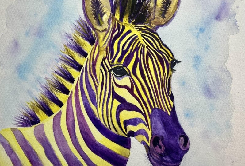
FUN painting this striking green and purple zebra. I'll see you inside the Course.
2. Class Project: For your class project, you can paint this zebra, which I provided an outline for and the link to
the reference photo, or choose another
animal if you prefer. I do suggest that if you
use someone else's photo, that you get their
permission to use it first, especially if you plan to
display your artwork online. Otherwise, you can use
copyright-free photos available on websites like
unsplash or pixabay.com, which is where I got this
zebra image for the colors, you can use the green and
purple complementary colors or use a different set
of complementary colors. In the next lesson, I'll introduce you to a free
online color wheel tool, which makes it so
easy for you to explore and discover
wonderful color combinations. I will see you in
the next lesson.
3. Using the Color Wheel: To experiment with
your color palette, you can use a traditional
color wheel or there are free and easy tools
to use on the Internet. I love color.adobe.com because you can get inspired by
trending color combinations. Or over on the Color Wheel tab, you can select from
multiple color harmonies. Complimentary
colors are those on the opposite sides
of the color wheel. So if I know I want one of my colors to be
purple or violet, then I will see that its
complement is Green. With this tool, as you choose a color closer to the center, the corresponding opposite
will also adjust. You can click on the white
circle or the black circle, and that will give you
the brightest values and the darkest
values of each color. Clicking the different color
harmonies along the side, you will get a sense of the
logic of the color wheel. What makes us split
complimentary or a triad, for example, since zebras are primarily
just black and white, it makes sense to choose two main colors
for this project, which is why I'm sticking with
two complimentary colors. In the next lesson, I'll show you how I
use my color wheel Inspiration and translate it
into mixing my watercolors. I'll see you in the next video.
4. Mixing Complementary Watercolors: I'll be using for tube
colors for the zebra and will be mixing my own Purple
and Green from these colors. This gives me flexibility with some different hues and
tones of the colors. Even though the colors
will be purple and green, I will adjust some
of the mixtures within the painted areas, making them either
more yellow or pinkish or bluish, for example. All of these are
also cool colors which are bright and vibrant. For the Purple, I'm using
alizarin red and phthalo blue. And for the green, I'm using
aqua green and hansa yellow. Remember I do have a supplies list in the
resources for this course. I'm going to mix up my purple first and I don't
want it too watery. I'm making tonal shifts
from bluer to Pinker to get an idea of the range
I can use in the painting. Checking the values
from intense to lighter by adding more or less
water to the paint. Now for the Green, I'm
gonna do the same thing with more green and
shifting to more yellow. Again, I'm adding water to
see the lighter values. Now that I've tested my colors, It's finally time to
start painting the zebra. So I'll see you in
the next lesson.
5. Painting the Green Stripes: I have the zebra traced onto my cold press
watercolor paper and taped down to my board
and ready to paint. This is where you
need to look really closely at your
reference photo because it gets confusing on which are the Stripes and which
are the whites. Since I'm starting with green, which is the lighter
of the colors and will be the whites. My eyes play tricks
on me since it's contrasted against
the white paper. And I have to remember that the white paper will be
where the Purple goes, which will be the dark stripes. So I'm painting wet into wet
and I only pre wet a small section so that not all the paper dries before I get to it. Moving on to pre wet, the next section,
working left to right I'm also looking closely at
my reference photo because I do want to pay attention
to shadows and highlights. The zebra is back, is lighter
than towards the belly. So I'm shifting the
value at the top by adding more water
to the green mixture. Here we're the main starts. There's more of a shadow
on the top of the Neck and the bottom is also darker and that's
lightest in the center. I'm using more of the
pure aqua green dropped onto the wet paper to
depict these shadow areas. I could also have used a more concentrated mixture
of the same green as before, but I think it looks
more interesting to add a little variety of color. You can see that by
paying attention to the light and shadow areas, it helps to give the zebra more of a three-dimensional
appearance. The next lesson, I'll continue painting the Green areas
of the head and face. So I will see you then
6. Painting the Head Stripes in Green: Moving along to the
Head of the zebra, I'm repeating the same process with the turquoise in Green, painting the Stripes
wet into wet. Again, I'm looking
at the values and my reference photo and adding
the deeper bluer values to the shadow areas on the
bottom of the jaw bone to create the impression of
dimension and contour. The lighter green is used for the lighter and more
highlighted areas. At this stage, the greens
and blues seemed to be too intense to take
the place of white. But once the deeper
Purple Stripes are added, it will make much
more sense visually. Don't be afraid to go a little bold with your
application of color Painting the back
of the ear here. I'm using a smaller brush
for these smaller areas and carefully painting
around the tiniest Stripes. I'm adding the water and
small manageable sections. Then we'll add the color. You can see that I'm
making this area very wet and the water is
raised off the paper. I'm adding some of my
lightest values here, so the extra water will lighten
the value even further, which is fine for this area. For these really small
sections on the head. I'm careful not to
just add the color, but making sure I'm adding it to the correct areas and not where the Purple
Stripes we'll go. Now inside of the ears, I'm painting wet into wet and leaving the center
of this ear with the white of the paper and letting the
colors softly blend towards the center. In the next video, I'll start painting the
main with the same colors. So I'll see you there.
7. Painting the Green Mane Stripes: I'm starting on the Mane
by wedding each section, then adding the greens. If you are more
comfortable just winning one or two sections at
a time, that's fine. Do whatever is more
comfortable for you. It's just important that
you do add the paint to the wet paper so you
keep those soft edges. I'm making the part
of the main closest to the Neck the
lightest and value. And adding the deeper
blue-green towards the top. After I add the light green, I use my smaller brush
to add the deeper color. I'm using small strokes to paint onto the dry areas
of the paper to get distinct brush lines to look like the
individual hair clumps. Then dragging the brush
stroke either into or out of the wet area to let the darker colors softly
blend with the light green. The next video, we'll be starting with the
beautiful Purple hues. So I will see you
in the next lesson.
8. Painting the Purple Stripes: Now that the Green
watercolors are all completely dry on the zebra, I'm going to erase some of the darker pencil lines
that I don't need anymore. I know that I'm
going to be painting between the green areas, so I don't need those
pencil lines to guide me. I have my purple mixed from the cool phthalo blue and Alizarin. And I'm going to start by painting the first layer of the, I just delight even
layer of the Purple. I like to get a little bit of the life likeness of an
animal before I get too far, just to help me get an idea for the expression
and personality. Now, just like I
started with the green, I'm going to paint the
Stripes wet into wet, starting on the left
side of the paper. Once this deeper color
is on the paper, it makes the green looks so much lighter and appears to be more of a tinted white color
than the bright green. Just like with the
lighter green, I'm using more pink
and the Purple on the top of the back where
the light source is. And deeper purple with more
blue towards the bottom. Again, I'm just wetting a few sections at a
time before adding the Watercolors so the sections
won't dry too quickly. The next video,
I'll just continue painting the dark stripes.
So I'll see you there.
9. Painting the Neck Stripes in Purple: Welcome back. We're continuing on with these Purple Stripes. And since it's a bit
more of the same, I'm just going to speed
the footage up a bit. And I just want to repeat that. You needed to keep
making sure to study your reference photo so
you know where to add the deeper shadows and
lighter highlights to give your subject
dimension and contour. Switching to my
smaller brush for the tinier Stripes so they
can keep those crisp edges. The next video we'll be completing the
Stripes on the head. So I'll see you in
the next lesson.
10. Painting the Face and Muzzle: I'm still using my
small brush to paint the Stripes wet into wet in
these smaller stripe areas. On the bottom of the head, I'm using the deeper
bluer purple, since this is a shadow area. For painting the nose
and Muzzle area, I need to make sure
the Stripes flow into the area
without hard edges, so wet it first, then paint the stripes
right into the Muzzle. I worked carefully but
quickly filling in the Stripes so the water
doesn't dry in that area. Now I'm switching
to the lighter pink or purple to paint
the Muzzle area. This is a little trickier
than the Stripes to get the highlights and shadows
and the right areas. I did avoid adding water to the nostril as this
will get added later. Also, I left the chin
dry since there's a definite separation between the top of the
nose and the chin, and that will get
added later as well. In the next video, I'll be adding the purple
part of the Mane. So I'll see you in
the next lesson.
11. Completing the Face and Mane: Time to finish the main. I wet it a little at a time
and I add the paint than at a little more water
than the paint and so on to avoid hard
edges in this area. Now in painting the chin wet
into wet as one section, it's much darker than the top of the Muzzle and I made
sure the top was dry before adding the Watercolour and to make sure it didn't
run into that area. Now, to add a deeper
color to the Eye and using a pinkish
tone at first, so it's not as dark as
the surrounding stripe. Now back to Finishing the Mane. I'm using my small brush
and dragging the paint into the dry green sections to give the look of
more hair texture. In the next video,
I'll be completing the eyes and Finishing Touches. So I'll see you in the
next and last lesson.
12. Painting the Eye and Finishing Touches: Welcome to the final lesson of our complimentary
color rainbow zebra. I'm going to spend
some time really bringing some life into the, I remember that I did to glazes
of light purple already. Now I'm using the
deepest blue I can make for my palette
to paint the pupil. To fix that extra
surprised Look, I'm using a more watery glaze at that same color to cast a shadow on the top
part of the eye. This is a shadow that's
cast by the upper eyelid. I use the same color
to paint the inside of the nostril and I add
this to dry paper. And also for the
inside of the ears, I make the Purple a little
bit lighter and use my small brush again to
do negative painting. Which means I'm painting the
white ear for by painting around it in these
strokes of dark color. For the other ear, I use one hard edge where
the white fur is and I blend out the Purple
softly to the other edge. This looks different
because this ear is facing at a
different angle and you don't see the heart edges of the white fur on that
side of this ear. For the final touch on the eye, I'm using a bit of white
gouache to paint a highlight. You could also use some
acrylic paint or a gel pen. I'm also using another
bit of blue to paint the pupil to make it darker
for some more contrast. Just these small Touches really
brings the zebra to life. And this is one of my favorite
parts of painting Animals. I also decided that the
green on the main needs to be a little darker on the
bottom where it meets the Neck. I add some more water to paint another glaze of
color wet into wet. And these sections, I use my damp brush to softly blend
the color towards the top. Lastly, I'm using some more purple to paint some
light brushstrokes on dry paper for the front
of the Mane between the ears to give a
little more for detail. And the zebra is done. All that's left to
do is remove it from your block or your
board and frame it up. Please join me in the next
and final video where I will wrap up the course
and suggest Next Steps. I will see you there
13. Congrats and Next Steps: Thank you for joining me on this color wheel
exploration course. I hope you enjoyed painting
along with me with this Watercolor Zebra
or other animal of your choice using
complimentary colors. Remember if you have
any questions about the course or watercolor
painting in general, please feel free to reach out to me and I will be happy to help. Don't forget to follow
me on Skillshare, so you'll be notified when
I publish a new class. And of course you can
also follow me on my socials and watch my
free tutorials on YouTube, or get a free
Watercolor E-guide from my website at creat
with aura.com. I'll links are posted
on my profile. I'm really glad you joined
me for this class and I really look forward to you
joining me for my next one. Until then, happy painting
 Aura Lesnjak, Watercolor & Mixed Media Artist