Transcripts
1. Introduction: Hello and welcome to
watercolor mixing mastery. I am so glad you are joining me along on this watercolor
journey and I congratulate you on
taking this step to improve your watercolor
painting practice. Together we will be exploring a limited palette
of primary colors, and I will be there
every step of the way to help
demystify the process of mixing nearly
any color you need and maintaining color
harmony in your paintings. The painting
demonstrations will be shown and explained
step-by-step. Although the focus of this course is mastering
a limited palette, you will also learn
how to practice it implements a wide
variety of techniques, including wet and wet charging, glazing and so much more. I also want to let you know
that as your instructor, I'm here to help
you along the way, simply ask a question in the comments section or
reach out to me directly. In the next lesson, we'll start a deep dive into exploring this
limited palette. But again, I congratulate
you and I just know you're going to enjoy exploring
color in this course.
2. Why a Limited Palette: This course will teach
you how to blend and mix colors from a
limited palette. And you will be blown away
by how just six tubes of paint can become an explosion
of color on your paper. Learning how to mix
luminous brights, darks, and neutrals will give you a foundation for
painting any subject. And in the following lessons, I will demonstrate this through multiple exercises and subjects. Before we even get started
painting together. I just wanted to answer a question that might
be on your mind. If there are so many gorgeous
watercolors to choose from, white paint with just
a limited palette. Well, here are some of
the best reasons to use a limited palette when
you're just starting out. Number one, it's less
complicated to learn. It's easier to learn when
you know that you can create almost any hue you need from the six colors in front of you. You'll get to know
these colors so well, it will become second nature to learn how to mix
them for the warm, cool, or neutrals that you need. Once you have more
of an understanding of how to use color, then you will know what you
are looking for when you do expand your palette to
include more colors. Number two, you're
much more likely to have a positive final
result in your paintings, since you will
have color harmony throughout the composition. For example, if you
wanted to create a painting that featured
red, purple, and blue, if you randomly grabbed a
tube of each of these colors, there's a strong chance that
they would not harmonized. For example, if the red had
too much of an orange tone and the blue headed green tone and the purple had
a magenta tone. It would look cohesive and when mixed together
could look muddy. On the other hand, if you
choose your red and your blue, and you use these to
create your purple. Now your colors are harmonious. Number three, save money. I won't tell you not to splurge
on some gorgeous colors. There are some T-cells and other earthy colors that
are wonderful to work with. And a lot of
premixed colors that save you time mixing your own. On the other hand, when
you are just starting out, you may buy colors
that look pretty, but they never get used because you find out
you don't need them after all or they don't behave
the way you want them to. I know this was a lot of
information to give you, but throughout these
lessons and projects, the concepts will
become more clear. In the next lesson, we will dive deeper into using your limited palette
for experimentation. So I'll see you in
the next lesson.
3. Playing With Colors: Now the fun begins. Let's get started playing
with these colors. So make sure you have all your
supplies near you and you are ready to learn about this wonderful
Daniel Smith's set. I have my cool colors
arranged on the left, the warm colors on the right. So from the left I have Hansa Yellow Light, phthalo
blue, quinacridone, rose, new gamboge, French
ultramarine, and pyro scarlet. And before starting the
actual painting projects, I wanted you to get
familiarized with these colors by trying them out in different ways on your paper. I want you to start
out by having fun, being loose and not
having expectations. I will demonstrate
techniques and discuss some color theory later. But right now, this is just a time for you to be
more like an observer. Just seeing how these
colors behave and blend. You don't have to try
to make a work of art. You just seeing what
these colors can do. In the next few lessons, I will go further in explaining a little color theory so
that when you want to make either a vibrant
purple or a mossy green, you will start to learn how to mix them and then it'll
become second nature. So when you play
with your colors, you can do these wet
and wet simple blob shapes like I'm doing. Starting with one color and then mixing other colors into it. Right now I'm just doing some regular straight color
swatches on the paper here. Some French ultramarine. And I'm just painting
it on dry paper. And you can do it in
any intensity you like, just to see what it
looks like when it's full intensity or when it's
really diluted with water. After I get these laid out, I'm just going to
start randomly mixing the colors together in
different little blobs. And another thing I
encourage you to do is if you make a blob
that you really like, write a note next to it
about which colors you use just so that you
can recreate it later. You can start your own color
swatch reference library. Here I'm starting with
just one wet circle. Make another one next to it. It'll give the water a chance to soak into
the paper a little bit. Now back to my size eight round. And let's start
here with the hansa yellow on this circle. Just going to paint it halfway. Now I'm going to add
some phthalo blue. And because these
are two cool colors, It's gonna be a
nice, vibrant green. Of course, if you use more
yellow and less blue, it'll be a lighter color. On this one, I'm starting
with phthalo blue. Then adding some
quinacridone rose. And these two colors
will make a nice bright purple. As I go on. Some of these splotches
will be bright colors, some will be warmer,
neutralized colors. It just depends on what
mix I use for each. Again, I just encourage you to experiment and get
to know your colors. At the end of this video, I will show you what these dried and almost dried
swatches look like. And then you'll just get
an idea for the variety of colors and hues and temperatures that you
can get from this set. For the remainder of this video, I'm not going to tell you
specifically what colors I used in which wet
on wet patches. I just encourage you to
try this on your own. And like I said, make
a note if you find a color combination you
like and just play. No expectations. And
when you're ready, join me in the next lesson.
4. Cool Color Wheel: Now we're going to learn
a little bit more about these colors by
creating color wheels. As I said before about
this introductory set, it includes three warm
and cool versions of each primary color. This is why you get so many combinations of
colors, especially neutrals. Since these neutral gray, and brown values result from mixing warm and cool
colors together, I will go more in depth on
neutrals in the next lessons. But for these color wheels, I will demonstrate the
range of warms and cools in two separate
color wheels. By painting the primaries
of red, yellow, and blue from the tube and
mixing the secondary colors, orange, green, and purple. The two color wheels will show you the range
of colors you can achieve by using only warm
colors are only cool colors. You are welcome to just
watch me paint these, but I do encourage you to
paint your own since it is a handy chart to keep in your color mixing
reference library. In this video, I'll be showing
you the cool colors first. I started by just painting a little pie-shaped wedge
of the quinacridone rose. Now the hansa yellow. I'm spacing them apart as so. So you have one on the top
and two on the bottom, and leaving space in between
for the secondary colors. Now for the phthalo blue. If you want to be a little
more exact, of course, you could draw out your your circle and
make equal Pi shapes. I didn't do that.
I'm just winging it just for
demonstration purposes. Now I'm going to
mix the rows with the yellow to create
a cool orange. Right away. You notice that these cool color mixes are
very bright and vibrant. And now I'm going to mix the
rows with a fellow blue. And this will make
a vibrant purple. I'm adding a little
bit more rows to make it more of a magenta. But you could also make it
more of a blue, bluish purple. Now I'm going to
mix a bright green from the Hansa yellow
and the phthalo blue. And since Taylor
blue is very strong, if you want to make
a bright green, you're going to probably want to use more yellow than blue. There's a nice bright
grass green color. And there you have it.
In the next video, I will show you the
warm color wheel.
5. Warm Color Wheel: Welcome back. In the last video, I showed you how to make
this cool color wheel. And you'll notice how
bright and vibrant the colors are when you
mix the cool colors. Now it's gonna be
a little different with these warm colors. And I'm going to start
with the pyrrole red, also starting in
the top wedge here. Now new gamboge. Again, leaving space to
mix the secondary colors. And the French ultramarine
are nice, warm blue. Again, you could pre draw
these circles if you want to make it nice
and neat and tidy. Okay, now I have my
three primaries. I'm going to mix my secondaries. I'm going to start
with the orange. And you can tell when
you compare it to the cool colors that it's a
different shade of orange. I do encourage you to try
these out on your own, to keep for your own
reference library. Because even on the
camera it doesn't pick up the subtle differences between the colors as much. Now for making the purple, you'll definitely be able
to see the difference. You have a warm red
and a warm blue. You're not gonna get
that same bright, vibrant purple that you use with the cool red and the cool blue. It's going to be more
of a purply gray color. And that's really
important to know when you're planning out your
painting and your values. Now you can see
how different that is from the cool color wheel. So now mixing the
French ultramarine with the new gamboge. Again, this turns out to
be a warm, neutral green. I'm done painting
my warm color wheel now I'm going to
zoom in and I'll show you exactly the difference between these two color wheels. If you're bright, vibrant
colors on the left and your warm or muted
colors on the right. They both make gorgeous mixes. It just depends on what
you need them for. So make your own color wheels and I'll see you in
the next lesson.
6. Mixing Neutrals: In this lesson, we'll
explore neutrals that you can make from
these primary colors. Mixing neutrals is
an important part of your watercolor repertoire. Not only are they fun and
beautiful on their own, but they really help your primary colors stand
out in a composition. In this lesson, I will
show you how you can easily make dozens
of neutral tones. Now what I mean when I
talk about neutrals is I don't just mean a
exactly neutral, gray or beige or brown. When you neutralize a
primary or secondary color, that's when you add its
complimentary color. For example, to neutralize
a bright green, you can add red to it to make
it more brownish or olive, depending on the pigments
you're using or how much of the complimentary
color you are adding to it. In this lesson, I
will show you how to paint wet and wet blobs similarly to the first lesson where you just
played with color. But this time you will experiment
and make neutral colors by adding two or more
colors to each wet blob. Remember that if
you really liked certain mixes that you create, make sure you list the
colors next to them so you can recreate that same
mixture in the future. So what I'm doing
here is I am making three squares of each color. I'll do this for all six
pigments on my palette. I'm keeping them
nice and watery, painting them on dry paper
because I'm going to come back and do some wet and
wet mixes with them. You'll notice as I go on, I come back and I dropped some extra water into
the colors that I already painted on the paper so that they stay nice and wet. I don't want them
to dry before I get all my colors on the paper. After adding this yellow square, I go back and I add
some pure water to these earlier squares that
I painted just to keep them wet and I'm not minding
the little blooms and backgrounds onto the
French Ultramarine. Last but not least,
the pyrrole red. Alright, I finished
painting all the squares in the order that they
are on my palette. To start to my cool yellow, I'm adding warm blue,
the French ultramarine. And a little bit of my warm red. This is making a rich and
interesting brown color. To the next square,
add phthalo blue. Quinacridone rose. These are all three cool colors. But when mixed together, still make a really nice neutral gray. If you add more red,
it'll be more of a brown, more blue, more of a gray. Now on the third yellow square, add some French ultramarine and a little bit
more pyrrole red. It's just like with
the first square except to add more red to give it more of a
warmer brown tint. Now I'm adding warm
red to my cool blue. Now warm yellow to my cool blue, makes a nice rich green. And a little quinacridone
rose to that as well. It's a nice bluish gray color. Now my cool red to my warm blue. For this demonstration, I'm
not following any specific mixing guidelines is just to demonstrate the
different varieties of neutrals that you can get. And you can mix. Multiple colors. I'm trying to stick to no
more than three in one patch. Because when you get to
mixing too many together, then it starts to lose
some of its vibrancy. So just continue to fill
in your squares trying to see what kinda neutrals
you can come up with. In the next lesson, I'll
show you how you can further refine the value
of these neutrals. So now we have a wide
range of neutral browns, grays, purple,
yellows, and greens. Stay tuned for the next lesson, I'll show you how to
use glazing to further change the tone and value
of some of these swatches.
7. Glazing Neutrals: Welcome back to the part two
of mixing neutrals lesson. So our patches have dried from the last lesson and
I'm going to show you how you can change the
color by doing a glaze. So remember, you
need to do this when the underlying
layer is completely dry and just make a watery mix of whatever color that you
want to glaze over it. So in this first pattern showing you how
to change it from that brownish color to
more of a blue tint. This is really useful when you get to the end of
your painting and you realize that the value is
just a little bit off. Of course you don't have to
do this just over neutrals. You can do this over any color. But when you do a
glaze over a neutral, It's still stays neutral, it just changes the tone of it. So in that swatch, I painted with my quinacridone rose over that neutral patch and
it turned it more of a cooler Rosie neutral. This is a really
useful technique. For example, if you want
your gray background to look a little bit more violet to help your bright orange
Sunflower to stand out. Or maybe you're neutral
is too dominating in the painting and not
quite neutral enough. You can glaze over it to
bring down the intensity. So this thin, watery
glaze is like laying down a very thin tinted sheet of glass that subtly
alters the color. Now, if you're using a
high-quality cotton paper, you can do a thin glaze
multiple times over a dried layer to keep
fine-tuning the color and value. As you do this experiment, try glazing different
colors over the neutrals so you can start understanding how you
would approach it, one of your paintings. Now I'm going to skip down
to this one right here. And I'm going to show you how it looks when you
glaze just half of it. This color turned out
to be a little bit, I'm kinda dull and
not very interesting. So I'm going to glaze
a little bit of a cool orange mixture to see if we can pump up the
intensity of that just a bit. So see here, even
just doing half of it really
enriches that color. A little bit more pink. And that just gives
it a little bit more drama in interest. So keep mixing,
keep experimenting, and don't forget to label your mixes so you can
refer to them later. And here's another
close-up of some of these glazed over colors. In the next lesson, I'm
going to show you how to mix some darks from these
primary pigments. So I will see you
in the next lesson.
8. Mixing Darks: In this lesson, I'm going
to show you how to make darks from this
primary pigment set. So I'm still working on
that same neutrals sheet. And I'm just painting a
long broad area with water. And I'm going to start with
my pyrrole red, my warm red. I'm just going to paint
that on the wet area. Now for some French ultramarine, if you remember from
our color wheel, when I mix these colors
together and made a very neutral violet color. If you take them to
their full intensity, you can get a very
nice dark deep color. Here at this intensity, It's like a rich brown. Now I'm going to add
some of my new gamboge and a little bit more of
that red and blue mix. I'm just going to
fine tune it until I get it as dark as I want it. And just as a side note, you can always glaze over the dried layer if you want
to make it even darker. But for the purpose of
this demonstration, I'm just going to show you how
to paint it all in one go. And here I'm pulling
it out into the paint again just so you could see what the lighter version of that
looks like. Method two. And here I'm painting another
wet patch on the paper. Again, starting with
the pyrrole red. I'm going to add the cool blue, the fallow blue mix, the little of the
quinacridone rose. So basically a bright
purple over that warm red. Again, that's a nice
neutral brown color. Let's take it down
a notch width, a little bit more
phthalo blue on top. And there's really intensifies
the deep dark color. And this is how you get
an almost black from this Daniel Smith color set. I'm deciding to go over back to the first swatch and makes it a little bit more of the warm blue and a warm
red over the top. And here you can just
see a little bit of a subtle difference between those two different dark colors.
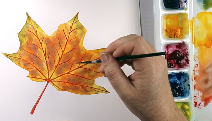
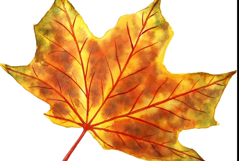
10. Autumn Leaf Part 1: This painting of an
autumn maple leaf is fun, easy and it will
give you practice painting wet and wet
and charging colors. I will be mixing
yellows, oranges, reds, and greens from my warm
primary colors to paint it, as well as browns. I'm starting here
with new gamboge, making a nice thick
consistency on my palette. Then I add some French
ultramarine and mix some of that yellow into it for
a warm, natural green. Now I'm mixing a warm orange
by mixing yellow and red. Of course. I'm getting all of my colors ready ahead of time since I'll be working with all of them
simultaneously, wet and wet. Now I'm using my oval brush
to fill in my outline. Close to, but not all the
way to the pencil line. Makes sure you watch the video on transferring your sketch to watercolor paper if you want to see a quick and easy
way to do that. Now I'm adding the yellow
all the way around the leaf. Since the outline area was dry, I can get a nice
clean, hard edge. Then on the inside of the leaf, it blends into the
water and softens. You want to paint carefully, but quickly enough so
the water doesn't dry. Now I'm adding the yellow
along the main veins. And here I'm adding a little green over the yellow
in some areas. And it makes us softly
since it's still wet. Now for that bold orange
and I'm just dabbing it around and between
the yellow vein areas and a bit of lighter
orange hair in there. The paper is still quite damp, so the little dabs will spread out and softened quite a bit. As the paper dries, some of the spots will hold
their place a little more, but we'll still have soft edges. Now I'm adding some
French ultramarine blue to the orange to
make a brown color. And this is holding its shape of small dots a little more than before since the paper is less wet and just a little damp. I also don't want to
overdo the brown. I want to keep most of
that vibrant yellow, orange and yellow
showing through. To add some more
interesting texture, I'm dropping pure
water around the leaf, which will displace the paint. The wonderful thing about
this project is fall leaves already have
unique abstract patterns. So there isn't really any
way to do this wrong. A bit more of the
browns and reds as the paper is starting to get
just a little bit drier. But I still don't
want hard edges here. Then I will let this
dry and I will show you how to finish it up
in the next lesson.
11. Autumn Leaf Part 2: The leaf is now dry
and you can see all the interesting colors and textures from the last step. I made a thick consistency of pure pyro scarlet, the warm red. I'm just filling in
the stem and veins on dry paper to finish
off the leaf. I used my size eight round
for the larger veins, then switched to my
rigger brush for the smaller ones that
connect to the main ones. In the first step when I was
mixing and charging colors, notice that I left
the vein areas light yellow in the last step. And that helps this
bright red to stand out and contrast
against the yellow. Now I'm switching to
my rigger brush here. And just adding those
finer lines and details. I hope you enjoy painting
this leaf and have fun painting them in different
shapes and colors as well.
12. Conclusion: Congratulations on completing
watercolor mixing mastery. I hope you find the lessons and demonstrations
useful and you can begin applying the principles to your next watercolor paintings. Once again, if you have
any questions about any of the lessons or watercolor
painting in general, please reach out
to me and I will be happy to walk you
through any questions you have if you'd like
to be notified of any future classes that
I've put out there. Please follow me on social media and I look forward to
seeing you next time. Bye.
 Aura Lesnjak, Watercolor & Mixed Media Artist