Transcripts
1. Introduction: In the first module, we
worked with a file liner. We did some of the
basics with it, and I want to expand on
that in this module. I want to show you some more
techniques that you can use with a fineliner
to enhance your work. That's not all what
we're going to do. We're going to mix now. We're going to mix ink, watercolor pencils and pencils. We're going to create some mixed media artwork as it is called. Before we get going, let me show you the final work,
and there it is. This is what I've created. Now, having said that, this might not be what
you are going to create. But that's at the
end of this module. I'm just going to
give you some ideas, what you could create. So a mixed media artwork, and you can see I just did something quite pretty
with it, something unique. And that's this module
we're going to create artworks and add a little twist to them to make it
really interesting. All right. I'll tell you in the
next lesson what you're going to need for
this. Let's go.
2. Sketching with Ink: We're going to do some
sketching with a pen now. We're going to work on
some different things. I'm going to show you
some extra techniques. Now, some of these we've done in the beginning a little bit, but I want to expand on them a little bit more. So what
do you need for this? You need a pen, and
you need your paper. I'm going to use the same
paper I've used before. I want to make use
of all the paper, so I'm just going
to draw on that. I've got a sketch of this one in the book of
note that will be in there so you can use this little sketch I'm using
to demonstrate something. But I want to show
you something first. In the book of notes, you find all these reference photos, as you know, and there's always two versions of
them. There's one. That's the plain version, which you can just copy, and the second one is
where we use the shadows. Now, what we want to
do in this lesson, we want to actually add these
shadows to our drawings. But we don't only want to
copy them from this paper. I want to show you a
little bit how this works. Okay, let's go to
that other paper, and let me demonstrate
something. I do have this flower. I got my pen, and what I want to demonstrate
you first of all, we're going to use
two techniques. Now, the ones we are a little bit familiar
with it already. But what I'm going to do,
let me draw a box here. And let me put a
second box there. These boxes I'm going
to make use of. Now, let's say with this box, the sun is shining right here, and with this box, the sun is shining on the opposite side. Now, if the sun is shining here, that means the light
comes from here and the direct light would
hit on this part. We've talked about that
already a little bit, but let's go a bit
more with that. And the opposite side,
this would be dark. So if I would hatch this, I will do my first layer. And then I will do
a second layer. To get that effect, and
here on the bottom, I might even do a bit
of a third layer. To get that nice gradation, that's easy to remember. Most light, we're
going very light. Further away from the light, we're going dark and you
get a nice gradation. Now, that's the first technique we're using is called hatching. We're going to do that
second technique, too. We talked about that
a little bit already. It's going to be
stippling, and I'm going to demonstrate that
now in that same box. Alright, let's go for that. Now, the sun is coming from this site, and
we're going to stipple. That means I'm just going to
put random stipples down. But the site where I have the most light I
don't want to touch, and this would be my
first layer of stippling. So I've got some stipples now. Now I want to create the same effects here, a second layer. So I'm just going to add
some extra stipples. And there you go. I
want to even have a third layer. And there you go. Now, you get a whole different
look right away than this, and just whatever you prefer
you use or whatever flour. Sometimes you want
to go delicate. So you could use this technique. Sometimes you just want to
go very quick and rough. This is quick or rough.
Use this technique. We just want to combine
this later on with color, and that is why we're
practicing a little bit now. So that's the first
step into this. We're using hatching
and stippling now, but that is just on a box. So what we want to do next? I want to do this
flower and demonstrate that a little bit.
Alright, let's do that. So I've got this flower here. Now, I'm going to first determine where does
my light come from. And let's say with this flower, the nice thing is to
just get our light here. So that means these
parts are all lighted, the most closer and
further away like here, like here under here, and this in the back,
that is less lighted. Now, what we want to do in this module is combine this ink with colored pencil and watercolor pencil and
it looks really nice. So then you can work even a lot faster because you already
have all your light and shadows in your
drawing and you don't need to regard
that with your colors. So what I'm going to
do? I'm going to mix these techniques a little bit
to show you how they work. Normally, you would not really mix them, but we can do that. Okay, I'm starting with
this obvious petal. Now, the light is here. So what I'm going to do is I'm going to hedge
away from the light. That is my first layer. And then the second layer, I'm going to say, right. There basically is
a lot less light here and the furthest
away from the sun. I might do it like this.
Now I've got this part. This here would catch
very little light, but I don't want to hatch
in the same direction. I'm going to go in an
opposite direction. Do them really close
together, and there you go. Now, this stands out
that this is dark, and this is less dark. You could even go cross
hedging on this one. So go exactly in
180 degree angle. So cross hedging
demonstrator on this box. This is my first hatch. Now 180 degrees
would be this hatch, and you get an even darker part. See, that works
really nice on this. Let's do this petal here. I'm putting down my random. Step ofs. All right, that would be my first layer. Second layer around here, a bit further away from the sun. And then I have a third layer. See, and that looks.
Quite different than what we already had. I want to put a few more here. And now I've got nicely free distinguished
layers on this petal. See, that works great, too. It's a bit more
delicate, isn't it? I'm not going to do
all of these petals, but with this petal, I'm going to demonstrate
that this one would work a bit more opposite. The most light. The less light, least light would be there, and I would just fade it away. And there you go. And then
the most light is here. See that would work a little
bit different opposite, and that looks just great. Alright, now, this one, we're leaving it like this. We're now going to
the bottom one. With these ones, I
have a choice now. Now, this petal on the here, for example, is
blocked by this petal. So it would get rather dark, and I'm going to just
do that probably. But I'm not going to put in much light and shadow.
Let me hatch this one. And as you can see, now
I'm going really close. There you go. But I'm going
to leave this a bit white, but not as much
as I've done now. See, I'm putting in a
bit of lighter shade. Now, get a shade here. This is where the shade
is the strongest, but it's a lot less there. But to be honest, this is not
close to this petal here. I want it really a lot darker, so I'm going to
just rehatg that. And there you go. And
a bit more there. And that will be this one shaded because this
one is blocked. This one gets a lot of shading. And now you right away
see the difference. Now, I have to do this one too. The light is there. And
let's light is there. And there you go. Now you
can still see clearly. Even though I shaded this one, you can see that this
one is different and lays a lot deeper
than this one. Stippling, if I
would do this one stippled, the light would come. This is all folded, so
that has hardly any light. And then around here
would be the least light. And here would be a
little bit more light. And there you go. Then I
have this one stipple. Now, if this one is down, this one lays deeper in again. So this one, I
would then stipple, at least on the beginning there, really dark, under here, too, where this one is overlapping
and around that edge too, and the rest, I would
stipple a bit less, but still stipple quite a lot. And now you get a distinguished you get two
distinguished petals. You see a difference
between this one, yeah, which is stippled
quite heavily and this one which is stippled a
lot less. So this is deeper. Now, in theory, you
could turn this around. You could do your main flower stippled really
heavy and strong. And then the ones that are
in the back a bit less. You could work like that, too. So that is an option you have. But for this one,
we'll just do it like this the easiest way. But still going to demonstrate
the other way around. Alright, the other way around. So we now have this. Now,
let's turn this around. Let's go to this petal. Without the explanation, this
is going to get confusing, but since I'm explaining
it, this would work. We've got this petal. Let's say I'm going to shade
this really heavy. There is no light there, but there is quite some
light, less light here. So I'm already closer
than the rest. Further away from the light. I am even shading more heavily. And at that bottom, I'm going to put a really dark, close shading And there you go. Now, even create a little
bit of a shadow line here because that catches the full light,
and there you go. Now this is still a petal, and I would still shade
this very little bit. But you can see the light
and shadow working on that. Now, we have a petal
on under here. And what I would do with that, I would go the opposite side, but only shade it like that. That's it. Now you get
the clear difference between the petal under it
and the petal above it. Here I would do the same too. I would only shade
this one like that. This one I would obviously give a bit more shading since
this is more prevalent. But since I want this
to be the top one, I'm keeping this one
really the darkest, and I'm just playing
with shades on that one. Let's do this one. And there you go with this one. We're not going over
the top like this one. This is really strong
and this is a bit less. And then you get
some sense of depth. Now, let's do this one, too. And this one depending on
what you use. There you go. Alright, that would be it. Now, let's do this one, too. This one here. This catches light, but since I have done
heavy shading here, I will just do it like
that so that you get that distinguishing
between the petals. Alright, so that is
basically it for this. Now I would for this one here, put some light shadow on here, too, and for this one. Definitely some light shadow. And a bit more here. And that's it. With this one to recap
here, this part here, I use the lighter
shading on here, the more heavy shading
on the lower petals. With this petal, I went the
opposite way, and I said, I'm going to do the heavy
shading on the top one, and I'm going to do the light shading on the one under it. That's a choice you can make. Now, most of the time, I will just make use of
the first method, do my top shading,
not too heavy. And when I go down, use
a very strong shading. But if I have something
really in the back then, then I will use very
light shading again. So free tones, basically. Regular, I would say, very dark under which is directly
under the regular. And then the stuff that is far away, I would do very light. Oh, I got to demonstrate
that to him. Okay, let's imagine there's
a leaf now behind here. I'm going to throw that leaf in. Now, this leaf will not be
in the original drawing. Let's say, there's
a leaf behind here. What I would do with that leaf that leaf obviously
has some shading. And There you go.
That's what I would do. I wouldn't do anything more
except probably around here, a slightly more shading there. That's it. Now I get three
distinguished layers. I get the front ones, then the back ones which
are really strong, but the ones which are
really in the back, this one is really light. And then you get some
nuances of shading. That's it. Looks quite simple, but it may need some practice. So I would say practice this, get a bit comfortable
with both the shading, stippling and with the hetching. We're going to use both of
them in the coming lessons. We're going to combine
this kind of shading and inkwork with our colored
pencils and watercolor pencils, which will give us a
totally different result from what we've
been doing so far. Alright, so your turn. The first step would be transfer that little flower to your paper and sketch it
with the loose sketching, not the continuous line
but loose sketching. Then once you've done that, add the light as I've done it, and then I would
recommend just drawing a new one and do that one in the stippling,
first one hatching, second one all the
way in stippling, and then perhaps create a third one and change the
light yourself and say, Okay, what if the light
comes from somewhere else? Perhaps you can figure
that one out, too. Okay, well, that's it. Have fun with that, and I'll
see you in the next lesson.
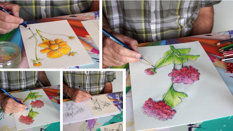
3. Ink and Colored Pencils Part 1: We've done some practice now, and now we're going to
use that practice to create something
for our artwork. We're working on a
mixed media artwork, so we need certain parts. For that, I'm going to
assemble some images together and we'll create a beautiful piece
of it at the end. Now, the two images I'm going
to use here are these two. Now, that makes up then three of them because I've done this
in the previous parts, pad that up and show you a little bit of a
final result on this. Didn't talk you
through it, but just you see how it looks like, and I'm going to
use this part too for our mixed media artwork. I'm going to put that aside now. So I've got these two. And what I'm going
to do with them, I'm going to just
hetch one of them, and I'm going to
stipple the other one. So let's go for
hetching on this big, the larger one, and
the smaller one, I'm going to use stippling. I'm going to start
with that first. And once I'm done
with the stippling, I'm actually going to
color this the coloring, I'm not going to talk
you through that. Since we've practiced that in the previous lessons already, I'm just going to apply
the same techniques. It will be at the end of this
video, those both of them. This one I'm going to do with
the oil dominant pencils, this one, with the
wax dominant pencils, and I'm just going to color. I will tell you at the
end which colors I used. But first, we're going
to just draw them or at least create the
shading in them. And once we've
created the shading, I will speed up the video
where I'm coloring, and then I'll get back to you. But let's start first. Okay,
before we can, of course, start, we need those references
and let me find them. Here's one of them.
These are the daffodils, and this is the one I used to transfer the image to my paper. And now the next step,
what I'm gonna do? I'm just going to
use this as a guide, and I'm gonna shade it. And that's just
the next part I'm gonna do. Let's
start with this one. Alright. So what do you
need is? Some paper. I'm using sketchbook paper, by the way, I promise that. Let me get the
sketchbook with it. I promised that in.
I think the material intro that I was going
to use the sketchbook. So now I am actually just using a regular sketchbook with
a bit textured paper. And if I hold it up close, you probably can see that there is some
texture on this one. Not rough, slightly textured. It's a nice paper, so it has
a bit of a different color, so we're just going
to play with that. Now, aside from the paper, I'm just using a pen, of course. This is the Statler,
0.3 pigment liner. And I've created this
already with it, and I'm just going to
keep on going with it. So let me get that
reference with it. And there we go. How
am I going to do this? I'm going to put this
one here and put the reference there. So
what I'm going to do? I'm just going to look
at this reference, and I'm going to copy it. Now, this is very detailed. I might go a bit quicker than that to get a bit
of a rougher idea. So let's go let's start
with this one then. Now, on here, there
is the shadow, so I'm just going to
copy that shadow. I'm going to hedge that in
and there I go. Looks nice. I want to extend a little bit. And now I'm hardly touching the paper to get that second in. Now, this I did a bit rougher. I no, not rougher. I mean, a bit firmer, and the rest I just did
very loosely in it. Now, this petal doesn't
have a shadow here, but I want to add just a bit of shadow behind
there, there you go. Now, the next petal, I see. I forgot some lines in it, so let me put simply back. Some of these lines, and now
let me start shading it. I'm just following a bit, imagining the way
this petal goes. So the shape of the petal, I'm following a little bit. Might need some darker there, and I definitely need
some darker there. Now, for this part, the
easier way is to turn this. So I've turned my paper to
make it a little bit easier, and let's see, I need
shadow right here. And I need shadow under there. That petal is casting those petals that actually too are casting a shadow there. And at the base here, I just want some more to make
it look really nice. Now, that's going somewhere. Let me see. Do I want? I'm going to keep it turned like this, and I'm going to
do this part here. And I'm seeing that I've put this leaf actually
on top of that one. That is not good. So
let's correct that. I think we can still do that. Let's just draw it in. And let's do it like that and then ignore these lines and
now shade this part in. So it's not exactly
as it is here. I have let it overlap
a bit more now. But what I'm going to do,
I'm going to shade that part in and by shading
this in really dark, I'm making this part
part of this petal now. And I'm just going to
shade under here too. There you go. Now,
that looks good. Now, this has become part of this petal again.
Okay, I've corrected. Hopefully my mistake
a little bit. Let's add a little
bit of shading here. All right, good. Is there
anything easy I can still do? Let's see. Now, this
has that underp, yes, I can do this folded part, and I'm going to put some dark shadow definitely on there. Alright. Okay, now I have
this shadow under here. And we're going to extend
that a little bit, and now this one
here on the here. This petal has
quite some shadow. There should be some
shadow on this fold. Let's just add that now. And then do some shadow
on this fold, too. Let's see. Let's continue
here and let's just bring in that shadow. Right there. And a little bit more right
there. And there we go. Alright, is that this petal? Yeah, that looks petal. Sorry. Is that this flower? Looks pretty good, doesn't it? Yeah. Alright, I'm going
to leave it like this. Asset is not going to be as
detailed as in this image. The pen I'm using is
slightly thicker, so I'm making the best of it, and I don't want to
have a one on one copy. I just want to play with
it a little bit, too. Following this as a guide, perhaps adding,
changing a little bit, you can do that, too, and create it a bit
like you want to. Alright, let's continue. I'm
going to do this part now. Created nice and dark here too. Nice and dark now, that looks
pretty good, doesn't it? Alright, I think I'm
done with this here. What I want is a
bit shadow right. On this one, I haven't
done anything. I want a shadow that
fold and I need still to put a bit
of shadow here. And let's add some
around there, too. And now I see that
this one part here, this fold on the bottom, I'm going to create some shadow, too, make this slightly darker. And let's see. Just a little bit of shadow there, and
now I'm going to stop. Alright, now that looks
pretty good, doesn't it? Now, the rest, I'm
just going to speed up because it's
the same process. I will keep on filming, speed it up, and then I'll get back to
you for the next one. Okay, I'm done with it now. There it is. I'm
totally done with this. So the next thing, what
I'm going to do with this, I'm just going to color
it. And that's part. I'm going to speed up,
as I said already. And then once I've colored this, I'm going to work on that. Second design, stipple that. So let's color it first. Let
me go through the colors. These are the colored pencils I'm going to use the artizas, the white dominant
colored pencils. Now, obviously,
there is the indigo. The other colors I need
to go fru daffodils. I'm going to go
with the yellows. I'm going with a very light
yellow, a sapphire yellow, then with a lemon yellow
as a bit darker color. And then with the Sunflower
yellow as the darkest color. So those are the three yellows. Then the greens in order. Let me put them in order. The first one is spring green. That's nice for a
daffodil, isn't it? Then you have the
parakeet green, and the last one, I'm going
to use an emerald green. So range of greens for that. Alright. So I'm just going
to speed this part up, and I'll see you at the end, show you the result, and then we're going to
go to the next part. Sir. Alright, I'm done with this one. Looks nice, eh. It's quite different
on this kind of paper, as you've probably seen
from what you just watched, that I used some less layers. I used a bit of a heavier
application of the column. Not really firm, just
slightly more because I just know this paper will
not take that many layers. So I might as well get
some more pigment in right away instead of applying
a lot of layers, since it won't take
that many layers. So I worked just a bit
quicker on this paper, but the result is pretty
nice, isn't it? I
4. Ink and Colored Pencils Part 2: This one I'm going to stip on. So let's get into
that right away. But before I can do
that, of course, I need the example with it. So let me look that up.
Okay, and there they are. The more in it. Ignore this. This is the drawing and the drawing I transfer
to the paper. And at the bottom here, there's a little bit of
the shadow and dark, and I'm going to
use that again as a reference. So let's do that. I'm using the same pen
again, the 0.3 Stetler. I'm going to look
at this example. I'm going to start with the
heart. Hard is obvious. Now, in this one,
it is all hatched, so I'm just going to use that as my light
shadow reference, and I'm going to give
this heart some stipples, some shadow around the bottom. There you go. Move into
it there right away. Now, probably from this little
part I don't can imagine this is going to take a little bit more time than a hatching, but it also will give
a very nice result. And especially on a
very small drawing like this, it looks quite nice. Bigger drawings, too,
but on a small one, you don't have to spend
that much time on it. Then if you use a large one, hetching really
goes a lot quicker. But for a size like this,
stippling is perfect. Let's continue. So
I've done that. Now I'm going to do the
more obvious parts that are these petals
that are folded. I'm going to do them quite
dark with the stippling. Going to identify all of them. See, there's some here. But there. Here is one. There you go. There's
one behind it. Give it some stipples. This is pretty much
folded here, too. I know. I'm going
slightly random. Whatever my eye sees. I'm just following that. Oh, let's see. Here's some more. M a little bit. Here's some more.
Oh, definitely. There's another fold. This
is another fold here, too. All right, let's
check the other one. Let's go with this. This
is one, definitely. Here's one. All right. Now, let's check.
That we've got. Now let's look at
this flower here. Be a bit more tricky
to do this one. A little bit small,
but works good. Nice. Let's see. I'm going to do this part now, and this is very dark. It's all cross hedged, so signifying it is dark. So let me right away, create something really
dark here and then, too. If you want to go
dark, make sure the dots are really close to each other. There go. All right. Now
there's a leaf here. Obviously, I didn't
just draw in, so we'll forget about that one. But if you would have
this leaf and this leaf, then stipple them
quite dark too. All right, I think I got might
have all the major parts. Now let's do a bit of a heavy application in
this part here too, to create some depth. There you go. Now on this heart which I
want to bring in the back and give
some dark parts too. All right. Let's see here. Here are some of these
folds still. There you go. Now, here I want to create
a really dark part two. Okay. That looks quite
interesting, doesn't it? Quite different than all
the hatching going on. Now, I'm just going to look
at this reference and say, other parts that I need to go dark on this flower
because most of them were left pretty light on the
reference. Here's another one. Let's see. These are
some faults, too. There you go. Let's see. This part here. Stipple
in a little bit. All right. Okay. That's interesting
so far so good. Extend these a little
bit into really petals. Alright, now this flower
under here is darker. So I'm just gonna stipple
it just a bit randomly. Here I want a heavier
application here, too. Uh, that brings it to the back and that brings this flower here to the front. All right, we're going
to work in color. We obviously bring some of
the color back. Let me see. There's supposed to
be a line here too. Might just as well
stipple that in now give this flower
that is under there. Some more stippling
too. All right. Connect some of the dots. Connect the dots,
some of the parts. Here I missed some. And stippling around the heart, the petals in the heart. Just a bit more here. Put this one a little
bit into the back. There you go. All right, do the same with this heart, too, that is under here. Call bring that a
little bit to the back. Bit deeper than it is now so that you get the idea that this flower is
in the front, indeed. But the other flower. These
flowers are more in the back. Alright. We're gonna stop here. Okay, that's the preparation
for the coloring. Now I've stippled this, and now I've brought in some
depth by doing that, some light, some shadow, and I was just gonna color it. Let me see which colors
I'm going to use. With this one, I'm going to do something slightly
different than the others. I'm going to use a
range of gray colors, except for the blue indigo, which we use for the
really deep shadows. What I'm going to do with these? I got a range of gray. I got full grays.
There's no black in it. I'm going to use this
really darkest gray, put that aside for the leaves. The other three, I'm going
to play with light parts, mid parts, and the dark parts. Now, that will give me a
completely different artwork than when I'm working
in this color. Should be a nice
contrasting artwork in total, in the whole. So then we will have a drawn
one. We've got a gray one. We've got some colored ones, and putting that together
in a mixed media art piece will look pretty great.
Alright, I'm going to do that. So free grace, and then
a really dark one. If you don't have really if you don't have that
much grace, only free, then you could use
for the darkest one, the black, but then
use it very lightly. Okay, let's go with this. C Alright. Well, I'm done with it. This is the end result
of what I've created. Now, instead of using color, I use these grays. No grays, technically a
color, too, of course. Mixing it in with that blue makes a very interesting
drawing, doesn't it? Now, you can see
this is all darker, and that makes this
come forward a lot. And even in here, I
use the tones to go from dark to light to
create some depth to it. So now we've got three of them. Ready. Color one, two, one. Pen, one in gray
tone, one color one. And in the next lesson, what we're going to do, we're
going to add another one. We're going to do one
with watercolor pencils. Then we've got four drawings, four color drawings, for
our mixed media art piece. And then in the
lesson after that, we're going to do
something really interesting with
that. All right. Well, I would say
create your pieces. And once you've done with
that, move to the next lesson. We're going to add
one more piece to this collection.
Have fun with it. And
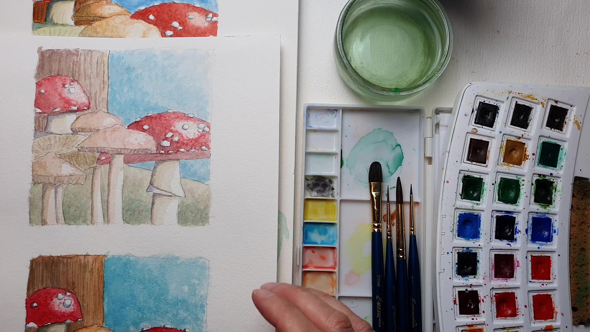
5. Ink and Watercolor Pencils: I want to add one more piece
to my mixed media artwork, and that one I'm going to do in a combination of ink
and watercolor pencil. I'm not going to
guide you through this part of creating
the mixed media artwork. I think you've got
enough knowledge by now that you can just pretty
much do this on your own. But once I've talked you through the colors, shown
you the artwork, there will be a sped up video at the end so where you can see a little bit
of what I've done. Okay, let me show you
the finished result, and there it is. So this is my fourth part
for the mixed media artwork. Now you may recognize this. Perhaps you don't
recognize it at all, but it is in the book of
notes and references. And let me show you
that this part here. And what I've done, I've created recreated
this little part, and using the grid method is perfect for that
because you can blow up something even from very small
to something really large. So I just took part of the drawing and created
a new artwork from it. So from one drawing, even from one photo, you can
create various artworks. So this will be the final piece to the mixed media artwork. Alright, the colors, let me
go through that with you. Now, the dark colors is obvious. I used an indigo for that, so we can settle
that matter now. The green, I used
free greens for it. The lightest color is chartresm. That's really a
very light green, but really more like
a yellow green. If you don't have this color, what you can do is mix a very light yellow and a
light green together, and you get pretty
much this color. So then you would need a
fourth color, actually. The next color I used is lime green as a bit of
a darker color, and the dark color, the fd
color is absinthe green. That's my green color. So a range of free greens. Then the next thing
is the petals. For the petals, I used I
got to get that right. Only two colors. So while
I used three colors here, I used only two colors
for the petals, and the light color is. Let me check that Tuscan sun. So an orange yellow, not a totally orange, but an orange yellow color. That's for the bright colors. And then for the dark colors, I just simply used an orange. And as you will
see in the video, I'm just coloring a lot
with the light color, then the dark color and
then mix them in together. For the heart, I use
slightly different colors, and that is Tuscan
sun for the yellow. But what I'm going to do
with that is you will see that I'm not going
to paint the top part. I'm going to go
halfway in the middle, use the orange as my dark color, and then just pull. When it's wet, pull this color to get the
light orange color. Alright, and that's it. So an orange, yellow flower and I thought
that was quite pretty. Now, in real life,
this is pink or white, but we've used some pinks
and whites already, so I figured let's create
a fantasy piece of this. At least the flower is real, but the colors aren't real, but still look pretty nice. Paper I used, let me
show you that, too. Must be somewhere here on
the desk, and there it is. The paper I used is cold
pressed paper for this. And there's another
one coming out of it. Just a sheet of
cold pressed paper. Cut it to the size I wanted it. So this will be my final piece. So cold pressed
with a fine grain, fine texture. Well,
you know that. Okay. And that looks
quite pretty, isn't it? Okay, so we cut the colors. Now, I drew it first, and I just drew the outline.
Then I hatched it. The hedging is in
the video, too, and then I just started coloring and then I started painting. Alright, that's the
watercolor pencil piece. If you keep on watching, you
will see me creating this. If you say, Well, I can figure that out
pretty much how to do that. Then I would say, create it and then move to the last
part where we're going to assemble it all into a
nice mixed media artwork. Alright, enjoy it, and I'll
see you in the last part.
6. Project 4 - Creating a Mixed Media Collage: No, I'm not gonna
read this newspaper. In this newspaper, there's
something I need to finalize this mixed
media artwork. Now, I've got the four
parts now, totally ready. And these four parts, I want to make an artwork
of I want to combine them. Now, for that, I'm gonna
need a few things. I need, of course, the artworks. I'm gonna need an
empty sheet of paper, quite a large one that
will fit all of them. I need some glue. I'm not going to use glue, but what I'm going to use is I'm going to use
double sided tape, and my wife has a
nice thing for that, so I'm just going
to borrow that. She doesn't know that yet. When she gets home,
she sees that. Probably quite some of
the tape will be gone. But I think she's
fine with that. So I'm going to use that, but as I said, clue can do, too. Or if you just have the loose
tape, that would work, too. And I need something that
is in that newspaper. Well, let me carefully open it. You still don't see anything.
Let me find something. Alright. In that newspaper, I have this dried flowers. We're going to create
a mixed media artwork. What I'm going to do
is I'm going to use dried flowers and mix them
with the flowers I've drawn. Alternatively, you could put
let me carefully take it up. You could rip up the newspaper and just
make a background with it, too, or you could just draw
quick flowers on this. Paint it. Color it. But use something else. So no color pencils, no watercolor pencils, but
I'm using something else. I got to put this one aside. And we're switching cameras
so that we can work. Alright, let's do that. Let
me open up the newspaper. Now you've seen some
of them already. I'm going to get them
out very carefully. They're nicely dried.
Put them here for now. That's the first. Those
are the first ones. I'm just gonna keep on going. There's some more leaves. Carefully put them
out. Small leaf. Quite nice. I'm just
gonna keep on going. See, nothing in there. Yes. No, no, where is it? Right, there's some more. So what I've done with
this, as you can see, I've put the flowers in kitchen between two
sheets of kitchen towel. Then I put this newspaper
on top of it on it, and put it in the newspaper. I folded it, and on top of this, I put just a huge
stack of books, left it there for two weeks, and then you get these
nice dried flowers. Two weeks should be enough
sometimes three weeks. Alright, I'm getting
them all out. And they're very delicate, so I got to be careful with it. A nice collection. And let's go. There must be more.
In this newspaper, I think I'm skipping something. Yes, there we go.
And when it's done, it's always a surprise. Oh, these were clovers. These still are cloves, but they're now dried clovers. Putting them aside, too. It's a huge collection. By now. See is there's more? Yes, there is more. There's a beautiful
purple flower. Put that aside, too. And as you can see, I put the
quam sum in this newspaper. I think I wonder if there
might be some more in it. Feels like there
maybe some more? Or did I get it? No, I guess I'm going through it once more. Check if I have everything. I think I've got it all. Yep. I think I do
have it all. Feel it. Feels like I've got all. Okay, put the news paper away. Now I'm going to
move this sheet up. And what I want to do? I'm gonna arrange them a little bit. I've got plenty, so I should be able to fill up this sheet with all of this
beautiful dried flowers. I've got clovers there. Just making kind of an
arrangement with them. And then I'm going to
put on top of that The artworks to see
how that works best. So then I need to arrange the flowers and I can go
even on top of the artworks. If we go on this one here, that one might want there, and then I would put this one under there. Now, that's good. I need something here. Go look behind here. See, there's one
I can definitely use I just put this one the other way
around. And there you go. Now, the clover is gone. That's a pity, so
I want the clover. To be here, probably.
Now, that's good. Alright. I think I keep the arrangement a
little bit like this. You're going behind there. So I'm going to play
with this a little bit. This one goes a bit higher. So this will be pretty
much my arrangement. Yes, that is nice. Let's see what's
behind here now. I might move them
over a little bit. And this one. I might I'm gonna cut this
one. Now, I got that. Scissors. That Well look. I'm going to put this
one here. Right. And now we've got the
flower there, clover there, and I think I'm fine
with this arrangement, and that makes it look
quite interesting. Now, you could go also
with the flowers over it. I don't think I'm
going to do that. I'm going to leave it like this. Now I got to get
it all on there. So that's why I have
the double sided tape. I'm going to just
put the tape on it, and then stick everything on it. Almost there. I switch hands for this one. Make sure the stuff doesn't
get stuck on it either. And one here. And I
should be, pretty much. Fine with it now. Right.
There's the grid. I need one in between
there. Alright. I'm done with this.
Okay, now let's move the paper in position again.
I've moved everything. Alright. We're gonna put that clover now
here. There you go. Turn this one around.
Put it right there. All right, this
one goes up here. The pretty purple
flower goes down here. Do this leaf. Right there. Okay, now I'm gonna stick the artwork on and we'll move
this one up a little bit. There we go. This one goes here, but I got to do this one first. Make sure this one
fits there. It does. Gonna take this one off has enough to stick. Yes, it does. There you go. This one, definitely, too. Put it up like
this. That's nice. This one goes now here. Alright, and now we got
that final artwork. I want to make sure it sticks. On there, it won't. Now it will. All right. And that sticks too. Pressing them down a little
bit, and there we go. Alright. Good. Right,
and that's it. I'm done with this.
Stuck it all on there. And it's now completely done.
Put it up a little bit. Can you see it? Yes, you can. And I'm peeking over it. Oh,
I just use the sight, huh? Right. That's it. That is my
artwork. Now it's your turn. Create beautiful
mixed media artwork. Create those drawings. You have them from the lessons. Do something unique with them. I used to dry flowers. You could do paint,
hark, pastel, you can put glue
on it, throw sand, different colors of sand on it, leaves, dry nice, leaves,
put them on there. There's really a lot
of things you can do. Be creative with this,
create something unique. Alright. That's it. Well, that's it for this. Module, I'll see you
in the next one.
 Benjamin A, Art Teacher, illustrator Art by Benjamin