Transcripts
1. Intro for Skillshare videos: Hello, and welcome.
My name is Emily, and I'm an artist and instructor based in Madison, Wisconsin. In this hour long
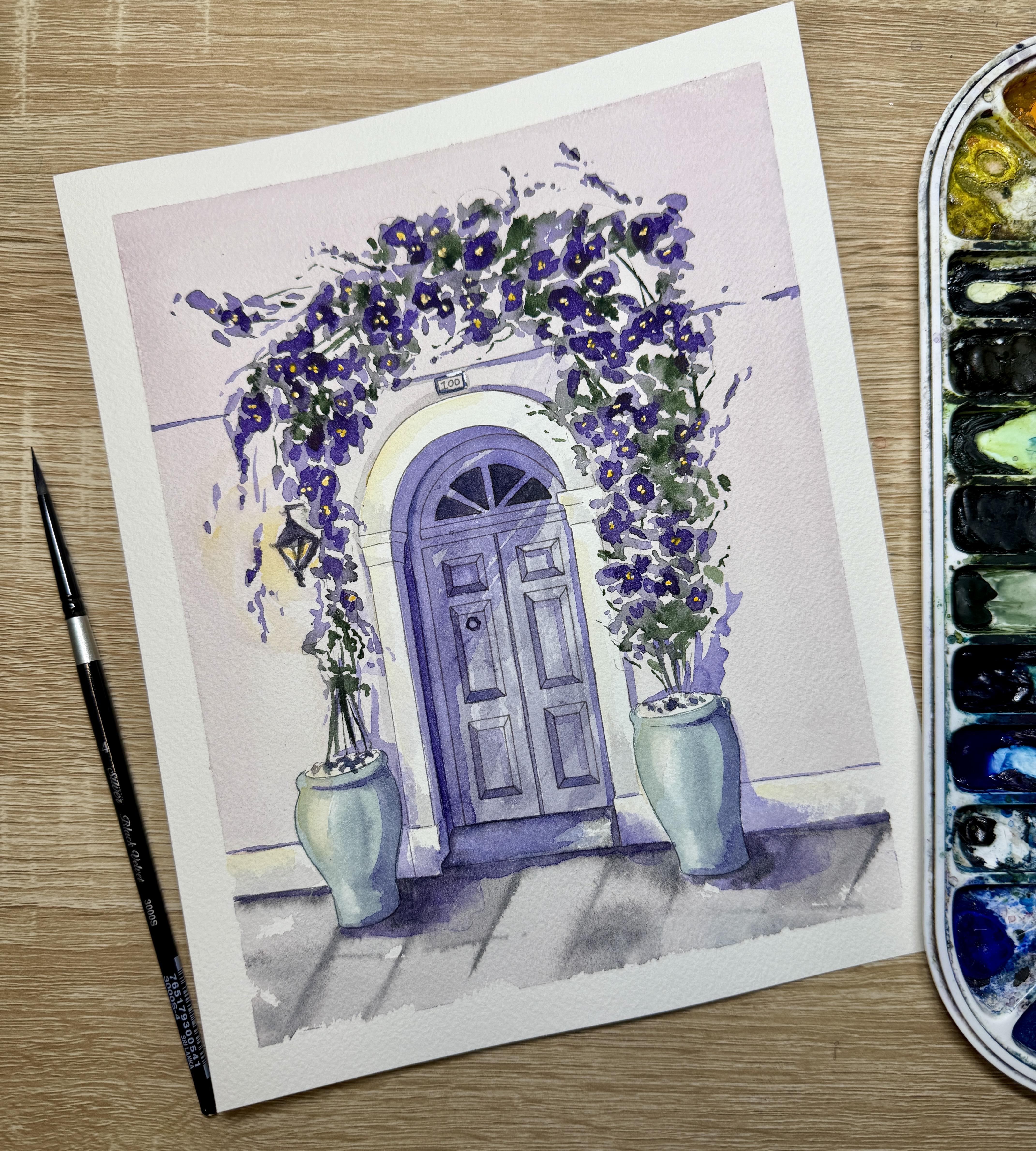
tutorial in real time, you'll learn how to paint one
of those colorful pictures of doors and flowers that
you've taken on vacation. We'll start by
learning some tips for a nice flat wash on the wall. Then we'll look at how to paint some loose Bugambilia flowers. We'll talk about the power of intense cast shadows and how to add them
to your painting, even if you don't see one
on your reference photo. We'll end with a second layer
to define our flowers and some white gouache details with a yellow glaze to add warmth. You'll have access to a tracing template
included in this tutorial, as well as some color
reference photos and printout instructions that will teach this
tutorial step by step. So grab your supplies, and let's get ready to paint.
2. First layer of Door with Plastic Wrap Texture: I To start out our
watercolor painting, we are going to use some plastic wrap to
create a little bit of texture just for
the wooden door area. Now, this, of
course, is optional. So if you do not like texturing your paintings or you don't
want to wait for this step, you don't need to do this step. First, I'm going to
cut out a section of plastic wrap that's the
same size as my door. I want to make sure that it
can be a little bit larger, but it's not too much larger because I want to
paint other sections of my painting while I let that plastic wrap
dry just slightly. Then I'm going to mix the color that I want to use for my door. So I'm mixing a little
bit of purple along with sal blue to make almost like
a slight periwinkle color. I'm going to paint that
door section first, and then I'm going to lay
my plastic wrap on top. I decided to add a little bit of brown to my color
just to tone down the vibrance to make
it look a little bit more worn down by the elements. And now I'm ready to paint. So I want to use a very
loaded brush here. I need to make sure
that the door stays wet before I put the
plastic wrap on. So make sure you're really
loading your brush up, really piling on that liquid and pushing the
liquid to the edges. Now I'm making sure to I'm covering all the windows
here at the top, but I'm just making
sure that that column that's on the left, that I'm not painting over that inner edge of the column because I want my
columns to be white. I will be adding
some shadow onto it, but I don't want them to
have any purple tone to it. As you notice, when I paint in large sections like this door, I'm constantly going back
to where I started and kind of re wetting the space and making sure
that it stays wet. I'm also taking a
lot of time to make sure that the edges
are nice and clean. I need to make sure
that my edges are clean before I add
the plastic wrap, because it's kind of hard to correct your edges
once they're dry. It's much easier to correct your edges and make really nice clean edges
while it's still wet. Alright, so before I lay
down the plastic wrap, I always like to kind of go over everything one more time, just to make sure
it's evenly wet. Then I'll grab my plastic wrap, and I like to lay
it down kind of gently and then
squish it inward. This makes sure
that I do not have any sort of paint that
goes over the edges. The more that you squish and bunch the
plastic wrap inward, the more texture
you're going to see. So wherever the plastic
wrap is bubbled up, you're gonna notice
that that's going to be just slightly lighter in color. I'll leave the plastic wrap on while I let that section
of the door dry. I don't need to have
that section dry completely in order to get the effect of
the plastic wrap, so I'm just going to
leave it there while I work on the vases.
3. First layer of Vases, Wall, and Floor: Alright, so now we
can start working on our first layer of our
vases and the background. So right now I'm mixing up the color that I'm going
to use for the vases. Now, you can choose whatever
colors you would like, as well as, of course, the door, whatever color
you'd like for the door. I'm mixing a little bit of teal using a thalo blue
and a deep sap green. And then I'm adding
a little bit of brown once again to
just kind of tone down the vibrance of the color
and to make it look a little bit more weathered
for the elements. My I'm going to start on my
vases at the very tip top, and then I'm going
to come around that left side and do one
solid brush stroke, and then I'll skip a
little section and leave a little triangular highlight
along that left side. I'll fill in the
rest of my vase, and then I'm going to drop in some darker pigment
along that right side. So I'm trying to just kind
of make up my own highlight here instead of using the exact highlight that I'm noticing in my reference photo. Now, while it's still wet, I'm not washing my brush. I'm just grabbing some
indigo directly from my pan, and then I'm going to drop it in along that right hand side. Now, it's important
that you're not washing your brush in between dropping in your
darker shadow color, because if you wash your brush and you have too much
liquid on your brush, you're going to push
that teal pigment away. You don't have to
use indigo here. You can also use a Paine's gray. If you wanted more
of a vibrant shadow, you can use deep sap
green or you can use really any darker color that
you'd like for that shadow. I decided to blend out the
edges of that highlight. It was a little bit
too intense for me. So I washed my brush, dried it, and then used a damp brush to just kind of blend around
that hard highlight there. I'm going to do the exact same
thing on this right vase. I'm going to still paint a little bit of a
triangular highlight there. I'll go through
all the same steps where I will paint
the base layer first, drop in a shadow along the right edge there
using an indigo, and then I'll come back,
wash my brush, dry my brush, and use a damp brush to blend
the edge of the highlight. So At this point in the painting, you're more than welcome to
take off the plastic wrap. You should notice that
it's still slightly wet. You will need to let it dry longer before you can
work on the door. But we also need to
let that section dry a little bit quicker so that we can paint the second
layer on our door. Alright, now that I have
the plastic wrap off, now I can get ready for painting the brick side or that
cement side of my house. I am using a little
bit of yellow, but then it was
too bright for me, so I decided to add a
little bit of tan color. So this is a raw sienna light. And then to that, I'm
adding just a lot of water. So I'm using a quill brush
to add a lot of water here. And then I'm going to slightly mix in a little bit of magenta or purple in order to kind of get a little bit
more of a warmer color. When I start painting
the background, I am going to actually flip
it upside down because I want the paint to just
kind of drip nicely. And I want it to be
a very even wash. So when I want an even wash, I want to make sure that I don't have I want a lot of liquid, so I'm using my quill brush, but I don't want that liquid
to stay in any one place. So I'm starting with
my quill brush, and then wherever I'm
noticing that I need a smaller detail brush
to kind of get up close to the vases or get
up close to the door, I'm going to pause and then use my detail brush to push
the pigment up close. Now, you'll notice that I'm
doing this in sections. So I'm going to wet
that whole area, and then before I move on, I kind of work on my details. Then I can finish that whole section with
my large quill brush. To do a really nice
gradient wash, we want to make sure that we work quickly and efficiently. That we have our board
slightly elevated so that we're using gravity to help us and that we are working on the edges and finishing the edges
before we move on. So I'm doing the quill brush
for this large section, and then I'm going to go
back very quickly with my detail brush and
come up to the edges. All right, a pro
tip here is when you're done, take a brush, and along the bottom line where you've got
that bead of liquid, take a damp brush and then dry off that bead of liquid from the bottom
where you are leaning it. We want to make sure to get
any liquid off the tape. We want to make sure
to get any beads of liquid off the paper, or otherwise, when you
set your paper back down, those beads of liquid are just going to be
pushed back into the painting and create
a hard edge somewhere. Alright, so at this point,
we're going to start painting the cement walkway and the
step in front of the door. So I'm starting by mixing a shadow violet
with some water. If you don't have shadow violet, you can use Payne's gray. We're going to do this
section by section, so I'm going to start
with just the step first. So I'll paint a first layer of the step and then
I'm going to go back around the edges
of the step with some concentrated shadow violet. Notice I'm not washing my brush. I'm not getting more liquid. I'm using whatever
liquids left on my brush, and I'll drop in
that shadow violet around the outer
edges of the steps. Now, you can leave
little sections of this, um in that first layer, you can leave a little bit of white paper to shine through. That's just going to leave
a little bit of texture or you can just paint
it one solid color. Now, I'm going to switch
over to my quill brush to paint the walkway just so I
can do it a little bit faster so that I'm using a
bigger brush and have a little bit more
time to drop in my darker shade before it dries. I'm going to start by outlining the connection between
the door and the walkway. Then I can use really
quick swift motions of that quill brush to
just roughly um, layer some of that
color in the front. Once again, if there's some little sections
there that are coming through of dry
paper, I can leave it. It just adds to the texture. I'll go back with my
smaller detail brush, and I'm going to drop
in that same color, that same shadow violet, first along the upper
edge of the cement, and then I'm going to also
drop in around the vases. I'm going to get a little bit
of that same shadow violet. I'm not adding more
liquid to my brush, but I am going to add a few horizontal stripes
to the ground. This is going to act kind
of like the grout in the pavers or like that
dirt in the pavers. And I'm using a very
light touch here. The cement is wet, so it is going to
expand just slightly. I don't want it to be a very
hard edge yet at this point. And then I'm going back
and adding a little bit of extra shadow violet
into a few of those sections just to kind of give it a little
bit more character. Um, remember that this
is the first layer. I'm doing all of
this wet-on-wet. I'm not looking to have really extensive details
yet at this point. I'm just wanting to add a
little bit of light and shadow.
4. Shadows on the Door and Wall: Alright. Now that
my door is dry, I'm going to start on the second layer of color on my door. So I started by mixing some
more opaque shadow violet. This can also be Pain's gray. And I'm painting the
little triangular sections at the top of the door. Technically, this is a window, and so I like to use
gray or shadow violet to just kind of represent
that they are windows and that it's a little bit darker
than everything else. Alright, I'm going
to take a peek at a second layer of
color on the door. So I want to make the door just slightly darker than the
molding around the door. And so I'm going to
mix a little bit more purple with blue and add a little bit
more of that brown. I don't want this
layer to be that much darker than my first layer, but I needed to mix a
little bit more purple. It should be around
the same consistency, the same transparency
as the first layer. There's a little section on the left side of that door
where I'm not going to paint. So I'm technically just
painting a second layer over the immediate door. There's a little bit of
kind of molding around the door that I'm going to leave as that first purple color. And I'm going to add
a second layer of color just over the door itself. Now, when I finish the door, I'm going to take a little
bit of that same purple, and I'm going to try
my best to almost line that leftmost edge of that crown molding and kind
of bring it up and around. So it's going to have a
little bit of a shadow on it. Now, to paint a little bit of shadow on the white columns, I'm going to grab
a little bit of that shadow violet
and mix it with water to create a little bit
lighter of a transparency. Then here I'm going
to start with the column that section of
the column on the right side. There's a section of that
column and then there's a little tiny sliver of white in between the
door and that column. I'm just painting that
section of column in between. If it goes over that little white section,
that's okay too. So I just want that
innermost section to be kind of darker. And I'm going and I'm adding a little bit of dry
brush along the base of that column and just kind of gently dry
brushing and swooping upward. On the column on the right side, I'll do just a little sohe
with a dry brush up the base, the baseboard there, and then along the base
of the column. And I decided to do the
same thing for that white along the cement. It was that edge is
kind of weird for me, so I'm going to
take my paper towel and just dab off that edge. I still want the texture that
is left with the dry brush. But to kind of correct
those edges there, I like to take my paper
towel and dab it off. I'll add a little bit of shadow on the upper parts
of the column. So same thing, a
little dry brush on the edge of my brush and
just a quick flick upward. We'll leave a little bit of that pigment there and
act like a shadow. Alright, I'm going to
use that same gray color to add a few little
dots into the vase, the top of the vase, that's
going to look like stones. And so I'm going to use a little bit more opaque
of shadow violet there. I'm not doing
anything fancy here, something really quick to
kind of add a little texture. Now I'm going to use
that shadow violet again to add a
little bit of shadow on the wall side
next to the columns. So using that shadow violet, I'm going to add a single
line along the top there. That's printed out on
your paper as well. And then I'll go and
I'll kind of outline, just do one line of shadow around the outer
edge of that white column. So what I'm doing
here is I'm just creating a little bit more
three dimensionality. Because this column is going
to be set against the wall, not in it, I'm just adding a little bit of a
shadow along the edge. And then with that
same shadow violet, I'm going to add a little bit of shadow violet to the
top of the light. And I can also add
shadow violet to the bars where the light is hanging and the
bars in between. Alright, the last little
detail is going to be a little bit of shadowing
on the molding of the door. So I'm going to mix
up a little darker, a little bit more
opaque of a purple. Once again, that's with purple, blue, and a little bit of brown. And then I'm going to
go ahead and paint the left and the bottom of each of these squares and rectangles using this
darkest of color. Now, because I'm impatient and I end up doing
layers too quickly, the first layer
wasn't completely dry when I started
on the second layer, so I've got a little bit of
bleeding that's happening. It's not a huge deal, but if you can let
your first two layers dry fully before you
add this last shadow, that would be recommended. And then we'll add just one little thin line of that dark purple in
between the two doors.
5. First layer of Flowers: I'm going to start with my
first layer of flowers. Right now, I'm mixing
some purple with water. I'm looking for more of
a medium transparency, medium to medium light. I just want to make sure
that I mix enough of it so that I can be painting
very liquidy here. So, right, when I start, I'm going to work
section by section, and I'm making different
size of blobs, basically. I'm going to leave
some space between the blobs because that's where some of the
greenery is going to go. And I'm kind of using
the edge of my brush, not the full flat
edge of my brush, but not the tip of my brush. I'm going to keep within
the limits of outlines, those rough outlines that
I added to the paper. I can go over the molding, I can go out on the
side a little bit. My dots don't all need to connect and they're going
to be very watered down. Then I'm going to
take a little bit of deep sap green without
washing my brush, whatever kind of liquid
is already on there. And I'm going to
add a little bit of deep sap green to the stems, and I'm going to create
a few little stem like sections on the
inside of the flowers. Both stems, and I can add
a few almost, like, dots, the same types of
dots that I did for the flowers
themselves because that's where kind of some of the greenery of the
Bugambilia is going to be. I'm trying to keep it within the sections that
I did not paint, but I am touching the purple. So you will notice that the
purple and the green is going to slightly mold
together and blend together. Once that's done, I'm
going to go back and take a little bit of deep sap
green directly from the pan, so it's a lot more opaque. And then I will.in
a little bit of that opaque deep sap green wherever I think it needs
to be a little bit darker. So I'm going back to some of those green sections and just kind of darkening
them up a little bit. If any of your sections
get a little too dark, or if any of the color is expanding a little bit too much, you don't want that
much green expanding. You can take a dry brush and lift up some of that
color with a dry brush. We're gonna keep moving and
do this section by section. So I'm doing roughly, like, a 1.5 to two inch
section at a time, just so that the
first layer of purple doesn't dry before I
can drop in that green. Now, as I come to some
of these sections that towards the end
of the Buganbilia, as it's curving up
around the door, I can always add a few little
almost like strands of tiny dots that are coming out of the main section and the main
segments of the flowers. These little dots that are these little
kind of vines that are coming out do not need
to be connected together. So I'm not painting a
full line coming out. I'm painting almost
like these little dots. And it's just going
to give the illusion of a little bit more of a vine. Y So I am liking how these little vines that I'm adding off the edges. I'm liking how that's
looking. So I'm going to go back to the beginning
and just add a few more. Basically, like, dotted. So I have a very light touch. And because of that light touch, there's some segments of these vines that just
aren't connected fully, and it's almost like dotted
coming out of the edges. Alright, so we'll
continue moving along. I'm not going to speed this
up because I want you to see in real time just
how fast I'm doing this. I know it can be challenging
to paint loose like this, but sometimes we need
to force ourselves to just kind of move
a little bit faster. And by moving slightly faster, we kind of have a
little bit more random of brushstrokes and it ends up looking a
little bit better. So try try your best
to kind of push yourself along and to not get caught up on
making it look perfect. We will be adding a
second layer here. So all we're doing is we're wanting to get that
first layer of the basic shapes and
colors onto our paper. So now, with the
nature of Bucambilia, it does tend to start really strong on one
side of the plant here. And so we've got it really nice and volumptuous
on that one side. And then as you come to
the other side of the pot, it's basically where the vein where those vines are ending. And so we're going to have the flowers be a
little bit thinner. It's gonna be thin out there and then connect again
with the second plant. And so having it a
little bit thinner on one side versus the other is also going to help it look a little bit more like Bugambilia. You can either
leave the shape of the Bucmbilia as very
arched or you can go on in and add a few little clusters to
change the shape slightly. I decided I wanted to change it a little bit and add a
little here and there. Sometimes it's hard to stop your brain from adding
to the extra spaces. So at some point you
just have to be done.
6. Second layer of shadows: Alright, we're going to start to mix a very strong shadow color. So my shadow color
is going to be a mix of purple and blue. And I'm still adding quite a bit of water
to this shadow color. I want it to be a
nice juicy shadow, but I also want it to be
fairly opaque in color. So you can see to the
left of my paper, there's some little
swatches there. That's kind of the
coloring that I'm wanting. So it's fairly opaque. I'm going to start by painting the little segment that's
in between the molding, the white molding and the door. That's going to be the darkest. And then I'll go and
I'll add a little bit of shadow to that stair there. I'm going to add a little bit of shadow to the right
side of my vases. I'm following the
curve of the vase, and then I'm going to
add a little bit of an extra shadow along that
rim there, that upper rim. And then where it
cinches into the pot, I'm going to add a little bit
extra down below as well. Now, you'll notice
that I'm using a damp brush to soften the
bottom edge of that shadow, but I'm leaving the top edge of the shadow as a hard edge. I'll then go and I will paint a strong cast shadow on the ground using that
same purple color. I'm just trying to make
more or less the shape of the pot on the ground. If that shadow edge is too
hard of an edge for you, you can always take a
paper towel and blot off the furthest most edge of that cast shadow just to kind
of soften it up slightly. Lastly, I added a little bit of water to that shadow color, and now I'm painting
the whole interior of those white columns using that purple
shadow color just to kind of really push the shadows, the light and shadows here.
7. Second Layer of Flowers, wet on dry: Now I'm ready for the
second layer on my flowers. The first layer that I did
what on what is already dry. So now I'm looking
at my second layer, wet-on-dry to add some
hard edge details. I've mixed up a medium
transparency purple, and I'm going to go in and
create some flower like shapes in these lighter
purple sections here. So to do the second layer, I am keeping it once
again very loose. I'm using more the
tip end of my brush and connecting some
different shapes of dots into clusters. So these dot clusters are
where my flowers are. They don't need to be
perfect dot clusters, but I'm basically adding
these dot clusters wherever I'm noticing larger sections
of that light purple.
8. Intense cast shadow: Alright, so I'm going back to that same shadow color
that I mixed earlier, and I'm going to use
that same shadow color for a large shadow on my door. Now, the key to doing these
large intense shadows is to have a very
watery, juicy shadow. I do not want hard edges on
the inside of my shadow, so I'm going to keep it
really, really, really juicy. Now, I start by outlining
the left side of the door, and then I come up
around the arch. And now I'm just painting
almost diagonals of that color. And I'm leaving a few slits of undercolor to shine through. The reason I'm doing
this is because it's going to look a little bit like sunlight is coming
through the Bugabilia and kind of highlighting the
door a little bit there. I'll come back and add that
darker shadow on the arch, and then I'll come around and
add a little bit of darker, more intense shadow to
the right of the vases. Mm. After adding a little bit of
shadow to that base step, I'm going to come around that right side of
my column and just very meticulously
outline a little bit of that column on the right. So I'm adding just the
slightest and thinneest line of shadow on the door side, not on the column
itself, but on the door. From here, I'm going to play around with adding a little bit of shadow color behind
the Bugambilia itself. So I'm coming to the
right side of the vase, imagining that the sunlight
is coming from the left side, and so all my shadows are
gonna be on the right. I'm still keeping my
shadow very juicy. So it's very watered
down and juicy, and I'm kind of trying to mimic the plant slightly coming
out of this right side. I'm going to do the same
thing on my left planter, although it's going to be a
little bit smaller in size, because it has a little bit less of greenery
on this side. I'm going to come in with
that same deep purple and add a little bit of shadow
around the outer arch. I have a little bit of
this arch peeping through the bottom of the Bugambilia
then I'm going to add another layer of
shadow on the top of the arch and along that line edge of where I'm noticing that cement kind of
coming through the flowers. All of these hard shadows and these deep dark shadows is going to give the illusion of
this kind of sunlit door. So if your shadow color
is not opaque enough, then you lose that intensity and that brightness that
we can get in watercolors. And lastly, I'm going to use that same deep purple
shadow color to just deepen and darken
some of my details, including the light
and some of the rocks. And then I'm going to use
that same deep purple to add even more intense shadow
along that column there. That's that tiny sliver in between the white
columns and the door, and then I'll darken up that little circle on
the door as well.
9. White gouache, yellow glazes, and final details: Alright, because I didn't
want to mask out where the yellow centers
of my Bugambilia were because I was painting
them very loosely, I'm going to now add
white guash into the centers of
these purple clumps to act as the yellow centers. So I'm going to add
whitewash first. Let that white guash dry, and then paint on top of the whitewash using
a yellow watercolor. So I'm basically
adding a dot or two. It can be multiple dots. It's not just one.in the
center of Bugambilia. So I'm trying to add two dots into the center of
each of these purple clumps. Alright, so we're going to give that white gouache just
a little time to dry. And then once it's
dry, I'm going to use a fine detail brush. This is around size zero. And I'm going to go
back in with some yellow directly from my palette, and I'm just going to paint
on top of that white. I just want those centers to be a little bit more leaning
towards yellow than white. Lastly, I'm going to take
some of that yellow, and I'm going to add
some of that yellow to the center of the light here. And then I'm also going to
bring just a little bit of water on my brush and then extend some of
that yellow outside of the light fixture itself. So I decided to switch
to a round size four, grab mostly water on my brush and just a
little bit of pigment and expand that yellow
just slightly so that I've got a little bit of
a glow around the lamp. I'm going to then
add this kind of watery yellow glow around my painting in certain sections, just to kind of accentuate
that glow slightly. So I can take some of that
water down yellow and add just the slightest hint. I'm basically glazing
a very transparent yellow along the leftmost
side of my white pillar here, just kind of to reflect that
glowingness of the light. And I can also add and glaze
a little bit of that glowing yellow in the left side of my vases and kind
of wherever else, I might imagine a little
bit of a yellow glow.
 Emily Marie Watercolors, Watercolor Artist and Dog Lover