Transcripts
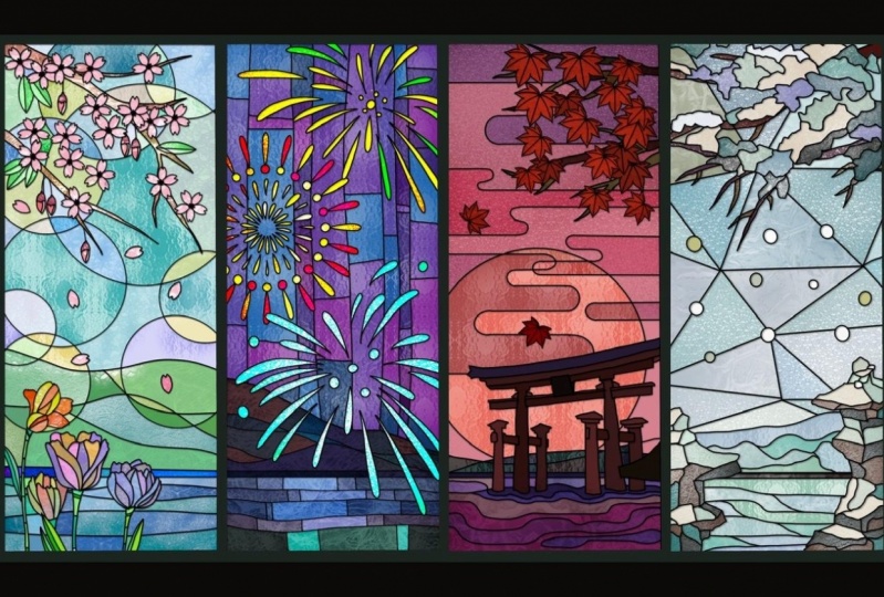
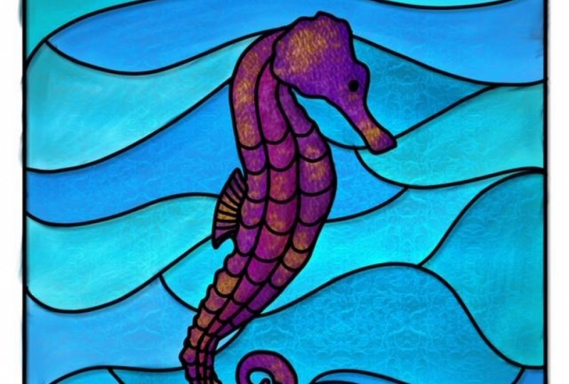
1. Intro: Hi, everyone. I'm so excited. You here to my newest glass stained glass and procreate. It's Simone here from the vintage in of calligraphy. In this class, I'm going to show you how to turn simple art, any of your art and pretty cool and stunning stained glass and procreate with some brushes , some texture you can do for, like animals. You can see the before, and after you can do flowers, you can design windows doors. You can do pretty much anything that you want anyone of your art as well. We're gonna have some cool texture brushes to play with some texture, you can apply to other art, geometric forms and windows as well, so you feel ready and let's get started.
2. Simple Art Pactice : So we're going to start with something really easy just in abstract art. So we're gonna open or canvas. That's gonna be 10 by 10. Just the blank 1 10 by 10 300 D. P. I and, um, you can name a stained glass and I work in inches those 10 inches by 10 inches. I'm going to just insert a couple of arts that I found on on Splash, but I'm just going to use it as an inspiration because they're pretty abstract. So it's two different types of art, so it's not going to be anything really similar. And I chose one for the color and the other one just for the style. So I'm gonna pick some of this colors here through the color drop. So I have a blank color palette, but by might wheel and, uh, just gonna put my finger and one of the colors that some of the colors that I like and with my pen, I just touched the squares underneath the wheel, and that's how you get those colors. So you feel if you have not done this before, you just hover your finger around the art and you see a little looks like a magnifying glass. And when you see the color day, you want you just, uh with your pen, just touch the square and the color will go in there. It becomes part of your palace. So I have several already that I'm going to use. I always get more than what I need to just in case. So I'm going to do you eat that layer because I'm not going to use it and reduce the capacity of the art that I want to use as an inspiration. And on the top layer, I'm just going to start drawing. So I'm also saving black and white just in case going to get my monoline on. Let's go ahead and start with a square, which is like the frame, and I'm so thankful of the straight lines that you can get appropriate that you just hold your pen and you can tell I'm not very good at writing or drawing a very straight line. So thankful for that feature. So I have my art in there and just turning around the position that I like, and I'm just going to trace over to separate the collar section so something very, very easy. There's no a secret to it at all. And you can do this with all kinds of different ones. You can just loosely draw flower or bird butterfly. I actually have a butterfly coming up in the next video, Um, but you can use you can use this for any type of shape that you want. So I just wanted to start with the abstractions because it's pretty easy. There's, uh doesn't we cry any Thailand? Let's put it that way. If you have watched my previous class on physics, you know, I like to duplicate a lot because I'd like to save my work in case I need to go back and redoing. Reduce something. So I'm going to duplicate this a few times. Want to save and the other one because we're gonna use it for the shading. So I duplicated, like, several times, and I'm going to go ahead and add a texture. So one of my texture brushes, I'm not sure which one I'm gonna do. Uh, let's go ahead in paint first. So I modified one of deeper create acrylic brushes into, um, I call the stainless acrylic just because It gives a little bit of extra texture the way that I like. So I just, you know, one of the the colors that I chose from the problem just gonna paint around it. I have no plan. I'm just dropping some colors and painting and just have fun with that. Just choose the colors from the palette and just go ahead and put it on the canvas. There's not no any exact plan. I'm just doing what I want. And now under the much brush and the same brush under this much, I'm just going to kind of smooth it out a little bit. We don't have to. I just want to do it just because I think school. But I absolutely have to can leave it the way that it waas. I'm actually going to make some changes at the end, so it doesn't really matter. I just want to show you, you know, my process, so just going to smooth it out. So there's a good transition from one color to another. Now under the eraser. We're going to get the hard brush, and I'm just going to get the access that it's out of that square so there's nothing on the outside of my supposedly, you know, art canvas. So I have a canvas in the Cayman. So I'm just getting the access outside of the Black Square. I'm gonna duplicate what I just did, and I'm going to save it for later, just in case like I usually do. And I'm gonna play with the hue and saturation a little bit, and I'm just going to make a little bit more vibrant. I also like to play with the capacity a little bit, depending on what kind of art that I'm doing or the purpose off the stained glass art. But this one, I'm gonna leave it at 100%. And now we're going to do some shading with the outlines as well. I need to give a little bit more dimension. So you're going to get the bottom layer and you're gonna go and do the adjustments, and you're going to just do a little motion blur. Don't say about 15% to the right, and that's what's going to give a little bit more death and to your art. Now, you could stop right here, but we're going to go a little further and add texture brush, and it's going to look a little bit like this. This one already has my one of my brushes in there. But I wanted to show you what the death this and I'm going to go in more detail on to all these blending modes that you see right now on to my next video and also has a step by step on the shading. But I just wanted to get a feel, um, of what it looks like on the just a little simple art. So if you're ready, let's go on to the next one.
3. Stained Glass Sun Catcher: Okay, so in this class, we're going to do a sun catcher to be similar to a dream catcher. But you can do like animals or usually you see birds. I'm going to do a butterfly. So I'm going to go into on splash dot com because those pictures are royalty free. You can use for personal or commercial. You don't have to give credit, but it's nice if you do. So I'm just gonna look for butterfly picture. I like this one. I'm just going to, uh, save it into my camera wall. I'm gonna add it to my que vous size it to the size that I want to do it. Turnout reduced capacity. And I like to work on the other side for some reason of this picture. So I'm gonna true, right? I don't know why, but I always like to work that way, and I'm going to just trace it over, lock the butterfly and get the monoline. Just trace it over. You don't have to do anything perfect because the outlines is going to outline is going to represent metal. So it's not going to be to detail is actually going to be quite smooth. So just trace over. I'm doing like some whimsical style. You see what I mean at the end? I'm not gonna follow the pattern off the real butterfly that I'm using. I'm just using some of it because that's just how I envisioned the stained glass to look like on the butterfly. So I just wanted to do some easy line work now that I finished the outline Very simple, Just like you see him going to duplicate quite a few times. I know I'm gonna need at least three copies of it, so I just for just to be on the safe side and I'm looking for a color palette. I don't have anything planned. I just I'm gonna used mostly lighter colors just because we're going to be using some clipping mask a lot. And they seem to show better when you use lighter colors and you're going to see the effects which you can go ahead and also do a little editing on your own. If you don't like the way the shade, the shading of order tone, the value of the colors they're using. So now I have my extra copies. I'm going Teoh, just remove the actual picture and I'm going to click a couple of the outlines. Just keep it as an extra. I'm gonna go ahead and choose my colors. I'm going to use lighter colors for this, but I'm gonna use darker colors for a different one. And I'm going to go into the bottom layer and I'm going to call start calorie. I usually also color the outline of the bottom layer because I just do that. I don't know for some reason. So the bottom layer is going to also not going to have a black outline. But it's not gonna show in a final design anyway, So it doesn't matter. You don't have to do that. I just do it just because I like it. So I just Joe some pastel comes. I think that's awesome, baby coz and I'm just going over and putting on the each of the sites the same oops, the same color on each side that took a while end. After that, we're just going to start putting our textures and so not choosy. I'm not thinking too hard of what colors. I'm just going to I'm just adding the lighter colors right over here, our own brushes that I made for the stained glass. Some work better than others. This one is my favorite. I will include in the classroom, and I hope we live in as much as I do. So I'm just going to choose a medium grey just because it's just a neutral one. Or sometimes I go a little lighter, and I do that in a different layer off what I wanted to pain. And that's because I'm going to use the bland mold a lot. So you see the butter find one layer, and the other layer is what I'm using with the texture brush. So I'm going to just do the first piece of the butterfly. Can you see already? That has that glass, in fact, and I do a clipping mask just because if it goes outside my design, it will disappear. So it's not going to be everywhere on the campus and whatever's extra, I'll just use the eraser, and I were erased on the layer off the mask and not your design, but the layer day. You pain it on top of your design, so the design of the butterfly is not affected This is what's great about clipping mask getting the extras out here because I'm going to add a different texture for each section of the butterfly. And by the way, I decided to go for a white color instead of gray just because just because there's no reason at all. But I go in between white and gray, and sometimes they put a blue in there because it has a great in fact for some reason. And if I do a different collar, I usually use the blend mode to have a different effect on it as well. So I'm going to use a blue for this one, and it looks a little messy. Then I go over the multiply dark and I go usually toward I check all the blending modes and sometimes I go to different ones and I choose different. Depending on the effects that I get, this one got the more like a frosty effect. And don't forget to for each affected that you want to do so. Each section of the butterflies going to be a different layer and you're gonna clip mask all of them. It seems like Alaba a really isn't if you're doing the same texture for different parts. Then you can use the same clipping mask off course unless you want a different effect using the same texture. It's getting a little over complicated, so I'm just going to use a different texture for different in a different layer. For each section off the butterfly, so is the same each side. So it's not. It's not going to be, you know, for every single little piece, but all just in one side so you can see here that the blue I didn't get that super purple effect, but he got a little bluish, frosty kind of effect, and you can get all of those different supercool fax by Messi around with the blinding lobes of your brushes. And I think I I'm going to do a class on that coming up because it's way too much fun. You can get so many different effects. It's just pretty much messes with the colors that it's on top and below the layer that you were playing with. This is a different brush that I did. It's all my brushes of texture brushes, so they're pretty much like seamless, um, patterns. And that's you know you can use it as a brush or just paying the whole canvas and use it as a texture earlier, it's the effect will be the same. So I kind of do a mix of both and just messing around with the blending modes. I use a lot of linear burn, multiply, and I also do the one the lighter one, the linear like the pin line just because they have such in luminosity at the very end. You see some of that that gives an extra, you know, on extra something something to your design because it just makes it all lighter. No. Okay, so all the colors and textures are in that I want for this butterfly. So, Mom, going to color the outline for a medium grade because I wanted to be so over so just like a metal. So I'm doing the It's going to be the top layer is going to be silver and I'm still gonna leave the black outlines underneath because I'm gonna do the Gaussian blur or the motion blur just to give the dimension that it's almost like in bossed de post. So you see what I mean? So I'm just doing a little bill Noble chalk with a lighter silver and a darker silver just to look like there's some reflection off the silver. You don't have to do that. Sometimes it doesn't even make that much difference. But I like the detail, so I do a little bit just in case, and if you zoom in, you can actually see the difference. So I moved the black version, the black outline underneath, agree, and you can see that I did a little bit of used either. The motion blur the Goshen blur, and it looks like it gives him just more dimension. More death. And I usually do two layers, one on direction. Just so the blurry part is all around, just not in one direction, but so you can do the Goshen blurry guests because that goes all around. I like the motion blur sometimes, but it is up to you is not, you know. It doesn't have to be one or the other. I do reduce the capacity, though, for whatever layers underneath. Just so it's not true, Striking looks a little bit more realistic. If you just leave it like that. Pure black is just it looks too much. But again, it's up to you. I'd like to reduce to capacities just a little bit lighter. And it looks more realistic now for the pretty much. The last part is just a little bit more time consuming because I'm gonna add a reflection to the metal to the silver part. So you're gonna get a soft airbrush um, about 10 to 12% size and just reduced capacity A little bit. Image is going to go over the metal part very lightly until you see a little white ist show up. Uh, so it takes a little bit of time. It's the color y a little bit more than half of the capacity and about 12% of size soft brush. And you just go over all around it right in the middle off the grey outline off your design and is just going to look like they're some reflection. And it's not just flat metal on the state glass, but it's more how to explain this part, but in a little bit more like mu tal, clich? If that makes sense to you, I don't add this in every single stained glass designed. It depends on what it is. I don't do it on Windows, and you're gonna see that later on on the future video that I have in this class. But I do on this one because it looks also more and me then something that it's just a mass produced. So I'm just beating up the video a little bit, so you don't have to see everything, but you're going to see the whole thing after it's finished. So you have to, you know, go through like, 10 minutes over just any reflection to the metal. If I see that some of the white parts are just whiter than others, I just go on and get a medium brush on a racer and I just go over the reflection, just everything. So just looks even. It doesn't look that there's just one big part that is white. Now we're ready to add the background. That's gonna be the final part, and I'm just gonna go to splash and get maybe landscape of greenery landscape with some sun if I can so just type in escape, I guess. Let's see what comes up. So after scrolling for a little bit, I found something that I like, and I'm going to insert it on the background off my design. I'm just going to, uh, making a lot bigger than my canvas just because I want just a specific part of that picture on to my design and I got it from on Splash. So it's a royalty royalty free can use for commercial and were personal. So make sure that you don't give pictures out of Pinterest, and they're tempting, but they belong to someone and unless you have permission, So I'm just trying to make it the design center or close to the ray of light, because when I reduced capacity of the glass, it's going to give the impression that the sun is going through it, and that's my whole point. So just hang in there while I put everything in the position that they need to. Everything seems to be in the right place. But if I move one thing, I have to move everything. So I'm just going to leave it where it iss and reduce the capacity a little bit. And you can see that some things you can like some of the leaves, very little you can see through the glass so can just leave this butterfly floating in there has to be hanging from somewhere. So even though you're not going to see where it's hanging from, I'm going to just draw string, and it's going to be very thin. I'm just going to do with the same color the same grade that I used for the outline of the Butterfly. But I'm going to use a six B pencil just because it has a little bit of texture. So, you know, it doesn't look like something that is obviously drawn by someone. So I'm just drawing the string that it's going to go outside of the campus so you won't see the end of it and a little bit of, Ah, hook where the string is attached to, and that one you can design with monoline feel one because it's representing the piece of a medal anyway. And there it iss your son catcher in front of a nice greenery ray of light tree. And you can do that with different backgrounds. That's well, it looks better. I think if you have like the sun behind them, but you don't have to, and you can make the glass a little bit see through so that sun can go through it and gives a much nicer effect to it.
4. Stained Glass Window: Okay, So wrong Next piece is going to be a glass window. So I'm going to open up my canvas, which is still 10 by 10. 10 300 bp. I just like before, and I'm going to just I think I'm going to use the symmetry for this one. So I'm going to turn it on so I can only draw one side of the window or the door. Whatever you prefer to dio, we're going to get some inspiration on Splash just to see what you know what kind of windows I would like to go and colors came and all that. I don't have a color pat up color palette in mind at this time. I'm just gonna go with some bright colors because I wanted to be a little darker, brighter will darker and vibrant at the same time, if that makes sense, okay. Think I want this window here, so I'm going to do ah, screenshot and just add it to my canvas so I can trace over a I make some changes in the future. I probably will, but I want to use this one just as an inspiration. Plus, I can just trace over it. So if you're gonna trace over anything, just get the shape right. You just open a layer on top of it. You reduce the opacity off the whatever picture that you paced eight year canvas and with the monoline, I'm just gonna go do just a simple line over and it doesn't have to be perfect about. Probably change it because I already have a different window shape in mind. But I'm going to use this one just to start. No, I'm just playing around with the shapes that I won on the glass of the window. So I must I don't have a plan. I'm not sure what I'm going to end up doing. Just doing some line work and see what it looks. Good. So I'm going to delete a bunch of times and redo is free food free to play around before you have a final work done. And until you're happy with whatever line geometric shapes or if you want something that it's more Kirby side. If you want some figures like birds or flowers, that's fine, too. I have another way that I did with flowers and Dragonflies, and you can probably posted in a project so you can have an idea what it looks like. So I'm just gonna go and keep with, like, simple shapes. So I don't keep this goddamn Have the class care being too long for you to watch? No. - Okay . Think I'm happy with the shapes and the line work that I have right now? I just wanted something simple so I can show you how to apply the texture brushes on this one in some effects that I really like. So I'm going to duplicate. I deleted the rough draft that was underneath that I used to retraces. So I'm gonna duplicate a few times, save one for later in case I need to go back and redo it if I don't like what I have and I'm no, I'm just going to start adding some color. So I have a bunch of color palettes here that I used in past projects, and I'm going to go for the bright upright. I keep saying right, but its vibrant. I want vibrant colors, even if it is a little on the darker side. I want that moody feel because that's what reminds me of church windows and that's there. Mostly staying glasses. Well, so I'm just going to go to my color paella here in the bottom. I'm going to set his default so I can have the wheel and just drop the colors on the each place on the window that I want. So I'm going to do some purples and pinks and blues, and, uh, let's see how it goes. - Okay ? Color Zion, I'm going to go ahead and use the last layer on top of Well, I'm gonna open a layer on top of the last one and use my texture brush my favorite one, the traditional glass stained. And I'm just going to go and just use, like, a neutral color. Or I can go white. Actually, white looks better, so I'm just going to go all over it. I'm not going to use the one texture and whole window, but that's I start with one, and then I'll go ahead and make edits afterwards. So clipping mask, it just it doesn't go outside of my design, cause I'm gonna have a different background. And I want that to look white like a white or transparent window. So I'm going to. But the white drop of the white color on that section as well. So I want a black background or a dark background, cause I'm gonna add some light in the back. So I'm playing with the blending mugs and probably going to go with the subtract. Yes. So this adds exactly, in fact, that I like because it brings that church field or historical. It's a So I'm just gonna, uh, lower the opacity, just a tiny base. So it's not too bright, and I'm going to start adding different texture to different sections as well. So for the sections that you want a different texture, you're going to go on the same layer off the texture they use for the whole window and just raise that section day. You want to use a different texture. Don't go into the design layer. You go into the clipping mask player, and I'm just a racing just a couple of areas that I want something that I want to use a different texture. I'm gonna go for the frost one, which is my second favorite, and I'm gonna go on the sides. But you feel free to use a different texture. I'm just using the ones that come to mind right now. No. And as a reminder, if you're not sure what the blending boats are there on the layer right next to the check mark and you just click on that and you can go on the bottoms. The bottom is all the categories, and then each category has a list of the fact that you can use no de overall. In fact, that I'm using for this window is the subject under the difference category on the bottom that you can see. But you can absolutely use different checks, different effects for different section of the window. Just make sure that you have each section and a different layer so you can do that effect. And it doesn't affected the other parts of the windows so you can have different effects that just has to be in different layers. And I'm not completely sold on that red right in the middle. So I'm going to try to make it a little lighter. And I just changed the whole entire window color and I like this better, So I'm actually going to save the original on, just in case I'm I actually duplicate that on the gallery, so I'll keep my layers. I will save on a Jeep J. Paige, just in case I want to do so. Use it. You know it's ready to go in a also going to duplicate. So I keep my layers and then I'm going to use. I'm going to change it to that pink color because I actually like it better. So let's duplicate this blessed sign selected duplicate, and you can do that for any of your art. To that, you're not sure if you want to keep the original, you're just duplicated and keep it and you can decide where you want to do later. So I want to actually this new collar selection, and I'm going to keep this one, and I know the light. It's because it's so vibrant. Sometimes you can't see the details, but if you zoom in, you going to be able to see all the texture. So I'm going to add a light behind the window, so I'm gonna choose the soft brush, the big one, and I'm going to go on, go back. I'm going to go into a delayer underneath the design, and I'm going to do just a little dot and I'm just going Teoh, zoom out. We'll make it. Baker just really big the size of the campus, and I'm going to reduce the capacity so it's not too bright and put the window, but the window was already on top of it. I just click. So it appears again, and that gives a nice little light, bright light behind the window. I absolutely love that effect, and I'm just going to the layer on top off the design. I'm going to do a little motion blur so he gives that depths of like the black part looks like metal on top of the glass that is holding the glass together and you can see that and I also reduced capacity a little bit. So I do two layers of that one in each direction, one coming down to the right and the other one going down to the laughed address. So we has the depth on each direction that you and I still have the untouched layer. The line work on the very top, so it gives the design a little extra sharpness and this is it. We are finished with the window and let's just move on to the next video
5. Bonus Lesson : So now I have the bonus lesson for you guys. So we're going to start with some lettering. I didn't want to write it myself just to up save sometimes. So I just added the text from the per create and just make sure that you choose the outline options. So choose a fund that has that option. And I just did some simple love l o on the top ve at the bottom and save some copies. And I also gasam art as an inspiration that I got from Splash and maybe I could from Pinterest. But I'm not going to copy this. I'm just going to use as an inspiration. So I'm going to copy just a couple of elements and I'm going to change the color so you can see the love is going to be on top of that art and I'm going to Instead of dropping color here, I'm going to paint with a brush that I modified from. The acrylic is acrylic stained glass. So I made a couple of copies on the side there and I put a bit below, and I'm just going to choose one of those colors on that palette causes. They're just really brought vibrant. I'm going to also change the color of the outline of the same layer that I'm painting just so it doesn't get black smudged and to all the other paint colors. You see, when you use the acrylic, it kind of smudges the outline or whatever pain is around it. So I just want to use something that it's similar to what I'm already painting, so it doesn't get black mixed with it. So you're gonna choose the acrylic stained glass. And I'm also going to have that as a freebie brush for you to try later and just choose a couple of colors and I just go and start painting. So and I usually keep a little darker on the edges. So you're gonna see it at the end of where it's a little dark long edges, because that's what I remember stained glass to be when I was growing up. And as I pain, you might be able to see some of the greenish outline beings much to intuit, which is totally fine. That was actually my intent. I just didn't want the black beans much to it, because it just doesn't look good, and that would just add a little extra shade of a different color. But it's still within the painting palette that I chose. Okay, so I call her all the parts that I wanted to color some parts. I left it clear on purpose because I'm going to put something in the background so you can see the effect off the glass, and we're gonna work with the textured layer instead of a texture brush. And you can see that right now, as I do the clipping mask, I'm going to reduce the capacity a little bit. And I'm also going to include a texture, texture into the class, the court, so you can use it as well. I'm also still playing with the blending mode, so I'm going to just go over which one I like the best. I usually keep it a multiply, and that doesn't change the color too much. Just makes it a little bit more vibrant, so I'm just going to keep it at that. Now I'm going to bring in the lettering, the love, and I'm going to not paint that part. I'm just going to drop some color. The texture layer I'm going to use both for the painting part and for the lettering part, so it's gonna be two layers of clipping mask one for each, and they're going to blend and turn into different colors that you can see it right now. And I'm also going to do play with the blending modes as well. So that's what's going to give the different colors. So I'm just playing with the modes right now, and they seem to always gravitate towards the multiply or difference or subtract under the darken or under the difference. So feel free to start playing around and see which one you like. Best I all like Sometimes they changed my mind after I thought I'd like something better So but I think I'm pretty close to what I want. And I just a Christie capacity a little bit. So it's a see through because I want to put up background. Okay, now this is the color combination that I like with the effects and from the blood blending boats that I like, So I'm going to merge both outlines together the love and the art, and I'm going to make a couple of copies save one if I need to for later. If I need to go back to anything and I'm going to do the motion blur, I always try Goshen. Gaussian Blur also, But I he really most of the time I don't like the effect that it gives me because I like to move things around. So I like the motion one better. So I'm going to show you the difference here, Like the Gaussian Blur is just not If you move it around, it's just doesn't give that depth that I need. So I'm just going to do the motion blur instead. Yeah, this is much better. I like the motion blur. Definitely better than the Gaussian Blur. So now it's time to add our background. No, we're gonna goto on splashes you usual to get or background. Just type in sunny landscape, sunny greenery, sunny mountains, sunset, sunrise anything that has ah, a little sun array of sun ray of light in the background so we can give a little extra special effect. Now I have my background. I put it to fit to canvas. So it was just sunset. It could be a sunrise. I'm not sure. So I'm gonna put that behind all the work. Um, as of the first layer from the bottom and you can see that you already can see the background through the work through the stained glass because it's a little bit of transparent. So I'm just going to reduce the size of a little bit so you can and I'm just gonna turn turn it around a little bit as its position. So it looks like it's hanging from somewhere. Now we need to make this look a little bit more realistic. So you go into the layer of the background on the picture with the sun, and you're going to get your lasso tool, and you're going to just make that square the size of your stained glass. You're going to swipe with your three fingers, copy and paste, and that actual copy is going to go to a different layer, and you're gonna go to that layer on the adjustments and do a little Goshen blurred until you hit a little blurry background. So I think I went to, like, 20% last time, so see, let's do you can see the blurriness that is behind the stained glass, so you can actually choose how far you want to go. I think I'm gonna go around between 18 and 22 and you can see that you can still see the background behind the glass. But it's blurry a little bit because it's through the glass. Now let's go ahead and other hook. That's the less part. I keep saying. That's the last part. But I promise you the less part. It's the hook and the string to hang it. So I put the hook a little bit to the left because the sign is a little. It's not straight hanging from the top with sideways, so it can be a hook up right in the middle of the square. So I put a little bit on the left side so it makes more sense there. You haven't that's your stained glass hanging from the top, but I know where it's hanging from, but it looks pretty cool with the sun in the back, so I hope you enjoyed the lesson. Next video is the class project
6. Class Project: time to put your skills to the test. So go ahead and grab some of those brushes and the texture layers go create something awesome posted on a project can do your flowers. You can do lettering. Animals Just use your imagination. There's so much that you can create and use the stained glass of fact, and it's going to be awesome. I can't wait to see it posted in the projects. And if you really like this class, if you learn a lot from man, just give it a thumb's up so other people can see it. I hope we really enjoy it and I'll see you next time.
 Simone Sloan, Calligrapher, Letterer, Mix Media Artist