Transcripts
1. Intro: Welcome to many in his class, illustration made easy how to draw using simple shapes. In this class, we're gonna go over how to draw three cards. And we're gonna do that by using simple shapes. We're going to start with the usual circle, square, triangle to your drop seekers and S-curves. And then we're going to refrain from there. Like you see in the video, you can draw a sleeping Fox just by starting with simple shapes and then you refine from there the secret. You start simple anyway, more details and texture. And you refine, refine, refine until you have something that you are happy with. You will be amazed of how much you can draw if you start looking at things at just a collection of shapes and lines. So if you're ready, let's go ahead and get started.
2. About this class, setting up canvas and choosing color palette: In this video, I want to show you how to setup your Canvas correctly and also how to download like a color palette that you would want to use for your design. So I wanted to make things a little bit more simple because I'm going to do a lot of copy and paste, but I wanted to make sure that you have the option of a shortcut for this design or for this class, I'm going to use one size canvas that's going to be eight by ten. It's an art size like a standard. So I'm going to click right here and a plus sign. And I'm going to click on this plus sign here on the file. And I'm going to choose inches down here, and it's eight by ten. It's going to give you 70 layers. On the 300 DPI, you're not going to use nearly as many. And you can name this as a deck of cards or tarot cards or anything that you want to keep it on their list of Canvas doesn't have to be anything super specific, but I'm going to just name a deck of cards. Okay, create. Now you have your a by ten here. Now I want to make sure that you remember if you are planning on actually drawing a deck of cards, this is not the dimension. This dimension if you want to print and hang it in your home or given as a gift, or if you want to even resize it to like a greeting card or something smaller, but that's not a deck of cards dimension. I would do a little research online. You can easily find that there isn't those dementias for cards and even the places that you want to send for printed there are printers that specifically print deck of cards and they give you the dimensions in there. So it was going to be in a larger size, something close to like a five by ten, something like that. So it will be pretty much like two squares, Not exactly that dimension, but something closer to that. So this is an eight by ten is much wider than actual card. But if you're just doing this as an RPs, eight by ten is what I would go for. Now, you don't have to do anything that is too specific to a Terrell card. You can really use your creativity and do whatever you want. You can do an inspirational deck of cards where you just pull one and it has an inspirational quote or just the word. You don't have to do anything that has already been produced before. You can just use your imagination and do your personal deck of cards. Or you can just do a few designs that you can hanging in your office as an inspirational quote like abundance or love or kindness. Wealth, health is something that bring positivity into your life. There are so many other cards doesn't have to be taro. Again, you can use an angel card, for example, where you can make your own game cards if you're going into that route. But this is just going to be specifically for art. So since I'm going to do three designs and they're all a by ten. I'm not going to show you on the beginning of every video that I'm opening a new canvas and I'm going to click here, and this is a by ten and it's 300 DPI. I opened one size canvas and I'm going to go back to my gallery. So click on gallery. I'm going to click on Select. And I'm going to select this artwork that I just did it by ten and I'm going to duplicate. And I'm going to duplicate again. Now you have the exact same canvas a by 103 times. So click on this x-ray here to get out of there. And to make it even easier, I would stack those so they are all in one place. So you put your pen on top of one, and when you see the kind of increases in size, you move to the one actuator and when you see that the bottom is blue, is stacked. And then you do the same thing with the two and go into the third one and stacked. You can go ahead and click on the stack and you can go and rename this. So you can rename it to deck of cards or card deck. And you have all three. And there. You can also do this if you're ready, have the frames on each card and you're going to see what I mean once you start watching my classes, I use the same frame on each card. And if you just want to add the frame first, you can do that and then duplicate the canvas. If you're not sure which frame you're going to use a, you just duplicate the blank canvas. You can always start over as well. Later on. When you go and procreate, let me get out of my stack and you open your canvas. Let's just actually open one canvas when you download your resources. So when you download your color palette is going to probably go. And somewhere around here, if you're downloading my palette from image, which is this one is the one that I'm going to be using, but I'm going to teach you how to download your own color palette. If you download my brushes are stamp brushes. They're going to probably be at the very top because there usually named, so they're going to be at the top of your brush library. Another thing that I wanted to mention is I'm not choosing terror cards for any specific meaning whatsoever. I chose because a tear card, well, at least a deck of tarot cards have a really interesting at least the major arcana. And I'm not gonna go into explaining what that means is just the 22 cards and they all have one word I'm going to be doing the magician, the full and the world. And the reason I chose those, it's specifically and solely because I use them as prompt. That's all you can use the same prompted I'm using or you can choose the other ones. There's 22 other car. There's 22 cards on the major account of the terror cards, but you can use anything you can go mermaid topic, you can go angel topic, you can go anything that you want. So I just wanted to make sure that we cover that part as well. I also just wanted to let you know that the 90% of this class will be recorded screen. So you won't see my hands going everywhere because I want to make sure that there are no distractions and I'm not in the way of the camera, so it's going to be screen recording. But this is the reason why I'm doing this video before the class started because I wanted to teach how to setup your Canvas if you wanted to duplicate, if you want to stack em and so on. So this is the reason you're not going to see my hands anywhere. So some knowledge of procreate will be best, but all levels are welcome. If you're a beginner, I always advise to watch my previous class, which is the illustration made simple Part one. And I go very slow on that course or on every single step. So if I'm going to teach you how to set up a canvas is going to be very slow and I'm going to point where everything is and show you where all the settings and all the tools are so you don't have to worry about being lost. But this one will be a screen recording. So you're going to see things showing up on the screen, but you won't be able to see my hand anywhere because it's just a screen. So if you are, if you think that's a little too fast paced for you, feel free to just slow down the video. You can do that on skill share. You can just follow along and then watch it again and do the design by following the video on the second time. So it's really up to you, whatever feels more comfortable. I also wanted to show you how to save your own color palette from a photo that you find online. So I have my color palette that I'll be using for this class right here. And this is one that I also saved just in case I change my mind. So this is what you need to do. You go into, let's go into Pinterest, and Let's find anything like landscape. So there's lots of colorful things here. I chose something that has a lot of purple, lot of Moody colors, and you're more than welcome to use that one that I saved. And this one gives, when I put landscape, I, it gives me a lot of greens. So if you keep looking, you might get a lot of sunsets and a lot of flowers. So we'll give you a little bit more of a variety. So this one, for example, it's a nice one that I just saw. This one. If you want to use this one, this is what I do. I screenshot it. Press this button Home. And it's gonna go into your camera roll. You can let it disappear, that's fine. And then you go into the circle and then on the plus sign, create new palette. And it will give you a blank new phone camera if it's fear, taken a picture with your iPad. New from file. If you have a file that has a color palette in there and knew from photos. So I'm gonna go into my photo so there's lots of pictures and don't need to bring this from put it into your procreate. You can just tap it and it will bring those colors. And so it's which is very similar to the one that I'm going to use for this design. So this is how you do it. You save it into your camera roll. And when you open here, knew from photos, you tap into the photo and bring those colors, then it doesn't even brain to the actual picture and to your procreate. So that's a timesaver instead of putting the picture here and during the color picker, which you had to do before the new update into the 5X. So now we have our color palette. We have set up our canvas. This is the canvas that I was using to make brush stamps. So the canvas that we're going to be using is the one from the stack that is right here, deck of cards. And I also showed you how to duplicate a blank one if you want to do, if you want to just duplicate already with the frame. For example, I have a couple of frames here and the, all those brushes, this is a set that comes with the class. So let's say we want to use a different frame, which I have the frame to. You just tap. You're going to see the frame in there and you just fit a screen that's going to be a little too big. And you can always make sure that it's an uniform. Decrease the size a little bit. Make sure that its center. If you want to make sure that it's right in the center of the canvas. You can turn on this snappy magnetics and snapping. And it's going to tell you when it's in the very center of the page. So right here when you see those two yellow lines, so this is if you have decided already, that's one of the frames that you want to use. You can go ahead and you can either copy by clicking in here, copy and adding to these two frames. So you go into here and you just paste in egos D exact same size and dimension of the first one. Or if you just want, don't want to deal with a, you just want to duplicate it. You could call select, click on one of the ones with the frame and click on duplicate. And you have the three ones with the frame. You can always select this one and then delete because there's an extra fame they are not going to use. And then you have already here three frames on your canvas ready to go. If you're not sure, if you're going to use this frame, you don't have to do this step. I just wanted to show you a shortcut. So if you're ready, let's go ahead and get started with our first video.
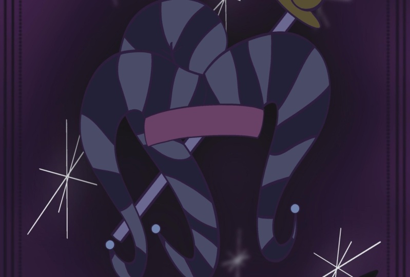
3. The Fool hat sketch: And this design, we're going to start with the full hat. And it's going to be for the Terracotta, the full. So we're going to start with the canvas that I set up in the beginning, a by tan. And now we're going to look for some inspiration on Pinterest. And so you just type in the full tarot cards, Tarot card art inspiration. And you're going to get a lot of stuff in there. And I'm looking for something that focus on the hat. There are lots of really cool hats in there. This one is one of them, and I really like the three-point yhat and that's probably the one that I'm gonna go for. And I'm just going to use simple see shapes for the sketch of the hat. So we're going to start with just the head part that goes right on top of the head where it just fits into the school. So it's Chu Si shapes one on top of the other and then you connect the sides. And I'm using just a 6B pencil. And I like the top when he kind of goes down to the forehead a little bit. And then I'm doing 21 C-shaped at the left side, one at the very top, and one on the right side. They're both C curves. And then I'll do another one to connect for all the three ones. So I do one on the left side, one in the middle, and one an array. And then I do other C curves just to make that kind of like curved triangle or a curb to see shape if you, if you will, and doesn't have to be perfect. And this is just a sketch, so you just keep adding those curves into you actually connect the sides. Like I've just add a couple of other ones because I wanted the one of the points of the hat to be a little extra, little wider, I would say. And I also like the sides of the head. Some of them had things coming down with a little ornament at the bottom, just like the three points of the hat, and also to an aside by the year. And then I will add three little circles in the middle where they look like gemstones maybe. But I'm not going to get into that detailed into those three little round or three little circles. So now that we sketched, we're going to go ahead and go outline with the monoline. But first I just wanted to emphasize these are all see, curves are just slides. They, you start with, and this is how simple it is and the sides of the hat. They're asked shapes and lines. So everything is very simple. So CHC curbs, S-shaped, see shapes or seekers, ornaments are circles, and that's pretty much what you have in this whole, entire design. Nothing else. And you're going to complicate it, quote unquote, by adding texture and other details and uneven or regular lines. But everything that I use here is just a very simple lines are shaped. Now want to go ahead and sketch it again just to refine a little more. And I'm going to start with the part that goes right on top of the skull. And instead of the sea shapes, now I'm refining to be a C-shaped curved at the end, which makes an S-shape. And I'm going to do that for all the three 1s. So I'm starting a little wider in space at the top of the head, and it connects at the bottom with a little ornament. The one at the top a goes up and then curves down and bends at the end and it's going to fall in front of the one on the right. So I'm going to erase that, those lines that overlap, you don't have to worry about it right now if you don't want to, this is just the more refined sketch and I'm adding those little ornaments at the very end. Now, I can go ahead and just add those little circles on the forehead. And if the sketch underneath on another layer is becoming a little distracting, you can go ahead and unselect that to make the layer or your design a little cleaner. So I'm just, if you see here, I'm just deleting or erasing that line on the right point of the head because it's behind the middle one that is falling on top of a meeting just asides that we did in the previous sketch. So they're just like two thinner, which say pointy parts of the hat that goes over the ears. So it also has the ornaments at the, at the very bottom. I'm erasing the any overlapping lines. And now we're going to choose what type of pattern we're going to do in the hand. I just chose the zigzag because I feel like it's very circus like and it goes well with the full hat. So you can do stripes if you want. You can do any other pattern that you would like, circles or any other shapes. I feel like for what I'm trying to accomplish, the zigzagging, which also represents triangles, fits really good on this theme. Now that I add the zigzag on the sketch, I'm going to open another layer on top of it. In the hat layer, I'm going to reduce the opacity a little bit because I'm going to design the banner. And this banner, it's an option for as a brush, a stamp brush. So there's different types of banners that you can use. You don't have to stick with this one. I just want to teach you how to draw your own Benner in case they want to do this. So you design 2S shapes just like I did and connect to the end. And now at the left side, on the left side of the left side of the Benner, you're going to write the letter m, just like I'm doing. And you close the shape just like that, like you do in a solid m. And then you connect those two points of the left side just like you saw just now my brush and I put a little hand sign pointing to where you close the shape to give the impression that the fabric is folding of the banner or whatever material it is folding. So we're gonna go to the other side and we're going to do the exact same thing. On the part that is going that's curving to the left. You design another em and you close that shape. And then you can actually those two corners right there to give the illusion that the banner it's folding. Now you can write the full on a different layer. You read The fall on the banner. You don't have to have pretty when writing a think the more organic, the better. So you can also add the lettering with a text feature and procreate edges like to write it myself. I'm now going to refine it too much. You're going to see at the end is going to look very organic, very natural. I don't want anything to look super perfect. And now we have the skid, the sketch ready to go. And then our next video, we're going to go ahead and outline it and color it.
4. The Fool hat and banner outline : If you're ready, let's go ahead and outline the full Hatton and the banner. They're going to be in two different layer. So open one layer and you can reduce the opacity of the hat to get, to get started. And we're going to go ahead and align the hat first. So just follow the most refined sketch there you've done so far and that's what we're going to follow. So still following the sea or as shapes, if you just did the C shapes for your hand, that's fine too. So I'm just going to outline with the monoline what I have done on my previous sketch. And trying to keep the aligns as smooth as I can, but definitely not adding any perfection to it. Because I still wanted to look a little vintage or little organic. I know that I said that a lot, but I don't really like when my designs look too perfect because it doesn't look like a drew. So I'm going to make the lines as smooth as possible, but not added that graphic element two-way. So I'm just going to speed up this video so you don't have to watch the whole thing. So I am just outline what I did previously. Now on a new layer, we're going to go ahead and sketch the banner, just follow the sketch that you did previously. So 2S shapes on top of each other and you're going to connect to both ends. And then we're going to add the solid M shape at the end of it. If you don't want to design the banner by hand, you can also use the step brushes that I'm, I have added for you. And there are also different shapes of banners on the stamp brushes as well. So feel free to use that. I'm going to design this one by hand because I'm going to copy from one design to another to make sure that the sizes are the same. But I'll explain better on future videos right now. I'm just designing this banner by hand in added that am right there at the end. I forgot to collect to connect to the lines or maybe a race the by accident. But now I'm connecting all the two corners to the bottom right, to the top-left. Top-right, bottom-left to depend on what angle you're watching. But now we have the outline ready to go. We're going to add the color and background.
5. The Fool color and background: Now that we have the outline ready to go, I'm duplicating each layer, one of the full hat, the layer for the full hand in the banner, because I want the outline to be separated from the colors that I'm going to add. So I have my color palette, which I chose. And the beginning. And I showed you how to save the color palette that you choose from. Any picture that you'll find anywhere on Pinterest or on splash if you want just a color, you can just follow the instructions on the first video. So I'm going to go with my moody color palette, and I'm going to drop a black color into my hat. I want them main or the base color of my hat to be black. And I'm going to use that pattern that I mentioned on a previous video about the zigzagging of the pattern for the hat. The banner is also going to be black. You don't have to use black colors. It can use lighter colors. If you want to go for Vintage, you can go for more like fall colors. You can go for baby colors like baby pink or baby blue. It doesn't really matter what gives the vintage feel is more of the texture and not so much of the colors. Colors help. But you don't have to use black if you don't want to. I'm also adding black to the gemstones are those circles that on the forehead and the forehead, I'm actually dropping a coal, a cooler gray. So it's almost like a grey with the blue color, but it's gray. And now I'm going to use my 6B pencil and i'm going to actually go for, I think I like the darker gray. I was just doing some experiments, so I'm going to keep the darker gray. So on a different layer above the hat, I'm going to add the pattern. So you open a new layer on top of the hat and I'm gonna go for something like a light bulb flush or a pinkish color with the gray hue. So it's going to be something very subtle in I'm going to do the zigzagging on top of the hat. I'm choosing the 6B pencil that's under the sketching on the brush Library. And I'm gonna go ahead and just add those lines that's going to form like my zigzagging. And I'm using reduced size of the pencil because I don't want it to go over the line. So I'm on top of the hat that it's colored but under the outline. So remember I made a duplicate layer of the outline and I colored the bottom and then left to the top to add the, to keep the outline and not have the structure to with any color. So I'm adding the zigzaggy in between those two layers. And it does. I'm not doing my perfectly, I'm just making sure that as I designed towards the end of the pointy part of the hat, my triangles are getting cut in half. So there's still the same size. But you're not going to see the entire shape as you move further along to the very tip of the hat, if you know what I'm saying. So after this, I'm just going to color and I'm going to speed up the video a little bit so you don't have to watch the whole thing. After I color the hat, I'm going to color the little ornaments at the bottom or at the tip of the hat. And I chose another darker pink or Plum. I don't know exactly what the name of that color would be, but I'm using a limited color palette, like I said, I would and the beginning of this class. So I just don't get overwhelmed with all the color choices. And I think that also leaves more, it gives the design more consistency as far as a color palette pellet, specially if you're designing a whole creation of things, which is a deck of cards. So I'm adding also a little different, a different color and behind of the banner it's almost like in the back of the banner, has a different color, so is black and a front and some shade of pink in the back. Now I'm gonna go ahead and change the background color and I'm gonna go right now, at least, can always change it later with one of the blue shades that I have in my color palette. And I'm also going to add some texture that I'm going to use an other cards as well, or at least a variation of a. So at the very bottom layer, open a new layer and i'm going to get one of the brushes under the probably artistic, a folder on a brush library. And I'm going to mix, I'd like to use the heart's brush and I get the biggest size that they have in. I also mix different colors. I'm also reducing the opacity so it doesn't get too strong. So several shades of pink or purple and there's no rhyme or reason. I want something that looks a little bit more abstract. So I'm just going to get those colors together in. Once I'm done, I'm going to do, just do a little Gaussian blur. So we kind of like a, becomes very subtle on the background. Once they finish that background and I do a Gaussian blur, I opened a brand new layer on top of that layer, and I do the same thing using another variation of pink in a different direction or a different pattern that I'm designing the previous one, then all those Chu layers, I'm going to click on the top one and on the little letter n, I'm going to just play with the blend mode. So right now, I'm going through all of them and see which one I like. The best. Hotline and Vivid Light are one of my favorites, but I usually go through all of them and see which one has the best one for what I want to use. So let's go ahead and use Color Burn because it gives a little deeper color on the background. And I'm going to use those backgrounds for the other cards as well. If you feel like the background is a little too dark because your design is also a little dark. Open a brand new layer on top of a, use a lighter color with the same brush and do the exact same thing that we did before. Choose the Gaussian blur under the little magic one right there. And it's going to merge everything together. And you can do a little blending if you want to. If you're satisfied with what you have right now, you can stop right here. As far as the background goes. I like to mess around a little bit until I find that perfect background even though it's all abstract and I'm just doing the blurring thing. I think this one is what I like to do, but you don't have to do as many times as I do. You can do just one layer. I did three because I wanted to get to the point where I was just happy with it. So once you're happy with that, we're gonna go ahead and choose the 6B pencil. And on a new layer on top of the banner, you're going to write the full Because this is the full card. Or even though it's just a hat, you don't have to use the six bps, so you can use any other brush if you want. I'd like to 6B because it has a little bit of a texture and I want to keep this a little vintage, little old looking, but you feel free to use the monoline or any other brush if you want something more painterly, you can do that as well. On our next video, we're going to add the frame and a little bit more details to the card.
6. The Fool adding frame : Time to add some final details into this design. And we're going to add the frame now into or full hat. And after that I'm going to add some juggling balls around the hat. I think it looks appropriate for this design and it's going to be something very simple. And you're going to see how I'm going to do it and give it a little bit of depth or movement without complicating the design. So I'm going to add my grid right now, 2D grid so I can have straight lines and I'm going to draw this by hand, but you're going to have a brush stamp. And I think I mentioned that in previous videos so you can add your frame. You don't have to draw if you don't want to, but I do challenge you to draw your own frame if you want to use a different one, all you need to do is just draw straight lines and hold your pen for it to snap. And it's going to be a straight line. So right now I'm just going to add a frame by using the monoline. And I'm still keeping the same colors that I was using for the hat. So they're very light PQ and I draw a very loose rectangle and then I just hold my pan and then it will snap. And then I'm just going to resize it to make sure that it's close to the edge of the card. Once I'm done, I'm going to group all of those layers for the hat only and the banner because I want to resize them and I want to resize them together. So what you do is click on one layer and the all the bottom layers are the layers below it. You just also click and swipe to the right very lightly and it's going to turn a lighter shade of blue. That means that they're attached to, not yet grouped but attached. And they're like stuck together, I should say. And then you can just resize them, all of them at the same time. You might not need to resize or reposition anything, but I had to at this time, right now I'm just drawing a circle and duplicating the layers until I have the right amount. Those are the my juggling balls that I went around the hat. And I'm going to have it as the same pink that you see or purple that I drew the circles I'm going to fill with color and then I'm going to outline it with a lighter color so they can pop on the card. So right now you can see much because that color of purple blends in with the background. And I'm just going to add the same color and then not line it with a lighter pink. Once I'm done adding that pink, I'm going to just with my 6B pencil outline those circles. And I'm going to add a line in the middle for the first one. And then I'm going to change the direction of the line for the following ones and they're all going to have a different direction for that line in the middle. That's to give the illusion that the ball is actually moving or is more than one ball. So he's juggling several and they don't have rhyme or reason for direction. They're all like just being thrown up in the air. I'm going to go ahead and add more details to the frame. So I'm just going to add some straight lines up to the top. And I'm just going to do half of it. I'm going to use the monoline seem thickness of the brush as the frame. So I'm just going to add four straight lines with the middle one is the biggest, and then I will go ahead and duplicate that layer, turn it around. You might have to rotate it because I tried to turn it around and he didn't go to the position that I want it. So you might have to do a little rotation and there, there you go. Once I have the correct position, you may have to do a little adjustment. I'll go ahead and merge those two layers so that detail is just in one and I can duplicate it again and move it to the other side. And then once I have that, I can duplicate it again and move both to the bottom. And then I'll have the detail and all four corners of the card. So I have this one right here that I'm just adjusting. Now I'll duplicate, I'll merge the layers. And I have a duplicated right there. Move it to the other side and adjust this so it's an preposition. And I might duplicate an extra one just so I have one that I don't need to use or if I need to use it later. So I merge those two at the top, duplicated, flipped vertical, and just to put it at the bottom of the frame so they're all And on the four corners now, there's two options you can do here. You can mask to make those lines disappear, or you can just erase it. I'm just going to erase it because the ones up top is untouched and I can use those if I want to, on the next couple of cards or any cards, if I'm going to use that same type of designed or the same type of frame. Just make sure that if your eraser, you're not erasing it too much or too little. So you might have to zoom in to see if everything looks consistent. Now I zoomed in and to the detail at the bottom just to make sure that everything is erased properly so they don't show on top of the banner that have to be behind it. The banner is covering it. So now what I wanna do is add a little depth to the hat. So I'm going to go into the layer of the black hat, only, not the one at the top that has the zigzag on I. Once I'm to let layer, I'm going to duplicate it in the bottom one. I'm going to go into the I'm going to recolor, I make sure that everything is all black. Then I'll go into the magic one and choose Gaussian Blur. And, and I'll just do a little blur slightly to about 8%. And then I just reduce the opacity. And then it looks like it's almost like floating on a card. I'm not adding too much depth into these designs because I actually want them to look a little bit flat because it's a card after all, or at least it's an inspired by terror cards. So I don't want any like crazy 3D anything. But I thought that a little bit of depth into the hat or behind the hat will look really cool. Now on top of the very background where you see the smudged all those colors that we did earlier. I'm just doing a little bit of bonobo chalk, reduced capacity for about a 50.5% and use that pink and I just slightly put a little bit on top of this, so it gives a little bit of texture, but not too much. So I'm going to do this to all of the cards as well. Now we're going to go ahead and duplicate that big rectangle in there. And we're going to make a second frame 2A. Once you duplicate that layer, you're going to get to duplicate the duplicate one and you're going to select and just decrease the size a little bit because it's going to be the inner, i would say frame. So the outer frame is the one that we did first and then the duplicate, you go ahead and decrease the size and I'm going to erase the corners that go over the detail, the lines that we add, just add it previously. I just don't want those lines to overlap, so we'll give a little bit of a cleaner look. And after that, once you erase everything, there's one little corner here that I need to do. If everything looks pretty good. Yeah, I don't have to adjust anything. I'm going to get my monoline. That is just the monoline that I adjusted. That is just a lot of just dots there. It's my dotted Russia would say, and I'm going to add a third frame at the bottom of each line. So it's almost like another interframe in, I'm going to just draw a line, hold my band. And that line will snap to be very straight. And I'm going to do that on all the four sides of the rectangle. You see that this one is overlapping with one of the juggling balls, but we can go ahead and adjust the position of those. I'm going to reduce the size of those ball as, as, as a layer, as a whole layer. So, but it's not going to be enough for you to even notice that all that was a lot of reduction and sizes just so I can reposition and it doesn't overlap with a frame. Again, if your design is not overlapping, there's nothing that you need to do. You can skip this step and move on to the next part, which is just make sure that everything looks correct. Everything is positioned where it should be. Them if you need to resize anything or just reposition your design, you can do that now, but if you are done, this is your card. I'm just moving the balls a little bit closer. I want to make sure that my hat is exactly underneath the juggling balls. But again, if you don't have to do that, you are pretty much done. Now let's go ahead and jump onto our next video.
7. The World card sketch: Now on to my favorite thing to design lately, which is an hour glass. That's how I decided to represent the world card in. I think it's because you can drop so many things inside of an hour glass. You can be so creative, it's so versatile, so I'm gonna go with that. So the first thing that I'm gonna do is go into my drawing guides and turn the symmetry as quadrant. So you go in to the ranch and you just turn on the guide and choose symmetry and then quadrant. And an hourglass to me is just like a wine glass, just like I'm drawing here. So if you turn it upside down is the other half. So just get two wine glasses and you just stick them together, one up, right? The other one upside down. And that's your hour glass and then you just refine it from there. So pretty much see curves in S-curves and then a little circle at the top of the bottom or rectangle to close those shapes is very easy. So right now we have the main shape of the hourglass and we're just going to close the top with either a little like an ellipse, like a circle smushed together is there will be an ellipse, like a narrow circle or a curve. But I'm going to do a little bit of a triangle shape, just not a triangle, I'm sorry, rectangles. So I just add those two lines side-by-side and then on line at the top and one at the bottom. Then you can refi from that so you can see the long rectangle. And then I'm just going to add a little curve to the end of it, so it's not so flat. I just wanted to add some dimension to it. And, and now inside of this hour glass, this is just a rough sketch, but I'm going to do the top. I'm going to do the sun with the waves. This turns into the night and the mountains. So that's the two opposites in the world. So you have a sunny day on the water and then the bottom you have the night with the universe and the stars with the moon, and then the mountains. So two opposites and, um, but there's so many things that you can do. One thing turning into another. You don't have to do just sand. You can do so many different things. You can do a little water, watering a plant at the bottom. So water coming down from the top like a rainy cloud and then at the bottom is like a little flower or plant. So we're going to open a new layer because the symmetry is on for the hourglass and I'm just going to add a circle. And that's going to be my son. That's the most basic shape. And then for the waves is just a bunch of C-shaped, so it's not perfect. I'm not going to, I'm just going to make the lines smoother on the final outline, but it's now going to be anything close to perfect in from the sun, I have the rays coming out which are just straight lines coming out of the sun. And right now they're not very symmetric. There are little cricket because this is just a sketch. But once we're on the actual outline of the design of wicking, go ahead and have him a little bit more like street. Then close to the middle of the hourglass, that's where I'm going to start adding some little stars. And then for the mountains, all you do in his two triangles sum just doing loose lines as the shape of a triangle. If you want to just start with a triangle, you can do that. And then on top of it you just do irregular lines. That's going to be our mountains. And then I'm adding the moon because I want to represent the night. So once the shape and then another C-shaped because I want a crescent moon, full moon, I already have the sun, which is just pretty round circle. So the moon will break that shape a little bit. And then to give a little bit of dimension to the mountains, just add another line close to the center, which is going to be another irregular line. And I'm adding those lines right there on the left side just to see how the shading is going to be. But we don't add those at the final, as the final details for the design. So let's go ahead and start the outline on the next video.
8. The World add color and background: Now that we have our sketch, let's go ahead and open a new layer and start the outline process on your sketch later, you're going to reduce the opacity so you can sketch on top of it. And then once we're done, we can go ahead and deselect that layer so you don't keep seeing it or you can even delete it. I usually just hide a so in case I need it for reference later on. So it's still with the symmetry tool, still on because I want to draw the hourglass pretty with the both sides to have the exact same size. I'm going to use the monoline and I'm going to start from the top on the left side. And it's going to draw on all four sides at the same time. So I draw on the left side, the top left, and all the other three sides are going to automatically draw as well. As you could see, I had a little extra line overlapping in there. I just gotta grab the eraser and i just delete it. So I'm quite connecting the top size with chew straight lines. So it's going to be the top. And then I close the shape with the C-curve. So two flat lines in a C-curve or a C-shaped C line, whatever you wanna call it. And then on top of that, we're going to go ahead and start adding the design. So the reason I want to do in a different layer, it's because I'm not doing the sun on all four sides of the canvas so I can't use the symmetry. So for the San, I'm just doing a simple circle and then it differently doing the ocean. Remember I'm going to make the ocean as a whole shapes. So I'm following the hourglass shape. It doesn't have to be perfect because it's going to be behind the outline of the hourglass. Anyway, I just want to make sure that that shape is closed, so just follow the hourglass shape. And then we can color that with using the color palette that you chose. You can use the same one that I'm using, or which is going to be in a resources or you can use your own color palette. They you've got online. So now I'm adding on a different layer, open a new layer and I'm adding the moon. So 2i shapes together for a crescent moon and you can always adjust it how thin or thick you want them to be. I'm going to do the moon and the lightest pink of my color palette, as you can see, have been avoiding using a lot of whites. So I use just a very light pink or a blush sometimes, but it's going to be pink and purple with grace and some blue. So the ocean, I'm going to just color it completely by itself. And it's going to be on a dark purple like a plum. If you knew UK, I guess you would call this aubergine because it's look like an egg plan color. I also duplicated the hourglass outline because I wanted the top one to have a different colour of the bottom, so the bottom is not going to show. So I want to have the outline at the top. I'm coloring the Sun and a darker, also in a purple but lighter than the ocean. And I'm going to show you how we're going to make that pop. The sun itself. It's going to be that color, but the rays are going to be in three different colors. So that's going to make that pop. And I'm adding the outlines right now. The straight lines of the sun rays in is going to be a purple, a pink, and a lighter pink. And if you see that it's not straight, you can go ahead and just delete it or just go back and do and then just do another outline. And I'm not adding everything with the perfect spacing in between. I'm just adding that negative space with another color of the straight line. So those look like the sun rays are just beaming out. And again, I'm not doing this to look perfect if you see that there's still a lot of space in between the rays just add more lines. Now on a new layer on top of the ocean or you can even do on, on top of the moon, I'm going to choose an even lighter pink and I'm using the monoline and a very small size brush. And I'm going to add some stars and it's just going to be some dots. I'm going to add a few for now and then we add more later. And on a different layer, open up a new one and we're going to do the mountains remembered just two triangles made with very loose irregular lines. So if you never, if you were never able to draw a pretty straight triangle before, that's even better because it's going to work in your favor. So just do two triangles. I'm doing with a different brush, but I'm going to outline it again with a monoline. And then you do that straight line in the middle, pushed to the side a little bit irregular and loose. Any few zigzag a little bit even better. We're going to color one side of the mountain and the other one is going to be the still with the purple color. So just to give a little bit of shading and a little bit of depth, since we need a closed shape of the mountains to be able to do that. I'm just outlining again with a monoline because I want those lines to be thicker anyway. Once you're finished with the outline and you close the S-shape, choose a side that you'll want to add, the lighter color. And I'm adding to the left side and I'm just covering any little holes and the color that you see here. And I'm going to also outline them. Middle line right there doesn't have to be perfect because you can fix later, but I want to make sure that it's a closed shape. Otherwise, when you drop the color, it will go into the entire page and you don't want to do that. So here's your mountain. And it has the shading, which is one side is the lighter, the other one is the darker just gives the illusion of light reflecting or the moon light reflecting in the mountain. Again, we're doing this as more of a flat design so we don't need to add anything that's going to look like 3D or too much dimension to it. I'm also refining them middle line in the mountains right now, but that's because I want to do it. You do not have to do that. If you're happy with the middle line that comes down to the mountain, you don't have to make any changes. I just wanted to do it just for me. After that, we're going to get into a new layer on top of the mountain and we're going to start adding some objects, bright objects into the sky. So dry, I chose the finest brush under the sketching or the inking. And I'm just drawing little stars. And for that you're going to do a vertical line and you cross it with an horizontal one. Any new cross it with two diagonals on each different side. And you can either multiply that layer or you can just keep drawing the same thing. And then I'm doing a planet which is just a circle coloring. And I do a ring around it, which is just an ellipse. And you just hold your pen and it will snap just like that. And it will be a pretty smooth line. And I'm doing this exact same thing on this side. Draw circle pain, it just outlining a little more to refine it. Then I drew another ring around it, which is just an ellipse. And I draw another ring on the other side, making it a little bit of a crazy planet. If you want to add more stars, you can go ahead and do that right now. You can also increase the size of your monoline if you're using monoline and add more dots to make it more of like a bigger planets or a bigger objects. And you can just, I do a variety of sizes in there too. There's no rhyme or reason. I like to do little tiny dots and then medium-sized and then a little bigger. And I add a little bit up into the ocean as well. But that doesn't necessarily need to be any stars. I just wanted to have the transition from the ocean to the sky below. Okay. We're pretty much finish with the main design. So if you have any leakage that it's low capacity can go ahead and turn it up to max where the normal opacity is. We're going to start working on a background right now. So I want to color the top and the bottom where the hourglass actually stands. I turned off the assistant drawing, so no symmetry. I want to do the background as dark as the other cards. Black is going to be a little bit much. So I'm still going to probably use the blue one that we use in previous card. Now I'm just resizing the hourglass again, you might not need to do this. If you do, just make sure that you group all the layers of the hourglass together. And then you can select, click on select at the top, and then you can resize it if you need to. Since I still had some negative space or empty space in between the sun rays, I grabbed my daughter monoline And I just added some dotted lines in between those sun rays that I see that it has enough space so that add the extra pop as well. And now I'm going to copy the frame from a, from one of the previous designs. And I'm going to paste it into this layer because I want the size to be exact the same, but you're welcome to use the stamp brush for the frames if you want to. You do not have to copy and paste. Like I'm doing some copy and paste it all the elements from the previous designed just to make sure that they are placed correctly and is exactly the same size. If you want to follow this, all you need to do is go into the previous design and go into the layer that you want a copy. Click on the layer, click on copy, go back to your design and click on paste onto the ranch. You do not need to open a new layer. It will automatically will open a new one and paste the design for you. I also copy and pasted the background from the previous one is exact same process, but I added the bonobo chalk myself. So I went on top of, I went to the layer of the background and I opened a new layer on top and I added the bonobo chalk. If you pay attention, the background is not as dark as the previous one. And that's because I reduce the opacity a little bit or I just made sure that it's not as dark, so the hourglass doesn't get lost and to the color doesn't blend in. I want the hourglass to pop a little bit. Now I'm pasting the part of the frame there was from the previous design, those little lines that come out of the corner. And I'm also copying the Banner and other writing, but just the banner going into the previous design, copy that layer and paste it into my hourglass. And then I'm going to get my 6B pencil. And I'm just going to write the world, which is the world card. And if you want to make this look alike, it's more like a calligraphy thing or a faux calligraphy. You go into the lines that you write down and you just, and the lines a little bit so you can see that all the lines that go down when you write, you just stick in that part of the line. So it looked like a little bit of a calligraphy, but now your card is ready and we're gonna go into our next video for third design.
9. The Magician card sketch: Our final design is going to be the magician scarred. So for that, I wanted to design a magic wand because it's just an object that I relayed or ISOC with the magician. So on, on a new layer, I had sketch some of the, some of it before, but I'm going to start all over just so you can see the process. It's nothing more than a triangle but a very skinny one. And then what you do is you just outlining with irregular or very loose lines. So a one can have different shapes. You can have very irregular ship lines are of very loose line. And then for this one I'm adding a detail like, like a, a string is around it just for decoration purposes. So we're going to add a little bit more texture to it on the, on the actual outline. In for this one, I want to add a crystal to the top of S, So I don't know if this should be the bottom of the 1.The top, the tip of the one, but it doesn't matter. It's my wand and I'm going to draw however I want it. And crystal is just the collection of straight lines, irregular, still straight but no really set direction lines. So, and I'm going to show you how to draw a very simple crystal. So once you decide if you want to add a crystal or naughtier Wanda, what you're gonna do is you're going to drop four lines in the shape of a triangle, 1234 with the two middle ones a little longer than the one on the sides. And then you connect those lines with the straight line. And then you do another four at the bottom, connecting at the very bottom. That's your crystal. You can leave it the way it is, or you can make at the top of flat. And for that you just connected those lines the way that I'm doing right now, like you to draw in a circle or a square. Since a straight lines will be more like a square or a rectangle. And then you just erase the lines at the top and in the center. And there you have your very own crystal with the flat top. If you want to reply, just go ahead and draw again four lines. I'm doing with the 6B pencil One 234. The two middle ones are longer than the ones on the side. And then you connect those lines by adding three lines, straight ones. And then right at the bottom of that triangle, you add four more lines. And you can connect to the bottom or leave it flat also at the bottom, and you just connect the bottom ones as well. So the first one, I connect it at the very bottom, so make it like a pointy crystal at the bottom. This one, I want to make a flatter. So I just connect those lines with a different line. We can go ahead and add the flat to the top again. So you just almost like you're cutting the top with your pencil. So connect those lines at three lines at the front and then three lines at the back. And engage your eraser. Erase the very touched the tip of a, and then the lines in the middle of the circle or a square or shape that you just drew. Now you have two different styles of crystal and we're going to add something similar to the very top. Now I can go ahead and isolate those two crystals that I just showed you how to complete. So I'm just what the lasso tool, I'm just going to cut and paste and that's going to put them in another layer. Cut and paste. And then I just deselect that layer, sorry, disappear, but it's still there if I need it. Now I'm getting my sketch for the one and I'm just resizing of two a little smaller. I'm going to add some effect at the top of the wand, like is doing some magic. But that's going to be on their next, on the next video with the outline. I'm going to add a little bit of what I was thinking. Wow, so it's going to be something like swirling with either stars or raise or something. That's my glow a little bit and add some stars around it. There's a lot that you can add. You just, you can add up soil that can take the whole background of the card. You can add just stars, you can add little rays. It's really up to you. And then we're going to add the banner and add the name demolition. And as by now, you probably know that a lot of these elements we're just going to copy from previous card, so they are remained the true size to the card. And that goes for the banner that we can copy from a previous design. Also, the frame, which we'll going to do, again, just a rectangle, rectangle as the outer frame, the lines on the four corners. And then we add the smaller rectangle as an inner frame. And then the dotted lines that we had on the other design as well. So this is pretty much what I came up with for the sketch. Now let's go on in our next video and outline it and add some color.
10. The Magician color and background: We're ready to start outlining our magician cards. So with a monoline and a new layer on top of that sketch, let's go ahead and add very loose irregular lines following the shape of the one to. So it's pretty much like it resembles a branch, like a tree branch because a lot of them looks like a, just a broken tree branch. So we can always follow that line of thought if that makes it easier for you, or you can just draw that skinny triangle that I showed you in a previous video. Now we're going to add on a new layer or crystal. So remember those four lines. So one, and I'm going to hold my pen so the line will snap. 234. Notice that the lines at the side of the left and the right side, they follow the edge or the wide enough to follow the edge of the 12 because I wanna make sure that they look like they're inserted at the top of the 1D. And then you connect those lines. And then you add your straight line at the bottom of the crystal. Add those four lines in there. And then it will look like your crystal is inserted on the wand. You can stop right here, or you can flatten the top of your crystal just like I showed you in a previous video. So I'm adding those three lines enclosing the shape. And I'm going to erase the very tip. That eraser was really big, so reduced the size is using a monoline. I erase the very tip of the crystal and you can always readjust or redesign the very top of the crystal. A few mess up with the line, so don't worry about that too much right now. And then you erase also the very center. So there's no overlapping lines. So that's what's going to show a very flat top of the crystal. Now on a different layer, new layer on top of the one, I'm going to add C shapes around the one in which it looks like rings, but they're meant to be like more like string, like you tight strings all over from the top to bottom. And I'm making it very thin at the very top and then thicken the little bit of the line close to the bottom. So I'm going to add one more here. And I'm all using monoline. And there you go. Sometimes you can end the like a little bow, like a little tight if you're want to type the string. I'm not doing that. I'm just adding just liquid looks like rings in now we're going to start adding color. My one will have two colors, the outline and the center color. So I'm going to duplicate that design. The bottom one, that's the one that I'm going to add the color and the top one is going to be the design, the outline color. So the top one is going to be like almost like a very Live Mocha. And the center is almost like a cream, like a beige or creams. So that's the color that I chose for my wand. And the crystal is going to be on the pink color palette. In each square or each shape inside of that crystal is going to be a different color. I mean, there it's going to be just three colors, but they're not going to be next to each other. So I'm adding a couple of lighter pinks. Then a couple of darker pinks and some on the purple shape. This is to give the illusion that the light is reflecting in some way. So if you look at a crystal, if you really pay attention to a picture of a crystal, you see that each side of the crystal that has been cut has a different, for some reason, the, the light, the light source interferes with what you see, what the color of it. So that's what I'm trying to accomplish here. I'm not thinking too much about it. I'm just adding different colors and they're not next to each other. So choose three colors. And adult scholars in each of the little squares. Now I'm adding the, changing the background color and I'm still for the blue, just like the previous designs that we used. And I wanted to add some special effects on top of the wand, like he's doing some magic. So I'm going to open a new layer, put at the very top. And I have a brush that it's my stars brush stamp. And I turned into more of like a, not a pattern, but more of like just a bunch of stars. Put them together. So it's like a group of stars and I'm just doing a soil a couple of times. I also change the effect of the brush where the stars are going to all be different colors. So if you see at the top right, I chose a pink, but all my stars are different colors. And now I'm going to add an effect to a which is the bloom is one of the new features of procreate 5X. So you click on the magic wand up to top left, go down to the list and choose blue, and then click on layer. And you slide until you see the effect and how much you want to, I'm gonna go pretty high to between 80, 90%. I know I'm going to go back to the stars and add more effects to web. But before I do that, I want to make sure that I have the background in place. So I if I add any effect, I want to make sure that it's going to show. So I'm going to go to my previous card and I'm going to copy the Background. Copy, click on my layer and just click on copy. Go back to your new design that you're doing right now and click on paste and it's going to automatically be added to any layer, then you reduce the opacity. If you think that's too strong. Now I can go ahead and make changes to my star. So what I did is I just grabbed any purple and I dropped in one of the stars. And since most of them are connected, most of them are going to change. Colors are going to change you in. That purple gave a little bit of an extra pop. And I reduce the opacity a little bit because it was a little too much. And there are some stars here that are leftover. So I'm going to grab that purple and throw in some color on them individually. Then I chose a some beige or some off yellow like off-white, pale yellow, I would say. And I just added some extra stars on top of that purple just to give an extra pop. Once I'm happy with how the stars look, I'm gonna go ahead and take my previous card and copy the frames. You can use the stamp brush. You don't have to copy. But I'm just going to copy because it's the exact size I want to use, but you can always adjust it if you use this thin brush is not a big deal. Go into your current design and click on paste in if it's the layer, if the layered ends up on top, just bring it to the bottom. And if you need to adjust the, ANY sizing of your design now is the time where maybe the banner is a little bit big, so I might decrease the size of Nabeel. You don't have to. I'm renaming my layer so I know it's a frame if I need to make any changes since the colour is very light once I opened my layers, it's a little challenging to see. Now I'm grabbing the 6B pencil and I'm just going to write on top of the banner on a new layer, I'll write du magician. And once I'm done writing the magician, I'm just gonna go over the lines and every line that I write down, I'm just going to make it a little thicker. So it gives the illusion that it's in calligraphy style. Once I'm done, I'm going to grab the bonobo chalk. And on top of my background layer, I'm going to choose the same color are enough white. And I'm likely going to go over that later just to give a little bit of a texture. Once you finish, you are done. That's your magician card.
11. Class project: Now that you've completed this class, it's time for your class project. You can go ahead and either follow along and post where you have created in class or you can do something completely different. I hope you are able to learn a ton of fun stuff. You can use different prompts from the tariff DAC, or you can use completely different cards. You can use the NGO cards, you can use just an inspirational quote cards. If you want to go even further, you can create your own game cards. I would love to see all the different things that you can do with that. I also have other classes on illustration. This is part two of my illustration made easy using simple shapes. If you want to check out the part one, just go into my profile on skill share. I also have other classes in there. If you're interested. I would love to hear from you. If you post something on social media makes should attack me. I would love to comment. If you have any questions you can reach out to me either via skill share or social media or my website or my contact information is on my profile. And if you have any feedback, I would love to hear that from it from you as well. If you enjoyed the class and learn a lot, please leave it a good reviews of other people can find this course. And I hope to see you next class. Bye.
 Simone Sloan, Calligrapher, Letterer, Mix Media Artist