Transcripts
1. Intro: Ready to turn simple
sketches into stunning ink designs
right from your iPad. Join me for a fun and easy
inking class in Procreate, and let's turn your sketches
into something special. Whether you've been using
Procreate for a while, or you're just starting out. This class is aimed to
make inking easy and fun. Ola and Sandra Mahia, I'm a Columbian Canadian Illustrator and surface
pattern designer, and I create art for companies around the world
to put on their products, and I teach others
how to do the same. In this class, I'll
walk you through my favorite inking
techniques in Procreate, and we'll be using
Procreate's native brushes, so there's no need to
download any other brushes, and you'll learn very
easy techniques and strokes that you can apply
to your projects in no time. We're going to be creating
a little goldfish, but you can choose any
animal that you prefer. The aim of this class is to keep things light and enjoyable while learning a simple yet
powerful technique, inking. We're here to have fun and create something
beautiful together. We'll start by creating a simple sketch using
very basic shapes, and then we'll start building upon it to create
our final sketch. This approach makes it very easy to create
your own sketches. But I'll also provide my sketch so you can work
with it if you prefer. Then we'll learn different inking strokes that you can use, and I'll show you
how the brushes work so you can choose
your favorite ones. With these cute little
goldfish that we create today or the
animal that you chose, you can create card texts, stickers, coloring
books, or even tattoos. And as a special bonus, I'm going to show you how to add a gold e factor linework
using my Shine brush, which is also included
in the class. So you'll get the basic
sketch, the shine brush, and a practice procreate
file where you can practice all the strokes
that we learned today. Putting all these strokes
into an illustration is a playful but lighthearted
way to practice your skills. And you'll have a masterpiece
to show off at the end. For this class, you'll
only need an iPad with Procreate and as stylus. I use the Apple pencil. If you're ready to have some fun and explore the world of inking, then join me and let's start inking this cute
little gold fish.
2. Class Project + Supplies: Oh. For this project, you'll be designing a card
with your favorite animal. This is a great way to apply the inking techniques
that you learn in class. Remember that the
goal here is to have fun and let your creativity shine and let your imagination
run wild with the inking. Before we get started,
let's go over the supplies that you'll
need for the class. You need an iPad with the
Procreate app installed, and you need a sil so that you can have variation in the
pressure of the strokes. I'm using an apple pencil, and it's optional to have
a reference image of your favorite animal if you're going to draw
something specific. And remember to download
the included assets. The brushes I'll be using
are all native to Procreate, so no need to download
anything for that. But you can download
my shine brush if you want to add foil effect
to your illustration. I'll also provide my very
basic color palette for these. If you want to download that, that's included
in the class two. Finally, if you
want to work from my sketch, download that two, and I have included a
Procreate file with the practice sheet
where you can practice all the strokes that we
learned in class today. You can just download that, open it up in Procreate and
start practicing each stroke. I have created one
sample of each stroke, so you can replicate
it on the side, so you practice some more. Gather everything
and let's go to the next lesson and let's
start with the file setup.
3. File Setup: We're going to be
using all brushes that come included
with procreate, and the color palette
is super simple. But still, I have included a color palette for you in
case you want to use it, so I'm going to show you
how to install that. I have included a brush
that is called Shine, and we're going to use it for
the bonus lesson on how to add gold or metallic accents
to our illustration. So in order to install the
brushes and the color palette, and this is for any brush or color palette that you want
to install in Procreate. What you have to do is
just exit Procreate, and then go to wherever
you have your file save. I have mine in my
files on my iPad. So I have here ink swatches. That's my color palette. So I just double tap on it. And it will be automatically
imported into appropriate. So if I go to my
color swatches here, I will see that it's either
on the top or on the bottom. Usually, it's in the
bottom of your stack. So what you can do now is app here and set
this as default, and this is what
we're going to be working with in this class. You can obviously choose
any color you want, but I'm going to be working with just basic black and white. And then I have here some
tan colors in case you don't want to work on a
solid white background. And then these colors are to add the golden accents
at the end of the class. So I like to drag my
color palette out. So I have easy access to it. And this way, I like
putting it here, for example, and it's easier
to choose the colors. So now we're going to exit procreate again and
go to the files, and I have the shine brush here. So if I double tap on it, it will import automatically
into procreate. And then if I go to my brushes, it will be here at the bottom, where it says imported. And here is my shine brush. So now that you know how
to import those things, let's set up our file. Let's go to the gallery. So here you can
create a new camas, and you will have some
premde sizes here, and you can make your
own premde sizes. So I almost always work with 3,600 by 3,600 square
file that's 12 ", or with a vertical
11 by 15 file, if I'm going to create a vertical illustration
or horizontal, like something
that's not square. Now that I have the preset made, I can just tap it and
I will create my file. But if you don't have
that preset made, let's go back to the
gallery, tap here. And go to this and create
a new custom canvas. So I'd like to give it a name. For example, this
will be 11 by 15. And then here I can choose
the width and height. In millimeters, centimeters,
inches or pixels. So let's say inches, so it'll be 11 by 15. And then the DPI make
sure it's always at 300 so that you have
a good resolution, and here it will show you the maximum layers that
you have available, and this depends on your iPad. Then for color profile, I always work in RGB in this
color profile in Procreate. CMYK in Procreate for
some reason, is very, very muted, so I
prefer working in RGB. And then I don't
touch any of these, and I just click Create, and it has created
that new file. But also, if you go to the
gallery and you go here, you will see that your preset
has been created here. So anytime you want to
create that size again, you just have to tap it, and
it will create a new canvas. And if you want to
rearrange this, and for example, you
don't need this anymore. You can delete it, so
you keep this organized. Anyway, this speeds
up your process, so just create the sizes
that you regularly use, and that'll be great. So we already have
our file here, so let's go there. If you want to name
it, you can just tap here and then name it fish, for example, and then open it. And now we're ready
to work on our file.
4. Sketches: You can either create
your own sketch or you can use my sketch. My sketch is very
basic because I want you to be the one that
creates all the details. So if you go here
to the actions, you can add and you
can insert a photo. I have it in my photos already, and you just tap here, and it will import that picture and you tap here to D selected. And then we have our sketch. And when I import the sketch, I like to reduce the opacity. So when you go here to the layer and you
tap the letter n, you can change the opacity and making it more transparent. So the lines are
not so intrusive, and I can see what I'm
drawing and not the sketch. If you don't want to import my sketch or you
don't have a sketch, and this is you drawing
your own animals, then I'm going to
create a new layer, and I'm going to grab any brush. I usually like in sketching the six B pencil and then
choose whatever color you want. And what I do is
create basic shapes. So first of all, I
am doing this very fast because it's the sketch. So I want to have a
little outline like that, and then I want to have an
inner one that goes like this. And here I will have the
name of my animal old fish. And then I want to create him like here in the
middle and then have, like a little fin
flowing out here. And then the tail,
I wanted to span, like, really big all
these area and flow out. And then here, they have, kind of like a bubbly head. And then here we'll have one fin and then
here the other one. And I'm just doing
very basic shapes and not worrying
about it too much. And then I'll start
refining the details. If you don't know how to draw, this takes practice, don't worry about it,
look at references. Don't copy the references
unless you own the copyright, don't copy a picture unless you're the owner
of the copyright. If you want to trace, you can. I had a really
good friend that's an amazing artist tell me that I shouldn't trace anything because my brain will just
start relying on that. So if I didn't have
something to trace, I wouldn't know how to draw it. But if you want to trace something that you
own the copyright to, go ahead, it's not
cheating in my opinion. It's just there's many ways to get to the final destination. This art should be fun. And however it's fun for you, then just do it. So now I'm going to start
like refining the shapes. And I never draw
super realistic, so I like to use my
imagination here. I'm not even looking
at references. I already looked at a bunch of goldfish to figure out
how they look like. And I know they
have a bubbly head here and that the fins are
positioned in these places. So I have that information
already in my brain, but I am not relying
on it anymore. Again, because this is a very
stylized style that I like. But if you are making a
scientific illustration or you want something that's
like very realistic, then you should have a reference
that you own a copyright to that you can
use to guide you. So here I would make the eye, and again, very,
very basic shapes. And here, let's say
it has like a bulge. And this is how I start
refining my sketch. Here, maybe I do like this. Again, this is practice. That's why I include my sketch in case
you want to use it, you're free to use it for
non commercial purposes. Because the drawing part
is a lot of practice. I'm not going to
teach you how to draw anatomy here because that
will be a super long class. But basically, I
just play around like this and make really,
really ugly sketches. Here I'm going to
draw some scales, for example, and then
draw bigger ones. And basically, that's
how I created my sketch. So in the next lesson, I'm going to start teaching you some basic techniques
for inking. And then when we
have mastered that, we will go on to create
our little fissure.
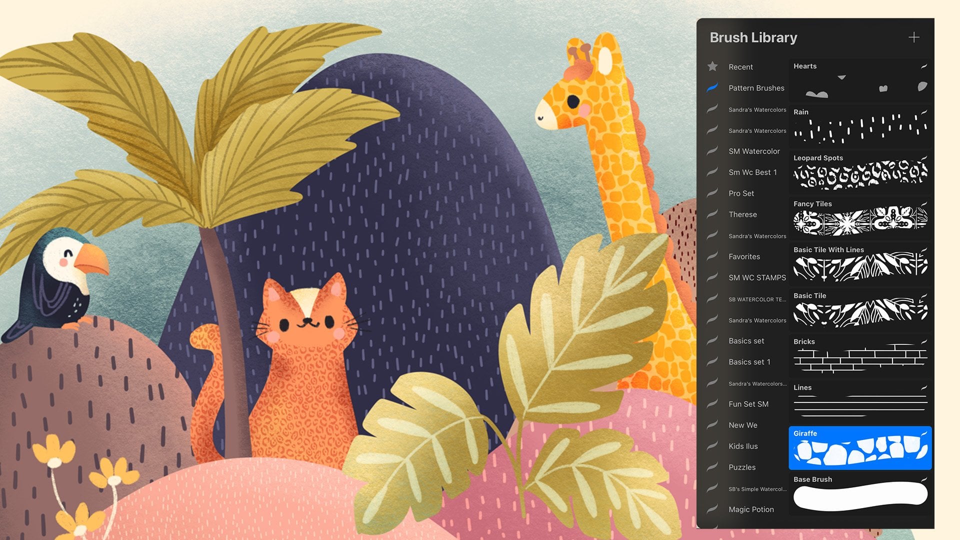
5. Inking Brushes: So now we're going
to see some of the inking brushes
that Procreate has. Let's create another canvas and let's just use
the same size. And it doesn't matter
what size you're using. I'm going to drag my
color palette out. So just drag it out here. And this is a
personal preference, but I don't like working
on solid white background. So if you tap here in
your layers panel, and you tap on your
background color, you can change the background. So in my color palette, I have included this color, and then a darker tan color. But you can definitely choose whichever color you prefer to be working on and whatever
suits your style the best. So just press done. And I'm going to choose
the black color now. And now we're going
to see some of the inking brushes
that Procreate has. My personal favorites are
here in the calligraphy set. I like the monoline. This is a very simple brush. If you press hard or light, it doesn't matter, it always creates the same
consistent lines. This is a monoline brush, and then here in the inking set, I like the technical pen. And the technical pen is very similar to the monoline brush, but when I press lighter,
it becomes smaller. I really like that variation
in the line because it looks more like a
traditional pen and ink. Then we have the studio pen, which also varies in size
when you press hard or small, and it's solid, very
smooth outlines. All of these have
smooth outlines. Then one of my favorite brushes, I hope I'm pronouncing
it how it is. It's called the Jasinski
inc. And this one. If you press lightly, it's, if you press
hard, it gets bigger. But the very cool
thing about this one, is that it has rough edges and it has some sort of texture. So to me, it looks
more realistic. But you can choose
whichever brush you want. This is all a matter
of preference. I invite you to explore different brushes that come with Procreate or that you buy or download somewhere else
and see you what feels natural to you and what you like and what suits
your style the best. In the next lesson,
we're going to start practicing some
inking techniques.
6. Inking Techniques: In this lesson, we're
going to practice some strokes and
different techniques. Choose whichever
brush you prefer. I am going to do everything
here with my Gesinski Inc. Let's start
practicing some strokes. Here, you change the
size of the brush, so you can make it very thin. Or you can make it very thick. When I move this around, you'll see that a plus
signs appear here. For example, if I'm working at 25% in this illustration a lot, I can press plus here and you'll see that this
little line appears. That means that if I
make it smaller here, I don't have to go and
remember that it was 25% and go very
slowly to get to 25%, I can just tap there and
the 25% size will be set. And you can create as
many markers as you want. So let's say this
one and this one. That way, if you're
creating an illustration with different sizes, let's say you're
making these very, very thin ones, and then you
want to go to this ones, and then the super thick ones. If you want to go
back to this ones, you don't have to remember
what size they were, you just press here,
and then there you go. That is super useful. If you don't want this
one anymore, for example, you can just tap on it and press minus and it will be
deleted. Let's undo this. I'm going to choose
a size ten maybe. I'm going to actually
add it as a preset, and I'm going to
make my canvas very big and use the rotation of
your canvas as your friend. I'm going to show you
the difference of making lines if I'm
doing it this way, that if I rotate it and I have my hand in a more
natural position. It's so much easier for me. You'll see that I have very squiggly lines.
My hand shakes. So if your hand shakes, don't be worried about it. This is just how you make art. If you need to make a
perfectly straight line, you can just drag it
and then don't lift it up and you'll see that your
line is perfectly straight. So don't worry about it. I just think those
little wigly things give your art personality. It's not a computer
that's making the art. It's a person, so
don't worry about it. Also with practice, and
by doing these exercises, You'll see that your hand
starts feeling better and that you will make more
precise lines every time. You just need your
hand to warm up. So here, I just made some
little straight lines. You can practice doing that, practice trying to make
them the same distance, just so that your brain
starts getting used to the pencil and the brush
that you're using. You can be using any
brush that you want, and your hand starts warming up. So these are just little
warm up exercises that I do before I
start drawing in. And you can do that
as much as you want. Until you feel confident and you know how
your brush behaves. For example, this brush that
I'm using changes the size, depending on how
much I push on it. Here I'm trying to learn
how much I need to push to make the line thin or thicker. L et's say we have a leaf here. With Inc, there's different ways to create volume with this. In this class,
we're not going to be very scientific about it. We're not going to create the
perfect ball with volume. We're going to create
very expressive lines because what I want you here is to have fun and to find
the way that you ink. That will be your style. Don't think about it too much. Just try a bunch of different things and find
something that you feel happy doing and you're
not super contrived and worried and just experiment
and have fun with it, and that is the
purpose of this class. So You can create little
lines to create shadows, for example, or you can
create them this way. And see it's not perfect here, but don't worry about that. If you go out, you can
always use the eraser, make it small, and fix that because that's
what digital is for. Practice creating some
shadows with these lines. To make some areas of
your illustration, you can use lines that
are closer together. See that the lines
are closer together. If you start spacing them out, they give the illusion
of darkness or shadow, or you can make all the lines the same
distance from each other. But if you start
making thicker lines, that will also give the
illusion of shadow. You can also feel shapes
with wiggly lines, and change the width if you
want by pressing harder. Or use lat those circles. You can change the size of
the circles also to give different illusions of see that it's much fuller
here than here. You can also make lines that are not wavy
like these ones, but that are more straight, but that are following
the cont of the shape, and you can combine that
with different textures. For example, if I have
those lines like these. And I add dots that creates
a different effect. I. There's many different types of patterns that you can create. So just have fun, make some squigly lines and
see which ones you like best. If here, you make them very, very on top of each other, you'll make a very dark area, and here if you make
them like this, you'll make more ay areas. There's also dot making. So if you make them very
far away and sparse, it will look like light. But if you start making them bigger and thicker
and closer together, then that will look like shadow. These are techniques
to add volume. To your illustration. There's also cross hatching, which means that you go and make diagonal lines and the
closer you make them, the darker that area will be. And then you go and you
do the opposite here. You basically crease cross the lines and where you
want it to be darker, you do it more closely. Here this area looks
darker than this one. You can also create
negative shapes. Let's make a dark area
here, let's fill it in. And use the eraser to
create the markings. If you go to the
eraser and you go to recent brushes
here in the top, and we're going to choose that Jasinski Inc or the same
brush that you're using. Let's move the sides here. You can also use it
to create markings. So these are some
incomplete lines, and see that I'm
pressing harder. I'm using that from this brush that I love to create
different markings. Now if I go back to my brush, I can draw something else again. And use the eraser to
create other marks. I just want you to
experiment here, have fun, try different things, try these negative space
techniques, try these ones. Again, don't be too precious. I'm keeping these very raw
and original and how I draw so that you feel
like it's okay to make mistakes and they're
not even mistakes. It's okay to have lines that
don't go to the corner. This is your art. You don't have to be perfect, and some people are capable
of being perfect and drawing these things that are perfectly
technically correct. But if that's not you, I
want you to embrace that. The reason I wanted
to make this class is because when I see
inking techniques, they are very precise and
my hand shakes a lot. And I also like the hand
drawn part of the ink. So I wanted to make
this class very playful in hopes that you can achieve something that you're
happy with and that you enjoy making and not that you're stressed while
you're making it. So I'm going to
provide a worksheet where I have created many
more patterns so that you can be inspired
by them and make sure that you practice them
until you feel confident, and when you do, we can move
on to make our illustration. So in the next lesson, we're going to start inking our fish or whatever
animal you chose.
7. Inking the Basic Shapes: Now, you know how
to use the brushes, which brushes you like, and what markings you
want to create. Let's go back to this file and create our
fish illustration. So I'm going to drag
the palette out. And I'm going to go
here to my background and make it this color
again so it's not white, and I'm going to press done. And I am going to delete this layer because
that's where I made my sketch. If that's where you
made your sketch, you can make it more
transparent and work from it. But I'm going to delete
it and I'm going to use a imported sketch that
comes with the class. Here it is, and I'm going to create a new layer
and I'm going to drag it underneath just so that my sketch is
always on the top. I'm going to name it. I know
that that is the sketch. Here, I'm just going to
create my basic outline. Let's choose a brush. It's still in the Jasinski
Inc. With the black, I want to make this
outside square. I'm going to create
the outside squares, and what you can do is if you draw a line and
you leave it pressed, it will create a straight line. That's very useful. This is great if you want to
make it straight, or you can just
draw it free hand. I'm going to undo
that. For that, you can go into your brush
and in the cibzation, make it really high, both of these, the
streamline and the civilization press done. You can go here and cavas
turn on drawing guide, and here you can edit
your drawing guide, so it changes the grad size. Press done. You can use
that guide to guide you. So The one they still look very hand drawn. And I'm going to go
do the inside one. And I like that. I am
going to create this in different layers just so that I can play around
with the elements later. For example, if later
I don't like this very hand drawn look and I want
to make it straighter, I want this to be in
a separate layer. I'm going to name
this layer frame. I'm going to create
a new layer and I'm going to name
this layer font. And there I'm going
to write my word. This is my handwriting. You can either draw your own
name or you can go here, add add text, and
then type goldfish. Then if you double tap that, you'll be able to
choose the font, the style, and here move around the design
and everything. So just press on. That adds the text in a different layer. But I'm not going to go
into daft into this tool, so I'm going to delete this and I'm going to
draw everything. So I'm going to add
some decorations to it. Just a little bit of decorations here to make it look better. This little dot, and
it's not centered. I'm going to grab this tool here and move it
here to the middle. If you don't know
where the middle is, you can turn on snap on
magnetics and snapping. Then when you move it, it's
going to show you this guide. S that's the middle. If
it's very hard to move ad, There, that's a middle. If it's very hard
to move around, just reduce the distance
and the velocity, and then you'll be
able to move it around a bit more precisely. T just set it there and
now it's in the middle. Now in another layer, I'm going to create the fish. Create another layer,
rename it, fish. And then we're going to start
drawing our little friend. Remember, you can
choose any animal you want or a plant or a flower. So what I'm going to go and do now is go around my sketch, but I'm not going to be too attached to it because then
it'll be super contrived. I'm just going to use
it as a loose guide. So I'm pressing softer and harder where I want
this to be thicker. And I'm just going to
follow the shapes around. For example, for the eye, if you want it to
look like more hand drawn, you can do it like this. But if you want it to
be perfect circle, you can just not release
when you get here to the end and tap here and choose circle and it
will make a perfect circle. Because this brush changes
sizes, when you press on it, it changes the thickness, this might happen, so you can
manually fix it this way. And then I'm going to make
another circle inside. I'm going to fill this in. I'm going to leave a wide gap here for the light of the eye. You'll see that the brush
is not coloring well. It's because remember we
change the stream line. When you tap on
it, if you reduce the stream line and
the sibilzation, then it will actually
paint where you wanted to. I'm being very disorganized
in this coloring so you can see what happens because
the brush is transparent. Remember that I showed you
that at the beginning. You're going to have
to go over it more than once if you want
it to be more solid. So I can create this shape. You'll see that now my lines are way more weakly than
they were here. It's because we don't have
that stream line anymore. If you don't like that
and you want some help, then go at some streamline
and some civilization to it, and then they should
be a middle point. I like that. Because now they look more hand
run than this ones. This looks more vectorized
than computer generated. Again, I'm following
my sketch loosely. I feel like that once
you create the outline, then the next part is super fun because it's
just filling in the shapes with the textures that we learned and having
fun with them. Again, remember to turn your canvas to make
your hand flow easier. On the tail here. If you're using a brush
that has varied pressure, then take advantage of that, and vary the pressure a lot, so you get more
expressive lines. Let's make this fin here
and our fish is inked. The outside is inked. Now, I am going to create
some decorations to the outside and do
that in another layer. I'm going to create
another layer and rename that and decorations. I want to create
some corals here. A I'm just free handing these. Destroy different
shapes. Again, have fun, this doesn't have to be perfect. Now I'm going to create
some wavy lines here. I just want those to be dark areas of color
in the background. So maybe like that. So I have colored all
the black parts in, what I'm going to do now is because the parts that
overlap look very ugly. I'm just going to go
here and duplicate this layer and merge them
together and see that is gone. There's still some areas
that are overlapped, but I like that. I am going to go
here to actions and in Cvas turn off
the drawing guide, and I'm going to turn off the sketch because we
don't need that anymore. Then in the next lesson, we're going to add all
the details sewer fish.
8. Inking the Fish Details: Great. In this lesson, we're going to add
all our details to our fish and finish
our illustration. I'm going to drive the
color palette here. Now we're going to start
adding the details, and I'm going to put those
in a different layer. On top of the fish,
I'm just going to create a new layer
and color details. I'm just going to start playing
around with this turning my cavas a lot to fill in all the areas with
different techniques. Let's start with this
fin, for example, and I'm just going to
start drawing wavy lines. I really like how
these lines look for the fins because the fins of the fish are usually like
that with little lines. You can create some lines
that are not complete also. Just play around and
have fun and see what you like and experiment. So if you overlap this here, for example, you can just go
to the eraser and actually, I'm going to go to the
calligraphy brushes and select the monoline brush
because that one is better to erase things
because it's actually solid. If I want to erase,
I won't be able to because that is in another
layer that's part of the, so you can go to that layer
and erase that if you want. I'm going to go
back to the details layer and with my brush, I'm going to continue
adding more details. For example, here, I'm going
to add some lines like this. If you want to add
thinner lines, you can also reduce
the size and do that. If you think that's
going to look better. I'm just adding some
incomplete lines here and I'm going to try this out like this and see
what I like better. I think I liked the
thicker ones better, I'm going to that and go
back here and continue. I'm going to split
this up because it's doing exactly the same
thing over and over. I love this mindless part
of the illustration. It's so relaxing. Great. I think that's looking cute. I'm going to add some dots here. You see that this brush
doesn't create actual dots. It's like oval. For that, I'm going to choose the monoline brush and
make it a bit bigger. And see this one actually
creates big dots. I'm going to make it smaller, not bigger and just
add some dots here. And you can make them closer together in the areas
that you want to be d, and then more spaced
out in the areas that you want to be lighter. Let's write some here and
then very spaced around here. See that I made it
way way darker here. It's because I want
this part to be in a shadow and I want it
to be very different, like mark a difference between
this area and this area. You do that by
adding more detail. Whatever detail you're using, you do that darkening by
adding way more detail. I think that's cute.
Just a bit more here. You can also try to
give it a mouth. I don't know. Fish
mouths are so weird. Yeah, I like him better
when he's smiling. I'm going to go back to
my brush Jasinski Inc, and I really like that. But let's try something
different here. Because my lines are so thin, I'm going to go here and increase the amount of
streamlined civilization a bit. Just so that they're a bit easier to make, like straighter. They're still not perfect. They still have
some shake to them. Here you can try different
things like have fun. I'm just playing
around with some of the different feelings that we practiced in the
techniques lesson. You don't have to
follow the same ones. You can create your own. Now here, I'm going
to do some arches. Great. Now, let's continue
here with the fins. And I'm going to create
even wavier lines. This one, maybe start from
the same point here and end in the same point
there following the shape. These illustrations could
work really well also for coloring books. Great. I'm going to make
it a bigger and I'm going to create very
thick black lines here. And then make some
cebra lines, basically, the ones that are not connected. Don't be scared to experiment. It's digital, so if you
are not liking something, just ere it you just era or do. Great, that's the
first part of the fin, then I want to make
another one like this. But for this one, I'm
going to add little dots. Now, this one, because I wanted to be different
than these two, but I'm going to make
very thin lines. Same for this one. And here we can add some
little unfinished lines. Great. I think I want to add some here too, and that's it. In the next lesson, we're just going to finish the background.
9. Inking the Background Details: In this lesson, we're
going to create the background and
finish this up. First of all, I'm
going to choose the layer where I
have the decorations. I'm going to choose a eraser and again I'm going to go to the recent ones and make
it the Jasinski Inc. So it matches my
brush that I used, and I'm going to create
some white decorations. I'm going to make it look
like foliage and I'm just erasing parts of that
black areas that we have. I'm just making
these little sort of leaf shapes. Same here. I really like how these
negative areas look. And you can add little
areas with thoughts. If you follow me,
you know that I like my illustrations very
packed with details. This might not be your style. You don't have to add all
these to your illustration. You can leave it very simple. Now I'm just going to add some light detail
to these areas. Again, using my brush. I'm just creating some
shapes like some leaves. As you can see, I
love leaf shapes. I think they look really
nice algae under the ocean. I don't want to add so
much that it covers all the area because then
it'll be way too busy. Then some. And we're done, I really
love my little fish, but in the next lesson, I'm going to show you how to add some golden details to it
if that is your style.
10. Bonus: Adding Gold Foil: A. This bonus lesson, I'm going to show
you how to add some golden or you can make them silver or any metallic
accents to your illustration. This will show up more
in the darker areas. What I'm going to do is create one more layer on
pop of everything, and I'm going to call it foil or it litter or
whatever you want. I'm going to choose any
color that is contrasting. Let's choose this pink, and I'm going to draw the things that I want to be golden. I want to add some accents here, for example, maybe a
little speck in the eye. These. I'm just having fun with this don't
even overthink it. A as little or as much as
you want. Maybe a bit here. A bit here. Maybe
some of these lines. Maybe in this spot. Just think about areas
that you want to highlight. You don't
have to do this. This is totally optional, but I think it
looks really cute. You can even draw areas that are not in the ink
drawing new accents. And now we're going
to go and create another layer on top of that. And when we tap
it, we're going to create a clipping mask. That means that whatever
we paint on top of here will only show
on this layer. Nowhere else, just
on this layer. So on that layer, we're going to drag
our color palette out, and these are the foil colors, and you're going to choose the she brush and
choose the yellow. And we're going to
make this layer black. So choose a layer, swipe p two fingers
to the right, and the alpha log
will be activated. You'll see that checkerboard. That means that
we're only going to be able to color on that layer. When you choose
black, and you go to the layer and you tap it
and you choose fill layer, the layer is going to
be filled in black, but only what was already drawn. So let's go back to this top
layer. Choose our brush. We have the shine
brush selected, let's start with the
yellow and make it a bit bigger and just
start going around. The areas that you
added the foil to. You'll see that it
will start to show up. You can make it even bigger. Just don't press too hard
because then it will be too full, just press softly. Then choose the next
color or this one and press very softly because
if you press hard, it will become too lemon yellow. We want some variation
in tones here. I'm going around everything
but pressing softly. Now I can try with that brown and you'll see that that
will make it a bit warmer. See here. It will give
some variation in shade. S. Great. Let's say that you
think it's too yellow and you want the gold
to be a bit warmer. You can go here and go to
the hue saturation and brightness and move
it around here and see it will become more
like copper tones, like even rose gold like
this or different colors. Slip it like this and then
press here to release that. You can also do the same thing to the
letters, for example. If you go to the font and you
create a new layer on top, you tap on it and you
create a clipping mask, and now you start
with this color. To make it a bit
smaller. Not so small. And you use this
brush on top of it, then you can make the
lettering also shimmery. Same thing. If it's too yellow, you can just go here and go to huge stration
and brightness and change it and release it. You can do the same thing
to the border if you want. That's why I like keeping
these things separate because then it's easier
to work with the details. For example, here in the frame, I create another
layer clipping mask, and I start with that yellow and I want to do it
only in the outside one. I'll do it like this. And
then maybe this brown, softly, so this orange. Then I go here, e saturation
brightness and make it a bit warmer and release
it, and it's done. See how cool it looks. Looks like it has glitter. If that's something
you like, this is a great way to add interest
to your illustration. I hope you really
had fun with this. In the next lesson, we're just going to recap
everything we learned.
11. Wrap-up: Congratulations on
finishing the class. I can't wait to see
everything that you create. I hope you had as much fun as I did creating this
class and that you learned some simple yet
effective techniques for inking in Procreate. To recap, we've
learned how to use Procreate's native brushes
to ink on our iPad. Build our sketches using
very simple shapes, and turn those sketches
into finished designs. Plus, we've added
some extra sparkle to our illustration
using my shin brush. Now it's time to
share your work. So remember to upload your projects to the
project gallery, and I can't wait to
see what you create. And you can also
share your work with M T Instagram at art
by Sandra Mahia. For more tips,
brushes, freebies, and a monthly creative brief, don't forget to sign
up to my newsletter. That's the best way
to stay updated with everything I'm up to and
new classes that I release. Remember to leave a review
and share this class with your friends if you liked it and follow me
here on Skillshare. Thank you for joining
me in this class. I can't wait to see where your inking journey
takes you next. Until next time bye.
 Sandra Mejia, Illustrator + Pattern Designer