Transcripts
1. Intro: Hey there!: Hey there and welcome.
In this class, we're going to create
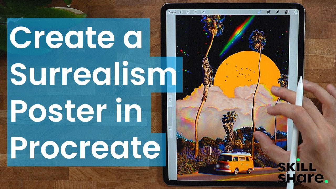
stunning poster using Procreate App. You learn how to design, bring your ideas to life, and add per unique touch
to every composition. Hey, guys, my name is Brian, and I'm a graphic designer, web designer, and a video editor currently live in Montreal. Most of my works are creating poster website, and
editing videos. I'm really passionate
about poster. So in this class, I will be showing you
some of my past work. So basically what I have this obsession about
making poster, it doesn't really
matter what poster. And my main goal is
to develop my skills. So I mostly focus on
poster for social media, photo manipulation,
different digital collage, and I challenge myself to create a poster
for the whole year, making hundreds and
hundreds of poster daily. Help me become a good
designer and deeply understand design principles
like composition, topography, color theory, and
a lot more exciting skills. So I challenge you
to be as creative as you can and have fun
with this course. And this course is specifically
created for beginners. All we need is the
iPad with Procreate installed and an Apple
pencil, and we're good to go.
2. The Class Project: For this project,
we'll be designing a poster from scratch
using the Procreate app. Together, we'll
start with sketch, build up the composition, add colors, textures
and final details. We'll also dive
into adding text, styling it to enhance
the overall design. Once you completed the guided
project, it's your turn. Using everything you've learned, I want you to create
your own unique poster. Be sure to share
your final design in the project section. I can't wait to see what you come up with. Let's get started.
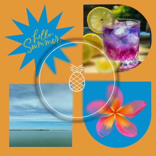
3. Let’s Get Started: Is called glass
morphism because it's the apparent glass that
appears on this composition. So I already made this before. There's a couple of layers, but we're going to go
through each one by one. So basically, we're going
to do some alignment. We're going to get some grid, like equal parts of grid
like one, two, three, four, so we can achieve
these partitions of different elements we're
going to do with typography, as you can see here,
fine artwork right here. We're going to clip images, and also we're going to
create first our shape. Before we can put all of it, we're going to be doing
a little bit of texture, as you can see, a paper texture. I'm going to show you
where I find them and how I achieve this glass Murphy. This is a simple iteration, but you can definitely make more morphism around
the composition, but that's what we're
going to do today.
4. Drawing Guides: Get into it. So this is
a square composition, but you can definitely
make different size. But I find that this
works pretty well. So we're going to go
to our gallery here and we're going to
create our composition. So actually, you can see, there's a square
selection of canvas here, so just pick that
up and you have it. We're going to go to our
ranch icon right here. It's like setting.
So we're going to go to our Canvas and drawing guide. We're going to just
select that real quick and edit drawing guide, and then we go to two degrid and then we're going to just increase the grid size. And until you hit a nice equal parts of
four different parts. So like this one right here,
that's pretty much it. I'm just going to do more
and more lines right here. I wish we could
put more of this. My setting is 900
just to be exact, and you can just center it. I think this is pretty good. I hope you can see it. So
we have an R alignment. Alright, so for
now, this is good, but we need to put more, like, a little bit of margins right here just to give it a
little bit of padding. So I'm just going to use my pentel here. I
mean, my brush. Going to probably use this
Nurner pencil from sketching. We'll just to try
it out quickly. I'm just going to then make it straight by just
tapping right here. I think that's pretty good. Then we're going to go
make a new layer so we can reposition them just in
case it doesn't work out, and we're going to just do that. I'm just going to
make a quick line right there and then
just stop it should give you a pretty
straight line and it increments by 15
degrees, I think. But this is how you achieve that perfect line and
then just just let go and now you could reposition it with the
transform tool right there. Still straight. Definitely.
I think that's pretty good. We could reposition
our drawing guide. You can go to Edit Drawing Guide and you can make it bigger and then just make it sure that
it has the equal parts.
5. Shapes: Start making our shapes. Oops, my iPad is
going everywhere. To make a shape, could start with the
easiest one, the circle. So I will probably use
a different brush. I will go to calligraphy
and then just sec monoline or something more stable because this one has a little
bit of a drawing. We're going to use
that actually later on to create those line art, but right now, I'm
just going to make these two layers
together, merge them. So you can just put your pinch
like something like that. Then we're just going
to probably rename it and lock or not rename it, but make the opacity a
little less visible, something like that, and then we can lock it so it
doesn't move or, you know, we're going to go new layer and Mine
brush from calligraphy. We can start filling up
this one with a circle. And it doesn't really matter
how much circle it is. And you can edit it as well. Ellipse or circle. It doesn't really
matter as long as it fits in the margin
that we create. So we're going to
reposition it perfectly. And then we could fill
it up with some color. I think that's good
for now. It doesn't matter what color you put. Going fill it up or
clip some images to it, so this color will
matter at the end. So we're going to duplicate
it, something like that. And then we're just
going to put it here. And that should be
super straight. Well, just make sure
that it touches the Oops. No, it's not. From here, you can just
strap it like here and then hold it so it
doesn't go everywhere. So I'm using my
other finger here. So it doesn't really
go from here, you can slide it like this
and you can always come back, make sure that you just
let go from there. You can also tap
it just like here. You can see if you tap it
a little bit like this and here it does move micro
increment movement. You can just tap
it just like here. It's easier to control than
just giving it by hand. From here, we're going to use another monoline and then
we're just going to actually, we have to make a new
layer for that one just to make sure that just in case it doesn't align well, we're going to use
that and then tap it and that should be good. Then I'm just going to move this quite because it doesn't
really. I guess that's good. And if you want to be
precise with your alignment, you can just go to
snapping here and magnetic and snapping
just to make sure that it's pretty good and probably we need to
erase the line here, that it was an excess. That's pretty good. It definitely
is aligned pretty well. I'm just going to
duplicate the line here. And we should rename it
actually, so it's easier to see, but we are still very
early with our design. And that's pretty good. So
what I'm going to do now with all of these different
shapes that we created, I'm just going to merge them. From layer two to layer four, I'm just going
to merge them. It's just going to be one shape. And so that's it. So I'm going to create
another layer here. Quickly make circle. You can go for lips or circle. I'm just going to
fill up really quick. You align them. Where it has to be because that's the reason why we
have this alignment. So it looks pretty good. I'm going to nudge it
here a little bit, just to be precise. Here, I'm just going to
make a different layer and then make different
lines everywhere, make it like, Oh, I'm going to show
you a little bit. That's not precise.
What I'm going to do, I'm going to notch it a little
bit. A little bit more. Okay, that's good. And we're going to draw more lines here, more lines here, and more lines
here just to close it up. For this part, I probably need a new layer just to make
sure that I can move it. Okay, that's straight line
and then I'm just going to use the transform and
then move it a little bit. So it looks more seamless, and I think that we made it. We're just going to close it set from layer three
to layer five. We're just going to
close it like this and we can fill it
up with some color. Okay, that's pretty good. Now we can duplicate
this part right here and then we put
it at the bottom part. Duplicate it and then just
move it quickly here. And that's pretty good. I think I made a mistake
with the alignment there. But we're going to do
that in a little bit, and then we're just
going to utilize the functions here
from the transform. So we're going to
flip it vertically, something like that, and
we're just going to nudge it actually not
uniform but freeform. And I think that's pretty good. They're not equal,
but it's okay. We don't need to
be equally parts. And I think that's pretty
much it for our alignment. We can turn it off and
we can move all of our shapes like in the
center, something like this. I think they were not
centered pretty well. Okay. So let's turn
off our margins. We're going to go to our
drawing guide, turn it off. You can see there's a great
shape that we just build. Also make a background here. So just to make sure the
saturation of the colors. I would like to probably this kind of color for now,
but you can change it. That's a good part of using
the background layer here, you can just change everything.
That's pretty good. But that's not going to work
in our composition later on. We're going to just add
a custom background. I'm just going to put
it probably here. I will use a background. I'm going to rename
it with background. I'm going to fill it
up with color and probably here and that's how
I usually do my background.
6. Images: And now we need to go to
pexels.com to get some images. So I'm going to use my
Safari browser here. And yeah, pixels.com,
you can see pexels.com. This is where you might go to Stock Photo.
They're free to use. So let's go ahead and get some yellow van maybe.
Let's try that. We're talking about spring
for this composition, like what we saw
from the first one, but we're not exactly
going to copy the pictures and the can experiment and our
color combo is going to be yellow or green,
but I prefer yellow. I think it's yellow and greener. You can use this one right here. I type yellow van. We're
going to download, click this download
right here and it should be and it gives
you this pop up thing, just click download from
this part right here, you can see that it's downloaded
because it's download. You can just click that
and you have your photo. And I'm going to show you how to get that from
procreate in a bit. But we need more photo. Maybe we can use for,
like, yellow flower. So these are the flowers
that we can choose from. There's a lot of flour that
you can choose from here, and they're all look great. They're mostly professional
photos that you can use. Yes, I'm going to use this one. So just pops download here. Download and to make sure
that it's downloaded, you can check your download.
I'm just going to go back. I'll probably get more flower just to make sure that
I have more options. Yeah, this one is good, too. Just going to click Download
and download should be good. Or this one too, this
is kind of cool. Probably need this. I
like the converse shoes, and I think it's downloaded, so you can see all
your download. We download four images so far, so that means we're good. Let's go back to Procreate.
7. Clipping Mask: And now we need to go to
pexels.com to get some images. So I'm going to use my
Safari browser here. And yeah, pexels.com,
you can see pexels.com. This is where you might go to Stock Photo.
They're free to use. So let's go ahead and
get some yellow van, maybe. Let's try that. We're talking about spring
for this composition, like what we saw
from the first one, but we're not exactly
going to copy the pictures and the can experiment and our
color combo is going to be yellow or green,
but I prefer yellow. I think it's yellow and greener. We can use this one right here. I type yellow van. We're
going to download, click this download
right here and it should be and if it gives you this pop up
thing, just click download. And from this part right here, you can see that it's downloaded because it says it's download. You can just click that
and you have your photo, and I'm going to show you how to get that from
Procreate in a bit. But we need more photo. Maybe we can use
for yellow flower. These are the flowers
that we can choose from. There's a lot of flower that
you can choose from here, and they're all look great. They're mostly professional
photos that you can use. Yes, I'm going to use this one. So just download here. Download and to make sure
that it's downloaded, you can check your download.
I'm just going to go back. I'll probably get more flower just to make sure that
I have more options. Yeah, this one is good too. Just going to click Download
and download should be good. Or this one too, this is cool. Probably need this. I like the converse shoes and I
think it's downloaded, so you can see all
your download. We download four images so far, that means we're good. Go back to Procreate. All right. So we have everything
that we need here. Is going to go to Durang icon, add and insert file. So you go download and you can see all your images
that we downloaded. Can use this one here.
I want to use that. And by default, you go
pretty much everywhere, but you can put it on
top of your layer. So these are the shape, so we can rename them big ones. I'm just going to go big shape. Or you can put it
like a capsule, since it looks like a capsule and this one here, top shape. This one here is going
to be bottom shape. So it's easier to clip images. So this one right here,
we have the capsule, so we're going to put
it above the capsule, click this with here or tap your upper pentel you
see clipping mask, just clip it and show it. Actually, it didn't really show. I'm going to go back first because that didn't
really represent it well. Make sure that your
images is showing, and then you just have to
click anywhere from this. We can even rename it. We're going to rename it first. Shoo yeah, that's good. And then we're just
going to tap it again, make sure that it's
the right layer, and then we're just going to
clip it, and as you can see, it clips pretty good and we
can reposition it as we wish. I think I'd like that here. You can even make it more
interesting with different. I think this is pretty
even better. I like that. We're going to
insert photo first insert file, certi file, make sure you went
to download folder, and we're going to
set like a flower that represents our composition. So we're just going
to put it where we want it to be clipped. So we're going to tap it in
and and that's our images. You can move your image fill since it's a different layer. You can even make it bigger. Make sure that it's uniform, not free form, just to make
sure that it looks good. We'll go back to Excels to get a paper texture if we can
find one, a paper sure. I'm pretty sure
they have. I think I could use this one here. We're going to
download this first, so we could probably
get one more just in case we don't
like this effect. Yeah, this one is also good, so we're going to just
download it probably large. All right, so I
guess we're good. And I will just take this
layer the top shape. I'm going to go insert file. And I'll get that paper texture. We're going to get
this one first. Let's see if it's
going to be good. And we're just going to
clip it and it shows great. But we have to
actually blend it. So it doesn't look
like it's just like paper that we just
put or let's see. I'm going to disable this
first in the top shape. I think I'm going to color it
like a yellow like this. So
8. Glassmorphism: We could move on
to our next level. We have all these layers. We can just select all of it. And we will need
to make a backup just in case it's
going to go wrong. We're going to group
it, and as you can see, it's scrupO layer
is super clean. I'm just going to
rename it as a backup, and I'm going to duplicate it, hide this one just in case
and I'm going to probably do another backup and this one the third backup
that I just did, I'm going to flatten
it, so flatten means there's no more going back to what
you just created. It's just going to be one image and there's no more layers. That's pretty much
what flatten is. Flatten. It's just one. There's no more layer
compared to our backup here. We have all the layers
that we just created, the flattened version
is, that's it. That's why I did a
backup just in case. So from the flatten image, so I'm going to use
this one final comp. I'm going to make
a circle first, and it doesn't really
matter what color, since we're going to put we're
going to clip image on it, and we're going to use our
calligraphy brush monoline, and then I'm just going
to draw a circle here. Something like this. That's big, but we can also make it smaller. Make sure it's uniform. We're going to dive
into what looks good and also the center. As you can see, it's easy
to determine the center of the composition because we have this division of elements
that we created, it's just a matter
of preference, and then we're going
to fill it up with color maybe white is better, we can see the extent or
the contrast is better. We can duplicate this as well. The final comp right
here, the second one, let's just put two just to make sure that we're not
missing anything. We're going to go
to our file comp two and then to get
that glassmrpism look, we're going to go to
our adjustment layer. We're going to go
Goshenbler and then we can start to gash and blur it. As you can see, you can
see that it's making it a little bit dreamy or
something blurred. I just want to point it out that's what's going
to happen and that's how we will
achieve the glasmorphism, but we're going to go back. I'm just going to
disable everything first so you have more
understanding how it works. We have to turn
this final comfort, these are base one
and then base image. This won't do anything.
It's just there. It's just a different layer, and this is going to be the
one that stays like that. The layer 52, we're going
to actually rename it. Our glass one. I just rename it glass, and then we're going to show
the final comp as well. If I remove this, it
doesn't change anything. I I remove this, it just show something like
this, there you go. That's the combination that we're going to have
to take note of. Then we're going to go
for the final comp two, we're going to
just like clip it. Basically, clips to the
glass, as you can see, it's just glass clips.
It doesn't do anything. We're going to just go to our adjustment layer and
then gaussian blur it. And as you can see,
it just change. I, it just changed to a glass. But there's a mistake.
Pretty sure you can point out that the
color is white here, so that's why it's doing white. But it's a different layer, we can just go ahead and
just put a black color. We can modify the
composition again here. We could make it more Gaussian. Or more super glassy
look. It's all up to you. But we're going to
start with just super simple glass feature, and we can add the glass
super nicely in a bit. But that's pretty
much it for now. Then we can duplicate the glass here and
then we could create a shadow because right now it doesn't do anything
for this glass. We're going to make a shadow, it looks more like
there's a glass into it. Right now, there's no dimension, so that's why I duplicated this. I'm going to name it shadow. I'm going to go
caution blur as well. So it creates a shadow. As you can see, there's a
shadow that's being casted. You can make it super shadowy, but I think if you
make it like this, it doesn't do any good. So make sure that it's a little like a
perspective of shadow, something like this.
I think it's good. And also, you can control
it with the opacity. So you can always control it. So you can always go back
and change the shadow, which is pretty nice. And so far, it
looks pretty good.
9. Exporting: I will just go back here
and then add more layer. I'm going to go for sketching
and then narinder pen. I'm going to go for white
and then I'm just going to draw a white cast
or a white circle. I also need to
decrease the shadow or the opacity so it doesn't
look super intense. I like that. It gives
it more dimension. Get a text, put it here, put the asterisk that we just use and then make it a little bit bigger,
and just put it here. I'm going to also make it like a raster,
something like this. I can always modify. I'm going to duplicate it
and the duplicated part, I will just color it with black. I'm going to go a caution blur. It has a little bit of shadow. As you can see, there's
a little bit of shadow right here. You
don't have to do this. You can add more pencil, white, and I could just sprinkle
it with a circle here and then reposition it here just to give
it a different vibe. But you can change anything. You can even put a texture
on your background. You can always go here
and certifle and get that nice paper texture and you can just decrease
the opacity to it. So it has more texture
on your composition. I like this and we'll try
to save it, share JPEG. And save it. This is the final
product I posting. It looks pretty good, though. It doesn't look perfect, but you can always move
the text and I like it. I hope you like it too, and this is classmrphism, and I hope you
enjoy this tutorial and I hope you learn
something new.
10. The End: Hey, guys. Welcome back. This is actually the end of the class, and thank you so
much for spending the time with me and
watching this class. I really appreciate it and I hope you learn
something new. We covered everything from
sketching to adding colors, textures, and styling text to bring your design to
life. Now it's your turn. Take what you've learned and create your own unique poster. Don't forget to share your project in the
project section. I love to see your work. Thank you for joining
me, and I can wait to see what you create, see you on the next class.
 Bryan C'ngan, Graphic | Web Designer