Transcripts
1. Presentation: These classes ideal for
those who want to learn a stylish and
effective technique using markers Ipropriate, and paint with confidence. Hello. My name is
Maurice De Angelis, and I'm a professional
Illustrator based in London. My background is in traditional
oil painting and drawing, as well as scientific
illustration. I worked in the film
and publishing industry for a very long time and have produced thousands
of illustrations for a wide variety of
clients over the years. These course is a powerful
and easy way to learn a technique for creating
a cookbook illustration. That can also be used in product design,
architecture, and fashion. The subject of our
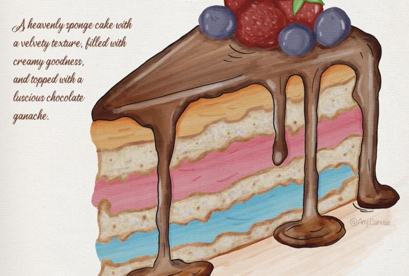
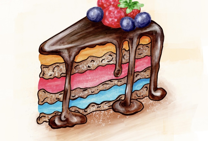
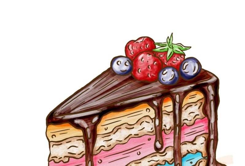
lesson is a slice of a delicious cake that we want to color in this
particular style. You can download the drawing
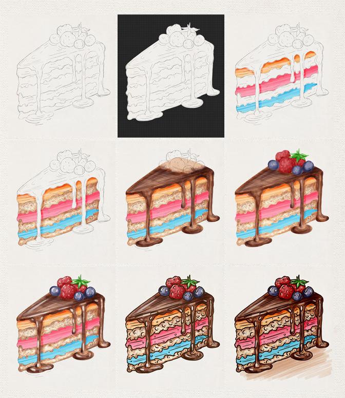
from the resources and start painting with me as we build up the layers of
sponge and cream, then paint the gage and fruits, and finally add some ink
to the illustration. It's a very simple, but
quite effective technique. So if you want to improve your painting skills and
learn something new, then this is the class for you. So let's get started.
2. Setting Up The Canvas: Let's have a look
at what we have. We have the paper where we
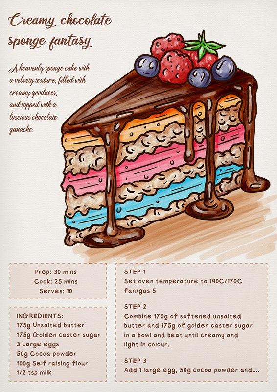
can see the name of the cake, which I completely invented, some description below the name, and at the bottom of the page, we have some cooking
instructions, which will eventually
continue on the next page. Then there's the drawing. And the color of colors
that we're going to use. We use four colors
for the spongy parts, these three colors
for the fruits, these two colors for the ganage, and finally black
for the outline. For this class, we'll be
using a brush called Marker, which can be found in
the inking library. The maker brush produces
something like this, but we want to change a few
settings before we start. If I do that, I select the brush and get to the settings by clicking on it. The shape is the first
thing I want to change. I can go to edit, port, and choose source library. I can scroll down in the
library until I find a stamp called
calligraphy number one. I will go with that. I also want to change
the scatter to non. Then I want to go to
the rendering tab and change the
rendering mode from intense glaze to light glaze because I don't want a
very aggressive brush, but rather something a
little more delicate. The apple Penzil and
proposes remain unchanged, so I can click done. If I test the brush now, I get this effect, which is exactly
what I want because that's similar to
a panton effect. Also, tilting the pen produces
a more transparent result, while painting
perpendicularly produces a more intense and visible
result on the paper. Another important
feature of this brush is that when I color
without releasing the pen, the ink does not ado, resulting in a consistent glaze. But when you release the pen
and start coloring again, the ink is added, resulting in a stronger effect. It might be difficult at first, but as you get used to it, it will become easier to master. To make things clear
and consistent, let's duplicate
this brush first. Then go down to about this brush and rename
it Market cake. Then you can click on create new reset Point,
and by doing so, you can always reset all brush settings and
that will revert to the amended brush that we set up before rather than the original
one, if that makes sense. Now we can get started. In the next lesson,
we're going to make the cutouts of the cake.
3. Making the Cutouts: First of all, we want to make some cutouts to make use
of the clipping masks. Without renaming anything
for the time being, we can create a new
layer and switch to a brush called monoline from
the calligraphy script. We can reset the settings, A monoline does something
similar to this, which is a little
too large for us. I would like to reduce the
brush size to about 3%. I want to draw the perimeter and then fill it
with this color, in this case, gray, but you can use any color
you want. Let's get started. Now I want to make the cats
for the creamy layers. I can use a different color
to make it easier to see, make a new layer, and place it underneath the sponge layers. And I can make the shapes again. Now it's time for the
gnage. Same approach. I can make a new layer
to go on top of things. And I can choose a
different color. I now want to select
the cream layer. D select, select
the paper layer, and then copy and
paste or duplicate. This will result in
a cut from the paper that retains the texture,
which is what we want. We can get rid of
the shape layer and rename this one cream. I can now repeat the process
for the sponge layer. I'll do select, then select
the paper and cut it out. Then rename this sponge and then do the same
for the ganage. Select the paper,
copy and paste. Place the gage on
top of everything, delete the shape layer, and rename it appropriately. Finally, we have the cts associated with the
corresponding layers, as well as the paper underneath. In the next lesson, we're
going to color the sponge. It.
4. Painting the Sponge: Now we start with a sponge, so I'll make a new layer called sponge colors and
add a clipping mask. It's time to choose
the marker cake brush. I want to color this layer with this brush without
releasing the brush. So you want to fill
this area in one go. As you can see, I'm not
going overboard because I'm essentially painting on
the clipped mask layer. I can't repeat the procedure
for this pink sponge here. And then for the yellow
creamy sponge near the top. And now I want to reselate the light blue color because
I want to add some shading, but I want to reduce the
brush opacity to around 50%. I want to rotate the canvas to correspond with the
movement I'd like to make. So I can add these lines and gradually build
up the shades I want. I can do the same with the
pink and yellow sponges. You can see that the typical
look of marks is emerging. In the next lesson,
we're going to paint the cream layers. S.
5. Painting the Cream: Now we want to paint
the cream layers, so we can make a new layer with a clipping mask and
call it cream layer. We choose this
very bright color, go back to 100% topacity, and add this creamy color. Like this, and like this. Go back to 50%. We can selate this color here, stealing from the
ganas color set. As before, I want to rotate the canvas as I find it easier
to paint in this manner. But this time, while
I'm adding the shades, I want to create a bit of ture by moving in a
different way than before. So I want to paint
a bit in a way. I'll do the same forget it, too. I. Then I'll be able to start reinforcing some areas
with more color. I may also want to add
some dots here there in order to differentiate
the look of the two layers. I can also add some shadows
behind the dripping gage, which will increase the level
of detail and description, even if we're working with
a sketchy illustration. For the sake of consistency, I'd like to add the cast
shadow to the sponge layers. With a few strokes, I can give the impression that the ganache layer is casting a shadow on the bits underneath. I would especially like to
add these shadow treatment to the yellow sponge because
the gage has some thickness. In the next lesson
with K D ganas.
6. Painting the Ganache: As you can see, it's now
time for the ganache layer. I'll make a new layer
with a clipping mask. Rename ganache color and
revert to 100% to opacity. We want to start with this yellowish creamy
color as a base, and I want to paint
this layer all at once. So don't let go of the brush. I That's it. Now we can reduce the
opacity to around 50%. And with this color, we want to start shaping
the dense liquid here so I can start defining
the drips on the side. And a bit on the top. And now I can change to this chocolate color here,
which is quite warm. Because it's darker,
I can reduce the opacity even
further to about 30%. With some decisive strokes, I want to start
defining the area of the gag and gradually
begin building the shades and the volumes by
how the light would interact with this type of semi dry or semi
liquid dressing. As usual, I want to
maintain control. I don't want to overdo it, but I always make a continuous assessment
because I don't want this layer to be overworked in comparison to others that
may be less descriptive. Again, you can see there
is gradually taking shape. I can feel the gravity of the dripping bits
that are condensing. I want to reflect these
aspects into the painting. And then closer to the fruits, the tones get darker. I think for the initial
treatment, this is enough. In the next lesson,
we're going to paint the fruits on top
of the gage. T.
7. Painting the Fruits: We can now make the
cuts from the fruits. I can create a new layer, choose this red color, and use the monoline brush. I can make the first shape by starting with the raspberry
in the background. I can then go back
to the strawberry on a different newly created
layer and repeat the process. Then I can repeat the process
for the remaining elements, selecting the appropriate colors and creating the
necessary layers. I believe I can feed the three blueberries
on only one layer. I need to make the
paper cuts after I made the shapes so I can start with the blueberries, do select, select the paper layer, and copy and paste, and rename the cuts accordingly. Then delete the shape, and I'll do the same
for the existing fruits layers as shown here. After that, I'd like to move
the cats on top of the cake. Beginning with the blueberries, using the violet color
from the palette and switching from the monone
brush to the market cake. We can make a new layer
with a clipping mask. I want to set the
opacity to two 100% and apply a first coat
without releasing the pen. Then with the opacity
reduced to 50%, I'd like to quickly apply
the second coat moving in a circular motion because we're working with
a spherical object. Go back to the raspberry, make a clipping mask layer, select this red color here and bring back the
opacity to 100%. I'm going to apply
the first coat, reduce the opacity to 50%, and now considering the physical
texture of a raspberry, which is quite
uneven and blobby. I want to try to
convey this kind of feeling by painting in a
way that can record that. I'll do this by using a series of strokes that are
released each time, as you can see, and
this is to a texture. Now I can do the same
with the other raspery. And now using the same color, I can paint the strawberry, giving you a slightly
different texture, as well as the cas, which is the green bit
on top of the fruit. I'm going to move the colleges to be on top of the strawberry and quickly define some shapes between the cavities
of the small leaves. In the next lesson, with
add some overall details. A
8. Adding Details: We can now clean up the
layer stab because we don't need the clipping mask separate
from the painting layers, so we can simply pinch
the layers to merge them. We now have them as
individual layers. What we want to do now is create some highlights
with a white color, and we start with
this blueberry here. You can adjust the brush size, and I think I'd like to
make it a little smaller, as well as reduce
the opacity to 40%. With this color, I'd like
to add some brighter spots. Simply rename the
layer highlights, and we can use this layer for all the fruits instead of creating a new
layer for each one. Once that's done, I can make
a new layer for the sponge, and maybe this timber
will be useful to make a clipping mask because the sponge is much
bigger than the fruits. I can increase the brush
size to about 17%. With this color, I just
want to add a few lines. It's not making a
huge difference, but I think it looks nice and add some dynamism in
to the illustration. And I can actually merge this. I believe I can combine all
the fruits at this point. Now it's time to add some
lighter tones to the gage, so allow the new layer
and a clipping mask. Here, we mainly imagine how the lights would reflect
on this organic matter. Perhaps imagining
that is almost liquid because the chocolate was
poured down just moments ago. This is fine in my opinion, as I don't want to do too much. Now for the cream layer, let's make a new layer
with a clip mask, and from the market brush, let's swap to the
flakes that you can find under the spray
paints library. We can probably grab this dark chocolate color
and test the brush. I think it's two small, so I'll increase the
brush size a little, like 14%, and maybe also reduce
the opacity to about 50%. With these settings, I can brush several times until I see
a texture coming through. As you can see, it's not
as present as before, and I like it, so I'll merge
these two layers together. Now that about the deflex pas, I think I'll add
some more das with the market at a low
opacity of around 30%. I'd like to better
define these layers. I'll do so on a new layer. And as you can see, this
is a very light treatment. I can now switch to white
and add some white spots. And I believe this
will be enough. In the next lesson,
we're going to nd the illustration by making an
outline and adding details.
9. Inking: We can now call the
painting process complete and move on
to the inking phase. To do so, I'd like to
create a new layer on top of e thing that
I can rename inking. For this step, we want to choose the darkest color
in our palette. We use the studio
pen brush for this. I'll just reset the brush setting so we can start
from the same point. With the default settings, you will get
something like this. The nice thing
about this brush is that the thickness is
pressure sensitive. When you press, the
line gets wider, and when you release,
it gets thinner. I believe something around 9% is okay. Let me double check. And that's fine. It's all about modulating the
pressure to achieve fatter or finer lines
along the curves. You can increase the amount and pressure of stream
line if you want. But generally
speaking, this is what you want to do by also creating some line insertions
because it's not just an outline
or perimeter, but a line that also
describe some des inside. Following this principle, I want to make the cream
in this manner, and I want it to
look fun and jo. I can now join the pieces
together by drawing lines on the sponge and
moving onto the gage. Again, I want to add a level of description similar
to the cream layers. Finally, when it comes
to round reflections, I want to go around the highlights without
closing the circles. Now it's time for the fruits. I can start with
the blueberries, which have a happy face now, and then move on to
the raspberries, taking into account the
difference in texture between these fruits and
continue in this manner. Now, I feel compelled to add some lines to the
fantasy sponge, some longer lines scattered with shorter lines that can convey
dynamism and movement. Also, some lines on the
ganache flatter surface. As well as a description
of the spot lights, I feel they need to add some
description to the sponge, so I can add the circles and
small bits to add movement. In the next lesson, we make
some color correction.
10. Colour Correction: We can call the illustration
finished, but if you want, we can add a cast shadow or
background as a final step. In the case of the shadow, I can create a new layer for it, and with the brown
or gray color, the choice is entirely personal. With the marker, you
basically want to create some decisive
strokes that tend to be darker closer to the base of the cake and fade out as they
get further away from it. And that's it. As usual, you can
adjust the saturation or hue of an element
at this point. For example, I can increase
the saturation of the fruits. I can increase the
saturation of the ganache, but I want to
control the level of it because when the
appearance changes, the element can be
something else, such as caramel instead of
chocolate in this case. The same is true for the
sponge or any other element. The very last thing you
want to do is to have the texture of the paper visible through
the illustration. To do that, you can merge
all the layers together. You might want to duplicate
the entire artwork in the gallery and open
the duplicated version. Then we can switch the
layer mode to linear burn, and now we can see the
texture popping through, but the entire painting
has become darker. To correct this, we can
use curves and simply increase the brightness by
adjusting the midpoint. So the illustration
is now finished. In the next lesson,
we're going to take a look at what we
achieved in this class.
11. Recap: Here we are at the
end of this lesson. We started by setting up
the canvas and making the first cutouts to use
the clipping mask function, which is very useful. Then we color the sponge
and cream layers, treating them differently to reflect their unique texture. We then painted the ganage
and the fruits on top. Finally, we unify the
illustration with some ink. As I always say in my classes, consistent practice is key
to becoming a better artist, and this applies to everyone from beginns to
established artist. Don't be discouraged if it doesn't come out
perfectly the first time. It will get easier as you become more familiar
with the process. If you enjoy this lesson, feel free to check
my other classes where I cover everything
from painting fruits and vegetables to animals and reproducing
all master paintings. I hope you enjoy this class and I look forward to seeing
you in the next one. Thanks for watching and goodbye.
 Maurizio De Angelis, Scientific Illustrator and 3D Modeller