Transcripts
1. Presentation: Hi, my name is
Marissa Angeles and the messiah figure stressor and 3D model and
based in London, UK, if you're looking to improve your parenting
skills in Procreate and explore your creativity. This is the course for you. In this class, we're
going to learn how to make an illustration pop from your Canvas using an
unconventional color scheme. We're going to start our journey from a drawing that you can download from the resources
you can use your own. Then following the steps, we're going to create
a neutral color base. And on top of this,
we're going to build our lovely radish illustration starting from IT perimeter
using an ink brush, the domain, and then
smaller details. After that, we're going to
create some volumes by adding the shades and chiaroscuro
using a very functional brush. When the illustration
is finally completed, we're going to play with
some color variations in order to achieve
a very creative. But without any further ado, let's dive into it.
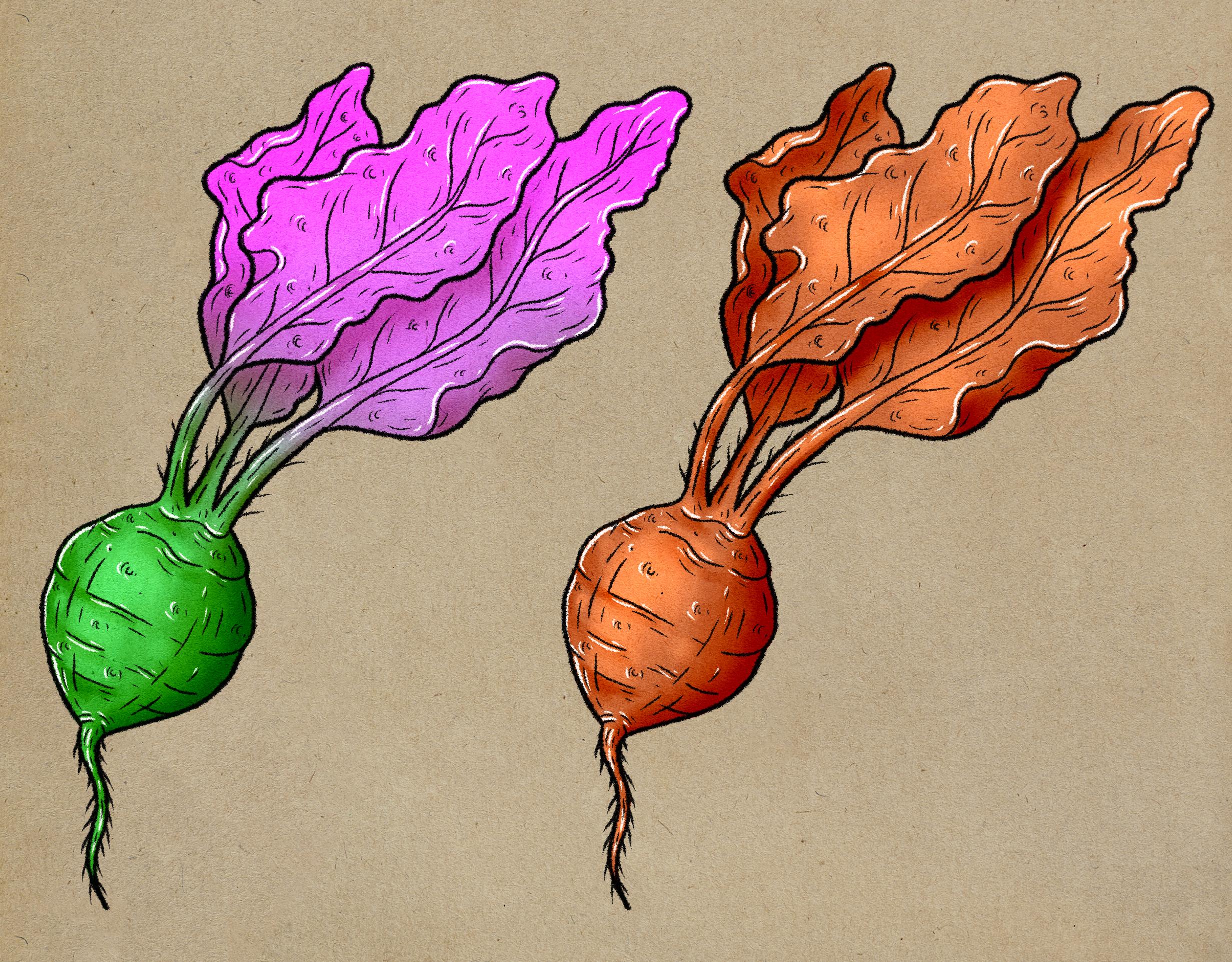
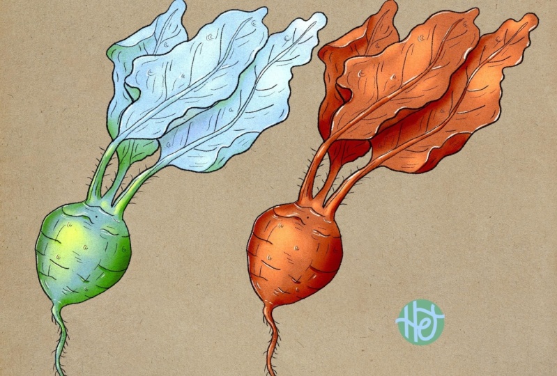
2. Workflow Overview: Okay, let's take a look
at this illustration. We have a finished
illustration on the left and a
drawing on the right. Here, we have some
color palette. So our goal is to reproduce
this starting from a drawing. Let's take a look at
the layer structure. What do we have? We have
these antique paper, which is this layer here, a drawing, which
is this guy here. You can see that
the layer is set to multiply by a few
switch back to normal. I'm able to see the white background as this
was a scan that I made. So again, if you
switch to multiply, the y is going to disappear, only revealing the
pencil drawing. Here we have the color palette
and we're going to use these three colors to pay
in this illustration. Here, there are many
websites where you can find nice color combinations
like Pinterest, coolers or Adobe colors. Procreate. It's got this harmony here. If you switch from classic to harmony and you choose a color, you have a combination
out of the box. And if you move
around the spectrum, you always have three colors that they get along
pretty well together. Let's take a look at the
illustration structure. If I open the group, I have a number of layers. Starting from the top, we have the perimeter. So let me make it
bigger for you. So we've got the perimeter, which is this bigger,
thicker line. We've got the small
details inside which are done with a
smaller size brush, another round of details. So there are two layers for the smaller details
that can be done in one layer only it
doesn't have to be two. We have the white ink, which is this one here. And then we have
the light layer, which is the lightest
part of our illustration. The shadows, which I
clearly the darker spots. Let me hide these two. And then we have a
base color layer. You can see that the lights
layer is set to normal, the shadows is set to multiply, and the base color is
set to linear light. I'm going to explain later
on the reason for this, but if you want to follow along, we're ready to start.
3. Base Colour: Okay, so what we want to do now is to close
this group layer, press and hold the drawing
layer and move it to the top. Make sure that it's
set to multiply. And palpably, we're going to
reduce the opacity slightly. So you can see there
is less visible. Then you want to select the
group and create a new layer. So you have a new layer
underneath the drawing. So this is very important. At this point. We can grab this
dark color here. So you press and hold
the color up there. We want to choose a brush. We're going to choose
the studio pen brush, which is basically under inking. And then you can select
the studio pen brush. If you click on it, you can do drawing pad and then
reset all brush settings. So if you do so, Oliver
style from the same point. This is also very useful if you messed up with
the settings of a brush and you want to go
back to the default settings. Naturally, you want
to test your brush. Okay, so in this new layer, we're going to create
the perimeter. So we're going to
hide these layers. One consideration is that these color doesn't
look like that. And why? Because this layer is
set to linear light. But if I switch back to normal, you can actually see that these two colors are
indeed the same. If we switch back
to linear light, we select our layer. And now it's time for
creating the perimeter. Here we're going
to follow locally the perimeter given
by the drawing. You can adjust the brush size
according to your needs. And doing this step, we
want to create the outset. Everybody say like a
cat out, always sticker that we continue with this. Now we can close
the perimeter here, and now it's time for
the leasing route here that I can actually
color these up straight away. Then we can sort out
these bits here. So now you have to be 100% sure that the perimeter
is closed and watertight. Why? Because we want to grab this
color without releasing slide to the right a bit and activate the color dropped
threshold just a bit. It's good practice to check if some pixels haven't
been colored. And at this point, we're ready to switch the layer mode from
normal to linear light. And by doing so, we get an exact replica of
the original illustration. At this point for
the sake of clarity, we want to rename this layer by tapping on the text
into base color. And this step is now completed. We are now ready to move to the actual creation
of the perimeter. So let's have a
look how to do it.
4. Perimeter: Okay, so what we want to do in this lesson is to recreate
the main perimeter. Ending the following lesson, pain, there's more details. So we want to
create a new layer. Then switched from
dark brown to black. These black or this black
are exactly the same. Check the brush. Now you can see that this brush is a bit of a distressed look. The stroke is not a 100% clean. And this is because
it's a different brush from the studio pen. And in fact, this brush here, It's called the Ink Bleed brush. Again, we can reset all
the brush settings. We have something like this. Now we can try the brush next to the completed
illustration. And we can see there's a
quite big difference in size, but we can clearly reduce the size and see if
we get any closer. It'll be probably
slightly bigger. Eight per cent. I can test here. Let's do eight per cent. Then I just undo this. Let's hide this small
dealers layers so we can focus solidly on the
actual parameter. So after creating this layer, I can rename it into perimeters. And then I can start. Now I'm going to trace
the entire leaf. Then going back down. I'll do the stem,
the leaf behind. Then I move to the other leaf. And then you want
to close the shape. If you don't particularly
like something that you've done or it wasn't
particularly successful, you can undo that and try again. Now the other side of the batch. And to finish it off
the list of root. And this is now down. We can actually are the little hair. In the next lesson. The stroke is probably
slightly thinner. Doesn't really matter size. We're here to learn
the technique, not necessarily
do an exact copy. So see you in the
next lesson where we want to add the small details.
5. Details: Okay, In this lesson
we're going to make the details
inside the leaves. Naturally we want
a thinner line. But before moving on, I spotted that I made
a small mistake, but it's not a huge problem. I can select the relevant layer, switch to the eraser, probably choosing a solid
airbrush and quickly fix it. This is something you can also do towards the end
of the project. Now we want to make the details in the following lesson,
the small details. So let's just focus
on the details now. We chart the main veins,
the main structures. Now we can create a new layer that we want to name details. If you want to recreate
the same layer structure, you can place it underneath
the perimeter layer. So that was a percent. The new thickness could be well, 4%, maybe five per cent. Let's go with 5% then. And now we want to draw the
veins, something like this. We can simply do
the smaller veins. We can do the leaf behind. The leaf here is
lively flipping. Having this manner,
we're going to approach the rest
of the details. Again, we don't want to get too crazy about making
an exact copy. We have the freedom to do
whatever we like in the end. Now we want to add
the d that's on the spherical part,
the actual radish. We can do this. You can also break up the line. In fact, you don't want
a continuous line on spherical shapes as
interrupting the line gives us a sense of movement
and dynamism and also simulates that the
light is affecting the area. So you want to create
something like this. Also some more
circular lines near the root that gives the
impression of spherical volume. Now we cannot this more
head that were part of the perimeter layer, the
original illustration. Now we can do them now. So with this quick strikes, we can create these. So you press and release. And if you do so at the end
of the stroke will taper off. So you get thinner. And that is given by the
pressure that you apply. Then there is this vertical
lines running down. And this is to emphasize
the spherical look. So we can ask them trying to
break up the lines a bit. I also do that on
the other side. For me, it's simpler if I rotate the canvas by 180 degrees. We can also add the
lines on the stems. And now we can add this smaller details in
the next lesson. Let's go.
6. Small Details: We now ready for
the small details. First thing first is to create a new layer and rename
it into small details. So the thickness for
the perimeter was 8%. The details was five per cent. So for the small details, we can try probably three. Let's have a look at the
original illustration and see if this is similar. Yeah, there could
be three per cent. So during this process
we're going to add these superficial dealers
will surface details, bits and bobs that
you might expect covering a badge of this guy. And at this point I think
we can hide the drawing. We don't need to
see that anymore. So I illustration looks cleaner. I'm going to start
from this area here. I want to add some
short and quick lines, maybe following the biggest
shapes next to them. One longer line and one shorter. We want to emphasize the
sense of dynamism movement. We can actually see that
something is going on over the surface As he doesn't have to be a
copy of the other one. You are free to evaluate the
illustration and say like, Oh yeah, maybe I need a line
here or it feels right. If I put a line there. Now, we can jump
to the other leaf. And the only consideration
now is to match the level of description
between the two leaves. As it would look
weird if one leaf was full of details and
the other one was not. So we want to have a fair
balance between the elements. Using now this method, we carry on until
some description. Now we can focus on
the rounder shape. Again, we want to follow
this spherical volume, but also the parallel lines always be some shorter
cannot spaced out lines. We want to treat these
area has the leaves. Now the root. We're going to add the protruding
hair later on. Now we can add
these bits kind of circular, maybe bumpy blocks. You can see that they
are not closed circles. There's always a part
that is not completed. This is again because
the elements or the sense of dynamism
to our artwork, and this is exactly
what we want.
7. Shadows: Okay, well, we want
to do now is to recreate these shadows here. Don't be scared.
That's very simple. You can see that the
shadows is set to multiply and the base color
is set to linear light. So if we switch to
know more here, you can see that these color
gets quite fluorescent. And this is because
the layer underneath is set to linear light. So if we switch both
of them to normal, you can see that this
color was our base color, and then the shadow color
is this color here. It's a bit confusing, I know, but there are many
layers to play with. It's just about
trying them out and see if you like an
effect in particular. So let's go back to Linear
Light and multiply. Now, we create a new layer, rename it into shadows, switch from normal to multiply, and nothing happens because
the layer is still empty. Now it's time to paint. There are many different ways to paint them black
colors together. And I published several courses so far that you can
check them out. For this class, we're going
to use the heart blend brush, which is a brush where you
can paint and blend at the same time without
switching to a blending brush. You might have
noticed that there's an arrow pointing down here. Because this is a clipping mask, which is an incredibly
powerful option of digital painting. If you want to activate
it in your layer, you click on the thumbnail and then click on clipping mask. Now, if few paint, you're going to
paint only within the boundaries given
by the layer below. In fact, if you
unclick the mask, you can see the actual paint. The great thing about this
brush is that you can paint. And then if you gradually
released the pressure of the brush switches
to a blending brush. So you can actually blend. And this is a great press, press, press to get darker tone. And then you release
to smooth things out. You might want to get
used to it or watch my other classes about
this brush in particular. But now it's time to
paint the shadows. So now with this brush, Let's try a four per cent. Because I want to paint
these shadow here. I can start from the outside, which is not going to
be visible because it's outside of
the clipping mask. And then move in. I'm applying the same
kind of pressure. And then I can lie. We released the pressure to activate the blending function. And then you get
something like this. I want to reduce
actually the brush size to maybe three per cent. I can do the root. Now I can move to the stem. I can reduce even
further, maybe to 2%. And here you can see
that the leaf is lightheaded thing
and it's darker. So I can apply some
pressure, release a bit, then reapply some pressure to differentiate the tone slightly. And these could be the level
of treatment I'm after. Now you can focus on this
area that as you can see, is in the shade. So I can press, press, press, and then release. Can do the same along here. You see that when you get
used to it, It's pretty easy. You just need to familiarize
yourself and learn, actually modulate the pressure. This one is going
to be like a flap. So naturally you
would imagine that behind these is
going to be darker. Has lacked this coming
from this side. So it's basically
coming from this side. And naturally, as the leaf is not facing the
source of light, it would be in the shade. And now we have this cast shadow from this leaf onto this leaf. So you want to follow the
EPA ramus health belief, applying a consistent
amount of pressure. And then with some
lesser pressure, we're going to blend these
brushstrokes. Easy peasy. I want to reduce
the brush size of B as I want to paint a stem. Something like this. I can probably make this darker. Now it's time for
some smaller details on the rounded shape, not so different from before. We just wanted to shade
these areas a little bit. Not too much. This is a similar same,
same, but different. But we're now ready to move
to the lights. Let's go.
8. Lights: Okay, so what do
we have now to do? We have the lights and
we have the white ink, which will be done
in the next step. So for the lights,
they're going to be just a few brush strokes. It will come to
approach these in the same way with
it for the shadows. In order to do this, we want to create a new layer, rename it into lights. We clipping mask the layer. And then we want to grab
this lighter color. So we have this color
There's getting fluorescent because it's
influenced by the base color. For this step, I want to try and see if this is probably
what I'm looking for, is probably is if you
imagine that the light is coming from this area here
and this is spherical, you would guess that
the highlights are around here and there
will be correct. You see that the
brighter parts here, and we have the
shadows on the side. And the relation between these two values gives
the impression of volume. So we're going to do the same. We start from this spot here. We spread out this light. I can probably reduce the
brush size to five per cent. You can press and then release in order to
blend the colors. Here, you want to create some bright spots so I'm
applying some pressure, but not too much. Then I do the leaf that
is on top of the others. Just a tiny bit. Now, if you want to, you can add some small Adidas using
the lighter color. There is not necessarily present in our original illustration. I would reduce the brush
size to be about 2%. And I would pay these bits here. You see that it's better. And also a bit here. And maybe some lights here. Now, the stem. The other one. Maybe I can add some highlights at
the bottom of the stems. So if you then
release the pressure, you really able to blend colors together like in a watercolor
if you think about it. Now, you can see
that we described our new distraction or be more
compared to the original. And lastly, I'd be on the root. Right? So now we're ready for the next step there is
about adding the white ink. So let's have a look at that.
9. White Ink: Okay, what is left? Is left the white ink. So the white ink layers
here that both delights. We want to follow the same
layer structure so we can create a new layer
and call it white ink. But this time we are
not going to create a clipping mask as we need
this layer and clipped, I can switch to
white or off-white. And I go back and select the brush that we used
for the black king steps. So again, we want to
double-check the brush size if it's correct or is similar
to what we have done so far. In this step, we want to only
focus on the highlights. You can actually see
that the white lines are running along the black
ones, but not always, you will need to
place these lines where the strongest
light would fall, like if it was a reflection. So I can start by
doing some fungi. These, you want to break up the lines as we already
learned in the previous steps. Some high notes here. Here. We can jump to the other leaf. And all of this I will
get a lot of light. Obviously don't want to overdo, even if it's quite tempting, is quite satisfying,
but you want to be in control and not to
be carried away. You want to be the
one who's making stylistic choice is known the
other part of your brain. Now on the radish itself, some shorter lines, much shorter than the
black counterparts. Then all the bits and bobs. Now I'm designed to
these quite important. Then along the route debate. And I think this
could be enough. We are now ready to
finalize our illustration, but before that, we need to fix some bits in the cleanup lesson. So let's have a look at that.
10. Clean Up: Okay, So the illustration
could be done. So at this point, let's forget about these. We can close the group
and actually hide it. We can also hide the
color palette so we can focus only on
the illustrations. Now, we can select
the base color layer. Then select the eraser
with the heart airbrush, which is a solid brush. While you want to do,
is to go and check the illustration
and fix these bits. You only need to do that
on the base color layer, Yes, The rest of them
are all clipped. So you basically need to
check your illustration if there's any
imperfections like here. Here. Until it's nice and clean as
refining is quite important. This is it. We now ready to
finalize our illustration, adding some color variations
in the next lesson. So let's have a look at that.
11. Colour Variations: Okay, now, when you
finish and illustration, you can evaluate your work here. You can say, for instance, maybe the lights are too strong, so you can decide to
reduce the layer opacity. You can even play
with the latest mode, but this is up to your choice. But what we can do
now is to select the first layer, then swipe, right to make a multiple
selection up to the base color, how we can group them. We can also rename the
group into illustration B. For the sake of consistency, we can rename the
original illustrations into illustration a. While we can do now
is to duplicate this group by swiping
left and hit duplicate. It gets read that as the layers are
influencing each other. But let's rename it
into illustration. See, you want to select
now this hero here. You can activate the snapping
function if you want. And this is kind of forcing the elements to move
by fixed ratios. And let's move it all back where the original illustration was. Now you can open the group, select the base color layer, click on the Magic Wand and select Hue, Saturation,
Brightness. And this is a lot of fun
as you can shift the hue, which means the color. And now you can choose
whatever color you like. So if I go with this green here, I want to select
the shadows layer. I'll do exactly the same. You want to shift
to a similar color or any other night
I combination. That can be for me
something like this. Now you can do the
same for the lights. And I think I'll go with this
bright and looking color, which makes the
illustrations popping out. Well, we can do now is to create an additional layer on top
of the painting layers, but beneath the ink layers
and clipping mask it. This time we can
select a soft brush, which is under the
airbrushing library. That we select. A color, can be anyone you like. I think I'll go with this pop of color because they
loved the purple, violet, and pink range. You want to increase the
brush size quite a bit. And you simply paint over the illustrations and look
how much fun is this. Then you free to explore
every variations. You can shift color, make it more blue
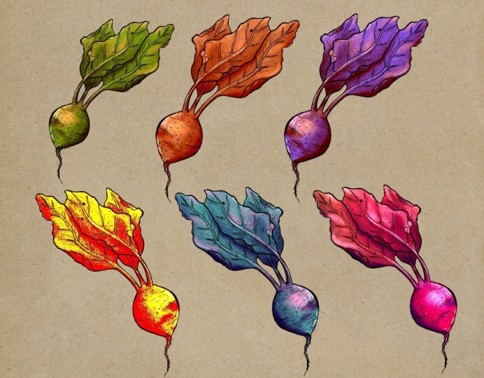
or red or orange. The sky is the limit. You can also increase
the saturation, which is the amount of
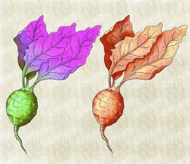
Karla you boot team. And also increase the saturation of the green elements a bit. But let's say that we are happy with something very creative, like in this case. This is it, this is
what we have done, and this is our color variation and our class is now completed. I hope you enjoyed
it as much as I did and I wish you all the best. Please get in touch if
you have any questions or if you want to share
your work with the channel, I'll see you at the next class, but for now, Bye bye.
 Maurizio De Angelis, Scientific Illustrator and 3D Modeller