Transcripts
1. Intro: Hi, it's Simone with a vintage nib calligraphy and lettering. You always wanted to learn how to make invitations, but didn't want to deal with complicated softwares or subscriptions or anything like that. While this class is going to be perfect for you because I'm going to show you how to make a full wedding invitation, sweet, on procreate, just using your iPad. We're gonna go with step-by-step on how to displace all the elements with hand letter font or just script font that is provided by procreate. And I'm also going to include some brushes, some step brushes, and some designs that you can use for your own invitation as well. So I hope you enjoy it. And let's just get started.
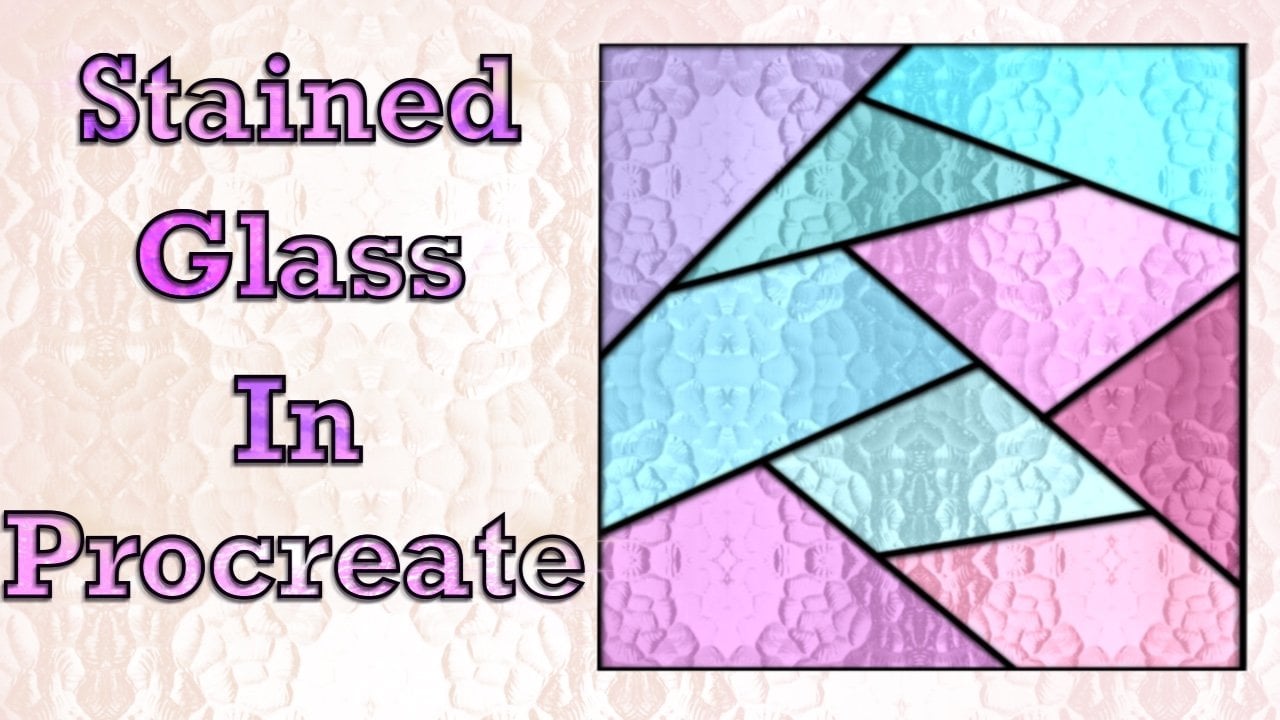
2. About this class: Hi, welcome to my newest class invitation design and procreate 5X. I'm so excited you're here and I just wanted to go over a couple of things in this class. This is entirely made and procreate. So if you don't want to do with subscription or being in front of a computer. This class is absolutely for you design anywhere. I also have some bonuses for this course. Obviously some brushes, some stamp brushes. I have some water color washes for you to use. I also included a font for you to download and use it on your x and x invitation. Or if you just want to play around, you don't have to use it, but it's also on the class or resources. In this class, we'll cover sketching, font choices. So what you choose for your invitation design and overall composition. Also, what this class does not cover that I want to go over with you is any special printing effect like folium bossing letter press. For that, I will suggest you contact your local printer and see what the specification is. You need to have that done. You can still make to study invitations in procreate without any of that however, so if you're ready, we can get started with our first lesson.
3. Inspo: So even though this class is going to have quite a few videos, I think a handful of them. It's going to be separated in three main points. So it will be inspiration. So we're gonna collect them, some of them right now. And then we're going to sketch, and then we're going to design. So the first thing that we're gonna do is just get some ideas. We're not going to copy anything. So we're going to hop onto Pinterest, which is, you know, the main places where the main place where everybody goes to get inspiration. So you type in certain key words and it will bring something that you like. So we can start with just the invitation card or you can type in watercolor invitation, or you can type in classe invitation. And you're going to get a lot of options and a lot of beautiful things. So what I do is I have a board and I saved some of them together, inspiration, so I can go back to it if I want to, but sometimes just look through them like this one, for example, which is the simple watercolor wash. And this is another one that I like. So I'm going to start with a watercolor wash just because it's much easier to play with the design to start. Also, another thing that you look up when you go into Pinterest is font, font inspiration when you look into invitation and a lot of people see the first thing is the design. So there's, there's flowers, if they're watercolor wash or on a flower arrangement or rigth. So basically the background of it, but a lot of people don't pay attention to font. Those are very important as well. So I'm basically going to use one font in one hit literary element, which I'm going to do it myself. But procreate also offers script font that you can actually add it to the invitation a, you don't have to hit letter anything. But you can also buy fonts like this one says free script fonts from commercial use. So I will advise for you to visit their website and make sure to read the terms and conditions of use so you know, if you really can use for commercial use of the invitation so you can buy it, use it and invitation and sell it. But other than that, just grab a couple of annotations they like seven and to your board if you want, if not, you can just follow along with what I'm doing and, or create your own, but I hope you enjoy and learn a lot. So let's get started with the first lesson.
4. Doing the rough sketch: The first thing that we should do when starting with an invitation design is to sketch. So we're going to open procreate and at the top right on that plus sign, you're going to open a new canvas, but we're going to open this, the sketch Canvas. So on rebel away you see a little file and with the plus sign, and I want something big, so you're gonna go and choose inches. And then you're gonna do 20 by 20 is going to give you only ten layers. And now I'm going to tie up to name this sweet sketch because that's where I'm going to design. My invitation Suite is going to be a simple one. And I don't need them. Any layer is going to be just a sketch. So we're going to first decide what it's going to be including, included and this sweet. So I'm going to add an invitation, a detailed card, and RSVP. I'm also going to designed Welcome to the wedding sign that you see when you get to the reception. It's all going to be in the same theme, but I'm going to keep it very simple. So let's go ahead and start with a simple sketch. So you have to do this just for invitation for a wedding. So I'm going to title invitation, but you can do for weddings. And you can also do for other events. You can do for birthdays, you can do four any milestones, birthdays for baby showers, for bridal showers for babies, first birthday for any other events they you do and could be a corporate event. So really any occasion and you can add as many or as little pieces as you would like. You can add just the invitation card or if you want someone to really respond by mail, you can add that if it's not a wedding. So we're going to design this for a wedding. But I will give you pointers also as well for to design an invitation for parties. But we're going to start with an invitation card. And we're also going to add an RSVP and a detail card. The day of stationary is going to be a welcome to the wedding of whatever name. If it's either your own wedding or if it's going to be a client's weddings. So we're going to add that as well on everything is going to have the same design so they can look cohesive. And I will also suggest that any other stationary they using during the event, you also add the same kind of design or color palette. So other options that you can add on a wedding suite. This could be more if it's something that you work with the client directly and she will tell you what you want to what they want to order. So you can add menus, reading programs like when you get to the to the wedding ceremony, sometimes they have a just a big board saying, you know, the bridesmaids are who the grooms. And but sometimes they want individual cards to tell everyone what's happening, what time everything is, What time is the reception if there's a cocktail hour, if what time is the dinner, What time is the send off? So when something's more custom is going to be a lot more work, but it's also going to be a lot more expensive. So it will all, it all depends on what you want to be working with. If you want to work directly with the client, just telling you everything that she or he wants on there. When he suite, you can do that if you just want to have a semi custom and someone just hey, I want that designed to just add the names, jurors added the information. You can do that as well. So it's really very flexible and you can just work with whatever you want. So we're going to start with are five by seven invitation card. Some invitation cards are bigger. For example, if you have seen Crane and co invitation collection, they have bigger invitation. They look very traditional, very minimalist is like a white or off-white paper card stock, very high-quality and with very nice printing with our names and address and everything. But we're gonna go for the standard five by seven. We also gonna do on RSVP and detail card and they're all going to be four by six. Also the welcome sign, but that's going to be bigger. So we're going to set up a different canvas for that. It's going to be either 11 by 14 or 12 by 16, whatever you would like to do the best. And you can take some, take the wedding, welcome sign to your local print shop and just haven't print on a, on a good paper and then you can frame it or maybe use a poster board. I think the local print shop can advise you what the best option will be in this case. So now what I'm doing is just filling out some of the cards and to see kind of have a rough idea what I wanted them. So they invitation card will be either together with their families. I just attitude random names and Peter would like the pleasure of your company on their wedding day. You don't have to add together with their families. You can just have the name of the couple. And on our SVP, you're going to add some sort of yes response. So it's going to be either yes, I'm coming. I can't wait or whatever it is that fits the theme for this wedding and a decline. You can also add things like food choice or requests for a song. So you can customize as much as he would like what I would say, just keep it simple because it's not going to be huge cards, so you can only fit so much in there. Also, the detail card is going to have things like a hotel options in the area, or also restaurant options in the area for the out-of-town guests that come to spend more than one day. Or maybe a small simple map, if you're working with watercolor or anything else that you would like to add if there's any babysitting services for guests to have kids, understand the hotels and they, you know, if your wedding doesn't allow children under 12 or under ten or no kids at all, then it can have that kind of information in there for the welcome to the wedding of Anna and Peter. So it's a consider day of stationary. It's going to be very simple. So we're just going to say welcome to the wedding of Anna and Peter. And we're going to add the date below some couples like quotes. But I usually when I have clients that ask for quotes, I usually keep that on a separate board, otherwise it gets too crowded. So that's it. That's what we have for this catch right now. We're going to start with the invitation on the five by seven Canvas. So get your 6B pencil on your procreate ready, we're going to start with that. And then after we finished, just the backbone of the invitation, so the skeleton so to speak, then we're going to start adding designs. The reason I do that it's because what? The wording and the verbage and everything, which is the hardest part for me. And then after that, you just add the design and I will give you all the details and how to edit design is how much on each piece of the suite. So let's go to the next video.
5. Invitation Card: Time to put our invitation card together. So now we're going to click on the plus sign to open a new canvas and you're gonna choose inches in. You're going to put five by 7300 dpi will give you a lot of layers. So go ahead and name and that canvas, I'm going to put an invitation card. You can put invitation, digital invitation, invitation design, something that you can just remember in the future. So here with right now I'm just doing a quick sketch just to see where everything is going to be placed. So at the top is usually together with their families. But you don't have to add that. That is just one of the options. And then sometimes they don't put any, anything. Sometimes they put a different phrase. Would love is just, it gets very creative. And then in bigger letters you put the couples names and that usually go into middle, center. But sometimes it goes towards the bottom, so it depends. It will dip. The final design will depend on what kind of theme and colors and what kind of background you're going to add. So right now, I'm just going to make sure that Anna and Peter are in a different layer, or I should say, and, and Peter design is in a different layer. So I can move it around and make sure that it's center or I can just place wherever I want it. And then below that I'm going to add the time. Actually, it's going to be first, it's going to be the date that's going to be on the new layer. So the date, the time and location will be after that. And the date and the time will be in one layer. Location will be in a different layer. So I want the date and the time to be a little bit bigger or in bold letters, but it's not, I don't want to too clumpy. Too bulky is just to give a little extra visibility, just to catch the attention a little more. But always the focus point of this invitation, it's the couples names always. And everything else is just to add to the detail. So this is the placement that I want everything to look like. And now we can go ahead and actually add the font. I always have the habit of opening a new layer, but you don't have to. Once you ready to open a add the text, just go into the ranch in, add and add a text and is going to open this box. And if you tap twice, it will show this. A little menu showed up and then you just click on the top where the font name was. And then this menu, you see where it shows optima right now, if you click on that, it will take you to the menu with a lot of options to edit the size and Kearney and spacing of everything. And if you want bold letters, if you wonder is regular, if you want to bold italic and all that sort of stuff. So I chose optima as the font just because it's a nice san-serif in it is just not too bulky. I don't want anything that is too bulky because it's just going to be a very small writing at the top bubble above their name. So together with their families, I'm gonna put it right here. And if you need the guides, you can also turn on the guides if you need any everything Center. But let's see if I can do it without so together with their families. And I'll just set array here. And then I will add a new layer for everything else. So let me go ahead and add the guys go to the ranch canvas and then drawing guide. And on the size of the grid, you just go to Max and that's going to give you just like a big plus sign. And that blue dot in the middle is the very center. And I'm also going to turn on the snapping. So if the lines of the grid is too light or too opaque, you can go ahead and edit those details at the bottom. So I put it in pink because it's not too hard MY eyes. But if few, mom, I'm going to add another layer to add the location. So it's gonna be the date, time, and location so that they didn't time will be and one layer and then the location will be on another layer. So I think I added a layer where you don't have to do that if you're adding tax, when you add a text, it will add automatically on a different layer, but I do it out of habit. So this is probably going to be like the third layer. I will call first layers together with their families. And then there's Anna and Peter on other early and then request the pleasure of your company on their wedding day. I'll speed up the video just a little bit until I place everything. Well, at least this layer where I wanted to. So I'm basically just adjusting the size and I'm going to put under, below where the couples name is going to be. So I click on that text edit and it's going to open this big menu and then you go into design on size and I just adjust the size that I want. So now I'm just using that layer, the request, the pleasure of your company on their wedding day just to make the size the way I like, I speed up the video a little bit so you don't have to watch the whole thing. But one thing that I would like to bring up as I'm using just two fonts. And that's what you usually see. I'm an invitation of any sort. It's either is usually too fond, sometimes three, but no more than that. You don't want something to Basie unless, and that's particularly the style there you're going for overall. But if you're doing a more traditional invitation, a five by seven and what the design on the background or something at the top and the bottom, you usually use two or three types of fonts. So now I added another text box for the date and the time. And that one is going to be just a little I don't know. Maybe bigger or just bulkier. I'm not sure. Yeah. Which one will look best. But I won that a little bit bigger than the other text boxes as because I want that to catch a little bit more of attention. So the main focus of this invitation as, as far as writing goes, is going to be the couples name and then after that is going to be the date and the time. And after that, the other boxes would whatever information is in there about their wedding or together with their families or whatever other phrases you have in there. There are going to be the same size because they're equally important, but I don't want them to steal the attention from. All the other details on invitation. I'm spinning up the video again because now I just wanted to play with the size. I said that I want the date and time to be a little bit bigger, but this one is a little too big. So I'm just going to reduce the size a little bit until it looks, you know, not too bulky. So I try the bold option, but that didn't look very good. So I'm just going to keep like a tiny bit vaguer and we'll see what happens when I finish everything. I can always adjust it. So if you notice I have a restaurant as any of the layers, I'm gonna keep it like that. Because number one, working with a client and it's ready to print, then you can go ahead and restaurants and then merge all the layers incentive plan and we get to that later on story about that just yet. But if, if this is just a sample and you want to show it on your website or new Etsy shop and say, hey, I'm open for business, I'm making invitations and you want to, someone is going to see the design and say, hey, I want exactly that. I just want to add my information to way which we'll get to that tube. That's going to be also a separate class, but I'll include a part of it. And here you want to make sure that you know which font you're using. So make sure that if you're going to rasterize the layers they have, just like you see here. If you're going to rasterize those layers, make a note of which font using for that particular invitation. So you don't have to look for a Once you have to add up the work. So keep it not restaurants, so you can go in there and just change the Bob added the writing so you don't have to just add a new tax box and look for those layers, look for those font style and do everything all over is going to save you so much more time. And you can add this as just a sample to your website or your Etsy shop or Shopify wherever you want to show off your invitation. And then if someone sees it, you they're going to order it from you and you just go ahead and just add it right there. You don't have to worry about what font you use double four, but I would recommended that you keep us separate layer, maybe just hide edges for you to see. You don't have to keep it on to show on invitation with details about it specifically. Invitation, so what fonts to use and the size. So you just keep it like a little file. You can even keep it in a different canvas that if you don't want to keep a with this invitation in particular, just put it in a file so you know, we used, I would name your invitation as well. So if you're doing a watercolor wash invitation, a watercolor invitation, and if you're doing a watercolor flower name, something like that or spring invitation. So you can keep more of a list of what invitations you have created. And we'll font to use them what designs you use so you have better control. So last but not least, now we actually going to manually add a new layer and we're going to add the names of the couple. So I am using a brush from procreative calligraphy brush that I made myself. So I'm going to include that as a one of the resources so you can just download it and use it as if you want. I'm going to include other resources as well. So I'm just going to, I want this bigger than everything else, much bigger. I think this might be a little too big. I keep it everything in one layer so I can just move everything together if I don't want a group is So I think Peter is actually a little bit out of place, so I'm going to bring it to the right a little bit. And I think that R has a ligature that is way too long, so I'm going to erase the end of that. So just everything looks center. Their names are equally long or at least I made it look like there. As long as they are ligature, there was too much to the right. So now they look a little bit better. And I might reduce the size a little bit, but we'll see. So you can also change the angle of the names if you would like, if you want something that it's like sideways or forty nine forty five forty five degrees, 90 degrees, 45 degrees. You can I actually like straight better. But once we add the background design, then we're going to see which one looks better. So this is just a simple, Just the awarding the, the, the verbage of the invitation. And then now we're going to finish the rest of the designs. I'm not going to restaurants or any of those layers. Because just like I said, I want to make sure that I know a font I used was size and everything. So I don't have to do any research and plus you have to do on all over if you rasterize. And I just deleted actual layers that I didn't have any other designs in there. So your invitation, your main invitation card is ready. I'm going to name the top layer, the top layer as in design because that's what we're going to do next. But we're gonna go ahead and do that on a different video so we can dedicate and just the four designs.
6. Adding the design: When deciding what kind of design you one for an invitation, you just want to keep in mind that everything we need to look cohesive. So whatever you decide to go on with, we will add the same design to everything that it's in that wedding, sweet. So if you want something that it's on the top left corner, you can add some flowers would send leave. So I always open another layer. I'm gonna invitation card right now and I open a new layer where I just do some sketching, what kind of design that I possibly world one and an invitation and I think it looks good. But you don't have this doesn't obviously is not permanent, so it's just a sketch. And you can try also with different designs and do a little experimentation here and there. You also don't have to add any specific the design. You can also just color the background. Or if you want to go from minimalism, you can just leave it the way it is. But most of the time you will want to add a designer. Your client will want to add a design. And it's a lot more eye-catching if you had some sort of design either on the background or at the top of bottom or even in the middle, depending on what kind of style you're going for. So I don't know if you saw me scrolling, true, there's several different types of invitation. So this one, for example, is just a water color background that I have. You can use that sort of design and you can add the same designed to everything. So it's very simple, but it's very nice and very, and Class C, so timeless. So it's not something that would require you to be messing around with the position of the design everywhere on the invitation. But I'm going to star what actually, you can see here that I have some flowers, but I'm going to start actually with some just simple watercolor so I can show you how I place everything together. If you already have a piece of art, a watercolor wash that you have made before and you want to use it, go ahead and put that on your invitation as well. So you just open a brand new layer and make sure that whatever our day you add, add to a new layer. I'm just going to paint something here really quick. I open a new layer and I use my blend splatter. It's a watercolor brush that I made and I'm going to include that in the classroom as well and the resources. And you're more than welcome to use this for any detail that you want on your invitation. And I'm using the same. You can see that it's a pretty bleeding kind of brush is. So what I did is I just mix two colors together. Two different tones are shades of purple and I use the same brush but on a smudge tool to just get rid of the sharp line. So you can see that it gives like a very nice watercolor wash. Diaz's almost like it's bleeding water everywhere. And that's exactly the look that I was going for. So I'm going to save this and I'm just going to keep him this invitation. I also have something similar that I'm going to use for the other items out of sweet as well, but you're more than welcome to just do something completely different, not completely different, but on a different layer that you're going to use for everything. I just use two different water color washes, but they're the exact same color. And I'm just placing everything in order. So I moved to the water color wash down on the bottom, and I moved to the name of the couple up. And I changed the color because the palette of the watercolor wash is a purplish, so it kinda clashes a little bit with the names that were in black. So I am grouping everything now just so I can bring everything to the top in, moving everything a little towards the top of the card because you have to just place where everything looks like centred and it's, there's not too much of an empty space or negative space, I would say an invitation. I also removed it together with their families just because it just didn't fit the kinda look at L1. And I only use the color of the watercolor, wash it just for the upper part of the invitation. And this is very simple to do. And now we have the invitation already with the design placed on it in. We're now going to go for the rest of the suite.
7. RSVP card: There are many ways to design our SVP card. So let's start with a four by six Canvas. So you open a new canvas just like it did the first one. And you choose inches and choose six by four actually because a one and landscape mode. So I don't want vertical and just name it RSVP or reply card. And create. So you can, you can name this RSVP card, but the title you could add RSVP or you can put, kindly reply or any other verbage day you've seen around that you think it's more fun. I'm just going to use our SVP. So now I have in my sketch pen, my 6B pencil, and I'm just going to put a few options in here so you can do it by hand and like I did the name of a couple or you can use the text feature if you prefer. And their RSVP, there are few may element, so there's the name RSVP and usually there's a date, and I always use the same date for everything for my samples. So just if you're if you're ready to make an invitation I live invitation. Just put the dates that correspond to whatever date of the event that you're working with. So right now you're going to see May 15th for a lot of things. So the, the first two options is either accept or decline. You can do accept with pleasure or wouldn't miss it for anything. And a decline, you can say decline with regret or unable to attend or anything else that means yes or no. Down below, I put the number of guests. This is not a super formal invitation, so it's not going to be Mr. and Mrs. I'm not gonna have any title. Just wanna make sure that everyone is accounted for. If everyone then it's on the invitation, is invited or if they're except to come down below, I had food choices and so I did beef, chicken, and vegetarian. So now that I sketched just the basic skeleton, I would say of the RSVP card. I'm going to open a new layer and i'm going to start writing. So on the RSVP part, I'm going to do hint letter with my brush letter, brush from procreate. And I'm going to include that on the resources as well. If you haven't already download it, make sure that you do. You don't need to use it for this, but you can use it for other lettering pieces. And I'm not sure yet how I'm going to add the date. So for now I'm going to add it as a with the text feature just because I wanted a more of a clean look. And this is not the font that I wanna use. And also this is really big. So I'm going to select everything. Choose the font and I'm going to reduce the size a little bit and I'm going to go for Optima. It's my favorite for this week. It's had as its essence Sarah, for, but it almost like has a little tiny serif, but not really. And just leave it down below from the RSVP. You can put it like next to a you can put right under it. I just like a little angle just to give it a nice detail and, and design. And then on a brand new layer, you don't have to open a Larry for using the text feature I'm going to add, except with pleasure, I'm going to use that verbiage. And this is also very big. And I'm going to add another text. Decline with regret. And you can do that. You can add all the text features and then you added everything as far as sizes and placement on the card, if you would like. And that's what I'm doing right now, just to make things easier. And I open another text. And please initial a meal choice for each guest. And I'm going to make everything a lot smaller so we can fit on this card. So you can just place it where you want it. And I'm going to put the except with pleasure as a first option. Then decline would regret right next to a I don't I'm not going to stack them on for this RSVP just because it's not the option that I want right now, but you don't have to put a 1X to the other. You can actually put one on top of the other so you can stack them. I'm going to put right next to each other just for sake of design. And I'm going to add the other one. Please accept initial amino choice for each guest. And down below, just wanna make sure that the size is pretty similar to each other. So it's not like a different if it's by half appointed doesn't mean you're not gonna see it. But I'm very particular with the style on the sizing of my letters. So also going to reduce the size for a please initial a meal choice for each guest. And now on a different layer, I'm going to add the food choices with my brush letter. Now I'm going to add the food choices with my brush lettering, brush. And I'm just going to reduce the size of very, very tiny because I wanted those words to be very small. So I'm just, I'm not even going to put too much pressure on downstroke to look like a calligraphy had just won a cursive handwriting. So I'm just adding beef, chicken and vegetarian. And I'm going to just going to center them or position them very well on the RSVP card and they need to be smaller or a little bit because I want to add a little line right next to them so the gas can initial their names end in case there's more than one gas, the one chicken, then there's enough space for two initials in there. I'm sure they will not mind if they just have to ride around it, but you want to at least to give them the option to be able to add two names in front of the same food option if they choose both vegetarian or Bolton chicken or both beef. And after that, you can go ahead and just group everything together and you can center on the RSVP, make sure that there, there's not too much negative space on each size. And you can also use the snapping. You see right at the bottom left, there's a snappy feature if you want to make sure that that center, now I got the same watercolor wash and I'm adding at the top of my SVP card. So I'm gonna do it at the top left, and I don't think that was strong enough of a color, so I just duplicated the layer, merged it, and just reduce the opacity a little bit to 75%. And then I changed the RSVP name with two white so shows better. And I'm going to change everything to the same color. So you see that there's some hard edges also. I'm going to fix that with my smudge tool with the same brush on the watercolor. What I didn't know just now I just did to little circles so people can just mark that, accept or decline that I didn't do in the beginning. So I drew a little circle and extra, except I duplicated the layer and dragged it to next to decline. Now that everything's placed where I want and I'm very happy with the final design. I'm going to remove the guideline so I have a better idea what it looks like. And now we are ready to go to our next item.
8. Detail Card: For the detail card, we're going to keep on the same size as the RSVP cards. So you can just open the same cave as if you like or if you want to keep track of what canvases for what, you can just open a brand new one on the little phi with the plus sign. And you just name a detail card. So six by four will be the standard size. So to keep things simple, I'm going to use my 6B pencil and I'm actually going to keep on the same dark gray that I used on a previous video. So you can name this detail or details or you can just use information as the title of the card. So really anything that you want to add it just to show people that this is just extra information. Somebody I've seen people use wedding weekend if they have out-of-town guess or something like that. So I'm just going to keep it simple and use the word details just for simplicity. So the information I'm going to include it in this card specifically will be lodging, transportation, and the couple's website for any information on a wedding registry. If anyone needs babysitting services, some atom to the website in case their wedding as there is no kids aloud or anything else like directions or things to do during the weekend for for guessing they're coming from out of town. So you can add all sorts of information in there. I'm just going to keep a simple so we don't spend too much time in here. So I'm going to write details with my brush off from procreate the same one to lettering brush. And I'm already using that gray that I've used on the previous invitation card and also the RSVP. And I'm going to be doing a mix of hand lettering and texts from the text feature. So I'm going to do accommodation, transportation, and website. Those titles, I'm going to use hand lettering and I'm going to do each one and they're separate layer just like you move them around and center if I need to. So I open a new layer and I did accommodation is the next one. I opened a brand new layer and i'm going to ride transportation. I'm also keeping this very casual hand lettering, so I'm now going to be fixing any of those letters. And then then the next layer I'm going to do the website. I really liked the loose style of this hint letter, so I'm not going to be fixing anion letter form or anything I like. It's just the way it is, but feel free to be more detail-oriented, if you would like. Now, I just group, but not put them in a group. I just selected the layers to move them together because I just wanted them to be the same size. And then once I want to move them around the card, then I can move layer, a layer by itself. I wanted the same size, so I just selected all the layers together and reduce the size so they're all the same size. So now I'm going to add a text part. And I'm going to keep this simple for accommodation, I'm going to add a block has been a block of rooms have been reserved for our guests at the hotel and any other information, and I included the address as well. For some guests that they don't block addresses they use, they don't block rooms. They usually do Hotel recommendation. Hey, this is the area that we're getting married. These are the hotels. They you can call and see if they have rooms for you reserve in advance because you receive the details card with your invitation. So it's going to be a ways away from the wedding day from the ceremony. So you have time to make any hotel reservation so you can put that in there as well. In this case, I just put something CIP oh, blocker robot has have been reserved for our guests. Hilton bay front. It's a hotel here in my town, but obviously I changed the address because I don't even know their address by by Hart. And I'm just going to add that under accommodations. Then I'll select those. That text box if I need to reduce the size. And once I'm done and I'm happy with the size, I can always change it later, which I probably will. I just place drag the box with my Apple Pencil or your finger and I just drag it to under our accommodation. So it's in the right place and it's not rasterize that, Yeah, but I will later make sure to take notes of the fonts they're using. If you're using the same as me, is just my hand lettering. So you'll be reading herself. And then the other one is optima. So it's easy to remember, but if you use something that is a different font they usually don't use, or if it's something they you bought is specifically for a client that day requested that font, make sure to take a note of what the font name is so doesn't get lost. And then you have to do a lot of more research. Now I added another text box and I'm going to add on the transportation is shuttle service will be available for gas, for pickup transportation from hotel to Ceremony and a reception. Another thing that you can add under transportation is any train services if this is being held outside of the country, subway or buses. Obviously that's something more of out of the box situation, but you can add that information as well. Some people add directions. You don't see that as much anymore because most people will have GPS with them. Bouba in case you want to add, that's also an option. And the last but not least, it will be the website. So I'm going to add another text box. You don't need to add a layer because once your other text feature, I know that a keep repeating that but I forget it myself. So I'm just centering everything now just to make sure that not there, not to cluster together and make sure that their center and they're all the same size. But you can do that at the end. I just like to do it as I see it. And I just add another box and I'm just going to add for more information, please visit our website and whatever your guests website, you can always put www dot your website here or your website name.com just so people see that as a sample. Let's say you adding this to your shop and you, if someone says, I want that invitation design and that's where everything is going to look like. So their website, we'll be down at the bottom. Things that they put on their website is the couple story, how they match, how they propose, how he or she proposed, and pictures of them, The rain in that sort of thing. Any other information that they think that it will be valuable for their guests, like registry, for example, will be on their website and the dress code for a cocktail hour. If there is a different, you know, if it's different for a ceremony and a reception, difference in time, if there's going to be along Wade, or if it is a whole weekend affair, if there's a brunch next day, that's where they put that information after that, which is going to take a look and make sure that everything is center, align, everything that it's not aligned to center, everything that needs to be centered in. I'm going to remove those guidelines so I can add my watercolor wash. There's no order to remove or add the guidelines. If I see that, I will just want to remove it right away. I do it. And we're gonna go ahead and add that watercolor wash and finish the design. I'm sure you have noticed that the invitation card that had the biggest size of the detail, so we had the biggest wash of watercolor of all. And then the detail card and that the RSVP had just a little bit on a corner and that's usually how it goes. You don't overwhelm the whole suite with a design. You can, there's really not a hard rule. You can do whatever you want any fulfills right day. You add all the details to everything you absolutely can. I'm using the invitation and the welcome sign that we have coming up as the biggest one with the details and everything else. More a little subtle sold here, there is a hotline for my watercolor. So what I did, I use the same brush, watercolour brush that comes with this class. And I use it in a smudge tool to kind of get rid of just the hard line. And then I duplicated that layer because I wanted something a little more vibrant and I reduce the opacity down to 75%. So I want to more vibrant but not double the vibrancy if that makes sense. And then I move that detail layer to the top of the water column. Rosch change it to white, just like the other ones. So they all look very cohesive. And I just see here another heart line from the watercolor. So I'm going to smudge that as well. It looks like is just water bleeding with the ink around the paper. So it's very natural in your detailed cart is ready. Now we have or next lesson coming up. So let's get started.
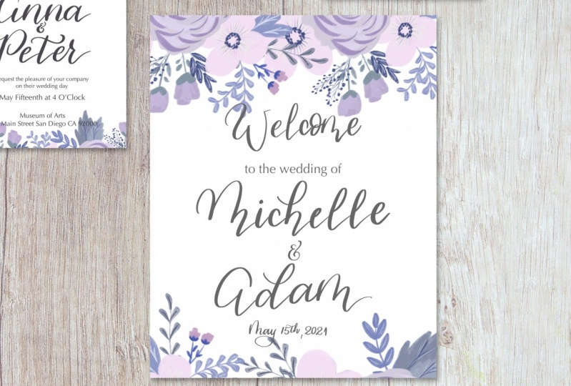
9. Welcome sign: For the welcome sign, we're going to open a different size or dimensions of the canvas. So it's going to be in inches. You can name it. Welcome sign. And it's going to be the sign that stays either at the entrance of the reception or the ceremony that says Welcome to the wedding of whatever couple. And the dimension is going to be, I'm going to put the standard one which is 11 by 14, that standard that I've seen, there are bigger ones, there are smaller ones, but I think 11 by 14 is a good size. Especially if you're going to have it framed or you can just use it a poster board. But if you're selling this digital, It's a great idea to just deliver this in a digital style to your client. And they can just decide how they're going to print this and what format. So we're gonna start with adding a guide. And with my 6B pencil, I'm just to do the same sketch that I do the other ones. And I'm going to increase the size of my pixel because since the canvas is bigger, the pencil will seem a little smaller, so I need to be bigger so we can see it on the screen. So I'm going to have the same hand lettering element with the font style with the textbox as well. So I'm going to do the welcome, the wedding. Welcome, welcome. And hand lettering to the wedding of an a text and the couple's name in hand lettering and also the date at the bottom. This is a very simple sign. There's not much to a is just a nice warm welcome to the guests when they arrive at the location. So I'm doing everything on the same layer right now just because it's just a quick sketch. But then we're going to start with the design. As soon as I'm done, the date will go at the very bottom or just under the names, but I usually like to put at the very bottom and it's going to be just very small. And there's no reason for people to see to date in huge bold letters just because, well, it's the day, day you're there. They don't need to know what they did is, is just a nice detail at the bottom. Once I my sketches complete, which is a pretty simple one, I'm just going to lower the opacity of this layer. And I wanted just to center the date right here and put a reduced size a little bit just so I can keep the trend. So I reduced capacity just to use as a guide. And then I'm going to go to my brush letter or hand letter or brush pen, my brush from procreate and I'm going to star hand lettering the elements that are going to be on a text. So will be the welcome. And you can also reduce the size or increase the size later on. So I'm just adding the words right now and then I can center and just adjust everything later on when I have everything ready. So I'm going to add welcome and in a different layer. And we're gonna go ahead and add the couples name. So Michelle and Adam. And I'm going to be a little bit more detailed and trying to be more cautious when I read the names because I don't want so much of a loose style. I still one modern calligraphy, but I won the strokes to show up very nicely. So that's why I'm writing a little bit slower than the, for example, the detail card and other detail card. But there are SBP card with the food choices. So I'm going to center those names and I know I'm going to change the size here and there just a, just a little bit, not too much, but we can keep it the way it is. At this time. One thing I'd like to point out is the welcome. The signs that I make, the welcome is a little smaller than the couples name. It's still big and bold, but the couple's name is going to be the focus of this of the sign. Just doesn't have to be too different. So the welcome will be a little smaller, but not too much smaller. I'm going to add also the date in hand lettering. So I'm adding that at the very bottom. And I'm pretty sure I'm going to resize the date at the bottom, but that's okay for now. I can always finish everything. And then right before I add the design, I can just resize if it needs to be. Now I'm going to add under the Welcome, I'll add a text, the text box. And I'm going to write to the wedding of, and I'm going to change to optimal, which is the font that you had been using for everything else. Just type into the wedding of in I've seen where people write with every first letter of the word and capital. I really don't like that all that much. I wanted to type it in and see if I actually like a butt. I don't think that it goes with the style, so I'm just going to have everything down with a lowercase nom just centering everything, make sure that everything looks good. I change from the capital letters to small caps because I don't like the way that it looked. I reduced the size of some words and some phrases. Now I'm trying to decide between Michelle and atom. You can add a plus sign, the word end or an ampersand. If whatever you prefer, it's fine. Or the client, I like the ampersand I don't like this style of ampersand. I like the E with a little detail. The top, this is my favorite one to write, so I'm going to keep this one. And this design. As far as warning comes, it's pretty much ready. Now all you need to do is actually check for, we're going to add the design, but before that we're going to check for any spellings or anything they were missing. So I'm going to add my color, my watercolor wash. I'm going to increase the size a little bit. And you go ahead, I'm gonna rotate just to see what position looks best. I also duplicated a design before I made any changes, so I don't have to pull in from my camera roll again, but it's not a big deal if you forgot, you can just I pulled the same photo from your camera roll or your files wherever you have a storage. So I'm going to edit design at the top, going to a little bit to the left side and then again at the bottom right. Since this is not as there is no symmetry to this watercolor wash, you can pretty much put the position of the wash. As you like the best. I like this one the most because it shows both different shades of purple. But feel free to use either a different wine or a different position for your call awash. When I add the wash at the bottom, the detail is a little smaller than the top. It's just a little accent. So you can see that the top one is much bigger, it goes over the word, and the one at the bottom is just a little on the corner, on the bottom right. And just like an previous cards invitation, RSVP and detail, I'm going to duplicate the layers just to give it a little bit more vibrancy and then I reduce the opacity just a tad. You don't have to do this if you're happy with how vibrant colors are, you don't have to do anything. You can keep it as it is. You can always change the hue and saturation under the magical, the magic wand up to, to the left. I'm not going to do that just because I don't want to over-complicate things and I'm just going to leave it like this. Now I remove to the guidelines and now you can see the sign as it is. You can always increase the size of the watercolor at the top and change the welcome to white. I didn't just because I wanted just the way it is. I think it looks a lot better in Boulder so people can see it from a safe distance is not something that they are grabbing into their hands. And this is your sign, is ready to go. If it's ready to deliver this to the client, just make sure they emerge all the layers and it's ready for print. Make sure to do that with all the other files as well.
10. Design variation: Before we move on forward, then to the design variation, let's go ahead and organize these files. So you're going to open your procreate and you're gonna drag one file into another and you're going to stack them. That means that they're going to be in the exact same spot. In to stack em, you just going to drag a one file, put it on top of the other, you're going to see a little number. And you just hold it in there and you're going to see that they're all going to go into the same place. It's almost like opening a folder. I like to keep the invitation as the first item because when I close, the cavitation will show on the very top. Now we're gonna do is we're going to rename it. Well, I'm going to just keep the name that I have, so you just click on the name and it will let you just rename your file and then I click on select, and then after that I click on duplicate because I want to keep this design, but I want to have variation to it. So I'm going to add open one of the ones that I duplicated while the stack and is going to give me all the options. So here I had downloaded a bunch of flowers and everything and background. I'm going to delete all of them and I'm just going to start from the beginning. Not that I deleted all the files that I didn't want, all the layers that I didn't want. I'm gonna go and add a picture. And I did this flower, little flower arrangement on procreate using my chuck brush. And I also added some stamp brushes into this class you can use to make something like this and it's under the resources. So I added this picture, this photo here to my one of the layers, it's a blink layer is obvi, obviously an empty layer. And I'm going to duplicate this flowers before I make any changes. I also changed the name of the couple from y to dark grade, the same grade that I used before just because it's not going to have the watercolor wash behind it. So I'm going to move those flowers around until I get a position that I like and an effect that I like. So I'm duplicating these flowers because I'm going to use more than just one layer of it. So right now I have one copy and I'm going to put at the top left, but I really don't like the way that looked, so I'm going to delete that one and use my next copy. And I'm going to turn it around because that big leaf right there that you see at the bottom, it's a little bit distracting. I didn't think of that when I was painting that flower. So I'm going to change to the other side where there's a little bit more of a delicate approach to the leaves and the flowers right there. So I'm going to keep the way it is right now. I'm going to maybe bring those names down a little bit. So it's not too flashy. And I'm going to add d other flowers to the bottom as well. Let's see how it looks. We might change it and have a completely different design at the end. But right now we're just experimenting. In this version, for example, you can have the top-left as a bigger arrangement and then the bottom right as a smaller detail, just like I did on the previous style which the water, the watercolor wash. I kept the bigger part of the detail at the top left and then a smaller version of it on the opposite side at the bottom. I can also do. Just straight line, almost like a straight line with the arrangement is at the top just to keep Lake at the top of the invitation with those flowers and then a smaller or a lesser version of it at the bottom. So I still don't like those leaves right there where they seem pretty big and out of places. So I'm just trying to position this where everything seems a little unnatural and you might have to change the layer up and down. If you see that a flower, it's kind of looking like it's in the middle or relief and it doesn't make sense. Now what I'm doing is I'm duplicating the top. Well, I'm actually merging the two flowers at the top and duplicating it. I'm going to flip it upside down and bring it to the bottom. So it's going to be a little similar and you can move it, change it horizontally so the leaves on the other side if you don't want it to look too similar. So you just click on the bottom to flip it sideways. And I'm bringing it down to just where you see just a little bit of the flower. So you see that the top is bigger, has more flowers, is more lush, and the bottom is just a little detail. And I'm also wanted to add some flowers at the very corner because it seems a little empty, so I just duplicate it the exact same layer at the bottom and I just brought to the, to the very side. So we shows just a little flower. And if you see that there is a leaf that it's like at a place, just bring that layer to the bottom and issued heyday. I'm also going to duplicate that layer to bring it to the very left of that same design. And I'm actually going to hide the other two layers there already placed in there so I could fix something real quick on this layer. I see this flower that I want to add, but there's some leaves in there that are on the way, so I'm just going to straight out delete them. So you've just bear with me for a second. I'm going to bring that layer to the bottom and I'm going to unselect those layers that are right next to it. And you can see that there are some flowers and leaves that don't belong there. So I'm just going to get a brush under my eraser and I'm going to just, I actually want to keep that tiny leaf. So let me go back. And I'm going to just erase the flowers and I will reduce the size of my, my eraser. I don't erase the leaf right there. If you get a little bit out of it, that's fine because there's going to be mostly cover anyway. So I'm just fixing a little bit, so just, just smooth it out. But if you see that there's a little defect on as long as is hidden, it's not going to make a difference because nobody's going to see you're the only know, the only one that we'll see that it will know that it's there, but it's not going to show up. Now I turned on all the layers and it looks a lot more subtle. So here is the design that I'm gonna go with. And I'm going to merge all those layers just for the design so I don't have to mess with it. So merge at the top and the bottom. And those first two layers that I designed or that I tested it, which is the one for the top left and bottom right. I'm just going to bring them to the bottom. You can erase them if you want, unless you're going to use them or if you're not sure if you're going to use it. I'm I'm Russell also rests rising all the layers and adding that dark grey so that black is not so striking. I like to just kind of tone down the black a little bit. If I don't have to use it, I won't use it. I like to use the dark gray instead is just a little bit more subtle. And this design option, I'm also going to bring back the together with their families just because I think it goes more with the style. So I'm going to put that up top, but it's not showing very much. And you can try maybe making it a little bolder by changing it to black. But I don't think it's going to change all that much. One option is to lower the opacity of your design to about 65%. You can do that both top and bottom. But I actually like the normal one. So I'm just going to increase the opacity back because I don't think I like the style was to move to mute it for me. So I'm going to go back and have just a 100% design and I'm going to just bring the names down. So together with their families is outside of the flower design and NO show on the invitation. And I can already tell that I liked us design much better. So I'm just going to bring back, bring down the names of the couple and also together with their families. And now you can read this much better. Make sure everything is center and he's your invitation. Ready with a brand new design, they can show your client and now let's go ahead and change the other elements as well. So we're going to change, and now the next one will be the RSVP, just because we're doing it in order that we did our other lessons. So this one will be easy because there's not anything really that we need to delete. Just going to go ahead and pull that flower again, unselected the watercolor wash. Go ahead and duplicate some of the layers of the flowers. And we're gonna rotate here and bring this side of the flowers down because I don't like the distracting set of leaves in your RSVP is ready to go. Now we're gonna go ahead and to our detail card, Remove the watercolor wash, changed the detail or to dark gray, that same dark gray, we might actually do a little lighter than the dark gray. So I'm adding that flour re now pull for you, move from your camera roll or your files and rotate. If you want to rotate. I'm rotating because I wanted this side. Put it at the very corner and change the color of the detail. This one is in that dark gray, which seems just to bold for me. So I'm actually going to do a little lighter. We're gonna go into a lighter gray, which it looks much better. Make sure that your reposition or adjust the size if necessary. So that's not clashing too much with the flowers. But now you have your detail card ready. We're gonna go to the Welcome to the wedding sign and remove the watercolor wash. This one, we're gonna do a little adjustment on the lettering because the flowers are going to be bigger. So I just wanna make sure that nothing is they you able to read everything even if you're at a close distance, sometimes it just can be a little hard on the eye. So I'm just duplicating the layer of the flowers because I'm going to use more than one layer with the same flower. So to make it easier, I just deselect as some of the layers and I just leave one in there so I can just use that layer and play with those flowers in that layer only. And I don't get confused with all the other layers and I don't move anything else by accident. So this design for the welcome sign is going to be pretty similar to the invitation. And it's probably because it's just like the invitation will have a much bigger impact than the RSVP and the detailed cards. So the elements or the items in the wedding that's going to cause the most impact is the one that you want to be more focused. And the other RSVP is going to go back to the, to the couple because they need to know the food choices or who's coming to the wedding. And the detail card is just that a detail card they're not going to be reading are looking at that. But the invitation, although people will save it at least for a little bit, especially if it's close family or a best friend. And the welcome sign, a lot of people take pictures of a n is just the nice memory for you to have Initiative is just your own welcome sign. If this is for just your own Whitey is just nice. Keep sake is just some nice memory to hold. If you have either the sign that you keep it in your house and just, you know, even if it's put away in a closet or if you have pictures of it on your wedding album. After you happy with the design and the placement of the flowers, just make sure that all the lettering and the font, everything is easier to read. So you might have to reposition some of those elements as well. So I'm just reducing the size of the wedding of and the date and placing them and it's just a little bit more in the center, also reducing the size of the welcome, the couple size, the couples names are a good size, but you can always go a little bigger, a little smaller if you would like. But I think this is perfect for what it is right now. And now you have your sign that is complete and you also change the whole design for the whole suite. So now you have two samples that you can show to your client or if it, this is for your own whiting, They you can decide which one you want to use.
11. Bonus: prepare file for printing: Once you have completed your invitation, Sweden, it's ready to be printed. Now we're going to open the invitation. We're gonna prepare the file for printing. So I'm just deleting all the designs that I decided not to use and all the layers that I added texts on raster arising. So we can prepare the file. So delete any elements that you're not going to use, all the layers that you selected because you're not using any of the designs. Get rid of that. And then we're going to merge all the layers. I'm also turning off alpha lock. And there's a couple of flowers here that we used for the other design. So we have a copy of that already. This one, it's when it's ready. So you either using for yourself or you using just as a sample or given to the client already. You're going to save it. I'm going to just remove the guideline. So you are going to merge down by clicking on each layer and just click on merge down at the bottom. You can do keep doing that for every top layer. And if you change your mind and you haven't left the canvas, you haven't left procreate. You see the, if you, if you deselect that, everything will be deselected. So if you not happy, you just came back up with the undue here on the left bar with a little arrow that goes to the laughter, The keep doing until you decide that you appoint up at stopping point for you to redo something. You can also merge everything by pinching with your fingers just like I just did. So what I'm doing is I'm going to group all these layers just in case I change my mind. And I'm going to duplicate this group. And you duplicate that by turning one layer blue by swiping to the right and then all the other ones listed with a quick swipe and there's going to be a lighter blue. Then you just click group on the top right on those layers that I'm just turning a blue. Once your group everything together, you can just duplicate the groups. So I just click on that arrow just to be on one layer, click on duplicate. And the next one, you can go ahead and make all the changes because you have all the layers that you just duplicate it. So I deselected that layer and the bottom because I'm not going to need it right now. And then on the new group that you can name it if you won, you can go ahead and flatten, which is the merging of the layers so you can just pinch with your fingers. Pension. Just like I just did. You can see my fingers because I'm just recording the screen, but that's basically what I just did. Or you can just flatten and everything will be merged together. Once you have completed that part and everything is one layer, we're gonna go ahead and turn off the, the drawing guy and you won't need it won't show on your file. So we're gonna click on share, and I'm exporting now as a JPEG. And you can do that and just save it on your camera roll. And I'm also going to save it as a PDF. Once you choose PDF, you choose the best quality because you want the printing to be the best. And the reason for a PDF is because of the can print more than one file and the page so more than one invitation. And then I'm saving to my files and I'm going to save to DLC, the iCloud Drive just in case I need to access above on a different device. And I don't have to specifically go to my procreate to access that file. And then once you're ready to send this to the client, you can just go to your email, access your files and attached that one. You can also send the JPEG first if you want to just show your client how it is, or if it's going to be sent digitally. And that said you can go ahead and change, make the same changes to all the other items in your good to go. If you're printing this at home, however, I suggest that you do a print test on your printer and use a good card stock to start any combine that in any art store like Michael's if you live in the United States. But if you are delivering to the client in a digital form and you're all set.
12. Class project: So it's project time. So would love to see what you end up creating if it's for your wedding, for a friend's wedding, or if you actually working with a client or just want to start making samples so you can attract those clients. I would love to see what you create. Please post it on a project section or if you posted on social media tag me or love to see it, I'll comment on like it. And if you liked this class, if you enjoyed it any fuel, learn a lot, please leave it a good review so other people can find the class as well. If you have any questions, feel free to reach out to me. My website and all my social media is linked to my page on skill share. And I will see you next time.
 Simone Sloan, Calligrapher, Letterer, Mix Media Artist