Transcripts
1. Intro Continuous Line Floral Abstract: Hi guys and welcome. My name is the largest mass grant and I'm coming to you from sunny, Manitoba, Canada. It's so tiny that you can see my freckles now. So today I am bringing you a class called continuous line florals abstracts. This class has been super fun to put together and it's a really good follow-up to my fantasy garden abstract class. If you enjoyed that one, I'm sure you'll enjoy this one too. But I was teaching in my high school class. One of the funnest things that we did was to do blind contour drawings. So students would have to draw something in front of them without looking down at their paper. We had so many fun times doing that. And this kind of reminds me of that. Although you will be able to look at your subject and look at your paper, actually procreation as you're drawing. I'm going to be showing you a bunch of different techniques. And we're going to start with setting up a document with a really great textural background. If you were in my other class, you probably have this already. I'm also going to be giving you all of the brushes that we use in this class. So you'll have that as well. And I know some of them are overlaps from the other class, but you're going to learn a completely different way to use them. To start off, we're going to take a look at a bunch of examples, everything that I could find on the subject. And I'm going to be talking to you just about current trends and that sort of thing. One of the things I haven't covered in many of my other classes and procreate is the insertion of text. So we're going to be doing that. I'm going to help you to download a font. We're going to install it into Procreate and then use it for our design. So that's kinda the basic idea I have for the class. Before we get into it, I just want to encourage you to hit that follow button up there. That way if you're not on my list of followers yet, you will be. And then you'll learn all about my new classes as I post them and anything else that I send out. You can wait till the end of class, make sure it's something that you like and make sure you like me as a teacher. But I really appreciate your follows any of your comments and discussions and the projects that you post, they really make my day. So are you ready? Get Started with his continuous line project. All right. Let's get into it.
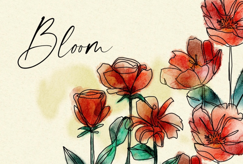
2. Overview and Research of Techniques: Hi guys, welcome to Lesson 1. So to get started, let's take a look at some examples, and I'm going to give you an overview of what we'll be producing class. Let's get started. I wanted to try to find some examples for you. And when I was searching it out, I was looking for continuous line art, floral with a watercolor accent because that's the kind of thing I want to do with you today. And there wasn't a ton of be exact look that I'm after. Of course, what we do will also be affected and may look different than the examples anyways, because we're going to be doing them in procreate. I guess, you know what I'm looking for is a certifier, primitive, simplistic kind of a drawing. Now if you've never heard of continuous line before, it's kind of an exercise that we do in art class I did with my students. You just kinda loosen them up where we would initially not even be looking at the paper, but be looking at some kind of an image or some kind of a still life and drawing without looking at the paper, we had tons. The last means, some of the things that came out of it, especially when you try to do portraits, was absolutely hilarious. But it's kind of an exercise in having your brain not trying to take over the drawing. So in other words, that you can more intuitively draw what you're seeing and not be trying to make what you're drawing into some kind of a symbol, if that makes sense. So we're going to be doing some really loose drawings. And like I said, was trying to find some examples and it wasn't actually the easiest thing to come by. So here's a few that I found on Pinterest. I'm not even sure exactly white flowers we're going to take a look at because I'm going to go out to my garden as soon as I'm done and gather some flowers to use as reference. But I'm gonna be showing you a few techniques that I think will help you to create this loose look. Here on Society 6, I found some really great continuous line designs and not all in florals, of course, this is something that we're seeing and it's kind of engineering because this has been going on for two or three years and we're seeing this kind of a line drawing more and more and super simple, super representational that look I want to create but with flowers. So let's take a look at some of these examples. I think you can see by what I'm showing you here, maybe a rough idea of what it is that we're going to be doing. I want to create the liner, but I want to work with watercolors. So I think what we'll do is probably create the watercolors first. Or if you were in my class, fantasy garden, watercolors and procreate, then you'll probably recognize the brushes that we're going to be using, their set of free brushes that I will also give with this class. And we're going to be doing a really rough and kinda punchy watercolor in the background and then adding the floral over top. Now once you get this technique, you can do it any which way. And I've also seen a lot of these which are great with very bold and chunky bits of color in the background, not watercolor. This is the kinda thing that would be ideal for Illustrator. So at some point maybe I'll do a class that will feature illustrator instead. So I found a few examples here. We'll just take a quick look. This is not what I'm looking for. This is more what I'm looking for. So we're going to be trying to really loosen up and create drawings that are full character in my opinion, I think that these are very different than the really realistic florals that we see. You can see here that you probably can't even specifically look at these flowers and decide what flowers they are by their distinctly flowers. So that's the kind of thing I'm trying to achieve with this. See if I can find anymore here for us to look at. I love this, but it's almost too close to being detailed. I think I want something a little bit less details. And like I said, I'm going to be gathering some flowers and I'm going to try to break it down for you to make it as simple as possible. The biggest problem and the biggest obstacle we faced is in trying to how things look realistic. So like this is a great example of a love the way the petals overlap and you can see the outline of the last one. This is something that if you were doing a traditional line art, you would be erasing away some of these lines to give you the impression of what's in and what's in back. We're going to be trying to ignore our impulses to do that. And just try to create really loose florals over these interesting backgrounds that we're going to create. So does that sound like something you wanna do? If you do, then I will meet you in the next lesson where we're going to get started. I'll see you there.
3. Setting Up Document Paper Textures: Hi guys, welcome to lesson two. You, unless until here I'm going to be showing you how to download that paper texture and get signed up for your projects. Let's get started. Okay, so if you've downloaded the watercolor paper for continuous line class zip file, then you'll be ready to get started with your installation in order to access the paper file that's within the SIP. Just double-click on it and you'll see that it'll decompress it and you'll have it here. Now I've got a couple of duplicates here. So I'm going to delete. And the way to install it is to simply click on that paper, click Open, and it will be imported into your gallery. So your file will then be ready to start working with. Now, within the document itself is the folder that has all of the papers. You're going to be able to make adjustments to this. I'm showing it to you fairly dark here just so that you can see it on the screen. At any one of these, you can adjust and you'll have to unlock it first to do that. So you unlock it and you can go in. And with any of these, you can change the blending mode. So I would suggest probably Color Burn, but you're going to be able to experiment with that and see what you like if you are doing any sort of watercolor painting or painting of any kind, the texture will show up. Now you fund it, be sure to be painting on the painting layer. And obviously if you want to be using a color not white, now, even if I hadn't used a watercolor, in fact, I'll show you if I was to go into one of my textured brushes like this smooth lineup cut brush, because we've got those paper overlays and we've got the color burn on, you're going to get the texture on it no matter what. Okay, so when you open it up, you'll see that there is this painting layer. You can add additional layers, no problem here. And I found that I was able to add about a 15 additional layers. So that usually works out to be enough to do at least one, well, probably several different versions of your flowers. So I did a little bit of messing around here and experimented. And these are the continuous line drawings that I did Just really quickly and just for fun. I think this is the one I like the best somehow of this one that has really loose watercolor in it. And we're going to be able to sort of alter what we do with the watercolor very easily. And that's one of the things that I'm going to be showing you as we progress through the lessons. Now we're also going to be creating color schemes and then creating custom palettes from photos or from whatever source. And then we can use those to create our final designs. Now when it comes to the brushes, you're going to be needing this continuous line brush stamps, which I would export. I'm going to share it to you. So when I export it, I save it to my files. Then I compress it and send it to you. And you're going to be working with it in exactly the same way as you just did the paper texture. So you're going to have a zip file that you'll unzip. Once you unzip it, it'll look like this. You highlight it and you just hit Open, and it will open the brush sets. I've just added this brush sampler set here, which we don't need because that's from another class. So I will delete it. But it's that simple for installing your brushes and your paper. So get that done first. And then when you come back in the next lesson, we'll take a look at the loose watercolor techniques and the line art, of course. Alright, so I will see you in the next lesson.
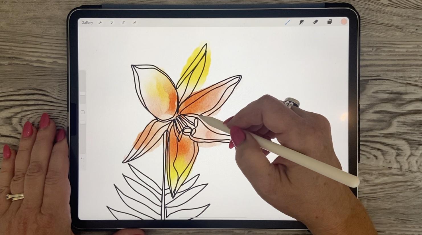
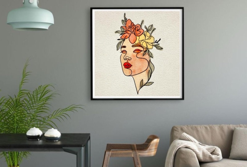
4. Practising with Techniques for Inking: Hi guys, welcome to lesson 3. So in this class we're going to talk about the brushes and I'm going to be kind of giving you an overview of what we're going to be doing with them. Alright, so I wanted to show you two or three different approaches to doing this line art. Now, in this example here, I've got my guides on. So you go into your Canvas here and you put on your drawing guides. You can go in and edit the opacity, thickness, size of the grid. And that's probably all you need for this particular application and decide is the grid kind of, to me, doesn't matter too much as long as they have kind of a guide for the vertical lines because I wanted them to be kinda street with this one. Now in this case, inches observed some flowers, some of the pictures that I took, and I just quickly sketched out some floral shapes, add in some leaves that probably don't really even match the particular plant, but just wanted to show you this one as a demonstration. So what I would do to that continuous line would be to get the Posca paint marker. So that's just that like a monoline. Let me add a layer here above. So it's, it's kind of a monoline, very thin line. You could also experiment with the brushes in this category. There's absolutely no rule that says it has to be thin, consistent line. You could do a variable kind of a line, thick and thin if if that's the kinda look that you were looking for, let me switch to black here. So you could definitely do something like that. I personally wanted to look up the Posca markers, so I will be including that in your SAT. And then I've got this thickness. I'm going a little bit thicker than I probably normally would, but I wanted it to be visible to you. So once I have the drawing, then my whole goal is to never or try not to pick up my pen. Now I'm going to give you some exceptions to that rule in a second. For one thing, I don't want to go through and draw this entire thing, get two-thirds of the way through and then make a mistake and to start from scratch. So what I often do is I just kinda, I do lift up my end at some point just momentarily so that I can make sure that, okay, this is now fetch. So I'll still do the continuous line, but at least this way, if something happens in the middle of it, I can at least have that part preserved. So here's an opportunity for us to think about that continuous line. Now do we want to go around the outside of this or do we wanna go down to the middle and we go down to the middle and come back up. That's going to give us a double line there. So we want to think about whether or not we're going to have double lines everywhere else. So I think what I'm gonna do is just continue on the outside here for now. So I'm trying to be fairly consistent, I guess you'd say, with the way I'm doing the end parts of these. Now here is the dilemma. Now do I go up and double up that line or watch? So I think what I would do is actually backtrack here. And now I would move into the center part here to do these. Now here you can decide if you want to go over that, you want to double it out what to make it look like it's not there. So if you want it to make it look like it's not there, you'd want to line up almost perfectly to that original line. So you really eventually kind of develop your own technique for this and how you want it to work out. We've got that part completely drawn and this is where you can kind of cheat a little. I do want to have a continuous line. S1 was doubled out. So I think what I'm going to do is come down on this side so that I can double up that. And I'm working right now with a much thicker pen that I normally would. So these lines are coming out a little bit bolder than I would like. But I think for my demonstration purpose here, it's working out. Okay, So that's started continuous line. Let's try one with a little bit thinner of appends that we can see a little more detail with a doubling up of lines. Actually in this case, because it's such a simple silhouette, there probably won't be a lot of evidence of doubling up anyways. So this one here is based on a diathesis I have in my yard and see if you wanted to have an additional line in there. You can just go back around and you're not necessarily married to the sketch, you can slightly change it as you're going through. So this is one of the ways that I could go through and complete the artwork. And I want to show you a couple of other methods just so that you have a couple of options. So this one was based purely on a drawing with an observation of a couple of flowers. So I'm going to turn that one off and I'm going to go into this group here. How I ended up with this particular flower. So what I did is I took the pictures. So I have this picture from my flower bed. I went through with a pencil first and did a quick tracing. Now I've done that on another layer and I've done it in light blue. I like working with light blue because then the inking comes really easily here. So here is the continuous line inking that I did for this one. Let me just go through and demonstrate that again. So I'm going to add a layer. Black is good and my thickness is good. You know, you can eventually figure out which is the best. Start on something like this. And how exactly you want to double up on these lines, like do you want to continue through whatever you hit along the way or do you want to do the whole perimeter first and come back those double lines? In this case, we are really good because that shows the fold. Now I lifted there, but I went right back to the same spot. So that would still be one continuous line and same with that. I don't like how that turned out. So I'm gonna do this one again and I think I'm going to go a little bit bigger comeback few here. And another thing is just in order to change to a more comfortable angles, sometimes you do have to stop and I just make sure that I carry on right from that same spot. Here's a little challenge where we need to come back and do these. So what I would do is go back and instead of doing those stamens earth, I would go through and add that to remember the names of the different parts of the flower, but I would do those at the same time. So I've got a really, I mean, it's kinda rough, but I've got a perfectly usable flower. They're done with continuous line of take a look at it with a little bit of a back to my original one because I added some leaves for the stem down here. So that one worked out good, and that's tracing from a photograph. Now make sure that you are using a royalty free public access photo if you're not using your own, the safest thing is to use your own, but you can't legally trace someone else's photograph. Here's my next one. And again, I did a pencil sketch because I find that that's easier to follow than trying to do your inking over top of the picture, even if you were to reduce the opacity here, it's difficult to work straight on the photograph with your line art or straight above it. So I do a quick pencil tracing and then that's when I'm going to use as my guide. And the good thing about going through and doing the pencil tracing. You also try to get that first bit of practice as to what you're going to double up on. So obviously moved to that. That shows you how he ended up looking. But this one, I also experimented with thin and thick lines just to see how about what look and if that's the look that you like, you could definitely go for that. So in that case, I had used, let me just hide this, add a new layer. I used my variable tapered brush and pressure, but that's the one that I can alter just by pressing a little bit harder, so little small. Let's try this one out. See it has a press a little bit harder how I can get a thicker line. So in a case like this, you can decide if you want to go all the way up first, you want to go around all the edges. And I think this one is nice to be able to go into the middle there and draw this to come back up and do this line here. So periodically here I stop, but I continue right from that very line and hoops bead excessive. I can press a little bit harder when I want the line to be a little bit thicker. And again, think about this, whether or not you want to draw that at some point, the middle of the flower so that you don't have to go back and do it by tripling up on a line there. So that's what doing that pencil sketch helped me figure out in the first place. And then here, what do I want to do? Do I want it just now go through and do this little bit of the leaves that are showing through. And I think I will go back. Oops, no, I don't have to go that direction. Here. I can just go back this way so you can see when I first did it, oops, I should put that central line, but you can see that when I first did it, in some cases I had triple lines. And I think that's worked out really nice to only have double lines. Now here of course, I should continue back on to do this bottom stem. And then if you weren't lifting up your pen, of course, you would go through and do all of these without lifting it out. But like I said, we can cheat a little bit here. And then we can go through and start this one here. So I think when you have to do something like this is a great exercise to just stop being in your head too much and just solve the puzzle, so to speak. It's not, you're fully representational kind of line art drawing, but I think it's pretty decent. Let's turn that off and I'm going to move that up so that when I show you the watercolor, you can see the effects of that would have now that watercolor was specific to that other piece of line art. I think that this would be a really lovely piece as well. Now in some of them, I've actually added some text and I'm going to go into that in one of the lessons that's coming up, show you how to install the fonts and just add fonts to your layout. But I think this is good cover for this technique. Before we end this lesson, now that we've done the inking brushes, let's try also a little bit of that watercolor. I'm going to show you this one again. And let's take a look at the watercolor without the liner and short the pencil sketch being there. So you can see that this is a really rough, really loose technique. So what I do there, let me just add a layer, turn that back on again. When should we use this one? And we'll use this one. And as far as the watercolor goes, you could use anything you don't even need to use a watercolor tube initially put down your color. So this is a lot like some of those other classes that I have with the watercolor. What we wanna do here is just put down some of the color that we're going to blend. So I've picked a palette here. I've got a bunch of pallets. And from some of these are derived from photographs. Others I've just created or purchased. And I'm thinking I would like to try one with a little bit of orange. So let's set this one as the default. So when we go back to the disk, That's the one that we have here. So I'm going to just drop some of that color in here. I mean, this kind of reminds me of a tiger allele. And in my garden it's actually really intense, deep kind of an orange. But I'm just using my pastel here and it doesn't matter at all. Honestly, I could be using watercolors. Let's go with the colors here. So I could be putting this. I'm going to move that layer down actually to be under my line art that could be using anything to put the color down at this point and add in there. And the reason why it doesn't matter is because the next brush that we're going to use is my blend. Terrific. And we're also probably going to ferment a little bit with other blends. So let me bring it up a little bit bigger for you. And then what the Blend terrific does, is it my on it? No, still on that texture. The blend terrific is what makes it look like watercolor. And then don't forget, we've also got watercolor texture. I'm going to hide the guides. We've got this watercolor texture that's reacting to anything underneath that and creating the look of the watercolor. So really we can get away with just doing this sort of quick blending of the colors to create the color back color underlay for that and have that really wet watercolor look. So it's as if you had lots of pigment and then added water to spread it around. I also have this textured watercolor blend and that one gives more of a, and you see that as I'm doing it, it gives more of a textured edge. So if you're looking for something like that with a little bit of, you'd almost see flaws. And note that I'm on this light pink color. So if I do drop it down, That's what I get. But as I move it around in a colored area, it definitely picks up whatever the color is and I'm moving into, but, you know, you can easily use it to just add what you consider sort of pigment flaws like when you're paid. Leave little bits of pigment in the background. So it kinda like that. You can go in and detail it. Absolutely. There's no reason not to. Let's try this line of cut brush to do a little bit of detailing in here. And I'm going to go just a little bit brown ear to add a little bit in there. And we're looking for a really rough, really sort of loose technique here. Okay, so don't overthink it. Now if there are things that bug you like, this is maybe sticking out a little bit too much compared to the other wines and going with your eraser, and I would suggest that you use a similar eraser to whatever the brush was that you were using so you can pick whatever brush out of whatever I send you in all the brushes I set you in the past, you can one of the ones that are inherent to use as eraser. So if you want kind of a nice rough edge, pick a rough edge or textural brush and think about it. You can also use that, go a little bit smaller to do things like highlights rate. So if you wanted to, you could go through and line a lot of these with white. And that's a kind of a neat technique. Just whatever style you use, just be sure to be consistent so that if you're doing this, you're doing this throughout your painting or throughout your series. So that also adds a really nice dimension, I'd say to it. You could put some little highlights on your link. These are called pistols, but I don't remember. I could be getting my organical science theory wrong. So then you could decide now am I can stick to this color scheme. Am I going to do the whole thing in this color scheme? Or am I going to introduce other colors? I like adding the green. In this case, we've got the green. Let's just set it up. I'm just using it looks like a lineup cut brush here to lay down the color. I'm going to add a little bit of that blue. Interesting, and then go in with my one. I'll use the texture blend small enough. And I'm going through and just blending these colors out. So this looks different than the original sample that I showed you, but can be equally as interesting. And that's just gorgeous The way it gives a little dark areas in here. And I like to sometimes I've got these light areas because that just kinda gives me automatic highlights. And then I would go in with an eraser. You'll then just tidy it up a little bit. I'm not trying to stay within the lines. I'm leaving some of it's sticking out because I think in our case, this is really adding to the character. So just don't overdo it with your clean up. But there you go. But another version here that now between the two things shows you both the inking brushes and the watercolor brushes. So I think we'll cut this lesson at this point, and I will meet you in the next one.
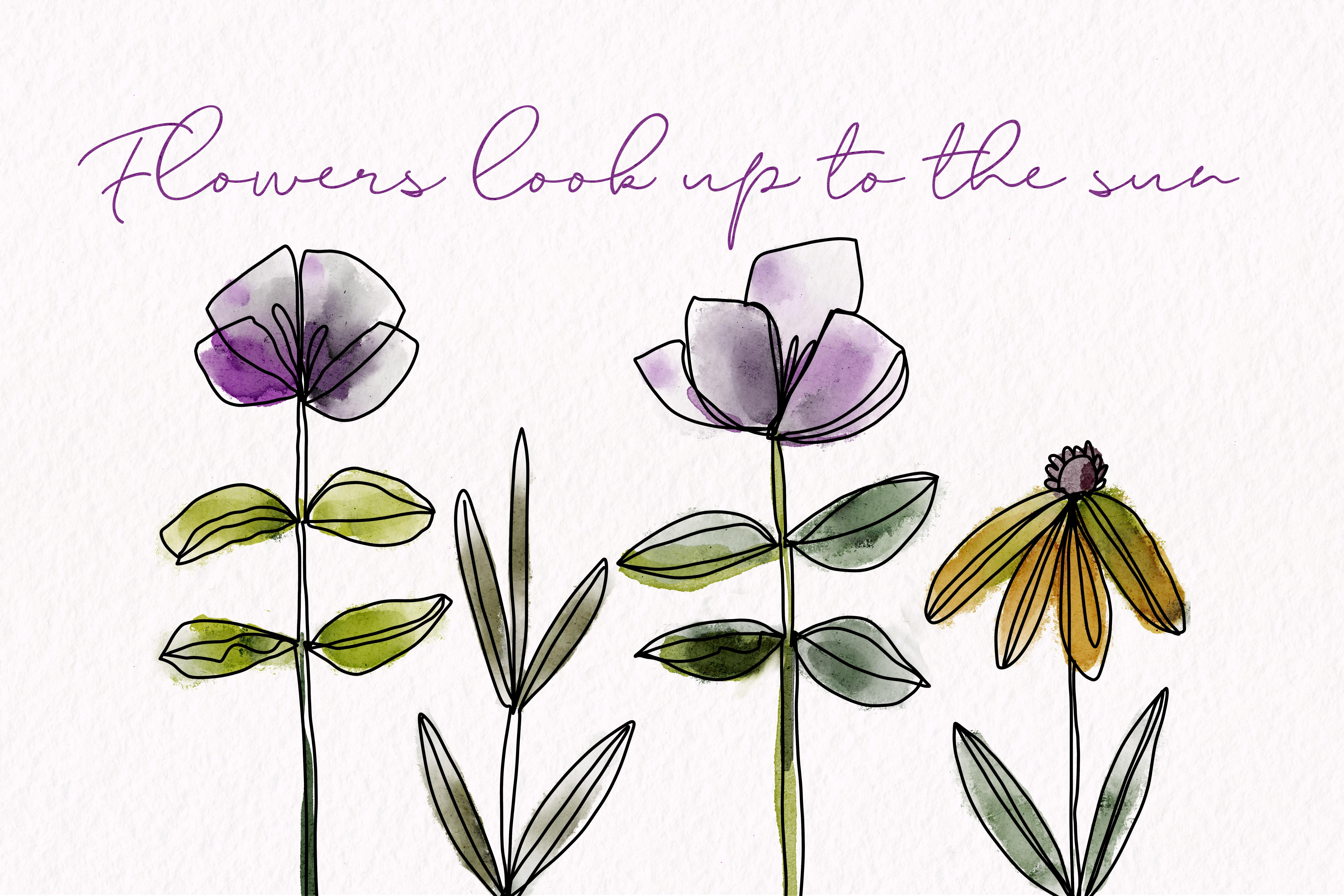
5. Lesson 4 Learning Loose Watercolour Techniques: Hi guys, welcome to Lesson 4. In this class we're going to talk about compositional strategies. So ways of setting up your layout to be really interesting. Let's get started. So I thought I would take a second to show you a few of the layouts that I kind of did with these techniques, just to give you an idea of composition. So ultimately what I wanted to do was to include text on my illustrations. So I left a lot of space at the top. I wasn't really quite sure how I would work in the tax. And in some cases, I did have to make adjustments. So I thought I would show you some of the things that I did. So in this particular artwork, the palette I use, I kind of made up because I did two different ones. So this is a palette that I created. And if you look at each row, basically they're each different palettes. So I was just kinda lazy and I didn't do separate palettes for each one, and I set that one as default. And then of course, it came up here for me to use as my colors for two or three different compositions. So I am working on a bunch of artworks to submit for a callout. And this is probably again for mugs and things. I'm not sure the house where is this some sort. And I wanted to try this different floral technique. So that's why I ended up doing these kind of floral. And then these are the colors that I kind of had put together. I really love this color scheme. And what I found with a lot of the compositions that I had done is that I didn't really have them laid out exactly like I needed. And in order to make adjustments, lose a couple of different things that you need to know when you've got color on one layer and you've got line art on another layer. So what I did is I selected both of the layers. And then when I made a selection, magically Procreate would grab both layers, which is just awesome because that's something that not every program does. So this allowed me to do things like move things tighter or put things in behind or whatever, you know, whatever my requirement wise. So for example, a lot of these, if I was to be using these for greeting cards, of course I'd want a vertical layout, so being able to tighten them up is really important. So then you can still go through and do the same thing with another. So I'm on the free hand selection tool here. I've got the two layers selected. I select, grab the Move tool, and then I can move everything around. Known a case like this where I might want to actually have that one here, but move this one. I would do is I would cut and paste and then go to this one here. It doesn't do the cut and paste with the two layers. It'll move them, but it won't do the cut and paste, but that's okay. So if you cut, actually I should have just done the cut-and-paste shortcut right here, but faced now these two are on a separate layer. So this and this. And then I can go in and make the change with these two selected, select that, move it out of the way. Grab these to move them in real tight. Then go back to this layer again, grab, select the both by swiping to the right, and then I can grab and move this one. So that would be a way that I could squish them together if I wanted to do, let's say a vertical layout and I needed them really tight. Or for example, the front of a MOG is our greeting card of mod, things like that. Now, let's take a look at another one here. So in a case like this, I grabbed everything and moved it to the side. So I did the individual selection of my flowers originally member, they were all in the one row. That was the one that we started with at the very beginning with that damping. And in this case, yeah, I moved them altogether, kinda overlapped a couple of them and moved it over to the side so that I'd have this nice little open area that I could use for my type. And I also went through and added this layer which is color in behind. I'm going to turn that drawing guide off so you can get a really good idea. But it's a really nice, clean layout. And I think once you add the texts and stuff, it really has a very finished look to it, something like this. I would also maybe go back and do that. Whites are erasing that we talked about. Because I think this one wouldn't lend itself really well to having a little bit of white detail within. And remember, don't overthink it. I'm not even being perfect at all. I'm just going really loosely, Kay? So just go in, take a look, make sure that you've got everything looking the way you want. But don't spend so much time fixing it out that it starts to look stiff. You want it to look really loose. Now, this is the one that I actually used for my titling. So on my titles, you'll see that I grabbed and moved them all closer together. And then I actually even duplicated and then turn one upside down to have sticking out on the top here. And then I think I repeated one of these flowers are the leaves towards the side here. So you see how that worked out very nicely for my titles. And I also did some adjustment of the color in this case. So. Get yourself onto the color layer, go to your hue saturation and brightness for the layer. And then do a little bit of this where you're moving and looking for a different issue that might work. And I landed a little bit past middle here so that my leaves and stems were kinda teal color. And then I have this sort of golden and rusty look to it. That's the one that I used for my titles. Now for this one again, I grabbed one of my palettes. And I think this one is one that I purchased are really light hits this one here. So red eucalyptus by KJ and see if I can find that link for you to let you know who that is. So here I stopped short of adding any background so that I can show it to you as I do it. So I'm going to add a layer here. We could pull it in under the line art. So it can be within the group or it can be outside of the group. And let's think about the color that we might want to use for that. So which one would think it was this one? So I'm going to go with maybe one of these grayish pink colors. So I'm going to grab my one. Should we use big watercolor fill? I like a lot. And with that, as you put your stylus down, you get the color and then you see how it kind of feeds off. So what's happening is as if you had a really wet brush and you just drop the tip of it into the pigment. Once the pigments is put down, it spreads into the water. And that's how you get that really soft sort of a look. Now we could add a little bit up additional color maybe as we're moving out to the edges. So let's drop in a little bit of a brighter pink here, but you see how it really feeds out. Super nice. So you get the deep color when you first drop it down. So if you want to stay at that color, don't spread too much. But if you want to really spread it out, you can do that. Another really nice technique is to build up the color on one side of the flower and leaves the other side blank. So that kind of adds some real interests in dimension. And if you have something like this happened and you don't want it to be there, you can definitely go in and erase part of it with one of your blenders. Let's just hit the smooth blend, and that's on the eraser. I've chosen the smooth blends in the eraser category. So here you could go through and decide, do I want to make sure that all my stems are really nice and clean? Do I want to add some highlights? And if so, what are the right layer? And you can use the eraser to bring some whiteness in on the edges of the flowers. And basically what you're doing is when you're doing this process is just trying to improve the composition. And in this case, I set it up in such a way that I could have my type fit into the center just like that. So let's meet in the next lesson now and start putting it all together. All right? Okay. I will see you there.
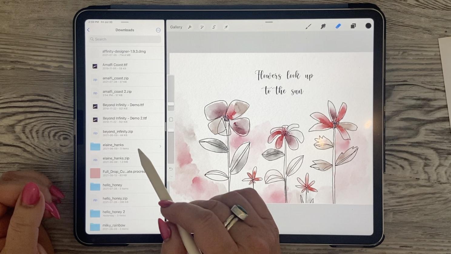
6. Putting the Composition Together: Hi guys, welcome to lesson 5. So unless i 5 here, we're going to download so specific fonts so that I can help you to install those, then we can start putting it all together. Let's get started. So producing a really pretty layout like this requires some really pretty fonts. And that's one thing that you don't just catch in procreate, most of the fonts are pretty standard, and I don't know if you've used much texts or type in your documents. I'm going to show you how to do that step-by-step. I'm going to show you how to download your own and install them just so that you can get a better selection. So if you needed to add tax, let's just hide this one here. You would go to add text and this text box will come out. Now by default, it's got the type that I just had in there. And I sat the pink flowers, look up to the fun. That was my phrase. And in order to make any sort of adjustments to it, we would have to select it here and now you get to select just one word. You can grab that little handle and select them all. So this could be a way to do two different types of bonds. If you wanted to. Double-click, we'll give you selecting one word. Triple-click. We'll select everything. And if you want to go in and make some adjustments, you saw what I did there is just hit the bar that came up the small sort of control bar. And now I'm in the full topography dialog box here. So the fonts are listed here, and I've added four or five. So the nice ones that you see here are fonts that I've added. So that one that I'm using is called hello honey. Then there's Elaine Hanks. Beyond infinity is one that I like. And then I think way down here, milky rainbow. Now these fonts are all free fonts that I downloaded from a fight called daft font. If you check it out here, this is the site, the font.com, and there's thousands and thousands of fonts here for you that you could download. So here's the, no, that's not the one. Hello, honey is right here. I've already got that, so I won't download it, but let's, let's try this one here. Amalfi Coast. So what I would do is hit the download button here. And that's going to download onto my iPad. And in my case, it's in my downloads folder. So go to your files here, go to your downloads. And there you're going to find the zip file. And it looks like I've downloaded that one more than once so I could delete one. But in order to install, what you have to do is unzip it. So hold down on the name and then go to uncompressed here. It's going to take a minute or two and you're going to see it decompress here. Once you've got it decompressed, I find that the most intuitive way to install a font is to have your Procreate open and then drag up here so that you can pull up your dog, grab your folder here, your files, pull it holding down your finger until you see the Procreate window gets smaller. And then you can drop your files over to the side here and then take your tight and just drag it in and you can see the plus sign there. And that means that you're adding the font. So let's just check and see. Let's do the triple-click on here. Click on that. I don't know if there's something wrong with that font box. This is the third time I have tried to install it and it's not working. So let's try another one here. So if that ever happens, I mean, I can't tell you why. Maybe it's just the wrong type of fonts. But let's try, let's try dragging beyond infinity in here and see if we can get it. No plus sign, so that one's not going to work. Maybe it has to be an open type fonts. So let's grab One me because those are already installed. What else have I got here that I haven't installed? New chapter. Let's try it and hit Done here. Maybe that's the problem. There we go. So new chapter, Let's see if that one gets added. New chapter. So that one was added, no problem. So it has something to do with the format of the type if you can't install it. So let's try this true type now that one installed as well. So I don't know that. I thought maybe it was because one of them was a true type and one was an open type font. It doesn't seem to make sense to me, but there's a reason why Procreate didn't like it. So I guess we're just not going to use that one to try it one more time and just stubborn in that way. So it acts as though it has installed it open to the 0s here and it's definitely not there. So there's something up with that particular font. Maybe it's damaged, can Talia. But now that you've got your fonts installed, then you can drag that off and get your full Procreate window again. And of course you can start making adjustments. Now, in this case, what I might want to do is change the letting. So let's triple click on that and go into our type again. And the spacing between the lines is called lettings. So that's what you would want to either increase or decrease to bring the lines closer together. Tracking is the space between the letters. This is a horrible mistake that you don't want to make, is that you take a handwritten font and you separate the letters. That far. You definitely want calligraphy or handwriting to be interconnected. So never, ever space out a hand-written fonts. Here you can also adjust the size. Of course, if you ever had to shift the baseline, I mean, you don't need to in most cases, but that's the way you would do it. You could also reduce the opacity here. I don't tend to do it in here. I'm more likely to do it in a different way. But that's the ins and outs of installing a font and making adjustments to it. So in the next lesson, I think what we'll do is really look at putting our whole composition together. All right, I'm going to give you a list of the fonts that I've installed, the ones that you've seen in these different documents. I'll put those on the course materials so that you have a way to get to them and find them. And at least you'll then know that those are fonts that will be installable. Alright? Okay, so I will meet you in the next lesson. See you there.
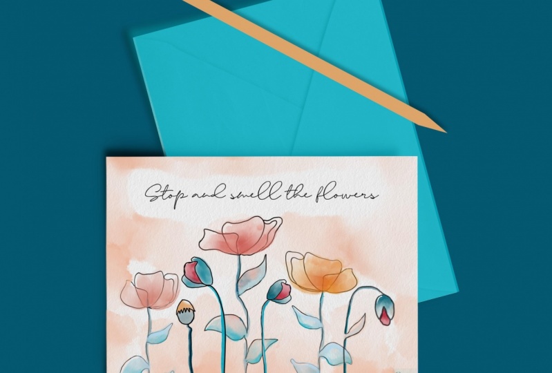
7. Optional Text or Quotation: Hi guys, welcome to lesson 6. So unless 16 here we're just going to take a really good luck at adding the text and deciding on different ways that we can work with it. Let's get started. So in this lesson, I want to show you how I might go about creating a greeting card if I've already got artwork that I want to apply to a vertical layout. So I've got the vertical layout here, which I accomplish this by rotating my canvas. Okay. I'm going to grab the artwork from another documents. So this is the one I'm thinking of. This is a really quick one I did. I had no actual reference for this one. I just kinda drew these flowers from my head. So very much in the way that you see Mary Lou Cuddy work her illustrations so very spontaneously. So that's the reference that I gave you at the beginning of the class. And I think I've got that already in the course materials for you to take a look at as a link. And here's what we'll do is we'll go in here and see we've got these into a group which is exactly what we need. And what we're gonna do is grab this group. We're going to hover over the gallery until its transfers into the gallery. With our other hand, we grab whatever document we want to drop it in on and then just let go. And you can see that it imports now happened to me before to where it said it was importing three items. And I know there's only two layers here, so I just hit Cancel and both of my layers were there. So I'm going to grab both of these and group them and bring this new group below my texture layers, okay, in this case, I could probably get rid of this painting layer. I'll leave it there for now just in case we do a background. So I've got my different motifs here. And remember that if we want to change them both, we drag to the right and they're both selected. And then we can enlarge or do whatever it is that we want to do with them. Now in this case, one of the things I wanted to, is to bring this one here in a little bit closer. So I've got both layers selected there in the way that I showed you in the last lesson. And I think I might even make this one bigger so that maybe not, we're trying to make a layout that's just a little bit more interesting. Yeah, I'm going to go bigger and I can do the same thing with this one. On this side, I think we'll see maybe not a maybe leave it like this because this would be kind of a nice spot to tuck in some type. Now, I want to be able to select these little guys here. So I'm actually going to eliminate this one, cutting that one, and then select this one. And I'm going to hit Cut and Paste. So three fingers down, cut and paste. And that's now on its own layer. So I'm going to keep that one in reserve here, so I'm just going to turn it off. Oh, I didn't put that on a separate layer. I thought I had, I guess cut paste. Now it's on a separate layer. I don't think I'll use it because it looks like the thickness is going to be not right for what I've got, but I'll move it down here and just keep it just in case. So now these two I'm going to select again so that I can, I think I'm gonna leave it for now because let's just check this out and see how it's going to work for our type. I may end up enlarging it and having it bleed off a little bit, which will help me center those flowers. But I don't want to do that now. It's I don't want to cut them off, so I'll just leave them there for now and then let's go ahead and add some text. So here we're going to go to add, add text. It just pops it in kinda randomly in the middle of the screen. I'm going to select it. And in this case, I think I'm going to use Happy Birthday just to be super simple. And I input a probably end up flushing it to the left. But let's just work with this for now. So I'm going to triple, triple tap on it to select all of the text. And let's go in and take a look at what font we might like to use for that. Now this is one I really like because I found that it really looked great with the line art. Bump up the size a little bit, and let's think about that orientation of the text. Now one of the biggest mistake I see new designers make is that they tend to have stuff To close to the side. What you need to do is always make sure that you've got a really nice frame of space around the edges, okay, so you've got kind of a margin there. And I'm not sure that I liked that any better than the centring. So I think we're going to go back and center it. Now I've got to reposition it again. If I want to make sure it's perfectly centered, I'm going to go to snapping and put the snapping and magnetics on. And that lines up absolutely perfectly. Turn that off again. And I think that I would be happy with that position and I think it could move down a little bit. And I think maybe we'll just adjust the positioning of flowers now. We're going to go in and select both of those, make sure that it's de-selected. Reselect this guy and play with the positioning. They're a bit wondering if that would just look better down here and with everything kind of enlarge. So I think that's what I'm gonna do. De-select now and now everything is selected and I can enlarge, slightly rotate it because that will help correct the quirkiness of some of the stems. And yeah, that position isn't too bad. So let's straighten this guy just a little bit more under have to enlarge them a bit to have them to have it kind of bleed off. And I liked the whole sort of feel of the size of that now. And I think that we can also bleed that guy off on that side. So I'm getting them as big as I can in the space. Now, I'm also going to select one of these little pods here. Three fingers swipe down, copy, paste and we're going to move that, nor did I miss something. I think I hit my maximum layers. So when I go to hit No, I guess not. I'm going to select that again. I don't know what I missed there. Select, select, de-select. Well, what is on this layer than nothing. So let's just delete that layer, select these two, select that little pause. So I'm going to select the southern one. I like this one better copy, paste. I'm thinking is this because this is not, doesn't have any color behind it. I was on both layers and I didn't need to be and it was recognizing the top layer as the one that I had selected. So I think now we're good, unselected just on that 13 swipe down, copy three swipe down, paste. It's a good thing I make all these mistakes because then you can learn from me all the things to do if something goes wrong. So I flipped that one has to make it look a little bit different and you don't, you can always go in and make other slight alterations. Nobody is going to be the wiser. So you could go in and, you know, this is pretty distinctively misshapen here, so you might want to erase it and rethinking, see how that ends up on that. So fix that up just a little bit. Now you can see here when I did my cut and paste at some point, I had grabbed a little bit of that flower there. I'm going to collapse these two black layers together. And then now I'm going to do just a little bit of fixing up there because there was a little bit of a piece of block that was cut off here. There's a little bit of it missing, so that's probably where and what exactly happened there. And then let's go through with the eraser and make a few corrections. Wrong layer on the watercolor. So I'm just refining, refining the edge of that, just kind of limiting most of that one there. Black layer, eliminate that little bit of black there. And I think we've pretty much got it cleaned up as much as I want. So you can see with this one, this is super, super rough in comparison to the other ones that we did. I'm going to move that back on top somehow it got in behind the watercolor. I could have left it that way and change the blending mode, but in this case it's just as easy to move it and put it in the right order. And now here, in this case, I could sample one of these colors and grab one of those watercolors. Let's go with that great big one again, the big Fill, I'm going to add a layer so that I'm not disturbing that watercolor layer. So I'm adding, and here I could go in and put a little bit of additional colors. So maybe even in behind these, sometimes it's nice to add just a little bit of a border that's just looks like watercolor. And remember that you can go in and choose an eraser. Go to white, and you can blend a lot of the color in. So you're adding almost like a frame around your lettering. You're going to go with my eraser here. Nice enlarge, going to go with the textured watercolor. And I'm erasing a lot of the color and leaving it really light, but I think it kind of adds to it, you know, it just gives a bit of a framing. And I think this would be a perfectly adequate card to submit to a POD sites. You can go in now and do anything you wanted in the way of adding interests. But overall, we've got a very usable piece here. So I think that's the end of this lesson and I will meet you in the next one. See you there.
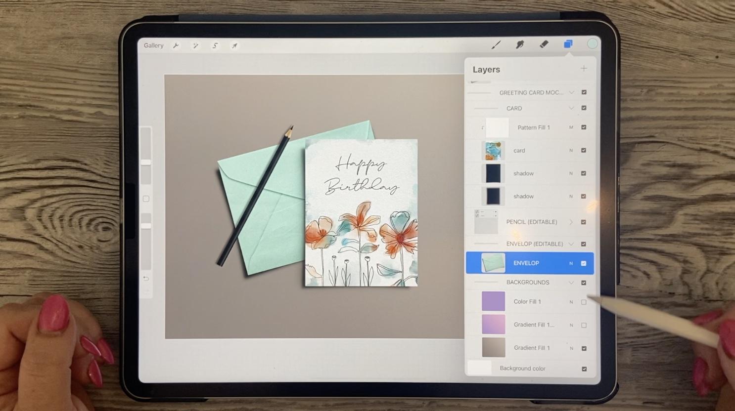
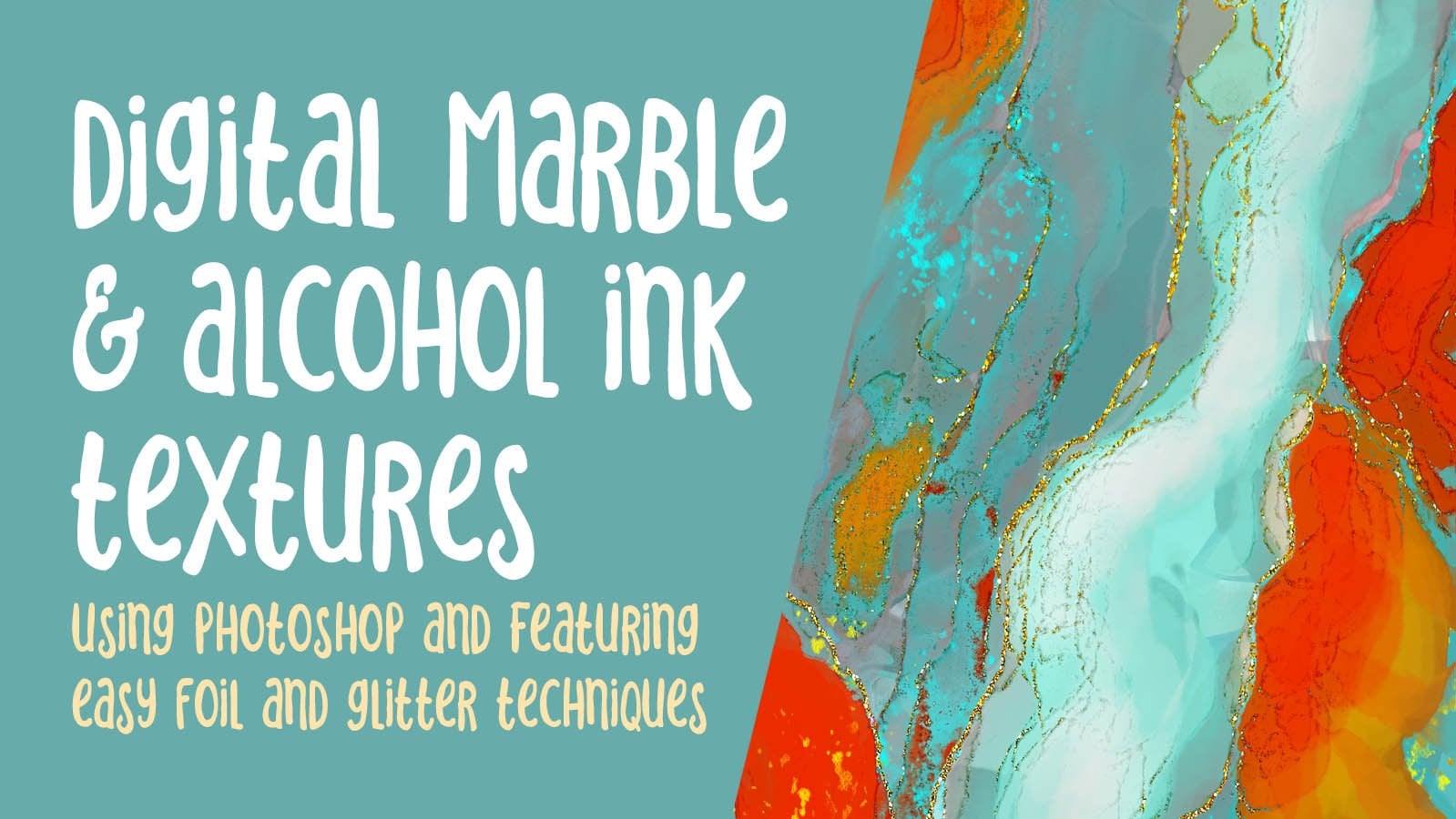
8. Mockups and Wrap Up: Hi guys, welcome to lesson 7. So in Lesson 7 here I want to talk to you about mockups. I really feel that showing your design on a product really makes it seem real. Let's get started. All right, so for creating a mockup, what I've done is I've saved a mock-up PSD file that I had on my desktop computer. So I saved it into my iCloud Drive. Now this will be ready. I'm going to just stick this into this mock ups folder that will be available for me to open in Procreate. So in Procreate, what I need to do is be in my, and I'm going to bring it into this grouping here. And I hit Import. And then I go to my procreate assets, that mockups folder. Oops, sorry, not that one. This mockups folder, and I open up or import the greeting card. So I've got the greeting card ready there. I'm going to need to import my art. So as opposed to Photoshop where we would have a smart object that we could just double-click on to replace your artwork in. In this case, we have to bring it in and do the cropping and sizing ourselves if we're doing it here in Procreate. So here is my artwork. And what I wanna do in this case is to export it. So I'm going to go to share here. I'm gonna do it as a JPEG and export it. I'm going to save the image into my files, into that. And you probably saw it a minute ago. I did have it saved there already as a birthday card, so I know it's there. All you'd have to do here is rename it to or number it or whatever it is that you're going to do. So for the card, hit Done and save, and of course I've already got it there. So it's going to ask me if I want to replace it. So that's all done. And what we're gonna do here is we're going to go into the mockup itself and just take a look at it here. So here is where the artwork is, the original, this kind of a marbling look. So that was from my alcohol ink, and marble class that I think I did in Photoshop. I can't remember and I've had two or three of these classes, so I don't remember for which class I did that particular one, but I think it was the first one. Anyway, it doesn't matter. Here we go and we're going to import, so we're going to go to Add, Insert a File. We're going to go to the Procreate assets mockups folder now, and that's where that birthday card is saved. So it's brought it in and obviously, it's way bigger than we need it to be. I'm not sure if the snapping and sizing is going to make any difference here, but it appears like it well, and it's lining up quite nicely to the previous card that was there, even to the point that the drop shadow looks actually quite good there. I'm going to turn off the snapping. So I think I could probably do a bit of adjustment here. You can always enlarged to make sure that you've got the fitting just right. But I think I have. And now I've got a really nice mock-up showing my artwork as a greeting card. With the mockups, you can always go in and make adjustments, for example, to the color here I would choose that envelope. I would go to hue and saturation, photo layer and then just slightly adjusted, read it. And I can even do the same thing with the backgrounds. There are several here already. So you could go in and experiment. I think these are different in the way the gradient is working. Like I like this actual light to dark gradient, so I might want to use that as my background. That's affecting the envelope though I think I'm just going to undo and go back to that grade, which I really liked anyways, could always lighten this up a little bit by reducing the opacity. But overall, I'm happy with that. And this is something that I could use on my website or my social media to draw attention to the fact that I've created these interesting cards with the continuous line line art. Now of course it doesn't hurt to also do numerous other mockups to show your other artworks are maybe not as a card, but maybe as well poster or wall art. So what I would do with each of my artworks is to go in here and what is share, share them out as a JPEG. I could AirDrop into my computer and then I could do them on my desktop with mock-ups that I have there. Or I could go and open up other mockups. So here, I'm not sure if I have any on here, but let's go back, I think to that mean mockups folder. I could open up that has a nice frame. I could. Let's go back to the gallery. And this might be a nice one as Walmart who share a pig. This time I'm going to save it to Files. Mockups. Go back to the gallery, open up that mock-up at a file, bring in that artworks and again, resize to fit my frame. Actually here I'm going to cut off the bottom there because there's a spot missing at the bottom of that when flower, so cups and a little bit bigger here so we can get really accurate with our placements. It appears to be a tiny bit crooked on the wall there that mock-up hit the distort. Distort. Here. It'll keep it as a rectangle, but it allows me to just make these minor little adjustments. And once I'm happy with it, hit that button again. Another mock-up has been created. So there's just a couple of ways that you could do the mockups. And of course, don't forget that you can take them into Photoshop and then create a bunch of mockups, traditionally with Photoshop and the smart objects. All right, so I think that's hits and yeah, Meet me in that wrap up. I'll see you there.
9. Outro: Hi guys, welcome to lesson 8. I'm so glad you stuck it out and you now have a beautiful product to show for it. It's always great to get to this point. And this will be the perfect way to showcase your product for sale. Make sure that you upload it to superiority sites or maybe tested out with a sidelight carnal. Now if you haven't done so already, please hit the Follow button up there. I'd love to see you in my other classes. Hitting that followed button ensures that you know about my classes as I post them and anything else that I send out. Don't worry. I won't be in your mailbox of million times. I only post when I have something really relevant. If you're interested in anything else that I do, make sure you go to my website shop dot dollar art dossier and add yourself to my mailing list there as well. I've just in the process of hiring an assistant to help me really fill out that artists resources section. If you're interested in checking me out online, I also have a shop at Society 6, one at art of where, and a big one adds docile.com. You can also check out the car dial site that I mentioned at the beginning. This would be a really great place for you to just wet your feet if you haven't been doing POD yet. If you're looking for artists resources, check out my Pinterest sites, diverse art dealers, South script and teacher Dolores NASTRAN. I share tons and tons of resources there and I've created a board for continuous line art so you can check it out. If you complete a project, please posted here. I'd love to see it and I love it when my students really share. We can learn a lot from each other is really just a great way to build your confidence in a very safe environment. Also, if you have a minute, could you leave me a little bit of a review down here? Any anecdotes that you want to share, you can do that with that review or you can post something in the discussion section. All right, thanks so much for being here today. Bye for now, and I'll see you next time.
 Delores Naskrent, Creative Explorer