Transcripts
1. Intro to Block Printing in Procreate 1: Hi guys and welcome. My name is Dolores now sprint and I'm coming to you from sunny, Manitoba, Canada. I'm always trying to come up with new ideas for classes. This time I decided to go back into the archives of my old assignments to see if I can remember anything that my students really love to do. Of course, I'm always trying to look for a digital angle. And so the sign with it, I kind of thought, would be fun to try and do digitally is line of block printing. So of course, block printing has been around for centuries. You could do it with lineup blog, you can do it with woodblock. There's so many different versions. The project that I've come up with will be kind of an amalgamation of a bunch of different techniques. I'm going to show you how to do what's called a reduction method with printing. And that's a method by which you take a solid colored stamp that you create and then you take bits and pieces away from it to make the second color and the third color and so on. We're going to keep it pretty simple. I don't think we're going to go beyond three colors initially. I'm going to start the claws, of course, by showing you a bunch of examples and giving you kind of an overview. And then from there we're going to go into procreate. We're, we're gonna do all of the carving work. Not really carving, but you know what, we're going to make it work. We're mainly going to be using resident Procreate brushes. And then at some point I'm going to be introducing you to a couple of sets that I've downloaded. I even have some that I've created myself, which I'm going to give to you for class. You don't even need to really pre-plan this first one. I'm gonna be showing you the most simple project I could possibly think of. Then we're going to work with a sketch that I have. And we're going to import that into procreate. And we're gonna, yeah, we're getting work from there. So I hope this sounds good to you. By the way, if you haven't done so already, make sure you hit that follow button up there. That'll keep you in the loop. Whenever I release a new class, you'll be the first to know. Also make sure that you check out my website at shop dot loris art dossier, and add yourself to the mailing list there. That's where I have all of my giveaways. Are you ready to get started? All right. Let's get into it.
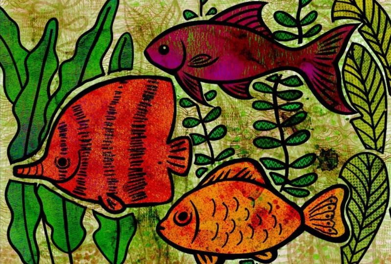
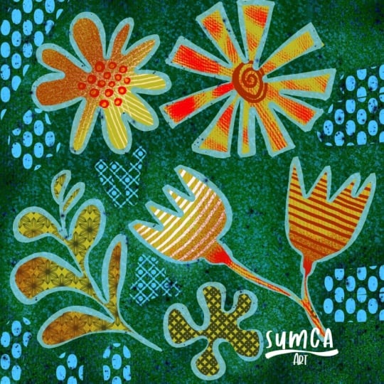
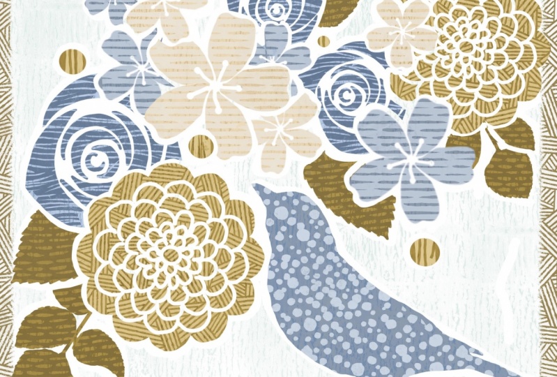
2. Overview and Examples: Hi guys, welcome to lesson one. Thanks for going beyond that introduction. Now that you're here, Let's start thinking about our pattern. First of all, I want to go through a bunch of examples and give you an overview of what we're going to be doing. Let's get started. All right, Let's get inspired here. I've got a few boards open here on Pinterest, this board of minus called stamps. But I've got several boards that you could use to draw inspiration from. The kind of looked out be going for is something like this. I want to really captured that casual and somewhat flawed look of liner block or woodblock printing. And when I say flawed, I mean this is an absolutely gorgeous piece of work. I love the whole texture of it and I think that's the main thing that I'm trying to capture. I'm going to be showing you examples of work that isn't just block print, but gives you the essence of this type of work, which is that really earthy casual feel. So we're going to be ranked to create a print that has more than one color. In a case like this, this type of printing is called reduction printing. And with reduction printing, the reduction method would you start with the initial print, then you carve a little bit more of it away. You add that print on top of the original print. And you keep working in that way until you've built up all of your colors. So the more that is revealed is the more detail you end up with. So doing it in a program like Procreate is a lot more forgiving then what you would have done initially with your steps because if you made a mistake with your stamps, there's no going back. You've carved it, it's done. You can't add to that surface area. Again, you've got a either start from scratch or just live with it. In procreate. Of course, we have the freedom of going back and making changes. Some fabulous examples of really, really detailed lineup cuts. The time it would take is just crazy when you think about it. Now looking at something like this, notice this background area in behind the carving and sometimes that area, a little bit of a surface will remain at the same level as this surface. Therefore, a little bit of that area ends up being printed in the final print rather than fight it. Mostly Nanoblock artists that I know embrace it and it becomes a part of the finished design. It just adds some textural interests in the background area. The carving tools are pretty basic. You can buy them from a 100 different manufacturers, but they're basically the same idea. You have some that GAO and you have some that you can carve flat with. If you've done any woodcarving, they might look a little bit more like this. I used to carve into clay like a leather hard clay, and even that used very similar tools. So the idea is the same. The tools might be slightly different for the different substrates. Here's a few other examples of the reduction methods. So you might have something like this where you can see that the more that's carved away is, the more of the previous color shows, if that makes sense. So the navy blue would have likely been the first card here, and it would have been carved in just a very large shape. Then the next one would have probably been this purple. And that purple was carved away to reveal more of the Navy underneath. So the Navy then becomes the detail work. And then another carving for give you some of these highlights that you see on this layer here. So think about it in terms of, let's say she's a cut paper. And the more you cut away as you stack them is the more that shows. So let's say you cut three leaf shaped pieces and the first one is just left as a solid piece. The second one is given a bit more detail like perhaps the veins are showing. And then the third one, texture is added. It's made smaller. And when that's printed on top, it gives some fine detail. I'm going to be demonstrating this in the first carving lessons so that you'll be able to visualize this a little bit better. Another thing that you can look at for inspiration is paper cutting. And there are a lot of really great paper cutters out there that can do this kind of work. Layered works like this where some of the paper is cut away to reveal paper underneath in a different color. So that's another place you can look for inspiration. Now the final look that I'm actually going for is a really complex piece. And this is something that I would never even attempt to do with carving or line of block printing. But I can create a look really similar to this in Procreate. So as the McLeod is someone whose work has always inspired me. Another would be Tiffany color. And there's just something about the casualness and texture of the layers that I just love. So I'm not even sure their entire process. I'd love to know a little bit more about how they produce their work. But I'm going for something that's me somewhat resembled this in the long run. So if you take a look at an area like this, like the wing of this bird, and you see some of the detail that's been cut in or even in these flowers see those little short lines that have been put in to create a texture. Here's another one and check out that bird and that's something that you could do easily inline-block. So that's the kind of thing that I'm going to be trying to do and to carve a really intricate art piece in Procreate. So I think the best thing for me to do right now is to move on into the next lesson and just kinda give you a demonstration of what it is that I'm talking about. All right. So I will see you there.
3. Explaining the Reduction Method: Hi guys, welcome to lesson 2. In this lesson, I want to go through with the reduction process to explain the exact process that we're going to be going through to create our first patterns down. Let's get started. Okay, guys, I want to explain to you the reduction method here as I was trying to explain it in the first lesson. Basically what you'll see here in my document are three layers. These were originally all exact same. So I drew the initial one and then duplicated it to make the two consecutive ones that you see up here in layers. So I'll show you really quickly how to do that. And this is probably a really good first exercise for you. I'll Co-Artistic with basically the same colors. We'll use the inking brushes, which are going to be absolutely fine for this project. So you don't need to buy any specialty brushes. Of course you can, and I do have some. I will be showing you later that I've imported, but this project can really easily be done just using the pens or the inking or the painting brushes that are resident here in Procreate. So Let's just start with his studio pen. And what I like about it is that you can get different qualities of the brush depending on how hard you press and how quickly you draw it. And I guess how steady your hand is. You can of course, go in and make adjustments to the brushes. By the way, my document here is about 8.5 by 11, just the landscape view of it. So the sizes of the brushes are based on a document at a boat that size. Let's go back and I'm going to draw that leaves just a little tiny bit better. And honestly it's almost like the rougher, the better to get this look. Once you've got the shape drawn, you can drop your color in. This is a decent pen for getting kind of a slight texture to it. And you can see that Let's switch to the dry Amy. She's actually one of my favorites. I'm going to just redraw the outside of this to give it that little bit of texture because I kinda like that look. And then what we're gonna do is just duplicate that a few times. Swipe to the left, hit Duplicate, swipe to the left, hit Duplicate. So we're going to hide that top one. And on the second one here, what I wanted to do is change the color of it. So I go into the settings here, go to hue and saturation and hit layer. And then I'm going to change it to that sort of darker teal colors. So you just drag until you get into the teal sort of area there. And you don't want to decide on whatever strength you want on that color. You can also go in and adjust the color using the color balance. So we can go in for that on the layers as well. And you can make finer adjustments here. It doesn't really matter for what I'm showing you here. This is perfectly adequate. So now just imagine that you got this stamp. You've used it and you've printed a bunch of copies of the ink colored leaf that's underneath. And now you're going to be wanting to print this darker color. What you want to do here is carve away some of that so that it'll show the cream color underneath. The way I do it is by using an eraser. And I'm going to go back to my inking sat there and grab that same brush, which is the dry ink. So now I'm doing, is getting rid of some of the teal colors. So let's just take the whole edge off, make sure you're on the eraser. And then choose the dry ink. And then what you're gonna do is erase away some of that image. I'm actually going to switch back to the studio pens. I think it's going to work better for what I'm trying to do here. So now imagine, especially if you haven't done a lot of line of block printing, remember that your blades are actually straight and solid metal. So it takes a while to build up your skills to be able to curve really nicely. So a lot of times you see line of block is almost just a bunch of straight lines that have been joined. And you get a lot of these sort of the points that are happening as you're carving away. The better you get at your carving, of course, the better you're able to control that and you go back sometimes and just take additional bits off. But this is part of what adds to the character of your piece is the fact that you've got a little bit of bumpiness. So now I would carve out what would be the main sort of stem or vein that goes through the leaf? Just make sure it gets the eraser that you've chosen. So I'm going to vary the thickness of the veins here. And so the lighter I press is the thinner the line. And I've now created my second color here. Now I could use that one that we, at the beginning, I think what I'd rather do is duplicate this one. So I'm just going to duplicate on that one there. And we're going to change the color to make it a little bit lighter. So what we're going to be doing is this foreground stuff here. So let's make it a little bit more intense and a little bit brighter and slightly changed it. So now what we'll do is erase more of this away. And at this point I want to add some of this additional texture that I've added by just making lines. So first, make sure you're on the eraser. And first thing you wanna do is around the edges and just Make that leaf shape a little bit smaller. I'm going to do same thing down the main stem and along all of these smaller details on the veins of the leaf. And now this is where your artist's career, you really comes into play with your carving. Go back and look at some of those examples, but think about the directionality of what you're doing. Think about the thickness. If you were doing this for real and you were using a carving tool, you could choose a very small Gallagher. And that's what I'm going for, is that look of a very small gouge through each of these sections of color. I've had a little bit of fun with this one, changing the direction of the lines a little bit as I was going along. I quite like how that turned out. So just take a look at each of these separately. Now that you've done this, go back to that initial shape and take a look at it, turn that off and look at this one. Turn it off and look at this one. And you can see how the whole thing really works is that initial wine is the really large background color. The second one is reduced in size and have a little bit of detail cut into it. And then the final one has all of that extra detail that you've added. That's basically the idea behind all this. So this is the method that you use to do this kind of project. Now I want to show you this other one. I'm just going to group these. I'm going to delete this one. We don't need it anymore. And to create a group with these your stylists or your finger down on the layer and then drop it over another one, you see a new group is created and then you can drag that layer in there as well. Oops. I made a group within a group, so I'm going to drag that over and delete this group. And we can now hide both of these. So this one here is slightly different in that instead of starting with just the leaf shape, we're starting with the entire background. So with block printing, if you had your solid block of linoleum, the ones that we used at school by the end of the time that I was teaching was very different from the material we used with the first few years I was teaching in the first few years it literally was linoleum. Linoleum was very brittle and you had to actually take your lighter block and dip it into a container of hot water to soften it so that you can go ahead and do that carving. And as you were carving and where they get hard again, and believe me, many injuries have been had with someone trying to gouge you really deeply and putting a lot of pressure on and then accidentally hitting their finger. And yeah, I've had kids with stitches more than once in my career. The new stuff that's out now is more of a rubber, much easier to carve. But essentially the idea with the same you carved out anything that you did not want to print. And of course, because of the tools that you were using, it was very easy to have some of the carving have just enough of the height to it that it would transfer when it was being printed. So this would be the result, a printed piece that has some of these ridges still showing, then the second layer would have less of those raised areas. If you went back and carve those off, you would have a little bit less if it's showing you is still see-through stuff at the back. But you eventually would build up in the exactly same way and have your lyrics that C are three layers exactly lay the method I showed you before. Now another method, and this is not the reduction method. Another method is to have two exact same pieces of linoleum or rubber and transfer the drawing onto it and then car, both of them, keeping in mind how you might want it to be smaller or the detail that you want to have showing from that other stamp. So it still would be artwork that you would print over top, but it wouldn't necessarily have the exact same leaf. You could do it absolutely differently. You could even just do the background. So the way I've structured this one is that I had a background. I carved out the entire shape where the leaf would be. And course I'm doing this within your research. So I'm trying to leave a little bit of rough stuff in here just to make it look authentic. And in this case, I would have carved a pattern into the negative space around the leaf. So then you'd have your three color prints. And you can go and print over top of it with a completely different pattern. So this is another thing that would be fun for you to try out. So let's just take a look at how that would work. And I'll just take this entire group here and move it out of the land. For this one, what I would do is start with a solid area unless do the block will do it exactly the same way as I did this initial one. So for this one, I used from the procreate painting brush set, I use this Nikko rule, added a new layer, and I just use black and painted a solid area of block. So let's just say this was the initial stamp. This is the initial piece of rubber before It's really had anything carved out. So what I wanna do is carve out most of the background. So I'm going to use an eraser to do that. In this case, let's use my liner cut blunt, and this time I'm going to carve away everything but the leaves. So I'm going to go this basic and what I wanna do is carve away most of this in the background. So I can see by the setting there that I've got streamline set really high, which I don't need. Streamline is what helps you keep the lines smooth. But in this case I don't really need that. And I'm just going to go through and carve away a bunch of this extra rubber around the edges. Now you'll often see with 90 block that the carving is done in this way where you do kind of strips. And the reason for that is it's just easier to do short gouges then to gouge out really long areas. So what's left here and in the background is what becomes the little bits of block that you're going to see in the back behind this one. So now we're gonna do that reduction. So we're going to duplicate this layer. So slice the left, hit duplicate. And what we wanna do this time is colorize it to be lighter so that you can see what's happening. So let's go into curves first to change it to a brighter hue, and then go into hue saturation and brightness or the layer. And you can change the hue to be your teal color, can make this one a little tiny bit darker. Okay, So again, this is the reduction. So what we're doing is we're carving away more and we did this print and realize, oh yeah, there's a lot of stuff in the background here that we could carve off. So we go in and we start carving a little bit more of that off. And of course that's what ends up revealing the block on the initial print. And then we're also going to erase or carve around our shape in the same way as we did before to reveal some of the additional color that we have. So this damp ends up revealing the block below because it's cut smaller or carbs smaller. And then at this point, you could duplicate this again, left and duplicate. And in this case, all I did was lightness a little bit and then just went and did the same thing, just kind of erasing around my leaf. I just give that additional color. You can always go in again after and adjust your brightness saturation. But that works perfectly well for what we needed it to here, if you see any things that you want to kind of fix up before you move on, you go ahead and do that. Remember, we're looking for a really primitive kind of a look. So we're not trying to get it perfect. Now, that other imprint that with you over top for the background, that would be a new layer again, add a different color. So let's go to kind of a Goldie color like I had before. And in this case, you would have a solid rubber. So you're looking at you're obese before you've done any carving. I'm going to temporarily reduce the opacity here and use my eraser to get that 90 eraser. And then I'll cut blunt and we're going to erase away part of that block so that we can reveal that printing that we did below. And now here's where you're going to add an actually planned out pattern over top. And again, you can do this with your lineup cut tools. Remember, we're doing this digitally, we're in Procreate. So there's no reason why you couldn't just paint that on with white or an alternate color because we've got the power of the digital that we can work with now. So I can bring this back to 0 opacity. And then here you can decide on how you want those curved lines to look. So you can use one of the tools like the Leno block tool. You could go in and use a different brush. Let's try maybe the panda ED. And less than this case tried to recolor will make it look completely different than what my original wise. And this is almost like you're taking and printing a completely different color over top. Now he painted this. We can now go in and make changes if we want to, using hue saturation and see what actually works better for your design. Now personally, what I would have done, should have done, was to have done that on a completely separate layer so that the lines themselves could be done in a different color the way I had done that original one, full disclosure. I will delete this one. And the way I had done this other wine was actually to use a brush that I purchased and it was lineup cut pattern brush by artifacts, forage. And this is the one that I use and it has heard of a pre-built pattern as you can see, or you can paint that just solidly. And you can see that at line of block, artists could easily create additional patterns in behind here to have more interests and then go in with your eraser, of course, and eliminate the area that would not have been on your stamp. You would have carved that area out, you know, I don't even mind some of this sort of dirt that ends up staying on the image when the carving is not deep enough. I have a lot of gorgeous line of block work and almost all of them have that sort of little flaw. And I think it's perfectly fine. Now I'm going to go back to my lineup cut blunt, so that can be raised bigger areas here because I actually want to reveal a little bit of my background there. I think that gives a kind of a neat little frame and go back to that other layer if you need to, and just paint in your border if you've somehow lost it. Somehow and lost that, I must have painted on one layer that has the lighter color in it. But you get the idea. This is the kind of project that you can create a beautiful art piece using these techniques. All right, so see you in the next lesson.
4. Planning and Set up Strategies: Hi guys, welcome to lesson 3. In this lesson, we're going to do all of our planning and setup. Let's get started. So the setup for this project is very similar to the process that I used for setting up this watercolor more alcohol in class, I did the phaco watercolor and procreate class. And really it starts with a sketch. So this was the sketch I had done for the other class. And I basically went through and did the same thing for this class. It's super rough sketch. And yeah, It's not my best work as far as catching goes, but it'll work for this honestly, what you need with this kind of a project is a fairly primitive and simple sketch, at least for your initial attempts. So once I have the sketch here, I was able to go in and just start inking in each of these or I guess you'd say carving if you're thinking about it in terms of the final block. And so I imagined this as a solid line oh, stamp. And I was carving out all of these areas in between or kind of giving a bridge of space between motifs if they overlap. You see here I've got these two in kind of agree because the were behind and I wanted to just really think about how I wanted them to overlap. So the drawing of it, everything on this layer was done very simply with a, let's just add a layer here and I'll show you high that when I was first working on this, I dimmed the opacity of the pencil line. If you go to, I don't know, about 25 percent, then you can just go ahead and start inking. Now, I used initially just one of the inky pens. And you can choose whichever one Sousa kind of work that you are trying to produce. So a syrup brush, for example, makes a perfectly good. Let's go on the right layer here. A perfectly nice line that could imitate the look of the knife that you'd be using. Now you can go in and you can set the streamline fairly high if you want to be able to draw a really nice smooth lines and basically just go through and draw your motifs. You'll think about the style that you like. And I personally ended up going through and making a lot of this kind of square ended sort of a finish Up to you. This is where your artistic judgment comes into play. Now, I have brushes that I've created that I think really capture what I'm looking for in the line of block kind of a look. I'm going to be giving you a set of brushes that you can play around with. But honestly the ink brushes will work for you just fine if you don't want to go through the process of installing. So this brush than I have, I'm called this my lineup cut variable. I like how it's got kind of a rough edge. That's sort of what I was looking for to add to that sort of primitive look. And you can see that it does have a variation in the way it looks, depending on the pressure that you put on it. So you can decide whether you want to import my brushes or use the ink pen. It really doesn't matter. Now you just go through and you trace out your motifs. So once I had a complete motif drawing here, I'm gonna do this one super quick. You could drop your color into it, make sure you've got no gaps. And then just simply drop the block into the area that you're working on. So I went through and did that and that's how I ended up with this. So you can see that it's a nice, a primitive look at lots of what I would consider little flaws, but I think that adds to the character. And I went through and did all of my layers and any of the ones that were motifs that I kinda planned to put in behind. I initially had on a different layer than what I did was with the eraser. I chose my lineup cut variable again so that it would match. Now I went through and put a release around all of the background items so that they did look like they were in behind. Remember, you can rotate your canvas if necessary to get the smoothest lines possible. I've already done this one, so basically I'm ready to go those two. I could definitely make black if I wanted to. I could just drag block into each of these, or I could go into hue saturation and brightness and just darken it to black. And the next part of my process is to do the reduction on this. So that's going to mean cutting away at this particular carving. So I'm going to just colorize that for now just so that you can see what I'm doing. Let's just choose a brown for that. So I'm going to just drag the color in to each of my motifs. There's one thing I wish that Procreate had was just polarization. That was quicker when you have a whole layer like this to do. There probably is a trick to this and I just don't know it yet. I've got that release there. So we'll go back and do that in a second. We're not really here to just doing a couple of minor little corrections here as they go along. And also to take all these little bridges. My intention was to have that look like this. And this is a good opportunity to definitely take a look and see if there's anything that you might want to adjust. I end up adding more motifs in the background and you'll see that in the upcoming lessons. But basically, at this point what I would do is duplicate if I'm going to recolor this and went into color balance first and changed it to the kind of greedy tone. I'm going to go back into hue, saturation and brightness and lighten that a little bit. It doesn't really matter. You're going to be able to change this completely after, but this is just so that you can see a contrast between his layer and the brown. Sure, I'm on the brush that I want because now what you do is you go through and you erase. I'll carve away at this edge. And the whole point is to go through this whole piece and reduce the size of the imprints from the others down. So this would be as if you've already printed all of brown and now you're going to be going in and printing with green over top. And so we're making this smaller and we're going to add texture and whatnot to it. So if we were to do a quick line or cutting on that, you see how the reduction of this green will allow us to add the texture and so on that we need to get that 10 blog luck. So I'll go through and do all of this and I will meet you in the next lesson with a completed and ready Second colors down. All right, See you there.
5. Carving Motifs with Texture in Mind: Hi guys, welcome to lesson 4. So our planning is complete. Now we can get started with the carving. Let's get to it. In order to save time on camera here, I have actually gone through and done some of that blocking in the color. Now my finished one, I can tell you right now, ends up looking quite different than this color scheme. There's so much happening with the layers that it ends up looking quite different. I simply went through and whatever motif it was that I wanted to color. Let's say I was trying to change his flowers. I would just drag that in and change it. And I went through and I colorized all of my different motifs to prepare them for the lineup blog kinda stuff that I was going to do in the next lesson. So this is my finished colored and completely released documents. So you can see in comparison to the one I just showed you, I hadn't done all of this releasing all the way around, so that's called a white release. Now my document is completely ready to go. The reason I've done it this way is so that I can alpha lock a layer. So let's say this one here. I was going to do the alpha lock on. That's the one that's in here in behind. And what that would do allow me to color or do anything to that particular wine, possibly even adding a texture before beginning, let's say I was going to want to make it look just a little bit texture. Now I can color in this layer and you can see that it does not go into the background areas. It only color the motif which is protected by that alpha lock. So essentially that's all the preparation we need to do in order to take this to the next step. So I'm actually going to be showing you a couple of different options using both this artwork and this one that we just did with the reduction method. Either works. We're kind of going to be diverging a little bit from the traditional block printing at this point. But let me just give you a look at some of the kind of things that I've done with the separated file. I guess that was this one here. So this is the one we were just looking at. And like I said, I went through and just applied texture to all of these different things. Now you can add a layer above if you want to do some additional detail in another color. Unfortunately, with Procreate, you are limited to the amount of layers that you can have depending on the size of your document. And I know my document is actually very large right now. I've got it at here, Crop and Resize. I've got the size here at 24 by 18, so that basically gives me about 15 layers. So here I can reduce it down in size. So let's go down to 12 by 9. And this is gonna give me a lot more layers. But the problem is that it's going to also be a, such a small file size that I won't be able to enlarge it really big. So those are some of the considerations. I did that wrong. Let's go back. We need to also resample the canvas here. So maybe I'll just leave this locked here. You can see between the two that whatever I reduced the size down to. So let's just even try something like 20 inches. That's going to probably give us quite a few additional layers. And it does the calculation for us. So it's reduced by the same percentage for the 2014 size and for the 18 inch size, I'm going to keep it at 300 pixels per inch. And what I forgot to do last time was just to click on this and resample the canvas. So we're going to go down to a reasonable size that will give us more layers. If you ever want to know how many layers you are, kind of being allowed to go back into the Actions menu here, go to Canvas and back that crop and resize. And it'll, if you saw it there, but just as I clicked on it, it showed me the amount of layers that I was allowed. So click here, canvas, Crop and Resize 20 layers available. That gives me a few more layers to play with. This is the one that doesn't have the reduction seconds colors. So these are just solid colors that we would play with. Let's start with the last one that we were doing just previous to the full colored one. So for this one here, what I did is I went through an applied textures to all of the different motifs I was able to come up with to really, really different looks. This one is with me, basically putting in all of my own textures in here. These are textures or brushes that I've created myself. They are versions of the thylacine brush. I created my own, so I based it on that brush and created these rate textures. So I was able to go in and put in this kind of texture here. I've also got all of those lineup cut tools that you can use and do some of the small detail work. So that was one of the versions that I came up with. I'm going to be doing this kind of thing step-by-step with you. I just want to show you the different kinda looks that are possible. The other one that I did was this one. And with this one, I this is the one I used on my title. So you probably kind of recognize it. This is the one where I use the purchased textures. Brushes by artifacts forage about this set here, the lineup cut brushes and the line of cut patterns. So the beauty of the patterns with that, if I did the Alpha Lock, which is what I had done originally, you can tell it's an alpha lock because here in the background you can see kind of a dotted pattern. I know it's probably hard to see there, but I'll enlarge it as big as I can so you can get a look at that. Once you have that, you can go in and paint with the textures and these textures. Of course, this is a very easy way to do it because the brushes are existing there a fabulous set, good amount of variety. Let's just pick one of these, and let's just go in on this flower here. Again, you could choose a color, so decide what color you want to do. And based on that, green that was in the background, Let's do something nice and contrast. And you can tell that as you painted on, let's go a little bit bigger. You can tell that it is being controlled with that alpha lock. So even if I color inside of the Alpha Lock, I don't get anything in that background. Now, when you saw me go over to this side, the reason that happened is because all of these are on the same layer. So the release is nice. It gives you a little bit of place-based there so that it isn't difficult to avoid other motifs. This one was super fun. I really love these brushes. I really feel like it was worth I think it was $21 to buy it. It's just quick, It's just super, super quick. And I just loved the variety. So you go in there, you choose maybe this one here? Yes. And that's allowed me to correct a few of the things that I moved on. And let me tell you too that these brushes, HE about them here at the absolute full size. If you find that the textures are too small for the size of the document that you're using, then you need to reduce the size of your documents. I did go through to take a look and see if I can make these brushes any bigger and I couldn't. So the key to having the textures look bigger, to go in and make your documents smaller. Let's take a look at the size of this document just so you can get an idea. I don't like is this what is 24 by 18? So that's not too bad if you wanted to have them any bigger though, you would have to reduce the size of your document. Now I went through and use a bunch of these just so that I could get a feel for what each of them looked like. And I love the way this turned out. I used a couple of other textures by other artists. I think this lined texture in the background here is by Lisa glands and that was in her instant artists package. I also bought that on Creative Market. So both of these you can buy on Creative Market. So those were two different really great looks that you can achieve by using just that reduction template that we use for that we created in the last lesson. So now I want to show you how I went through and created this look. This is also using a lot of those brushes and textures that are from artifacts, forage, but I've done a bit of different stuff in here. You can see that I've added additional texture. I'm going to show you how to do that. And in the background here, I created what looks like a line of block OK ground that kind of occurs when, and I think I talked to you about this in the first lesson. This occurs when the carving that goes on in the background is not completely removed, but you get these little raised areas. There are a couple of examples of once I've seen online that end up looking like that. So I think that really adds to the character of it and makes it look a lot more authentic. That is a texture that I have included here in this class, so you can import that. And what I did is I simply went to the Actions menu here, went to the Add, Insert a file. And I had that one saved here in my textures with my Procreate add on. So I was able to import that one. So that was it there. I'm just going to delete it because we don't need it. And then I combined that with one of the artifacts forage backgrounds. U by the artifacts forage hits. The brush set includes some of these backgrounds here. So I also imported that by going to insert a file. And that's the Leno cut lovers companion. That was the set that I bought and inhere our ink textures and there's some great backgrounds there. Now you don't have to buy these. You can achieve this kind of a look by using one of the painting brushes. So in the next lesson, let's go through and do a bunch of that kind of stuff. And then you'll get a better idea of how I ended up with these different looks that I've created. All right, I'll see you in the next lesson.
6. Alternate Color Ideas and Adding More Texture: Hi guys, welcome to lesson five. And less than five here we're going to work on the alternate colors are the additional colors that we want to place on our design. Let's get started. So color is a very personal thing. I think we all have our preferences and you can see just by the amount of experimenting that I've done with this project. So you see here all of these different files. I have tried a whole bunch of different things. In this particular one, I kept it very analogous. So these are colors there, adjacent to each other on the color wheel. This one is more of what you consider a complimentary color scheme. So we've got opposites on the color wheel, a little bit muted, but basically we've got the red and green, which are, if you look at your color disk here, red and green are basically across from each other. I've chosen kind of a rusty red, but we've got a complementary color scheme going. And I thought I would do this one with you in class because we kinda started it and really didn't go anywhere with it. So let's take a shot at, at a completely new version. So this is not going to be like this one. It may turn out a bit like S1, but what I'm going to try to do is show you a whole bunch of different techniques all on one. So I'm not sure how it'll end up as a complete art piece. It may be a little bit too much, but I want to show you really all of the different techniques that I used. This particular one here, you'll recall, has all of the different layers. So we can work with these quite autonomously. So I could choose this flower and not have to worry about adding textures or doing any coloring and having it overlap into these other areas here. So in order to make it easier, of course I'm going to put it on alpha lock. And now I can go through and just add texture. Now you can add texture in a 100 different ways. I'm going to use a resident brush from the Procreate library, my old favorite equal rule, because I love how much texture there isn't this brush. I'm going to sample the color and then just kinda pick something a tiny bit different than it started to slightly moved it. And I don't know if I can even see that. Let's try a little bit darker. So it is definitely putting some texture on there. And let's enlarge and C. And you can see that I'm adding quite a bit of texture in there. Now, depending on the size of your brush, I find that this Nikko rule really looks like texture that's been rolled on. So if you were using your line of block stamp and you rolled the paint to coat it and then you did the imprint most of the time with minor block. You do get this kind of an effect. So you do get a little bit of mottled texture. So I'm going to go through and do that with all of these. I'll time-lapse this so that I don't spend too much of your time going through this repetitive tasks are basically sample the color, went a little bit darker, make sure it's on Alpha Lock and then go in and add that texture because basically going to be the base on all of my different motifs. So I might as well just go and choose any of the ones that are that color scheme. And so you'll see me doing that. I'll grab, if I grab this color, I'm gonna do it the same way everywhere near I forgot to put alpha lock on and you saw what happened. Now one of the things you can also do is to use this phase to give a little bit of interest to your motifs by going a little bit lighter, Let's say in the middle, and then a little bit darker on the outside edges. We're going to do a bit more about when we do the textures. So we're ready to go with our textures now. Now in this case, I want to use a little bit more variety. So we're going to use some of the built-in textures and we're going to use some of the ones that are in the purchased sets. Let's start by adding some spatter. This is a very dense spatter. And again, the colors, you can sample colors from within. And you don't have to do all of them by any means, but you can go and sample a color and go lighter or darker and just add a little bit of texture to each of your motifs. Now in cases like this, I'll go maybe a little bit lighter at the top and a little bit darker in here at the bottom. And now I want to go in and start adding some of my different textures that I have here on hand. So I'm going to start with a couple of these lines and textures that I purchased. This is from the artifacts orange set. So if I'm still on this flower here, I think I'm going to just sample and go a little bit lighter. Remember, I was talking about the scale of the brush itself. You can see that that brush is scaled quite small for what I'm doing here. So I think what I'll do is I'll go in and adjust my canvas size, make sure I set the resample and let's go 16. So 12 by 16 will be my Avinash size. Now this also gives me more layers to play with, which could be handy. Let's go little tiny bit later so you can see this texture better. And you can see that that scaled a little bit larger. And what I wanna do here is add some of my rake textures. I'm going to enlarge really big. I want to do this at the top of this flower here. So I'm going to go quite a bit lighter. And let's see, that's a very large brush and I'm scaling it back just a bit so that I can add that sort of a look on the end of all of these hearts because he was doing now is adding additional texture, but it's also giving a little bit of depth here. I like that. I'm going to go back to the painting sat, and I'm going to go into that kind of orangey color that we're using elsewhere. I'm going to tone it down a little bit, and I'm just adding a little bit of character to these different flowers. So I'm also going to time-lapse this. So I'm going to go through and add a bunch of texture to each of these different motifs. You'll see me mainly going to the artifacts, forage, Russia's here, the lineup cut pattern brushes. And I'll go to this Lisa glance that instant artists. Lot of really fun things to play with here. And then, yeah, my own set here, which has a fair variety that I'm going to use throughout because I want this one to turn out quite a bit different than that initial one that I did. So let's go into this one for now. Sure, my alpha lock is still on way. I now wanted to also point out something here with these brushes. I've got some brushes that are just kinda straight lines, straight up and down lines. If ever you wanted change the direction of the lines. So here I've got them just going straight up and down and the whole pattern is going to be like that. So it's different than this thylacine, that thylacine brush, you can actually really have the contour follow your brush. This one doesn't, but if you didn't want to change the direction, you can just simply rotate your canvas and then your lines will come out at that angle. I chose. Hi, again. So at this point you can see I've got a really good start on my color. I've added tons of extra texture there. I think that you've seen me do pretty much everything that I told you I was going to do. I'm going to do a bunch of stuff off camera here just to save you some time. And then in the next lesson we're going to just do kinda of our finishing and finessing. So I will meet you there.
7. Finessing and Finishing the Layout: Lesson 6 here is all about finessing our design. In this lesson, we're going to just add some finishing touches and just think about all the different things we can do to add interests to our design. Let's get started. Okay, so I've added a bunch more detail here. This is my what I call finessing stage. So I'm trying to really unify the design here. And one of the things I think that I feel I need is a way to unify the color. So I've made two different overlays here and these are kind of experiments. Let me show you what it looks like. Normal. So I did one completely Brown. I find sometimes a neutral color has in-between the two. If a good way to unify everything, then what I have is a blending mode here called difference. No difference, dependent course on how you set the capacity and so on. Difference has a way of mixing with both of the colors. Here are both a color groups and just kinda giving it unity. So that was one I tried, and then I tried. This one was more in the sort of dark teal sand greens. And the blending mode I use, there was darker color. So you can see how that kind of takes and unifies everything. And it was a little bit dark around the area of the main bernie thing that you see here. So there I added a little bit of orange. You can see here on my thumbnail, on my layer thumbnail, of course, that went to kinda mess around with the opacity. But I find that doing this has really unify the look. So I've set to kinda decide at some point which one I prefer. So this one or this one. So I think maybe this is my favorite. So I'm going to leave this one on and time being. And then I want to walk you through some of the other things that I've started to do here. You can see that I've used my thylacine brush here. So the one that I created, which is the hedges should read, I've used that in a couple of different places. And what I've tried to do too, work with a bit of color value here. So I've gone from light to dark. And I think that's really helping to add interests. Now in some of these other areas, I started to play around with some of the brushes from the artifacts four-inch set. I really enjoy these and I think I'm going to have to go into creating some of these brushes because I really love working with them. So I want to add a few other profiles. So this one is just called LC arrows. And I've used that here and I thought that I might try using that for here on this little flower in the corner. I'm going to go to the layer that's on. Let's make sure that alpha lock is too long. Yes, it in my sample, the color, and we'll go in a little bit later. I just really like that. It's just been like a really cute brush at a great profile. And it's just a really find kind of a filler with a little bit more control than just the ful, full-on Philip brushes. So let's also try a couple of these other brushes. I didn't really get a chance to show you all of these, but let's try this. What would be like a regular monocots lead pace. So the cool thing about this as a course, it goes from thin to thick. And depending on how hard you press, you get a thicker line and it tapers from thick to thin. So that's fun. I think that works kinda neat in that corner to add a little bit of interests. And then these leaves too, I think they're on the same layer. I want to do something there. So let's get appointed taper in this case, let's see how it, my size is a little bit bigger without a little bit later. So you can see that as I draw it, you can see that I can get it kinda of tapering off at the end. So I think this is going to be a good one. I'm going to undo that because I want to go all the way down. And I like how that mimics kind of appointed or very sharp angle of a GAO general. Let's just take a look at this. Now I'm not really liking that too much because of the contrast or the fact that it's just too close to this textures. So I'm gonna take that out and I'm going to try something different there. And this is more of a black stroke. And I think I like that because it does contrast quite a lot from that flower up above. That could be a possibility. And I'm thinking this might call for one of the monocot brush patterns. And I thank you, Jeremy, at artifacts forage for these courses, brushes. I'm having so much fun using them. I know if you buy these, you will too. I'm sure we can use these in more than just this kind of artwork. And that's what I think is fun about the variety. Amazing. And that's, I think a little bit more like what I'm looking for and combine them. Of course, you can put additional textures over top. Now you can go directly on that layer and do the same thing. Or if you have enough available layers, you could do the texture on a different layer and then experiment with the blending modes to see what kind of cool UI is not nice, like that plaid. So you could go through and see what kind of really neat effects you could have by leering those textures. Wu, yes, I do. Like that one. And of course you can reduce the opacity, but I think that makes a very interesting texture. Very different than what I had there. You know, that really light, Let's try it. It was really dirty. Wouldn't look not much of a difference. Little bit toned down again. But there's some other ideas for you for coming up with methods to add interests that was using ad. You can see that some of them don't blend and disappear, like this one here. You can see that around the leaf still showing up, but I think there's enough of them to choose from that you can really do anything interesting with what's available. So there is something for you to experiment with. Now the other thing you could do is fill your entire canvas with a texture and let's just pick another one. And maybe this time we'll go to Elisa glands texture. Let's grab. We'll just do a Canvas texture. And of course you don't have to do it everywhere, but you can selectively wherever you want to add texture. Now I'm looking at this as a real experiments, so don't judge. But now we can go in and use the blending modes to see what kind of interesting finish that kink this can give us. Let's go really big so you can kind of see what's happening with the motifs underneath. This one's quite nice and if you can see the texture there, but it definitely adds a little bit of something, something in there. And of course, Let's talk about the background. So at this point, I'm going to try to make this quick because I know I've taken a lot of your time here. So let's import that. Let's import one of these first, let's get the ink texture. Jeremy's ink texture fits perfectly. I don't know how that happened, but I guess the last time I resize this, I happened to resize it to pretty much exactly what his textures sizes are. So let's grab and pull that one down to the bottom. That's kind of interesting, even fully dark like this is what's fun about experimenting. This is why I encourage this so much is that you can experiment. Sometimes you can come up with such amazing and different ideas. I often look at artwork and think, how did they cope with that? How did that, how did they figure out that color background or that particular texture? And most of the time it probably comes from this exact sort of exploration that we're doing today. So let's also, oops, I keep hitting Gallery. Instead of let's insert a file and we're going to go to my textures and we're going to add that line o texture. Now, this I created in Illustrator on my desktop and I could go through another hour talking about how I did that. But basically I created a repeating tile. So pattern with these just kinda longish brush stroke, it mimics that idea of the ridges behind your motifs as you've carved away. And let's, again, I haven't been colorized this, but let's just take a look at blending modes here. And this would definitely be worth exploring. Don't you think that whole idea of dark background haven't even thought of that. So maybe off-camera, maybe later tonight I'll have a chance to experiment with that and to see. So I think that's pretty cool. That's a pretty good blend of the two. And of course we can change the opacity. And let's also go in and change the color of this background. And so I was talking to you earlier about, you know, I wish it was a way to just colorizes so you could either alpha locket and go in with a paintbrush in whatever color you're thinking of that colorizes your background. So right now it's reacting with this one here. Obviously that's not a color I would choose, but that's one of the methods that you can go through and recolor it. Or you can use your color balance and hue and saturation to figure out a different color. I kinda covered that before, so I won't go into it right now. Then once you add your background, and now that we're over that colored image, than the blending mode probably has to be changed as well as the opacity. So I don't even really know what I had 100 percent in mind for this at this point. And at this juncture, I'm basically just experimenting to find something that I find appealing. So sometimes it works like that. As you start out with the exact plan of what you're going to have and sometimes you kinda make it up along the way. So I'm going to experiment here with erasing sections of that overlay that I had created. So at the moment my eraser is not what I want to switch it to Nikko rule. And I'm just going to go in and erase in some areas, I'm just kinda brightening some areas. And that brightening is happening is because I'm erasing away some of that original overlay. And you can ask yourself like, is it really worth it? Do I really want that in there? Which one do I like better? And I think I will leave you at this point. This is just a bunch of ideas that I've thrown at you. And I'm going to do some experimenting and additional sort of finessing. The beginning of the next lesson, I will be able to show you what I would consider a usable finished piece. All right.
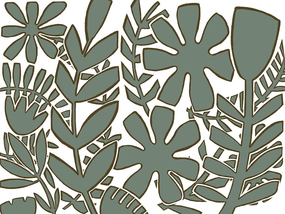
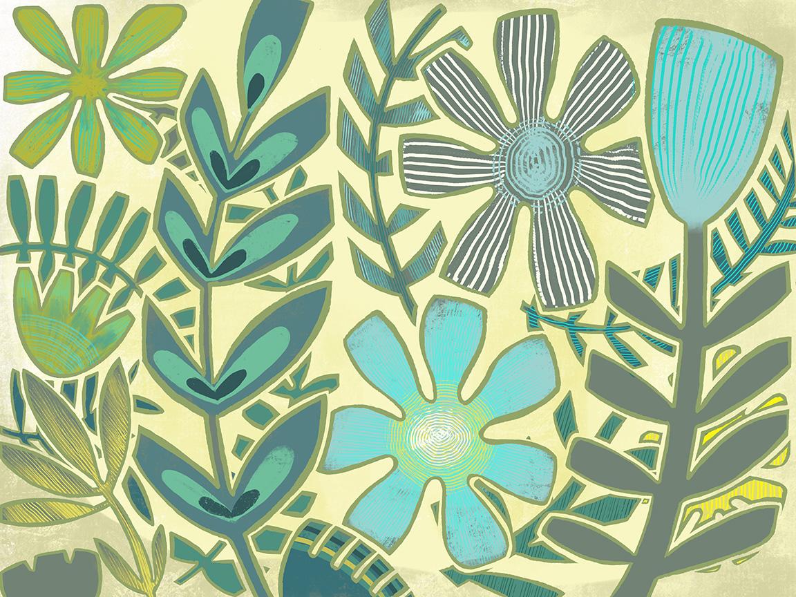
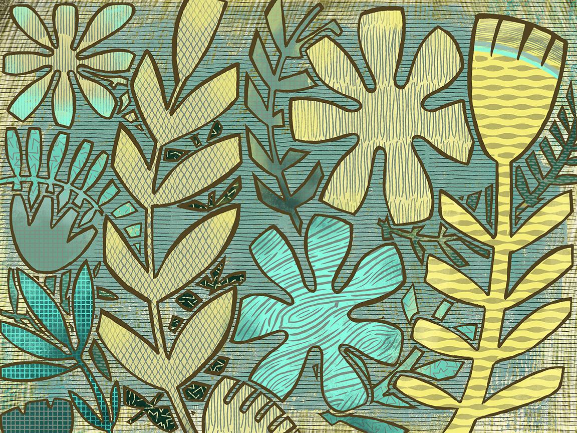
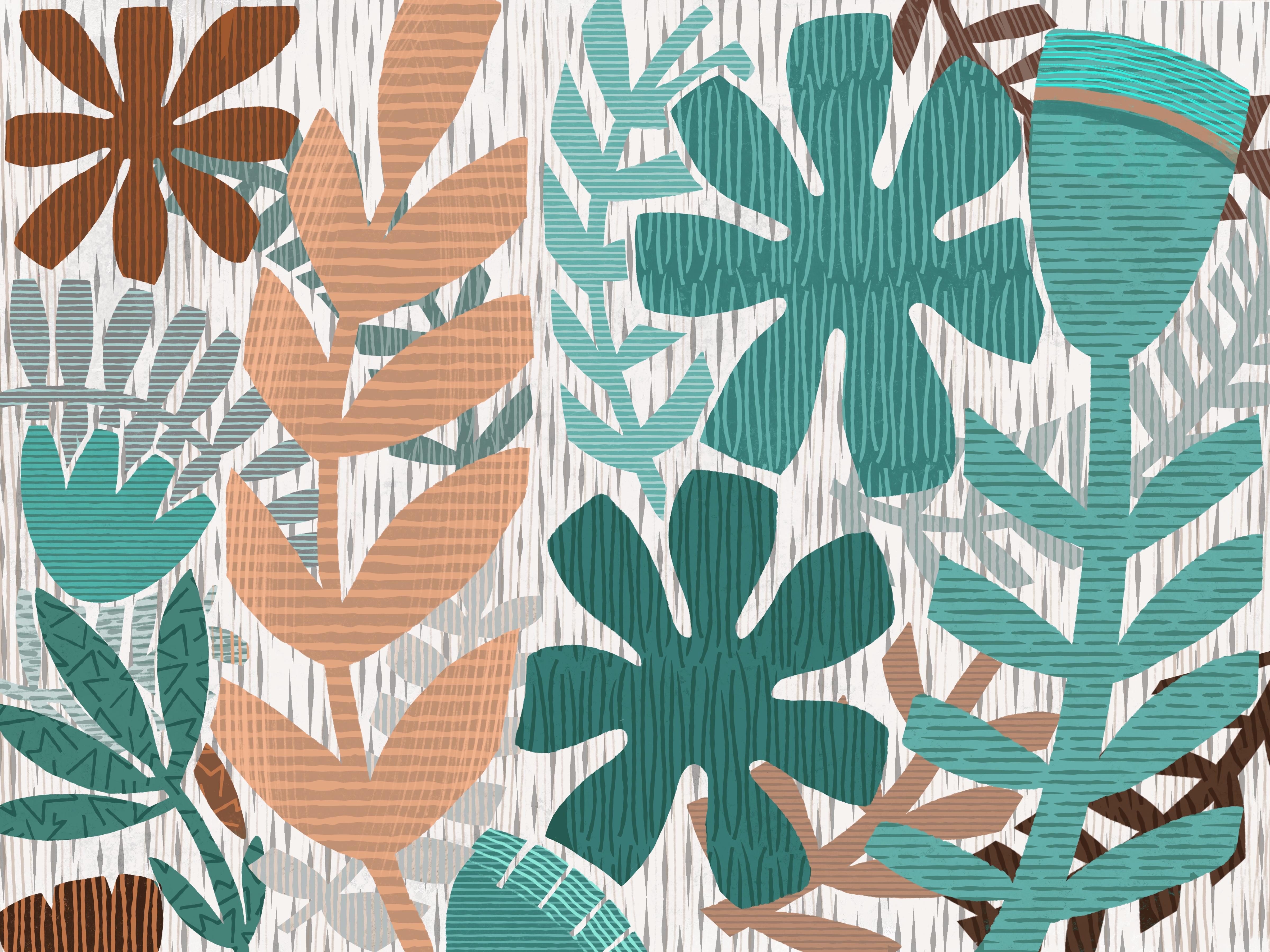
8. Outro and Conclusion: Hey guys, welcome to the wrap up. Thanks for hanging out with me today. I hope you really enjoyed this class. It's been kind of a fun one to do because it's kinda casual and really forgiving as far as the finishing and really the whole style is supposed to be quite casual and kinda lose. So here's how we progress. There's the black and white version that we did from that very basic can rough sketch. This is the two colors where we did the reduction method. This is the multicolored one with no release. Here's a look at that one which just a bunch of funky textures as we first experimented with the use of those. This is what I would consider the finished wine in that series. And then this is the one that I use for all my titles and it's probably my favorite, I think, because of the color scheme and also a more restrained use of the patterns. This is one of those projects that it really pays to experiment and then just try to hone in on that final look that will make this truly original. Remember to go back and check out those boards that I pointed out on Pinterest. You can get so many ideas by just looking at other people's work. And don't limit yourself just to the printmaking. Take a look at my art inspirations forward and my whole flowers for it. You can get lots of ideas just looking at these other bits of inspiration. When I'm getting started on our project, I'll go through tons and tons of research time. And usually I'll create a mood board or put a bunch of images on a Pinterest board that I can go back to and we'll cat as I'm doing my sketching or by initial planning. If you haven't done so already, make sure you hit follow up above. The thing that you could do to really help me out would be to go down to the review section here and leave a review on the class. Reviews are what really helped me to get other students interested in what I'm teaching. So I'd really appreciate that. And of course, if you do end up doing a project hip this Create Project button, and you'll be prompted here to upload your image and maybe give me a bit of a description of what you've done. I just love seeing your work. It really makes my day. And then make sure you go to my website and add yourself to my mailing list. That way you'll get information of any of the freebies that I offer. I know it may take awhile to have a bunch of resources there for you, but I'm constantly thinking about and constantly working on it. If you have ideas for classes, please pass on to me. I've loved here what you want to see and work on. I'm happy to oblige. If it's something I can teach, I'll teach it. You can also find me on 1000.com at Arctic query here in Canada, and on tons of different PRB sites. Like I said, thanks so much for hanging out with me today and I will see you next time. Bye for now.
 Delores Naskrent, Creative Explorer