Transcripts
1. Welcome!: Taking inspiration from
everyday life objects and infusing it with Zentangle art is kind of like my superpower. Seriously, I'm not joking! I've done a bunch of wild
and experimental pattern art and Zentangle art
classes before, but throughout all
of those classes, one question that's
always popped up is, "Ridhi, when are you doing
this on Procreate?" Well, the answer is today. Right now! It's not a
drill! We're doing this! Hi everyone. My
name is Ridhi Rajpal, and I'm a Filmmaker and a Multidisciplinary
Artist from India. I'm also an art educator
and a creative entrepreneur running my own creative studio by the name of TheColorBirdie. And if you're wondering
why I talk about Zentangle with so
much enthusiasm, it's because I'm also a Certified Zentangle Teacher as well as a Top Teacher
over here on Skillshare. So the idea for
this class came to me, as usual, when
I was traveling. I was in the beautiful
city of Jaipur in India, which by the way, is
famous for blue pottery. This ancient craft is a great source of artistic
inspiration because you can spot many beautiful
floral motifs and geometric patterns
on everyday objects, such as wall plates, tea
cups, planters, and more. And of course, the artist in me wanted to capture
the beauty and essence of those
monochromatic designs in my favorite art style,
which is Zentangle. Now of course, we can do this with traditional
art materials as well, such as sketch pens
and drawing paper. But by doing this
digitally on Procreate, we can eliminate the limitations that come with
traditional mediums. For example, we can build
our designs in layers, change the scale of our motifs, and even change the
colors quickly to create multiple variations
and combinations. So no more messy inks and
paints to worry about. Just you, your stylus, and a whole
lot of artistic adventure. In this class, we'll be
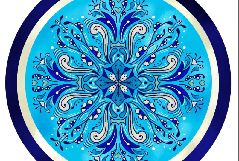
developing two projects. For the first project,
I'll be showing you some interesting
Zentangle patterns that look very similar to traditional
blue pottery motifs. So if you are already familiar
with the Zentangle Method, this will help you to expand your knowledge of
various tangles. And in the second project, we'll develop our own motifs, inspired by real flowers, while still maintaining
the essence and characteristics of
blue pottery designs. This class is perfect for
students of all levels. Whether you're a
beginner or a pro, you'll find plenty of fresh
creative inspiration to infuse the look and feel of blue pottery designs
in your own artworks. If you've never heard of
the Zentangle Method before, don't worry, I've
got you covered. Also, if you've never opened the Procreate app
before, don't worry, I've still got you covered. We'll start right
from the basics and we'll level up
as we go along. Also as a bonus for this class, I have designed three custom
color palettes for Procreate inspired by the colors of traditional blue pottery
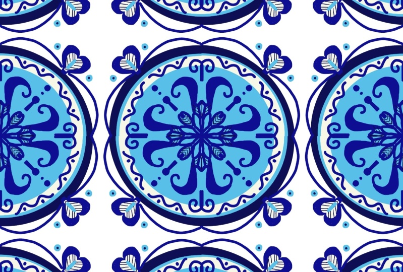
designs in India. Plus, as another bonus, I'm going to show
you how you can repurpose your class
project into a beautiful, seamless, repeating pattern
to upload on print-on-demand websites like
Society6 and Redbubble, where you can then
see your designs on beautiful products
like wallpapers, cushion covers, curtains,
and so much more. So in a nutshell, I've got some pretty
exciting stuff lined up for you
in today's class. Go grab your iPad and
let's get started.
2. Overview and Prep: Alright, so before we get started with the actual
drawing process, I want to give you a quick
overview of how this class is structured so that you can make the most of your learning
experience today. First up, let's talk about everything that you will
need to get started. Now, this is a Procreate
drawing class. So you will need your iPad with the latest version of
Procreate installed on it. You will also need your
stylus or an Apple pencil. For our first project, we
are going to be making a composition inspired by plates in the blue
pottery style. For this, I have selected a bunch of wonderful
tangles from the Zentangle method that look similar to original
blue pottery motifs. But you don't have to stick
to the same tangles as me. You can use any of
your favorite tangles from the Zentangle method. And in fact, I have also put in some suggestions and ideas in the class resources document, which is available
for you to download. So make sure that you
check that out before you start with
your first project. For our second project, we will take inspiration
from nature, more specifically
flowers and leaves. We will be developing our own stylized motifs
for this project. Now in order to do this, we
will need reference images. I've curated a few
good photographs from a stock photography
website called Unsplash. The links to these
reference images can also be found in the
class resources document. So make sure that you
check them out before you start
your second project. Apart from this,
you will also find three custom color palettes that I have developed
especially for this class, once again, in the
resources section. Now, if you're someone
who knows how to use the Procreate app and you know how to import
the color palettes, you can go ahead and
do that right now. But if you're new to
the app and you need a little bit of help in
importing those color palettes, then don't worry, I've got
a lesson ahead for that. Now, one thing that
I must mention before you get started
is that if you're a beginner and you want
to follow along in today's class with
the exact same steps that I'm demonstrating
and create the exact same piece of
artwork that I'm making, then that's totally fine. You totally have my
permission to do so. But just keep in mind that you won't be able to eventually sell this artwork either physically or
digitally later on. That's because it has
my copyright on it. If you're interested to later on sell your designs on print-on-demand websites like
Society6 or Redbubble, or even physically with your
friends and family members, then I recommend that
you try and make your design significantly
different than mine. And don't worry, I've got plenty of resources available for you
to follow the same steps, but still make your
own unique pieces of art in today's class. All right. That's pretty much all the information that you
will need to get started. Once you're ready
with your iPad, meet me in the next lesson
and we'll dive right in.
3. Tangles vs. Motifs: All right, so in this lesson I'm going to talk
a little bit about what tangles are and how they
are different from motifs. Now, if you're someone who is familiar with this
Zentangle method, then you probably already know the meaning of
the word tangle. But I recommend that you continue watching this lesson
for a quick refresher. And for those of you
who are literally hearing the word tangle
for the first time, I'm going to give you a
quick introduction. So for this, we're going to take a
small step back and we're first going to understand
what Zentangle is. Now the Zentangle method is
an easy-to-learn, relaxing, and fun way to create beautiful images by drawing
structured patterns. We call these patterns, "tangles". Now because the
Zentangle method is so unique and different from any other art methods
in the world, the founders of this
method decided to come up with their own
vocabulary or terminology. And if you're interested to learn more about the Zentangle method, then I have a separate
class dedicated to this topic where we look at the history and
origins of Zentangle, as well as the terminology
in complete detail. But for the purpose
of today's class, all you need to know
is that tangles are basically patterns
from the Zentangle method. And these are created with
a combination of dots, lines, simple curves,
S-curves and orbs. These simple shapes are known as the elemental strokes in
all kinds of Zentangle art. Now, most of the tangles in the Zentangle method have an element of
repetition to them. In other words, the same
drawing strokes are repeated over and over again to produce a beautifully
structured design. This element of repetition
is what makes Zentangle very relaxing because it puts you in a very meditative
state of mind. Tangles are usually abstract. That is because Zentangle art itself is abstract and
non-representational. Even the names of the tangles are chosen in a way that they have no relevance or connection to what the
design actually looks like. However, that being said, it's interesting to note
that certain tangles bear a striking resemblance to actual objects or
natural elements found in our surroundings. This shouldn't really
come as a surprise, since ultimately tangles are actually crafted by artists
just like you and me, who draw inspiration
from their environment. Despite the presence of repetitive patterns and
abstract qualities, certain tangles may
appear more familiar because they share similarities with things that you've
encountered previously. This resemblance is particularly noticeable in organic tangles, which often resemble flowers, leaves, and other organic forms. Some of these organic tangles will be used in our
first class project. Now, as you may recall
from our previous lesson, I mentioned that we won't be utilizing tangles for our
second class project. Instead we will be creating
our own stylized motifs. This naturally raises the question - how
are they different? What sets tangles
apart from motifs? The distinction between tangles from the Zentangle method and stylized motifs lies in
their approach and purpose. Tangles within the context of the Zentangle method
are intricate, repetitive patterns
created using specific steps and guidelines. They're often abstract
and they don't aim to represent recognizable
objects directly. Tangles are designed to promote relaxation, mindfulness,
and creativity. On the other hand,
stylized motifs don't necessarily have
specific steps and guidelines. They are more focused
on representing specific objects or elements in a stylized or
decorative manner. While they may still involve
patterns and repetitions, their primary goal is to capture the essence or visual qualities
of a particular subject. Stylized motifs often draw
inspiration from nature, culture, or personal
imagination. And they can be used
in various art forms, such as illustrations, designs,
or decorative elements. Now my goal in today's class is to teach you both the
approaches because, well, why not? Using pre-existing
tangles from the Zentangle method
is great when you're experiencing a creative block and need a little
bit of handholding. But when you feel
more confident and you want to explore and
experiment further, then it's always a good idea to develop your own stylized
motifs from scratch, which truly reflect your own
personal voice and style. This way, as an artist, you will have a lot more tools in your toolkit to rely on. Alright, now that we have
all of those basics covered, let's move on to our next lesson and get this Procreate
party started!
4. Importing Color Palettes: All right, in this lesson, I want to give you
a quick demo on how to import these color palettes that are provided
with this class. There are three color palettes
that I've provided and you can import these
directly into procreate. Now to access these
color palettes, you need to go to
the projects and the resources section
of this class, which looks something like this. Now I'm sure that
a lot of you have the Skillshare app already
downloaded on your ipad. And you're probably watching this class on the ipad itself. But in order to download
these color palettes, you'll have to log on to Skillshare from a
browser instead. For example, I'm logged in
from my Safari browser. This is only because at the
time of filming this class, the skillshare app does
not have the feature or the capability for
you to download the resources directly
from the app. The workaround is
that you just log on to the website
from the browser, and then you'll be able
to see these resources. But in the future, as soon
as Skillshare provides this option for
you to be able to download the resources
directly from the app, I'll definitely put an update about it in the discussions tab. Currently, this is the
best workaround available if you're accessing the
class directly from the app. You can easily recognize procreate color
palettes by looking at the extension
of the file name. Dot swatches usually
means that it's a color palette which can be taken directly into procreate. You can just click
on any of these. Just tap and it'll give
you a download option. You download that and then it's going to bounce over here. It's gone into your
downloads folder. You just tap over there. Find the file. It'll already
have the Procreate icon; you just tap over there. And the file is already imported. If you want to see where
the file has gone, then you can just open any of the Procreate canvases that you have and click
on the circle, the colorful circle on
the top right corner, which is where you can see
all of these palettes. You'll have the palette
imported right at the bottom, which is Indian Garden, in my case right now, because that's the palette
that I've just imported. But if you want to
take it to the top, you can hold it and just
take it all the way up. Or if you want to
place it between existing color palettes,
you can do that as well. I'm just going to take it
all the way up right now. Now, I already had this
color palette with me, which is why you can see it twice. In case that
happens to you, you can also click on the three dots over here and
delete the color palette. But basically that's how you import color palettes
in Procreate. I recommend that you
go ahead and download all your color palettes
right now and import them into your app so that
they're ready for you to use when we start our
first project.
5. Canvas Prep: All right. We're now in
the procreate gallery. Of course, I have a bunch of different projects that
I've been working on. Yours probably might be empty if you're just starting out with Procreate for the first time. Don't worry if your screen doesn't look like
mine right now. I'm sure it'll get
filled up soon. We want to start off
with a new canvas. I'm going to click
on the plus icon over here on the top right. Over here, you'll see
that Procreate gives you a bunch of templates that
you can play with already. You'll see the sizes
mentioned over here. And you are definitely welcome to use any of
these for today's class. But what I'm going to do is create a custom
canvas for myself. For that, I'm going to click on the plus icon over here on this black little
folder like icon. And I'm going to
create a canvas of 3,600 pixels for the width, as well as 3,600
pixels for the height, which is going to give me a
square canvas to play with. This will basically become
12 " at a DPI of 300. Basically, If you multiply the number of inches
with the DPI, then you can get the
number of pixels. In this case, we've already
chosen the pixels to be 3,600, which means
that at a DPI of 300, it'll give us an output of 12 " Which means our canvas
is basically 12" in width as well
as 12 " in height. Now you can, of course, go bigger or smaller
depending on your preference. But the reason why I'm
choosing this particular size is because it's a
fairly decent size for when I have to print it, let's say on a greeting card, on a coaster or any
other merchandise. Um, and at the same time, this
is a decent size for me to get my maximum layers
as 76 over here. You can always see the number of layers mentioned over here. In this case, I'm getting 76, but yours might be different. This basically depends on the model and the
make of your iPad. Depending on the RAM
that your iPad has, your layers might be more or
less as compared to mine. If you choose to
change the width and height of your project,
that's totally fine. Just as long as your layers are somewhere around 30 or 35; you definitely want at least 30 to 35 layers to play with for today's project.
Just try to find a sweet spot between the number of layers
as well as the size. Just to give you an example, if I go to, let's say, 7,200 which is double the size, that's going to give
me only 16 layers. That basically gives me very little room to play
for today's project. So my sweet spot or
my compromise is that I'm going to go
for 3,600 pixels in width and height, and then get
a maximum layer limit of 76. The next thing that we
want to do is go to our color profile. And over here, you get options of
RGB as well as CMYK. I usually let it stay on the second option over
here, which is sRGB IE61966-2.1. This is the color profile
that I've been using... I don't know, since the beginning of time or since I've been
using Procreate... And this has worked
fairly well for me for displaying my designs digitally as well as physically to print on different
types of merchandise. This is the profile
that I'm going with, but if you ever have specific
requests from a client or from a vendor that prints your products and they
ask you to do it on CMYK, then you definitely
have that option over here in Procreate. Yeah. These are the settings that we are going
to be working with. And then I'm going
to hit Create. And we get our canvas. We can use just two
fingers to scale it down like that so that
it's easier for us to navigate and rotate it as well. So yeah, if you're new
to Procreate, then just take a moment
to play around over here and just get comfortable
with rotating your canvas. Once you're fully set
with your canvas, meet me in the next lesson where we'll start
to prep our design.
6. Project 1 - Plate Base: All right, in this lesson we're going to start
developing the base, or the structure for our design. As I mentioned earlier, this is going to be
inspired by the wall plates or the dinner plates that we see in the blue pottery style. That means we're
going to be creating a circular design over here. For this, we're going to
start by drawing a circle. And we need to select
a brush for that. I'm going to go into the
brush icon over here, and it will give me
a list of brushes that come pre-installed
in the Procreate app. So these are the
default brushes. Now, my list might seem a little longer than
the list that you have and that's only because
I've purchased a lot of brushes as well as collected
them from other artists. I'm like a "brush hoarder", if
you want to call me that! But basically, yes, if this is the first time that
you're opening the app, then don't worry if your list
looks a little shorter. The brush that we're going to use today is a default brush, so you're going to find it
in the calligraphy tab. And the brush that we're going
for is the monoline brush. You just want to
click on caligraphy, go to monoline, and that's the brush that
we're looking for. By the way, when you
click on the brush, it just opens like
the brush settings... as you get more used to procreate and as you want to make specifications according to your own hand and
your own gestures, you can play around with
these little properties over here and basically just
customize the brush. But I'm pretty okay with
the way it is right now. I'm okay with the
standard settings. So I'm just going to click
on the monoline brush. We have that set to default. Then this one, the second
icon is the Smudge tool, and then the third one
is the eraser tool, which we will also need. You can use the brushes
as erasers as well. When you click on
the erasers tab, you will see that
all the brushes are available as
erasers as well. Again, what we want
to do is click on Recent and click on the
brush that we're going with, which is the monoline brush in this case. You
can also just hold your eraser a little longer and you'll see
that there's a pop up that comes, which says "erase with current brush." So for example, if I change my brush to, let's say this one, Odeon, and I come to my eraser
tab and hold it. This will automatically
change to Odeon as well. Same way now when
I go to Monoline, and I click on my eraser
tab and it says, "Erase with current brush", it's automatically
switched to Monoline. Of course, we're going to
see this once we actually start drawing, but that's again, just a little Procreate
hack for you to know that if you long
press on the eraser tab, then you're going to get the
same brush as the eraser. Now on the top right over
here you will also see a small circle with
a color in it. Now mine currently shows blue because that's the last color
that I was working with. Yours could be a
different color. Over here you'll see
all the color palettes that you have
imported as well as the color palettes
that procreate comes with. So the default color
palettes will also be here. Just like the
brushes, I also hoard color palettes as well as develop so many of
my own color palettes. My list is obviously very long, but yours might be shorter, and that's not a problem at all. It doesn't mean that your app
is any different than mine. Just putting that out there for anyone who's new to the app. I already have my classic Jaipur blue pottery color
palette loaded over here. This is currently
set to default. This is the one that
I'm going to be working with for
the first project. Now, of course there are no hard and fast rules over here. You can choose to work with
a different color palette, if that's the one
that you prefer. You can choose the color
palettes which are available in the
class resources, or you can create your
own custom color palette. That's totally fine. Now whichever color palette
that you choose to work with, you want to set it as default. Basically, for example, if I was using this color
palette over here, I would click on
the three dots and then select this option
called "Set to Default". What this allows me to do is use this as a standby color palette for any changes that
I want to make. For example, if I go
to the disc icon, I have this over
here on standby. Same with the classic... harmony. Basically, this color palette
is my base color palette. And then I can keep
building further on it. So it's always available
to me on standby. Obviously, this is not the color palette that we're
using right now. I'm going to go to
palettes and I'm going to go to my
classic color palette. And then I will click on the three dots and
set that as default. Now this is the color palette that you will see at the bottom, over here in all of these tabs. Okay, we're going to start with the darkest blue that
I have over here in the classic Jaipur palette. I have my brush
thickness set to 100% The brush thickness can
be easily changed from this little
navigation bar over here. At 100% it is this thick. Then if I go down to
about 17% it's thinner. Same way at 2%, it's this thin. Basically, you can
just play around with the thickness. To
undo or to clear, you can just tap
with two fingers. And it will "undoes!"
So basically it "undos" or it "undoes" the action. To bring back an action or
to bring back a paint-stroke, you can just tap
with three fingers. If I tap with three
fingers, it'll redo. It "redoes". And to undo it will go back with
two fingers. So anyway, right now I am going
to keep this at 100% because I want this to be like a nice big circle and we're going to fill it
with color eventually. So honestly, it doesn't
matter which size you pick. But I just like to use
it at a thicker setting so that it's easily
visible to you on camera. Okay, now we are going
to create a circle. If you are already
familiar with procreate, you know how to draw a circle
with the Quickshape tool, but for new people, well, we just start with a
really messy circle. It doesn't honestly matter
what kind of circle it is. And then you hold it,
and then Procreate automatically
smoothens it out for you and creates an ellipse. Then you just tap
with one finger and it'll convert it into a
circle for you automatically. You also get this
little menu on the top. You can take it back to an ellipse or you can
take it back to a circle, depending on what
your preference is. But you want to catch
this menu quickly because then it disappears, if you don't like
tap it in time. Just going to do
that once again. I'm just going to undo this. It doesn't matter how
messy your circle is; you just want to make a circle, hold, tap,
and you'll get a circle. It's already at a circle, but in case you
wanted to edit it, you could go back to
creating an ellipse. That's how we have it. Now
this is not big enough. I want to cover almost the
entire canvas with this. So I'm just going to do a really
nice big ellipse. Tap. And that pretty much
looks like it's going to cover the whole canvas. Okay, now we have
our circle in place. Now as you can see, this circle is currently
not centrally aligned. Meaning that there is less space over here and more
space over here. It's not in the
middle of the canvas. To make it centrally aligned, we're going to click on
this Transform tool over here, which is the little arrow. And you will see that
it automatically selects whatever
is on that layer. And if you want to see
the layers, they're here. So this will probably be a little hard for you to see on camera. But I have my dark
blue circle over here. And otherwise, it's
a transparent layer because there is nothing
else on that layer. If I uncheck this box, my circle will get hidden. But if I tick mark
it or check it, then basically the circle
will become visible. We can collapse this back by
clicking on that layer icon. Come back to our Transform tool. Now we want to try and
bring this in the middle. Now to do this, procrate again comes
to our rescue, making our life a little easier. You want to be on uniform
and you don't want to be on free form
because uniform make sure that the aspect
ratio of your circle doesn't change. If you're
going to be on freeform; so let's show you what that is. It's basically just going
to change the aspect ratio. You see how it's
allowing me to change the entire shape of the
circle, which we don't want. So I'm going to go
back to where it was. Click on the Transform tool again. And now this time I want
to do this on uniform, which will basically
allow me to scale it back and forth with the
same aspect ratio. It's not going to
squish my circle or elongate it in weird ways. I don't want it to be small. So I'm going to undo and take it back to the
size that it was. Click on the Transform tool again, and we are back to this menu. Now what I want to do
is go to snapping. And we want to make sure that the magnetics and the
snapping are turned on because this will now allow us to position
our circle in the middle. You can see these golden
lines which are popping up; as soon as you see them
intersecting in the middle, or you see that cross sign, that's your indicator that
the circle is basically now in place with equal
distance on all four sides. If your snapping and
magnetics were not turned on, then you'll be moving around
your circle like this, trying to eyeball the center. And it wouldn't be accurate.
So to make our life easier, we just go to Snapping; turn
on the magnetics and snapping and make sure that we are right in the middle using
those golden guidelines. Yellow-golden guidelines. Okay, we can close
our Transform tool. Now, we want to fill this with color. You want to just
basically drag the color. Now, whatever color
that you used to draw your circle is what's going
to show up over here. I'm just going to
drag it and drop it, and that creates a fill for us. The circle is now
completely filled. Now, in the same way, we're going to create a
couple more circles, but they're going to be
on different layers. I'm going to go to
my layers panel, tap on the plus icon over here, and create a new
circle on this layer. For this, I'm going to choose, let's say this creamish
ivory like color. I basically just want to
create a nice border. Again, I'm just going
to create a circle. And I'm going to tap;
create the circle. Just scale it a little bit. I'm going to fill this first. Go to my Transform tool, make sure my snapping and
magnetics are turned on, and I'm just going to
align this centrally. Okay, same way, I'm going to create a
light blue circle as well. I'm going to go to my layers. Click on the plus icon
to create a new layer. I'm probably going to go
with this sky blue like color and do the same
steps basically. Again, just scaling it. It doesn't matter if they
cross the previous layers because you can always
adjust the placement. And I'm going to bring
it to the center. It's pretty big right now. I want it to be smaller. I can always scale it
down a little bit. There we go. Okay. Actually, I think I want to add one
more light blue circle, which is between the ivory
and the dark blue circle. If I don't like it later
on, I can always delete it. But for now, I just want
to add another circle. Instead of going
back and repeating all the same steps again. I'm just going to
do a quick hack. I'm going to go to
my layers panel. Instead of drawing the
circles all over again, I'm just going to hide my
blue and ivory circle. And instead of drawing a circle, I'm going to duplicate
my dark blue circle. I'm going to color drop
my light blue on this. Now the light blue circle is on top of the
dark blue circle, but we just can't
see the dark blue right now because they're
of the same size. And I want my light
blue circle to be just a smidge smaller than
the dark blue circle. So I'm going to keep both
these layers visible right now. And I'm going to make sure that I'm on the
light blue circle. I will click on my Transform tool and make sure I'm on uniform. I will just take it a little
smaller than that. Yeah, I think that looks good. And then I'm just using
my snapping and magnetics to position it in the middle. Yeah, that looks pretty good. Now, if I see it with all
my other layers turned on, this is pretty much the
effect that I'm getting. Yeah. Like I said, if I feel at a later stage that I don't
like this light blue circle, I can always hide that layer. And it'll get deleted
automatically. Well, not deleted,
it'll just get hidden. That's a decision that
I can take later. But for now I like this look. I encourage you to create a basic plate for yourself
in the same manner. And then meet me in
the next lesson where we'll start adding
motifs on top of this.
7. Project 1 - Adding Tangles: All right, let's start adding some beautiful patterns to this wall plate structure
that we have created. Now this is our first project. As I had mentioned earlier, in this particular project, we're going to be
using tangles from the Zentangle method to
create our final composition. Now I actually had a lot of fun researching various kinds
of tangles on the Internet. I have selected a few
tangles which have an uncanny resemblance to the blue pottery motifs
that we see in real life. The tangles that I'm
going to be using to demonstrate the steps for this particular composition have similar characteristics as
real life blue pottery motifs. But as a reminder, you don't have to use the
exact same tangles as me. If you're interested to
create a unique piece of artwork for yourself
in today's class, then you can totally use
different tangles as well. In fact, I have put in a lot of options for you in the
class resources document, which is available
for you to download. Feel free to check them out. All right, now coming to
this particular composition, I want to actually start off with something
in the middle. I want to add some sort of
floral element in the middle. And create a composition
where everything is radiating outwards or
blooming outwards, pretty much like a mandala or one of those sacred
geometry formations. We can actually draw each
element individually by hand. And we can actually create
each stroke by hand. For example, if I click
on the layer over here and add a new layer, let's say I want to create
a flower in the middle. Then I can actually create each petal individually and build a framework which is blooming outwards step by
step with each stroke. But I want to create a design which is slightly
more professional, slightly more polished, and it has a mandala like
quality to it. In order to do that,
procreate actually has a very wonderful feature
called the Symmetry Tool. And what this tool
does is that it basically saves us from
drawing each stroke individually because
it can create mirror images of some of the
strokes that we're drawing. For example, I'm going to first clear this
layer over here. I'm going to click on
the layer and hit Clear. And I'm going to come
to my wrench icon, and I'm going to click
Drawing Guide over here. I'm going to click on
Edit Drawing Guide. Here is our symmetry tool. Under the options, you will see various kinds of
symmetry options. We have vertical, horizontal,
quadrant, and radial. I have vertical selected right now. I'm going
to click on Done. And I'm going to
come back to my canvas. As I was saying earlier, if I draw something on one side, it's going to mirror
it on the other side. Same way, I'm going to go
back to Edit Drawing Guide. This time I'm going to
click on Horizontal. I'm going to click
Done. You can actually see this line which appears;
it's like a guideline. It might not be so visible
on the camera right now, but if you're following along
with the same steps as me, then you can definitely
see this line. This is the horizontal one. Again, if I create
something on the top, it's going to mirror it
on the bottom. Same way, we'll try the other two as well. I'm going to click on
the layer and hit Clear. Then I'm going to go
to my wrench icon. Click on Edit Drawing Guide. Let's do quadrant. As the name suggests in
the quadrant one, whatever you draw
on one quarter, it's going to repeat it on
the other three quarters. Then the other one that we
have is the radial option, which is going to give
us eight sections. Anything that I draw
in one of these, it's going to repeat
itself on the other seven. This is basically the
easiest way to create a mandala or to create a blooming radial
design in procreate. Now we're going to use this to our advantage and
basically use Zentangle inspired patterns
over here so that we don't have to draw each
stroke independently. And this is going to help us to preserve the sizing
of our elements, and at the same time,
everything is going to look very consistent
and very cohesive. This tool is actually great for building very professional,
polished designs. We're going to clear
the layer again, and we're going to start
off with our first tangle, which is Blooming Kangular. I'm currently on the radial
symmetry option right now, which is great for
us because this will help us to build a lot of
petals for our flower. But if you want to try a
different symmetry tool, that's totally fine as well. For example, if
you are very clear that you want to build
a four petal flower, then you can go to
the quadrant setting. You can basically
play around with the symmetry settings and
create a design for yourself. I'm going to start
off with Blooming Kangular over here on the
radial symmetry option. To start off this tangle, we want to draw a V. Okay, now that's a little
too thick for me. I want to reduce the
size of my brush. I'm actually going
to bring it down to, let's say, about 16-17 percent. Let's see how that looks. Yeah, I quite like
this thickness. Now I want to actually make sure that all my designs are
of the same thickness. So what I'm going to
do is; since this is at 17%, I'm going to tap lightly over here and
click on the plus icon. Now anytime that
I move my slider, I don't have to constantly bring it back to that 17% mark. I can simply tap on
that mark over here. The slider will jump down in place and it'll come
to that 17% mark. This is a quick way for
me to make sure that all my elements are with the same outline or with
the same thickness. That's a quick
Procreate hack again. Now, coming back to
drawing Blooming Kangular, it basically starts off with a V. I actually like what's happening over
here in the middle. It's giving me a star element. This is the way it's
actually drawn. I actually like
what was happening earlier. I'm going to do that. I'm purposely going
to make it not meet in the center so that I can get this little
design in the middle, which is basically just
adding a few more details. You can drag out your
brush and see how it gives you
different formations like a kaleidoscopic effect. Yeah, I think I like that.
There's a little bit of gap that's happening over here which I think I want to change. Yeah, I think
that's pretty good. While I was doing
this, I think you probably also noticed that anytime you draw a line and
if you hold it long enough, procreate will automatically
straighten it for you. If you're worried that your
lines are a little wonky, well, don't worry about it. Just hold it long enough and procreate will basically
straighten it out for you, unless you are going for a
wavy line or a wonky line. Then you want to basically
lift your stylus really quickly so that procreate automatically doesn't change
it to a straight line. In case it does that,
then you can of course just tap the undo
button. For example, if you want a
curve and procreate automatically makes
it a straight line, just undo it and it'll go
back to the original shape that you intended. Anyway, coming back to Blooming Kangular, the way this is done is that we basically have these
V-shaped petals. Then we have an inverse V, which goes something like this. Maybe I just want it
to end slightly lower; something like this. I like how this is right now. Then, you basically just want
to connect these sections. Now for all the empty spaces
that you have over here, you can actually repeat the same steps and you
can create more petals. You can create
something like that and maybe then connect it like so; if that is something
that you want to create. So that's a fun way to
create a design. But what I'm actually
going to do is extend this and create a longer petal;
something like that. So even within the tangles that we have from
the Zentangle method, you're totally free to change
some strokes here and there. Tangles are not set in stone. Every time you play
with one stroke, you are going to end up having
a variation of the tangle, which is also known
as a "tangleation" in the Zentangle method. So feel free to create as many
tangleations as you like, and basically just have fun with the symmetry tool and create your own kind
of compositions, create your own kind of motifs. I promise you this is going to become pretty addictive
in some time. Yeah, so now that we have this, what I also want to do is
add a line going like so. I'm not going to do too
many details right now. I'm going to come back
to the details later on. But right now, I just want to start getting some elements in place to see how my composition
is going to look like. Now I'm going to move
on to my second tangle, which is going to be Mooka. I'm going to add this
tangle on a separate layer. The reason why I'm going to do each tangle on a separate
layer is because it gives me the flexibility to delete
them later on or to change the color of each
of those elements without hampering the
other tangles around it. Because I have 76
layers to play with, I can use them to my advantage. In case you have lesser
number of layers, then you can do two
or three tangles on the same layer as well. There is no rule against that; just that I like to use
layers to my advantage, and I like to have
a mix and match and various permutations and combinations of
different elements, which is why I like to keep hiding and unhiding
all of my layers. I like to play with it that way, but you don't have to
do the exact same thing as me. So for now. I'm just going to create
Mooka on a separate layer. Mooka is actually a
pretty old tangle in the Zentangle method. Over the years, many artists and many certified Zentangle
teachers like myself have created their own different versions and variations of it. The way I like to
draw it is that I do an S stroke and then
I create a bulb. And then I bring it down and connect it to
the stem like that. But there are other
ways of doing it. Some people like to do an almost straight
line with a bulb, which connects it
right at the top. There's a very thin stem and then there's a bulb at the top, almost like a paisley shape. Then there are some people
who like to do it with a C-stroke like that
and then connect it like so. So yeah, they're basically various different
versions of doing this, but I want to do it
with the S stroke, which is my favorite style. Now one thing you
must have noticed is that while I was
doing this over here, this did not replicate on
all the other sections. And that is because we do
not have drawing assist on. When you go to
your layers panel, you'll notice that in
the previous layer it says assisted. That is because when we had
selected the drawing guide, this layer automatically had that drawing guide
applied to it. The radial symmetry
automatically got activated. But the minute we
created a new layer, we have to now tell
procreate that the drawing guide has to
apply to this layer as well. To do that, we're going to click on the layer and
click on Drawing Assist. As soon as this is turned on, you're going to see the
word assisted over here. That basically means that it has been activated on
this layer as well. So I'm now going to
create my Mooka. I'm going to bring it down
and connect it to the stem. I'm just going to neaten
that up a little bit. There we go. We
have Mooka in place; we have eight such
beautiful Mookas. Actually, I'm just going to create
another one which is nesting under this one. Yeah, I'm not sure I'm going
to keep the second one, but right now I just want to have some sense of
the composition. I'm keeping it right now. I might delete it
later. We'll see. Okay, so that's our
second tangle done. The next tangle that we're
going to be using is called Eze. To create this, I'm going to first go on a new layer and I'm going to
put my drawing assist on. Then I'm going to come here
and put a curve like that. That's actually too high;
so a curve, go inward, make a curve again, and bring it back and
connect it like so. Just gonna neaten that
up a little bit. Now again, tangles have
no hard and fast rules. For example, if you
wanted to do this with the curve inwards
and like that, that's totally fine too. That's a different
effect, but it's okay. It doesn't matter
because tangles have no hard and fast rules. Nothing is set in stone. You can do this according to
whatever is your comfort, whatever is your aesthetic. No rules over here. I
might actually do this again because I
want the curve to echo the shape of the Mooka, just so that it nicely
sort of snugly... Snugly? So that it's
nice and snug. It fits there basically. Yeah, something
like that. And I'm going to use my eraser; I'm going to long press
on the eraser so that it uses the same brush as
the brush that I'm using. That's too much. Okay. Yeah, so I have Eze in place. Once again, I'm going to
go to my brush and I'm just going to add a line
over there like so. Now this leaf is
actually very similar to the leaves that we see
in a lot of Indian, Mughal, Persian patterns as well. A lot of blue pottery designs
have this kind of a leaf in them. You will spot this literally everywhere on Indian clothing, on decorative items in India. This is a very familiar motif. Interestingly, it happens
to be a tangle as well. Yeah, I definitely wanted
to use it in my design. All right, the next
tangle that we're going to be working
with is called Flux. Once again, I'm
going to start with a new layer and I'm going to make sure
my drawing assist is on. Then I'm going to come here and add it somewhere over here. I'm going to try and echo the effect of the
outline of the Mooka, which is drawn previously. It's like a paisley shape. But you can create many different variations
of this tangle as well. You can have one which
is more symmetrical, looks like a literal tear drop. This one has a slight
more bend at the bottom. You can accentuate it even more and close the bend
a little early on, so you'll have like a
stem at the bottom. There are many different
ways of creating this. Choose the one that
you like the most. Okay. It took me a couple
of attempts to get that. Yeah, I'm finally happy with the one that
I have over here. Okay, Now I have this little
odd space in the middle. Instead of actually filling
this with a tangle, I'm just going to follow along the outlines of the
previously drawn shapes. I'm just going to create
a decorative shape. Once again, I'm just going
to go to a new layer. I'm just going to follow
along the outlines. Yeah, this is not
exactly a tangle, but this is more or less like a filler element; and a
decorative, stylish filler... You can add these
anywhere; wherever you feel that your design is
looking a little bit empty. Instead of trying to think of a tangle that you can fit here, you can just add some decorative
elements here and there. In fact, later on I
might add some dots and some other random fillers
here and there as well. Right now, this
looks pretty good. I'm just going to add a
line over here like that. Or maybe not. That
looks a little odd. Yeah, I'm going to
let it be like that. Yeah, I think this is
shaping up pretty well. I'm going to grab a
little bit of coffee right now and then I'm
going to see you in the next lesson where we're
going to continue adding more tangles to our design.
8. Project 1 - More Details: All right, I'm nicely refreshed and re-energized
after my coffee break. And I am now ready to get
back to this illustration. And we are going to now start with a tangle
called Henna Drum. I'm going to make a new layer
and I'm going to make sure my drawing assist is on. Now again, Henna Drum,
is a very versatile tangle. It is pretty organic. You can take it in any
direction that you like, but you don't have to stick to the exact same steps as are
mentioned in the step-out. You can actually choose
to improvise the tangle. I'm going to
improvise it as well with the strokes and the
structure over here. I have this nice stem as a base. Then on this I'm going
to add a few flowers. The way Henna Drum works
is that we basically add a semicircular
element on this stem. Then we have some petals
which are coming out of it. Actually, I think I'm going
to take the flower a little lower because I want to try and close the gap
somewhere over here. Okay. Yeah, I quite like that. Now I'm actually going to add another stem which is sort of branching
out from this one. Something like that. And
then I'm going to have maybe a little pod or like a bulb
which is going on like this. Then I'm just going to add
another flower over here. Okay. That looks good. And then I think I'm going to add another one
over here as well. Okay, so now that we
have these in place, we can refine the
stem a little bit. Of course, I only have this much space in my illustration, but if you have a different
composition and if you feel like you can add more stems
and you can add more flowers, then totally go for it. There's no hard and
fast rules over here. So basically, just go
with your aesthetic sense and fill up the illustration
the way you like it. I like to have most of my illustrations with a
lighter feel to them, so I like to have some sort of like an airiness
to my illustration, so I don't overstuff
them with elements. But if you want to like fill it completely with more
patterns and more tangles, then this is the time you
can add more details to your illustration
and basically just draw to your heart's content. And yeah, there's
no pattern police, there's no tangling
police that's going to come and stop you from
doing what you like. I think I'm pretty happy with everything on
the illustration. The only thing that
I want to do is try to have some sense of
cohesiveness going on. At the moment, these flowers are standing out completely
as a different element. There is nothing else on
the illustration which is going with the same strokes
or the same characteristics so to say. I want to bring in
some harmony in my design. The way I usually do that
is that I borrow strokes from some of the
elements and add it to the other elements. For example, currently what's bugging
me is that I have nothing which is looking
like these petals. While this is a beautiful
element in itself, it's currently not looking like it belongs to
the same family. I want to basically introduce this somewhere in
the illustration. I think I'm going to experiment with some
details over here maybe. I'll go back to
the layer over here. Let's see if we can add some wavy elements
over there like that. Yeah, that could work. Okay, now they look similar
to the flowers outside. I'm also thinking
that I want to add this stem somewhere
else in my design. This stem that I have done
over here is actually very similar to an element in the Zentangle method called
Fescu. It's basically stems with
these little pods at the top. What I'm going to do is try and add them at a couple of
other places as well. Let's see where we can do that. Maybe one over here and
this could be a new layer. I think we can do
this over here. I need my assist on. Okay, so that looks good. I think we can also
add them over here. Now, these are basically just filler elements that
we are playing with. You can choose to add as many filler
elements as you like. I'm actually going to
change the shape of that and match it to what I
had done previously. And same way I'm going to
try and add more details. Now is also a good
time to change your brush size and add a few other elements
here and there. These are elements that will
come to you intuitively. So wherever you feel
that you need to add some more decorative motifs, or if you feel like you
want to add fillers, you can do that
pretty intuitively. There are no rules over here. For example, I'm going to go to my flux layer and I'm just going to add a few stems and
dots and things like that. I'm also adding another flux. I'm on the same layer so that later on when I
rename these layers, I'll remember that all the flux elements are
on the same layer. Let's see if I want to
add any more elements. Maybe another one over here. Same way, I'm just going
to go to all my layers and see if I want to
add any more details. You can also add some
simple strokes that just echo the effect of the
previously drawn strokes. That just adds some more ornamental value
to the illustration. I'm trying to get the
right angle here. This is the time when I really like to refine my illustrations. I spend a lot of time looking at every tiny detail to make sure I'm fully
satisfied with it. For example, over here I'm
just erasing it a little bit to get that line
to look smooth. Then again, I'm just going to add a few more details
here and there. All right, at this point, I think I'm fairly happy with
the details that I've added and I'm not going to add more details till I don't
color the illustration. What I'm going to do is first add the colors to
these outlines, and then I'm going to judge if I need to add more
details or not. Meet me in the next
lesson and we're going to get started
with the coloring.
9. Project 1 - Coloring: All right, time to make this baby look even
more beautiful. And we are going to do that by adding some color so that
it'll give more life to this illustration. I'm going to start with the
center one over here, and then gradually go outwards. What we want to do
over here is add our color on a separate layer
for each of the elements. The reason why I like to do
that is because it gives me more flexibility in
case I want to make changes to the texture
or the color later on. As an example, I have my center element
selected on this layer. I'm going to add another
layer on top of it. I'm going to come back
to my original layer and click Reference. When I have reference selected, Procreate will
basically understand that I need to fill color
within these outlines. I'm going to go to my new layer. As an example, I'm going to take this blue color,
bright blue color. I'm going to drag this
color into these areas. Now procreate
understands that I'm going to add color only
within these outlines. The bottom layer is basically
acting as a reference. Now that I have
this, I am going to color the inside petals
with a different color. I'm again going to do a
new layer on top of this. For this, I'm going to take
it between these two layers. Again, the immediate bottom
layer is the reference. And procreate will
understand that I'm adding my color in
reference to the bottom layer. You don't have to keep
dropping the color from here. If you saw that there
was this little pop up that came over here which
said "Continue Filling"; so let me go back... Instead of dragging each
color individually like this, which is a little
time consuming, you can just click
on "continue filling", and then tap at various areas. And it'll basically
understand that you want to color the other elements
as well. So right now, however, I just want to color
these diamond like shapes. I don't want to
color the petals. I actually don't know what color I'm going to do for the petals. So I'm going to leave
that right now. I'm going to move onto my flux. Where is my flux layer? I should actually rename
these now, at some point. Here is my flux layer. And I'm going to select my
flux layer as the reference. The top layer is empty, that's where I'm going to be dragging and dropping the color. For this, I think I'm going
to use this light green. One thing that I wanted
to mention is that the layer that you have on top can also have
drawing assist on. For example, right
now you saw me adding the color individually
to each of the elements. That's going to take
me a lot of time; if I start to add color to each of the
elements individually. So I can have drawing assist
on on this one as well. Now I can just quickly
fill in the elements. Okay, that looks like
we've got all the flux. Let's see, what do
I want to do next? Let's do the leaves and
the Mookas. Same process. I'm going to click on Reference. Add a new layer. As
I mentioned earlier, you want to have
"Drawing Assist" on also. Just so that it makes it
a little easier for you. And let's start dropping
in the color. For the center element, even though I have two
layers of color already; I have my original outline as a reference layer and I have the blue diamonds and the white diamonds on
individual layers each; I still want to
create one more layer for the petals that
we have added. This is because I want to shade each of
them individually. Having colors
separately on each of the layers is going to give me a little bit more
flexibility with that. Now, I have my entire
illustration colored. I recommend that you
also take your time to decide which colors you want
to put on your illustration. Just balance out the darks, the mediums, and
the light colors. And once you're happy
with the base colors, meet me in the next lesson where we'll start to shade them.
10. Project 1 - Texture & Shading: All right, so we're going to start shading the
illustration now. But before we do that, let's actually quickly
rename our layers. And this is just
going to be like a hygiene check on the list of layers that we have over here so that we're not
lost in this puzzle, this maze of layers. So what I want to do
is I want to quickly start renaming each of the layers with the
tangle that they have. And then the top
layers will be called assisted or color or
whatever they are. As an example, if I have
my Eze layer over here, I'm just going to click on it. We just want to click on Rename. It'll give you a keypad. I want to call it Eze. Then the layer on top
can also be renamed, and this one is going
to be called color, or you can actually
call it Eze color if you want to be
even more specific. And then same way,
I'm just going to rename each of the
layers so that it's easy for me to identify them when we're scrolling
through the list. All right. I have
all my layers named now and the one with the
fillers is just called fillers. What I'm going to do is now just group them as well so that it's easier for me to navigate through this entire long menu. To group the layers, we just select one layer and slightly just swipe right on the layers that
we want to group at the bottom; you'll see
a difference in the color. The selected one will be a
different shade of blue. And the ones that
you want to group under it will also be in blue, but in a different color. In a different shade of blue rather. You're going to see
the group icon over here. You just click on
that. Then same way you can rename
the group as well. I'm going to call this
Blooming Kangular. When you want to
collapse the group, you can just click on
this drop down menu; that just makes life
a little easier. I'm going to quickly do that for the rest of the layers as well. The random element
that we had placed, which was a decorative element, was not really a tangle. So I'll just called it "Deco 1" You can choose to call
it whatever you like, just as long as you are
naming it in a way that you remember what you
had drawn over there. Of course the fillers are
just a layer by themselves; nothing else in the
fillers as yet. So I'm just going to leave
that independently for now. And now it's time to start shading. Before we actually
start the shading process, I want to give you a quick idea as to why we're doing this. Currently, the illustration
looks pretty good. If you want to stop at this
point, you totally can. This is pretty good right now and the colors are
nicely filled in. All the details are
looking pretty nice. But the reason why I thought
we could add some texture and shading is so that it could look a little
bit more handmade. The reason for that is that
I want to make it look like authentic blue
pottery wall plates or ceramic dishes that we get
in the blue pottery style. Usually the artisans hand paint these motifs and then
the dishes are actually given some heat
treatment because of which the color sets in
on the ceramic dish. Sometimes they're put
inside a kiln; other times they're given
other types of treatments. But basically there is some
heat processing that happens. So the colors are completely set in on the dish. When that happens, there is a certain amount of inconsistency that
appears on the plate. We can actually see little
specks of paint going lighter in some sections and
darker in some sections. That's the nature
of any item which is hand painted or
handmade that it'll have some little
minor inconsistencies here and there. So just to replicate that texture and to give a nod to the handmade feel
of these dishes, we are going to add texture
and shading over here. What I'm going to do right
now is that I'm going to demonstrate with a
couple of tangles. Then the process is
pretty repetitive. So you'll be able to follow along looking at the
steps that I'm doing. Let's start with the
middle one, actually, because that has the
most amount of colors. We're going to start
with Blooming Kangular. I'm going to go to
my layers panel. The first thing that
I'm going to do is come to the
green color layer, which is the inside petals. On top of this, I'm
going to create a new layer. Right away, I'm going to change the
blending mode of this layer. Currently it says N over
here next to the checkbox. And we want to change
it to multiply. N stands for normal, but we want to change
it to multiply, which will give you an icon like this. You'll have
M written over here. Basically, what happens
with the multiply mode is that whenever you apply
another color on top of this, it's going to
multiply the effect on top of the layer
which is under it. In this particular case, I'm going to take
the same color, which is this teal color. Now I'm going to actually
change my brush as well. In the charcoals tab, I'm going to take the
willow charcoal brush, which has a very nice
texture to it. So now, over here; let's make sure we're
on the correct layer; so with the multiply mode, if I add this, you can see that it's
giving a darker effect. The lighter color
is already there. But on top of it, when I'm
adding the same color, it's just doing that multiply
blending mode action and it's giving me
a darker effect. Now if I let this be on normal, then you can see that it's basically
the same color, right? You can't really make
out any difference. I'm only talking about
the color inside. I'm not talking about the color
that's spreading outside, which we'll also get to
in a minute. Basically, the point is that if you're
applying the same color on a separate layer and just
letting the layer be on normal, then you're not going
to see any difference because it's literally
the same color. But the minute you
change that to multiply, the effect will become darker. In fact, if you want
to play around with different types of blending
options, you can do that over here; you'll see Screen
which makes it lighter. Then the Color Dodge
effect basically also gives you a slightly
luminous effect. Then we have Add which really
highlights the color. You can play with
different types of blending options over here. For now, I'm going to go with the Multiply option
because I want to create some darker patches. The reason for creating
these darker patches is that when these artisans
traditionally apply the paint, um, the paint brush is really
heavily filled with paint, right? So in certain sections, the paint starts to pool in. That's the effect that I'm
trying to replicate over here. Now coming to all the extra
stuff that's coming outside; that is happening because we currently don't have
a clipping mask on. As an example, if I
currently now start to, let's say use a different color. For example, say I do the white. Now I start to add this; you can see that
the color's going outside on the blue
areas as well. It's really subtle, but you
can still see that happening. And the reason for that is that we currently don't have
a clipping mask on. A clipping mask is
basically, again, a tool in procreate which
allows procreate to understand that
the previous layer is supposed to be used
like a reference. The top layer is
going to clip itself to whatever is drawn on the
layer below it or under it. I'm going to clear
this layer for now. I'm going to click
on Clipping Mask. And you'll see this little
arrow which will pop up, that's an indicator that
layer number 26 that I have over here is currently clipping itself onto the
green color layer. I'm again going to go
back to my teal color; and because I don't want to spend too much time coloring each
of the elements individually, I'm again going to put on my drawing assist
on this one as well. Let's see how this goes. I'm going to try to add
some darker elements. Okay, that's too big. I'm going to make my
brush size way smaller. Okay, that works. The difference is really subtle, but you can make out the slight texture; and that is so much better than
just having flat colors. That's one effect. Then, since we have this
color selected already, let's go to the
decorative element. Again, I have my green
layer; on top of that, I'll add another layer. I'm going to click
on Clipping Mask. And I'm going to change
the blend mode to Multiply. Let's
add it over here. It's very subtle
texture, not too much. Oh, it looks like... ah! My Drawing Assist was not on. Let's undo. Yeah. The exact same thing
that I was saying earlier. I'm guilty of doing that. Sometimes I forget to put
on my drawing assist. Okay, let's do it again. There we go. Okay. Now
it's on all four of them. Now let's go back to
Blooming Kangular. I'm going to do the white one now. So white ends up
looking creamish, or more or less like
an ivory cream color when it's put inside the kiln. When you buy these
blue pottery dishes, or even Chinese
blue pottery items or any Delftware items, you can often see that the white is not
exactly pure white. We'll see that effect
when we start to multiply with the
white color itself. Drawing assist because I've done that mistake once! Clipping mask; I'm going to change
the blend mode to multiply and I'm going to
select the white color. Just make sure we're
on the right layer. Okay, now it's really subtle, but you can see that it's almost like a
slightly yellowish, creamish tint which is on
top of the base layer. Now if you feel that
this is too little, you can always duplicate the layer with the
multiply mode, and that'll really intensify it. Now you can really see that.
Let's do it once more. It's becoming more
and more yellow as you're duplicating
the effect. It's totally up to you whether you want to add this
kind of an effect or not. Actually, I wasn't
planning on doing this, but now that I see this little
yellowish tinge appear, the tint on this, I like it! Yeah, I think I'm going to
keep it this way, but yeah, you can choose to do this color or like you can go even
lighter, totally up to you. But I like this yellowish
effect that's happening. As a side note, if you feel
that this is too much, let's say you were doing a single layer and you feel
that this is too much, you can click on the M icon over here and change
the opacity as well. You can always reduce that. Instead of trying to
make the color lighter, this is a quicker way to reduce the intensity
of the color. But for me, I think I quite like the effect that
was happening there. This yellowish effect is nice. Yeah, I think I'm going to
leave it like that. Then, since we already have
the white selected, let's do the Henna Drums. Or we can actually do
the Ezes first. So I go to my Eze folder, click on the white color layer, add another layer, drawing
assist, clipping mask... Change the mode to multiply. Let's add the effect.
Really subtle... By the way, you don't have to do this with the same color. You can do the
Multipy mode with a different color as
well. For example, actually, let's try doing
that on this layer. So I'm going to clear
this. Let's say I want to have a bluish
tinge over here. I'm going to take the
slightly pale blue color. Everything else stays the same. Clipping mask, drawing
assist, multiply. Now it's giving me this effect. This is also an option
that you can explore. If this is too much, then, as I mentioned, you can
reduce the opacity. And that looks pretty subtle. Yeah, that's another
way to play. Imagine that if this
was hand painted and they had the white paint and the blue paint next
to each other; then some of the
color trickles in. These are, again, very small
handmade imperfections that we're trying to
replicate over here. It's totally up to you whether you want to add this texture or not; and you can play with your aesthetic
preferences over here. No hard and fast rules. For this, I think I'm actually
going to keep this light blue little texture. This also gives it a
slightly more modern look because we have these little highlights and little textures. It's giving it a very
traditional meets modern vibe. Then let's do the Henna Drums. The willow charcoal brush is actually pressure sensitive. If you press more then you're going to get
a lot of color. But if you press lightly, then you're going to get
very subtle color. So play with the pressure
to get the kind of gradation effect that you want. It looks like we got most of it. Yeah. Okay, that
looks pretty nice. I think I want to actually color in those circles as
well; those semicircles. While we're here in this folder, I'm just going to add
a new layer on top of the Henna Drum layer.
And in the bottom one, I'm just going to make sure that reference is switched on. Now in this layer, I'm going
to switch to the teal color. Come back to this layer. Just double checking
that my reference is on. Yeah I'm just going to fill.
Okay. Yeah, I quite like the
green centers over there. Same way I'm going
to do Mooka as well. I know I'm going a little
back and forth here and there in terms of the
order of the tangles. But that's because I'm trying to just use the same color that
I have used previously. I'm trying to work
according to the color rather than the order
of the tangles. You can choose
your own workflow. I just tend to go a little back and forth on my illustrations. I'm not really picky about
the order of the tangles. Yeah, if you want to stay
organized, totally go for it. But I'm just going according
to whatever color I have. Yeah, we were on Mooka right now. Again, on the blue layer, I'm going to add another
layer on top of it. Drawing assist. Clipping mask. Make it to multiply. This time I'm going to
use the same blue color. Let's see how that goes. Yeah, this is,
really dark, and I think you can make out
the difference on camera. This is the original
blue and this is the dark effect. For this one, actually, I might do another layer which also
has the screen mode. Right on top of the
multiply mode; the layer that has
the multiply mode, I'm going to click the plus icon and create another
layer. And on this one, I'm going to do screen
mode just because I want to bring some nice patches on the top half of that bulb. I'm going to click on
Clipping Mask again. It's automatically going to clip down below to those
layers under it. Drawing Assist is on. Let's
see how this looks. Yeah, this is giving
me a lighter effect. This is what I meant when I
was telling you earlier that sometimes the paint has little inconsistencies
here and there, when this is hand-painted. I'm doing a lighter effect which is blending down into the previous layer that
has the multiply effect. But this is too intense, so I'm going to reduce the opacity. You'll see a really
nice subtle shift going from light to dark. Yeah, let's keep it at about 85, 86%... something like that. And I'm going to do it
for the other Mooka as well. First on the multiply
mode. It's the same color, so lucky for us that we don't have to keep
switching the color. This is the darker effect, and then on the screen mode, this is the lighter effect. Okay, Yeah, I really like that little ombre
gradation effect that's happening. In fact, let's do this on the
Kangular as well; since we have this
color selected. So we come to the blue layer. Add another one on top and we'll actually need two. One with
multiply and one with screen. Actually, let's try doing just with screen and
see how that goes. So Drawing Assist... Clipping
Mask. Screen is selected. Let's see how this goes. Yeah, this is a
little too streaky. And that's because my brush was at a very, very small size. So I'm just going to
increase the size a tad bit. In fact, I'm going to
change the direction; I'm going to do
it from this way. There we go. I like that better. You can see this subtle
shift from dark to light. I feel like I want to add pops of this little light green, yellowish color that we
have created somewhere. I'm just going to keep
that as a mental note. Yeah, let's do the flux now. A new layer on top of the
colored layer... Drawing Assist. Clipping Mask and Multiply. This was the lighter...
sort of, sea green color. Okay, let's do it over here. Yeah, there we go. The other fluxes
are really tiny. You won't really need
too much over there. Just one stroke each
should be enough. That pretty much covers Flux. I think I'm going to do
something on the centers as well over here because these
are looking pretty bland. Let's play with screen
mode on that. Henna Drum. We've got to come to
the layer which had the centers...
add another layer. Screen mode and clipping
mask... drawing assist. And let's try it with the same color and
see how that goes. Yeah, it's just like this
tiny little highlight, although I want to make
it a little smaller. Yeah, something like
that. There we go. And this one as well. Just play with different
blending modes to see the effect that you like. I actually want to brighten
up this deco element as well. I might add one more
layer over there. We already have one
multiply layer but I'm going to add another one with screen... and drawing
assist and clipping mask. This is the entire reason
why I was saying that we should have as many
layers as possible because we can
totally play around. We don't have to worry about the number of layers when we are creatively brainstorming
and playing around with our ideas. What color was that? Okay,
that was the same teal. Yeah, more number of layers
are definitely a good idea. Okay, on this one, I think I want to reduce the intensity of
the multiply layer. I'm going to click on the
M icon and reduce the opacity. And this is much better
because this is quite subtle. That's how I like it. Okay, we have covered pretty much shading
all the elements. Now it's time to add some final touches in terms
of more decorative elements, and this is totally a
personal choice. As I had mentioned earlier, I want to add some elements with this particular color that developed while we were
creating the layers. Now we don't have this
color on the color palette, but we can just tap over here and procreate is going
to pick up that color for us. If you just hold
for a little while, then it's going to
pick up that color. When we come to our
color palettes; this was the palette
that we had... on this, we can just tap over here and we can add this
color to our palette now. So we just expanded our
palette by one color. I want to add some
elements with this color. So I'm going to go to
my fillers layer. And here, I'm going to change my brush
back to the monoline brush. Actually, we can play
with the syrup brush, which is pressure sensitive. If I draw lightly, it's going to give
me a thin line, but if I put more
pressure, it gets thicker. Now, using this, we can add
some elements here and there. So nothing too big, just small decorative elements. I think I'm going to
add a few dots as well, somewhere here and there
in the composition. For that, I'm actually going to switch to my monoline brush, because it's easier to
draw circles with that. For these small dots, I'm going to try and
not use too much of the QuickShape feature
because I want these dots to, again, look slightly
hand drawn and handmade. I try not to rely too
much on the features of procreate when it comes to
creating organic elements. Yeah, it's a good thing that we are adding this color because it's really helping to brighten up the
piece a little bit. This looks like a combination of the syrup brush and
the monoline brush. I'm just going back and forth and playing with the design. Just adding some
fillers here and there. I actually want to color in these little triangles from the Blooming Kangular
element as well. Again, I've got
my drawing assist and we actually don't need
clipping mask on this; we just need the previous
layer to be on reference. Yeah, I'm just going to
add this color here now. Just looking at this in case I want to add any other touches, but I'm fairly okay with this now. And that finally leaves us with the outside
circles to deal with. If you remember earlier, I had mentioned that I might not use the second blue circle. Yeah, I knew that I might
not use that, so straight away, I'm going to hide that. I
like this look much better. This actually looks like a
wall plate or a dinner plate now; with the thick border. I'm going to do the
exact same texture thing on the plate as well. But for this I'm going to switch off my drawing guide completely. The reason for that is that
I want the texture to not be replicated on each of
those eight segments. I want it to look natural.
So on top of this layer, I'm going to add screen mode. I'm going to put on
my clipping mask and let's take that color. I'm just going to go lightly
around that entire circle, but I forgot to
select the brush, which is willow charcoal. You can see this really subtle
shift which is happening. I want to make it
even more subtle. I'm just going to add it
randomly, here and there. In fact, for this, I'm
going to play with two or three different
types of colors. This is barely doing
anything right now. I'm going to actually reduce the opacity of the screen mode. On top of this, I'm going
to add another layer, which is also going
to be on screen mode. I'll have my clipping mask on, but I'm going to take a lighter
color over here, maybe, this pale blue color. Yeah, this is now bringing
in some variation. I'm just going randomly as you can see. I'm
not going all over... but this is too bright, so I'm going to reduce the opacity. Now you can see this really subtle texture. It's not repetitive. It's not even and
repeating itself or mirroring itself in
those eight sections. That's why I wanted this to have a slightly more hand drawn
feel. This is too bright... if you feel that it's getting
lighter and lighter again, as I mentioned, just
play with more layers. You can add one more
with multiply on. Make sure you take the
darker color for this because then the multiply
effect will be even more. We have our clipping mask
and the brush selected. As you can see, it's just
subtly adding more texture. Now you can really see light
and dark specks over here. It's like a nice mix of paint flecks in lighter colors... and lighter
tones and darker tones. This looks pretty good. Maybe a little bit
over here as well. Okay, let's do that
on the white one as well. Add a new layer. We're going to have
clipping mask and multiply, and I'm going to take
white for this. You can actually take the slightly sandy-ivory
color as well. That's just going
to give it an even more pottery like look. I'm going to do one
more with screen mode. Screen is basically
the one that I use to lighten and multiply is the
one that I use to darken. Just play with these modes. Yeah, you can see that it's slightly
lighter at some places, slightly darker at some places.
Almost like... there's a little bit of dust...
not even dust actually; It's literally mud that
is used to make pottery. It literally has that effect; almost like that
ceramic texture to it. Now one thing that I want
to do is that I also want to add some texture to
the blue circle inside. But before that, I
actually want to change the size of that
lighter blue circle. Before I actually come to that, I'm going to first group the other layers, so that
it's easier for me to identify which layer is in reference to what.
So this is going to be the dark blue layer. I
can rename them later, but just to clean up my
entire layer panel over here, I'm just going to group them. We have this for
the white group. Then I think I can get rid of
the blue layer completely. Okay, I can select this and I can make this go bigger and I
can readjust this. This is a quick fix, but I would really recommend
not to do this. Simply because every time you resize elements in procreate, it has to recalculate
the number of pixels required to
create that design again. So basically this
is a pixel-based app. And every time you make an
element smaller or bigger, or you try to distort it or warp it or make any
kind changes to it, it has to recalculate
over and over again the sizes or the pixels for that particular element; and that
creates a loss in quality. This is a really
simple element and it'll just take me a minute to create a blue circle again, so instead of actually being
lazy and just scaling it, I'm just going to
delete the layer and create a new
circle altogether. Because I don't want to
have a loss in quality. I'm quickly just going to add another circle and that's
going to be much easier. Okay, there we have it. I just wanted it
a smidge bigger, but that just gives me a little bit more blue
area to play with. I wanted the white border
to be really thin, very similar to how we
see it in real life, blue pottery wall plates. Now I can actually
add some texture to the light blue background
over here as well. I'm just going to add
a new layer. And on this, I'm actually going to do
screen mode because if I do multiply and it
creates a darker effect, then it's going
to take away from all these luminous elements
that we have on top. So I'm going to do this
on screen mode. I'm going to do; I don't
need drawing assist, but I don't need
clipping mask over here. Let's do the same
light blue color. I'm going to change my
brush to willow charcoal. Ooh, that is really
making it super bright. I don't want it to be
so bright as well. I'm actually going to reduce the size of the brush as well. I'm trying not to
be too consistent and too even with the
application. So like over here, this is a really
nice luminous patch. Then the other areas
are slightly more dull. Yeah, that's the
effect that I like. I'm just going to reduce
the opacity a little bit, just so that it's really subtle. Because if this is
at 100% opacity, then we can't really see those nice yellowish green
elements that we had created. Just going to keep it very, very subtle. On second thoughts, actually let's do a
subtle multiply as well. If I don't like it, I
can always delete it, but there's no harm in
doing it right now. Clipping mask; multiply is on. Yeah, I'm glad I
decided to try this. This brings even more variation. Yeah, I think I really
like this subtle texture. Okay, so that finishes
up our first project, and I truly hope that you have enjoyed making your
wallplate as well. If you've used different tangles, then I'm sure your result is going to be equally phenomenal. Either way, whether
you've followed the same steps as me or you've
tried different tangles, I would love to see the results. So make sure that you put
them in the project section. And don't forget that I reply to all the projects
posted over there. This is a great way for you
to get some feedback from me. And also if you need any
help in problem solving... so definitely connect with me in the projects tab as well
as the discussions tab. Once you're ready, meet me in the next lesson where we'll start working on
our second project.
11. Making Stylised Motifs: All right everyone,
welcome back to the class. I'm super excited to get started
with our second project. In the previous
lesson, we finished our first project
in which we used Zentangle inspired patterns or tangles to create
our illustration, which was loosely inspired by blue pottery wall
plates and dinner plates. But in this lesson, we're going to explore how to develop our own
motifs from scratch. In other words, we're
not going to rely on pre-existing tangles from
the Zentangle method. Instead we're going to look at reference photos to
build our own motifs. Now let's talk about
these reference photos. There are a bunch of
options that you have. The first option that
I have included in the class resources document
is pictures of flowers. A lot of the objects
that are created with the blue pottery style
in India, such as vases, dinner plates, wall clocks, and so much more have
floral motifs in them. This is because a lot
of Indian folk art and traditional art forms have a heavy emphasis on natural
elements and flowers. Needless to say, there are a lot of Indian flowers that you can see appearing in blue
pottery designs as well. And for inspiration, I've
included some of these pictures of various kinds of flowers
which I've taken from a stock photography
website called Unsplash. And I've included the links for that in the class
resources document. That's going to be
our first resource. The second resource
that I have is pictures of various monuments that you can find in the
city of Jaipur, which is famous for
blue pottery in India. The city of Jaipur is
absolutely stunning. It's absolutely beautiful and it has these wonderful
architectural delights. And I've included some of
these beautiful pictures of various sightseeing places and monuments in the class
resources document. When you look at these pictures, you can really zoom
in and get some ideas for color palettes as well
as for motifs, for shapes, for the way the elements are
interacting with each other. And basically just get your
creative juices flowing. This is going to be our
second resource. Then, because I've been
lucky enough to visit the city of Jaipur twice now, I've also included a lot of my personal photos. In the
class resources document, you will see a lot of these
close up shots that I've clicked of all of these
places that I visited. Interestingly, inside the
City Palace of Jaipur, there is an entire room which is dedicated to the
blue pottery style. Here's a close up of that, which I've also included
in the document. Here you can really see how
the blue pigment is used on the walls and how
these designs are basically creating this
intricate pattern. This is another resource
that you can look at. You'll get a lot
of design ideas. One more resource
which I've included in the class document is the Pinterest Board,
which I've created, again, especially
for this class. So you'll find pictures
of flower pots, decorative items and fabrics, et cetera, which are all
in the blue pottery style. So make sure that you check
out that board as well. All right, now we have all of these resources and we have
all of these references. But we need to understand how we can use them to create
our own motifs. In order to do that, we must
understand what exactly are the defining characteristics or the defining features of
the blue pottery style. Of course, if you look
at these pictures, the first thing that
you will notice is that the elements are always
simplified in terms of shapes. For example, if we look
at this picture over here, let me zoom in. You'll notice that
all the motifs, the flowers and the leaves, et cetera, are done with
very simple shapes. You'll notice C strokes
and S strokes over here to achieve these basic
simple lines and curves. Similarly, if you
look at this picture, which is of a monument
called Patrika Gate in Jaipur... You'll notice that
all the paintings, which are done on
the wall panels over here are done in the
blue pottery style. Or at least similar to the blue pottery style with
very simple lines and curves. Even though there
are geometric shapes and even though there
are these floral motifs, what's common in all of them is the fact that basic
simple strokes are used. There's use of C strokes,
S strokes, simple curves, simple lines. Over here as well,
you can see that the leaves are done with
very simple strokes. While they're intertwining and while they're going here and there in different different directions
to give it a flowy effect, they have the leaves still
with very simple shapes. That's one of the most defining features of blue pottery style. Once again. If I zoom into
this picture over here again, you'll notice that these are
basically simple strokes. It looks very ornate and
it looks very intricate. But you can basically
make out that this is just a combination of
different types of arcs, which are used to create
this scallop shape. Even over here, we have this
little shape over here, which looks like a tear drop. Then we have the simple lines or simple curves which are basically bringing
some ornamental value. Same way over here, the flower is done with simple outlines, basically, overall, just
use of simple shapes. Similarly here you can
see that it's just, again, a combination
of simple curves. And this element over here
is actually very similar to the Mooka that we had
done in our first project. Basically, we're seeing
a lot of colors. We're seeing a lot of details. But if you look at
them very closely, you'll notice that
everything is simplified in terms of structure,
in terms of shape. That's one defining feature. The second thing that really, really sets the
blue pottery style apart from other folk or traditional art styles
in India is that the elements are not
always overlapping. There's a lot of empty spaces and there's a lot
of negative spaces. For example, over here you'll notice that the elements are never overlapping each other. They'll branch out
definitely from the vines or the twigs that
are drawn or the branches, but they will basically
never be overlapping. When we look at
real life flowers, for example, let's say I
open this one over here. Now if I look at the picture
of an actual flower, we can see that the
petals are overlapping. But if the same flower had to be represented in the
blue pottery style, the petals will
not be overlapping and the shapes will
be simplified. In fact, I think I have
a picture where there is a sunflower motif somewhere. Let me try and find that. I think it's here. Yeah.
Okay. For example, over here, you'll notice that
the sunflower is represented with
very simple shapes. And the petals are
all equal sized. And they're also almost
equi-distant from each other and they're not
overlapping each other. It's almost like a
silhouette or like a flat cut out which
is on the wall. Again, I can zoom
in over here to show other examples of how
the elements are simplified, but at the same time they're
not overlapping each other. Same for the geometric shapes, same for the floral
motifs as well. Over here as well, no
elements are overlapping. Same way, these flowers are
not overlapping each other. The final trademark,
or the final USP, or defining feature of
blue pottery style, is that everything
has a little bit of flourish and style to it. For example, if we're
showing the leaves, then we'll exaggerate
the ends a little bit. We'll exaggerate the tips of the leaves a little
bit. Over here, also, if there is an S stroke, then there's a little
bit more emphasis on the curvature and there's a slight bend in the
shapes. So basically, there's heavy use of
stylistic flourishes. And like these flourish
lines or these wavy motion like lines which give
it a flowy quality. That's true for almost
all blue pottery designs. This design philosophy,
or this design language, is very Turko Persian. It's inspired from Turkish
patterns and Persian patterns, which of course, have a very long and very vast
detailed history. A lot of that influence is on Indian architecture and on
Indian art forms as well. In fact, when blue
pottery came in India, it was with heavy influence
from Chinese delftware, as well as from Turkish
patterns and Persian patterns. It was like a mixture of
all of these influences, and you can see a lot of
that in the monuments. Even when I look
at this picture, which is from the
city palace in Jaipur, while this is not traditionally in the blue pottery style, you can still see that the design language
is still similar. For example, over here we
have these lotus flowers, which are shown with outlines. And then the elements are
not overlapping each other. But at the same
time the shapes are simplified and the tips of the petals are emphasized with
a little bit of curvature. Is slightly stylized
in that sense. Then same way the
leaves over here, which are again
with the outlines, but they have like
these simple C shapes which are going on the edges. So the curves are done with a little bit of like a
stylistic touch to them. Overall, this is the
look and feel that has loosely translated or trickled down into the blue
pottery style as well. Which is why I've created an entire Pinterest board,
in which you can look at so many examples of Turkish patterns,
Persian patterns, and actual Jaipur, Indian
blue pottery motifs. You can do like a
mash up of all of these references and
build your own patterns. Now when it comes to
our second project, we'll be building
a tile or a block which can then be repeated to create a seamless
pattern later on. For that, I'm very excited
to show you how we can take inspiration from real flowers and all of these other
references as well, and basically build
our block. So for that, let's do a couple of
practice exercises first. So I'm going to
go to procreate. I'm going to create a new
canvas which is again, going to be 3,600 pixels. That's my usual size, but you can go with
any other size as long as it's a square. Then I have my DPI to 300
and my maximum layers as 76. I'm quickly going to check my color profile and it's the same one that
I usually keep, which is the SRGB profile. We are in our new canvas. Now the first thing
that I'm going to do is bring in a couple of these pictures so that I
can have them on the side as a reference. So I can
click on the Wrench icon, and then I'm going to
click "Insert A Photo". Then I'm going to bring in the sunflower image
just as an example. It comes with a
selection and you can just put it on the side; just scaling it down
and keeping it on the side so that I have
it as a reference. You'll see that it comes on
the layer that you're on. The image is imported. Before we actually
go any further, I want to show you
one more way of bringing in a reference
image inside Procreate. Let's say you don't want to have this image right on
the canvas and you want to keep your
canvas completely free with the reference
image on the side. Then you can come
to the wrench icon. And then inside the canvas tab, which is the second tab, you will see that there is
an option called reference. You just want to switch that on. And you have an option over
here to import a new image, and I just cleared
the previous one. You can click on Import, and
inside your photo gallery, whatever images you have, you can bring them as a reference. Let's say I want my sunflower as a reference. It'll come here. And then I have
this entire window to move around wherever I like. I don't really need the
image on the canvas. I can actually come to my canvas and clear
this particular layer. And I have my reference
over here on the side. This is great when you want your canvas to be free
and you just want to draw on the canvas
without having another layer over here or without having an
element over here. So you can scale it like this and draw side by
side from reference. But if you want to
trace over the image, then the other method works, which is that you click
on the wrench icon and you go to the
Add tab over here, click on "Insert a Photo"
and bring in the photo. And it'll be here on the canvas. Pick whichever option
works best for you. For now, I'll have this option with me because
I can then trace over it. I have this as a layer. Then on top of this, I'm
going to add another layer. Coming back to my first layer, I'm going to reduce the opacity because I just want
to see the shape. I don't want to see
too many details and I just want
it for reference. Then coming to my second layer, I'm going to draw over here. I'll come to my brush icon. And inside the sketching tab, you have a lot of
these pencils that you can use to practice
your sketching. I usually go with
the Narinder pencil. And I also like the 6B pencil. I use them interchangeably. Right now I'm just going to
use the Narinder pencil. Let's try making a motif. Now remember the three principles that we're
going to follow. We're going to keep
the shapes simple. We're not going to overlap the
elements. And at the same time, we're going to add a
little bit of like a stylish touch to
these elements. If I wanted to do a sunflower
in the blue pottery style, I'll start off with
something really basic, like a circle like so. I'm going to wait for procreate to
convert it into an ellipse. Put my finger and convert
it into a circle. Then if I want to do the petals, instead of doing it in
true botanical style, I'm just going to take the
general shape of this petal. I'm going to bring
the petal like so; and I'm just going to
make my motif like that. Now of course, you can use the symmetry tool as
well to create this. So that you can get
all your petals equidistant and almost
of the same size. But this is basically a practice exercise to
show you the difference between an actual
botanical illustration versus a blue pottery
style illustration. When you look at
reference images, you can translate them, or you can create them rather in the blue pottery style by just keeping these
principles in mind. Now I have a sunflower and I
can get rid of that image, so I can just hide that layer. Now this is, again, just
a sketching exercise, which is why I haven't
done a neat job. But you get the general idea. If I want to add
some design touches over here or if I want to
include some stylish touches, I'll probably just
show the center with a few dots or circles. I won't really be adding
too many details over here. I'll just scatter a few
circles here and there. That will basically qualify as a blue pottery style motif. If I just want to add
maybe a few more touches, I'll probably just add a few lines like so,
but not too many. The more detailed we
start to make it, the less it looks like the blue pottery
style and the more it leans towards actual
botanical illustrations, which we don't want. Something like that would qualify as a
blue pottery style design. Now let's say we want
to do another image, I'm going to create
another layer. Let's try carnations. Because carnations
are popular as an Indian flower and
they often appear in the blue pottery
style products. You can see a lot of
carnation design motifs in flower pots. You can see it in wall clocks. You can see it in jewelry
boxes and so much more. It's also shown a lot in Mughal architecture and in
Persian and Turkish motifs. Carnations are basically like one of the favorite
flowers in India. Let's say I want to
do this. I'm going to maybe add another
layer over here. I'll hide my
sunflower for a bit. Let's say I want to do
carnation on that layer. I need to reduce the opacity. If I want to do a
side facing carnation or like a profile of it, I will just take the basic
shape; I'm on, the wrong layer. Coming back here, I'll basically just exaggerate the shape of that little center
or the bottom. Then instead of doing
so many petals, which would lean more
towards the botanical style, I will just take some
general shapes like that. That would be one petal, something like that, and
something like that. That would qualify as a carnation in the
blue pottery style. In fact, you can
actually go ahead and fine tune the arc as well. How you will actually see
carnations represented in the blue pottery style would
be with a bulb like so. You will see the petals with a little bit more
flourish like that. The top arc is going to be; actually that one should be defined
a little bit more. So you'll see something
in that style where the top arc is like a
geometrical outline over there. Another way that carnations
are usually shown is that we have one petal like
this, another like this. Then you can do three
petals or five. Usually they're in odd numbers. Then you'll have
a center like so, and then a stem going like so. That's another way of
showing the carnations. Now you can exaggerate
the petal a tad bit. So you can do this kind of a petal where you can
emphasize the curve. Over the years, the style
has evolved quite a bit. So there is no such thing as
a true blue pottery style. All of the artists have a different way of
interpreting this style. Even the local artisans
who have this style running for generations
in their families, they have evolved the
craft quite a bit, and now you will see slight deviations in
every artist's work. Feel free to add your own
unique touch to this. Basically, you can emphasize the curvature if
you feel like it, but if you don't feel like it and if you want
to keep it loose, that's totally fine as well. Okay, now let me actually see if I have an example
of the carnations. I think I had it somewhere. Yeah, For example, over here
you can see that I've done a basic loose interpretation of the carnations with these
simple strokes in the middle. And then the leaves are
basically just like silhouettes and they don't really have a lot of
details in there. Yeah, this is inspired from the blue pottery
style as well, and it has a limited
color palette. And you can see that the
strokes are very, very simple, with some stylish
flourishes here and there. And that's like the
blue pottery look. Similarly. Let's look
at other photos. Let's say you want to do tulips. I, I did that on
the wrong layer. I'm going to undo that. Hide all my layers, bring the tulip in
on a new layer. Let's keep this over here. I'm just going to keep
that on the side as a reference; come to a new layer. Let's say if I
want to do a tulip in the blue pottery style, it'd be something as simple
as doing one petal like this. And then we can have maybe
another petal going like so; maybe another
petal going like so. Then we'll have the stem. So very simple; no overlapping
elements, basic outlines, simple shapes with just a
little bit of emphasis on the tips so that the curve is
a little bit more stylized. That would qualify
as blue pottery. Of course, you can
add some details like that, but not too many. Similarly, when you're
doing the leaves; let's look at the sunflower
example for that. Let me bring this to 100% If you notice this leaf has
a lot of these pointy edges. If I was to do this in
a true botanical style, then I would be following each of those pointy
edges and I would really try to imitate the
effect in my illustration. But when it comes
to blue pottery, that's not what
we'll be going for. We'll actually just be taking the general idea of that shape. I'll be doing a stem like that and then I'll be
simplifying it further. I'll just take a loose
interpretation of that shape; and that will qualify
as a blue pottery leaf. You can add some veins and
little nodes like that. It's not the same number of pointy edges as
in the real leaf. It's also not the same number
of veins as the real leaf, but it's a loose representation of that with simple strokes. And that's exactly what
the blue pottery style is. Basically, just go through these reference
pictures and try to experiment with different
kinds of shapes, with different kinds
of formations. Just really study
these pictures to see how the elements are
interacting with each other. For example, over here you'll see the stems are
criss crossing each other. Here you can see that
there's an S stroke on both the edges and
then we have like a little center petal.
So basically, just look at all of these images and practice different
kinds of shapes, different kinds of formations. You can also look at
pictures of monuments where we have Persian and Turkish influence
on the architecture. Over here for example, you will see how these flowers have simple outlines
and simple shapes. And then we have these
beautiful branches with like nice curves
and twirls and swirls. They have these trailing
leaves coming out. Again, it's either
silhouette or its outlines. You can see that all
of this is basically flat colors on silhouette
style painting; there's not a lot of
detailing inside, but once in a while you'll see these outlines inside or
the details inside rather, which have
simple-simple strokes. Over here, there's not
a lot of detailing. It's just a simple blob of
color with a little dot. And then we have these
petals; it's all silhouette. This is also a silhouette. But once in a while,
you'll find some strokes. For example, over here you have some lines which are
showing the detail. This is actually a
great example of a rectangular tile block. But in the next lesson, we'll be developing
a square block, which can then be repeated
into a seamless pattern. Have fun and play with these motifs and
explore these designs. Just practice a few strokes,
warm up your hands. Really immerse yourself
in these motifs. Then I will see you in
the next lesson where we can start
to create our block.
12. Design A Block: All right, it's time to get started with our
second class project. As I had mentioned earlier, in this lesson we are going to be developing a block or a tile, which can then be later on converted into a seamless,
repeating pattern. Once again, I have my canvas
set to 3,600 pixels in width and height,
at a DPI of 300. And I've got my color
profile selected as SRGB. First things first,
I'm going to activate my symmetry over here. I'm going to go to
my wrench icon. Click on the Drawing Guide. Edit Drawing Guide. Symmetry. And I'm going to choose
radial symmetry over here. You can choose to work with
a different symmetry tool, if that's what you like.
Feel free to customize the project in
any way that you like. Depending on your aesthetics, depending on the motifs
that you're going for. Basically have a lot of
fun in this project. This is a great
opportunity for you to add something new to
your portfolio today. Hopefully, this
will also give you an opportunity to
monetize your pattern later on via a print-on-demand website like
Society6 or RedBubble. Have fun, take this opportunity to create something new and
unique for yourself today. All right, let's get started
with some reference images. I'm going to import my
reference images one by one, and these will help
me to get some ideas for the general shapes that
I want to add in my motifs. The first image that I
have is of Patrika Gate, which is a very beautiful
monument in Jaipur. It has a lot of motifs on
each of the wall panels. I usually start with the corners when it
comes to these blocks, because that gives me an idea on how the pattern
is going to shape up, once it's repeated seamlessly. I usually start with
the general shapes first and then I get to
the details later on. Once again, as a reminder, you don't have to use the
same reference images as me. If you are planning to build a unique pattern for
yourself in today's class, then I definitely
encourage you to use different reference
images so that you can build something unique, which reflects your own personal
style and your own voice as an artist. So take
this opportunity to really have fun and create something beautiful that you can add to your portfolio. So here I'm just adding a general flower
shape in the center. And then I'm going to use
this to build more outlines. Now I'm just going
to add a new layer and fill it with a solid color to create
it as a background layer. Now even though Procreate comes with a background
layer pre-installed, I'm just using a
separate layer for the background. So that later on
when I flatten these layers, I can have my background moving along with the
rest of the elements. Now I'm just going to add
more elements over here. It's all about
rearranging your layers and adding more details in the foreground,
in the background. Basically creating something that reflects your aesthetics. So on the layers, where I
have to add circles, I usually don't keep
the drawing assist on because that helps me to place the circles exactly
in the center. But for other
details like these, I have my drawing assist on, so that I don't have
to draw each of those curves independently.
For the colors, I'm actually using a
combination of colors from all the three color
palettes that I've provided in the resources. All of those colors work
very well together. I think those arcs were
looking a little dominating. So I've switched to
this Mooka shape. I want a little pop of yellow, but I definitely don't want
it to be very overpowering. Same way, I'm just going
to continue adding more details. So wherever I feel like I want to add similar elements
over and over again, I'm using the drawing assist; but whenever I'm focusing on individual elements
in the center, then I'm keeping my
drawing assist off. I'm basically choosing colors from all the three palettes. Just mixing and matching
various colors over here. Here I feel like I want a slightly lighter shade of
green for my background. I'm selecting the same color, and in my disc icon, I'm taking it a little bit
more towards the lighter area. I think that should be a better choice for
the background. I can always change it
later, but right now, I want the foreground elements to stand out a
little bit better, which is why I've changed
the background color. Then, same way, I'm basically
just adding elements here and there. For this design, I also want to play with
some straight lines and some geometric patterns. Let's see how that goes. I'll actually speed up
the video over here a little bit for you
to see my progress. Because a lot of these steps are similar to what we have done
in the previous lessons. I'm basically going
back and forth between my layers and
my color palettes, and I'm adding different
elements here and there. Sometimes I'm also duplicating elements so that I don't have to keep drawing them
over and over again. Remember, every time you want
to transform an element, or you want to scale it, you
can definitely go smaller. But it's not a good idea to go bigger on the elements because then it'll lead to pixelation issues; that will
cause a loss in quality. That's something to keep in mind whenever you're
scaling your motifs. To bring some variety and
interest in my drawings, I like to switch between the Monoline brush
and the Syrup brush, because the Syrup brush is great for adding these
flourish lines and to add those
little wavy touches. It actually imitates
the effect of a real paint brush very nicely. Feel free to use these
brushes to your advantage. Now I'm just going
back and forth, trying to balance
out the colors. I definitely like this
pop of red over here. It's almost like a dark rose red. I think it's really helping
to liven up the piece. It's also very close to the
reference image that I have. I'm using the cool colors as my base palette with pops
of red and yellow on it. I quite like this interplay of the warm colors
and the cool colors. Making these tiles and
blocks is a very fun, relaxing, and addictive process. You can draw all of your
elements in separate layers. If you don't like an
element or if you're unsure about its placement, then you can always
hide that layer. And you can draw
a new element on a separate layer and
see how that one looks instead. Basically, instead of working
on limited layers and erasing the
elements constantly, you can just keep hiding
and unhiding the layers. That way you get
a better sense of the permutation-combination
between the layers. That is one of the
biggest advantages of creating these
tiles on Procreate. In fact, so many times I'm
just playing around like this and I keep on adding
elements on separate layers. But I don't really decide or settle on the final
motif till the very end. I keep hiding and
unhiding my layers to see the best permutation-
combination possible. That's when I finally decide on the final look or
the final motif. Yeah, it's all about
experimenting. It's all about playing. It's just basically
all about having fun. One of the things that
I also like to do is to start off with a very
limited color palette. For example, over here I'm
just working with yellow, blue, white, and red. Then later on I
introduce a new color. For example, now I'm
adding the green. The reason for this is
that it helps me to first focus on the composition and
then move on to the colors. Usually, if I have
too many colors with me right at the beginning, then that tends to
confuse me a little bit. I'm sure that there are others also who feel the same way. Because then the brain
basically starts focusing on the balance of
colors rather than focusing on the composition
or the motifs. Colors tend to do that
with our brain, right? Like we basically just
start focusing on colors and the emotions that
those colors are giving. I like to keep those
decisions for later. First, I like to focus
on the composition. When I started off
in the beginning, I purposely kept my
palette very limited. Now when I'm adding this green, it's giving me an idea as to where all I can
place it on my tile. Now I can use this
green to brighten up some of the spaces or
some of the elements. It's definitely a nice addition. But had I started off with
this right at the beginning, then I wouldn't
have been able to incorporate it in this way. I would have definitely felt very confused having so many colors right
at the beginning. Yeah, I'd say work with limited colors in the
beginning and then gradually expand the palette to add those little pops and those little vibrant touches
and accents here and there. Once I feel that
I have exhausted pretty much all possibilities
with one reference image, that's when I bring in
the next reference image, so that I get some more
ideas on shapes and colors. Using this
new reference image, now I feel like I want
to add a slightly darker green somewhere
on the background, because that whole area
is looking very empty. I definitely want to add
some elements over here, but I don't want them to be overpowering or distracting
from the main elements. Which is why I'm using a shade which is just slightly darker
than the background color. This can be a great way
to add some new elements in your design without
suffocating it. Really, if you feel
like your design is missing something
but another color is not really adding value, just use a lighter color or a darker color similar to what you already
have on your palette. That way you can add some
tiny details here and there. Same way, I'm just going to add some details on the
inside elements now. These are all with the syrup brush because it helps to replicate the
effect of paint strokes. Then I'm just going to
work on the corners once again. I want
the corners to have these petals which
can eventually become a flower once the entire
pattern is repeated seamlessly. But I definitely want it to be a secondary motif and
not a primary motif in my design. The center
element is going to act as the main focus or the focal point of
the repeat pattern. Then these corners
are eventually going to get patched
up or lined up in the seamless repeat and they're going to become the
secondary motif. I'm just changing the shape of the petals a little bit so that the flower is
not too overpowering. But at the same time,
it's also helping to balance out that little
yellow in the center. Yeah, it looks like we've got most of the work
done over here. I feel like I want to add a little bit of pink
on my illustration, because when I'm looking at the reference image
on the left side, I can see that there's
this beautiful pink and there's this whole
lotus pond illustration. Even though I've
not really drawn any lotus flowers
in my illustration, I feel like I want
to use that pink. Let's see how that looks. Yeah, I think I want to add
this color to my palette. Instead of keeping that
white in the center, I'm going to keep
it as a light pink. Then just to balance it out, I'm also going to
add a few dots on the corners which are in
the same light pink color. Maybe a little arc over here, which will eventually look like a bud once the pattern is
all stitched up together. All right, that looks good. As a final step, I
just want to add a few more details on
the central element. For this, I'm once again
going to take a color which is slightly darker than the light pink that I
already have on the palette. With that color, I'm going to
go to my Disc option here. I'm just going to
move a little bit more towards the darker
side of the spectrum. With this slightly darker pink, I'm going to add a few lines which are echoing the shape
of that flower in the middle. Once again, this is a
great way to fill up the negative spaces without adding any other
overpowering elements. It's just helping to build
some ornamental value. And to add some fillers
here and there, maybe one more circle
in the center. All of these circle
layers don't have the drawing assist
on because it's just one circle which is
common for the whole canvas. I'm not using drawing assist on elements like these
where I need them to be in perfect
geometrical shapes and I'm just placing
that in the middle. There we go. Okay, this
looks pretty good now. And I'm not going to be
adding any texture to this, because I want this to be converted into a
seamless repeat pattern, which can then be later on
used on multiple products. These products are made
of different materials. For example, wall clocks
are made out of wood, there are acrylic boxes, then there are curtains
and bed sheets which are made out of fabric. Then there are mugs which
are made out of ceramic. Basically, the same pattern or the same design is going to be used on a bunch of
different products. I'm not sure that the texture is going to translate well
on all of those products. For this particular project, I'm choosing to keep
this illustration flat, but if you feel like
you want to add some textures or
if you feel like you want to add some
shading here and there, then definitely go
ahead and do that. There is no right
or wrong over here, It's just all about your
own aesthetic preferences. Once you have this block ready, then meet me in the next lesson where we'll convert it into a seamless, repeating
pattern.
13. Build a Repeat Pattern: All right, in this
lesson we are going to look at how we can repurpose this illustration or
this block that we've created and convert it into a seamless,
repeating pattern. The first thing that we want
to do is to create a copy of this file so that everything is safe on
the original file. Our original artwork
stays unaffected while we work on building our repeat pattern
on a separate file. I'm going to go back to
my Procreate gallery. I will click on Select, click on my File, and
tap on Duplicate. And I will have a
copy of my file. Now our original artwork
is safe on another file, and we can always go back to it whenever we like in
its original state. This is the new file that we will be building our
repeat pattern on. For those of you who
are just getting started in the world of
surface pattern design, I must start off with
a quick disclaimer. Surface pattern design is a whole big world in itself
with infinite possibilities, where there is a lot to
learn and experiment with. What we're doing
in today's class is just the tip of the iceberg. But the reason why I wanted to include this quick
introduction in today's class is because I want to encourage
you to start looking at your illustrations from
multiple perspectives. And to try and look at ways of
monetizing your artwork via print on demand websites like Society6 and RedBubble. Basically, I want you all to
work smarter and not harder. This can be a great
side hustle for you and it's a wonderful way of earning
passive income as well. Consider today's class to be a little sneak peek into the world of surface
pattern design. Consider this to be a
little head start for you in case this is
something that excites you. Now, surface pattern
design is the process of creating art for the
surfaces of products. As the name suggests, surface pattern design is primarily artwork that
repeats itself in a pattern seamlessly for it to be printed on products
like wallpapers, fabrics, gadgets,
stationery, and more. The fundamental concept behind surface pattern designing is that whatever
elements you have on your design must
repeat themselves seamlessly in a horizontal as well as a vertical direction. They must line up
perfectly without any kind of odd spaces
or gaps in the middle. When anybody looks at a pattern, they should not
be able to figure out the beginning or
the end of the pattern, because it should all
connect seamlessly. And that's what we're
going to be doing with this block that
we have created. First things first,
I will come to my layers panel and I will
group all my layers over here. This also includes the background layer
that we had created. Once I have this
group ready with me, I'm going to create a
copy of this group. Then on this new group, I will tap lightly to get this little menu with
a bunch of options. Here I will click on Flatten. This will basically flatten all the elements into
one single layer, so that when I move them around, they all move together
instead of separate elements. To show you an example of this, I will first hide
my previous group. By the way, once again, the reason why I have this group over here is so that I have all my elements in
their original state available to me as a backup. But for the purpose of
creating our pattern, we are primarily going to be working with this
flattened layer. Now when I click on
the transform tool and try to move this around, you can see that everything
is moving together. Earlier in the group, they
were all moving independently. But now that we have
this flattened layer, we can move them all together. Now I will close
my transform tool. And with this layer selected, I'm going to duplicate it three times to get a total
of four copies. Just to make it easier for me to see things on the canvas, I'm going to switch off my drawing guide because we're
not illustrating anymore. So I can see my
illustration properly. Now coming back to the layers, I'm going to click on
the transform tool on the first layer. Just making sure that I'm on uniform and also double
checking that my snapping and magnetics are turned on. And using this corner
node over here, I will simply drag this into the first corner or the first
quadrant of this block. Once again, over here you have the yellow
golden guidelines. Same way, I will come
to my second layer. I'll click on the
Transform tool. Now I will drag this to
my top right corner. Coming to my third layer, I will drag it to
the bottom left. My fourth layer will go
to the bottom right. This process becomes
a lot easier when you have your snapping
and magnetics turned on because you don't have
to position the elements independently and you
don't have to calculate the pixels in trying to
place them correctly. The snapping and
magnetics will do that for you with the
guidelines turned on. Now we have a seamless, repeating pattern ready with us. Now the way we check that
this is seamless is that we zoom in and try to look for any gaps or spaces
in the middle, Especially at the points where the tiles are lining
up next to each other. When we can't see any gaps, that is basically a clear
indicator that everything is lined up perfectly and that
this pattern is seamless. In the same way, if I
had to repeat this block multiple times now horizontally
as well as vertically, then it would line
itself perfectly. You won't really be
able to make out the beginning or the
end of this pattern. That's what a seamless
pattern is all about. Now this pattern that
we have over here is 3,600 pixels in width and
3,600 pixels in height, because that was the
original size of our canvas. But when you're designing
patterns for specific products, then each of those products
require different sizes. This is where we need to create templates which are specific
to each of those products. As an example, I will go
to the Society6 blog, where they have a
list of products available along with
their dimensions. These are all the products that they sell on their website. You can look at each of
these products and then create a custom canvas based on the size
that's given over here. As an example, let's do the one for the
benches over here. Now this is 8175 pixels
into 3675 pixels. You can also do a different
product. That's totally fine. The steps will pretty much remain the same as
I'm demonstrating. We'll go back to our
Procreate app. And here, I already have a canvas
created with this size. It's 8175 pixels in width
and 3675 pixels in height. If you're doing a
different product, then of course, yours is
going to be different. Now I will go back
to my pattern file. From here I will take my block, but I will not take
the blocks that are already arranged
and transformed, because these are now
scaled down in size. When I click on
the transform tool and I click on the
node over here, you can see that these are now only 1,800 pixels
in width and height. Because we scaled them down. And we actually need the block
in its original size. I will make a copy of
the original group that we had with all the
elements in their original size. I will now flatten this group. I will hide all my other
layers on the top. This is the flattened layer that we have now in
its original size. This is 3,600 pixels. I will go to my wrench
icon, and in the Add tab over here, I will click on Copy, which will copy this layer. Then I will go back
to the gallery, open my bench file. Here, once again in the Add tab, I will click on Paste. Now remember that
our original file is 3,600 pixels
in width and height, whereas the height of this
bench file is 3675 pixels. Which is why we have
this extra empty space on the top and the bottom, which accounts for
the extra 75 pixels. But this empty
space will go away once we repeat the tile and
line up our pattern over here. First we will create a duplicate
of this layer two times. With the transform tool, I will place one on the
right and one on the left. Then we are just
going to zoom in to check that everything
is lining up perfectly. Now we will deal with
the top and the bottom. We will just group these layers and then duplicate
that group two times. With the transform tool, I will drag one group
on the top so you can see the pattern filling
up that space seamlessly. Same way. I'll line up
the second group as well. Now we'll just again zoom in and check that
everything is in place. Now this file is
absolutely ready to be uploaded on Society6
for the bench. And all we need to do is
create a JPEG or a PNG of this file and it can be uploaded and it's ready to be
printed on the product. But I want to quickly show you one more example of how
you can design this bench. Now, depending on the motifs
that you have designed, sometimes a pattern can
look too big for a bench. You can actually play with
the scale of your block to create a more aesthetic look for each of the products
that you design. This is where you
really get to show your eye as a designer for the products that
you're designing. To give you an example, I will first create a
copy of this file. I will clear all the layers over here to make
it an empty file. Then just like before, I'm going to go
back to my original block and I'm going to copy that layer and paste
it on this new bench file. Now this time I'm
going to play with the scale over here to show more of the repeating pattern.
Using the corner nodes, I will scale it down and
place it in the middle. I'm just going to adjust
the size of this to 2000 pixels by clicking on the corner node
over here. It's easier to do
this in even numbers so that you can line
them up perfectly. Then I'm basically doing
the same thing where I'm duplicating the
original block and then I'm lining it up
on both the sides. Now once your
middle row is done, then you can group
all the layers and once again place
them on the top. And then place them
on the bottom. Now it's the same design, but now you have it available
in a smaller scale. As a surface pattern designer, you get to choose the
best placement of your artwork on each of the products that
you're designing. I encourage you to look at templates for each of the products that you're
going to be designing for, and test out your pattern at various scales
and proportions. Because going that
extra mile to achieve that perfect aesthetic
look will really improve your chances of selling the product
that you're designing. Now, one more thing
that I want to quickly mention is that what we've done in today's lesson is a very basic block
repeating pattern. But as you dive deeper into
surface pattern designing, you will learn that there are many ways of creating
a repeat pattern, such as a half drop pattern, a diamond repeat,
a stripe repeat, a brick repeat,
and so much more. In fact, you can also customize workflows in
various software like Photoshop or
Illustrator to speed up the process so that
you don't have to manually arrange your
blocks all the time. But as I mentioned earlier, this is all stuff that
you can explore as you keep diving deeper into
surface pattern designing. I hope that this first
step in today's class has got you a little bit
excited to try out these ideas. In case you'd like me to do more classes on surface
pattern designing, then please do let me know in the discussions tab and I'll definitely create
something for all of you. Hopefully you'll try out the
ideas that we've explored in today's class and try creating some mock ups and
products for yourself. That's it for this project, and I absolutely loved creating this illustration
with all of you. Once you've finished
with your project, do make sure that you
put a picture of that in the project section where I'd be happy to give
you my feedback.
14. Wrap up!: All right, so
congratulations on finishing this class and making
your beautiful projects. I truly hope that this class was helpful for you in taking inspiration from
blue pottery motives and infusing them
with entangled art. I truly encourage you to keep practicing this
technique further. And I promise the
more you practice, the more improvement you
will see in your work. Also, if you found this
class to be useful for you, then may I please request
you to drop a review about it in the review stab reviews. Make sure that all my classes and my presence over here on skillshare Fantino is
going forward and that I can keep building more
valuable content for you. Skillshare is truly a
student driven platform. I love creating classes around your feedback
and suggestions. If you have any ideas and
suggestions for future classes, make sure that you put them
in the discussion stab, which is right below this video. The discussion Stab is also
open for you to ask me any questions about this class or exchange ideas in general. I also recommend that
you visit my profile over here on Skillshare
and hit the Follow button, which is right next to my name, that you subscribe to all
my notifications over here. This way you will be
the first to know whenever I launch a new
class or add a bonus lesson, or when I plan a giveaway and have other exciting
announcements to make. In case you haven't
already done this, I want to give you
a quick reminder to post your projects
in the project gallery, which is right below this video. I reply to all the
projects posted over here. And this will be a great
way for you to receive personalized feedback from me as well as feedback from other
students in the class. In the same tab, you will also find the class
resources document, which is available
for you to download. As I mentioned earlier, it contains links to some of my favorite tangles as well as some additional
reference images. Finally, don't forget to connect
with me on social media. I've created a hashtag community
on Instagram where you can find students from all my classes posting
their wonderful work. This way we can all exchange wonderful
ideas and inspiration. Thanks so much for
joining me today and until next time,
keep creating.
 Ridhi Rajpal, Artist + Film-Maker + Educator