Transcripts
1. Intro: [MUSIC] Movement will
always catch your eyes. With animation, you can enhance your illustrations in
just a few simple steps. Welcome to Procreate
animation for non animators. With me, Vera. [LAUGHTER] I'm a
German artist with a passion for character
design and animation. In this class, we will marry
these two things together. Armed with an iPad
and Procreate, you will materialize a
character and give them life, not just any character, one to represent yourself. [MUSIC] We'll start with a little warm-up exercise to challenge your
creative thinking. You'll learn how to simplify. The trick for animation or the
trick for having sanity in animation is to work with
the least amount of lines, because you might have to
animate every single one. You'll built characters out of simple shapes and
push their posing, aiming for are compelling
and clear silhouettes, or in other words, communicating your
character at a glance. The animation itself, trust me, this part is actually more fun and easy than
you might expect. I'm going to guide you into
it bit by bit with a examples on how to apply it like for flow emotions of
hair and clothing, for flames or
sparkly reflections. We are going to implement
this with the help of Procreate's truly
magical animation assist that transforms
layers into frames. Remember, if you're
one of my students, you know a frame is like
a page in a flip book. The structure of your file
plays a major role in this, and you will learn
everything about it. You will conclude this class
with a fully illustrated, well-posed character
spangled with magical animated
elements to make them stand out and
underlying their story. If you are an illustrator that
has been a bit too taken a back by bouncing balls and
such to start animating, this class will put the fun back into fundamentals for you. Any level of skill is welcome, all you will need is
an iPad and Procreate. By the end, you will have a stunning artwork and a
bunch of new tools and hands, plus a lot of insightful resources for you to download and help
you along the way. Ready when you are, let's get started [MUSIC]
2. Class Project: Your project for this class will
be to brainstorm, design, and animate a
character in Procreate. This character can be you
or one of your creations. Mine will be a self-portrait
with the theme, if I were a D&D character,
what would I be? I chose this as a theme
because I love fantasy stuff, and I love telling stories. Quite honestly would be pretty
dope to be an adventure. This theme creates a frame
for us to move freely within, and yet it sparks
are creative brain. We will prepare our project with a character design warm-up. Then we will do
some brainstorming, and sketching to find
out what kind of person our animated
illustration will feature. With this as a solid basis, you will create your
illustration according to your own preferences
and style decisions. The lessons will
guide you through the process of setting up
your artwork for animation, which we will then add-in. You can feature any number of elements such as flowing
ribbons or hair, moving clothes, flames,
or sparkling surfaces. Once you have exported your
art as a GIF or a movie clip, you can show us your final work. However, I would like
to encourage you to share all your
steps in-between, and your work in progress. This way you can receive
feedback, and praise, and also encourage
other students to overcome their inhibitions. Let's begin by warming
up our drawing hand, and creative thinking
in the next lesson.
3. Character Design Warmup: In order to stretch our
creative muscles a bit, we will begin this
class with a warm-up. This will help you
to loosen up and create a beautiful illustration
in the next lessons, Here's what I think
about character design. You can draw a circle, a square, or triangle, with a little bit of
creativity on top, you can create interesting and
dynamic character designs. These are the two principles I like to think about when
I'm creating a character. Character design starts
for me with two things. Firstly, the shape theme, and secondly, the
posing and silhouette. What do I mean by shape theme? You probably have heard about shape language and
character design. How certain shapes might evoke a certain feeling
or association. Characters with round
shapes, according to this, tend to seem more happy,
joyful, and trustworthy. Those based off of squares might feel more calm,
strong, and grounded. Characters composed of
triangular shapes often come off as edgy,
dangerous, or intense. While this theory, as many
other theories in this world, should be taken with
a grain of salt. It is in fact, a
good starting point. I have prepared two
worksheets for you, which you can print out to
draw on or used digitally. On the first, I
would like you to sketch out a couple
of characters. Each one should
follow a shape theme, so be centered
around round shapes, square shapes, or
triangular shapes. This does not mean
that you should enslave yourself to the shape and instead use it as a guideline to put
down the big masses. A character can generally be divided into three big shapes, the head, the torso,
and the legs. These can vary in height and width and thus create
an interesting dynamic. Try to break free from the generic seven heads in
the body size relation here. Be free and explore
the possibilities. These sketches don't have to
inform your final design. They can, but they
are mainly meant as a warm-up for your hand
and your artist's brain. On the second worksheet, we will take the sketches
you made and look at our posing and the
silhouette of our characters. As a step in between, you can take a fresh
piece of paper and trace the outline
of your characters. Fill them with black to
get their silhouette. Is your character is
still recognizable? Does the posts read well? The silhouette should still show their characteristics
and what they are doing. If you want lightly trace the characters onto
the second worksheet. Analyze what works well and
where the weak points are and draw over the traced image to improve the posing
and thus the silhouette. Adding shapes that break
out of the silhouette at the head will give them a recognizable
feature for instance. Moving the limbs out of the silhouette will make
the pose more readable. Consciously create the negative
space around the figure. This means all the
space the character is not occupying. Nicely done. You now have three
characters with different shaped themes and a clear posing and silhouette. If you want to
challenge yourself, create another set of these or combine two
shapes into a theme. Feel free to share these with
us in the project section. I hope you're all
warmed up now and ready for some brainstorming
and sketching.
4. Brainstorming and Sketching: [MUSIC] Now that my hand is warmed up and my
creativity activated, I will let you in on my process. I like to start with some written brainstorming
and some sketching. I would like to invite
you to tag along with me. But if something I do our way I think doesn't work for
you, that's totally fine. Adjust the process to
something that feels approachable to you
and do it your way. When I feel the drive
to create something, I like to set myself a frame. Otherwise, the
world's opened with endless possibilities and that
feels very daunting to me. In this case, I know
that I want to create a character illustration
and that I, later on, want to add
a little animation. That could be anything
that moves, hair, clothing, magic, fire, water. I also know that I personally enjoy
drawing fantasy stuff. Why not seem the
illustration accordingly? Even more so, I think
I want to create a fantasy RPG character like
four Dungeons and Dragons. This gives me a tide framework, but still with a lot of
wiggle room to explore. Brainstorming. I often just do this in my head, but I guess for this purpose
I will visualize it. In brainstorming, it's important
to not block any ideas. There are no bad ideas, but you will go through a couple before you
find a good idea. According to my theme, I'm just writing down
what comes to mind. One thought will spark the next. I'm setting aside 10-15 uninterrupted
minutes for brainstorming. There are many aspects
I want to consider. The general theme is clear, but what ties into it? Besides the decision for the
actual type of character, I thought of colors, items, clothing, and mood. My thoughts were that I
might want to draw one of my D&D characters
that I already play, or maybe put myself
into the universe. What are my physical traits? Do I want to break
these or stick to them? Isn't the joy of
fantasy that you can bend reality to your will. I fill my thought cloud with
things that come to mind. For instance, colors I like that might fit the type of
artwork I want to create, and their associations for me. Types of clothing
and accessories that evoke a certain
feel that might support an archetype
or could give me an interesting silhouette or
a movement to apply later, and what general mood I would like to have
in the artwork. All these things will
influence my sketches, and thus the final idea
for the illustration. If you would like to
go with the theme but you are not
familiar with it, I have made a collection
of D&D ethnicities and class passwords and associations
for you to download. Doing research is also an important part of
this process for me. I like to Google
things excessively and use Pinterest to collect
visuals that spark my fancy. Once I've collected my
thoughts and references, I begin doing little scribbles. These are very loose
and quick and are the visual representation
of my brainstorming. Then might collect some of my favorite combinations of
tropes that I came up with. It really doesn't matter
how rough or ugly are. They are just the
representation of your ideas. Just make sure to draw down defining elements so you
recognize them later on. Keep the warm-up in
mind and play with the shape theme you put
into your scribbles. Maybe an iteration is worth considering for one
and the same idea, I'm looking for something
visually interesting. The thematic accuracy
is secondary. Just keep in mind what the
purpose of this is making a character illustration
that will have something in it which
can be animated. Now I pick a sketch in which
I see the most potential. I pay attention
to these aspects. Thus the sketch provided an interesting representation
of my chosen idea, doesn't have a
coherent shapes theme. Is the posing and
silhouette somewhat clear and can easily be improved
in the next step? Most importantly,
does it offer me the opportunity to add
animated elements? I've made my choice. This design feels the most interesting and relatable to me. It has a coherent shape
theme and character, but the posing is not great. The sketch is
lacking some detail. I decide to get inspiration
from this other character, which actually has
a strong posing and silhouette and offers
interesting details. [MUSIC] Now that I have nailed down
what I'm going for, I collect my visual
references as a mood board to inspire
my final design. If you want, add your
brainstorming results and sketches into your class project and let us in on your process. I hope you picked your
favorite sketch now. Let's take a close look
in the next lesson. [MUSIC]
5. Analysis of Motion: With our initial
sketch established, we can now make our
decisions for which parts should be animated
and plan accordingly. If you worked on
paper until now, it is time to take a photo or scan the sketch
for the next step. Now I start to tie
down my sketch a bit, make the changes I
feel are needed, and note where what
animation will be added. Let us take a look at what
we will be working with. The references I
looked at influenced the design decisions I
have made in this sketch, but maybe a change or two
could be made to enhance it and offer a
better opportunity to add an animated element. You don't have to settle
for your initial sketch. Take it as a base and
evolve it from here. Long flowing ribbons, cloaks, and other garments
are especially well-suited to be
later on animated. Open hair or single-strands hanging out could move slightly. Maybe the character is a magic user or maybe
you like sparkles, flames, or other
elements like that. These could be added as a
free-floating fancy addition surrounding them or they
could interact with them. My character has this
little flame as a familiar. Elements of metal and other reflective material can have a slight shimmer to them. These are the possibilities
that come to mind right now. I will explain in
detail to you how each of them are made in
one of the next lessons. But for now, keep the
elements as free as you can. What I mean is don't have too much overlap in these areas. Every overlapping
element will potentially make the animation more
complicated to integrate. I'm sure I want the braids
to move and the little flame and also I added a couple
of loose strands of hair. In addition to that, the quill and other elements on the satchel might be
an option as well. You might have noticed
that I don't have any moving cloth in here so far. I just like the silhouette
and posing as it is and did not really see a good opportunity to
add something like that. But now I am adding in a cloak, I think this will frame
the character nicely. But no, I will have some overlaps even though
I told you to avoid them. Whoops. You will find out how I prepare
this to work out in the following lesson about
structuring your file.
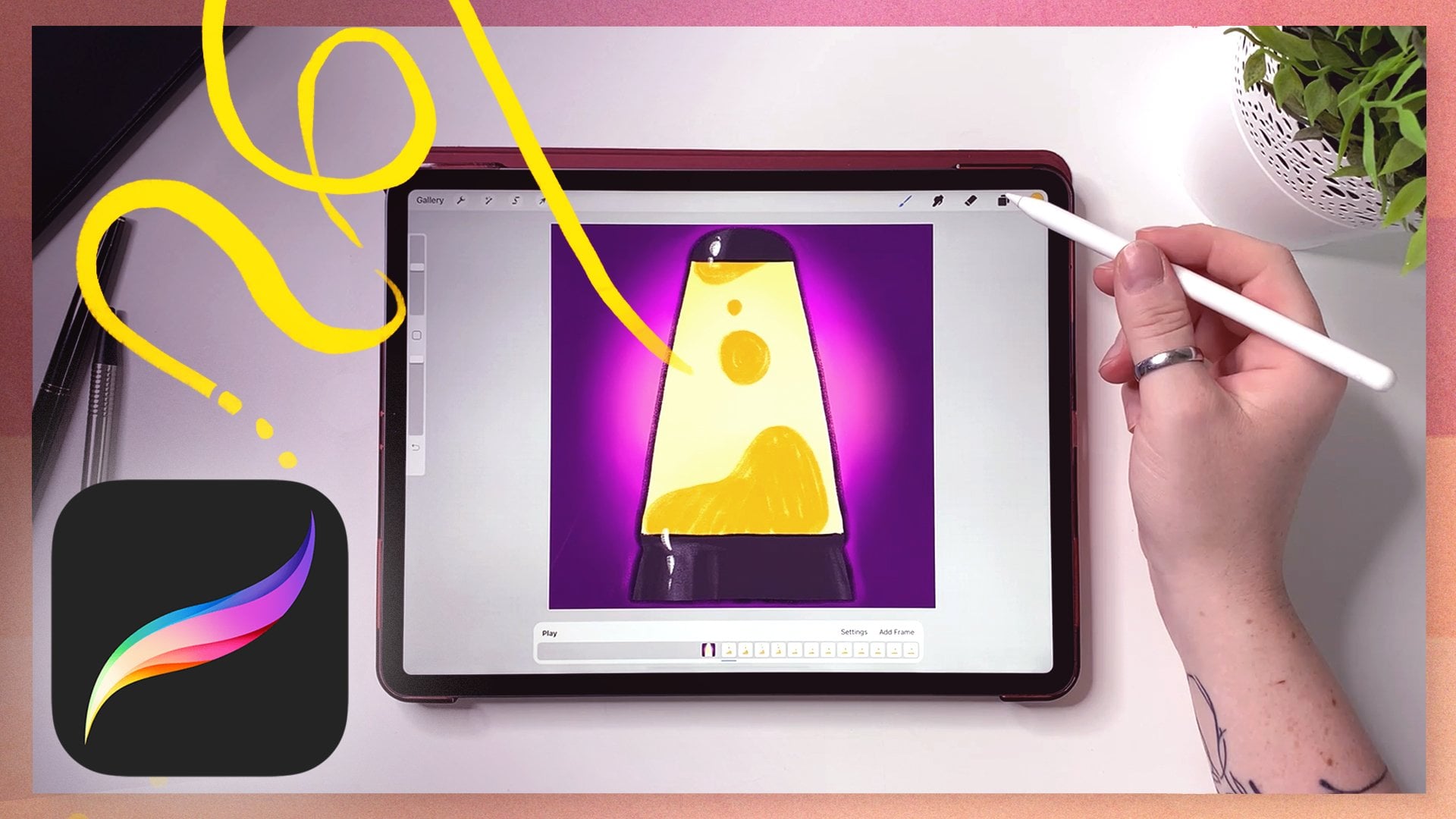
6. Structure of a File: As you know Procreate is our main
tool for this class, I chose it because it's
super simple to use and I enjoy being able to
work wherever I want. If you haven't prepared it yet, now's the time to
get out your iPad, charge it up and
install Procreate. I hope you have worked
in this app before, but just to be sure, I will walk you through it step-by-step and show you
how to set up your Canvas. On the top right, you can tap on the Plus to choose or
create a new canvas. Either pick one of the
prerequisites or create your own. I'm going with a
portrait format, which in my opinion, usually shows a character
illustration best. You can zoom in and out
with two fingers like this. On the top right are
brushes, smudge tool, erasers, layers, and
the color picker. Here you can adjust the size of your brush and the opacity. We're going to start
with an illustration, but since we want to
animate something later, let's set up accordingly. Activate the Animation Assist by tapping that wrench
on the top left, then tap "Canvas" and enable Animation Assist and the
little bar down here appears. The bar shows your layers, but as frames, right now, you only have one, but you can add more
by tapping "Add frame" or in the Layer
menu with a Plus symbol. Let's add the sketch to
the file, tap the wrench, then go to Add and select
"Insert photo" if you already have it on your iPad or take photo to directly
take a picture of it. Once it's placed,
you can re-size it with two fingers to
fit your needs or tap "Fit to screen" for the biggest possible view of the picture without cropping. I will now show you three
essentials you need to know so listen up carefully. First, the biggest part
of the illustration will be still so we can set this
generally as a background. You can consolidate
multiple layers into one frame by grouping them; swipe left to right
on the layers in the menu to select them and
then tap "Group" on the top. By tapping this frame
in the animation bar, you get a menu popping up in which you have a
couple of options. When you activate background, this group of frame will always be visible throughout
your animation, that's what we want right now. Secondly, we are not
yet animating anything, but I will tell you how to work with Animation
Assist now anyways, and we'll repeat the
essentials later on. Adding a frame will
create a single layer. Each layer will be visible
for a certain amount of time and by seeing multiple
layers in an order, the changes in them will
seem like a motion. This optical illusion can change depending on the
frame rate you choose. Our brain perceives anything around 10 frames per second
and above as a motion. You want to set the
frame rate accordingly. In the animation bar, tap "Settings" and
adjust the slider. The more frames, the more work, but the smoother your animation will seem when done right. I generally work with something between 12 and 24 frames per second but you can play with the settings later on
and see what works best. As mentioned before, multiple layers grouped
will form a single frame. This will be especially
useful when you have more than one element
that you want to animate. Assuming there's hair and also cloth going to be animated, you would probably
end up with a bunch of groups containing two layers. You have to keep in mind that
Procreate has a layer cap. The power of the app is
limited and you should keep that in mind when you're
creating your artwork. By tapping the wrench
and then Canvas, you can find Canvas
information and the layers. It will show you
exactly how many layers you have used and
how many are left. Thirdly, you have
the option to assign a foreground just like you
did it with a background, select a group or layer, tap it in the assist bar,
and select "Foreground". The contained elements
will stay always on top of everything
else in your artwork. This can be used for
overlaying elements like limbs or accessories that
are close to the camera. Please remember that the foreground cannot
contain animation. Instead, use it to
add simple shading, creative vignette, or for the aforementioned elements
that need to be in front. You should be set to get started now and everything else you need to know will come
in the lesson in which I show you how
to add the motion. For now, let's move on and
prepare the illustration.
7. Preparing the Illustration: In this lesson, I will show you how I approach my illustration and let
you in on what my style, decisions, and techniques are. Please note that this
might be very different from how you approach your
illustrations and artworks, but that is totally fine because there is no right way to do art. I'm going to point out a
few technicalities along the way that might
be helpful for this specific process. Let's go. You already went through the initial stages of
finding the right posts with me and I like to think about colors before
working out details. In the case of
this illustration, I drew this character
as a person with a somewhat okie-sh heritage. I associate with a certain
range of skin tones, mainly greens and browns, could also go into
purplish tones. Procreate has this
terrific tool for color harmonies in the
Color Picker window. Playing around with
it helps me to find the colors I want to
base my artwork around. Tap the writing underneath
colors to choose a preset. These are pairing
colors according to different rules
of color harmonies. Play around a bit and see which one fits your
style choices best. With green as a given, I decided to pair it
with orange and purple. I think it's important
to find a color that can function
as a focus point. This could be accomplished
by being the one that is the cleanest in
terms of saturation, the one that is featured most dominantly or stands
out in terms of value. No, I'm not speaking of the
most expensive color here. By value, I mean
how light or dark the color is compared to the
other colors in the picture. I like to check up on my value structure by looking
at my artwork in grayscale. To do that, fill an
empty layer on top with white and turn them all
to hue or saturation. This will help to see if your chosen colors are
well distinguishable and if they might be
drawing the attention to areas that you don't want
the attention drawn to. Now, I have painted in a rough color sketch
underneath my drawing, inspired by my reference board and initial color decisions. This will help me define
the final artwork because sometimes it's also good to see what you don't want
in your artwork. Since I like doing
clean line art, I'm now drawing over my sketch
in the next step to define the design of the clothing further and work
out my accessories. I'm a fan of embroidery, so I'm adding this to
the vest, very likely. Something as noisy
can easily draw the focus away and I
want to avoid that. Also, I have looked
at many harp designs and could not quite settle
on the one I love most, but when I was drawing it, it somehow turned
into a swan or duck. I love this. You can see that I'm flipping my
canvas every now and then. This can have different reasons. For instance, a better angle to draw a specific line or just to refresh my eyes and thus recognize odd elements
in my drawing better. There are to be animated
elements that are overlapping my figure go on separate layers so I can handle them better
along the way. Then I fill my
character's silhouette neatly with a solid color, this will make it
more convenient and quicker to color it in. By swiping with two fingers from left to right on its layer, I activate the Alpha lock. This blocks every part
of the layer that is transparent, so not painted. When I draw on this layer now, I will only color in everything
that is already painted, in this case, the silhouette. By keeping my color sketch
present in the background, I make my final decisions
for the design. I felt like the pens
were way too light, so I move the color more
into the purple range to fit the vest and highlight
the contrast between the white shirt
and the purple doublet. I keep the rendering
as simple as possible, but add in a bit of texture
and occlusion shadows; these enhance the shape
and give them more volume. The hair was a bit too red, and I shift the hue more towards brownish-orange and
add some highlights and shadows as well. Turning on my frame of animated objects makes them
stand out in their white, but it's good to imagine that these will be the
elements with motion, drawing the focus up
and framing the face. The preparation is
almost done now. I only have to separate the illustration onto
foreground and background. My sketch from before helps
me to find the right line. I duplicate the color
layer for safety, cut the other layer in half, and move the parts
accordingly into the right groups for
fore and background. Without the color duplicate, you can see a small line
where it was separated, so I keep the duplicate
on in the background. Lastly, I paint in the cloak
and the animation group, which has the
foreground overlapping. It used to be purple too, but I felt that was a
bit too much purple, so I changed its color to mirror the quill
on the other side. That's it. You see, I've made a couple of
design decisions that are appealing yet not overly
complicated to animate. I think one of my
pet piece is when you're watching an
animated show or movie, you can clearly
see which part of the background is going
to be animated later, because it's overly simplified. I think that's the reason why I like to find a middle way, not too clean, not too sloppy, not too rough, and not too detailed. But you need to define
your own sweet spot. Just let me remind you, every line you make might
have to be animated, so choose wisely my friend. Before finally animating go, I will give you a
quick breakdown of how animation actually works
in the next lesson.
8. Animation Basics: We're almost at the point where I
show you how exactly the animation is added
to the illustration, but first, a little crash course on how to animate
in this crazy app. In Procreate, the
frames are equivalent to the layers or groups
within your artwork. Think of frames as pieces of paper that each
holds a drawing and the drawing is a little
bit different on each new sheet like
pages in a flip book, just digital in this case. The frames represent a
moment in time and add to the illusion of movement when played in a rapid fashion. Procreate allows you
to manage, rearrange, or select the frames either by tapping on the
Layers button up on the right or directly in the animation assist
bar at the bottom. Hold down and drag to move a layer to another place
in the layer order, and you can see that it changes down in the animation
assist part 2. For a better understanding, the order of frames
bottom to top is in the animation assist
bar beginning to end. Unchecking a layer here will remove the frame from
the animation assist. You can also touch the frames directly in the assist
bar at the bottom. Hold down and drag will move
the frame to a new place. When you tap a frame, you get this little menu, which lets you delete
or duplicate it. But you can also change
the duration for it, which will function as a copy of this sheet of paper or frame that will remain right after its original for the amount
of frames you choose. In the Settings menu, you can change the
playback you get. I would recommend sticking
to loop for our purpose. With a slider for the
frames per second, you can basically adjust the playback speed
of the animation. You can also scrub through the drawings back and
forth by touching down on the animation assist bar and going left and right. There are generally
two different kinds of animation I will use: The first kind will add
a sense of life and motion, but without displaying movement. Confusing? I know. Here's what I mean. This here is what I will
call cooking animation. The result is
produced by drawing the same thing in the same
place for a couple of frames. Through the texture
in the brush, the layers will all look
a bit different and the final animation will have
a bit of a jittery effect. I will mainly use them
to add highlights on metal or other
reflective surfaces. But you can also use them
on other still elements in your illustration to give
them this animated look. For the other kind, the purpose is to create
a visible motion. While minding the
object's mass and volume, you change its position
from frame to frame. For convincing result, cushion the beginning and end of a motion by adding more frames. This will imitate speeding
up and slowing down. The more frames a segment
of movement is covered by, the slower the motion will be. Vice versa, a fast movement
is drawn in fewer frames. For a calm movement, without speeding up
or slowing down, you can spread out the drawings evenly through time and space. It can make things a bit
easier when you put down few key positions first between which you
then fill the space. For instance, draw
the first drawing, then draw the last drawing, and then find the
middle between these. The onion skin is a great
tool to help you with this. In the Settings menu, you can see two sliders for it. The upper one sets the amount of frames
you would like to see before and after the frame
you are on right now, and the bottom one lets
you adjust the opacity. It takes a bit getting
used to when first working with animation
and the onion skin. Don't get discouraged. To focus a bit better
on the current frame, use the onion skin colors, which will tint the
previous frame one color and the following
frame another. Now you should have a
rough general idea about what I will be doing in
the next lesson and how. Animation is not easy to
wrap your head around, so if you're having
issues, don't fret. You will be getting more
inside in the next lesson. I'm covering these basics
very detailed in my class, From Dot to Line to Mass: An Intuitive Approach to
Animating in Procreate. Go and check it out if you're
feeling a bit lost here. Please take all
the time you need. Sometimes it's just a matter of trial and error.
You've got this. Up next, finally, adding the animation.
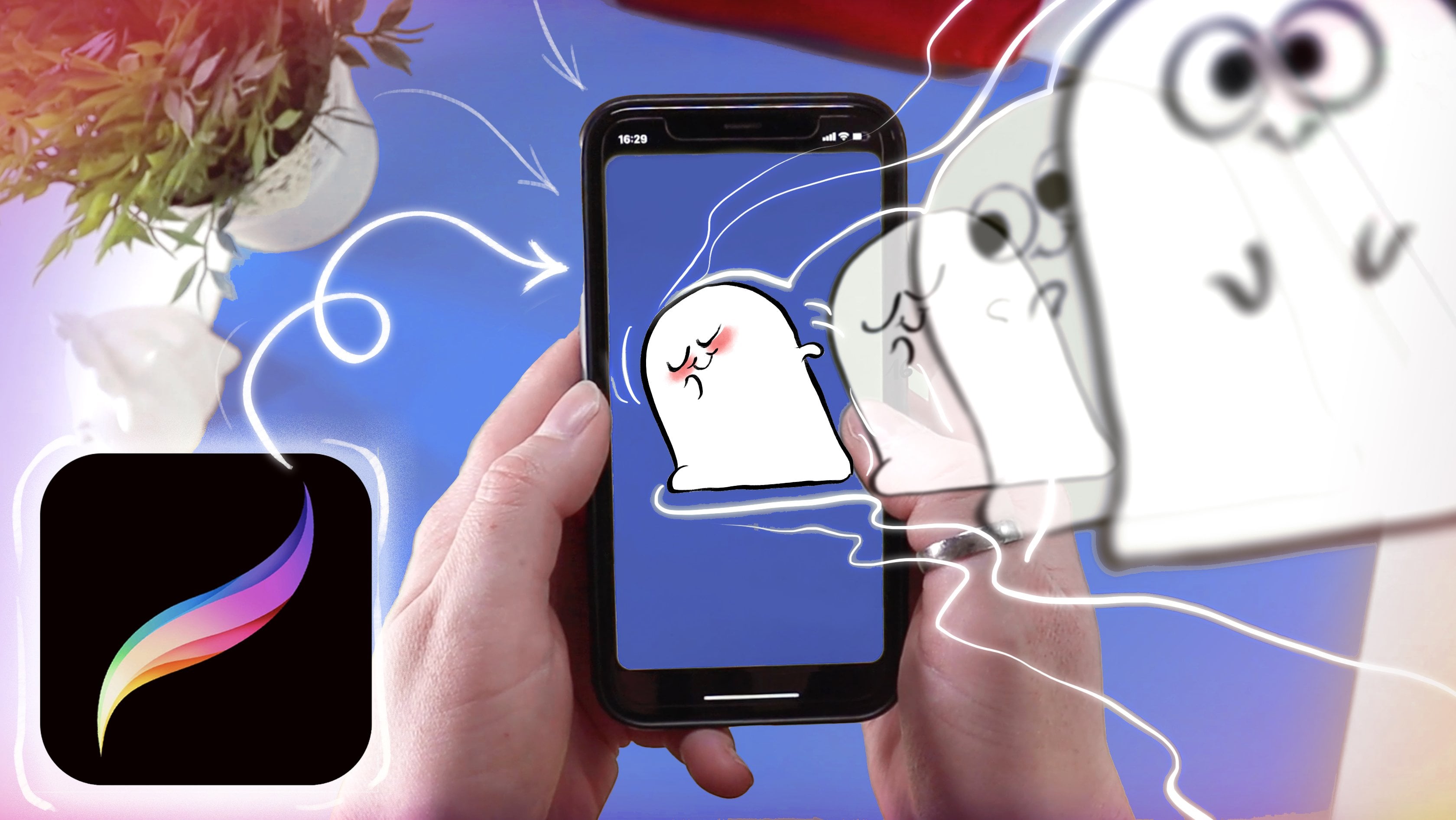
9. Adding the Motion: It's time to dive in. Now we're going to add animated elements to
the illustration. With a rough idea of what
I went to accomplish, I create a few visual
notes for my planning. Numbering the frames gives
me a better overview. Then I draw this
timeline for frame 1 to 12 and give each animated
element a letter. By doing this, I tried to visualize how I'm thinking about the animations and how I want the movements
to overlap in time. Having everything move
at the same rate with the same beats would
look a bit boring, so I'm trying to give each their own
timeline, so to speak. This is really just
for me to think about it and it will change
along the way. Then I start drawing my
little flame familiar. I use the pre-installed
light brush for it. You can find it in the standard
brushes under luminance. For natural elements like this, going straight ahead, so from start to end, frame by frame, is
a good approach. This keeps it natural and flowy. But I want it to loop nicely, so I put a duplicate of the
first frame at the end, which I will delete later. This helps to find
back to this shape. Just relax and keep in
mind that flames change, split, shrink, and
grow quite randomly. Mine started with
two of these spikes, which are each splitting off
and dissolving over time. There's constant movement. The flame phase is a cooking
animation for the most part. I add a blink in the
middle, otherwise, it's just the same
pair of eyes and mouth drawn over and over again. Then I begin working
with a braids. I start with an extreme pose
somewhere in the middle instead of going from beginning
to end straight ahead. This is called pose to pose. By defining the extremes
in your animation, it is easier to plan
your animation and keep the volume of the
objects consistent. What part is leading
the movement? What is dragging behind? These other things you
have to keep in mind. The light end of the braid is the last thing to follow
its motion so it will arrive last in the extreme pose and follow back as
the last thing too. Instead of just
returning to frame one, the last frame is overshooting
the first position a bit before turning into the outward swing
in the next loop. Once these essentials of
emotion are established, I can go straight from
beginning to end, filling in the gaps. Always keep in mind
the volume and shape of the element
that you're animating. If you squash it or
stretch it a little bit, it should always
feel like it has the same volume and weight
as in your initial join. The strands of hair on the head, I animate straight ahead and reverse engineer the
end for a proper loop. You can see the problem
with this though, as the hairs are shrinking
and growing a bit randomly, this is why you plan and construct your
animations first, kids. Next, I try out a variation
where instead of redrawing, I duplicate the quill
and ink bottle, moving them slightly
in each frame with the help of
the transform tool. But I ended up not liking it too much so I will not go into it. Trial and error folks,
trial and error. Animation tends to
feel different when it's colored in
instead of just lines. You might choose to animate completely without
lines even that tends to be much faster actually and has a
very charming look. But I am a person who loves tedious pedantic line drawings, so I have to do both. Once the base color
is filled in, the braids get some
highlights and shadows. I paint them with a textured
brush and keep it loose. I add animated highlights
to the metallic button and the eyes and drew a
rim light on the hand. These are just simple
cooking animations, so the same thing drawn in
the same place on each frame. If you want this to be a bit
more crisp and less wiggly, make a selection with a freehand select tool and draw into it with
a textured brush. Now I return to the quill and ink bottle. I was not happy
with the movement. It was a bit too
hasty and stiff. Instead, I focus on the quill by adding
cooking frames to it, I create a sense of
movement here as well, like slight wind touching it. I hope you could
follow my approach. If there's any need
for clarifications, please do not hesitate to ask. I'm here to answer all the
questions you might have. In the next lesson, I
will go into details for another very cool
animation trick.
10. Circle Trick: As you probably noticed, I did not add the animation
for the cloak yet. I will do that now and I will show you a really cool trick. You can apply this to anything that does
a flow of motion, like ribbons, open
hair, or a cloak. Let's do this. I have drawn one frame of the cloak that will be blowing
behind that figure. This is our starting point to which the moving element
will return in the loop. I drew this pretty freehand
and without much thoughts, and it got this wavy
line at the bottom. We will trace the
shape of this by adding a new layer
and then really sloppily joined in circles that follow roughly its
shape like this. The movement will be from
bottom left to upper right. Now, the trick is to pay attention to the waves
moving through the element. To keep check of that, we will use the circles
and move them bit by bit into the direction
our wind blows. This does not have
to be neat and tidy, but you might want to keep these guides on a
separate layer. This animation can work well
if you go straight ahead, but I like to approach it
with a bit more planning. I want the movement to be slow
and not distract too much. I decide to duplicate the
frames of the hair and such and move them up
ahead in my order. What that should
do is these will loop twice in the same time, the cloak loops once. This now has the advantage
that I already can see how many frames
I will have to fill, and it's easier to plan the
placement of the circles. The movement is nice and
steady into one direction. There's no moving up and down, which means the circles can line up along this
line like this. You can go straight ahead
and move the circles a bit to the up and
right in each frame. But since it should return to the first frame
for a clean loop, keep that in mind and move a
copy of it to the very end. This will allow you to reverse engineer the circles
from the end to somewhere in the middle of the second half to ensure is
somewhat even transition. Again, if you want to have
a passage move faster, move the guides a
little bit more ahead. The spreading should be bigger, if you want them to
slow down any point, reduce the difference
from frame to frame. For an even movement, keep the difference
consistent for each frame. Once you have these circles, you can draw the
element wrapping nicely around the
shapes of the circles, like in the first frame. The color blend mode for
the secondary frames in your onion skin settings
is your friend. This will make it
less confusing to look at all these
waves and circles. You can draw in the line as another guide just to keep
better check of everything. Or if you're feeling confident, just draw it on a fresh
new layer, you daredevil. I disabled the circles
now and go straight ahead from the beginning to
add the sides of the cloak. If you want to be
super thorough, adding in the circle
constructions for them as well would be very helpful
but as you can see, the freehand do winging
it style works too. Finally, I add in the
color to give the thing more weight and
voila, it is done. The circle check
can be applied to the four mentioned
things like ribbons, clothing, hands, or open hair. You might have to
adjust the technique and try around a little bit, but that is basically
just animation in general. Nice job. You can now add
some final touches like overlaying textures, some foreground elements,
shading, or a vignette. Then I will show you how you can export this beauty
in the next lesson.
11. How to Export: Whatever animation you decided to add to your artwork, now is the time to share
it with the world. To export an animation
with Procreate, tap the wrench and go to share. When you look at the bottom
where it says share layers, you can find different options
to export your animation. GIF is the most commonly
used format for the web and will loop
through your frames. Depending on the
quality you want, you can pick either
the max resolution preset or web ready. The estimated size of your
file is displayed at the top. Animated PNG is
basically just the same, will give you a bit higher
quality in general, but the files are bigger and it is not too
commonly supported. Animated MP4 makes a video
composed out of JPEGs, the file size tends
to be a bit smaller. Finally, HEVC also
gives you a video, but it can have a
transparent background. When you tap on your
format of choice, it will show you a preview
of how your animation will look like with the
frame rate you worked in. You can change the frames per second right here if you want. You don't really need
to change any of the settings unless
you would like to, for instance, export
the animation with a transparent background. Now hit ''Export'' in the top right corner,
and you're done. One last thing for
the next lesson, a few more examples and tips on how to
take it further.
12. Other Applications: With our main artwork done, let me show you a few more
examples for your inspiration. The more comfortable
you feel with adding movement to things that
have dimension and depth, the more you can, of course, impress your audience
and your mom. But it is also quite
advanced and there are other easier and
faster techniques to spice things up with. Cooking animation is
quite simple to pull off. You can add it to
literally anything and the artwork will
instantly stand out. This illustration features
cooking animation exclusively. Also, it portrays another
great use for it, typography. Are you more into lettering or like to add writing to your art? Add some subtle animation
with cooking effect. But maybe you are indeed more
ambitious than that and you really would like to do the frame-by-frame animation
with some real motion. In this version, I have
illustrated a Kenku wizard. The magic they possess
can be seen in the floating tone and
the wand spewing light. This first animation
is mainly accomplished by moving the book in
every frame a little bit. The light coming from the
wand is speeding up before exploding into a little
shower of sparkles. You can look at it with
the onion skin on to see where the frames
are closer together. This is where the
movement is slowest. When applying movement like
I added to the sleeves here, it's important to
plan your animation. First, look at how many
frames you would like to use and how fast the
animation should be. Put down the extreme
positions first and then fill in the
frames in between. Also, remember that things slow down when they
reach a turning point, so stagger the pictures
closer in these areas. In this artwork, the cloth
is a flowy movement, animated with almost no lines that does not use
the circle trick. This is more like a
cooking animation with the texture stripes of the clothing tricking
the eye into seeing a more complex
movement than there is. If you want to try this, keep the pattern
simple for the start. Remember the
direction of movement and think how things will fold. Think in all dimensions:
up and down, left and right, depth and time. I can't wait to see your animated fantasy selfies
in the projects gallery. Now, on to the last lesson
to wrap up this class.
13. Final Words: You made it. Congratulations. We covered everything from properly warming
up your hand and creativity over brainstorming
ideas for the illustration, to painting and
animating in Procreate. You have learned how you
can structure the file properly and make use of
the animation assist, that insights into my
approach to illustration, and also learned some
animation basics. This hopefully leaves
you inspired to create your own
animated self-portrait. We all hope to see
your work in progress and final artwork in
the class project. Please, don't forget to
leave an honest review for this class to help your
fellow students and me. If there are any open questions, please don't hesitate
to reach out to me and follow me for updates
on future classes. Thanks again for
taking this one. Until next time, bye-bye.
14. Bonus: Bloopers: Welcome to animation. Armed with an iPad and Procreate, we will dive. Spoiler. Learn how
to, to communicate. Aiming for. We're going to implement
this with the magical. No, we're taking it back
to start animating. Plus a bunch of new
that character. It gives us some freedom
to create and be inspired, and yet it sparks your creative with your design
decisions and preferences. Create your
illustration according to your preferences
and style decision. According to your design. However, I would like to encourage
you to also share your steps in-between
your work in progress and everything you are
feeling comfortable with. Let's begin by warming up our. In order to stretch
our creative muffle. Next lesson. Just adapt the process
to something that feels and works right way for you. If you want, share you
sticker or scan it too. If you worked on
paper until now, this is the moment. I chose it because it's super. I will give you a
quick bake down. A ribbon or a cloak. Let's go. One last thing before
we end the class. You got insights
and how I approach. My goodness. Please don't forget to leave an honest review for your term. I will answer them always.
 Vera Rehaag, Freelance Artist