Transcripts
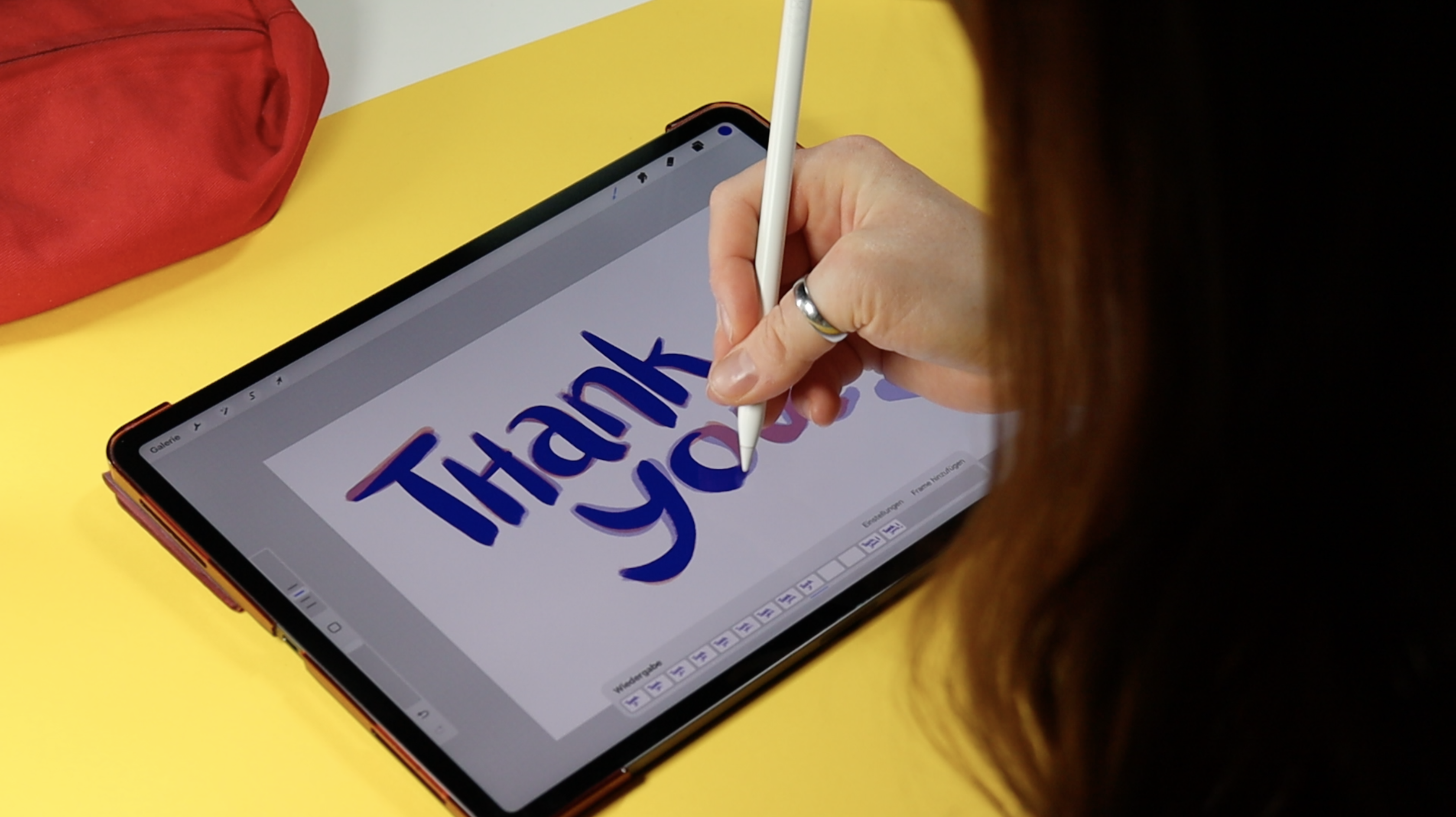
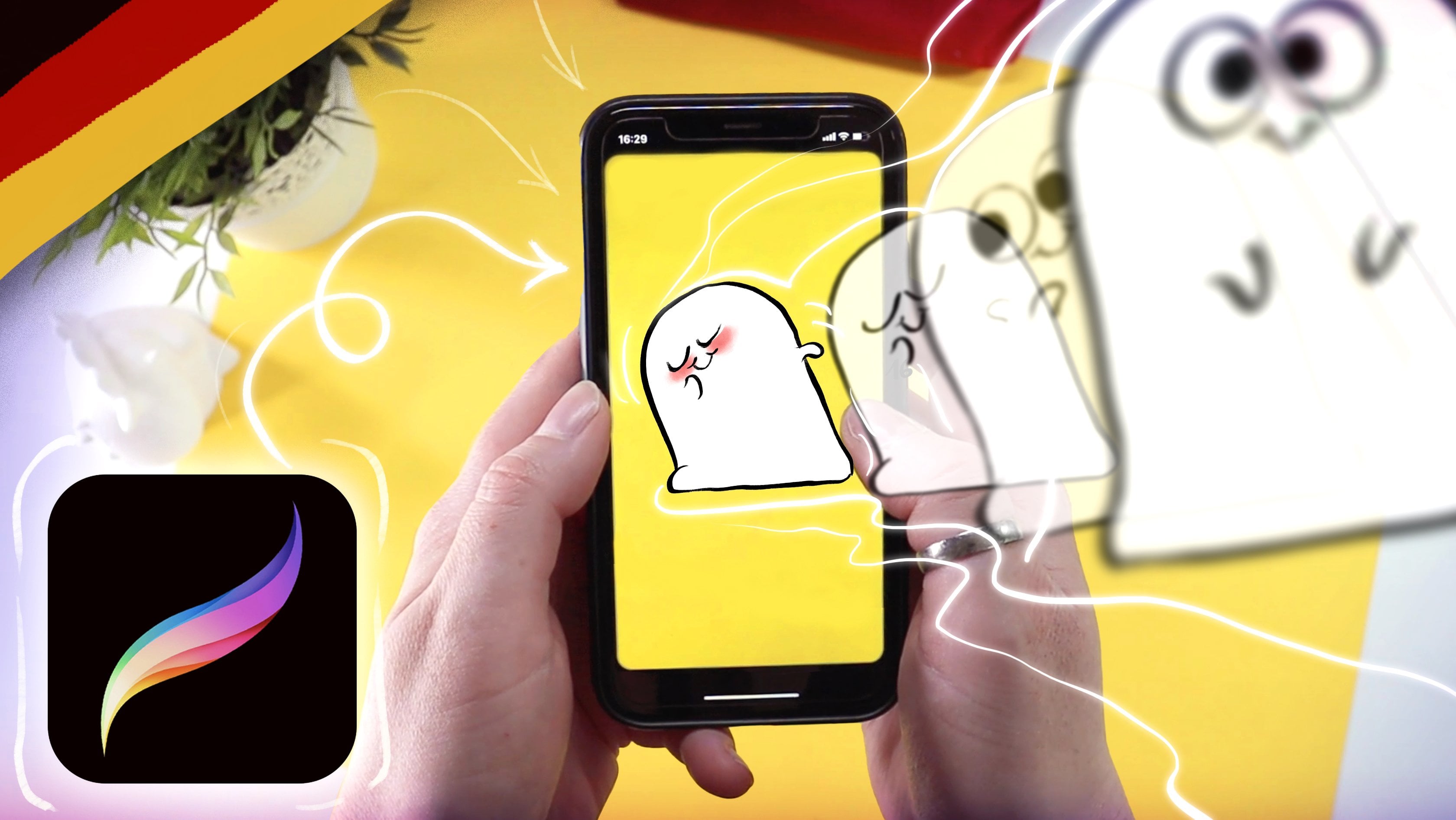
1. Class Trailer: Do you know that feeling? Sometimes you're looking
for the right GIF but you just can't find
something fitting your mood. Not anymore. Today you
will learn from me how to animate your own
animated GIFs in Procreate. Hello and welcome. My name is Vera. I work as a freelance artist
in Hamburg and I've been teaching on Skillshare
since 2019. My work is full of
little stories. These are often inspired
by the adventures I experienced as a laborer or in other role-playing
games and I just love how they helped me
connect with others. In this class, I
want to help you to express yourself with
little GIFs and stickers. Not only on social media, but also in private messages. With my guidance,
you will generate a couple of ideas which
you will transfer into sketches and then into final concepts for a bunch of
animated reaction stickers. In order to tailor these
exactly to your liking, I will inspire you with a few different
examples to help you understand what is possible. Should you have never
animated before? Fret not. That is also something you
are going to learn today. For the class project, you will collect
all your steps from first idea to final animation. It is so cool to
see how a couple of random scribbles turn
into a moving thing. I promise you not only your most perfect work
will be appreciated. No. We all want to see the
unfinished steps in-between and maybe not quite as perfect
as you imagined animation. These things are super inspiring for your fellow students and me. Also you can collect some
feedback and praise a long way, which will in return
motivate you. If you're an artist
and you like GIFs and stickers then this class might just be the
right thing for you. As I mentioned, you don't need any prior experiences
with animation. The only important thing is that you will need an
iPad with Procreate because the process is shown in and tailored to this medium. Besides that,
everybody is welcome. No matter if you're a
beginner or advanced artists, everybody will be able
to take something away from this class and
broaden their horizon. By the end of the class, you will not only have turned many great ideas into
animated little GIFs, you will also have
learned a great deal of things that will stick with
you on your way as an artist. So grab your iPad and
let's get started.
2. Class Project: [MUSIC] Are you
ready? In this class, you will be creating your
own pocket-sized animations. You can present your ideas and iterations in your
class project. I personally enjoy using little GIFs and stickers
to express myself, but ever so often I'm
missing something specific or something that
fits my visual identity. I decided to learn how to make my own little animations which I can use on social media, and since I'm assuming that
others might feel the same, I want this to be
the class project. You do not need any prior
knowledge about animation, but a little bit
of experience with drawing is of course
of an advantage, but it's not a must. You do need an iPad, Apple pencil, and Procreate. You can buy this app for around 10 bucks
in the App Store. I've linked their page
in the description. Before we jump into the topic, you will get an
introduction to Procreate. Also, a little info drop on 2D animation
and how it works, as well as a few technical
specifications you need to know when you're creating GIFs for
your class project. In order to spark
your creativity, we will do a
brainstorming session and collect ideas
for your stickers. In the next step,
you'll make sketches of those ideas and then we
will get to the juicy bits. I will show you a handful
of different kinds of animation and how
I approach them, so then you can choose and
apply them to your own ideas. By the end of this class, you will have created
at least five different animations and you will also know how exactly you can use them on
Instagram, for example. I created this class to be especially well-suited
for beginners, because I personally
was very intimidated by animation for quite some time. I hope I can take
away this fear of it. Then, it is in your own hands
to share your process with us in order to feel
accomplished after this class. You can upload any and
every step in between to the gallery so we can see your
process and your progress. I'm here to support
you along the way, and I'm very excited to see your project and the ones
of your fellow students. Please don't forget
to have fun. [MUSIC]
3. Introduction to Procreate: Before we can
really get started, I want to give you an
introduction to the app so that you can always understand
exactly what I'm doing. If you're already familiar
with Procreate, great. I'll still go through all the basic core
features that will be relevant in this course so
we are all on the same page. This is what Procreate looks
like when you open it. In the gallery here, you can see the preview of all your projects or the pre-installed artworks if you have freshly
installed the app. At the top-right you will
see different options all of which will
start a new project. Let's just start with
an empty document. Tap the plus. In the
menu that now pops up, you can choose presets. For me there are a few more because I have saved
new ones over time. The size of the Canvas is not so relevant for the testing now, you can just choose the
top one or like me create a new Canvas by tapping
this button at the top. You can set any size here. I like to start with
a square format. The more pixels your Canvas has, the fewer layers you can use. Unfortunately, this is
somewhat limited on the iPad and also varies depending on
the model you're working on. Since I want to create something
for digital use today, I'll make sure the color
profile is set to RGB. This type of profile enables
the full spectrum of colors that the iPad and
any other display can show. CMYK is used for things that
are to be printed out later. Accordingly, the colors
are somewhat more limited. So beware because if you have created a file in one of
the two color spaces, it can no longer
be changed later, you can only change
the profile within the RGB or CMYK color space. You can leave the rest of the presets on the
left as they are. Now we are in the document
and have our Canvas ready. You can zoom by pinching
two fingers together. The most important
functions can be found in the menu bar at the top and
at the edge of the screen. This is where you go
back to the gallery. The wrench shows you various
actions and settings. You can use the
magic one to make adjustments that
deal with colors, effects, and sharpness,
among other things. This helix loop S
symbol thing here is the selection tool and the
arrow is the transform tool. You will also find
brushes, smudged fingers, and erasers on the
right and of course, the layer menu and colors. These sliders are on the
left for me because I'm right-handed but of course if you draw with your left hand, you can change that. The top slider changes the
size of the tool you're working with and the bottom
changes its opacity. What I think is particularly
cool is that you can set your consistently used
settings for both with a plus here so you can
find them again quickly. I'm not sure if this is possible with just the original presets, but you'll probably see
me doing this as well. A three-finger swipe from top to bottom opens the
copy and paste menu. A tap with one finger opens
the quick menu for me. You can find gesture
controls under wrench and settings and customize
everything there to your liking. Also two finger
tap undoes a step and three finger tap
redoes an undone step. Finally, I'll show you how to prepare your
file for animation. Tap that wrench and then Canvas. There you will find a slide button for
the animation assist. When it's on, the animation bar appears at the bottom
of the screen. I'll explain exactly what we do with it in the next
lesson. [MUSIC]
4. Animation 101: [MUSIC] Our file is
ready to animate in. But what exactly is animation? We call animation anything that creates the illusion of
movement in a visual medium. Individual drawings in which
something changes from picture to picture are played back in a
quick succession, and our brain interprets
these changes as movement. This works best when
the number of frames shown is over 10 per second. Everything below that can still be recognized by our eyes as single images and thus make
the illusion less convincing. Let's check what frame
rate our file is set to. To do this, tap Settings in the animation
bar at the bottom. The menu here shows you
different aspects of your file. At the top, you can select
the type of playback. Infinite is, I think,
self-explanatory. The animation plays from
start to finish over and over until you stop it. Ping-Pong will play it
from beginning to end, and then from end to
beginning, and so on. One Shot plays the animation through once and then pauses it. Next, you will see a slider
for the frames per second. This goes from one picture, or frame per second, up to 60. You don't really need
the other settings yet. I'll get to that later. You can always change the frame rate while
working on your animation. Keep in mind that the higher
you set the frame rate, the faster the
animation will play, and the more drawings
you will have to make. It's always a balance between, this looks super
smooth and cool, and ****, why did I put
so much work on myself? I like to start with
a frame rate of 12, and sometimes in the process, I find that other
ones might work better. That's totally fine. Animation is a constant
learning process, and you'll get a
better sense and understanding of these
subtleties over time. Now, you should have a basic understanding of
animation and how it works. In the following lesson, we will look at the framework
conditions that are important for our planned
class project. [MUSIC]
5. Framework Conditions: [MUSIC] For the class project, the goal is to
animate a handful of personal gifts that you
can use as reactions. However, I would like to not only be able to use them
in private messages, but also use them on Instagram, for example, and share
them with others. Here's the difficulty, these animations will mostly be viewed on a cell phone display. This means that they are not particularly large
and must function well and remain readable in there correspondingly
small size. Readable not only in the sense of if there's writing in it, readable in the sense of
you take a look at it and recognize what it
is without having to concentrate on it
for half an hour. That doesn't sound
particularly dramatic. But the fact is it's
actually much more difficult to present something reduced and too overloaded
with more bling, bling and visual information. Here are a few tips on how to
keep your design readable. The shapes of your animation
should be clear and simple. If you look at this example, you can see that it
looks nice and large. One recognizes everything, can differentiate the forms, and read the movement well. But as soon as we
look at it in small, it turns into a brown mass and you can no longer
tell what's going on. So what can you do? I tried to reduce the
curves and stripes. The fewer inflection
points as shape has, the clearer and
simpler the design, the easier it is to recognize
even at small scale. After all, you can see
all the details anyway so why not make it easier
for yourself and your eyes? I'm not saying that
details are stupid, just that they don't do
much good for this purpose. The coloring of the
individual elements falls into a similar pattern. The more different the
colors of the shapes are, the easier it is
to recognize them. That doesn't mean
that you shouldn't combine harmonious colors. Just keep in mind
that every hue has a brightness value and the
more different they are, the better the
contrast can be seen. You can use this in
a very targeted way and use contrast to focus on certain things and
push others more into the background by
pairing similar colors. To recap, make
conscious decisions and choose the shapes
and colors with care. The simpler you can
communicate your idea, the easier it will be to see in small and work with contrast in colors to support
your design. Now, you can grab
your pen and paper or your iPad because the next
step is brainstorming. [MUSIC]
6. Your Brainstorming: [MUSIC] Now, let's get started. Let's brainstorm
together and write down exactly what we want to
do for animated gifs. You're of course
welcomed to use my ideas and make your own variation
of them in the process. Then, I would like to invite you to do your very own same. Here are a few questions
for you that can help you discover and define
your own creative voice. You can also find them as a
worksheet in the resources. Let's just start
with what we know. What types of gifts are
your favorite to use? Are they small pictures
with creatures or animals, maybe speech bubbles,
arrows, squiggles, confetti, or what
exactly did you miss? Now is the chance to
fill in those gaps. Just write down everything
that comes to your mind. Next question, what statements do you want
to make with your animations? Are there specific thoughts
that come to mind? Statements you generally
want to make more often, but for which you just never found exactly the right thing? A gift that says, hey, I like you, but you're
really annoying. I'm not here to judge
you just write it down. Is there a certain vibe
you would like to radiate? Are you more goth, or floral and colorful, cute and cuddly, or totally weird and messy? Take notes in the way that
makes the most sense to you. Maybe concrete ideas for designs are already
crystallizing in your head, or you have even
written them down. In the next step, we
will define these ideas in more detail and make
sketches for them. [MUSIC]
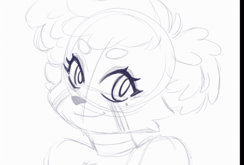
7. Sketch Your Ideas: If you already had
super concrete ideas in the previous lesson, great. I will show you how I
approach my ideas now. But actually before I do that, I will tell you something that might be relevant
to you as well. Since I plan to use
these animations in my stories on
Instagram, for example, and make them
accessible to others, I would like to be
able to access them within the app via
the GIF stickers. To do this, they must be
uploaded to giphy.com. You must also have a verified
official artist account on Giphy so they
can be accessed, but that is actually
really easy. You can find the link
to it in the resources. The most important thing in order to get your
account verified is that you should have at least five GIFs
in your profile. If you have goals
similar to mine, it would be great if you
tackle five different ideas. Back to the topic. These other designs I
would like to develop. I make some sketches
and notes that make me realize
what my idea was. Because sometimes I tend to forget something like
that in the process. These sketches start out
very roughly for me, not very pretty, but they
serve their purpose. Please remember that my way of working is not
the non plus ultra. Maybe your sketches
already looked like finished works of art or do you always want to sketch out as many different variations as possible or quite the opposite? The first draft that's taken. Do you maybe work in
color from the start? Whatever your process
is it's important that you work in the way that
makes the most sense to you. I can easily divide my
designs into categories. Text, no text and boiling
animation, moving animation. Sure, everything is moving, but I lack better words. In the next few lessons
I'll tackle the drafts in visually and show you the
implementation in detail. That should make those
vague categories a bit clearer and, of course, also help you to
create your own animations. By the way, it doesn't
hurt to simply collect stickers that you like
as reference material. This is the best way to
see what examples exist, what works well,
and what doesn't. Remember to present your
sketches and notes in the class project so we can
take part in your process, and then we'll start animating in the
following video. [MUSIC]
8. Animating Text: [MUSIC] We have completed
our preparations and it's time to move on to the
actual animations. In this lesson, I will show you different ways to
make texts move. Get your iPad and Procreate
ready and if you want, you can also download my sample files for this
and the next lessons. This way you can take a
close look at them in Procreate and maybe better understand what
I'm doing exactly. The first animation
technique I want to show you a simple yet effective. I call this style
cooking animation, because it looks a bit like
bubbling water in a pot. I first heard this term
from Michael Ralph, credit to him make sure to check out his great work
link in the resources. For a cooking animation, you draw the exact
same elements, or letters in this case, in the exact same position for a handful of consecutive frames. Repeat this for at least
four frames and you're done. Since it can be a bit
complicated to jump back and forth between the
pictures all the time, I recommend using the
onion skin settings. In addition to the image
you're currently working on, the onion skin also
shows you the images before and after them
as ghosts frames. You can use the settings
at the bottom of the animation bar to set
how many that should be. I mostly use one, or two and set the
opacity to 40-60 percent. You can add grade variation to your cooking animation
with the brush you use. For example, if the brush
has a lot of texture in it, then your stroke will vary more, and the simulated movement in the letters will
have more impact. You can choose how carefully, or wobbly you want
your strokes to be. More care makes the
effect more subtle, less care makes it
more noticeable. Of course, you can fill as
many frames as you want. I would only recommend to
not use less than four, it just looks a bit
more interesting. You can also play with colors. Make the letters swap colors, or send your whole
text to the rainbow. Get creative and
just try it out. You have nothing to lose. Remember to watch
the animation in very small format
during the process. This way, you can check to see what it will
look like later. It's best to pause here and take five minutes to animate your
first text in Procreate. Just try it out. Otherwise, let's
continue straightaway. Next, I will show
you how to grow your text letter by letter. I recommend that you
write out the text once so you know how it should
look like in the end. You may have already done
that in your previous step. Then you can just import it. Once you know what
you're working towards, this animation is
easier to tackle. In order for the sketch to not annoy you while you animate, that you still always see it, you can define it as
a background drawing. For this, the layer must be at the very bottom of
the layer menu, so right above the
background color layer. This will have it appear as the first frame
in the bar below. Tap on it to bring up the Frame Options and
enable background. If you scroll through
the frames now, the sketch will remain
always visible and will also not change through
the onion skin settings. I want the writing
to appear gradually. If you're super structured, you can create frames
in preparation in which one letter is added
one after the other. Those are the key moments
of the animation. Now start in an empty frame
before the first full letter. The animation shouldn't
take too long when in place and depending on what frame
rate you're working in, you'll have more or
fewer frames available. I just suggest we start
with three steps for each letter between none
and letter complete. Also, leave one
frame empty before the first letter to insert a small pause into
the animation. In the first frame, we only see a dot or a few light dashes. In the second frame, the letter grows out a
little more clearly, but it only is half visible. In the third frame, it's almost fully
there, but not quite. The next frame should now be the previously drawn
finished letter. For each following
letter you do exactly the same with the
difference that all the letters
that have already grown are also
already in the frame. You can choose to copy and paste the finished letter
one at a time. This will keep it still a
bit stiff after growth, or you redraw the letter at full size for each frame like
in the boiling animation. Again, you can play with the cleanliness of the
strokes as much as you like, and you're also
completely free to design the way the
letters appear. I look forward to see your
ideas in the project gallery. In the next lesson,
we'll apply what we've learned to abstract
shapes. [MUSIC]
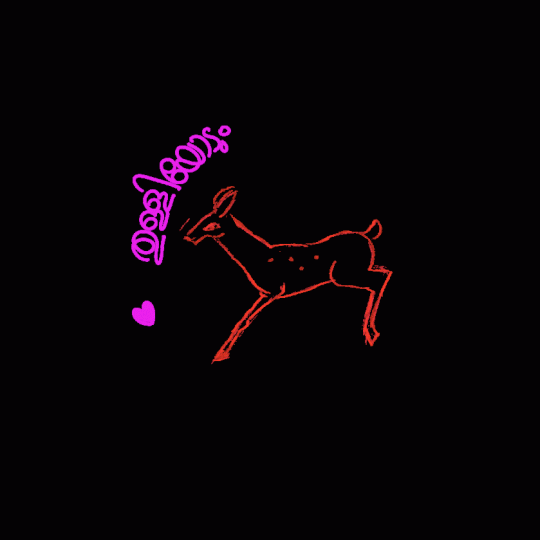
9. Animating Shapes: Perhaps you didn't include
any text in your ideas? Well, don't worry. That
doesn't really matter. I hope you still paid attention to the
previous lesson though. What you have learned
there can also be applied to non-text. Let me show you how, and I even have a few extra
tips and tricks for you. I know it's a bit cheesy, but I like hearts and stars
and things like that. Dear with it. If that's not your style, you can use any other
shape you like; triangles, skulls, I
don't know what you like. This animation will grow multiple shapes and then
burst like soap bubbles. I start again with
a basic drawing and set it as the background. I don't want the three hearts to all grow at the same time, but rather overlap, so to speak. So the next one starts appearing before the previous
one is fully there. The process starts at
the bottom and goes up. I start with an empty
frame, which stays empty, and then start in a new empty frame with
a small dot in it. It may have a bit
of a heart-shape, but given the size, that won't really matter. Now at three more frames, the last one shows the
shape in its final size. Also in frame two of
heart one I start the next heart in the
same way. But wait. Sometimes you have to correct the positions in the process
or make other changes. This also works
even if everything happens in the same
frame on the same layer, but it's easier to accidentally change something that
was already good. That's why sometimes
it's good to have different elements
on different layers. However, the layers are currently equivalent
to the frames. If you add a new layer
here in the menu, a new frame will appear
in the bar below. However, you can combine multiple layers into
a single frame. Select the layers by
swiping from left to right. The layers now appear
with a blue highlight. A new button also appears at the top of the menu; Gruppe. Tap on it and your layers will be moved into a sub folder. At the same time, these two frames are
combined into one. Back to the hearts. I had just started
the second heart in the middle of the
animation of the first. Also with the layers
and groups technique, I could now easily
change my mind about the timing and move the
heart two layers in the groups so that this
animation starts at the same time as the first or
frame later, or maybe two. To move layers, all you have to do is
hold down on them for a moment and then you can drop them in a new spot
in the layers menu. I now have my three hearts. Since I want all
three of them to be seen at the same time. I kept the first
and second cooking. Next, they should
burst and once again, one after the other. Not all at the same time. Structurally, I approach it
in the same way as before. I start with Heart 1
and let it grow a bit. In the next frame,
it almost bursts. Do you know these slow-mo
videos of bursting water bombs? The shape persists for
a split second before gravity takes over.
I'm not a scientist. I just hope you
know what I mean. I just want to say
that I'm still leaving the form
of a heart there, but a little bit chunky. Like it burst. In the next frame, the
leftovers are scattering, and in the following
they're almost gone. The wider the gap between the positions of
the chunks look, the faster it will
feel when playing. You can memorize
this in general. Greater distance; fast movement, smaller distance; slow movement, because it takes more frames to move something just
a tiny bit per frame than when there's a
big change in every frame. I also apply this process to the other two hearts
until they are all burst, and I have a finished animation. Ta-da. I keep checking
back during the process to see what it looks like in
small-scale, less is more. I look forward to seeing your progress in the
project gallery. The following lesson will
be a bit more complex. But don't worry, you already learned the most
important things. [MUSIC]
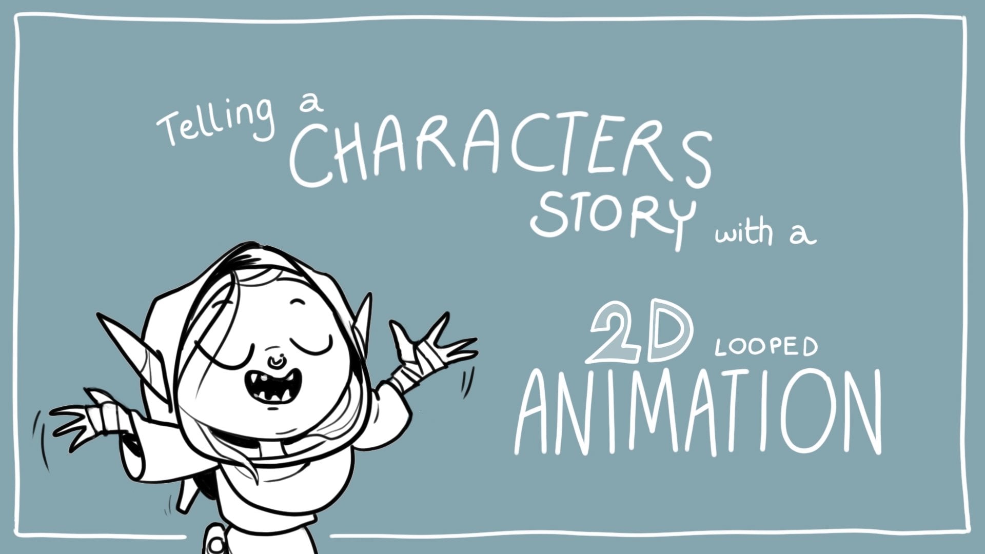
10. More Complex Animations: [MUSIC] In this lesson, we'll tackle animation
that tell a little story. In this, I focus on a specific emotional
response to be communicated. But I will try to give you
a general understanding of the technical elements so you can apply them to
your own animations. As before, I start with a sketch that I put
in the background. This shows the most important key poses for the animation. The transition
between the poses is of course, particularly
important. This is what tells the story. If you represent the movement
of a body from A to B, then it usually describes an arc that can be flat or wide. The important thing
is that you do not connect A and B with
a straight line. This can work in
exceptional cases, but in most cases it would
disrupt the illusion. I started my animation
with the first pose. For the implementation. I chose a thick brush
with strong strokes. This reminds me to keep
the animation simple, to keep it readable
in small for. Depending on what you're animating and what
your style is, look at your design and ask yourself if there's
anything you could reduce to get more
readable results and less work for yourself. But don't worry, you can always
change things in-between. It is never too late. I can now work my way through
frame-by-frame because I've established the sketches for the most important
first and last pose. I know what I'm working towards. In some cases, however, it may make more sense to first define the critical
transition pose as well, and then jump back and forth between parts of the animation. This process ensures
consistent shapes, masses, and connection
points in your design. Because these things
play a role in the believability
of the animation. Basically convincing the
viewer's brain that it is actually a movement and not
just individual drawings. Since that is a
bit more complex, I will show you how I do it. If you want to connect two poses with an image in-between, you need to find the middle between drawing A and drawing B. This can be tricky sometimes. Remember to use the onion
layers or slide animation back and forth to see the
frames as motion and context. Don't look at the
entire drawing at once. Often, there are
individual elements that change independently
of each other. Take the time to understand how the things will move through dimensional space and always
remember the arcs of motion. Animation takes
practice, so don't be frustrated if it
doesn't turn out the way you want it
on the first try. With some elements,
you can actually see quite easily how
they shift from A to B and whether they
overlap and it can be quite easy to find the
center there and draw it. As you can see, there's a large one-way movement
intended in my artwork. In order not to make it look
too stiff and mechanical, I put a so-called
anticipation in front of it. This is a counter movement
designed to build up energy to move the body in
the opposite direction. Like bending your knees before jumping or pulling
your arms back. When you throw something. It adds a spark of reality
to the movement and gives the whole thing a
little bit more juiciness. The rest of my animation
is filled by me with poses that close the gap
to the final position. How many there must be is at your own discretion and depends on the
nature of your idea. I can only recommend
that you play the animation from
time to time to get a feel for whether it meets your needs and adjust the
frame rate if necessary. You can always disable
or delete frames, add new frames and
modify existing ones. Whether your sticker
animation is complex, three-dimensional movement, or a bit more graphic and flat. You can always spice it up
by exaggerating the change. If a shape is squashed, just squash it a little more. If a movement describes
an arc, make it bigger. Hold poses for a frame
or two longer to give the viewer time to
understand what's happening and if the
movement is fast, make it really fast. But also break the rules. Say, they've had just
because you claim something doesn't
mean that it's true. I'll try everything myself. [LAUGHTER] Because there is no right way to
express yourself, your experience, your style, the way you draw
animate are unique, you should celebrate that. Depending on how you
approach the animation, you can now give it color. Use the group frame
function to put color behind each
line and new layer. Or use the color drop to fill your lines
on the same layer. When you swipe left to right
on a layer with two fingers, you activate the Alpha
Lock off the content. With this on, you
can easily paint over parts or all of your lines. I hope that was all
understandable. But if you have any questions, you can ask them
in your project or you can open a new
discussion in the course. I see and read all your posts, so don't hesitate to contact me. If you share your process, I can give you feedback and it might save you a
lot of frustration. [MUSIC] Next, I will
show you how to prepare your files for export and how to save them
as a gift. [MUSIC]
11. Export Animations: As I mentioned before, I want to use my GIFs
on social media. Therefore, the animations must meet certain
framework conditions. I'll guide you through
the conditions needed to be met for Giphy.com. This is the website that
Instagram, for example, accesses if you want to
use animated stickers. Other sites might have different terms, so always
check the guides carefully. So we have to meet the
following conditions before we start the export. Stickers need to move. You need at least two frames but these two frames
are actually enough. Stickers must have a
transparent background. We can easily ensure this by disabling the
background color. If you can see the grid
pattern in your file, then that is correct. In the first frame, at least 20 percent of the
area must be transparent. If you have implemented
ideas similar to mine, that shouldn't be a
problem at all, otherwise, add a new frame at
the beginning and see how best you can
meet this requirement. Playback must be
set to infinite. If your animation is
based on ping-pong, you can duplicate each frame and arrange them in reverse
order at the end. A bit complicated but
not a deal breaker. I'm not 100 percent sure
whether that's necessary or if the ping pong setting also works because it's
still loops infinitely. For resolution, Giphy recommends one that
is a multiple of four but ultimately, it
doesn't seem to matter that much what size and
resolution you upload, the only restriction is that the maximum file does
not exceed 100 MB. Let's go to export. Tap on the wrench
and go to share. In the lower section, there are different
options to share layers. That's Procreate's
odd way of saying, this is going to move four
times out of six, at least. We need our file as a GIF so tap on it and then
export window will open. On the right side, you
can see the playback and display of your animation
as it will be exported. You can change your frame
rate on the left if you want. There are also three sliders. I have to admit that I couldn't really find a good explanation for dithering and color
pellet per frame. Just try out what and if
they do something with your animation or
just leave them off. The third is important, however, and you should
definitely activate it. Play around with the
Alpha threshold slider. Alpha is the transparency
in your animation and the threshold determines when
a stroke turns transparent. Just see what looks best. It varies a lot depending on how your animation was created. Now you can check again whether your animation exceeds
100 MB or not. You can see that up here. If everything is good, you can tap Export
and you are done. If your file is still too large, you can do the following, go back to the gallery, swipe your file's preview from right to left
and select duplicate, then go into the file,
tap on the wrench, and then on canvas. The top button, Crop and Resize allows you to reduce
the size of the file. In settings, you can turn
on re-sample canvas to keep the aspect ratio the same then change the
numbers at the top. If a file is still too big, you can also reduce or
flatten the groups to, well, reduce the amount of
layers and that's the size. I hope everything went well and you have your GIFs ready. In the next lesson, I will show you how
you can use them now.
12. Using Giphy: You should now have a
handful of awesome, personal, animated stickers. If you transfer them
to your smartphone, you can easily send
them on messages, on WhatsApp, for example, by
uploading them like a photo. If you want to use
some on social media, I will show you how to
do that via Giphy.com. First, you will have to
register on the website. In order for your
animations to be found, you also need an artist account. For this, you need
a profile picture as well as relevant
links, for example, to your social media
accounts or your website. Then of course, the
most important thing, stickers and GIFs. You can upload them by
clicking on Upload at the top. The things we animated today qualify as stickers because they have a
transparent background. Just select the
file to upload it. The next step is to add texts that are as descriptive
as possible. So use words that
reflect the content well but no more than 20 or
Giphy will complain. Then you can tap Upload to Giphy and the sticker will be
added to your profile. Once you have uploaded something between 5 and 10, your
profile is ready. You can now apply for
an artist account. This may take a while,
but don't worry. If you follow the
guidelines, it should work. Then you can search your Giphy
name in Instagram stories for example, or the text that you have added
to your stickers. Tada, there they are. The great thing is that now, your friends can also use them. Excellent. Now, it's time
to share your work with us in the Project Gallery before I have a few
final words for you.
13. Final Words: [MUSIC] Yay, you did it. Thank you for being here. Together, we covered
basic knowledge about Procreate
and 2D animation. We brainstormed, we
sketched, and animated, and finally also learned how to export GIFs to use
them on social media. If there's one thing
I hope you take along with you on
your artist's journey it's that animation isn't that difficult and it's
actually a lot of fun. Now please don't
forget to show us your finished GIFs and the
steps to get there too. I'm really looking forward
to the great result, and I'm so ready to give
feedback and praise. Last but not least, I would also like to ask you
to leave a sincere review. This will not only help me
to improve future courses, but also help
potential students to know what to expect
in this class. If you're really in the
mood for animation now, you can find even more animation
classes in my profile. If you like, please follow me on Skillshare and other
platforms to stay up to date. Thank you and see you
next time [MUSIC]
 Vera Rehaag, Freelance Artist