Transcripts
1. Course Introduction: Hello, and welcome to
Power B Crash Course for Quick report creation. The goal of this course
is to provide you with all the necessary
knowledge needed to build professional reports in Power B by utilizing all
of its features. So brief introduction
about myself. My name is Abatasia and I'm a Microsoft certified
Powerby developer with over 11 plus
years of experience. I have worked with many
projects in Power BA. In this course, we'll
be learning PRB Desta, Power B service,
and Power B mobile. So these are all the
three components of Power B and we'll be
learning all these three. This is a five crash course but with a lot of information. We'll be connecting to various
kinds of data sources. We will transform the
data, modify the data, and also we'll see
how much Cores works, how data gets
compressed in Power B, data modeling,
what is the use of **** and how to create
the dx calculations. And some of the features
like Canvas settings, all the charts in Power BI, custom visuals, hierarchy
and drill down, drill through,
edit interactions, tool tips, conditional
formatting, align page view, format painter, bookmarks, including
buttons, shapes, images from selection, new parameter fields, sync slicers, custom visuals, visual
level features, performance analyzer, appli
and clear of slicers. And as we'll see
some of the topics related to A and
ML like U and A, decomposion tree,
smart narrative, column from example,
and many more. And also we'll see
after publishing the report to Power
Base service, like how to create Workspace,
how to assign the roles, how Power Query works
in Power Base service, how to create the dashboard, role level security, how to install the gateway
and schedule refresh, how to share the reports with end users or clients, alerts, subscriptions, and how to create the app in order to share
the reports or dashboards. And also we'll see Powerbmble like how to consume the
reports and dashboards. By end of this course,
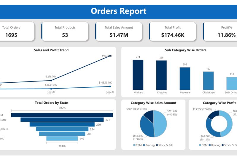
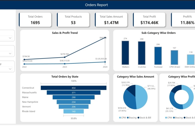
you'll be able to create your own professional
report like this. This the power bits up. You'll be able to create the report like this after
the end of this course. Who can take this course? So this course is ideal for anyone looking to get
started with Power B, including managers
and stakeholders, press are beginners, professionals looking to
enhance their data and skills. Anyone planning to
start their journey and seeking a quick hands on introduction to
your key features. So no prayer experience
with Power B is necessary. This course is designed to
help you hit the ground running and quickly
gain essential skills. So some of the best practices
for successful learning, take notes on
important concepts, practice along with me, utilize all the documents
in the resource section. I highly recommend utilize
the resource section where I have published all the
documents for this course, including the applied steps that has been used
to clean the data in Power Creditor and formulas used to create the
provisional report. Additionally, I have
included a handbook that covers all the explained
features in PowerPA. This was all about
course introduction, thank you, and see you
inside the course.
2. Power BI Introduction: Hello and welcome
to this course. Now, we will see
some information about Power BA.
What is Power BI? Power B is a self service
business intelligence platform, which includes both desktop
and web based applications for connecting modeling
and visualizing data. Now, what is meant
by self service? Self service means if we
can able to do our work, with point and click
or dragon drop, that is called self service. What does that mean? Now, I'm
just pointing this visual, just clicking this, and I'm dragging some information
into this visual. Done. With the help of point
and click or Dragon drop, I'm creating a visual that
is called self service. In simple words,
Power B allow us to transform raw data into
meaningful insights using graphs, charts, tables, and
other visualizations. That means this is my raw data. So if we see here,
this is my raw data. This raw data, we are converting into meaningful insights with
the help of these graphs, charts, so and so. There is a brief explanation
about Power B. Now. Why do choosePower B? Because
Power B is global leader. If we look into this chart, these are the challenges
and these are the leaders. See, Microsoft Power
B, it is in top place. Okay? Now, many organizations they are shifting
towards Power B because Powerb is coming with
a lot of features and updates, many more. That's why they're migrating from other reporting
tool to Power B. Components in Power Bay. We have three main
components in Power Bay, Power way desktop, Power way service, and Powerway Mobile. Our 80% work we do it
in Power Way desktop. Risk, we will do it
in Power way service, and we will consume that
report in Powerba mobile. We can consume in
laptop or tablet also, we can either consume in
Power Way mobile also. Next. What will happen? Raw data is extracted and transformed in the
Power core editor, then loaded into
Power B front in. What do you mean by
frontin and back end? As soon as you open Power B
desktop, it looks like this. If this is our front in. If you want to do
any transformations or cleaning to this data, you had to go to Power B editor. This is the back end. So the transformation Sandal, we can do it in Power co editor. These are Power co editor.
This is the back end. Once it is done, again, you
should close and apply. We'll come back
to the front end. In order to create any report, we have to follow one flow. That is we have to
transform the data past in Power coorredtor because if we don't have
the correct data, we cannot create the reports. Next, we have to create a model in the model
view, the data modeling. If we don't have the correct relationship
between the tables, we cannot create the report, and we had to write some
additional information to the report with
the help of dikes. Then we can create the report. Directly we cannot create
the report if we don't have the proper data or relationships
like data modeling. This is the complete
architecture of Power B. Data is coming from
different different sources. Data will be stored in different different sources
like databases, flat files like Excel
or text or Jasn. We have so many data sources. Data can be anywhere. And the data sources.
First, we'll bring the data into
Power B desktop. Power Query is also
called as ETL tool, that means extract,
transform and load. First, we'll extract
the data from Power data sources into Power B, then we'll transform here with the help of
power correlator. Transformation
means the cleaning. Then we will load the data
into Power B desktop. That is called as Power Quod. Here we will create the data modeling and
we can write the *****. Next, we'll create the
reports in Power view. Once reports are created, we'll publish the report to Power Bay service
in order to consume those reports because if a client wants to
see our report, they cannot come to
our Power Way desktop in our local machine
they can see right. If they want to consume, it should be online like cloud. So this is a Power
Way Service Cloud. After that, they can consume
the reports to the report from their system or from their mobiles.
However they like. Okay. Yeah. That's all I
have in this session, we'll see you next
lecture. Thank you.
3. About Data: In this lecture, we'll
understand the data. So understanding
the data is very, very important to create any report in Power B
because we should know that, what are the columns
we are using and what is this data used for what is the
domain of this data? What is the main purpose of
this data of this report? By using this report, what clients are expecting. So we have to analyze
the data first. So for this training, I'm taking five tables related to the customer
product category, product lookup,
product subcategory, and territorial lookup. That means for a location table. So these five are my
dimension tables because these five tables is
consisting of textual data. It's not related to any sales. I have some more
information in this folder. It is called sales data. I have sales, but
2022, 23 and 24. These are my fact tables. I have that is in my folder. Now in this course, I will connect to Excel data source
and CSV data source and folder data source because my files are
in Excel format and f in CSD format and
f are in folder. Now we will see what is the
data inside these tables. First, we will open
product table. These are the products we have. Actually this information,
the data related to the DME providers, DME
manufacturer, providers. What is meant by DME? It is
durable medical equipment. I will show you the products
we will come to know. So this company is selling their DME products in
US under six states. Just click on DME products, you'll get it
wheelchairs, scratches. After surgery performed
by the doctor, he'll write some DME
products right in order to retrieve
from that surgery. So these are the
wheelchairs, scratches, some of the things related to
the braces or CPM machines. These are the DME equipment. So these are the products the
clients are delivering in six states in US, United States. Okay? So I have that information in
this product table, what are the products? I have 53 products
total and product rise and product cost also
in this product. And this is the subcategory
of the product. I crutches. We have so many crutches related to this subcategory for
this subcategory, we have so many products, but subcategory name is same, and we also have a
product category name. The crutches will fall
in stock and bill, bracing part will falls in
bracing and CPM missions. We have three categories. And also we have some information
related to the states. As I mentioned, they have their business in
six states in US, US, United States, C one, two, three, four, five, six. Only in six states, they are giving their business. Out of six states, they
have some regions, and they have some cities
in the six states. We also have the customer table. We purchase those orders, we have that information here, but this is not
incorrect format. We have to clean this data
in Power Query editor. We have some incorrect
information here. We have so many blanks. The headers are not
incorrect format. We have some blanks either here. Some textual data in this
in this numerical column. We had to clean this data.
Is a customer table. This is having first name, last name, some information
related to the customer. We purchased that products. Now we have this main table. This is fact tables
related to the sales, when it is ordered, the product when it is shaped, or ID is a sales rep
given this order, product key, customer key, territory key, line
number, or quantity, how many orders are
purchased. But this hard ID. What information
I have in sales. I have the sales
information first three, 2022, 2023 and 2024. Now we will try to bring
this information to our Poway desktop and clean the data and we'll create the relationships and
create the data modeling, then we'll create the report create some of the
dik calculations. We'll see you next
lecture. Thank you.
4. Power BI Installation& Settings Update: Now we will see how to
install Power B desktop. Open your browser, tron, type Power BA Select the first one, Microsoft
provided link. Just click on this. Make
sure that you select the English download,
select this one. If you are using 64 bit machine, you can select this or else
you can select this download. It will start downloading. Since I have already
installed it, I'm just canceling this one. You can also download
it from Appstore. Just type app in your
machine to get Absore here, just search for PowerP. Type such power Bas
already instant, if it is not installed,
we can install this. Once it is installed,
it will be like this. On this we try to do
some settings for stock. We will adjust some settings
for our better performance. Go here, click on this
blank report, go to file. Options and settings,
go to options. The first one in
global settings, data load, we have to
disable this auto data time. If it is enabled, just
disable this one. Next to go to security
under the security. You have to use map filled map visuals.
You have to enable this. If it is disabled,
just enable this one. Then only we can use
the map visuals here. Show go to preview features. Turn on the field parameters, enable this option and disable this on
object interaction. This was our update recently
introduced by Power BA. We can also use this one. It is the best option, but since I'm using
from long time, I'm not using this option. Now I think we are done
with these settings, go to next current
file, go to data load. Disable this auto dat time also. If you don't disable this, or we automatically
create datables for us. It will be a little bit difficult for us to
create a report. Next, go to regional settings. Make sure that we should select this in English United States. Next data load. Turn off this to detect
new relationships, so it should be unchecked. Okay. Now once this
is done, click on o. If these changes should
apply this to Poway atop, we have to close
this Poway stop, only to save this reopen. That's it. Our changes will
get enabled and powwto. That's all I have, we'll
see in next cature.
5. Power BI Navigation: In this lecture, we will see the Power Bed
stop interface. My Power Bistop is installed
in my machine, open this. It will take some five
to 10 seconds to load this my Power B desktop. This is the home page. You had to click
on this plank page so that it will open here. This file we have seen how to use the
settings and you can see this file share or get these things it's not
required for now. We know options and
settings, go back. You can also use this option to get the data into
Powerb desktop. You'll see we'll bring some data into this desktop
for better explanation. Bring Just change the data so stro CSV. Now, I got the table in my power will
stop. It is loading. Once it is loaded,
it looks like this. The main thing you should
remember is these three types, report view, table
view, model view. Before that, if it
is not lean data, we can use this transform tap. If you click on
this transform tap, it will take us to
the power coortor. This is the front
end application. We can do a lot of
transformations here. We have a transform tab, add column, view,
tool, so and so. Under this transform time,
we have so many options. If you want to split this column into two, you can use this. If you want to remove this
column, you can remove this. Anytime if you don't
want to that applied, you can click on this to come
back to the original state. By default Power B is
producing three steps here, source, so it will show the
source which is coming from. Promoted ads or we automatically promote the
adress from first to header. This type, it is promoted
unchanged data type, depends on the data
available in the columns. I assigns that dataset based
on the first thousand loose. We have some more options
in this ad column. If you want to add any
dates for this table, you can add that custom
column can create. This is something related to the A artificialuns
column for example, transform format also
you want to make this sales uppercase,
we can do that. Out of step, if you want
to remove any rows or top or bottom if you'd like to remove top five rows
from this table, you can remove the top five. Same Bottom rows you
can remove blanks, remove errors, remote
duplicates, so on, so information is
available here. You can do a lot of
transformations. Once it is done, just
need to close and apply. It will take us to the
Trenton application Power PO or data will get stored
in Column no database. This is a PowerPivot. We'll come to know what is
mean by Carnot database and how data gets compressed. Now, this section is done
transform power correlator. Once that is done, we have to create our data
modeling in Model tab. Since I have only
one table here, it is not showing any
relationships here. As we have disabled
relationships. If you have enable that option, automatically Power
create relationships, but it is not useful for
our training purpose, that's why I have disabled. So we'll do all our data
modeling stuff here. Once it is done, we'll
go to the table view. So here we can see all the
data related to our tables. Here we can create the decks. We have four types of
you'll see a new column, new measure, quick
measure, and new table. We can also create
a dx here also. But this is a data view. We can see the
data in this step. The report these colors Canvas. This is where we can
create the reports. Just click on on visual. Change this to card.
If you want to see total customers, click on that. So here we can do our report these Canvas
settings to click this space. Something related to our
Canvas page, the report page. These are the filters,
visualizations, data available here. Once this is done, we can publish the two Power was service in order to
consume the report. For that, we need to
save this file first. Then we have to sign in. If we don't sign in, it will take it will
not get published. We also have some
of the options, we can add text boxes, we can add buttons, we
can add shapes, images. In modeling, we have some more
things like manage roles, these are related
to RLS parameters. We have some advanced pictures. We also have some
filter options, bookmarks, selection,
performance analyzer, synclaser. In optimize, we have pause
visuons refresh visuals, optimized precepts,
performance analyzer, upraiser, so on. In help section, this is all
related to the Microsoft. If you want to see
the version of this desktop application,
you can see the version. Learning, we have the
separate learning for training videos
also available. YouTube videos
you'll get it here. Complete documentation
about this Power Bay, you'll get it here if
you click on this. If you want any assistance, you can click on this support. If you want to find any blog related to the Power media
stop, you can seleve this. Community is related to
the Power Bay developers, if you have any idea, you can submit external tools
like Dax Studio on, you can import this to Power B. If you want to see any
examples of data, you can see, these are the
consulting services using if I want to use this Power BA for
my office purpose, I can consult Ka Powerws team in order to get the best price. I think these are
the main options available in Power BA desktop. We'll discuss more in
upcoming sessions. Thank you.
6. The Power Query Editor: In this section, we will see
how to get the data from different different
sources and how to clean the data in
Power Query Editor. As soon as you click
Power B desktop app, it will be open like this. Just click on Blank Report. So we have option here called
Get Data. Click on TG data. First I will try to bring
data from Excel file, click customer Lookup table. I have two tables here
as in Excel format. Connection is
creating. Das preving select the table, click on load. So I will do it
transformations later. First I will load
this table into Power be restock, click on load. No data is getting loaded from data source
to power beta stop. So once it is done, we can click Transform tab
and we'll go to the ETL tool called Power
Cortor to clean the data. So my first table got loaded. Now, same way, I'll try to
bring other data source. You can also click here. Next one is territory Lookup. It's also in Excel
format, click open. If you are selecting
Excel data source, it will display only the
Excel related tables, not CSB files. Let's click on this load. 23 loads gots loaded. Now my two Excel
tables got loaded. Next, I have some more
data in CSV format. I selected CSB load
this data into PVS. Same way I'll do it
for other two tables. Click on this textar CSE, selective table. You can open. Lo another table in CSD format, it's product subcategory,
open d. Lot. Now we have taken the
data from Excel and CSV. Now I have some more data
available in folder. So that data is
related to my sales. Now this time, I'm selecting folder as data
source, click on Connect. You can either give
your path name here or you can click on Browse. I just selecting the path name. My folder is located here. I select data. Click on Okay. Three files are there,
click on combine load. If you click on combine
and transfi we'll take you to the Power Query editor. Query is evaluating. This is my first file. Click on okay. Parameters successful loading
data to model loaded. Now, if we see here, This my product category table, so I don't want to do any
cleaning in this table. Next same product lookup table. This table also looking good. I don't need to do any transformations on
this table as well. I don't need to do any transformations on
this table as well, and my territory lookup
table also is looking good. Now we have to do
some transformations on sales table, customer table. If we look into this
customer table, we don't have the data
in correct format. We have so many. We don't
have the correct column name. We have some incorrect
data in column nine. We have some ABC data in
numerical data column. We'll see how to fix that.
Just click on Transform tab. Got to transform data. Power Query is powerful
ETL tool where we can extract the data from
different different sources. We can transform the data in Power cortor then we can
load into orbit desktop. This normal preview it is showy. I don't need
to worry about that. Now, the first thing
what I will do is, I'll just rename
the table names. So I don't like to keep
these big table names here. I'll just rename
these table names. You can also do it from here. I don't need to worry
about this refresh. Okay. Or Lou product category, changing. Next healthcare product lookup I'm renaming it to just product. Same way I'll do it for
product subcategory lookup. I'm just removing the
healthcare and Lou. My sales table is in card format I don't need
to do anything here. I'll just go to customer table and we'll
start cleaning on this tape. Now, the fast row, we have null. So we don't want this column. We don't want this row, how to remove the Fastow
we'll go here. We'll select remote to rows. It is in first row. I'll first row. My
row got deleted. Now my column is in Fasto. I'll make this column as
header. How to do that? We'll go here, se
Astro as header. Rostro became header. No, I feel I have some of the duplicate values
in this table. We can easily find
out the duplicates. Select keyros, we have option
called keep duplicates. We have these many
duplicates available. So we should not remove
the duplicates from here. If we remove this table entire table will
get deleted because we have already chosen
this step kept rods. This for our reference, how many duplicates
are there or not. In order to check
the duplicates, I have added this step.
So let's remove this. Power BI before this step, what happened is Power B automatically created
four steps for us. First one is data source
where it is coming from. Next is navigation. Next is promoting headers. Since it is not in
correct format, it has not changed anything. Now we made first rose header. Now we know the duplicates
are there in this table, we'll remove the duplicates. Before that, check, we have
662 rows are there now. After removing the duplicates, we'll see how many
cards are remote. See now it's reduced to 642. 20 re cards got remote. Okay, now we have
blank values here. We have blanks. If I can see, here it is null, so
easily identified. But if you don't know, you can directly find out the
blanks in data source. Level. Now, I want to remove
the blank rose, go to remove Ros
remove blank ros. Before we had 642, now when blank Row got
removed, it began 641. Now I feel I have some error
data in this. How to check. If you have more data, it's very difficult for us
to check the errors. Now, that's why data
types came into picture. Power Bay supports
these many data types. Why data types are
used in order to check whether we have
right data or wrong data, data types are used. So we have so many data types, decimal fixed whole number, percentage, data
time, date, time, and so I know this
is numerical data, but it is taking a ABC and 123. Now I'll change this
to whole number. So as as you changed here, the color guard
changed and it is telling us we have
two errors in it. We'll remove those errors. Select this option,
remove errors. Before we had 641, we have removed
those two errors. It became 639. Now I have some unwanted columns
are there in this table. So this priority. Here
we have less columns. We can easily find
out the column name, but in real time, we'll get 50 or 100 columns. It's very difficult for
us to select the column. Now we have another option in power query called
choose columns. If you select this
choose column, but Go to column. If you select this go to column, if you want direct,
you go to priority. I will list all the columns. Just click on the priority, the particular column
it will get highlight. But if you click on
the choose column, again, it will list
all the columns. But this time if you
select priority, it will keep only that
column, remove other columns. I don't want other
columns to be removed. This time, I'll go to column. I'll select my priority. Go to priority, it is
getting highlight. Now I don't want this priority because I don't have
any values in it. I don't want this value. I don't have nothing in this column. I'll just
remove these two. How to remove these two.
We can click remove Ros or we can right
click and remove Rose. We have another option
here, remove other rows. If you click this option,
all columns gets deleted. I don't want that, go
to priority column. Just shift and click value
here, remove columns. Okay. Now we have gender, but this is not
incorrect format. We have gender dash male, gender dash female,
dislike that. But I want only female or male should be there
in gender column. So we have an option here
called split column. Then you use that split column. So it will ask so many
things like Dilimeter or how you want to split by deimere by number of
characters by position so on. Now I want to split this with Dalimter Dimeter means
the special character. I have special
character is hyphen, dash here, or you
don't have the dash. We have other option here
called custom sent custom, then I'll just
kick the dot dash. Now it is splitted
into two columns. Now I don't want this
column, remove this. We name this gender
column. It is done. No, this step is done. I have some NAs in prefix. I don't want NAs to be there. I want to replace this NAs
with blanks. How to do that. Come here. We can also get the options here in
transformer add column. We'll see what is the difference
between transform and add column in next step. Click right click
Replace Values. I want to replace NA
with blank null values. I don't want to give any number. Just give okay.
Just double check. It is replaced with
blanks. Cancel this. Now, the difference between
transform and add column is when you do any
transformations in transform tab, it applies the transformations
on the same column. For example, I want to merge these three columns
into one column, and I need to make that
new column as full name. You'll see the difference.
I'm doing that step in transform tap merge columns. The same option is available
in add column also. So first, I will do it
in transform tap on C. I can get option from
here also, but this time, I'll select here Arch column. It will ask the separator. Usually names will get
separated with space. Just select space. New
column name is full name. Now it is merged to full name. But my prefix first name
and last name got removed. But in this case, I want that three columns
also to be there. Whenever you feel like you
don't want to do that step, you just close that step to go back to our
previous screen. Now this time, I'm selecting Merge column in
under add column. Same thing I'll select
space now, full name, okay. See now new column gets added, and my old columns
are still there. There is a difference between add column and transform column. When you do any transformations
on transform tub, it applies the transformations
on the same column. But if you do any transformations
on the add column, it creates new column and apply the transformations.
There is a difference. Now, when we go to this
educational level, we have some null values. I want to replace the null
values with bachelors. So es I don't want to replace. I just want to fill down from bachelor's from this
column to downwards. We have an option called
fill up and down. If you use filled on,
I will get sorry, I think I have selected
the incorrect column here. You have to select
your correct column in order to do that step, sell the education
level, we filled on. Now these nulls are
replacing with bachelor's. I know these are related to the bachelor's
education level. That's why I did west. The next one is
now, this is done. Customer table is looking good. We have cleaned all the stuff. Now, when I go to
the sales data, since it is coming from folder, it is giving the source name. I don't want this source
name, remove this. Now, I don't have anything information to
the product price or cast, but that information is
available in product table. Product cast and product price. Now I want to bring that
product cast and price into sales data with the
help of Much chores. Much Qorus is also
nothing but joins in SQL. Select the sales data. Since I want to get data
from product to sales, click on merge Cores don't
click and merge Cores as new it creates new column,
we can merge ores. My first table is sales data. My second table is product. The main thing you
should remember is if you want to
join two tables, we need common column. If you don't have
the common column, then we cannot join the tables. In this case, we
have common column called product key product key. Selection is matches
169 out of 1695. We have six type of
joins, left order, right totter, full
router, inner, left 20, right t. If we
select left touter, we'll get all records from first and matching
recurs from second. That means in this
product table, I have 53 cards. These 53 cards all are
there in this sales table. These 53 re cards got
repeated so many times here. This is primary key and
this is foreign key. Just now, click on Okay. It creates a table for
us, click on this one. I don't want all
of these columns. I just need product
cast and price. Uncheck this. I don't want
the prefix should be there. Click on Okay. Now we products into
our sales data. Now we are done with
our cleaning part, we'll just close and up play. It will load to the power pivot and there we'll see
how it looks like. All the records got loaded, all names got changed,
data is looking good. Now we will save
this file so that we don't lose any of our data. Now I'm saying this
encores retails, saving it as orders report PBI. Okay? Save. That's a put pork or editor, we'll see you in
the next session.
7. How is data compressed in Power BI: In this section, we will see how data gets
compressed in Power BA. For that, I have one CSP file. It consists of 5
million records. This file is huge
number of records. So I have loaded this CSP
file into my Power B desktop. See, we have 5 million recats. If we look into this table view, we can see 5 million
rows are there. If we see here, the original
file it is 595 MB size. After bringing this file into Power Bitop after
saving this file, we'll see how much
the size will be. What will happen here
is this is Power Pivot. So after doing some
transformations in Power Correlator we'll
load into Power Pivot. So this Power Pivot, it will compress the data with the help of
tipAG algorithm. VertibeG algorithm is a
Columnar compression engine. It was developed by Microsoft. Okay. So with the help
of VertiPAG algorithm, the data will be compressed
now I have saved this file and we'll see how
much MB it cost reduced. See the same file
I have saved here. Now, if you look into
the size part here, we can see 122 MB. So it was reduced almost 450 B. Okay. Yeah, that is what I
want to explain in section. See you next lecture. Thank you.
8. Data Modelling: In this section, we'll see how to create
the data modeling. As we know we have a clean data available in Power By desktop. We should remember two things. In order to create a report or in order
to use any visual, we need to have clean data. That is step number one.
Step number two is we have to create data model.
What is data modeling? Data modeling means creating the relationship
between the two tables. How we can create the
relationship between two tables by identifying
the correct tables like dimension or fact tables
and by identifying the primary key and foreign key. You'll see how to do that. Now we have three tabs here. We put view, data view, or table view or modern, our modeling part
will be in model A. Now, I use this for now. Se Power B automatically
created the data model for us. I mean, relationship for us. But it is not a best practice. We'll just remove all of this. Increases a little bit. Decrease try to remove this. You can also go to
manage relationships. Just select all of this, delete. It will get deleted data. Is taking some time delete. Now, we have to identify
the tables first. Dimension tables and
fact tables in order to create the data model.
Now we'll close this. We have six tables
available the six tables. What is meant by
dimension table where I have the textual data that is
called my dimension table. I have textual data in customer territory
product subcateon but I have the numerical
data in sales table. That's why we can call
this as pack table. Now we'll create the relationship
between these tables. Now I have Customer
key here in this, this is primary key. How we can justify
this primary key. Primary key should not
contain any two p values, primary should not primary
key should not contain any null values and it will be one primary key in one table. Now I have primary key in this, I have foreign key in this. This foreign key
contains ducal kits, null values, one table can
have many primary keys. I'll create relationship between from this table to this table. It is showing one, two, many, or it is
showing one too many, we have four types of
relationships in P B, one, two, one, one too many, many 21, and many too many. 121 means both tables if
you have same re cards. Unique re cards. If there is no duplicates,
that is called 121. In this case, it is
created as one too many. That means this table customer
keying unique values, this table customer key
having duplicate values. Star means many, table have
many duplicate values. Like that we'll create
for territorial lookup, we have sales territory key. Here we have territory
key will join this it's creating
the relationship. Now we have product key here. We have product key here, we'll join these two. We can save Now, we don't have product
category key in sales data. But I have product key here. You can still create
the relationship. On product key. Many
subcategory is available. Product category, per category. Now, I'll bring this
product table here. I'll bring this
sales table here for better the presentation.
Tables here. Now, these two tables are not
linking to the sales table, but the product
table got linked. But we have product
subcategory key here, but we have the product
subcategory here as well. You can create relationship
between these two, see it's that one to
many relationship. And No, it is formed as a
Snowflax schema. Why? Because my dimension tables are indirectly linking
to my fact table. Indirectly means
these two tables are not directly linked
to my sales data. It is linked to product table, then product table linked
to the fact table. That is why there
is Snowflax schema. Then what is mean B star schema? If all my dimension tables
are directly linked with my fact table that's
called star schema. That's all we have done the
data modeling part also. You'll see in mixed
lecture. Thank you.
9. DAX - Data Analysis Expressions: Now we have created
the data modeling. What I want to show is, we'll just remove this
relationship from territator to sales data and we'll create one visual and we'll
see how it looks like. Just click one table,
sorry, visual, click some data from
territory Lookup state, and in sales data, I want product price. Yeah. Now if we see here, 1 minute, let me switch
on the data label. If we see here, all states
are getting same value because we don't have proper relationship
between the sales data and territorial lookup table. Now, I'm creating the
relationship between these two tables territory. Drag this territory into here. This table just can save. Now, we will go
back to our visual see now will this change. Now it is showing
correct values. That is what I would like
to say, Just close this. Close this. Just remove this. Yeah. In this section, we will be discussing on
dx. What do you mean by dx? Dix means data
analysis expressions and why to use Dix in Power BA. Because if you want to add any additional information
by using existing data. For example, I have
customer data here, if I want to add any
other extra column by using this existing data, we can use dig and we
can create that column. We are not going to discuss
all the dx functions. We have more than
250 dx functions. My intention on this
course is to cover all the available
features in short. Now we'll create a couple of dike functions and we'll see. If we want to create dikes, we should go to the section, calculations measure
new column, new table. Quick measure we don't use much. We'll use measure new
column, new table. Now I'll create my
first dike function. So first, we'll
create one table. We don't have calendar table. If we want to perform any
time intelligence functions, we need calendar table. Even though we have date
column available here, but this date column contains
a lot of repeated dates, and this date column can
contain null values. Can contain duplicate values. That's why it is
not best practice to use the existing data. We don't get the exact
numbers if we use the existing data column. That's the reason we can
create the calendar table. For that, I should click
on this new table. We have two tax functions
to create calendar table, calendar and calendar Auto. My table name is calendar. We'll just select
calendar Auto for now. We no need to give any
input for this function, close the bracket and enter. Now the table gets created. But if we look into these dates, it is starting from 19 and 22. We don't want these many
recats to be there in our model because our report
performance cut slope. How this date came
into this picture? Because if we look into
this customer table, the first date we
have here it is 1922. If we use calendar
Auto function, the Power B
automatically captures the first date in
our data model. That is why it is giving 1,922. In my case, I don't
want those many cards. I'll create calendar table
with calendar function. Now, just use minimum
of order date. When you use minimum, it will
take the minimum date from order dat and max of order date. There you go. Now we
have column created from 116 2022, 1011, 2024. This is the last date
in my order date and this is the first
date in my order date. Now this all are unique dates. There is no duplication in this. There is no repeated
dates in it. Now I want to change
the format of this. I don't want time to be there. I'll just change the data type Here also we can
change the data type. Just click on date now
it doesn't look good. I will change the format here, I'll change it to short date. Now I will extract some of
the columns from this date to here because if I want to perform any if I want to use this month name or a day number, year number, we can use
in any of the visuals. Now, this time I'll
create new column. I want to extract here first. Of State calendar date. Now you're getting
extracted from this date. We'll get quarter from
this table column. Same way, we'll select
new column This time, quarter quarter of
date, not this date. Calendar of date enter. Same way. You can
also select here, right click on this,
click on new column. This time, I'll
bring month number. That I have to use
month function. Date will be my calendar date. No month bugtEc The
last one is dead. Which day is that
record belongs to? You call them. Just named as a day day of calendar date. Now I have month number. I have quarter number. I don't have month name. So we cannot see any
visual by month number. The visualizations,
it will be not good. We need month name. For that, we have the best dikes
function called format. We'll see how to use
that format and we'll bring month name
in another call. Now we'll name it as month. We use format function. Well, you will be date,
which date can rough date. Since it is a textual data, I'm keeping this
in bubble codes. Enter MMM. Since we're extracting
month, we're giving MMM. If you're extracting day, you can give DDD.
This is very lengthy. I don't want these
four characters, reduce 23, then you'll get
the half name after month. There you go. I think these are the columns
I need in this table. We go to the sales table now. I want to multiply this product price with
product quantities because I have one, two, three, four products. I mean, quantity, but
product prices this much. So I have to multiply
this product ties into this order quanty in order to get the
total sales amount. Now, sales amount for that particular obro ro ro
will get the sales amount. For that, I need
to use new Calum. We'll use this sales amount. Product price into quantity. Stress center. Now it added. Now we'll double
check. We'll just select one quantity here. Sell the second price is two, three, one, zero int two, 4620. Yes, it is matching.
Just clear all filters. Now we are done with
our calculated columns, we'll add some measures
into this model. Now I want to find total
orders in this sales data. This time, I'm
selecting new measure. The main difference
between calculated column or new column versus
new measure is. Whenever you add calculated
column or new column, that column will be
stored in memory. But when you are
creating measure, it will not store anywhere. When you are applying
that measure into visual that time, it
can be displayed. Now I want to find
total orders for this, I'll use distinct count or I use count function because I don't have any
duplicate data here. Count of order ID, Enter. Same way. We'll check once total orders
are correct or not. Visual, change it to card
1695 it is matching. Same way we'll find
out total product. Click a new measure.
Remember that we have only 53 products. Total products off. Product Enter. Now, we'll check that measure. Ic now. Drop is here, c1695. We don't have this
many products. What it is doing is it is giving all the re cards,
including the duplicates. I don't want duplicates
should be there in total products.
Now, how to do that. Just click on the products, change the function
to distinct count. This distinct count will
only the unique values. It will display only
the unique values. Slick enter. Sorry. Can enter. No, see it will change it to 53 because we have only 53 products
available in our data. Now, same way, we have to
find out total sales amount. We have sales amount,
but that is column. We cannot use this
column everywhere. If we create measure, we can use that measure
in multiple ways. Now on top of the sales amount, we'll create one new measure, click on new measure. Its total sales amount. Name is mismatched. So this time, I use some. I'm summing total mold
in sales amount column. Is a sales amount column. I'm summing all the
mold in sales column. See if someone is done, next, we'll find out the profit. For that, just
click new measure. To find out the product profit, I have to subtract product
price minus product cost. So we have to use
two columns here. With the help of some,
we cannot subtract. We can subtract, but it
will form asen column. But now we need it as measure. Total profit. Equal to. We have another
function called Sumx. This one is also called
as iterator function. The table name, it will ask for tblum Always the function, it will give the suggestions. The next is table. What is metaboli Metabolism, sales data. Come and expression is
what product price? Sorry. Product price
minus product cost, closer bracket, enter. We have our profit. And the last measure which will create is profit percentage. We need to find out the
profit percentage between the sales amount and
the profit amount. New measure. If we want to find
any percentage, we usually use
function anywhere. Same here. Same like that. You'll use did function here. Divide half my numerator
will be my total profit. You have to select your
right measure or else you'll get incorrect values or errors, total sales amount. I have two columns. I have
one column as sales amount, and this is my measure. Don't get confused.
Just Enter for profit, I will drag and drop
this profit here. Change it to card, it is not giving correct
format because it is not displaying in percentage. For that, just click
on this measure, go to here format,
click percentage. Now, it will be
shown as percentage. We have done with the
dag spot next section, we will see visualizations. Thank you.
10. All Default Charts in Power BI: Now we're done with
the data modeling, we're done with
writing daxqeries. Now it's time to see some of the visualizations
available in Power Bastop. Now we have 42 types of visuals available
in Power Betastop. These are the default visuals. We don't use all of these
visuals in our real time. We'll use majority of these
visuals, but not all. But we'll try to cover all of these visuals
in this section. If you feel like all
of these visuals is not enough to build a report, you can also get more
visuals from App store. Those are custom visuals. Now we will see one by one. We have stacked bar
chart, column chart, stacked column chart, we have column bar chat,
clustered column chart. We have stacked 100%
bar chat, By chat, scatter port or scatter chart, bun chart, waterfall chart, KPI, slicer, table,
matrix, so card. These two are newly introduced. This is Card new slicer new. We'll see one by
one how it works. First, we'll select What. Now I want to see category is sales and profit
total sales amount and profit. First we'll see total sales
amount, how it looks like. See, it is giving Bars and
it is showing the data. We keep your custom here. You can see the CPM is
having 711000 $690 amount, followed by bracing,
followed by stock on. It is giving in horizontal view. But the same graph if you
select in column chart. Before that, it is not differentiating between
these two charts. We'll try to add some
background in it. This is Canvas settings. We can see all the
information related to this page, the
canvas settings. This by default, it'll be
16 inch to nine ratio. If you want to change,
you can change it later, you can also have custom option. Manually, you can change the
height and width of this. But I'll keep 16 to nine, but anint can set background. I'm setting the background and transparently,
I'm reading is 20. Now we can able to see the differentiation
between these two graphs. We can also add image You can
also add image if you want. Same thing you can do
it for wallpaper also set some color on
wallpaper. I don't want. You can also add image
into our background. Now remove this can also make changes for some of the backgrounds
in filter section. We usually don't do that.
Now we'll see one by one. This is the bar chart. These are stacked bar chart. It is showing in horizontal way. The bars are showing
in horizontal way. The same graph I
have copy pasted. Now I will change this graph
to stacked column chart. Now, these bars are
showing in vertical way. Values and all its same. The representation is changed from horizontal to vertical. That is the main difference. We have another chart,
it is clustered. So the main difference
between stacked and cluster is we'll take profit and
we'll see how it works. Now I'm using two
measures in one category. For CPM, I have sales amount so and so and I have profit
amount, so and so. The same way I have
sales amount, so and so, nonprofit amount, so and so
in this column chart as well. But this is my stack chart. Stack chart, it will display the two values
one next to one. See, this is one and this
is one the next to one. But if we select the
clustered bar chart, the clustered bar chart, it will display one top of the one. Say it came down, it is in up, but it is one next to one. There is a main difference
between staged and clustered that we
should remember. Same way we have
clustered column chart. Just this one next to one. It is displaying
one next to one. We have 100% stack ba chart. We'll go to the next one. We'll try to add some
background here. Change it to 0%. We can copy this on solid
here to highlight, copy here, go to second
page should now, we'll just change it
to 100% bar chart. But what happened here is. I will display in
percentage wise, along with the values. Out of 100% how much
CPM contributed, same amount contributed
in CPM category, and how much profit contributed in CBM
category out of 100%, how much these two values are contributing towards
the product category. In the same way we have
clustered column chart, 100% cluster stacked
column chart, as I mentioned, we can
see one top of the one. We can see it is
differentiating with the percentage. There
is a difference. These four graphs we now we'll see this line and
stacked column chart. We'll copy paste
is visual again. I'll come here, we'll
change the graph. This graph name is line and
char stacked column chart. This visual name is line
and clustered column chart. We know that difference between stacked and custom
now will change it to higher line and
stacked column chart. It is giving the same result. It is giving the same result. Like this chart,
stacked column chart. So it is using the same result. But what is the use
of taking this chart? Now we have two values so that
it is displaying only two. We have secondary line line YXs. That means we have to bring another value into this line so that it will form as a line. I'll bring profit percentage into line Y axis and
see how it will be. We have CPM, bracing
and stock and bill, CPM, so much amount,
profit 83,500. In this, what is the profit
percentage? CPM is having? Same bracing is having how
much percentage I got? Same way, we can change
this to graph to there. So it is displaying in one
next to one because it is a clustered column chart and
the line also, we can see. Yeah. So those are all the bar
charts and column charts. Now it is very important to know when to use
which visualization. If we have small amount of data, we can use the column chart
or Pi chart or donut chart. If we have medium amount
of data, for example, I have subcategory name, that subcategory is having more than 2020
subcategories I have. I want to show that
20 subcategories, I can select this war chart
I can bring the sales among here and subcategory nap now What I'm trying to say is in real time, you'll not get this much space. What I'm trying to say
is. This is bar graph. We have more number of
subcategories. You'll get all Scroller option here. You can scroll this to see
the other subcategories. But if you select column chart, you don't get that option. It will be congested. See, it is not in
correct format. Maybe if you want to decrease to this much, this is
not in correct. But if you reduce this one, you can scroll down
C. But here you can see all the options.
Non Certa scroll. Even though you get the
scroll here in down, but the representation,
it's not good. You'll get the scroll
option here down, but there is no use
of this because see, my column names are not visible, but here my column
names are visible. Not common names, it's
subcategory names, my bet. Now. If we have more and
more amount of data, then we can use table R matrix. We have medium amount of data, we can use bar chart R, we can also use Treemap and
we have less amount of data, we can use column chart, pi chart, donut
chart, so on and so. We have higher amount of data, we can also use scattered chart. For medium amount of data, we can also use funnel? No. We want to show wise data. Trend. Which visual
we have to select? Anything related to
time means year, quarter, month or day. It is best show
it in line chart. Always use line chart
to show the trend data. Now I have selected
the line chart. We'll see how this works. I have the year. I'm bringing the
year here and now I want to bring my sales
amount, total sales amount. It is not giving any value. I think it should be Xxs. Even though it is XXs
something is missed here. Yes, I found that tissue because we have
created the table, but we miss to create
the relationship between the fact table
and this calendar table. So now I have date
as primary key in this and order date in this, just creating the relationship. It is form domain, save it. This load now we go back to the visual data
is showing correctly. 2022, we have so much, 23, we have this much, 24, we have this much. It will show it in line. The trend, it will
show it in line. Now, I'll try to bring profit also into this
chart and we got a profit. Always you can switch on the
data labels if you want. We have this much 194000 sales here in 2022 and profit, 30,000. Okay. Now we'll see the difference
between these three charts. We can use these four
charts for trend analysis. If we want to show
any data by year, month, quarter, and day, we can use these four charts. Now we have seen the line chart and we'll see the area chart. These both are same. So these lines will be
filled with some color. That is the only difference we have between
these two charts. Okay. Now we have one more. Stacked area chart, 100%
stacked area chart. We don't have cluster
here, only stacked. We'll change it to
stacked and C. C. Now if it's changed to stack, it is showing top of the one. Now we'll change this graph
to 100% stacked area chart. I will display percentage
along with the values. There is a difference
between these four charts. Next we have ribbon chart. It's very beautiful chart in
Power B, see how it works. Select the ribbon chart, go to take subcategory.
Subcategory. Next, I'll take L amount. What happened is
the ribbon chart automatically assign the rank
based on the given value. Here we have product
subcategory. And the sales amount. Based on this, this CPM is
having high sales amount. That's why it is showing first the ranking ranking
wise, it is showing. The second one is this
subcategory EWH orthosis. I will form as a ribbon.
This is the ribbon. Whatever the fill is this ribbon and we can see the rank wise, the product subcategory
name and sales by rank wise. There
is a ribbon chart. Now we have another chart called waterfall chart,
very useful chart. If you want to see any
data by breakdown, we'll add some background
color into this change to 0%. Now, I want to see wise sales amount category here. It's very important to keep
your values in correct axis. Correct position. As
you'll not get the values. So here I want to see the
sales amount by year, sales amount here by
axis, I'll keep this. Okay. Now, what
happened here is 2024, we have so many sales. 2023, we have so many sales. 2022, we have so many sales. Now till here, it's good. If it is decreased, it
will show in red color. So this is the
totals increasing. That is why it is
showing in green color. If it is decreasing, it
will show in red color. Now, I want to break this with
one of my category column. I think I have only three
values in my product category. It suits with this, uh just select your product
category into breakdown. As soon as you brought that product category into breakdown, it is breakdown now. See, it is turned
into red color. Why it is turning
into red color? Because here it is
not in correct order. It is the starting is 2024. Then followed by 20 2022, but it should not be the case. 2022 should come first. I'll just change
it to ascending. Now, see, 2022. This category, bracing has so many sales
and followed by CP month, stock and bill, same
like 2023, so on. If any sales were decrease then it would be
showed in red color. There is a waterfall chart. Next one is ribbon
chart we have seen. Next one is funnel chart. So same subcategory I have
used in funnel chart. We have medium level
of categorical data. So that's why we chose
this funnel chart. It is showing beautifully. So the main thing what we should understand here in
this family chart is, it will show the percentage, but it will compare with the first subcategory and
the last one before to this. So here, it is comparing to
the previous subcategory. See, the percent
of first is 26.99% of previous is 26.9 because
this is first and second. But if you look into
this third subcategory, The percent of first is 22.6. That means comparing to
the first subcategory, how much this is contributing? What is the percentage of
this third subcategory? Compared to the second one, the previous one,
how much it will. And same fourth category, we have total sales
amount percent to first. It is comparing with the
first subcategory, CPM. So comparing to the CPM, what is the percentage of
this food subcategory? And compared to
the previous one, what is the percentage is having in this
food subcategory? That is what? We
have scatter chart. These are one of the
beautiful chart in BA. Now in this charter, scatter chart, we'll try
to bring some columns, bring some medium
amount of data, bring product subcategory
name into values. Then we'll bring sale
amount XX we'll bring some profit amount to x now you can see
the bubbles here. Same way, you can also
bring your product name. You have the product name,
bring that product name. It is displaying all the
products in bubbles. Now we have another best option here in this scattered chart. We can also add one of the
field to this play axis. What will happen after adding
this value to play axis. We try to add here
and see how it works. We'll add here to this play axis as soon as you add the play button
is enabled now, click on this play
button and it will show how the products are increasing based on our share amount for
this particular year. There is a scattered shop. And these two charts
are very easy. Pie chart and do not chart. So when we have any
less category decata, we can use Pie chart
and do not chart. So try to change the
background color. Transparency zero now. So less category I
have in product name. Bring the product name here and bring sales amount
or profit amount. Anything is fine. See now, how beautiful it is showing. It is by pieces, it's showing this piece, how much this piece
and this piece. But if you add any large
amount of data into this, for example, you have
subcategory name. If you add subcategory name, it's not looking that much. Same way we have donut chart. See, this donut
became clansy now. It's not looking good. So
it's recommended to use only a small amount of data to this small amount of category. We have category name. We'll just add that
category name to agen. Click on this move the
subcategory name and add category here so that it
will display in good manner. We have other visuals
like Treemap you have. As I told if you have any medium level of information
like subcategory name, we can use this
Tremap by CL amount. I will display blocks, CPM this much EWHbtesesnbs, how beautiful it is showing. It's very nice. Now we have other charts we have card this one of the repeated
charts in every projects. If you want to display any
single number, for example, I want to show sales
amount in this alone, just click on sale sumo, it will display only
the sales amount, only a single value. But you have multiple
if you want to display the multiple measures
into one card, how to show that we have visual card multi row
card, that multi row card. Enlarge this, add some
measures into this ladders products profit and total sales sums multiple measures,
we can see in this. Same way, we also have slicer. Slicers are used to
filter the data. Based on our condition. Our condition here is here. I'll change some settings here. We just select to drop down. Now, if I select 2024, I can see only the
data related to 2024. Select 2023, LLC, only
the data related to 23. These slicers are very interactive compared
to the filters. We'll discuss filters in upcoming sections for
understanding I'm telling. Hear me on that. Don't
try to bring this here. We have this gas chart and
we have another one KPI. These two are also called as
if we want to KPA charts. If I want to show my data, show any data in KPI, what is meant by KPA KPA means for every project,
there will be a goal. Like for example, for 2024, there will be a certain goal, and we have to check we
have met that goal or not. By checking that goal, we can use and we can show the data in Gaze
charter KPI chart. For these two charts, we need some time
intelligence functions, we have to calculate the
previous months sales are the order target, so and so. That is how it works. We have table and matrix. These are the simple visuals. If you want to show
any large number of data, Sorry. State category name. We can select multiple
columns here. Subcategory name. I want to show sell some profit amount
orders products. Okay? In detail information, if I want to show in
detail information, I can use this table, and also I can use
the matrix as well. If I use the matrix, for the same thing,
I'm using the matrix, but you can see some changes. It is showing state wise. Under this state, just
click on this one. You can see the products. It creates the
hierarchy in matrix. Automatically it'll
create the hierarchy. You'll see what is meant by hierarchy in upcoming classes. Don't worry. Now, this
is the difference. Here we can see state wise, product category N,
subcategory NAs. But here, it is
created hierarchy. If you go to the next
level, just on this. It will go to the product level. Same way if you come back, it'll show the straight level. That is what this is. With that, we have done
our visualizations part. We have left with
these two visuals. These are newly added
and beautiful visuals. We'll discuss about this
in our upcoming sections. As we have these four visuals. These are related to AI and ML. These are also very important and very interesting as well. We'll see one by one this
upcoming sections. Thank you.
11. New Card & New Slicer Visual in Power BI (Newly Introduced): In this section, we will see
newly introduced charts. These are one of the
advanced charts, which was newly introduced, card New and slicer new. So first we'll see the
slicer new visual. Just look at the slicer visual. Now I would like to see
month name in this. Once name got selected. If we look into this chart, it is not correct format. It is not in correct order. When I change, also it is not taking something is incorrect. Now we'll try to fix that. We'll go to this table. Month name, select
the month name and we will sort
with month number. We sorting with month name. That is not giving because
the letters are different, so I sorted with
month number now. Once it is done, we'll go
back to the visual and see now it is changed as ending. John Pip March character. Now in this chart, they have introduced a
lot of flexible options. The format options, lot of
options they have introduced. Like we can sit we can add
the images to this chart. We can add the buttons. We can add so many
things we can do. The main thing is, I have
added tool tape in next page. So in this tool tape, I'll explain how to create the tool
tip and incoming sessions. Now I have added tool tip
and in this tool tip, I have taken the
multi car this card, and in this multi card, I have taken total orders
profit and total sales amount. Now for this new sizer, when I keep my cursor here, it should display the
total sales orders and profit for this
particular month. How to do that. Before we had that option
for other visuals, but not for the slicer. Now they have introduced
for this new slicer. Now we'll see how to enable
the tool tip for this laser. We'll go back to the visuals, to the general
TnanaTolTips, two. My report is this one and my tool tip is
available in page 11. They select that
page that's done. Now, if you keep
your cursor, home, you can see the total
order sales amount and profit for January month. Even though if you have
three years in this data, it will display data for all the January
months in every year. 2022, 2023 and 2024, January data, it will give. Next we have card useful. Click on this card
new reduce this side. And we'll keep it here.
Now, I have card new issue. I wanted to bring my total orders to save
some total product, total profit, profit percentage. I brought five measures
into single card. We have a lot of
flexible options available in this chart. I personally like
this chart very much. When we go to layout, we can change the cars to five. Now it is showing only three. Since we have five measures,
I'm changing it to five. You can change the
car lot value size to 22 or something so that it will display
incorrect from it. You can also add a lot
of things for this, you can add measures background, everything you can do
it for this visual now. When you select cards, we have so many options.
We have X and bar. If you can this one, the side on bar,
you will created. You can change the undercards, you can change the position like rectangle to
round or rectangle. We'll bring this down. It will give a better
representation compared to the other charts like
cards and multi card. Now we can switch on the border, we can switch on the shadow. If you want, we can
switch on the globe. See how beautiful it was. In one visual, I can be able to display five different
measures in a good manner. That is what Card knew. See next lecture. Thank you.
12. Creating Hierarchies in Power BI: In this lecture, we will
see how to use hierarchies. Hierarchy means organizing data, the related data fields in a hierarchical structure
so that it helps us to diildw the data at
various granularities. What does that
mean? We will see? Now, we have two different
types of hierarchies. One is system defined hierarchy and other one is user
defined hierarchy. What is meant by system
defined hierarchy? Now we have these many
tables available. When I enlarge
this calnar table, I can see the date column. Under this date column, I have data hierarchy. This was created by Power B. So by system. It is system defined hierarchy. So I can see year,
I can see quarter, I can see month, and
I can see the day. What happened is now I'll
take one column chart. Now I want to see wise sales. I'll just click on here. I'll click on sales. So it is displaying
the wise sales, 2022, this much, 23, this much, 224 this much. Now I want to see the sales for quarter and month and data also. If I want to see that, again, I have to come here I had to add this quarter
to this chart. Again, if I want
to see month wise, I had to come here and again, I had to drop that month here. Again, I have to do the
same thing for day. Now this created the
drilling options for us. So we can click on this
drill up, drill drill up. We can see the hierarchy
from here to Dyno. So now we are in her level. If we click on this, it will
take us to the next level. This is quarter. If
you click on this, it will take us to
the next level. This is month.
Again, if we click, it will take us to
the now this is fine. But again, we have to come here and manually
drop all the fields. It takes a lot of time. That is why Power B is automatically defined
hierarchy for us. If you dragon drop entire
data hierarchy here, it automatically
created lung options for all the granularities, here, quarter, month, and day. You can click this and see
the next level granularities. So the lowest level in
this hierarchy is day. So this day, we can
call it as granularity. Granularity means
the lowest level in that particular fields. Okay. This is fine. Now, I don't have
this hierarchy. In territory table. Since it is a date column, power be automatically
identified. Now it is column, this table is related to the country or state
or region and city. Now we will see how to create
user defined hierarchy. For that, we had to
select our first level. So in this table, state is my first one. Region is second one.
City is third one. So I'll just select state, click on these three dots. Create hierarchy. As soon
as you create hierarchy, it will create hierarchy for us. Now we can see stat
in this hierarchy. We'll add other fields
also to this hierarchy. We just need to move this. So just select the region, add to hierarchy,
state hierarchy because it is state hierarchy. Now, same thing.
We'll do it for city. Add to hierarchy
state hierarchy. No hierarchy gots created. Now we'll remove this date here. Now we'll bring state
hierarchy into X axis. Now, hierarchy got created and the drilling
options got enabled. We can see from state level, from region level and the
last one is city level. Now we'll discuss
about these options. So this option is expand all on one level
in the hierarchy. This means, if we click on this, it will include the
first hierarchy and the second hierarchy. That means state and region. It will include both. Again,
if you click on this, it will include the city also, state region and city. But I don't want to see for all the hierarchies
in one chart. If you don't want
that, you can use this option and
you can drill up. We have another option
called go to the next level. Now we are in state hierarchy. If you click on this, it will take us to
the region level. So we cannot see the
state values now. Just click on this again. It
will take us to the city. Drill up again, it will
go back to the state. Now, I want to freeze
this city and I want to see the regions and
cities see smon for this. Connecticut State. I'll just switch on the data levels for
better understanding. Now, how to freeze this. We have one option here
called click Tn onRllw. So when you click on this,
this has got freeze now. Now we will select the
state, whatever we need. Now, I'm just
selecting Connecticut. So these are related
to the Connecticut. You can see that
information here. Just give your cursor here. So filters is
affecting Connecticut. So again, you can use this
button to see the city level. I can go up, go up. So there is options,
this drilling up. Thank you. See you next lecture.
13. How to use Filters in Power BI: In this lecture, we will see how to use the
filters in Power B. Now, I have created two
visuals here in this page one. One is column chart, and it is showing total sales by
product category name, and another one is bar chart. Sorry, another one is Pichat. It is showing total sales
by product category name. I have also created another
visual in second page. This is showing total profit
by state in bar chart. Now, we'll see about filters. So we have option in Power B
called filter, this section. We have three types of
filters available in Power B. Visual level filter. Page level filter and
report level filter or all pages filter. By default, we can see
these two filters, filters on this page, filters on all pages. Once you click on this visual, the other filter
will get enabled. See, filters on this visual. So this is one filter,
filters on the page, one filter, filters on
all pages, one filter. Now we'll see one by one. If you apply any filters
on this particular visual, but filters will affect
only for this visual. For example, we have sub
product subcategory name. I want to see only top five
subcategory name sales. Here we have more than ten, but I want to see only top
five subcategory sales. For that, just click here, it will display all
the subcategory names. You can manually select, but we don't know which is the first one and
which is the second one. And we have three
types of filter types. The first one is
advanced filtering, basic filtering,
top end filtering. Advanced filtering is
it will give again, more options like contains
starts with so on, so if I use this starts
with, if I want to see, only the letters start with C, for example, I use
I can give C here, just give on a play. It will display only the
letters start with C, CPM, C, C hides, crutches, cans. And I have another
called basic filtering. Manually, you can select the
fields whichever you like. Now my case is top in. Now I want to see top five
subcategories sales amount. For that, just
select top in top, how many subcategories
are I want to see, I want to see top five. And this is important buy value. If we don't provide buy value, we cannot see those top five
subcategories sales amount. So we want to see top five subcategories,
sales amount, right? So in buy value will
the sales amount. Se amount here, go
on sale amount. The last step is you have
to press this apply filter. See the filter is affected now. These are the top
five subcategories, subcategory, sales amount. See this filter is applied
only for this visual, these filters are not
applied to this visual. Now, there is a
visual level filter. Now we will see page level
filter, filters on this page. So if we apply filters
on this particular page, all the visuals
will get affected. Now we'll select this.
I will delete this one. Now this time, I'll apply
filters to this page. Now I want to see the
sales were only 2024. For that, I add here to
filters on this page. If you add here,
again, it will show. It depends on the column
which you are giving, it will pop up the filter types. For this one, we can see only advanced filter
and basic filtering. It is not giving so here we
can select basic filtering, and I want to see the
sales related to 2024. If I click on 2024, the two visuals got affected. Even though if you
have more than two, how many visuals if
you have in this page, entire page will get affected. We can see that here. See, this visual got
filtered with 2024. This one also you can see this
visual affected for 2024. But we have another
page in this report. If you go and look
into this page, the filters are not affected
because we have applied filters only on this page level. The same thing will do it for other filters like
filters on this page, dragon drop here to filters on this page and we'll
we'll select 2024. Now see these two got affected. This one is also affected. And if you go to
the second page, now this one also got affected. That is the difference
between visual Lael filter, page level filter and report LawlFlter also called
as filters on R pages. Thank you. See you
on next lecture.
14. How to use Drill Through in Power BI: In this lecture,
we will see how to use drill through
functionality in Power BA. So first of all, what
do you mean by drill through Drill through
allow us to right click on particular data
point in a report page and navigate to separate report page that provides
detailed information about that particular
data point. What does that mean? Now, I have created three visuals in page one and two
visuals in page two. I have bar chart, column
chart, and pie chart. This bar chart is showing
total profit by state. This column chart is showing total sales summon
by subcategory name, and this one is showing total sales sum by product category. And in second page,
I have a table. This table consisting of some detailed information
related to the subcategory. I have orders for the
subcategory, products, total sales profit
profit percentage. I am also having
this donut chart in this page too with total sales
by product category name. Now if I create drill through, it will with the help
of drill through, we can jump from this
page one to page two and we can see the information
related to the selected point. We'll see practically, then
we can able to understand. Now when we select
this page two, we have option here
called drillthrough. Under build visuals, we have
option called drill through. Now, in my page one, I have something related
to state and subcategory. I'll use S here under this not in values
under drill through. I given state. As soon as you've given some information
into this drill through, this arrow mark it
will get enabled. You can control, then
press on this arrow. It will take us to the homepage. Now I have states here. When I rightly con
this particular state, the drill through
option got enabled. Okay. But for example, I'll right
cl on this particular visual, that option is not
enabled because we have given drillthrough only
for state and subcategory. Now I want to see the data
related to match hosets. Just we look, drillthrough. So my report page is page
two. Just click on this. So it is showing this
page two is showing the data related to that particular state
which have been selected. That is Massachusetts. How to check that, you can keep your cursor here,
we'll come to know. So this state is Massachusetts. We have these many ders
in that particular state, total ders products, sales amount, profit,
profit percentage. Same like that, we
have sales amount for this particular category
name for Massachusetts. This graph is also affected
with this particular state. Now, how to clear these
filters, we can come here. We have this eraser option, clear filter, click on this. I'll get remote. Now I'll go back to
that past repeat. This time, I want to see
subcategory is drill through. Now I'll select
something related to this 1 ft or walkers,
right click on this. So drill through is
not enable to here because when you go to the page two, We have only state. We are not given subcategory. If we want to use
the subcategory, we have to give that
information here. Product subcategory
can give here. It is enabled. Now, go
back to first page, right on the Walkers. It is enabled now page two. Now we can see only the
information to walkers. See it is showing
only walkers and the product category
of that walkers is stop and will that
is showing only one. This information related to only for that
particular workers. That is all about,
drill through. See you in next
lecture. Thank you.
15. How to use Edit Interactions in Power BI: In this lecture, we will discuss
about edit interactions. So this feature
allows us to control how different visuals on this page interacting
with each other. That means in Power BA, all visuals are interacting
with each other. That means if I click on, I have taken four visuals here, bar chart, column chart, pie
chart, and donnut chart. If I click on this main, it is getting
highlight and it is showing all the information
related to the main. Now how to check
that information, you can keep your cursor here. I will display showing
for main State, showing for main State,
showing for Mainstreet. Now we have option
called Edit interaction. With the help of
Edit interaction, we can control the visuals.
We'll see how to do that. So by default, you don't
see that option here. If you want to find that option, you had to select one
visual, then go to format. Here you can see
Edit interactions. Since I'm highlighting
this visual, I'm clicking Edit interactions. See, these three
pop ups came out. One is filter, one is
highlight, one is none. We have these three types
of interactions available. By default, it
will be highlight. We don't need to do
anything about this action. We will use non filter. Now, I'm selecting this chart. I don't want to
highlight this chart. I'll just select none here. Now, if you click on something, this chart, it will
not get changed. See, the other charts
are getting affected. This chart is not
getting affected. Now if you want to remove that, if you want to still
filter this chart, how to do that, just come
here and click on filter. You know, this chart is
also getting highlight. But if you click on this chart, it is still
highlighting because we have given edit interaction
only for this chart. You can give it interaction
for other chart as well. Come here, select this visual. I don't want to
display this visual. On something. See the other two visuals are getting affected,
not this visual. Just remove this filter. See if it bracing, showing. There is no use of showing one bracing here, so that's why. I'll on none so
that this visual, it will not get interact. That is about edit interactions. See you next lecture.
16. How to use Conditional Formatting in Power BI: In this section, we will discuss about
conditional formatting. So in the name itself, we have the meaning
like we can format any visual based on our condition with
beautiful colors or shapes or bars, so and so. Now we'll see how to do that. So I have table visual and I
have bar visual in page two. I will use these two visuals to explain this
conditional formatting. No select the table. So
go to format your visual. So how to find the conditional
formatting for table. So we have action
called cell elements. So select your column to do the conditional formatting to apply the
conditional formatting. So I'm selecting
a profit is fine. Now I want to give some background color for this product based
on my condition. I'm just turning it
on. Click on this FX. See when you move
your cursor to FX, you're showing
conditional formatting. Make this property change under different conditions that you
define. Just click on this. We can apply condition based on gradient rules
and field values. We don't have any
field values here, so we'll just select gradient. And what is the field?
Field name is total profit. We'd like to apply conditional formatting for total profit. This is a basic gradient. Now I want to show
highest value in green color and lowest
value in red color. Now for this profit, again, highest value should
be shown in green, lowest should be shown
in red. Just lc on okay. See, the highest
value is showing in green color and the lowest values are
showing in red color. We can also give
the middle color between this add middle color. Middle color will add it
to something like yellow. And this color. We can. See, showing like this. But still, it is not
looking that much good. We can change this condition
based on our requirement. So this time, I'll change
it from gradient to rules. Now here we should
the condition. What is my condition if my
profit is greater than I can see 15,000 and it is in number. That's why I need to select
number when it is less than not zero, anything, Max. Delete this. I will go to the number. Then it should show
in green color. Convene. Okay. The next one is add another
new rule for others. If my profit is greater than 5,000 number less than 15,000. This should match. Since
it is greater than 15,000, it should be less than 15,000. Then it should show low color. Under the new rule, if
it is greater than zero, and less than 5,000, it should be number. When you're doing
it for percentage, you can select percent here. Then should be red color. Green, yellow,
red, looking good. Just press on, Enter. Se it's perfectly showing
based on our condition. It is showing green color
for the high amount, yellow color for this one,
red color for this one. You can sort this
profit if you want. See it is showing from
lowest to highest now. Showing highest to lowest. Okay. Now we have seen how
to give background color. We'll see how to
give font color. Just turn on this, go to FX. Same thing, you will
apply for this as well. If you want to play
rules, you can apply gradient you can apply. So we have to for profit only. Highest number green,
west number red. Okay. So our font number
just get changed our font. Same thing you can
do it for this one. Rules. Can also add some bars here and apply the same condition
formatting this as well. If you want, you can turn
on these icons also. We can apply some
formatting here. I'll just select
one rule for this. You icon layout, how it should display
left side or right side. See right side. Place
should show right side. Ex. If you want to
change these icons, you can change arrows. Three s is fine. Now, we'll apply some condition
for this data. If my value is greater than 15,000 number and less
than max delete this number number greater than 5,000 and less than 15,000. This should show if
it is greater than zero and less than 5,000 umber. If you don't change the
number, you'll get error. Make sure that you should write the correct one. Just click on. Okay. Now see all reds are I think we have
given an incorrect way. It is showing red for
the highest value. We just go here. If you want, you can
reverse this order. Clic on. No, that changed. Green, yellow, red,
green for highest value, low is for medium value, red for low value. You can also apply conditional
formatting for bar charts. This was not there earlier. It was recently introduced
for bar charts. If you want to do
it for bar charts, come here, search the
chart and go to bars. I want to do it for
all categories. Click on ex. Same thing here, rules are gradient.
Just select gradient. I want to give red color. I want to add one more color. I want to give green
color for the least one. Sic, okay. See it is not
showing in correctly. You had to find
out this icon ex. So it is taking the field
name is product subcategory. That's why is there in that
subcategory sales amount. So we have to select
sales amount. Okay, okay. Nos. You have medium middle. Even though if you have
middle, it is not visible. If you want the proper color, you can use the rules
and apply the rules here so that you can get
in good format. Yeah, that is a good
conditional formatting. See you next lecture. Thank you.
17. How to use Tooltips in Power BI (System Defined & Custom Tooltips): In this section, we will see
how to use the tool tips. Tool tips are small, interactive pop up windows that display additional information when we hover over a visual element. That means when you
keep your cussor here, this pop up came out and it is showing the total profit for
that particular state. If you change if you move your
cursor to the dome state, it is showing the total profit amount for that
particular state. This is system defined tool tip. We have two types of tool tips, system defined and user defined. Power way will
automatically generate tool tip for us. That
is system defined. Now we'll see how to create
user defined tool tip. For that, I have to create new page go to Canvas settings. Click on Canvas
settings, click on Type. We have option card tool tip. See now tool tip
Canvas cut created. Now in this Canvas, I'll take you can
take any visual. Now I will take multi row cut. Since I have only the
profit amount here, I would like to display
the other elements in this like um I'll
take total orders, total products,
total sales amount, and profit percentage. This is the second step
which we have to do. Now, we'll go back
to that page one. Which visual, I want
to see the tool tip. I want to see the tool tip
for this particular visual. Just select that visual, go
to format visual option, go to general tool tips. If it is disabled,
just enable this one. Automatically, it
will be enabled. Just click on report page. My report page, this one only on the page tool tip created
is page number three. That's it. Done. Now, if
you keep your cursor here, it is showing total orders, total products, sales
amount and profit for that particular Same thing if you want to do it for
this visual, you can do it. Since I have not done
tool tip for this, it is not showing. You can select this
auto tool dips, just enable page three. This visual is shry. This visual, it is not showing because we have not enabled
the tool tip for this one. That's all about tool tips. We'll see you next
lecture. Thank you.
18. How to use Sync Slicers in Power BI: In this lecture, you will
see how to use sync slicers. Sync slicers allow
us to synchronize slicers across
multiple report pages. What does that mean? So we have four visuals here. I'll just take slicer here. I want three slicers in this
page, copy and paste it. Yeah, now I have three slicers. For first one, I'll take here. You can change the
settings, drop on. Second one I'll take
month take month name. Same thing, drop on. The last one I'll take. Sort this visual category name. Now, I'll take same visuals. In second page as well. Just copy and paste it. It is asking sync visuals. One or more of the copied
visuals can stay in sync with the sync
it was copied from. Do you want to
keep them in sync? For now, I'll just click
on this Don't sync. You will see how this
one just keep this here. Keep this down. I don't
want this for now. No. What it is mean when I change anything in this
slicer, the slicer one. So I'm just selecting year
2023 and August month. See, in my page one, the visuals are
getting affected. But if we see here in page two, it is not selected. The visuals are remains same. But if we use synchronized
option for this page two while pasting this slicers, then automatically it will get changed the year and month. What I'm trying to say
is now I have selected 2023 and month August. Since I have not enabled
that synchronize option, it is not automatically taking. But if I enable that
synchronize option, it will take it from second page also. How to enable that? Just go to view, click on Sync
slicers, click on Slicer. Now Page one and Page two is having the same
slicer. Now I want to. This one is the I
symbol is visibility. We have the same slicer in
page one and two, page two. If I want to sync between
these two visuals, I can just check page
one and Page two. Same thing. I'll do it
for page one page two. And for third one,
select the three. Don't close this. Now I'm
just removing these filters. Now, select 2024 this
time, select June month. Now we are in first page. We are selected 2024 June. If you go to page two, the slice are automatically
taken 2024 June. That is the beauty
of sync slicers. And so you need to go
here and manually do it. If you want to do this
one for any other page, while copy pasting, it will ask, do you
want to sync this? If you give S, then
automatically, it will take. Since it is a tot page, I was not able to do this. We can paste in page
four, give sync. I add one visual here.
Product category name, something you give total profit. So it is automatically taken. Now, if I change
anything in page four, I'm just selecting 2022
now, month December. These two pages also should
reflect these changes. 2022 December. We'll see if it is
changed or not. 22 in December, 22 December. In page one, 20 December 2022
December, it is changed. Now our sync slices are working. Yeah, see you in next
lecture. Thank you.
19. How to use Apply & Clear All Slicers in Power BI: In this lecture, we
will see how to use, apply and clear all slicers. In Power BI, slices allow
us to filter into the data. But there is a need
like all slicers should apply at a time. Now we will see how to do that. Now we have three slicers here. So I can select 2024, March. So when I'm selecting,
this automatically, these sos are changing. I'm selecting three times
here, one, two, three. Now, I'll remove this. We have two options called
apply and clear all slices. You can find that option
in Inset Votto buttons. Apply all slaser,
clear all slicer. Just click on apply all slicer, bring it down or change
the disks a little bit. Okay. Now, this app
slices button is enabled. Now I'll select 2024. As soon as I select, see, this is not affected
to any of the visual. I'll also select one name here. I'll also select product
name. It remains. But once you click on
this apply slicer button, the slasers will affect it. So just use Control and
click on apply all slicers. So now, at that time,
it was selected. Now, if you want to
create these slicers, you can go here buttons, use clear all slasers and
bring it on and make it hold. Now, control and
click on this one. All filters got removed. What is the use of the
apply R lasers, but an As? When we select the data from different different
slicers at a time, sorry, different different time, what will happen is the queries will send each time
to our data source. For example, if I select 2023
here, on query will send. Again, if I select
20 June month, another query, it will send. But if you do like that, in real time, we'll face
some performance issue. Now what is mean by
performance issue? If any report is taking too long to load,
refresh or respond. To our interactions
such as filtering, drilling, selecting, et cetera. That means by performance issue. Since we have less data in this, so we are not facing
any performance issue, what if we have more than 2
million or 3 million records? That time we'll face
some performance issue. To overcome this, that one, we have to use these
best practices. This is also one of
the best practice to improve performance. When you're selecting year, month category, if you
select apply laser button, the queries at a time it will
send to the data source. Query, it'll get
reduced the time. Now instead of selecting, I set clear laser. Select 2024, vests click
on I play us lasers. Okay. See you next
lecture. Thank you.
20. How to use Bookmarks in Power BI: In this lecture, we will
see how to use bookmarks. These are one of the powerful
tool which Power Bay has. Bookmarks are used
to capture and save the current state
of the report page. What is that mean? We'll
see with practical example. For example, I'm taking Brshot just clicking category name. And she smoke? I'm just copy
pasting this chart. This time, I'm
changing it to column chart and I'm taking
profit in this. I also chan the data levels for our understanding for both
visuals we have our charts. You don't want this data.
We have our charts. Total saw by product
category name and total profit by
product category. Now, I want to hide this
visual beside this one. And when I click
on some buttons, it should show the other visual. See in real time, we
don't get, you know, a lot of space to
develop our report. I mean, to keep our visuals. That time, these
bookmarks are very helpful for us to use
this kind of scenario. We'll see how to use
that bookmark and hide this one visual,
one behind one. But this first I will go to view enable selection
page and bookmarks page. This selection page is
it will show what are the visuals available in this
particular page. The tiles. What are the tiles available
in this particular page. If you click on the first one, this is the first visual, that is where it
is highlighting, click on the second one. This information
related to this one. The third one is
textbox Babu one. Now, I want to show column chart first
and hide bar chart. But this what I should do. I'm just make sure that our
two graphs are in same size. How to do that, go here visuals. So this one go to general
to properties will make 27430 or both. 272, 430. Now these are correct size. What we'll do is we'll
add two buttons here. We have so many buttons. We can add those, based on our requirement and blank button and go
to format painter, hide this now, go to styling. I want to add some text in it. So first is chart. Bold, copy this and
paste one more time. And the second one is Bar chart. Okay, we have created
the button stop. Now, we'll hide this visual inside I can add we can change the name
for better understand, go to the selection page. So this is our Okay. Back changing. Marat. So for our reference,
I'm changing the names. But in real time, don't change any names like this
Bhat or alum hat. This is column shot, not bara. The other one is B Now I'm hiding bar chart and
showing column chat. Now I'm in column chart. I will hide this bar chart. I'll show you how it works. Now I'm selecting column chat. I'm hiding the bar chart. Br chart is not visible now. Now this screen we have to capture and we need to give
some name for that bookmark. Next same way, hide this column chart
and give one name to the bookmark and we'll give action to this
button in order to toggle between these two charts. You'll see how to do that
we'll hide this inside. Okay. The lines should hatch. Go here for column
chart, hide, bar chat. Add the bookmark. Now
I'm adding the bookmark. What This is? Column. Same way. I select bar chart. Hide unhide this,
select bar chat. No hide column chat. Now, add another one,
capture this screen. Bar enter. Now we are done with
creating bookmarks. Now we have two buttons here. First, this column chart,
enable the action. Under this button, we have
action called action. N type of action
should be bookmark. And what is a bookmark name? For column chart,
I had to column. Same thing, do it
for bar chat also, go to action turn on. Bookmark, column chart. We have already
given this is Bong. Now weird. Now we will see
how beautifully it will work. Now it is showing Bhat. Now I want to
display Column chat. If you click on this button, it will display Chat. Again, if you click
on this Brchat, it will display bashot. We can use bookmarks
in a lot of ways. This one of the way where we can hide two visuals and we
can display at a time bom. Now I want to show
you one more thing, the help of bookmarks. Okay No, I have this page. This page consists of four, five, six, seven visuals. Now, if I change anything here, if I highlight anything here, all graphs are changing. That means it is filtering
and it is displayed. Same thing if I do it here, the other graphs are changing. I do it here, others
are changing. Now, how to come back
to the original state? How to clear these all filters. Do you have any option here? Clear selection? Yeah, we have option. We have option is
not enable now, click on this, deca, select multiple filters,
click call this. See it is very difficult for
us to remove the filters. Since we have these
four visuals, we can go ahead and check one by one and
we can remove it. But what if we have more
than seven to eight visuals? It's very difficult for us to
remove the filters, right? So that is why we'll create one bookmark for this
rightly clear selection. I came out or State now. We can also add buttons, or shapes, our images, and we can assign bookmark
to that particular. Now we have seen how to assign
the bookmark to the shape, how to assign bookmark to
the button. Mark shape. We have used blank and we
have assigned the shape. We can also add this
type of button. Add the book mode. Now I
have added one button here. Now, I'm capturing this
homepage, the current page. Add bookmark. Just
name it. Here. Just close this.
Now, click on this, go to Format button. Action enable this
one, select bookmark. Or bookmark name is
clear this time. Now, select anything you like. Select multiple
filters. See now, you want to go ahead and remove all the filters by
eking every wish worth. Now if you click on this, you need to use Control here, if you click on
this clear button, it will come to your
personal posion. That means it will remove
all the filters at a time. Okay. You can also set
tool tip for this, click on this, know
what it is showing. It is showing Control plus
click here to follow the link. Just select this
one, go to action, go to tool tip,
name herasHFlters. Okay? And you mow
your cursor here, tool tip is showing
clear filters. Just one lick, come back to our original this is one of the powerful features B is
having utilize this one. We can also insert an image. I will delete this shape button. Now I will add one image and I will do poop mark
for that image. I think so having some images, take this one, reduce the size. Keep it somewhere here. Now, select this one,
turn on the action. Select the bookmark as type
bookmark line is clear. Select something here
in the is this one. Boom, it is working. That's all about bookmarks.
See you next lecture. Thank you.
21. How to use Performance Analyzer in Power BI: In this lecture, we
will see what is meant by performance analyzer
and how to utilize that. Performance analyzer
will help us to analyze and improve the
performance of the reports. We already know what is
meant by performance issue. That means if our report is
taking too much time to open, load or refresh, due to some other reasons that is
meant by performance issue. Now we will see how to find the solution by using
performance and laser. Way to find performance laser, go to optimize performance. Click on this. What will happen here? It provides beautiful
insights into how long it takes to load
and render visuals, queries, shapes, et cetera. With the help of
performance analyser, we can optimize our reports
for faster performance. That means click on
starting, start recording. It is starting the record. Now, just click on
refresh visuals. After clicking on
refresh visuals, it is displaying all the visuals here in this box
performance unaser box, and it is showing what is the time it took for
this particular visual? Now, if we see this total profit by product category name
visual, just click on this. Since it is taking
more 717 milliseconds. The duration is milliseconds. Just open this enlarge. We can able to see
the details of this. Dax core is taking 75
milliseconds visual display. This is Donut chart,
it is taking 62, others is taking 580. Okay. So we can see the timing
based on the timing, we can take our action. Like for example,
if you have used any Dax query for this
instead of that Dax query, we can try to find out we can use any other related Dax
query instead of that one. We can change the Dax query
to the better result. And we'll try to
do something here. We'll stop it here, close this park laser for now. Now, I'm adding a new page
here, adding the background. In this I'm planning
to put header. How to put header,
we can use text box. I used text to work and
we'll use some for this. Order report. We
increase the size of county bolt. This is my head. Now I add another header. This time, I'll use shape. I'm using rounded
rectangle shape or I will use the same shape. This is a rectangle shape. Using the shape,
reduce the size, go to styling options, change color to white,
turn off the poder, go to text and add change
the font color to black. Harder report. Increase the size soup
quanti. Make it bold. No, we have two headers. One is text works
and one is shape. Two are showing the same result because there is no difference
between this and this. Now we'll run the performance
analyser and we'll see which one is taking more time to optimize
performance analyser, start recording,
refresh visuals. If we see here, text box
is taking 20 milliseconds. It is taking only
20 milliseconds, but our shape is taking
42 milliseconds. Now we can judge by seeing this one, which
one to take now. Instead of taking this shape, if we take this text box, we can try to improve
the performance. Like that, we can analyze our report with the help
of performance analyze it. Thank you, seeing
the next lecture.
22. How to use Measures in a Slicer with Field Parameter: In this we will see how to
use the killed parameters. Now we have slicer. We have slicer,
and in the slicer, we have given year
name. That is column. So slicer will not
accept measures. Say example, I have total orders or total sales amount or profit. I'll try to drag the total orders into the
slicer, see it is not taking. Even though if I click,
it is not taking. Now, my requirement
is I want to show the profit and sales amount and profit percentage
in line chart, and I want to use slicer between those measures.
We'll see how to do that. Open your new page, go back
room, change the color. Transparency, make it zero. Now. Click on home,
create Line visual. In this one, I want to show earwise sales profit profit percentage. It came to Axis, move it to X axis. We'll try to add
some data labels. Yeah. Now this is done. So we can see 2022
sales, 2023 sales, 2023. 2024 sales along with profit
and profit percentage. Now I want to add
one slice for this. And drag the fields
totogrophic cell one. It is not allowing
me to take it. Now close this. We have one option called
field parameters. Go to modeling. We can see new parameter under
these new parameters, we have fields.
Just click on this. If you want, you can
name this parameter. I'm keeping it parameter only. Now, what are the fields I need? I need sales amount, total sales amount, total
profit and profit percentage. I'm adding the
three fields here. Here it is giving one option like add
slicer to this page. If you check this
box, automatically, slicer will add to this page. Click on create. So Power BA will
automatically create new parameter table
for us in back end. Now our slicer got added. See, this is a Dak script
which it has written, total sales, the and so on, so we no to this Power BA will
automatically generate for us. Now, if I select total sales, it is not changing. It is not changing.
The reason is here we have taken sales
profit and profit percentage. But these three are included
in our field parameters. Now we will take that field parameters measure
instead of this one. Where is that parameter
table? It is here. Now, take this field parameter
and draw into this visual. A three options. Something
has happened here. Close this two slicer. Now we have our three
measures in this. Now click on sales amount. See, now we can able to see only that total sales
amount measure. If you want to see total profit, you can click on this
profit percentage, you can click on this 22, we have this much 23 and 24. You can select multiple
measures at a time. No problem. You can clear this or click on. So this is a new feature which
was introduced by Power B. It was not there earlier. It is a new update. Thank you. We'll see you
in the next lecture.
23. Other Useful Options in Power BI: In this lecture,
we'll see some of the useful options
available in Power B. First I will try to
bring some graphs here. I'll just take these
two charts, Control C, go to this one, base king size. I'll also bring one
more visual from here. Just click this copy
Control C, Control V. If you by mistake, if
this visual is deleted, if you press Control
Z, it will come back. Just save this. Now
we have the visuals. Not only visual, for example, I'm deleting this
field parameters page. If you use Control Z, that page will come back. But in Excel, once the page
fits deleted by mistake, it will not come back
again. The sheet. Now we'll go to the page one. First of all, we'll try
to change the background. It's not showing in
the correct way. Now the first one
is view under view, we have page view option. This is fit to page. The default view, which
we have in Power B. But if you go to
the fit to width, if you close this, it
will enlarge something, again, go to fit to page. This is a default view. But if you select this fit to width, this will the screen
will maximize for us. The last one we
have actual size. This is the actual size. After publishing this report
to Power Bay service, after consuming the report
in Power Bay service, the page looks like our report will look like in this view. Okay. Go to the
default view now. We have format
painter also here. For example, I'm
doing something here. Just click on this bar. By chart, use S state wise profit. I'll do some modifications
with this one. I'm trying to change
some effects. I'm keeping background
blue. Just for example. Now I'm adding another chart here taking total
profit or whatever. I'll take cader Okay. Now there is no
background for this, but in this we have background. If you want the same
formate options to be pasted in this visual, just come here, click
on format printer. Click on this visual. Once you just select the visual, we have format printer
here, select that one. This bridge, it will
pop up, click on this. If you want to do it for this
one also, you can do it. There's a format Control Z. No, I don't want these two
shows. I'm deleting this. Now. We have these three visuals, but this is not correct size. It is incorrect size, but
this is not in correct. Width is not
incorrect exact way. You have to manually adjust
the width and height. For example, you have the
alignment is not correct. Here you have one, like this. Now what we can do select all
these visuals, go to view. M go to format that
view, go to format. We have align align left center, right, top, so on. Now we have to distribute first this one based
on our requirement. Now I have to distribute this
horizontally because these are in horizontal
distribute horizontally, go to the align now. Align middle. See it is
aligned in correct way. Again, I'm doing this.
Just select this. Go to format. Align. I this is not selected. You can also manually
select with your mouse by clicking by Control plus
left click to align. It is aligned. We have some more options
here in this format one. You can use that
selection we have. Send back our front, for example, what
does this mean, go to inset, bring
one shape here, shape, bring that shape. If you try to keep this
visual inside this shape, we'll see how it look. So when you click
on empty space, that visual is not shame. That means it is their
backside of this shape. Now how to bring
that one friend, click on this shape,
how to format. Bring forward. Bring sorry, we are pushing
this shape to back. So send back word,
send it to back. Now, click on empty space, your visual, get
displayed in frint. There is a options.
We'll continue next lecture. Thank you.
24. Visual Interaction Options in Power BI: In this video, we
will see some of the visual interaction
options available in Power B. For that, I have created two visuals here.
Let's click on this. See, we know this
filtering option. So if any filters got affected,
it will display here. Not only filters,
filter slices, both. And next one we have focus mode. If you click on that focus mode, it will enlarge the visual will get enlarged and it
will show in clean way. Go back. Next we have a few more
options under the three dots, export data if you click
on this export data, this file, it will get saved as SB file in our call mission. S here for profit and we'll
see what is that mean. Now we have total profit
by products upcad here in. Go to this where it is saved. It is saved under
my costs thing. Now it is, this is a one. So it is exported in
CSV file and given. See now we have the profit for the CPM is this much
the same thing. We can see it here. It is giving in CSV format. That is a export option we have. And the next one
is show us table. It will show table
here only for this. CPM 83,520 800 like that. Okay. Next one is remove. We can remove this visual. If you don't bo, again, can press Control Z,
it will come back. Spotlight, only this visual, it will get highlight if
you use spotlight. Do. You visual calculation,
it's recently introduced if you want to any calculation on top of this visual,
you can do this. For example, total profit I will just add total
profit plus thousand. The new calculation is 2125. It is added 1,000
to this profit. Go back to the previous one, come here, remove
this calculation. We also have salt axis. We can sort with total
profit or subcateon. Now it is in descending order, I'll just change it
to ascending order. See now it is showing from
low to height like that, we can use this ascending
and descending order. Those are the options under
visual interaction options. I'll see you next lecture. Thank you.
25. How to use Custom Visuals in Power BI: In this lecture, we will see
how to use custom visuals. So we know that we have so many visuals
available in Power B. These are default visuals. If we need other visuals, we can get it from app source. How to get it, click on these three dots,
get more visuals. You cannot also import a
visual from your file. Just click on get more visuals. It will take us to
the app source. This Micro app source. If you see here, we have so many
visuals available zebra performance flow onset
with that we have so many. We have scroller. I like
this chart very much. See if you find this one, this is Powerba certified. If it is not there, then it is not Powerba
certified, sure. We'll try to bring two or three visuals
and we'll explain. String scroller. Click on this. Price loading. Yeah. Once you
click on scroller, it will give some information
about the scroller, how to use that and what is the overview of this and
ratings and so on and so. The pricing is this is free. Not all custom visuals are free. Majority of them
are paid visuals. We have to check here
before inputting. If you click on this Add button, it will directly add to
our Power way desktop. But if you click on
this download sample, the sample visual,
it will get saved. Let's click on add. So it will get at
over four wet up. Now it is added,
successfully added. Right click and if you
click on this about, you can see the
certification is certified. So and so information
about privileges, about the scroller published by so and so persons you will
show the details like that. We'll try to bring another
visual from app source. Good app source. This time, we'll
bring this d clot This also got added. Now we will see how
scroller works. Just enlarge this So we have
to check the options first. So once it is downloaded, we have to check the options. Here it is showing category measure absolute and
measure deviation. It's nothing but we'll show
you go to sales data or take to total profit. Native deviation, profit
and sales amount. Now these numbers are
in correct format, which is that total
sales amount, we try to formal this one. Now it's format. Now, see how beautiful it is. You can do a lot of format
options here, close the title. This is good. You can control the speed
also here, scroller. Scroll field, you can increase to four or you can decrease. You can also add another
fields you can add profit. We'll go to this section. We'll add profit to deviation
or you can add profit here. It should take, but
not it is not taking. Okay, anyway, this
looked like this one. Like, we can see, what is the total sales
amount we have and what is the profit amount in scroller. Try to write some speeds
very fast. This is good. Now we'll try to see
the other visual. We can use a lot of
formatting options. We can change the backroom. We can switch off
the background. We'll keep this one here. Now we'll see odd Cloud visual. These very simple visual. For example, I want to see
only the subcategory names, not the values, only
subcategory names in beautiful visual, how to see. Subcategory name, add that subcategory
name into category. It will the subcategory names. You can change the font
Maximum font will make it 50. If you don't want this title,
you can switch it off. See, these are the
subcategories. Subcategories available
in our table. You don't want the
wide breaking, you can switch it off. Now it is looking good, yeah. So these are the subcategories
of ours like this, you can download
the custom visual from my app source
and use it in. Okay. Thank you. See
you next lecture.
26. AI & ML related in Power BI: In this section,
we will see some of the artificial
intelligence and machine learning features
available in Power K. The first one is
smart narrative. We have created some of
the visuals in homepage. Now, I'll use Smart narrative on this home page and see
what information I'll get. So as soon as you click
on this Smart narrative, it will ask you I will show two options here,
CoPtPreview and custom. So we cannot use Co
Pallet here because we need premium capacity lens. So I'm clicking Custom. When you click on Custom, this visual is automatically
generated some text for us. What it is stating at 42,935 Maine had the
highest total profit. So for this one, at 42,009 35, this value
mean has the highest profit. So this state is
having highest profit was 163% higher than Vermont. That means compared to
this Vermont state, this one is having more, I mean, 163% on 73, higher percentage. And also we had the lowest
total profit of 16 280. Ormond is having 16 280 profit. I will the brief description of all visuals in this report. That is what I
would like to say. This is this smart
narrative option. Now, Q and one of the
powerful feature. Just click on Q and now assume that we don't have any visuals created as of now. I want to create one visual
quickly with the help of Q&A. Q and A means
question and answer. If you ask question in this Q&A, it will you the answer. Now I want to see
category I profit. Just type your question here. Click on submit. I load. Yeah, see, now I got the answer. It is giving the
exact information like in the custom visual, visual which we created. So for CPM, this much, bracing this much and
total profit this much. I can also ask Q&A to change the visual in Donut Pie chart. How see it is giving
in donut chart. If I want to see
it in Pie chart, I can ask and if it is
showing in Pie chart. Same way I want to see
category wise StewsPfit In Pi. I'll just type this profit. He is giving in bar hat. If you want to see this in column chart,
you can just type. Ile you in column status. If you want to take this visual and keep it in your
report, you can do that. Just we have one option here, turn this Q and result
into a standard result. Click on this. It will
create visual for us. Then you can go ahead and
change your format options. Turn on the data
labels if you want to keep this header so many
format options we have, we can do that.
There is a Q and. Now we have another artificial
intelligence visual. I is called decomposition tree. Just click on this
decomposition tree enlarge this a little bit. Okay. Now, what is meant by this decomposition
tree in Power way? It is an interactive
visual that helps us to analyze data across
multiple dimensions, and it will understand the root cause of
that particular KPA. That means it will automatically
aggregate the data and provides historical
view of our data. So what does that
mean? We'll see? So as soon as I selected this visual. I
can see the options here. Analyze, explain
B and tool tips. So for which column I should analyze or which
measure I should unlase. I want to analyze
with my sales amount. So just give analyze
option here, sales amount. And explain by, I want
to explain this by category standard product
by category name. By subcategory name
and state vision city. You can select in number.
So now it's creative. Now we can see this
plus symbol here. If you want, you can change
this color if you like. It's not visible, can come here, bars, go to colors,
bar background color, change it to something
else. It's just change. Click on this plus. You'll
get a few more options. If you want to see high
values for this sales amount, you can just click on
these high values. It will show what
is the high value available in this
total sales amount. CPM is having this
much high value next bracing and stock and bit. If you don't want to see this, just close this one. Now, if you want to see product category name wise,
sales amount, it forms a hierarchy and it is finding the root cause
of this particular product. Now again, under CPM, I want to see statewise
sales amount. In this CPM, we have
these many states. Now I want to see
in Massachusetts, how many regions are there. In Massachusetts, we
have three regions. Under these three Southwest, how many cities are there? And what was the sales
for that particular city? So unfortunately we
have only one city in the Southwest and that
city sales is this much. Okay, like that,
you can analyze and bring a lot of
dimensions to our chart. Now if I want to see city
wise, Southeast in Southeast, we have to Boston
and Worcester we have this much sales amount. Like that, you can
analyze this visual. Now, I would like to show one more powerful
feature in query, not visual now that I want
to go to transform data. Now I assume that we don't
have the customer name. We don't have the
customer full name, last name, first name, anything, but I want
to get the full name. I don't have these three names. Just remove this
for our reference. Remove this full name also. Now we don't have
these names available. Now I have only email address. Now I want to extract only the first name
from this email. How we can extract this. We can extract with the
help of the extract wooden, but it should we
had to give a lot of things here to extract
only the first name. But we have another
powerful option here as column frame example. Click on this column
from example. So just type CO TT, center. We are giving the input. We're just giving the
hint for the power way. That hint automatically
is taking and giving the first names in all the rows. In same way, I need domain
name in this column. Healthcare, I should bring
only the domain name. Healthcare, type healthcare. It will bring all
the domains to this. Okay. We can do this for any column if I want to get the only half part
of this professional, how to do that, go here. Column from example,
click on this, type what is our column,
occupation, right? So for occupation,
just type PROS. This can be done for entire
tableR for selected columns. That is a column from example. Okay. Now I'll come
back here, go to home. I'll remove this
step. Close this. I don't want to save anyway. Just not now. Make sure
that don't save that file. Charles, full name and the first name last
night will get delete. Yeah. That's all about A
and ML related things. We'll discuss few more topics
in next lecture. Thank you.
27. Visuals before and after formatting in Power BI: In this video, we will see how will visual looks like before formatting and after formatting. Okay? Now, I'm taking on
bar chart here. In this bar chart, I would like to see
subcategory orders. Subcategory, total orders. So this is the visual. I'm not doing any
formatting things here, same, copy and paste it
this visual next to this. Before that, I would like to
change the background color to something else. 50%. We have these two visuals. Now I'm trying to apply some formatting options to this second visual
and see how it will. Go to here format visual. So this is my X axis. This is my YXS. So YX, I don't want any values. I want values because these are the main product subcrims. I want the values, and I would like to decrease
the size values to eight and Title I don't want. I can switch off the title
product sub carry I don't want this layout we'll see later
coming to XXsThi one, I don't want this
title and values both I'd like to
delete those two next. I don't want grid lines, it is not enabled. Now, I want to see only top
five subcategories, not all. We already know how to use the
filters and select tf per. Now I'm selecting the
visual subcategory. Top five orders, total
orders, here, just apply. Now top five got selected. Disable this one. Now, I would like to
enable data labels, come here, scroll
down data labels. Under this data label, increase to decrease it to
eight. Columns, let it be. Display values, it's okay. Magron want layout on
one. Now it's fine. Now I want to make some nice coloring for this YXS values is to open this autocloring,
select this one. It's looking good now.
Now I want to change something else to this title. Okay. So category orders. I'm decreasing it to
ten and changing to CY, keeping it in middle, use this bold option. I would like to change
this color to blue, navy blue. Just come here. Now, space I don't want, I want to increase the
space between these bars. Not this space. Come here. You can, uh, check your option
if you don't find there. Space between label and music? No, this song like dance. I think under bars we
should increase the space. Now it is 20%. I will try change
and reduce it to 30. Now maybe 35. It is looking good now. I would like to give some
border to this. How to give the border here, turn on the border color
this electronice color for this and decrease the width
2%. Now it is looking good. Now, I would like to change the colors inside this bar with the help of
conditional formatting. Select bars FX. Ax means conditional
wherever you found XS, you can give the
conditional formatting. FX is more colors. Kick on FX. I had to use gradient. I would like to use more
color I'd like to use. Selecting the colors
is very important. You should plan before
designing any report. I would like to add middle
color also and middle color. I'd like to use. These
are the hex codes. If you are planning to develop any report before
starting the report, just plan the colors
and background and all. No person. Okay. No, I
don't want this one. This is a legend. I
don't want this legend. Tour. If you to
find that legend, just come here, type
legend, turn it off. Now still that conditional
formatting is not applied. Now we'll go and see
what is the reason. So it did that. See, the field I selected subcategory instead
of total orders. That is why it is not taking in card Nos how beautiful it was. We can add some other formatting
to this could effects. Tour on the visual border. Make it some gray
rounded corners. 15%, if you want, you can reduce to three.
Now, this is soda. Now we have I don't want
this much big name here. You can delete and keep
whatever you like. If you delete here, the changes will
not reflect here. Only it will change
from this x section. Only for this show I will
change the two orders. If you see here, the tool tip
showing subcategory orders. If you want to change the tool tip colors,
you can go here. Role dip, let it be, change the color
to something else. You can select whichever color you like depends on
your requirement. Now this is that difference. Then go to view, fit to width. Two. Now we can see that
difference how beautiful it is after applying
the formatting, see? Now, we have this visual. If you want to apply
the same type of formatting to this visual
also, it is very easy. Just select this visual.
It is two steps pos. Select this. Select this
printer, three steps. Click on this. That's done. Now, this visual is also
having same type of formatting of conditions,
whatever this visual. Okay. Yeah. Thank you.
28. Create Report from our learnings: Now we'll create one
beautiful report from all our learnings. I have deleted all the pages. Even I have deleted
the bookmarks also, which you created earlier. Now we'll try to
develop one report. First, what I'm doing is
I'm just keeping header. I will take one shape rectangle. Turn off the border, change this color to 003060. No do this heces so that
it will be useful for you. 0060, 30. This my primary color. Now I'll use text name for
this we'll keep it later. Now, you add another shape, same thing, rectangle one. Before that, I will change
the background color two. This one. Transparency
will keep zero. Okay, this shape, color, I will change it to white. I'll turn of the
border. Yeah, no. I want to show all my
KPIs in this card new. Taking the card
new enlarging it. I'll take all my matrix. Total ladders, total products, sell some profit and
profit percentage. Next I will do some formatting
here, go to layout. I have five categories here, increase the cards
to show to five. Category use change it to
we will bold, make it 20, but it will size and
the labels be tall, it would be 11 The sales amount, I will remove the
extra characters here. Go to color values. Settings apply to
total sales amount for this display and its
value decimal places too. The connote values will make it. Make sure that you select. We have reduced and now
we'll do something in cards. For all cards, I'm changing
the shape to round rectangles to you best view, size let it be
border background, let it be shadow, and
still not looking good, and change it to something
and try to increase this 18. Now, the der, it's two k, it's not that much good. Now, select ders come down, display in its None. I'll go to background. Select this one, leave. It is included in this
background color. Now, I don't want this much
rounded carves, come here. Cards rounded columns,
16. Yeah, this look good. Let's make it done.
Switch on the accent bar. Use this color. The
first one. Two, five. It's looking good. You
can also add images if you want to the
cards, and go to here, click on the Image turn
Sills, for example, orders, if you want to insert
image, you can insert that, you can change the
settings here, fix size, turn it off. You can reduce the size also. But here I don't
have that much time. I'm not adding any bar here. It is not going. Now it came back to our
original position. Now we have added the card. Now, I want to show sale profit amount in line shot I will
take one line shot. Move on. This size is
good, grease this much. I want to add ear
hierarchy into this and sales and profit. It is taking in YXs
move to XXs now I have total sales amount
on profit by year. Now we'll try to apply
some condition I mean, formatting to this,
we should go to xs. This is my XXs, this is my YX. I want to categorical means
it will show like this. I don't like to
show it XX values I want, I don't want title. For these are values,
title, the E, which after that YXs don't
want value title, turn it off. I don't want this
legend as well. So turn up the legend. I can see some grid lanes here. I don't want that grid lens. So by any chance, if you can't able to find the option here, you can directly check here. So what grid lines of closes. Now, go to the title and change the title name
sales and profit trend. Sales confit trend and
change the font to two CVI, make it 12, keep it
between middle of this, and I will try to add some
data labels for this. So how do add data
labels turn on this. Okay, now, go to Markus going
also add markers for this. The data allables
are not incorrect. Go to the data ables again. For total sales amount, data labels, position
should be abo. Same thing for total profit, Cision should be abo. This is looking good now. I'll go to Markus section. For all the two lines, I need to switch on the marks. There is a markers
available here. I think. Okay. Now markers got. Now I want to change
the line colors. So go to lines, select total sales amount. Scroll down, come to color. Now primary color,
I'll keep it 003060. 60. Enter. Now secondary color for
this profit amount, I would like to keep the
secondary colors 05 c9d. Just make this code so that
it will be useful for you. Now I'll try to do some options
in general but effects, be visual border color, change it to white with this fine rounded
corners, make it 15. Now this is absolutely good. Now we will go back
to the other one. See, I have taken the year here. That's why it is not
showing any hierarchy. I want to see for
quarter month and Here as well, select
the hi date here. As soon as you select hierarchy,
it will show like this. Don't worry about
this, scroll down, scroll up, scroll up. You go to next level, you
can find the quarter, go to next level, you can
find a month like that. You can change the numbers you want if you want
to change it too. Thousands, you can come here, go to data labels for
all position is fine. Sales amount first. Values. Display thousands. Values displays now it is
showing in thousands. Okay. Now I want to see top five
orders by subcategory. I'll copy paste this chart here. I'll try to reduce some size. It should be same for both. What is the size for this?
I will make it 245-22-4520. A little bit drag this here. It drag this here. This is good. I'll remove
this date column here, these two also removed it. Now I'll change this
two column chart. Now I want to add subcategory N. And I would like to add
orders to this one. I can see subcategory
is orders now. Now, I would like to
change the title here. The titles would be
subcategory wise orders. Now I want to restrict these
subcategories to five. How to do that? Go to view
filters. We already knew this. We have already seen just select this visual subcategory advance stopping, just select five. So based on orders, I would like to see the
top five apply. Now done. Now I want to apply some conditional
formatting to this one. Just select here, the
format or visual, go to bar or go to columns, and columns, click on FX. Based on gradient, highest value will be my primary color. It is 0030, 60, and I would like to
add middle color. My middle color will
be zero double five, my D and the lowest value 68 BB. 68 BE three third color. Now I'd like to give this
color based on total orders. Okay. Just click on. Okay. Yes. No, it is changed. You can also do some
extra formatting here. You can switch on the border and the border color
you can give it to this 30% white or you can
also give 50% darker. I'd like to give
this one only nice. Now, I would like to increase
the width two is okay. I want to space between
these, I will increase. I make it 50. Now you see, it's looking very nice. Yeah. Now the next chart I want to add here is funnel chart
on this funnel chart. What is the size of this? Would here to 45 20 make the same change
for this as well. Before that, I would like
to add our numbers here, stay twise Total orders. See, now we got it. Now I would like
to apply the same formatting to this
visual from this one. Just here, Bridge this one. Now, you need to do anything,
it's automatically changed. You just need to go here, If you want to add
any other things, you can do it, but this
is looking good for me. I'll try to bold these
headers, go to title. Bold Bold. Come here. Bold. Okay. Now I'd like to add another
chart. In this chart. I want to see categoriys sales amount. This is our chart. We'll try to make
some changes to this. Even you conditional formatting, you can use this format painter.
Now it is looking good. Oh, I don't want this
much with title. Change the title to
revise sales amount. I would like to include
legend for this. Then only it looks
good, Legend included. I'll just bring it
to bottom center. But I don't want this tight
in switch off the title. Now it's looking good. I have. Bhart same thing. I'll do it for I'll
copy page this. I'll change it to donut chart. But here, I would like to see profit amount
instead of sales amount. Bring profit amount
here to these values. Done. We can see the profit
amount for this one. Try to increase this.
Way to increase this. Keep this one. No, it
is looking perfect. **** has a header
to title category, from a fit. Okay. We are done here now. I would like to add some slices to this, click on the slicer. Make it small, even smaller. Keep it here, and I want
to see here to this. I want to add any hierarchy
here to the slicer, rest here or to slicer
settings, use dropped on. I have the slicers. Now header, I want to see CLI, make it ten values, make it ten, is fine, little bit decrease the size. Now, come here effects
visual border, change it to this cutter.
It's looking good. You can round the shape
if you like, go here, go effects visual powder, rounded corners would
be ten is fine. Now this is looking
good. Same thing, I'll copy paste two more times. Second one, I will
take month name. It is not showing in correct
order, we'll change that. Now for this one, we'll change, we'll change it
to category name. It is showing very big,
you can rename it here. If you rename here, it does not affect the visual. Rename it to category. We can align these three, select these three,
go to format, align, distribute vertically
because these are in vertical size, align middle. I think don't mistake
align center. These three are
looking good now. Now if I select here here, it is not showing
in correct way. I don't want to interact this
visual with slicer here. Sect this, go to format, edit interactions,
turn out this visual. Now if you select anything, this visual hotacF category, I don't want to
interact the two, turn it off turn it off. Now done done. Now I want to create
one bookmark for this because if I
select anything here, if I want to come back,
it's difficult for me to come back clear
selections, go by go back. For that, I would like
to bring one image. We'll take this image clear, make it to 40%, 40%, keep it somewhere here. Okay. Nope. I'll take the bookmark, go to Vw Goop Marks, add, I'll give a name as clear. Homepage, like this.
Clear homepage. Close this here,
select this one. Switch on the action, switch on the type to bookmark
bookmarks, clear homepage. Sclose hide this hide this. Now we will check this. It is working or not. Use
control. It is working fine. I don't want the book
filters here, data. Now, I would like to keep
some header to this. I think I did Border is
turned off, style is there. Effects, grow. That's fine. It is looking fine. Now, I would like to keep some header. You'll keep it in some advanced
level with the help of scroller and we'll see how
it will be bring scroller, to get more visuals. You have to pin that
visual to our visuals, then only it will save or
else it will not save. Just type scroller. Let it low Import. Now, just write like this one. Okay. We have the scroller
bring this scroller here. We will keep this
scroller as header now and we'll see
how it will work. Keep it here, increase
this size and this one. Just use one orders
here, total orders. Now, come to the settings. Background color change to this. Effects background
switch it off from here. Is not throwing. We do some custom text like order or report. Think status indications fine. Scroll, speed is fine. Text, color is fine. We'll switch off the title. Okay? No, it is looking
in correct way. We'll change the
background color. What is my background color? You can select from here also. We have used this
color for our header. Just if you just copy that, select the scroller, go to
scroller background color. I add that color here. Now see. Ours, I think I did some spelling
mistake here. Ours report. If you'd like to
change the text color, you can change Okay. Is my text color,
make it white only. Could be looking good. Now, this is our
header, scroller. We can do a lot of
formatting options as well. No. I add a name to
this, just add home. I would like to
create another page. But this time, what I
do is just come here, just duplicate this page and rename these two details
and delete all of this. I don't want this. I want to show only table. So for this one, action
we had to change because this was captured the
home page. Now this page. We'll do that? Well
create one table. In that table, make it size
a little bit like this. In that table, I
would like to see product name category
product subcategory name. I want to see State sales rep. We can see sales rep
parcel in the sales data and the matrix we have created. I'd like to show total
orders, sales amount. Fit amount profit percentage. Profit percentage, no, remove
this. Rename these columns. Product and this
one is category. Let's rename this and
this one is subcategory. Name this two
subcategory, rename this. I think I have taken the
state hierarchy here. We don't need the state
hierarchy, close it. I just want to take state here, come here and add state before this sales rep. Now
I have state sales rep, total orders, I'll change
it to sales amount. I'll change the stock profit. Okay. Now this is looking good. I will decrease the
space so that I can see all other columns. I'll try to do some formatting
for this style press. We'll take minimal.
Board header. Board header is fine. It should be grid only borders
should be options, values. If you want, you can
keep it eight and you can increase the
size of this column. Now, I don't want
totals for this, which of the totals. Be here. Column headers, make it to 12. No, ten is fine.
Text color is okay. Background color, we will change it to this color
is looking good. Yeah, it is looking good. Now we'll try to
increase this to 11. Alignment, middle. Column header Middle. Increase to ten only. Don't want 11, this us size. A size. Now total is fine, specific column condition
formatting we don't want now. Style precedes will take
Walter neross looking good. Yeah. I is looking good now. Column heter change
color to this one. And these values will try
to keep it in values. Column headers. It's fine. Specific column product
on, keep it middle. Same thing, do it for category. Han apply to header
apply to total, keep it middle and
subcategory also. Oh sorry. Keep it on. Keep it middle. No. State, middle, and sale sp, switch on D bit middle
orders, same thing, do it. Sale am thing for that. The last one is profit. Okay. No, this is really looking good. If you want to add
conditional formatting, you can add for this. Now, I would like
to see a profit next to profit two
decimal numbers to that, sell it to your
profit column here. Can also do it from here,
two dismal numbers. It is changed. Now it is matching. If you have any alternate numbers
apart from this zero, it will be good to see. That's right. Okay? Now, I want to create some drill through functionality to this
table, how to do that. We just add state
here to this field. It has been created. Reduce the size. You don't want this much excise. Go to style. Icon color line will
change to white. This is good. Try to increase this
size of scroller. You can see this, go to homepage and we'll check if it
is working or not. Select Ostate Main,
right details. It is showing only
the details too. Now, clear this. You'll select bookmark
for this one. Now, this bookmarks
is for homepage. We'll add another
bookmark, go to view, bookmarks, I Clear details. You have added this,
Seret this one, change the action from
homepage to clear details. We'll check if it
is working or not. S one thing. Just click
on clear function. Yeah, it is working. That
means it is working. We have created homepage
and retail page. So next we will see how to publish this report
in Power Bay service, and we'll see how Power
Bay service work, how the clients will
consume that report, how to set up the gateway, how to create the workspaces. We'll discuss so many things. Power BA service section. Okay. Thank you.
29. Working with Power BI Service: All right, it's time to publish our Power Bay report
to Power Bay service. It's a cloud based account. Now we will see how to publish this report
to Power Bay service. So in order to
publish this report, we need to create
workspace first. So understand that this report is created in my local machine with the help of
Power Bay Desktop. If anyone want to
see this report, they cannot come into my
system and see, right? If they want to see, we should
publish this to online. That online service is
called as Power Bay service. Okay, now we will see how
to publish this report. Before that, we'll
create one Workspace. Workspace is nothing
but a folder in this Power service.
It is like folder. So I'll start it from if you want to log in,
just type app.powerby.com. It will take us to
the ORB service. Since I have already logged in, it is not asking any
login credentials. If you're logging
from the first time, you have to give
your login details. See, this is my work account. Okay. So Gmail accounts are IHO the other accounts
will not work here. If you want to log
into Powerby service, you should use the W
account school account. So we have so many blocks or materials is
available in Google, like how to create a free
Powerbe service account. You can look into that. Now,
as soon as you log in here, we can see a lot of
tabs available here. The first one is, you'll get all the things related
to Microsoft 365. If you want to enable,
you can enable those have outlook,
I'm enabling it. I have also teams
I'm enabling it. Okay. So these are related to
this user for this account. So now we have open
Mail and Teams. Now we have another
option called Create. Here we can same
Power B desktop, we can get the data from
different different sources, and you can create a report. Okay. Next we have Bros in this, it will show the recent
activities and favorite if you make any report as favorite, that information will show here. This shade me uption
is very important. If anybody shared any report or app or dashboard with you, you can come here and you can see like it's fabricated thing, we need to discuss about that. This app is also if anyone
shared any app with you, you can see it here. We'll see how to
create App Bundle. Metrics not required,
monitor are required, learn, these things
not required. So we have to concentrate
on this part, my workspace and workspace. The difference between my
workspace and workspace is if you publish your
report to My Workspace, no one can see your
report except you. This is not a shared folder. But if you publish
your report to spaces, and if you give access to
that particular person, he can come in that
workspace will be available in his account also. For example, I have
logged in with my name. If anyone logged
in with his name, for example, John logged in, if I share this workspace
to his account, his email D, once he logged in, he can able to see
that workspace. He like this. I'm already
having so many workspaces, but these are for
different purpose. I'm just creating
the new workspace. How to create workspace,
just click on New Workspace. I name this workspace
as orders Workspace. If you'd like, you
can give description. Domain Admin because I'm Admin. If you want to add any
logo to this workspace, you can add any you can add. Advanced functions
with the Owner, it will show I'm having
Pacess click on apply. It Now, my workspace is created. Now I'll go back to
my Power By desktop. So this is the publish option
here in my Powerb desktop. So just click on publish. It will ask for the same option. No, I have to sign in first. See here, I have not signed in. In order to publish
this report to Powerb service, I
need to sign in. I have already copied the
email address, just continue. T us some security details. I'll get caught to my mobile
to my authenticator app. In real time also, we
should do the same thing. It's logging in. Something
is showing, but that's fine. See now, I logged in. Now, Il publish. Once you click on publish, it is showing all the
available workspaces. So I just now created
RS workspace. I would like to publish my
report to this RDS workspace, select that workspace
and publish it. M Okay, it is published. Go back to your Power
Base service account now, just refresh this page to
see that report. Yeah. Now, as soon as we publish that report to Powerbas
service after refreshing, we can able to see
the two tabs here, one is report, another
one is sematic model. Semtic model is nothing
but our dataset. Whatever the data is available
in our Power Bay desktop, this all data, I get loaded. Okay. Now we have some
options in Workspace. We can create app, manage, access
workspace settings. These are the general
settings of our workspace. This is details I have given. I'm having pro license, so on. Manage access. This is
the important thing. If you want to share this
workspace to anyone else, you can add their
email addresses here. But it should be within
your organization. It will not take
external things. Okay. Just giving
the same account because I don't have
any other things. I'll make Admin this guy also. Like this, you can
share your workspace. As soon as the opposite
person logged in, he can able to see
this workspace, and he can able to see the
reportant semantic model. Now, that is how we
can create workspace. Now while assigning this
workspace to other people, it is showing four options here, admin member
contributor and viewer. These are other roles. If
you give admin access, he can get all the permissions
to this workspace. He can add members,
delete members, he can add content, he can create report, so many
things he can do. But if you give member access, few of the, you know, permissions he cannot get. He cannot add other
people as admin. He cannot delete this xpace. That type of things he cannot. If you give contributor access, he can only contribute
to that particular Workspace, he can only
create a report or he can only do some changes to
that report like that. But he cannot add
any other members or he cannot make anyone admin. If you give viewer access, he can only view that
particular report or dataset. He cannot do any
modifications to that report. That is what you
should remember. We usually give
view access while sending this workspace to any of our end users because I don't
want my data to be lost. Just close this. That
is the workspace rolls. Now, we'll see one
by one options in this report and sematic model. First, we'll see in report,
click on this report. So this is the report we have created in our
Power Bay desktop. You have option you
can use fit to screen. Fit to with our actual size
or also you can full screen. Yeah, see how it looked like. Now, we'll see other options. We have file option where you
can save as a copy of this. You can download this
file as PBX file. For example, if
you lost this file which you developed in
your Powerbeatstop, and if it is available
in PowerBs service, you can download this
file, it will open. Okay. In Power Vdstop
manage permissions. You can also manage
some permissions here. Okay. For now, I don't have any permissions or
these things here. We'll see how to do
that permissions. Print this page, you can
also print this page. You can generate a QR code. Once they use that QR code, they can able to
access this one. See? Now that you
are graded QR code, scan it from mobile device
to access this report directly to save QR code
left, download button. So if you download this,
it'll get download. If you scan this QR code, be able to view this report. It will last some
kind of permissions, you had to give
that permissions. Now, this will discuss settings. These are the general
settings of this report. No need to concentrate
on this one. Now, this is the main
thing Embed report. If you want to
share this report, you can directly, you
can share it here. Like you can give
their email address, select the email address. You can copy the link
before sending, send. And also, you can
mail this I will ask for the credentials of the email, can also send email. See, I don't want now. You can either send in teams or you can open
this in Power Point. That is how you can share
within your organization. Now, if you want to create a link and share to
any of your endcers. So we can open this
option embed report. We can publish this report to
SharePoint or online also, website or portal, but this required some security aspects. Published to public, contact your admin to enable
embed code creation. We usually don't
use that option, but we will use this
option, website or portal. So once you click T, link will
generate, copy this link, go to Teams if you want
to send to this guy, you can send if you
want to send to anyone, whoever person you
would like to send just copy and send. Now,
click on this. Click on that link. It will directly open the
four way report. Before that, it will ask
for the login details, due to some security reasons. That is how we can share our Power Bay report
in these ways. You can also chart in teams. Directly you can send this
report through teams. A link will get generated. You have to give opposite person email address order
to send this. Se link automatically
it came here, just need to type their name. Share. Explore this data. I don't
think so. It will be useful. If you want to
explore any kind of information here,
you can do this. For example, I want
to see product name. I matrix it is showing. I would like to see the
total orders for this. See? Automatically, it is
creating a visual, but I don't think so
it is useful for us. But in some scenarios, it is useful, but not always. Don't save. Insights. So this
option is very useful. But unfortunately, I don't have access to use this option because it works only
on premium account. We have two types of
accounts, pro and premium. If you click on this kit, it will ask for upgrade
to premium account. I don't want to do this now. What this option do is if you
click on that get insights, it will show all the insights
for this particular report, like sales or happened for
2022 this much or this much, this much like a narrative,
smart narrative. Yeah, smart narrative,
it will show. You can also subscribe
to this report. What does that mean?
Create subscription? If I want to subscription name. I'll give orders. So why to create
this subscription if you create the
subscription and give your end user email address here if they want to see
this report periodically, that we can set
this subscription. So they will get email on that particular
time with the page. They no need to come for
the service and open this. They can get email
and with the page, I will show you
how we'll get it. Is not required date
start time will take this date, you can give date, whatever the date you like, how many days you want, I want till December 31, I can give. Don't require now. Daily or hourly or weekly, how you want to send this. Now the time is three, I'm scheduling at 12:15. A. Now this subscription
got created. So after creating
the subscription, the opposite person,
he will get the email. Whatever email which
we have shared, they'll get this
email like this. Trust sender it should show the PowerVRport page Yeah,
a little double click. You will get the report page. But it is just a
screenshot of this report. It is not interactive. You can download
this report or you can use print screen
and see the values. Here's a quick, email to check. You can also print
this if you want. There is a subscriptions. Just close this.
It is not closing. Now we are seeing
the subscription. Now set alerts is one of the beautiful advantage
we have in Power Bi. For example, I would like to
set alert to this visual. What happens is we have
total orders by state. So measure total orders, we have charges changes
what changes we have to set is I orders becomes
greater than 454. For this particular state, we can set alert. Or if any changes happen to these particular orders
for total orders, I should get email or I
should get teams message. I'll just select email. Now. Since I am the owner of
this one, showing my name. If you'd like to add any of
your end users or managers, you can add their email address. They also will get email stating your report
has been changed and the reason is your orders got increased like
that, you'll get email. I'm not required. I think we
have to select Opokspace. Set a space that supports
Microsoft fabric atoms. Okay. Before it was not
there now it is asking me to dll it
to fabric account. I think I don't have
the fabric account. That's why I was not
able to set an alert. But that's fine. So this is
how you can set the alert. So if any changes
happen to these orders, you'll get the alert message to your email or teams message. You can also do same
thing for other visuals. If you would like to see select
this one, you can select. You can also select this one. You can select
depends on property if you want to set an alert to change or you can select the action type email or teams and you can create that alert. Now, sets done. Edit. If you want to edit this report in
Power Base service, you can edit this. For example, I don't
want this chart. I would like to
sit in bar chart. You can edit this the same
options. I'll get enabled. So Legend, I'm turning it off, you can save this file. Okay. I don't want
to do that steps. Control, controls it
will work here also. There is a edit option. You'll get a lot
of options here, like what are the options
available in desktop? Not all, but you'll
get majority options. That is the edit. Now we will see how to
create the dashboard. The difference between
report and dashboard is report consists of
detailed information, like report can be consist
of four or five pages. But dashboard consists
of a single page with information from all the five pages that you
should remember. We can bring the visuals from page one, page
two, page three. Till page five, we can bring and we can put it in one page. Now, we'll see how to create. Click on this new item
before it was showing list. Now it is changed to
some other screen. Power BAE monthly,
it will get updated. We have to follow those updates. Just click on Dashboard. Dashboard, I will name
it as Orders dashboard. Just create Now dashboard is created. So I don't have any
information in this dashboard. Now, dashboard options,
we have the same thing. You can file,
manage permissions, share teams comment
you can keep. You can also subscribe
to this dashboard. Like we have subscribed
to this report, right? We can subscribe
to this dashboard. You can also edit
this dashboard, okay? Now, we'll go back to our report and we'll create the dashboard. Click
on our report. Dashboard creation is very easy. You should remember one thing. We cannot add filters, I'm sorry, slices
to our dashboard. If you want, you can pin entire the page to
this dashboard, but not the slices. See, these options is
enabled, the pin option. But for this slicer,
it is not enabled. Now I would like to see this
matrix in my dashboard, just need to click
on that pin symbol. So existing dashboard
or as dashboard, I would like to pin this,
just click on that. And I want to see this one. We have the pin symbol right pin visual. Just click on this. Existing dashboard. Now, this. Click on this
existing dashboard. And this table also,
I would like to see. Just click on pin visual. Pin. Now, click on. Go to Dashboard, or you can go back and
see your dashboard name. Now, this is a dashboard
which you have created. You can enlarge this. See,
this is not interactive. If you click on any
particular visual, it will take back to you
for that particular report. Should be very careful on that. Now how to go back
to the dashboard, come back, enlarge this. It is not visual. Oh. Size decrease it. Okay. Now we should arrange this in correct format. Keep it here, keep it
here. Let's keep it here. Let's sent table, keep it
here enlarge this table. Yeah, now dashboard is created. Dashboard theme, if you'd like, you can use any theme. You can download it from your computer or you can
use theme like this. A dark theme, or
color blind theme. Custom theme also you can do, then change something
to your theme. Just cancel this. Don't save. Edit theme. I'll use this color blind
theme. Just save this. It is created.
Dashboard is created. This is single pitch. Gonna also add some
kind of tile here, tile like a heading. You can use the textbox, click next or is the tile name? Orders dashboard,
keep it middle. Just apply. See,
you got your tile. We'll get options.
I make this here. Okay, we can change this heading and you can
keep however you like. You can delete this
and you can do. Also have something related to content Ospace lineage,
open usage metrics. If you open this one, it will
show how many members have seen your space or report
or dashboard, so on. If you see this matrix, it will show the detailed matrix of the usage of this because we have just
created this workspace, so no one has seen. It will show views by user. You'll get the email
address, the email address, total views, how
many views happen. These are the metric of this. I go back system is very slow. That is how we'll create report. Now we'll see how to refresh
the report automatically. I mean, the schedule refresh. Automatically means
schedule refresh. If you want to do manual
refresh, it's very easy. Go to Workspace, click
on the workspace. See now dashboard gets added. Go to sematic model, or you can directly
refresh here. Just click on refresh. The time I got error message
stating schedule refresh has been disabled because we have not set any
schedule refresh. Now we will schedule
refresh to this. We also have so
many options here. You can explore this data unless in Excel, you can
delete this report, quick insights, page reports, manage permission, so on, so. But those are not
that much important. The settings, whatever
we have it here in sematic model,
these are important. So click on settings in order
to set schedule refresh. So the main thing is if we want to set
a schedule refresh, we need to have
gateways installed. Not for all the cases if our data resides
in on premises data. Data sources like X, I mean, flat files like Excel, CSB files or the databases
like SQLs or poqule. This type of on
premises data sources, we need to install data gateway. What this data gateway will
do is it will act like bridge between our data source on premises data source
to Powerbs service. To get the data from premises
data to Powerba service, gateway will be helpful. Okay? But if our data resides in Cloud
data sources such as Snowflake or SharePoint or
somewhere or data breaks. So that time we don't need
to Enable any data gateway. No need to install
any data gateway. Now we will see.
Gateway connections. See, I have already installed gateway. It is
showing like this. If you don't have the
gateway, go to downloads, click on the data gateway. So gateways are two types. One is, standard mode, and another one
is personal mode. So standard mode is also
called premises data gateway. Okay. So the difference between standard and personal mode is if we install the
personal gateway, we cannot share it to anyone. But if you install
the standard gateway, we can share it to
our colleagues. So in real time,
our company will assign standard gateway for
us, not the personal one. Okay, we can download
this gateway. Since I've already downloaded, I have the gateway installed. I'll just check the settings. Hm is data gateway
install. Just open this. It is all set up. You have to sign in with your email address. Just copy it from here. Next, Same thing you'll
ask for the security, email address, and password, and you'll get your message
to your authenticator. Authenticator is Microsoft app to authenticate in this app. Then you can able to install
GatewR you can able to log into data or Power service. Close this so this is the
settings which I have to do it. It is loading. I'm
getting some error. ASD gateways can't
figure correctly, but is unreachable due to local network
connectivity problems. So I'm getting some problem
here. I have to fix that. After fixing that,
I had to restall this gateway in order to
work when I was on so I need to check my system
it is unreachable. I think I had to run
this from somewhere. I'll do that steps
later, but I will do the brief explanation
of this gateway. If you want to schedule refresh, you have to configure
this gateway. For example, 1 second. This is my report. Go here. You had to create the
connection first to this, how to create connection. Come here. This is my gateway. You can give two
connections, new connection. Connection name is ST
gateway Gateway name, connection, we can keep
orders test or something. The connection type is. We have used three types of
data sources here. One is Excel, CSV and folder. You had to give the
connection for all the files. So our Excel file is this one, you have to path
where it is coming from Antication
windows in real time, you'll get Windows or SSO login. You can use that
password as well. If you don't want, you can
skip this for now, close it. I'm not doing that
connection now. Once connection is done, you can come here, schedule. You can set the time and you can add the time
frame and you can set it. Now I got one message. I think it's for
the subscription. See now, I got subscription. Email for this report. Now, I got the
screenshot of this. Now easily I can understand. So many Rs are
there. These many. After refreshing data, they'll get some other
numbers in this. If any arras get added, they'll get their numbers here. This we'll get email
for subscription. Now, we'll come here. We'll set the schedule refresh. For Pro account, we can
schedule eight times per day. For premium account,
we can schedule 48 times per day
schedule refresh. Once it is enabled,
our data will get refreshed on the
given time frame. If you want to schedule
daily or if you want to schedule monthly or
weekly, you can do that. That is how schedule
refresh works here. I think we have almost
all the topics here. Now we will see how to
use role level security. What do you mean by RL security? Roll level security, we have two types of role securities,
static and dynamic. If we want to restrict
the data between users by any state or region, any condition, that
time we can use RLS. For example, I have six
states here in this report. I want to restrict
Massachusetts states to data to only for that
particular user, how we can do that. We can use RLS and we can achieve that where we
can find that RLS, come back to Powerba desktop,
not in Power Way service. We have to do two options. We have to enable two options. One is in Power B desktop, next one is Power way service. I'm doing the static one,
not the dynamic one. Since time is not
permitting me to do it, manage roles, click on you, again, I will show it to you. I think I'm going fast. Click on modeling, manage roles. Under this, click on U name like main because
this is a state name. I would like to restrict the
state with particular user. Main next, select the table
where it is available. So this state is
available in this table, territorial table.
Now, click on U. Now what is the main state
State equal to main. It is done, S No, it is saved. Just close it. We can also check that role security here in
this page A, click on VS. Now, see this view access got enabled for main,
select this Poka. Only the information related
to that particular state. Main only should display here. It's not showing anything. Okay. Did I do any mistake? State is correct, right? MINE. Is correct. I think it is not
saved. It is saved. This new state equal to m this. Yeah, maybe something is
incorrect in Main State. I think or I don't
have any data in that. Now I have changed
it to Wormont State. See now I can able to see only the information
related to the armont. So whoever login with their email address will see how to give access to that
person in Powerway service. Now we can able to see
only Warm information. Now we have to republish this because we have enabled
the level security here, save Workspace, Ads workspace. Replace. You can also click here to go
to the Pb service, but I will go it from here. Just refresh this page once. Now, go to the sematic
model, not to the report. Sematic model, click on these
three dots. Go to security. We have option called security. I have not changed
the name here. It is still showing
the main here. Go to manage rolls. See this one. Maybe this one. Is Vermont, right?
So just see this. It is showing main here.
It should not be main. It is Vermont. Close this, go to home, republish this. Select your workspace,
der workspace, select, replace because we have already
this report is available. That's why it is
showing to replace audit refresh this page. No, that is changed. We can test here also, give the test viewers test. It will open the information
for this is taking time. See now it is wing
in Ormont State. You don't have any person here. That's why it is showing. You can give that particular
person email address here, whoever there in
Vermont or whoever want to see only that
Vermont state data, you can use their name
and click on add. I'll get added. Once they login
from their account, they can able to see the data
related to that Vermont. Make sure that you should give only the view access
in workspace. If you are sharing workspace, they should get
only view access. If they get other options, then it is not useful. That is our O level security. The last part, what
we'll see is we can create the app and we can share this three
dashboard report or semantic model at late. No, we don't need to share
the semantic model or dataset because no one
interested into this data. They want to see their report. That is the goal main goal. So if you have like
ten or 20 reports or dashboards available
in the same workspace, we can create the app and we can easily send it to
them at a time. Now what is the app name? How to create the app, select your space, create app. Oh my app name is Orders app. Okay? Just this is creating for testing purpose. I'm just giving one
of the name here. App theme color will ask. You can set whichever
theme you like. Okay. Next, we have to add content. What is our content Dashboardon report, select the content. If you want more, add more, can you can add those
as well. Click on add. Next is audience who you want to share this report
or dashboard. It will display it will give the preview of
this dashboard report. Okay. S. Meanwhile, it is giving the
preview of this report. If you want to share to the entire organization,
you can share. No need to add their
email address. Whoever is having this
Power Bay service account, they all will get this app, but I don't like to do that. You can add your end
user email address here or client email address, we're requesting
this app from you. Just publish. Dentro. Something went wrong to second. It is not showing.
And cancel this. Quickly create this app, test, color, select
contact information, show these items, contact
for the soak space. Basically, it's me.
It's not required. Go to add add Content Add audience. Add the audience name. I'd like to show this. Let's try to copy this one. We are hitting some issue. Why is this much slower today? Oh, I'm facing some
Internet problem. I'll try to fix this.
That is the reason. Oh. I just suddenly deactivated. 2 minutes. Key. Forgot connected
to my phone. Is connected. I try
to relogin this. Quickly, we'll create one app. Go to Rocks piece. Create app. The name is Orders. At content. Audiences should come publish, publish. Now it is being published. You'll get this link. Copy this link and you can
share whoever you want. Open that app will get open. But this was shared just now. It will take five to
10 minutes in order to show it in their systems. I have used my name here, but I don't have
any other account. That's why I've selected
my name. I'll go to. So if they open and
click on these apps, they would get that app here. See, I already got this app,
just click on this app. It will show, so I selected the background
color this one. It will show the
report on dashboard. We can create the app and send
that report and dashboard. I think we have covered all the topics in Power Bay service. Yeah, thank you.
Thank you very much.
30. How to consume the Reports & Dashboards from Power BI Mobile: We have seen how Power BD desktop works and
how Power Base service works. And we have created one
report in Powerb Desktop, and we published
Powerba service. There we have created Dashboard. Now it's time to
explore Powerba mobile. So for a better explanation, I'm using my tab to explain
this Powerba mobile. You can also install on
your phones or tabs. There is no difference
between it. Now, I have my Power
B desktop here. Before that, I will show
you how to install this. Like it's simple,
just go to Playstore, search for Power B Install. Now I'll go back to my desktop. Open Power B as
soon as you click, you can see the six steps here, home favorite app or space
shared with me more. In home, I can see this many
things under favorites. I can see one report.
If you want to move any report or dashboard to your favorite
in Power Bay service, you can move that so that it will reflect in
Power Bay mobile. This is a profile. My profile, I'm
using Rosens Next, if you go to apps, we have two things here. This we have created
in Power was service. One is dashboard, one is report. If you open the dashboard, this is a dashboard
which we have created from multiple pages. If you go to the report, I read this report and I will check if it is
interacting or not. Yeah, it is working fine. Select slicer, clear
this, go to second page. Perfect. It is working fine. This is a app and you have another option
called shared with me. Whatever the content or
reports or dashboard, if anybody shared with you, you can find that
information here. This more, we don't find any
other information useful. Then go to spaces. These are space
orders workspace. You can also, if there
is no app created, we can check or dashboard or report
here in this workspace. It will be very helpful
for end users or client, or CEOs, or managers to access this report
or dashboard anywhere. If they are traveling,
if they want to see the status of the
report or dashboard, they can open their mobile or tab and they
can see it easily. So these also the same type
of dashboard I have here in this workspa the report. We have two pages here,
details and form, and these are
filtering properly. That is what I would like
to show in RPA mobile. This is all about B
mobile. Thank you.
31. Course Exercise: In this section, I'm
giving you the assignment. This is the exercise
you have to do. I'm giving you the PDF of this report consisting
of two pages like this. Page one and page two. These PDFs, you can find
it in resource section. Also, I have given all the data related to this
report in resource section. Once you do that, read this course because ratings
are very important. Your feedback is
very important to me and will encourage me to
post the next course. Take the screenshot
of the rating and mail me at Shotsa
training Instut at the Gmail Make sure that subject lane should be exercise one or
B crash course. This is how you can write. Once you do that,
I will send you the solution for exercise one, and I will send you
the exercise two, along with the solution for
x two. Okay. Thank you.
32. Thank you Note: Hi. This is a quick note to
say thank you to you for indulging into this
course and reaching this far. I really appreciate it. I would really happy
and appreciate if you'd rate us. It
will really help me. And if you have any
queries or doubts, you can mail me at Sybathsia
Training Institute at the rtffmil.com. And I will drive
my level best to resolve your queries
as soon as possible. Thank you and all the best.
 Siva Theja, Microsoft Certified PowerBI Data Analyst