Transcripts
1. Introduction to Creating a Statistical Dashboard: Wow, it's beautiful out they do eat. This
was a statement. I mean, when I stumbled on different dashboards on the
Internet and look there, I'm in data analysts
at prolific. I currently work with primary
Edgar Development Agency as a monitor and
evolution specialists. In this course, I'll
walk you through a step-by-step process on how to arrange your raw data to create a well-designed
dashboard. In the lessons, you be exposed to out of feta, a pivot table, great private chats that we
see job in your dashboards. Ever other slides with before? Magic to perform in
organizing data presentation? Yes, you will learn how
to use this slicer. Let thickest sneak
peek on dashboards, online music marketing
dashboard that summarizes the performance of an else which aren't your total amount spent. The ads reach and clicks are rather live dashboard
is like WHA dashboards. You can see the supply
side, left side here, you can see categorizations of vaccination, cases and deaths. Now, the interesting
part, click on cases. You can see the difference in
the fingers and the format and the color formatting
and the ligand. Yet now let's change it. Now. J two dates. Can you see the
change and a change in color formatting and also
the Lyn diet and also allows the lessee the nation can
see the beautiful magic. This is indeed going to
be an interesting curves. And mind you, you do not need a complicated pre-knowledge
to qualify for this course. You only need some
basic knowledge on the Excel tools to flow
along throughout this class, we'll create an
assessment dashboard for West share collect. So without wasting any time, get your pattern pieces
already as we get started.
2. How to use Sort and Filter functions: Like I said in the
intro of this course, that it's important
that you have a basic knowledge on the usage of salts and filter function. Now, in this lesson, we're going to see in the use of certain foods or function
because it is important that you are able to
search and filter your data before you can
organize it into a dashboard. Remember that data, it's
all about giving insight. It is essential
that the data you present are well organized
and well sorted. An easy presentation. Okay, now let's get
into salt program. What does the sort function? So function salts the
content of a range in an ascending or
descending order while feature function x2
to fit a range of detail based on your specified
criteria feeder functions, FC return the data output
according to the requirements, become analysts
work on this data. Let's try to sort this data. Let's say, for example, that
will have to sort this data alphabetically based
on the firstName. Oh, I forgot to mention. You can sort them based
on rows or columns. Now, in this teach-out, we have our head as, as colon. So we can save this data
based on first-name basis on, are based on gender,
or based on country, are based on age
or preserve score. We also decided to sort them based on FirstName
and also agenda. Now let's look into a cropper. Let's assume we do to sort
this data based on FirstName. And we're asked to
sort alphabetically. Of course, if you change,
the names are not considered false names starting with D. The second aim that's
not alphabetical. So let's try to sort this data
based on the firstName to use the sort function and
gas and assault boats in the Home tab. Or you can see other
data tab right here. Okay, Now to sort it on salt, now remember, we call me. So what I'm starting
with sorting by first name and we
sorted alphabetically. So a to z or k is also now we have our first name
arranged alphabetically. You see angel ie
be Bolinas Ecolab. The Metro is in
beautiful as a Zoom, we were told to sort this
data based on gender. And we're asked to present the males first
before the female. One sort this data
based on gender, of course, go back to the salt. Now this time around
when a sodium of frozen were sorted by gender, note that the parameter
non-degenerate just male and female you could use to wind began to Okay,
male and female. So that will be said to exist. M comes before F. All right, there
you can also use a custom list where you include your
parameters is that we can include comma female
and you had, Alright. So we can use C to B, which is quite pretty fast. So C to E, Okay, now you can see that
our agenda has been sorted based on male and female. So we can see milk
first and females. You can see that it has affected the other columns of the data. Now let's assume we're given True criteria for
sorting to sort, first of all, based on gender, based on gender, male to female. Agenda Z2, of course. So we're sorted based
on mute for me. However, we are also told that wanted to see mu of
United States first, then followed by mu for France, followed by Great Britain. So that means we're
actually add another level of sorts in and ease out
to add a level of sorting. Do up to Insert,
click Add Level. So this time around
where we are sorting based on country, country. And we're asked to
arranging United States, first, France, and
Great Britain. It's on here so you can create a custom list, like I said, United States where you
have United States routine. Okay, So clearly, okay, guys. Now we have sorted
data quality meal, United States for Mu first, then we have France and
Great Britain and so on. So this is how to use a
cost on Zoom with 22 sorts. Evaluate this day and
age according to value. So we're sorting
this time around. Let's delete all this value. Age as it were actually sort
from smallest to largest. So see, people go
from the Lewis than to be Bu scope IS from
smallest to largest. Exert already recognized
each as values. This time around,
I'm bringing a to Z, Z to reelect the
firstName and gender. Okay, so we're going from
smallest to largest, isn't it? Now? Beautiful guys are our
age we often want and 34, I'm sure you can see
anything higher than 24. So it increases as it goes down the rows to unfold and 567. So we have successfully sorted our data according to
the criteria given. Now onto fetal function. What's the theta function? Theta function x you
to filter your ring of data based on your
specified criteria. It should return in detail out according to the requirements
been command Excel. So here's how to use feet
are fortunate to sin the same time you saw the
social changes and speeds or so to future. Now, when you click on
the fetal function, immediately if you
take note of the data, you see that exert as
automatically added, it broke down on our Eddas. Now if I click on the drop-down, we said the least of the
parameters you are on that dot, ada, see gender, you
can see why meal, and those are the
parameters we have on the agenda, male and female. On contrary, we can see
where I'm friends with. The filter function is Ananda to the MCU syllabi parameter on a particular few tidy
this function, like I said, we'll do that. We only want to see, only wanted to see
the data of the meal. So we got to go to the agenda and only check female
using Chegg female, that one lives with mu. So we can see that Excel has
the data for females now, it has returned to roast
the data only for mu, or let's say you were
to filter for that, that we will only want to see meals that leave in
the United States, that live in the United States. I also go to Content Editor
and only check France and Great Britain and
just state that. So we only have the
data or the score, the each tweet it out. We're living in
the United States. Of course, you can
always return it back to the old one C, for the grid bridging
to rehabilitate. Two guys. Now that we do not only
have data for nicely, we have for you asked
it on Great Britain. Guys see that? Yeah, it's kind of no row. This is when oxygen comes in. You can arrange gallery, you can represent criteria. So this is a short insight into the usage of Sort
and Filter function. This is going to
come in handy as we move on in our dashboard cost. So in the next class will be
seen into pi votes table. Hope to see you in
the next class.
3. Pivot Table and Pivot Charts: Welcome back to the second
episode of this class. Don't forget, in the last class, we saw into sort and
filter function. Now in this class, we're
going to look into by both tables and pivot charts. Why is it important to
learn this and just understanding our
pie chart works is significant towards grating
and insightful dashboards for either presentation
of analysis. Okay, let's move on to
what it's been pirated. If ever, tables in statistics
to summarize is anaerobic, nicely selected columns
and rows of data in a spreadsheet or database
table to obtain a desired. So in summary, a poverty we
simply a summarization tool. In summarizing your dataset into graphic out appearance or into graphical layout for
presentation now? Or do you agree that by
voting, brain and poverty, who relies on a dataset that museums have a
dataset out of reach, you want to create
a high voltage. So here's the data
set we've been working with from the
start of this video was shot College now to
create my watch him simply go to the inside layout. Then you give them private if they read from table or range to contemporary means that we
are working for simply from this danger or the axles we'd wanted poverty
able to be placed, knew or should I just start watching for the
sake of this course, Let's use this existing
worksheet to location. So for the sake of this course, we can just put something. Yeah. Okay. Now, if you look on
the right-hand side, you see a pi vertical feet. And underneath we
have the address. Excel automatically
recognizes the edist either on the row or column. In our case, we have the
address or the column. So here we have a column
shows the engender country, each store and wait, and go further down, you'll see the four categories, utah School on rows and values. Why you select aedes? It's automatically
places them into each category that best suits them specially,
for example, now, we want to create a pivot
table that details gender, country, and the Scott, if you see, for example,
if you look at our sheet, you can see that Excel has
returned this into a table. It says on the female, the total score or females, the wish I collect is
truth auditory tube. And females from
France scored 45 in Judah and females from
grip regions called this. If you go down to mill, the total score 814 and
meal from France got to O2. You can also add
any other thing. You can also add weight. You can see that exit as automatically weight
on the columns, same as with the E site. Is there anything that requires
statistical operation? I either place on the
columns or rows where anything that is
statistical operation can be performed on, such as call waiting room, can decide to
calculate the mean. You can decide to calculate the song just like we
have yet to exempt, automatically places the
founder value to year. We can decide to buy from
any signs of cooperation. But all the value
field settings, there's a one a day average
on getting maximum. You can also click
on maximum Moscow. And here we have it. So
we'll change the value, initially, exert
some of the scope. Now I've modified it
to maximum scope. So it has modified our data. So now we have maximum
of store and I've got another operation
you can perform on your privative his future. So pivot table
allows you to filter your data based on
the inside one clock. Notes that only a dies under
Coulomb's law gravity, it can only be fitter. For example, now, we only have named that
has the drop-down. So let's say we want to see, only want to see the milk, the dataset of the male. So we can simply uncheck female. And okay, now we only
have the data for me. So take for example,
you want to know the top ten scorer in this data. So you can simply use a free
reflux and dropped down. Then since we are walking, want to check score
is simply values, is it in so we're welcoming values does not live if
you don't value Pietas, top ten list or we're looking
for top five year you can Austrian top five, top five. And now some of which
were working with scores. So some of score. Okay. So that's simply returns rows, the top five scores. So exert allows you to filter your data based
on what's inside, what kind of insights
you want to extract. All right, let's move on
to pie charts, the case. So what does private chat? A private chat is simply a visual representation
of your day. To create private chat, if you click on table and you
go to PivotTable Analyze, click on private chat, or you can choose recommended by vertebrae
like is there as well. So I'll private chat
for this kind of data. You got your alveolus, the
column lime pie bar chart. So we can simply use private cologne for
this particular one. And yeah, we can see, so we have our pi bar chart. So you can make so many details. You can even filter
here as you want. So you can decide to only one sorted
alphabetically from a to Z, or you can change the name. We can add a title to
just ask you want. So you can, you can indeed,
the right-hand side, you can edit the song
whatever he wants. So that is our fibrous chats. So in the next class we're
going to categorize. I'm bringing up inside from
our datasets such that we can have a very
representative dashboard. I hope to see you
in the next class.
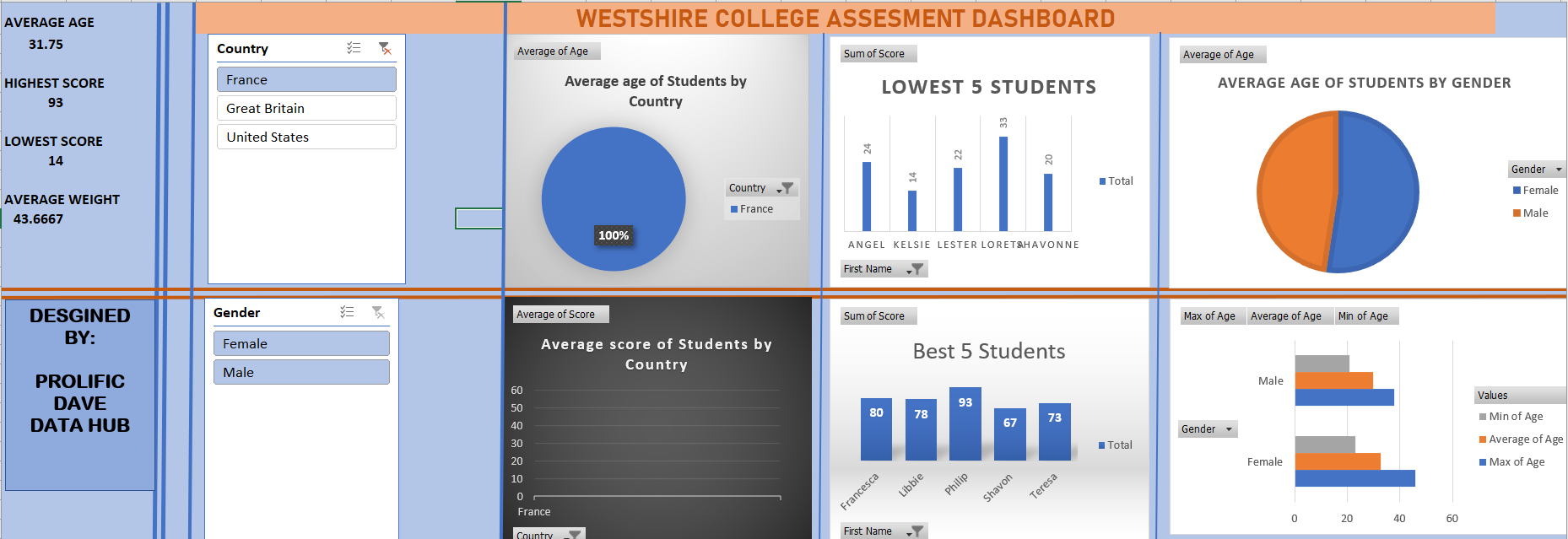
4. Transforming Data into Pivot Tables & Charts: Hi there, Welcome back. Our journey into designing in statistical dashboard is almost reaching to its final fees. You just need to remember
the last class we saw in the PivotTable
and private jet out that we can filter our data using
pivot table and design the private chat out of poverty and leucine two
different pie charts. And the pie chart. That's also a time, remember I said in the previous
class that none of the significant process into creating an accurate dashboard. Dashboard, organizing data
that keeps accurately sites. So it is time to
organize the data such that the give
awkwardly say, because theta I organize
and process so that we can derive insight from
the Elazar forming it. I'll do a quick run by
organizing this data into different sections that
appear on our dashboard. So what mic loosely either
organize this data. Now we're done with the
major categorization of data into different insights. Now let's move on
to the minor widow. Of course we include
average age, average weights,
and highest score. So we are done with
the categorization of the major and minor
insight because let me give you a
recap of our sharp up. So of course, I
started with this just like we've learned in
the previous class. I agree. And since I'm working with averages to them by conflict,
choose this. You'll notice that I
was randomized and are not using this button year, using this decimal to a year
to decrease the decimal. And of course did the same for average age of soothe
them by gender. So we're working with
gender and average age. Of course you
notice our changing the value field settings yet into hybrid and
maximum or minimum. So k here you notice I use country average score
because Best Buys. Now remember you remember
our last lesson. We choose the best five students
using the value of data. Yet, if you need to obtain
clicking this option, clicking this off and then
reducing it to five, okay? Now, okay, So average,
minimum, maximum age. So you notice I did
something here that I chose age maximum of each
and my first attempts. I drag this AGE year to include on that
one. You notice that? I did that for minimum
D then D minor, minor size, average age, average weight IS code. So we've successfully created, designed the pivot table for the insights we think
to present on our data. So let's move to greatly tie vote charts for more updates. So pay attention again, as I create my budget
for it, I will tip. I've successfully created
by a bar chart for each of our pi, what steam. So let's do a quick
run through on our grid by looking at
some who don't post. So for this one, we
use pie chart and you saw here that I
changed the format, the psi, so I selected my
desired pie chart formats yet. So you notice here that I add
charter to determine if the gain or the fight who just
like I can create bad. And same for this one, chose to do the same. So for this one, I use
over an area chart, covers the average cost price, agree with Jane and yet
I chose my style of one. And yet, of course, like
you add axis titles, new chart I choose and they are to avoid. You
should try as much. It's possible to make sure
that I'm not too cumbersome. So here if I butcher
your best face today, so I desire to use
clustered column here, column where I changed the
format year to four year, I used Batch, batch. So that's a quick rundown on how to create poverty
been parvo chat. I'm sure it's
something you can do already. Let me keep this. Now. You got to work on a
similar project by creating a statistically
dashboard of the data. I'm going to attach this
course, right, let's move on. So we have successfully created a pivot
table on a project. So in the next class, we are going to bring
all our charts to get into a single sheet
to make a dashboard. We're also going to
implement slicer that will allow us to interrelate
with all our data. So I hope you
enjoyed this class. I hope you're learning values. I'll beginning of values. I'm sure you have a k. So we move on to the last class where we'll put our charts together and we will put our
charts together. I can't wait to see
it in the next lab.
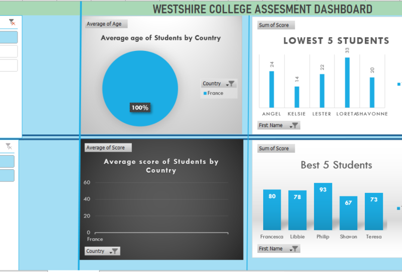
5. Final Dashboard Setup with Slicer: Right, Are you ready? So finally we get our dashboard
of our running total, or we have to do is combine our charts together
into one sheet. Okay? Alright, so that's great.
I'm not sure it will. Dashboard. Dashboard.
You remember I said a dashboard is a visual
display of all your data. I know anything that relates to the schwa as to be appealing, as to be alluring to the eye. So you can just great. I can combine chat
and yeah, just great. I'm just calling it
dash, but it has to be well organized. That's two good
color combination. So I'll put structure such that it presents the data you
want your viewer to see. Larynx, so that it
makes the data you want to view as to see on
your end, I'm very beautiful. So we're going to look a little touch of color combination where you
don't have to beat yourself up in a
hello condition is also getting walked off by
letting graphic design. No, but at least just a basic
application of purpose. The purpose is just to make
sure that the dashboard, it looks the best, appears in its best. Oh, okay. So that's it. So for my team, so we can pull out
page the sclera. So we can call our pages, come to a excuse, any poorer ear drum loop. Okay, so just watch him as I do. Right, So we have successfully put together our dashboard. Well, it looks
beautiful, isn't it? K? So now it's time to
see the beauty of slicer. Same cell B20 of
science Slicer, right? So how would you, so
slides are Fs to program our chats to interact
with each other. Either had a teacher that
so this is our new slider. So you see slides, I
hear the clicks so you can design slides
of different sorts. Hostname, no quizzes or
on three agenda. Okay. Alright, so given us
Ls can come through. Yeah. Okay. Alright. Diesel now. All right, so this laser work, these slides are symbionts, few telephones and that FC to
feed that data interaction. Your feet on the
data as a whole, the chat, as she presents. It's a way for me
to call my xo to present all simply setting friendly of data
out of the pool. This apple pie charts
you haven't invested. So to ensure that your data
worksheet all of your chats, we have to include
that connection. So you right-click
bolt connection. So you have to check all the pilot Stephen's
such that involved. It's just like just like you ensure that
all private state. So vesicle commission, agenda agenda slicer,
what connection? Object. Shape,
protect everything. Any type of tipping miss out, definitely affects
your connections. Okay, So we have not done. So now let's not, let's test our agents. So this is our original
data due to that original. So notice me boot disk
space that you can see. Right? So yeah, attention
to our t-tests. It however, the left side
and the chat shampoo, you want to know the
average age or S4 traps. Just uncheck that and
just keep crafts. So once you click Christ will return the
data specific to France. And of course is the mid
abdomen, the satellite data, specific data specific to the price ratio to add it to the average age of
male and female in prices. The highest score of male
and female in prices. If you check the chat that
you asked, yeah, changes, it changes here. You can see. You can see. Alright, so
we can list the psyche, narrow it down, hold that lyse. That's wonderful
for the department. Got the Aberdeen
asbestos easily sputum. He can easily interact, easily navigate to
the E site on actin. Statistic out national. So you can count, walk around these random neat, you can catch up, or this is where you allow this list and send it to
add more to this level. So that's, so, that's the
wonderful for us on Twitter. Let's do kind of a
puncture analysis across and we get every detail. So simply community, France
and Great Britain gave you, I just want to look a
lot more to select. You get something wrong to remove all the
t-tests and tiny, I just get everything's
back to normal. Everything is compact. So that will generate that isn't just so you can walk around too
many insight into the site. You know, the best five to
the present United States. Newly produced by state. In grids, grouped it, wants to sell it to an output. You have to remember that we did not design
this by vertebrae, one by one for each country. So this is the beauty of it takes you make your
presentation with fossa. So now he's not up to you to
create a similar dashboard. You said, just fine, I have attached to this course. And then they shot glass right from introduction
to the last class with an interactive dashboard. And I'm sure you
will be very glad that happened and
we do that soon. I'm sure you can read the case. So now onto the
end of this class, I'll be doing some values. Amazing conversations. Create your own dashboard.
You can walk around it. If you don't descend
into the watch glass. And I'm sure you can turn out. Great. Alright, so let's go
to the end of this course. And I'm very glad to stick
to as linked data analysis. See you in this course.
 David Adepoju, Data Analysis||Forex Trader