Transcripts
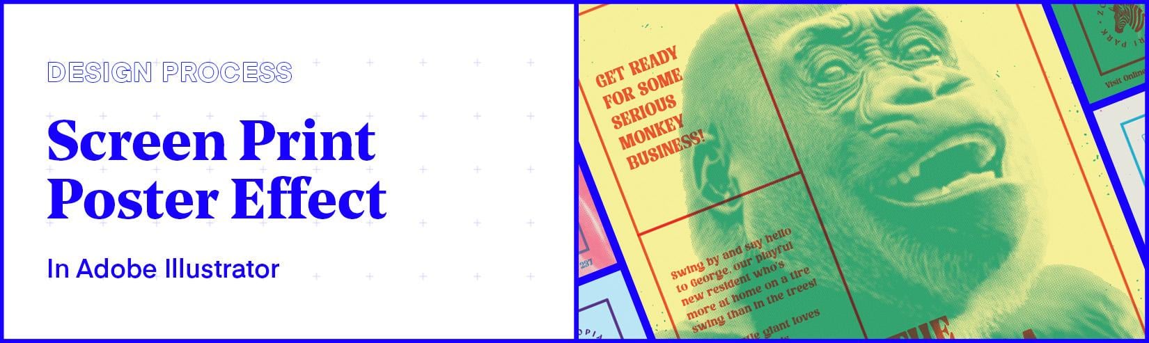
1. Introduction: Hello, and welcome to
this poster design class. In this class, we are going
to take a look at how we can create a screen
print poster effect. Now, this effect can
give your poster design a tactile human quality with plenty of color
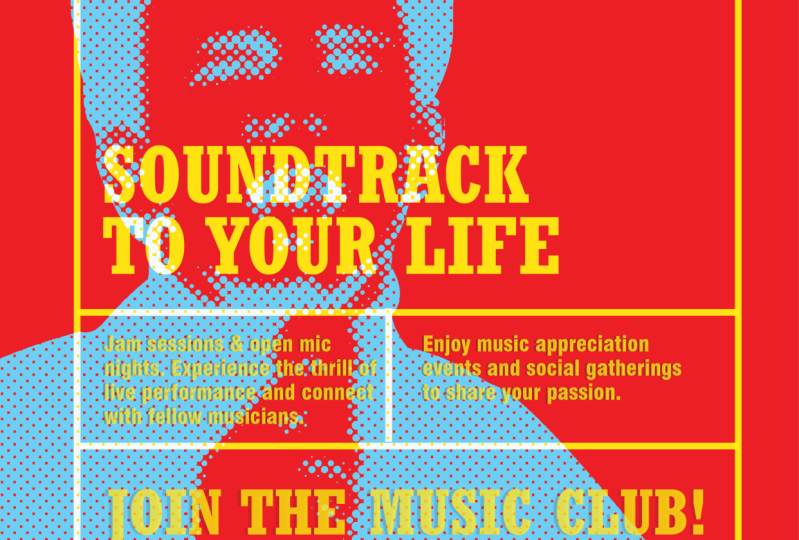
and creative flare. So here I am an illustrator, and these are some posters
I created earlier. In this class, we will be
looking at creating posters for a fictional zoo to promote some of the
star wildlife on offer, where we will be using
photography, typography, grid, and graphic images as
part of the poster design. This class is divided
into two parts. In the first part, we are
going to learn how to create a eotone effect in Illustrator to help us craft the
screen print effect. And then in the second part, we are going to
learn how to use it as part of a complete
poster design. After this class, you
will be able to create a screen print
poster effect like this in Adobe
Illustrator super easy. So let's get into it.
2. Part 1 - Create a Duotone Effect In Adobe Illustrator: In this first video
of this class, I'm going to show
you how to create a really impactful 00 tone
effect in Illustrator. This is going to be the effect we use later in
the poster design. So before we get into that, it will help to understand how to generate this effect first. Now, this effect is usually done in photoshop,
but guess what? It's actually super easy to
pull off in Illustrator, too. And once you have this set up, it's even easier
than photoshop to edit and explore
color combinations. We're also going to add a
half tone effect to give the overall effect
a bold graphic look that's perfect for adding
some creative flair. Whether you're a
beginner or a pro, stick around because
this tutorial is going to make your design
game even stronger. So let's get into it. So here I am an illustrator, and these are some
duotone image effects I have created earlier. Here you can see many color
variations you can create. If I zoom in here
and scroll across, you can see that
in this instance, I have the effect applied
to some wildlife imagery. Also, above my samples, I have an easy to access color palette with lots
of high contrast samples, which makes it very easy to pick some combinations to use. Also, I have all these colors saved in the swatches
panel ready to use. Here, I have a vast amount of colors and combinations I have placed together
to make this easy to use and also save
me a lot of time. In this video tutorial, we are going to look
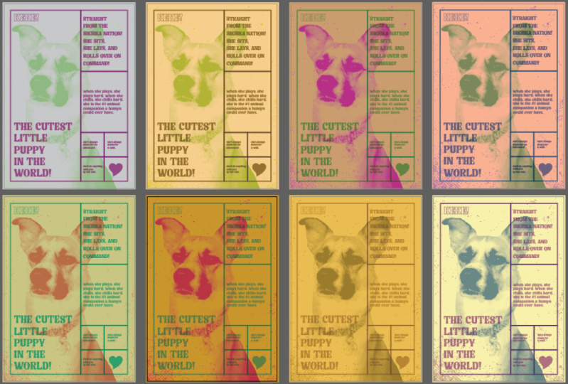
at how we can create six unique uotone color effects. We are going to use
this image of a pug and convert it into a uotone
effect in Illustrator. If you want to take
a closer look at this illustrated document
with all the samples and also get the Duotone
Swatch library file and the pug image
to follow along, you can acquire it in the
project section of this class. Step one, document setup. To begin, I'm going
to set up a document. I'll come up to file new, I'll hit print, then come
over and set my Canvas size. For this tutorial,
I'm going to set up a custom size document to
demonstrate the effect. I'll set the units to pixels, I'll type in 1,000 for
width and 1,000 for height. For R boards, I'm going
to set this to six, I'm going to leave the
color mode set to CMYK, and I'll explain why shortly. And with that set,
I'll click Okay. Next, I'll come into my
artboards panel, hit the menu, hit the rearrange all artboards, and I'll set this to
three columns with a spacing of 200
pixels, and click Okay. Step two prep colors. So with my document set up, the first thing I'm going to
do is source some colors. To make this easy, I can
do one of two things. I can come into my
previous document, which I prepared earlier. Select all the
colors, copy them, come into my new document, and just paste them all in, and position them above my
Canvas area, like so. Or I can open the Guo
Tone Swatch palette. Once you have downloaded
the swatch file, simply come up to swatches, click the menu, down to
Open Swatch Library, click O. Navigate to the Guo
Tone samples and click Okay, and you should see them in
their own panel, like so. For now, I'm just going to
drag this into my side menu. Step three, set the base layer. Once I have my colors ready, I'm going to come over
to the Tools menu, grab the rectangle shape tool, come into the first Canvas area, and just draw a box to fill
the canvas area like so. Next, I'll press eye on the keyboard to activate
the eye dropper tool, and I'll come and select a color from one of my samples above, and here I'll start
with this light yellow, or I'll come into my
Duotone Swatch library and click on a light yellow. And that will create
my base layer. So with my first shape selected
with the selection tool, I'll press command plus x on MAC or control plus x on PC to cut, and then I'll press command
plus Alt plus shift plus V on MAC or control plus t
plus shift on V on PC, and that will then
paste my layer back and also duplicate it
across every artboard. Next, I'm going to select each new shape with
the selection tool and press eye to activate
the eye dropper and select a different
base color from above. Or simply click each
shape and select a base color from the
uo Tone Swatch library. And just like that, I've set up six background tones super easy. Next, I'll jump into
the layers panel. Double click on my new
layer and call this base. So once I have a light color
applied to each shape, it's time to source
and prep the image. Step four prep the image. For this demonstration,
I'm going to use this image of a
happy little pug. Now, the only drawback about this effect is
that to create it, you're going to need a
black and white image of a subject and for
it to be cut out. To create this effect properly, we're going to need to prepare a high contrast black
and white image set on a white or
transparent background. Now, this isn't easy to come by, so we're going to need
to use photoshop. So let's see how we can do this. So here I am in Photoshop, and I have the image
of the pug ready. What I can do here is come over to the rectangle
Marquee tool. I'll draw a selection around it, and up in the Control panel, I'll click Select and Mask. With the Quick
Selection tool active, up in the Control panel, again, I'll click Select Subject, and Photoshop will do its
best to select the pug. In this case, because
there is fur involved, I'll also hit the
refined hair button. With a refined selection, I can click in the
bottom right corner, and a selection will be
made around the pug. With the new selection, I can come over to
the Layers panel, and at the bottom, I can click
the Add layer mask button. Upon clicking, I have now added a layer mask and
cut out the pug. Perfect. Next, I'm going
to come to the bottom of the layers panel and hit
the adjustment layer and select black and white. Back down to the adjustments
layer, again, this time, I'm going to add a
levels adjustment layer, and I'm going to tweak it to punch out some of the blacks. Now, keep in mind,
you have to be really careful when you
toggle the levels. You want to avoid oversaturating
the blacks and whites. The goal here is to get as
much contrast as possible, but at the same time, maintain as much detail as possible. The download folder
that comes with the Duotone Swatch library
and the pug image, you will also find a PSD
with a contrast sample. If you open this, you can see a good example of the type of contrast you want to aim for. Try and get some solid blacks in certain details and
maintain some gray shades. Try not to push the contrast so much that you get a lot of pure white and blacks as this will impact the effect
that we will get later on. What I always try and do is get some rich blacks with some lighter tones
and some nice grays. For example, here in the eyes, I have some solid blacks and I have maintained some of
the detail in the face. If I push this up too much, there will be too much black
and we will lose detail. On the left here is what
you want to strike for. Once happy, I'll
press command A on Mac or control A on
PC, dislect all. Then I'll press command
plus shift plus C on Mac or Control plus shift plus C
on PC to copy everything. Then I'll hop back
into Illustrator, come over to the lays panel, hit the plus icon off the
bottom to create a new layer, and I'll name this image. I'll paste to bring
in my pug image, and I'll scale down to place on my first Canvas area like so. Step five, apply uotone effect. Next, we want to turn
this pug into a color. What we're going to do next
is use this image as a mask. With the image
selected, I'm going to come over to the
image trace panel, click on the drop down
and hit shades of gray. This is just going to take the raster image and
convert it into vectors. Once this has been processed, I can come up to the control
panel and click Expand. Then I'll select the
direct selection tool, click and drag over one of
the corner points and just press Delete to remove the
white space from around it. Next, I'll just come
to my base layer and select the base
layer beneath my image. I'll copy this. Then I'll click back on my image layer and press Command plus Shift plus
V on MAC to paste in place. And this will place the shape
on top of my pug image. I'll right click, scroll down to arrange and set this to back. With the shape still selected, I'll press ei to activate
the eye dropper and come and select a darker
tone from my colors above, or select a color from the
uo Tone Swatch library. Then I'll just come over
to the layers panel, hit the lock icon
on the base layer. With the selection tool,
I'll click and drag over my two new layers
to select them both, and then over in the
transparency panel, I'll click M mask. And then I'll hit the
invert mask button. This will then use the black
and white vector image of the pug as a mask
for the color layer, and now we can see the eotone
effect has been applied. Now, with the mask
layer selected, in the transparency panel, I'll then come up to effect, scroll down to Pixelate, then come and select
color half tone. For the Max radius, I'll
hit 15 and click k, and that will apply a
nice half tone effect. Keep in mind, if we come
to the appearance panel, we'll be able to click back into the half tone effect and change the Max radius to toggle the complexity of
the half tone effect. For example, I'll
just set this to 25, but for my case, this
is a bit too much. I'll pop this back to 15, and in the transparency panel, I'll click on the left thumbnail and click off to D select, and that is our eotone
effect applied. You may be wondering, why
did I set this document to CMYK and not RGB. A
quick note on this. What I have found is that when applying this half
tone effect in RGB, the dot effects don't
look as intended. For example, if I come over and change the
color mode to RGB, we can see that the half
tone effect appears quite different with a lot
of overlapping dots. But if I come back and
change it to CMYK, the half tone effect is applied there the way I would prefer. I have found that the
best results when using this effect is to do it in
the color mode of CMYK. Step six create
color permutations. Now, applying color permutations is really easy and quick. Check this out. If we
click back on the pug, this time press t to cut, then press command plus
Alt plus shift plus V on MAC or Control plus Alt
plus shift plus V on PC, we can then paste back and duplicate across each artboard. Then I can easily
select the next pug. Make sure the left thumbnail is selected in the
transparency panel, press e to activate
the eye dropper tool, and simply select
a new color from above or from the
oton Swatch library, and that will change the color. I'll press V to activate
the selection tool, select the next pug, press I to activate the
eye dropper tool, and click another
color from above, or choose another color from
the eatone Swatch library, and I'll do this for each pug. And soon I have six different
versions of the same pug, but with different
eotone effects applied. If I want to change
the combination, I can do one of two things. I can either click to unlock the base layer and click
to lock the image layer. Select one of the squares
on the base layer, press I to activate
the eye dropper tool, and simply select
a base layer color or choose a color from the
Duotone Swatch library. Lock the base layer, select the image layer and
choose another color. Or I can unlock the base
layer and the image layer, and with the selection tool, I can select them
both, come up to edit, come down to edit color, then across to recolor artwork. Upon click, a menu will appear, and we can then toggle the
handles on the color wheel. As you do this, you will see
the Guotone effect change. We can also come up to generative color,
click on the prompts, and Illustrator will generate some additional color
combinations we can choose from. Step seven, apply
gradient effect. Now, this duotone effect doesn't just work
on solid colors. It can also work really
well with gradients, too. So now, if we come
to the base layer and lock the image there, we can select a base layer and choose a
gradient from above. And if we come and click on the gradient tool in the menu, we can click and drive
to change the direction. And depending on which
gradient we use, we will also need to come and click the image and
change the tone. Step eight, export samples. So once you have your samples, you're going to want
to export them. To do this, we can
come up to file, down to Export, and choose
export for screens. Upon click, a menu will
appear, and from here, we can choose which artboards
we would like to export. Here we can export all
or choose a range. For the format, I like to push this up to get lots of detail, so I'll push this
up to times four. I'll set the format to PNG, choose a destination to export, click Export, and
there I'll have my images ready
to use elsewhere. And if we look at
these in photoshop, we can see that we have lots of detail in the half tone effect. Perfect. That is
how you can create a otone half tone effect
in Adobe Illustrator. Now we know how to
create the effect. We can now move into the next video where we will
look at how we can set up a poster design and
use this effect to create a screen print effect
in Adobe Illustrator.
3. Part 2 - Create a Screen Print Poster Effect In Adobe Illustrator : Hello, and welcome to the
second video in this class. In this video, we are going to take a look at how we can create a screen print poster effect
using the duotone effect. In this video, I'll demonstrate
how to use the tools of Illustrator to create this
poster design specifically, and later we will look how
to make some variations. To create this poster
in Illustrator, we are going to cover
the following key steps. This is a methodical
process that will ensure we create quality poster designs and not leave
anything unchecked. This video, you will
be able to create a screen pin poster effect like this in Adobe
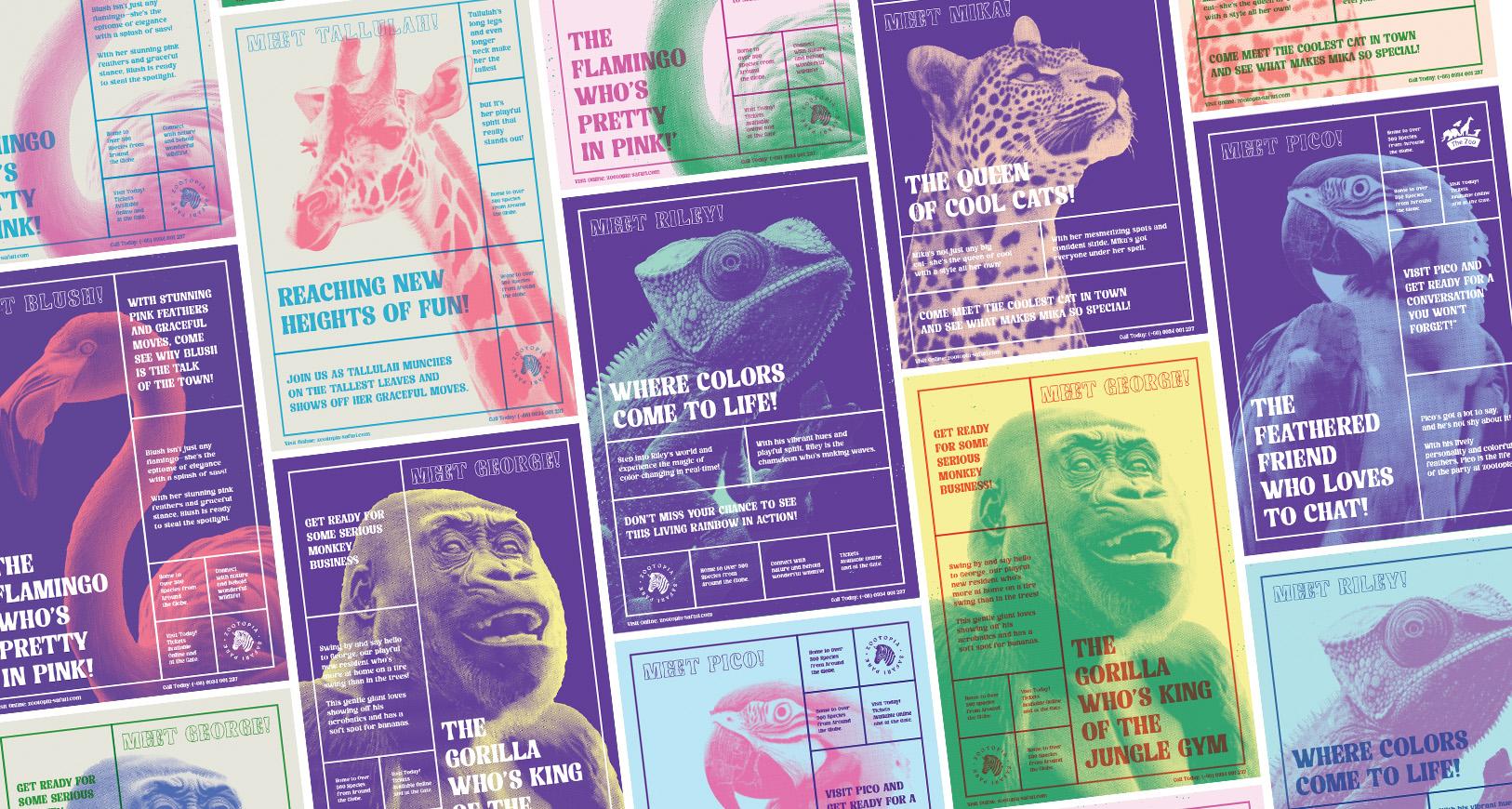
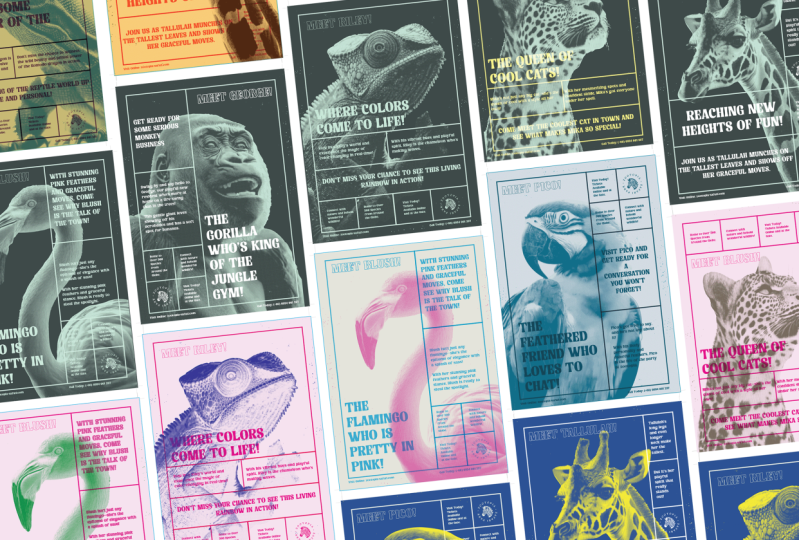
Illustrator, super easy. So let's get into it. So here I am an illustrator, and these are some
dynamic posters I created earlier using the techniques
I'm about to demonstrate. If I come up to view
and hit trim view, we can clearly see each board. Down below, I have six
unique poster designs focusing on one
particular animal, and you could also see
other options where I have explored other
color permutations. If I come back up to
view and hit trim view, we can see what's in
the pasteboard area. Next to each poster design, you can see the color swatches
applied to the design, and to the left, you can
see the steps that I have taken to produce
the screen print effect. So for these poster designs, I have used a simple
stroke grid which divides the composition into modules where I have placed
the contents. And for each poster composition, I have explored a different
stroke arrangement. If I press command plus colon on MAC or control plus colon on PC, I can toggle on and
off the guides, and you can see the
grid system that I used to structure
the stroke grid. The first step was to establish
the grid for the design, then position all visual
elements inside the grid, then prepare and process the
image ready for the design, then incorporate it all into a poster design and apply color. With a complete poster setup, I then explored other
color permutations. Working in steps like this
will make the whole process easier and also true to the
real screen printing process. Typically, in screen printing, each part of a design
is prepared on its own mesh screen
and applied to a canvas individually with
their own paint color. Each color will be
printed down onto a canvas one at a time
in a particular order, which can create a simple
yet bold graphic outcome. Also, when applying paint
with a mesh screen, it's common to get subtle
half tone effects. What's nice about
screen printing is that it has a
tactile effect to it, where there are certain
imperfections which make it feel more organic
and less digital. For our poster design, we are going to follow a similar process to screen printing, to prepare each
layer separately, then apply them in order and use some simple effects to simulate a real
screen print effect. We are going to look at how to create this poster design with the flamingo and then look at how we can easily
create other versions. If you want to take a look
at these poster designs, you can access the
illustrated document in the class project folder. Link is in the project
section of this class. Step one, research,
and inspiration. When creating a poster design, it can really help to undertake
some initial research. This can give you
some inspiration if you're not sure what
you want to create, and can also be good if you
already have an idea in mind for a particular theme
or style to research further. To gather research,
I like to save found images or take pictures
when I'm out and about. As of late, I have
been gathering all my found research in Figma, where I can paste
all my research and see it all in
one huge board. I find this to be an amazing
platform to save research, but that's a topic
for another video. Another good source of
inspiration is Pinterest. So here I am on Pinterest, and here I have a board
I have created that contains a lot of screen
print poster designs. Here we can see lots of
examples of the kind of effects you can get
with screen printing. Here, there's lots of
bold compositions with bold typography and images with colors that overlap
and blend together. Also, we can see the type of color choices that
have been made. Here we have lots of
vibrant contrasting colors. If you want to take a
look at this board, you can find the link
in the description, or you can take a closer look at some of these references. So when working
with poster design, it can help to look for some inspiration to get you started. So let's now look at how we can develop a poster like this. Step two, document setter. In Illustrator, to begin, I'm going to set
up a new document. I'll come up to file new
and select document. Now, on this occasion,
I'm going to use a standard print
size document. So on the top tab,
I'll click Print. I'll click view O presets.
I'll select A three. Over on the right,
I'll make sure my orientation is
set to portrait. I'll set the units
to millimeters. I'll set my bleed
to 3 millimeters, and I'll do this because
some printers like a three millimeter bleed
when sending off to print, so I'll do this at the start. I'll set my color
to CMYK and make sure my raster is set to
300 and click Create. And up will pop my new document. May be wondering why
I set this to CMYK, well, I'll be touching on this shortly for a very good reason. So here we have our
new document set up, and you can see
around the outside, we have the bleed line. Now, for those of you that
don't know what this is, this is where you extend your artwork off
the Canvas area. So when a printer
cuts the artwork, they can trim a little off so
you don't get white edges. Again, if I press command plus colon on Mac or control
plus colon on PC, I can toggle on and off the guides to toggle on
and off the bleed line. Now, if you're following along, make sure you can
see your control panel at the top of your UI. If not, come up to
window and make sure there is a tick
next to control. You're also going
to need to have your swatches and
layers panel visible, so make sure to come
up to window and click these to activate
and have them to hand. In this instance, I have a lot of panels down
here on the side. That's our document set up, and before we continue,
I'd like to save it. I'll come up to file, save as, and save this document
to my computer. Okay. Let's take the first step in the process and
set up the grid. Step three, base grid set up. For this poster design,
we are going to use a modular stroke grid to compartmentalize the
visual elements. To create this stroke grid, we are first going to need an underlying modular
grid to base it on. The first step is to set up the base grid to help
structure the stroke grid. To begin, I want to
establish my margin space. I'll come over to
the shape tool, grab the rectangle tool and draw a box to the full size
of the Canvas area. Next, I'll come up to object, path, and click offset path. When the menu appears,
I'll type in -15, set mita limit to
zero, and click k, and this will reduce the
size of the box by 15 mill. Now I know there is
a 15 mill margin around my Canvas area. Now, keep in mind
when you do this, you will also duplicate
the shape layer. So with the selection tool, be careful to click
the original shape behind and remove it, so we are only left
with the smaller shape. Okay, now to set the grid. With my shape selected,
I'll come up to object, down to path, come across
and select split into grid. Upon click, a menu will appear. First, I'll click on preview, and up in the rows,
I'll set this to 14. In the columns, I'll
set this to five. In this instance, I'll leave
the gutter set to zero. Notice now how the grid
is set into the shape. Once happy, I'll click Okay. Now, this is where
the magic happens. With the block still selected,
I'll come up to view, scroll down to guides, come across and
select make guides. Upon click, we will now
transform the block into guides, which we can now use
for our poster design. To finish, I'll come over
to the layers panel. Double click on the top layer, name this to base grid. And if I press
either command plus colon on Mac or Control
plus colon on PC, we can toggle on
and off the guides. Perfect. This is a
simple modular grid, which I'm now going to use to
construct the stroke grid. Step four, stroke grid setup. Next, I'm going to come
into the layers panel, hit the plus icon
at the bottom of the layers panel to
create a new layer. I'll drag this below
my base grid layer and name this stroke grid, and for now, I'll
hit the lock icon on my base grid layer. Looking back at my
poster compositions, we can see that I used a variety of stroke
grid approaches. For this one, I'm going to
use a grid where there's a relatively large module on the left and smaller modules for me to place content
in on the right. Back into my document,
I'll come over to the tools menu and grab
the rectangle tool. In this instance, I want
to be really precise, so I'll press command plus Y on Mac or control plus Y on PC. And this will put us
into outline mode. I'll press command plus zero on Mac or Control
plus zero on PC, which will fit my Canvas to my window height so I
can get a better look. I'll come to the top left
corner of my base grid, click and drag and
come down across three modules and release
at the bottom like Z. Next, I'll come to
the top, right, click and drag down across
two columns and down five rows like Z. I'll press V to activate
the selection tool, then click and drag my new
module down while pressing ult plus shift to drag it down in a straight
line and duplicate. I'll be very careful
to position this approximately on top
of my previous module. Next, I'll zoom in
here to be precise. I'll come over and grab the rectangle tool, and this time, I'll click on the
bottom right and drag up across one
column to draw a module. I'll press V to activate
the selection tool. Then click and drag my new
module up while pressing Alt plus shift to drag it up in a straight
line and duplicate. And I'll be very careful
to position this approximately on top
of my previous module. I'll press V to activate
the selection tool. Then I'll click and drag
over my two new modules, and with them both selected, I'll click and drag them
left while holding Alt plus shift to drag them across in a straight line and duplicate. And I'll be very careful
to position this approximately on top of
my previous modules. With my final modules in place, I can come over to the
Layers panel and click the visibility off
for the base grid. And now I should be able to see the outlines
of my stroke grid. And in this instance,
I'm going to make sure that all the lines are perfectly set on
top of each other. I'll press command plus y to
go back into normal mode, and with the selection tool, I'm going to click and drag
over all my new modules. I'll come to the bottom
of the tools menu, make sure the
stroke is selected. I'll make sure in
the Swatch panel, this is set to black and in my stroke panel, I'll
set this to five. Over in the layers panel, I'll click back to see the
visibility of the base grid, and here we can see
how the stroke grid has been created on
top of the base grid. Next, I want to look at
how I'm going to bring in the type to include in
this poster design. Now, for this
particular process, I'm going to
duplicate this grid. I'm going to leave
a copy of this grid on its own artboard,
because later on, when I create other variations, I'm going to want to focus
on this grid separately. So I'll come into the Lays panel and click off the Lock icon. I'll come up to view
down to guides and make sure that the
guides are unlocked. I'll come over to
the Tools panel, select the artboard
tool, come across, click on my artboard and
drag right while holding Alt plus shift to duplicate the artboard across
in a straight line. And now I can begin to
focus on working with type. Depending on your design, sometimes it can be
easier to start with the image element of the poster and then build up from there. But for this poster design, the grid and type is going to create the main structure
of the poster design. To begin, I'm going
to start with the type elements first and then work with
the image after. Step five, working with type. So looking back at my
final poster designs, we can see how the
type is composed. In the larger module
of the stroke grid, we have the headline text
along with some outline text. In the smaller stroke boxes, I have placed in the
subhead, the paragraph text, and then in the smaller
modules in the grid, I have placed in some
footer elements, and below the grid, I have also included some
further footer elements. Using the stroke grid creates a very straightforward but
very clear visual hierarchy. From afar, the eye may be drawn to the colorful animal
in the background, but then when the eye
looks to view the type, the eye is first drawn
to the biggest space in the stroke grid to view
the main headline. And then naturally,
the eyes will move across to the
smaller boxes in order. The primary hook will be
the big, colorful animal. The secondary hook will be the largest type in the
largest module space, and then the supportive elements will work in the
smaller modules. Let's start by bringing in the large type element into
the first module space. To start, I'll come over
into the layers panel. With the stroke grid
layer selected, I'll click the plus
icon at the bottom of the lays panel
to add a new layer. I'll rename this layer to type, and I'll make sure to drag this one down to
the bottom and hit the lock icon on the
grid layer above as to not accidentally
select anything. To begin, I'll start
with the headline text. With my type layer selected, we can come to the tools menu, select a type tool and click and drag and then
release on the poster. Upon release, this will
create a paragraph of type. Right now, I have a default
fontap, but that's okay. I'm not going to worry about
that too much right now. For the content, I'm
going to jump into the poster content doc I have
created for this tutorial. To access this content doc, you can find the link in the
class project description. On the page for the
poster one content, I'll copy the headline
type, the Flamingo, who's pretty in pink, then
back into Illustrator, I'll select all the type in the paragraph, and
I'll paste it in. And now we have our
first bit of type. Now, depending on your
default properties, here I'll push the type up
to start working with it. On this occasion, I'll set
the font to size 70 points, and click and drag the frame
down and out to see my type. So with my first piece
of type in the poster, I quickly want to change
the typeface for this. At this point, I could
use any typeface, but I already have an idea
of what I want to work with. So these posters are for a zoo. The type of font
I want to use for this poster design will need to have an earthy natural quality. At the same time, I'd like a font with a bit of
character and flare. For this poster
design, I'm going to use the font Bogista, which I think is a good
example for a few reasons. I like the organic
quality the typeface has. To me, it feels
earthy and natural. With some creative flare. The font feels a little
Bohemian and vintage, which I think would work well to give character to the design, and it also has a
good weight to it, which will work well as part
of my screen print effect. Now, this is a free font, which you can get your
hands on right now. In the content dock,
you will see a page with the link to this font
with some other choices. If you want to explore
some other natural fonts, you can also check out the
GDS font book where I have a curated list of the best
free Earthy fonts online. Back in Illustrator, I'll select the type and up
in the font selector, I'll type in bookisa,
and apply the font. On this occasion, I'll come into the character panel and
hit the all caps button. Before I move on, I just want to correctly format my
type and position it. For my headline, I
want this to sit in the bottom left, so
I'll drag it down. I'll come into the
character panel and set the leading to 75, and I'll add my line breaking like so and place it
in the bottom left. Now, on this
occasion, I feel like the typeface tracking
is a little tight, so I'll come into the character
panel and set this to 20. Now, looking back at my
final poster design, in the large module, I also included a piece
of type just to add a bit more visual dynamic
to the overall design. Each poster design is
about a star animal. So there will be a piece of
type to introduce the name. I'll copy the name, and
then back into Illustrator, with a selection tool, I'll
click on my head of type. And while pressing Alt, I'll click and drag up to the top of my module
to quickly duplicate. I'll double click into
the headline text, select all and paste. And with the selection tool, I'll click on my new text. I'll come into the
character panel and set the font to 60. And over in the Tools menu, I'll hit the swap fill
and stroke color to apply a stroke effect to the type and make sure the stroke
size is set to one. Next, I'm going to
place in the subheader. Back into the content doc, I'll copy the subhead. Then back into Illustrator
with the selection tool, I'll click on my header text. And while pressing Alt, I'll click and drag up and
across to quickly duplicate. I'll double click
into the header text, select all and paste. So with the selection tool, I'll click on my
new text paragraph. I'll come into the character
panel and set the font to 35 points and set the
leading to 40 points, and then click and drag on the Bower box to set the
type ragging like so. Now, I'm going to
want to position this text neatly inside the box. To do this is quite
straightforward. So first with the
selection tool, I'm going to grab
my type element. I'm going to place the
top left hand corner of the bounding box in the top left hand corner of
the module space. Then I'll click and drag the bottom right anchor point on the type box down to the
bottom right of the module, essentially filling the
paragraph bounding box to that module space. Next, I'll come up to the
control panel and click on the drop down for the vertical type alignment and
select center. Then down in the
paragraph panel, I'll come into the indent and
add 8 millimeters for left, and this will set my type
nicely inside the module space. Easy. To be consistent
with our spacing, I'm going to come back
to the headline type. I'll click on my headline
with the selection tool. I'll come up to the
control panel and click on the Drop Down for
vertical type alignment. And this time, select bottom. Down in the paragraph panel, I'll add eight millimeter
indent to the left. I'll place my box against the
edge of the module space. Now, unfortunately,
in Illustrator, there isn't an indent for the
bottom of the type frame. I'm just going to
have to use my eye and place this at
the bottom like so. For now. Again, I'll do
the same for the top type. Down in the paragraph panel, I'll add a eight millimeter
indent to the left. I'll place the box against
the edge of the module space, and use my eye to position
at the top like so. Next, I'm going to place
in the paragraph text. Back into my content doc, I'll copy the paragraph. Then back into Illustrator
with the selection tool. I'll click on my subhead text and my pressing Alt plus shift. I'll click and drag down and place neatly in the space below. I'll double click into the text, select all and paste. So the selection tool, I'll
click on my new paragraph. I'll come into the
character panel and set the font size to 20 points and set the leading to 25 points and click to
deactivate all caps. And then click and drag on the bounding box to adjust
the type dragging like so, and the paragraph is set
perfectly into the module space. Easy. So now it's just a case of adding the extra elements
into the bottom modules. Now this can be done
using the same technique. With a selection
tool, I'm going to click on my paragraph type. I'm going to click and drag
down while holding Alt to duplicate and set the type box to fill
the module space, back into the content dock, I'll copy the extra element one, then back into Illustrator, double click into the text, select all and paste. With the selection tool, I'll
click on my new paragraph. I'll come into the
character panel and set the font size to 15 points and set the
leading to 19 points. Again, I'll click
and drag across while holding Alt to duplicate, back into the content dock, I'll copy the second
extra element, back into Illustrator, I'll double click
into the next text. Select all and paste, click and drag the
text box across, while holding all to duplicate, back into the content dock, I'll copy the third
extra element, back into Illustrator, I'll
double click into the text, select A and paste, and that will place the
three extra elements into the module spaces. For the last module, in
here, I'll place a logo. To do this, I'm going
to open a file. I'll press command plus O
on MAC or Control plus O on PC to open and navigate
to the download folder, into the images folder, into the logo folder, and I'll open the zootopia
logo black dot EPS. Since we are working Illustrator
and working in vector, it's easy to paste in
another vector element to give us the flexibility to
change the color later on. With the selection tool,
I'll select the logo, copy and jump back into
my poster and paste. And the logo will now be
placed into the document. I'll come to the far right,
middle anchor point, press and hold both
ult and shift, and click and drag inwards to scale the vector
logo down like so, and I'll simply place it in the bottom right module space. Easy. So now for the
last foota elements, looking back at my
finished designs, we can see that I have put the web address and
telephone number at the bottom of the poster
outside of the modules. These are quite small
though wide pieces of text, so won't fit comfortably
in the modules. So it's best that
I put them down here in the footer
outside of the grid. However, I'll still align them. So with the selection tool, I'll click on one of
my new paragraphs. I'll click and drag across
while holding alt to duplicate and down
to the bottom left. Into the paragraph text, I'll remove the left indent by selecting this and
setting it to zero. Back into the content dock, I'll copy the footer element
one, B into Illustrator, I'll double click into the
text and select all and paste, and position the frame
in the space correctly. I'll click and drag across
while holding all to duplicate and align
with the stroke grid. B into the content dock, I'll copy the Foota element two, back into Illustrator, I'll
double click into the text, select all and paste. So this now creates one
of the layers that I'm going to use in this
screenprint effect. I was to do this in real life, I would use this black
and white layer with the text and grid on its
own screen print mesh. I would use this mesh to
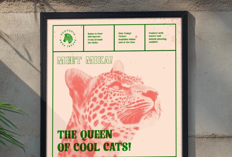
lay down one solid color. So with the layer complete, I can look at the next layer. Step six, working with image. Looking back at
my final designs, we can see that for this poster, I want to include an image of a flamingo in the background. And if I zoom in here, we can see that it has a
half tone effect applied, which gives that screen
print look and feel. In my document, I'm
going to come over to the artboard panel and click
to add a blank artboard. With the artboard tool, I'll click and drag it
across like so. Once we have our
grid and type setup, the next step is to bring in an image and add the
half tone effect. Now we are going to use the effect we learnt
in the first video. If you want to know more about how to do this in Illustrator, then you can check back to the first video to watch
a more in depth tutorial. So in the download folder, you will find a
folder called images. In here are the original images we have been provided
for the poster designs. If you want to learn
more about how to prepare these images ready to bring into Illustrator to
apply the duotone effect, you can find out more in the dedicated Duotone
Illustrated tutorial. However, for the
sake of this video, I'm going to use the images
in the sample folder. In the sample folder, we will see images I have
prepared earlier. And if we click on
each one of these, we will see that they are black and white high
contrast images. For now in Illustrator, I'm going to come over to
the Layers panel and click the plus icon at the
bottom to add a new layer, and I'll name this images
and drag to the bottom. Then I'll press command plus shift plus P to place an image. I'll navigate to the
download folder, and in this instance, I'm going to bring in
the Flamingo image, and I'll just draw and place
into my new board like so. So with the image selected, I'm going to come over
into the image trace panel and click on the drop down
and hit shades of gray. This is just going
to take the rest of image and convert
it into vectors. Once this has been processed, I'll come up to the control
panel and click Expand. Then with the direct
selection tool, I'll just click and drag
over the corner anchor and press delete two times to remove the white
area from around it. With my vector image selected,
I'll come up to effect, scroll down to Pixelate, then come across and
select color half tone. For Max radius, I'll
type in eight and click, and that will apply a
nice half tone effect. Now, keep in mind if we come
up to the appearance panel, we will be able to click back into the half
tone effect and change the Max radiance to toggle the complexity
of the half tone. For example, I'll hit this
to 25, but for my case, that's a bit much, so I'll
pop this back to eight, and that is our duotone
effect applied. Now, this brings me to why I set the document up
to CMYK earlier. What I found is that when applying this half
tone effect in RGB, the dot effect does
not look as intended. For example, if I come over and change the color mode to RGB, we can see that the half
tone effect appears quite different with a
lot of overlapping dots. But if I come back and
change this to CMYK, the half tone effect is applied
the way I would prefer. So I have found that the
best results when using this effect is to do it with
the color mode set to CMYK. So this now creates
the second layer that I'm going to use in this
screen print effect. If I was to do
this in real life, I would use this
black and white image on its own screen print mesh, and I would use this mesh to
lay down one solid color. So up to this point, we have
been working to get all of our visual elements into the document to create
our two layers. With my image prepared
on its own artboard, I'll again come over
to the poor panel and click to add a
new blank artboard, and with the pod tool, I'll just click and
drag it across. With the two layers complete, I can now look to bring them all together on this new artboard. Step seven, working with color. So for my poster design, I don't have any
specific colors planned. What I'm going to do is start with an initial color approach, and later on we can toggle them to explore
more color options. Back in my final poster design, we can see that
above each design, I have a color palette
for each poster, which I have prepared earlier. What I'll do here is
just come and select my color palette on top
of my first design, and I'll come into
my new document, paste it and place it
above for reference. Also, upon pasting my new
pallete into my document, I'll see up in the
Swatches panel, I have three new swatches. Nice. Now, as well as copied and paste in my color palette
from my previous design, I can also open a swatch library
I have prepared earlier. In the download folder, you will see a folder call Swatches. In there will be a
swatches library file called uo Tone Swatch library. If we come into the Swatches
panel, Click on the menu. We can come down to
Open Swatch library, scroll down and click O. Here I'll navigate to
the download folder and open my eo Tone
Swatch library. And upon click, we
will see a range of base light tones and darker top tones I can use
for my color choices. Using this can save
you a lot of time when selecting good color
combination options. So to begin, I'm going to
come into the Layers panel. Lock every layer apart from the stroke grid
and type layer. I'll zoom out here so I
can see my artboards. With the selection
tool, I'll click and drag over my type
and stroke grid, and this will select all
the visual elements. I'll press Alt
plus shift on Mac, Alt plus Shift on PC, and click and drag across
into my new artboard, keeping the visual elements on their respective layer and
position carefully like so. So I'm going to set my elements on this
layer to monochrome. So I'll come into the
layers panel and just hit the lock on every layer
apart from the type layer. I'll click and drag
with my selection tool to select all the type. In the bottom of the tools menu, I'll make sure the foreground
color is selected, and in the swatches panel,
I'll set this to blue. Or I could select a color for
my Duotone swatch library. In the layers panel,
I'll hit the lock on the type and release the
lock on the stroke grid. I'll click and drag with my selection tool to
select all of my grid. In the bottom of the tools menu, I'll make sure the stroke
color is selected, and in the swatches panel, I'll set this to blue, and
that's the first layer sorted. Next, I want to bring
in the base layer. Right now it's set to white, but for a more vibrant
authentic look and feel, I would like a more beige
background paper effect. I'll come into the lays panel. With the image layer selected, I'll hit the plus
icon at the bottom of the lays panel
to add a new layer. I'll name this layer base
and drag it to the bottom. I'll make sure all the
layers above are locked, and with the base
layer selected, I'll come into the menu and
grab the rectangle tool. Carefully draw a rectangle
from the top left corner of the bleed down to the
bottom, right bleed line. The tools menu, I'll make sure the foreground
color is selected, and the stroke is
set to transparent, and come and click on my base
swatch to set the color. So with the base layer in place, I can now bring in the image. So I'll come into the
layers panel and apply a lock to each layer apart
from the image layer. With the selection tool,
I'll click on the image, press and hold alt plus shift
and drag across and place it into my Canvas area and
position and scale, like so. So the image I've chosen for this composition
isn't just any image. As we can see, the large module
is on the left hand side. So I've been careful to
choose an image which leans into the module
as a point of focus. For this composition, I have
a side view of a flamingo. The body is down in
the bottom right, but its head comes up and enters into the
frame on the left, which is going to make for a
nice balanced composition, which is easy to comprehend and has synergy with
the stroke grid. This image is going
with the flow of the composition and not
fighting against the top layer. Once my image is in place, it's now time to apply
the color effect. To do this, I'll come
over to the tools menu. I'll grab the rectangle
tool and just drag from the top left corner down to the bottom right corner of my poster design
covering the image. And in the tools menu, with the fill color selected, I'll come into the Swatches
panel and set my pink color. Right now, this color layer
is on top of the image. I'm going to need to get
this below the image. So I'll right click, come to
arrange and sent it back, and the color layer will
go behind the image. With the selection tool,
I'll click and drag over the new color
shape and my image. With them both selected,
I'll come into the transparency panel
and click make mask. Once applied, I'll click the invert mask button in
the transparency panel, and what we have done
there is essentially use our black and white
half tone image to create a mask on top
of the colored shape. Now, to enhance the true
screen print effect, I'll come to the layers panel. I'll apply the
lock to each layer apart from the stroke
grid and the type. With the selection tool,
I'll click and drag over all the grid and
type to select it all. Down in the transparency panel, I'll click the drop down for blending mode and hit multiply, and this will then
fuse the colors below, creating an overall effect where the paint is blending
with the paint above. Easy. Step eight, add
print imperfections. Now, one of the
charming qualities about screen printing
is its imperfections. When screen printing
in real life, the print is pressed by a human, and there is a lot
of spontaneity and subtle mistakes
that can occur. When laying paint
down through a mesh, there can sometimes be
instances where there are paint splotches around
the edge of a canvas. This adds subtle imperfections, which again adds to the human
authentic tactile quality. When we design posters
on the computer, everything can tend to look
a bit flat and perfect. So one thing we can consider
to add an extra level of authenticity to our screen print is to add some subtle
imperfections. And to do this is really easy. In the download folder, you will see a folder called textures, and in this folder, there
will be a file call textures. If we open this, we
can see there are a few artboards with some very subtle ink splotch
texture vectors. These are some samples I
have prepared earlier. Some vary from really
subtle to a bit more busy. So I'll select one
of the textures and jump back into my
illustrated document. I'll come into the layers panel, click the image layer
and hit the plus icon at the bottom of the layers
panel and name this textures. With all my other layers locked, I'll paste in my texture, place it over my poster design, and in this instance,
I'll choose the same color as
the animal print. And now we have
some subtle paint blotches around the
edge of the poster. So now it looks like paint was applied for the
background animal image, and there were some
slight imperfections and mistakes around the side. Now, if this is
too much, you can simply grab the
direct selection tool and drag over some of these
splotches to select them, and if you wish, you
can remove some. So that's a very
flexible way of adding some subtle imperfections to your screen print
poster designs. Now, that's the color applied
to the first poster design, and that's looking pretty cool. Now, once you have
one poster setup, creating new poster permutations is going to be really easy. So let's have a look
at how we can do this. Step nine, create
color permutations. So first, let's look to
duplicate the design. First, I'll make sure that
all the layers are unlocked, and up in view, I'll
come down to guides and make sure that
guides are unlocked. Then in the Tools menu, click the artboard tool, click on the Canvas area, press and hold Alt and drag to the right
and upon release, you will create a new artboard effectively duplicating
your poster design. Easy. So with the
second poster in place, we can now make some
color modifications. So back into my
final poster design. For this one, I'm going to try a more vibrant background with an alternative color
scheme on top. So I'll come down and
copy this color swatch, back into my illustrated
document, paste, and place it above
my poster design, and the colors will also
appear in my swatches panel. So I'll come into the
layers panel and hit the lock icon on every layer
apart from the base layer. With the selection
tool, I'll select the base color on
my poster design. In the tools menu,
I'll make sure the foreground
color is selected. Then I'll come and click my light pink shade in
the swatches panel. Back in the layers panel, unlock the base layer and
unlock the image layer. With the selection tool,
I'll click on my image. Now, I'll carefully look
in the transparency panel. I'll click on the
thumbnail to the left, select the colored object, and make sure the fill color is selected in the tools menu. And in the Swatches panel, I'll hit a green color. Back in the lays panel, I'll hit a lock icon on the images layer and unlock the type layer. With my selection
tool, I'll click and drag to select the type. Make sure the fill is
active in the tools menu,
4. Final Thoughts: That's how you can create a screen print poster
effect in Illustrator. By using the same techniques
as seen in this class, you can create a variety of screen print poster designs
with vibrant color effects. This brings us to the end of
this poster design journey. I hope you have enjoyed this
class, and most importantly, you have gained some
valuable knowledge to harness your creativity, and you have something
to show for it. Setting up a poster in
this way in Illustrator offers so much flexibility to
change your colors quickly. I hope that this process
has inspired you to explore the stroke grid and experiment with
color combinations. Using this screen
print technique, you can get some really
interesting results. So next time you create
a poster design, maybe explore this technique and see if it's appropriate
for your design. Well, I hope this
class helps you, and I look forward to seeing all your poster designs
in the project section. So until next time, unleash your creativity, and I'll see you
in the next class.
 Gareth David, Graphic Design & Process