Transcripts
1. Introduction: From the beginning of
time, photographers have been editing their images. When people used film
photography for their work, they edited using the dark room to develop their photos and then to print them as a way to manipulate colors and
enhance an image. Create a unique style that helped to show their
vision to the world. Nowadays, a lot of us
shoot on digital cameras. Name is Fa Kerry, and I am
a portrait photographer. I've been working in the
industry for almost a decade, and I work with a range
of different clients, a range of different equipment, and I work across a vast
range of genres from portraiture with musicians and sportspeople to fashion shoots. I shoot a lot of
my work on film, and I actually do steel
print in the dark room, but the majority of my work
is shot on a digital camera. And my editing process is
using Adobe light room. In today's class, we're going to be looking at how you can us Adobe Lightroom to edit
your portrait photography. We're going to be looking
at color correction. We're going to be looking
at color grading. We're going to be exploring
a range of tools within light room that you can use to enhance your
portrait photography. So join me as we deep
dive into nine images, which I will be
editing from scratch. I will be showing you
how to create presets, to create consistency
across your work. If you're interested in learning a little bit more about how to edit your photos
using adobe light room, then join me in
the first lesson.
2. Class Project: Welcome to this class all about editing in
Adobe Lightroom. We are going to be diving
into Lightroom in a moment. Go through some photos that I've taken as a portrait
photographer, and we're going to
be editing them together in a hope that that is the best way to show you
guys how to use Lightroom, what's applicable,
what maybe isn't applicable for portrait
photography editing, I encourage you guys
to try it yourself. There is a class
project for this class, and it is simply to edit one portrait
using Adobe Lightroom. So I'll be using Adobe
Lightroom classic for this, and I'll be using it
on my MacBook Pro, so it's a desktop version. Lot of the controls
are similar in Adobe CC and also
Adobe for mobile. So you can follow along, even
if you don't use classic, but some of your controls might look a little bit different. So once you've
edited your photo, please upload it to
the project gallery. I'd love to see what you've
created, and even better, if you can screenshot
your settings and talk me a little bit through some of your creative choices. That would be amazing. But
without saying much more, let's move into the first
proper lesson of this class, and we're going to dive
straight into Adobe Lightroom.
3. Importing Your Photos: Okay, so here we have Adobe
light room all opened up. I've started a new catalog. So different photographers will work differently in
terms of workflow. And the way I like to work
personally is I like to open up a new catalog for
every shoot that I do. This is just the easiest way
for me to keep everything organized and clear and concise. But you might decide
that actually, you want to do all of
your shoots one catalog, or you might want
to organize and separate things differently.
That is totally up to you. It's just about
finding a workflow that suits you at
the end of the day. But as you can see, I have got a fresh light room
catalog open here, editing portrait photography in light room Skillshare class. So what we're going
to do festival is I'm going to talk you through
kind of all the tabs. I'll open this all
up just so that you can see it, how
I normally have it. And we can go into the
library tab if you want. Personally, I don't do too much work in
terms of cataloging, moving and organizing my photos. You'll see as we go
through kind of my process of organizing and cataloging, I don't tend to pay too much attention to
the library tab. So we're going to
head into Develop, and I'm going to
open up my finder. So I've got nine
photos here that I'm going to be importing
into Lightroom. And the way we're going to
do that is by going to file, import photos and video. And then we're going to
search for that folder. So for me, it's on my hard
drive, includes subfolders. For me, mine is in video,
Skillshare, editing. Here we go. So we got
these nine photos, as you can see, selected. They already live
on my hard drive, which is where we're going
to be exporting too as well. So there's nothing
else I need to do other than click Import. So now you can see we
have a few selections of different images all
with different lighting, different skin tones,
different scenarios. So are outdoors,
some are indoors. Some are in the
sun, some are using artificial light, some
are using natural light. And that is because I want
to show you how to edit a variety of different traits. So as you can see, this is taking us
into the library tab. I'm just going to
select an image. We'll start with this
one and click Develop. In the next lesson, we're
going to be running through the Developed tab and
looking at all of the little bits
that we might need to actually grade this image.
4. The Develop Tab: So in this lesson,
we're going to be looking at the developed tab, and particularly we're going to be looking at the ones that I find useful for
portrait photography. We've got our photo open
here in the developed tab. I'm going to just shut
this bit down here just to give us a bit more space
so that I can see it. I'm going to close my
presets because we're not going to be
using those either, and we're just going
to be focusing on this right hand side
of the developed tab. Let's talk you through from
the top to the bottom. So we start off
with the histogram. This is showing me that we've
a lot in the shadows in the Blacks and a lot in
the highlights, also. It showed me that we don't
have a lot in the whites, and we don't have a massive
amount in the midtones. Personally, I don't like to pay too much attention
to the histogram. I like to edit from my eye. But if you're
someone that likes a little bit more science
behind your editing, you can actually drag this
histogram to even that out. So we're bringing
up the midtones and try and level
it out a bit more, and you can see that
what it's doing is changing these highlights
and blacks down here. For me, I'm not going to mess about with that. I'm
going to click Reset. We're going to start
again. So we'll close that histogram so that
we can see what we're doing. This section here,
this little bar here, these little sliders basically
mean that we are on like, your normal develop tab mode. This one here is for
your composition. Usually, I just start with
a quick composition check. So just removing this
dead space here. Let's do it again.
I can show you. I like to try and keep the eyes on these lines if it's
like a headshot like this. This tab here is
the removed tab, so you can similarly to
something like Photoshop, you can erase something. You can spot heal or clone. We don't really need to do anything like that
in this image, but I might show you later
on. This is the clone brush. This is the spot healing brush, and this is the erasing brush. You can also use
the red eye tool. Again, not really applicable
for what we're doing here. And this is your masking tool. Which I'm not sure we'll
be using in today's class, but I do have videos
on Skillshare, different classes where I have
gone into masking before. I think my live music
photography class actually goes a little bit into masking if you're interested. Okay, so let's just move back. And we'll go into the basic. So in the basic, we start off at the top with
your white balance. So your white balance
basically controls how warm or how
cold an image is. So if we bring it down, you see it's going
colder more blue. If we bring it up, you see
it's In terms of the tint, it does the same thing, but
with green and magenta. So I use these a lot in terms of once I've kind of
got an initial edit on maybe making fine adjustments to ensure that skin tones, et cetera, are accurate. Next, we have our exposure and contrast exposure
does the lightness or darkness of an image. Once you've done
something in light room, a quick tip is to double tap. Like so, and that will
reset that kind of bar. Contrast is affecting
kind of how dark the dark is and how white the white is and the correlation
between the two. So if we reduce the contrast, you see you have a
much flatter image. The whites are flatter,
the darks are flatter. If you increase it, the
darks are much darker, the whites appear much lighter. Your highlight shadows,
whites and blacks control the different parts
of your images as per your histogram up here. That's zoom in to
show you texture. Clarity and dehazing Texture, as it says on the tin, increases the texture on the photo. Let's reset that. Take it out. You can see how it
gets a bit softer. Clarity. Again, it does
the same kind of thing. But my understanding
of it is that the clarities affect kind of the darker parts of the image
more so than the texture. Dehaze is not really relevant within portrait photography, generally, so we're not
really going to touch that. Vibrance is the vibrance
of your colors. Saturation is the
saturation of your colors. Then we come into
the tone curve. And the tone curve,
again, is a way to control your different
parts of your images from the dark parts to the
mid tones to the light parts. Then we move down
into color mixer. This is your HSL,
your HSL sliders, which is hue
saturation luminance. Your hues are going to affect
the value of that color. So if I move this red to pink, you can see the red in her
glasses is going more pink. If I move it to orange, you can see that it's going more orange. Let's see if there's any
other colors in this image to show you with the
yellow there we go, it's going orange and then
we go it's going green. So that is changing the
color, essentially, the hue. Your saturation does
what it says on the tin. It's going to increase
the saturation of that specific color. Your luminance is the lightness or darkness of that
part of the color. So if we reduce the reds, you can see this woman's lips and inside her glasses
are getting darker, as well as parts of her
skin because, of course, skin does hold red values. If we increase it,
it gets lighter. So that's basically your
lightness and darkness. Your color grading,
what we have here is, again, we're looking at mid tones, highlights and shadows. A lot of the time, that is
what we are looking at. So this applies a color to
that part of the image. So if we start with mid
tones and I put yellow, it's going to apply
yellow to the midtones. If I add blue to the shadows, it's going to add
blue to the shadows. And if I add, let's say, red or pink to the highlights, you can see that it's adding
that to the highlights. There's also this bit
called lens corrections, which sometimes if you have heavy distortion
on your lens, it can be useful to use this
enable profile corrections. I will find which lens that is, and then you can see
here the difference. For me, I'm probably
gonna leave that off. It looks like it's just
taking out some of the vignetting in
this corner and, of course, changing the
distortion in her face, but I'm quite happy
with how it is. So now we've kind of done a run through of the controls in the developed hub that are most applicable to
portrait photography. We're going to get
into the actual grade.
5. Grading Your First Image: So we're going to
start with editing our first photo here. Now, I almost always
start with a tone curve. This is my favorite
way to introduce contrast and color
into an image. So I'm going to start by
putting little points on this. Line to be able to change it. So what this does, this line, as you move it, it's going to
change the different parts, the different parts
that were talking about earlier, the blacks, the shadows, the highlights, and the whites in an image. So this corner here, this bottom left corner is controlling the black
part of your image. So if I lift this up, you're going to see how the
blacks are being crushed. We call this crushed.
Basically takes out the detail within that
part of the color. If I bring it back down again, you see that detail
comes back into it. This top right point here, is going to control
the opposite side, so it's going to
control the whites. So if I bring this down, it's going to crush the whites. So again, you can see, we're
losing detail in the white, which is what crushing means. If I bring it up, it's
making it brighter. If I bring it down, it's
just crushing it a bit. So for me, I like to try and maintain a level of
softness in my images. So I am actually
going to bring this down slightly,
maybe around that. For this midtone, I might just bring that
down slightly as well, just to try and
soften out even more. And then this dark bit, I want to bring some contrast
back into the image. So I'm going to move very slightly across from
the left to the right. And you can see, let me just
zoom in so you can really see how these dark sections are just getting a
little bit darker. Actually, that's a bit too
much. Let me take it out. This is your general tone coat of this little gray button here. If I move on to the
red, the green, and the blue, this is going to affect the specific
colors in your image. For example, if I put
the dots back in, if I bring this red up, you can see how it's adding a red kind of cast to the
dark parts of the image. If I bring it down,
it's adding green. Same with the highlights.
If I bring it up, it's going to add that pink. The reason that we
have this green coming into the shadows is because
I haven't put a point here, so it's affecting
this point in two. So I need to bring that back
up for that to come off. Let me reset that because we
obviously do not want that. So the way I usually work is by really small
fine adjustments. You don't want to go
too big on any of these because as you
could see before, the effect is, you know, it it's quite a big effect if
you go too strong with it. So what I will probably do is add a little
point here and then just slightly warm up this lady's skin probably
from about there. What I'm doing here
is, as I'm putting my point here and
I'm dragging down, you can see that it's basically affecting all of this midtone, and that is where her
skin predominantly lies. If I was to put a point in here and drag it
just this corner, you can see that
it's affecting more of the shadows and
I don't want that. And I'm keeping the
highlights the same. I don't want to
introduce yellow or blue into those highlights. So we're just going
to have a really subtle warmth within that. Then I'm going to come
into the green as well and probably just add
a tiny bit of magenta, which is dragging it down
towards the magenta, just to perfect that skin tone and make sure that
they look good. The slightest point because you don't
want to go too much, you see how easy that
is to overdo it. Okay, now I'm going to
look at the exposure. I've got my contrast and my
colors to a certain point. So what I'm going to
start by doing is just affecting the exposure. So I'm going to bring
it up about one stop. Of course, that
is way too light, but it means that I
can add a bit more contrast and change things up. So what I'm going to do is
bring the shadows down, bring the whites down.
Blacks a little bit. And when it comes up here, I'm going to just slightly warm up the image and also bring up
a little bit of saturation. What you can also do is,
if you're into kind of, like, that film kind of vibe, sometimes reducing the
clarity just a tiny bit, takes away some of
the digital sharpness and just makes it look a
little bit of a softer image. But for now, I think I'm
pretty happy with all of that. We'll come down to the HSL. There's not really anything
I want to affect too much. The colors I'm
pretty happy with. If I wanted to, I could maybe take out the
saturation in that blue, but I quite like the blue. I mean, her top was blue, so we want to keep it
quite true to real life. When it comes down to midtones, again I'm quite happy
with the midtones. I might add a slight accent to the highlights,
kind of add that blue. There we go. Let me take that out so you can see what it did. It's very subtle, but we're just adding a little bit of blue
to the highlights here. It means that she stands
out a little bit more, and also it compliments
the top still. For the shadows, I think
I think we'll keep it, maybe add another bit of blue into the shadows
a little tiny bit. Again, you don't
want to go all the way because it's very strong. Yeah, you got to be careful when you're
doing the shadows, especially with darker
skin because you're gonna affect the skin more. Let me take that
out. Yeah, actually, I don't think we're
gonna add anything to the shadows. It
doesn't need it. So this is something
I'm pretty happy with. I maybe actually
bring up the shadows. The Blacks a little bit more. Maybe reduce the contrast, and then bring contrast back in with the blacks and shadows. So I'm pretty happy
with that first edit. And what we're going to do now is I'm going to show you
in the next esson how we can save this as a
preset and how I can also copy and paste
it onto other images, and then we're going
to tweak it from there to kind of apply
to different skin tones, different lighting
setups, et cetera.
6. Creating Presets: So in this session,
we're going to be taking the edit
that we just did, and I'm going to be
showing you how to save this as a preset and also how to copy and paste it from
this image onto the next. So we're going to open
up this bottom tab here and open up the side again. So to save something
as a preset, if you like this and
you want to apply it to something in a future session, then you're going to go
to develop new preset. I will upload these presets that we create as digital products. So if you guys do want to
get your hands on these, then it's very easy
for you to do so. Let's call it 01 and add it to a new group called
Skillshare presets. Okay, so here we have all of the things that you want to
include within the preset. I personally have everything
ticked apart from the transform because I don't believe that transform
is something that you can always apply
to other images. It's just better
to leave it off. I'll show you what transform does just so you
have a reference. And then you just click Create I'll show you transform
before I forget. So if we come down
here to transform, transform basically changes like the way that images in terms of, like, distortion, so it's
not always applicable. So now we have a
preset. If I wanted to say apply it to this image here, all I need to do is go
through my presets here, find Skillshare
presets and click it. This is useful because if I want to do this in another session, it's easy for me to find
it in another catalog, the presets stay the same. However, if it's just
this image and I want to copy and paste it to something within
the same catalog, a lot of the time, what
I'll do, especially if I'm just making small
adjustments to a preset, is I will copy and paste it. So you can either command and see or you can click
this copy here. Again, you're just going to select the things
that are applicable. Personally, everything
is selected for me, apart from crop, transform, remove and mask because those
are the things that are, you know, not always applicable to every image. So you copy it. Then I'm going to go onto the
next image and press Paste. And that is there now. In the next Sassoon,
we're going to be editing another photo using the preset
that we've just created.
7. Tweaking Presets: In this lesson, we're
going to be looking at the preset that
we just created, and we're going to be
looking at how we can tweak it for
different scenarios. So firstly, let's
go into this one where we already
applied this preset. I'm going to start again
with our composition. I like to use this navigator sometimes to see the
overall composition. This lighting is very similar to the last one, but of course, the skin tones are different, so we might want to
make a few adjustments just to make it bright
for this woman. One of the things
I like to do when I'm trying to match
skin tones, et cetera, or original colors is use
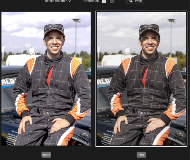
the before and after view, which is just this
little button here. And there are a few different
ways that you can use before and after if you just click through or cycle through. This one is the
clearest way to see it. So firstly, what we can see here is that we're losing quite a bit of detail
in the highlights. So I'm going to bring
this back up again, and then you can
see here how that is being reintroduced
into the image. I still want to keep
them relatively flat, so it's just a process of kind of playing around with things
and seeing what works. But we do have a bit here on this side of
the image that is a little bit too strong
in the highlights. So I'm going to use
the whites up here. To decrease that to
flatten that down. Okay. Then looking at colors. I want to warm this
image up a bit, bring a little bit more
life back into her skin. And again, with
the pink as well, because we're going
a little bit green. I don't know if you can
see that, but if we bring a little bit of
magenta in the tint, and then again, I'm going
to bring the highlights down as well just
to really that. I want to bring some
contrast into the image, but not with the dark bit because I think the
darks are dark enough. We're going to drag
this shadow bit down to bring some of
those shadows down. Again, I'm just
going to bring that mid tone down a little bit more just to kill some of
that hot spot here. So, already, we're
kind of getting a bit more of like a lively
feel to this image. It looks a bit better all ready. So we have here her top has kind of lost a bit of the
saturation from this image. It's a lot more
kind of like blue. So what we can do is come
into our HSL sliders. And there are two
ways to do this. Either I can look
by eye and bring up the blue like that or there's
this little gray button. If I click on that, I come
over to the actual image. I find the color that
I want, and I drag up. It's going to increase
the saturation. If I drag down, it's
going to desaturate. And that's a really good way of finding the color
when you're not 100% sure on what that color is. So I'm pretty happy with kind of the matching of
the colors now. Of course, the colors
are different, but I'm trying to
think about how I saw this image when I
was taking it because, obviously, the camera doesn't always give you an
accurate representation. We're going to come
back to this, and I'm just going to see
if I want to add any little bits of
color into image. I'm going to bring a bit of
yellow into the shadows here. Not too much just to
warm up the image. And now I'm pretty
happy with that. So again, we can develop
new preset, Oh, two, create so that when we
come onto this image, which has currently got
our first preset on, we can now put the
second preset on. So in the next ssa, we're going
to be editing this photo, which was taken using
a strobe flash. Whereas the other two photos
were in natural light, so we're going to be looking
at how that kind of differs.
8. Tweaking Presets (Part Two): So for this lesson, we've got
this photo that I took in the studio using a flash light. So the other two photos
that we've already edited were shot in natural
light indoors. This one is indoors but
using artificial light. So we're going to play around as the contrasts are going to
be a little bit different in this image and also
kind of the field that I want to go for with this image, it's a
little bit different. It's a little bit less natural. Okay, straightaway, I want
to bring up the shadows. We've lost a little
bit of detail here, so I want to bring that up. I'm going to crush
the highlights a bit more because I don't
want them as strong. Let's play around. I
might bring up this bit, so we're crushing the
shadows a bit more. Actually, no, quite like that. We'll just bring this one down
to make it a bit flatter. We have, in my view, a little bit too much magenti. Let's open that up just
so I'm going to bring it back to the green
on the tint here. Already, we're
looking a bit better, and then we're going
to come back down to our color grading section. I'm going to add a little bit
of colour into the midtone. So let's maybe add a bit of yellow to kind of
compliment the skin. And then for these highlights, let's see what we want to add. Again, yeah, we'll
stick with kind of yellows, warm it up a bit. And in the shadows,
we'll stay where we are. I'm happy with the shadows. Okay, so maybe that is a little bit too strong now
I'm looking at it. Again, let's maybe
change the mid tones. Yeah, something like a
blue is quite natural, a very tiny bit of blue. And then warm it up instead
up here in the temperature. Change the composition.
There's something here about his skin that
feels a little bit lifeless. So I think we're in
the contrast here. So let's add the contrast up, flatten it in the highlights. Come down to the
tone curve again. Let's see. Yeah, we're
getting somewhere now. Color grading is just all
about fine adjustments. You don't ever want to go too strong on one thing
or the other. It's all about
making really small adjustments that suit the image. And that way, you can create a preset like how we
have done that applies to a lot of different
images because it's easy to y and then just tweak
a case by case basis. For this image, we don't really have much color other than his actual skin tone to play
around with in this section. So we're going to leave
that pretty clear. Let's click on profile
corrections. Yeah. So for this image, I do think
it does actually suit it. This section down here called the calibration section.
Let's move into this. The best way that I can
describe calibration is that calibration affects the value of a color within another color. So, for example,
looking at red primary. When I move the red primary, that is not going to just
isolate the reds in the image. It's going to isolate the red value of every
single color in the image. If there's a tiny
bit of red that makes up that color,
it's going to shift. A good example is to
look at the green. So from this image, there's not really an obvious amount of
green in this image. But if I increase
the saturation, increases the skin because the skin still has
values of green. So, for example, if I take out the saturation of
the green here, and then I take out the
saturation of the red. You can see how it's taking
out different saturations. If I come down to blue and
I take that out as well, you can see how it's
affecting the image. So essentially,
calibration isn't something that I want
to play around with too much because of how
much it affects an image. But I will slightly move
it towards the yellow here in the reds and increase. That kind of gets me the
look that I want better. This is the before, this is
the after, looking at it, I want to introduce a
bit more contrast by bringing the shallows down and bringing the highlights up. Look at the final image.
I'm pretty happy with that. We're going to add that to
the preset pack. Oh three. Let's now apply
that to this image, and you can see how not all of these presets
are going to work. That second one, I think
that works. That looks nice. Actually, probably I prefer
that to the first one. And it is very much trial
and error, I think, going through the
editing process. You will change your mind. You will do something that
works better all of a sudden than something
you were doing before. We'll keep this
one on there just for reference of
what it looks like, but I actually do think
that this second one where the skin is a little bit
more saturated looks better. So for this image,
let's choose one of our three presets that we've created that we
think looks best. So we've got one,
two, and three. I'd probably say two
is the best so far, so we're going to go with
that, and we're going to move from there onwards. Again, we'll bring open this split view so that
we know what we're doing. I'm going to add a bit of green we're going to flatten
some of those highlights. I don't want it
quite as contrasty, then coming down
into this section, I'm going to
strengthen that blue. I think this image kind of allows for a bit of
a stronger edit. Gonna add some blue into
the midtones, as well. Then let's just
bring it over here. Gonna lift that shadow slightly to bring back
some detail in her outfit. And then I am pretty happy. With that for now.
So that just shows, like how some really simple
tweaks can affect an image. We will add that
also to the pack. Next up, let's look at something with really different lighting. So we're going to copy that. We're going to paste
it onto this image, which is very
different lighting. So already, we can see that
it's not really done much. Here, we still need
a lot of work. I'll start by cropping it. This image is going to work best if we really work
on these shadows, I would actually
say, so we've got a blue light source coming
here, white light here. I'm actually going to add
a blue to the shadows, and we're going to add a bit more contrast
into this image. I'm going to warm
it up slightly, heap the before and after, just keep an eye on what we're doing. Bring in a bit of green
to protect our skin tone. Down in these shadows,
let's have a look. Yeah, I'm pretty
sure the blue is the best for this one.
Just a subtle blue. And then, again, it's just
playing around really and trying to work out
what style you want and how to achieve that. Let's add a little bit of
yellow into this image. We need a bit more contrast. Then let's try and copy
this onto this image, which is a very similar
kind of lighting, but with different skin tone
and a little bit harsher. Already, I quite like
it. Well, just the crop. The things that we've
got wrong here is we're a bit overexposed, so
let's bring it down. We want basically his face in the shadow to be in the shadow. If I bring it up too much,
it's going to look very flat. I'm not really looking
for that vibe. W a bit of detail,
but not too much. And then highlights, again, you want a bit of contrate. The lighting is like
this for a reason, come back into curve. Might just crush
those blacks a little bit here so that we
have a bit more detail, but it still looks
soft and contrasty. I'm quite happy with that. And then we can see
if we want to add a little bit more
color, probably add, like a warmth into the mid tone, and then something contrasting in the shadows. And there we go. We've taken it
from this to this. Looking at it, I think we're a little bit red on the skin tone. So I'm going to shift the greens a little bit and maybe reduce some of
the saturation in the red. There we go. I think
that's much better. Develop that into a new
preset number five. So so far, we've gone through three images are natural light. We've gone through
this first one, second one, this one here, and we've also gone through these two that are more
creative constant light, and this image that's
with a strobe lighting. In the next lesson,
we're going to be editing an image
from scratch again. But this time, it's going to
be a natural light image.
9. Editing an Image from Scratch: So in this Esso, we're
going to be looking at this photo that I took outside on a really
nice sunny day. It's backlit, which
means that the light is coming from behind the model. If you're interested in
learning a little bit more about lighting in natural
light in particular, learning a bit about
back lighting, I do have a full Skillshare
class all about that. But we're going to
dive in now and edit this one from
scratch again. And see what we can do. So, again, we're going to
start with the tone curve. Personally, that's just works for my workflow to start there, but you guys might decide to
do it in a different order. So again, I'm going to introduce a really similar tone curve. I just like to kind of crush highlights and I like
to lift the shadows a bit. I shoot a lot of film,
and I like to try and keep my photos
quite similar to that. I'm going to draw in
a curve here as well. And what I like to
do here is introduce contrast into the image
just by using a curve. So what I'll do is I'll
just flatten this image completely just so that we can see what this contrast
is really doing. I'm going to do something
called an S curve, which you might have
heard of before. It's a very common technique
when it comes to tone curves to create
contrast in an image. And it's called an S curve
because it looks like an S. So I'll just
lift this bit here. Kind of ignore what's
happening to the image right now because that doesn't
matter too much. I'm going to show
you why, and then we'll drag this one down. So we have kind of
like a S curve. Here go. So what I'm
going to do here is right click and I'm going to
copy the channel settings, and I'm going to paste that into both of the other
color channels, and that's going
to kind of offset the color shift that
I had going on there, which just creates
this contrast. So we know that, there's no contrast actually
in the image. All of this contrast is
built by these tone curves. And then you can play around with tweaking the
colors if you want. Might add a bit of yellow
into the highlights. Let's flatten that and bring
back some of the detail in those highlights and
same with the whites. And then we're just balancing, bring back some of the detail. This sheet that I did was
actually for this T shirt, so it is important for me that you can kind of
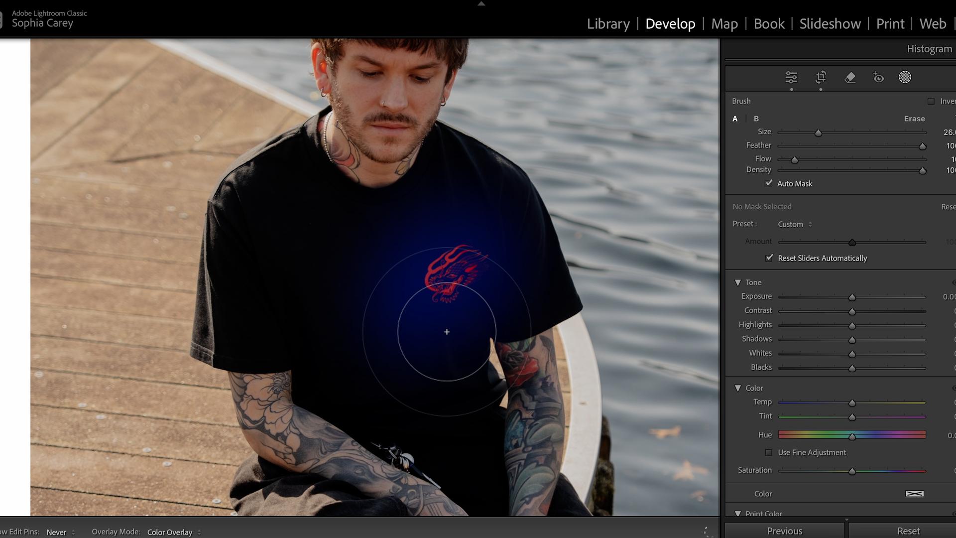
see this logo here. This is actually probably a good way of showing you masking. So if we click over
to the mask here, there are these
different options. We're going to go for brush. What I'm going to do
here is I'm going to just brush in over the image here that I want a
bit more detail to come to. Now, all of these
controls here underneath mask one are going to affect the image that I've drawn over. So if I bring up shadows, you can see that it's affecting
that part of the image. I just want to increase
a tiny bit just to kind of lift the details so that we don't have
as much shadow here. So that is a way in which
you could use a mask. Okay, so the next thing here I'm going to do is
we're going to come down to our HSL section, and I want to bring a bit
more life into this water. So we're going to do
that through HSL, the color mixer, and also
through color grading. So for saturation,
let's drag this up. I want to bring a bit more
of that into the image. The rest of it will probably
be done in color grading. So this, for me, looks like it's a shadow
section. Let's see. Yep, so all of this
section down here in the bottom of the
image is shadows. So I want to add, a bit
of warmth into this. Let's go for something like
that, that nice orange. And then in the mid tones, I also want to add
a bit of warmth. It's a nice bright sunny day, so let's add a bit more orange into that as
well, just subtly. And then in the highlights, let's have a look at
what color looks best. Maybe a nice kind of blue to
kind of contrast and offset. Then let me just have a
look. Is that looking too orange? I'm quite happy. I'm going to add
a little bit more yellow into the shadows. So I'm pretty happy
with that as an edit. So let's add that to. Our preset list. What number is this?
Let's have a look. Number six. So these are all the presets
that we've got so far. This one here, the reason
that it's kind of going like, more bulbous is because
on this preset, we had the lens correction set. So that's what
you're seeing here. Okay, so we're going to
click on to this one, which is also natural light, and we're going to apply that. Okay, so straightaway,
this one is way too orange for this image. So let's kind of try
and correct that. We'll bring open our
reference view again, and we're going to just work on kind of correcting
what we've added. So straightaway, I know that
we added some midtones. Some color into the mid tones, let's take those out and offset. Then I think there's too
much contrast around here. We want there to be a little bit less light and
a little bit less dark. So again, we're going to use
the tone curve to do that. I'm going to push this bit down here and bring it up here. Let me move that down a bit just to try and add
a bit more contrast. The reason this is adding more contrast is
because it's also affecting this part of
the curve, the midtones. I'm quite happy. With that, that looks better to my eye. Make it a bit warmer again, maybe add a bit more
contrast to it. Okay, and then that was the
original, and that is now. Quite happy with
that one, as well. So let's save that
as number seven. Let's put number seven
onto this image, and we can just do some fine
adjustments onto this one. So I want to bring in
a bit of contrast. Let's do that with
the contrast tool. And I want to take out
some of this orange. Change the white balance
first, bring that back a bit. And then it's just going to be about resetting the contrast, basically, kind
of a similar kind of tone curve to what
we've been playing with. The other images. I'm
probably just going to smooth out his skin here with the
clarity very slightly, bring in some shadow again, bring in some highlights, maybe reduce the contrast a bit. Yeah, starting to get there. I'm going to bring in
some more saturation. We're just going to generally
saturate the image and then just play around with
tweaking the colors now, and then I'm pretty happy
with something like that, which I will save as
an eighth preset. I think we've got nine photos, but only eight presets. So where have we gone
wrong? Maybe it's this one. Okay. So we didn't say this
one. Let me add that one. In the next lesson, we're
going to be looking at calling these
images and exporting.
10. Culling & Exporting: So now we've finished kind of the grading part of this lesson. I just want to go through
the kind of final steps, you know, once I've
done all my photos, how do I export? I'm also going to be
talking about culling because that is something
that we didn't really do during this lesson because I had pre
selected the photos. I'm going to show you
my way of culling or how I select what to
export in Lightroom. So for me, I use something
called quick collection. Quick Collection is
this little dot here. You can also click
B on the keyboard. But clicking that
is going to add it to a quick collection. If I go onto this part of Light room where it
says previous input, and I move to Quick collection, it is now going to
just show this image. If I go to all photographs, we've got all of
the photos, maybe I want to select this
one for Export as well. I'm going to click
that little dot or press B on my keypad. And then when I go
into Quick Collection, I've got these two
images ready for export. If I want an image
to be exported, I click B on my keypad, it goes to my quick collection, and those are the images
that I export at the end. So let's actually
Export. I'm going to select both images.
Shift and click. I'm going to right click Export, and then click Export. It's going to bring up
this tab for you here. The first thing I do is
export to specific folder. I choose the folder that I
want to be exporting into, so it'll be the editing
portrait photography class. Then put in subfolder, I'll put edits or Export,
whatever we want to call it. I personally have
my name here and my start number so that
people can credit me, and then the start number will basically be
where it starts. So image number one will be one, Image number two will
be two, et cetera. Video is not applicable
for file settings, I use JPEG, high quality. I keep my color space in SRGB. I don't use any of
the other things. That is as simple as it gets. And then I just click Export. These are no exports, and in a second, they'll
pop up. Here we go. I have the images now exported. But thank you for
sitting through today's class and
editing with me. It's been really fun to
kind of show you guys how I personally edit portraits
in Adobe Lightroom, and I'm really
looking forward to seeing you guys upload it to the class project gallery
with your edited photos. I really do encourage
you to play around with Lightroom and find
your specific style. When you have a go to way of
editing, it's going to make Everything's so much easier for you in terms of your workflow, in terms of what clients expect, in terms of consistency
for your work. All of that will be so much easier and come more
naturally to you when you kind of know what it is you are looking for
from your editing. Hopefully, in this class,
you've been able to see what some of
the main tools in Lightroom do and
how to understand them so that you can use them within your portrait
photography. If you guys are interested in more of my work
here on Skillshare, I have classes from shooting in the studio to shooting
in natural light. But thank you guys
for watching, and I will catch you in another one.
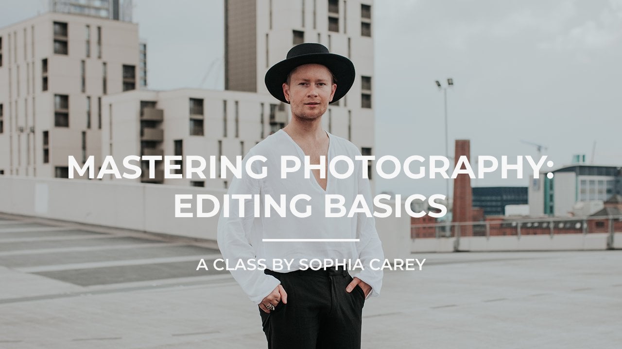
 Sophia Carey, Photographer