Transcripts
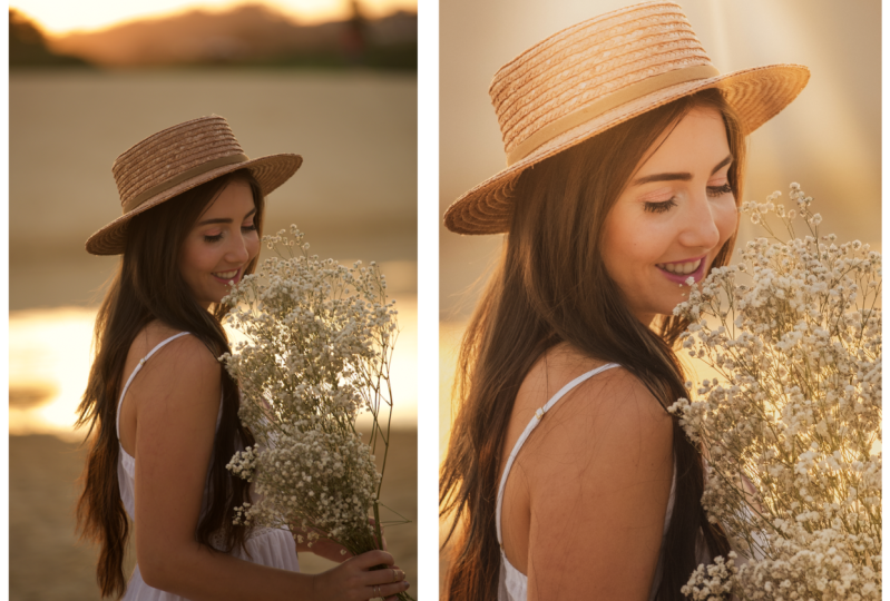
1. Introduction: Mastering the art of
portrait editing allows you to express your
unique artistic voice. Do you wish to transform
your portraits from ordinary to extraordinary and leave a lasting impression on your audience during
this workshop to master Lightroom and unlock the full potential of
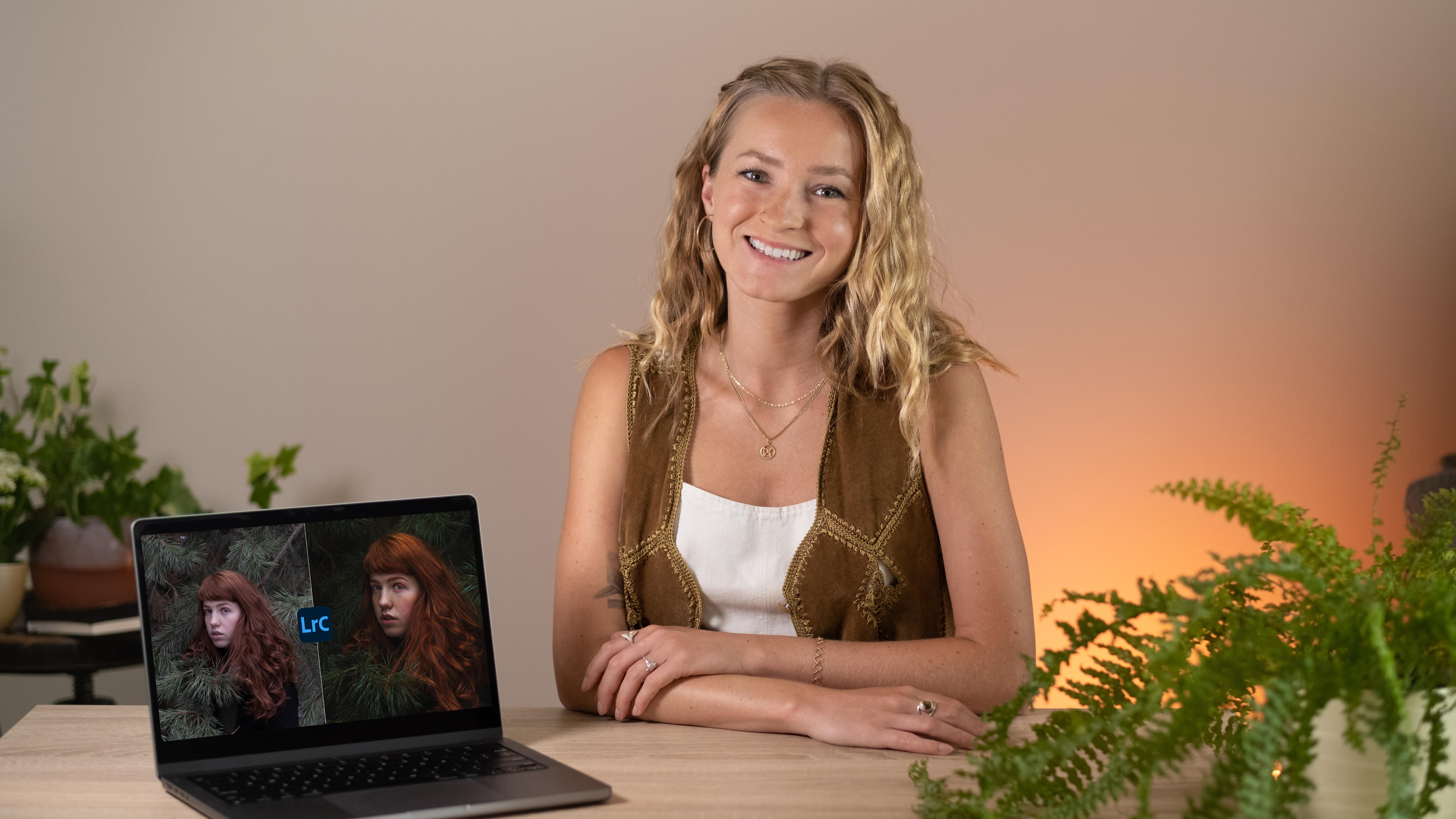
your portrait photos. Welcome everyone. I'm Clara and I've been
immersed in the world of photography for
almost a decade. Throughout my career. I've had the privilege of
working with numerous clients, capturing their
unique stories and bringing out their
personalities through my lens. The editing process has always been an integral
part of my workflow, allowing me to enhance
the raw potential of each portrayed and create
compelling visual narratives. I have a dedicated countless
hours to mastering Lightroom and exploring
its tools and features. I'm thrilled to have the opportunity to share
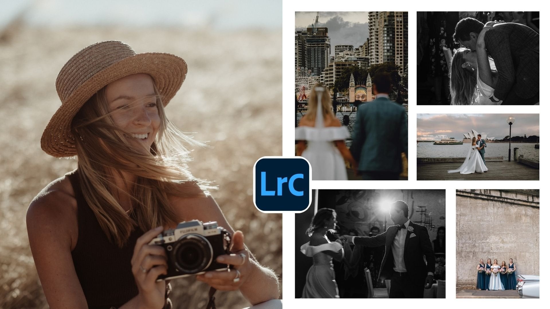
my experience with you. The only thing you'll need
to finish this class is editing software, preferably
Lightroom Classic. We'll explore both the basic and advanced tools
that it offers. Whether you're a
beginner looking to grasp the fundamentals, are an experienced
photographer seeking to elevate your editing skills. This workshop has
something for you. And if you're not really confident with shooting
portraits yet, you can also check out my
previous class where I teach how to work
with your models to take images that stand out. And in this class, you'll learn to make them
even more powerful editing. I'll first introduce you
to my editing workflow. Will then continue exploring Lightroom's basic
editing tools to build a solid foundation for
more advanced techniques, we will discover tools for
correcting imperfection and venture into the realm of
tools for color adjustments, including RGB curves or
HSL color adjustments. Masking doors will
open up a world of possibilities for creating
depth in your photos. And there will be much more
tips and tricks that will help you to simplify
your editing workflow. By the end of this workshop, you'll have a solid
understanding of Lightroom's portrait photography
editing capabilities, enabling you to transform ordinary shots into
extraordinary works of art. To breakfast those
newly learned skills slow tried editing
workflow with me. I'll provide you with
a portrait photograph that needs some editing. And your task is to use the
various tools that we'll discuss to bring out
its full potential. So fire up your Lightroom
and get ready to discover the art of portrait photo
editing. Let's dive in
2. Project: I have an exciting project
for you to work on, a hands-on opportunity to experiment with the editing
techniques we'll cover. I'll provide you with
a portrait photograph that in need of some editing. And your task is to apply the various tools and
techniques that we'll discuss to enhance the image and bring out its
full potential. This project will allow you to experiment with
different adjustments, gain confidence in
your editing skills, but also explore
your creative side. Feel free to add your
personal touch and make artistic decisions
that align with your vision and the mood
you wants to convey. The only thing you will need
to finish this project is editing software, preferably
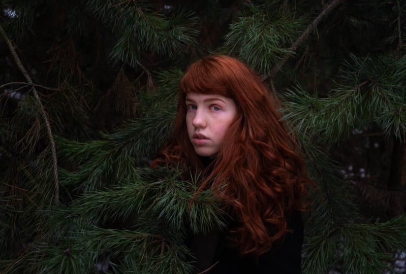
Lightroom Classic. First go to the class resources and downloads the project image. I have uploaded three
photos for you. You can choose one
that you like the most and that you will edit, import a photo to your
Lightroom to get started. Take a moment to study the portrait and decide
what edits with suited. Begin by applying
basic adjustments. Then move to skin
corrections, and finally, play with adjusting
colors and creating more depth with
masking and brushes. Most importantly, shared
a photo with us in the project section to receive feedback and engage
with fellow students. Don't hesitate to reach
out to me if you have any questions or need
guidance. Happy editing
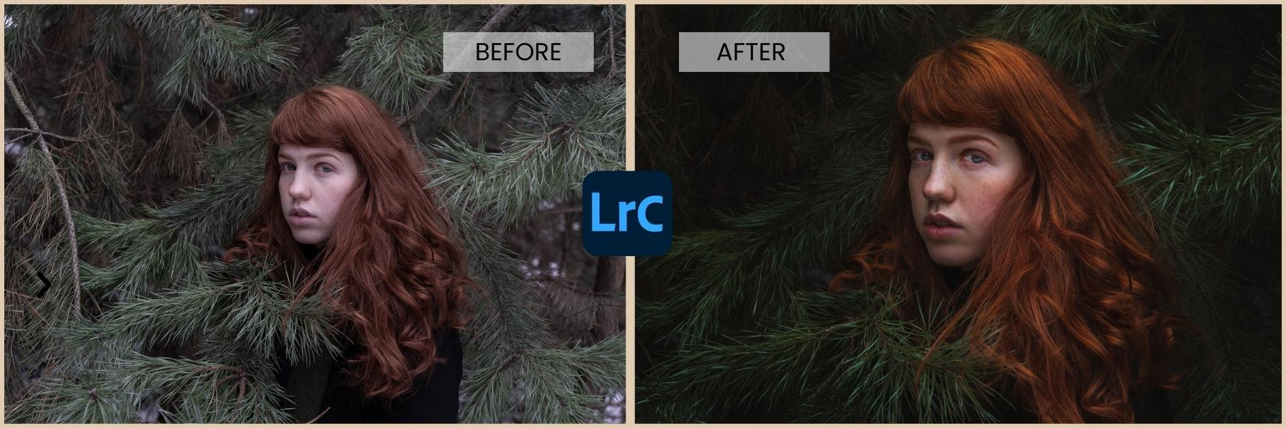
3. Editing Workflow: In this lesson, we'll dive
into the exciting world of Portrait Editing by exploring
my personal workflow. Over the years, I've developed a systematic approach that guides me through
the editing process. It's helpful to follow a
structured workflow to ensure efficient and effective
editing and well, individual preferences may vary. I'll share with you my
workflow that you can adapt and customized based
on your specific needs. After importing the
photo into Lightroom, I start to apply any unnecessary
initial adjustments like cropping and straightening to establish a solid foundation
for further edits. Begin by adjusting the basic
tones and exposure settings. Start with global
adjustments such as exposure,
contrast highlights, shadows, whites and blacks to achieve a balanced overall
exposure of your image. To the right. The white balance, vibrance and
saturation to achieve accurate and pleasing skin tones and overall color balance. If needed, move on to retouching the skin and removing any
blemishes or imperfections. Use tools like the spot removal, Healing Brush to carefully address any areas
that need attention. Be mindful to maintain a natural appearance while
minimizing distractions. I do skin retouching, incorrect blemishes before
diving into color adjustments. And there is few
reasons for that. Retouching the skin
and addressing blemishes airline in
the editing process allows you to create a smooth and even complexion
for your subject. By starting with
skin retouching, you establish a solid foundation for the rest of your
editing workflow. Once the skin
retouching is complete, you can focus on color adjustments by addressing the color accuracy and balance. After retouching, you ensure that your
adjustments are applied to the most accurate representation
of the subject skin. This helps to maintain natural looking skin tones and avoids potential
color shifts. Once the global color
adjustments are in place, you can move on to selective
color adjustments. This includes working with
tools like RGB curve, the HSL Color panel to
fine-tune specific colors, enhancing or desaturating
certain hues and making subtle adjustments to bring out the best
in your portrait. We can now explore
creative adjustments to enhance the visual
impact of your portrait. This can include using tools
like Graduated Filter, radial filter, and adjustment
brush to add depth. Emphasize certain features or direct focus within the image. Don't be scared to
experiment and find the adjustments that best
suit your artistic vision. Proceeds to enhance the
details and sharpness of your portrait using tools
like the Sharpening panel. I just the amount radius, detail and masking sliders
to selectively sharpened important areas of the image while minimizing
noise or artifacts. Lastly, make any
final adjustments to refine the overall look
and feel of your portrait. This may include adding
grain, adjusting exposure, contrast, or color tweaks to achieve the desired
mood or style. Pay attention to the
small details and ensure a cohesive and
polished final image. Remember that this
suggested workflow is a general guideline and you can adapt it to fit your
personal preferences. The key is to have a
structured approach that allows you to
efficiently navigate through the editing
process while maintaining a natural
appearance in your portraits. Remember, it's always a
good practice to work on a solid foundation and address the critical elements
of your image, like skin retouching
before moving on to more creative
color adjustments.
4. Basic Adjustment Tools: In this lesson, we'll begin
our journey by exploring the basic adjustments
tools that serve as the foundation of
the editing process. You'll find these
basic adjustment tools in the first panel
and Lightroom. By starting with the
basic adjustment tools, you lay the groundwork for a
successful editing process. They provide the
necessary corrections and establish the overall look. As you progress to more
advanced tools and techniques, the foundation that
you create visit the basic adjustments will contribute to a more
polished final result and effective editing workflow. I always start editing my
photos with a crop tool. The crop tool allows
you to adjust the composition of your photo by cropping out unwanted elements or straightening the horizon. You can use different
aspect ratios to give your photos
a unique look. Lightroom also provides
grid overlays, including the rule of thirds, to assist you in
composing your photo. The first panel you'll see in Lightroom is called
the Basic panel. It contains essential tools that help you set the right exposure. We have the exposure slider for adjusting the
overall exposure. But be careful not to overexposed
or underexposed image as it can lead to loss of detail or unnatural
looking results. Below the exposure slider, you can see another four
sliders for highlights, shadows, whites and blacks. This can be a little
bit confusing, so I'll explain the differences. Both the highlights and
whites sliders impact the brightness of the
brightest areas in your image, but they serve a slightly
different purposes. The highlight
slider is primarily focused on recovering DDL
and the brightest areas. Moving the slider to the left reduces the brightness
of the highlights, recovering detail in those areas that may be at risk
of overexposure. This can help prevent
highlights from appearing too bright
or blown out. On the other hand, why it's represented the purest white
tones in your image. These are the areas that
should be completely without color or
tonal information. Moving the slider to the right helps enhance the
overall contrast of your image as it
determines the level of brightness at the extreme
end of the tonal range. The shadows slider
controls the brightness of the darkest areas
in your photo. Moving the slider to the right increases the brightness
of the shadows, revealing more detail
in dark regions, especially when working with backlit or high
contrast portraits. Moving the black slider helps establish the darkest
points in your image, ensuring rich black tones and
enhancing overall contrast. I move the black slider
slightly to the left. Another basic tool is
the white balance tool. Divide Balance tool
helps you correct the color temperature
of your photos. You can adjust the
temperature and create more warmer colors. Moving the slider to yellow
tones. Duty opposite. And at coolness. The tint slider allows
you to fine-tune the green and magenta
balance in your image. You can also use the
eyedropper tool, which will set the
right balance for you. Selecting the eyedropper
tool and then clicking on a neutral
gray or white area in your image will automatically adjust the white balance
based on the selection. You just have to ensure that
the area you select is truly neutral and not influenced by strong color casts
or reflections. We can then enhance the colors using vibrance and
saturation tools. Saturation and vibrance are both adjustments related
to color in Lightroom, but they affect your image
in slightly different ways. Saturation at just
the intensity and vividness of all colors equally. On the other hand, vibrant. Adjust the intensity or vividness
of colors, selectively. Focusing more on less
saturated colors. Vibrant also protect skin tones, preventing them from
becoming overly saturated, which can happen when using
the saturation slider. When working with
portrait photographs, it's generally
recommended to use vibrant more often
than saturation. Avoid overly saturated
skin tones and to maintain a more balanced
and realistic appearance. The last the things that we
find in the Basic panel, our texture, clarity and dehaze. They all enhanced image details, but in different ways. The texture affects
only the details. Clarity affects
mid tones. And D. Hayes targets low
contrast areas. For portrait photography,
I mostly use texture to sharpen the
details like ice or hair. When it comes to Clarity slider, I move it slightly to
the left to soften the skin and produce
force and wrinkles. You can see that if
I do the opposite and move the Clarity
slider to the right, all those unwanted details
are much more visible. I always use these two tools
for portrait photography, but not so much. The third slider,
which is Dehaze. Slider, can help to reduce
the effects of haze, making the image appear
clearer and more contrasted. And with these last
three Image adjustments, we have covered all the
basic Lightroom tools. Remember that every great edit is built on a solid foundation. So embrace the power of the basic adjustments
tools and unlock the true potential of your portrait photos by
addressing exposure, white balance, and composition. Early on, you establish a strong starting
points that may require fewer adjustments
in later stages.
5. Spot Removal: Clone and Heal: From now on, we're
moving away from the Basic Correction panel and focusing on more advanced tools. The first one is the
Spot Removal tool. You'll find a spot removal tool in bar above the basic panel. It is handy for removing blemishes or distractions
from your portraits. This tool has two options. You can either use
grown or heal mode. Let's explore how each mode
works and when to use them. A clone mode is ideal for
situations where you need to duplicate or copy pixels
from one area to another. To use clone mode, select the tool and
adjust the brush size. You can make the brush
smaller for precise areas, are larger for broader areas. Another important
feature is feathering. Feathering is the
ability to control the softness or transition
of an effect or adjustment. It allows you to create more
natural and seamless blend between the affected and
unaffected areas of your photo. A higher Feather value creates a smoother and more
gradual blend. Well, a lower
Feather value create a sharper and more
defined transition. When using the tool, move the brush over
the blemish or unwanted elements and click. Lightroom will clone pixels from the source points to cover
the area you clicked on. Sometimes it doesn't choose
the best area to copy from. So we need to drag it
manually to the place that is closest to our deserts
texture or color. The clone tool simply makes
an exact copy of the pixels. It can be useful if you
need a definitive edge, for example, when
removing a bigger object. But what do I like even more
than cloning is a heel mode. Mode is designed to
automatically blend the area of the
surrounding pixels, creating a smoother and
more natural result. And that's the main difference
between these two twos. The Healing Brush
takes into account the surrounding
color and texture. It hides content seamlessly, making a spot to disappear
in a very natural way. So in most cases, when removing hair
dust or pimples, I use the Healing Brush. But when I need to
remove something of a larger size from the photo, I use a clone mode to
have more control. When using either mode, it's important to
keep the brush size appropriate for the
area you're working on, ensuring that the
cloned or heeled area matches the
surrounding pixels. Additionally, zooming
in on your photo can help you achieve
more precise results. When working with these
tools in general, remember that it's always a good practice to
strike a balance between removing imperfections
and maintaining the natural texture and
appearance of the skin. I use these tools as
little as possible. I always tell my clients that I don't change their
appearance and therefore, I don't remove wrinkles. Of course, that I get rid of
the pimples that showed up overnight and will be gone
in a few days anyways. But wrinkles are part
of our faces that stay an important
part of who we are. So item remove them. I rather use other
tools to soften them up a little bit and
make them less visible. And I'll talk about those
stores in the next lesson. Take some time to practice
with the Spot Removal tool on different portraits and you'll see what works for you the best. Over time, you'll gain confidence in using
it effectively. And now that we've
covered the basics, let's move on to some
advanced tools in Lightroom that can take your portrait editing
to the next level.
6. Tone Curve: Manipulate Exposure: Another advanced tool will explore is the Tone Curve Tool. The tone curve tool
as a powerful tool for adjusting the tonal
range of your photos. You can make precise
adjustments to the shadows, highlights, and midtones to add depth and dimension
to your portraits. The Tone Curve tool
consists of a graph that represents the tonal
values of your image. The horizontal axis
represents the input tones ranging from shadows on the left to highlight
on the right. The vertical axis represents
the output tones, allowing you to
control the brightness or darkness of those stones. To make adjustments
using the tone curve to, you can simply click and drag on the line to create
control points. By manipulating these
control points, you can reshape the curve and fine-tune the tonal
distribution in your photo. Let's explore some common
adjustments you can make. Whether the Tone Curve tool
to darken the shadows, create a control
point on the bottom left side of the curve
and drag it down. On the other hand, if you want
to brighten the highlight, create a control point on the top-right side
and drag it upward. Creating this S-shaped
curve helps you to increase the contrast and depth
to your portraits. Working with the curves
tool also gives you the possibility to find
you in the mid tones. You can create additional
control points along the middle section. By raising or lowering
these control points, you can add or reduce
the brightness and contrast in specific
areas of your image. And if you get lost
with too many points, simply double-click on a
certain points to remove it. You may be thinking, why would you use
this complicated tool if you can adjust the highlights and shadows easily with the
basic sliders and answers. Simple curve tool gives
you more freedom. The basic sliders provide a simplified and
user-friendly way to adjust exposure
and tonal values. But the curves tool offers more precise control
and allows you to make adjustments at different points along
the tonal range. What I like to do when editing a portrait is to drag
the black points slightly up to give the blacks of pushed out
and softer look. And if there are too
many bright parts, I drag divides down so that my highlights are
not overexposed. This is a creative choice
that I like to do, but there are a few
things to keep in mind. Raising the black point can work well for certain
styles of portraits. Providing a dreamy or
vintage atmosphere. However, be cautious not to lose too much details or contrast in the darker
areas of the image. This can result in a loss
of depth and definition. Dragging divides down can help in avoiding
blown out areas. But be mindful of the overall
tonal balance and make sure that your image doesn't appear overly muted
or lacking contrast. Make sure that your adjustments maintain a balance
between the shadows, mid tones, and highlights. You may need to make additional adjustments
to other points on the curve to achieve the
desired overall tonal balance. I really like to
experiment with curves, and I always use it
to edit my portraits. The choice between using the basic sliders or curves
depends on your level of comfort and the complexity of the exposure adjustments
that you need to do. The basic sliders
offer simplicity and our great helpers
for quick adjustments, especially when dealing with straightforward exposure issues. But on the other hand, the curves tool provides
greater flexibility and control for more
precise adjustments. It's worth mentioning that both approaches can be
used in combination. Feel free to experiment
with both methods to find the workflow and adjustments
that work best for you. Take some time to
experiment with the Tone Curve tool and see how different adjustments
can transform the mood and atmosphere
of your portrait photos. With practice, you'll gain a deeper understanding of how to use this
tool effectively. Another thing I
want to mention is this tool for
targeted adjustments. If you want to make
adjustments to a specific tonal range, this tool will help you click on it and it will turn
into a target symbol. Click on your image to select a specific tone
in Lightroom will automatically create
a control point on the curve that corresponds
to that tonal range. You can then drag
the point up or down to make it brighter or darker
7. RGB Tone Curve: Manipulate Colors: In this lesson, I
want to focus on the Tone Curve tool again, but this time on the RGB curves. In addition to the
basic tone curve, Lightroom also provides
the RGB curve to which allows you to make adjustments to individual color channels, red, green, and blue. This tool gives you
precise control over the color balance and tonal
range of your photos. Understanding RGB
curves is quite simple. The red curve tones
the picture either towards red or towards
its opposite, turquoise. The green curve tones the picture towards
green or magenta. And the blue curve tones, the photo towards
blue or yellow. Let's explore how you can use the RGB tone curve tool to
enhance your portrait photos. Let's start with adjusting
the red channel. Creating control points and dragging them up or down allows you to increase or decrease the intensity of the red tones. This can be useful for
fine tuning skin tones. Adding warmth to your portraits. If you do the opposite
and lower direct curve, it can be saturated or reduce
the intensity of red tones, resulting in a cooler or
more cyan color cast. Modifying green
channel allows you to target the green
tones in your image. It can help you correct
color imbalances, such as adjusting
foliage or grass colors, or even adding or reducing the green cast and certain
lighting conditions. It can also affect
the appearance of skin tones as green is a
complimentary color to red. And lastly, manipulating
blue channel allows you to control the
blue tones in your photo. Raising the blue curve will increase the intensity
of blue tones. This adjustment can
enhance blue skies, water, and other blue elements. It can also create a cooler or blueish cast in
the overall image. And because I prefer warmer
color tones in my images, I can lower the blue
curve to add some warm. What usually works best
for me is to create an S-shaped curve in all
these channels to add some extra contrast and
be able to manipulate certain colors to add
warmth at the same time. After you're comfortable
using RGB curves, you can keep adding more points
to play with, highlights, shadows, mid tones, and
anything in-between. So again, the RGB curve tool gives you more
possibilities to play with the color channels
than just using viable and then sliders
in the Basic panel. It helps you to create
contrast or achieve a more faded and Raymond look
all in one place. When blank, when
the RGB tone curve, I do only subtle adjustments. Even the slightest shifts can make a significant difference. So it's essential
to keep an eye on the overall impact
of your changes. By selectively
manipulating the curve, you can emphasize or de-emphasize
specific color tones, giving your image a
distinct look and feel. This can be especially
useful for creating vintage, cinematic or dramatic effects. You can, for example, create a vintage
look by lowering the blue channel or experimenting with cross
processing effect. This tool opens up endless possibilities
for color grading and tonal adjustments to add an artistic touch to
your portrait photos
8. HSL/Color: Hue, Saturation, Luminance: Another tool for color
corrections that is worth mentioning is the
HSL color tool. This is a powerful feature
that allows you to make precise adjustments to the
colors in your photos. Hsl stands for hue,
saturation, and luminance, which are the three
aspects of color that you can control
using this tool. Let's explore this
tool in more detail. The hue slider is LRU to change the actual color of specific
elements in your portrait. For example, you can
shift it to you of the reds to make them appear
more orange or magenta. It depends on your preferences
and editing style, but I'll show you
what I usually do. I usually touch greens, blues, and oranges because I like to have warmer
tones in my photos. I slide the green more
towards yellow tones. And I moved the orange, red and yellows as well. Sometimes I also like to
change blue to more turquoise. The next one is saturation. I don't like to have my
photos over saturated. So what I do most of the
time is that I rather lower the saturation of some colors selectively,
then raise it. I mostly do it with green
because with portrait photos, I like the main focus to be on the person not under overly
saturated green leaves. I also lower the saturation in the blues to affect the sky. And especially in winter
when it's cold and certain parts of the face
can turn red or purple. I also an overdose
situation of these colors. And the last sliders affect
the luminance of colors. This adjustment affects
the overall lightness or darkness of the colors
without altering their hue. But remember that if you
move the slider to the left, it will not only
darken the color, but also make it
richer, more saturated. I use this tool to make the sky brighter and therefore
less saturated, and also to make
the greens darker so that the face can stand out. I usually switch between these three features because
if you change one setting, for example, illuminant, you didn't have to
adjust saturation. Even within this panel, you have the targeted
adjustment tool that we talked about in
the previous lesson. You can click on a
specific color within your image and by
dragging it up or down, adjust its hue, saturation,
or luminance directly. This tool is particularly
useful when you want to make targeted adjustments
to specific colors without having to manually
adjust the sliders. The HSL color tool gives you precise control over the
colors in your photos. You can use it to
correct color costs and enhance or tone down
specific colors. Experiment with HSL color tool, both globally and using the
targeted adjustment tool to achieve your desired
color adjustments to make your portraits stand out
9. Masking: Adjustment Brush: When it comes to advanced editing techniques in Lightroom, one powerful tool that opens up a world of possibilities
is masking. Let's dive in and unlock
the power of masking in Lightroom than the first
tool, the adjustment brush. Masking allows you
to apply adjustments selectively to specific
areas of your image, providing fine control over where and how those
adjustments are applied. With masking, you can target specific regions such as
subject's face, eyes, background, or other elements, and make precise corrections without affecting the
rest of the image. This level of precision
and control is crucial when it comes to
portrait photography. To access the Adjustment Brush, click on the Brush icon
in the develop module, or press the shortcut key. Once activated. Range of adjustment
options available, including exposure,
contrast, saturation, clarity, sharpness, and more. You can select one or
multiple adjustments to apply to your targeted area. I want to make certain parts
of the portrait brighter. So I'll start by increasing
the exposure of mine brush. But before we start painting, it's important to adjust
the brush settings. You can increase or decrease the size of the brush
or change its feather, which controls the softness
of the brush edge. I'll go for higher
Feather value that creates a smoother transition. The Flow slider,
which we see below, determines the rate at which the adjustments are
applied as you brush. And density controls
the overall opacity of the adjustments applied. The last option we have here is enabling auto mask that
helps the brush to automatically detect
edges and apply the adjustments more accurately
within the targeted area. When you have your brush ready, we can start painting. Click and drag the brush over the area you want to adjust. If the effect is too strong, you can always
modify the sliders afterwards to make
it less visible. If you make a mistake
or wants to remove adjustments from
a specific area, you can use the
erase brush within the Adjustment Brush tool to selectively remove
the adjustments. Adjustment Brush Tool
is incredibly versatile and can be used for various purposes and
portrait photography, you can selectively brighten
or darken specific areas. I use it to brighten the
eyes and make them sharper. Brighter than the dark
circles below the eyes. I can paint sunlight in the hair or add highlights on
the nose or above the lips. If the person has
visible wrinkles, I use the brush to make them
lighter and less visible. By highlighting the shadows
and reducing clarity. You can achieve a lot
with the brush tool and sometimes when you
play with it enough, you don't even need to use
the clone or heal too, because you can soften
the skin with brushes. I can also make the
brush bigger and darken the background so that the face of the person stands
out even more. You can completely change the mood of the photo
with the brushes. And that's why it's one
of my favorite tools that I use most often when
editing portraits. The key is to ensure that the adjustments blend naturally with the rest of the image. Take your time to practice and experiment with
this powerful tool. It's worth it
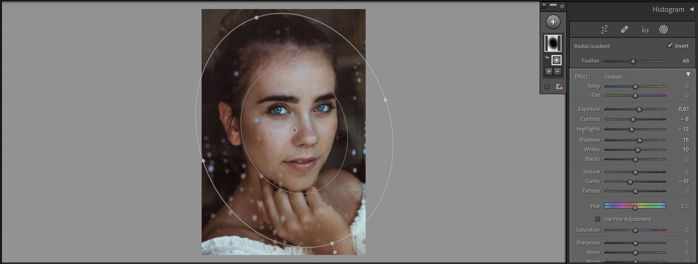
10. Masking: Radial and Graduated Filter: Similar to the adjustment brush, we have other tools
to selectively apply adjustments
to certain areas, radial and graduated filters. To access the radial filter, click on the circle icon with the plus sign in
the develop module. Or press the shortcut key Shift M. Draw the circle
or oval shape. And once activated,
you'll see a range of adjustment options in
the radial filter panel. It's very similar to
the adjustment brush. You can adjust
exposure contrast, saturation, clarity, and more. You can adjust the size and shape of the mask by
clicking and dragging the handles or by using the size and feather sliders
in the radial filter panel. The feather slider controls the softness of the masks Edge, allowing for smooth
transition between the masked and unmasked areas. I always aim to have my
transitions soft and smooth. And you achieve this by moving the feather slider to the right. When making adjustments,
by default, it applies the changes
within the mask. If you want to apply
adjustments outside the mask, select the invert mask checkbox. This both flip the
mask adjustments that you will make effect the
area outside of the mask. The radial filter is
an excellent tool for emphasizing specific subjects or areas within your portraits. I use it to darken the
background and create a vignette effect to make the
face of a person stand out. Another powerful tool
in Lightroom for making selective adjustments as
the graduated filter. This filter allows you
to apply adjustments gradually across
a selected area. It is particularly useful for
adjusting skies, horizons, or any other areas
where you want to apply specific
adjustments gradually. To access the graduated filter, click on the square icon
with the plus sign in the develop module or
press the shortcut key M. You can then make adjustments the same way
as with the radial filter. You can again modify
the position, width and feathering of
the graduated filter by clicking and dragging the handles or by
using the sliders. You can also rotate the gradient filter by
dragging the rotation dial. The graduated filter is an excellent tool for
balancing exposure, adjusting skies, and
creating gradient effect. You can also combine these
filters with other masks. For example, I want
to darken the sky. So I use a graduated filter, but it applies to the face
of the person as well. So under the mask, I click on a minus sign, select the brush and paint over the face so that the gradient filter
doesn't affect the face. You can easily combine the masks like this to achieve the
result you're after. Take your time to
experiment and keep exploring all those
amazing possibilities that these filters offer.
11. Final Touches: Sharpening, Noise & Grain: We are getting towards the
end of our editing process. One of the last edit
I do at the end of my editing workflow is applying sharpening
and noise reduction. Sharpening and
noise reduction are essential aspects
of post-processing that can greatly
enhance the quality and clarity of your
portrait photos. Sharpening is used to enhance the details and
sharpness in your image, particularly on edges
and find textures. Lightroom provides a
sharpening panel that offers several parameters
for sharpening adjustments. The main parameters and the Sharpening panel
include Mount radius, detail and masking Amount control the intensity
of sharpening. Radius determines the size of the details that
will be sharpened. Higher radius value Vo
sharp and larger details. And a lower value will
target finer details. Detail parameter helps to control the sharpening
of smaller details. Increasing the detail value
enhances the sharpening of fine textures while reducing it focuses more on
larger details. The last value is masking, which allows you to
limit sharpening to specific areas of the image. A higher masking value
limits the sharpening to areas with more
significant edges. A lower value broadens the sharpening effect to
include smoother areas. The specific values for sharpening will depend
on various factors, including the characteristics
of your image, the level of noise, and your personal preferences. But I can provide you with some general guidelines
to help you get started. Start with a conservative
amount value of around 25 to 50 and adjusted gradually. Try to avoid
excessive sharpening. It can introduce artifacts
and unnatural appearance. And it can make the noise
in the image more visible. Set the radius value 1-1, 0.5, and adjust the Detail
slider to bring out the desired level
of sharpness and smaller textures and details. Higher values such as 50 or 70, are commonly used
for portrait photos. Let's invented in noise
reduction to noise reduction is used to minimize
the unwanted noise or grain present in your image, especially in low light
or high ISO situations. Lightroom's nurse reduction
panel provides sliders to adjust the luminance
noise and color noise. Slider reduces the
luminance noise, which is the random
variation in brightness. Increasing its value
smoothens the image. But excessive luminance
noise reduction can result in a loss of detail. And this Slider
targets color noise, which is the
variation in color in areas with low
light or high ISO. Increasing the
value helps reduce Keller speckles and
artifacts caused by noise. When it comes to exact
settings starts with a conservative luminance
noise reduction value of around ten to 20 and
increase it as needed. Be cautious not to over smooth the image and lose
important details. Adjust the color noise
reduction slider. Values 20-40 are often suitable, but adjust them based on the intensity of color
noise that is present. Remember that these
values are just starting points and you should evaluate the impact of the adjustments on
your specific image. Zoom in to 100% or higher to assess the details and
noise reduction accurately. It's recommend is to make adjustments and observe
the changes to achieve the desired balance between sharpness and noise reduction. Over sharpening can lead to artifacts and
unnatural appearance. While excessive noise
reduction can result in a loss of fine details
or a plastic look. You can also selectively
apply these adjustments using brushes are masks to
specific areas of the image. You can, for example, use it for the subjects phase while
preserving other areas. Remember that the
different images may require different things. So feel free to
experiment and fine-tune the values based on your
aesthetic preferences. But as you near the final stages of editing your portrait, consider applying both sharpening
and noise reduction to additive finishing touches and bring out the best
in your image. Another finishing
that you can apply in Lightroom is adding grain. Grain is a film like
texture and can add a vintage or artistic look. Even if we reduce noise
in the previous step, it can still make sense to add
some grain to your images. Noise reduction is
used to reduce or eliminate digital
noise in your image, which can appear as unwanted
grain or pixelation. By applying noise reduction, you can achieve a cleaner
and smoother look, reducing the
distracting effects of noise and enhancing
overall image quality. Adding grain to your
photo can create a specific mood or emulate the look of traditional
film photography. Grain can add texture, depth, and nostalgic
or artistic feel. It can also help to soften or blend areas of
smooth transitions, such as skin, a more natural
and pleasing appearance. You can experiment with
the amount of grain, with the size of grain
particles or roughness, which determines the contrast
and sharpness of the grain. And it is same as with
any other adjustments. I recommend making
gradual changes, previewing the results, and evaluating the impact
on your specific photo. These adjustments
are subjective. Feel free to experiment with different values
for grain to find the settings that the
best compliment your portrait and reflect your
creative intentions.
12. Final Thoughts: Congratulations, you
have finished all of the lessons and thank you all so much for joining
me in this workshop. I hope you found
the information and techniques that I
shared variable. And now it's time to put your
new found knowledge into practice and complete a project using techniques that we've
covered in this workshop. Download the sample
photos from resources, and choose one that you'll edit. Let your creativity shine. You can try to follow
the edits that I made or edit the photo your way. Don't forget to share your
edited portraits with the community by uploading
them to the project section. It's a great
opportunity to showcase your progress and receive
feedback from fellow students. I also invite you to leave
a review for this workshop, sharing your thoughts
and experiences. Your feedback is invaluable in helping me improve
my future workshops. And lastly, if you'd
like to continue learning and stay updated
on future workshops, I encourage you to
follow me here on Skillshare or connect
with me on social media, I share some additional
resources, tips, and inspiration to help you
further develop your skills. If there's one thing I hope
you take from this class, It's that the power to elevate your portraits lies
within your hands. With the knowledge of
tools you've gained, you have the ability to unleash your creativity and create stunning portraits
that truly resonate. Remember that editing is not just about technical adjustment, but a means to express your unique vision and bring
your artistic ideas to life. Don't be afraid
to experiment and explore the vast possibilities
that Lightroom offers. Thank you once again
for watching and I look forward to seeing your
amazing projects.
 Klara Zamourilova, Photographer/Videographer