Transcripts
1. Introduction: Welcome to a cozy,
playful creative session focused on the
magic of autumn colors. When we want to explore
a new seasonal palette, the koto method is usually
painting rows of swatches. But what if we make this process a bit more playful and creative? Hi. My name is Garima Shavaso. I'm an artist and a
surface designer. In this short watercolor class, we are playing with an
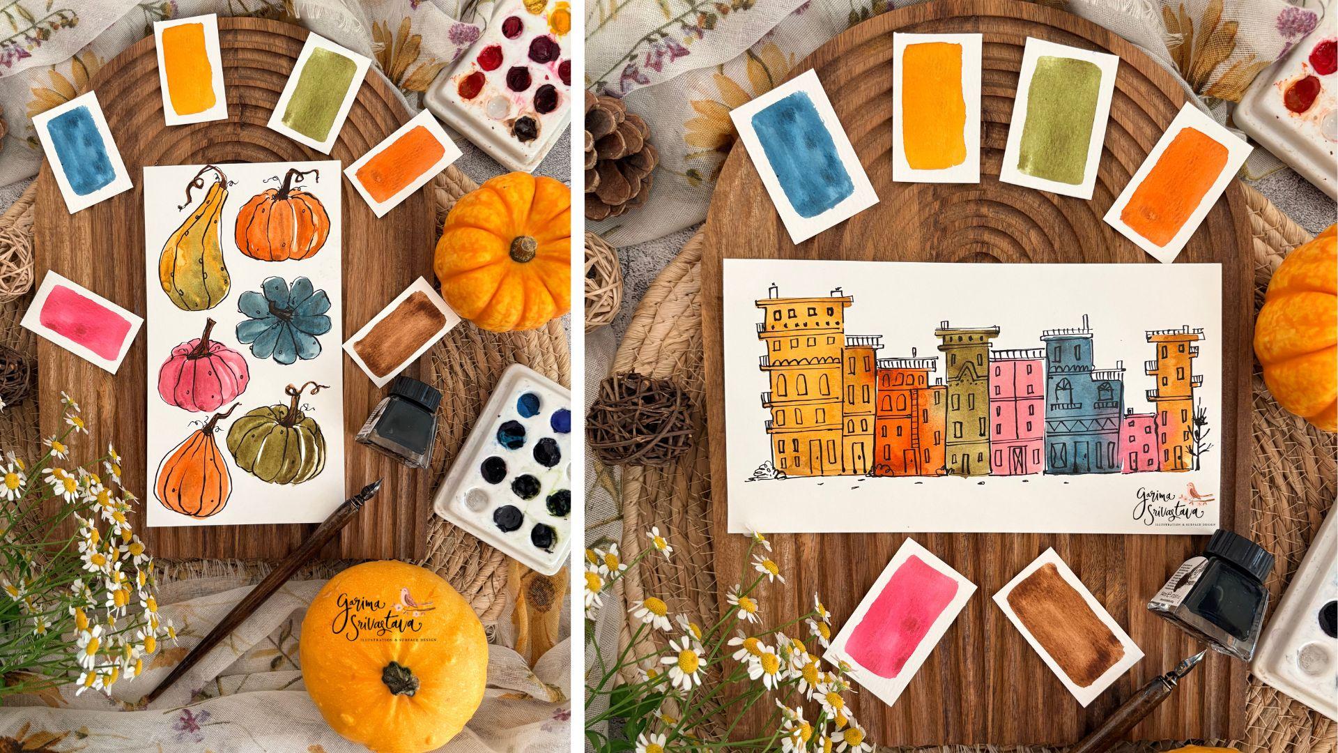
autumn color palette. I will show you my
little trick to mix a cohesive muted
color palette, and then we will test these colors with two
fun class projects. We'll paint loose mismatched
pumpkins and gourds and simple building
shapes to see how our colors actually look
next to each other. Finally, we'll use
an ink pen to add simple loose outlines to frame
our playful color studies. This is a low pressure, relaxing way to warm up your
creative muscles, learn color interaction, and simply have fun
with your acals. So grab your Waco at supplies, and let's get started.
2. Art Supplies: Let's have a look at the art
supplies I'm using today. For paper, I've got
these small pieces of 300 GSM Colpres
watercolor paper. CoolpresPaper has a bit of
texture on one of the sides, and for most of the
brands of paper, the backside is quite smooth. I often like to paint on the back side of the
watercolor paper, especially if there
is a bit of ink or linework involved because of
the smoothness of the paper, my ink pen nib doesn't
get caught in it. It's just a bit of
personal choice. If you prefer painting on the textured side,
that's perfectly fine. You will get a slightly
different look. So these pieces are kind of
leftover from my project. When you chop a bigger
sheet of watercolor paper, you get some smaller pieces. So for projects like this, these kind of smaller
pieces come handy, but you can also
try the projects of this class on paper
format of your choice. So these are some wider ones. Favorite watercolors
are squeezed out into the smaller wells here. I've got some
yellows, pinks, reds, followed by some orange
and a bit of brown there. Here I've got my
blues and I ready to use green, purple, and sepia. And then I've got my
neutrals there, black, a bit of gray, and sometimes I put a bit of white
in here as well. Activate the colors, I use
a spritz bottle like this. You just have to spray water
on the colors and let it sit for about 30 seconds and
the colors get activated. The colors I'll be using
today are transparent orange, cadmium free yellow, sap green, permanent rose, to
turquoise, and burnt umber. To mix the colors, you can use a white dinner plate or a ceramic color mixing
plate like this. You can also use
the plastic ones. I'll be using some
very simple brushes. These are some of my
old flat brushes. One of them is number eight. The other one is, I
think, a number 12. They are so old
that I can't even see the actual numbers
that were on them, but I'm sure you'll be able to find similar brushes
from any brand. These are both
synthetic brushes. I've also got a smaller
number two brush because I want to show you an alternative
technique as well. You can use a pencil to draw some shapes before you want
to proceed with colors. I've also got my dip pen here. I'll be using My Vincent
Newton black color ink, black Indian ink for this. It comes in a small
cute bottle like this. If you prefer to use a fountain pen, you
can also do that. You can also use your
favorite liner pen. This is a micron. You can also use UIBOL or any other fine liner
pen of your choice. For these projects, you
don't need a waterproof kip, but the micron one is a
waterproof liner pen. For some of the line words, you can also use some
colored pencils. I will show you later
how to do that. I've also got small pieces of watercul paper here just
to swatch my colors. For watercolor you're going
to need jars of clear water. I prefer to have two with me, one of them to clean
my dirty brushes and the second one to
create clean mixes. I also have some
paper towel with me. You can use an old rag just to dry your brushes and
remove excess moisture. The entire list of
art supplies and the color swat chart is available as a resource
for this class. That's pretty much it
for the art supplies. In the next lesson,
let's mix our colors.
3. Color Palette: In this lesson, let's mix the colors for
our color palette. I'm just going to
sprit some water. And you can wait just
maybe 30 seconds or a minute for the colors
to be fully activated. I'm going to use an old
number six round brush just to mix my colors. For a color palette, at first, what I'm going to do is I will swatch some of these
colors just as they are. And then I will show you a
little trick with which you can kind of make this color
palette a bit more cohesive. So the first color
that I'm going to pick is transparent orange. Let's watch it. This is my
plain transparent orange. As you can see,
it's quite vibrant. Next up, I'm going to make
some cadmium free yellow deep. That's my cadmium
free yellow deep. Next, I will pick
some sap green, so these are the swatches of these colors just as they
are right from the tubes. Next, let's pick
some permanent rose. That's my permanent rose. Next up is To turquoise. I'll add it here.
That's tho turquoise. While these colors do
look great together, when it comes to autumn, I prefer my colors
to be a little less vibrant and my color palette to be a bit more
cohesive looking. There are a couple
of different ways in which you can achieve that. One of them is for
each of these colors, you add just a touch of
their complimentary color. So say for orange, you add a little
touch of blue to it, for green, you can add a little touch of red
or a pink into it. But there's another trick
that I like to do is I like to introduce a motherly
colour that binds them. For me, that color
usually is burnt umber. Burnt umber is a neutral color, and that will
instantly lower down the vibrancy of your colors
and make them a bit muted. But since you'll be
adding this same color to all of these original colors, your entire new color palette will look a bit more
cohesive because they have a touch of this same burnt umber in all of them. Now, let's have a look
how these colors look when I add just a touch
of burnt umber to them. Make sure you're
adding just a touch. You don't want to add too
much because it will become muddy because burnt umber
is a neutral brown color. I've got my transparent
orange here to that, I will add just a
touch of burnt umber. I'm not trying to turn this orange into a
terracotta color, but it instantly reduces the
vibrancy of that orange. As you can see,
the top swatch is of transparent orange
all by itself, and the bottom one has a little touch of
burnt umber in it. Let's do the same for
the other colors. I've got my cadmium free
yellow deep here too that, let's also add a
bit of burnt umber. This was my original
swatch. And now let's see. Here is slightly
muted version of it by adding a touch
of burnt umber to it. This was our permanent rose. Now, I'm going to
add just a touch of burnt umber to our
permanent rose. Let's test the color. Here is a muted
version of the color. This was my sap green. Now we're going to add some
burnt tumberT the sap green. You instantly get a color
closer to olive green. Top one was sap green, and this is a bit
muted version of it. This was my tho turquoise. We had mixed it here.
Now I'm going to add just a touch of burn tumber. Be a bit careful with this mix, else it will become muddy. It's still To turquoise, just a little bit muted
compared to the first swatch. As you can see, the colors on the right hand side are almost similar to
the first column, but they are a bit muted and together they look a
bit more cohesive, and I like them better for
my autumn color palette. These ones were a little
too vibrant to my taste. You can of course use these for your projects if you prefer
them for your color palette. I have used burnt umber for changing all of these
colors a little bit, but you can similarly
use yellow ochre or colors like quinacrodon
gold for similar purpose to modify your color palette
and bind them together as a motherly color that you
have added to all of them. As I told you earlier,
you can also add a touch of complimentary colors
for all of these colors. So for orange, you can
add a touch of blue, and you will get a
slightly muted version of orange and keep doing
that for individual colors. So for pink, you can add
a little bit of green. For yellow, you can add a
little touch of purple, for green, a touch
of pink or red. And for To turquoise, you can use some kind of
reddish orange color. You can use a color wheel to decide what kind of
complimentary color you can add. So for your reds,
you need to add a green and simply rotate the color wheel and
following this, it will give you two
complimentary colors. Orange and blue
are complimentary, you can use the help of
a color wheel to decide your complimentary color to add and modify your color palette. Now our colors are mixed. Let's get started
with our projects.
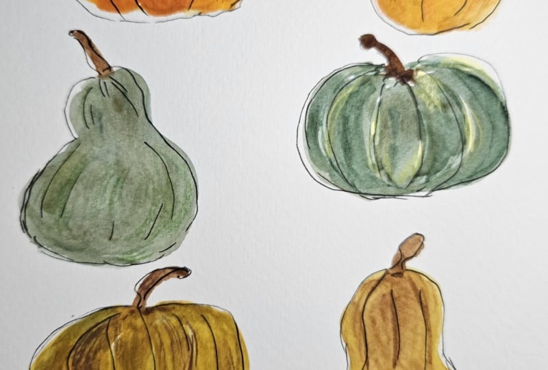
4. Pumpkins: Color: Color palette is ready, and now all we have to do
is play with some colors. For this first project, I'm going to be
painting some pumpkins and gourd shapes
using these colors. I will be painting
it pretty loosely. For that, I will be using
my number eight flat brush. You can use your favorite
round brush or a mop brush. I like to pick the flat brushes because they force me to keep it a bit loose without trying
to make it too perfect. I've got the perfect
prop for this. I've got a little pumpkin here. You can use some
inspiration like this or look online for some
pumpkin and gourd shapes. Now let's get started. I will first pick the orange mix and we'll first create one
here, something like this. So individual sections here. Got one here in the center, and then simply going around it. So at the back. Don't worry
about making them perfect. You can also use this moment
to add a bit of extra color. Since we won't be
working with layers, this is your moment to
add a bit of deeper color along the ridges to give a bit of color variation
to your base shape. This is just one color mix, but you can also use two colors. So let's start with that
mustardy yellow color. And this time, let's
make a gold shape. Don't worry so much. Simply wonky little shapes. Well you can leave it like this, what you can also do is pick another one of the colors
from the color palette, maybe an orange or a
green and add it to this just to see how they interact together, bit of green. I'll just mix a bit
thicker mix so it doesn't bleed too much and just
dropping it at the base. I'll leave it like
that. Let's try our turquoise mix here. And this time, let's
make a flower shape. So just like petals, not trying to make them perfect. Depending on which side of
watercolor paper you're using, you will get slightly
different look. I will just drop
in that same color a little bit more
along the ridges, just to give a bit of
color variation in there. Now, let's paint one maybe with some pink, our dusty pink. This time, I'll add a little bit more
of the back side as well. You can also just paint
round shapes and simply add pen lines later to refine
them into pumpkin shapes. I'm just showing you
a few simple ways to create shapes that can
become pumpkins and gourds. Et's paint another one
like this one right here. This time, we'll use some green. We start with first the center, and then some
sections on the side, and then a little bit
of the back sides. Again, dropping in
some darker color. Sometimes I paint with
the full brush and sometimes using just the
corner of the brush. If I want to make
something a bit more precise with a bit more control, we have a little bit
of a space here. I will go back to my orange, add a simple smooth kind. This exercise is a
great way to see how your colors are looking
together on one page. Now what we can do
is in our brush, pick some burnt umber. And without adding too
much water to our brush, I'm going to use the
corner of my brush, lay it like this first
to add some stems, lift it up, give a little
bit of a loop like this. Now let's try with this
one, starting from here. For some, you can go
just straight like that. If your base color is still wet, this part might
bleed a little bit. You can pick a bit thicker mix to prevent it from
bleeding too much, but feel free to wait, or if you're impatient like me, you can simply add
it without worrying. For this one, we can probably
add it like this here. So now our color layer is done. I have used all of the colors
from my color palette, and I can see that they
look quite nice together. Sometimes an exercise like this tells me that I
might need to change some colors a little
bit to make them either a bit more vibrant or muted or shift them
a little bit more. So this is a good
exercise to see how your color palette
actually looks when you're creating some
designs with it. I'm going to wait
for this layer to completely dry before
I come back in with some pen and ink lines to refine these shapes and turn them
a bit more like pumpkins.
5. Pumpkins: Ink Lines: So my pumpkins are ready and I can start
adding some linework. Just as I told you earlier, you can use your fountain pen. You can use your fine liners or you can use a simple
dip pen like this. I like how dip pen gives me different kind of line
thickness variations. I've got Black Indian
ink from Vincent Newton. I will just keep a little
bit of paper towel with me just to remove
excess ink sometimes. So simply dip your pen and remove excess ink on
the side of the bottle. And without worrying too much, let's add some line work. So ridges. I'm intentionally making the lines a little
wonky, making them playful. You can add a few tendrils. Whenever I want to have
a bit thicker line, I push my dip pen
down a little bit. It opens up the nib and
gives me more ink flow. And if you release the pressure, the ink comes out
in a thinner line. Now let's ink this one out here. I love the sound
that ink pens make. So you can see how I'm going intentionally outside my
colored shape a little bit, just to give it a bit
more playfulness. So I've just drawn very
simple suggestive lines for these pumpkins and gourds, but feel free to add little bumps and things
if you would like. It's entirely up to you
if you don't feel like adding details.
You can skip them. I had initially thought
I won't add any details. But now that I've started, I do like adding
these tiny bumps. So this is how I've
used ink pen to simply add some suggestive lines
and tiny details here. You can also turn them
into little Jack O Lantern pumpkins like this and
add some features. So what I like to do is
first make the features, eyes, nose, and maybe a mouth. And then you can
add these ridges. And they will be ready for your Halloween cards or
Halloween bookmarks. So this was using some ink, but feel free to
use pencil colors or even your watercolors
to add similar details. Here I've got my number two pointed round brush,
and with that, I will simply pick
one of the colors, let's say, some orange, a bit deeper colored
than this original one, and I will create similar
kind of detailed ridges, suggestive line work this time using simple watercolors and
a thinner brush like this. Or you can also use simple pencil colors like
this and add similar lines, some more playful details, some texture to
your pumpkin shapes so it's entirely up
to you what kind of finish you would like on top of these basic shapes that you have used to test
your color palette. This was a quick way of
testing our color palette, and then we had some fun with some linework added
with a dip pen, and I showed you a
couple of variations of some linework using
maybe some pencil colors, watercolors or have a bit
more fun with dip pen and add some features
to your pumpkins and gourds and get them
ready for Halloween. I really hope you
enjoyed this project. And I can't wait to
see how you will add some finishing touches to
your pumpkins and gourds.
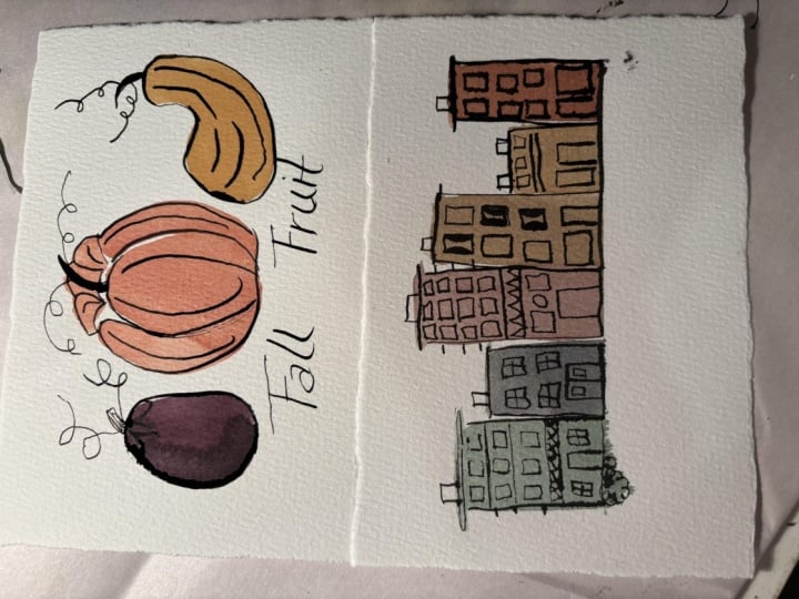
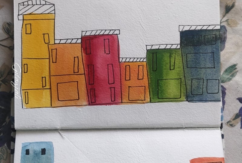
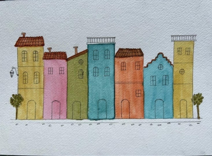
6. Buildings: Color: My color palette is ready
again, and this time, I'll be painting bars of colors
right next to each other, and then later we will
turn them into buildings. It's a great way to see how colors actually look
right next to each other. If you don't want them to
bleed into each other, then simply leave a little bit of paper white gap between them. But don't be scared of
letting colors bleed. It creates a nice dramatic look, so don't be worried about colors bleeding into each other. Using another slightly
bigger flat brush this time. I use flat brushes for
dimetric shapes because it's easier to make sharp
straight lines with them, but I'm not trying to make perfectly straight lines either. So just some bar shapes might add a little touch
of burnt umber more. Another smaller bar
right next to it. Since we already know these
will become buildings, so you can add a bit of roof and sometimes some balconies
jetting out from the sides. For the second building, when you're picking
the next color, if you don't want
the colors to bleed, simply leave a little
bit of gap between them. So just like this a small gap in between if you don't
want them to bleed. But if you like how the colors look when they are
bleeding into each other, then feel free to
let them touch. Just like this. If they're
wet, they will bleed. Let's pick another color. This time, maybe we
can pick the green. I'm trying to keep all of their
bottom at the same level. But since I'm painting
it pretty loosely, sometimes, some of
them get a bit longer. So what you can do for that is either try to make
them all same height, or simply add a little
bit colour at the paste, or you can also draw a line at first and try to stick to that one as your
reference point. You can also add a Scotch tape or a washy tape here
at the bottom to keep all of the bottom edges
clean and at the same level. But I'm painting
it quite loosely, so I'm not going to
worry so much about it. Now we can try adding
a little bit of pink. I'd like to add
one small building right in the middle
of tall ones, creates a nice interest. And then we'll add the
same color we began with and let it bleed for
a little dramatic click. Now you can see how these
colors look next to each other. Some of them have even
bled a little bit into each other and that
creates a nice dramatic look. I like it like this. Try to create different
variations of this, try to change your
color palette, sequence, simply change the
color, start with another. We'll wait for this to dry
and then we'll come back with some pen lines and add some details and turn them
into cute little buildings.
7. Buildings: Ink Lines: Our color layer has dried
for these buildings. Now we can use some linework
to add some details. I will show you how I will add some linework using Winsor
Newton Black Indian ink, and my dip pen, which gives me a nice line
thickness variation. But you can also use your marker pens like this or a fountain
pen like this one. When you put a bit
more pressure on your dip pen, the
thickness increases. As more ink flows from it and if you release
the pressure, your lines will get thinner. Dip your pen in the ink pot, and then we can simply start
adding little details. Don't worry too much.
I'll just be adding some doors, do windows. This is the time to play
without worrying too much. So you can see how playful
I'm being with my linework. I'm not worrying too much. I don't have any building
particularly in my mind. I'm just adding little details. Sometimes I add little
doodle details like this. There are literally no rules when it comes to
this kind of play. Simply enjoy yourself because you've already seen how colors
look next to each other. And this is your moment to turn your swatches into something
a bit more playful. You can use them as
bookmarks or little cards. So I'm just adding a little
bit of railings up on top. For some of these buildings, for some of the roofs. Always making sure to add
a door, some windows. I'm trying to make
each building a little different from
the one next to it. Intentionally trying to
make them imperfect. Just creating different
kind of window shapes. Some are simple blocks
and some have arches. I've got some balconies here, so I'm just adding some
protective railings. And You can simply go around and see if you would like to add some more details. Sometimes I add
little plants and trees right next to
buildings like this. Here I've used a dip pen and some ink to
add these details, but you can also use simple colour pencils like
this to add similar kind of playful details
some windows, doors. Or if you would like to keep
it just watercolor base, then you can use
your watercolors. For example, I'm picking a contrasting color
for this yellow, I'm picking a darker color like green with my number
two round brush, I'll just add some windows like this to add similar kind of details can use some pink for the door. For darker base colors, you can also use white quash or your white gel pens to add
some lighter color windows. This is just to show you how
you can add similar kind of linework details with your
brush and watercolors. You don't need ink pen, and I equally enjoy using pencil colors to add
these playful details. So windows and doors. I especially love adding some contrasting colors
for my windows and doors. That way, they stand out nicely. So here you can see that I
have used some ink pen to add some playful details to our buildings to
our color swatches. But you can also use some pencil colors or
simple watercolors to add some similar details and turn your color swatches into
these playful buildings. I really hope you enjoyed this project and I can't
wait to see how you will paint your set of buildings and what kind of details
you will add to them.
8. Closing Words: And just like that, we've
reached the end of this class. I've shown you a
neat little trick to mix a cozy, cohesive
color palette. We then tested these
colors by painting a few pumpkins and
cute little buildings, which we refined with
playful ink line work. I really hope you enjoyed this way of testing
your color palette, and I can't wait to see
what you will create. You don't need to stick
to pumpkins or buildings. You can try other
playful subjects like leaves or mushrooms to test
your autumn color palette. There's just one
rule, and that is to simply have fun
with your watercolors. Do share your projects here, as we would all
love to see them. I'll be back soon
with another class. Until then, stay creative.
 Garima Srivastava, Artist and Illustrator