Transcripts
1. Introduction: I do not know how to juggle. [MUSIC] When I moved to Arizona, I expected to see cactus. I did not, however, expect to see beautiful citrus trees growing everywhere I went. I have an orchard across the street from my neighborhood. My neighbor has a lime tree tree that hangs into my backyard. It's incredible. They are cheerful, and happy, and they spread joy, and they smell amazing. They have very clearly made their way into my works of art. I can't get enough of them. Grape fruit, oranges, lemons, limes have all graced my studio table in the last few months. Hi, I'm Caitlin Sheffer, a self-taught painter juggling motherhood, working as a full-time artist, and everything in between. My education consists of many, many watched YouTube videos, skill share classes, and endless hours of trial and error. My goal as your teacher is to instill in you a passion for learning, the ability to see beauty in the world around you, and the confidence you need to paint with watercolors. When you are finished with this class, you will have gained the skills you need to paint watercolor oranges and greenery, how to create a stunning and cheerful flat lay, and you will complete a final project that combines everything you've learned. I love it.
2. Class Project + Outline: [MUSIC] In this class, we will be doing a final project that will combine everything you'll learn today, so that you can put those skills to good use. We'll start off by getting to know our color palette. We'll experiment a little bit with mixing, making swatches and just getting to know our paints in general. We will then practice painting oranges. We'll move on to painting orange halves, or oranges that have been cut in half. Then we'll practice adding detail to those oranges. After that, we will practice painting different types of greenery. Then the fun part of our final class project, making a flat lay and painting our flat lay. These skills are invaluable and will help you so much as an artist in many different ways.[MUSIC]
3. Supplies: For this class, you'll only need a few basic supplies. You'll need some good-quality watercolor paper, as well as a sketchbook or less expensive practice paper. You'll need brushes. I prefer round in a variety of sizes. A water cup, a white paint pen like a Posca pen or a gel pen, a washcloth, or a paper towel, and watercolor paints of course. You'll also need some square pieces of watercolor paper to make our swatches. You can find a full list of my favorites supplies in the class resource guide in the class project section.
4. What is a Flat Lay?: What's a flat lay, you might be asking yourself? It's really simple. It's just a group of objects that have been styled on flat surface and photographed from above. Sometimes this might be called bird's-eye view. It's really helpful in certain industries like food photography or weddings. It's especially helpful for artists and it's a great skill for you to have so that you can have your own reference photos when you're painting. Essentially when you're styling your objects, you want to create a sense of motion or movement. You want there to be lines that draw your eyes up or around, and you want there to be a sense of balance. These are all principles of design that are really helpful to know as an artist. If you don't have oranges or greenery accessible today, don't worry, just use similar-shaped objects so that you can get a feel for how to create these flat lays. When you're painting your final project, I will have reference photos in the class resource section that you can refer to. The first step in creating a successful flat lay is gathering the objects you want to style. In this case, it would be oranges and sprigs of greenery. The next step is to clear a space, a flat area in your home that you can arrange your objects on. I prefer to shoot on a white background because it's bright and airy, but you can shoot on any background that you'd like. The next step is intimidating, but you can do it. This is where we're going to start arranging our objects. It's important to keep it balanced. I like to keep larger objects across from each other and to throw smaller objects in between. I also like to create a line that leaves my eye either up or around. Having greenery that is long and curves is a really great way to establish that movement. My best advice is to just keep trying, move things around as much as you can until you find the perfect placement. I know I've found the perfect placement when I stop questioning it. If I pull back and think, yeah that's perfect, we're good to go. If you're still feeling like something's off, keep going. You'll get there eventually. Once you're happy and satisfied with the way your flat lay looks, it's time to take a picture of it. My favorite way to get a perfectly flat picture of my flat lay is to use the level that's in my camera settings. It's a little cross mark in the center. When my phone is perfectly flat, it highlights to a yellow color. Most phones have this feature and you can turn it on in the settings section of your camera. Once you've finished taking your photo, you can edit it for stylistic preferences or to bump up the exposure. It's really up to you. It's fine as is, or if you make adjustments. You can refer to this photo on your phone or computer, or you can choose to print it out on a printer. I like to print mine out so that it's easier to see when I'm painting, but that's again up to you. We will go over this process thoroughly in the project section of this class.
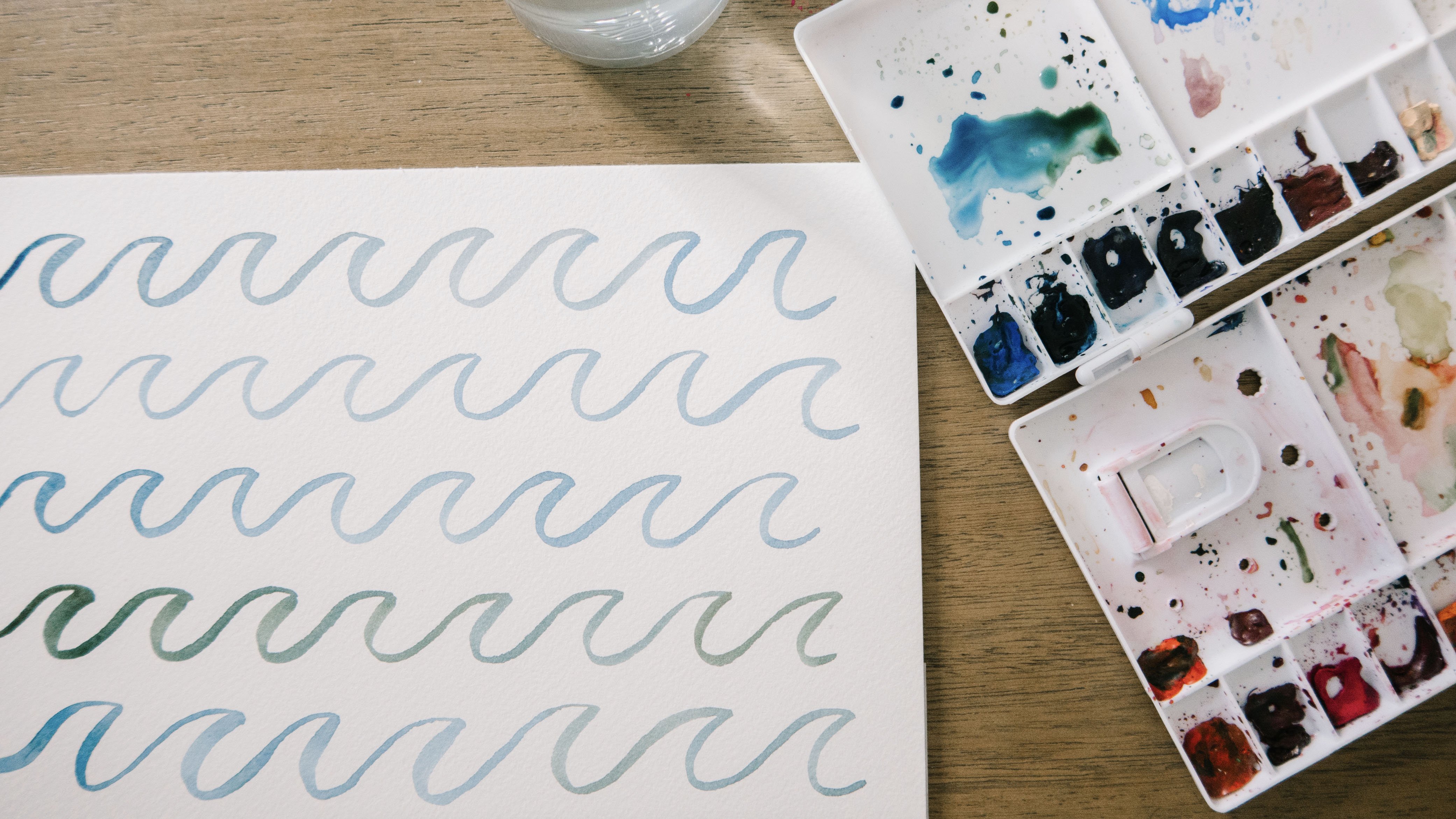
5. Knowing Your Color Palette: Before we get started painting our really beautiful citrus and our beautiful greenery, we're going to look at our colors. I have some squares right here that I've cut out of my watercolor paper. I'm just going to do some test swatches with some of my colors to make sure I love what I'm using before I start painting my oranges here. This right here is a smaller palette than the one I usually use, but it's perfect for what I'm doing today. I'm going to use this one. But with my full palette, I actually made a color catalog with all of the colors I have mixed with each other. I can refer to this and see that this one right here, the cadmium orange mixed with lemon yellow deep would be a good color to use today. Maybe this one right here, which is lemon yellow mixed with yellow ocher, this would be a good one, some of the ones up here. This is a really good tool to have. If you haven't made a color chart, I highly recommend it. There are some really good Skillshare classes here that you can take. Or I also have a tutorial on my YouTube channel that you can refer to. Let's get started. Let me show you how I like to make little swatches. I'm just going to wet my brush right here. Just as an example, I'm going to use this beautiful quinacridone pink and just come on here and go back and forth. I like to keep mine pretty saturated, but obviously the more water you put on there, the more transparent it will be. This is just a simple example of how you can make a color swatch. I'm going to clean my brush now, wipe it on my towel. Let's go in here and pull out this scarlet red and see how this one looks. I'll just set these over here so they can dry. Let's do the lemon yellow deep. This one is a little less pigmented, so it takes quite a bit of dabbing. As you can see, it's a nice clean yellow color. Next up we have naples yellow, which is more of a peachy color. I have a little fuzzy that got on my brush. When that happens, I just use my brush to scrape it off and wipe it clean. Don't worry if that happens, you can always just scoop it out. This naples yellow is a very muted yellow, has some peachy tones to it. The last color swatch I'm going to do right now is cadmium orange because this is the one we'll probably be using the most today as we're painting oranges, go figure. As you can see, that's a pretty spot on color for our oranges over here. I mean, it's a really close match. As you can see, this will be a very heavily used color today, our cadmium orange. Now as you can see, we have five of our color swatches that are just the pure color. I want to show you how I make a swatch when I mix the two colors together. Let's take this cadmium orange, and we're going to mix a little bit of this quinacridone pink, and we're going to get a nice rich orange. Maybe I'll add in a little bit more. This is a good color for the shadows of our oranges or the outline. As you can see, there is a nice difference between the plain, pure cadmium orange and the cadmium orange mixed with the quinacridone pink. Let's do one more together. Let's try mixing the cadmium orange with the naples yellow. This will be a more muted color because our naples yellow is more muted. I've also found that it's highly pigmented. One thing I forgot to do is I like to make a little note so I remember what color combination it is. I'm going to write cadmium orange, I'll just use abbreviations, and naples yellow. For this one, I'll do the same thing. QP for quinacridone pink, and CO for cadmium orange. That will just help me remember what my color combinations were. These ones I can remember pretty clearly because they're straight, pure colors. But these ones that I've mixed, I'm going to make a note just like I've done on my color chart here. As you can see, we have three lovely different oranges. We have two nice, soft, muted yellows. We have a good pink and a good red. This is a beautiful color palette that we can use today to paint our citrus.
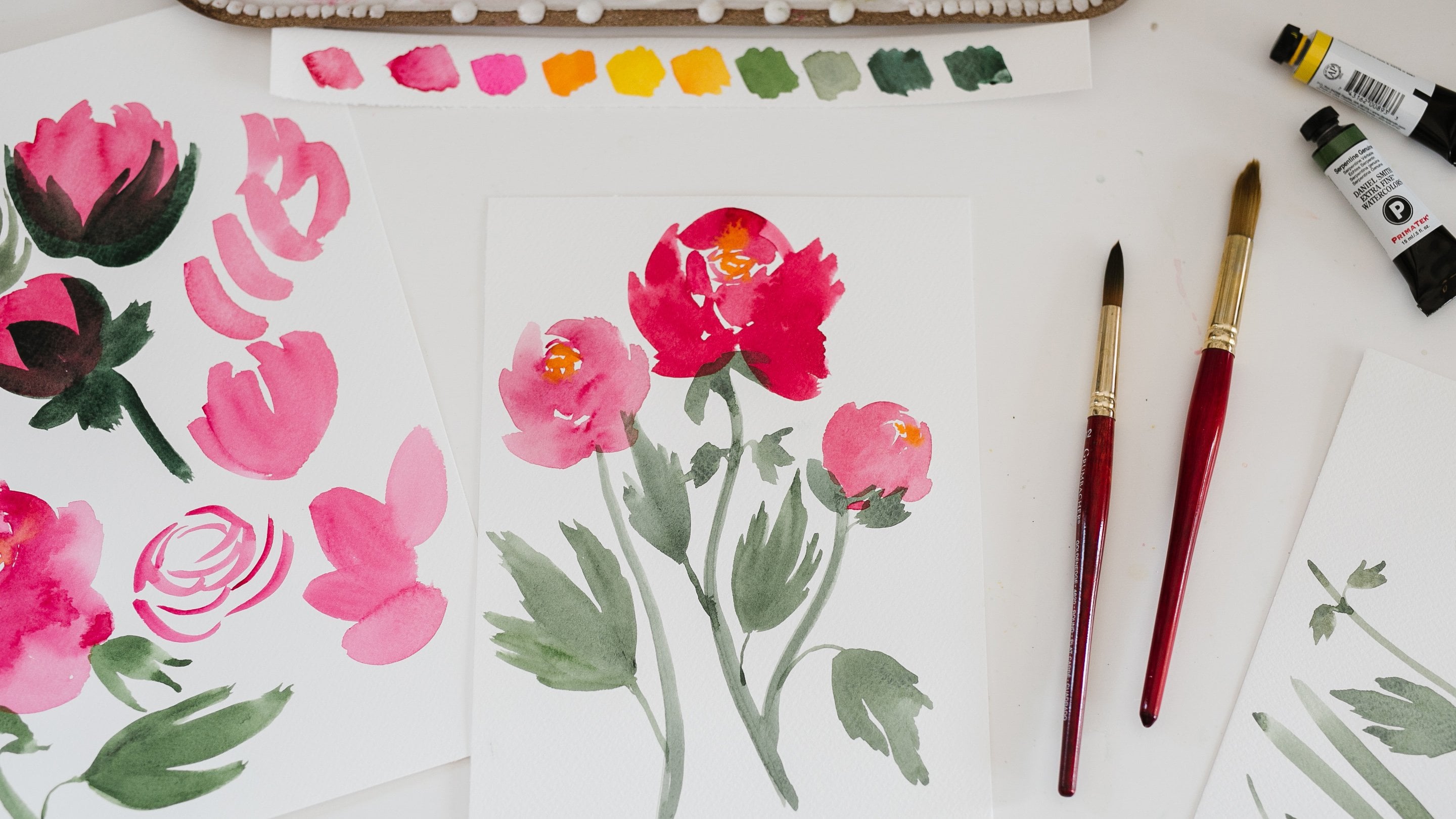
6. How to: Oranges: Now that I've made my color swatches and I have a pretty good feel for the paints, I'm going to use my sketchbook to start painting my oranges. I have my really nice paper over here that I'm going to use for our final project. But when I'm practicing and explaining how to paint these citrus, I'm going to use my sketchbook paper because it's a little less expensive and I don't go through as much of my really nice paper. This is a watercolor sketchbook from Moleskine. I really love it because their watercolor paper is pretty close to the paper that I like to use when I'm doing actual client work. It's just my sketchbook that I started in January for my 100-day project. I'm just going to skip ahead to where I have a blank page. This is where I'm going to explain to you how we're going to start painting our oranges. To start, we're going to paint just a whole orange, this sphere. We're not going to cut it yet, we're not going to look and see what's on the inside, we're just going paint what we see as if we had just picked it off the tree. We're getting a little dirt there. They're fresh off of the tree. I live in Arizona and citrus is in season right now, which is the perfect time to film this class. I'm just going to put it over to the side and find a view, an angle that I really like, and we are going to paint it that way. Let's see. I think that might be good. When I'm setting it to the side, I'm looking to see if there's color variation that will add some interest to our painting. We don't want just a blob of cadmium orange, we want to have some variation in our colors. Right now I can see there's some yellow, there's some darker orange over here, there's a little green where the stem was. I think this will be a good angle to paint. If you do not have actual citrus to refer to while you're painting, don't worry, I will have reference photos for you in the class resource guide. Let's get started. To make things easy, we're just going to start with a nice, plain, pure cadmium orange. I'm going to wet my brush and come in, grab some paint with my brush and bring it over here, and I'm just going to add a little water. I want this first layer to be more transparent because I'm going to add in more colors as we go. If I start out too strong, I won't be able to create that color variation that I want. I'm just adding a little more water. Now, I'm going to come over here, right here, and sketch the shape, this circle. Obviously, this is 3D and this is 2D, so I'm going to do my best to create this little wobbly orange shape. They're not a perfect circle, they're a little bit wobbly, and that's what makes them organic. Nothing in nature is absolutely perfectly symmetrical. Now that I have my outline, I'm quickly going to go in and fill in so that I don't get any harsh lines. You need to work quickly when you're doing this first wash layer because, as it dries, you will get some lines are streaking. As you can see, this is a nice, transparent wash. We have a little bit of a darker color coming in right here, which I really love. When I'm looking at the orange, you can see that it's a little darker on the outsides. I'm going to grab a little more orange, and while my painting is still a bit wet, I'm going to come in and outline along the edge where there might be more shadow. This is going to give the appearance of a sphere, even though it's a two-dimensional painting. We have this darker edging with a lighter inside, and that helps make it look more like a ball. As with watercolors, we're just going to keep layering. This might be a good time to come in with a tiny bit of our quinacridone pink just to get a darker orange. Over here is where it's the darkest. I'm just very lightly, with my brush, tapping in along the edge so that it will bleed very organically. If you get a little clump, don't worry, just drag it while it's still wet and it will spread nicely. Perfect. That's looking really good. Now I'm going to grab a little lemon yellow deep while it's still wet, and just drop a little bit over here, drag it down so we get this lighter color in the center. Let's move on to our next orange and let's change up the color just a little bit. Let's take some of this scarlet red, some of our cadmium orange, and we're just going to go with a little bit of a deeper color. I think I'm going to add some Naples yellow because that will help tone it down just a little bit. I like how it makes it more muted. I'm just adding in more water. We want that first layer to be nice and transparent. I'm just going to come in, follow the shape. This orange has a little more of a flat side over here, and then a nice round top. One of my favorite artist who paints a lot of food and fruit and vegetables is Ohn Mar Win. She is a teacher on Skillshare and has many great classes that show how to paint food, and fruits, and vegetables. I love following her on Instagram. She just has so many inspiring sketchbooks filled with these beautiful food paintings. She's actually the one who recommended this Moleskine journal to me. I highly recommend checking out some of her classes. I've gone down with my wash. I started going back in with a little more paint on my brush, it's the same color. I didn't mix a new color. But right here is a lot darker because I'm getting a shadow cast from this orange onto this orange, so I'm just going to make this part of the orange darker. That's very easy to do. You just put the paint on your brush and glide it over the edge, dragging it up and down. These don't need to be perfect. We're going to add a little more in the middle. That was a little darker than I meant to do, but that's a quick fix. You just need to add a little more water and spread it around. I'm going to leave this side over here lighter because the light is hitting it on this side creating a nice highlight. Beautiful. Then I'm going to go ahead and make this side even darker with this quinacridone pink, and just let it do its magic of bleeding in together. I might just add a tiny bit more paint on this side. Just to give it a little bit better of an outline and make it look more like a sphere. If we have it, really lie on the edge. It looks flatter. If you have a lie on the edge, it makes it look a little flat. So we're going to add this little thin little line so that you know that the highlight is hitting here, but it is curving around, and the highlight fades as you get to the side. So that's looking really nice, and over here let's just do one more. Let's do a little bit more yellow this time, we'll do lemon yellow deep. It's really hard to keep the yellow clean on your palate. It picks up the pigments from the other paints really well. So if you find that your yellow is getting muddy, you just need to spritz it with a little water and you can use a little paper towel or your brush to clean it. So this orange over here, which actually I'm not entirely sure if it is an orange because it's so huge. It's like the size of my son's face. We had a neighbor gave it to us and I'm really curious to cut it open and see, is it really an orange or is it indeed a grape fruit? We will find out. I think it's just a gigantic orange. Can you believe that? Isn't that humungous? All right, this one has a lot more texture and it has an oblong shape. So we are going to try and get that effect. It's also more of a light orange, more of a yellowy orange color. I don't have a lot of space, so we're not going to get the big scale. But we're just going to practice working on this wobbly shape. I'm just using my brush, and making some wiggles and then it curves up better, almost looks like a lemon. The shape. I'm going to fill in with my lemon yellow deep my naples yellow. Then we're going to mix in a little bit of our cadmium orange to get more of that orange color. We don't want it to look like a lemon and then down here is where it's the darkest because that's where the shadows are. Down here. This is just making me crave orange juice. Which funny story I had a glass of soda over here earlier and my paint water was a bright orange, and I kept reaching to drink it thinking that it was orange juice. So when this class is over, I might have to just go make myself some fresh orange juice. Same thing as before, I'm adding a little bit of a darker line up here to show that it curves down. Perfect. As they dry, the paint's spread, and pool and you get a very nice organic texture. This is the moment where I'm going to test to see if it's dry enough to come in with my paint pen. I'm just going to add a little bit of some stippling. Let's test it really quick. Yeah, it's ready. I'll show you on this. It just adds a really nice texture, little stippling with the white paint. This one's a little wet so I don't want to put my hand in it, but I see some texture on the orange down in this corner. I'm not going to cover the whole thing because I want it to be more of an effect and not covering the whole orange. So I'm just going to create a line here and a line here that curves and that helps give it the illusion of dimension, and it's very subtle, you can barely see it. Then I do have a spot right here on the orange that has a little bit of a blemish where it's more concentrated. So I'm going to add that there. On this orange I have it as well and this one's not fully dry, and I just put my hand in that one. Oopsy, I'm imperfect person. If that happens to you just spread it around a little bit. So there's a little more white on this one up at the top, probably where the branch was resting and it got a little dirty, but we're just going to add in this paint, create these lines. You can see them right here. There's also a blemish to the side where it's a little darker. I'm going to follow the shape and add a little more over here where it's highlighted. This is just a fun way to give the citrus some good texture, so you can have fun with it and add as much or as little as you want. Then this one's still wet, so I'm going to let it dry and while that's drying, I'm going to add just a tiny bit of green in this orange right here because there is still a little bit of the stem showing. So I'm going to grab just a tiny bit of this sap green, just a tiny bit. You want to make sure that it's nice and dry so that you don't get any bleeding. A little bleeding is okay of the green into the orange but you don't want a whole lot. So I'm just going to create this tiny little spot where the stem was, and that looks so cute, and if you want, there is some dirt, some brown spots on these oranges. If you wanted, you could go in with some raw umber or raw sienna and just stipple in a little bit of that. Let's see if we can illustrate that for you really quickly. I might just take a tiny bit so that we get a nice realistic orange. There was a little bit over here as well. So that is how we are going to paint our oranges and add a little bit more texture with the paint pen, and the greenery, and a little bit of the brown spots. So this was just an example of how we're going to do that. Then when we do our final painting, we will practice that again and we will add in our greenery onto the same painting.
7. How to: Orange Halves: All right, let's get started with our next orange painting, which is this beautiful orange that's been cut in half. We are going to start with a darker orange around the outside. Leave some negative space, fill in the center and leave this very, very middle blank. Mix up the perfect orange. All right, it's not a perfect circle as you can see. It's a little bit wobbly just like we did before and there's various thicknesses. As I'm going, watch this how I do this. I'm going to use just the very tip of my brush to make an outline, and in some areas, I'm going to push down a little more to get a thicker line. There we go. All right, so there's the outline of the orange peel. Some areas are thinner than others and that's just like in real life. I'm going to go ahead and do the second one. This time I'm going to leave, from this angle, you can see that there is a little bit of the skin showing if I have it tilted. I'm going to show you how to do that. I'll start off with a really thin line over here. It's going to get a little thicker as I go around, then over here, and then I'm going to push down hard as I come up. I'm going to add a little more, and that gives us the perspective that the orange is tilted just a little bit, but instead of looking at it from up above, I'm looking at it just a little bit from the side. All right. It's a little darker under here, so I'm going to add in a little bit more color that cadmium orange mixed with the quinacridone pink. We want that blend. All right, perfect. Now, we're ready to go do the center. For the center, it's a little more muted than that orange peel. I'm going to come back over here and just like before, I'm going to mix the cadmium orange with the Naples yellow, and a bit more water. Then if you can see, just like we did with the outside of the orange peel, it's not a perfect circle, so I'm not going to go in and paint a perfect circle. I'm going to go in and make a little bit of a wobbly line, and then I'm going to leave the center open. Let me show you how we can do that. In some places, I'm going to get really close to the line, in other places I'm going to leave some more room. Then I'm going to outline this center just like a diamond shape. Then what I'm going to do is instead of just filling in the entire area with the solid color, I'm going to come in from outer rim to the middle, and I'm going to pull in just like this. That will help us get these little sectioned pieces, and what I like to do is leave some white space because there are these really beautiful lines and it's not all one solid color. You can come from center out or from outside in. It's totally up to you. Might be easier to come from the center out, but the point is that you want to leave some negative space. There is a little bit of a darker orange in the very center. I'm just going to do a couple of little lines right here. There we go. That is the first part, and we will go in with our white pen in just a minute and add some more details. Let's come over here and do the same thing over here, except we have a little bit different perspective. Over here, it's going to be nice and close to the line, comes away a little bit. I'm just using the very tip of my brush. If you have a hard time getting that really fine line, you can use a smaller round brush, but you should be able to use the tip. As you put more pressure, you'll get a bolder line. Then with that excess water and excess paint, you can just push it around with the tip of your brush just like that. Okay. Then we're going to outline our center again, and I'm going to come in like a cone shape or triangle shape since that's how it's facing. I'm just going to pull from the inside out or when I come over here from the outside in, it's really just the direction of your paper. Create this illusion of the sections of the orange. Perfect. All right, we're going to let that dry and then we will go in with our paint pen or our gel pen and add in some more detail. The last step in adding some detail to these half sections of orange is I'm going to try and give a little detail to where these lines are. There's lots of little lines of light orange, and I'm going to use this paint pen, a posca paint pen, but you can also use a white gel pen or white calligraphy ink, whatever you have on hand will work. It's very easy. I'm going to add a few little dots on the outer peel, just like we did before. Give it a little more texture. I'm going to take my pen and just draw the illusion of these sections very lightly. I'm picking up my pen as I bring it down. I'm not doing real solid lines. Coming in, adding lines in the middle of these sections. That's light, but adds just enough detail to make it look like an orange. Here's an example of a grapefruit painting that I did. Where you can see it a little bit better because it's a darker color, and I have this pink of the center of the grapefruit and I took the pen in the same way and made these sections. All right, let's come over here and do the same thing, except this time, we're doing it on a little more of an angle because of the perspective of the orange. Add a little few dots where the paint is darker so you can see it better. It's hard to see on this light orange, but it is there. Just take your pen, add some nice lines. Make sure you add some in the center, but the top, bottom will make it look a little more realistic. I think I'll do a couple more. We are good to go. We have our beautiful orange paintings.
8. How to: Greenery: The last step that we need to talk about before we start painting our final project, is how to paint greenery. Now, I have an entire Skill Share class based on how to paint greenery. If you're a beginner, I would recommend going and taking that class. But if you just need a little refresher, this will be perfect for you. We're going to start with this really dainty leaf. I'm going to use my liner, which is basically a round brush but with longer bristles. I have two greens. I have Sap green and Undersea green. I've already mixed them up a little bit. They both are just beautiful greens right out of the tube. The less work I have to do mixing colors the better. Here's an example of the beautiful Sap green that's just ready to go right out of the tube, and then the Undersea green has a little more, it's darker, a little more brown in it. To get started, I'm going to use my liner to create this nice long, thin stem. It's a little thicker at the bottom, but thinner as you get up. We're going to curve up, leave space for the top leaf, and then there's actually like a little tiny branch off. As I come down here and make it a little thicker, I'm going to branch off right here, and there's actually a little node, a node and a node. I'm going to come in and just add those, just to give it a nice realistic look. That's easy enough. We just have a nice thin line going up the center, and then each leaf besides the top one has a pair, they go 1, 2, 1, 2, 1, 2, 1 ,2. We're going to paint the top leaf and work our way down, and as we work our way down, these leaves will be directly across from each other. I'm going to switch to my round brush because it's a little easier to work with. It's bigger, the liner has long bristles, which is good for straight lines, but not as good for when you're filling in. I'm going to start with the top leaf, which comes out, makes a nice point. We're going to fill in, and then each leaf actually has a rough edge. It's not a smooth edge. What I like to do to create this jagged edge is come up and out. You get almost this little razor effect. That helps it look more natural. We're just going to do that the whole way down. Pulling from in to out to make this edge, and then there's a little partner over here. I actually like to turn my sketch book a little bit to be able to work from out. Sorry, from in, outward. Let's keep going down the line. These ones go out flatter. These ones start to curl down. This little one just has these tiny little leaves right here. Go ahead and paint those, and I'll do one more because I didn't leave myself quite enough space. That's all right. We'll just go with the flow. But you get the idea. It's super simple, just a straight line, create a leaf shape, add rough edge, and then go down with each leaf having a little partner as you go down the line. Lastly, if we have, all these. These are actually from my neighbor's yard and these are lying leaves, and these ones are so simple, you guys are going to love these ones because all we do is create a super basic leaf shape. Very simple. Are you ready? It's so easy. We just do a little stem like this. We come around, and we come around, and then we fill it in. Simple, and then we're going to do it again, except this time, we do have a nice little stem. We're going to have go up just like so, and there's a nice sharp pointy thorn right here, and right here. Can't leave those out. I don't want anyone to feel left out, and then we're just going to come back and add in our other leaf. Leaves are so easy, so fun to paint. Again, if you find that this is a little tricky, I recommend going and watching some of my watercolor greenery class, and that will break down even more how to paint these shapes and it'll give you a lot more practice. If this was too tricky for you, definitely go and check that out. But otherwise, we are ready to do our flatly.
9. Project Refresher: In this class, we will be doing a final project that will combine everything you learned today so that you can put those skills to good use. We'll first start off by making our own flatly, photographing it, and then painting it. It will be a beautiful compilation of all of the skills you've learned today.
10. Project: Creating a Flat Lay: We're now going to make a flat lay that we can paint for our final project. This is an example of a painting that I've done with grapefruit. It's an example of what we're going to create right now. But in real life, we're going to use these beautiful natural elements, these oranges, this greenery. We're going to make an arrangement on my table. I'm then going to take a picture of it, and that is what I'm going to reference when I'm making my final project. I encourage you to make your own flat lay. But if you don't have these materials, don't worry, I will have the reference photo in the class resource section. This is the really fun part, where you get to use your imagination and your creativity and play around with the placement of these items. I have five orange pieces and orange elements. I like to work in odd numbers. I find that in design, working with odd numbers of objects is more aesthetically pleasing to the eye. I have five elements and then all of these beautiful pieces of greenery. I'm just really going to experiment. I think I want these three-half sections to lead your eye down. Let's see. Then let's see what happens when we add in some greenery. I want the movement of the flat lay to bring my eye up. I want it to feel balanced, which is why I put the bigger orange piece on the bottom. I've created this line with this greenery. I don't love this blank spot on the greenery on the stem. I'm going to use this orange right here to block that. Then I like how this leaf comes up and covers the orange right there. The same thing right here. We have this leaf that comes up over the lip of the orange. There we go. I think that is just perfect. Now I'm going to go ahead and take a picture from up above of this flat lay, and this is what I'm going to paint for my final project.
11. Project: Painting the Oranges: We're now ready to start with our final project, which is painting the beautiful flat lay that we made with our oranges and our greenery. I went ahead and took a picture of my flat lay and printed it with my printer that I have at home. But like I said, if you don't have the ability to do that, you're welcome to use this reference photo. To start this painting, I am going to work my way from top to bottom, starting with the oranges and doing the greenery last. Remember with watercolors, you can't put light over dark. The green is darker than the orange, which means I'm going to layer that on last. I can't go back and put light orange over the dark green. I'm going to start at the top so that my hand doesn't smudge anything. If I started at the bottom and worked my way up, my hand might smudge the paper. I'll start at the top with this sectioned orange. I'll come down here and paint this one. Then I'll come over here and paint this other sectioned one. I'll paint this tiny little cute orange and I'll end with the larger sectioned orange at the bottom. At that point, I'll let everything dry. I'll add in my details, and then we'll finish off with our greenery. Let's get started. I've been using a size 6 round brush, but I also have a size 10 and a size 12. You can use whichever size you're most comfortable with. For this one, I'm going to continue using my size 6 because that's the one that I use the most frequently and the one I'm the most comfortable with. I'm mixing up my cadmium orange with my lemon yellow deep. I'm starting with the outside of the peel. If you prefer to sketch things ahead of time, you're more than welcome to do that with a light drawing pencil. I tend to like to paint freehand mostly because I'm just a little bit lazy. I don't like to add more steps. I like to just get to the painting. I've done my outline. I'm just adding a little more thickness in some areas. This one has some unique white space in the center, so I'll try and capture that instead of just making a circle. Then I'm going to go in with a little more lemon yellow, little more water and we're going to do this second outline using just the very tip of my brush. I get closer in some areas, further apart in others. Then I'm going to come in. I might want to add a little darker on the center, [inaudible] to look too flat. Feel free to take a little artistic liberty. It doesn't have to look exactly like the picture. Then we'll put just a smidge right here in the center. Now we're going to move down to this orange right here, which is a whole orange. As you can see, it's darker where the shadow is and it's lighter right here where the light is hitting it. This one, I'm going to do it more true orange. I might add a little bit of red. This one's more vibrant than the last one. We'll come down a little bit. Just use this as a judge and to start. This one is like a very round circle, so I'm going to keep this one a more true sphere shape as opposed to the wobbly ones that we painted when we were in our sketchbook. I'm going to do these circular motions where it's darker. Then as we get to the center where there's more highlights where the light is hitting it, I'm going to add a little more water and blend just like this. As you can see, that gives it the appearance of a three-dimensional object. I'm going to go in with my pink, make a little darker shade of orange, and while it's still wet, I'm going to add in in right here, in the bottom where it's the darkest. The nice thing about watercolor paper is that the texture of the watercolor paper actually resembles the texture of an orange so that helps. When the paint dries, it takes on that shape of that watercolor paper. Perfect. That will continue to bleed out as we work on our next one, which we're going to come over here. We'll go back to this nice, happy, cheerful yellowy orange. This one is really thin, and then as you come over here it gets a little thicker. Perfect. I did get a little smudge of paint right there, but that's okay because we're going to cover that up later with another orange. By this point, you know the drill. Perfect. As you can see, watercolors get lighter as they dry. This one is a lot lighter than when we first painted it. This one has gotten a lot lighter, so you can decide if you want to go in and add more layers to give it more contrast. Over here I might add in a little more where the shadows are. I don't want to overwork it too much. But that is an option if that's something that you want. If you want it to have a little more dimension and be less flat. I am not a very realistic, I don't have a realistic style. I like more loose, modern approach to watercolors. But if you like that realistic look, then you can continue to add layers. That is just fine. For our last orange we've got right here is this one, is the biggest one that we have. We're going to leave a little space for the greenery. Perfect. We've finished up with our oranges. We're going to let those dry and then we'll add in details. We're now going to take our white pen, whether you have a paint pen or a gel pen, and we're going to add in a little detail. Over here I have some nice white lines that show where the sections are. I'm going to start filling those in along with some dots in-between the sections. Perfect. Then right here, there looks to be like a little blemish. I'm going to add that in, just like so. Then with this orange we have that blemish that we painted in our sketchbook, except this time we're looking at it from above. I'm going to add in a little bit of that. I don't want it to be too stark. I'm just being very light with my touch of the pen and following the pattern. Then probably over here I'm going to add in a few dots just with my artistic license. To make it look a little more like an orange. Over here we're going to do the same thing. We're going to come over here and add in our sections just like we've done many times by now, you know the drill. There we have it. We have our details added to our oranges, and we're now ready to add in our greenery, which is my favorite part because it's the part where everything starts to come together.
12. Project: Painting Greenery Part I: I've cleaned off my palette so I've a fresh area to mix my colors now that I'm switching to the greens. I love adding in the greenery. It's my favorite part of any floral painting or citrus painting. Any painting that I have that has greenery, this is my favorite part. It really starts to come together and look like a cohesive painting. I have these really nice rich greens right here. I have Sap green and undersea green. I like to mix them together to get a really natural-looking green. These two greens are perfect for watercolor floral painting because they just straight out of the tube look good. They look natural. I like to start from the bottom and work my way up. This first leaf is unique because it actually comes up over this orange right here. That is going to be really fun to do. Let's get started, and you can follow along. We've got this little stem right here. It comes up behind our big orange. Then this leaf right here comes up and over and then behind our big orange. It's really dark gray in here. Actually, I think I made this stem a little too high. I'm going to bring it down just a bit. We're going to get this dark undersea green. My favorite trick is to add a little bit of red, and that will give us a very earthy dark green. That'll be perfect for this really dark section of our leaf. All right. Then we'll come back in. You can still see a little bit of the orange underneath it from the orange. I'm going to add a bit more green just like so. Then we'll come up to the next leaf, which is also got this really dark shadow going over top of it, but also the leaf itself has a brown to it. I'm going to just tap it in. When you do it like that, it will blend and bleed into the other colors very nicely. Then we're going to bring this stem up. I'm going to use a little more of the lighter green, blend this part. There's a tiny little node, almost like a thorn coming out of it. I'm going to make sure I get that. It also comes up like this and then bends just a little bit. A little thorn right their. A little thorn right here. Then you can see this leaf right here comes behind. Let's practice that. If you can see the underside of the leaf is really bright. We're going to add some lemon yellow deep to our green and add some water so that it's a nice light green. We're going to paint the underside of this leaf first. I like to create a straight line. Then you can see it curves down. I'll fill in carefully around our orange just like so. Then before we go in and add the dark part, we're going to come up here and do this one, which also, if you break it down into shapes, don't get scared. You bring the line up and a curve. We can go in and add this darker section later. Curve and curve back down. Perfect. Then we can continue to do that. Just follow the shapes. This one looks a little tricky. It's like a fun little tube thing going on. We're just going to come up, and make a little v. Then the last one is over here, and I'm going to actually take some liberty, and paint it as I want it, not quite as I see it. I'm just going to do a normal leaf shape. All right, perfect. Now let's go in and do the darker side of the leaf. Now let's go in and do the darker side of the leaf. We'll come up, and just follow that shape. Perfect. Awesome. Now it hadn't fully dried yet, so it's bleeding into it just a little bit, which is totally fine, but I'm going to give this a little more time to dry before I add in the other areas because I don't want it to bleed a lot. Maybe let's come down here and work on this just a little bit more. Give it another layer. Perfect. Let's add a little more over here so it's darker. Awesome, that looks great. That should have enough time to dry over here, so lets make this curve. It's going to come down just like that. Perfect. Let's come do this one over here. It curves up, around. This leaf doesn't have a really smooth edge. I'm creating a little texture on the outside. Then I'm just going to continue to drop in this darker paint where it's really dark right here. Then one more. Same thing we'll add these little strokes to give it some texture. Now that I have the darker parts of my leaves, I'm going to add a little more detail to the undersides where the veining is. I feel like that will make it a little more polished. I'm just taking a liner, which is just like a round brush but has a longer bristle, and it helps create really fine thin lines. All right. Perfect. We are now ready to come over and do these smaller leaves over here.
13. Project: Painting Greenery Part II: Because they're more dainty, I am going to use the liner as well. I really like this up green, I think it's just the right color, I'll add a little undersea. I think this will be the perfect color. I'm going to use my liner to create the stem. Get the water off of my brush, and let's come up here, and we'll start with the stem that curves just like that. Let's start with the top leaf. I like to make the shape first, fill it in, and then I add in these raw edges right here because it's not a smooth leaf. Then as we step down, we have two leaves right across from each other. As you can see, this liner is really good for creating those fine lines, but it's not ideal for filling in. Actually, I made this stem a little longer than I should have, so I'm going to add in some leaves that aren't actually there, which is fine. It's your painting, you can do whatever you want. You can add in more leaves if you think that will look better. Then we have one that's pointing down a little bit. We used to be really afraid of painting leaves that weren't just dead or on a normal leaf shape. It was hard to add perspective to paint leaves that were curled up like this, but it really just takes a little bit of practice and breaking it down into shapes instead of freezing when you see, oh my goodness, this is so overwhelming, how do I paint a leaf that's curled up? You just need to break it down into shapes and paint each shape as you see it. These two are a little darker, I'm going to add a little more paint my brush for these lines. There's a tiny one peeking through right there. Perfect. I'm going to go in and add just a little more detail to this top one, and this one here on the side. Not a whole lot, just a little more detail. Perfect. That's looking great. Then my last step is to paint these two over here, and then we will be all done with our gorgeous flat lay. Perfect. That's looking so nice. I am really happy with how it turned out and I can't wait to see what you guys have made. Here we are. We've got our photo flat lay and our finished painting, and I am just so pleased that you've come along for the ride. I hope that you've learned some things and enjoyed the process. It's such a fun way to relax and to get to know your paints a little better.
14. Final Thoughts: Thank you so much for joining me in today's class. I hope that you now feel confident going forward to create future flat lays, as well as beautiful citrus paintings. You have the skills, you just need to go practice them. Don't forget to upload a picture of your project in the project section of this class. I make sure to leave a comment on every single one. I'm so grateful for your support here on Skillshare and encourage you to hit follow so that you can be notified of any future classes that I share. Orange you glad you decided to take this class? My husband really liked that joke.
 Caitlin Sheffer, Watercolor Artist & Designer