Transcripts
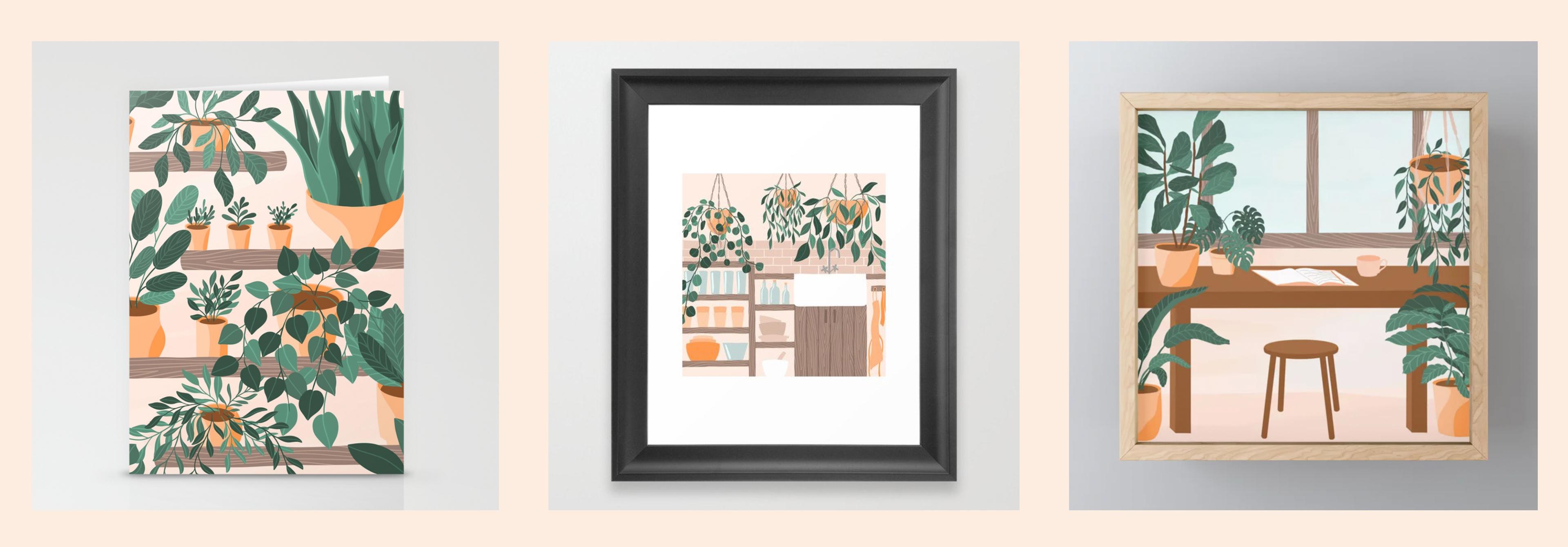
1. Plant Illustrations in Procreate: Hi, everyone. I'm Liz Kohler Brown. I'm an artist, designer, and teacher. Today I want to show you how to create plant illustrations in Procreate, so you can start incorporating a wide range of platforms into your work. Adding a plant here and there in your drawings helps give a flat image variation and movement, and adds the pop of natural color into an otherwise lifeless drawing. When you take this class, I'll share with you a workbook of six step-by-step plant drawing tutorials so you can easily start incorporating these plants into your illustrations. I will also share with you some color palettes and six of my illustration brushes for Procreate, plus a set of six pot-shaped stamps that you can use to add some variety to your drawings. First, we'll draw a single plant and talk about how to make plant leaves curl and twist so we aren't just depicting flat leaves facing the viewer. We'll also talk about how to add a simple wind animation effect to your plant illustrations to help your drawings capture your viewer's interests with movement. Next, we'll draw a menagerie of overlapping plants to create an illustration with movement and depth. We'll talk about how to pair plants that contrast well with each other and cover some tricks for working with drawings with lots of layered elements. Last, we'll create a simple illustration of a room and talk about how to incorporate plants into the scene to add variation and depth to your drawings. Throughout all of the projects, we'll talk about rules for compositions that will help you create balanced, cohesive drawings. What I love about incorporating plants into my illustrations is that it's a quick and easy way to bring some bold color and movement into an otherwise boring scene. Whether you're creating work just for fun or just sell or license your drawings, adding plants to compositions will help you add variation, movement, and bold color to your work. Drawing plants is also one of my go-to practices when I feel a creative block coming on. Because leaves can be almost any shape at all, plants are a great confidence booster for your creative mind when you're having trouble getting into the mood to draw. I'll be demonstrating all of these principles on my iPad in Procreate, but you could use canvas, paper, or whatever materials you like to work with. Let's get started.
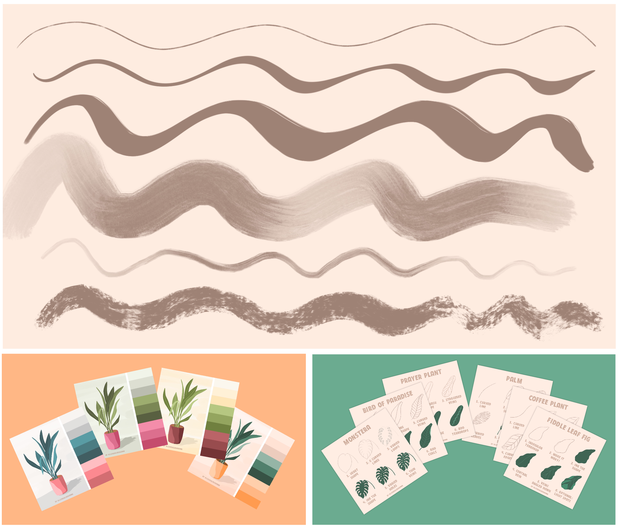
2. Creating a Reference Board: First, we're going to draw a single plant so we can talk about how to break leaves down into parts, and also how to portray leaves from the side and back so we're not just always seeing the front view. To get started, we need to choose a platform and some reference images to help us with the shapes. I'm going to start out here on the Downloads and Resources page for this class. You can find the link to get to this page in the Project section on Skillshare, make sure you're viewing Skillshare in a web browser, not the app because the Project section doesn't show up on the App. Once you click on that link, you'll see that you need a password to get into the page and I'll show the password on screen right now. Once you get into the page, you'll see there is a list of all of the downloads and resources I'll be mentioning throughout this class. The first one I want to take a look at is the Class Workbook. If you click on that, I'm using Chrome here as my browser and it should open in a new browser tab. I'll click "Download" and then you'll get the option to Open In and then you can select "Procreate" as the program. You'll notice that if you're inside a stack, you need to get out of that stack to find the workbook and it should be there at the top of your gallery. The next item on the list is the Brushset, and you can do that exact same process to get the brushes. Next, we have the Pinterest Inspiration Board. If you click on that, you can see there is a big list of images that are free for personal and commercial use with all kinds of different plants that you can copy, get inspiration from. This is a great place to go when you need a little practice and you're looking for a leaf shape maybe turned in a certain way or a certain type of leaf. You may also get to the point where you're just not sure what plants to draw next, so I made a list of some of my favorite plant websites. Now, these are not images that you can use for personal or commercial use, so you don't want to copy any of these, but this is a great place to get inspiration for some plant types. I'm just going to the first one here and you can already see here some beautiful plants. What we can do is find one that works for your personal style so that's what I'm going to do for this first project. Scan through here and find one that works for my style. I really love this Fiddle Leaf Fig plant, this is one of my favorites. I'm going to choose the Fiddle Leaf Fig as my plant type, but of course, go with whatever plant works for your style. Now that I know what plant I'm going to use, and of course, if you're not sure, go through all these other lists and find one that works for your style. Now I'm going to search Fiddle Leaf Fig and go to Images, and then I can get a huge list of fiddle leaf fig plant images. I'm not going to copy any one of these, but I am going to take a lot of screenshots so I can start getting an idea of how this plant is shaped and what the leaves look like at all of the various angles. I'll just start by going through and screenshotting each of these plants. I'm especially looking for images that show different angles. This one shows the underside, so I really like that one. This is a great side view and this is a great top view that really shows me what these veins look like. Having all of these different reference images is going to enable me to accurately depict this plant without copying any specific image and creating a shape that works for my composition. I'm also noticing it's a theme that this is thicker on top and thinner on bottom, sometimes really sparse on the bottom, and then we have those really chunky bases. I'm going to try to incorporate those into my plant. You may also be looking here at pot styles so you might consider doing a basket or maybe doing some ceramic thing. I'm just getting a lot of images so I have a lot to pull from as I work. Next, I'm going to open up my Photos app, and then I can go to each of these images, press Edit and Crop, and then just crop it to be whatever part of this image that I need. We definitely don't need all that extra white space and then just press Done, and I'll continue that same process with each of these. I'm just gathering my reference images. I'm just going to make myself a nice little inspiration board so that I have everything I need in one place. Now I've cropped all of my images. I'm going to go to Procreate, go back to my gallery, tap the plus symbol, and create a new canvas that's 3,000 by 3,000 pixels. I've created a saved Canvas at this size, which you can do by just swiping left on one of these and clicking "Edit" but I've already created that so I'm just going to click "Square 3,000 by 3,000 pixels." Now I can swipe up to grab that Photos app, put it over on the left, tap Select, tap each of these images, and just drop that onto my canvas. Now I can get rid of this because I don't really need it anymore. There were a couple of these that I didn't crop because I just didn't really feel like I needed all of these images. I'm selecting each of those by swiping left and then just going to resize and go one at a time and just spread these out so I can see each one. I may also delete some of these. I don't think I need all of these images, but personally, I always like to start with a lot of images so that I have a lot to pull from, and then you can always delete some of it just seems excessive. Now I've got all of my plants here on my canvas and I can start thinking about the shape. If I grab my sketching pencil, I'm just going to take a look at one of these leaves and see what is this overall shape. It's like a foot shape, so I'm looking at this right here. This is a time when you can just go through and practice your shape, just get to know that plant form a little bit, and maybe also try some of these where you see the underside. Here's a good one right here where I'm seeing the side view like that and then I see the inner part too, and then the veins are just coming along the back. So this is what I usually do when I'm getting to know a new plant form. I just take some time here to play around with the leaf in a few different forms. Of course, if you're doing the shape that I'm doing right here, you can just copy what I'm doing and that's fine. Or if you're doing a different plant, of course, you may have a totally different process to follow based on the leaf shape. I want to give you an idea here of how I approach some various leaf shapes. If you open up the Class Workbook that we downloaded earlier, you'll see in the Plant section here that I've broken down how I like to draw a few different popular plants; Monstera leaf, Coffee Plant, Palm leaf, Prayer Plant, Bird of Paradise, and the Fiddly Leaf Fig, which is what we're doing right now. Typically, how I do that is an irregular teardrop, make it wavy, ink the shape, add a central vein down the middle, add angled veins, and then optionally, add some light spots. You might flip through here and if you feel like you need a little practice, you could do a practice page of a few of these leaves, or you can just go ahead and jump into the project with me.
3. Leaf Directions and Curls: Back to my inspiration board. I feel like I have a pretty good idea of what this plant looks like. So I'm ready to dive into my composition. I'm going to tap the Actions menu, tap Share, and tap JPEG to save this image. Then I'm going to start a new document that's 3,000 by 3,000 pixels. If you'd like, you could go ahead and share your inspiration page with your sketches in the project section on Skillshare. You can do that right under the video by just clicking projects and then create a new project. If you're using the app, you won't see that project section, so make sure you switch to a browser if you're ready to go ahead and share your inspiration board. I'm going to jump in and start my composition. I'll click 3,000 by 3,000 pixels, and I want to have my inspiration board nearby, so I can just see what I've got going on here and what leaf shapes I can expect to be adding in. What I really like is this plant that has like a central piece and then some leaves coming off the side, but I also want to have multiple stocks like this. I'm just going to start by playing around with that. I'm going to get black as my color. I've got the sketching pencil from the plant illustrations brush set. I'm just going to start by thinking about where the central veins could be. I'm trying not to make them too alike. If one is curving this way, I'd like the other one to curve the opposite way. Just thinking about variation here. I'm going to grab the selection tool, circle, one of those, and maybe just shifted over here so it's angled in a different direction. I'm constantly thinking about variation with these. I want to be sure that I'm creating an interesting composition and not just several leaves that all look the same. I'm happy with that, I do think the pot is way too big, so let's make this whole thing a little bit smaller, and extend these pieces up. I think with plants like this that are really chunky, they look great and really small pots because the small pots emphasizes how big the leaves are. That's just one way to change how your viewer sees your piece. I'm going to start by doing one of those irregular teardrop shapes. This leaf gets larger at the ends and it's smaller in the center. I'm keeping that in mind. Then I'm using the vein to direct where that goes. I really like these on the side here, so I'm definitely going to do a few of those. We've basically got a straight vein and then just one side of the leaf. As you're drawing these, it's important especially because we're using so many different reference images. It's important to think about sizing. As you can see with my reference images, this plant tends to get bigger leaves as it gets taller, and so we're definitely going to have some little guys here at the bottom and then some bigger ones at the top. I'm keeping that scale in mind as I'm drawing these. I love this leaf that you can like see the inner part here. I'm just going to play around with that. There's the outside part of the leaf and then the inner part scoops around like that. As you can see, I'm not perfectly following what's going on in these pictures because number 1, I don't want to just copy someone else, and number 2, I think it's really important to remember with plant forms that leaves can be almost any shape. That's why this is such a great topic for when you're feeling creatively drained because you can't mess this up. You've just got to keep drawing shapes that resemble this leaf. But don't obsess over. Does it look exactly like this picture? Did I do that little curl exactly like they did that curl? It just doesn't matter. The point is to create an interesting composition, not to perfectly depict someone else's photograph. Some of these are really crazy with the shape, but I'm just going to go with it. I'm really looking at those folds and you can see how I added in those folds. I'm just following this curvy shape here, and then I just go through and add these little lines to show where the fold is. If you've never really drawn leaves like this where you really are emphasizing the folds, I would encourage you to start trying it because this is a great way to add so much visual interest to your compositions and really show your viewers various angles and interesting perspective on your composition. I accidentally did a pointed leaf here, and this plant does not have a pointed leaf, so I'm just going through and getting rid of that. Can you just check yourself as you work and make sure that you're sticking to the true form of this plant. Again, doesn't mean it has to be perfect, but you want to get close. I'm just going to repeat this exact same process going back and forth between these different leaves and different stalks, and trying to just create an interesting composition that doesn't have any two leaves that are alike. That's one thing I really want to avoid is, let's say I've got this big leaf on top and then I do another one on top that looks like it. You just get this boop like repetition that you never see in nature. So rather than doing that on top, I'm going to go the opposite way. Also have some little folds on the side here, so that this is clearly not copying this one over here. That's my challenge for you on this composition. Every leaf you draw, look at all the other leaves and say, "Does this look like any of the leaves that I've already drawn?" If so, then try to make it different. Change it in some way erase it, redraw it, and by the end, you'll have a really interesting composition. I'll take just a minute to finish out this sketch. I also want to note one really important thing about plants, and that is how the leaf meets the stalk. In this plant, we've got these little fat stems that connect to our stalk, and our stalk is pretty thick. I'm going to go through and thicken these stalks. As I'm drawing in these new leaves, I want to continue thinking about leaving room for those stems so that every single plant is attaching to the stem in a similar way. With this plant, it swoops in to the stem, so I'm just going through, swooping into that, let's call it a central stem. I'm also deciding here what is going to overlap. I want this very lower little leaf to overlap with this other plant. That overlapping also helps you a lot with adding depth to your composition. If you're feeling like it's flat, you may need to go in and just add a couple of leaves that overlap with each other. That's going to give you so much more depth and movement in your composition. I'm also just trying to be clean. If I'm making little marks with all of these different lines we have going on, it definitely can get confusing, so I'm doing my best here to stay organized and keep my sketch relatively clean. One thing I try to avoid with these compositions is too much overlapping. Sometimes you get to the point where there's just a plant, on a plant, on plant, and the viewer almost can't really tell what's going on. For me, when you get into illustration, you want to balance between creating something realistic and creating something that looks good on the canvas. This is almost pushing it with all of these different leaves here that I have overlapping, but I'm going to try it. I can always erase it later, but I think that leaf is definitely in question at this point. I'm just going to add a couple more in here and then I'll get started with coloring. When I finish my sketch, I always do a final assessment to see if anything looks too redundant or too pattern like. One thing that's bothering me is the side. It's like side view, side view, side view, side view. Front view, front view, front view. I think we just need a little bit of variation here. This guy is going to have to go. It's really hard when you're drawing to think about these things. You almost have to just draw it and then step back and think about it later because it's just not easy as you're drawing to think, "Am I doing this perfect variation? Is everything looking the same?" So just that alone added a lot of variation to this piece. I'm not crazy about these, but I think because I've got a side view and a front view, this is going to end up okay. These two are mirroring each other too much in my opinion, so I think this guy or this guy is going to need some folds on the side. I think you can see here, there's no science to this. It's just, put some things down on the page and play with it until it starts making sense to you. Everything here looks okay to me, but of course, you can take a lot more time to play around. I'm noticing one more thing here. You want to avoid awkward meet ups. You could call these awkward intersections too. Here's one. This leaf here starts right at the bottom of this other leaf, so we've got a leaf and then a leaf, and it almost looks like they're part of each other in a way, whereas if I could break that up, I think it would make a lot more sense on the page. I'm going to grab the selection tool, select that top leaf, tap the move tool. Let's make it a little bigger. All ready, that variation is nice. Then, just pull it down a little bit, and then let's erase that. Just that tiny bit of adjusting where these two meet can really help get rid of an awkward situation with the leaves. I try to always think about that with these. You don't want two tops or two bottoms, or a top and a bottom to just touch each other. It's better to overlap or just give them a little breathing room. Here, we've got some nice breathing room. Here, we've got some nice breathing room. Here, we have some interesting negative space that's wavy, so we're looking at all of those different aspects as we work.
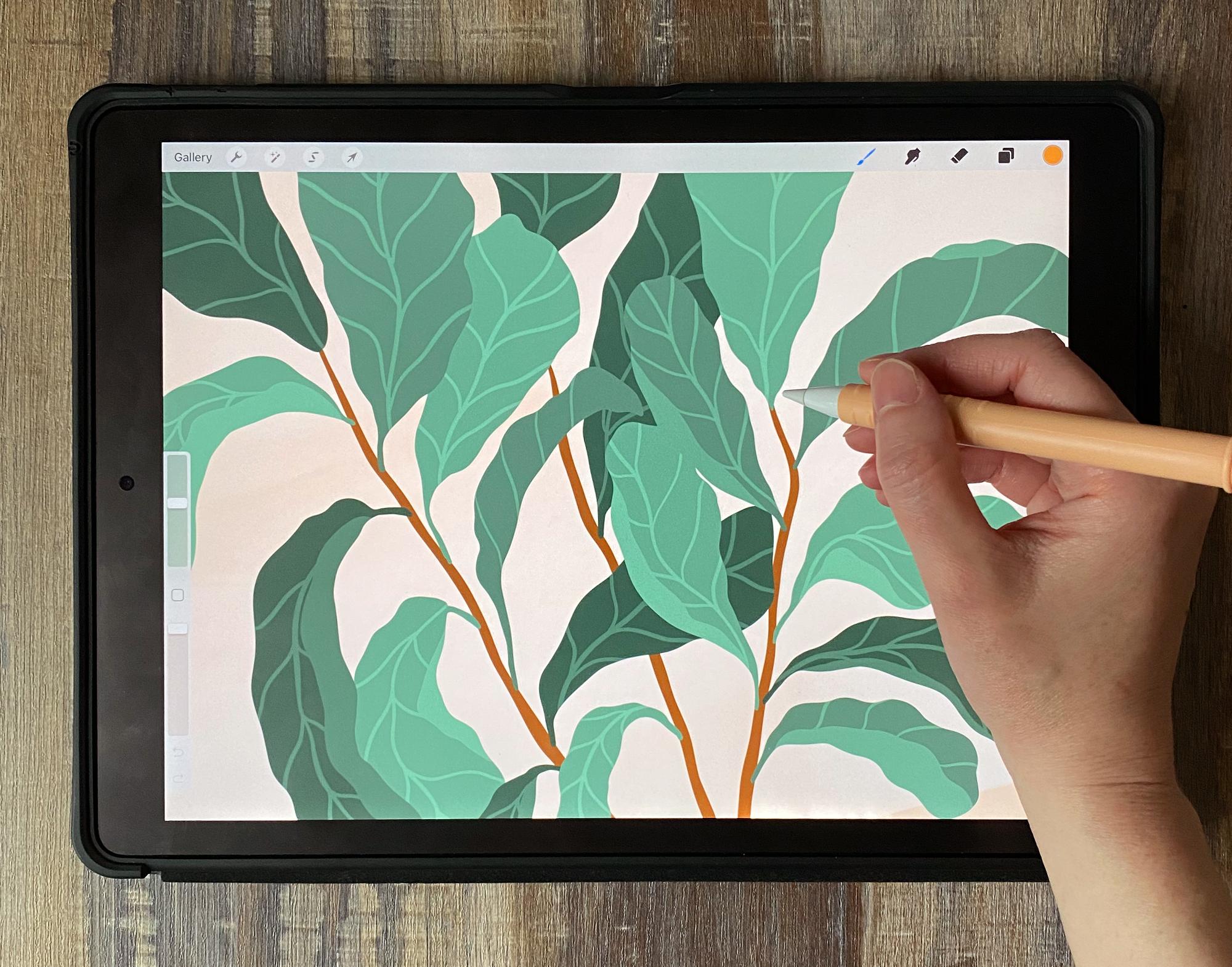
4. Refining Your Sketch: Now I'm just going to reduce the opacity of that layer, create a new layer and this is going to be my final sketch. The first thing I'll do is choose a color for my pot, so it's going to be this orangey color. We're going to get more into color palettes in just a minute, but for now I'm just talking about my sketch color. If you look at the plant illustrations set, you'll see that there are a lot of different pot shapes in there. You can feel free to use these, or you could create your own pot shapes, whatever works for you here. I'm just going to go with pot number 1 and what I like to do is size it, then tap with my finger because if you tap with your finger, you're going to get the size that you see here, whereas if you tap with this, you're going to get a different size every time. There's my pot. Now I'm going to create a new layer, grab a dark green color for my sketch, get my sketching pencil and I'm going to go through here and just refine and finalize everything. So starting with making some really nice thick central bark pieces here, then I'll go through with each leaf. You're kind of just tracing over what you originally did. But I almost always change things when I do this part of the process, it always seems somewhat unnecessary, then I do it and I'm like, wow, I'm glad I did that before I started inking because it just gave me a minute to actually think deeply about my composition. You can put on some music. This doesn't have to be a super serious time, but it is a good time to go into the refinement stage and start thinking about, did I leave enough room for these nice stems? Did I make these wavy enough? These leaves are very wavy and I think I've not shown that enough in my sketch. I'm going to be going through and just making sure I'm getting super wavy with each of these. I'll take just a few minutes to do that and also add in my central vein on each leaf. One thing I want to note here as I'm working on this piece is that, while the leaf itself is really wavy, if I show the bottom of a leaf, like I'm showing with this piece, the bottom is not wavy. That's the one thing that's going to help my viewer understand when I'm showing a side view piece that this is different because it's super smooth, whereas these are getting that rough, chunky, wavy thing. Then let's just add in some of the other side of that leaf just so the viewer can really see that that's a two-sided leaf. You can see already going through this part of the process, I'm making some big changes to my leaves. That's why I do this part of the process because I need that extra time to go through and think about the waviness. I'm not just thinking about chunky shapes anymore, I'm thinking about this actual leaf and how it's formed and how to make this so that when someone looks at it, they say, ''Oh that's a fiddle-leaf fig plant, not just any old plant.'' I went through and added a lot of waviness, a lot more chunkiness to the ends just to really accentuate that thick part at the very bottom of the leaf. I'm pretty happy with this drawing for now. I'm going to make my sketch invisible. One thing I want to note here is that, interesting negative spaces are one of the best ways to improve your illustrations. When we talk about negative spaces, that's just spaces that don't currently have anything in them and they're really just as important as the spaces that do have things in them. One thing I might suggest you do, especially if you're new to illustration, is go through and mark your negative spaces on a new layer with a new color and see if they're varied. If you have a lot of the same negative spaces over and over, then you probably don't have a very interesting composition, whereas if you've got some big ones over here and then some skinny ones that are wavy. This is really a great way to test yourself and see what kind of variation you've got going on on your drawing. I'm pretty happy with that. I'll just delete that layer and now I'm ready to start inking.
5. Inking: For my ink layer, I'm going to be pulling from this color palette that I created. I want you to feel free to use the color palettes that I created for you. If you go to the workbook and you open up this section called Color Palettes here, you can see four different suggested color palettes. Of course, you can make your own too, but feel free to pull from mine if you'd like. If you want to use one of those, you can just go to Palettes, tap the plus symbol, create a new pallet, go back to the desk and then tap and hold to save each color. I'm holding on a color and then tapping on the palette. Feel free to use those if you'd like or create your own palette. As you may know, if you've watched my other classes, I really like working in limited color palettes. I do have a class on how to create limited color palettes if you're curious about that process. Back to my drawing, I'm going with the warm clay pot color palette. I'm going to start with a medium-range orange. I'm going to get the Fluid Ink Brush from the plant illustrations set and start out by testing that size. I'm keeping this really fluid. Personally, I don't like to use quickline very much, which in Procreate is just where you tap and hold to make a straight line. I like to keep my lines somewhat wavy, somewhat handmade-looking, so I'm not getting too much over-refinement. But of course, go with whatever works for your style here. I'm just starting by totally filling the shape in. Then I'll create a new layer, get a slightly darker color, and then I can start showing how this plant, how this pod is broken up. I'll make that sketch semi-transparent. I can just go through and just highlight those areas here. You can see I'm drawing right off of the pot. If I tap on that new layer and tap "Clipping Mask", it will clip it to the shape under it. That's how I like to add in new colors. That way you're not totally committing to anything, you're not messing up your original drawing. You've always got the ability to go back and cancel what you just did. I'm going to keep this pot shape pretty simple, new color, new layer. I always put each color on a different layer, so I have the ability to go back and change it. Back to my layers panel, I'm going to reduce the opacity of my plant layer. I'm just going to go through and start with my back here and create some really nice varied lines. I like to always make a line like this in a few different strokes. What I mean is this particular brush, you could go through and just go like that and make a varied line. But look how different those two lines are. This one is very smooth and this one is more rough, more realistically plant-like. That's why I like to go through and do one side of these, being sure to get nice and wavy, lots of movement. Then I go back through and do the other side. New color, new layer, I'm going to start with a light green and then work my way down to the darker green. What I like to do with my plant illustrations is just use a few different colors for each plant, which gives it a light to dark feel. Every leaf doesn't have the same color to start with. That's just my personal style. Of course, go with whatever works for your style here. I'm really just tracing my sketch. I'm going to worry about adding in those folds and everything else relating to this leaf later in terms of the veins, the folds. For now, I'm just blocking out these main shapes. Of course, I'm trying to space out where the same green colors are. You don't want to do one area of my plant that has a ton of the same green in it. I'm going to put in that variation just like I did in my sketch, making sure the colors disperse throughout this whole composition. I'm going to move on to my next color, so new color, new layer. I'm going to a slightly darker green just to give that little bit of variation on this whole piece. I'm also planning out where those darker leaves are going to go. I'm just keeping that in mind. If I leave a leaf, I want to be sure that can be the darkest color. That gets a little tricky when we get into these overlapping areas. We'll just have to take it as we go here. This one, I know can be the medium green. Then I wouldn't want to make this one the medium green because then it would overlap with that, same thing for that one. I'm going to have to go with this one over here but just barely gets close to that other medium green leaf. That's just one thing to think about if you're going to do this multi-color option, you want to just make sure you're spacing out those other colors so they don't get too dense in one area or there's not some weird overlapping issue. I'm going to my darkest color now, new color, new layer, and I'm going to fill in the remainder of these leaves. Now I'm realizing that I want this leaf to be below these other leaves. That's going to have to go on its own layer below everything else. I'm going to tap the selection tool, circle that leaf, drag three fingers down the screen, cut and paste, and then just drag that below the other leaves so it peaks out nicely there. I could do that with another dark layer like, for example, these two that are in that crazy overlapping zone that may or may not work out here. I'm going to have those be in the back and then these others can be in the front. Again, just trying to push that whole concept of variation, making sure my viewer is getting a lot of interesting things to look at. I think I'm going to put my other dark ones on this upper layer so they're above everything. At this point, you may decide that you want to change some things. I'm not crazy about there being two darks here and then no darks right here. What I'm just going to do is go to these different layers and drag a color in to see if I like it. If I do, then that needs to go on a dark layer. I just colored this one. I'm going to tap the selection tool, circle it, drag three fingers down, cut and paste, and then I have to merge it with the dark layer. Once I'm happy with all of the colors and all of the correct colors are on the right layers, I'm going to create a new layer above each leaf layer, and I'm going to set that to be a clipping mask. Just like we did before with the pot, I just want to make sure I'm presetting those to a clipping mask. That just saves me a little bit of work while I'm drawing. Let's go to these dark layers first. I like to get a color that's just slightly lighter than the leaf itself, and then just go through. I was on the wrong layer here, so just go through and add in those veins. You can do a central vein. You could also do these inner veins. Of course, if you need to go back to your reference image to figure out how those veins should look for that particular plant, this is a great time to do that. Another thing I'm going to do with that same color is add in my folds. Let me go to one that's really easy to see here like this layer. I'm on this layer right here. I'm going to go to the layer right above it, get a color slightly lighter than that color, and I'm just following my folds without light color. Now when you step back, the viewer just sees these nice simple little folds. I may even end up going through and adding extra folds that weren't there just because I just love how those folds look. They just add so much visual interest for the viewer. It's an easy way to show the side of a plant without doing a ton of work on the shape itself, you're just showing the viewer how it curls. I'm going to repeat that same process, adding the veins and the curls to every single leaf. I also wanted to note here that it is a good idea to count the number of veins that you're going to do. I'm not checking my reference image because I'm just going to go with my gut here. But let's say you do four on this leaf, you probably want to stick to four on the remaining leaves so that your composition is cohesive. Otherwise, you're just going to have a lot of different styles of leaves and that might be a little bit confusing for your viewer.
6. Finishing Options: Once you've taken care of all the veins and the curls and showing the side of the leaf, you can make that sketch invisible and there are a few different things that you could do here to finish this off. What I like to do is create a new layer below it and fill that with a lighter color, so I'm just going with the lightest color here and then I'll create a new layer above that. Let's just do a floor by getting some fluid ink and just a wavy background, just something simple or you could do a straight line if this was an indoor thing. I also like to create a new layer above that and go through and add some light and dark variation. I'm going to grab the wet acrylic large brush and this is a new layer. I'm just going to go through, and you can see how I'm adding just a tiny bit of variation, just so we have not just a plain background, but a little bit more visual interest. I'm getting a color that's slightly darker than that background. I'm just going to go through, just a little bit and then let's get a color that's slightly lighter than the background, and do a lighter area down here. This doesn't have to be anything fancy, just getting some brushstrokes in there. You can go as extreme as you want with this, but for me this just takes it from being a boring flat composition to having just a little bit of painterly aspects to the background. I don't like to get too extreme like that. I feel like it was a little much, so I'll go a little bit lighter, just warming it up a little. Of course, that's up to you how far you go with this. My plant looks a little bit high, so I'm just going to go through and select each layer that contains pieces of my plant, tap the Move tool and shift it down. That's one thing I try to always think about is where is my top of the page and where is the bottom of my page and is my object somewhat centered and also not having an awkward meeting with the background. You can see how the background almost touches that bottom leaf. I really don't like that, so I'm going to go through and fix that by assembling that background color, getting the fluid ink brush, and just make this a little bit bigger. That way you can see now this leaf is just overlapping with it a little bit instead of just touching it which made it a little bit awkward. Of course, we need some dirt in our pot. I'll create a new layer above this darker orange layer, and I actually want to create a clipping mask for my dirt layer. But this layer's already a clipping mask, so I need to make it not a clipping mask so I can put one on top of it. I'll show you what I mean here. I want to grab a dark color and I want it to be just on the orange area, but right now it's showing up on this pot too which that obviously doesn't really work. What I'm going to do is go to my pot, tap ''Select,'' go to the orange darker layer, drag three fingers down the screen, cut and paste, and then I can delete that extra little bit that it left. Now I have this new layer that is like a clipping mask, but it's not actually a clipping mask layer, it's just that color clipped to this shape. Now I can create a new layer above that, tap ''Clipping mask,'' and now let's get a color that's darker than my branches and put some dirt in my pot. That's really all I do for these compositions, and of course you can create a lot more of these and try a lot of other plants. I like to experiment with a lot of different plant shapes and just have those in my arsenal. This should be a good time, or maybe later after you watch the class to just go through and try all of your favorite plant shapes. Another thing you can do is just add some other object in with your plant. In this piece I just added in a cat, and I think it makes a fun little composition for the cat to just be interacting with the plant. One last thing I like to do with these compositions is go to my gallery, tap ''Select,'' tap on it and tap ''Duplicate,'' and then I have a duplicate of that plant. I'll go in here and I'll delete the background, delete all that extra stuff in the background, turn off the background layer. Now I just have a plant on a transparent Canvas. This is something I would add to my illustration library. Let's say I'm drawing something and I'm suddenly like, this would really look great with the plant. I've got this plant here I could just pop that in and because I have the pot on a different layer, I could just change the color of that pot and just pop it into my illustrations. You can see I've done that with several other compositions of just simple plant forms here. Now I can go through whenever I'd like and just add those into any drawing that I'm working on. I can also add those into a repeat pattern. If you watch my pattern class you know I like to make my repeats in Affinity Designer because you get this live pattern preview. I took some of my plant illustrations and I just turn them into a pattern here. If you want to see that class, I'm going to put a link to that on the downloads and resources page, but this is just a really nice way to use your simple plant illustrations to create an interesting pattern that you could use for print-on-demand projects or just for personal use.
7. Creating a Wind Effect: Next I wanted to show you my quick process for adding a little bit of a wind animation effect to your drawing. This is a great way to get people to look at your drawing just a little bit longer. We're going to start by pulling up one of our plant drawings. This could be the one that you just created or you could create a new one specifically for animating. I have here another drawing that I did of that same type of plant and I just added in a cat. You don't have to add in anything extra here, of course. But I just thought this would look nice with my animation and then I just added in this little shadow, which, of course, you can do that if you'd like. The first thing I need to do is delete any layers that I don't need. I'm getting rid of my sketch layer and things that aren't important here. The next thing I want to do is merge everything that's in the background onto one layer. For example, we've got this background, we've got this floor, some texture, the shadow, I'm merging all of those together. Also, anything that's not going to move in my animation doesn't need to be on its own layer, so that's going to apply to the pot. I'm going to merge everything in the pot layer together and that can be merged with the background. Also, my cat doesn't have to move, although I could make it move if I wanted to. For this one, I'm just going to do a simple animation where only the leaves are moving. So just going through, deleting everything that isn't going to be part of this composition and then merging anything that is part of the background. Now I have everything except for my leaves on one layer because my leaves are the only things that are going to move. That's my background layer. Next, I need to have my leaves and their veins on the same layer because right now those are separate. I'm just going to go to each color and just merge the veins with the leaf itself. I do want to note here, I'm working with a duplicate document. This is not my original drawing, so make sure you go to your gallery and duplicate before you start merging all your layers, so you have all of your work saved. We've got a few different layers with leaves on them but I want those to act as a single unit in my animation. I'm just going to swipe right on each of those and click "Group". I've really just got two things going on now, a leaf layer and a background layer. Now if I tap the tool symbol Canvas, Animation Assist, then I get this little menu down here that's going to help me set up this animation. On my background layer, I'm just going to tap and turn on background. That just tells it to keep that part playing through my whole animation no matter what else I change. For my leaf part, I'm going to start by just duplicating it. My first frame of my animation is just what you're seeing right now. The next frame, my leaves are going to move a tiny bit. First I need to decide which way is my wind coming from. If it's coming from this way, it's going to move towards the cat and if it's coming from this way, it's going to move away. I think I'm going to make it turn towards the cat so that they're interacting a little bit. What I need to do is go to each leaf and just nudge it a tiny bit and I'll do that a few times so that each frame of the animation is moving just a little and then it's going to come back. First I'm going to start with these leaves right here. You can see when I turn them on and off where they are and I'll just start by going to the Adjustments menu, Liquify and then what I like to use here is Push, I feel like this is the most helpful for a wind effect. We're going to play around with the size as we do this, pressure, you just have to play around with these, but basically pressure is how hard you have to push to make it move. If I turn the Pressure down, it just barely moved when I did that. I just leave the Pressure up because I wanted to move a lot. I've got my size at about 40. I'm just going to go to one of these leaves and just move it a little. I'm going on one side of it and then the other and just picture if some wind was coming through, what would happen to these leaves? It doesn't need to be extreme because we're going to do this three or four times on different layers, so just a tiny bit. Of course, this is not going to move. The bottom of your leaf doesn't become attached when the wind comes through. It's just this top that moves a little bit when we've got wind, so just making sure I moved all of those. Then I'm going to the next layer and if it's helpful for you, you can make things that you're not working on invisible. Sometimes I'll do that, just make all of these others invisible, so all I can see is the one I'm actually working on. Also, if you go to settings and on onion skin frames, you turn it down to none, then you can't see any of the other parts of the animation, that can be helpful because then you're not getting confused about what was on the previous layer, what layer you're working on. Honestly, I always leave my Onion skin to one and that means I can always see the previous layer or the previous group in this case. That's how I like to do it but go with whatever works for you here. Back to adjustments, back to Liquify, making that wind come through just a little bit. I like to pull it in on one side and pull it out on the other so that we're getting just so little bit of a shift in all directions. If you don't pull it from the side, I think it just ends up looking like the wind is smashing the leaf, which doesn't really make sense. The wind is not going to smash the leaf it's going to move it. Just going through and making sure I'm shifting that correctly. Again, just making the others invisible that I'm not currently working on, move the outside, move the inside and really only working on these very tips of the leaf. I'm always trying to pull in this direction because that's the way the wind is going. It's not always easy to do in a spot like this and that's where I'm going to reduce the size of that brush and just come through and do little movements because I don't want to capture this part in my movement. I'm just going to do some little shifts here like this. I'm just going to repeat the same process with all of these leaves. Then I need to make my brush a little bigger. Then I'm going to repeat the same process with another group. Just duplicating this group over and over and repeating the process. You may want to check it as you go to make sure you're moving the right amount that works for your style. I'm just going to click "Play". Right now it's just wiggling. If I click "Settings" and I reduce the frames per second, it's going to go slower. I like how it's looking, but I definitely need more frames. The wind is moving it and then it's moving back. Let me do a couple more of these. I'm duplicating that top group and repeating the exact same process that we just did on each of these layers and then we'll take a look at the animation and see how it looks. I'm also focusing on moving these about the same amount each time. I don't want one or two leaves to look like they're moving way more than the others because that's just going to be confusing. It's like why is this area of the plant in a more windy zone than the other? It's just not realistic. Let's say if I do a quarter-inch movement on this one, then I need to do that same movement on the other one. I did that same process again, so let's click "Play". That's a little bit better. In settings I'm going to go to Ping-Pong, which makes it go forward and back, so the wind is moving that way. Let's do a couple more layers, doing that exact same process, always duplicating the top layer. Basically, I want to touch that cat's nose with the wind. I'm just going to go through and keep pushing it until it gets pretty close to the cat's nose. Now I've done five layers that each one is shifting the leaves over just a tiny bit. Let's click "Play" and see how this looks. That's a pretty nice wind effect. I think it's on Ping-Pong. I'm going to try slowing it down and see if that looks a little better. I think the slower version is a little bit better. It doesn't need to be super fast. We don't want it to look like it's wiggling. We want it more to look like the wind is just flying through here. I like that speed. I think that looks nice. If you want to share this, you can just go to the Actions menu, Share and then choose the file type. If I was going to go for YouTube, I would go Animated MP4. If I was going to go for Skillshare, I'd go Animated GIF. You just have to choose whatever file type works for wherever you want to share this. Also, if I was going to do like Instagram, I would use MP4. Anyway, just a short little animation tutorial to help you add a little bit of wind to your composition. I think this really just helps viewers engage with their piece a little bit more. People are always looking longer at something that has video and movement in it. Definitely play around with some animation, see if you can make your plants wiggle and move around in the wind a little bit. I think you'll notice it gets a lot more engagement when you do that.
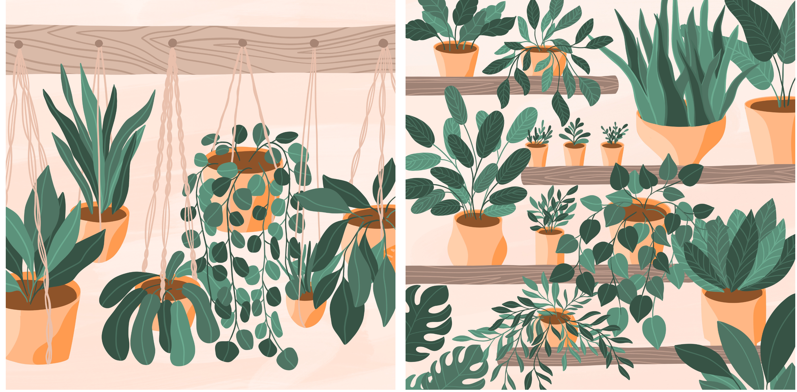
8. Sketching Layers and Variation: For this next project, we're going to draw a few hanging plants that are really close to each other in order to practice combining different plants to create a lot of contrast and variation between different platforms. We'll start by choosing a few different platforms and sketching those out in hanging baskets. I'm starting here with the same Canvas size, 3,000 by 3,000 pixels, and I've got the sketching pencil and black color. What I want to do here is just create a piece of wood on the back here that's going to hold all of my plants up. Then I'm just going to make some little marks here where I want my plants to hang from. You can do as many of these as you want of course. I'm going to go with six. I've got somewhat evenly space but I'm not trying to make this perfect. This is a loose illustration. I've got the free-hand selection tool and I'm just going to stretch this out a little bit so that my six marks are evenly spaced on the Canvas. Then I want to start thinking about variation when it comes to how these are hang. For example, let's say we have one up here. Then my next one I don't want to do up here as well. I'm going to do something totally different and go, let's say right here. Of course then the next one maybe could be in-between those two, somewhere in here. Then the last one, let's do that one super low down here. This is a really good exercise for practicing variation. I think this is one of the hardest things to do when you start out as a beginner because you think things need to be even and perfect. But honestly the last perfect you make things, the more interesting they are for your viewers. I'm really just going with looseness, playfulness here. I've got these pretty wide open. If you want it to look like you're more facing the plants head on, you could do a much more tight oval like that. But for me I want this to be more of a wide-open view, so I'm going to keep these pretty open. I'm also going to do some variation with my pot shapes. Let's do rounded, let's do a little oval. This one's going to be like an orb and maybe rounded with a flat bottom, and then another just standard pot shape. Trying to get that variation in there. I want to make sure that my strings are coming down straight from my middle point. Sometimes what I'll do is come straight down from the middle point and then come across like this. This is just a beginner sketch, so this doesn't have to be perfect but we want to just get an idea of where those hangers are going to be. This one doesn't look very good, for example, because the hanger is coming down right in the middle, right on the left side of the pot. I'm just going to move that pot over a little bit. Any little thing like this that you work out before you get to the refined sketch portion is going to make your life so much easier. Now that we've got some variation with our pot shapes, I'm going to get a different color here and start thinking about variation with the plant shapes. This plant is going to be droopy, hanging down, big chunky leaves, and some variation in the leaves. Some of them will be bigger than others. That plant takes up a lot of space. I think with the next one, I might go with something a little more simple like a snake plant. Again, you may want to start by going and getting some reference images before you even get to this point. Don't feel like you have to dive straight into drawing the plants like I'm, I've done a lot of work with reference images before I got to this point. Feel free to just copy me this time if you just want to get to know these plant shapes that I'm going to work with. But also know that those reference images are there for you whenever you need them. This is going to be a circular leaf, and this one's really fun for filling big spaces with because these guys can just really travel and go all around a room. I like to use these when I need to fill spot of an illustration that just needs a spread of plants. You can also do these as sparse or as full as you would like. I'm just going through and adding these as little circles, but feel free to get a little more detailed with maybe adding some side views like that, oval like this, any plant that you can find like this that's a climbing plant is great for filling spaces. Keep that in mind when you're looking for something to fill spot in an illustration, if it's a weird space that needs a lot of filling in these climbing plants are great. We did some long stringy plants for this one. I want to do some wide open chunky ones that are droopy but they really just don't go very far outside of their pot whereas these do. That's just a little bit more variation. These are like a peanut shape, so wider bottom, wider top, tight middle. Some of this overlapping might get a little too much, so we're going to have to decide that when we get to the more refined sketch, but for this one I'm just going to go with it. I'm going to do a bigger snake plant. Another thing to think about what the variation is that you don't want to get too crazy with variation. There is a limit of course. One thing that you can do to add in a little bit of cohesiveness if you feel like you've gotten out of hand, is to reference something else on the Canvas. Here we've got a little mini snake plant. Let's do a large snake plant over here. The shapes are going to reference those shapes and just brings a little bit more cohesiveness to your composition. Next, I'm going to do some really big leaves that just stand up straight on their own. They're not one of those droopy varieties. I'm just do a few of those. I pretty much have the layout worked out for this composition. I'm going to reduce the opacity, create a new layer, and now I can start getting much more refined with this. Of course, starting with that pot, if I put down one finger, that will clean up that oval and make sure it's not sideways. just like we did with the last composition, I'm just refining. I'm just making sure that what I thought I wanted to do is what I actually want to do. I'm going to create a new layer here to do these pots, and I'll show you why. I want to draw the side of this pot, and then just a little bit of the bottom. Then I'm going to duplicate that layer, tap the move tool, flip horizontal, and just stick this over here. That's going to help me really quickly create some nice even pot shapes so that my pots aren't getting a little bit wonky as I work. One thing I'm going to do to make sure these pots are in place is draw a straight line, straight down from each of these hangers. These hangers need to be at the very center of my pot. If they're not, then they're a little bit off and the piece is going to look like it's sideways. One that I'm noticing here is this piece right here. That one needs to get shifted over to the left a little bit. Everything else looks pretty good. Although now I wish that these lines were orange, so I'm going to tap the orange, I will also lock that layer by swiping two fingers to the right, tap on it one time and tap fill layer. Now everything is orange again. I like my plants to be one color and everything else to be another, so that's why I just wanted to turn that from green to orange. With these hangers, again I'm thinking about variation. If I have one that's in the center on this plant, then I'm going to try to avoid doing one on the center on this plant, instead I'll do two on the front and one on the back. Here I've got one on the front and two on the back. Always thinking about that variation aspect as I'm sketching.
9. Refining and Inking: I'm happy with how those pots slug. So I'll create a new layer with a dark green color, and I'm just going to go through just like we did on the first project, and just make sure that my leaf shapes are how they should be. Which in my opinion is varied but somewhat cohesive in terms of the shapes that I'm using, that I'm using interesting shapes, that I'm not just doing the same thing over and over, that I'm doing a stem that connects the leaf to each vine. Just little things like that, making sure there's no awkward meetups. I've already had to fix a few things here. That was a weird meet-up. Take your time here and refine that sketch. Again here I had to think about the cohesion aspect. I did one little leaf and it just looked weird. I'm adding in a couple more little ones so that that one isn't so lonely there. If you just add one little aspect that's different, sometimes it really stands out. Whereas if you add one or two, then you're breaking it up on the page, and it's not going to just shock your viewer. Also, if things get really crazy here, which I feel like they already are starting to get a little crazy. I will switch to a different sketch color for every other plant. I'm just going to go over here and grab a pink and that way, I don't get confused when I'm inking about what belongs to what layer. That's the most annoying thing. When you get your music on, you get in the mood to sketch and then you're like, oh, I actually have no idea what's going on here. Feel free to just pull in as many colors as you need for the sketch. Nobody's ever going to see the sketch layer. Make it utilitarian, not pretty. With this hanging plant I am trying to make sure it got some more open areas and some tight overlapping areas. I'm just taking a couple of more minutes on that piece in order to make sure I've got that nice balance between sparse and more open. I'm also letting some of these plants go up into the wood area. I think that helps tie the wood area into the plant area. I don't just want to have this weird element floating above everything else. I want it to be tied in. I'm going to make a couple of these leaves just barely touch. I'm going to get the free-hand selection tool and just shift this one up. So it's kind of mirroring what's happening over there. Just little changes like that can bring your composition together rather than just having two broken up spaces that don't grow with each other. Just one more plant here to take care of. Now I can make my original sketch layer invisible and I'm just left with this colored sketch. I'm going to merge all of the colored sketch layers together, reduce the opacity and now I can start inking. Let's go ahead and start by choosing a color for that wood and then building up from there. Again, I'm just using that same color palette that I used for the last composition. But you can use the same color palette for every drawing or you could try a few different ones. Personally, I like to stick with one color palette for a while and then move on later. Rather than switching around all the time. I think exploring one color palette for a while can really help you hone in on your style. Maybe consider creating a color palette that you really like and just stick with it for a few months and just see what happens. I've always found that that leads me to create more cohesive work and can usually free you up to not have to think so much about color all the time. You're really just reusing the same colors over and over. Again, I'm just filling in these pots shapes with one solid color and then I'm going to come through on a new layer above that, that's set to be a clipping mask. Use that darker color to just fill in all these interior spaces. One thing you'll notice with this piece compared to the last one is I put a lot less detail work into these plans. That's not just because I'm feeling lazy, It's because, if you're going to show something at this scale, then there's really no point in putting a ton of tiny tiny details into it. Because when your viewer zooms out to here and views it, possibly on Instagram or your website. They're not going to see all those tiny little details. When I did that one single plant, it made sense to go into a lot of detail with that one piece. Whereas these are a lot of little pieces that work together so it's okay to have a little bit less detail and sometimes it's nice to just take a break from going crazy with the detail and just see what happens when you let loose and do some loose drawing. I'm just going to continue this same process, inking with three different greens, each one on its own layer and just filling in all of the green spaces in this composition. Sometimes with these vine plants, I like to go ahead and draw all of the vines. I'll go through, probably do two dark vines, create a new layer, do some medium green vines and the reason I do the vines first is because it's just a lot easier to draw each leaf off of a vine if your vines are already there. If you're just trying to draw them in space like I did with this one. Then when you come in to put your vines, it's challenging to get that vine in the right spot. Now I have all my vines. Now I can just go through with each color and just pop in that little bit of color, attach it to that vine and we're good to go.
10. Details and Composition Options: Now that I've taken care of all of my leaves, it's time to add in some strings for my hanging pots. I'd like to start by just adding those in as straight strings. Or you could do something a little more interesting to create a macrame affect. So there are so many different macrame styles. What you may want to do is just go make an inspiration board just like we did for the first plant on macrame plant hangers. Then you can get ideas for so many different styles of these hangers. I love just sitting and drawing these. It's a really just relaxing fun, style that you can do. So whatever works for your style here, maybe try a few of these more fancy ones, and then a few that are just strings like this one. Again, that's bringing in a little bit of that variation. Then I need to erase the parts of the macrame hanger that are not being covered by the leaf. That's really going to depend a lot on how you want the overlapping to work on this piece. Then I'm going to click "Select" on that layer, go to my macrame, and then erase that little bit. That way I'm just changing how the overlapping works on that layer. Now it's just weaving in and out of the plants, which is nice. I'm going to repeat the same process with all of these macrame hangers. Some of them I'll do more interesting and some of them I'll just keep it really boring. I'm also going to take a minute and add dirt just like we did in that last composition. I'm selecting the pots. I'm going to the darker orange inner layer here. Dragging down three fingers and tapping, cut and paste and deleting that extra layer it created to get rid of those little bits, create a new layer, clipping mask, and then I can do my dirt layer. Of course, a few last things we can do with this. Turn off our sketch layer. Turn on a background color, whatever background color you want to use. Go to the layer above, this wood piece and we need to maybe add something in there like some wood grain. I'm just going to get a slightly darker color. Turn that into a clipping mask layer and that's the layer right above this wood. Then just go through and using that liquid pen, adding a little bit of just wood grain variation. I can already see that I'm going to need to differentiate between the colors of the wood grain and the macrame hangers. What we could do is just go to hue saturation brightness on that wood layer and bump it down a little bit. That's going to allow me to bump my wood grain down a little bit as well. These are just things you have to work out as you're working. Now we have some nice differentiation between the macrame and the wood grain. Another thing I'm going to do is above everything, I'm going to get a darker color. That is going to be for my, let's call these pegs, that are holding my hangers on. Now of course, the last thing I would do here is add veins on all of these plants. I'm not going to do this on camera because you know how I add veins on plants. I just go to the layer above that layer and get a slightly lighter color and draw a vein. Here is my finished composition. I made just a few tweaks with some extra veins and played around with the layout a little bit. Another fun project you could do that would be similar to this is a shelf. This is another great way to practice your composition skills. Here I did the exact same process coming up with as many varied plan forms as I could and trying to balance the plants that are pointing up to those that are drooping down. I've got those three little small pots, so those are balancing out the larger ones. In this composition, I decided to go through and do a more detailed sketch of the veins because, I really wanted to emphasize the veins in this composition. So depending on your style, depending on the composition, you may or may not just want to go ahead and sketch those in as you're working. I went into a lot of detail with the sketch in this composition, and then did the exact same process that you're familiar with for the inking. This is a great way to just unwind or, if you're stuck in a creative block, you can just fill the page with plants and it doesn't have to be just shelves. It could be a combination of the hanging pots and the shelves or some other location where you would put plants. As you can see, these types of compositions are a great way to practice adding in all that variation and movement. If you'd like, you could even throw in an animation like we did for the first project.
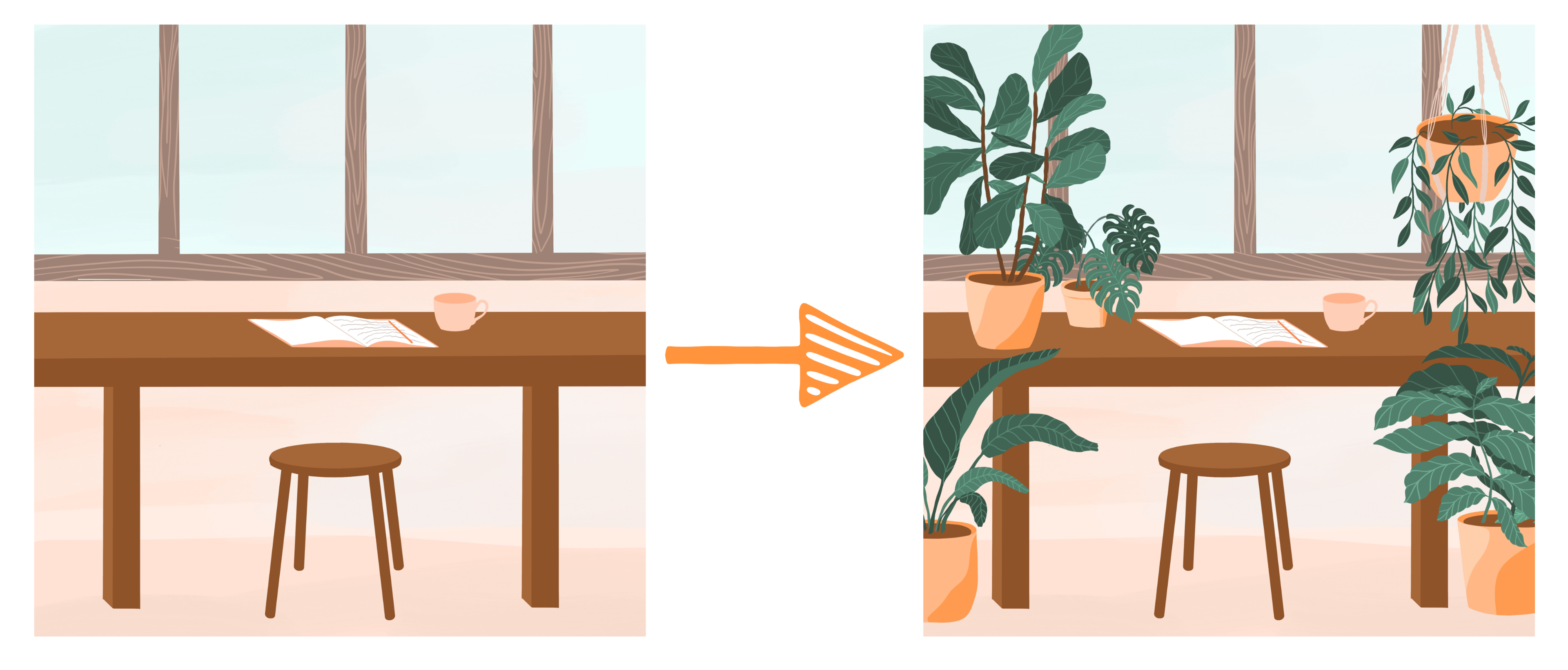
11. Creating a Simple Scene: Now that we've practiced a few different ways to draw plants, it's time to bring it all together in a composition. I'm going to start with a really simple background. I'm going to do a desk, but you could do wall or wall with a window, anything simple in the background, and then we're just going to fill it with some of our plants. You can either use the ones you've already created and pop those in, which I'll show you how to do, or you could draw these by hand just like we did for the other two projects. Again, I'm starting with the 3000 by 3000 pixel canvas with black as my color and the sketching pencil as my brush and I'm just going to do a really simple room because I just want to show you how easy it is to just fill the space with plants so that you have some really interesting movement on the canvas without doing a ton of extra work or having a lot of other objects in the scene. For this example, I was thinking I wanted to draw a room where I would like to draw or create, maybe a studio space or coffee shop, but all I could think of was a space for me to sit. I've got a little stool here, and we'll draw that stool in later on, we've got a desk, just a really simple desk here. But then the problem is we just have a lot of extra space that needs to be filled. I'm actually going to shift this up, so I have some more room for my plants. These are just going to be windows up here. Feel free with this project to depict any room that you'd like, but the key here is to have something small maybe towards the center of the canvas, and then the plants can fill the surrounding area. I'm going to have pretty much everything going on right here, and then all this extra space, I'm going to fill with plants. I'll just work on this just as I did with the other pieces. I'm going to sketch this in and then I'm going to go through and ink everything. I'm just doing a simple frame for the windows, and then a really simple desk with just two big pegs to hold it up. I going to do a lot more detail about drawing spaces in my perspective class because this is a plants class, I'm not going to go deep into drawing spaces, but if you are interested in that topic and you want to check out that class, you can learn a lot more about my process for drawing spaces and wood grain and get drawing things in perspective. If you feel a little lost in this topic, then jump into that class. Here's a really simple space. I'm just going to go through and ink this. I want this leg to be the exact same size as this other one, so I'm going to use the free hand selection tool to copy that, drag three fingers down, copy, drag three fingers down again and paste, and then I can just shift this over here and merge these together, and now I have that table all on its own layer. I'm going to choose a background color, and underneath this window layer, I'm just going to choose a light color of blue for those windows. You can see this is going to be a pretty quick illustration. I'm not taking a ton of time here, but of course you could later go back and do more refined version of this. I like to work this way in the beginning because I feel like if I go too slow then I'm overthinking everything. Often start a composition like this and then later go back and refine it. But then sometimes, you get into this process and then you realize it looks great just as it is, so you don't always have to go back and do that refining if what you've created is actually working well. Can I show how to draw objects like this in my perspective class? I'm not going to go into a ton of detail about this, but basically I'm using my eye to judge where these little spokes should go and just extrapolating out like that, doesn't have to be perfect of course. If you want to get perfect, you can use the rules of perspective to get really precise with this, but for now, I'm just going go for it. I'm just going to use a gray line to show where that page cuts across. We have just that little bit of a definition. But I'm really not putting a ton of detail work into this composition. I just really want to show you how you can start with a super simple composition and then turn it into something really interesting just by adding in some plants. That's why I'm keeping all these details pretty loose, because in this case, the plants are really my focus.
12. Adding Plants and Composition Options: There we go. We have a super simple composition. We could go into a lot more detail work with this. But for now, I'm going to just let this be as it is, and I just want to pop in some plants to really liven up this space because right now it just feels dull. As I showed you before, I go through each plant image that I create and I remove the background, make it invisible so that I have a transparent image. Share PNG. PNGs are the only images that can have transparent backgrounds. We're always going to use that file type. Then I can just go to the actions menu, add, insert a photo, and there is my little plant. Let's drag that to the top, and maybe I want that to be a big plant on the side like this. I'm turning off magnetics here so it doesn't snap. Maybe I want it to sit on top of this table. What I'll do for now is just duplicate it, make the first one invisible. Then for now, I think I'll just put this one right here. Then I'm going to bring in my other plants and see how they work together. I'm also looking at that negative space. Do you see how this blue is making some nice negative space here? I'm watching all of those different things as I build this composition. Let me pull my photos up over here because I've already saved a lot of PNG plants. I'm just going to grab some of those ones that I already created and saved, just like I just showed you. I'm going to drop those into this composition. As I was telling you in the first project, if you just go through one day and make a bunch of plants, then it can be really fun to see how you can fit those into a composition. This one, maybe you want to have it up here. This is nice to have two big plants surrounding this writing space. I'm going to take this little plant and stick that down in the corner. Let's get this Monstera plant and make it small, and it can just be sort desk plant. This is where you can just play. You've already created a lot of the detail work as you were drawing your plants, and now you can just play around with composition and spacing. I don't necessarily want my plant covering up my writer, but I might have just a little bit poking out on the side here. Sometimes I like to see how many plants I can get in a single composition because it just creates some really interesting layering. You can already see this going from being a very boring composition to almost becoming a jungle, which I think is nice for the viewer to just get some really interesting movement. I'm also putting some of these behind each other. This new plant is just going to peek out from behind this one. Then we get that visual interests of one piece peeking out from behind the other. Here's my final illustration. I played around with the placement for the plants. I added in a little bit of wood grain on each of the wood pieces, and I added a mug and a pencil, and that's my final composition. I want to show you a few other options that you can do with this same style. You really could start with just a room and a window. It doesn't have to be super complex here. You can start with something very simple. In fact, it could just be a wall or put a painting on the wall. I just want to show you this composition because I want you to know you don't have to spend a ton of time working on the background. It's all about the plants here, so you can really play around with just moving those plants around and drawing in different versions, and just have fun with a really simple space. If you do want to spend a little bit more time on the background, you could do a really fun perspective drawing. Again, I show how to draw in perspective in my class on perspective drawing. But here I included a window and a bookshelf in perspective, and then just added some plants and a cat on top of it. You can see how this composition with all the plants would be pretty boring, but the plants just give it so much fun movement and playfulness. You can see that I use the same sketching process that we use throughout this class to block in each piece and then get down to the detail work on my final sketch. I kept it really simple with the background illustration. I didn't go crazy with color or anything. I let the plants be the main focus and just kept this background super symbol with some neutral colors. I used the same multicolored leaf pattern that we did in the other compositions. But I just added a little bit more detail to the veins. Just keep in mind that you certainly can add a lot of detail on those veins if that works for your composition. Just like I did here, you could add in another element like a cat or some other objects that are fun in the composition. You can see that I also played around with popping in some other plants that I'd already drawn. It doesn't have to all be drawn by hand here for each individual composition, you can certainly use some of those drawings that you've already created and mix and match those in various drawings. You can also add in a lot of beautiful detail into your background if that's the style you're going for with a certain composition. For this composition, I wanted to focus on my dream kitchen. I wanted to show all of the different aspects of the kitchen from, vintage tile to the open concept shelving, to some wood cabinets. I really went into a lot of detail with the background and then just used the plants as a prompt to fill in the upper area. This is where the plants get really fun because they don't have to be the main essential character of your illustration. They can just be a support that give a natural flowing feel to your composition. That's really what I did with this piece. I spent most of my time working on all of the detail work for the kitchen area. Then the plants are really just an afterthought that boost the whole composition and make it contrast with those lighter colors that are in the background. I think you can see here that I like to use muted tones. But just using muted tones alone can sometimes get really stagnant and boring and doesn't really catch people's eye. Whereas when you pop some of that bold color in there to contrast with the neutrals, you're getting so much more life in your composition. I also went through and added a lot of detail work to the macro may hangers and the wood grain and played around with a lot of variations on the detail work in these pieces before I finished it out. I hope you enjoyed watching this class and that you feel inspired to start incorporating some plants into your illustrations. If you liked this class, you may like some of my other classes where I cover a lot more ways to design and paint on your iPad, like how to draw in perspective, how to combine lettering and illustration, and how to create limited color palette illustrations. Check those out on my profile if you want to see more. Also, I share a lot of free downloads for iPad artists and designers on my website. If you'd like to get more like you got for this class, check out my site. I would absolutely love to see the illustrations that you create after you watch this class. Please share what you make. You can do that here on Skillshare in the project section, or you could tag me on Instagram or Facebook. If you have any questions as you're working through the processes in this class, please reach out to me. You can reply to my discussion here on Skillshare or you could contact me through my website. Thanks so much for watching and I'll see you again next time. Bye bye.
 Liz Kohler Brown, artist | designer | teacher | author