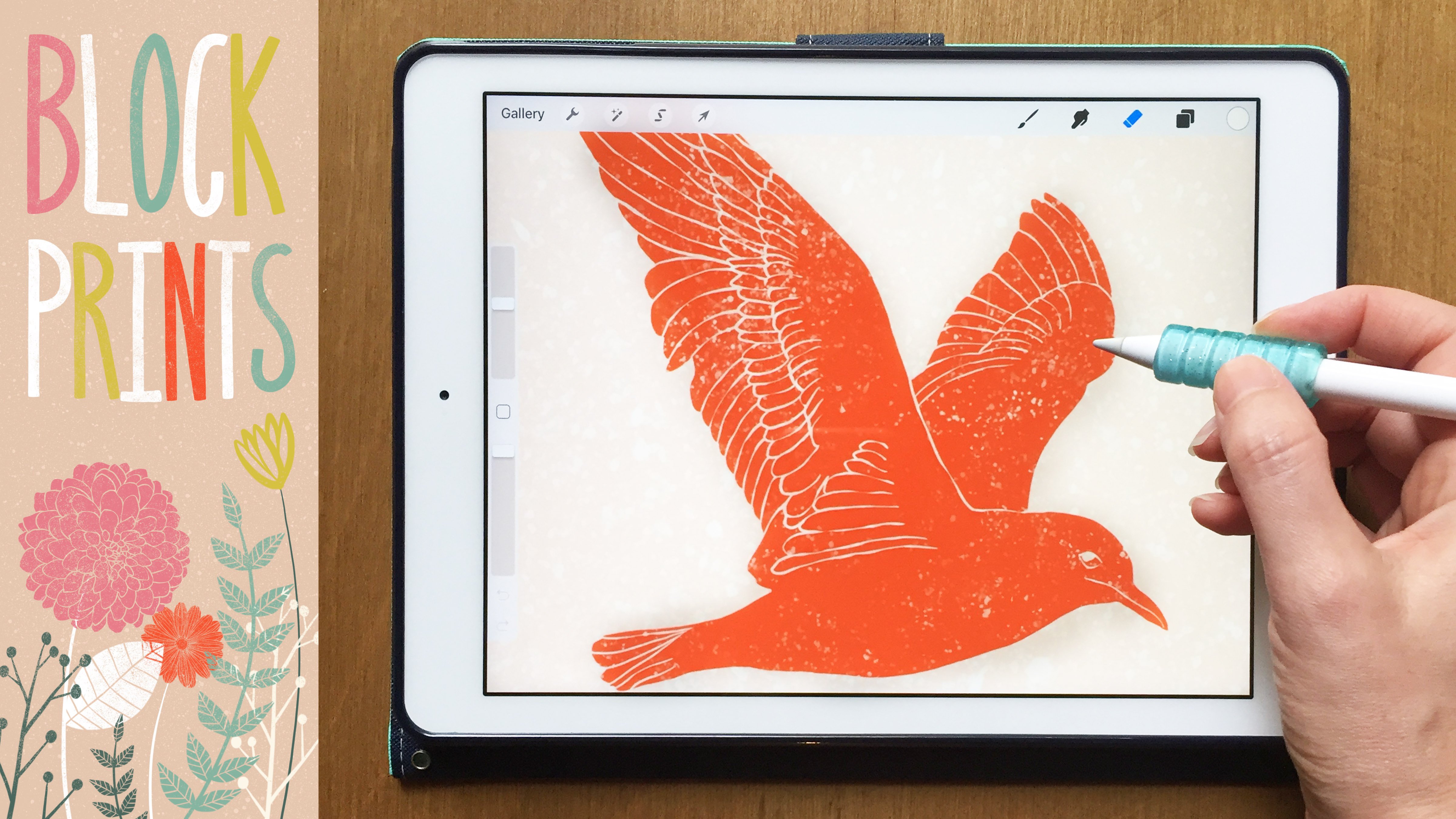
Transcripts
1. Flatlay Illustrations: Hi everyone. I'm Liz Kohler Brown. I'm an artist designer and teacher. Today, I want to show you how to create flat lay illustrations that communicate a message or a theme by combining objects that both show your personal style and draw your viewers into your work. When you take this class, you'll get all of the brushes and resources I use to create my flat lay illustrations, including 10 object stamps and a wood grain texture that will help you quickly fill your canvas, and the six floor tile brushes that you can use to add an intricate background to your flat lays. I'll also share with you a workbook I created where I break down the composition of shadows. So if you have any doubt about the length or direction of your shadows, this class will help you get confident with where and how to place them. First, we'll create a simple flat lay illustration by combining a few related objects and add some shadows and layering to give the composition depth. Next, we'll create a cafe table illustration combining detailed objects with an intricate tile background. I'll also show you how to make your own tile brush so you can include any style of tile in your illustrations. Lastly, we'll look at ways to create a mess in your flat lays to give them a human element that takes your flat lays from stiff and lifeless to playful and narrative. Drawing flat lay illustrations is a great way to communicate a message to your viewers in a playful way while also practicing your drawing skills like balance, composition, and shadows. They're also great for adding to your art licensing portfolio, so you can show companies how you could integrate their products into your illustrations. All you need to take this class is your iPad and the stylus. I'll be using the Apple Pencil, but you could use any stylus or even your finger. Let's get started.
2. Inspiration Board: For this first project, we're going to create a simple flat lay illustration by combining a few related objects to communicate a theme. I recommend starting out by choosing a theme, I'll be using the theme of photography. But of course you could choose any theme that works for your style. Then we'll be taking a look at how to place shadows at the correct angle and length so that your flat lays look realistic. If you've had some trouble in the past with placing shadows, this section should help you with that. We'll start out here on the Downloads and Resources page. You can find a link to get to this page in the project section on Skillshare. The project section doesn't show up on the app though, so make sure you're viewing Skillshare in a web browser. Once you click on that link, you'll see that you need a password to get into the page. I'll show the password on screen right now. Once you get into that page, you'll see the list of downloads and resources, and we're going to start out here on the Pinterest inspiration board. Once you click on that link, you'll see that there are three different sections and each one is for a different project in this class. We're going to start out on the photography flat lay. Of course, if you're not doing the theme of photography, you will get your own pictures that you like. All of these pictures I've found on Unsplash, so if you click on any of these pictures, it'll take you to unsplash.com. You can just type something like whatever your theme is, let's say, for example, gardening and then flat lay. You will find some interesting pictures from Unsplash. They have really high-quality pictures on here that you can use for personal and commercial use. But of course we're not going to copy these pictures, we're just going to use them as inspiration. I really like to start out my flat lay drawings by just going through and finding a lot of different pictures that inspire me. I'm not going to copy any one or two elements from any of these pictures, I'm just going to think about what I like about each picture and why. For example, I really love this one because the camera's usually dark and it's nice to have some color balancing that, so I really like how they brought those flowers into the side. I'm going to tap on that image and tap "Download Free", and if you're using the Pinterest app like I am, you can just hold and then click "Add to Photos". Other apps I think are pretty similar. You'll tap and hold or you can just take a screenshot like that. If you'd like to just scroll through here and find some pictures that speak to your style, I like to get at least 10 or 15 so that you're not pulling too much from any one photo. You're really just using little elements as inspiration. I'm going to take just a few minutes to do that. Once you've chosen all of the photos that you'd like to have some element that you'd like to incorporate into your illustration, you can go to Procreate and make an inspiration board. So I'm going to create a new canvas that's 3,000 by 3,000 pixels. I just have a saved canvas here, so I'm just going to tap on that. Then I can swipe up from the bottom, move this photos up over here, tap "Select", and then tap on all of those photos that I just saved and drop those here onto my canvas. This is just a quick and easy way to create an illustration inspiration board. Once that's done importing, I can close that Photos app, swipe on each of those pictures, tap the "Move" tool and make these smaller so that they all fit onto here. Then I'm just going to tap the "Move" tool, make sure magnetics is off in snapping, and then just move all of these into place. What I love about this step is it really helps me organize my ideas. You may just have a foggy concept in your head of what you want to do, but when you actually write it down and can see it visually, it makes the process of creating these more complex illustrations so much easier. What I'm going to do is get black as my color and go to the flat lays brush set. If you haven't downloaded that yet, you'll go back to the Downloads and Resources page and tap "Download the Procreate Brushset." I'm using Chrome here that's going to open up in a new tab and you can tap "Download" and then open in Procreate. Once you download that brushset, you can go back to Procreate, and there is our brushset. The first one is writing pencil, and it's the same as the sketching pencil, it's just a little less sticky. For example, the sketching pencil, you can see how it smooths itself out, whereas the writing pencils is much more realistic, so I use that when I'm just making notes on my drawings. I'm just going to make a few notes here. Because I really like these flowers, I definitely want to include that in my illustration. I also liked how this notebook here was just sticking out of the corner. In terms of the camera style, I really like this camera more than the others. I'm not going to perfectly depict this camera because, of course this is a brand and they own that image, but I'm going to do something somewhat similar. This is what I would invite you to do. Just go through and start thinking about what you'd like to include in your flat lay. You can always add things later. You can always change things out. But this is a good time to just start playing around with ideas and seeing why some of these setups work better than others. For example, I think this one works well because they included some organic elements with some products. You've got rectangle, rectangle, but then this rectangle is in a soft leather case, so it has that nice flowing feel. The camera has that nice strap, so I think that's going to inspire me to add in a strap to my camera. We're just using this to get our basic ideas of what we want to draw. Once you're done with that, we can get started on the illustration.
3. Layout and Sketching: To get started on my illustration, once I'm done making all the notes I need on my inspiration board, I can tap the tool symbol, tap "Share", tap "JPEG", and just save this image to my camera roll. Now I can go back to the gallery, tap the plus symbol. Again, I'm just using 3000 by 3000 pixels, swiping up from the bottom and then pulling that photos up to the side so that I can keep an eye on my inspiration images as I work. I'm going to do a somewhat simple flat lay illustration here, of course you can get as complex as you want. But as we're getting into the shadows and everything like that, you may be happy for this first one if you stick with something a little more simple. I'm just going to make here using the sketching pencil, a really basic sketch of what I'm thinking. I want to have a camera that's sideways. Some of these are straight up and down. I like the one that's sideways here. That's going to be where my camera goes. Then I was thinking this strap snaked around a little bit, it might add a little visual interest to this composition. We're going to have that strap. Then I liked this notebook element over here. So I'm going to have a notebook, and that's going to have a little pencil sitting on it. This is a really rough sketch. I'm not trying to get perfect proportions. I'm going to have a latte over here. I'm not worrying about perfect sizing or anything. This is just for me to get a basic idea of where things are going to go. This person had a lot of flowers. I'm probably just going to do maybe three or four simple flowers pointing in a few different directions. For now, I'm just roughing that out. Know that this is just a tentative plan. I almost always change things as I work, so it's very rare that I will stick with my original sketch all the way through. Really, just get some ideas down here. Don't worry too much about perfection or whether or not you're going to change stuff. It really doesn't matter at this point. This is just going to be a symbol set of glasses. I could include something over here. We've got a little bit of dead space, but I think if I take the selection tool, select these with the freehand selection on, tap the Move tool, and just pull this out a little, I can fill that space. I like how this is a close-up zoomed in version. Of course, you can zoom out more and include more objects, but we'll be doing that later in the class. I'm going to go with the simple version on this one. Now that I basically know what I'm going to do, I can reduce the opacity of that sketch. Tap the plus symbol to create a new layer and start drawing my final versions of some of these objects. I'm going to start with this camera, and again, I'm not trying to perfectly depict this camera. I'm drawing a line and then holding down my finger to get that straight line. You really don't have to use quick line here. You can draw everything by hand. It's really just up to your personal style here. For this composition, I do want it to be a little more refined. So I'm just going to use quick line, so I get these nice straight lines. I want to make this rectangle a little bit taller. So I'm going to turn on free form and just bump this up a little. I'll create a new layer to draw my camera lens because once I put that finger down to create a perfect circle, I want to be able to move this around separate from the other piece. You'll see as I draw today, I really like to create each new little piece on its own layer. That gives you a lot more flexibility when you erase things, when you move things around. This line is on a new layer. Then when I want to erase part of that line, I can just erase it and I don't have to worry about erasing anything else on the page. Once I get all these parts together, I'll merge it. But for now, I'm just going to have each circle, line, square, whatever it is on its own layer. Anytime I resize this circle, I'm going to make sure I turn back on the Uniform option so that it doesn't distort my circle. Free form will distort, uniform will keep it in the correct proportions. I'm not really going exactly with this picture. I'm doing it with the lens cap off, because I want to differentiate my drawing from this picture as much as possible. I'm not taking too much time to look at how this actually looks in the picture, I'm just using it as a guide and then getting my own personal style in there. That's the best way to make sure that you don't copy. Use your images as inspiration, not as an exact copy. I merged all of those parts of the sketch together so I can start doing a little more detail work and just refining. I'll just continue this same process until I feel like I have enough detail here. Of course, I'm not trying to get as much detail as you're seeing in this picture. Just because this drawing is going to be shown, we really don't need this much detail because you won't even be able to see it. Once you zoom out to this level, you really can only see some big major details. I'm keeping it pretty simple, but also trying to make sure it communicates the concept of camera when someone looks at it. Another reason I like to draw each new part of my sketch on a different layer is because sometimes you need to duplicate something, and it's so much easier if it's already on its own layer. For example, this thing that I just drew, I actually want to make it taller and put a little hole in there. I'm going to do a lot of work to make that perfectly proportion. Now I can just duplicate it, tap the Move tool, flip horizontal, turn on magnetics in the snapping section, and then just slide that straight across. Now I've got those equal-sized camera strap holders. Once you feel pretty good about the basics of your sketch and you've used quick line as much as you need to, to get those nice straight shapes, we can go ahead and move that camera into place. I'm just using the basic layout of my sketch to figure out where to put that camera. Again, I'm making sure I have Uniform on if I resize so that I don't disturb my proportions. I'm happy with that placement. I'm going to create a new layer, still using the sketching pencil. I want to start thinking about the curve for my camera strap. Elements like this that move around, can really help break up your drawing. If you've got these straight flat things all over the place, this can create that little bit of movement that you need to make your drawing just a little more interesting. If everything on your page is super blocky and boring, the viewer isn't inspired to keep looking. Whereas if it has a lot of things sneaking around, going on in different areas of the canvas, you can really interest your viewers for a longer period. I'm going to try to get two different types of curves. That one feels like an S, and then this one, I'm going to dip down here towards my notebook and then come across. I'm trying to do something totally different with this one. I also want these to bend and fold so you can see how I'm not keeping this as a flat camera strap, like you'd see if it was displayed in a store like that. I'm letting it wave and crossover. I can have a light side and then a darker side here. One thing I don't like about this as the crossover, is basically at the same point right here. That feels a little bit artificial. I'm going to adjust this and move the crossover to here up high. That feels a little bit more realistic than having them at the exact same place under the camera.
4. Adjusting and Stamps: Now that I'm happy with where my camera is, I can go through and start adding little details like this stitching on the camera strap. But you honestly can worry about stuff like that when you color. I think some people do really detailed sketches, and they know everything they're going to do by the time they get to the inking stage, whereas other people do more loose sketches and then do a lot more playing around when they ink. You just have to go with what works for you here. Go with as much detail as you feel like you need, to jump into inking at the end. I'm happy with that. What I like to do at this stage is merge an object all in one layer. There's my camera layer. I'm going to make that invisible, create a new layer, and do the same process with the other aspects of my drawing. For example, now I want to work on my glasses. I need to find some glasses on here that I like. I like these, just big, chunky glasses. Again, I'm just going to sketch this in the middle of the page because I just find it a lot easier to use quick line, and keep things aligned in that way, and then move them into the angled place afterwards. I like to start out something like glasses with a very chunky, boring shape, like a circle or a rectangle. Then I can start playing around with the actual shape. Sometimes, you just need a starting point for a shape like this, and then you can step back, and just see how you could adjust it to make it a little more realistic. Another thing I like to do is go into adjustments, liquefy, and then you can play around with the size of this brush and the pressure, how hard it moves it. But let's just say for example, 99 percent pressure, 50 percent size. I can just tweak this shape, and look over here to see what we've got going on there. I'm going to get a way smaller one, and make this sort. Sometimes, I'll do this if I feel like something's close to being right, but it just needs a little bit of smooshing around, molding. I used to work in clay, so I feel my brain sometimes works like I just want to smoosh that into a different shape. That may work for you. You might like just smooshing things sometimes. As you can see, I'm drawing just one side of these glasses. That's going to give me the opportunity to just duplicate later on. I'm doing a rough chunky sketch first, and then I'll go through over top of this to do a more refined sketch. I think that looks pretty good. It's somewhat similar to the glasses I'm looking at, but maybe it just needs a little bit more of that liquefy tool to make it more rounded. This is also a great tool for just shaping things that are nice, curved images, something that's straight and rectangular like the camera. I wouldn't really use this tool but something like glasses. I think this is a great option. Now, I can take that side of my glasses and just duplicate it. Flip it horizontally. I think these are going to need to be a little bit closer together. Now, I can just play around with this angle and adding in the remaining parts of these glasses. I'm happy with how these glasses look. I'm going to leave it transparent for now because I know that I want to show, for example, this part of the glasses through the lens. For now, I'm just going to leave it transparent and just group these two parts of the sketch. I've got the back of my glasses, the front of my glasses, and I'm going to tap group. That way I'm preserving that flexibility to shift things around later if I need to. Let's turn back on the camera, so we can play around with the placement of these glasses. It deviated from my sketch a little bit, but that's totally fine. You're starting to see now as you look at this sketch, that the style of these things that I choose totally dictate the style of the illustration. It's very important whether you choose the style of glasses, or maybe some aviators, or maybe some more feminine-looking glasses. There are a lot of things that go into just a little element like that, that tell the viewer about your style and what you want to communicate with this illustration. Not to put any pressure on making these choices, but every choice you make with these illustrations means something, and it will mean something to your viewers so just something to think about as you draw. Just a simple cup, and I'm going to have this cup have a little rim. I know I want to have some little latte milk marks here, so I'm going to come through here and just draw in a simple latte art. Of course, this doesn't have to be a latte, could be tea. Again, this is a choice that you make and then it tells your viewers a little bit about you, which one you choose. I'm going to go with a latte because that's one of my favorite drinks, but choose something that works for your style here. New layer for the next piece of my sketch, and this is going to be my flowers. I'm going to zoom in on these beautiful tulips here and, just take a minute to sketch out these thick stems. Then they're bulb shapes here. Flowers don't have to be perfect. This doesn't have to be the exact shape that you're seeing in the picture, just something close so that your viewer knows what you're even talking about here. I'm going to keep these really simple because they're just a highlight in the corner. They don't need to be the main event. The camera is really the most important aspect of this. Everything else is just a supporting detail. I'm going to try to get this curved flower because I just really like how it curves around. It's going to provide that little bit of movement just like the cameras drafted, so we've got a little more visual interest in here. I'm doing each of these on its own layer, just in case I want to shift these around a little bit before I finish this drawing. I'm happy with that. At this stage, I'm going to turn everything on because this notebook is a super simple aspect of this drawing. But I want to make sure I get it in the right place. I've got all my other sketch elements on. I'm going to create a new layer, and just go across like this. I think that's going to fit pretty nicely in here. I may or may not include a little binding piece there on the notebook. Also, I want to show you some stamps that I made that you can feel free to pop into any of these flat lays. If you just feel like you're missing something and you want to just go through and pop one of these in, you can do that. I'm going to grab this pencil, and you can adjust it here and then tap with your finger. If you tap with your pencil, you're going to get a different size each time, whereas if you use this to adjust and then you tap, the size is predictable. I've got that pencil and accidentally put that on the wrong layer, so let's make a new layer. I want to choose this angle, so it's not the same angle as the notebook and it's not the same angle as really anything else on the canvas. It needs to go its own way, and form a new angle across the canvas. If you picture everything that you draw, shooting out a ray of light through the end of it, you don't want all the rays of light going to the same place. This one's going up, the two loops are going that way, the camera's going that way, the glasses are going this way. That's why I'm choosing this particular angle for this. Now, I can make that original messy sketch invisible and I can also close out my inspiration. We don't really need that anymore. This is a good time to just take a step back and make sure nothing strange is going on. I'm thinking about those angles that we just talked about. I'm thinking about big, open blank spaces. Not that you can't have blank spaces, but you don't want it to be really awkward or if the space was this big for example, that might just be a little bit too much. Whereas this little bit, I'm okay with that. It mirrors the other parts of the drawing. Once you're happy with your sketch, it's time to move on to inking.
5. Inking: I'm ready to start applying some color to this illustration. I'm going to be using a color palette that I shared with you on the Downloads and Resources page. This is the photography palette. Same process for downloading that, just click on it and click Download and then open in Procreate. Once you get that color set or bend. I'm going to start here with this beige color. That's going to be my background color. I guess it's more of a pink color. I'm also going to merge all the parts of my sketch, but before I do that, I'm going to go to my gallery and just duplicate this canvas. Select, tap on it and duplicate. The reason I like to do that is because I may want to use parts of this later in a different composition. I may want to pull a single layers out and it's just a lot easier if it's on separate layers whereas with this one that I'm ready to ink, I can just merge all these, just pinch them. That's fine. I don't have to worry about losing any of my work. This may be a good stage for you to share this as a project on Skillshare. If you'd like to do that, just scroll down below the class and go to the Projects and Resources section. Again, you have to be viewing Skillshare in a browser and not an app. Then over here in the Project section, you can click to create a new project. Once you upload your sketch, I can see it and then you can upload your inked version when you're ready with that. Here back on my illustration, I'm going to create a new layer and I always like to ink below my sketch. I think it's a little bit easier to see if you ink below your sketch so that's what I'll be doing. I'm going to go to my palette and I'm going to start with what I consider the most important aspect of this first, which is my camera. Let's start with this dark gray color, or let's go with a light gray color. I'm going to go through and ink every single bit of this camera. I'm using the fluid ink brush on the brush set. Let's go even lighter with the sketch so we can really see what we're doing here. For me personally, I don't like to use quick line when I'm inking. I do use it when I'm sketching from time to time. But when I'm inking, I like to have that messy human element in my final drawing. Even though I can see that this is a straight line and I could use quick line, I like to have that little bit of variation that just shows my viewer that I did this by hand. I think people can really pick up on those tiny little wobbles versus that perfect straight line. For my style, that's what works, but of course do whatever works for you here. Once I've got that covered, I'm going to create a new layer above it. Turn that layer into a clipping mask and if you've never used a clipping mask before, then what that does is it prevents the ink from going anywhere except for the shape. If I draw like this, it only goes on the shape itself. That is how I do all my colors for these types of illustrations. I don't ever make a change to the original drawing unless I start running out of layers, in which case you have to. But for now at the very beginning, as I'm still thinking about different colors, I'm definitely going to use clipping masks. I'm using that same brush as an eraser just to clean up some areas. When I switch to a new color, I'm going to create a new layer, turn that into a clipping mask, and then I can start working with my new color. I would never put two different colors on the same layer because that makes it much harder for me to adjust my colors later on. I'm also adding in some little things that aren't in my sketch because I sometimes just notice things that I don't like, things that I want to change, and it's really easy to just adjust those when you sketch. I'm also noticing this as a little bit off with the circles, but I'm just going to leave it because I like these little aspects of hand-drawn pieces that are just a little bit off, just a little bit not perfect compared to what you would see if the product was for sale. I just like to include those little quirks because it lets people know that it's handmade. Now that may not work with your styles, so feel free to go through and do as much refining as you need to, to make it your own style. Creating a new clipping mask layer and this is going to be my lens color. I tend to use this blue color when I want to communicate glass but a lot of different shades of blue or some white would achieve the same thing. I just like this blue for communicating glass areas. Every now and then, I pull back and zoom out just to get a bird's eye view of what's going on on the canvas. Sometimes I'll notice some big mistakes when I do that and then I just need to go through and fix those, especially when I'm trying to talk and draw at the same time. As I'm zooming out, I feel the camera doesn't have quite enough detail, so I'm going to go through and just add a lot of detail layers to this camera. This doesn't have to be anything specific. For me, it's just going to be different size circles. That just communicates those complex ends that you see on the end of a camera, and of course, if you need to pull one up here, pull up a lens and take a look at it and see what levels and layers it's going to have. I'm happy with that for now. The only last thing I'd like to add is just a little bit of texturing on the black, so creating a new layer just above that black clipping mask layer. When I need to do is put that texture just on these little side black areas. I'm actually going to have to make this layer not a clipping mask anymore, the way I like to do that is move it to the very top of your stack, go to the original shape layer, which for me is this big camera, tap on it and tap Select, we're selecting that shape. Now go to my black layer, tap to reduce that menu, drag three fingers down and cut and paste. What I've just done, if I make this shape visible, is I just cut and pasted those low end pieces onto a different layer. Now my black is its own layer and it's not a clipping mask. The nice thing about that is I can create a new layer above it and turn it into a clipping mask. There are sometimes where you start something as a clipping mask and then you have to change it later on, so that's one of these cases. I'm going to go to the Brush in this set called specs and seeds and change this size to get the size specs I want. You know how these cameras have this texture to them. It's like a spotty texture. I'm just drawing that in and it doesn't have to be super obvious. It can be pretty simple and it will still add a lot to the illustration. I'm just going through making sure I'm getting that on every square inch of this black side spots here. Then of course, I'm going to turn that into a clipping mask and it's clipped to that black shape we just created. My only problem is it's bleeding onto the lens so I'll just go through and clean that up.
6. Adding Details: I'm happy with how my camera looks. I'm going to be repeating this exact same process with every single object on my flat lay. There is no perfectly right or wrong way to color these, of course. It's going to be your own personal style, so you'll just have to make those decisions as you go. Do you want to go with a lighter color here, a darker color there? What I intend to do is start with my medium-range color. For example, on this one, I started with a medium gray. Then I added in my light gray, my black, and my dark gray. Starting with that medium-range color, for me, just makes it really clear what the overall feel of the shape is, how heavy it is visually. Then I can use those lights and darks to just add in a little bit of detail. I'm just going to continue inking, and I'll speed up the camera while I do this since I'm really just repeating the same process over and over. I don't put a ton of detail work into any one part of these flatlay illustrations personally. But I do like to include at least one or two little things to show the viewer what the feel of this object is. I really wanted this to be communicated as a leather strap for this camera. I'm going with leather colors, and I'm just including this little bit of stitching that you would see on something leather. I'm also making the front and back sides different colors because you always see that with a leather strap that'll be like a darker side and a lighter side. So just a few little elements to tell your viewer what material is this, what does it feel like? That just lets them know how to read it and what the style that you're trying to communicate is. I could easily make a brush that would make the stitches the perfect length than they would be exactly spaced from each other. But I really think this hand feel on them gives us so much more visual interests and just makes it more fun for the viewer to look at something that's got that little bit of handmade element in it. Before I move on to coloring my other objects, I like to group these shapes so they're all on the same group. The reason I do that is because once you get this many layers for each object, things get a little bit confusing. I'm going to tap "Group", and then I'll just rename that, Camera. As I'm recoloring or moving things around, it's just really easy to go to that camera group and get started. I do recommend that you do that. Also, if you have an older iPad and you start running out of layers, just like we did with the sketch, I recommend that you go to your Gallery, tap "Select", duplicate that document, merge some layers, and then you can preserve your old layers and have the new one. That way you're not losing anything in case you ever want to go back and change your colors. For this glasses set, I'm creating the lens rims on one layer, the glasses on the layer below it, and then the actual ear parts on the very bottom so the lenses are sandwiched in between those two. Then when I reduce the opacity of those lenses, we can start to see peeking through that other little part. What I might do at this stage is make my sketch invisible so I can really see what's going on at those lenses. That's how I can make sure that opacity looks good. I could also play around with the lightness and darkness of those rims if I'd like to do that. I also wanted to mention that what I intend to do is one or two detail elements on everything. I would never have just a solid shape with nothing on it. I always go through and add, even if it's just a little line that is a shadow or one little side of it that's a little darker than the other. What that does is it just gives the viewer a little bit of a hint of, is there a little reflection here? Is this a shiny object? Is this something rough with a texture like we did with the camera. I also intend to do more detail work with the most important thing, so I spent a lot of time on that camera. Then everything else is just like a supporting actor. It's there and it's important, but it's not everything. I don't intend to put a lot of time into those additional objects that are really just there to support my concept of photography. I'm doing a gold feel on these glasses, so I'm going through and getting colors that are slightly lighter and slightly darker than the rims and just giving those a little bit of gold feel. For these flowers, I'm just going to really use the movement of this liquid pen. I'm pressing, releasing, pressing, releasing to just get that little bit of variation that I need to show that this is a flower petal. I'm swiping all of my layers having to do with the flower grouping them and renaming, and same thing with my glasses. Once you're happy with all of the detailed work in your composition, of course, we want to make sure all of our layers are grouped and labeled. What I like to do at this point is go back to my Gallery, select and duplicate that document so that master document is saved. Now you can make any crazy changes you want to this one and just try some new things out. That might be something as simple as just moving a group around. Maybe try it flipped this way. Maybe duplicate this pair of glasses and make the first one invisible so you can try, what if it was just hanging off the edge like this and you put something else over here? Anytime I do something different or edgy like that, I create this new document because I want to feel my original is safe so I feel comfortable making changes here. Once you're all done with that and you're happy with the placement, it's time to start adding some shadows. I want to start by going through some of the basics of shadows before we start adding those in.
7. Shadow Basics: I created a workbook where I show you all the basics of shadows and give you a little bit of practice time. If you go back to the Downloads and Resources page and click download the class workbook. If you have trouble with that, there's a smaller version right below it that you can try. So I'll tap on that and tap "Download" open in and then choose Procreate as the app, and I want to note here if you have any trouble importing this, trying a different browser can sometimes solve all your problems. If you try Chrome and that doesn't work, give it a try on Safari, and that usually clears it up. The workbook will open up in your main gallery, not in the stack if you were inside a stack. I'll go to that workbook in the gallery, and if you open this workbook Layers panel, you'll see there are three sections; shadows, topic ideas and the challenge. We're going to start here on shadows, and the first section is about the influences on shadow composition. How do you know what direction the shadow should be, how tall it should be, how wide it should be, all of those things. There are a few different things that influence that. The light intensity is really important here. The more intense the light is, the more crisp your shadow will be, and the more dim, the more fuzzy it will be. You can probably think of that if you think about being out by the pool on a hot day, you can see these crisp shadows. If you're on a cloudy day sitting out on the porch, the shadows are really soft. Another thing that's important is the light angle. If the light's over here and the object is over here, that's going to change where the shadow is if it is reversed. So that's the second part of what influences what a shadow looks like. Also the height of the light. If it's right above, if it's really close, the closer it is, the more crisp it will be, and the further it is, the more diffused it will be. Of course, the object height and shape influences the shadow. This is why shadows can feel complicated because it's like, wow, there's many different things to think about when I want to place a shadow. But I want to show you how it's not actually as complicated as it looks, because you can actually just draw some lines to figure out where your shadows are going to go. For example, here we have a high light source and you can see these short little shadows. All we're doing is drawing a line straight down from the light and then coming across using the object as the border, and that determines the width of the shadow, and then coming down from here that determines the length of the shadow. I did these three just to show you, if you have a highlight source, you've got these short little shadows. A medium light source, they get a little bit longer, and then a low light source they get really long. You can think about that with your flat lays. If your shadows are really long, it makes it look like the light is really close to your table, which may or may not be what you want to communicate. The important thing is for an illustrator to know what they're communicating when they put a shadow in a certain length and direction. If you want to practice this process just to wrap your head around, how long should shadows be? How wide should shadows be? I created a practice section for you here, so you can just create a new layer, get a new color, and do the exact process that you see on those previous pages that I showed. You are just coming down from the middle here, coming across the object. If you'd like to do that, you can use these previous pages as a reference, you can also move this light source around to help yourself practice what the shadows are going to look like in different directions and angles. That's the first part of thinking about shadows, thinking about them in real space. When we look at flat lays is actually a lot more simple. Once you do those previous practice pages, this is going to seem a lot more simple to you. We've got the light source over here, and you can tell these shadows are short or you can tell this light source is high because the shadows are short. If the light source is really low, these shadows would be much longer. They might even go off the table like that. As you can see, we're just taking rays of light and hitting the end of each object, and that determines the shape of the shadow. The other thing that determines the shape is the object itself, so the shadow will curve with the object. These are just a few things to think about when you start coloring and shading your flat lays. I did a practice page as well for flat lays, so if you'd like to practice doing just what I did here for shading a flat lay, if you'd like to practice that here on the practice page, you can move your light source around to wherever you want it, and then just come through and do just like you saw on that page. Popping these shadows out here so you know exactly where they're going to end. That way, for this cafe cup here, this shadow is never going to be like that because then it goes past this border that we just created. Instead, it's going to be like this, and it doesn't have to be perfect. It can be really close, but not perfect. The problem I think would come if you were way off like this and then maybe this one's over here, your viewers are going, "where is this light source? What is going on with this weird light source?" That's just something to think about as you're digging into these shadows that doesn't have to be perfect. But these basic roles can really help you communicate the correct light source and light distance to your viewers. Once you feel comfortable with this whole concept and you've taken some time to do these practice sheets, we can go back to our flat lay.
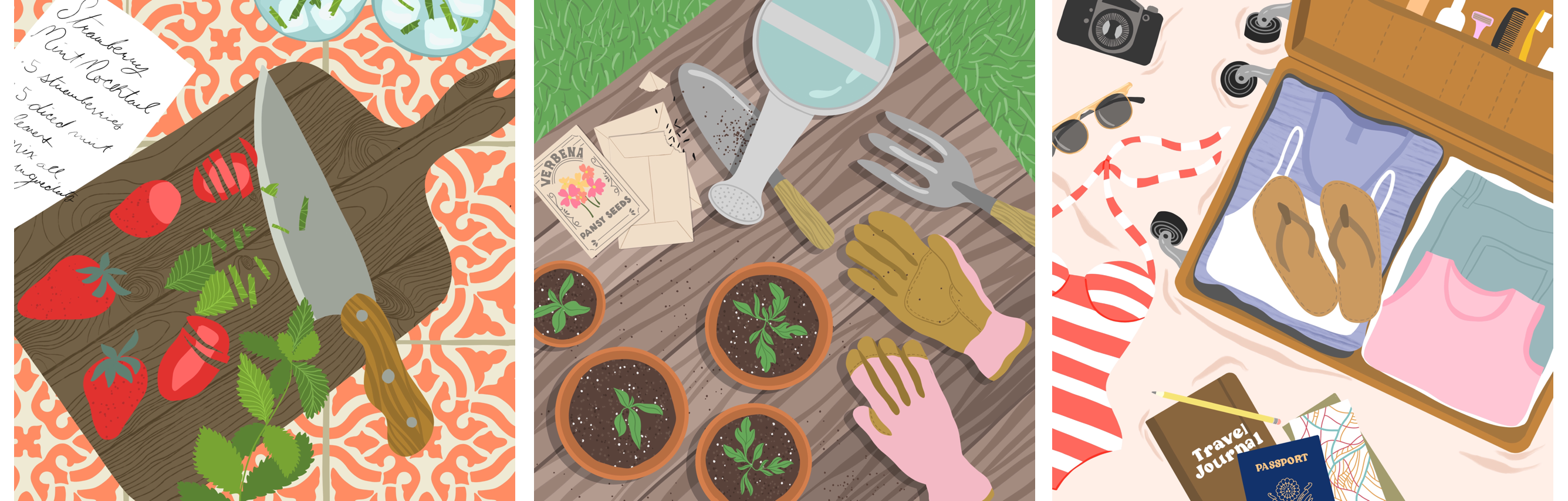
8. Adding Shadows: Back on my flat lay composition, I'm going to start adding in some shadows. Again, this is my duplicated document, this is not my original. As I start merging layers and things, I just want you to know that I'm not just ruining my original, I am working with a duplicate here. I'm going to go to my camera layer and merge everything. I basically just got one layer that's got my camera. I'm going to duplicate that. Get black as my color. Swipe two fingers right to alpha lock, this camera duplicate layer. You can also just tap on it and tap "Alpha Lock." Either way it works. I'll tap one time and tap fill. Basically, I just got a black version of my camera. Now I'm going to take this and I have to make a decision here about my length and direction of my shadow. If my light source is up here and it's pretty high, then I'm going to have a short shadow and it's going to go in this direction. If I did it all the way over here, that's okay. I just have to make sure I'm doing that with my other objects as well. For me, I find that just a little bit of shadow makes a big difference. I don't think that you have to go totally crazy with shadows for it to make an impact on your viewer. I tend to just do a really gentle shadow. Then I'm just going to reduce the opacity of that. I'm stepping back here so I can get a feel for how intense that is. That feels good for me. Now I can undo the alpha lock and you're going to see there's going to be a little bit of clean up here. This looks good except it's cut off because I had to move that shape. I'm going to fill that in and I'm just going to gently pan around and take a look at what might need to be adjusted. Now, this is an interesting case here because I don't necessarily need to connect these. I don't need to fill this in because a bright crystal light can be coming down and just leaving a little bit of light in between here. But this would never happen because the edge of the camera needs to be shading all the way across, just like we did in drawing those lines across that needs to finish off the shape all the way. Like this. You may even get some other weird shapes like that where you need to add in a little shadow so you can do that. But for the most part that shape is pretty much done. I'm going to repeat this same process with all of my other shapes. But one thing to think about here is keep an eye on where your light source is for your very first object. For my first object, it came down a little bit like this. For these little flowers up here, I'm keeping that in mind. It's coming down. I wouldn't want to go across, I wouldn't want to pull back a little bit. I want to try to mimic exactly what's happening here. If I have a light source here, it's shooting out in this direction. This object, it's actually going to go that way a little bit more whereas this object, it's going to go down a little bit more. Just picturing those lines that we drew on the practice workbook and just extrapolating that out. I also like to make sure that my shadows are the same strength. For example, on my camera shadow, my opacity is 17 percent. This is 17 percent, but then my flowers, those are 28 percent. You would just never see that in nature or in the real world, and it just confuses the viewer. I got to make sure you can draw 17 on your number. Who's here, procreate, set that up. I will just draw that number in or you can adjust that with the slider. I'm just going to repeat this same process with every shadow, making sure I do that little bit of clean-up each time. Just keeping in mind, don't worry so much about your shadows. They don't have to be perfect. They don't have to be perfectly realistic. You can make little shadow mistakes here and there and nobody is going to know the difference. The important thing is to keep your basic angles and colors on so that they know you're trying to communicate even if your shadows aren't perfect. One last thing I want to note here is that your shadows don't have to be gray. Some people like having gray shadows whereas others don't. What I like to do to start is tap on the blending mode letter right here and go through and try some different blend modes. Sometimes you'll discover something interesting there, I like this soft light. Now I'm adjusting the opacity. That's nice to have that warm color as your shadow. Go with whatever works for your style here, soft light, 64 percent. Now I can go back to my camera, soft light, 64 percent. I like that. Take your time here and play around with whatever works for you. One thing that's also fun that you can do with shadows is get some of your other objects into the shadow. See how this little bit of glasses is just peeking into the shadow. I think that makes a big difference for the overall feel of the composition. Just one tiny little thing like that, one little overlap can really tell your viewer a lot about how your composition is laid out. I'm going to continue with this process. I'm going to add all my shadows in and then we'll finish up. Another thing I want to note here is that you don't really see overlapping shadows like this in most lighting situations, especially if there's only one light source. Those two shadows overlapping each other was just not making sense, so I just erase that little bit of overlap. I'm happy with how this composition turned out, but of course, this is where you can take time to add more detail, add some little reflections in, you can add tiny little details like writing some text on your pencil or having some little texture here. Every little bit of detail like that makes a big difference for your overall composition. It's definitely worth taking your time and going through and adding as much detail as you can. I want to show you another composition where I did something really similar. I just added a bit more detail in. I thought of the concept of doing a breakfast in bed tray and putting some interesting things on the tray. I started out by drawing the tray and then I started working on some individual objects. Rather than doing that sketch beforehand where I laid everything out, I really did this one, one object at a time. That's what I suggest you do if you're having trouble laying out a drawing, just start creating some objects and fitting them in and seeing what happens. You really don't have to know everything at the get-go. You can just play around with things as they come onto your canvas and using those inspiration images to think of, maybe next I want to do some glasses. Next, I want to do a doughnut. Next, I want to do some silverware. Sometimes you need to just look at the objects to get to that next step. You can see this is a really similar concept to what we just did. I just added in a lot more detail. I did some really simple sketches, but then added a lot more detail when I got to the coloring portion. I took a lot of time here to add little specks on the fruit, little pieces of raspberry seeds in the yogurt, little pieces of leaf, and little decorations on the silverware. I think that these tiny details make a big difference for our viewers. They can really tell, how much work we've put into creating this. I think that they will be more interested in looking at it if they feel like we've gone the extra mile.
9. Flatlay Challenge: I want to invite you to join me in a flatlay illustration challenge, where you can share your drawings on Instagram and tag them with the hashtag #flatlaydrawingchallenge, to share them with me and everyone else in the challenge. You can complete as many illustrations as you'd like from the flatlay topic ideas lists or you can come up with your own topic ideas. I recommend nine illustrations because that number looks really nice on the Instagram grid. But of course, do as many as you'd like. Remember to tag me and use the hashtag #flatlaydrawingchallenge so I can see what you created.
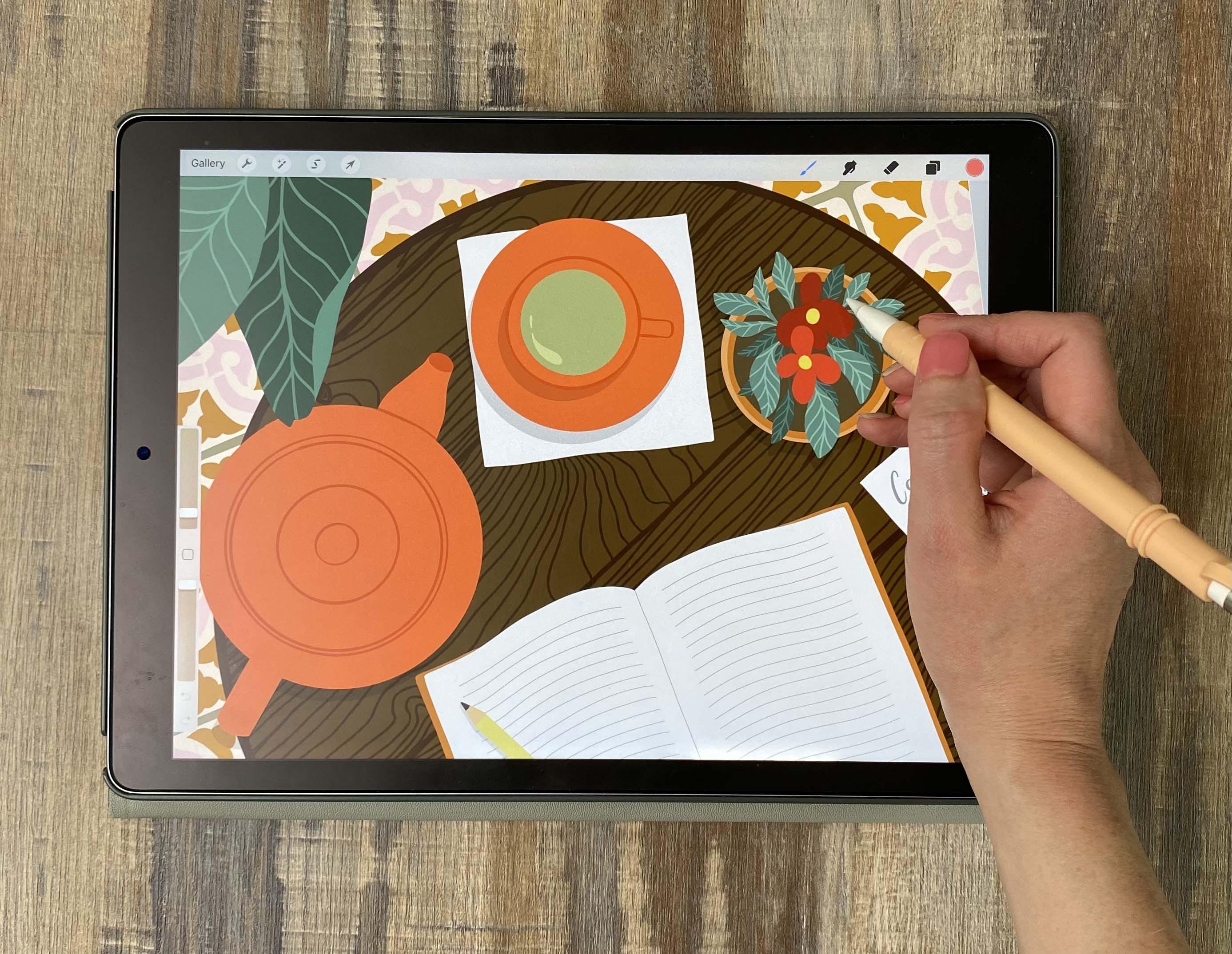
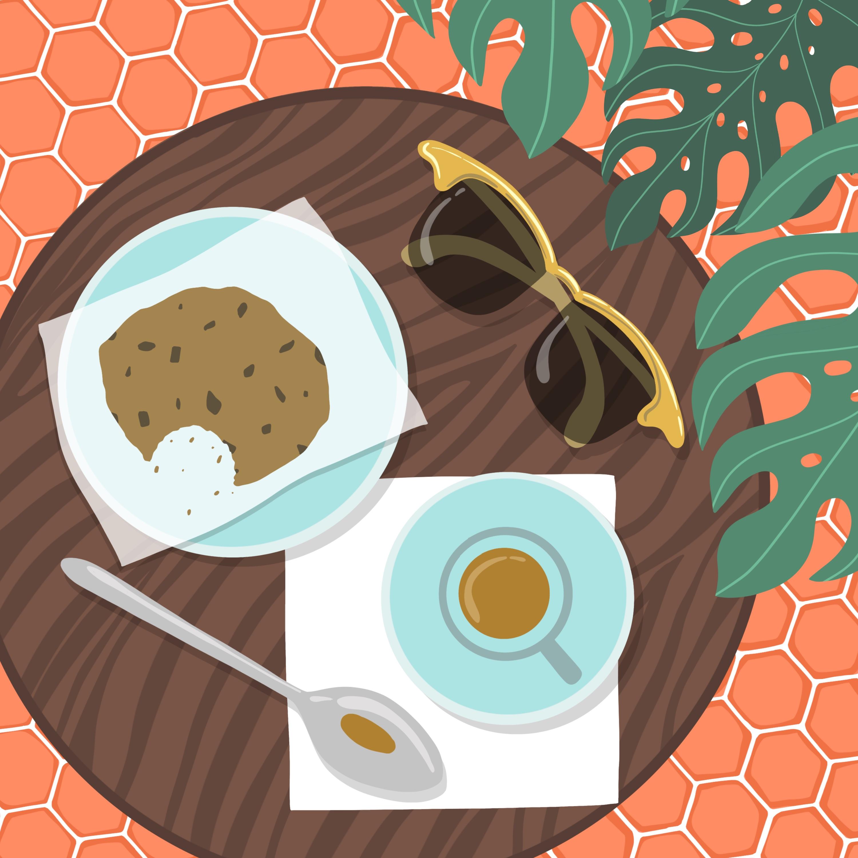
10. Preparing a Layered Composition: For this next project, we're going to create a cafe table-inspired illustration as a way to practice layering objects in your flat lays to create more depth. We're going to look at how including multiple levels like a plant and then a table and then a floor can add so much depth to your drawings and can just add that visual interests that makes people look at your work a little bit longer. Let's get started by deciding what kind of objects to include on the cafe table. I'm going to do the exact same process that I did to get started on that last piece. I'm going to go to my cafe flat lay illustration board. But of course, as we talked about before, you are free to get your images from another source or just go straight to Unsplash find images, just work for your personal style, whether it's a single object, or whether it's the whole feel of a certain image. I love this little cookie that has a bite out of it and has that little piece of paper there. I think that's going to be a nice contrast to the table and everything else I want to include just having that little bit of paper and that little bit of crunchy cookie is going to make some really pretty contrasts in this composition. I have all the photos I need. Again, I'm going to make a quick inspiration board. I really do this with every single flat lay illustration I do. I have this process down pretty quick and I think once you do it, a couple of times, you'll see how it really doesn't take that much time. It just gives your drawing so much more interest in variation because you've just got a starting point. You're not just starting from what's in your head, you're starting from all these beautiful images and just using them as inspiration to add little bits of interest to your drawings. I think a lot of people, in the beginning, are afraid to use references. They think if they use a reference, then they're not good at drawing or something like that. But even professional artists use references all the time, so don't feel like you're not doing it right if you're using a lot of reference images. I think you can see the way that we're using them here. It's not as a way to just copy someone, it's a way to just generate ideas by looking at imagery. I love this cup and saucer. I'm definitely going to include that. I really like the way that these really dark plants contrasts with lighter porcelain or lighter ceramic color. We're going to have some dark plants in there. I also like the circular table. You usually see rectangular or square tables. I really like that circular one. I think that's going to add some interest. I love this wood grain. I'm going to be thinking about that when I create my table. There's something cool about the way this plant peeks in. I'm going to call this peeking plant. It just really frames this illustration nicely to just have that little bit of peeking and the green contrasting with the brown of that latte. I think overall, I'm ready to get started. I'm happy with what's going on here. I'm going to do the same process. The main difference between this composition and the last one is that we're going to do three levels of distance. In the last one we had a table or some surface that was flat and just had some objects on it. With this one, we're going to have a floor level, a table level, and then a plant level that's above everything else. Let's start by just thinking this through. The first step will be a table and I'm going to use my finger to create that perfect circle. Let's go with something like that. I think in the end I'll be putting it over to the side, but for now I'm happy with it being just a circle in the middle while we get all of our objects on it. I'm also going to have that cookie. Let's go ahead and get our inspiration image over here so we can see it. I'm going to have that cup and the saucer. I think to break up all of these circles stuff, I need that paper that we talked about with the cookie that's over here. I like that just flexed semi-transparent paper, something like that. Then I'm going to do an espresso cup this time instead of a latte just to mix it up and then that's going to have a little handle. I also liked this spoon, I think adding that little bit of metal adds a nice, playful aspect to it. We'll just do a basic spoon shape here. I think the spoon, rather than resting on the saucer like it is here, I'm going to have another napkin that's off-center with this cafe cup and that way we've got two different rectangles on here to break up this whole circular theme we've got going, and just giving it a little bit of variation on the table. I think I also have room for some glasses flows, let's just pop those on there, and that will be my cafe table. That's my middle layer but the layer below that is going to be some tile. I've created some tile for you that you can start with and I do like to start with that just so I have an idea of what's going on on that base layer. If you open up the brush set and you scroll down to the tile section here, you'll see there's a wood floor tile and then there are several other different types of tile that you can choose from. You may want to go with something more intricate like this Spanish tile and of course you can adjust the size by tapping on it, tapping Grain, and then changing the scale. Just get it to a size that you like. I'm going to go with this hexagon tile, and what I recommend here with this hexagon tile is making it a little smaller than you think you're going to need, and same thing with all of these tiles, because the way we're going to turn it, you're actually going to need to make it bigger. I'll show you what I mean here. If I draw this tile down and then I tap the Move tool and I want to just turn it a little, well, then I'm missing these little corners, so I actually need to resize my tile quite a bit. Generally in digital art we say don't upsize, but these are just sketches, so it's not a big deal if you upsize. I think I actually went a little too small, I'm going to go a little bit bigger on this and do that same process again. That looks pretty good. I'm happy with that size. But before I actually do my final tile, I want to make one note about this hexagon brush. These hexagons aren't actually perfect squares because the repeat of a hexagon doesn't actually work out for perfect squares and Procreate requires that shape. What you'll have to do if you want to use this hexagon is just turn on the Drawing Guide. Tap Edit, Drawing Guide, zoom in here and just make a square that is about the size of one of your hexagon, maybe just like a little bit bigger so you can really see. See here how the top of the hexagon touches the top and the bottom doesn't. It's a little bit squished because of the way this repeat worked out. Tap the Move tool, tap Freeform, and just make this a tiny bit bigger. Then when you zoom in, you can check it, and now this hexagon fits nicely into a square. This is just one little extra step you'll have to do just for this hexagon brush. I'll turn off the drawing guide, tap the Move tool, turn the tile however you want it to be angled, making sure that uniform is on so I don't distort the proportions of my tile. Then I can just lay down my tile. Now, we're not going to individually ink every single one of these, I'm going to show you a process for speeding that up. But for now, I'm just going to name that layer Tile Sketch and move on working on the rest of my sketch. I also want to note here that if you want to make your own tile brush, it's actually a really easy process. I just want to show you quickly the canvas that I use to make these brushes. All I've done is create a new layer, go to Canvas, turn on the drawing guide, Edit Drawing Guide, and go to Symmetry, Options, turn on Quadrant. You've probably used this tool before if you've ever played around with the Symmetry tool in Procreate. Then I'm going to draw whatever my tile shape is, and you can use reference images as inspiration. You can make an inspiration board just like we did for that, for your tiles. Then tap this button, tap Share, tap JPEG, Save Image. Then we're just going to insert that into one of these tile brushes. For example, with the basic square tile, I'll swipe left, tap Duplicate, tap on that brush, tap Grain because we want to change the grain which is this drawing, tap Grain Source, Import and Import a photo. That's how you make a tile brush. I do recommend that you give that a try. If you just want to play around with making your own tile brush, it's a really fun process and it will make your illustrations very unique because you've got a different tile that no one else has ever used. Of course, feel free to use my tiles in your illustrations for whatever purpose, but I just wanted to show you that you can also make your own tile and that is a fun process.
11. Sketching: Back on our illustration, I'm going to make my tile sketch invisible and I'm going to go back to my rough sketch. As I told you, we're going to do three different layers here, and that can include some plants. I'm actually going to use these plants stamps that I'm sharing with you, but of course, you can feel free to hand-draw some plants in. But I might start by just popping somebody's in to see how they're going to interact with this table. I'm going to make that brush really big and tap to put down a leaf. It'll be something like this for one of the leaves. That makes me realize I'm probably going to need to move my table. But the good thing about these plants and any plants, is that they're super flexible. However you set up your cafe table, you can use these, so just peak in from the side. I'm not going to worry so much right now about how those leaves are laid out, I'm just going to leave those for later, I'm going to leave them for later. Sorry for the leaf pun. But I do have a plants class where I cover how to draw leaves. If you want to get more into drawing plants and drawing leaves, then check out that class, because I'm not going to go too deep into that today. I'm going to start with my cafe table, and I want my table to have just a little tiny ring around the edge, so I'm just drawing that in. I'm going to create a new layer and start working on my individual objects. Let's make that sketch a little more transparent, so it's not too distracting. Let's start out with just a little mug and I'm going to go to my saucer image because I really liked the way they had that saucer. I'm actually going to do a slightly smaller cup, but it's the same idea. We've got this nice little rim, the viewer can see, that's really thin, and then we've got our drink in there, then we've got this little handle off the side. This is quite similar to the process that I used for doing the first flat lay. It just requires a little bit more planning. You can see I'm going through and thinking about each of the elements before I start sketching because you don't want to add one element in and then realize, "Oh, that throws off everything else." So you definitely need to do a little bit of planning with these more complex illustrations. I'm going to take a look at this spoon while I draw this spoon, because I want it to be somewhat correct in terms of the proportions. Another nice thing you can do with something like this is draw a straight line down the middle because it can be hard to do something somewhat symmetrically without having that nice straight line to help you out. But of course it doesn't have to be perfect. If you draw a spoon and it's a little bit off, that is okay. I sometimes like to just isolate a single layer so I can focus on that. To do that, you can just hold on that layer and it makes everything invisible except for that layer. Now, I can bring this layer into the very middle and do a symmetry drawing. I'll tap Canvas, Drawing Guide, Edit Drawing Guide, Symmetry, Vertical; so I have symmetry from side to side. Make my spoon layer sketch semi-transparent and get it in the very middle. Then I just take a little bit of time to get a really pretty spoon. I'm realizing that this seems a little short, so I'm going to stray from my sketch a little here. Now I can turn those layers back on and just get that spoon into place wherever I want it to go. I'm also going to draw that napkin. I want it to be a square napkin, so I'm just going to start by drawing one line. Again, I'm just holding to make everything else invisible, duplicate. You'll notice that when you do that mode where you make everything else invisible, if you merge or duplicate a layer, it will make everything else come back, which drives me nuts, but then you just have to do it again, hold on it, and then hold on it again to undo that process. Now I can just take this napkin wherever I want it to go. I think it's a little big at this point, so I'm just making it so my spoon can rest on the very corner of that napkin, but then I also want my espresso cup to be on it. You can see why I keep everything on different layers because I'm changing the size of the spoon, moving the espresso cup. This stuff is like flexing around a lot as I work, so I really don't want to have the issue of things not being flexible. I like having that little bit of the napkin peak out here. That way we've got the rounded shape and the rectangular shape and they're playing off each other. As I showed you before, you can sketch by hand or you can just grab a shape from the stamp menu which I have provided for you in the Downloads and Resources page. I just stole some glasses from there and I'm just popping them in my composition. You can do that and then maybe just change it a little; just change the frames or change the chunkiness of certain areas of it. If you feel like you just need a starting place, feel free to grab those when you need them. I'm ready to draw my cookie. I think I'm pretty much done with that original sketch and it's just making things confusing at this point, so let's remove it. Remove our spoon sketch, remove our circle sketch, and now we can start working on the more refined version of our drawing. At this point before I move on to inking, I'm just making any last adjustments that I can think of. This just seemed way over to the right here, so I'm selecting all those layers and moving them down. I also think this glasses shape isn't quite right for this composition, so like I said before, you can use this as a guide and just make some interesting changes. I think I'm just going to do a swooping shape here, and then that'll come down into just some interesting retro glasses. Then you can easily just duplicate that shape, flip it horizontally to get that same angle. I'm also making it just a little bit more chunky than it was in the sketch. Using that sketch is inspiration, but just changing the style of the glasses a little bit. That's a great way for you to use these stamps. If you don't just want to use them right out of the box, just use them as a starting place, and then you can really make it your own on the back-end. I'm happy with these glasses, I'm happy with the rest of this composition. Now I want to bring in my tile layer and my plant layer. At this point I'm just looking at my sketch overall and thinking, "Is there anything major that I want to change before I start inking?" Of course, you can always make adjustments afterward, but this is really the roughing-it-out stage where I want things to be basically correct. The one thing I am going to do is move the cafe table down, but I'm going to wait to do that because I don't know how much I'm going to want to cut off and I don't want to cut it off prematurely. It's also just easier to draw circles and things like that when you have them fully on the canvas. I'm happy with my sketch, so I'm going to move on to the inking stage.
12. Tile and Wood Grain: Just like I did before, I started inking last time. I'm going to go to the gallery, tap "Select" and duplicate my sketch. I just want to leave that original sketch preserved in case I need to make any changes later on, it's there for me. Now I can feel free to merge things. I am going to keep my plants separate from my tile. I've got tile layer, cafe table layer, and tile sketch. Keeping those separate just allows me to work on one at a time. I find that a little bit easier than trying to keep all that stuff on at the same time. Let's get the cafe table palette, which again you can get on the Downloads and Resources page. I'm going to get the fluid ink brush. You You have to ink these all individually, of course. What we can do is just create a few of them, and then duplicate them. I'm just going to start by drawing in this tile. Personally, I do like doing just a few of these first, because what I don't like to do is have everything looking perfectly uniform. I like to have a tiny bit of variation, both in the shape of the tile and in the way that I shade the tile. I'm just going to start with three, and then we can play around with changes as we go. Now that I've got several tiles that are ready to go, I'm going to Alpha Lock those by swiping two fingers right, get a slightly darker color, and then just to show that these have a little bit of a raised fields in them, I'm just going to go around and create a really varied outline. That gives these tiles a nice, natural organic feel, rather than just being bold hexagons. Those three look good to me. I'm going to duplicate that and shift it up here. Then I'd like to just change a little bit of the shading, so I might erase on some, not erase, but use that lighter peach color to erase the dark area on some, and then on others, I will add more dark. What that does is it just gives a little bit of variation, so you're not looking at the exact same thing over and over. I'm going to duplicate that again and just repeat the same process. What you could do is just do the duplication process first on a bunch, and then go through and adjust. Of course, you don't have to adjust if you don't feel like it really matters. But some of them look the same, then that's fine. That's just my personal obsession with variation. But go here with whatever works for you, take your time to fill these pieces in. I know this is a lot of work, especially if you're doing one of the more detailed tiles with multiple colors, it can be a lot of work but it adds a really beautiful look to your illustration. I definitely recommend taking the time to do this. You might wonder why I'm not just merging all of these and duplicating the big batch. Ideally, you will never duplicate a duplicate because that leads to blurriness. Sometimes I will sneak and duplicate a duplicate, but that might be if it's just an Instagram post that I'm doing. But if I was doing a client job, I would never duplicate a duplicate because I'm not going to send someone who's paying me a file with some blurry assets in it. Just keep in mind, who are you doing this for, and is it possibly going to reflect poorly on you if there's some blurriness at certain distances? Keep that in mind as you work. I'm leaving some of those blank, I'll just come in and color those. But for time's sake, I'm just going to duplicate and throw these guys into place. I want to show you one more quick, easy way that you can fill these little spaces if you need to. Is get one tile on a layer, then drag three fingers down and tap "Copy". That copies everything on that layer. Drag three fingers down and paste, and then you can just keep dragging three fingers down, pasting. That's just a quick way to fill in these weird little spaces. Especially these hexagon tiles tend to be time-consuming, but you can really speed it up by doing this just quick copy, paste method. As you're watching me do this, you're probably thinking, wow, that's so many steps and you really could just do a few and repeat it over and over. But I think that that is the only way to get this variation that you're seeing here. If I make my sketch invisible, and of course, I'm going to merge all of these onto the same layer. If I make my sketch invisible, you can see how the whitespace really varies all the time throughout this whole piece, and it looks like a real tile lay job. See others some thicker areas, and some thinner areas. Of course, if you don't care about that thing and you're not obsessed with that perfect variation like I am, then don't feel like you have to do it that long way that I just did. You could certainly do like a whole quadrant, and then just duplicate all of those. I want to leave that option open for you. If you feel like, wow, that's way too many steps, I really don't want to do that, I don't have time for that, then just create a bunch of these in one quadrant. Do one whole quadrant, and then duplicate it onto the four, and then you just have to do the matching areas. Feel free to go with whatever works for your time constraints here, there's no right or wrong way to do this. You're not doing it wrong if you take some so-called shortcuts. For me though, I love getting all of that variation and all of those interesting little spaces, so I do take the time to get all of those in. Now that we've got that floor all taken care of, I'm going to make that layer invisible, bring back my cafe table, and start doing the exact same process with sketching that cafe table. I'm going to start here with the wood grain because I want to make a really nice wood grain here that's reminiscent of that grain that I was showing you in the picture. I need to pull up that picture, make sure I have it beside me as I work. I'm going to create a clipping mask just above that wood layer and get a slightly lighter color for this wood. I like that color. Then I'm going to mimic this. But of course it's not going to be exactly like what you're seeing here because that's got tons of detail and I'm trying to simplify it for this illustration. I'm just going through here creating some nice, bold movement. I also want to make sure that I include some stripes coming this way, so I'm going to start with creating a big open area here, so that it's referencing this one. We've got one big point and one smaller point, like that. Again, I'm creating another point on this side. I'm just looking and seeing how they do that here. I could do also one of these circular things where it starts with one circle and then it bleeds out, mimicking that shape. However you want to simplify these concepts, it's really up to your personal style here. For me, I like to just do some simple shapes like this. Once we get all these cafe table elements down, you're barely going to see this wood grain anyway, so don't worry too much about perfection here. I'm happy with how that wood grain looks. Of course, I can make little adjustments as we work. But I wanted to note here that I'm keeping these object sketches on here, because I don't want to have any awkward situations between the wood grain and the objects. For example, there's a point right here on this napkin, so I wouldn't want wood grain to come and make a point right on that napkin because it's just going to confuse the viewer a little bit. Looking at my sketch and making sure we don't have any strange points meeting a point, or anything like that. Ideally, my wood grain will cut fully across all objects rather than just meeting it or kissing it right on the edge. Here's an example of one that I don't like. This tissue paper meets the edge of this wood grain. That's a little awkward and it's going to confuse the viewer, so I'm just going to thicken that wood grain right there, so that we don't have that situation. Now I'm going to continue the same process, inking all of these objects. Let's get our sketch out of there to preserve the battery. I'm going to repeat the same process that I did with the photography flat lay, finishing each of these objects.
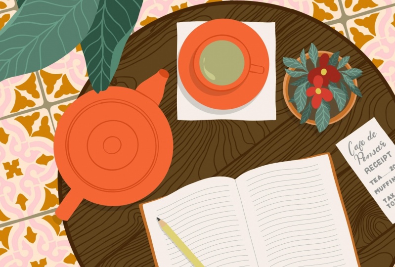
13. Layering and Composition Options: So just like we did for the last piece, I've grouped all the parts of each object and layered the group. Now we can turn our tile layer on and start thinking about how to incorporate those plants. I'm going to turn on my plant sketch, and before I get too crazy here, I'm going to go ahead and duplicate this document. I tend to do that anytime before I make a big change because there's just no going back after you start pushing things off the edge of the Canvas. I really want to be careful about moving things around. I'm going to swipe to select the glasses, the spoon, the cookie, and the coffee, and the table. Now I'm looking at that sketch of my leaves in the corner, and just thinking about how this could interact with the table. I'm letting the table go just a little bit off the edge, but keeping some of that tile down here in the corner, and now I can add in those leaves. So just to keep it simple, I'm going to tap and hold, so that we've got those leaves on their own layer, and I can see clearly on the white background. Again, I'm not going to go deep into drawing these because I provided you with the stamps for a few different types of plants so you can feel free to try it out, and I also have a class on drawing plants and leaves in procreate. Check that out if you want to get deeper into the whole plant thing. But for now, I'm just going to ink the stamps. Just go around the border, not trying to perfectly follow this just getting the loose overall shape, and I'm going to do each leaf in a different color. I have a little bit of variation going on. Now to highlight these veins a little bit, I'm going to make a clipping mask layer above each leaf, and just go through with a color that's slightly lighter than the original color, and just following those veins that were already on the stamp. One thing I like to do with these veins is go in and thicken the space where the veins connect to the central vein, and that gives a really nice thickened area that shows how they blend with each other, rather than being this just digital artificial-looking connection. Now that all of those leaves are inked, I can bring back my coffee table, and my tile, and everything related to it. Of course, I want to make that sketch invisible, and you can see how much this plant area adds to the composition. But I'm noticing that my glasses are a little bit hidden there. Let me just bring my glasses in, and then maybe group my plants and bring that group up a little bit. This is just the final part of the process where you're just playing. You just decide how much of this plant area do you want peeking out. We could even duplicate one of these plants, and let it peek out from over here, maybe flip it horizontally, so it's not too similar to the other one. Maybe make it a little bit smaller as well. Little changes like that allow you to reuse elements. You can get a little bit more variation in your composition. You can see here how having the two layers, the tile and the coffee table, is interesting. But then having that additional layer of the plants just adds so much visual interests to these compositions, and just keeps your viewer looking around the page. Whereas just this flat central image, it's missing something, and you can really be fit up by just one little or two little leaves peeking out in the corner. I want to show you another composition where I did this exact same process. I just included a few more objects. In this case, I added a teapot, a plant, and a notebook. You can see I just use the stamps from the brush set for the tile, and the wood grain on the table, and then I sketch in the rest by hand. You can see I spent a lot of time playing around with the placement, I added a little bit of lettering to the receipts, so we had just that little bit of variation over on the corner, and then I started with bringing that tile color down. Then I base everything else on what would go well with that tile color. Because once you create that tile, it's really hard to re-color it. I start with the tile color and go from there. I really wanted to have a high contrast from the tile as well. I went with a darker wood on the table, and then I just took some time to add a lot of detail work under this composition, the lines on the notebook. I added in some details into the plants on the table, and I use that same green on the plants on the table as I did with the plants in the corner, and I think that does a nice job of referencing those two colors together. The last step, which we did before is just add in those shadows, and of course, shadows are optional, so don't feel like you have to add it on every single composition. But it can be a nice little touch to add a little bit more detail into your composition.
14. Planning Your Illustration: Next, we're going to illustrate a recipe, as a way to talk about how to create tiny messes on the canvas, which introduce a human element into your work. A tiny mess would be, for example, a little bit of mint on a knife and a cutting board, so your viewer can see that someone was slicing up some mint in this scene. These little elements add just that little human touch that you need to get someone to look at your work just a little bit longer and see that there is an active human role going on in the scene. I recommend here by starting out choosing a simple 2-4 ingredient recipe. It's nice if the recipe includes some herbs so that we can get a little bit of contrast between the leafy greens and maybe some fruits and vegetables, and the metal on the knife. We're getting a lot of beautiful contrast there with the variation in materials. Let's get started by choosing a recipe. I've already pulled together my flat lay inspiration board here, and I just wanted to show you a little bit what I mean by tiny messes. You can see how these blueberries are just scattered around the page here, that little mess makes a really nice composition because, it just leads your eye around. Imagine this composition without the berries, without the pearls, without the time sticking out around the corner here, it would just be missing a lot. But these little messes that are included in flat lay compositions are a really good way to just show your viewers some action, some movement, and life in your drawings. In this composition, we're going to focus on adding in some messes, and just use a simple two or three ingredients recipe to play around with creating a mess. I'm going to do a strawberry-mint mocktail. It's just strawberry, mint, and seltzer water. I'm going with something super simple. Of course, go as complex or simple as you want here. This is totally up to you, but I do recommend keeping it somewhat simple, just so you can practice mainly on the concept of creating a mess rather than having to worry so much about depicting so many different ingredients. I'm thinking, I'm going to have a knife here and then a cutting board with my knife. I'm going to be slicing the strawberries here on the cutting board. That's going to be one of my messes, is just, strawberries that are half sliced. It's going to look like I've gone halfway through the process and then stopped. I need these strawberries here, my reference images to get an overall shape. I'm also going to include some mint. I got a nice up-close picture of some mint. I definitely recommend looking for these nice close-up pictures because they're going to make your life a lot easier. I'm going to zoom out a little bit so my cutting board takes up little bit more space. I'm also going to have some glasses over here that are just going to have some ice in them, some little cups, then I'm going to have my recipe card actually sitting here, and I'm going to write on the recipe. That'll just be one little playful element to include here. I'm going to get that freehand selection tool, tap the move tool, just make everything a little bit bigger. This is where I do just the super rough version of a sketch, so I don't worry at all about stuff being perfect, I'm just trying to get basic shapes in order. I feel like I could have a little bit of that mint over here or maybe we'll just let some of the kitchen tile show through. I've got a couple different messes going on here. I've got my mint that I'm going to be cutting and my strawberries. You could also include some other messes that you think of. You could have some torn paper, you could have some of your ice cubes fell out. Whatever you want to do here, just play around with some fun mess ideas here. I'm going to start with my tile. I'm going to go with this Spanish tile on a really large scale. I'm going to click on it Grain increase the scale. I'm thinking here about if this was a kitchen and I had a little cutting board on it, how big would this tile be? I think that's a pretty good size for what we have going on. I'll make that invisible and bring back my sketch. Then, I'm going to start sketching these objects, one at a time, just as we've done for all the previous projects. I'll go ahead and speed up my camera since you've seen this process before.
15. Inking Complex Tile: You can see here I've done a really simple sketch. I didn't go into a lot of detail with this, and then we've got that tile on a different layer. I'm going to go ahead and remove that inspiration image because I don't need that anymore. You can see I didn't draw a lot of my masses in. I'm going to be creating those by cutting and slicing up different parts of this. For now, I'm just going to leave this as it is. I want to start with my tile, but as you know, I like to save my sketch just in case I mess something up. I'm going to select in the gallery and duplicate it, and then I'm going to merge everything except for my tile onto one layer. At this point I only have two layers, my tile layer and my everything else layer. Let's get started with inking the tile. Again, you can pull up the recipe palette from the resources list, and just like we did on the last one, I'm going to do one tile and then have it repeated everywhere. But I'm going to do this one a little differently because obviously this one's got some color that the other one didn't have. I'm going to start with a grout color, that's a darker color so I can see the contrast. Of course, you can change the colors at anytime, so this doesn't have to be your final color. Again, I have a class on limited palette illustrations. If you're feeling a little bit lost with color, you may want to watch that class because you can get a lot of insight into why certain colors look better together and how to choose your own palettes. Of course, feel free to use my palettes for all of these projects, but you may eventually want to do your own thing and that process can be helpful. Above this white or beige tile layer, I'm going to create a clipping mask. I can get this orange color, and then I'm just going to start filling in the shapes loosely. I'm not worried about this being perfect. One thing you'll notice is that this has four quadrants that are all the same. We can duplicate it, tap the Move tool, flip it, and then just stick those into play. If you don't want to read your others over and over, I totally understand that. Just wanting to save a little time, so just popping those into place. The one thing I would check, if you do that, once you merge them all together, make sure there are clipping mask, is just go through and make sure you went all the way to the edge with these or your tiles are just going to be a little bit cut off on the edges. Just looks a little messy, so just clean that up a little, and now I can fill in the rest of this tile. I'm happy with that tile. Now, I may want to change this color later. I'm going to group the beige and orange into a group, duplicate it and make the first group invisible. I'll just shift that down to the bottom, swipe left and lock it, so it's just hidden away. That way. I don't have to do that inking process if I suddenly decide, I want to change the color of all these tiles. I'm going to merge those two colors together just to make this simple for the duplication process, and then remembering to always duplicate the original which is the bottom tile. Never duplicating a duplicate. I'm happy with those, so I can merge them all onto the same layer, and that doesn't need to be in that group. I've got my grout and my tiles, swipe those and group them. Let's call that tile. I can make my tile sketch invisible. Let's turn off that drawing guide because that's a little distracting, and now I can start working on inking my sketch. I am going to make my tile invisible while I do that because it's just a little bit distracting to see that tile.
16. Inking and Details: Let's start with the cutting board, I'm going to go through an ink with this dark brown and make this sketch semi-transparent. I want to use that wood grain texture on this, so I'm going to create a new layer. Grab that wood grain or I called it wood floor, it could be floor or something else. That's a little bit small, so let me go to the Grain, bump it up a little, that looks nice for cutting boards, so let's stick with that. Now I'm going to tap the Move tool, shift that so it fits. I'm going to just bump it up a tiny bit so it fits on that cutting board. Of course I need to turn that into a clipping mask. Also, I can go to use Saturation Brightness and bump that up or down a little if it just doesn't seem intense enough. With each thing I ink I usually will turn on the tile just so I can get a feel for how that's looking. I'm happy with that overall, so I'm going to group it and call it cutting board. I'm going to do a little mini wood grain on this knife handle. I'll just get my liquid pen had a medium size and then come through and push and pull to get that nice and varied. The nice thing about these illustrations that are almost a collage is that you can just keep drawing elements and mixing and matching different things like I could draw a spoon and see where that would fit in or if that doesn't work, just throw the spoon in the trash. These are fun because there's not a lot of pressure on each object, you just build up one object at a time and in the end you will have a beautiful composition. But moment-to-moment you don't have anything terribly complex, which for me is a nice feeling sometimes when I just want to relax and draw a little bit not have everything be so perfect or high pressure. I think most artists and designers can appreciate the feeling of just trying something easy once in a while, so you're not always struggling to create your next perfect piece. I'm going to use the same specs or seeds brush that I used on the camera to get just a little bit of speckle texture on my strawberries. For these ice cubes, I'm just doing varying shades of blue, and I may end up adjusting these later, but for now I'm just getting those shapes in there, so I have something to play around with when I'm ready. I didn't draw in this aspect of the mint, but mint does have this spiky edges. I'm just going to draw that in as I work. I know that some people like to just sketch all that stuff in the beginning and I think that's a great way to work too, if that feels better for you. For me personally, when it comes to just repetitive stuff like that, I don't see the point in me sketching it in advance. I really would prefer to just do it in the end and just work on going slow so that I can get those jagged areas really nice. I'm also going to use a couple different colors for the mint, that way I can layer some of these leaves. The viewer can see the differentiation between the two colors. Now that I have my basic shapes done, I can go through this composition and add as much detail as I want. For example, with these plants, we could do just a single vein or if you want to get super detailed, you could go through and add veins to every single leaf, which would look awesome if you have the time and energy. I definitely always recommend just going through and adding in that extra bit of detail if you can. I'm just going to go through and add all these little veins on my mint leaves. Another thing I can do, which I think is a beautiful touch, is getting the writing pencil and writing in the recipe, I'm just going to do that with my normal handwriting. I'm not going to write the whole recipe because I want it to go off the page a little bit. But you could write it smaller and get your whole recipe in there, however you want to make that happen.
17. Making Messes: Let's dig into just making a few messes before we finish up. I'm going to tap the Selection tool in the gallery and duplicate because I'm going to need to merge some of these and I don't want to totally lose everything that I've done just in case I need to make some changes. I'm going to merge all of the mint leaf same colors together. I've got the lighter leaves merge those with their veins, and the darker leaves merge those with their veins. I haven't done all these because I don't want you to have to sit here and watch me do that, but you get the point, you would just continue doing that. I'm going to take one of these leaves and slice off the tip and have it just on the knife. It's just like sitting here on the edge of the knife. Let's take another little strip and put it on the knife. Then I'm going to cut a couple more strips and show how whoever was cutting this, sliced this into parts. Let's do the same thing with the darker one. I'll put a piece of the darker one on the knife as well, so that's a really fun mess. I don't think I made these wild enough. I think they would be much more out of order, so I might take a little extra time to just make these even more messy. Another thing I could do is put some of these strips in here. If I want to do that, I probably want to use duplicates of what I've already drawn. Let's group the mint. Duplicate that group. Move that group over here. That will be my group that I play around with. I'm going to grab these mint leaves that are here. Let's just merge those together. Now I can take little pieces of this and just have it floating in my drink. Of course, all of the pieces that you're not using, you can tap the Freehand Selection tool, drag three fingers down, and cut. Now I've just got these fine little mint leaves that clearly came from over here sitting in my cup. It's like the person's chopping them up and throwing them into the cup. I think you can imagine I can do the same thing with the strawberries. I'm going to select that strawberry layer. Let's just go ahead and duplicate that group just in case we decide to change our strawberries at all. I'm going to merge all my strawberry stuff on to one layer. Let's just slice up some of my strawberries. You can imagine I could get even crazier with these. I could cut off the top and set it over here and then show the opening. I could cut up little tiny pieces and put those in the drink as well. There's endless amount of things that you can do with these. You just have to sit and play, go with your personal style here. Of course, you don't have to get too wild with this if you just aren't really into the mess concept. But I find this really fun to just sit and figure out how many realistic elements I can pop into this composition. I'm taking a strawberry round here and slicing it, and then just turning it a little bit and then that's a fun piece that's just scattered around. Keep going with this, play around with messes. Try to think of new ways that you can incorporate these messes in. I'm telling you this makes your illustration so much more eye-catching, so much more fun to look out for your viewers. In turn, they're going to be looking at it longer and engaging with your work more.
18. More Time Lapses: I want to show you a few more pieces where I incorporated some messes into my drawings. This piece, I wanted to do a travel inspired composition. My first mess is just a little bit of wrinkling on the clothing. You can see they're not perfectly straight, they've got that little bit of a wrinkled aspect, and I think that makes it fun for the viewer to just see how the suitcase is packed. Another mess is just how things are scattered around the page. For example, I created all of these little pamphlets and papers down at the very bottom, and I just scattered those around the page along with the camera and the glasses, so the viewer gets just a little bit of a look at the mess that comes when you're packing. I also played around with the sizing a lot and tried out a few different ideas on the left there. I started with a hat and then I decided to incorporate a bathing suit. You can see how as I was sketching, I was getting ideas and changing things. I think those little toiletries on the top right corner, they're tiny, but they're really important touch that balances the heavy detail work with the more wide open areas in the composition. For color, I did the exact same process that we did throughout this class. I started with a base color and then I played around a lot with color because, of course, in the beginning, you're not sure what you want the overall palette to be. It may take a little tweaking and a lot of color changes to figure out where you want to end up in the end. Last, I just added in a little bit of wrinkling, so you can see the sheet under this is just a little bit wrinkled up and each object on the bed is just pushing the sheet a little bit. It gives that movement and that realistic feel for my viewer. For this next piece, I knew I wanted to do something related to gardening, but I just couldn't figure out where to start. Rather than starting with a composition, I just started sketching gardening tools. Know that if you don't know where to start and all you have is a theme, it's time to just start sketching parts, so I did gloves, I did those gardening tools, I did a watering can. I realized all of a sudden, wow, this could be on a wood table, so why don't I add in a wooden table, maybe there will be a little grass in the background. It doesn't come all in the beginning, you really have to dig into the process for these little ideas to start coming to you. That's what I recommend doing when you're stuck, is just start drawing something related to your concept and it will come in time. I wanted to include some messes in this composition. I decided to, after I had placed everything, I shifted some of the pieces around so I could include a seed packet. The cool thing about including this seed packet is then I can have some seeds sprinkling out of it, so that's a fun little mess to include. I also decided to throw some soil around, so that gives much more of a realistic feel. If you were gardening, you would never have a perfectly clean table, you would have dirt all over the place and it would be a total mess. Just sprinkling some dirt around gives it such a realistic feel compared to just having this pristine table with all these perfect tools where everything's in order. That's just not the reality when you're gardening. To create those seeds and soil, I just use the brushes that are in the brush set so you can certainly copy that same concept in your drawings. For this next composition, I knew I wanted to do something related to self-care or pampering, and so I came up with the concept of just painting your nails. You can see I had an overall idea of the composition before I started, and then I spent a lot of time sketching these feet. Feet and hands are some of the most difficult things to draw. If you are going to include something like that, take your time, do a lot of sketches upon sketches, because when those are off, they just look really strange and it's odd for the viewer. I really took my time there on the feet and then I just popped in some simple objects to communicate that concept of a pedicure. You can see I like to include a little lettering. I go into lettering in my other classes, so I'm not going to go deep into lettering. But check out my lettering classes on my profile if you want to see more about that. I also popped in a pedicure set. I wanted to include a lot of detail in this section because I thought it would be a nice balance to have the wide open tile areas and then the highly detailed pedicure tools. It's just that balance of high detail and low detail going back and forth, and I think it helps the viewer stay engaged in the piece. I did the exact same process that we did for the hexagon tile where I just darkened the very outer edge of each tile. Then I went through and inked each object just like we did in all of the projects. You can see here that I played around a lot with color and went back and forth between more saturated colors, more dark colors, lighter colors. But overall, I just want to get a lot of bold contrasts in this piece. That was something I was focusing on with the turquoise and the pink playing off each other. I hope you enjoyed watching this class and that you feel inspired to create some flatlay illustrations. Remember, if you click "Follow" on my profile, you can get a notification every time I come out with a new class. Check out my profile to get more iPad art and design classes like this one in your inbox. If you liked this class, you may like some of my other classes where I cover a lot more ways to design and paint on your iPad, like how to create plant illustrations in Procreate, how to draw in perspective, and how to sell your illustrations on Society6. Check those out on my profile if you want to see more. Also, I share a lot of free downloads for iPad artists and designers on my website, so if you'd like to get more resources like the ones you got for this class, check out my site. I would absolutely love to see the projects that you create after you watch this class, so please share what you make. You can do that here on Skillshare in the project section or you could tag me on Instagram or Facebook. If you have any questions about the process you learned in this class, please feel free to reach out to me. You can do that here in the discussion section on Skillshare or you could contact me through my website. Thanks so much for watching and I'll see you again next time. Bye-bye.
 Liz Kohler Brown, artist | designer | teacher | author