Transcripts
1. Introduction Pattern: Welcome to the most hands on photoshop course
you've ever seen. This isn't your
typical feature tour. We are diving straight into
exciting creative projects, and you are encouraged to create completely
unique designs. Pattern design is a very
exciting and rewarding sector within the creative industry. And in this project,
I'm going to show you various ways that you can approach creating a
professional, seamless pattern. End result that we
will be creating here can be applied to any product, apparel, or packaging,
or even be used in digital format for a
website or a mobile app. And at the end of the project, we will also visualize our work with this
cool T shirt mockup. Whether you are an
aspiring graphic designer, photographer, marketer, or simply an individual with a passion for visual
storytelling, mastering photoshop provides you with the tools to bring
your visions to life. This course is perfect for you if you are new to photoshop, or if you are self
taught and a to get more confident and
effective using it. I am Martin Purina, a certified Adobe
expert and instructor with a design background
spanning over two decades. Throughout my career,
I collaborated with renowned clients
such as Disney, Mattel, Cartoon Network,
Nickelodeon, and BBC. Learn to use photoshops
latest features together with the
fundamental building blocks, like layers,
adjustments, selections, transformations, masking, smart objects brushes
and so much more. You can also future proof
your skills by mastering Photoshop's amazing
generative AI features. I am not just
teaching photoshops. I am empowering you
to express yourself, tell your story,
and create designs that resonate with
your unique style. This is your chance to
create work that is truly personal and worthy of your professional
creative portfolio. You can follow along
with each project and replicate my designs, or you can use the workflows
and techniques I show you and create something completely
different and unique. So are you ready to revolutionize the way
you learn photoshop? Your creative adventure with
Photoshop starts right here.
2. Generating patterns with Adobe Firefly: We will approach this project
in two different ways. The first method is going to be much faster because we mainly will rely on do B Firefly
and an AI generated pattern. But then we will see how to use Photoshops pattern preview and manually put the elements
of the pattern together, which will rely more
on your creativity. Like with all the projects, I prepared lots of assets so you can really play
around and explore things and have creative freedom to create your own
unique design. So let's start in the
desktop version of Photoshop first and
create a new file. I'm going to use 1080
pills by 1080 Pis, and I'm going to use RGB color mode and
a white background. This is going to be
the blank document that I'm going to
start working in. If you want, you can
already generate something directly here in photoshop
by selecting everything, going to the select
menu and choose all. And then from the
contextual Tas bar, you can choose generative fill. In case you don't
see the tas bar, just make sure you go to the
window menu and enable it. So if I choose generative fill, I can just type in something
like floral pattern, maybe seamless floral pattern is going to help to make sure that it can actually
work as a tile. And we will get three
random results here. So this is the first one. Here's the second one,
and here's the third one. Now, as you can see, it
would already work as a pattern because the
edges would line up. So it did a good
job in that sense. And I actually quite
like this one, and we will see how this works
on a product mockup soon. But first, I would like
to open up Adobe Firefly. In case this is the
first time you use it. Open a browser and type
in firefly adb do com. And here, go to the
text to image option. When you click on Generate, you can just type
in the same prompt, so we can type in
seamless floral pattern, and then generate. Here, we will get four
options to choose from. And also, we will have
a lot of options on the right to refine the results. So we can see that it's quite different from what
we've seen in photoshop, and that is mainly
because currently, the Adobe Firefly website is using a more advanced
model or engine. This is currently only available here as it says it
here at the bottom. This is not the
one that Adobe is using when you are using
generative fiel right now. But by the time you are
going through this course, that might be much
newer versions both in photoshop and here. So it's just good
to know that you might not have the same results, and currently, the
Adobe Fire five website can generate better results. So we can refine this further. We can make it look more like
a photo if we wanted to. But I actually prefer
it to look like an art or illustration. And I'm going to go
for this image here, so I'm just going
to select that. And I will save this. So I go up to the more options, and I choose download. I'll jump back into Photoshop, and then from the
file menu using Open. We can find this
image and open it up as a separate
document. There it is. We just open that one. And now in each of
these documents, what you will need to do is
to save them as patterns. So just go to the edit menu
and choose define pattern. I'm not going to even
change the name here. I will just hit and do the
same with the other documents. So I go up to edit
define pattern. Save it. Now that we have
both of these ready. It's time to see
how they would look like on an actual
product like a T shirt. I have a file prepared in the exercise files folder
called T shirt Mockup. So open that one up. And in this document, you will find a layer
called Design here. That's the one that you will
need to double click on. So the thumbnail of
this layer is where you double click to
access the actual layer, where you can apply
your pattern. Notice how it already has a layer style called
pattern overlay. This is what you need to
again double click on. And within there,
you will be able to change to the pattern
that you just saved. I have both of these
versions here, so there's one, and
there's the other one. This one was the one that
we created on the website. And actually, when
I zoom closer, I can see some parts where
it's not perfectly repeated, so there is a visible edge here. So that's clearly not good
for a seamless pattern. But just to test it out, I'm going to reduce
the size a bit of the pattern with the
scale attribute. We could also change the
angle on it if we wanted to. And then when I click okay, all I have to do now
is to just save this. So go up to the
file menu, save it. And then if we close this
smart object layers document, We can see how it would
look on the product itself. Now, from this distance, the edges are not noticeable. But of course, if this
is something you want to actually print out and
sell it as a product, you would want to make sure that the pattern itself is
completely perfect, and there's no visible edges. But let's just go back
to this layer again. Double click on it once more. Double click on the pattern
overlay effect and change it to that other version that we
created with in Photoshop. I'm just going to increase
the scale on this a bit. This one seems to have
no visible edges. Feel like this actually is
really a seamless pattern, so I can keep it
somewhere around there. Let's just turn it around a bit. Now, actually, I just noticed
an edge here as well. If I zoom back, I
can see right there. There is still a
visible edge here. So it's still not 100%, slightly better, but maybe just because it's a little bit
more abstract pattern. But as you can see, currently, both of these
generative AI methods, whether you are using
at OB FR five website, or you are using the feature
directly within Photoshop, will have some minor
issues around the edges. It's good to experiment
with them still, but I would recommend to
do the pattern manually, which I will show once
we are done with this. Maybe I'll just increase
the size a little bit more. So let's just save this again. I just use commando Control S to save the pattern quickly. And then closing that
smart object document, we can see the MCU itself. Again, from this distance, it doesn't look that bad, but even here, I sort of can
tell where the tiles are. So there is a visible
edge right there, which would obviously
show up in print.
3. Preparing assets for the pattern: The good thing is that we've already seen the whole workflow. So now we just
concentrate on creating something ourselves
instead of relying on AI. I would recommend to create
another new document, and I prefer to work
with a square format, but you can work with
whatever suits you. This time, I'm going
to make it slightly larger just so we have a little bit more
resolution to work with. So 1,500 by 1,500 pixels, RGB color mode, and
let's just create that. Once you have this
ready, you can decide the theme
of your pattern, depending on which
assets you are going to choose from the
exercise files folder. I'm going to go with
the floral theme. So for this, I'm going
to open the plants Illustration one and two images. So double click on these. They will open up in photoshop. And as you can see, these are nice watercolor illustrations
of various floral designs. These are actually also
created with AI, by the way. But that doesn't really
matter in this case because they can be drawn by
hand or digitally, or they could even be
vector illustrations. But for this project, we will have to
separate them from their original white background. So first of all,
I am going to use the rectangular Market tool and make a selection of
one of these details. Let's just start with
this one right here. Once I selected it, I can just press command or Control C to copy this
and then jump back to our blank document
and then paste it in with commando Control
V. There we have it. And if I use the move tool, I can already start moving this around within the document. Now we can separate this from its original background later. Now, I'm just going
to keep it here. Let's jump back to
that document and select one of these other ones. Maybe this bigger one here. Going to make the
selection, and by the way, if you hold down the
space bar while you are using the
rectangular market tool, you will be able to make your
selection more accurately. And once again, copy this and then paste it in
the other document. So we have two of them, and then maybe let's pick something from this
other document as well. This one is quite nice. I'm going to select that, copy it and paste it in here. Use the move tool
to put it on top and choose at least
five of these elements. I would recommend to have
at least five of them. The more the better because
you will have more variety. So there it is. And then maybe this one is
quite nice as well. L et's copy that. Drop it
in our untitled document, and then I'm going to choose
one more, maybe this one. In case you have
a selection where it overlaps one of
the other details, you can just hold
down the old key and highlight that area. That way is not
going to copy that. You are removing
from your selection. Don't forget to
copy and then paste into the main document that
we will be working with. Now, you can see as I'm
moving these layers around, we have that white background
showing up, which, of course, we don't want
in the final composition. It just makes it harder to
work with these layers, so they will always
overlap each other. And the easiest way to spot which layers need
to be extracted from their background is by creating a new layer
at the bottom. You can even delete
this background layer because we won't need it. Just select it and press
backspace on the keyboard. Then click on the
adjustments icon here at the bottom and
choose solid color. So this is a special
type of layer, and just pick any color for now, maybe a blue and make sure that this layer is placed all
the way at the bottom. If you want to change
the color of this layer, you can just double
click on it and choose whichever color
you prefer to work with. This is just to help us
see which layers we still need to extract from their
original white background. So I'm going to start with
this layer right here. I'm using the Move tool and holding down the
commando control key. I can click on layers to
quickly switch between them. Or if you have the auto
select feature turned on, this is a feature that will
automatically work for you. So by default, photoshop
is working like this. It will automatically
switch between the layers. But if you don't
want that to happen, make sure you turn this off, and then you will stick to always the layers
you were working with unless you hold down the commando control key with the move tool to switch
between the layers. So what I would like to
do is to go in order. So let's start with this
one here on the top left. That one is selected. I can use the contextual task bar
and choose select subject. Most of the time it
will do a good job. In this case, it didn't
do a perfect job, so we can see that it's not aligned exactly to
the illustration. So instead of this one, I am going to rely on another
quick selection tool. This is actually
called the magic wand, which is great for highlighting
solid color backgrounds. In this case, the
white background. So once you have the
magic one tool selected, the tolerance of this tool can be adjusted here on the top. By default, it
should be set to 32. And that actually is a quite good value to work
with most of the time. And here it worked like a charm, so we can use that. And within the
contextual task bar, you can click on this icon
to invert your selection. And then click on the next icon to turn this
selection into a mask. Once you've done
that, you should see a very good extracted result from the original
white background. And this is exactly what we will need to do on the other assets. But before we move on, I also would like to turn this
layer into a smart object. So let's right click on it and choose convert
to Smart object. This is going to
allow us to work non destructively when we are applying a facts and
resizing, rotating the layer. It is a good practice to remember to first
do your masking, then save it as a smart object, and only then do
transformations. So that should
always be the steps. Masking smart object
transformation. Let's do the same thing here. Once again, I'm going to
use the Magic one tool, click on the background. And as you can see, it starts to pick up
some details here in the middle because the
contiguous option is turned off. That means it can
actually jump over and even select highlights
or bright details, even if it wasn't connected
to the background. If I have the contiguous turn on and I click on
the background, that means it will't be able to jump over these darker details, so it won't select
those accidentally. So we actually don't
need those details. We don't want them
to be removed. So now I can invert my selection and then
turn it into a mask, and that looks great. Right click, convert
to Smart Object. Moving on to the next layer. We again, click on
the background. And in this case, I can see a few areas like these here in the middle that
should also be selected. And this is when the contiguous
option can be turned off, so let's just test it again. If I now, click on
the white background. You can see how it
managed to go inside those isolated details
as well, like here. But the problem is that some of these branches are a
little bit too bright, so the magic one is actually
selecting them as well, not just the background. So in this case, we can also reduce the tolerance,
maybe down to 20. So let me try this
selection again. First, I will go to the select
menu and choose D select. Or you can press
commando Control D. That way we can
restart the selection. So I'm going to click
again on the background. And I can still see it's starting to pick up some
of these details here. So let me try with
a lower tolerance. Maybe go down to 12. Now when I click, it looks
already much better. So I think I'm going to
stick with this one. I will again invert
my selection, and then save this as a mask. And now we can save
this as a smart object. So I will do that, and we have three of
them ready to go. Let's continue
with the next one. Once again, magic one, maybe a little bit
higher tolerance is going to work here. So let's click on there.
Take a closer look. We can keep contiguous on
as well, but in this case, I don't think it was
making any difference, and then invert the
selection, save it as a mask. And then save the whole
thing as a smart object. And we have two
more to work with. Let's move this up a bit. Make sure always that you have the full layer
within the canvas. So not on the edge because then it won't be able to
select all the details. So right here, again, with the magic one, we managed
to make that selection. And in case you
notice that there are some isolated
details like these, you don't have to
restart the selection. You can just hold down the
shift key and click on those. That's another way around
it to create the selection. And then if you're
happy with the result, just invert the selection
and save it as a mask, and then turn it
into a smart object. And finally, this one here. Again, magic one, click on it. There's no isolated details, so we can already invert
it and save it as a mask. Actually, I noticed one
additional part there. So before we save it as a mask, I'm just undoing this last step. I am going to use
the magic one still, shift click on that area, then invert the selection
and save it as a mask. Okay. That looks good. Now we can turn this into
a smart object as well.
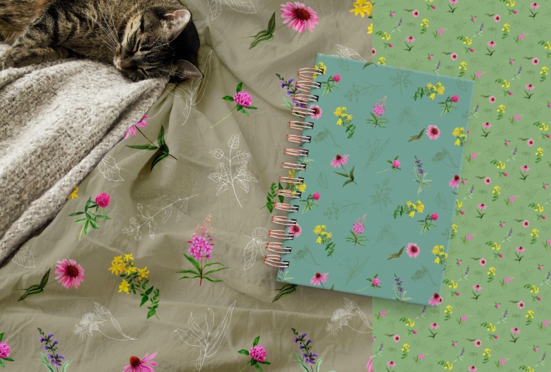
4. Creating seamless pattern: Now that we have
these elements ready, it's time to create the
composition for our pattern. And first of all, I'm going to change the background
color to white. I think that's going to
work better for this. But because now we
extracted all the images, we can easily even overlap
them on top of each other. And generally, I'm going to make them all slightly bigger, so I select them all
and make them bigger, and there is an amazing
feature that we will be using here in Photoshop
called Pattern Preview. This will help us to be able
to create something where we want notice the edges
in the final design. So if you go to the view
menu, choose pattern preview. And then immediately, we
can see the current design. But when I start moving
elements around, notice how it already creates
the repeated details. The additional
instances that are needed are visible
outside of this tile, the square that we
have in the middle. If I zoom further back, you can actually see that
it's an unlimited canvas, so you can see exactly how
the pattern would look from a distance or how it
would look close up. Going to work closer, so I just zoom the back, and I'm going to quickly move
these objects around using the free transform
tool that's command or Control T. We can
rotate them around. Just press enter
when you are happy with the position of
a transformation. I'm going to move
this one up a bit. These ones, I actually
like a bit of overlap. So I quite like the
way that looks. Maybe we can turn
this around a bit. Like that. This can have a
bit of an overlap as well. We can maybe make
this slightly bigger. So I just keep going back and forth in the free
transform tool. We can maybe turn it around. We can also flip these elements
around in the edit menu, transform flip
horizontal or vertical. This case, I just wanted a
horizontal flip like that. I feel like that
looks quite nice. I can bring that one up here, and then I can maybe turn
this one around as well. Just so they are not in
the same orientation. Then I want to make
these two layers bigger. So I will start with
this one first, fill out that space
a bit more here then select the other one and
also increase it in size. Yeah, something like
that. Let's make this one also a bit bigger. And if there is
more overlap there, that's actually going to
make it more interesting. Right there. And then this
one can also overlap. And now you can see why
it was so important to have no backgrounds
on these assets. And in case you
want to bring one of these designs in
front of the others. So for instance, this one, if I want it to be in
front of the other leaves, all I have to do is to
just simply move it up in the layer spanel until
it comes in front. And I think this was actually
probably better behind. So I'm going to drop it
back there and maybe just turn it around a
bit. Something like that. Now, besides having
these larger elements, it's always good to have some smaller filler details
within a pattern. For that, I'm going to
use an empty new layer. I will actually
call this fillers. On this layer, I will
use the brush tool. With the brush tool selected, I'm going to sample a color
from the existing design by holding down the
altar option key and clicking
somewhere like here. When you're using the
sampling shortcut, you are temporarily accessing
the eye dropper tool. And by the way, if you hold down the altar option
key and click and drag, you can even see a preview of the colors that you
are hovering over. So I can find maybe something nice like this color
here I quite like. And I'm actually going to
use a special brush for this technique called Kyle's
ultimate charcoal pencil. It's within the dry
media brushes category. You should be able
to find it here. In case you want to find
additional brushes, you can go into the settings
and choose get more brushes. You can download these for free. But this should be
there by default. So I'm going to
work with that one. And I'm actually going
to use my stylus. But of course, you
can do this with your mouse as well,
whichever is easier. I will zoom a little bit closer, make the brush smaller. And I would like to
draw something simple, so I'm going to
just draw a leaf. And another leaf,
something like that. Yeah, there's one design there. Then I'm going to go here. I will do like little berries
or something like that. Again, I'm trying to make it similar to the
rest of the design. Then I come up here, maybe do a bigger
leaf, like that. And by the way, these are all on the same layer right now. So it might be easier if you do everything
on separate layers, that way you can
move them around. So for instance, now, if I use the move tool, they
are all moving together. But if I wanted to, I could make a quick rectangular
marke selection around this leaf and use the shortcut command or
control shift J. That way, I can put this
on its separate layer. So it's cut from the original layer and
paste into a new layer. The shortcut that I used, you can find in
the layer spanel, and it's the new layer via cut option that
you can find here. Now let's just draw
a few more elements. And before I draw it, I create a new layer
just so it's isolated. Let's just fill this part
here in a bit as well. I'm going to do
something similar to what I've done earlier on. Just create another
branch, like that. Maybe move it down a bit. And then let's draw something
again on another new layer. I will draw an acorn this time. Just to go with the style or theme of shading
on it like that. Of course, we could also vary the colors of these
little scribbles. Maybe I will use something more of this yellow color
on another new layer. Again, create something
very simple like leaf. We can move it down a bit, maybe extend the stem. And so on and so forth. Maybe just one final
detail with this color. I'm going to add just a few more berries here at the bottom. Yeah, something like that. All right. So now that
we have this ready, it's time to turn
this into a pattern. Simply go to the edit menu
and choose define pattern. You can give it a name or just keep whatever it's
called by default. And once you click,
it will be ready to be used on any
of your documents. So we can go back to that
mockup that we created earlier. I will double click on
that thumbnail that we used and also double click on
the pattern overlay effect. And here we should
be able to switch to our latest custom
design that we created, where there shouldn't be
any issues with the edges, so it should be a
really seamless design. We can adjust the angle
maybe on this a bit. Yeah, I feel like
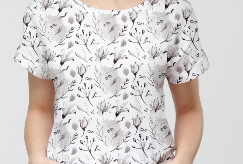
that looks good. The scale can be reduced, and then once we
click and save this, we can see how it would
look on the actual T shirt. And I'm quite happy
with this result. It's actually something I
would be happy to wear. And I'm sure your design
looks just as good or better. And don't forget there's a lot of variation that you
can do for this project. Lots of assets I prepared. So feel free to explore them, both the elements and both
the various options that you have to add smaller details
between the larger ones, and really just
experiment and have fun before you move on
to the next project.
5. Conclusion: Well done for
finishing this course. I hope you had just as much fun going through it as
I had recording it. And of course, don't forget
about the class project. Because remember,
practice makes perfect. I can't wait to see your work, so make sure to submit it. And in case you
like this course, and you would like to
learn more from me, then there's plenty of other courses that
you can find here. Go ahead check them out now. I can't wait to meet
you in the next one.
 Martin Perhiniak, Graphic Designer, Illustrator & Educator