Transcripts
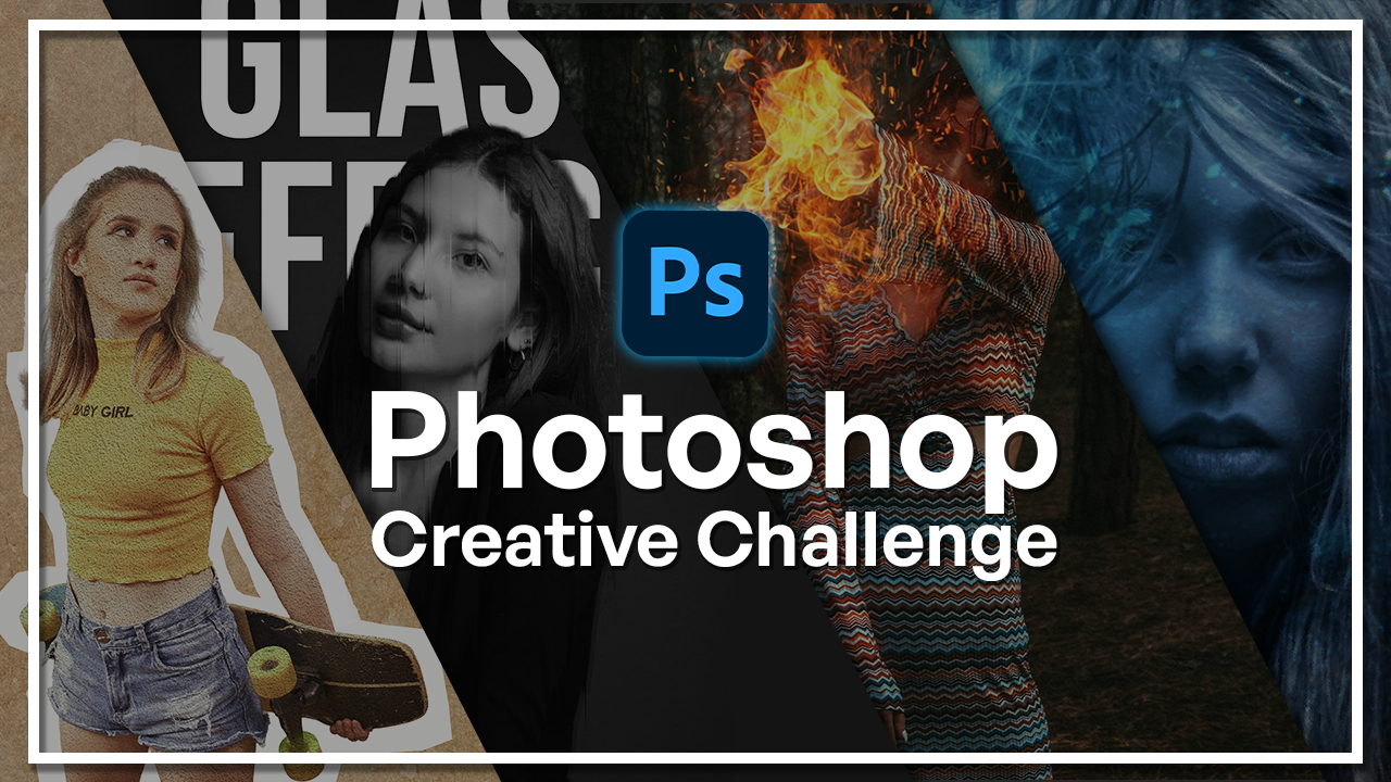
1. Welcome to the Photoshop Creative Challenge Class!: Welcome to this Photoshop
challenge course. If you ever wanted to improve your Photoshop skills in
a fun and practical way, then this class is just for you. My name is Hosta Kuchui and
I'm a graphic designer with over six years of experience working with Photoshop
across photo editing, visual effects, and
creative compositions. Throughout my work,
I've explored both professional workflows
and creative techniques. And in this class,
I'll be sharing with you the most useful
and the most exciting. Instead of just learning
the tools one by one, we're going to be doing
this via challenges. Each of these challenges is
meant for you to practice real techniques and also get a very creative and
exciting outcome. Before we get into
the challenges, we're going to do a
quick refresher on the Photoshop tools just so that we're all
on the same page. We're going to learn about all the tools, how layers work, how you can make adjustments, and how your general
workflow should be like. Once you're confident
with Photoshop, we're going to move on
to our three challenges. The first one is photo
editing and retouching, where we're going to be
enhancing portraits, adjusting colors, and
creating cinematic looks. The second one is
visual effects, where you're going
to be creating things like glitch effects, dapple exposure
effects, and many more. Lastly, is the
creative compositions, where we're going to be building full scenes such as fire, underwater, and other
creative artworks. The end of this
class, you will not only improve your
Photoshop skills, but you have a wide range of creative works that you can
now put onto your portfolio. So let's go ahead
and get started with our Photoshop challenge.
2. Create Your First Project & Workspace Setup: Before we get started
with the challenges, I just want to give you guys a refresher of Photoshop tools. That way, we're all on the
same page about the tools, and we can move along in
a more efficient way. So this right here
is the homepage, and we're going to be making our new projects
via this button. You can also import a photo directly using open
or an old project. So you can sort your files here. They're all named,
the type of file, how recently you've opened them. There is also Firefly
integrated into Photoshop. I'm using the 2025 version. If you have an older version, you may not be able to see this, but you can just kind of create stuff via firefly by just
typing stuff in here. I'm just going to create a
new file and take a look at the templates that we they are sorted via the names above. We have photos, prints, arts, web, mobile, and film. So basically, those just mean a difference in
dimension resolution, and for some cases, artboards. If you go to photo, for example, you have the default
photoshop size, we have landscapes, we have
portraits, and many more. And you can see that
the orientation changes when I go over
these different templates. For my first project, I'm going to do a default. You can decide on the width and height in whichever
metric you prefer. I'll do a seven by seven,
so we get a square. Next, we have resolution, which can be per inch
or per centimeter. The more you have a resolution, the more high quality
the work is going to be, but your file is also
going to be heavier. We have the color space
which you can set for print, for screens, for labs and other stuff for
different purposes. We have the background
of your first layer. You can choose the color, and that's about it. I'm just going to hit Create. I'll just lower this to 150. Then we're going to
click on Create. So now we are in the
Photoshop workspace. I'm just going to hit Command or Control Zero to make
this fit to screen, and we can get started by taking a look at all the stuff
that we have around us. So all of our tools
are right over here. On the left side, you can always grab these panels and pull
them out if you want. Maybe you prefer it to
be on the right side. And if you put it back in, it will just snap back in. Over here, you have
your Photoshop windows. So think of them
as browser tabs. You can work on various
projects at the same time. If you hit the X, you're
going to close that project. We have all of our panels
on the right side, and if you click on either one, you're able to see the
options that come with it. Whatever you're
doing via the tools will have a property
that you get to shift. For example, for a brush,
when you're painting, you get to change the size and the hardness or choose
a template from here. If you're doing a adjustment, we'll get the sliders like this. So not all of the panels
are currently visible. We do have a lot more, and you can see them
in the Windows tab. So all of these are
different panels that you get to enable. Let's do history. You
can see just pops up. And if I don't need it anymore, I could just close this tab, and it gets out of the way. Have some other tabs up here. If you want to save or
export, you go to file. You have edits,
image adjustments. You can modify your selections, add filters, work with layers, type, and so on forth. We have the Canvas right here, and my cursor currently has
the brush tool enabled. If I choose another tool, my mouse is going to
be for that tool. You can do any sort of work
here in the main canvas. Whatever is white is
currently the canvas, the stuff on the outside are
just not part of the canvas. So whatever you do
here will not go onto the final work
that you will export. So to set up your workspace, you first need to figure out what is it that you're doing. If you're doing
simple image editing, then the default setup
should work for you. But if you want to do
something with animations, for example, you do have
to change your workspace. So on the top right, you can see the
different workspaces. This is essentials,
which is the default. But if I go to motion, going to get a timeline, and that's something
you're going to need if you want to do
something with motion. For photography, we have
a longer panel section. We have the core
tools, painting. It brings out all the brush and the colors for
you over here, and you can even make your
own personal workspace. So say I really need
to use the let's say, channels panel all the time. I could go over here
and make new workspace, call it Channels, hit Inter. And if I go to painting, let's do essentials and
then go to channels, I'm going to get
that previous setup. You can delete a
workspace just like that. So you can set up
your workspace. If you know you want
a certain panel all the time, you
can bring it in, save that or just go with
the essentials workspace, which is what you would
usually use anyway. Now that we know
where everything is and how we can
make a new project, let's talk a bit about the
different tools that we have. And more importantly,
the essential tools that we're going to need for all of
these challenges.
3. Essential Tools Overview: Welcome back. Now
we're going to be looking at the different
Photoshop tools. The most important tool is the first one, which
is the move tool. If you're dealing with an image, a shape, a text, you will have to move it at some point across your canvas, and that's precisely the tool
that you're going to need. You can easily enable it
with V on your keyboard. And the way it works is that, let me just make a shape here, is that you simply
click on the thing that you want to move and you
move it across your canvas. The move tool, you can do
a bunch of other stuff, such as duplicating by
holding down alter ruption, holding down shift to move
it in a straight line. So if I let go of shift,
it'll be free form. If I hold down shift, you can see that it's very
precise with the movements. You can copy paste,
Commander Control C, Manner Control V, and I'm getting the outline
here just like that. Can also align things
with the move tool. If I grab this guy,
set it to canvas, we can just set it at the center at the top, bottom, left, right, and we are able to play around with
the different layers. So let's get rid of that. We'll talk about the layers
panel in a separate lesson. Now let's move on
to our next tool, which is all these
selection tools. I'm just going to import an
image to make this easier. So I just imported this image
from the resource pack, and we're going to take
a look at how we can use the tools to do
some very basic stuff. So as we said, the move tool is for you to move things around. So I just converted
that and I could move my entire image across the
canvas. Let's put it back. With these selection tools, we have a few different
ways that you can select. The first one is
the Marquee tool, which gives you a very
controlled rectangle that you could use to
maybe make a copy. I'm just going to move the
layers panel here with the marching ants that basically indicates that there
has been a selection, and now you have to do
something with that selection. So in my case, I will be copying this command and control chain. And now I have that selection in a new layer. Let's delete that. If you long click this, we have another shape
for Marquee tool, and that's another controlled
shape that you could use. If you hold down Shift, it will be a perfect circle. If you let go, it's
going to be an ellipse. So more free form. I could do something like this, make another copy, and you can
see that's what comes out. Commander Control Z to undo and to get rid
of the marching ants, you can do Commander Control D, and that's going to deselect. We have more free form
items for selection, such as the Lasso tool. It's literally a lasso that you get to move around to
make your selection. If you go over the same
area multiple times, it's going to basically
think of the sum of all those lines and give
you a result like that. If you don't close your shape, it will automatically link
them with a straight line, and that's going to give
us a result like this. If you long hold long
click the Lasso tool, we have a selection brush
tool which is going to detect the subject that
you're trying to grab. So this guy, for example,
always like this. So I could grab these guys and just select them like that. Go over here, we have a
geometrical lasso tool, so you just do clicks, and it's going to be
forming straight lines. And you do have to close this, so you will notice a circle appear when I go to
the first point, and we get a shape
like this, Deselect. Then we have more
automatic selection tools, such as quick selection. So I could just go over the area and you can see
that it detects and expands when it realizes that this is the
edge of the subject, and you can continue
going like this. Have Object Selection tool, so that's going to basically separate all the
objects in your image, and we can simply click on them. So you can see when I
hover over the subject, I'm able to grab
him or his shirt, his pants and the same
thing with everything else. Then we have the magic one
selection tool, this one, you just do one click, and it's going to detect
that area automatically. Now, once you have a selection, you have a few options. So let's say this
is my selection, you're able to select and mask, add onto the selection, remove from the selection. And the reason why we do selections in general
is to be able to add certain adjustments
to one part of the image and not
the entire thing. So this method goes very well with masking because
once I make a mask, I could just do
whatever I want to this portion and leave
the rest as it was. Let's deselect. So those
are the selection tools. We have some crop tools right over here,
some Canvas tools. This is just your
regular cropping. If you want to do a
certain aspect ratio, you can look for it here or type it in here for
width and height, straighten your images or do different things with the way you're looking at this
canvas right now. So center preview, cropped area, you can kind of work with
what you want to see. Now, because we do have AI
in Photoshop right now, you're able to use generative AI to either
expand or make new things. So say the image is
too small for you, you could just expand
it right over here. This is done with
Firefly. All right. We have some drawing tools. The first one is an
eyedropper tool. You get to select any
color on the canvas, and you can see the
lineup over here. If you long hold this,
we have a color sampler, which will give you all the
information that you see. I could do multiple
and you know, work my way around the
design from here. Clear all. With any color, you
get to use a brush. So choose a color, and you can immediately start
drawing on your canvas. This is not only for drawing. You can also use it
to make adjustments. It's used for masking. This is another powerful tool that we're
going to look at. During the challenges, we
have a pencil, as well. This one is more for drawing. Then we have some
other paintbrushes that you could use for blending colors in so color replacement
and mixer brush tool. These ones, you may
not use it that often because they're
for painting purposes. And the challenges, you won't
find yourself needing them. We have the clone stamp tool, which is exactly what it says. It clones a certain
part of the image. If I do alter uption, I could clone this tree, but it will go over my subject, so we have to be
mindful of that, too. We can also clone the pattern. Have a history brush, brings back what you did
previously, an eraser tool. There's also automatic eraser, such as the selection. So the magic eraser
will magically detect the area that you're
trying to remove without you having to
go over it yourself. We have the bucket tool, you can paint stuff in. This is I don't think we're going to need that
for our course, our classes,
Adjustment Brush tool lets you do some
local adjustments. So you can see that if I want to do brightness and contrast, only to this area,
I could brush it. I like to do this via masking
and not so much this tool, but you could use
it if you want. We have the same idea
with a blurring, smudging and sponge tool. So you're able to
darken or brighten a part of the image or blend it in using
these three tools. We have the text
tool for some text, the pen tool for doing lines like this or a
mixture of shapes. It's more free form, and we have the shape tool. So the shape tool
and the pen tool lets you create
shapes and paths. Whatever you do here, you're
able to change the fill, the stroke, the width
of that stroke. If you want to do any sort of specialized strokes,
you do it right here. And then it goes hand in hand
with the swatches panel. We have the hand tool,
which lets you move the entire canvas
and not the image. Let me just undo this. And then finally the Zoom tool. So you get to zoom
into your work. If you do alter option on a certain point, you're
able to zoom in. I'm using my scroll
wheel on my mouse. So if I do it without any
sort of alter option, nothing happens,
so use that to go in to a specific part
that you're working on. Use the space bar to do the
same thing as the hand tool, and a bunch of other
shortcuts that we could learn real quick is Command
plus to zoom in, Command minus Commander
control to Zoom out. If you do brush, let's
make a new layer. If you do brush, you can use
the right bracket key and the left bracket key to change the size so I could
color this in. If you want to do any
sort of masking and you want to switch between
your colors down here, you can hit X, and you can see I'm switching
them as I go. To invert, you do
Command or Control I. To delete, you can do
backspace on your keyboard. Regarding layers, you
can do Command or Control J to duplicate
to make a duplicate. And then if you want
to merge everything, you can do Command Shift
A and E on your keyboard. So four keys at the same time. And that's going to
merge all the stuff down here and make
you a new layer. There's a bunch of other stuff that you could do
with a layers panel. This is another very
powerful aspect of Photoshop because it lets you do so many blending and gives you so much more control
over your composition. So we're going to
learn all about layers and blending
in the next lesson.
4. Layers And Blending Basics : Now, let's talk about
blending layers and just how the layers
panel works in general. So right over here, I have a
duplicate of my first image, and as you can see,
we're able to build up as we continue
making duplicates. So we're making various
layers as we go on, and each of these layers, you can think of them as a card stacked on top of each other. So what you see on your
canvas depends on what's at the top in the layers
panel and what is visible. Next thing that we would
have to work with going forward in the challenges is
the opacity and fill slider. So the slider for opacity basically tells you how much
of that image is there. And if you do 28%, you're going to make
the image transparent. You can say I'm playing
around with the slider, and that's going to
be really helpful when it comes to
blending adjustments. Other important thing
is blend modes. So this is how your top layer is blending on the blending
with the bottom layer. And there's various categories. We're going to be using a lot of blending modes within
the next challenges. So this is the
darkened category, brightened, a mix of both, and some special cases. It's normal, it's just your
regular image as it was. Down here, we have
some special effects. So we have bnding
options at the top. We have some stroke, inner glow, inner shadow, that
sort of stuff. We have the ability to
make mask right here for our layers and basically make
only a part of it visible. So if I do white, currently for my layer mask,
everything is visible. If I do Command or Control I, nothing is visible because the entire thumbnail
here is black. Next, we have adjustment layers. These are all various things that you can do
within Photoshop. I'm going to go into
these a little later. We can turn things
into groups for organization purposes.
Renamed the group. If you want to, you can make a new layer like
this, an empty layer, and use it to add
something that's not directly connected to
the layer below it. So this is independent. You can use a delete
button to delete layers. If you right click on
any of the layers, you're able to do
a bunch of stuff. You can export that
layer as it is. So this layer alone
not the entire canvas. You can lock stuff, can copy
the styles convert it to a smart object so that
you're able to go back to adjustments
and change it up. And this is where you
make layers visible. We also have the lock feature, which prevents you from
accidentally moving that layer. Now, when it comes to blending, one thing that is important is knowing what blend
mode to choose. And I'll just do a very
simple example here. Going to zoom in onto
this person's pants. Let's choose a bright
color, such as red. I'm going to go over
the pants area. I go to hit X to get
red, just like that. Say I wanted to change his pants color to
red with this method, and this is just a rough
selection of his pants. Now, if I want to blend
this just for the color, I can go all the
way down to color. Now notice how it did not work with the
tone of the color, and it simply just changed the hue of that yellow
pants underneath. Let's actually do
that in a new layer, so just redo that. Okay. So color, again, it just changes the hue
of the yellow underneath, but you can have different
types of blending. So if you want the red basically blended into the item below, but really emphasize
the shadows, you would use one of these
categories from this category. So multiply is usually the one to go with because
it's very clean, and you can see
how well that red is showing itself
in the creases. If you want the red to be
brighter above the yellow, you would choose from
the next category. Once again, it's
blending into the image, but it's a lot brighter
than the original. Then we have a mixture of both. So this is going to focus
on creating contrast. So like soft light is something you might
use often overlay. When it comes to special cases
such as skin adjustment, we will use vivid light. And then these are
these special cases. So you can see they're
not it's no longer red anymore because we're dealing with different
properties of that red. And this is just the hue of it, saturation, color,
and luminosity. It's going to look
at the HSL values of that red separated
into these. In various challenges,
you will find yourself using
different len modes. But now that we
know what each of those categories do and
what they look like, it might make it a
little bit easier. So that's just a quick
overview of layers. I hope you guys
remember these work. As we move forward, I will be providing step by step guidance. So this is just for you to
get a little familiar with it and be ready before we
move on to our challenges. The next lesson, we're going
to talk about adjustments. So this guy down here, all these different
options, what do they do? What's it good for, and
when would we use them?
5. Adjustments Layers - Introduction: So with adjustments,
you're able to change different parts
of the entire image, whether you're targeting light, color, details or anything else. So we still have this image
from the previous lesson, and I'm just going to delete these extra elements so that
we have our plain image. So this is what we
had originally. You go over there,
you may find some of these terms to be familiar. If you do any sort
of photo editing. These are basically
universal terms such as exposure curves levels, and then we have the
color section down here. So if you've used any sort
of photo editing software, then these will work
about the same. What we have at the top group, you can see they're
separated by a line is these are for just
color in general. So you can start
with a solid color. So just red, and then you
can turn it into a gradient. So going from color A to color B and then
adding a pattern. Next section is regarding light. So this is where you do
all your brightening, darkening and that
sort of stuff, and it will go to the entire
image unless you mask it. The next section is regarding
anything with color. So we have some of the classics like human
saturation vibrant. But down here, we have
a few different things. The most important one is, well, not important, but unique one to Photoshop is color lookup. It's basically a set of three DLUTs or presets
that you could use to quickly color grade
your image if you choose to. And it shows up as a
separate layer that you can adjust as we saw
in the previous lesson. Down here, we have
some special cases such as inverting
the entire image. And these are not your
classic adjustments. So you would only do these
for maybe special effects, which we will do in a
different challenge category. Now you can access
adjustments from here, or you could go over
to image adjustments, and you're going to find
the exact same thing here. We have some auto
features as well. If you're not sure which
adjustment to choose, you can have it be
done automatically. So auto contrast,
which is applied that, auto tone, auto color. So it's more blue now. And all your
adjustments, as we said, come in as a layer so you could
blend it into your image. Let's do one together. Say I do a gradient map, I could blend this into my image to get this
like retro look. You don't always need
these adjustments to make changes to images. You can create your
own by using layers, brushes and different colors. Combining that with
the blend mode, you kind of get your
own adjustments. And that's something that
we're going to look at. It's useful four times
where you want to maybe add on some makeup to
your human subject. If you want to intensify an
element in special effects. So that's another way that
you can make adjustments. Now let's move on to the
last topic of this chapter, and that's how we can export
images within Photoshop.
6. Exporting Your Work: So how do we export
in Photoshop? It's actually very simple. You're able to export the entire Canvas
artboards or a layer. So say I have a duplicate
layer right here and I want to export the
top and not the bottom. I could right, click on this, click on Quick Export
as PNG or export as a certain format that
I want, say a JPEG. I could change the size, take a look at the size here, the dimensions, I could
do it here as well. Scale it down if needed. And you can see that's going
to update here for me. If you want to export whatever's
visible on your canvas, you just go to File Export, either export it
quickly as a PNG file, which is going to be a larger
file or click Export As, and that will bring
you the same window. Now, bear in mind that
whatever you export, it's only going to
be a collection of things that are visible. So if I have nothing visible, I will get an empty
black screen, probably. So make sure that
your layers are visible so that you don't
run into that problem. Save your project, you
simply go to File, Save or Save As. You can also save a copy. And the good thing
about Photoshop is that if you're connected to
your Cloud account, Adobe Cloud account, you're able to save projects on your Cloud. So you can access it easily
from another computer, whereas if it was local, you would have to send
it via USB, email, drive, or whatever other
method of transfer you prefer. It's very simple to save
and export with Photoshop, and now we know just about everything that we need before we get started
for the challenges. So let's go ahead and begin with our first set
of challenges, which is going to be
around photo editing. So that's going to be
a good buildup when we go onto more
advanced challenges, such as Sx and compositions. So let's go ahead and
move on to our challenge.
7. Challenge 1: Photo Editing And Retouching: Change The Color of an Object : For the first challenge, we're going to be working with photo editing and enhancing. So basically, for the
rest of this chapter, it's going to be images
that we're going to take one component of and edit
via the tools in Photoshop. So by now, you should
be a little bit more confident with
using the tools. If not, feel free to go back
to the previous chapter. And get familiar with what
tools is used for what. But we're still going to
be going through each of the effects step by
step in the challenges. So don't worry if you
feel a little bit intimidated by the
titles of the lessons. So I just imported the first
image in the resource pack. You can go ahead
and download it, then hit open on the home menu and import
it from your computer. Right here, we have
this couch with little cushions and like
a carpet at the bottom. Using some very simple
techniques and selections, we can change the color of
these into anything we want. And we're not going
to be slapping on a solid color and
trying to blend it in. We're going to be
working with the hue and saturation of the
couches color itself. The first thing
you want to do is open up your layers panel. If you can't see
this, go to window and make sure layers is
turned on right here. So once you do that, you should be able to see the layer an. So this right here
is the background. I'm going to unlock it and
then make a duplicate. We're always going to be
creating duplicates in case we need to go back to the
original or start over. It's always a good idea to do this so that you don't
have to start all over. Command or Control J, and now we have a copy. I'm going to name
this base, hit Enter, and we're just going to select the things that we want
to change the color. Going to move this here with
a space bar, zoom right in. I think I will
change the color of the cushions and
the couch itself. So first, you can grab the
select tool or the Lasso tool, whichever you prefer and
just make some selections. The reason why this picture is perfect for this
is because there's a clear contrast between the
couch color and the cushion. If you had a couch with a
similar color as the pillow, it may be harder for you
to separate the two. So this is a very good
example for this lesson. With the plus selected, we're just going to go over
the cushion and grab it. You can do both or just one. It's up to you. I think
I will do both and then make another selection to separate them. Zoom
in right here. I'm using my track pad and
just go over the edges. So you see here, we have
some extra bits inside. I'm just going to
switch to the minus up here and remove from
this extra bit. Then go back to plus. You can do Shift and Alt to switch
between the two. Hold down shift for plus, and I'm going to
reintroduce this section. If you see that it's a tricky part for you to use these guys, you
can use the brush. So right now, if I go
back and forth with this, it can't really tell
the difference between the white bit of the cushion and the bright
part of the couch. Simply hit Q while you're
seeing the marching ants, and you should see
this red overlay. Then hit B on your keyboard, right click, adjust the size, and as well, do the same thing for the hardness. Click away. And then using the color white to introduce
black to remove, just simply go over the
edges to make it perfect. I want to remove this section, so hit X until you
see black here and just go over it like
that. Also have this part. I'm going to use
the bracket key, left bracket key to minimize, right, and increase the size off and just go over
the smaller sections. We have the same issue here, so I will hit X to get white, introduce this X for
black to remove this. Anything in red is not going
to be part of the selection. Okay, once we're done, we can hit Q again, and the red part should be gone, but now you can see that we
still have the marching ants. With this selected, I'm just
going to hit Command or Control J on the base
layer to make a copy. And now we just have
the two cushions. Now to separate the cushions, although they are pretty
much the same color, you just need to hide
everything else. Go on the cushions layer
and then do the same thing. So with the select tool, we're just going to select the first cushion with alter
option or the minus one, remove this extra piece. If you're having
trouble doing that, you can just hit Q and use the brush with the color black. Okay. Hit Q again and
do another duplicate. So I'm going to call this
thing front cushion. And if I only bring that front, you can see that that's the
only cushion available. But if I bring back
the previous layer, you can see that we
have both of them. So to remove this front cushion
from the cushions layer, using Command or Control, we're going to click on the
thumbnail for front cushion, and you should see
the marching ants. Now, go to the cushions layer, which has both the
cushions and just hit on the mask and do
Command or Control I. So now we have everything
but the front one. We are getting this halo effect, which you could easily
remove with the mask. So make sure you're
clicking on the mask. Use the color black,
just get rid of this. Okay. And now when you put
both of them together, they should look like
a normal situation. So I'll call this back. Bring the base back and
everything should look normal. Now, we could do
the same thing with the pillows here or just
leave them as they are. I'm going to leave these to B, but now we're going to
grab the couch itself. So select base. And once again, I'm going to go to
my selection tool and just click on
Select Subject. So this is
automatically going to grab the subjects of your image. You can see that it
grabbed a bit too much. So we can easily correct
that with the minus brush. Just go over the curtains. Command or Control
Z, if you want to exclude something or
undo something, actually. And you can hit Q just to
make this a little easier. Go in with the color black, and then we can fine
tune it once we zoom in. Okay, so now that we're here, we're just gonna zoom in and try to remove the curtain from
the edge of the couch. Don't worry too much
about the cushions, because we're going to make
a copy of those anyway. We already did for this side. We're gonna have to do the
same thing for the other side. We also got this table, and we lost part of the couch, so switch to white. Go over this with
a bigger brush. Gonna exclude the table. Don't need that. And if you don't want to color
every part of the couch, for example, the legs,
remove that, as well. Even though, technically,
it is part of the couch. Alright, so I made my selection. Sometimes when you have
a less firm surface, such as a fluffy object or hair, you may want to feather the edges or use some of
the refined hair tools. So for my case, I don't need to do that
because it's a couch. But you could go to select, modify, and then feather
the entire edge in one go. So you would just
choose the pixels and it will get applied. But for me, I don't
need to do that, so I'm just going
to hit Command or Control J on the base
and then call it Couch. So now we have the
couch without the legs. If you see some
problems like this, you can just use
the eraser tool, where is it right
here and just make a very easy correction. Okay. So now we're going
to exclude the cushions. We already did that
for the left side, but we need to do the same
thing on the right because it's gonna end up changing
the color of that, as well. And these shades are not the same, so we can't
really do that. So let's just do the same thing. Grab the select tool, and using the plus, we're going to select both
of the pillows or cushions. I'm not going to separate
the two, as I mentioned. I'm going to do that
for the right side. So just focus on grabbing both
of them at the same time. So let's refine that and
then do Commander Control J. So these are separated. I'm going to be changing the colors of these
two separately, and then we have the
couch right underneath. If we bring back all the layers, they should look pretty normal. So if you're seeing
something weird like this, make sure you are fixing
that before we move forward. So now all you have to do is grab the object
that you want to change the color off and then go to adjustments, hue
and saturation. Clip this onto that
layer with alter option, and you're simply going to grab the hue slider and
change the color. So we could do maybe
this blue color. You can play around with the
saturation if you'd like. And then the lightness. There we go. So in one go, I use the same original color, but simply change the hue. Same thing for the cushions, so we can just do
hue and saturation, clip it, and change the color. Oops. This is the wrong one. We'll do one for this, which is the back cushion. So I could do like a blue color for that and then we'll do
another one for the front. Make sure you clip it, and
you can see that we're able to manipulate the colors
of the original image. Just like that.
Now, if you'd like, you can also apply a solid color if you're dealing
with a white background, such as a white base color. So that's another method
that some people prefer. You just go to
adjustment, solid color, choose something,
clip it the same way, and just change the
blend mode to color. And then when you
go back in here, you can kind of play
around with I'm just lowering the fill to
make it like pastel color. And for this guy, I think
the saturation is too much. So you can combine the
two, keep one of them. Either way, they will look good. And there we have it. We have completely changed the
color of our couch. I'm going to group
these together. This was before, this is after. You can repeat the same
process for the curtains, the basket, the carpet, anything else within the image. So that was the first challenge. I hope you guys were able to
achieve a similar result. In the next lesson, we're
going to be enhancing a portrait using some
photo editing techniques.
8. Enhance a Portrait (Makeup / Skin): M Mm hmm. For this challenge, we're going to be
enhancing a portrait. So right here, this is another image in your resource pack. I just imported it, and I'm
going to once again make a duplicate so that we can refer back to the
original if needed. So right over here, if you
zoom in on our subject, we're dealing with a little
bit of imperfections. You know, this is
optional, of course, but say you want to get
rid of texture on skin, that's something that you can
easily do within Photoshop. Sometimes the subjects
makeup or, you know, preparations don't really stand out in the photo than
they do in real life. That's something else
that we could focus on. And then, of course,
there's the overall mood and coloring of the image. So we're going to
always start from the smaller details and then
move on to the bigger ones. So that means we're
going to start with the face and then finally do the little coloring
on the outside, make those greens pop more, brighten up the
image a little bit, and see what else
we could get done. The first thing is the face. I'm just going to zoom right in, and then using the Lasso tool
or hit L on your keyboard, I'm going to use the
generative fill feature to just get rid of
these textures. Select area on that first copy where you're going to
click and hit fill. You could use artificial
intelligence for this or just the
regular fill feature. It is completely up to you. Now you can see if
I bring this back. We got rid of the first
detail. And do the same thing. If there's a lot of details you want to remove
at the same time, you just make your
first selection, hold down shift until you
see a plus on your cursor, and then make another selection. So you could have
two selections at the same time and then
fix those together. It's not really a
good idea to do it on different parts of the face because we're dealing
with different lighting. So even though we do have
some imperfections down here, I start from the forehead, and then I move to
the different areas. Once you're done,
Commander Control D, and we're just going to move on. When it comes to makeup,
sometimes you're going to get smudges
on the subject's face. Like here, we have some miscia. For this, you could use the Clone tool as well or
the other field tools. I prefer this method
just because it does a really good job of recreating the textures that we
might have missed. So we got a few of these. Got some clump over
there, but that's fine. Going to see if we have
anything else. Maybe down here. Just make sure
you're holding down shift because if you just click, you're going to undo all the
other selections. All right. Right, click, fill,
and then hit Okay, Commander Control D. Now, for parts like this,
you can't really do the fill because it's going
to remove the eyelash. What you can do is use the clone tool because
we're just going to clone what's on the bottom and then bring it up.
So make your brush. With the left bracket
key using alter option, sample the same area
that you're going to copy and just go upwards. So I'm going to do
it here, actually. So we could get
that same lighting and everything and just kind of make that eyelash a little bit less
clunky. There we go. We could go back on it
with a lower flow and just kind of smooth
out the edges. But I think we're good on that. Just make sure that
your hardness is zero or else you're going to see
the edge of that correction. Same thing on the other eyelash. And then because I got
rid of the hair here, I'm just going to go in
with that same idea. All right. There we go. We do have some stuff down here. We could try to grab
a similar part and just make really close click. So just click click
click so that you get a more precise correction. Alright, so far, the
eyes looking good. This is one side of the eye. We have the other side as well. I'm just going to use
the Clone tool going forward just to
show you that you have the option of
doing other stuff. Just make sure that you're
sampling a relative area. Here we got some I'm not
sure what those are. I think they're glitter, but
they look a little weird. So I'm going to remove them. If you want, you could add
separate glitter yourself, but I'm just going to leave
what we have up here. Okay, the rest is not too bad. Going down, we do
have some more spots that I'm gonna clean up
in the same exact way. Don't worry too much about
the little bumps on the face. We're going to use a
different technique. For now, we're just gonna
focus on, you know, bigger bumps, things that we could easily remove
with a brush. For this area, because
it's rather large, I'm just going to use
my fill technique, make sure you grab more
than the area itself. Right, click, fill. Click Okay. Then I think we
do have this guy. Just go to fill it as we go. Okay. So the face is a lot cleaner in
terms of the makeup, and we got rid of the bumps
that we don't want to see. So what we're going to do now is rename this, I'll
call this face, and we're going to
work to smooth out all those textures just by a little bit because if
you make it too smooth, it's going to look unrealistic, and that is not the point here. So now we're going
to hit Commander Control J on the face layer, and we're going to invert this. So commander Control
I until you see this. Then we're going to change the
blend mode to vivid light, and you can see that sort
of flattens out everything. We're going to go to image,
actually filter, blur. First, actually, let's do
the high pass. There we go. We're just going to add a
little until it's fully smooth. Something like that. You
don't want to go overboard. Make sure you're adding
in small amounts. For me, that's going to
be like ten pixels or so. To make this even more smooth, we're going to go to filter and blur it out
with gaussian blur. So again, a very small amount. You want to basically
see the edges of the eyelash without being, you know, too much
like the original. So I think something
around this much. And now we're going to hold down Alter option, click on mask. Using the mask, we're going
to hit B on our keyboard. Make sure hardness is set to a small amount,
adjust the brush. And then switch the colors so that we have
white over black. And again, we're selecting the mask and not
the layer itself. Going in, we're just going
to start from the forehead. I'm going to remove the flow of my brush so that it could look
a little bit more natural, and we're just going
to paint on the face. Be careful of the hairline. You don't want to smooth
that out as well. And don't worry for the way it looks right now because we're
going to fix it afterwards. Just go over the areas
that are a little bit too textured and if needed,
adjust your brush. Avoid the areas that need
details such as the nostrils, the lips, the eyelashes. You don't want to go
over that area at all. Okay, so right now it looks a little weird, but as we said, we're just going to fix that by making
further adjustments. Just go to fill
and reduce this to about half or until it looks and it should
look something like this. Before after it's a very
subtle texture adjustment. You could add on to this if
you want it to be, you know, very smooth, but I like to
keep it somewhat natural. The goal here isn't to
completely flatten out the face because then it will look really, you
know, unnatural. We do have pores on our faces. We just want to make
it look a little bit more cohesive
across the entire face. There is the smoothing aspect. I'm going to call
this smooth skin. The next thing we're
going to do is go over the makeup and just kind of enhance what the
model already has. So first the eyes, I'm going to make
a adjustment layer for brightness and contrast, and we're just going
to flip the mask. So right now it's white. So like that,
commander control I. So with the brightness
and contrast, I'm going to call it eyes. We're just going to increase the brightness and
decrease the contrast. Just pay attention to
the eyes right now, not the rest of the face, since we're going to flip
the mask layer. So Command or Control I, hit B on your keyboard
with the color white and softness introduced. Go over the eyeballs. Just like that. Right
now it's too extreme, so we're just going to lower the fill as we did
with the skin. So around 21, and this is
before, this is after. Just a little bit of glow in
the eyes. This is optional. The next thing is regarding
color on her face. So we have colors coming from
the blush and the lipstick. This one is rather easy to do. You could use a couple
different techniques, but I like to go in
with a photo filter. Choose the color red. You can actually
choose it from here, click on Red and we'll
come back for the density. But I'm going to once again flip the mask using the color white, introduce that to the
areas that needed. So again, it's too much for the blush. Don't
worry about it. Just go on that area, and then we're going to
you can either lower the density before you make
your brush selections, like brush on, or you
can reduce the fill. Now we get a little bit
more color from that blush. Next is the lipstick. Here, we could kind of change the color or just use
some hue and saturation. So I'll do that, make a new hue and
saturation adjustment, and then play around
with the hue. So first, let's make our
selection Commander control I until it's a black mask with a color white
and a soft brush, which is going to
go over the lips. Okay. So now when I change this, you can kind of see what
we're dealing with. I'm just going to have it on
this random color so that I could go in and fine
tune my selection. Okay. So now we could go for, you know, something a
little bit more red. If you don't want to
change the color at all, set hue to zero
and just increase the saturation or decrease it if the original model
had too much lipstick. So this is completely up to you. And right now, I just dealt
with whatever the model had. If you went outside
of the lip area, you can always go in with the black brush and just
fine tune the mask, especially around the edges. You don't want it to
look like a sharp line. I will call this lips
and this one Bush. Okay, so far, we're
looking pretty good. If you want, you can
also darken the, you know, eyebrows a little bit, but for me, I don't
think I want to do that. I will just leave it
as it is right now. The last thing I want to
do is sort of brighten up the under eyes just
by a tiny amount. So go to brightness
and contrast, lower that contrast and
add on to the brightness. Then we're going to flip this, change the fill to 40 or 30. We'll fix it later. With a white brush on the mask, we're going to introduce a
little bit of brightness. And because our brush
is on a low flow, you can build up on your
selection. There we go. And now I'm pretty much done with the retouching
of my subject. This is regarding the smaller
details on this subject. In the next lesson,
the next challenge, we're going to focus on how we could color grade an image and basically turn
something like this into something more
cinematic and more moody. So that's going to be
our next challenge. Make sure that you were able to follow along until this point, save your project, if needed, and then we can continue
this in our next challenge.
9. Create a Cinematic Gradient Map Look: For the next challenge, we're going to be
turning an image into something more
cinematic and moody. So this is where we left off
in the previous challenge. We added some makeup
and some enhancement, remove things that we didn't
want and more importantly, made the colors pop out
from the model's face. So now that we're done with the more detailed
part of our image, we're going to move on
to the big picture. So first, we're going
to get started with the lighting aspect of this and then move
on to the color. Please go ahead and
make a brightness and contrast adjustment. You can also do exposure
if your image is too dark, but this guy just needs a little bit of brightness.
So let's do that. And at the same time, I'm going
to increase the contrast. With one adjustment, we
made a big difference, and that's just how we're
going to build up from here. Now that we have the
brightness and contrast, I'm going to add in some curves. This will let me work with the lights and shadows in
a bit more flexible way, so I could use the go
upwards for brightness, go down for more
darkness, and so on. Just going to darken
the shadows a bit, lift the highlights, and I just worked with the
shadows down here. So this is before and after, we're adding onto that
moody atmosphere. Now we can go ahead and use some adjustments
for the colors. We do have a lot of green here, so I'm just going to go to vibrance and increase
that amount. Then we could add in
some human saturation. And this is the
part where we get to kind of manipulate colors. So the green, we can easily target it here
by clicking on this, and you can just change
the hue and saturation. So I will be going
towards the warmer side. So that's our green.
You can also pinpoint the colors with the eyedropper
tool. So maybe this green. We just select it,
and now I'm able to directly change the
hue. This is optional. You can leave it
green if you like, but I'm going to
keep mine like this. You can see we did not work with the colors on the human
subject, only the greenery. For an overall color adjustment, just for aesthetic purposes, I could use gradient maps and just blend it
into the image. So go down to Gradient Maps, all the way at the bottom. Just go over to adjustments
right over here. If you're not seeing this,
go to Window adjustments right here and we're going
to click on Gradient Map. Then go to properties, and we're going to
choose one depending on the colors of the shadows
and highlights that we want. So there's tons of options here. I think I will go
for red and green. Trying to see if
there's a template. Let's just make our own.
Click on the gradient itself. This right here towards the
left, that's your shadows. You can see that the hair, which is one of the darker parts of the image is currently white, and the highlights
is now set to green. So we're going to kind of switch this the
other way around. I'm going to dabble click on the white color and
bring in green. So dark green,
something like that. Then we're going to set
the bright part to red. Something like this, if
you go towards a dark end, you can't really see the effect. So I have this red chosen for my highlights and the
shadows have that green. Once you're done, click Okay, and we're just going to
change the blend mode. Soft light, and then
use the fill and opacity to kind of make
this less intense. And now we got this overall
moody filter for our image. If at any point you want to
go back to an adjustment, you can just double
click on the icon. And in the properties panel, you're able to further adjust whichever
adjustment you go over. So I'm just going to boost up the brightness so that the
subject is not, you know. And now we're pretty much done. If you want, you can also
explore the color lookup. These are basically
pre made three D LETs, so there are different
filters that you could try. And they're just like
any other adjustment, meaning you can change
to get the opacity and the blend mode if you wanted
to. Gonna delete that. But other than
that, we are pretty much done with our
color grading. As you saw, it wasn't
that complicated, especially if you
know which sort of mood you're
trying to achieve. I'm just going to group
everything and show you a before and after. So you can easily color grade your images into any
mood that you like.
10. Add Light Effects: Let's go ahead and add some light effects onto
this very simple image. So with the light effects, you're able to either
enhance some sort of lighting onto your subject or just create artificial ones. It's just like if
you're standing in a dark room and there's little peaks of light
coming through the window, that's the effect that we're
going to be recreating. First I have this image. I'm just going to darken it so that the light can
stand out more. I could make some adjustments from the previous
lesson as we saw or I could just use one of the color lookups,
something quick. So let's see, candlelight. That looks good. And
at the same time, I'm just going to add some let's do a brightness
and contrast one. Something to darken the image, increase the contrast, as well. Very dark, very moody, very dim. And I was able to achieve
that with two layers. Now we're just going to make a selection with our Lasso tool. If you long click and
click on this one, you're able to make
more geometric shapes. So seeing the direction of
light from the original image, I could tell that it's
somewhere over here. This part is in the dark. So using the Lasso tool, I'm just going to grab
this portion of the face. So let's start from here
and just make our way down. Try to follow the
natural light path that the original image has and just close
your selection. So that's what you
should see right now. With the marching ants visible, we're going to make an
exposure adjustment. Let's bring this up, increase the exposure and then remove some of the
Gamma corrections. Next, we're going to
dabble click on the mask just until you see this part
in the properties panel, and we're just going to
feather the edge quite a lot. Something like that, you
can play around with this. You want the edges to
look very natural. So for me, that took 147 pixels. If you want to
further adjust this, you can kind of
remove the fill and make this more natural looking. The next thing you
could do is add some sort of coloring
over this light. So if you just go to solid
color, I could grab, like, a warm orange color, something like this,
maybe. Click Okay. Pull down alter option and just clip it onto the
exposure adjustment, and we're just going to
change the blend mode, soft light, and then
remove the opacity. If you want to change the
color, you can still do that. So you just click on it once. If you want to go for, like,
a bluish color, you can. But I think I'm going to
leave mine as the orange. Okay. And there we have it. So this is what it
looks like without it. This is what it looks
like with the light path. So it's a very simple
effect that you could do, but you can see how it immediately enhances the
mood that you're going for. It makes it more dramatic, and it makes it
look like you had a light source coming
onto the subject's face, even though it's
completely artificial. So that's a very
simple technique that you can apply to any sort of portrait or even pictures where there is no human subject. You just select a path, add your adjustments
and feather it. Our next challenge, we're
going to be looking at artificial intelligence and how you could use it
inside Photoshop. So we're going to create
some adjustments and see how we could maybe add onto an image or remove s
that we don't need.
11. Create AI Photo Enhancement: For this final challenge, we're going to be taking
this image and only use artificial intelligence
to make our adjustments. So this is going to be whether
we're adding something, removing something
from the image, and then using some
of the techniques that we've learned so far within the challenge to just help blend those new things in. So I have this image of this person baking
some croissants, and I'm just going to
quickly show you how you could add things using AI. Photoshop uses firefly when you try to do generative fill, and it's really simple to use. You just let me just
make a new copy. You just simply grab that area you want the new thing added or removed until you see the marching ants and just
click on Generative fill. There's going to be a
prompt bar appearing, and you can just type
in what you want. You can see fireflies
right over here, and I will say strawberry. Like a strawberry slice. Let's see how it's going to
add that onto the croissant. There we go. We got
some adjustments down here, some variations. And I think the first
one looks the best. Once you're done,
we can click away, and you can see that
it sort of blurred the strawberry into the image
to make it fit in more. I could try other things. So let's grab the base layer, and we'll do powdered
sugar on this one. So let me just make
a new adjustment. Let's grab this guy
because it's easier. Put powdered sugar on top. We're just decorating
the croissants using a few selections. There we go. We have some
variations down here. I think the first
one looks the best. It did kind of push down the height of the
croissant, but that's okay. And there we go. We now have two croissants that
are not plain. You can also add some stuff
onto a human subject. That's what we're
going to look at next. So our subject has
a lot of tattoos. And say I want to
add in some more, I could easily grab a
portion of her skin, one that has space, and just
write a tattoo that I want. So tattoo of a butterfly. Generate, make sure you're not selecting anything
else within here. We have a few more designs here. You can make some more, but I think this guy looks pretty good with the
rest of the designs. And if you found
that the generation isn't really fitting
into your image, you can always use some of
the adjustments that we have. So for this, I'm just going
to blur it a bit using Gaussian blur just so that it could look similar
to the other tattoos. Click Okay. And now she
has a butterfly tattoo. Let's see what else
we could do here. We could replace the pendant
with something else. So let's do a heart pendant. This one is cute. I'm
going to let that be. And finally, let's try to
change the design on her cap. So make your selection. First, I'm going to
remove it completely, so hit remove the one
on the other side. It's going to remove
and clean up the area, then we could use generate
a fill to fill it in. So now, on top of this, we're going to add
another design. So let's go for a turtle design. Turtle embroidery, in my case. I generate make sure you're within that selection
or else it's going to have a weird cutout.
This one is cute. It's kind of like a frog, but I think this
one looks better. Let me just generate some more. I feel like they're kind
of smudging the top. We got this weird
frog looking turtle. So I'm just gonna go
on the three dots and generate similar. And hopefully we could get a
creature that's, you know, well in the center, and it's not like
squishing in the base. Okay? Now we got a
different design. This one looks more
like a turtle. I'm going to let it be. Actually, I think
I like this thing. I'm not sure what it is,
but it looks pretty cool. You could generate more
precise with your prompt, so a turtle facing this way, it has a shell like
this and that. So you could describe it here, but I'm kind of liking this bird crap situation,
so I'm going to leave that. So far, we have decorated
the croissants. Two of them, we have a tattoo. We changed the pendants, and we added a new design. I could also make the tray look a little bit
more populated. So let's grab the Lasso tool, and I'll add one
more cisant here. So add croissant, generate. Let's see what we get. There we go. I think this one looks the most realistic.
I'll leave that be. The last thing I
want to do is maybe switch out something that
the model currently has. So, for example, she has, I think that's a hair tie. I could switch it out for
a watch or a bracelet. So let's make our selection
with the Lasso tool. I'll grab the bracelet, as well, and I'll ask for
another bracelet. Okay, we got some
interesting stuff. If you want something
more unique, you could describe
it in your prompt. But I think I'll leave mine
is this blingy looking one. So we just kind of switched out what you had for
this new bracelet. And you can just
keep going. So as long as you are selecting the right amount of surface and you're blending it
in afterwards if needed, you're able to adjust your images to the
way that you want. Did not have to do a lot
of adjustments here, and that's because
Firefly within Photoshop, it's currently very
advanced that it knows that it needs to
change the lighting. I should add some shadows like the croissant
you can see here, and it basically
recreates the surface underneath to make it look like the rest of the board here. So that's the end of our
photo editing challenges. In the next set,
we're going to be looking at some visual effects.
12. Challenge 2: Visual Effects: Make a Glitch Effect Poster: Now we're moving on
to special effects, and we're getting started
with the glitch effect, which is very simple to
do, and it's really cool. So here we have the base
image of this person. It's very colorful, but
we're going to isolate them first and have them set in front of a synthetic background. So first, go ahead and
select the subject. I'm going to use
the quick selection and the option right here. Command or Control J, and
we can hide the base video. I'm going to call this subject. Next, we're going to scale the subject with
Command or Control T, hold down ultra
option and then drag the edges and position the
subject right in the center. Now we're going to desaturate the subject and get rid
of all the colors with Command Shift U or
Control Shift U until you see a black and
white image like this. Now we're going to
add a background, so something on the darker side, maybe a dark gray. You can do any other
color you prefer. And I'm just going to call this background and
put it underneath. So you should be left with this base to get started
with the glitch effect. Now, what we're going
to do is duplicate the subject layer two more
times Commander Control J, and I'm going to basically separate the channels for
each of these images. So the first one, we're
going to double click. This window should pop up. Down here, you can see we
have the RGB channels, and that's basically
when put all together, the result of images that
you see on a digital screen. When you remove those, you're just isolating certain channels. We're basically going to
have each of the layers represent one channel and not
all. This one will be blue. The second one that will click, where you're going to have green and the last one is
going to be red. Now, when I click
Okay, everything looks normal because
we still have RGB stacked on top of each other and that's making the
final image that we see. But now if I offset any of these layers with
Commander Control Team, use my arrow keys,
you can see that I'm creating that
chromatic aberration. As I move my subject. So you can kind of play around with the direction if you want. Going to do red on
the right side, blue on the left side, and then green somewhere
in the middle. So basically on the areas
where they intersect, the subject looks normal. But when they're separated, it's just, you know, that channel on its own. So this is green, this is red. All together, we get
the glitch effect. Now that we have this, I'm
going to add some texture. The first one being
a VHS effect, which you could do
with a solid color. Make sure it's white. Click Okay. We can
get rid of the mask, and then simply convert
this to a smart object. Now, with your four colors set as white and the
background is black, we're going to go
to filter gallery, and add the halftone effect. So it should be in
the sketch folder. Half tone pattern, set
the size to something smaller and contrast to
five and set this to line. I think by default,
it's a circle, but we need a line here. Click Okay once you're done, and then we're going to set
the blend mode to soft light. So now when we zoom
in, we have this, like, VHS effect, which
looks pretty cool. We're going to make another
layer or solid color. But this time we
want, like, a gray. I think actually a better
ways to make a new layer. Make that new layer. I'm
going to call it green. Then go to edit, fill, and I'll do 50% gray. Okay. Now we can add in some
green by adding some noise. So filter, noise, add noise. Set the monochromatic option
so we don't get extra color, and you can kind of play around
with the amount of noise. Let me actually make
this a smart object so we can come back and
make some adjustments. So let's add some noise again. G to go for maybe 50%. Click Okay. And then we're going to change the blend mode. You could do overlay
or soft light. I think I'll keep
mine like this. We can play around with
the opacity as well for both the lines and the
grain. Just like that. Now, I'm just going to group all my subject layers together, Command or Control
G. So I'm just going to group them so that
everything is organized. Once we're done, we could make a layer that merges
everything together. So hold down Command
Option Shift E or Control Alt Shift E, all at the same time until you
see a new layer like this. Now we could go in with a rectangular marking and
just make lines across. So make that selection,
Commander Control J. Then with Command or Control T, we can kind of
offset that portion. So it looks like this, and
do as many as you want, maybe somewhere like this. You can make them vary in heights or just keep them all
the same. That's up to you. I'll do one more where
it goes the other way. And there we have it. Once I group
everything together, we're able to see a
before and after. So this was before.
This is after. So it's very easy
to get this effect. You could use this
for posters or any other compositions
and play around with the amount of offsetting
that we did right here. You can add more green stuff. You can add more grain and
textures with overlays, as well, but I'm just going
to keep this as it is. In the next lesson,
we're going to look at a horror effect, and we're going to give
our subject some demonize. Let's go ahead and see
how we can do that.
13. Create a Horror Effect: Welcome back. We have this scary picture that's available for you
guys to download. The only issue is that they have normal eyes and we want to
make it look like demonize. So there's two
images that we need. This is the first one, and
this is the second one. We're going to use
the veins here. This is of a leaf and just
basically blended into their skin to make
it look like they were either possessed
or infected, whatever story line
this subject has. First thing we're going
to do is zoom in, and we're going to
isolate the pupils. So you can use the Lasso tool, the quick selection tool, whichever you like, and just
simply go over those areas. It's a little hard to see, but it should grab the
edges for you perfectly. The same thing over here, this part is harder
because of the shadows, but it should be something
like that. There we go. Once you're done,
Command or Control J, and call this pupils. Now, right above our base layer, we're going to make a black
solid color. So just do that. Then we're going to
invert the mask, Commander control
I, get your brush, and we're just going to
color in those eye whites. Let's add a little
bit of hardness. And don't worry
about the pupils. You can paint over those as well because we
already made our copy. Just zoom in and out
let's hide the pupils. Take out any whites
that you see. This image does have
a lot of shadows, so this should not
take too long. Okay, once we have that, just make sure that the
water line is pretty normal. When you zoom out, everything
should look scary. Bring back the pupils, and we're just going to change the blend mode to hard light. So that's going to give it that shine that the
original image has. We could also enhance that shine with some
brightness and contrast, clip it onto the pupil's layer
and increase that amount. So maybe like 17. Can use contrast here. And I'm just going to blur out the eyes because it's a
little too sharp for me. So go to filter, blur gauge and blur and add
a smaller amount. Maybe two. That really helps. Got the pupils going, and that's pretty much
how you do demonize. Now, what we're going to do
next is add in that win. From the leaves. So use
the Lasso tool to select an area that does not include
the main stem or wing. Maybe this part. Just
do this roughly. Then do Command or Control
J to make a new copy. You can do multiple cuts or use the same copy.
It's up to you. I think I will do only one here, so I will delete the rest. Manner control T
on this new layer, and we're just going to fit
it and warp it onto the skin. So first, let's flip it, rotate it, and gonna click, warp it so that it's kind of, you know, going with the
pattern of the face. So the nose is right here. We know that it
has to duck down, stretch this like that. So here the skin is tighter. Just go to add it
on like this. Okay. Then we're just going to change the blend mode to multiply, or maybe darker color is better. Next, we're going to, you know, do some masking,
but before that, I do want to blur it
out a little more. So go to blur, gaussi and blur, and we're going to
add a tiny amount, maybe less than one pixel, Alteruption, click on the layer, and we're going to
slowly introduce this with zero hardness over the eye. Okay. Looking good. The next thing I
want to do is create some dark rings around the eye. So we could do that with
an easy exposure slider, bring down the exposure, and we can decrease
the gamma correction. Commander control eye to invert, and then using your soft
brush and a low flow, slowly introduce that, you know, darkness around the eyeballs. You can also do, like,
a dark red if you want, but I think the dark color
is going to help with the demonized. There we go. And there we have it. If
I group this together, this was before, this is after. So that's another quick effect that you can do with Photoshop. Let's move on to
our next challenge.
14. Make a Duotone Poster: This is going to be a
very simple effect, but it's very stylistic and you could use it
for your designs. Similar to the previous lesson, we're going to utilize the different channels
within our image. So head over to the
channels panel, which you could get from window
channels right over here. And once again, if you
hide each of these, you're able to see the colors
that make up the image. So we have RGB. And what we're going to
do is basically select whatever's in the
blue channel and then whatever's in the green
channel and assign a color to. Let's hide everything
except blue and then hold down Commander Control and
click on the thumbnail. So that's going to tell
you where that blue is. Seeing that it's not
mostly on the face, I'm going to do
Commander Control D and try a different channel. So this one we get a
little bit of highlights, but I think the majority is red. So I'm going to grab it. Okay. Once we have
that selection, we could go ahead and
do a solid color. So you can see that I'm applying
the colors to the mask. Dapple clicking it. It shows
me what I have currently. If we do it with one of the other channels,
let's try green. It's gonna look a
little different. So like blue. That's
what it looks like. I'll do red. On the
original image, do red. And this time we could do like an orange and then
build those upon each other. So you can see we
have that separation. We just need to choose
two colors that work out. So if you want to do that, an easy way is to grab the gradient tool and see what sort of templates
you have already. You can also use a
color matcher online. But I'm just going to
scroll through and see which gradient I
want to apply here. Let's say this gradient, double click on the first one. So double click on the
first color and just copy the hex code with
Command or Control Stein. Double click here, and
then paste it like so. Then going back, I'm going
to grab this lighter blue, copy go here paste. I'll go for a green color because it goes
better with the red. Maybe a bright green like
that. And there we go. We have the pink and
the green making up this duo tone effect.
And there we go. So like I said, this is a very simple effect
that you could do, but we're basically coloring certain channels
within the image. Let's move on to
our next challenge, which is going to
build up on this idea, but we're going to be
adding some textures.
15. Create a Halftone Effect: So we're back with this image. This is in your resource back, and we're going to do a
little bit more intense look compared to what we did in
the previous challenge. So I'm just going to
make a duplicate as always and hide our
original layer. I'm going to call this one base. Let's turn this
into a smart object and then make a new layer. Go to edit, fill, and we're going to do 50% gray, 100% blending mode
set to normal. Now going over to let's actually make this a
smart object as well. I'll call this green. Go to filter camera raw filter. Over here, we're going to do effects and then increase
the green to 80, we could play around with the roughness to get
a desired outcome, and we'll do a smaller size
and increase that roughness. Let's do green all the way. You could add texture as well, and just play around with this until you're happy
with what you see. Click Okay once you're done, and it's going to apply
that green effect for us. We're going to change the
blend mode to overlay. And you can see we have that green immediately
on the subject. Next, we're going to make a new black solid
layer like soap. We can delete the mask and
then make this a smart object. Make sure your four color
and background color are as follows,
white over black. Then go to filter, and we're going to do a sketch
filter from this category, this guy between
plaster and stamp. And that's kind of like it's
similar to the grain effect, but it adds on to that grain in a different
way, if that makes sense. We're going to do a
bit more for density. G to reduce the foreground
color and background, we could keep it low, as well. So as you can see, that's
a different type of grain. Once we're done, we can click Okay and make another overlay. So you can see the difference between the first grain
and the second one. So I'll call this grain too. Next, we're going to
make another layer, and I'll call this halftone. Just do let's do the same thing. So make another solid layer with the color black
or actually white. Make this into a smart object. Go to filter, filter gallery. And we actually have
a halftone pattern right over here in
the sketch category. Just change this
from line to dot. And you can kind of play
around with the size here. So maybe two for size and
increase the contrast. Click Okay, and change
this to overlay. So we have that dotted look, and it's looking
pretty good so far. Next, we're going to
merge all the layers. So on Mac, that's Command
Option Shift E or Control Alt Shift E on
Windows, all at the same time. And we're going to add
the threshold effect. Like, so you can play around
with the slider here. Get the desired outcome. I think I will do a little bit more maybe
around this part. And finally, to bring
back the color, we're going to add
a gradient map. So just go down to gradient map and we could do a
different set of color. So if you go on each one, you can see that it
looks very different. So I'm just going to
choose one for now. So I'm going to change the
color to linear Dodge. You can also do
another blend mode if you prefer. To do that. Now if you go back,
you can kind of see the preview a lot better.
I think I'll do this. Now, because the
background color of our subject was white, we're getting a
lot of white here, but if you have another image, you may get a different
result. There we have it. That's the halftone effect. Let's group all this together. This was before, this is after. If you want more detail here, you can just go back to the threshold and play
around with the slider here. That's completely optional.
I think actually, I'll keep mine around
this much just so I could tell what I'm dealing
with here and there we go. Before, after.This is
great for posters, for any album design. It's a lot of different layers, but ultimately we're just adding some greens
in different ways. The final challenge for this category is going to be
the Dapple exposure effect. It's very popular and it's
actually really easy to do.
16. Make a Double Exposure / Double Face Effect: So this is probably one of the easier effects that you
could do within Photoshop. You just need image
like this of a subject and some sort of element to get blended
into that subject. The first thing you
want to make sure about your image is that there's
a lot of contrast, so a lot of dark color
over white color. And over here, we
have that going. The only thing is
that the background is kind of grayish
and not fully white. So I'm just going to
make a levels adjustment and make that difference a lot more potent and also increase the contrast so that the darker
colors become more dark. Bring over this element, and we're simply going to
change the blend mode. So you can do screen, and you can see how
well it shows up in the darker parts
of our subject, which is the clothing, the hat, and even the lipstick. I'm going to scale this
up so that we don't get any cuts just like
that. Click Okay. Next, I will just
desaturate everything, so just make a black
and white filter, and this will kind
of make it more intentional because
there's no mix of colors. Some people like
to use the mask. I'll use the mask to remove the elements
from the outside, but you can easily remove the visibility of these by playing with the
levels adjustment. So you can see the
more I pull this, the more I get rid of the
elements on the outside. As long as we're able to see the subject perfectly,
we should be fine. So I'll just keep
mine around that. And now we have this effect. If any element is going over important parts of your
subjects such as their eyes, you can just mask that out
by making a layer mask, the color black brush, and just go over
that important area. But that's pretty much
it. It's very simple. This is before, this is after. You could use this
for posters and any other sort of graphic
design work where you just want to transform an ordinary image like this
into something more stylized. That concludes our second
category of challenges. Let's move on to the third one, which is a little
bit more advanced.
17. Challenge 3: Creative Compositions: Make an Underwater Scene: For this challenge set, we're going to be
focusing on compositions. And just to define what
compositions mean, it's when you combine
different types of images and you blend them
into make one artwork. And that's precisely
what we're going to do. We're going to go over
different scenes. The first one being
right here, underwater, and then we're
going to move on to different elements and see what else we could do with
different types of overlays, some filters within Photoshop
and some blending options. So this right here
is the two files that are available to you
guys in the resource pack. They are labeled as per
the chapter and lesson. So just download them in and
import them into Photoshop. So we have this
image of underwater. We have the bubbles
and everything, and the color here is something
we could use, as well. So not only are we using
this for the, you know, underwater bubbles and
the waves over there, but also for the
blue that's going to help make it look like the
subject is underwater. Regarding the picture, I
have an image of this woman. The hair is kind of
flowing in the air, and that's going to help make the composition more realistic. So I'm just going to hide
the water layer for now. Let me just rename it as such. And this is our base layer. As always, we're going
to make a duplicate so that we can take a
look at before and after. So I'll call this original
and that one base. First, let's bring back
the water picture, and we're going to scale it so that it covers the
entire canvas. You can put it in the middle via these tools and then do
Command or Control team. Hold down alter option, and then drag one of the edges, scale up until it, you know, fits the entire image. I'm just going to move this
to the side so I get less of this light because I think the light source
somewhere over here, and we could actually flip
this horizontally so that, you know, we get
that same pattern. If you scale it further, you could get less
of that light. So just play around with it until you're happy
with the placements. So the first water layer, we're going to use it for the
coloring that I mentioned. So we're just going
to duplicate it. I'm going to call this color and just change the
blend mode to overlay. So already you can see we got that dark blue color,
which is perfect. And we also get all those
little bubbles on the edges. We're going to take
the second duplicate and we're going to turn
this to hard light. So that's just going to
intensify that blue, but also give us a lot
more of the bubbles, which would really help sell the idea that the
subject is underwater. Now the problem here is that the bubbles are
now too detailed, taking away from the subject. So we're just going to blur
this with some Gausenblur. Go to filter blur, Gaugenblur and we could
do a small radius, maybe around five,
then click Okay. Let's take the base,
and we're going to make a duplicate command
and control Jame. And I'll call this face. Drag the face layer
above everything, and we're just going
to make a layer mask. Now we're going to go to Image, Applyimage, put this over here, blending, multiply, play
around with the opacity until you're happy with
it, something like that. Click Okay. You could
go back to the layers underneath and play around with the opacity there as well. Like, water copy is a
little bit too intense, so I'm just going to lower
that. Color is fine. I do want it to be more intense, so I'll duplicate
that one more time, and we could even move
this so that we get a different shade of blue
different on another side. So I'm just going
to drag it towards the center and we
get this effect. Now, the final thing that I want to do is blur the
image as a whole, because, you know,
she is underwater. So what we're going to do is
hold down command option, shift and E, all
at the same time, so we get a merged layer
of everything underneath. Now, over here,
I'm just going to turn this into a smart object, call this draft, I guess. Then we're going to move
on to filter, blur, Gaudenblur, give this
a little bit of blur. There we go. So you can
see that it kind of takes away from that sharp look. So it gave it a little bit of softness, and
that's what we need. The last thing you could
do, this is optional, but if you go to filter gallery, you can add a very
slight ripple effect. Let me just zoom out here. O. So there's a bunch of stuff that you could
choose from here. I think we would have
to go to distort. So we get this ocean
Ripple, for example. I think we do have something. Okay, so there's Ocean Ripple, and you could also do one of the color ones in the artistic. But with the ocean
ripple or glass, whichever you prefer, if you play around
with a distortion, you can kind of
recreate the waves. So this is the ocean. We can play around
with the ripple size. You know, if you
want it to be larger or smaller, it's up to you. I'm going to go for
something a little smaller, and then we can play
around with the magnitude. So if you go really big, we're kind of pushing
it towards ourself. Think something like that. Click Okay. Once you're done. Again, this is optional.
You can leave it beam. But because we have
a smart object, we could always go
back here and just dab a click and
you'll go back to the options that you chose. The last thing I
want to do is bring more light to the subject's face because now it's very dim. So let's just duplicate the base layer one more time,
bring it all the way up. And we could do linear Dutch and then lower
that opacity quite a lot. I am seeing a little bit of because we added
the ripple effect. Should have done this
before the ripple effect, but if you just scale
it up by a little bit, you will find it
lining up perfectly. So we just kind of
added that light. Hold down alter
option, click on mask, get your brush, soft
round, adjust the size, and then with the color white, we're going to introduce
that light to the face only because I get enough light coming from
the overlay picture. There we go. So just kind
of brings her out a little. You can hit X to
enable the black color and just remove if you went over areas that you
didn't want to. And then you could add
in more blue coloring or some filter
adjustments down here. But I think I will
leave mine as it is. So let's group all
this together. So we turned this image into one like this
underwater, very simple. We just used an
overlay and some of the adjustments
within Photoshop. So that was the first
challenge of the category. Let's move on to the next
one where we kind of build up on this
idea but with glass.
18. Create a Foster Glass Effect: For this lesson, we're going to be turning this portrait and make it look like there's a glass wall in front
of the subject. The first thing we're going
to do is just unlock this, and if your image is
brighter than this one, this is in the resource pack, but if you chose to do
it with another image, try to make it a little bit
more dim, add more contrast. As you can see, we have
some shadows over here. We got some nice lighting. Try to recreate that because the glass effect is going
to look nicer that way. First thing we're going to
do is make a new document with the exact dimensions
of this image. If you go over to
Image image size, you can see the size of this image and you
just want to have that written down for that new document that
we're going to make. Bear in mind these width and heights or at least the ratio, and then just make
a new document. Same resolution and everything, I'm just going to hit Create. So we have the image and
then we have this document. To make that glass effect, we're basically making
the texture that's going to be fed into
the filter gallery. The filter galleries
is where we were in the last lesson for
that ocean effect. So just grab your rectangle
and make long shapes. The width depends on how detailed you want
the glass to be. So if it's like this, it's
going to be very small lines, close lines, but you could
make them expanded like that. That's up to you. I will do
somewhere in the middle, and we're just going to
turn this into a gradient. Make sure it's white
to black, so hit this. And then we're going
to turn this to zero. Oops, zero, and
then click on that. So it's white to
black, as you can see, linear, 0%, scale and
everything is the same. Okay, once we're
done, we're going to exit that and just
make duplicates. Oh, and we do have a stroke. Make sure you don't
have a stroke. So when you click away, it
should look pretty uniform. Make sure that you're not, like, outside the canvas like this. Now just hold down
Alt or option. Click on this rectangle,
hold down Shift, and just duplicate until
you build the page. Make sure there's no
extra space between them. They should sort of snap on
their own, just like that. So if you zoom in,
they should be perfectly aligned
without any spaces. Our texture. Again, if you
want it to be further apart, now is the time to do it. I will leave mine like this. Go to File, Save As. So we're going to hit Save As, make sure it's a Photoshop file, and I'm going to
call this texture. So texture dot PSD, make sure it's not
PDF or anything else, because we needed to import
it into Photoshop again. Going back here, we're now going to add that glass effect. All you have to do is go
to filter, filter gallery, go over to glass, and down here, you can Oops,
let me zoom out here first. Down here, you can
load a texture, and that's going to
be what we just made. So just go over to this button, load texture, and just
import the texture. As you can see, we
have that line. Currently, it's a
little bit spaced out, so we can just play around
with the sliders here. So if you want it
to be skied in, you can see that we're
able to do that. And now I'm getting
smaller lines. If you want bigger lines, just go over here. Invert that shape, and I think I'll go for a
smaller scale, maybe 50%. So 11 for distortion, three for smoothness,
and then 50 for scaling. Play around with it and
see which one you prefer. But we pretty much have this
very simple glass effect. I go to zoom in here. So it's very easy to add that effect. Click Okay once you're done, and it's going to go
right over our model. Now one thing you can do is turn this image into
black and white. Now you can also combine this with the other
glass effect if you prefer or add in more
textures as you go on. So I will do another texture. I'm just going to delete
most of these guys. You could do, like,
a smaller one. So I'm just going
to clear my screen, get the same rectangle tool. But this time makes
smaller cuts, and that's going to go above
what we had initially. So make sure you don't have
any stroke, black to white. It should save the settings
that you used previously, eruption and just
duplicate it as you go. You can also speed
this up by grabbing, you know, the new bunch
and duplicate that. I'm going to save this again, but save it as a different
names a texture too so that you don't replace what we
have active in the document. Alright, same thing. Could also turn this
to a smart object, so you can go back to
any of the filters, filter gallery, same idea.
I'll do texture two. Now you can see the
distortion is more potent, but you're able to manipulate that within the scaling slider. So if it's too distorted, you can kind of scale it up. I'll keep it around like that, leave everything else as it is. Click okay. So now we have a
more intense glass effect. If you want, you could turn this into a black and white image, just to make this more dramatic. You go to adjustments, you can turn it into
black and white. Play around with the
sliders if you want, but usually it
should do the job. Click Okay once you're done. There's our glass effect. Just to make this a little
bit more populated. I'm going to select my subject. Just like that, and
then make a copy. Commander Control Jain, go to the original and
just put a text. So I'll just put a text just to show you an application
of these compositions. You could use it for posters. So class effect. Let's put it in white in
bold and just scale that up. And it goes behind
our subject because we made a copy. So glass effect. I'll just work with the
Where's my properties panel. There we go. Work with the
spacing of D paragraph. Just click on that. And I
think it should be here. Okay. I want it to be
a little bit closer so that people are able to
read the effect part. And then we're going
to add a shadow from this top
layer. So go to FX. Drop shadows all the
way at the bottom, and then the distance will
help it stand out a bit more. So I'm just going to make
this shadow go this way, play around with these,
and then click Okay. So now we get this shadow. So that's our glass effect. Very easy, very cool. You can use this in posters, something like this, or do any other design
that you prefer. In the next lesson,
we're going to look at the fire element
and make it look like our subject is
throwing out fire.
19. Make a Forest Fire Scene: We have our subject
reaching their arm out, and this is the perfect
place to put in a little fire effect and make it look like she
has magical powers. So download all of
the resources and import your base
image into Photoshop. I'm now going to import all the different fire elements overlays that we have in
the resource pack as well. So we have three images. The first one is the spark. This is another
one for the flame, and this is like
the ball that we're going to use as a
base of that ball. So I'm just going to name them as such. I'll call this ball. We'll call this intense, I guess, and then spark. This way, we have
everything ready. The first thing you're
going to do is take all of these fire images and turn
their blend mode to screen. Because we have elements on
top of a black background, we could easily separate
them with screen. And you can see that
already does a great job. Hide spark and intense for
now and just keep ball. And we're just going
to separate the two because we need
one at a time. So just grab the Lasso tool or any other selection tool
and just grab one of them. I'll just duplicate that and then just duplicate
the second one. Commander Control J, delete ball because now we have
them separated. I'll call this ball
two and ball one. You can name them
whatever you prefer. Now, we're just going to hide everything except ball one and put that right over her hand. You can scale that
down so that it fits because we have all
the other images to intensify the fire. So that's going to
go right over here, and then the second
one ball two, you could use it to kind of
merge it with the first ball, maybe a little smaller, just to create that
going out effect. Like, Okay. And now I'm just going to hide
these for a second and darken this image even more just to make the fire
stand little better. So let's convert our base
image. I'll call that base. The base image into
a smart object. So right click, convert. Then using the adjustments, we could do some stuff. So maybe levels for this.
Just increase that. More contrast, more shadows. And now you can see the
fire is a lot more bright. Okay, now bring
the intense layer. You could do multiple
things with this, but I'm just going to
use it on her arm still. A little bit larger than the ball images and position
it right over there. The last thing is the spark that's going to go around,
you know, everything. And I'm going to
mask this later. So just put it in the center. Then we're going
to click on mask. Hold down Alter ruption, click on mask, use
your white soft brush. Switch it here to introduce the spark only around
this fireball. So we don't need it
to go everywhere. I have a very low flow. Let me increase that
and get that going. So we have all of
our fire layers. I'm just going to group them together just so that
we're organized. Call that fire.
What we can also do is play around with the
individual fire layers, so you could add in some wevels. For example, and I'm
actually going to do this clip to this
collection of images. So alter option, clip
it to the group, Dapple click, and, you know, you can intensify or brighten
up anything that you want. I'm going to add
a little bit more to the highlights
just like that. So that's going to help
it look more natural. Speaking of glow, let me just reduce that
amount a little bit. Speaking of glow, because there is a fire right over here, it does need to
reflect on her arm, her shirt, a little
bit on her face. So we're going to
use a new layer. I'll call this glow. Then we're going
to sample some of that fire color
using alter option. So you should get
the eyedropper tool, and I'll grab this guy,
maybe this orange first, get my brush, get
a smaller brush and just go over areas where
there should be a glow. So definitely on her arm, and I'm just going to turn this to color dodge so you can see. What we're dealing with here, I think this is a little bit too red. So let
me just start over. I still have that blend mode, but we're going to sample
another part, maybe. So something a little brighter. This yellow is nice. Make this smaller and
lower the opacity. So we can create that
look just like that. It's a little bit too yellow, so maybe I'll go over that
with my um, my orange. I have an orange and red. Let me try this darker color. I'm just experimenting
to see what works. Okay. I think this
color works better. I sampled it from
the darker area, and we're just going to go over any part where there's a
highlight on her body. So look at her shirt,
a little specs. So here, as well. And because we have
color dodge selected, it's going to look
a bit more natural. Okay, so let's undo that for the face because the
face is at a distance. We're just going
to lower the flow, increase the size, and
then go over that area. So it's not as dark as the
one on the arm. There you go. If you go out of the area, just use the eraser tool with 0% hardness, go
around the edges. So there shouldn't be any
glue on the background trees. That makes no sense. It should
only be on the subject. So you can see how that
really helps sell that idea. To make this blend in more, we are going to
lower the flow of our brush, the same color. Just make little clicks around this area so that it doesn't
look like one ball of color. And once again, use your eraser if you went outside the areas. Okay, looking pretty good. Another thing that
we could do is just merge all of our fire layers now that we're happy with it. Right click and merge
them like that. It's going to give
you back the overlay, so just switch it
back to screen. It should look normal. I'm just going to use a little bit of gaujmblur to make
this more natural. And there we go. So
that's how you can add a fire effect
for your subject. I'll just show you
before and after. This was before, this is after. A very simple design
you could do. Using Photoshop tools. I do see that we went
outside DRM here, so I'm just gonna go in with
my eraser and fix that. Very nice. So that concludes our third challenge
of the category. Let's move on to
our next challenge where we do a paper cut effect.
20. Make a Paper Cut Out Style: We're going to take the subject and make it look like she's a paper cutout and put it in
front of a paper background. So this is a good idea for collages or any fun video
thumbnails that you want to do. So I have one image and
three paper overlays. Go ahead and download them, import them into Photoshop. So what we're going to do first is hide all the paper layers, and I'm going to
select my subject. Let's make a duplicate. As
always hide the first layer. I'll call this base, and we're
going to select subject. Like the subject, make
sure it looks good. Once you're done,
click on layer mask, and we should have a
cutout of our subject. But it's not really
looking like paper. So we're first going to
adjust the colors of this to make it look more
flat and more retro like and then bring
in those overlays. So first, let's add in, let's make this a smart object. There we go, then go to
filter image adjustments, and I will go to curves. We're going to lift
the shadows like that, just to make it a little flat and increase
those highlights. That is the first effect. Go to adjustments again, and we're going
to grab vibrance, increase the vibrant, but
lower the saturation. The second thing, third one, we're going to go back here. And I'll add an
overall photo filter, something warm like
this, warming filter. You can go for cool if you want. We also have some stuff
down here. Let's do sepia. The last thing I do want to make some colors pop out
more to go to hue and saturation or actually
do color balance. And I do want this to be
a little bit more retro. So more towards the
red yellow side. Click Okay once you're done. So all these filters were added. Now we need to make
her look like she was printed from
a piece of paper. So we're going to
use this overlay. I'll call this subject paper. We're going to rotate this. So right click, rotate
it, so it's vertical, increase the size, and just
blend it onto the subject. Something with I'll
do multiply for this. And if you find that it
darkened your image, you can just go back
to image adjustments and we'll add some
exposure here. If you found that your image
became a little too dark, you can go to image adjustments, brightness and
contrast, and just increase the brightness.
There we go. That's going to help out.
Next, we're going to only limit the subject paper
layer to the subject itself. So just hold down
Commander control, click on base until you see the marching ants and just
make a mask on subject paper. So now that paper effect
is only on the subject. All right. Have the subject
all nice like this, Let's hide that for a moment
and bring our next image, which is this brown
paper background. I'm going to rotate this
like we did with the other one and just increase it
until it fits the screen. Just like that, bring
back our subject. Let's bring this layer actually
underneath everything. Bring base, and now
we have this effect. But now it's not really
looking like a paper cut out. So what I'm going to do
is use this design that we have and use it to kind of make it look
like it is a paper. Out. But first, we need
that white separation. So hide that layer for a moment. Go underneath base and make a new layer with
solid color white. If you don't want your
paper to be fully white, you can just sample
one of these colors, but mine is white. If I sample it like this, it might be a little
off white, actually. Okay. So just sample whatever color you have here
and then hide that again. Now we're going to make a mask. So just disable or delete the layer mask
that it comes with. Then I'll call this
background paper. Then using the Lasso tool, the polygonal Lassa tool, we're going to just
make very rough cuts around our subject. So start somewhere here
and try to match what's happening and make a
very rough outline as though someone cut
this out with scissors. The more pauses you have, the more detailed
this is going to be. And the goal here is to
make it look imperfect. Use your spaceboard to move up and just make clicks
as you go around. Okay. Now, we're here
at the start point, but I don't want to leave
this area as it is. So I'll just go outside the
canvas and continue going in just to make my cuts
look more intentional. Then we're going to
close that selection. Now, we have the
same problem here, so we're going to zoom
in and then using Alter option until you see a
minus on your scroll wheel, we're going to make
that same cut. So we can exclude a
little bit of this area. There we go. Now
we're going to make a mask and we have
that paper cut effect. Once we have that, we can
start using these and, like, position
them in the edges. I'm going to separate
each one by using the Lassa tool to
just go over it and make duplicates.
Command and Control J. That's the first
one, second one. You could use the
Marquee tool as well if you want. And
then the third one. We can delete the original and position these
where we want. So if you have
something that's a little flat looking
like the legs, we can put this on the side. Just go in like that and
put it, try to, like, line it up, and
we're going to use our subject. Just
bring it up like that. So these paper things should
be underneath your subject. We have different
types of paper cuts. Can't really see what this is. Okay. So for this, we could use it over here. You can do commander
control T and then use your arrow keys to make
very small movements. I'm going to leave that there,
but if you don't like it, you could just erase
it because it's a regular layer. Oops. Just make sure your
hardness is all the way up. So we're getting some areas with these paper mistakes like maybe the hand slipped and we couldn't use our
scissor properly. It's going to make it
look more natural. Flip this guy and I could kind of position it around the head. And I'll delete this
extra part. There we go. So this is great
if you want to do a poster or any sort
of design where you want to give it back to school
feel or this retro feel. It's pretty easy to get done. I'm just going to
show you guys a before and after,
group everything. This is what we had before. This is what we have after. Now let's move on to
our final challenge of this category where we
make a human glow effect.
21. Human Glow Effect: For the final challenge, we're going to be
turning this person into a completely glon person. So they're going to be like
this magical creature and hence why these people are
staring her direction. The first thing
we're going to do is just make a duplicate. As always, I'll call this space, and we're going to
select the subject that you want to turn into
the human glow effect. So I'm just going to use maybe the Object Selection tool to make this easier.
Click on it once. Once we have that,
we're going to go to select, modify, expand. And perhaps by two pixels, we're going to expand
that selection. Click Okay once you're done. And just to check and make sure I have all of the subject, I'm going to hit Q and zoom in. I don't want to bring
in anything extra. A, so this is good, hit Q again, and we are going to
make a duplicate. Now we're going to
select subject, go to FX, do the color overlay and
choose the color white. Make sure there's no blend mode, and the opacity is 100. Once we have this, we
can turn this into a smart object and begin building upon
that glowing effect. So we're just going to
duplicate subject four times. Just do command and control J. So you should have until
subject copy four, and we're just going to
basically add blur from the bottom up and increase
the blur by two times. So it's a very simple effect. Grab the second layer,
so not subject. Go to filter Gaussian blur
and start from maybe 40. So 40 for this one,
the first layer. For the second one, we're
just going to add 20. You could also do it
multiply it by two. It really depends on
what you're going for. So here, I'll do 60. And then here we could do
80. Just type that in. And then we could
do the last layer. You could try to do 100 to give it that
fully glow effect. And now you can see that
we get this person just sitting there and
they look magical. So if this is too
much and you're losing the details
around your subject, you could just go back
to the Gagen blur and reduce the amount or
just lower the opacity. This guy, I could do
something less extreme. Actually, I think I'll
do the opacity method. Okay, so now I can see the edges of my subject
a little better. The last thing is to
take the first copy, the one without any
Gaussian blur to this guy. We're just going to
add a motion blur. So go to filter blur, motion blur, and we could
just work with the angle. So I'll do an 80 degree angle. So I went with the following
for angle and distance. And now we have, you know, something a little bit
more natural looking. The last thing is to add
some overall mood to this. I do want her to
stand out a little bit more and make this
look like a horror movie. So let's go all
the way up and add a brightness and
contrast adjustment, and then we could group
all of the subject layers. So there's some
brightness and contrast. You could play around
with the saturation. The last thing I'm going
to do is add some glow to the wall behind her because
she is sitting down. So just grab let's actually
do this with exposure. Increase the exposure
and then flip the mask, Command or Control I, introduce some of
that white color with a soft brush with
the color white. So just go around the subject
and increase your flow. I'm going to track
this underneath my subject so I don't add on to the the glow of the
subject itself. This is before, this is after.
22. Class Project: Create Your Photoshop Creative Design: Now, it's your turn to
take on the challenge. For your class project, you're going to be creating your own Photoshop composition using all the techniques
that we have learned. You can choose any of the
styles that we went over. If you do something like a
portrait, glitch effect, or a composition
where you put in a few images and then
blend them together. If you'd like, you can also combine some of the
techniques from the different challenges such as adding Seffcts to your
creative compositions. Start by selecting your idea and then take the
resources that you need. You can find various images
online or your own images, but you're just
going to be putting them inside Photoshop, building it from the layers,
starting from the base, moving your way up,
and then blending everything together so
that it looks cohesive. The goal here isn't just to follow along one of the
lessons that we did, but for you to explore your
techniques and see how you can apply what you learned
into a practical outcome. So you have a creative
and original work that you came up yourself using the stuff
that we've learned. Once you're done,
export your work and upload it to the class
project gallery. You can also add a description where you talk about your idea, some of the challenges
that you faced or any unique techniques
that you came up with. This is your chance
to be creative and show your style.
So have fun with it.
23. Congratulations! What’s Next?: Congratulations on completing the Photoshop
challenge course. You've now worked with
multiple creative techniques, starting with photo editing and retouching to visual effects, and to full creative
compositions. And that on its own is a huge step in your
Photoshop journey. The key now is to
keep on practicing. You can try different
techniques, blend them together, or see how you can
make something work by using a unique approach. So keep on experimenting
with new ideas and see how you can finalize
or fine tune your style. You haven't already,
be sure to upload your class project to the
Class Project Gallery. I would love to see
what you guys have built and provide you
with some feedback. And if you enjoyed the class, feel free to drop us a
review as it really helps us better our courses and see what else you
guys want to see. Thank you again for joining us, and I'll see you guys
in the next class.
 Skillademia Academy, Creative Skills for the Future