Transcripts
1. Introduction: Hey, I'm DIC mode and I am a Photoshop fanatic. But let's get straight to the point because that's what you're here for. In this course. We're going to learn all the concepts needed to become an expert in Photoshop. And the best part is you don't need any kind of knowledge about Photoshop or even designing in general for that matter, I'm going to teach you every single concept that you would need to master Photoshop. But these concepts, you will be able to turn your imagination into reality. So let me put it this way. I'm not going to teach you how to break up the butt. I'm going to teach you how to play the instrument itself so that you can play every and any song in the world. In this course, we are going to learn how to change colors, such as no one would ever noticed. But that's just the tip of the iceberg. We would also be talking about advantaged masking manipulations, removing unwanted stuff like this, blending modes, which would allow you to do things like this, calibrating and correcting, removing stuff from background to put them in front of a trashcan? Yeah. That just means you can put them in front of anything. Then with the help of retouching, I will teach you how to turn an image like this into an image like this. And by the way, we are also going to do some morphing, Pretty cool. Then finally, we would also be making stuff like business cards, t-shirt designs, book hours, et cetera. These would get your concepts down and those concept would ultimately help you to create anything like flyers, brochures, postcards, etc. Because as Sir Walter Lewin said, concepts, what matters? So that's all good, but it's not a wired. We would also be having class exercises and assignments to define concepts to its limits. But if you are not interested in those, then you can skip them. I would not come out of the screen to score you, I promise. All right. So that's it. You our very close my friend. All you need to do now is to enroll. And V would be swapping a human face with the one of a horse in the secret bonus section should not have said that.
2. How to watch this course: So I just wanted to clear this out. This is not Netflix. Alright, you can hide. Just watch this iron. Sit back, relax. I don't want you to do that. I want you to carefully watch all the lectures in this course and then practice them out yourself. If governing our topic in lecture, I would want you to open up Photoshop and dry dark topic yourself. That would yield you the best results possible, because that is the only way you will be able to get the most out of this course.
3. Section 1 : Basic Concepts: Welcome to section two. And in this section we are going to discuss about some basic concepts that you would use in your entire Photoshop Korea, they are super basic, super important. So let's get in.
4. Pixels and Image Dimensions: Pixel. Image dimension
and resolution are some of the most fundamental
properties of an image. You should know what
they mean before you start creating
projects in Photoshop. In this video however, we are only going to cover
pixels and image dimensions, because I think resolution
deserves a video on its own. First pixels. A pixel is the fundamental
unit of an image, Meaning an image is created with the help
of multiple pixels. A single pixel is nothing but a box with one color,
just one color. If you arrange these boxes in the form of a matrix,
you would get an image. Now, images can have any
number of these boxes, but the more the
boxes there are, the clearer the image looks. But that's not
necessarily the case. You'd get a better idea of that as you go
through this course. You might even have
heard the term his associated with an image. This just means
that the image in question has a relatively
high number of pixels. Therefore, looks
sharper and clearer. But terms like these are not
quantifiable, are not exact. That's where image
dimensions come into play. Image dimensions just
explain themselves. It shows you how many pixels
there are in an image. A dimension such as 1920
by ten 80 means that there are 1920 pixels horizontally and ten 80 pixels vertically. Which means the image in
total has 1920 times ten 80, which is more than
2 million pixels. Well now you might be thinking
that more pixels equals better image then should I use like 7 trillion
pixels or something? Let's solve this mystery
through the scientific method. Let's look at some
images and see if we can tell which
one has more pixels. Here are two images, which one according to you, looks more clearer
or in other words, appears to have
more pixels gazed. The image on the left
then your right. The image on the left has
more than 300,000 pixels, while the one on the right
only has 230,000 pixels. But we can't conclude
this experiment with just one test case.
Let's try this again. Which image, according to you, looks more high res. If you gazed the
image on the right, then you were absolutely wrong. The image on the left
again, had more pixels. As you can see, after a
certain threshold resolution matters less and less. You just need to figure
out what your needs are. I'm saying this because using high resolution
images is expensive, meaning we would need a
better computer to edit it. Also, the file sizes
would increase. Finding a general sweet spot would be more efficient for us. Now, don't let all of
this overwhelm you. As I said, you just need
to figure out your needs. For example, if you want to
create a Utube thumbnail, then you would need to use 12 80 by 720. How
do I know that? Because U tube literally
tells you that if you end up using more than the
recommended amount, it would do you. No. As they would automatically
downsize your image. Anyway, the moral
of the story is, choose the dimensions
according to your needs, which most of the time would be easy to find by just googling. Or in case of a freelancing gig, asking your client,
if you still feel overwhelmed or confused,
just calm down. You have an entire 11
hour course ahead of you. You would understand this
tiny concept in no time.
5. Resolution: You would often hear things like this monitor has
four K resolution. Or the resolution of
this display is ten TP, et cetera, But
that is incorrect. What they're actually talking about is something that
we've already discussed, and I think you can
guess what it is. Well then, what is resolution? Resolution defines how many pixels there are
per unit length. For example, my monitor
has 96 pixels per inch, or PPI, meaning I have 96
pixels in a single inch. Now this method is way
better compared to image dimensions if you want to talk about the
clarity of a display. So let's take a real
world example here. If you were in the market
shopping for a monitor and came across a 32 inch
full HD monitor, then you might think, oh, full HD is decent, right? I should have no
problems, right? Well, no, because
if you would ever get a chance to
see it in person, you'd realize there are actually too few pixels for such a
huge size, which is 32 ". Now this is where
resolution proves to be a way better metric compared
to image dimensions. Because if you would
have looked at the resolution instead of
image dimensions here, you would know that
that 32 " display has 69 PI for reference, a Macbooks display has 220 PPI. This was all about monitors. But the same thing applies
for printers as well. For printers, we use
something called DPI, meaning dots per inch. So there could be printers
that can print $300 per inch or $1,200 per
inch, et cetera. So a quick recap of pixels, image dimensions,
and resolution. A pixel is just a square
with one single color image. Dimensions define how
many pixels there are. Resolution defines how many pixels there are in a
measurable distance.
6. Color modes: Welcome to section
one, lecture two. In this lecture, we're going to discuss about color modes. So now let's get into the official definition
from adobe of color modes. So from Adobe, Color
Mode or image mode, determines how colors
combined based on the number of channels
in a color model. So let's throw all the complicated definitions
out of the window. You can think of color modes
as the thing that controls how colors would be
interpreted in your images. There are in total
five color modes, but we are going to
cover only two of those. So the first color mode is RGB. Rgb stands for red,
green, and blue. And this color mode, every color is a mixture of red,
green, and blue. Every color has an intensity
ranging 0-255, e.g. black is shown by zero
value of each color, whereas byte is shown by
255 value of each color. You can see that this
color on your screen right now has a red value
equals to 55, blue equals zero,
and v equals zero. This results in a pure red
color, as you can see. Similarly, this color, which you are seeing on
the screen right now, has 255 of blue, with every other color
having value as zero. This results into pure blue and this exact fashion
continues for green also. Now look at this color. Can you identify it? This is cyan. You can see that it has red
equals zero equals to 55, blue equals to 55 also, this means that CAN, is created with absence of red and complete presence
of green and blue. Okay, so let's get
back on track. Now that you have a good
idea about RGB color mode, we would move on to
our next color mode, which is CMYK color mode. In this color mode,
C stands for cyan, M stands for magenta, Y stands for yellow, and K stands for black. Here, in this color mode, every color is a
mixture of cyan, magenta, yellow, and black. So now you need to
know right across the bat that this color mode is only used when you
know that you will need to print out the image. By that, I mean, if, if you have got a project
for making a book cover, then you would design that
cover in CMYK color mode. There is a good reason for that. Suppose you want to print white on a white paper.
What would you do? The answer is, you
wouldn't do anything because the paper is already
white and to print white, it wouldn't print anything. But according to
the RGB color mode, you can create white
with red, green, and blue, maxing out
all those three values. But I assure you that any two colors mixed on a
paper would never give by, I hope by now you would have guessed why we use
CMYK for printing. Now that you know the basic
difference between them, you can decide when
to use which one. So the rule of thumb is
use RGB when you know that you are going to use the image only for
digital purposes, that is, for social media or digital wallpapers,
et cetera. You see why we use RGB
for digital purposes. The reason is that RGB color mode resembles
pixels the best, because every
display has pixels. So whatever I told you about
RGB color mode applies to them if you aren't seeing right now a white object
on your screen. We know those pixels which are
inside in that white area. Those pixels have the
RGB values to 255. But you would use CMYK when you know you are going
to print it out. Suppose book covers, as
I gave that example, I will see you in
the next lecture in which we will be
covering bit rates. And after that, we would
finally get our feet wet. In the mystical
world of photoshop. Can't wait to see you there.
7. Bit Depth: Hey everyone, welcome back to yet another lecture. In this lecture we're going to discuss about what is the depth. So you would have noticed that anybody you would try to create a new document, which is by a control command N or File, and then New File. And then New, you would see this dialog box. And here it would ask you to select the bit depth here, 8-bit, 16-bit, 32-bit, our close this. So now what is bed depth? So depth means how much amount of colour information is within one pixel. Didn't give me, let me explain. So 1-bit Equals Black and White, 8-bit equals 256 colors, 16 bed equals, I don't know how many colors, but you can see them on the screen. So you can see higher the bit depth, higher the number of colors, now higher the number of colors. Better idea you can do. So if you have more colors, then you have more information to manipulate. So basically, if you have more colors than your edits would look better. And also you will be able to make edits school farther. So for example, if you were to add it in an eight bit workspace and tried to edit very harshly, such as using, such as Let me give you an example, this image and you would try to edit it scholar, scholars like so, you don't need to worry about how am I doing all of this. We will talk about this and for the lectures, but for now you can think of this as a just manipulates the color of this image, right? Nothing more right now. We will talk about it in detail later in this course. But you can see that, yeah, I'm not able to edit this image ready. We'll see this image doesn't look good right now. That is because this is just an 8-bit image. If it would have been a 16-bit or 32-bit image, it would have looked a little bit better. So that's the whole point about 8-bit and 16-bit or 32-bit, basically bed depth. So just keep in mind that whenever you need better quality edits, just use higher bit depths and minima. You don't need 8-bit. Whenever you don't need the best quality, then just go for it. But it would save your files. It would save you file space. And also it will be easier on your computer. But I usually use 16-bit because it's quite good. So I will give you an example for that. Now, I'm back as it was before, and you can see this is our image. Now, you don't need to worry about how I opened it and just concentrate on what is bit depth. Alright, so, so let me give you an example. So you can see this image right now on your screen. I want you to notice the lines that are appearing on the image. So those lines are collectively called banding, so it's called a duck banding effect. Now this doesn't look very cool. You should avoid binding. And this banding is occurring because PR working with 8-bit images now, see this image right beside it. This image. Now here has been edited and 16-bit. So you can see there is no banding visible. There's just looks way better and has more quality to it. So that's Ed 4-bit depth. Just keep in mind more depth, more. You can edit your images and it will be heavier on your computer and would have a big file size. If you want to prevent hire file size and you want it to be easy on your computer. You can use eight-bit, but keep in mind that you will be losing on heritability. So that is it for this lecture. I will see you in the next lecture. And if you didn't understood this, then I would recommend p watching this lecture. You'll get it eventually.
8. Color Spaces : Hey everyone, welcome back
to yet another lecture. And in this lecture we're
going to discuss about what our color spaces eyes can see anywhere from
2000000-8 million colors. And our screens cannot even show that many
colors by themselves. So that's pretty cool. Now, let's get into
color spaces for years. So as I said, eyes can see much more
than screen can show us. Because of that, we need
to get some standards in four monitors
for images, etc. Because at the end of
the day you are going to see an image on a monitor, on a screen or on a paper for the scientists or whoever
who created color spaces, they thought that we would
need some standards. They came up with three
major color spaces, and those were sRGB, Adobe RGB, and telephoto RGB. Now, what are these three? So all of these three
are color spaces and the sRGB here would
be the smallest one. Now let's see what
is the color space? So, color space means, as the name suggests,
space for color. So a small color space
means it has less number of colors and a bigger color space means it has more
number of colors. So it might be beneficial
for you in terms of editing. So here we have
three color spaces. Srgb, Adobe RGB, and
for pro photo RGB. So from all of these three, the smallest one is the sRGB. Know the web has a
standard color space, and that is SRGB. So anything that you are watching on your
screen right now, any image you are watching it in sRGB now you might
be thinking, Hey, sRGB is the smallest
color space, but why is the web using
the smallest color space? The reason is that billions
of users every day use their phone tablet,
monitors, basically screens. So there are billions of
different types of screens. So we needed a color space that could comprise into
every single screen. The screens could
be ranging from 20 years old iMac or latest computer that
you just bought yesterday. So there is a pretty
huge range to cover. Because of that,
we are using sRGB, which is the smallest
color space available. So whenever you are
uploading anything to web, just keep in mind to
convert it into SRGB, and that is very easy. Here's how to do it. Just go to File, Export, Export As, and now whatever color space you're
working in, doesn't matter. Just check on Convert to sRGB and Photoshop would handle
everything from here. So that is how sRGB is useful. Now, why do we have
Adobe RGB and refer to RGB if the screens
could not show them. We have preferred to
RGB and Adobe RGB because your cameras
can shoot on Adobe RGB or pro
photo RGB pro photo RGB can be shot with
higher end cameras. So if you were edit and pro
photo RGB or Adobe RGB, you will see that
you would be able to manipulate colors better
as compared to sRGB. So what I suggest is if
you can use should capture your images and pro
photo RGB or Adobe RGB, that would give you
more information as compared to if you would have shot them
in sRGB color space. But now you might be thinking
that hey, deep on web, you will not be able to see the image in Adobe RGB
or peripheral RGB. Then why should I shoot
them and prefer to RGB and Adobe RGB isn't
as if you were to shoot in RAW photo or Adobe RGB, you will be able
to edit it better. You will be able to
have much more control. You would be able to make
granular adjustments, especially in the
saturated areas, because that is where profit or an Adobe RGB could
really shines. So it will be basically just a better editing
experience and a better edit that
would come out of raw photo RGB and Adobe RGB. So I highly recommend that
whenever you are at it and if possible use pro
photo or Adobe RGB. Now, this might get a bit
complicated for this course. So here's a quick summary. If possible, whenever you
are shooting any image, try to suited and Adobe
RGB or preferred to RGB, then edit it in Photoshop with Adobe RGB or pro photo RGB. Then when you are
exporting it and putting it out on the web for
Instagram, Facebook, etc. Just convert it into sRGB. So yeah, that's it. And if you just don't care
about that irritability, then you can just use sRGB.
It's completely fine. It's upon you. So that is it for this lecture. I will see you in
the next lecture.
9. Creating our first photoshop document: Now, finally, we
know everything that we need to create our
first photoshop document. To create that, we
first need to get ourselves comfortable with
the home screen of photoshop. The first screen
that you would see whenever you would
open up this program. You might see a random
dialogue box here as I do. For now, just cross it out. Then you should see
this screen right here. There are a bunch
of things here, but we are going to focus
on just one button. That's the new file button. Taking this, we would
see this dialogue box. This would allow us to
create a new document. Now, to create a new document, photoshop provides you a few
templates out of the box. You can see those right here. All these templates do is give you certain
preset properties, such as 13 66, 7608 height, et cetera. But for this lecture, I guess
we should create a document from scratch in order to get ourselves comfortable with
all of these properties. I would choose custom and here, let's first name our document. I would name it first Doc Then
we have the first option, that is for the
dimensions of the image. I would keep it at 19:20
and height as ten 80. Also, I'm choosing pixels here. If there are different values for you here, you
can change them. Second, then we have
orientation artboards. Now, let's skip art boards
for now because we would dive in depth on artboards in
the artboard tool lecture. Now, the next is resolution, which is here 300
pixels per inch. I would just leave it at 300. Then we have color mode. I would keep it at RGB because I just need it
for digital purposes. Then depth by default
would be eight. All we need is eight
for most cases. Next, we have
background content. Now, this is a bit tricky. You wouldn't be
able to understand it very clearly straight away, but what it does is it decides what background
layer would you have. Now, you don't know what
a background layer is, but I guess the two
words background layer would give a vague idea. So for now, let's
keep it at white. As soon as we create
this first document, I would talk about what
this background means. Then we have some
advanced options which are the color profile
and pixel aspect ratio, I would recommend to
keep those on default. I guess you know what
the color profile is, but you might not be familiar
with pixel aspect ratio. But this anyways is
used really rarely. I have never used it in my life. I would be skipping
this setting. Then finally, let's
hit the create button. Now Hi. I'm Anna Mc No. Okay. Let me show
you how to go from this starting image to this final result in
just a few seconds. I would hit try later.
So as I was saying, this is the screen
that you would be spending most of your time on. Here, this is our project that we created in
the previous screen. You can see in the properties
we have with that 1920, height as ten 80 and
the orientation. These are all the settings that we defined in the
previous screen. Now, coming to the
background layer topic, Here, you can see that Photoshop uses the
layer architecture. We would be talking about
layers in a future lecture. But for now, it's okay if you don't know what
they exactly are. But for now, just think of them as sheets of paper stacked
on top of each other. The background layer here
would be the bottommost sheet, and you can create subsequent layers by
clicking this button, you don't need to
but you don't need to worry about layers just yet. We would be talking
about them in depth in future lectures. By this, what I
wanted to show you was in the previous
screen, by the way, you can go to the
previous screen, the home screen by clicking on this icon. We are
in the home screen. If I would click
on new file again. You can see we selected
background contents as white. Because of selecting white, we got a white background layer. Let's say I would select black. Then, guess what? We would
get a black background layer. Now, let's again go here and try out some
different options. Now, background color is a little different
from all the options. To show what it does, I would have to create
the document first. I would hit the
create button now. In the left hand side, you can see this
thing right here. These two squares show you what are the foreground and
background colors. The squared that is in front shows you the
furground color. If you would hover over it, it would say set foreground color, and the second square says
set background color. If you click on let's say
the set foreground color, you'd see a dialogue
box where you can set this color to be anything. Then there is the
background color. Same thing applies here as well. Now, let's change the background
color to a green color. Now let's go back and again, select background
color and create. You can see that we have
that green color that we had here as the
background color. That is what this background
color setting does. Custom is pretty
self explanatory. It would allow you to
give a custom color to the background layer. Now, transparent just means that there would be no
background layer. So if I would create here, you can see that we
have got a layer, but it is not the
background layer. Unlike this document right here, where you can see, we
have a background layer. You can see background return
here and a lock symbol. But in the transparent
setting, we don't have that.
10. Placing Images: Now that we have successfully created our first document and have gotten ourselves
comfortable with the UI of photoshop. It's time we learn
how to bring images inside of Photoshop
because most of the time, you would be working
with multiple images using multiple images, you would be creating
a single document. So now, there are two ways to
place images in photoshop. The first one is
right in front of us, which you might
not see if you're using a older version
of photoshop. Which is this import
image button, click this, and you would be
greeted with this to box. So if you're like
me and you don't have any images on the cloud, you can click this button
right here on your computer. Click that and you'd see your
finder or explorer opened. Now, select your image. For me, that would be pictures, and then let's
select this image. It's just way more cue. Now, there are several
things happening at once, so let's discuss
them one by one. First of all, your image
has these handles, these broke blue color lines with cubes all over the place. These are called
transformation handles. Now, the reason they are called transformation handles is
because holding these down, you can transform your image. You can rotate your image. Also, there are a dozen
more things that you can do by right clicking and selecting
one of these options, but we won't be going in depth
with this menu just yet, but you feel free to
double with these options. Now, let's come down to
this menu right here. The first two buttons
here are just for rotating the image,
anticlockwise and clockwise. So these are pretty
straightforward. The next two buttons
are for flipping your image horizontally
and vertically. So it would look
something like this. Next, if you're happy with
your image. Well, I'm not. I would just rotate it a bit, like so, and I would hit done. If you would hit cancel, then the image would be gone. Let me bring it back and it. Now we have successfully placed an image inside of our
photoshop document. You can also see that we have a new layer in the
layers dialogue box. Now, if you don't see
this dialogue box, what you should do is go
to window and then layers. Make sure that
layers is checked. Also, I would
recommend you to go to workspace and then
select essentials. So you would see
everything just like I do. Now, let's discuss the
second option which you would be able to use if you have a prior version
of Photoshop. So for that, you
would need to go to file and then place embedded. Here, let's again
select an image. Now you would see these handles again and this menu again. So none of that would change. But now, I would like
to tell you that there is another way
to confirm changes, and that is with these
two icons right here. This is for canceling, and this is for confirming
the placement of the image. It would achieve the same result as these two buttons right here. So let's click on this button, and now we have placed
the second image. You can again see a second layer here in your layers panel.
11. How to change Color Modes after creating the document: Everyone, welcome back to yet another electron. In this lecture, we're going to see how to change color, moods, and bit rates after you have created your document. So here I have an image opened, and suppose I had this as a document and I edited it so much. And now I realize that, oh my God, my client wants it and CMYK and I created it and RGB. So the thing is, you can change RGB to CMYK or CMYK RGB after you have completed your document here, I have opened up an image, and this is an RGB image, image mode, and then an RGB is checked on. That means its RGB, I will click on CMYK and it will show me there's data walks I would click on okay, and see it is now CMYK. You can see here CMYK, if I were to undo this, did you noticed a difference? Let me zoom in a bit. See, did you notice the difference? This is CMYK and this is RGB. Rgb v1 is just a bit more poppy and more colorful. The reason behind that, as RGB has more colors, do you remember in the lecture where I experienced with or difference between RGB and CMYK, we discussed that RGB is created with red, green, and blue, while CMYK is created with cyan, magenta, yellow, and black. Now, IDB has an advantage that it is using luminance. So RGB is for monitors, screens, etc. And they have light. And that allows them to reach much more colors than CMYK because paper doesn't have illuminance. So that's the reason why RGB generally is just a better color mode to work on. Now, if your client does need CMYK, you do need CMYK, then you would have to convert it into CMYK. So I just showed you how to do so. And I would say this to you that when you are editing a document, you should specify the color mode first. So if you are sure that you want CMYK for a project, work on CMYK, choose CMYK forest because changing color modes would change your colors. You saw here, right? Cmyk, RGB, hard difference in colors. So it might just happen that you worked on a project you collaborated, and after the fact you realized you need CMYK, you converted it and the colors just doesn't look so good. So to avoid that, I would suggest just simply specify your Belmore before starting your project. You would edit it based on that column would. So finally, I recommend that if you have worked on RGB, first, just make sure you have a copy with RGB because if you change to CMYK from RGB and edited later and then you would try to convert it into RGB, then your colors would not pop again. Alright, so there is no coming back after you chains to CMYK. So I would suggest to keep an RGB copy with you. You can do that by Save As the go to File, Save As, and save your document wherever you would like and just write RGB in front of it and save on. Here, I have selected JPEG. You can set up Photoshop document that created a Photoshop document basically. So I would counsel that I don't want to save it right now. But the point is, first, keep RGB or the original kernel mode project saved. And then I would say just to not to convert your image into any color mode if you are preparing your design for a client, and I would suggest that you should leave the converting to the printer if you can buy the best would be to lead them converter because they would have much more experience with RGB and CMYK stuff they knew. So that's what I would say. There's but if it's a compulsion that you need to convert it, then you kind of need. So that is it for this lecture. I will see you in the next lecture.
12. Change Bit Rates after creating the document: Everyone, welcome back to yet another lecture. In this lecture we're going to see how to change bit rates after you have created your project. So you wouldn't know that if you would press Control Command N, you will be greeted with this window and you can select your bit rates here. So suppose you chose 8-bit and you created your document. Now more and you worked on it, and now you want to change it to 16-bit. How would you able to do that? And is there even a way to do that? Yes, there is. And that is very easy. And you would be able to see it right here in the Properties tab. You can not see the Properties tab. Just go to Window and then make sure that properties is checked. So you would be able to see proper properties. And here you can select betrayed as 16-bit, 32-bit audit wit it's your choice. If you would select 16-bit, See, the document would convert to 16 RGB slash 16 means here that it is an 16-bit per channel image. And yes, there is also one another way to do the same thing. And that would be to go to image mode and then 16-bit, 32-bit, 8-bit anything. So that is it for this lecture. I will see you in the next lecture.
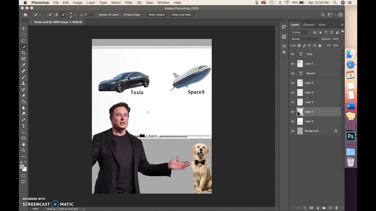
13. Layers: Let's say I want to place an image in this
Photoshop document. You already know this by now. We need to go to File
and then Place Embedded. Now I would select my
image and click on please. I don't want to resize it, so just click on this
button right away. Now let's say I want to place a second image in the
same Photoshop document. Can I do that? Well, I can. And all you need to do is
just repeat the same process. Go to File, place Embedded, and I want this image. Now, I do want to resize it. I were to use this handle right here and click and
drag to resize it. Now I can click and
drag this image and take it to my
desired location. I'm done with transforming it. So I can finally click
on this check button. Now that we're done
placing both the images, Let's say I want to
move the first image, which is the red image, a bit to the left. What do we think? Can I do that? Well, there are two
possibilities here. The first one would be, yeah, I can do that. I can just click and drag
it and move it to the left. But the second possibility could be that after placing
the second image, these two images, meaning the Mona Lisa painting
and the red wall, combined into a single image. And now I can't move one
of them independently. So pause the video
and take a guess. Assuming that you have taken
a guess, the answer is, you can move an image
independently in Photoshop. And that brings us to the
topic of this video layers. So as you can see on the
right side of your screen, you can see there are
three panels here. One of them Is layers. If you don't see layers, makes sure that you go to Window and Layers is checked or just go to Workspace
Reset Essentials. I would recommend you doing that if you're following
along with this course. So coming here, you can see that we have our
Mona Lisa painting. We have a red wall
and background. Now what does all this mean? Well, all three of these
are called layers. So what happened was when
we placed the first image, it created a new
layer for that image. So this is that layer. You can just click anywhere
here to select this layer. And when we placed
our second image, it again create a new layer for that image curves that layer, and by default, we get
a background layer. Now coming back to our problem of moving the red ball image. So either press V or click here and make sure you
are in the move tool. While following
along this lesson, now, use your cursor, hovers it anywhere
over your image, and then drag it
towards the left. Now, if you would
repeat this process and your cursor is over on
the Mona Lisa painting, then it is going to move
the Mona Lisa painting. Well, this is happening because
auto select is checked. What auto select does
is that it would automatically select the
layer your cursor is on. So if I click on this layer, the red ball image, see it selects red wall automatically. Now notice that red
ball is selected. And when I would click on this image on the
Mona Lisa painting, it would say like Mona
Lisa painting layer. This option exists because
when you are working on a complex document that might be like layers in the
triple digits, and it would be hard to move one layer when there are
like 99 layers on top of it. So turning auto select off
would give you the ability to just move the image
that you have selected. So if here Monalisa is selected, even if my cursor is not on it. So notice that my cursor here is not on Monalisa
as painting image. It's on the red volume, which if I were to
click and drag, you can see Mona Lisa
painting is moving, not the red wall image. I would place it back again. Similarly, if I would select the red wall with Window image, it would move the red ball with vend or not the Mona Lisa. Even if, like my
cursor is over here, or literally on top of this
image, Mona Lisa painting. Now that you know a bit
about how to use layers, we need to talk about why do
we have layers in Photoshop. In fact, in the earlier
versions of Photoshop, there were no layers. So it's not like Photoshop
originally came with layers. It came through an update. Here's what does the
benefit of using layers. So bad. Then let's say you're working on a Photoshop project
and your client wanted to make a change
to a symbol genes, like changing a font or a
color of something somewhere, then it would be
really tedious for you to make those simple,
trivial changes. But now that we have layers, those issues are now long gone. As you just saw, I was able to move
both the images independently without any issue. Now, to understand this better, let's look at it from
a different angle. Now you can really
see what's going on. At the very bottom, we have our white
background layer. On top of it. We have
our red wall layer. And then on top of that, we have our Mona
Lisa painting image. Now as you can see, these are three different layers independent of each other. This is the reason why
we were able to move both of those images
independently. Now, imagine if Photoshop compressed these three images into one, what would happen? Well, we won't be able to
move the individual images. Now let's come back
to the top-down view. And I think now you would understand why we
see everything as a single image when it really
is a collection of layers.
14. Raster Layers vs Smart Objects: Let's get the crab and let's move straight into the lecture. So in this lecture we are going to discuss about raster layers. So to understand them, you need to come right here. You can see that this layer has a small icon. This one in the, in the lower right side corner, bottle, those layers have that icon. And this Eigen means that these are smart objects, these two smart objects. And now first, you need to know what our smart objects, okay, on this layer is a smart object and as you know, I have resized it and made it smaller in the last lecture. So what I will do is I will press Control or Command D again. And you can see I have my transformation handles. And now I would make it very, very, very, very small. And I would click on the check mark. Now I word press Control Command D again, and now I would make it bigger again. Alright? Now you can see that there is no visible pixelation. Here. The image is as it is. So you might be thinking, all right, that is what was expected, right? But now let me show you by making this layer invisible. And I would make this layer at rasterized layer. So for doing that, I would right-click on the layer and click on Rasterize Layer. So now you can see the mock object icon is no longer here. Now I've heard press Control Command T and make it smaller. And click on the check mark. Now I will press Control Command D again. And now I will make it bigger. And I will click on the check mark. You can see that there is visible pixelation here. There is a lot of pixelation impact here. And that is the difference between that asked today's Leah and a Smart Object, Leo, what Smart Object layer does is if you have an image and then you make it a smart object, and then you make it very small, and then you resize it to its original size. It retains its information of the original size. But water Rasterize Layer does is venue would make it so small. Then it would burn to the information of the image. It would burn all the extra information that was required for the higher resolution image. And therefore, when you were again upscale it, then it would be pixelated to you. So the takeaway here is that whenever you know that you are gonna resize the image very much, then you would use smart objects and, and if you need to, then you would use Rasterize Layer. Now you might be thinking, why should I use Rasterize Layer? I should always use smart objects rate, but that is not always the case. The thing is. That there are some filters and there are some tools in Photoshop that are only able to work with rasterized layers, such as a very important tool, the brush tool. And that tool can only be used on rasterized layers. So that's the thing you need to keep in mind. But there is work around with that also. So suppose. So I would make this layer visible, and now I would click on its thumbnail twice. And I would click on OK. And then you can see I am in a separate document. After clicking this and this Smart Object thumbnail, I am in that specific image, and this image is right now at asteroids you can see it is not a smart object, and that's a very important property of smart object. Now see what can I do? I would select the brush tool from here. You don't know what I was told what it is right now, but you were no data in the lectures. But for now, just keep in mind that brush tool is just a brush that you have in various different software. Ci can be individualist, right? It's just a brush. So I will do anything. I would write the with terrible handwriting and then I would save it Control S. And I were okay. And I would get back to my original document. And you can see that whatever I did here is updated here. And now I word press Control Command T. I will make it smaller. I would click on the check mark. I will press Control Command D again, and then I will increase the size of the layer again. And I will click on the tick mark and you can see again, the smart object retains its original inflammation of the higher resolution image. So this is a walk around I usually use because see if this is a smart object layer and you were to use the Brush tool, you can see I cannot use the Brush tool. The smart object must be rasterized before proceeding. Proceeding edit contains will no longer be able and be available. It esterase the smart object. I will click on cancel c. So I cannot use the Brush tool here because this is a smart object, but I can do so if I double-click on this and I would have a separate document with that image. And now I can do anything. I need to save this. And the property of Smart Object of retaining its original size. I would have dark too and I would have the heritability to. So that is it for this lecture. I will see you in the next lecture. And also a side note that take this like-minded levy avert, use layers, Rasterize Layer Smart Objects, Wally much in this course and you would get the idea of it as you go through the course.
15. Transforming : Hey everyone, welcome back to yet another Jan. In this lecture, we are going to discuss about transforming. So previously we have already discussed how to place an image. Now you would have noticed that whenever you place an image by default, you will see transformation handles. If you don't know what I'm talking about, legis place an image right now. Let's go to File and then simply place embedded. Okay, now let's select any image. Let us choose this one. Right? Now, you can see I have these transformation handles. So these square boxes are what I refer to as transformation handles. Now, there is a possibility that you might not see this. And if that is so then let me click on the check mark. And then for that you would need to go to edit and then preferences. If you are on a Mac, then it would be Photoshop references. Then go to January there you need to make sure that this option is checked off. Skip transform when placing. So if this has checked on, then you will not see that transformation handles. If this is checked off, then you would see them. Also make sure that you have taken on always create smart objects when placing, because it's very useful. Because if you have a smart object, then whenever you would scale it, whenever you were scaling, then it would remember previous information of high-resolution highest sites we have already discussed about smart objects, right? So here is our image blazed. And if you want your transformation handles back, then you just need to use the shortcut controller command fee that will bring you back your transformation handles. And now I would like to show you to shortcuts. So first one would be the Shift key. If you would hold shift down and then you would transform, then you can see it doesn't maintain any ratios. So what do I mean by that? If I let go of shift, then you would see that this is maintaining its proportions. It's not changing its proportions. And if I would hold down shift, then it won't change its proportions. I do use it sometimes, so it's quite helpful. And if you are on an older version from CC 2019, then I think that it would be inverse. So if you are on a previous version from C32 AND 19, then you might have to press and hold shift to maintain proportions. I would suggest to just try that out. And then the next option would be with Alt or option. So for PCI is you would need to use old and for Mac you would need to use option. So if you were present her art auction, then it would scale from the center. So it will do something like this. And if you press and hold shift to wet, pressing and holding all, that means you are basically holding both of those keys. Then it does both of them at the same time. It's just scaling from the center and also not maintaining propulsion. Again, if you are on an older version then cc 2019, then the shift scenario will be completely inverse. Alright, let's do something like this to vertex. And I will press the Enter key on my NUM pad. To accept the changes. Alright, that looks quite good. And yeah, that is it for basic transforming. Now let's get a bit deep into this controller command P again for transformation handles. Now let's right-click on this. So first option would be placed and the act similar to checking on this and placing the Enter key on your NumPy. And also if you don't have a full keyboard, don't worry, you can use Control Enter or Command Enter. Then the next option is cancel, which is just like this one, pretty obvious. Then scale your contains its scale. Then the next option is rotate as symbolize it sound, it would enable rotation. So if you were to how i occurs near the handles, then you will be able to rotate it. Now just abroad tip, if you're pressing hold shift, then it would rotate in 15 degree increments. So 30 degree, 45 degree, and 60 degree, etcetera. So let's bring it back normal. Then the next option is skew. So as the name suggests, it will enable you to do something like this. And I would argue that control command Z, then perspective, perspective as kind of Very good. I usually use this prospective as very helpful, but I don't want the changes, so I would undo this. Then the next option is for the start. So they start would allow you to do something like this. So this gives the image three-dimensional look. So I quite like this. I would undo this. I just don't do it because yeah, it was extraterritorial. Then rotate 180 degrees, as simple as it sounds, 190 degree clockwise and counterclockwise. Let me draw the data again. Now, warp, warp is kinda cool that var p you would get these handles. So can you see these small points? You can move these, these are actually handles and you can warp the image as you want. I really use this one. And this is actually very helpful. So I would recommend to go ahead and experiment with this option because it's very equal, believe me. Then here you can change its great options. For example, you can keep it five-by-five and you would see these many handlers and they will allow you to customize, customize it even more. But if you want, you can choose from three by three or four by four, etcetera. Alright, then let's keep it. Alright, let's press Control Command D Again. Let's right-click. And the next option would be flipped horizontally and flip vertically and speak for themselves. So let's do that again. We are back. Alright, now, did you saw these five options? Now, look at these five options. You actually don't need to every time go and select them. We have keyboard shortcuts for them. That's the prototype. Always use keyboard shortcuts for these options. Never used them by right-clicking because V1 to use for the shop like a boss or how do you say? I'm not sure, but yeah, you can read the text, right? Alright, so what we are going to do is use keyboard shortcuts for all these five. So for scale, what do you need to do is simply just how all your mouse near the tube, which is right here. And then you will be able to change the scale. And if you choose the scale option by acting and then you would not need to go ahead and hover your mouse over the cube. You can do it from wherever you like. It would just scale. It won't do any other thing. So let me demonstrate that to you. Better control command t, If I were not Tuesday scale option and I would have here, then see It lets me scale. But if I would go a bit to the right, you can see the cursor into the rotation, coarser thing. So now I can rotate it. But if I were to right-click and scale and select scale, then if I were moved my cursor towards right, then it will not change into rotate. That's the only difference. Now going to go to the Monday again. And now the second one will be very clear that rotate one. So you just need to get your costs are just in the right spot, just right here. And you would see your cursor change and then you can rotate. Now for skew, you just need to press and hold Control or Command key on your keyboard and you will be able to skew. And this is also distorting the image at the same time. You can do both at the same time. And if you just want to use skew, press and hold shift, and it would just skew. So let me show you what I mean by that, or do right-click and select Q. That was ordered skill, then you can see it just moves it in a single straight line. But if I were to distort, then I can take it wherever I like. Right now. Keep that in your mind and let's do it again with keyboard shortcuts, Control, Command, pissed down. And then see, this is the starting, right. That means I can move this point anywhere I want. But if I were present who are shift, then I can only move it in straight lines or 15 degree angle. So yeah, that's it. So in terms of the right-click option, this one controller command shift one would be called skew and without pressing shifted would be called distort. That's quite simple. Then the next option would be prospective. And prospective is quite easy. Let's go back and draw command t. You just need to press control shift and art at the same time. So for MCAT would be Command, Shift and option at the same time, pressed all those three keys and see we can use the prospective. So that's how you can transform an image like a badass. Because that's how I want you to use Photoshop like that. Alright, so that is it for this lecture. I will see you in the next one.
16. How To save a Project: In this lecture, we're going to learn how to save a document. So here I have a document, I have clearly a Senate and I wanted to save it. How can I do that? So for saving a file, you can go to File and then Save. If you would click that, you would see this window. And here it's asking you whether you want to save it on cloud or if you want to save it on your computer. If you want to save it on your cloud, click this button or else, if you wanted to save it on your computer, click this button. I would click this one. And here you can choose variable you want to save it and save as type. Here you can select which file format do you want? Photoshop be SDP, DDP, SDD. This is the Photoshop document file format. And if you would see you in this file format, then you can come back later and edit from wherever you live. So let me show that to you real quick. If I would save this. And here it's asking me for maximum compatibility. I check on. And here it says Don off maximum compatibility may interfere with the use of BSD or BSB files in other applications, orbit other versions of Photoshop. So I don't want that. I use Photoshop with after-effects and Premier Pro. So I don't want that. So I always gone maximum compatibility. Howard, click on OK. And now the document is saved. I just need to locate it. See here it is. This is our Photoshop document. And if I were to close this document here, let me close this one. And now I will double-click on that. And you can see it has open that document inside of Photoshop. So there are drawbacks of BSD. The obvious drawback is that you would not be able to use this image for any other purposes outside of the Adobe suite. Because if you want to do anything with your image other than Photoshop or it'll be sued Voc, then union to save your data.
17. Section 3 : Some Important Tools in Photoshop: And we're going to talk about every single important tool in Photoshop. Now there are around about, as I know, 69 or 70 kind of tools and Photoshop. I would write it on the screen. But the point is that every single tool is not important in Photoshop. So I have segregated tools into two sections. Saw the four section would be this one, and the next section will be section five. So in this section we are going to talk about more important tools. And in section five, we are going to talk about some not so important tools. Tools in Photoshop our way, very important tools are basically in the left side of your workspace. And to explain tools to you, I would use the analogy of actual tools, actual hardware tools like hammer, screwdriver, playa, etcetera. So these tools, hammer, screwdriver playa, etcetera, will help you to do some stuff. And they are good at doing one thing, but suck out everything else. Salts such as Hamill is great to create for hammering nails, but it can never screw, screw N, you would need a screwdriver. So similarly in Photoshop, you would have certain amount of tools and you will be able to use them to your advantage. And every single tool would have its advantages and disadvantages. So, yeah, there will be a hammer that will be great at hammering. And Edward suckered screwing in a screw. So I will see you in the lectures.
18. Move Tool: Hey, everyone went back to yet another lecture. And in this lecture we're going to use our very first 2a, which is the default tools elected in Photoshop and that is move to it. So it's located right here first and their tools bar. And this would be the default to. Now, if you are using an older version of Photoshop, the symbol might look a bit different, but they work exactly the same. So Move tool, as the name suggests, is used to move stuff around. So this is an image. I can move this around however I like. Now let's place it where it was. So move to is a tool which allows you to move stuff. Now, it would move the layer that you have selected by default. So I have this layer selected. That's why it's moving this one. And if I would select the background layer, it won't move it. Now, that's counter-intuitive, right? If I have selected the Background layer, they should move it. But why is it not moving it? And the reason is that the background is locked and when alleles is logged, then it cannot be moved, it can not be touched. So to unlock this layer, you need to click on the lock ones and it unlocks, Yeah, it start simple. And if you want to lock it again, this hit this log key or this log button and you would lock it again. But I don't want to lock it so I would unlock it. Now. I can move it, but you can not see I have moved it. The reason is this layer is above it. That's why we can not see this one. So let's make this one invisible. You can see this white rectangle. It has been moved. I can move it wherever I want. And it's moving this rectangle, not this image, because we have not selected this LEO. Quite simple. Alright, lets it escaped its options, but first option would be auto silicon. Now, auto select is quite useful. If you choose auto select, then it would automatically select whatever you are hovering on. So here in this case, we have selected the background layer, which was actually the background layer. Now it's just direct byte rectangle. And what we have learned up till now, if I were to try to move this layer, it won't happen because we have not selected this year. But with auto select checked on, what should happen is it should automatically select this layer for us to, in order to move it. So let's try to move this layer. And it should move it. And you can see it is able to move it and it has automatically selected this layer. So that's what auto select does. But I will give you a personal tip that I use and that would be to uncheck auto select. And whenever you need auto select, displacing hold Control or Command key on your keyboard. And you would see that auto select automatically turns on. So whenever you want auto select, you can use your Control Command Key, two, twos dat, and whenever you don't want it, you would not have it. Because many times auto select, there's messes up things. So suppose I want to move my rectangle, but I would not be able to do that because autotelic will be taken on. So if I were take on auto select and I would choose my rectangle and I will try to move it, see its not. Moving it because it's selected this. Now let's check off auto select. Let's come to the layer 0, which is the white rectangle, and try to move it. You can see I'm able to move it. So sometimes auto select can mess up things. That is why I keep it checked off and use the controller command key. By mistake, I press the Windows key and as the controller command key in order to select it. Yeah, it's tax. And then the next option is for the Auto selected self and that is for layer or group. Now, in Photoshop you can make groups of layers. So let me show that to you real quick. If I would select these two layers by pressing and holding shift, we can select the other layer. And I would make the group, I would make a group often out of them by clicking on this small, I can. Now I have a group. Alright, so let's duplicate this group. How can we duplicate it? It's very simple. Just press Control or Command Z on your keyboard and it wouldn't be duplicated. But if you want to use the GUI of Photoshop, then you can just drag it and drop it on the new layer. I can do the same thing. Now, let's open this group and we have the exact same thing. Leds plays a bit off from the original group. Now, if you would select layer in order to select and let's keep artist electric Don for, for awhile, then it would select an individual layer which you are powering your mouse on, dragging. But if you would select group, then it would move the entire group. So here it moves. Then direct hope you can see the white rectangle. It moves everything. But if layer is checked on, it will only move a single Leo. Quite intuitive and easy to understand. Then the next option would be short transform current roots. It's very easy if your check, check it on. Then whenever you would, you would be using Move tool, it would show the transformation handles, but I find it pretty irritating, so I keep it checked off. Then the next options are four alignments and they are quite self explanatory, but let's just cover them for, for now. Alright, so first of all, let's delete this one. I don't need this, okay, now, I don't even need that white rectangles, so I will delete it. By the way, I'm just deleting them by hitting the delete key on my keyboard. You can also delete allele or by dragging and dropping it to the bin. And I want that to come back obviously. So I, we're desk and rural Command Z, and that's back. Now suppose I want to align it in the dead center of my canvas, and I do that. It's very easy. You can do that by the movement. All you need to do is you need to first make a selection of your Canvas. You can do that by pressing Control or Command a that would make the selection of everything. Now, what do you need to do is you need to select this option which says align horizontal centers. And here this option align vertical centers. And that would basically just align from both this enters and you would get dead center image. And I will press Control Command D to de-select. So yeah, that's it for the alignment options. You can dive into all of them, but they are pretty self-explanatory, so I'm not going to cover them right now. So that is it for this lecture. I will see you in the next one because we have a lot more interesting rules. Then move to Saudi. Moved.
19. Marquee Tool: Hey everyone, welcome back to another lecture in this section. In this lecture, we are going to discuss about the marquee tool. So the shortcut given molecule is the M key on your keyboard. And it is the second tool just after the move tool will ask discussed on the duals bow. So this right here is the monkey duly favored. Keep your mouse over it. You can see the preview offered rectangular marquee tool. So what it does is it makes selections for you. Now we will discuss what selections are. So first of all, you can see I have selected this image as a leader and I would click and drag. And you can see, I'm making a rectangle out of this. You can see that white dots are marching through this rectangle, and these are also called Marching earns. In Photoshop, these marching ands denote that this rectangle is our selection. Now foretells this election. Well, a selection is something that restricts you from affecting every area inside your image. So suppose that I just want to paint white colour or any color for that matter, into this rectangular box. And I don't want to go out of this. So what do I do? What I do, I will create this rectangular box with the marquee tool. And I would select the brush tool and I will be able to paint. And what the good thing about this is that you can see it doesn't go out of this box. See, I am trying to go out of this box, but I cant that he isn't being the selection. The selection restricts me from going out. And sometimes this is what you want. You want that the yet that you are affecting. Is it restricted? So for example, in an image, you want to change the color of hair, color of hair off somebody. You would select his or her hair and then change the color. If you were to change the color of the hair and would not select the hair, then you would end up changing the color of the whole image. That is where selection tools are handy. But you would not select hair, that marquee tool, you can not do that. There are different tools for data. We will talk about them later. But marquee tool is used to create selections of perfect shapes such as rectangles, circle, ellipse, squared, etc. So this was the rectangular marquee tool. You can select the rectangles with this. And if you want to deselect the selection, you can use the shortcut Control or Command D. I just did it. And you can see this election has gone No. Now what I would do as I will again go to the marquee tool and suppose I weren't perfect, square out of the market will I don't want a rectangle like this. I want a square. What can I do? If I want a square? I can press and hold the Shift key on my keyboard. You can see it makes it a perfect square and it maintains its shape as a perfect square. I just let off the schottky diodes fire changed. So I will address the controller command key shortcut Control or Command D to Deselect. Now let's see the Options bar for this tool. So the first option. Is to make selections. You can see new selection. It says new selection if you hover your mouse over it. So you can create new selections with this. Now, what does the second I can do? It says Add to selection. If you would select this and suppose you selected another area, then you can see it adds to the selection. The selection is not gone. Before when you selected this eigen, what happened was if you were to select a new selection, you can see the previous one was gone. The reason was this is I can for new selection, if you will select, add to selection, the previous election would not go away, but it would add those two selections. And if you would do something like this where both the selections are intersecting, then it would add it like this. You can see that now this one is for subtracting the selection. So I would do this and you can see the selection is subtracted. The intersecting areas of the selections, I subtracted. The fourth and last icon says intersect with selection. I will click that. And what this does is it keeps only the area of selection which is intersecting with other selection c. You can see that this area is intersecting. Now if I were to let go off it, you can see that the intersecting area is only selected. So that's what this does. Now, what does fed them in? First of all, I would descended back to new selection. And what does fed their mean feather mean how much smoothness is there in your edges? Here you can see there was no smoothness because it was 0 pixel. If I would bump that up and our make a selection, you can see that the edges are the most Moodle. And also when I grab my brush tool, you can see some amount of color bleeds out of this election. You might want to do that. You might want to increase the fader when you want to give the image more natural look. So I've heard undo this by Control or Command Z or Z, however you pronounce it. Okay? Okay. Alright, so now I would head back over to the marquee tool and I would keep my fader argv 0 pixels and style. Now what does that mean? See, anonymous dial means I can make rectangles and squares with just like rectangles normally. And if I press and hold shift, it would make squares. But if I were to change the style to fix the ratio, for example, fixed ratio. And I will select a ratio like three is to one. You can see that it would always maintain that ratio of three is to one. Now, if I were to keep the style as fixed size, then whatever size I define here, suppose I define this size randomly. I would make selection. You can see that I cannot resize it whatsoever. I can only move this. I am not able to resize it. Now, this was the rectangular marquee tool, if you would right-click on its icon, you can see there are other three rules also. If you would select the ellipse tool, you can make an ellipse as the name suggests, or if you would press and hold Shift key, you can see you can make a perfect circle. Now, everything that I told you about rectangular marquee tool applies on the elliptical market will also anti-aliasing just means you would have smith smoother edges. That's all it means. It blends the edges of the pixels to give you out smoother edges. So MDS is something I keep check down every time. And the other Boulez single row marquee tool. And you can see I can select only a single row and single column, only single column. It's that simple. So that is it for this lecture, I will see you in the next lecture where we will be talking about the law school. And we didn't talk about selected mask just because it's a whole topic in itself. So we would call it in the later lectures. I will see you in the next one.
20. Lasso Tool: Hey everyone, welcome to yet another lecture for tools. In this lecture, we are going to cover the Lasso Tool. Lasso tool is the third tool just below the market we discussed last. Let's select the lasso tool. And now it's also a selection tool, just like the marquee tool. But what it does is it allows you to make any type of selection. It allows you to make freehand selections. C, I can do anything I want. I can make this random shape and it would select that. And if I would grab my brush tool again to demonstrate, you can see this is what it did. That's what it did. So I would press Control or Command Z or Z to undo this. And our new this also. And I've heard about the last rule again, these four icons remain same as we discussed with the marquee tool. So these four icons are straight grab from the marquee tool. So if I were to create a selection here, and I will create a selection here you can see the previous election was deleted because it's selected the new selection. I can, if I were to select adds election than it would add to this selection. If I were to subtract selection, it would subtract this lecture. If I would select intersecting selection, then it would, it would just take the selection which is intersecting. This area was Justin intersecting, so this was elected. Now I would reset it back to add selection and feather remains same. It smoothens out your edges and the alias. It also helps to blend in the pixels of the edges of the selection to give you out smoother results. And selected mask, as we said, it will be discussed in later lectures. Now, let's right-click on this tool to see the other tools. The second rule is polygon and lasso tool. What polygon and lasso tool does is allows you to create a straight lines of selection. You can see you just need to click ones to create a selection. I have clicked here. And now you can see, suppose I want to make a selection here, right? Click here. You can see a line of selection has made. Suppose I want to make a triangle, what I will do is I would click here and then I will click again to the starting point. You can see my cursor changes. Notice that, and now I would click again. And you can see I have a triangle. I would raise controller Command D to Deselect. Now suppose I want a pentagon. I can do that also. See now I have a pentagon. So that's how you use the polygon and lasso tool. You just click on the points where you want to break the line. So, so I wanted to break the line here. I clicked here, I wanted to make the line here, I clicked here. It's as simple as that. Then the next tool is Magnetic Lasso dual. I would select that. And you can see that most of the options are same. Magnetic Lasso Tool water does. I will first need to deselect this selection by Control or Command D. And I will zoom in by Control or Command Plus. See. Now I will press and hold the space bar key on my keyboard to drag along and move in this workspace. And now to start selecting, I would click on the edge of the car. Because I want to select the car and I won't see, you just need to drag along the edges of what you want to select. Just drag. It would automatically select by, by looking at your, at the contrast of the image. But I don't find this very helpful. There are better tools for selecting that and selecting these types of selections. I will discuss them in later lectures. I just suggest you to not use the Magnetic Lasso tool. So I will press the Escape key to get out of this and see all of that is gone now. And I can select the width contrast. Contrast is how much contrast would you, except for the polygon and Lasso Tool, frequency determines how often would be the points added. So see it adds point. You can see it added point right there. So if you would increase frequency, it, it would increase the number of points added pixels of length. You go, I would press the Escape key again. And as the title suggests, you can hold the cursor on this and you can see it says He was w to pressure to change pen width. So if you have a pressure sensitive tablet, then you would be able to change the width of the pen with changing the pressure you apply on the tablet. So now that was it for the lasso tool. And I really suggest not to use the magnetic lasso tool. It's trashy. There are better ways to select. So I will see you in the next lecture and in the next lecture we're gonna cover Quick Selection Tool. So can't wait to see you there.
21. Quick Selection Tool: Hey everyone, welcome back to yet another lecture. And in this lecture we're going to discuss about the Quick Selection Tool. Now, Quick Selection Tool is my favorite tool to make selections. Now, you would see in a minute why. So up until now we have discussed about quite a few selection tools. So for example, we are talking about the marquee tool. We had talked about the Lasso Tools since regular Lasso Tool, polygon and law school and the Magnetic Lasso tool, which I completely hate, I never use it. Then we are going to use the Quick Selection Tool. Now, let's see how it compares. So suppose I want to select, let's say we want to select this trashcan. So what do we do? First of all, I will zoom in and all we need to do is just drag a little. And you can see it makes selections, By the way, just make sure that you have selected this icon and it would automatically switch to this one. But when you're starting, just make sure you have selected this. Then the drag out and you can see how magically it selects so much so fast. And I know it has not selected quite good here, but we can fix that. First of all, let's get a basic selection down. And that all looks quite good. I know it's quite bad here, but I'm not looking for that perfect selection right here. Now, there is a little part that I think is extra for that. All you need to do is press and hold order option and click you. That would subtract from the selection. You would have seen that tool switching to the minus sign from the placenta. Notice the plus sign. Now it would change into the minus sin. And that's happening because I President hold or if you are on a Mac, then just press and hold option. Alright, that's cool. Let's select this one to make the brush a bit smaller. And how I did that, that's very easy for PC based in whole or part. And then see it has into a task known and one negative Eigen because I have pressed and pressed and then press and hold right-click, then you will see this changes into red thing, red circle. Then if you move it towards it, it would increase the size. If you would move it towards left, it would decrease the size. Then if you move it towards, if you move it upwards, then it would decrease the hardness. And if you would move it downwards, then it would increase the hardness. So yeah, in the whole course you will see me using this method. Now for MAG, unfortunately, you guys don't have right-click as Apple. And for that you would need to use control option and then click and drag. But seriously, why don't you guys have right click? Right click is awesome. Alright, that's, and you can see here, if I zoom in, you can see that a bit of area is left, but that's quite easy to fix. Actually, just do this and it would fix automatically. Now, if you think that it's not allowing you to have the ultimate control dentist go to. Yohanan's and check it off. Then you can take the control in your hands and auto enhance or Photoshop. Computing photoshops, EIA would not interfere in your way. But I quite like actually, it works wonders for me sometimes, actually a lot of times. But in some exceptions, it just looks like this one. Now, we don't want this big area. And what happened to my school? We don't want this big area, so let's subtract that present world order option and click, click, drag. And she archways. And you want this area, what are you doing? Photoshop. All right. Now, you need to keep in mind that Quick Selection Tool works based off of contrast. So here you can see that there is not much of a contrast. That is the reason why a Quick Selection Tool is not working well. In this case scenario. Here, the best selection method would be the Pen tool method. And we are gonna talk about pain too soon. You just have to wait for that. But when you would see that lecture, you will understand what I'm talking about for now. Let's just try doing it with the quick selection. I would never do this with the Quick Selection Tool actually. But still I wanted to do was a hard image so that I can show this tool. Do you better? I guess? Yeah, this tool is actually quite cool. Just think about Howard, you have selected this with the last market tools are just out of the choice. You cannot select this trash can with rectangular or elliptical market. You would have to use lasso boots. That regular lasso tool would require complete artist, which I don't think any of us, because I don't think any of you watching, including me, can make a perfect selection of this TransCanada regular lasso tool. And if you do, if you do use OBS of free program to screen record your screen and then p centered to me the quad at 85 Instagram, please, please. I would be thrilled. But coming back to the point, you would not be able to make the selection with any of the last four pools that are going to lasso tool would not work for most of us. Yeah, I gotta have to say now most of us and polygon Alaska is out of the question because it cannot make selection of curved edges. And if you would try to make selection, then it would take you 24 hours, then the next option would have been Magnetic Lasso rule. And as I told you, that tool sucks. Just download this image and then test it with the polygonal lesser. You will know what I'm talking about. Alright, let's subtract that. So we have successfully made a selection of this trashcan, began to anything with the selection. For example, let's use the Brush tool. We will talk about it with a brush to later, but for now, just take around with me. Let's make a new layer and you just need to keep in mind brush from MSB and Russia is very simple. You just need to drag and pain proceed. I have white, then asthma foreground color, and let's choose a lighter it on rate. You can see the selection is helping us to stay within the boundaries. If I wanted to pay into it just the brush tool on the trash can, then it would have it would have been quite difficult, but that a selection, it's quite easy. Now you can see that this is not looking good. We need to add this election, and I will show you how you can do that very easily. And that is with the last sort of, you can do it with the Quick Selection Tool two bar, I exist for whatever reason prefer the lasso tool. So what do you need to do is just go to the Lasso Tool, regular law. So dual is what I would prefer and Bayesian horse shift key. And your eye can work done into this and then make a selection of this abstraction. And it has been added to the selection quite easy date. And that's how I use the lasso tool actually, just to assist other selection tools or other selection methods. Now, let's switch back to the brush tool by pressing the beekeeper. And yeah, see you. Paint. Quite cool. And now you can see B, how Also messed up here. Let's go to the last rule by the L key and pressing and holding Shift. And let's make a selection. Now, it's done before the brush tool. Let's paint here. You would have noticed that I quite heavily used keyboard shortcuts. And I would ask you to do so to, because keyboard shortcuts Eduardo makes you bad ass. Alright, now finally to de-select your selection, you can press Control Command D, and that will deselect. Obviously, let's go back to our quick selection tool and then let's discuss the options. And the next option would be sample oil layers. Now, if you have not selected, for example, not selected sample or layers 10-watt would happen. You asked elected Quick Selection Tool and suppose, Let's make the brush first of all, are a little bigger. And suppose you want to select this white, whatever this is, white cardboard, I think. Yeah, so let's try to select that. It is not selecting it via. The reason is that this is not pleasant in this layer. The layer one. Layer one is just this bread painting. There is nothing in the layer one here. But if you would select this LEO, the trash Cleo and do this, it selected. So to prevent this, Photoshop has a pizza.
22. Object Selection Tool: Hey everyone, welcome back to yet another lecture in the dual series. And now the tool which we are going to talk about today in this lecture is the object selection tool. So here is the object selection tool. I would select that. So now, what is the object selection tool? So do you remember what is select subject? The thing he died here? We discussed about select subject in the last lecture. So word select subject does, is it analyzes the image and guesses that which part of the image is the subject and it tries to select it. So now, suppose you can dell Photoshop, that Photoshop just look at this specific area for this object. So let me give you an example. So this is the object selection. Do lie have selected it? And I will select this watch. I just need to make a rectangle around this watch. And I would let go of the mouse. And you can see that it has made a spectacular selection of the watch. So now how is it related to select Subject? The answer is that it uses the same technology as the, as select subject. But VR just telling Photoshop that Photoshop don't look all over the image for subjects. Just look in the area that I have specified to you. Though, I would cancel the selection by using the shortcut controller command B. And this election is gone and we will try using selects object. Let's see what it does. Okay? You can see that it has elected this heart. It has elected this phone's Brazil, this lens and Dart to naught very clearly. So you can see it does not do a good job at this because there are way too many subjects in this image. So what objects Selection Tool allows us to do is just restrict the area in which photoshop searches for that subject. So by now, you would be pretty familiar with these four eigenstate. The first one is for new selection, the second one is four, add selection. And third one is four, subtract selection. And the fourth one is 44, intersect with selection. And let me give you an example of art selection. I word cancel these selections by Control or Command D. And now I will select this watch again. And now I would select our selection. And I would also say like this lens. So you can see that it added to the selection I R. Now suppose I also want this phone. So it has selected the phone to, now I warned the heart and glasses. Also. It has selected the heart and glasses, but not a great job there. But you get the idea about ARD selection and subtracts election. Same thing. It would subtract this election. Pretty easy intersect selection. It will just try to select the subject from the intersecting area of those two selections. You will be pretty familiar with this because the last few lectures, we are discussing these again and again and again. So now the second setting is mod. You can select from rectangle and lasso. So rectangle, as the name suggests, you can draw rectangles. And lastly, you can use for free hand selections. So I can make a free hand selection like this. And it still IN intersect mode, I need to get a new selection mode. And yeah, you can see it did a pretty good job, but not that good. And suppose I want to add this also, but I don't think I would be able to add because I have not selected adverse selection. It would be a new selection. Yeah, that's good. So that was modes. Now sample all layers. You all know that auto finance at, you all know that we have discussed them in the Quick Selection Tool lecture. So the third setting is objects subtract. What objects or subtract does is very nicely shown by this Jeff inside of Photoshop that it could subtract from the selections which it thinks is the part of the subject in which in this case, it was the area between the handle and actual mug. Actually what I did was I downloaded this image and I tried to show that example live to you, but I was not able to do that. Photoshop was not able to carve this out. So sometimes it doesn't work. So that is why you need to learn all the selection tools. Because if I were to use the Quick Selection Tool here, I will be able to get rid of this selection. I would press and hold Alt key so that my brushes now negative. So it will subtract from this election and I would click and click again. Again. You can see this did a pretty good job. Barred began do better than this by using the pen tool. But we will talk about the Pen tool in later lectures. Pen tool is a fabulous tool to select curved edges, but we will talk about that in later lectures. It was just a sneak peak for that. So that was aired for the objects selection tool. All I wanted to say at the last is it's not a 100% reliable, but it would make your job easier and less time-consuming. So what I suggest is when you have easiest elections like these, you can just use the object selection tool that you have, a raw selection, and then you can use other tools to refine that selection. For example, that selection of this lens, you can see that there is a slight discrepancy here. You can easily fix that by the object selection rule. I would quickly show that to you. Quick Selection Tool selected old key pressed down and you can see I clicked and removed that from the selection, are now it's perfect. So that was it for this lecture. I will see you in the next lecture. We would be talking about the magic wand tool. I would see you in the next lecture.
23. Magic Wand Tool: Here one will come back to yet another lecture in the series. And in this lecture we're gonna discuss about another selection tool in the same group as the Quick Selection Tool. So let's go to that tool. And that tool is magic Born rule. You can access that by clicking this icon so that you can see all the tools in this group. So I would select the magic wand tool. Now, what does magic one rule does? Well, it makes selections. But what sets it apart from other selection tools is that how it makes a selection. It makes a selection based off of colors. So for example, I want to select this guy. I would click on this guy. So you can see that it selects the blue color in the sky. And so what it did was it took the sample of color that I clicked on and it thought to itself, okay, I need to select similar colors to that of the sample. So that's the general idea of the magic wand to. So by now you know what for icon's do? I'm not going to discuss them again. So the next option is sample size. And what does that mean? So for that, you need to have a quick look on again, how this toolbox in depth, when I click on the image, then it samples the colors from its pixels. So here you can decide how the sample is taken, whether it is exactly the pixel's color sample, or you want to average it out by three-by-three square, or a five-by-five square. So what does three-by-three mean? So suppose you have a square which has smaller nine squares in it. So now these squares are your pixels, these smaller squares or your pixels. So what Photoshop would do is it would average out those nine pixels colors, and it would give that average value to you. So you can decide from here how many pixels average you need. So you want it to be a three by three squared. And then you can select that five-by-five square, 11 by 11 square, 31 by 3151 by 40, etcetera. So I would select three-by-three average. And then what is tolerance? So tolerance is the most important option in this options button. So tolerance means how much change in colour food the magic 12 will tolerate. So suppose I decreased the tolerance to 0 and delete this selection by Control or Command B. And I will click now. So you can see that it made up pretty small selection. So tolerance 0 means it would select those nearby pixels which have the value exactly as the value I sampled. So whatever the three-by-three sample I got, pose it had a value x, then it would only select those pixels which have that exact same value X. But as you increase the tolerance, it would tolerate more and more changes between the colors. So suppose I click again. Now see it has we selected the vast range of colors. Now suppose I want to select more of this guy. I would select add selection and I would click again and again. Yeah. So you can see that it did a pretty good selection of this guy. So that's where the magic wand tool comes in handy when you want to make color based selections. That's where it comes hungry. So now anti alias, I have talked about it before. Contiguous. I have not talked about that before. So I would talk about it now. So you need to keep one thing in mind when using Photoshop, that whenever you don't understand what an option does, just keep your mouse over it and it would tell you sample only contiguous pixels. So what does that mean? So that means that it would only sample the pixels which are nearby the sample area you will have selected. So suppose I remove contiguous and I deleted this election back ontological Mandy. And now I would select again. You can see that what it did was it selected this area also? It didn't amid a continuous selection. Now, I were to delete this selection also. And I would check on contiguous. And I would take again, you can see it didn't make that selection here because it was not a continuous selection. If so, based on your use case, you can toggle that on. I have also talked about sample or layers in previous lectures. So that was it for the magic wand dual. So summing up, I would say that magic wand tool is only used when you need to create selections based off of column. So that was it for this lecture. I will see you in the next lecture where we will be talking about crop.
24. Summary of Selection Tools: Hey everyone, welcome back to yet another lecture. In this lecture we're gonna just have a quick summary of every selection tool we have looked at since now. So the FAA selection tool that we talked about was our market would now marquee tools are quiet, easy. They just how a particular shape and deselect that particular shape. So if you choose the rectangular marquee tool, it would make a rectangular shape and make a rectangular selection and elliptical or make a circular or basically an ellipse. So that's pretty basic. So then the actual, then from the last school is where the actual selection starts. Now, that doesn't mean that market is not an actual selection tool, but it's just that whenever you are using to select intricate selections, you would look at the Lasso Tool Group and the Quick Selection Tool Group, but naught are the market. So the lasso tool allows you to make 300 selections. So if you'll check the lasso tool, you are free to make any selection based on your skills. Now, as I said, that I never use lasso tool as a mean selection rule, I just use it as an assistant for other goods. So I demonstrated that in the Quick Selection Tool video when I was making selections and I had fewer problems with my selection. I just connected them with the lasso tool very quickly. So yeah, because at that time, if I would have use the Quick Selection Tool, then it might have messed up with the selection. So that is why I prefer using the lasso tool for that then polygon Alaska. So Polygon and lasso tool as also a quite interesting tool. I really like it. So I will press Control Command D to D select right now. And if you want to select straight edges, then Polygon, a lasso tool S quite good. If I were to zoom in a bit. And if I want to select straight, I just see, I just need to point on turning points or whatever. And I can make selections quite easily. So, yeah, I really like this option. Alright, let's scrap that. We don't want that right now. Okay, so that's how you can use the polygon and lasso tool. Now magnetic classroom, Let's just not talk about it. Alright, I will give a brief description. It's us. It completely sucks because we have discussed this image in the Quick Selection Tool. Now, see if you would make a selection with the Magnetic Lasso tool. You can see that it's not as easy to correct as it is with the Quick Selection Tool. And also it says something about it. It is the customization that I don't like with the Magnetic Lasso bored, it's just not a good tool to be able to customize. That's why I hated, because I cannot go back into the selection easily and customize this election. It's not estimates. So that's why I hated Codec Selection tool would be way better for this. So that's a proper segue to the Quick Selection Tool Group. So right click there. And you can select from objects election to magic one tool and Quick Selection Tool. So objects election dual is the first one. So let us discuss about that. Now. Objects election dual is select subject, but where you can select the range. So suppose you want to use selected object, but you want to select this white area, this white cardboard, but selects object is selecting this trash cans. So how can you fix that objects selection tool would be done, and so you just need to select dark white area and objects. Election would do something for you. And let's see what it can do. Alright. It's taking a lot of time. I would just add at this point. Okay. As soon as I said, God, it did this. And you can see it has made a pretty good selection of that byte Cardboard. So that's how objects election tool is. And let's turn on auto announced. I think it might help, so but I'm not gonna do it again because it takes a lot of time, right? Then I click now again, and on Mac it would need to belong press, then comes the magic 12. Now magic 12 is r two, which is criticized by a lot of people. It's quite polarizing. Look, magic wand, tool, voice, quite good. Ven, color range and channels method were not popular, but nowadays, people use colorings and tunnels. We will talk about both of these methods in detail later in this course, but for now, just bear with me. So these are two really good methods for making quite good selections. And now that we had these methods, nobody wants to use the magic one, poor, little, poor magic one. Alright, let's get back on track. And the thing is, many users call it the tragic one, because seriously is sometimes. So I've ordered to suggest you not to use it because there are better options, which would be the coloring in the method and the tunnels method. So yeah, that's what I would like to say about the magic wand tool. Very solid colors like this one. And you want to make quick selections there you can use this one and it works quite good. Let me show you just use case that I use it for. For that I would place an image file and then pays embedded. And it should be right here. So this is a photoshopped logo, as you can obviously see. And I wanted to remove the byte borders from it. So I use the magic wand tool, selected the wide borders, and it just amazingly just selected them. I ticked off contiguous because if I left it on, then I would have to click every single corner separately. But yeah, you have kept it off. So we get this thing and I can remove that how I want. But I cannot do that right now because this is a smart object. I would right-click and rasterize it. Now, I can base their delete key and it will delete those white areas Control Command D and deletes them. Quite cool, but that's how I use magic worn pool nowadays for just solid color selections, very simple selections for selecting things like sky, sea, or these types of things. I use the color range method or the channels method. So yeah, that was aid for the summary Vivre talk about most of the things we have teased about in this lecture. For example, channels, method, color range, mentored, exedra, much more interesting things that are coming up. So stay tuned and I will see you in the next lecture.
25. Crop Tool: Hey everyone, welcome back to yet another lecture and that dul ses. And in this lecture we are going to discuss about the crop tool. So a crop tool is 1-2-3-4-5, fifth tool. And that was bad, at least for me. It may be different for you. I don't know, but you can select it by clicking here or you might not have it here. You might need to right-click here, and you might have selected another from these four. So make sure to select Cropper. And i have, so you can see I have these handles radio. So as the name suggests, crop with this tool, I can grow up any which way I weren't right now. And see. Suppose I want to just get those benches so I can do that easily. See, now I have just those benches and I were praised the check mark there. And you can see I have just Avengers. I have successfully cropped the image, but I would like to go back. I would do that by controller command Z. That's for undoing. Let's look at the options, but the Options bar has the first option called ratio. So we can define any ratio that we weren't. Here. I will define four by three. And you can see that I have already a 4-byte tree crop and I can also adjust its size, but it would maintain that four is 23 aspect ratio. So I'm happy with that. I would click on this checkmark or else you can also press enter or return key. And i will clear this. And you can. And I also want to go back by Control or Command Z again. And Let's see another option that is w h cross resolution. That means width, width by height, by resolution. So I want to be in 19291970. They knew D and height to be 1920. And I would say resolution to be 72. Yes, 72 pixels per inch. So now you can see it maintains that expect ratio. That's super awesome. And that's very, very helpful. So you can choose between these two, or you can select any of these presets, or you can also make your own preset. I will do this quickly. You can see I have entered, you can enter any name or Jumbo. And now I have a mumbo-jumbo blizzard, which is 1080 by 192072 pixels. But end. How cool is that mumbo-jumbo present? So now the next option on the Options bar as straighten. Straighten is used for val straightening pyramid. Suppose you took a bit which was slightly tilted and camera. So you can correct it. In post, but it would be cropped slightly. So suppose I do a line like this, then it will try to straighten that image with, with respect to that line. So suppose you took an image of the horizon, then you just need to draw a line over the horizon and it will center it with respect to that horizon. I would cancel that and I will draw a line over this. So you can see it rotated that image slightly to make that image Albert straightened. So it happens often that you click an image in your camera, but it turns out to be a bit tilted. So you can fix that in post with this method. I would take that on. And now you can see it's just 0.7 degrees more street than before. And this is the grid option. So you can choose any grade that you weren't. Rule of. Thirds, grid, diagonal triangle, golden ratio, golden spiral. Suppose I selected golden spiral and now see what happens. I will select ratio and see it has that grid. I can use any great I want, I can use the rule of thirds. I can use grid, I can use diagonal. You get the idea right? I will change it back to the rule of thirds. And then is this Settings gear I can sort of, and these are the options. The first option is use classic mode. So classic mode is the legacy more used to be given in the previous versions of Photoshop, but I don't like it that much, so I keep off. And the next option is show cropped area. So where does show cropped area mean? Suppose I would check that off, and now I will try to crop this image. Notice that you are not able to see the cropped area now. But now I will check on that show cropped area and you can see you are able to see the cropped area. So the answer is in the question actually then autos enter preview. So what does that mean? Orders entropy view. You can see right here, the image is, the image is in the upper part of my workspace right now, so I can not see the top portion properly or if I wouldn't have I wouldn't be able to see the top portion properly if this image was distributed Boolean, then auto center of review comes in very handy. Then the next option is enable crop shield. So what does enable crop shield does it reduces the opacity, it changes the color, etc, of the cropped area. I usually leave it are the stock settings and I never ever come to this gear icon actually. So now the next option is delete crop pixels. I recommend you to never, ever delivered on. So let's see what it does. If I check off, delete, crop the pixels, and see if I were to crop this image. And I will click on the check mark, my image. My image is cropped. Yes. And now I would crop it again and see if I can get back that image. If we take robbed earlier, I can get back that area again. So that's pretty cool. But if I click on delete crop pixels and then I were deleted, seawater does, and I would I would crop it. And now I warn that area again, no, I cannot have that C because I have deleted the pixels. So that's too bad and I recommend you to never check that on. So the next option is contained on Earth. And so content are very uses for the shops AI to fill in the blank gaps in your crop. So I will take that on content of air on and now crop again. And I were clicking in. And you can see it loads that blank area on the top, but it felt n that blank area with photoshops AI. Now this looks a bit awful to me. I do not use it that much, but if you have a fairly simple image, then you can do that. So that was it for this lecture. I will see you in the next lecture. See that phi times mumbo jumbo, mumbo jumbo, mumbo jumbo, mumbo-jumbo. I'm probably, probably gonna cut this.
26. Perspective Crop Tool: Hey everyone, welcome back to yet another lecture in the series. And in this lecture we're going to discuss about another crop tool, which is the perspective crop tool. So this is in the same group as the crop tool users need to right-click here. And you could see the respective grower tool. So now suppose I want to crop this image out of this image. So this is a photo. I wanted to go up this photo from this image. And you can see that it's tilted frame, so it's off axis of the actual framing of this image. So the prospective as incorrect. So we can fix that by the respective crop tool. So it's very easy to use. You just need to click on the points where you need to crop it. So I click here, then I will click here. And I just wanted to make a rectangle out of it. Yeah. And I would click on the check mark. And you can see I have that photo now. And this is both perfectly in the right perspective. That's it for this lecture, I will see you in the next lecture.
27. Frame Tool: Hello and welcome back to yet another lecture in the dul ses. And in this lecture we are going to have a look at the frame. So the frame dual as I went into the crop tool, and you would select it by clicking it obviously and the shortcut key for it, as good as you can see here. So what does that do? Let me demonstrate it to you. Just make a rectangle by dragging. And you can make a rectangle or a square. If you wanted to make a square, you can press and hold the Shift key to make a square. I will make a rectangle here. And yeah, I'm happy with that. So this is a frame. Now to demonstrate what it does, I would place image in this workspace. So to place an image, I would go to File and then place embedded. I would place this image by double-clicking on that. And you can see this image is inside the frame. Now, if I were to resize it by pressing Control or Command B, now resize it. You can see it is not coming out of flim, only the area inside the frame is visible of that image. So that's all dataframe dual does. If you want, you can make a circular frame by clicking this icon. That is it for this lecture, I will see you in the next lecture.
28. Brush Tool: Hey everyone, welcome back to yet another lecture and section three or whatever the 16 is, what we are going to discuss about the brush tool. So first of all, brass rule only works with rasterized layers. So for that you need to convert this smart object into a Rasterize Layer. But I have shown you a workaround and with which you can use browse tool on smart objects. So for that you need to double-click on this smart object and you have this layer or on its own. And now you can do it, but I school whatever you want to do. So that's super cool. So let's discuss that. All id offer brush to brush tool as the name suggests, it's a brush with which you control with your mouse and you can paint with it. It's so simple. Now I will press Control or Command Z to undo this. And let's see it's Options bar. So the first option is for dual piece. It's if you have any please edge for this tool, you will see it here, but I don't have and you might not have to. So that's not offer any advantage. And the second one is the Brush Preset picker. So this box here allows you to customize your brush with their own legging. You can select the size, you can select the hardness. I would keep it low, and you can also silicon it from the print please hit like this. General Russia's soft ground soft known pressure precise. So pressure is pressure opacity. These are for pressure sensitive tablets. I have a pressure sensitive tablet, but I'm not gonna use it throughout this course because I know many of you don't. So that's why I'm not going to use that. But I do recommend getting one. And you can see you have different types of brushes which would give you a different type of effects. So I have selected the soft round brush and you can see that it has soft edges. And if I were, select another Brush Preset such as this one, you can see that it gives me another effect. So you can create brushes on your own, but that is out of the scope of this lecture. But you can download videos, brushes from Adobe, Adobe Stock. And there are various visits. You can have a look at them. Read media brushes, especially effective brushes. And the next one is the brush settings dialog. And here you can see you have various different types of pieces. And also you can customize your brush with its size, spacing, spacing of particles, and texture dual brush. You can really get into the brush with these options. But this is out of scope of this lecture and you would rarely use this one. Now, mod is word blending more, do you want for your brush? We have an audio desk is the blending mode because the ds to dad with complicated. So we will discuss them in later lectures and then you would get an idea of them. So for now we're not going to discuss about them. Now what is opacity? Opacity is just the transparency of the pressure. So you can see baths ED, or 100. Just a second, let me make this clear. I did undo this by Control or Command Z. And you can see I am drawing with a 100% opacity right now. Now, I would drop it down to 10%. Suppose 15%. And now this is 15%. You can see that this died now as transparent way too much than this one. If I would bump that up to say 50%. Now see, this is, I'm sorry, 50, 50%. This 50% with 15%, and this is a 100%. So you can see what impact does opacity, mic and now flow. So flow is how much paint blue you have in your brush. So for example, if I have flow at a 100% and I need to pass 80 to 100% also. And I would undo this. Now, I would make this 100% flow. I have drawn this with 100% flow. Now, I will drop it down to 50% is 46% is also fine, dreaded 46%. And this is not to be confused with opacity. See if I were to drop it down to 46%, also, change it 46%. And C, this is the 46% opacity. Brush. C. There is vast difference here. The opacity is not changed. I have just changed flow in these 246% here. But here I have changed the opacity and flow part either can't get to 100%. And then you can see what is like. You can see that it is, it is much more transparent than this layer here. So the thing is, flow doesn't affect the transparency of your brush, but it affects how much pain do you have in your brush? So by that, I mean, suppose you have 50% flow, then to make a brush stroke equivalent to 100% flow, you will need to paint two times. I hope you get the idea. See, this is with 100% flow and this is with 46% flow. Let me change it to 46%. And C, I would draw once again, right? You can see that this is gradually going to look like 100% flow. But the thing is that I need to paint more times to do have the same effect as the 100% flow effect. So the use less flow when we are retouching, because while retouching the need to maintain the Certainly D of the effect. So flow is a very handy feature. Now this option here is for pressure sensitivity. If you will check this, then it would alter the opacity with pressure sensitivity of your tablet. If you were to apply more pressure, it will give you more capacity. If you'd have Laila is pressure, then it will give you less opacity. So here this button, this button says enable airbrushed style buildup effects. So this is just like you are using an airbrushed. So it would build up like an airbrushed C, It makes it solid-solid toilets or entitle. You might want to use it, but I don't use that much. So for explaining smoothing, I needed to go to another workspace. So here I am with another document. So what is smoothing? Smoothing helps to reduce shake in your strokes. So for example, if I were to make a stroke and I will do something like this. And this is a fairly big brush, so you might not be able to see that I will make it smaller. And I will do this. So here you can see that I wanted to call the smart. It was cleared and I made, I wanted this to be beta curve, but it was not that, that is involved. My mouse jittered here. So this guard satellite discrepancy here and various regions. So what smoothing allows you to do is that it makes your strokes v more stable. So in Greece moving to 100% and now I will make the shape. And let's see. So you can see that the second one is vey better than the first one. It's all because of smoothing. So let's see what smoothing does. So here you can change the amount of smoothing and the real deal is here. So first is we'll string mode. Let's go there and see what it does. And bolstering mode is this. When you would hold your left mouse button and then you would see this magenta ring and it would not paint anything. It fueled our Dragon or sorry, inside this ring, you need to go outside this ring in order to do anything. It allows you to make a very stable brush stroke. If you are into this, you can use this. It's all personal preference, but I would turn this off. And second one is stroke catch up. So what this does is you can see very well in their description of it. It says enable pain to catch up when brush cursor movement is paused. So for example, let's see here. You can see that I am painting barter. The paint is little bit behind my cursor and if I were to let go of it, it would catch up. And now I would cancel that. I would check off that and see. I will stop now and it would not catch up to my cursor. So that's what it does. And the third option is catch-up on stroke. And so what Edward do as, so let me show it to you. And for that I will need to undo this. So now I'm going to do this very, very fast and see what I'm doing. Here. You can see that I stroked wh up till here and then quickly moved it to here. So it didn't painted up till here. That as I did joke my brush here, but I certainly changed the direction of the stroke. So now let me show you what it would do if I were to take this on. Now, if I would certainly teens my direction, it would auto complete that stroke. It. We're not just buying desk broke. It will not destroy and change the stroke based off of just meet changing WHO? Edward autocomplete where I left. So that is what it does. You need to experiment with it to get a better idea. So that is it for smoothing. The next one is for changing the angle of your brush. We have around brownish and ending its angle is pointless. So I would use an underbrush and see if I were to change the angle of her. See notice the angle of the brush. Now. I will change the angle. Now. See, the angle is changing. It's as simple as that. It rotates the brush. And then it is always use pressure for size when off recipes that controls pressure. So whenever you don't know what a thing does, just keep your cursor over it. I have said this many times in the course, so that's what I even do because photoshop is such a big software that I don't even know everything about Photoshop late. There are some nitty-gritty stuff that I don't even know till this day. So but this one I knew I needed to show it to you how you can see this. So this I can, as the really good descriptions shows, it will double the size of your brush according to the pressure of your tablet. And then this is, this icon is for maintaining cemetery. See if I would click on vertical, then and I would click on the check mark and then I would pay in here, you can see that it maintains the cemetery, maintains the vertical symmetry. Right? And I would undo this. And now I would change it back to baby. And seeing order does its very foreign to us, but I never use it. So that is one another tool and brush tool group. And that is the penciled Lula and pencil dual is nothing but a brush tool that one pixel size. See, I never, ever, ever use this tool. So you don't need to worry about this. That is it for this lecture, I will see you in the next lecture.
29. Eye Dropper Tool: Hey everyone, welcome back to yet another lecture. In this lecture, we are going to discuss about the eyedropper tool. So now I don't know if it is used to sample colors. So suppose I have a mid-year, and here is the image. Now, I want to sample any column from here. Suppose I want to sample this green. So all I need to do is select the eyedropper tool and click on this area. Now you can see I have the foreground color of mine as dark color. So that's all pretty good. But I would suggest you never to use eyedropper tool. Now, why is that? The reason is that most of the time when you will find a need of eyedropper tool, you would be using the brush tool. So suppose you were painting somewhere and you had the brush tool. I will select the brush tool by placing the V key on my keyboard. And now it's not allowing me to paint because this is a smart object. I would rasterize this layer by right-clicking on it. Now, this a Rasterize Layer. So I wanted to paint here. I painted, I think I shouldn't do this and I will create a newly. Now I would paint. So I painted. Now suppose I want to sample this here. How can I do that? I just need to press and hold Alt or option. And that would give me the eyedropper tool and click and I were sampled that and I would let go of the ALT key. And now I'm back into the Brush tool. So I have selected that color without using the eyedropper tool actually without selecting it. So that's what I said is OK. Now I want you to understand what this thing does here. So for that, I would select the eyedropper tool just for tutorial purposes. I still wouldn't recommend you to use this to. Now, here, if you take onshore sampling ring, then you would see this sort of ring whenever you are clicking and sampling anything. And if you would check off it, you want it. So this is the sampling. So what does it do? So basically, it just helps you compared the color that you sampled previously and the Palo you are going to sample right now. So previously, the color that I sample is shown in the ring in the lower half. That color is the one I sampled before, and the color above it in the upper half is the color that I'm going to sample. Data's the colour which I am pointing out right now. Suppose I would go here and you can see that this is the colour which I am pointing out. So if I were to let go off my left-click, I was pulling it until right now. So that's why the reading was visible to me. And now if you see my foreground color has changed. Now if I were, lose something similar like this, you can see now that new color is my sample, the color and any color I would sample right now is going to be denoted in the above half of the ring. So that's all that the searing does. And just a quick tip. If you want to sample for your backgrounds, watch what you can do is you can press and hold Alt or option, and then sample. That would sample for her background-color. Now notice that I just did it right now. And notice my background color. I would do it again. Notice my vacuum. It is this one, dark, bail greenish. And now if I were press and hold Alt or Option, and suppose I would sample this color, then see my background's Watts has changed. And if I were not ricin hold Alt or option, then my foreground color would change. So that's all good. Now let's move ahead to the next rule that we are going to discuss in this same lecture, which would be Gallo sampler tool. So this tool is pretty straightforward. It's just like the eyedropper tool, but it makes, but it makes points. So let me explain. If I would click here, then see it creates a point here. And this point is named one. So if you would come here into this info tab, and if you cannot see this tab, just go to Window and then make sure that info is checked. So here is the embossed marker that I created. And so here in this info tab, you can see number one and you can see its red value, it's green value and its B value. So that's all that it does. Suppose I want to note this colors values C, The number two, Marco gives me the RGB values of this point. And by doing all of this, we can totally create 10.10 markers. See, you can create these markers anywhere. And when you reach the limit of ten, it would give you enter. Here. You can note every single markers RGB value. And also if you would click here, then it would clear all the Marco's. Now, I would switch back to eyedropper tool. And there is a way to do the same thing but without leaving the eyedropper tool. So if you were to press and hold the Shift key on your keyboard, then you can see it switches to color sampler tool. You can see that I can. Now if I would click anywhere, see it's making mako. It's basically just the color sampler tool. So the advantage of this method is that you don't need to select that colour Sandler tool. It's all within the eyedropper tool. It's both convenient and foster If you were to use this method of pressing and holding shift for this tool. Now, if you want to remove a mako, you can do that as well. Just press and hold Shift and Alt at the same time. However, cursor over that marker and just click, See it removed that point. You can do the same with every other point that you want to remove. That's how you remove mockups. Now, if you have selected color sampler to and with color sampler to lure him, What do you want to remove those markers? You can press and hold Alt or option, and then you can remove them. Remember, if you are in the color sampler tool, then you just need to press and hold Alt or option. But if you are in the eyedropper tool, then you need to press Shift Also. You can remember it this way. See if you are an eyedropper tool. First of all, what you need to do is you need to press and hold shift to get into the sampler tool. And then when you are in the color sampler to, you need to present hold Alt or option so that you can remove a Margo. So if you were Place Order option, It's just that no, that's basically how I remember it. So that's it. Now let's discuss Just one more thing, and that is sample size. Sample size allows you to change how your sample is taken. So point sample would allow you to take a sample of the exact pixel you clicked on. So let me show you if I were to zoom in way too much. And suppose I click here, then I would be sampling from this exact pixel. The exact color of this pixel would be sampled. Now, why I'm telling you this? It would seem quite obvious right now. But if you were to something like three-by-three average, then what would happen is it would create a three by three square around the pixel that you clicked on. Suppose I click Done this pixel, then it would make a square of three by three pixels around this pixel. And then we'll take.
30. Mixer Brush Tool: Hello and welcome back to yet another lecture in the series. So in this lecture we're going to discuss about the mixer brush tool. So this tool is again available in the same group as the regular brush tool right beneath the color replacement will be just talked about. So select the mixer brush tool by clicking on this icon, know, as the name suggests, mixer brush tool. That means it mixes stuff, right? So in official definitions, what makes approach to Luz as blends in pixels around it. So for example, suppose I would paint with this brush on how to face. You can see that it tries to blend colors here and that's all this does. So I wanted to tell you that I am working on poppy off of the background Leo, because I have not you this that always create a backup by just making a duplicate of your background, Leo so that your background is safe. So if you do some weird stuff with this, like this, and you realize it later, and you cannot undo up to that step. So you can always delete Darley and just head back to your original background dam. So that's pretty good. And now let's get back on track. Who makes several shrewd, makes us stuff. Let's see its options, but to know more about this tool. So first of all, I need to undo this because this is weird. Okay? I undo this by Control or Command Z. By now. You should have memorized it anyway. So let's continue. First of all, there is brush presets, then brush settings. Then we have a strange little box. What does that do? Here? You can select any color. Suppose I will tell you what this color will do, but suppose we select any color light this green. And then if you were to click on this icon right here, then you can see the color that I selected as visible. If I would check off this icon, then it is transparent. So now everything comes down to this icon. So what does this i can mean as their description says, lord the brush after each stroke. And that's actually what it does. Every time you make a stroke, Edward loaded brush with that color that you select here. So suppose I would paint on her face like this. You can see that it's painting and green also, because we have selected green iron also check that this Eigen, Bart, I have personally not found this veto as useful. But again, there is a personal preference and also depends upon roject to project. You might get reduced for it, but ideally don't. So the next option now is cleaned up brush after each stroke. So what does that mean? If you would paint and you have checked on this, I can then it would clean your brush after each stroke. That means Edward refresh your brush or any previous paint, any previous sample that you took while painting would be discarded. If I would check off this and pinned, then you can see it's again painting lighter and lighter. But if I were to take that on, then it would gradually go darker. The reason being darted samples again and again and again. So the next is a drop-down menu where you can select any please set for your brush that is dried, REI light load and dry, heavy load, moist, moist laid makes heavy m6, etc. So my favorite is actually the moist light mix because I'm just trying to grow it. But I think as Tom would be good for this tutorial and usually I'm accustomed to. So now what does it do in coffee? Normal watercolour brush. So dark brush needs to get into the colors in order to paint. So though, the more color it has. So if you want to have more Caledonia Canvas, then you can increase of 8%. And if you want to have a bird lesser than you can degrees it also. So now moving ahead, I would check off this. I can and I would also check on this one for cleaning the brush and see if I have the word AD 100%, see what effect this has. And if I were to have it on something like 4% and then see what affected this has c, this one is more gradual and you can say has less pinned on it as compared to this one. Now, the next one is Lord. So Lord now means how much amount of paint your brush has. So now, it can be confusing between lord and wet wear to decide how much color would be accepted by our canvas. And Lord decides how much color actually is on your brush. So that's pretty straightforward. If I would have more load than I would have more paint and more effects where diver if I would have less load, then you can see I barely do have anything. I would undo this again. So the next option is for mix. So now let's see what we get if we have mics at 0% and also. So what makes controls is that how your color as being blended into your image. For demonstrating that I have already clicked on this icon and this I can, which allows me to have a colour impression on the image. So I have selected data green as McCollough. And I would paint here. You can see I have a green bad obviously. And then I would go to mix AD 100%. And now you can see I don't have any green patch. So that makes controls. If you would have it at 0%, it would have the complete emulation of the color that you select. But if you would have aired at a 100%, then it wouldn't have any effect of the color. So I would unload this step. And that's how that works. And you don't need to worry too much about all these options right now. As you process any image, as you work on any image, you gradually learn these things and gradually you fine-tune all of these and you make sense of them. Because actually that's how I learned. Then the next option is flow. And don't worry if all of this is overwhelming to you because we are going to have examples of area going to remove these blemishes of her skin so that all of the shenanigans would make sense to you. So let's move ahead and talk about flow. Actually, we don't need to talk about flow because you already know about that. Then airbrushed type Bill defect. We have discussed about that also. Then we have smoothing of the stroke. We have also discussed about that it reduces the shakiness of your brush. So I have it at 10%. Then the next is for the gear icon which controls the smoothing options. We have also discussed about that. And then we have the angle of the brush. And also after that we have sample or layers. Suppose we have a new layer above this layer. Then we would have to click on sample or layers in order for it to work. If we have taken it off, then it would not work. So I would undo this. And now that we know everything about the mixer brush tool, let's try and remove how blemishes of skin. So let's start. First of all, we need to check on sample or layers because I'm on a new layer and I will rename this layer by double-clicking on its name, and I will rename it to blemishes. So now I prefer the full-screen mode and Photoshop, so I would press F key on my keyboard for full-screen. Now I will press in whole speeds bulky to move the picture and the workspace. So now, first of all, I don't need dark green color. So I will click on this icon. That is for Lord color. So I don't want that. And now I will zoom in to have a better view. Now I will change the brush size by pressing and holding Alt and also holding right-click and dragging towards left for making it smaller. Dragging, dragging towards right to make it bigger. And if you are on a Mac, then you need to press and hold control option and your lift clip. So now I want to make a more smaller. And then what I need to do is I warned the Lord, add something about 50%, 48 percent is fine. And I warn my flow, something like 10% or 8% is fine. So the reason is that when you are watching, when you are working with skin, you need to be asset less possible. So if I would have something like a 100% and load a 100%, then it would be something like this. And if you zoom out, then it looks absolutely bad. See, if I were to do something like this, then it looks so bad. So that studies in that we keep the Lord and flow comparatively very less. So I want it at around 10% First of all, we would remove blemishes of her cheek. So suppose I want to remove this blemish. So what do I need to do? I need to press and hold ordered option. And this anywhere near this blemish. So I'm going to sample here. So I would click here. And now I can start painting. You can also use your pen tablet. You are Wacom tablet, anything like that. That would be better. But for this course, I'm reaching that because I know many of you don't have that. We need a bit more flow. Something like 28% is fine. Let's try increasing the Lord saw you always need to find unit. You rarely, ever nearly always keep taking samples. You cannot paint an area like this while taking a sample from here. So always keep taking nearby samples. That's a very good practice. That would actually yield you ve better results. So what you actually just need to do is whenever you would want to remove any blemish, just the examples around that area and just paint. And you might constantly need to change the values of low opacity, et cetera, lord. And you can do it. Feel free to do that because every part of an image is different and it needs different settings. So you can see that the blemishes are slowly going away. And I also think that the effect is pretty strong, more stronger than I think I need. So I will tell you of the how to deal with that in just a sec. So now this is the final result that I got after using the mixer Brush Tool. So this is the before and the after. And I quite like that. But I would say that it's bad or whether daps or I want to decrease the effect of this mix of brush. So for that, I will decrease the opacity of this layer to around Lake 74% is fine. And now this looks realistic and also good. And if you want, you can just keep it at 100%. It's all your choice. So that is it for the Mexicanos tool, the only thing I want to say is oil-based keep taking samples that would yield you better results and don't get overwhelmed by all of these options. That idea, to be honest, identity even used the option for vet and makes. Obviously I didn't use makes because I was not using a color, but I didn't use wet at all in this example because I didn't need to adjust their gestured the Lord and flow. So you will get the hang of this after practicing. So I will give you this document and you need to practice and posted. After doing this dark, I just dot u. So that is it for this lecture. I will see you in the next lecture.
31. Clone Stamp Tool: Hey everyone, welcome back to yet another lecture. And in this lecture we're going to discuss about the clone stamp tool and spoiler alert. This is a pretty fricking amazing too. So let's start. What lonesome tool does is it copies funny area of an image and paste it into another area of that same image. So I am in full-screen by, by pressing the F key. And now you can see that this is the original image. And notice this red thing over here. I don't know where this is our bin or word and discard our here. And now I am going to turn on a group that I made and see it just disappeared. If you want to know how I did this, then you should keep watching this lecture because I did this with the clone stamp tool. So let me open this group and you can see I have two layers and let see just first one of them. And I would turn off the background layer two. And you can see I have this layer here. So what this layer does is it covers up that can read things over here. So I made this layer with the clone stamp tool, and I also made this layer to hide the car clone stamp tool. So let's discuss how to do this. So I am going to turn on of this group that I created. And I'm going to recreate this once again. So first of all, you need to create a new layer. Then you need to select the clone stamp tool, which is right here. And also its shortcut key is s. Now, this is the clone stamp tool. So I will zoom into this image and to give you a gist of this C, you just need to press and hold order option and then click to make a sample. And then if you would paint, and then you can see it, it starts to recreate that image. I would undo this by control command said. So in order to make this disappear, what we need to do as we need to sample the area around this. So here you can see we have afford part. So you need to sample this footpath. So ever present world order option and click on this footpath and now try to align this by the preview that you can see on the clone stamp tool. And if you can not see the preview goal, do you clone source? And if N naught C, that loan source for some weird reason, you can go to Window and then take on clone source. So you will be able to see this window right here and make sure that show overly is checked on, then you will be able to see this overlay. Alright, so I have already sampled this and just make sure to align it to the effort part. You don't need to paint right here. You need to align exactly with the footpath and then start painting. Now, you can see that v have entered another area, which is this building. So I would sample this here and I would start painting. All right. Looks good. Okay. So now this looks pretty good. To fix these unnecessarily dark. That's looking pretty good. So now, if you show this image, would never notice that there was something here. You can see we have completely hided that red colored thing or there. Now it's done of that guards. So I will name this girl. And I will create a new layer. And I will name this God. Now, let's see this guy. So I've heard sample this area. No, I have a temple this video. And I will try to align this with the footpath. And let's see how we do. I would be the sample data. And let's see what can we do? I always keep taking sample if I think I'm going a bit. Because taking more samples always gives you the show already, Daddy, what accurate? Maybe sometimes you are digging unnecessary samples. But that's completely fine. Let's make it o, because this area here, it is lighter. So I think this should also be lighter. So alright, so now that looks pretty good because this matches with this area here. Nobody would ever notice what happened here because they will not notice that there was a car here. And that's pretty good. So now dessert for the clone stamp tool. So this was just to give you an idea by the clone stamp tool is used. So as you can see that weekend remove any discrepancy, anything, any weird thing that appears in our images with this clone stamp tool. So now that we have discussed an example, let's discuss its Options bar. So first option is for British presets. Second is four, clone source and clone source window is pretty awesome. Let us discuss about this. So here first of all, these five buttons are for clone source. So you can see if your souls here. Suppose you took a source here and then you want to save it. You just need to do one thing. That is, whenever you want to take another sample, just click on another Eigen and take another sample. So if you were to click on this icon, then you would be painting with the sample. And we have clicked on this. I can then you would be painting off of that sample that you've saved. So it's that easy. You can see a multiple sources with these buttons. Now, W and L to R, That means, that means weight and height. So you can change the size of your stroke here. So what do I mean by that? Suppose you login sample here and you bump up the size. And then if you were painted here, you can see that that road is ginormous. So that's what it does here you're going to and the size of your sample. So I've gone back to 100%, and here you can change the angle of the sample. So suppose I took a sample of his heart and I will change its angle to Lake, something like that. And you can see that it twisted, it tilted. So that's what that does. Then this shows you that various sample. Then you have Shaw overly, If you would check off this, you would not see the overlay. I don't see a use for this. You always should check on shore where labor, that's pretty personal preference. And then you have opacity and the blending mode. So it's that easy and these options are of no use. So that is it for the grown source. And then the next option is for Color Modes source, you want to be sampled or a baton. But we want sample, fewer, select bad and you can paint patterns, but if you would like to paint patterns, then why don't you use the pattern stamp tool? So we are just going to, we're going to discuss about the pattern stamp tool and later lectures, but not know so bad and Stan bool actually is very easy. You just paint pattern except of samples. So, yeah. And then the next option is opacity. You are contained opacity flow airbrushed, I effect then the angle of the brush aligned for does a line mean. So whenever you would take a sample, first of all, I change my angle to 0 and then take a sample of this son. And I would go to My, First of all, I would go to my clone source and change the angle to 0 degrees. And let's see. So here you can see I have sample Leo and I were paint here. So you can see that white colored plus icon. That means I am sampling from there. Now suppose I would be in here. You can see that that plus igon has moved, which means that it has moved the sample. So basically what it does is move the place where it sampling from as I move my brush. So if I were take off aligned and then I will paint, then you can see that it doesn't move it in the same area as it was when I was painting here. So it doesn't move. So that's what aligned does. It aligns that sample to your strokes, then sample, sample here you can select currently going on down below Euler's, etc. Then the next option is for ignoring adjustment layers. And we will discuss about what are the adjustment layers. But you just need to keep in mind right now that it just meant layers are something that change the colors of your image. So if you want to ignore every adjustment layers so that it doesn't sample from an adjustment layer scholars. So you can do that. So that is it for the clone stamp tool. The moral of the story is that clone stamp tool is a pretty awesome tool and you can fix any imperfection that you have. Well, most of the imperfections you have in your photo. So I will see you in the next lecture.
32. Gradient Tool: Hey everyone, welcome back. We get another lecture series. And in this lecture we're going to discuss about the gradient tool. So as the name suggests, it is used to make gradients. So for demonstrating Gradient tool, I would create another document by a controller command N. And then this dialog box appears. And I don't want any outwards right now. So I would hit Enter to create this. And I would zoom out by Alt or Option and then scrolling with my scroll view. And then I would select the gradient tool, which is right over here. So It's very simple, right? You need to select your gradient here and then just draw a line by dragging. You can see I have a pretty good gradient. I just need to drag. And wherever I would leave, it will create a gradient accordingly. So that's pretty easy. Now let's see how can we change our gradients? So this is where we can change the colors of the gradient. So I would select this marker and I want to change the color. So suppose I want the color to be cyan and I would hit OK. And then you can see I have changed the color and location. Location means from 0 to 100 scale varied. We want this color to start from. So location, I want it to be 0%. Then select this marker and I would select the color which I want to end of it. And I would select, let's say red. Yeah. So that's pretty good. And then how much smoothness do I need? I need a 100% smoothness. It's very good. Soviet these markers, you can select. Where do you want to start the gradient and where do we want to end it? So suppose I want Diane to end later. I want play something like this. I would move this, I could earn. You can see that sun moves forward. So what this will do is it would give me more cyan and the gradient and less rates. So I'm happy with that. And I would hit OK. And now I would make gradient and see I have more Roxanne and less upgrade. I will do that again. I undo it by Control or Command Z. And let's see, see, cyan is more, you can see with respect to the diagonal of the workspace. See cyan is more and read is less. And also by clicking here you can see that there are many presets that you can select from Soviet. Suppose I went to blue and I can select this one. And I would hit OK and draw another gradient. You can see I have a blue gradient now. And that's pretty useful if you want, you can use that. And there are five types of, five types of gradients that are offered to you. This one was linear gradient. See, that's a linear gradient. And the next one is the radial ingredient. It's very easy. You can, this gradient is not that visible. So let's choose another one. I would change its color to be black. And now it would be visited. See its radial gradient, you know, right? Let me change it to white. See, this is at a daily gradient. I hope you get the idea. And now the third one is an angle gradient. See what it does. It generates an anger lake that it's a pretty good effect. If you want, you can use it. I have never used it. I never found it to be as useful as the first two. Now the fourth one is the reflected gradient. Let's see what it does. You can see now, right? It gives you the first color and line and the arts are the next LRC. The first color of ours was the black color. And you can see we have the real, the line is black, but other areas are white. It's reflected actually see, it's inverted. This part is inverted at this side. And the fifth and last is there diamond gradient. And let's see what this does. As the name suggests, it creates a diamond. You can choose anyone that you want. I usually use linear and radial, but it's personal preference and depends upon project to project, then mode, which blending more do you want for this? I have not talked about blending Modes yet, but we will talk about them in later lectures because they are just really complicated. And you need to learn a few things before learning them. So, yeah, just because good things come after, waiting just a little bit. So opacity, opacity, you know, very well. And reverse. Notice this box here, C. As I toggle, reverse on and off, you can see the colors reverse it. It's as simple as that. See, let me demonstrate it to you. And see I have selected linear gradient and I'm drawing a gradient. It's white to black. And now I were to reverse. I would uncheck reverse and see it would be black to white to see it's backed away. It's as simple as that. And then deta, so detail is used for reducing banding and talked about banding and bit rates. And you can see that here is visible banding because I have not checked on veto. And then I will check on data and then make a gradient. Now you can see there's just a little less binding. There's just a little less banding. As compared to the previous example. It doesn't make a whole lot of difference, but yeah, it's a small difference. It counts. And then transparency. Okay, so for demonstrating transparency, i would need another background, and let's switch background. And here we are with another background. And let me demonstrate transparency to you. I would go to the thing, the rectangle, the gradient editor, whatever you want to say it. So, so here you can see the gradient editor. Now I will go to this marker here, which controls the opacity. And I would set the opacity to 0%. So now you can see that I have a gradient which is black transparent. So I were to change this. And I will click on OK. And let's make a gradient c. Now here you can see that you have black here and we have transparent here. But I would check if I were take off transparency. You can see that the gradient went from black to transparent to black to white. And now if I were to draw a gradient, you will notice that you wouldn't be able to see the red part of the background. See, you cannot see that. Now. Now we have white area here and the red background has disappeared. So I would undo this. And yeah, that's all there is for Gradient tool. And I will see you in the next lecture.
33. Pen Tool: Hello and welcome back to yet another lecture. And in this lecture we're going to discuss about the Pen tool. Now, the pen tool is of very, very important tool for many different things. You can make selections with it. You can make pots so that you can create shapes, you can stroke them. There are many different things we are going to discuss about them in this lecture. So let's start here. I have a rectangle. So I want to create a path around it. And so let's select the Pen tool for the first time. You can select the Pen tool from here, but I just prefer to you do use the shortcut, which is the peaky. Now, Let's zoom in and click here on the point. So now we have our very first. Then if you were to click on suppose, say, this point, then it draws a line between these two points. Now if I were to click here, then it draws a line between these two points. Similarly, if I were to click here, then guess what? It's going to create a line here. If you hover your mouse over the first, then your cursor changes and has little circle beneath the pen. And so that means you would complete. But here I just completed my butt. So that's it. We have our very first path right now. So what's the use of it? We can do these different things. Let's right click here and see. What we can do is we can, of course read the part we don't want to do. We can define a custom shape with it. We can click here and we would have our very own custom shape. But I'm not going to do that because we already have a rectangle tool. So I will click on cancel and I will write like I will show you define custom shape in just a minute. So the next option is makes election. And that's very, very important if I were to click here. So it will display me this mailbox. So it has four makes selection here. I can feather selection if I want, but I don't want it. Feathering just means that it would blur that selections from Florida selection from the edges. And then in aliasing I want that. Then I don't want the Phaedo. So I will click on OK. Now we have a selection, and then you have a selection. You can do so many things with it. You have a selection so you can now restrict your editing to just a selected area. That's fine, but I would undo this. I want the pot back. Right-click and see we have filled path. If we were to click on that, we can fill it from the foreground color, background color, also, any color that we want. We can choose Pattern, we can choose black, 50% waveguide, anything. Suppose I want a red color, I would click on OK. Now I have red color inside my, but I can also stroke my bud. Stroke my BAD means Edward make a stroke around this. But so I didn't use the Brush tool. I can choose the pencil. If I would choose the insert will then it works. It is things around this, but let's use datas are two. Let's see what he does. See. It. It is, is the area. Around the path. Look at that. I wouldn't do this. And outlook on stroke path again. Then C we have the bond holders to will sharpen will every tool that is based off of the brush tool. So if I were to select the brush tool, I would click on OK. See, it simulates a brush being painted along the value. If I were to do this, and I would go to my brush tool and make it smaller and make it harder. Let's see what this pen tool can do for us. Now I would say get a stroke, but again brush and I will click on OK. And now you can see it's smaller. It's not software anymore. This looks good. So that's what's so part does then we have three transform. But if you would select that, you can transform your bad however you want. It's poorly also as you want, you can rotate it, you can scale it. You can do anything you want. If you press and hold Alt or option, then you can scale it while maintaining that issues. Scene, it's killing from the center. And if a word scale IV or not, press that, then you can see it does not scale from the center, it rather scales from here. So scaling value, pressing Alt or Option, or if I were not precedent, then it will do something like this. Click on the check mark to ignore, to accept the changes, I would right-click. So these were some important options. So the first most important thing that you can do as create selection, then you can make the pad for making shapes and whatnot. And that's about it, that evolved one that you would want to do and also stroke, but is also very, very helpful. And suppose, suppose you want to paint hair in an image, you can just make a part like this. I will show how to go this path also, suppose this, you made this path along hair or something, then you can just right click here and stroke and select your pencil. And yeah, it looks actually was. And we're going to do this. Let's select the brush tool actually, let's select the best tool and I will keep it something about four pixels. And I weren't its hardness to be 100%, I would press the peaky for the Pen tool, I would right-click and select the stroke. But let's see what the brush tool can do for us. Now, you would see that we have a hair. If I would use the Move tool and click away, you can see this is what ended the main stroke out of a path. So you can paste that for hair for a drawing or whatnot. So that was just an implication that you can use it for. So that's, that's it for the applications of the ad to the pen tool. Now, let's move ahead to more complicated. But I just pressed the F key to get into this mode. I was previously in the full-screen mode, just so you know. Now let's select the Pen tool. Now. Let's make a circle. I will make a new layer, and I will disable this one. And also I would delete these bots. Now, I will go to the Ellipse tool. I would press and hold Shift key so that I get a circle. And yeah, this looks good. And let's select the Pen tool. Now we need to trace the circuit. So how would we trace COPD areas? So in order to select a circle, you need to create a 0.1 and then just create a point right about here. And that looks good. And just keep in mind that don't just click, press and hold your left-click. Don't just like you need to press and hold this time. So if you are holding your left click, then you need to drag your mouse downwards. You can see now we are creating AP gov and you can adjust.gov by moving it variable you want, if you were to move downwards more than your curve would be Dido. And if you were moved towards the point, it would be less and less and less so. So you need to adjust it accordingly. And I like it at that. So I would leave it. I know I released the left-click. Now I need to select this point. I rest and hold it this time too. And Let's see what we can do. And I like it at that. And you might say that the this part doesn't look good at as going outside, we would fix it right now. So to fix it V_2, I would zoom in and VGA to move this handle and this handle, these two handles, current role, this, but let me show that to you now. To edit these handles, I just need to press and hold Alt or option and see my cursor changes to this thing right here. And now I can adjust disco however I want see, I would adjust it. Something like this, I suppose. And I would like to adjust this one a bit more. So that looks good. And I want this point to be a little downwards. For that I would press Control or Command and I would be able to move it. That's looking good. Our present hold Alt or option to make sure that this code is, this code looks good and I think I need to move it towards the right a little bit. And let's see whether that helps. I think I need to move that towards right, a bit more. And that should help us. And I would like to move this one also. That looks good. And move this one out here. Now, that's all looking good. We need to make another point here. Press and hold the left-click. And now just stretch to make a nice king. God. Don't pay attention to the love in the right side just to pay attention to look up near the point you just created. So here it looks good, but here it doesn't look good. But while creating the point, you don't need to worry about that because we can edit it later. I will present world order option and I will be able to edited as I want. That looks good. I would also added I will also edit this one. Alright, that looks good. And then let's bring it down so that it's easier for us to make another point. And now I will do the same thing. That looks good. I would present whole control or command to move this point. And I would press and hold Alt or option to move these handles. That's looking great. That looks good. I think I need to administer distributed. Yeah, that looks good. And now you are now I would complete the path by hovering mine, by clicking here. And you can see my icon changes and has a circle here. So that means I will complete my part here, and that would be about it. Let's edit these by pressing and holding control, by pressing and holding current Royal Command. And I will click on the point so that I can see the handles. Now I will press no larder option to edit the handles. I know it might be a lot to taken, but you get the idea of it. After practicing. Just go ahead and practice with a so-called you would get it. So that's it. I like it are dat. And let's see how we have done it. Our just turn off this layer so that we can see iPod. Now this looks quite good. Okay, so now let's step up our game and use the pen tool for actual selections. So if you were to go ahead and use the Quick Selection Tool for example, then you would see that it would not do a good job at that. Let's zoom in and let's see what it does. So the Quick Selection Tool has done a pretty good job at selecting this. But you would see some discrepancies here and there. You can see that this election is not in particular, very straight or accurate. You can see here we have a slight bend or whatever. And you can see it's not perfect. It's not bad, but it's not perfect. So if you wanted to make the perfect selection, you can usually use the pen tool. And that is for solid subjects. By that I mean, if you want to select the head of it bendable, then that's not gonna happen because selecting hair with N two would not be easy. That's been tool is used the most or selecting curved edges. And also the subjects that do not have something like hair, which are very Ten and hard to select because they are many in numbers. So let's start either spreads controller command D. If you are wondering to deselect this election, I would grab the pen tool by pressing the peaky. I want you to get in the habit of using shortcuts to. So let us start from here. I would make a point and I will click here. And let's see what we can do. That looks good. And let's move ahead to creating another point here. Okay. That looks quite good, but we need to adjust this handle here. I would pass the art or the option to do so. And that looks good. So now I would also make this a 100 shorter or else that would be very long. I want a tighter chlorophyll. So That's good. Let's just this one also. And let's create a point here. That looks good too. Now, I would make a point here and press and hold to make a call as I did many times before. Now I need this point to be a bit downwards, so pleasant. Hold the command or control key and just, just do it. You can also register it with the arrow keys on your keyboard. That looks good. And make it. Yeah, that looks good. Now, let's keep moving. Edges. This handles slightly desorption. And that looks nice. All right, that looks good. Now here is a complicated a, Let's move slowly. Wherever you would see complicated areas, you would most likely want to create more points to be more accurate. But sometimes creating unnecessary points could also throw you off. And that would make our selection in accurate. So you need to be mindful of that, but you don't need to worry about that too much because you won't get idea of it after using an practicing with it. But let's move it down. And that's about it. Alright, I need two edges. This one like that. Let's get a point here. Okay, I replace ordered option to handle. And that looks good. And V now successfully have bought or a mug. I want to edit something here. So that looks good. And there is still one catch though. We have not be selected this, But we would fix that later. So now what we will do is we would go to the pots panel and we will save this as COP. So in order to save that, you'll just need to rename it Fiverr and name it. Gop. And I'll click on enter. Now I have a CFD, but now I would create another pod for d selecting this. So let's go ahead. Okay, so that looks good. So whenever you have CFD apart and you wanted to create a new, but you need to click on this eigenvectors for new layer also and just flickered and you would have a new part. So I want to do that. And you can see I have about four cup and I have a bad for selection that I want to remove from the first part selection. So I've ordered based controller command and then click on the thumbnail of the GOP, but so that it's selected. Now that this is selected and you need to go to select, then Save Selection. I would name it GOP, and I would click on OK. Then you can go to the channels jhanas tab and you would see that we have got full. And if you were, let's say Praise control command u to be selected. And if you were president will control command. And click here in the thumbnail you can see it's reelected. I would undo Dart and I would do the same for the part one. Also. After you have saved both of those selections, you would see them in the Channels panel. You can see cup full and empty cup. So let's see what cup full has to offer us. This is our selection. So here you can see the I invite as our selection. And the next one is empty cup, the empty space that we want to subtract. This is also selected. So what we need to do now, Veni to select this selection for that, you just need to press and hold Control or Command and click on its thumbnail. And this has selected. Now just click on empty cup and grab the magic 12 and press and hold R-dot option. Saw that subtracts election is checked on because we need to subtract this area from the selection. Now, just click and you have subtracted this election. And now if you want, you can just right click here and save selection if you want. So now I were, God, I would write it GOP selection. And I would click on OK. Now I have GOP selection as a new selection. Saving this complete selection is completely option. You'd need not do that, but I just did it for convenience. So after this is selected, we just need to go to the parts panel and click on this icon here, which says make work, but from selection, just click here. And now you have a brand new part. So after this has done, you just need to select the Pen tool, right click here and just click on defined custom shape. And then I will name it as GAAP, and I would click on OK. Let's go to the channel dab again. And I would select RGB so that everything is normal again. And then lead select the custom shape dual. Now we can go to the shape options and we have our flower shape here. I will select that. Let's zoom out and we can make a cup like that. How good is that? So the customer shaped tool as exactly like the other shape tools. But here you can select any custom shape that you want, like from flowers to boards, to wild animals, to leave trees, etc, narrow several, many. And now you have also learned how to create your own shape. That's all there is for pen tool. But not exactly because in the later lectures in section eight to be exact, where we will be covering how to remove background viewer. How do use the pen tool to remove diagonals? So I will see you in that lecture. And just a quick note that there is a very interesting option in the pen tools options about and r does auto, delete or select. So what would that do is whenever you would hover over the apart, you can add any point anywhere that you want. See. You can add any point your cursor changes to a plus icon and you can add any point anywhere or as if you would, Hello when a point, you can also delete any extra points. So that's equipped applied, they're always give it, its very handy also then there is another option for making selections. If you would select that, then it would make selections out of your, Let's see. It's now going to make a selection. It's exactly like just by clicking and making selections. So that's what that does. If you would select mask, it would, it would make a mosque. And we have not talked about masks yet, but we are gonna cover masks very, very soon. And after watching Dad lecture about masks, you would understand what this option means. Then the next option is for ship. You could create a ship with it. And every other options we have discussed before that the shaped roots. So that is it for this lecture. I will see you in the next lecture.
34. Horizontal and Vertical Type Tool: Hey everyone, welcome back to yet another lecture in the series. And in this lecture we are going to discuss about the type tool or to be specific, the Horizontal Type tool and the word crew time. So let's get to the typed. This T I can is for horizontal dipole or any type to it actually. And if you were to right click on this icon, you can see that there are four different types of dipole forces. Horizontal dipole secondaries, vertical dipole third is vertical type mask tool and forties Horizontal Type Mask tool. So in this lecture we are going to discuss about the first two and later to would be discussed in later lectures. So let's start. I would select the horizontal dipole. And this tool, as the name suggests, is used to type horizontally and to type something you have to B's. First is you can make our text box. And then you can type anything. And then you need to click on this icon, check mark icon or else you can press enter the NUM pad, enter if you have the full keyboard as I do. And if you don't have a full keyboard and you can press control enter. Now, the second way is just by clicking. If you worked like that, this will own your workspace. You can type anything you want. I ever type in the Alright. Now, after typing this, I will check mark. I would click on the check mark. Again. These were the two ways of typing. And there is a pretty big difference between both of these two. So if you were to create our textbook as I did here, I would click on this text to edited again. And now suppose I want to increase the foreign side of it. So what I will do is I would highlight this text and then go to this option in the Options bar here, and click on the dropdown menu and select any phone size. Suppose I warned 70 to now 72 is not big enough for me. I would select, let's say 1-20. And we have this text here. Now, the advantage here is that you can see the text didn't exceeded XBOX, which I do with it next to it, you can see that T S carted off because it was not able to fit in the textbox. So in order for me to make the visible here, the missing t visible, I need two, rather decrease the font size or I need to increase the size of the textbox. So if I would take, if I will increase the size of this text walks like so. I word c, d, which is lost. You can see. And both were lost in my spelling. Now, that's pretty good. I were to click on the check mark. Now let's see what this does. Now. I increase the size of this one also. And you can see that this one doesn't follow anything. This one doesn't has Anytus friction. This method doesn't have any restriction of going anywhere. So if I ever type like this, it will, it will keep on typing, keep on typing. And it would go any which way, red wines, but in this case, it would remain inside the Xbox. So the advantage of the first one is that suppose you wanted to create a book cover and then you are creating a book over. You need to be in the specified margins. And what we do as Photoshop artists as we make our text box relative to the margins, saw that whenever we type anything into it, it were cut off from the textbooks and we would know that, okay, we need to do something about it. But if we would do something like this, just clicking and then typing, then it's not going to help that much. See I clicked here and I'm start I started typing, then it's going out of the workspace. I don't want that. I want it to be in a specified textbox. Let me delete and both of these. All right, and now ever create another textbox? See I created another text box and now I would increase the font size to 120. And I would write in the heap. And then I would write a type and come out. And you can see that automatically. The K here, which I was going to see am I wondered IPA and then I want to type you. You can see gay and you bought and jump down from the line. But if I were to do this by clicking method, I will move this deep k And then you, and then whatever I would type, it would not jump down. So that's a drawback of this method, but it depends upon you is when you want to choose. So which technique to use then? So if you have a restriction such as margins in your image, then you should use the text tool. But if you are, do you have free space and you are typing in very small font size, and then you can use the clicking method. So those were the two methods. Now let us discuss the options about of this tool. So the first option for the options about foreign family, this is pretty self-explanatory. You can choose any one that you like and rocket. And then you can choose any subtype of that. Suppose you selected Roberto. If you were to electro Bordeaux, then you have various different types of Roberto forums. You have different types of foreign weights, source Ebola, boil, orders like this. Ten is like this, ideally like the tin hat all Bordeaux font. And that's the reason I downloaded it. And the second option, the Options bar, is for adjusting your foreign sites. And the third option offers you do change how your text looks in a specific way. Like if you want it styled to be none sharp, crisp, strong, smooth, etc. I want here smooth. So yeah, it doesn't make a huge difference, buddy up. If you want, you can try this. It's just trial and error, whatever you find, good, do rocket. And then these are pretty standard alignment options. This is the left align, center line, and the right-align. And from here you can changed our foreign Bella. And to do that, I would select this first, and then I would click on that rectangle. And this color picker bobbed up. Suppose I wanted to be there. And this is now read. I will click on the check mark again. And voila, we have already find eight. Now, this option is very important, so it allows you to choose from different presets and it would follow the path of those presets. Let me explain it to you. But an example, suppose there is electric arc, and then you can see that this text follows arc part. And see, let's say we were right just deep and we were decreasing upon tes. And we would send her 98. And I were to delete b. Okay. And I would click on it and you can see that it follows up arc part. You can really dig into this and try different, various different parts, such as fish I include squeeze executor. It's just a game at this point. So now the next option is for toggling the paragraph panel. You can do various different things with this manner. B would not go in depth because it's pretty self-explanatory if you have ever used Microsoft Word. And then the next option is 3D. And three days out of the scope of this lecture. So we're going to skip that. So that is it for the Horizontal Type. Lets go to the vertical type bool. And as you have guessed, vertical dipole is exactly same as the horizontal type bool. The only difference is that Etypes vertically. Let me show you. And let's increase the font size. You can see it types horizontally and it's as simple as that. So that is it for this lecture, I will see you in the next lecture.
35. Type Mask Tool : Hey everyone, welcome back to yet another lecture and that will apply to CDs. And in the sector, you're going to discuss about the Type Mask Tools. So there are two types, horizontal angle article, but the only difference between them is 100 types horizontally and when types vertically. And that's all. So for that, let's go to there takes tools group and I will click that now and I click on that. And you can see that we have Vertical Type Mask pool land, horizontal type mosque tool. So I would select the Horizontal Type Mask tool. And now let's type anything that we want. So for that I just, I would just click here. And let's deep. That's pretty cool. And I WordPress on the NUM pad enter or else you can also click on this tick MyType. So now you can see I have a selection of what I typed. So word, word this helped me to do. It would help you to create a mask with this. So just click on the Mask button right here. And now you have a mask, so nothing's visible, right? The problem is that I have a background layer visible, so I need to turn that off. And now you can see we have our text which is masked with the image that we had earlier. So you can see that this Xist has an image inside it. So if I were to select this image and I will check on this eigen, which is C. And I can, so it would unlink the mosque with the layer. So I will check on that. And now you can see that I can move dark image through this xt. How cool is that? And if I were take on that, if I would not do anything with that link, I can then Edward move the whole text also. So and that's all it does. And if you would select the vertical type mass tool, it's the same thing but Edward Dy vertically, and that's all this tool is actually helpful sometimes when you need this effect. But I will show you how you can do this with regular text. So first of all, I would delete all of this that I did. I will delete this layer altogether and I will make a copy of this background layer by dragging it to the newly are eigen. So now what I will do is I will grab the horizontal dipole, the regular one, and I will type beep, and I would click on this check mark. Now, lets move it with the movable by pressing the VP. And now we can move this, the Santo. Now what we need as meaning to present hold control or command on our keyboard and then click on the icon of this fixed Leo. What this would do as that would make a selection of your text layer. Now select the background copy Leah, and create a mask. Now, don't off your text layer and turn off your background layer. So you can see you have the same effect. So you can do the same thing with this technique also. But the only difference is that the type mask tool will allow you to do that vehicle. Then this technique, so I highly recommend using that tool if needed. So that is it for this lecture, I will see you in the next lecture.
36. Rectangle Tool: Hey everyone, welcome back to another lecture in the series. And in this lecture we are going to discuss about the Rectangle tool, rounded rectangle tool and etcetera, various different rules about ships. So first of all, we are discussing about the Rectangle tool. So as the name suggests, it is used to create rectangle. So you just need to drag and make a rectangle. And you can see I have a rectangle now. And let's see what is in its Options bar. First option is for shape, but in pixels, shape would make a shape obviously. And part would make about as we make with append. And pixels would make Rasterize Layer of a rectangle. Just like this. This was a smart object by R. This is born into the bag and on Leo. So that's what pixel does. I would keep it on shape and I would undo this. Now, next is Phil. Phil defines which color would you like and rectangle. And you can choose any color by clicking this rectangle and color picker would show up and you can select any vertical you weren't. I would sit exam. And then stroke. Stroke is just the outline of the rectangle or initiate. So I would select, it could be black. And here you can select how much width you weren't for the stroke. I've earned ten pixels. Yeah, I were cleared rectangle. Now, you can see I have Amartya and I have a fill of science. And in the next option you can set which line you weren't. If you weren't a dotted line or solid line, r dash, line, etcetera. And then you have the weight and height of the rectangle. You can change that. And the next, next option is but operations. You can create a new layer. Combined shapes overlap from subtract front shapes, intersect. This is just like the selections are discussed and the selection rules. We had four icons and it's just exactly the same. So we're not gonna go into that right now. And the next one is for alignments. And then next we have bring shift to, shift to the front, etc, etc. So here you are going to define a few R&D or shaped to be in front, forward, backward with respect to other elements in your layer. And then the next option is for this gear icon, which for which you can define how the part should look like, its thickness, its Scala. Unconstrained. Six, these are the options and these are pretty straightforward. Squared would make a squared fixed size. We would have a fixed size and unconstrained as what I go with it. And the next one is align edges. So this will allow you to align vector shape edges to the pixel grid. That's what its description says. So this option allows you to align your next ship to another ship. So first of all, what I will do is I would go to the direct selection tool and I would select this rectangle. And then I would go back to the rectangle tool and I would make shape. And now you can see that it's trying to align my edges of the new rectangle with this rectangle, you can see that here are two magenta lines, and these are trying to align the edges of my rectangle to the oblivious rectangle we just selected. So that's what it does. And that is it for the rectangle tool, let's move ahead to rounded rectangle. So what rounded rectangle rule as to the rectangle tool, but the only difference is it has an honored corners. You can change the radius of the roundedness of the corners of the rectangle. So suppose I make a rectangle like this, and you can see the rounded corners. Didn't really need all these years. I would select all these three layers and I would review them. And now we have a clean slate to work. So I would make another, another shape. And you can see it has rounded corners and it has ten pixels of radius. I would bump that up 60 pixels and I would create another one. And you can see it has more rounded corners. It has the boundedness of the corners has increased. So that's what it does. And the next tool is Ellipse tool. As the name suggests, it is used to make ellipses and circles. So for making circles, you just need to hold down Shift key. So you can make circuits. And similarly, if you wanted to make squares, you can hold down Shift key with the rectangle donor to learn you would get squished. So the next is polygon tool. And here you can decide how many sides you weren't and everything else is same. Paused. I wanted to create another sheet. So you can see that I have another shape which is a pentagon. And I have created it and now I will change this side. It will be say 12. And now you can see I have VI polygon which has sides 12. So that's what it does. And the next option is the line. So line dual, as the name suggests, creates line and you can teens the beta of the line, which means the thickness of the line. So I will change this to 60 and I would click on Enter. Let's see what it does see. This has 68 and then the next is custom shaped pool. And we were talking about this tool and later lectures. So that is it for this lecture. I will see you in the next lecture.
37. Eraser Tool: Hello and welcome back to yet another lecture. And there was part two series. And in this lecture, we are going to discuss about the eraser dual. So now you can select datas or tool right here. It's available here, as you can see in that rules, but so I have selected it and as the name suggests, it is is stuff. So before explaining it to you, I would make a copy of this background layer by Control or Command J. And then I can just, is anything see, I dragged No, but wait, nothing happened. Why? The reason being we have done on the background layer. So the top layer has deleted those pixels. Bar down under lying layer is covering that up. So I word disable that. And now you can see I eat is these parts of the Leo. If I would enable the Background layer, you can see the background layer fills in that void. So for demonstration purposes, I would disable the Background layer. Now you can see that I can eat is as much as we have learned. So you might have used speed. And if you have users who would have guessed VD is, are told us. So I would undo this as invalid data is just, it is as images and nothing else. So let's move ahead to its options. Buyer for first option is for Brush Preset, then for settings, then for mode. Here you can select whether you want a brush of pencil or a block. So block is just a square brush, if you will, and pencil is just a one pixel brush. So now I will change this to brush. And then opacity, you are familiar with this. And if you were doubled this button, you can change the opacity with the pressure on your tablet. If you have one, then flow, you already know what that is then airbrushed than smoothing, then the angle of the brush, and then it is to history. Now, what it does it is to history does it is to history, word, it is your image and would restore the history. So for example, I have tagged on it is to history and let see what it does. So you can see that. So it has colored in white. Actually it's not coloring the image, but you might say via white. So for that, let's see what would happen if I were to check off, erase history and C v get transparent boxes. These just mean that there is no color, no content beneath this layer. Actually that is, but I heard disable the Background layer. But here you can see that when I take on it is to history. It was painting. Invite it actually, it was not painting what it was doing. It it was restoring that area to its history. So then the reason is it was a new document and by default, a new document comes with white background sorted this document. So when I created it, it was white and then I painted this pattern in here. So that is why is through history, it is this layer, layer one to the white background. So that's pretty cool. Then the next option is for changing the size of the brush with the pressure sensitivity. Then the cemetery options here you can select. If you want a vertical symmetry, you can check on that and it would maintain symmetry, you can choose any of these options. We have talked about it in the brush tool actually. So that is it for this lecture. I will see you in the next lecture. And actually a side note, I do not recommend using datas are doable because masking is a nondestructive way of doing that. So I always recommend masking that other than it is. Because if you, if you, it is allele, then you cannot get it back off course. You can get it back by undoing. But suppose you have image where you want to remove its background and you have edited upon that. You have already removed Earth's background by erasing it. And you now have edited for suppose one day and now you can not get back to that history state of removing that background. And even if you do even if you do, then war Taylor, progress that you made in that whole day is gone, is gone. But on the other hand, if you had a mask, then you can just go into the mosque and update it as symbolize that. No undoing. No, it is in all your work, none of that. So for just recommend to you using mosque rather than the Eraser tool. So that is it for this lecture, I will see you in the next lecture.
38. Spot Healing Brush Tool: Everyone, welcome back to yet another electron. In this lecture we're going to discuss about the Spot Healing Brush Tool. So this tool is heavily used for retouching. But let me give you an example. Here I have an image and I have used the spot healing brush tool to remove blemishes, temples and all that bad stuff. So so this layer one is the layer that covers those blemishes. So if I were to turn this off, you can see this is the before. Do you see these blemishes, marks and everything? And let me turn this on. And you can see the blemishes from here. Some black spots from here. I'm blemishes from your oil gone. Z. Again, this is before. This is the after. And actually it just took me a few clicks to do that. So it's very, very simple to use. Let's start. First of all, let's make a new layer. I will turn this layer off and let's create a new layer. And now I said this year to make this on an Yulia, because suppose that I am not happy that the Edit here. Suppose I did something bad, like suppose I dated something like this, and this is messed up. So I can fix that easily. What I need to do is I just need to grab the Eraser tool. I can grab the Eraser tool from here. And I just need to erase this part from the liver and I'm all set. So that is the reason why I would always recommend you to make these edits on new layers. So, yeah, that's it. And let's select the Spot Healing Brush Tool. Again, it's located here. Select the swaddling brush tool. So now let's turn this off and select this layer. So I will zoom in and suppose I need to remove this blemish. So what do you need to do is you need to make your brush and just a bit bigger than the idea that you want to cover. So here I want to cover this blemish. So I may adjust the size of membrane accordingly. So I would like a dat, dat. And what do you need to do is just click and you're all set C cannot even tell that it was even there. Now let's move ahead to the ADA blemishes. I would just click here and see it's argon. Diverges click here, and just click away all the blemishes. So now see these black spots here. I don't think they look dark girl. So I will remove this. And here I will make the brush a bit smaller. Remove this one to this. Not so good. So let's move to this. That looks good. Let's move to the chin. And while doing so, you need to make sure that contained a very selected and also sample or layers as selected. If sample or layers is not elected, it's not going to do anything that isn't as you are working on a new layer. So you need sample lawyers checked. So now that we have done this before and the after, this looks sobered. So after we are done this, let's discuss its Options bar. So first one is for brush settings, second one is for the blending mode. You can select any one of these and then type. Actually most of the time you are going to use normal blending mode for this to 99.9% of the time. So let's move on. Now. Type, you need to make sure that contained a very selected because condemned aware is the best. It works, debased. It works most of the time, but for any real reason, if it doesn't work, then you can select, create texture or proximity match. What proximity merge does is it analyzes the areas nearby and it would fill in according to that. But I have never ever felt a need for changing the type from content of air. And this one is for the angle of the brush. And this I can, as you have guessed by now, is for pressure for size, you just need to hold your cursor on it. I knew could you ever know its description? So that is it for this lecture. I will see you in the next lecture.
39. Healing Brush Tool: Hey everyone, welcome back to yet another lecture. And in this lecture we are going to discuss about the Healing Brush Tool. So in the previous lecture we discussed about the Spot Healing Brush Tool. So now what's the difference? So what Spot Healing Brush tool does is it replaces any area that you click on By using the algorithm on Photoshop. So let me select the Healing Brush Tool, this part Healing Brush Tool. And I selected it and if I were to click on any blemish such as this one, you can see it's gone. And what Photoshop does is it uses its algorithm to determine what should be based video. So, and that's because I have selected content of air. If you would select proximity match, then it would, it would just paste in the area which is Niantic. So you can see that this one, let me select the Move tool. You can see that this area is copied here. The reason is I used the proximity matters and I clicked here. So this area is repeated here. So that's what proximity mass does. It just replaces the area of it the area nearby. All right. So that's what Spot Healing Brush told us. So the biggest disadvantage of Spot Healing Brush Tool as that, it doesn't let you take your own samples. So suppose I want to sample from our hair for whatever reason I would present old art. So my cursor changes to this, this thing, and I will click here and it will give me pop-up. And that says this party Lynn brushed will automatically samples pixels to correct a spot with one step to manually set the source, use the Healing Brush Tool. So I will click on continue. That means if I want to manually sample, then I need to use the Healing Brush Tool. So for that I just need to right-click here and select the Healing Brush Tool. Now, what I can do with the Healing Brush Tool is suppose I would take the sample of a hair by pressing and holding art and then clicking. And you can see I can paste it. I can do anything. So the biggest advantage of Healing Brush Tool is that it gives you more control. So suppose you want to remove these blemishes, you can do so. You just need to take samples again and again. But if you are using the spot healing brush tool, then you don't need to take samples. It's as easy as dot c. Here. I constantly need to assembles. And if I would say the spot healing brush tool, then it's so easy. I would click on content of evidence. I like a bit more. And you can see that it's much more quicker. And I find it pretty dang accurate. In the earlier days, all Spot Healing Brush Tool, it was nor data accurate. So what people preferred was, if it was a very important document, then the word, then they would stick with the Healing Brush Tool. But if it's not so important and convenience is what they prefer, then they would use this part, Healing Brush too. But nowadays, I have seen that healing brush tool is used less and less nowadays. So now let's see this ADI idea. You can see I have, we have kind of a black spot audio, so let's try to replace it. I were to click here. And then you can see it has done pretty eager Java dad, let's see what healing brush we can do with this. I would undo this and let's see the Healing Brush Tool. See, it's I would say I am not able to see any different. And if I were to try to remove this area, it's you can do you can see it has not done a pretty good job here. I can just tell that its editor here. If I were to zoom in and let's see what the sparkling rose tool will do. Ps bottling brush tool, in my opinion, did a better job than the Healing Brush Tool. So it's totally upon you. Something goes wrong in your image file using the Spot Healing Brush Tool, then I recommend using the Healing Brush Tool and taking your manual samples and then correcting it. But I don't see a big use of that tool. It is definitely, it is definitely good. Whenever I am retouching a very important document, I would prefer the Healing Brush rule because it gives us more control over the edits. But I have not much to complain about the sport Healing Brush to leader. So it's completely upon you. If you want the convenience, go for the Spartan inverse two. But if you want the outmost control over your edit, then you need to use the Healing Brush Tool. So let's see the Healing Brush Tool Options bar. So these options are pretty standard. And then we can move to source, source. You can see either I can use sample, that means I would sample from the image or else I can use, pardon? I don't see any use of it. I never use that. And let me just show quickly. Do you select pardon? Then you were based pattern like that. So but I have no found a use for that. I would click on sample and then aligned. We have discussed about a line in the clone stamp tool. Use legacy. If you'd check on US legacy than Edward, use the algorithm of Photoshop CC 2014 earlier. But I find that it's not pretty good. I found that the leaders towards, you know, Photoshop has the best one. So let's move ahead then sample, sample Euler's current, then below. And then currently. So I have kept it at all layers because y naught. So we have discussed about all those three. Now this I can, you can shut off sampling from adjustment layers. So if you have applied any adjustment layer, it, we're not sample by Edward, not sampled from their dysmenorrhea. That means if you have created, suppose a color balance adjustment layer, you have read something like this, then it is not going to take an account for the edges, mainly if you would click on the second, then the angle of the brush, then pressure for size, and then diffusion. Diffusion means that transition between the edges of the healing. So I find that their default value five is the best one. I melody and that for me it BOX windows. And if I would select one, then see what it would do. First of all, I would shut off the color balance and dissimilar and then see it leaves a hard edgier. So if you were to increase the diffusion to seven, let's say, then it would be a smoother. But I find that five is the best value to be on. So that's what I use. You can use the slider to change the value by just tapping the non-whites easier. So that is it for this lecture. Just for a quick recap, if you need convenience, use the spot healing brush. As awesome. I use most of the time, but if you need the outmost control over your edits, use the Healing Brush Tool. So that is it for this lecture. I will see you in the next lecture.
40. Patch Tool: Hey everyone, welcome back to yet another lecture. And in this lecture we are going to discuss about the patch tool. So the password is located in the same group as the Spot Healing Brush Tool and the Healing Brush Tool. The third one is the patch tool. So I would select that and so were dispatched to do, let me give you a quick example. Suppose I want to remove this, this sheep or whatever from here. So how can I do that? Let me show you. I just need to select it roughly. I don't need a great selection and I just need to move it to the area I want to replace it with. And I moved it and It's gone. I word press Control Command D to Deselect and see you can't even tell that it was even there. It works phenomenally. So let me undo that. So let me make a duplicate of this layer so that we have a backup. Now, let's discuss its options. But So all these tools you have to be really familiar with. The first one is for making selection. Second one is for adding selection. Third one is for subtracting selection. And the fourth one is what intersect with selection? That means, let me show it to you again. You might have forgotten it. If you make a selection and you would make another selection, then it would select only the intersected area. I would compress Control Command D to D Select. And I always actually keep it at that. And there's a shortcut for this. You just need to select. This adds Selection button. Whenever you want to add selection, just press and hold shift. And you would see that the icon changes whenever you would let off the shift key, you can see your cursor looks something like this. But if you would press and hold shift, then you can see there's a now has a plus. I can also, now you can see that ad selection is checked on if I would let go. It's not at art selection. It's normal selection creates selection. So I will press and hold it so that I am Add Art selection. And I can add selection to the existing selection. And if I want to subtract selection, then I can press and hold Alt Option or Windows option for Mac. And then my cursor changes to minus I can, and I have selected this now. So I am subtracting from selection now. And if you were to hold art and shift together for Mac would be option and shift, you would select this one, intersect with selection. So now whatever it is intersecting, That would be selected. So that was a quick shortcut tip right there. Then the next option is for patch. First one is normal and the second one is content of a. So for me, normal always works debased. What normal does is it will not do any processing. Whenever you would select something like this. I did a pretty bad selection here, so I will present all shift and correct it. I want to add some selection. So yeah, that's good. Something some here also. And whenever I got shifted anywhere, it will not do any kind of processing. It would just copy the pixels in this area to this area. So. Suppose I would keep it here, you can see it would just copy the pixels from here and paste it here. So for me, it works most of the time. Greedy word, ninety-five percent of the time. I have no problems with it. But if it doesn't work for you, you can select content of air very Edward and do some processing for replacing the patch area. I would redo because I don't want this election anyway, I will switch to normal. And now then the next option side for source and destination. So whatever I told you right about now was for source. So let me make another copy of this background layer by Control or Command J. And I will start this one off. And let's select the spec again or whatever it is. I think it's I don't know. So I would move it here. And notice that it's replacing the pixels of this area from this area right? By iron load that. And let me tended to destination. Now, if I will change it to destination, seawater does aired copies the pixels of this area to any area that I would keep this selection on. So, but this option, the destination option, you can click on subjects with this option and with source, you can delete them. That's how I look at it because anytime I want to replace it with the normal grass or the background, I will use source and anytime I want to duplicate it, I will use destination. So it's that easy destination. If you were to like this, and if you pasted here, it will list it here. But if you would select source, then the only difference is it would replace this area of any area that you place the section on. So I will remove this, there's this, everything. And only one that I would just kinda recommend D2D select. And now let's discuss transparency. Use transparency when blending patch. So if your take on transparent, then it would use transparency to blend. So let's see what it can do. You can see that it's not doing the best job here. And that is the reason why I always just keep it unchecked because I have not found any use for it. And then diffusion, we have talked about diffusion with the Spot Healing Brush Tool also. So we are not going to repeat that. Then let's discuss the options for content aware. For a container where you have structured and color. Structure means how much of the structure of the selection do you want to preserve? You can see it in its description at just how strictly the source structure is preserved. So if you would keep it at higher value, then it would reserve. The source structure more and if you keep it at less than it would preserve less. So you just need to experiment with it. If your patch walks out grid, then you don't need to adjust it. But if you are patched, walks out bad, then you can adjust structure. And now let's move to color. Color is similar to structure about, as the name suggests. Here you can chain how strictly the color is maintained. So a lower value means that color would not be adjusted at all. And if you keep it at a higher value, then it will try to adjust colors so that you get a better result. But it doesn't mean that you would always get a better result. Let's see what it does. If you are patched, it doesn't work out grid, then only go ahead and edit these options or is don't touch them because they might ruin your patch. So you can see that as it has not turned out Gate, the edges are blurry. So that is the reason why I don't use them frequently because most of the time that default settings worked out great. Color 0 and structure five. That works great for me. But any time I need to adjust it just a little bit. I would go here and change the structure. And then the next option is for sample or layers. If we have created a new layer, then we would need to check on sample or layers or else it won't work. C, it would work right now, but if I were to check off sample or layers, it won't work. So let's undo this and let's check our sample, our lives. See, it doesn't work because it is a blank clear on that we have selected. I would press Control Command D, and that's all for the patch tool. I wanted to show you quickly and just another application of Patch Tool. So here we are with the image that we used, 4s Healing Brush Tool and Spot Healing Brush Tool. I would duplicate it and I will show you how to remove these blemishes with the batch two. So you need to just click on normal right now because I prefer that. And then select blemishes. And we'll zoom in. And I would hold down the Shift key to select the Add selection icon. And I would select every blemish that I want to be gone. So I have selected every blemish I wanted to remove. So now what do you need to do is hover your mouse or any selection and move it. Now, I will press Control Command D, and you can see all of them are patched. So it's a quick way for doing that. If you want, you can do so, but I actually never use it, but I found it pretty fun to do just a quick disclaimer. I always using burst will ninety-five percent of their time for removing blemishes. But it was just fun to show you how you can do the same with the password. So that's it for this lecture. I will see you in the next lecture.
41. Content Aware Move Tool: Hey everyone, welcome back to yet another lecture. And in this lecture we're going to discuss about the content of air moved to. So what this tool does is that it moves certain parts of an image to another part. And it does it so seamlessly that you wouldn't even notice anything. So that's all there is. So suppose I want to move this sheep, goat, pig. It's not, it's definitely not big. It's, it's definitely a sheep or something. Suppose I want to move it here. How can I do that? It's simple. Just select with the content of air moved too. By the way, it's in the same group as the patch tool, Healing Brush Tool and on Sparty linguist will buy now you might have seen it already. You just need to move it very well. You want to place it? Suppose I want to place it here. I will place it here and click on the check mark. So all right, it's doing its job. And our press Control Command D to D select. And you can see you wouldn't even notice it was there. It's so seamless. But it would not be the case every time. It might mess up some names, it's not perfect. But here, the background was not that difficult. So it did it easily, not, let's discuss its Options bar. So first for you are familiar with that, right? So if you are not, then you have not watched many of my lectures. So the next option is mood. You can select from Move and extend movies what I had selected in this example. So move just moves a certain part of image to another part. And basically what that means is it would cut apart from your image and pasted somewhere else so that, that part would not be visible. So you can see the sheep was here, but it's not here now. But if I would select extend, and then suppose I want to move this one to somewhere like this. Then you can see it would preserve of both of these areas. See, the sheep has not been removed from here. It has been kept there, but upload has also been made. So that's what extent means I would undo this because I don't want to do that. And then the next options are for structure and color. We have discussed about them in the previous lecture. Then the next option is for sample or layers. So suppose you have created on newly and you're doing all that on this layer. And if you select this and drag it anywhere, you would see an arrow could not move the selection because selected area is empty. That's because this layer is an empty layer. If I were take ensemble oil layers, then it will sample this layer. That's why we don't get any error. And Voila, it's done. That's good, right? So then the last option, and that is for transform on drop. That means if you were to move this and when it has done its processing, you would get these transformation handles so you can rotate it, you can scale it. And yeah, that's all. And then you can click on the check mark to accept the changes. And if you would check off that, you would not see those hundreds. So that's all that is for the content of air move tool. I would see you in the next lecture.
42. Section 4 : Simple But Powerful: Welcome to section four. And in this section we're going to talk about some easy but powerful topics in Photoshop. I gave this section, this title because these concepts are going to help you create amazing artwork easily. So I will see you in the lectures.
43. Masks: Everyone, welcome back to yet another lecture in the section four. And in this lecture we're going to discuss about a very, very, very essential topic in Photoshop, which is masking. So now almost every time when you will be using Photoshop, you would be masking. Masking as a very, very fundamental tool in Photoshop. So it's not actually a dual visit resides in the toolbar. It's like solar, like it used to enhance your image. So I consider it our tool as well. Now let's dig deeper into what our masks. So here we have a layer, and now suppose your Lille wears a mask, right? So what does mass do? A mask hides the area on which it put it on and it would reveal only the rest of the area where it's absent. So that's exactly how the mosques in Photoshop work. So to create a mask, you just need to select that layer very wanted to create the mask. So I have selected this layer which has named background. And I will click on the mouse button, which is right here. Now we have a mask. You can see this is a mask, so this is your layer and this is your mask. So if you are editing anything on your earlier, suppose you are dodging and burning or you are doing anything on your earlier, suppose late brushing on your Layer painting on earlier, anything. You need to select this one, or if you are editing your mask, then you need to select this one. See, nothing is happening when I have selected this mask on the image because anything wouldn't happen because I have not selected the middle, do something on the image. I need to select the image first. So I would undo this back and see. Okay, that's looking good. Now, let us discuss about mask. Here is the mask and you need to select that by clicking it. Jude can see these borders. These waters signify that this is selected. Now, mask has a simple rule. That simple rule as white shoes and black heights. What does that mean? If you have selected the brush tool, for example, and you have your foreground color set to black. So you can see my background color is black, but now I want it to be my folder on color so I can just switched out by clicking on this icon or else you can use the shortcut key also, which is x. So you can toggle between the foreground and your background color. So I won't, I won't black as my foreground color. So now notice that I have selected the mask. I have brush tool on the foreground color is black. Now see. So what is happening now? Why I am, I am painting white. Actually, the thing is I'm not painting light. This is the layer beneath the Background layer. Suppose I hired this layer one which is just a white box. You can see transparency because there is nothing below the Background layer. So what is happening here? The thing is simple mask. For a mask, as I told you, black hides. So here available we would paint with black. That area of that image would be hidden. C, i painting here, and this area is going away because I'm painting with black. It's that simple. Now. Suppose I want this idea back, what would I do? It is also simple. You just need to toggle your foreground color to white and just be invited on your mask C, I can get all of that area back because it's not removing that area from the image. It's just hiding that area. That's what makes mosque so good because you are not destroying your image. You are not eating anything from your image. You are just hiding some things from your image. So if you mess up in your mask, then you can just come back and just make them perfect. Again, you can make your corrections later after doing anything to your project. But if you have, it is any portion of your image with suppose and it is a rule which we're gonna talk about later. So that's not coming back. If you use the it is it is just a removes anything that you paint on with the soda. It is a dual, just removes everything from your actual image. It remove it doesn't hide as the mask does, it removes from your image. So that's what makes it is a dual destructive unmasks, dual non-disruptive. They are going to talk about it as a tool, don't worry, but that was just a short limbs. So what I'm trying to say, as you want to reveal certain part of your image and hide certain parts of your image, you are going to use mosque. So the rule is simple. Suppose I want to hide her face from the photo. I just need to select the mask. I need my foreground color as black, and I just need to paint. See I have hydrate of this. Suppose I want to hide this background, I can hide dark background. So now, a very important role of a mask is for removing subject from the background or hiding the background from the image. So let me show what I mean by that. So now here what I will do is I would select the magic one tool or Quick Selection Tool or any selection rule for that medal. And I will click on select Subject Barton. And now let's see how photoshop performs in this. So this is a pretty dang, good selection. And suppose I want to hide the background from her. How can I do that? For that, I need to paint that background black right on the mask. I need to paint it black. How can I do that? I can do that by a selection, but here's the problem. I have selected the subject nor the background. So if I would use the brush tool and paying, it would only affect though. Subject. So that is a work-around. Do that. Suppose you did this and you, it is your subject. And now you can press Control Command D to Deselect and just go to your mask, select your mask and press control command i, that would invert your mask. And now you have your subject and your background successfully gone. This is not a great selection, I would say, because here is some discrepancy maybe, and here is not good. But the thing is I just wanted to show you how you can use layer masks. We have a dedicated section on how to remove background from subject. So that's pretty cool and we are going to use masks heavily there. You just need to keep in mind that black heights and white shows. And also just a side note, I just wanted to share a few keyboard shortcuts, V2. So here I would undo this. And now there is another way of selecting the background. So here what we have is we have the selection of our subject. So what we can do is we can invert the selection by control shift and I and for MCAT would become and shift. And I see now as soon as I press this, I have inverted my selection. And what this allows me to do is I can paint on the background directly. I don't need to invert the mask now. So both ways work exactly fine, but it's, it depends upon you which one you prefer. You can either invert the selection or else you can invert the mask would do exactly the same thing. And also another shortcut that I wanted to share with you as for filling a selection or filling the workspace, anything. If you have a selection inverse electoral the selection, or if you don't have a selection, then it would fill the whole document. So I will undo here. So now here I want to fill the selection with black. Well, how can I do that? Make sure that you have background color as the color that you want to fill it. Background-color, right? Not foreground color. So here I want to fill it with black and I have back as my background color. And that's what I want for the shortcut and this press Control or Command believed. And now you can see we have directly painted on the selection with background-color, which was black in this case. So that those were the key shortcuts that I wanted to discuss with you.
44. Clipping Mask: Everyone, welcome back to Get in the lecture. And in this lecture we're going to discuss about the clipping masks. No, clipping masks. As the name suggests. It it had something to do with the concept of masks. So let me show that to you. I will paint on an empty layer with any color, doesn't matter. I just painted something. And now I will create another layer. Now, I would select fight as Michaela. I toggled it by clicking on this key or else you can also use the shortcut, which is the X key. What if I were to create a clipping mask out of this? So I will right-click on the layer and I will click on create clipping mask. Now I would undo this and you can see I had my brush strokes like that. Keep this picture in your mind, right? My brush strokes were outside of this black brushstroke that I made in the layer one. So now I want to redo this by controller command Shift plus zed. And you can see that only the strokes that coincide with this layer, this layer, one layer are only visible. So Dax wrote a clipping mask does c. Now I would select this layer two and I will try to paint. You can see that I am going out of this black area, this layer one. But I'm not able to. The reason being that this is a clipping mask. And what clipping mask does is if you have a layer and that's a clipping mask, then anything that you do on that layer would only be visible where the layer below is visible. So in this case, layer one is visible here, dark black stroke. And that's where the layer one is visible. That's where the layer one has pixels. Now, Lear too, is it's clipping mask. And if I would do anything on this layer, then it would only be visible on this brush stroke that I made for this layer one. Now, let me show one more thing to you. If I were going up this image and I would. So now I have this image, I will transform it by controller command and I resize this. And now I am deleting this layer to this layer two is this white stroke that I made on top of this. I will delete this. And now I have this layer three, which I have turned off C. Now what if I would create a clipping mask out of this, our directly on this and create clipping mask. Now you can see that this is only visible where this layer one is visible, see either turn off this layer and you can see this is the layer one. I have these black strokes and I have done on this layer which is a clipping mask. And you can see this is only visible where this layer is visible. So dads for a clipping mask does. So suppose you wanted a shape like this and you weren't the argument to be just in that area. You can do that. See now available, L1 will be visible. Only the earlier three does image for divisible because it's a clipping mask of this. So I hope you are. What is clipping mask? If you don't, then just try out what ideas there and you would get the idea. Also, there is another way of creating a clipping mask. First of all, I will show you how to turn off a clipping mask, just right-click and then release gripping mask. So these were torn off your clipping mask. And another way of making a clipping mask is pressing and holding order option and then dragging and innovating your mouse between these two layers and clicking. It does the same thing. So that is it for this lecture. I will see you in the next lecture. And also when another way of creating a clipping mask is by a shortcut, keyboard shortcut witches, control, and G and for MCAT would be command option and g.
46. Blend If: Everyone, welcome back to lecture. And in this lecture we're going to discuss about Blend. Blend if is a tool effect or anything that you want to call it. It is something that confuses students way too much then it's short because it's really simple. But it confuses students when they don't learn by the right example. So right here, I have the best example from which you can learn. And if, OK. So pay attention here, I have two gradients. First one is a black to white gradient C, I would make this layer invisible. And you can see we have a black to white gradient. Now above that layer, we have just an inverse over it. This one is white to black gradient. So very easy. Black to white and white to black, just inverse of each other. Now, to use Blend, If you just need to double-click on the right-hand side of the layer. Just double-click there and you would see allele style dialogue box appeal. Now here, a small section. Bending is given here. By default, grave would be chosen here. You can choose red, green, and blue as you want. But we would use grey for this tutorial menu, would learn the fundamentals of blending. Then you would know how to use red, green, and blue. So now we have two sliders. First one is this layer slider and then Underlying Layer. And both of these sliders go from 0 to 255. Ok, so now listen, this blend if tampers with the visibility of a layer. So I would write it down on the screen so that you can refer it anytime during this tutorial. Now, fort if I would slide this black slider towards right. Let's see. So here you can see that eight is hiding the dark areas of this layer. You can see this is a white to black gradient and below it is its inverse, which is black to white. So that is why here you can see the light area and see if I were to move this slider more towards right, then we can team more and more of the underlying Leo because this layer is hiding away. So I will bring it back. And now I hope you got the idea of what it does as I move it towards the right, it's hiding the dark areas of the image, sc. That is why it is showing black to white slider. If you would move black areas towards y, that means you are deleting blacks. See, if I would move it towards diet. It's deleting those black pixels. It's hiding those black pixels. Now guess what would happen if I would move this slider towards lift? Obviously the whites would go away. Similarly, what, similar to what happened to blacks? See they are going away and unleashing the layer beneath it. So that's pretty straightforward. It just tampers with the visibility of your life. If you would move this slider towards right, then it would hide the dark areas. If you would move this slider towards live, then it would hide the byte areas or the bright areas, as simple as that. Now. The next slider, which is for underlying layer. So first of all, let me tell you this slider would also just tamper with the visibility of the selected layer, which is the white to black layer, this one. So it would tamper with this layers visibility. You need to keep this in mind because notice how much of Veda I'm putting into these lines. It is going to tamper with the visibility of this layer of white to black. It's not gonna do anything to the layer beneath it even if it's written underlying leo. All right. So the visibility would be affected of the white to black layer, only the layer which we have selected. Now, if I would move this slider towards right, see what would happen. Now. Just the opposite is happening here. When I move this layers slider seed, this item which is, which has the name this Leah, when I would move this slider, it's removing the blacks. And when I'm moving this slider for the underlying layer, it's removing the whites. Why is that? The reason is underlying layer means that it is going to hide the areas of this image, of this layer, white to black. I told you it's going to tamper with the visibility of the selected layer. So it's going to hide the fight to black layer from those parts. Where the black to white layer, the layer underlying it, the layer underneath this layer is dark. So, so you need to keep in mind, the black to white gradient is black to white, so it's dark here. Now, if you would move this slider towards the right, then it is going to hide this LEO white to black from the areas where the underlying layer is dark. So see, that is why it's removing the areas from here because the underlying layer is dark here. That is the reason. And similarly, if you were moved this one, this slider, then it would, then it would hide the layer where the underlying layer is bright. So as easy as that. Now we would be using blend of four, retouching. You would see it in section nine. And we are going to do pretty awesome stuff with it, something called dodging and burning. It's pretty useful live. You would learn about that later. But in my experience of teaching Photoshop, instructing Photoshop, I have known that many students have confusions with blender. So that is why I request you to watch this lecture again if you want. And if that's still does invoke, then please go ahead, make two gradients layers, just like I did, black to white and white to black on your own. And then practice with Blend f. So that is it for this lecture. I will see you in the next lecture.
47. Layer Styles: Aaron and go back to yet another lecture. In this lecture we are going to discuss about Leah styles. Now, when you are creating a business card or any traffic for that metal layer styles is a windowed dire would grow itself more often than not. So do so. Now let's just get straight into it. So for demonstrating that, I would just make our text layer first. Now to access the earlier styles dialog box, you just need to double-click on that right-hand side of the layer. So this is my layer. And I will double-click here. See that Leo status dialog box has appeared. So first of all, you how loginData Blending Options here you can select the blending mode, which you can do the same idea. So these are not unimportant. Neither these yogis and disable or enable different channels you can control. And many different options that you won't be using 99% of their time. And then blend it with which we have covered separately. So let's move forward then, Bevel and embossed. Now, every effect in layer sales has allegedly checkbox and before it. So if you click on it, then it will disable it. If your take on it, it will inhibit it. It's as simple as that. So beryllium Nimbus gives your eggs or your graphic and M bossy look just like a dark image or graphic was appearing above the surface. So you can play around with all these settings. You can choose any rich bevel on m bars you want. You can choose the angle, you can choose the contour, you can choose basically everything so that all of these are pretty self-explanatory. You just need to play around with them to understand. Here you have very nice preview for it and see if our increased their depth ward. And so you can see he ATO, then size, then soften, etc. I usually refer M was a leg that see that the log data it gives you. And also you can choose something like something like stroke and most those individual radio. And yeah, that's it. Then, then texture, you can also give texture. That's pretty cool actually. And I will not warn him was here, so I will disable that. Now, the next option is stroke. Stroke is just an outline, is just an outline for. So if you were to increase their size, it would increase that outline. Here. Gonna decide from the outline, appeal from inside the graphic or from the outside or from the center of their selected Santo. And see, that's what it does. You can adjust its opacity and yeah, or brand or print or help Albert here to our text would be, would be clear. Also. Little thing to keep in mind is that many effects have glass icons in front of them. Dark means that you can have multiple instances of those effects. So if I click on this icon. See, I have another stroke. So here I can change anything I wanted was I wanted to increase its capacity. Suppose I want to increase it way too much. Let's take these capacity a bit and see now we have two different strokes. Similarly, you can do with any effect that has that plus icon in front of them. I used drop shadow that this does. I can fade or much like I usually create clean sharp shadows for just a single graphic. I would show it to you later in this lecture, let's discuss the next option. Next option will be inner shadow. You can have that you can play with all these different settings. Mostly same as what you would find in drop shadow. You just need to play around with them to understand the speak for themselves. Then what if you have any doubt, you can just keep your go sit over there down, you can see the description of it. I'm not going into every single slider just because it will be a very boring lecture. So let's move ahead in our glue. Now, inevitable as the name suggests, word glow your text from inside. So here you can choose any color, you can choose noise, you have a lot of control here. Then the next option would be certainly you can give a certain effect to it if it is higher. You can also give it all early. Suppose I want it to be like, see, I have and see what saddened does to it. You wouldn't have been able to notice it then the color was black. So now you can see this is before and this is after sardines, pretty cool, I really like that. Then gradient overlay, you can give it a gradient. So suppose let's select this one actually and click on OK and then see nothing happens. Why is that? There isn't a scholar or latest checked on. So you need to disable that and see, now we have the gradient here. I will disable certain so that it looks better. Now that's good. I really don't want that actually there's a gradient that's to the board and also this stroke. But I will just keep it so that you know. Then the next option is pattern overlay. This is similar to gradient overly and Colored Overlay, just, just their differences. Edward half baton. So let's not get very deep into this. You can see it has the pattern right now. If I were to turn on color overlay than it hides away. So I will shut off bad an overlay because I really don't want that, I really don't like it. And then the next option is outer glue. As a name for this, it's opposite to inner glue. It glows the outside of your graphic. Now I am going to apply a drop shadow so I don't really want out of glue. And above all of that, you have a white background. So how would you able to lowered in front of a white background? And then the next and final option is the option. Also just a quick little thing that many people don't know that you can move there drop shadow when you have selected a drop shadow here, see you can move it anywhere you want. So let's keep it here and let's disable their stroke. I don't want stroke here. And also most of the effects I don't want. And that's good. Now let's focus on drop shadow. So drop shadow is pretty important here into wisdom, blending more multiplayer works best and you can choose the opacity. I would like to add something like dark and now I wouldn't keep their distance dark modes and also the spread. So let's keep their distance quite like that. And the size I will decrease a bit. And I mean spread saudi previously. And that's cool. Let's select angle. Alright, that's looking word. And now I will create one more drop shadow. And also I would make this more visible and I would increase it. So possibly a bird. First ones. Now the second one, I will make it a bit more for the VA and I would increase its size and spread. That's cool. And I were degrees its opacity just a little bit. And I will make another drop shadow. Now, I would increase the distance mode. And I will increase this red even more. Similarly, this size. Now let me actually decrease their capacity. And yeah, ideally like that. And I would click on okay. So see, the dog law for infects doesn't know before. This should be the after. Yeah, this is the after. So that's what you can do with list as it helps you a lot when you are trying to create graphics inside of Photoshop. So that does it for this lecture. And I will see you in the next lecture, but I was going to say something else. And that is go-ahead and blackness with every single option that you can see in layer styles, because that's fun to do. And if you find it fun, then I would appreciate if you would, if you were to do so. So I will see you in the next lecture.
48. Content Aware : Everyone in the back of a yet another lecture. And in this lecture we're going to discuss about the content of their fill feature. So what kind of effort does is it could fill in any part of your image with any other part of your image. So it might be confusing. Let me elaborate. Suppose I want to hide this sheep right here. I don't want this ship here. I want to delete it. So content available to help him for that, what content overfilled would do is it would analyze that if the sheep were not b here, then what Furby. And it would analyze that by sampling the pixels of the image and then decide what should be here. And it will paste that here so that the sheep would be hidden. So enough of theory, let's do a practical. So first of all, you just need to select any selection tool that you want. I would select the marquee tool and I would just select this sheet right here because I want to replace it. I want to delete it actually. After selecting it, I would go to Edit and then content of a Phil. Click on that. And you would see your workspace changing to this. Now, here you have the preview of what it would look like. Here you have a few tools and we will discuss about them in a minute. And here you have the content available options. So let's start. Now. You can see that here I have some greenish area. What does that do? This is the area of this green area represents the area from which photoshop is sampling from. So that means whichever area is covered in this green color are those pixels which are being sampled for removing this sheep. So you need to just make sure that Photoshop select from that height pixels to get an accurate result. So now you can see that Photoshop has also included this sheeps ears. And we don't want that. We just want the grass to be selected. So what do you do as we would edit this? How can we do that? We just need to select this tool, and this is called the sampling Brush Tools. So with this brush tool, we can change the areas which are sampled. We can add or subtract the areas which are sampled. So we have two options here, plus and minus. If you would select the plus one and then paint, then it would add the area. And obviously, if you would select the negative one, then it would subtract from the sampling area. So I don't want any area around the sheep. And I saw something here also, so I will delete it and here to know also if you have noticed that here we have some sort of different grass or any co-op. I don't know about that. But the area near this sheep, there is no crop or plants like these yellow ones. There is nothing like that here in this area. So what I'm trying to say is this area here, this one where the crops are or this yellowish plants are. We don't want that because here they are absent. So I don't want any of these type of plants. So I'm going to remove them from the selection. And that's all good. And also I want to add this part in the selection. So I will click on this one and I would add. And also if you want, you can use a shortcut that is the art shortcut. Ok, so if you press and hold Alt, then it would done to this negative icon. And you can subtract. And if you would let go of Edward JSB ad, and if you have selected the minus one, you just need to press and hold shift. You just need to press and hold Alt here. So it would select the alternate one, which is the odd one. And obviously for a Mac Edward B option, again, my bad, I need to select this one. That's looking good. And let's zoom in to preview. Let's see how it looks. It looks pretty good. I move down a bit and yeah, that looks pretty good. Then we have these options. So the first one is for sampling area overly. So here you can edit how the sampling area, Willie, looks, if you were to take off that, you would not see on which area is sample. But I always recommend to do so because it helps a lot. But if you just want to see how the image was previously, so you can toggle that on and off. So here you can change the opacity of it 0% to 100% anywhere you want. So that's cool. Then the color offered, their default is green. You can change it to whatever you like. Because it, because it might be possible that the area that you want to replace as exactly the same color are close to the color that you have in the overlay. You might just want to change it. You can do so. Suppose I would want, think, I can't do that also, I will click on OK. That's right. Then next option is what indicates that means, which ADI we want the overlay to indicate those sampling area or the excluded area. So here it is telling us that which area is sampling from only that area is highlighted. If you would click on excluded area, then it would highlight the area which is excluded from the selection, from the sampling. So that's why all of this area is pink and this video is not. But I always prefer to be sampling area. Then I will close this one and then we have sampling ADR options. So here you can select whether you want the selection to be done by a Photoshop, or you weren't a rectangular selection, or you weren't accustomed selection. That means you want to paint in the sampling areas yourself. Let's dive deeper into this. So what auto does is it automatically generates assembling area with its algorithm and default is always auto. So you saw that order was not that accurate. It selected the sheep's just a little bit, but auto is good for starting hand. So I always keep it at Oracle and I would make the edits later. As you saw, I did. Then the next option is rectangular. And if you would select rectangular, C makes a rectangle around the selection. And I don't find it much useful, but yeah, you might. And then custom. So you can see it says use the sampling brush tool to add to the sampling area in order to fill the selected region, our click on OK. And now you need to do everything by yourself. And you can see you don't have any starting and you just need to do everything by ourselves and deselect the sampling area. It might be helpful to I always keep it at auto and it does a good job. C, it has messed up around here. I don't want that, but it's very easy to fix. I would just simply be select these and I would be good to go. So I have completed the selection now and then let's move ahead. It has done a pretty good job, but I would not say it's a brilliant job because it is quite blurred here. So this area doesn't look that good. So let's move ahead. So the next options are for Phil settings. Now, there are in total four options for Field Settings. First one is colored adaptation, then rotation adaptation, then scale and meter. So what color adaptation does is if you keep it at very high, then it will have a tendency to adapt the surrounding colors more CR, to give you a better blended. In effect, if you would, if you would hold your cursor here, it would give you a quite nice preview. You can see here we have a gradient from blue to pink, and it blends in very nicely with the adaptation at default, high or very high, but it's on, it's definitely not none. That's why it showed you the preview. So that's what colored adaptation does. Whenever you have some sort of Gradient Type of colors which are blended in together nicely, then you might want to use color adaptation, but here we have sharp edges which are glass. We don't have two colors merging in him less Levy have harsh glasses. So color adaptation would not work very well in my opinion. So what do you need to do is just experiment with it, select every option and see which one you like the most. So here I thought that I would not like the color adaptation, but see our default, it's pretty good and high. Let's see what that does. High is not that good. I would say. Then let's see, very high what that does. Yeah, it has not done a pretty good job this way, blurrier than its surroundings. I think the first one was the best. Yeah, it's done now and it looks better than before. So then the next option is what auditioned adaptation? The more the rotation adaptation, it would tend to rotate the batch mode. So you can see relearned clip here. You can see that we're rotation adaptation on. It tends to rotate, to blend in, to patch. It tends to better match the soundings. So that's pretty cool. Let's experiment with it. Use scale, metta or rotation adaptation with auto sampling may cause unexpected results. Do you want to proceed? Yes, we want to proceed. And let's keep it on medium now. I would take on don't show again. I would click on OK. Let's see what it does. Yeah, I like that actually. And let's keep it on full. Ok. Let's try higher. I like it that high. And then scale, what scale does is it would allow them to scale more or less. So if you would take in scale, then you might see a better result. Audio might not. So you just need experiment with it. I think it might give us a good result. Yeah, does I like that? Then meadow, it would allow the match to mirror itself to better match to the background. And let's see what it does weather, it gives us a better result or not. And I think it does, but I doubted. And just a little bit. Let's see. Yeah, I think it's good, but let's see what difference it makes again. Yeah, I think I like it out meta unchecked. So that's what you need to do. All of these, you just need to experiment with it because you could never guess what Edward do. So we have cleared all these options then the next one is output settings. You can output it to the currently that would be destructive because you would not be able to change it later. It would be burned down to that layer. Or else you can audience, you can make a newly out of it. And that's what I suggest. What else? You can also duplicate allele of that dragon only o. And I will keep it out new layer so everything is non-destructive. If I don't like the effect, I can apply anything, do it. I can delete it if I want. I can adjust anything afterwards. I can as any part of that, anything I want. So I will click on okay. I will compress Control Command D to D select. And now that looks pretty good. But we had just a bit of hard edge here. So what I will do is I would grab my clone stamp tool and I would sample from here. And I would paste here. That sample from here. And being yeah, that looks good. And samples, samples, sample. And yeah, I'm pretty happy with that. Okay. That looks good. I like it, that dot. So that's it. That's it for this lecture. I will see you in the next lecture.
49. Paint Bucket Tool: Hey everyone. Welcome back to yet another lecture in the series part two. And in this lecture we're going to discuss about the paint bucket tool. So Paint Bucket tool resides in the exact same group as the gradient tool. So you can click, you can right click over there and select the paint bucket tool. And what paint bucket to LAS is if you have ever used MSB and then you would know that it would fill in areas, Continuous areas. It bit us seem color. So here we have actually avoid evolves and actually it's background, color background, but let's call it a box. And I would click here and you can see it don't sit into black. By. The reason is I have selected my foreground color as black. Here you can see that. So it pastes the foreground color into variable you click. Now, let's get the buy into this. We will discuss its options, but first one is for selecting whether you weren't fold down color or you want a pattern. So if you select a button and click, then you can based any pattern that you weren't. But I don't want the pattern right now, so I would want to do this. And I will click on foreground. And in the next option is more. And here you can see NGO blending mode, but we will discuss about grading modes later. Then the next option is for opacity, and then we have tolerance. Tolerance. We have discussed about tolerance in magic, one tool, but I will repeat it myself again in this video. So, so what tolerance does is it would, so the higher the tolerance value, it would tolerate more variance between the colors. So to explain that I would go to another document or disable these two layers, I would actually delete them. And now you can see I have a pretty good image of a sky. And let's, let see what we can do. So for demonstrating tolerance, I word Jane's metal elements to 0. And let's click. Now you can see nothing happened, but actually something happened. And if I were to go dispatch here is because of because I'm shooting this video a second time, the first file got corrupted. So I'm recording this second time two, that is why you are seeing this patch right here. So let's continue OK. This here you can see that we have colored some area, but it is very, very less. The reason being that v have teens don't all rinse two zeros. Dalton is 0 means it, we're not already to any variance between the colors. Any pixel that you have clicked on. It would only go to those pixels which you at exactly the same value as the ones that you clicked on, sort order and 0 is not of very big use here, is not of great use here. So I would bump that up to 5050. And now let's see what it does. I would click here and you can see that we have black colored sky. How crazy is that? Right? So that's what tolerance does. Next is anti aliasing. Anti-aliasing just smoothens out the edges by blending the pixels of the edges. The next option is contiguous. Contiguous means that it would only paint on the areas which are continuous. So what I mean by that for demonstrating that I would undo this. And then I would take off contiguous and I will click again where I clicked previously. Now, notice that these areas, these small, small areas, this area, etcetera, are not connected to the bigger areas. So this is a pretty discontinuous selection here also you can see that this area is not connected to this area. But if I would undo this, and now I will take on contiguous again. And then let's see what it does. You can see that all those areas which are disconnected to the main area are not showing up. That's what contiguous does it only pains in the areas which are continuous. And then the next option is all layers. So for discussing all layers, we will take help of shapes. So first of all, we would undo this by controller command and said. And then we would go to the shape tool and we will select pixels. And let me create another layer for that. I can click on this icon. And I would say this every time make another layer for any effects or any changes that you create on the background Leo, or on your image. So for, so if you do that, what advantage you get is if I would screw up this image sets, such as I created a random shape here, I can always delete this layer by clicking the delete key and I would get back my background image. So anytime you were do any editing, any effects, you would create another allele for that. So I have created another layer again, and I would make a shape. Now I will make another shape in another layer, I'm sorry, ever undo this? I would make another layer and I will make another shape. So now I have selected layer two, and I am going to select the pin Bucket Tool and let me change the foreground color. I would change it to red. And now let's see what I can do. I have selected layer too, but I would click on layer one. Let's see what it does. It changes the color of layer one. How crazy is that? You might not find it crazy, but we would find it plays even I would show you what happens if you check off oil lives. So now the only difference is I have ticked off or layers and no, I would click on the same rectangle. You can see that it beans every thing read except the rectangle that is in the same layer. So the reason is that it does not sense any other LEO except the layer that we have selected. If we have ticked off oil Layers option, what all layers allows you to do as it senses every Leo. And so because of that, it, I end with this. And because of that, it senses the other rectangle layer and it would paint on that rectangle layer only. I wouldn't do again. And I would click on oil layers. And our click here, you can see it senses that another Leo and it pains the color N. So that's all for the pain Bucket tool. I would see you in the next lecture.
50. Blur Tool: Hey everyone, welcome back to another lecture in the toolbar to seize. And in this lecture we are going to discuss about the blur tool. So as the name suggests, it's pretty straightforward. It blurs stuff. So basically, if you paint with it, you will be able to blow your image with it. So let me undo this and let me zoom in a little bit so it's very clear to you. So what I would do here is I would paint on these clouds and you can see that the clouds are getting blurrier. Right now I would press Control Command Z to the workspace to my screen and even see, it's just a little bit blurrier. Our zoom in again and you can see the difference. This one is blurred, this one is not. So you can see that this one is noisy or this one is very less noisy. This one is green. So that's all the Googlers. Let see its options by first one is for deciding the Brush Preset. Second one is for brush settings. Third, as for the blending mode. And then we have the strength. Strength determines how much strength your ruler has less certain percentage of strength, the lesser, it would blur your image. I have set my strength 200% for demonstration purposes, and then there is an angle and we have dogged about angle in the blurred with video, it just changes the angle of your brush. Then the next one is sample all layers. Let me show that to you real quick. I will make another layer. And now what I will do is I would take all sample layer. And let's see what it does. Now I'm painting on this cloud over here, but it is not blurring it. The reason is that this is a blank layer that I have selected. You can see that it's layer one and this is a blank layer. So plant layer has no information in it. So how would it be able to blur anything? So if I would take on sample oil layers, then it would also sample the background layer which is beneath the Selected Layer four blurring. So now it would blur. And the best part is that this is non-destructive. So for example, if I don't want the blur that I did just now, I can just delete this Lear ci hydatid, this layer. Just notice that I added this layer right now, and you can see that the image is back to its original form. And if I would show that Lear again, you can see that it's blurred again. So that's what I recommend you to do. I always recommend you to make separate layers for separate effects so that anytime in-between you born to change any effect, you can do so or you can delete a specific effect. So that is all for this lecture. I will see you in the next lecture.
51. Sharpen Tool: Everyone, welcome back to another lecture in the series which has its part two. And in this lecture we are going to discuss about the sharpen tools. Sharpened tool is in the exact same group as the blur tool. You just need to right-click it and then you can select the sharpened. So now you might have guessed had sharpened dual opposed that of the blur tool. So sharpened dual sharpens stuff. So here you can set the strength of it. And I would set it to a 100% and I would increase the breast size by pressing and holding art and then right-clicking and dragging towards right to increase it. And if you are on a Mac, you can press and hold Command Option and dragging them towards right for increasing and towards lift for decreasing as x. So now let's see what it can do. So let's move to another area and see I am painting with it. And you can see that it tries to make the image sharper. It's as easy as dot. Let's move to another area and we'll see what it does. You can see that this area was blurred by me previous tutorial and it is making these artifacts. These artifacts are made by Photoshopping it over sharpens and image. So we don't want that. I would undo this. All right, and let's see what we can do. So it's as easy as bad. They're just sharpens the image up. And you can change this trend for your use case here, I think that a 100% strength is way too much. I would keep it at something like 37% and I would undo all this. Now let's see what it can do for us. So now I think thirty-seven percent is pretty reasonable and it tries to make the image sharper. And we have also discussed about sample or layers in the previous lecture. The next one is predict detail, product detail. What it does is it tries to protect the areas which have detail in them, which are the intricate small areas and it dries nor to pixelate them. So I always suggest that you keep it on and that is it for this lecture. I will see you in the next lecture.
52. Smudge Tool: Everyone, in this lecture we are going to discuss about the smudge tool. So does merge tool is in the same group as the sharpened dual and the blur tool. You just need to right-click and select this much Tool. So what's much told us is it allows you to warp the pixels in your image. So let me demonstrate real quick what I mean. So before that, what I will do is I would duplicate the Background layer so that if I mess up the image, then I have a backup. So I always suggest making a duplicate of the Background layer. There are several ways of doing that. So the way that I like to do is with our keyboard shortcut, which is controller command j. You can see I did that and I have a copy of the background, Leo. Now, let me undo this and let me show you what are the Adobe's. So the second way is by right-clicking on the layer and then duplicate layer. Then you can mention what you want to call it. I just want to call it Background copy and I will click on OK. I have copy of the Background layer now. So I guess also the third way is by dragging this layer to the new layer I can. And this does the same thing. But I suggest you to use the keyboard shortcut because it makes your workflow faster. So, but it's totally upon you. You can use whichever method you want. So now, I have changed the brush size of mine, two of a really big brush. And now let's see what it can do. So here I want to move her jaw inwards. So for that, I would try to push inwards and it's as easy as that. See, we just did it. Let me show you the before and after by hiding this duplicate layer C. This is the after, and here is the before. So this is the before and here is the after. So it looks pretty good to me. But if you then I wouldn't do that unless a client asks me to do so. Because you should always keep the subject as she is. You don't always need to make VA more magnificent than she actually or he actually is. So that's just a dip there. But suppose outlined asks for it, then we can do so. So now you get the idea they'd, You can warp pixels with this. So now that you have a basic idea of the smudge tool, let us discuss about the, let us discuss about its options, but so do the first option is for the Brush Preset. Second is four settings tourists for blending modes. So what is strength now? So the more this trend, the more power does, my school has to move around the pixels. So that's what it does. And then we have the option to change the angle of brush. Then we have sampled all layers. As I said, that as I alter demonstrated in the previous two lectures, I would demonstrate it again by creating a new layer, and that's by clicking the newly icon. And let's see. So I'm in the newly, I cannot do anything. I am trying to, but I cannot. The reason being that sample or layers is not checked. I would check on sample or layers and see I can do stuff now. So now I have checked off sample or layers and how you have understood what I did previously and now I can not do anything. So that is why you need sample or layers. Then the next option is finger-painting. What this allows you to do as Whenever you would try to smuggle a pixels, it would also being just a little bit off your foreground color. So let's check on edX and let's see what it does. And also I need to check ensemble or layers because I'm in a new blank clear. So see painted red here. So I have no founder proper use case for this option. But now you know this, you might find use case for this iron. So that is it for this lecture. I will see you in next lecture.
53. Dodge Tool: Hey everyone, welcome back to yet another lecture in the rules part two series. And in this lecture we'll discuss about the Dodge Tool. So what the dots tool does is it brightens stuff up. Okay, so first of all, what you need to keep in mind is that Dodge tool only works with rasterized layers. So for example, I have this background image and what I will do is I will make a copy of it by control command j. And you can see that this is a Rasterize Layer, and now I would right-click and convert it to a Smart Object. So now this is a smart object. You can see the smart object icon here. And now you can see that my r dot's rule doesn't work. I have my cursor as this stupid icon. I don't know what that does, but that's it. You can see it gives me an error that the smart object must we asked arise before proceeding and it contains will no longer be available, Rasterize the smart object. So it's asking me to rasterize the smart object and I would hit OK and Edward rasterize into layer. Now you can see that I am able to use the doors to look and see I have my brush back. And if I were to use this, then it's walking. We will discuss water does. So first off, oil, dots, dual, brightens, stuff up. So if I would paint here on the trees and I'm painting, painting, painting. And you can see that this area as brightened up. Actually, that's all that does told us. Let's see its options by the first one is for brush presets, then brush settings, then range. Range means here you can decide which range you want to target. Mid tones, shadows, and highlights. So let me explain what are these three. So shadows are the areas which are darker. Mid tones are the areas which are nor darker, nor bridal bar DE lie in-between there, like on a 0 to a 100 brightness scale, they would be at around 50%. So that's mid tones then highlights. Highlights are the areas which are bright. So that's all I mean, shadows are the darker areas. Those are the areas which lie in between. Shadows and highlights. Highlights are just the brighter areas. So here, I want to suppose brighten up the highlights, which are in this case the orange trees. So now you can see that it started getting only the leaves or neither trees, not the black area. Here. You can see that we have the black area between every tree. So whenever used, dots, it's not brightening up dark black area, but if I would switch to shadows, then it would brighten up that black area. I just unload all of that. And I did that by controller command zed. Then the next option is for exposure. So what exposure does is it controls the amount of brightness you are applying. And if we were to have 100% exposure, then it would just brighten up more. And if you would have valence exposure like 9% Edward brighten up in lesser amounts. It would like not brighten up as much as it would at a 100%. That's kind of obvious. So the next option here is airbrushed style buried up effect. We are familiar with that. And then the brush angle and then predict tones. So now what protect tone does is that it would minimize the probability that your shadows, audio, or highlights get clubbed. So what does glib means here? If I would select, suppose highlights and if I keep on painting, painting, painting, and I will check off NorTech tunes. And then let's see what happens. Now here, you can see that this part here, let me grab my move tool. Just to show that this part here is completely lied right now, let me take a sample. I will get the eyedropper tool for taking a sample. And I will click here. And let's see what color do I have? You can see I have two 55 to 45 middle V5, which means that this is beyond white and venule color becomes your right after editing, that means dark color is clipped. That means the information that there was in that pixel is completely gone now and it's completely white. So that sort clipping is, and similarly, if you are a pixel becomes completely black and it was not previously completely black, then error. It's also called clipping. That just means that dark pixel has lost every information of it. So now let's undo this. Okay, so let's get the Dodge Tool. And now I will check on verdict tones and let's see what it does. Now you can see that it's preventing the pixels to get clubbed. You can see I'm not able to see any white pixel here in the area that I'm painting in. So that's what it does. I recommend always do, turn it on. It helps a lot. And the next one is for pressure sensitivity. You can control the size of your brush with pressure sensitivity of your tablet. If you have 12, there is one another specialized use case of dots tool. And that use case is for retouching. So usually those tool is used for retouching where you want to make the brighter parts of subject brighter and darker parts, darker and darker parts darker. We use our tool called Bond who will, which we are going to discuss in the next lecture. But Dodge Tool is used to make the brighter parts brighter. So that is it for this lecture. I will see you in the next lecture. And also remember that you will be using the technique of Dodge and born as an assignment. So there will be a lecture where we will be doing dodging and burning on an image from start to finish just after you were done of mortars dodging and burning. So was their lecture, that would be fun. And before that you need to watch the bone to. You would also have assignment for dodging and burning. That would be pretty cool. So I will see you in the next lecture.
54. Burn Tool: Hey everyone, welcome back to lecture and Woods mitosis. And in this lecture we're gonna discuss about bond tool. So bundle is in exact same group as their doors tool. You just need to right-click and you consider the bone to know. The bond tool is used to dock and stuff. So it's exactly the opposite of the Dodge Tool. Burn tool darkens and or Dostal brightens. So the options but is exactly same as the Dodge Tool, so we're not gonna get into that. And yeah, so let's take an example as this beautiful pattern. So first, I will make a copy of this layer by controlling them I and J. And then I will make this brush smaller. Then let's make this Docker file. You can see that wherever I paint, that area is getting darker. You can see this area where I painted as now Docker. So I want to make the shadows only taco. So let's do that. You can see it makes a nice contrast here. Wherever I pinned. So it looks pretty good, but I think it's effect is a bit too strong for my taste. So what you can do is you can decrease the exposure or else, in this case, Dart ID have a backup layer, we have a duplicate layer. Beneath this layer, we can just drop down the opacity of this actually. So this is the final effect. That's really good rate. This gives more depth to the image. This is without the Burn tool. And this is what the Burn tool. So that is it for this lecture, I will see you in the next lecture.
55. Direct Selection Tool: Hey everyone, welcome back to yet another lecture and their dues B2 series. And in this lecture we'll discuss about the direct selection tool. So let's get started now to explain your direct selection tool, I need to create a path for that. I would make a rectangle of fill like black color is fine. And then I would head over to their direct selection tool again, which is in the same group as the bad selection tool. So what direct selection tool allows you to do is you can select individual points in the path. If you compare it to the path selection tool, here you can only select the whole path. But in the direct selection tool, you can select individual points. C, I can do that. I can't do anything like this. So that's the advantage of the direct selection tool. Now the options, but it's exactly the same as the baud selection tool. There is no difference in between them. So I'm not gonna discuss it once again, but there are some cool features about the direct selection tool. So first of all, you can select single points and also you can select multiple points and move them simultaneously. So here I have two points over here. I need to select two points. How can I do that? For that, just click on 1, then hold down your shift key, and then click on another point. Now you can move these two points simultaneously. See I'm pressing down, down arrow key, and you can see that I'm able to extend this path. And also with my arrow keys, I can move this part on just about these two points. If I would press and hold Shift and then use my arrow keys, then Edward happen faster like Edward B n bigger steps. See how cool is that? So that's one advantage. And suppose I want this point to, so I can press and hold Shift and then click on that. Now I have three points simultaneously moving. Look at that. How cool is that? And also I can move the whole path as well. See eigenmodes will pad by selecting it, by making a rectangle out of it. And then you can see all the points are highlighted. And now I can move it about these points. Let me try that again and see I can move them. So that's pretty cool. Now I want to make it smaller and that's, that's fine. Alright, so that is it for the direct selection tool. I will see you in the next lecture.
56. Section 5 Blending Modes: Welcome to section six. And in this section, we're gonna talk about blending modes. Now, winning modes are available in the layers panel. You might have seen it, you might have ignored it. But draining modes are really very important. They give a certain look to your image. Awesome. We're going to talk about most of the important ones. There are in total 27 bending modes, but you would not be using every single one of them. So I will be teaching you top ten blending modes from that 27 learning modes lists. So I'm really excited. I hope you are too. Let's begin.
57. Normal and Dissolve: So now welcome to the first lecture of this section. And in this section we are going to discuss about the normal blending mode and dissolved blending mode. So first one is the normal ending mode. So it's 34 blending mode. And this means that you are not blending in with any layer. So like you are if I say normal asthma blending more than my layer is not at all affected by any other layer. So that's what it does and it's pretty straightforward. And the next one in the same group as dissolved. So first of all, what do you need to know is every blending mode is divided into various groups. So this line here is, is what defines a group. So normal and dissolve are in one group. Darker and darker color is another group. The enlightened to lighter colour is another group then overlay to hard mix is another group, then difference to divide. Then you do luminosity, et cetera, et cetera, NOI, etc. But you get the idea right? You two luminosity that, so, so every color mode in a single group has some sort of similarity between them. And hence they are kept in a single group. So normal and dissolve have a similarity that they do not blend in with any other layer. So they were not, so they are not at all affected by any other layer in the workspace. So that's it. Now, we have discussed about normal, let's discuss about dissolved. So dissolve just looks like normal as well. But there is a slight difference. You will notice that difference when you would decrease the opacity. So let me set the opacity something like 89%. Now you can see what has happened. Everything is now getting any, What's this? So what it does is it represents everything in dots. So here you can see if you would zoom in, there are various different dots. And the lower your opacity, the farther away a, those dots are from each other. So if I have something like 34%, then you can see that here I have V farther away than if I would have opacity add something like 78%. Now, I would make it like 35%. And also you can see that here where the gradient fields that are darts are more farther away than usual. So actually that's it for the dissolved blending. More users need to keep in mind that if you decrease the opacity, then it represents every blending mode in dumps of dots. So that's it. I have never ever used dissolved blending more than my life of using Photoshop, but you might find a use case for it. I don't know, so I just thought I should put it in this course. So that's it for this lecture. I would see you in the next lecture where we will be talking about the darkened blending mode that you might actually use in your real life. So I would, I would meet you in the next lecture.
58. Darken: Hello and welcome back to yet another lecture. And in this lecture we're going to discuss about the darken blending mode. So yeah, I have a gradient and now I would create another layer. This is a new layer. And what I would do is I would get my brush tool and, and I would paint with white like this. Right? Now what I will do is I will change my blending mode too dark and you can see that my breast stroke is gone. Was the reason for that for darken does is it prevents you from from painting any color that is lighter than the colors beneath your layer. So here I have a gradient on my background layer, which is beneath the layer one. So I was painting with white, right? I would change it back to normal and see, I have painted with fighter. Now, white is lighter than black and gray. And every color you can see here, you can see that he'll only there is white and rest of it is darker than white. So what Darwin does is, if your color is darker than, then you're layer beneath that layer, that darken layer, then it would not show it, it would just hide it. So suppose I would select or darker color than white CIS elected Apollo, which is grayish. Now let's see what happens. You can see I can paint here because here we have white in the background layer, we have ITO, my brush, got it as darker than white, so I can paint in this area. Now as soon as I go below that, you can see I'm not able to paint here because black is darker than grave. Now, what if I were to take it down even more and I would make it darker. So you can see I can paint in more areas. If I would take it even more downwards or make it even more darker, you can see that I can paint in a greater area because it's a gradient. And if I were, I had selected Black, complete black, then you can see that I can paint every pair I want. So that's how the darken blending mode books. It would just hide any color that is lighter than the color which you have in your layer, beneath the layer which is darker. And so here we have layer one as Darwin. So it would hide any brushstroke that is lighter than the background layer. So that is the reason why we were able to paint black, because black is the darkest color. So you can play paint black and dark and would not hide black. But if you were to paint white, I'm undoing this. And if you were to paint white, you can see that it hides white. See here was white. But it hides white completely because right is the lightest fellow you can have. So it hides white completely because my background image has a black to white gradient. That is it for this lecture, I will see you in the next lecture. Just keep in mind that darken hides lighter colors. That's why it's name is Dogen because it tries to dark on your earlier and it does that by hiding everything which is lighter.
59. Multiply: Hey everyone, welcome back to yet another lecture. And in this lecture we're going to discuss about the multiply blending mode. So for explaining that I would create a gradient. So let me select the gradient tool and I would make simple straight gradient. Here is our beautiful gradient. So now one multiplier does is that basically darkens image. And it removes everything that is 100% white and it keeps everything which is 100% black. So let's make another layer. And I will choose the brush tool and let's paint on it like so. And I will change its bending mode two multiplier. Now you can see that it has been darkened. So here you can see that basically multiply darkens. So now scientifically what multiplier does is it multiplies the RGB values of both the layers. The layer, which is the blend layer, which is the layer which has now changed blending mode and layer beneath it, the RGB values of both these two players are multiplied and hence always we get our darker color. So you just need to keep in mind three things. First, that it darkens up. Second, it removes everything which is 100% white. And third, it keeps everything which is 100% black. So now, to give you another example, I will disable this layer. I would select the background layer so that the next layer I would create would be above it. So I would make a new layer and I select the gradient tool. And now this time I would reverse the gradient. So I am going to create a reverse gradient of the same radiant c. The first one is black to white, the second one is white to black. That's the only difference. Now, let's make it multiplier. Interesting effect, right? So what's happening here? First of all, it would remove everything which is 100% white. So this area would be gone. And we can see here that we, we can see that this layer, layer two is black gradient. So here was black. So it has replaced the white which was here. And that is replaced by the black here because we have selected multiplier. Now you can see that everything which is in medal has been darkened up. And also here you can see that black remains black. This black has not changed. You can see, if I turn this normal, you can see that this gradient is black to white. So there shouldn't be wide, right? But when I would turn this to multiply, then black comes here. Why? Because the layer beneath it has black here. So the white in this layer has heightened up because, because multiply blending mode deletes everything which is 100% white and giving our darker look. Now, it might be too much to taken, but I recommend you to practice with gradients. And as I did do this practice by your own, you are to get the idea. So that is it for this lecture, I will see you in the next week.
60. Lighten: Hey everyone, welcome back to yet another lecture. And in this lecture we're going to discuss about the lightened blending mode. So to demonstrate that, I would again create a new layer and let's paint with black C. And also keep in mind that lightened blending mode is exactly oppose it of third dark and blending mode. So let's discuss what lightened us. So do you remember that darkened bending mode, what it used to do, docker blending mode used to hide every kind of it's, it's lighter than the colors beneath your layer. So what lighten would do, it would hide all the darker colors because darken used to hide lighter colors. So lighten is opposed to it. So it would hide darker colors. So I would select lighten and you can see that it completely hided my black strokes C, I would switch it back to normal. And you can see I painted black here. And now I would switch it to lighten. You can see every thing is gone. The reason being that black is darker than every color here in this background layer, darker than or equal to every color here. So it would just hide it. If I would use 50% gray, then you can see that it is allowing me to pay int here. See it's allowing me to paint here, but it's not allowing me to paint. Write eight as the reason being that white is brighter than this gray I have selected and lighten ranging mode. What this does is that it would only allow you to paint on the areas which are darker than the color you're painting with. So you can see, I am not able to paint right here. But if I would select white, which is the lightest fellow. So there is no color here which is lighter than white, then e2 would allow me to paint everywhere. So that is it for the lightened blending mode. Just keep in mind that it's the exact opposite of dark complaining mode. It just hides everything with its Doug.
61. Screen: Hey everyone, welcome back to yet another lecture. And in this lecture we're going to discuss about the screen bending mode. Now, just keep in mind that screen is exactly opposing to multiply eg exactly. So let's remember what was multiply. There were three points and multiply, right? The first one was a darkens. So now what word screened? It would lighten. It would light up. Then the 2.4th multiply was that it hides everything which is 100% white. So what would be the second of screen? It would show everything which is 100% white. Now the third of multiply voice, it keeps 100% black as black. So the third of screen would be that it hides everything which is 100% black. So it is exactly opposite of multiplier now. So now I would change this to normal. You can see that this is the same document that I used for multiply blending mode. So you can see here that we have a gradient of black to white and also white to black. So if we were to keep this layer, this layer as screen, then what it would do is it would hide this black area and Edward keep this white area. So what would we get is here would be void because this area would be hidden and layer beneath it has white, so that white would show up. So I am expecting that this area would get white. This area would remain white and this area would get brighter. So let's donate to screen. So this is exactly what I expected. Remember, the gradient was white to black. You can see in this Tom millenia, the gradient is white to black to white to black. But black was hidden up because it's the Screen blend mode and it hides up everything which is 100% black. And also it has kept the white of the layer because it does not touch the white in the layer and it has made the rest of the colors brighter. So that's it for the screen learning mood. And also, I will give you a quick example with this brush stroke, I would change it to screen. You can see that it lightens up. If you would see here, this is the normal, this is multiply this screen. So you can see that what basically screened does is it just brightens up the stroke or the layer, whatever, you keep it out. So that is it for this lecture, I will see you in the next exam. Also keep in mind if you are confused with blending modes, you don't need to worry because most of the students are, make two layers and just do what I did keep. One add black to white gradient and the second one exactly opposite to it, you would definitely get the idea. So I will see you in next lecture.
62. Overlay and Softlight: Hey everyone, welcome back to yet an electron. And in this lecture we're going to discuss about the overly blending mode. So to demonstrate that I have a gradient from black to white, I would create a new layer to demonstrate things to you. And now let's take a gist of it. So what already does is it brightens up everything that's lighter than 50% agree, and it darkens things which are darker, then 50% gray. So here in this gradient, this middle line here is 50% gray. Now, the area below this is darker than 50% gray, and the area above this is brighter than 50% gray. So now I have selected black as my foreground color. So I would paint with black color. And if I have overlays, elected asthma blending mode, then it would allow me to paint here. Why? Because this area is darker than 50% gray and it would allow me to darken up the darker areas, but it would not allow me to paint here because this area is lighter than 50% gray. I have color which is darker than 50% gray. So it would darken up this, but overlays selected so it would prevent darkening the brighter area, so it would not let me I know. That's a lot to take in. That might be confusing, but let's take an example. So what I will do is I would paint here, see I paint idea, but my blending mode is still normal. Tangent to overlap. So you can see no changes. We have no changes here because this is a darker area. Edward, let me darken the darker areas up. See I can paint here, but now let's try painting here. C, It's not allowing me to paint here. Some color is leaking here, but for the most part, it is not allowing me to paint here. The reason being that it is overlay Blending Mode and it would not allow me to darken up anything which is brighter than 50% gray. So that's it actually for the overlay blending mode. So just keep in mind, I will repeat that again. The overlay is a blending mode that draws a line of 50% gray. Anything that is brighter than 50% gray, it would prevent it to be dark and it would only allow you to brighten that up. And anything which is darker than 50% gray, it would allow you to darken that up, but it would prevent you from making Ed brighter. So that is it. So now also in this same lecture, we are also discussing the soft light blending mode, also, because of late, is exactly same as overlay, but it's just a tone down version of that. So it's exactly similar, just its power is bid less than overly. So yeah, there is no difference between them just software, it is donor down version of overlap. So yeah, that's it for this lecture. I will see you in the next lecture.
63. Linear Light: Everyone, welcome back to yet another lecture. And in this lecture we're going to discuss about the linear light bending mode. So let's get started. First of all, I would like to explain it to you. What does linear light bending mode does? So what linear blade blending mode does is, so the first is that it keeps 50% gray as 50% gray. Now let's try that. So I've heard, take my brush tool. I have already selected it and I will go to my color picker and type in 808080, which is the code for 50% gray. You can see that our value, that means rate value is 128, green is 108 and glue as also 128 and brightnesses also 128. I would click on OK. Now let's paint. Again. C is 50% gray. Now I will change it to linear light. You can see it hides 50% gray. Nothing happens when I turn on and off the Leo. That's pretty cool. So I word press Control or Command a to select the whole Leah. And I will press the delete key to delete the stroke. You can see on the terminal there is no stroke. I will deselect the selection by controller command D. Okay, so now what's the second? So the second one is that it dodges and bones that the color of the layer with the blend color actually. So when I say blend color, that means that the color of the layer whose blending mode is linear light. So that's what I mean by blend color. So when the blend color is lighter than 50% gray, then it would brighten up the image. Lets see. So this is the 50% gray here. Around about here. I will push it upwards. So now I have a gala definitely brighter than 50% gray. So I would also show it to you in the color picker. You can see that the brightness value is 72% and all the values are 104, which is higher than 128. So this is brighter. Let's see what this does. You can see that it brightens up the image. So the second is that any color which is brighter than 50% gray, word brighten up the image, I would unload this. Now the third is exactly opposite of the second. If your color is darker than 50% gray, then it would darken the image. So let's push it down. And let's see the color picker again, you can see that RGB values are lower than 128128128. And also the brightness is 33%, so this is definitely darker than 50% gray. Now let's see what distance you can see that this is darkening of the image. So that is it for the linear light bending mode, you can get various fancy effects, but this one, let's try. Suppose this red. And let's see what we can do with this. This, this gives us some funky type of effects. It is also used when sharpening an image. We would talk about sharpening in retouching, but this is quite a cool effect. What I will do is I will decrease the fill. And also linear light is the part of spatial aid blending modes. That means it would react differently with Phil and opacity. See, this is effect. With 21% Phil, I would duplicate this layer by control Comanche. And here I will keep the fill at 100%, but the opacity at 21%. So see, I will turn off this layer. You can see this LEO has failed or 21%, right? And this has opacity of any one person. So you can see there's quite a bit of difference. This is opacity 21%, this is filled 21% opacity just fades the effect, as you can see here, it just feeds they affect. But Phil gives it a very nice book where Airlines controls kind of the projection of that color because the background has less over time the subject has moved. So I just like Phil mode than capacity and let's try decreasing it. Furthermore, 3% offered to give more reds to your image, just your choice if you want, you can go a bit higher. Bert loan more low is totally your choice. But this is the end of this lecture. I will see you in the next lecture.
64. Color: Alright, now the next kind of mode is color itself. And let's see what it can do. So for that, I would make a solid color. I just meant Leo. And let's select something like grade. Now this is a solid color. If I would change the Blending Mode to colorless and then see what it does. It applies dark color to the image. Now, what it is actually doing is it is keeping the brightness values of this background layer as the r. It would not change the brightness mode. It is changing its hue and saturation that this layer, so whatever the hue and saturation is of this, philia, is applied to this background layer. Now this color mode is very useful when you are using gradient maps. And we would talk about Gate in maps in the next section. So there you are gonna see what color is actually capable of doing.
65. Luminosity: Hey everyone, welcome back. We had an addict and interconnectivity and discuss about the luminosity blender blending mode. So now to demonstrate luminosity blending mode, I am going to use an adjustment layer. Now, I know you don't know what an adjustment layer is. We are going to cover adjustment layers later in this course. But to demonstrate luminosity, it's necessary for me to use adjustment layer. So just bear with me and don't think about how am I creating Adjustment Layer and what I'm doing with it, and just focus on the blending mode. So I would create Adjustment layer and you don't need to know right now how to create it, also how to manipulate it. So there's just a dysmenorrhea called coves. And I will tell you about it in short, that you can change many things about your image with this, cause they're just mentally or you can make it brighter or you can make it darker. You can increase contrast. You can do various different things, but you don't need to know right now how am I doing all this? How am I manipulating these codes? We will discuss about all of these in later lectures. I have a dedicated lecture, a pretty long lecture on gloves, because it is a big topic. So I just wanted to say you that right now, don't worry about more discos. And how am I doing all of this? Think about curves as something from which you can change the directness of different areas of image. But there's a little work with Coase that here. I have tried to increase the contrast. I have lifted up highlights and I have dock and shadows. But here you need to notice her dress. See heal her dress has a different color and if I were to turn on this, you can see her dress is saturated. Now, why is that? The reason is that COGS is also affecting the color of the image. And suppose I don't want that, I just want to change the brightness of my image. I just don't want to change the colors of my image. So how can I do that? The answer is luminosity blending mode. So when you select luminosity blending mode, you are commanding Photoshop, you are auditing Photoshop that do not touch my colors. So let's change our learning more to Luminosity. And now you can see that her dress has the exact same color as it was previously. So what luminosity does, it just eliminates any change which would happen into the colors of your images. It would only affect the brightness levels. So that is it for this lecture. I will see you in the next lecture. And I really don't want you to worry about cause right now we will discuss about it later.
66. Section 6 : Adjustment Layers: First of all, going in ads for making us so far in this course, not many people get so far. Congratulations for that. Now, in this section, we are gonna discuss about something that's very essential in Photoshop data's adjustment layers earlier adjustments. So in this section we would understand what's the difference between layer adjustments and adjustment layers. Which one should you use in your workflow? And also each and every adjustment layer would be discussed in this section. So now what are the adjustment layers and layer a Desmond? Well, as the name suggests, they allow you to make some adjustments to your layers and ultimately your image. So we are gonna discuss in detail about them. So watch those lectures, do no more.
67. Introduction to layer adjustments and adjustmment layers: Hello and welcome back to our brand new section where we are going to talk about collaborating and color correction and also mainly the adjustment layers and the discipline. So now let's talk about elephant in the room. That is what our earlier, it just meant and it just middle ears. Let's still this sound pretty similar, but they are different. So now I have this image here to demonstrate a few edges, many layers, and Leodes, it's mint. So first of all, the soul part earlier, adjustment layer edges means, as the name suggests, adjustments for layers. So you can adjust your layer in a particular way so you can apply brightness. You can have like Lauren trust, you can see in the colors of the Leo, etc. There are various different things that you can do with clear adjustments. So do apply allele or edges when I would go to Image and then adjustments. So here you can see we have VDS, different adjustments. So I will click on brightness contrast. And here I have the brightness contrast dialogue box. So here as the name suggest, I can change the brightness of the image and also the contrast of the image. So yeah, I like that and I'm happy with that. So now that was a layer adjustment. So now what is the adjustment layer? Now, Adjustment layer can be accessed by clicking on this icon right here. And you can see that these are pretty similar. That what you are offered here in the image edges means, and these layer adjustments D's are pretty similar to these. So let's get brightness contrast here as well. And now I would increase the brightness or I would prefer to decrease it. And then I were to increase the contrast yet again. So now, what's the difference? You can edit brightness and contrast from both of them. They both offer the same editing potential and every feature is exactly the same. But there is one key difference. The difference being that when I use the layer adjustment, as soon as I click on the OK button here you can see I would go to again, limited adjustments and brightness contrast. I have this icon and if I make any edges meant here, suppose I do something like this or that, and then I will click on, okay, I am stuck with it. But anything they didn't happen. Just the reason being that I selected the brightness contrast edges mainly for something will happen. I need to click on the background layer. And I will click on Image Adjustment, brightness contrast again and see, suppose I did something like this, something hilarious like this. And I will click on OK. And now I'm stuck. I cannot do anything. I cannot edit it back. But suppose I undo this. And remember, you cannot always undo. Suppose you did something disastrous with your layer adjustment. And then you realize that you have completely messed up. And after that, after doing the more editing, you cannot recover that by just undoing. Because suppose you did some readouts and after that, then fewer undo to get back to that stage of your editing, then what would happen is you are retouching would be gone. And also there are chances that you might not be able to reach out that point of history where you just messed up. So what I'm trying to say is that Larry adjustments are are destructive process. So if you apply them ones, then other than undoing them, you have no other choice. So, so the better way, according to me, as using edges meant layers. So he, I suppose I did something hilarious like this. So now after doing this, suppose I date somebody touching, I tied it something like this. I'm not eating because I'm, I want to show you other things. Suppose this as the edit that I did. And now other than just undoing and getting back to this stage, what I will do is I would redo this to just show you, without undoing all of this work that I did in quotes, I can just get back to the background or contrast here. And I can reset everything back, and I can change it again. So that's the beauty of adjustment layers. Now this was not a tutorial on brightness and contrast that would becoming soon, but dyslexia, or just to show you the difference between the layer adjustment and adjustment layers. So I always recommend to use the adjustment layers as much as possible. So that is it for this lecture, I will see you in the next lecture.
68. Brightness Contrast: Hey everyone, welcome back to yet another lecture. And in this lecture we're going to discuss about the first adjustment layer, which is the brightness contrast adjustment layer. So as I said in the previous lecture, that there are two identical ways to do the same thing. And those two ways, Lear edges means and adjustment layers. But I always prefer adjustment layers because of their non-destructive nato. So let's begin with that in mind. So now we're going to discuss about the Adjustment Layer northerly or adjustment. They're actually identical. The only difference being one is nondestructive processes and the other is a destructive process. So now, let's begin now. So how can you access the brightness contrast a dysmenorrhea, you just need to go to the small icon here and click here. Then you can select brightness contrast. There is also another way which is layer and then a new adjustment layer here you can select brightness contrast, but that's along b. I prefer it by doing this way. So let's not now brightness contrast here you can see it in your properties. So there are two sliders, brightness and contrast. And also you have a button which is R2. Let's see what it does. See. This is what it has done and what auto does is Photoshop automatically guesses that which settings would look good on this photo. So that's good. But I never use article, but it's not bad. Like don't be ashamed of using auto portal is gone when you just want to add it of photo for just one or like, it's not a big project. But if a client is playing you good amounts of money, then you would want your images to look the best they can. And for that, I don't think auto is the best option, but you can always try and mess around with it and see if it's got onward. So now let me undo this. Now we are back on 00. So as the name of the adjustment layer itself suggests its brightness or contrast. So here one is for Brightness. Slider is for contrast. If you were, take this slider to the right, then it would increase the brightness. If you will take it towards left, then it would degrees the brightness pretty straightforward. And similarly for contrast, contrast if you were taken towards right Edward, increase Avant rust, if your ticket towards left, it would decrease it. So Now some people also confused with contrast. What is contrast? So let me discuss it with your contrast means the difference between whites and blacks. So let me put it this way. If you were to increase the contrast, then you are increasing the brightness of the brighter areas and you are decreasing the brightness of the darker areas. So that results into higher contrast, which just means that there's a bigger difference between those two areas. So the brighter areas get brighter and darker areas get darker. See if I'm bringing up the contrast way high, then you can see that the black areas are guarding black or darker, and the white areas are getting lighter or brighter. So that's what it does. And then we have a last option which is use legacy. Let's see what it does. So now use legacy. Legacy in Photoshop means of aid that was used by the previous versions of Photoshop. Edward interpret brightness, contrast, adjustment layers as the previous versions of Photoshop. So in previous version of Photoshop and the brightness and contrast layer adjustment, what VA stronger than they are right now. So if you were to increase the brightness, you can see that I can go so far with this. If I would check off Use Legacy, then I would go for the same look. You can see I'm at 150. But if I were used, use legacy and then I would go, you can see I'm at 100. So that means that the newer versions give you more control over the brightness because it has more levels of brightness. And the similar story continues with contrast. As you can see that at a 100% or at a 100, whatever units, you can see it as a pretty drastic difference. It has a pretty drastic. And if I were take off Use Legacy and then I would crank it up. You can see it's not that harsh as it was in use legacy. So that's what it does. And also if you were to use legacy and drop your contrast survey down, you can see you get 50% gray. This gray is called the 50% gray because it has the brightness 50% and red, green, and blue. All those three values, 1.81409. So this scholar is 50 passing grid. And now if I were take off Use Legacy and dropped a contrast down. See it doesn't make that big of a difference as it does if you were to use legacy. And also one other thing, every layer adjustment has a button which looks like this. This button means that you can create a clipping mask. C. If I were cleared a clipping mask to this line, it would only affect this layer. What do I mean by that? Let me explain it to you. For what I would do is I will grab my pattern stamp tool and I would I would make another layer and I will place it below whatever do I ever make this image smaller? Let's get up out in any, you know, we have our pattern and let's see what brightness contrast does. See. I'm taking the brightness up and I'm taking the trust up as well. And if I click on this clipping mask icon once again, then it will disable the clipping mask. Let's see what it is. Just see. If I disable clipping mask, then this edge just mentally as affecting both the pattern layer, which is this layer one, let me name it pattern. So it is also affecting the pattern layer as well as the subject Leo. Now, if I were to click on this button, it would only affect the layer below it. See, this creates a clipping mask. Another way to do the same thing is by pressing and holding art. And then you would see this Eigen and you can click on this would create a clipping mask as well. Or else there's another way I would undo this and there's one another which is a keyboard shortcut, which is control alt and G. And for Mac command 4d and G. So data's finally it for this lecture, I will see you in the next slide.
69. Solid Color: Hello and welcome back to yet am lecture and in the sectarian and discuss about the solid color adjustment layer. So as you have guessed by now again, the are going to click on this icon and you would select the solid color adjustment layer. So now we would get a color picker. So here we can select any color. Soto said Michaela, I would select edge if it's not selected already. And then suppose I want this red, or you can select from any color you want, okay, and move the slider to change your heel. And if you want to find unit, you can come in here and do that. Also, you can change the brightness and saturation with these options, these checkboxes, these, I don't know. So I will click on okay. And C v have LEO but just contains alkalis. So actually that's it for solid color. There's nothing more. It's just earn adjustment layer which has color and which you can change Leto. So see you just need to click on this icon here or the adjustment layer. Just double-click here and you would see the color picker again and can now change the color again. So that's it for this lecture. I will see you in the next lecture. Bye.
70. Gradient Adjustment Layer: Hello and welcome back to yet an electrode. And in this lecture we're going to discuss about the gradient adjustment layer. So you have already learned about the gradient tool, right? But there's one problem with gradient. Let's select the gradient tool right here. And let's make a random gradient. See this is a black and white gradient, right? But suppose now I want to change this gradient. How can I do that? The thing is, I cannot change this gradient. After I have made this, I will need to create an new gradient altogether. See, I cannot just change one thing about this gradient. Suppose I want to change its location, I want to change its color. I just cannot do that. Just need to create a whole new gradient. But what if we could change everything about this after the fact? So that's where the gradient edges mentally ill comes in. So I would undo all of this to now, let's discuss about the gradient adjustment layer. So click on this icon and you would see ingredient here. You would see that when dialog box open and it's named gradient fill. So here you can select a gradient. If you were to click on this drop-down menu, you can select from pieces of gradient. So I would not want a piece it, let's make our own gradient. So let's see what we can do here. I would keep my smoothness Art 100 person who wouldn't want a smooth gradient. And I would click here on this marker to change the color. Suppose I want something like red, and here I would want something like darker red. Okay, you can see that I have selected darker red here, but it is ending are to white or you can say transparent. So for that you need to click here on the upper marker. And you can see like the opacity with these biomarkers. So I would select my capacity to be a 100%. Now you can see that it's ending to the darker red color. Let me make it bit more Docker and let's see what we can do with this. Yeah, that looks good. I would click on, okay, and I will keep my style to linear, but you can change from radial angle, reflected diamond, anything. So now here we have the angle, you can change the angle of the gradient as you like. I would keep it at that. Yeah, this would be good. And I would keep my scale at 100%. I don't want to mess around with that, but you can see we can do this different cool things with this. But I will keep this at 100% and I didn't want you to click on enter. I would click here again to get this and see we have options like reverse. It would reverse the gradient, then data, it would minimize banding, then align with layer align gradient with layer bounds or document bounds. So this option would align your gradient with layers boundary. So here in this example we have these Canvas boundary, so it would align with that. Yeah, we would want that and I would check off reverse. And as the name suggest, if you were to click on this button, it will decide the alignment. That's it. And now I would click on, okay, so here we have our gradient. Now, suppose I want to change it. How can I do that? I would just double-click here. Now I can change everything about this gradient. See how cool is that I can change with styled gradient. I want quartets, angles should be scaled, reversed. Everything began to change after the fact. That's awesome. Because if you were to use the gradient tool, then you would never be able to change that after the fact, you'll just need to create a new gradient then. So because creating a new gradient is not that easy, See, it would not be exactly same as the previous one. Suppose I wanted to create an exact same in this particular direction. I cannot do that. So I don't want that. So I would use the Adjustment Layer four gradient. So that's it for this lecture. I would see you in the next lecture.
71. Pattern Adjustment Layer: Hey everyone, welcome back to week, yet another lecture. And in this lecture we are going to discuss about the patent adjustment layer. So now to access that and just mainly just click on this icon and then choose Patton. Now you have this pattern for a dialogue box and you can select the scale of the pattern. Let's decrease it. Then. If you want to link, link it with your player or Nord. So if you check this on, then it would move as you move the layer. And if you uncheck this, then it won't. Then the next option is snapped to origin. It would reset the partisan position as the description says. If you were to hover over this, that's exactly what it says. It says reset the Patton position. Then here you can select any pattern that you want. You can select from trees, you can select from grass. Let's select these. And that's cool. And now by clicking this icon here, you would create new piece it. So let's scale it to 1% and then click on this icon and let's see what it has done. See this is our new preset. So that's it. Then you can click on, okay, and that's all it does. So that is it for this lecture. I will see you in the next lecture.
72. Levels: Hello and welcome back to yet another lecture. And in this lecture we're going to discuss about the Levels Adjustment layer. So this edge is Mammalia is very, very useful. So basically, this edges mainly allows you to change the brightness of your shadows, mid tones and highlights. And that's pretty cool. So let's start for getting the Levels adjustment layer. Just click on this icon and click on levels. Now, this is how Levels Adjustment layer looks like. So first of all, you have some presets, you can use any of these. Suppose I use Docker, it would make the image back. Oh, that's pretty cool. You can check out all these, but I will choose the custom one. Now, you here, you are going to RGB, red, green, and blue. So now what RGB means? If you want select RGB, then venue word, use these sliders, then you are going to control the overall brightness of the image. But if you would select any of these three red, green, or blue, Suppose I selected green, then you would control the brightness or intensity of that specific ton. So in this case it would be green. So you can see I am reducing green. That's why I'm introducing magenta. So that is how it's working. Now I were to do this. Or if you want to reset everything in your adjustment layer, you can just click on this icon that would reset everything. So that's cool. Let's start. We will start with RGB, and also we have these three eyedropper. What would this do? So here, the first one is force sampling black 0.21 is for a mid tones, and the third one is for whites. So if you think your image should have a part which would be 100% black, then you should sample it with this eyedropper. Let me show you, suppose I think that this would be 100% black, but I don't think so. I, I don't think any part in this image would be 100% black bar. Let's just try it. And you can see now it has made this top darker, considerably darker. Let me select my eye dropper tool. And to sample this color, I need to first select the layer two, which is this image. I will click here. And you can see it has turned it into 100% black. So let's see the color picker and you can see 00000. That means it's a 100% black. So that's what it does. Let's select the level set again. Now, if you would select the white one, then you could sample the idea that you think should be 100% white. Now, why you are seeing this? This is because I have precent holder art. So when you were present, hold Alt or option, then you would see this. Now what's this? This means the area here. Indirect means there I am clipping. That means I am losing details there. So why am I seeing these red particles? Reason as this is showing me the area which is bright. So let's select this. See that's what it does. And I don't think it's good. And if you press and hold or then you can see if any part of your images clipping, See if I do something crazy like this. And personhood order option, you can see that this area which is a 100% white in by purchasing order option. That area is clipping. So that's it for that. I would undo this again. And yeah, most of the time these three icon's would not do the job. So I would undo that also. So now let's start finally. First of all, we have this graph. So this graph is, you can say pixel by values is suppose this is a 0 to 255 scale, and the y-axis is the pixels that reside in that scale. So here you can see that the beginning part is the highest. That means most of the pixels reside in this area and very less pixels reside in that in this area. And you can also see that the image, the image here is overall a dark or dark image. You can see every part of this image is dark. The brightest part in this image is her eyes and her skin tone. So that's why you can see that most of the pixels it aside in the darker area. That is in, suppose 0% to 25% of the scale. So that's how you see this graph. Now if you were to select this marker, this black marker, and move it towards died, then your image would be darker. You can see that right? It's making the image darker. If you move this slider towards right, it would make the mid tones darker. And if you move it towards left, it would make them brighter. So that's it. And similarly with this slider controls highlights and drag it towards left, it would brighten up the highlights. And if you drag it towards trying to just make it normally. So that's what these three sliders do. So let me read this. I've already like it to be just to start with Docker. And also I like the mid tones to get just to tamber Dhaka. That looks good. And yeah, I would not change the highlights. So let's see that before and after this is done before, this is the after. That looks pretty good, right? So here we have another side and you can see it goes from black to red. That means if you take this black slider towards died, it would brighten up the image because you can see it's moving towards white. And if you drag this slider towards left, it would make the image darker. It's as easy as that. So see, if I were to move this slider toward site, then you can see that output levels 47255. What does that mean? That means any pixel which has 47 as its value would turn into 255. Now what does that mean? It, you just need to keep in mind that 0 means black and 255 means right. Now, 47 means pretty dark colors, right? 47 is near 0 and farther away from 255. So that means it would be dark color. Now what, what we are doing here is we are saying to Photoshop that every pixel in this image having 47 as its value, V12 converted to 255. That means that a VR brightening up, not image. And by assigning these values, Photoshop would also add just the values lying in between them. So suppose a value of 70 would also get brighter. A value of say, suppose 59, It would also get brighter. So all the values in between would also get brighter. So we get overall a brighter image. And similarly, if you would see for the white slider, you can see that here it's showing 2290. That means every pixel that stood 29 would be converted to 0. That means complete black. Every color in between them would adjust itself and would become darker. So that's as easy as that. And if you would select here any other color, say red, then you can control it individually. You can now control individual colors with these options red, green, and blue. If you were to select RGB than I repeat, it will just vary the brightness of the layer. So that is it for this lecture. I would see you in the next lecture. And also just a quick tip. This, it just meant layer is just a little bit complicated. So some of you might have problems with it. I think most of you would not, but if any of you have any problem with it, I recommend you to just going ahead and practicing with it. You were master it. That's easy. So I will see you in next one.
73. Curves: Hello and welcome back to yet another lecture. And in this lecture we are going to discuss about the Curves Adjustment Layer. Now, you might be thinking, why have I opened Levels Adjustment Layer? The reason is that curves is just levels on steroids. So whatever options you have on codes are also available with levels. But the curves, they're just mentally or gives you more control over the colors, then levers. So you can just keep in mind that Groves is superior then levels. But levels is a lot more simpler than COGS. So actually to be honest, I rarely ever use Levels Adjustment, Leo, I most of the time used the cosy adjustment layer because I like the control it gives to me. So but you don't need to, but you don't need to follow me for this choice. It's your own choice whether you want to use cause or you want to use levels. So basically, whenever you want more control, you need coves and whenever you want to ease of use, you need levels. But if you would master coves, then actually to be honest, you would never use limits. So now let's start. I would first delete the Levels Adjustment layer, and now I would create a Curves Adjustment layer. Here we have the exact same graph as we had in levels. So you can see we have two sliders, black and white. If you would move this black slider towards right, you would make your images darker. That isn't being that you are giving input of 11 and getting an output of 0. That means every pixel that has a value of 11 would be converted into 0. Every pixels between them would have to Xist and get darker. As I gave an example, suppose of pixels having value of 70 would have to get darker because the scale is getting shorter and 11 is now the darkest. So you can imagine that. So see if I were to push this to the right, you can see it's making the image darker and darker and the exact opposite as this white slider. If you would move it towards left, you can see it's making the image brighter. Note notice the image, it's making it brighter. So, so now what's happening here? Notice the input value. We have given the input of 228 and, and we are getting an output of 255. That means every pixel that has a value of 28 would be Noun 255. That means we are brightening up the overall image because 228, which is obviously darker than 255, is null, getting the value of to 55. Now, that means that 228 is a brightness value, slightly less than the maximum brightness value, but we are now pushing it towards T max. That means the overall image would get brighter because this, because now today 28 is a 100% white. So that means every color in between would have two edges. So I will move it towards right again. So we have the values same here. That means no effect is taken on now as levels, you have presets here and here also you can choose from RGB, red, green, and blue. They would keep it out RGB. Then we have this elephant in the room, but data is this cove. So what you can do with it, there are two ends of this coil. This is one end, and this is the other. You can move it wherever you want. And the graph. Both of these, you need to know what they do. If you would move this upwards. Notice the input and output values. This means the input which is 0, and the output here is 28. That means you are brightening up the shadows cause now that means that the darkest areas are now getting brighter and having the value of 28, that means the whole image has to adjust and overall image becomes dark or basically the shadows become brighter. So let me make it easier for you. Just suppose that this is a y-axis and this is z axis. So both of these accesses have values ranging from 0 to 255. So just suppose that it's a graph and it's values range from 0 to 255, and also for the y axis 0 to 255. So here what I have done is I have kept the x value at 0 and via 28. So that means whenever you would put X value as 0, you will get the output 28. So that was in terms of mats. So now in terms of Photoshop, what we mean is every color that is of brightness value 0, that means black, complete black, 100% black would be converted to 28. That means it would get brighter. What does that mean? That means that every pixel here, you can see that this graph here, every pixel here whose brightness was earlier on this line here, it has been lifted up, so that means the overall image has become brighter. You can also see that visually here, see it is becoming brighter. And the exact opposite is for this slider here, if you would push it down, you are making the image darker. Why? Because here you have the input at 255, because you can see the x value, which is 255 bar the y value is low. Here. In this case, it's to 29. Especially here, the pixels lying, he'll have to decrease their value. And also over here you can see that this part, every pixel lying in this part, has to get darker. So this is a, so actually that's all that you need to know in terms of graph. I've heard reset them by getting them back to their original location. So now also one more thing is, which is the speciality of visited, the speciality of coves, which you are going to use the most is you can create points in side this code. Let me show that to you. Suppose I click here, you can see I have a point here, and now I can move that point as I want. So what is the advantage of that here with these points, what you were doing was you were changing the values of absolute black and absolute fight. But by creating any point anywhere, you allowing yourself to make changes to particular values of image. So I have made a point here near Exactly and Mendel, if I will keep it at 228128, currently it's at 129 hour keypad 128. That means this point right here is exactly in the center of the core. So this point now would control the mittens. If I were to live this point up, then you can see that the mid tones are brightening up. Suppose Edward, keep it at one green. You can see that one drain d eight right there. And I'm increasing its brightness to 148 because you can see the output is when 48, it's Cato, that means I am writing it up. So see I can brighten up the mudstones as much as I want and however way you want. And also I can make them darker. See how cool is that? 125 to 116. That means I am making a Docker. And that doesn't mean that I only have to target the exact mid tones. I can make a point here, I can shift that point here. I can also add another point, c. It's so cool. You can target any area that you want. And if you want to delete any point, then you just need to take this point outside the graph and it would get deleted. C, just like that. So suppose you want to give contrast to your image. What you need to do is you just need to somewhere around here and make your shadows darker. And click somewhere around here and make your highlights and just a bit brighter. And then you can adjust diet like so. And now we have applied contrast C. I have not applied that much, but I'm pretty happy with that because I don't like too much contrast, contrast the images, but that's just me. I guess you might want more contrast. Then what you can do is you can shift this one and make and showed this point upwards a little bit and you can see you have applied more contrast. No. According to me, that's going to over the ball because this image does not look good. Right now I would undo this Beck and rural combined said, and to me, that looks pretty good. And also one more tip is that if you were to click point here, you can see I have clicked this point, I have selected this point. If you want to make final adjustment, you can use the arrow keys on your keyboard and make final adjustments. So suppose I want to be like so. And that's pretty good I would select now at this point. And let's move it. Yeah, that's good. I like that. So that looks pretty good. So that's what you can do with the coves and just meglio, if I weren't, suppose me on undergoes adjustment layer, I can make it brighter, I can make a darker. There are so many possibilities. Suppose I want to crush my shadows that most people nowadays like, it's pretty trendy on Instagram right now. That's good, right? Then we have red, green, and blue channels. Suppose I say like the red channel, and if you increase this point O here, you can see that your brightening up the reds in the mid tones and take it down, you are reducing reds in the mid tones. That means you are introducing cyan more. And I would like to keep it about that. And I would go to green and i would decrease it. Now it looks good. That looks good too. I actually like that. You can see that, right? That looks good. It has just changed the image completely. That's the power of goes. You can do so so much whether you can stack many different columns, it has many layers and you can really have fun with it. From all of the edges, mainly OS codes as the favorite of mine. Also, if you find using this curves graph hard, you can use this option right here. If you click here and suppose you want to brighten up this part of this image. You can just click and hold your mouse cursor and move it upwards. Then Edward brighten it up. You can see correspondingly the graph here and it's moving. Visit my cursor. So that's predictable rate. But I usually never use that. And that's it for that. If you would select RGB, it will do the same thing. Would that an auto-focus? We have these three either operators which we had previously, and Levels Adjustment layer. So if you want to use them, you can, but most of the time I don't find a use for them. And then we have Edit Points to modify their Cove, which is this method we used here. There is also another method which is this drama to modify code. I will show that to you in an orderly because I don't want to change those ones. And if you click here, then you can draw to change the codes. Suppose if you are draw. Suppose if you would draw some thing like that, then this happens. But this is pretty stupid. I never user, I find this one pretty accurate, Pretty good. I like that. So that's it. And also you have a button which says that it would calculate more accurate histogram. And if you do that, you can use it. Also, there's a button for auto. If you click on it, Photoshop automatically added the adjustment layer as it likes. So you can try orbital if you want, but I usually don't do that. So that's it for this lecture. I will see you in the next lecture. Also, I would like to say that practice with combs calls as not a topic that you would grasp by just watching a video. You need to practice in Photoshop, you need to take images, you need to download images on your own or click that all images or any type of images would do. But Robert be preferable. So open them into Photoshop and practice scopes for that. You would love them. Because if you master, then I can certainly say that most probably coves would be the Adjustment Layer, that would be the favorite of yours. So that's it for me. I will see you in next lecture.
74. Exposure: Here when we come back to yet another lecture, in this lecture we're going to discuss about the exposure edges meant layer. So for explaining that, I would take help of raw images. So let me open one. I would open air by controller command o. And now I will double-click here on that image. Now, whenever you would open image, then you would see it and camera row window. So here you can change many things with this image. You can change it from color to black and white. I would keep it on color obviously then you continue this profile data or many things. You can change the color temperature ten to exposure contrast highlights, shadow. So Camaro helps you to make small changes to your photo before getting started into your actual edit. So I don't want to use camera right now. So I would go to open image. Now, I have this image open and my Photoshop workspace and I would create an exposure adjustment layer. Now I have an exposure edges mainly. So what Exposure slider does, basically, it just seemed as exposure. That's all. And as you might have guessed, right? So if you're taken towards sided would increase the exposure. If you would take it towards left, it would decrease the exposure. Now, I think that I want it around. This must exposure. And you can see that this as the difference we have made by now. So you can see that this image lags, pop in it. This is a flat image as many dual images are, but it's not super flat, but it still flat. So that's where gamma correction comes in. What we would do as we will take this towards right. And this would make our image.gov. That's too much. I would like to give you just a quick tip that you would use this slider to change values, then it would be a more quicker way. But it would be less accurate if you want more accurate results than you should have over this name, this title of the option. And then you can drag for making final adjustment. So to my eye, that looks very good. And let's see the before and after. So this is the before and the after. So according to mean, that looks pretty dang good. You can see we have got the pop again. Let's keep this at z o again, and let's see what just changing the gamma correction has yield to us this W4, this is, it's not a huge change, but you can see the significant changes here in this art before and the after. I like the gamma correction better. So I would keep this exposure Arabic lower value, and that's good. Now what is offset? So for explaining offset, let's take an example. Suppose you have a part in this image which is of suppose a very dark color. So in this image, suppose we have head. So if you would take the offset towards lift, then it would eventually make her head 100% Black. See, if I were take air towards left, makes her hair 100 person black, right? So that's what offset does. More. More you would take it towards left, the more it will make your darker colors 100% black. So suppose you have a colour whose value is ten, and you would, and if you would shift the offset slider towards left, then it would eventually make that then value 0, which just means a 100% black, because 0 is for black and 255 is four white. So if any colour has ten, then it is very dark, but, but not 100% dark. So if you achieved your exposure towards left, it would make it 100% OK. Now, same thing goes for making byte. So that's the same thing goes for right? So first of all, let's sample, let's see if any color here is 100% white. So for sampling, make sure that you have selected the layer from which you want to sample. I would select this layer or as if you would select from this adjustment layer. Every color you would select would be 100% white. So I would select this background layer and let's see if this is 100% white. Yes, it's kind of 100% white, but not completely white. Yes, this color is not 100%, right? So we have no color, which is, which appears to be 100% white. But if you would shift your offset towards right, then, if, then it would make those Neil 100% white areas a 100% white. See if I would sample this idea. Again, you can see that this area is, if I were to sample this area, you can see that this is 100%. Now you can see, now you can see that I made a mistake. That is, I have selected the exposure one layer, I would select any color here, and that would be 100%, right? That's silly me. I would select this player. Now let's see what are the colors. You can see this is not yet 100%, right? Let's bump the offset way too much. And let's say like the background layer. And let's see if it's now 100% white. It's not yet 100% white. It see now it's not yet. So says for demonstration purposes, let's take it towards right vey more than we should. Now let's see if this is, this is not yet wide. This is not yet right, but it is getting closer. You can see, you can see that this area here is finally 100% white. If you are not sure that you can just click here and you can see that this is 100% white, RGB. All those three values are 055. So that is a word. Offset does lead School to the exposure Adjustment layer and. Keep it at 0. That's good. That is it for. And then we have these three, these three eyedropper. The first one is for sampling the black, 0.21 is for gray on the third one is for right now, what does this mean? If you would select the black point, a black eye dropper, and you would select any area in your image which you think virtue thinks should be 100% black. Suppose this area. Then you can, then it would adjust your exposure offset and gamma correction values according to that. So now you can see that this image is completely ruined. It does not look because in most of your images you would not have 100% black and 100% white areas. So if you have 100% white area, then you can select this eyedropper and choose the area which you think should be 100% white, then it would add just it around that. But I don't find these eyedropper. Is that useful? Because most of the images that I showed you don't have 100% white or 100% black areas in them. So, yeah, that is it for this lecture. I will see you in the next lecture, but before going, I would sum up by saying that offset and Nonaka dictionaries that are the sliders that you would use. The least exposure to the slider that you would be using the most and part exposure does. It controls the exposure of your image pretty straight forward then offset would make darker colors seem a 100% black and brighter colors seem 100% white depending upon what value you have in offset slider, then gamma correction downward direction basically just controls the brightness of mid tones. I would undo this and I would again demonstrate it to you. See, if I would bump that up. You can see it's darkening the mid tones. If I would lower that, you can see it's brightening the mid tunes. And to demonstrate it better, I would give you an example I gradient. Let's select a gradient layer and let's make it from black to white. I would click on OK. OK. Again, I will replace this below exposure layer and I will zoom out. Now, I will keep the offset value 0. And you can see we have a pretty standard gradient, but I would also keep this one. So if I would bump this up, you can see that the area between complete white and complete black is shrinking because those values in between are becoming darker. And you can see that it seems like the black is moving forward because the mid tones here are getting darker. If I were to move it towards left, then the white area seems to get forward because it's making the mid tones, which are the colors between white and black darker. So that's all there is for gamma correction offset and exposure. I will see you in the next one.
75. Vibrance: Hey everyone, welcome back to yet another lecture. In this lecture we're going to discuss about the vibrance adjustment layer. So let's begin now. What is Y bins? Vibrance is a slider where you can control the intensity of dilute colors basically. So let me show that to you. Here I have a librarians Adjustment Layer, which I got by clicking on this icon and then clicking on vibrance. So by this you will get this. Leah and I were done on this layer. Now, I would say back my vibrance to 0. First of all, look at this image here in this image are scanned on lacks column. So what violins does is it brings up the colors c. If I were to increase the vibrance, you can see that our skin tone gets more intense. See, I'm turning off this layer. And you can see this is the before and this is the after. This is the before. The after. It increases the amount of yellow in her skin, it just tries to increase the intensity of color in the areas of image. So many times, people just confused themselves with Vibrance and Saturation. Devote. Quite similar, but also quite different. So what violins does is it brings up only the colours which are done, and it's quite muted as compared to saturation. Now, if i were done on saturation, then you can see that it's more powerful than vibrance, as well as it affects every single pixel in the image. That means every single area of whether or not it has muted, it has done, it's bright, it's dark. It doesn't matter. It will bring that up. So that's basically it for saturation and vibrance. You just need to keep in mind that violins brings up only the area which are dull. And it's also very much muted version of saturation brings up the intensity of every pixel in the image. So that is it. For this lecture, I will see you in the next lecture.
76. Hue/Saturation: Pair only going back to yet another lecture. And in this lecture we're going to discuss about the US agitation and dysmenorrhea. So let's begin. So here I have opened up a project. And if I were to make this banner bigger, you can see that I have in total five hue saturation adjustment layers. These two are named differently, but while these are huge as an engine and Jasmine layers, I have background image, which I will show you here. You can see this is the original image. What I did with this abuse agitation and at this middle layer was this, I made it red. And what I did with this one, I don't even know. Ok, I made this background, the brass and a few please. Orange or then I made these bushes orange. Then here I made the car green ident, did a good boy. You can see that I did a pretty bad job with masking. If you want to hide this effect, you just need to click on the mask, select the brush tool and select your leg black as your foreground color, colored by clicking on this icon and mask that out. But I don't have time for that right now. So I'm doing a pretty good job at that. If you paint access, you just need to click X to toggle between the foreground and background. Click on next and just paint with wide so that you can get the lowest idea back. Click on Next again because I have been third here. So I will take this one out. That's looking good. And let's go here. Yeah, that looks good. I'm pretty happy with Dart. It's not perfect, but I don't want it to be perfect. This is just a tutorial. So because this is a tutorial of US adulation and adjustment layers, not about masking. And this layer V made the car look green. Then in this layer we made it look button. Now, you can see it is a pretty bad job at masking. But if I were to hide all the other layers by just dragging, clicking and dragging here, see, I will show that to you. If you want to hide multiple layers or show multiple layers, you just need to click and drag on the icons. So you can do that. Now, that looks pretty good. Now let's do a good job at masking. Led me mask all of that out. So I just realized that this area is something that I don't want any layer to reach on. So what we can do is we can make a group of all these Adjustment layer. And so to make a group, we would select the first one and then press and hold the Shift key and select the last one. So it will select everything in middle and click and use the shortcut controller command G. This makes a group. Now ever click on Mask, and I have a mask on the total group. So this would apply on every single layer inside that group. That's a pretty cool tip right there. All right, that's good. So that's looking good. Let's see how I did that. So I will open this group and all of my layers are here. So I've heard actually just done off this group and I were to start from scratch. So I will click on this background layer and then create a use Saturation adjustment layer. Now, I mean the properties panel bigger. Let's discuss every single option here. First one is for p set. You can choose any piece that you're given here. See any break PD set that you want. So now the next option here is for selecting the tunnel. So you have various different options. Master reds, yellows, greens, and blues, magentas. So you can select any channel that you want. So if you were to select master, then it would affect every single channel. But if you want, you can target and single one. So the next option is for changing the colors that you want to target. You can target master. That means every single color you can target specific color, which is supposedly heads. It would target only the red parts of the image. See how cool is that? We just changed the color of the car to read. We did that by just moving the slider. What Hugh does is it changes the colors c. You can make it any color that you want. And it's so easy and effective. So if you want, you can choose suppose greens, then, then it would affect the grass and trees. Or there. See how cool is that we can make it seem Brown or like some sort of adapter. You can slide on this and you can do whatever you want. Then the next slide is for saturation. Saturation means how much color you have in your image. If you move your saturation towards right, then it would make every single color Orfeo image more saturated. That means it would have more amount of colors. If you would. Take this towards left, you can see it makes your image totally colorless. So you can change saturation as per your need. I think I wanted right there. And then the next slide is for lightness. Lightness just means the brightness of the colors. So, yeah, I would like it at that. That looks pretty good. And I want to go to reds and we'd like to punch, and I would like to brighten up the red and also make them Burt saturated, because here the subject is red colored versus the sky. So there's a pretty simple rule and photography, darker, more saturated areas of an image draws the viewer's attention more than the areas which are less saturated. So here the most saturated part of this image is the scar. And the bond has to be saturated because this is our subject. So that's a little tip there. If you want to draw attention off your viewers towards your subject, you just need to make the subject more saturated or the background less saturated. So here what I could do is I would go to greens and I don't the saturation down soda or even make them aware it darker so that they just don't down a little bit. Also, I would go to yellows and do some things similar to them. Also known that looks pretty good. Seed these trees have gone down and the attention off of your board directly go towards the car. Let's see the before and after. This is the before of very, very bright and poppy image. And this is the after. According to me, that looks pretty good, but artists objective, you might not like that. So that's it for these options then we have colorize. What colonized does is it would give the whole image a single. Don't see. If I were to click on colorize, then you can see that whole image has a single tone. If you change the Hue, you can select that tone. Suppose I want that, I wanted saturation where it will be something like that. I wonder it's lightness to be something like this. You can do whatever you want with color, colorized, but what it actually does is just colorizes the whole image with a singleton. And I will take off that because I don't want that. Then that's it for these options. Then we will move ahead to the most important option here. And that is this, I can write here. What this allows you to do is selecting any color in your image. So suppose I want to select the color of the car. I can do so. And I can now change the color of the car specifically. See, I can change it. Or see you can see that here are a few discrepancies. I can fix that by these markers. These markers were not available before. These only appear when you select the colors. So these two markers here determine what is the range of color. That means how much color is affected. See if I would make these markers bigger. You can see that here. This part is healing up. See before this market was right here, you can see these discrepancies here. These areas are not green. But if I were to make the selection bigger, these markers bigger, you can see that it's selecting more and more colors because there is a pretty good representation by these two bars. The first one is input bar. That means any color above these markers would be converted into any color. Data's below these markers. So our car vase, orange or red edge. So here was the area that we were targeting. And these colors that you can see here, which are mostly yellow and green. These are the colors in which under color of our car has been converted to. So I would fix this discrepancy here also. And yeah, that looks pretty good. Let me adjust just alert mode. And now you might be wondering what these two sliders do. This one and this one. These are for figuring out the selection. These are for figuring out the colors. This will make the selection of colors smoother. And these two slider controls how many colors are selected. If you would make this v bigger than Edward, select or change or affect more colors. But in this case we don't have that many colors, so you can not see that. But if you would have a different image, then you can see if you were to make this slider webpage like so, then it would affect more and more colors in your image. You can see that these countries change their color because we made the markers bigger. See, I've heard me this. Phaedo, smaller. You can see these were orangeish bard when we made the marker super huge. Then they change the colors. C like that, they became green now. So that's what these markers do. Digital help you choose the areas which you want to target. So here in this case, we just want to target the car. So I will change these markers as they would target the car only. This might be a lot to take in, but you would get a hang of it when you would try it yourself. Just grab any image you want and writing against colour or else you can download this image from the resources. And also I have given you an assignment, you can do that for practicing. So here I like this image. That's good. And now I can change it to any color I want C. It's such a cool thing. Suppose I wanted to be pink. I can't do that. I can change its saturation too. Suppose I wanted to be like so and I can change its lightness. See how cool is that? So that is it for this lecture, I would just suggest to you that you should practice you Saturation adjustment layer because it might have been a lot to take in. You just need to practice and you would get a hang of it. I will see you in the next lecture.
77. Color Balance: Hey everyone, welcome back to yet another lecture. And in this lecture we're going to discuss about the counterbalance adjustment layer. So as you might have guessed, again, you need to click on this icon and you will be able to see the color balance. It just meant there, just click on that and you would see color balance. I just meant they are popped up and you can see its properties and the properties tab. Now, let's discuss step-by-step. So first of all, we have done, we have shadows, mid tones, and highlights in it. So as you might have guessed, this is given to you, do target any specific color groups. So Shadows means they're darker areas, highlights means the brighter areas and mid tones. And between shadows and highlights. So, so the Scandal on as usually and mid tones area. So suppose I want to change her skin tone. So I would select mid tones, and now I want a bit more red in her skin tone so I can move the slider towards red. Now, suppose I want to remove read from her skin tone. What I can do is I can move the slider towards left. So you can see I'm introducing cyan, which means just removing red because cyan as opposed to read. So that means if it would reduce red, then you would introduce cyan. That's how they vote. And similarly, magenta is opposed to green. So if you were reduced green, then you were introduced meant in, into your image. So that's pretty cool. And similarly for yellow and blue, yellow is opposite to blue. So if you introduce blue, you would introduce yellow. And if we were to increase blue, you would reduce yellow. That's pretty cool. And let's see what we can do now. So here I just wanted to target scanned on. So I would research to sliders, which are magenta, green, yellow, blue. These two slides, I want to reset, to reset them. You're just type in 00 and you're going to do so. That's good. And I've warned, It's kinda want to have some red color to it. So that looks pretty good. Now, I want shadows, which is background to be a bit more tending towards blue. Now, that looks good. And let's see what we can do with Preserve Luminosity. I like it with resolve luminosity. Check on. So what I will do, I will try to pop on, paid off in the end. Let's take it towards magenta. That's a bit extreme. Yeah, that's that's good. And I can see some artifacts building up here. Blue artifacts, I don't like that. So what I will do is I would simply crop this image. So let's click on the C key. So we will be in the crop tool, and now let's just crop this image. Yeah, but that's good. And yeah, I'm pretty happy with dark IBS Inaki, and this is what I got. And you can see we have a bit of artifacts here and the bar, that's fine. And if you want, you can just reduce the opacity of this one. But I think that it's not a big deal. The artifacts, they're not a big deal. So this looks quite good. So what we have learned from this lecture is colored violence. I just meant layer allows you to balance the fundamental carriers, which are red, green, and blue for an RGB color space. So if you would increase one, then we're degrees the opposite color of that same color. So as we took the example, if you were increased red, then you would decrease sin if you were in the sand and you were decreased red, it's that easy. Then similarly goes for magenta and green, yellow and blue too. So that's it for this lecture. I will see you in the next lecture. Bye. So now I just wanted her skin tone to be just a tiny bit more read. So I will click on highlights because her skin tone currently is the brightest idea of this image and also her dress. So let's increase Reds. Yeah, that's good. Yeah. Right about there. I like that. So that's it for this lecture. I would see you in the next lecture. Bye.
78. Black And White: Hey everyone, welcome back to yet another lecture. In this lecture, we are going to discuss about Black and White Adjustment Layer. Okay, so how do we get it? Click on this icon and then choose black and white. Now you have the black and white Adjustment Layer and c, as the name suggests, it turns our image into black and white. So let's discuss its options. First one, SPD said, or as always, you can choose from any filter that you want. And then you have N'T tend to means you can give any color, tend to this image. You can click on that. And then suppose you want to give CPR, suppose you want to give, Let's see, orange. This is orange. Either type it takes code and I would click on OK. See, it gives it orangeish tint, but I don't want that, so I would check off that. Then what we have is in total six sliders, which are red, yellows, greens, sand, blues, and magenta. What does these do? You can increase or decrease the brightness of these colors. So, so let me make it easier for you. If I were to move this red side or towards the right, the areas which have read would get brighter. Notice her skin tone and this tree leaves or anything that it is an idea. These are going to be brighter, her skin tone and distinct. So let's move towards right. You can see and if I would move it towards left, they would get darker. So that's what these litres Do. I would keep it at 40 again. And similarly, if I would increase or decrease the value of yellows than it would increase or decrease the brightness of yellows. Seeing the yellow areas are getting brighter and if I move it towards left, they would get darker. And then similarly for Green's sounds, blues, etc., everything. So what you can do with this at just mentally, is that you can create awesome black-and-white images. So let's see what we can do with it. I want the yellows to be darker. I want the reds to be a writer. And I want the blues to be brighter too. And also I want them to be darker. Let's see what brighter does but merchandise not affecting that much. I will keep it at that. And Let's keep cyan and something like that a bit down. And then let's see what Green's can do. And that's how I like this before. This is the after. That looks pretty good. So that is the whole idea of it. If you want to create black and white images, then for a black and white image, the most important thing is the brightness of different areas and that image. So the thing is your subject needs to be brighter and your background needs to be darker. That's kind of a rule of thumb there. So that is the reason why I bumped up the reds and try to move the other colors down. And, and I'm not that much into it. And also we have a button called Auto. If you were clicking it for the job, would automatically edit this as it likes. So that's a cool option right there, but I don't use it that much. But if you want, you can. So that's it for the black and white or just mentally, uh, just a quick tip that I would like to give you. If you would change the blend mode of Black and White Adjustment Layer two luminosity, then you can see it doesn't turn it black and white. The reason being that luminosity blending mode tells Photoshop that and not affect the colors, only affect the brightness. That is, that he's environment, the image doesn't go black and white. You can see this is the before this adapter, it would just affect the brightness of different colors. If I were to mumbo breads, you can see that the reds are getting brighter. If you want the yellows to get bright, or you can do so. And let's see what we can do with this one. I want to be darker even. Let's see, blue will be darker. And yeah, that's cool. See, this is the before. The after. That looks a bit too much to me actually. So I decrease the opacity of this one to around about 35%. And let's see the before and after this, a little before. This is the, it's not that good, but this was just an example. So that's it for this lecture. I will see you in the next lecture.
79. Photo Filter: Here one will come back to yet another lecture. And in this lecture we are going to discuss about the photo folder. And just mainly, oh, let's see what we can do with the photo filter adjustment layer. I would turn on this photovoltaic adjustment layer that I created. And let's see what we can do. C, doesn't it look amazing, idea linearly like that effect that we can achieve with this color adjustment layer. So let's start. So let see how ie did that. So first of all, you need to go to this icon here for adjustment layers and then just click on photo filter and getting the properties window. You can see that I have felt color and density and then preserved luminosity, preserve luminosities as means that it will not mess around with the brightness of your image. It would just mess around with the colors. So that's pretty cool. You might want to take it on or you might want to check it off. So let's see what we can do. If I would have checked this option of in my photo filter which I created here, this one, this one is mine. I wouldn't rename this mine. And then let's see, what if I were take off this option C. It affects the luminosity of that image. C, C images, but I'd heal as soon as I turn on the photo of Aldo edges meglio, then you can see it gets Dhaka. And if I will check on preserve luminosity, it does not change its brightness. So now let's turn off this one and let's work with this. So he'll inverter, you can choose from 2's from various different filters. So let's try deep amyloid. And that doesn't look that good. Let's try orange. Nope. And let's, let's keep our density to 100%. That means how pronounced the effect would be. And let's see, blue does so I quite like the blue one. So let's stick with that. Now. What you can do with color, if you check on color, then you can use the color picker to change the effect. Let me show you what I mean. See here. I have the color picker and I can change the hue of the scholar. So it would directly affect how this image looks. If I would do something like pink, see the effect into pink. And if I would change it to green, if I would change it to say, and I can do anything with this. So I have the total control here. That's why it's pretty dang cool. So I would stick with that. And now, suppose I want to change the saturation. How can I do that? I would just click on the S. I can hear the s option which is for saturation. And then I can change the saturation of the article. See, I can make it less saturated. I can make it more saturated, et cetera. I would keep it at that. Now, also, I can change the brightness by clicking here so I can make it brighter or I can make it darker, etc. So I would like it somewhere about here. Yeah. Yeah. That's good. Now I would take my Saturation up a little bit. And yeah, that's looking pretty good, but I think I need a bit more brightness and I will compensate dark with the saturation. Yeah, that looks good. And now I'm happy with Dart, so I will click on okay. So let's see before and after. This is before, and this is the opera. I'm not, I'm not a huge fan of this one. I quite like more. The one that I made previously, this one, I quite like this one mode. So how I did that, I selected it red and then I got this column. I just selected red and I didn't mess around with color. I just used that. It please it so let me show you. It would give me the same results. I would click on credit and then I would use red. See, that's what I got. And all that I did was I decreased its opacity. See, I have opacity at 73%. And here it's more pronounced because its opacity is a 100%. So let's change it to 73 and see I have the exact same effect that I made. So for the filter is pretty awesome. You should definitely check it out. That is it for this lecture, I would see you in the next lecture. Bye.
80. Channel Mixer: Everyone, welcome back to yet another lecture. And in this lecture we are going to discuss about the channel mixer adjustment layer. So what the talent Mr. adjustment layer does is that it helps you to introduce colors into different colors, hence the name channel mixer. So what did help you, helps you to do is that you can choose a channel, suppose your channel, and then you can increase or decrease the value of reds in different areas having different columns. So let's see an example here. This is the sample image, and here I have a ton of them, et cetera, just mentally ill. And I edited it. So let's see what I was able to do with it. I would done on this and see, that's what I got. This is what I have done, that this channel mixer adjustment layer. So let's start from scratch. I would select the background layer. I'm selecting this because I am going to create a channel mixer just mainly are now. So if I would select the background layer, then the channel mixer adjustment layer would be above this layer. And I would select the channel mixer. And just mainly. So here are the properties for it. And i were done of this one. We'll name it one. And this one is example. Now, here are the properties. Let's see all the options. So the first one is, but he said Here you can select any empty set daddy wants oppose black and white or blue, or like anything you want. But we're gonna stick with default or yeah, we're gonna stick with the default. And here are four sliders. Phosphine is for red, then green, then blue, and then constant. And also we have something called a total. We will discuss about that also. So first of all, you need to select the channel that you weren't. Suppose I want the red tunnel. Now, if I have selected the red channel, that means that I will be able to control the amount of red. So whatever slide I would move, I'm going to increase or decrease the value of red. Now, let see what this rate slider do. If I were moving towards right, it's going to increase the value of red. If I'm going to move it towards left, it's going to decrease the value of it. So that's what this one does. Now, think about, what were the green? Let's see. If I am going to move it toward site. Would it increase Green? And the answer is no, it doesn't increase green, red. And when you would move it towards left, it decreases. So what's happening here? As I said, that whatever channel you select in the output channel, drop-down menu, Dark Channel is affected. So if I have selected read every slider here would affect the value of radius c. If I would move the slider to, it's controlling the value of red, I would move it to 0. Now then you might be asking then why are these sliders named green and blue and red if all of them are going to control the value of a read only. So the answer is that if you would move the green slider, then it would control red in the green areas. So. Let's start from scratch. These areas here are green. These bushes, plants, whatever they are, they are green. So if I would move this slider towards die, then I'm going to increase the value of red in these areas. That isn't being, I have selected the output channel as red, so I am going to affect the value of red, but there's green slider means that I'm controlling the red values, but in green areas. So let's increase it. You can see that these areas are getting more and more red LED. So you see this area is getting more and more red. You can see that most of the image is going towards red. So you might be thinking why is that happening? The reason that is happening is green is everywhere in this image, but, and small amount, but it is there. If you want to check that, you can go to channels. And here you can see each and every channel there that you have. First one is RGB that shows every color. But if you weren't supposed to click on the green channel, then you can see that it goes back invite. What does that mean? So here it is representing to you which areas have how much green in them. So the areas which are brighter have more green in them, and the areas which are darker have less green in them. So here this area is darker, this ADI is darker, or hair is dark, this area is dark. All these areas mean that there is very less green. And these areas to vet the plants will are very, very bright. That means there is considerably higher concentration of green colour. Similarly, if I were to click on the red channel, then you can see her hand. And this plant over here are very, very bright and also how phase mostly red. Let me select the RGB one. And so I have selected the RGB channel now and you can see that this plant or whatever this is, is red. So that's why it was bright. Here. Now you can see her hair and these chains are very, very dark. Dark means that it is very less concentration of red in these areas. So let's get back to RGB. And now that we know all of this, let's start with a tunnel mixer. So I don't want that much read. I would keep it at 0. So now you get the idea right? If suppose I will increase the reds in the blue areas, let's see what happens. You can see that this area was alarmed blue. So this is gaining the blue color. This short offers is also blue, so this is getting more red. So let's, and please, if I were to increase it too much, then you can see this area is getting too much red. The reason being that this area has blue content much more than the others. So let's turn off this. Let's go to channels and then select blue. You can see that this waterfall is very bright. That means it has very much of blue content. So I would say RGB again, and that is the exact reason live and I would increase the blue slider. The water foil that's getting the most amount of red column. So let's move it back to 0. So let's see what we can do with this. I want to be yeah, I want some rates to be removed and I want it less red in the waterfall. Yeah, that looks good. And I want a bit more red in the green areas. And that's good. So now let's move to the blue channel. So here I have selected the blue channel. That means that for table I would do with these sliders, it would control the value of blue. Okay, so if I were to increase the red slider, it's going to increase or decrease the value of blue. But the only point is that it's going to do so in the red areas. So now for Similarly, if I were to increase the green slider, it would increase the amount of blue and the green areas. And if I were degrees it, it would decrease the value of blue and the green areas. So that's what I want. I want a bit less blue and the green areas. And I want more blue and blue areas. You see that the waterfall is getting more bluish. That's what I'm talking about. Data that looks good. So let's see the before and after. This is the before and the after. That looks pretty dang cool. So now let's discuss another option then that has monochrome that we're turn your image into black and white. And then if you were to increase this red slider, then it's going to brighten up the areas which have a red in them. If I were to move this slider, it's how I see this as affecting the blue area, which was this waterfall in this case, and increasing its brightness. Or I can't make it easy to. So that's what the monochrome does, but I don't use it down. So I wouldn't do this. That's good. Let's see the before and after again. This is before, this is the after. That looks good. Now, let's discuss two more things about this adjustment layer, those, so the first one is total. Here you can see that I have 91% in the red channel, and then let's go to the blue channel. I have 105%. Now what does that mean? So let me create another channel mixer adjustment layer to explain you this. And now this is a brand new channel mixer adjustment layer. You can see that the total here is 100%. That means completely normal as it was a 100%. Now, if I increase the value of blue, suppose any cycle, you can see that the total goes up. And if I were to move any other slider, suppose towards left, then it will decrease from the total. And if I would move it towards right, it increases the total. So, so that's what it calculates. So now what we need to understand from this is that here you can see it is 115% not 100%. That means that you are, you are adding colors into the image. That means that you are adding colors into your image. Now what does that mean? Let me explain it to you. Then. I am increasing the red slider or any slider, or for that matter, I am increasing the color of the image. I'm quoting him into the image, let's say. And hence the image is getting more colorful. That's why you can see that total is 151% in the blue channel. So that means that blue channel has 51% more colors than it had before, before it had 100% colors. That means every color that it had originally, but now it is 151% colors. That means we have added 51% colors into the blue channel. So there is a kind of tumble rule that many people use, which is you should keep that order will add 100%. So that means if you have increased the retina, then suppose deputies green channel and blue channel and just keep it at 100%. Now you can see that it has 100 bus and that means because we have increased the red slider, but we have also decreased green and W slider. So basically we are just compensating for increasing red with the green and blue channel we are encasing red and decreasing the green and blue. But I would suggest you to not follow this rule. What I mean is if you want, you can follow, but it's not necessary. It's upon you. If you like, the look that you get after introducing more color into the image, then it's totally fine. It's completely your coil. You are an artist, and artists have no boundaries. They have to follow no rules. You don't have to follow this rule. It's just upon you. If you want, you can do so, but if you don't want, you can just move out from it. You can just increase or decrease that. It's totally upon you. It's optional. If you were talking about me, I always this big this rule. I just never see the total. I just believe my eyes, whatever I like, I would keep it at that. I never see their duty. So total is clear. So then the last slide is the constant psi dot. What constant does is that it increases the overall amount of the output channel you have selected. So in this case, it's blue. Now let's take with blue. So if I would move it towards right and see what happens, again, see our image becomes more bluish. So what constant is doing here is it's increasing the value of blue in every single area, in every single area, whether it be red, green, or blue, every single area has an increased value of blue in them. So that's why you can see that each and every area in this image is more bluish. And if I were to move it towards left, it would decrease the value of blue. That's what concerned us. I usually never use it, but you might find a use for it, so it's completely upon you. So that's it for this lecture. I will see you in the next lecture.
81. Color Lookup Table: Hello and welcome back to yet another lecture. And in this lecture we're going to discuss about the color lookup adjustment layer. So let's start now to get that layer, as you might have guessed by now, just click on this icon and select color lookup. So you have the color lookup adjustment layer. Now, you would see these properties here in the Properties tab. And there are three file formats from which you can select. One is 3D LUT filed and abstract profile, iron device link profile. So now also what does determine data just detailer tries to lesson though banding effect that you'd get if you have a lower quality image. So yeah, That's it. So how can you use this adjustment layer? Just click on this drop-down menu, and then you can choose from various different color lookup tables, which are also called lutz. So suppose I choose crisp bomb. That looks pretty good. And if you want, you can decrease the opacity of the Adjustment Layer to fit your needs. So see, that's a pretty cool effect. But I don't quite like that. And let's see fall colors. No. Let's see night from day. That's good. And yeah, ideally thing that's good. Then let's see what we can do from this. That's pretty good too. And you get the idea right. You can just try every single lard in here. And also if you want, you can also create your own large. So if you want, you can also download lots from third party websites. And so you might have heard many YouTubers say Dart, you can buy my large, you can buy mileage. So they sell large word that mean they are selling presets like these. These are called Laertes. So you can get them, you can select on Lord 3D MUDs and locate them wherever they are on your computer. So that's it for this lecture. I will see you in the next lecture.
82. Invert: Hey everyone, welcome back to yet another lecture. And in this lecture we are going discuss about the inward edges mainly. Now there is not much to invert adjustment. This is going to be a very short video. What inverted just Monday or does, is it inwards every single pixel in color and that image. So you can get that adjustment layer by clicking on the second and then clicking on inward. Now, you can see that this image has totally inverted itself. So you can see that harder as was originally red, but now it's sound that isn't as breads directly opposing color is cyan. So her address is now cyan. So that's all that it does. There is these green plants and trees. And because of that, these parts are getting magenta. And the reason being that green as directly opposed to magenta. So actually that's all for inward edges. Mentally, adjust inwards your colors. And if you don't want to use adjustment layer, you can also do this onto your earlier. So I will delete this Adjustment Layer and to make Lear edges min, that means you are not making another layer of inward creating just mentally ill. You are just baking dot invert effect into your original Leo, who can do that by controller command i. So now what's the difference? The difference is simple. This is destructive, and using the inward adjustment layer is non-destructive. It's that easy here. If you have inward adjustment layer, then you can anytime come head and delete this. But if you have big inward effect onto your layer, then you can never deleted. You'll just need to undo it. Desert into if you have edited anything after inverting, then you would lose all of that edits. So that is it for this lecture. I will see you in the next lecture.
83. Posterize: Hello and welcome back to get an electoral. And in this lecture we're going to discuss about the poster eyes adjustment layer. So you can get that by clicking on this icon and then clicking on poster eyes. Now, what does post-docs do? Post arise as a name, so that gives you a watercolor effect on your image. So here you have just one slide, and the more your push the slider rightwards, it would reduce that effect. And see if I would make dark values smaller. Then you can see that it's giving a dark post study lock. I like it. That I like this value, value four. And that's pretty good as a pretty nice effect. So if you are into this, you can use this, but I don't find myself using a dark image. And actually, that's it for this lecture. I will see you in the next lecture. Bye.
84. Threshold: Hey everyone, welcome back to yet an electrode. And in this lecture we're going to discuss about the threshold adjustment layer. So you can get that by clicking on the second again and click on threshold. So here you get this slider. Now, threshold just makes your image into 100% black and 100% white. You can see that as soon as I have created this adjustment layer, my image has become N2, image of just a 100% white and a 100% black. You can see that this area right here is 100% white and all the rest of that, It's 1% black. So the more you will shift the slider rightwards, it would make her images colors more black, like more of the Euler's of your image would turn into black and more. And if you would turn the slider towards left than more of your colours will become white. So I personally like it this. And yeah, that's pretty good, but I don't like this right here. So what I will do is I will make a new layer and I would grab my brush tool vibrates in the leaky. I would impress on the geeky, and that would make my swatches black and white. So I would paint here and here because I don't want these white patches here. And now we have a pretty cool effect. I would also crop this and I would select the crop will by C, T. And let's crop it. That's looking pretty good. And now we have a pretty good angered effect. Also, I don't want this figure here. I will select my brush tool by the beekeeper. And I would hide that. Pretty dang, cool, right? So that is it for this lecture. I will see you in the next lecture.
85. Gradient Map: Hey everyone, welcome back to yet another lecture. In this lecture we are going to discuss about the Gradient Map adjustment layer. So now we need to break down both of the words to understand the meaning of it. So gradient, gradient means mixture of colors. Map, that means inflammation of locations. So we're gradient map does, is that it takes color information from you. You give it the information that there should be very, should be Alcala in, in terms of brightness levels. So what basically you do is that you will define that at this brightness level, this should be the color of the image, and at this brightness level, this should be the color of the image image. So what are you doing as that you are telling Photoshop, that Photoshop, I need these colors in these areas of image which has these levels of brightness. So let me explain it to you. I will quickly create gradient map I just merely by doing this, you already know that and now you have these properties. So here you just have upgrading bar here. So we will click on that to open the gradient editor. And now just click on this Marco. And let's select, suppose black. And here let's select bite. Alright. So you can see that this is now a black and white image. If I were to turn off this, then they notice that cause skin is the part of highlights and her hair are the part of shadows. So if you would see here, then you can see, but hey, I'm black and her skin as bright. So what are we doing here via single Photoshop? That Photoshop, variable location 0 plus, and that means rightness 0%. Those areas, black should be the color and a 100% brightness. It should be the color and everything in between would adjust accordingly. So if a brightness level would be 50%, then there would be 50% gray. So that is what happening here of phase was bright. So this part of the image is leaning towards white. Hence, it is brighter and her hair were darker. So they were leaning towards this part of the gradient. So the narco so it's as simple as that. If I were to heal and I would say to Photoshop that I won't read as my color in the shadows, in the dark areas location 0 plus n, That means dark ADS. So it will do that. See all the dark areas have red in them, but see how face was bright. That's why it is considerably more wide than anything else. So I don't want that Actually, I would keep it at black. So now we have a black and white image, but it's not always that simple. What we are trying to do here is we are trying to make this. So this is the composition that I made. Let me make just a bit bigger and see. This is the allele that I downloaded and this is the background image, and this is, this is the portrait that I downloaded to stickier, but you can see that it doesn't suit it. There isn't. Being that this is a color image and this one is a black and white image. And even if I were to create a gradient map, I just meant Leo and I were to keep it out black and white. I would go to basics on black to white. I will click on OK. I know it looks bad, but I would click on rivers. So you can see this is a black and white image, but this is not matching to the backbone. Why? You can, if you would, if you were telling me that this is not a composition, this is just an image, I would not believe you. The reason being that hurt color is completely off compared to the image, the background image. So that's where the Gradient Map comes in. C. This one is just a black to white. This one it has to black to white gradient. And I would turn off this and this one. Gradient map V1 is created by me. And let's see what it does. So now you can see now she is blending way better than she was in this one. I'm going to teach you how you can do this too. So if you would come in here, you can see that this one is not completely black and this one is also not completely white. So that's what we're going to understand now. Okay? So first of all, what do you need to do is you need to remove the background. And this is not a lecture 40 moving background, I will teach you later, but you would get this image with the mask. This is the image I have anymore with its background. You can download it from the resources. You would not need to remove its background. So you just need to download it and you need to open this image and the background image in the same document. So I have none this, alright, and I will disable this. So let me make a group of this. I will select all of that. If you don't know how I did that, you just need to click one year and then press and hold Shift, and then click here, then just based controller command G. So you have a group. So I would name it by me and I would done of this. So this is what we are working with. Now, let's start from scratch. First, you need to create a gradient map at dysmenorrhea. Then, then you need to just make it black to white gradient. And then what do you need to do is click on this model and then click here. Now you have the color picker. What do you need to do now is you need to pick the darkest area in this image. So in this image, I guess Node.js area would be this one right here. And you can see it samples, right? Why is it doing that? They just need to cancel all of that. And you need to select this icon. If you don't select it, select the mosque, and then it would just stumbled right? So let's go to basics, black to white. Then double-click dot to have the Galapagos. Then let's just, let's, let's do one thing. We've done all this, Leo. So it would be easier to work with. Now, what we are going to do is let sample from here. Let's sample from here. I just realized that I need to zoom in a bit because it was really hard to sample. I would click here once. And let's double-click here. And let's sample this area. That's looking good. And I will click on OK. Now, we need to select a bright area. So according to me, a good bright area would be something like this. I will double-click on this MCA and I will click on here. That's looking good, okay? Okay, and let's see what we have done. And this looks way better than just creating a black and white or just mainly, or just a gradient map that back to white gradient. So that's how you match colors with the image. Now you might be thinking that this is still a bit of. So if you think that what you need to do as this deselect the Background layer, right-click and then Convert to Smart Object, and then just go to filter and Blur Gallery and then feel tableau. Here you have a point. So what does that mean? These are the points and these points determine the amount of blood at different points. So let's move this point at about here. And let's create a point there. So what do you need to do as you just need to click and then you can create a point and you're going to adjust the amount of blur. So you need to just mimic the effect of a DSLR camera. And what it does is it makes a bocce. So what happens is the things in front are a bit more in-focus as compared to the things further back. This area is considerably back, so I'm going to give it more blur than this point. So this one, we don't need any blur. This one needs to be sharp. And that's good. Let's give it a bit blurry because we need a subject and focus. Alright, that's good. And this one, we were a bit more blue. That's too much yet. That's good. I like it that, that so I would just click on OK. And that's it. I have not covered in this course because that's all you need to know about it. We don't need to get n depth of it. So now, why did we created a smart object? Why didn't we just stick with Rasterize Layer? The reason was that if now suppose you want to change the field, you can do So what do you need to do is just click on the blog and do anything that you want. You can change the blood, you can create more points. Anything. I will click OK. Because I don't need to do anything. I would also make a field blur for this, for this portrait. So I need this point here because I want this to be completely in-focus. And this point I need it to be. Then let's decrease nobler. Let's create a point here also. And we will keep the blurred out for or maybe less to landscape. Let's keep it at one actually. We don't want too much below. I would keep it. One. Ok, that looks good. I would click on OK. And now this cell's defect, that is it for this example, we will move ahead to the next example. So this is the second example. You can also color grid with gradient map edges material. So if I were done of this and this is the before and the after, that looks pretty good. And how I did that was, let me show you. I created a gradient map and I created a gradient from D to orange. And that's all. So see this, I just, I just selected the T Coelho who's Xcode is 008080. But I have since there two a2, a2 because I liked it better here. So but the official hex code as 0000 depends upon you. What do you want to use? Click on OK. And I hear selected orange and the hex code for orange is F, F a 500. But I didn't like that. So I selected my own wind and I'm okay, and I will click on OK here also. And after doing all of that work, your image would look like, is this, your image would look like this. So in order to make it better, you just need to click on multiplier. You just need to change the blending mode to multiply. And this looks absolutely awesome. And also one more thing that I decreased its capacity to 76% because I didn't like it at a 100%. So if you want, you can keep it out 100 person, but I like the dot-dot. So that's all, if you're wondering that how I selected multiple, How I decided to use multiply. If you want to know my thought process, then listen. I just wanted to darken up the image. This invention was bright. I wanted it to darken up. I wanted to darken it up. That eland orange Look, what I did was I thought to myself that which color mode darkens. So it would obviously would be in their Darwin group, so dark and would look like this. And I knew that I needed to go for multiplier. So this is what I got with molecular and it looks absolutely awesome. So let's recap what did we did in this lecture? First, we talked about how Dodona color image into a black and white image such that it blends with a black and white background. Then second, we discussed obviously color grading. What we need to do is we just need to select which colors need to be an shadows, which colors need to be in highlights and mid tones. And just select the proper blending mode if normal doesn't work for you. If you want to brighten your image, Bergen opioids, then you can select screen if you want. But I wanted to darken it up. So I selected multiply. So that is it for this lecture. I will see you in the next lecture.
86. Selective Color: Hello and welcome back to yet another electrode. And in this lecture we're going to discuss about the selective color adjustment layer. This is very, very helpful Adjustment layer and a very powerful Adjustment Layer two. So let us begin. You know, they're driven by now, right? You just need to click on this icon and you can select the adjustment layer you want. In this case, we need to select a color. We have the selective color adjustment layer. So the first one, as always as p set, you can choose any one that you want, but I don't have one. So I've stick by default. Then colours here you can see was the target color that you want. Now, let's discuss what that means. So I would stick with the default which is read. Now, let's see what that does. So I have selected as my target color. So what would happen when I would move these sliders around? So to know that you need to understand what selective color does. Selective color is used to target a color and then increase or decrease the values of other colors in it. And did you get it? No. Then keep watching. See I have selected reds and now I have these four sliders. First one is psi n. So if I heard in these cyan, then what it will do is it would increase the value of cyan in the red areas. But because we have selected, are targeted color as rates. So all these sliders are going to affect the grid areas. So I have moved the sign slider towards a 100% and you can see that her skin, this tree or whatever is pale. Now, if I were moving towards left all the way, then it would increase the value of red because sine and red are opposed to each other. So you can see that her skin or face is red. Now, if i were done off the selected color adjustment layer, you can see that this tree and her skin as the most red-ish part in this image, I would turn back on and you can see they are now more red. And if I were in these magenta in them, then you can see we have no mentioned task and don't send that tree or something. That is also imagine tunnel. If I were to increase yellow, then we would have more yellow. If I decrease the ALU, we would have more blue. And if I were decreased Magenta, we would have more green. But green looks weird on skin tone, so I don't prefer it and black. Now, this basically it does just controls the brightness. If you would increase it, then it would darken up. And if we were to decrease it, it would brighten up. So now let's adjust it. So now let's adjusted. As we like. For that, I would firstly set all of this by clicking on this icon. And I will decrease the value of cyan because I want us to own and autonomy to be more poppy. And i would increase magenta, just alert. And I would also increase yellow and I would brighten them up. That looks good. Then let's move ahead to different colors. So let's go to glues. And now lets increase cyan blues. I'm dragging this waterfall. If you don't know, this waterfall is blue. If you want to verify it, then you can just go to channels. And then select any channel and you would know which area of the image has more of which color. So if I were to select the blue channel, then you can see the waterfall is the brightest area. That means the waterfall contains the most amount of blue in it and also has short as also bright, that means has short as also bluish. So now let's select RGB again. And I want to target this waterfall. I want it to look more greenish. Yeah. And I want to decrease, they lose to increase blue. Let's move it all the way. And also I would like to darken that up a bit. Yeah, if you find the settings bit muted, that means they are less powerful, then you just need to make sure that absolute as selected rather than relative. Relative. If you weren't selected relative, then it is just a muted version of absolute. It is just a toned down version of absolute. I usually keep it on absolute. So that's looking good. And let's see whites. And I want to increase cyan invite. You can see this area has lots of white, so it is affected so much that it's about it. I would like to add that and our decrease some magenta. And I would also increase blue. That looks good. And I've increased brightness just little. So I would want it to be relative at this point. Let's see what relative does and not that good. So I would stick at absolute, but I think I have gone a bit too far in cyan. I ever keep IVR degrees that just a bit darken that waterfall of it. That looks good. And also I need to adjust that green. Yeah, that looks good. I'm happy with that. It's upon you how you want data Munster look like. If you were to go to suppose Blues, then you can change the values of these scholars in the blues. So this area has lots of blue. You can change whatever you want. We have discussed about blues. You know, if you want you can go to Green's. Suppose you weren't more greens in them. You can decrease the magenta. If you want them to be more yellowish, you can do so. If you want them to be more radius, you can decrease the science leader. And that's about it. So now let us discuss what are nucleotides. Neutrals control your mid tones. So if you used the black slider and move it, move it towards the right, you can see it darkening up the image. Because it is darkening up the mid tones because this image doesn't have that many shadows. It just has more of highlights, unmet tones. That is the reason why it appears to be that the whole image is affected. Okay. I would warned of it more or less. Now. That's good. And it's increased just right. But yeah, I'm happy with that. If you want, you can also give it any color cast. Suppose I were to increase yellow. You can see it has a yellow color cast. If our decrees that it has a blue color cast, and if you want, you can give it a magenta or green color cost. You get the idea right? So that's it for neutrals and then blacks, they control the shadows. So you can see these areas, these areas, O'Hare, this area, this area, all these areas are shadows. Shadows are the dark areas. So if I were to move this towards left, then it's going to brighten up those shadows, thus giving us a faded effect. So I would like to increase the value of shadows so that I get a contrast. Iraq, I'm much more than do that. And you can also give them any cost. You weren't suppose if I were to increase gallows, you would see that the shadow areas would get more yellowish and if I decrease it, it gets more bluish. So I would like to keep it at 0%. And let's increase the magenta. You can see the shadows are getting more magenta. Wish fiver, I were decreased. It gives it green, but I don't want to edit the shadows that much, so I would leave it at that. Now let's see what all before and after this is done before. And this is the after. This looks so good. So that is it for this lecture. I will see you in the next lecture.
87. Section 7 Removing Subject from the background: Hey on, and again, congratulations for making so far in this course. Not a lot of people make it so far. So a big, big congratulations to you. So let's discuss what we are going to do in this section. So in this section we are going to discuss about removing subject from the background. So almost all of these, we need a certain part of an image and we need to do some or the other thing we're there. Suppose we need to move this part of an image to another image. And me to just mix up many different dimensions. So for that very, very important skill is to remove subject from its background so that you can use dark part of the image which is the subject in another project. So that is what we are going to learn about in this section. So this section is divided into six lectures. And in the first lecture, we are going to discuss about the tools that are not very often used. And by that I mean, I don't use them very often. Then the second lecture will be on quick selection tools, which are the three tools available in its growth. And by the way, these are the only tools which you are going to use most of the time. But now the Quick Selection tools are convenient and pretty accurate. But sometimes you need the outmost accuracy or the codec selection tools are just not working for your image, then the Pen tool comes in to rescue. So the Pen tool makes perfect selections of straight edges, uncovered edges, but there's a problem. It takes a lot of time to make a selection with Pen tool because you need to define each and every point. You need to customize it. You need to do many things with it. So we're going to discuss about Pen tool also. But mind you, it would take a lot of time, but it would be very, very accurate. So if you are paid hundreds of dollars, thousands of dollars for a gig, then you should use the pen tool. So now after that, we will move ahead to the lecture four, which is select unmask. Now selected mask is super awesome, but it is only available on Photoshop, CC2650, 15 and newer versions. So if you're using an older version, please upgrade because this tool is amazing. So you just need to select any selection tool and then you can access selected mask option. Then the next lecture will be on color range. So alanine is used to remove background, which is often uniform color. So suppose you are subjective standing in front of a white background, then you can just remove that white background and Photoshop. We will talk about that also in the lectures. Then the last option, option do you would be channels and tannins would be your last option for making a selection. So tannins are very accurate, but they don't want to work in all cases. We would talk about what I mean in detail in the lectures. But just keep in mind, dad, channels would be the last choice of yours. If every method I told you about before channels fails, then use channels. Channels were to be or should be your last option. So that's it for the intro. I will see you in the next lecture where we will be talking about the tools that are not video often used for making intricate selections.
88. Not Often Used Selection Tools for making selections: Hey, we're the magnitudes. Yet another lecture. In this lecture we're going to discuss about the not often used tools. That's what we're gonna call them. Now. What do I mean by them? So let's just go through them. So the, so all the market rules are the rules that you're not gonna use often for removing subjects from the background. There isn't just being dark. Most of the subjects never perfect shapes, such as rectangles, squares, elliptical, or circular. They are never perfect shape. So in this case you can see we need to remove the scar from its background. How would we do that? Actually, we cannot, with the rectangular market will order elliptical market because this God is, nor this God is not a rectangle, square, ellipse, or a circle. So we cannot use these tools here. There would be really, really rare cases where you would be able to use them. Suppose you want to just remove a box from its background, then you will be able to use the rectangular marquee tool. Or suppose you want to remove the V of this guy from the background. So you can choose the elliptical molecule and just zoom in some more distributed and then drag. And you can press and hold shift to move your selection and just try to resize it. I'm pressing and holding shift to make a perfect circle. And I would let go of it. And you can see we have a pretty good selection of the wheel. So that might be a use case for this tool. And then the next tools are the last words. So the first one is the lasso tool. And to be honest, you would never use last for removing subjects from the background until and unless you just want to be 100% rough with it. So just take this for example, suppose I want to remove this car from the and background C. It's not very helpful. C, I cannot make precise movements with this tool. So this tool is more often used in conjunction with other goods. So suppose you just wanted to select half of the god and you use quick selection tool and it selected the full car, then you can just press and hold order option and then remove the selection area of the selection that you don't want. So I usually just use the lasso tool in conjunction with other goods. So that's the use case for that. And then the polygon Alaska. Making selections of hard edges and straight edges. So this tool is actually useful. Suppose you want to remove a photo frame or you want to do anything related to hard surfaces and straight edges, then you can use this to, this to as actually useful. But I have found that if this we'll get into that, then quick selection tool can also do that. And also it would do that way easier than this one. So I don't really use this one, but this is a useful tool. As I told you and dedicated lecture of magnetic Lassa tool. This tool is complete garbage for me. Notice that I'm saying for me because you might like it. But my experiences with this tool nor very good item that the Quick Selection Tool is way better because this tool is just lasso tool on steroids, but it's not better than the Quick Selection Tool, I would say for selecting with the Lhasa too, you need to be precise. And for selecting with this tool, you also need to be precise because see, suppose I warned you select that and see here, it just continued. And I hate these things about this magnetic lasso tool because I just hate when it loses track of points. So I would say that just don't use this one. If you like. Then you might. But I don't love this tool. And so those were all the tools that I don't use very often. So yeah, that's it. From all these tools. I would say that the rectangular marquee tool, Elliptical Marquee do these both are useful. These both are useful inserting conditions such as this one here, the elliptical market dual does a great job, but the Quick Selection Tool works so far here, you can see that it is not able to select the wheel properly just because the wheel is dark and its surroundings are also doc, I would press Control Command D to Deselect. So here, the rectangular marquee tool or the elliptical market will agree choice. Then the original lasso tool is a great choice to work in conjunction it on other tools. So as I told you, I use it to add or subtract rough selections from other selections that I make from other tools. And then the polygon and lasso tool is also a very helpful tool when you are dealing with hard edges because it's very accurate. And then the magnetic lasso tool is garbage. So that was it for these tools. Ideally tank that the best all-round as the Quick Selection Tool. But that just means you can tell me what you feel about all these selection tools. You can also join me on my forums, on my website, decode.com. So see you in the next lecture.
89. Quick Selection Tools: Hey, on the back to yet another lecture. And in this lecture we're going to discuss about the quick selection tools. So that means we are going to use those tools to remove the background from the subjects. Subject, in this case, its subjects. Because as subjects we have this man and his dog. So our goal is to remove this background, trees, road, everything else other than the subject obviously, and just completely hide it or remove it. So I have already done it. Let's see the before and after. So I have yellow color philia, to just have a background and see we have successfully removed the background of this image feed. This is before, and this is the after. So Visa stoke this image from this to this. So soon now, let's discuss how to do this. Okay? So first of all, we need to know that we have lots and lots of selection tools. So we have marquee tool, we have last or two. But in this case, you cannot use the molecules or the Lasso Tools. Because for lasso tool you were needed really very steady hands. And I don't think anyone watching this course can make this perfect selection with lasso do. But if you can, then please contact me. Then the second tool as Polygon and lasso tool would be a headache to use. And also when there would be any gov, then you cannot use it. Then Magnetic Lasso dual will also not work very well with this. So our only options here are the Quick Selection Tool, which are here. In this case, objects election to the Quick Selection Tool and magic 1-2. Now magic wand tool is only used when you are dealing with colors. So for example, suppose that this image was in a background, which was often a uniform color. Suppose it was in a background of this yellow color, then it would have been really easy to just select the background and then create a mask and then inverting the mask. So that would have been it because magic wand tool is great for selection uniform colors, as we have talked about it in lecture. But here, in this case, if you see here, the magic wand tool would not work grade because here, there are many different colors. If you were to use the magic wand tool, suppose c here, it would be a headache. To use it. It's creating these kind of selections which would be a headache to deal with. So I will press Control Command D to D select these selections. But let's just check what objects election dual can do here, just for the sake of chicken. All right, let's see what it does. Okay. This has done a spectacular job. I was not expecting this guard of a job. You can see that this is almost perfect. We just need to correct some areas that says as this area here and this waterboarded. And we can do that very quickly with the Quick Selection Tool. So always make sure that auto enhance because it really enhances your selection model. So if making your selection was then tick that off as invokes one knows. Now this payload, SBD, hard to select with this tool, so I will deal with it later. First of all, let us create a mask. So to create a mask, you just need to click on this icon right here, and you will have a mask. So see, we have successfully separated the background from the subjects. Now, you can see that this area is not looking good. So I would show you how you can fix this. So first of all, I would just turn blue so that I can fix the selections and I word base in whole R-dot option so that I can subtract from these selections for that, just make sure that your ad selection, I can ask jagged. So if you are present, hold Alt or option, then Edward subtract from the selection. Alright, so I'm happy with that, but we would need to take a look at this ambit later because giver need to fix this area and this area two, we need to take care of things such as this area and slight discrepancies here, and we'll take care about that later. But for now, this is good. We will make a mask. This looks fine. Now, how can we improve this? So for that, just make sure you have selected your mask and make sure that you have selected your brush tool. And also make sure that you have your foreground and background color set as black and white. To do that, there is a shortcut key, and that is the d key on your keyboard. So that would make your swat as black and white. So see if I were to select any color such as these random colors. Ms. Waters, now you can see these are two random colors and if I were placed D, E, then you can see these are reinserted back to white and black. So that's fine. And now we need to work with the mass. So if you remember, our lecture of masks maneuvered, no, dad back hides and write chose. So if you, if you would paint any area with wide, then it would show up. And if you were paint any idea of a black, it would hide. So just make sure that you have selected the soft round brush. And I will zoom in, remake double-edge, smaller. And I would paint with white here. And also what I would do is I would decrease the density of the mask. You can do so by going to the properties of the mask. And with this, I can see through the mask just a little bit so that I can see if there is any problem in the mosque. I am hiding away any extra area. I can see that. So I would switch the color to black by pressing the X key on my keyboard. And I would be in this area. And that's looking good. Right? So is there any area? Okay. So here you can see that the object selection rule has not done a good job with the hair of the subject. You can see if I were decades that density mode that it has left behind Albert of hair. So those hair back, we just need to pay in red-white. As easy as Doc. I've heard made the hardness of the brush a bit high. Alright, then dad looks pretty guard. Let's zoom in and see. So this area here, we need to take a bit of that. So I will paint with black on this area. Two picks, some stuff out of the dark, looks good. Also, we need to bring them back so far that this degree is your density or bed and dry painting on this bag. So that looks good to my eye. And we are done. So we have successfully taken as object out from the background. And most of the time you will be using this method, because this method works for the majority of images. And also this is really easy to pull off. So always, according to me or first method of removing the background should be by using the object election do we'll select subject are the Quick Selection Tool. So, so that is it for this lecture. I will see you in the next lecture, we will be covering more about removing subjects from background because mind you, this case was not that hard. Data might be harder cases. So VLC harder cases in the next one.
90. Pen Tool for Selection: Hey everyone, welcome back to yet another lecture. And in this lecture we're going to discuss about the pen tool and how you can remove background from your subject with dad tool. So let's start. Okay, so here we have an image of a beautiful car, but we cannot selected with just the Quick Selection Tool. Let me tell you why. If I would select the Quick Selection Tool and if I were to try to select the car and then I will reach for the wheels. You would see that it doesn't do a spectacular job for selecting the wheels. So we need to do something about that. So I will press Control or Command D to be selected. And now we need to use the pen tool. So first of all, I just want to make it clear that every time whenever I am selecting anything which is not hair or far, then my first preference is always Quick Selection Tool. Then it doesn't work. I use the pen tool or colorings or our jhanas. And these are the methods that we're going to talk about later in the lectures. But in this case, for solid edges, I will use the pen tool because, because they'll quick section just doesn't work you. So I've ordered press the P key on my keyboard to activate the Pen tool. Also, you can go to this icon to get the bandwidth, but I just suggest using the key, the correct ha, ha, ha, ha, ha, ha ha. And so that's a lot of cities. How, how, how, how, how, how. That's not how this works. So I'm done creating the path. But you can see that here I have selected though, we'll Bart here. I have not. I have did this on purpose because I want to show you something. So we were talking about that in just a bit barred foster file. We need to turn this into a selection for that, just right-click and then select, Make selection. Here you can select a few onto Federico selection. I don't want to, so I will click on OK. Then I would just make a mask. And that looks good. So here we can see that our desktops guard, bard of ILA is missing. So we need to do something about this. How can we do that? The VGS need to painted, so we're not just going to paint it. So I'm willing to pay just a little bit so that I have a good idea about how to proceed later. Okay. So I did this just to have a better look. The tire. So for, so now for making a good selection, we just need to go to the Elliptical Marquee tool and just make an ellipse. I'm moving this ellipse by pressing and holding the space bar. And I will release it to the size it again. Okay, so I'm happy with that. And now what I will do is I will press control shift. And I, so it has now inverted the selection. So now I can use the Brush tool by pressing on the geeky and selecting black as my foreground color. You can toggle between your foreground and background color right-clicking on by pressing the X key. However, don't do this. And now you can see that my color is also going beyond where I want it to be. So for that, it's a pretty simple fix. You just need to limit the selection. And how would you do that? Just select the lasso tool and then our press order option to subtract from selection. I would subtract from the selection. So now I will use the brush tool. And now you can see I can very easily remove the areas you do making a selection. So that's good. There's just this small area that I need to fix. And then our press controller Command D to the select, the selection. And as I told you in the intro of this section, that mostly I use the lasso tool for just adding, subtracting N2, the selections. So this looks great. And that's what I wanted to show you, that how you can use the lasso tool for adding and subtracting selections. And now successfully you have removed on hided, in this case the background of this image. So that is it for this lecture. I would see you in the next lecture. And just remember that pen tool is used when you have solid edges and, and you want the outmost perfection you can have. And also not to mention, you have all the time in the world. So that is it for this lecture. I will see you in the next lecture.
91. Select and Mask : Hey everyone, welcome back to yet another lecture. And in this lecture we're going to discuss about the select and mask. Doing so with selected mask, you can make very complicated selections very easily. So here I have this image and the background of this image is not very simple. You cannot use color engineer, you cannot use weak selection tool and just because of her hair. So the Quick Selection Tool would not do a good job I'm selecting here. So the only option we have right now is selecting mascot. So now let's see how we can use it for library maker duplicate layer of the Background layer by pressing control command j. Just because we need a backup, then we would go to any selection. Do we we can select any selection Dewey, you would see select unmask. You just need to click there. And here we are inside the selected mask. If you're. So, so here first of all, you need to set your view to overlay. So what does overlay mean? It means that anything that is not selected would meet reddish and anything we just selected, it will be in the original color. So let me explain to you. Suppose I will select this area B, C. You can see that this is now in the original color. The red color is not showing up in this area. That isn't as this area is selected. How did I selected this? I selected the brush tool and I kept at add the plus icon. That means it would add into the selection. If I were to select this, I can then negative one, it would subtract the selection. That's why this area is getting more reddish because I'm painting here and I'm subtracting from the selection. So that's how you can use the Brush tool. But we will use the Quick Selection Tool here for making foundational selection. Because selection rule is just quicker. So you can press and hold Alt or option. So your quick selection, we would switch to negative icon. That means it would now subtract from the selection. See I address my alt key because I'm on Windows and Mac, you need to press and hold option. And if I were click, you can see it subtracts from the selection. Okay, so that looks fair enough. Now, I've heard dropdown the opacity of the overlay that I can see what things I'm missing out on. All right, so let's see, we need to add up these hair and these 12. So we will do that just now. So for that, try selecting this part. So now I have my brush tool. Don't worry about the strands of hair right now. We will fix that. We would fix them later. So now, this looks pretty good. Just we need to fix this area. All right, this looks good. Now we need to fix these single strands off here and these ten here. So we cannot do that by the brush tool. We cannot do that by the Quick Selection Tool, Ido. So what we can do is use the Refine Edge tool, which is located right here. Just click on that. And now you can refine the edge C. If you weren't paint like that, it would try to refine the edge, try to hide away those small areas inside of the hair. Tsunami. Word. Fix. These areas where the refinance to what this tool is doing is any extra area that we don't want right now inside of our hair, such as these areas which are inherited from the background itself. So it's going to remove them. If it's turning red, that means it is now remote. Refinanced tool just works wonders. Alright, that looks fine enough. And we need to do something about this strand. We can write that looks good. So what I will do is I will grab the brush tool here. And I would precisely Moscow this area because we absolutely want this image. So I'm pretty satisfied with this. Now let us discuss some nitty-gritty things about the silicon mask option. So here let us discuss that xn bar real quick. So first one is the Quick Selection Tool and they're defined as tool. We already discussed about that too, and also the brush tool that's pretty basic. Then the object Selection Tool, peer inside of selected mask, you can use the object selection tool. So suppose you would have just tried to select her with the object selection tool if you want it. But I knew that I would need the Quick Selection Tool in this case because this background is a bit complex. That's why I didn't use the objects and action today, but you can try it out then the lasso tool. So lasso tool, as you know, is very useful removing or adding big areas in the selection. So if I were to select the Lasso tool and see I can remove something from selection. I can add something into this election. See, I added this. If I want to remove, I can click on this icon or else I can press and hold order option and do this. So it would iron into the selection. And that's how you can use the lasso tool, then the hand tool to move around. Here. If you zoom in, you can move around with the hand tool, but I would say that's not using the hand tool, rather just USPS bar to move around. Suppose I have selected the Quick Selection Tool. If I want to move, I would not select the hand tool. Rather, I will just press and hold the space bar. So it turns into the hand tool. And I can move. That's how I do it. Then the zoom tool, I also don't use the zoom to leader. I just use the shortcut which is pressing holding order option and then using the scroll wheel for zooming in and out. So that's how I do it. But you are free to use these two. Then let's discuss the properties of the selected mask. Here you can change it to anymore. You want, say, you want it on white. That means the overlay which was read, it's now white. That's all. And you can see this however you want and do what you can do with this view mode is also very, very helpful, black and white. So byte are the ideas that you have selected and black are the ones you have not selected. This one is pretty useful, but I just keep it on overlay because I find it the best. Then you can take on show edges. You can take on show original except extract drag sector. But here we just want to see the preview. So we are not going to take any of that. Then opacity of the overlay, then the color of the overlay. And then you can select here from indicates. That means which area do we want it to indicate here? It's indicating the mosque a, that means the areas which are going to be hidden. That's what it's indicating right now, if you're tended to selected areas, then it will do just the opposite of that. That's pretty handy. Then edge detection here you can change the radius for the refinance tool. You can choose smart radius that helps too. And you can do all sorts of things with this. You can just get into your refinance to these settings. But here in this case, we didn't need it to use that because we really didn't need it to use this. But if your refinance tool does not perform very well, then you can use that option right there. Then the global refinements. You can define the selection globally. That means that each and every part of the selection would be affected with these settings. So here you can change the smoothness of the selection. You can feather the selection. I don't want any smoothing. I would change it to 0. You can further your selection then you can add contrast, all sorts of things. For explaining contrast. I were to go to the black and white view mode and then see if I overdid turn up the contrast, then you can see it's prying up the edges. It's making the black area as black and white areas vital. That's what it's doing. So I like that 0% contrast because yeah, this image works better with 0% contrast. Then you can shift edges. Also. See what's its doing. Shifting the edges in an hour. If you want, you can do that. I would like to add that, I suppose, then you can clear your selection by clicking this button. You can invert the selection by clicking this button. And then let's discuss, let's close this global refinements and let's discuss the output settings. Here you can select decontaminate colors. So Ligon dominate colors is used when your subject has something called fringing color, fringing or chromatic abbreviation. So what does that mean? That means sometimes your image has. Sort of color on the borders of it. So suppose you took an image of a bird and there is a possibility that the feathers of the bird or any part of the world, but on the outside, ideas obeyed suppose. So. I mean the outline of the bird Verde have some sort of colours such as green or pink. It would hired some sort of color cast. You can remove that by clicking on decontaminate colors and you can select the amount of it with this. So that's what decontaminate color does. You can notice that in various examples that I took to in this course, many of the images had chromatic abbreviations or our color fringing. So now the next option is output to, you can select whether you want to make a selection. You want to make a Layer Mask. You want to make a new layer, you want to make a new layer of it Layer Mask. You want to make a new document. You want to make a new document with layer, new layer mask that sobered. You can do so many things with it. But we're just going to select layer mask because we already have diagonal and the copy. You already made a background copy. So we don't need to select New Layer, Layer Mask. I would silicon layer mask and then I would not click on remember settings because I'm always changing settings. I would click on OK. Finally, now, let's see what we have got. So this already looks pretty good, but we need to do some adjustments to it. So now let's zoom in and I would select the mask, I would click on the mask and I were to reduce the density of it so that I can see better the magnum, right? So let's just select the brush tool. Make sure your essay, you have selected the layer mask. Press the d key to switch to white and black. And I would paint it with by it. Yeah. All right. That's good. Now. We will do so. Also we need to fix this venue I using many times it happens inside your subject also gets, gets selected. So here you can see the edges are looking pretty Jaggard. We can fix that very easily. Just doesn't hold ardor option and click on the Layer Mask. Now, you have this sort of representation for your layer mask that here the representation means that white areas are selected and black areas are hidden. So we need to make this area affect. How can we do that? A very easy way of doing that is available. You just need to select your blending mode. To overlay. All you need to do is just select your brush blending mode as overly. Now, if you would change your foreground color to white in order to paint white here, notice this, I am painting outside the boundaries. And then also the color is not going out side of the selected area. C. Let me tell you what I am trying to say. If I were to paint with light like this, it's going out of the subject. Now I would undo this and I will do the same thing by using the overlay blending mode. And now I would paint, see, this looks so much better. It doesn't go outside of the subject. What it does is it just to make the bright pixels brighter. So we have talked about overlay blending mode, and we discussed that overlay makes bright areas brighter and Arcadia stucco. So if I would paint with white, onComplete black, it would not paint anything just because overlay darkens up their dark things and it would brighten up to criterias. Now black is complete darkness, so it cannot darken it, so it won't do anything. Here you can see that these trends are appearing as white as bright pixels. So if I would paint with fight on them, see, it's painting on them and it's bringing them back. Let's see how that looks. We would present all latter option and click on the layer mask again. So that doesn't look very good. So we would change the Blending or to normal and they would hide them. That looks good. And now the edges are much better. If you want to make them perfect, you can just use the pen tool and also that would tell you the best results possible. But here in this lecture, I just want to show you how you can use the silicon mascot. So here we have removed the background of this image completely and flawlessly. So let me show you the before and after or that I would just unlock this layer and move it upwards and say, this is the before and the after. We have done a spectacular job with silicon mask, option C before, after, before, after. If you want it, you can take all the time in the world 9090 hair here in selected mask option itself using the refinance too. But I don't do that because escalating off some strands of hair in this object would not make any difference. So that's why what I will do is I will just select the layer mask and I would select the foreground color is black, and I would just hide them away. So that everything's look good and now that looks good. And that's just how I do it. I just don't care about those moral strands of big sets. But if you want to keep them, you can do so, but you just need to spend a lot of time doing that with daddy findings. And then yeah. And and and and yeah. So that's it for this lecture. I will see you in the next lecture.
92. Color Range: Hello and welcome back to yet another lecture. And in this lecture we're going to discuss about the color range tool option or whatever. But color range is used to select any area that is related in colors. So what does that mean? Let me show you. Here. I have this image of a girl standing in front of our yellow background. So here, if I want to take out from the background, The best way here would be colored range. So you might be asking why not the Quick Selection Tool. So the reason behind we are not using the Quick Selection Tool is that click Selection Tool is not very good of it here. And here we have a lot of them. Soviet can not use the Quick Selection Tool. Then you might also ask that, why not use the magic wand tool because it's great at selecting colors. Yes, we can use that, but here you can see what I got out of it. You can see I have named it magic one tool and let's see what I got from it. So that's what it looks like. So it is overall pretty good, but we would need much more refining that the magic wand tool and also it would be pretty time-consuming. So a better option would be range. So that is why I disabled the mosque for magic one rule and I continued with the color range. So this is what I got with colorings, and that looks way better than this. So we are going with color range. Okay, so let me just make group of Dart. I will make this group Invisible. And now let's work with the background layer. First of all, we would create a copy of the Background layer by Control or Command Z. And now let's go to select and then color range. Also, if you are wondering that y here is control shift, see written. That is because I have assigned a shortcut to this, we would have a separate lecture on custom keyboard shortcuts. So this is a custom keyboard shortcut that is set it up by me. I have set it to control shift c. So whenever I press control shift and see, I would see the column Range option barred, you just need to go to select and then colorblind because you would not have this shortcut saying, alright, so that out of the way, now we have the color range data walks here. So you might not see your image as this because your selection preview would be none. I have settled it, a scale for just seeing things better. So I want you to switch it to grayscale. So grayscale here, what it means is that white areas are areas that are selected and black are the areas that are not selected. So how can we select the background? Just first of all, make sure that select a set it to sample the colors, and then select an eyedropper and click on the background. So this looks very bad. Mark weaver, fix it for that. Click on this icon which says eyedropper and then a plus icon. That means we are sampling more colors. So CVR, taking more of the background. So that looks good and we can see that the background is now white. That means we have selected the background right now. So, so as you know that it doesn't matter that you select the background or the subject, because you can always inward your selection by just using the shortcut Control Chapter nine. And also, if you don't want to use the shortcut color range, has this option already built in. You can look inward and see the selection has been inverted. So now let's go to none. And now let's select black Mac. So that's looking guard here. We can actually see VD to add into the selection. Just keep adding those yellows. Alright, that looks good. Now what we will do is we will click on OK. Now we have a selection active, click on the mask icon, and then I will disable the background layer. And you can see that we have a beautiful separation of a from the background. Now also there's a small problem and that is dyed her hair from here. And here are looking yellowish. So how can we fix that? The fixes very easy. You just need to create a Curves Adjustment Layer. And then go to blues and then increase the blues because yellow is opposed to blue. So if you would increase blue than yellow would be decreased. So let's try doing something like that. So let us see in the blend mode to color so that the brightness is not changed. And yeah, that's pretty good. Now we would make sure that we have selected the mask. We will click on the mass. Now you just need to use the shortcut controller command. And then I would invert the Mosque. Here you can see what does that do? That just makes the mosque completely black. So remember, var unmask black heights and white shows up. So if the whole mask is covered in black, that means everything is there. Then basically this layer is just hidden. See this layer does nothing because the mask is completely black. So now whenever we would pay into it, white on this mask there at that place. Because it just mainly would show up. So let's say the brush tool and I would select soft round brush. And Yeah, and let me demonstrate it to you. If I were to say, why does my foreground color by pressing the X key to toggle between the foreground and background colors. And now you can see that very what I would paint, their adjustment layer shows up, but we don't want that. I would undo this. And let's pin on hair. And so for removing this yellow cost from her and from her body, you just need to create a selective color adjustment layer and then target yellows, then decrees, they lose. So now you can see how much of a difference that makes just degrees the yellows, and that looks good. Now what I will do is I will decrease this. Also introduce some Harrods N2. Now that looks good. What we will do is we would again invert the selection and viewer pane here. So now that does seem a bit bluish. So I will increase the yellows standard Hilbert. That looks good. Alright, so that looks good. You can see the before and after c, this is the before, all the yellowish caused or no hair and on Hub already. And now you can see the after welfare doesn't known. So that is it for this lecture. I will see you in the next lecture. And always, just keep in mind that whenever the subject and background are separated with color, the color range option is the best one to go. But also just a little thing to keep in mind too, is that suppose you have an image like this. See, I will show you this as the image. And here it looks like that colorings would walk awesome. But sometimes, if you have just a bit complicated area such as this one here we have a concrete wall or some type of oil which has this sort of texture. And also this wall here, the galleries option doesn't work that well. So we have another method and that is called the channels method. We were talking about that in the next lecture. So I will see you in the next lecture where V would be separating this subject from its background with the help of channels. So I will see you in the next lecture.
93. Using Channels for Seclection: Hey, on the back of a yet another lecture. And in this lecture we're going to discuss about the channels method of a moving subject from the background. So let's begin. So first of all, you need to know when to use this method. Usually you would need to use this method venerable. Every other method doesn't work. Or what I recommend is just go to channels and then go to every channel here, red, green, and blue. Just ignore the blue copy one. I will tell you what does that mean, but for you, this would not be available for you. Just RGB, red, green, and blue would be a little bit. I will tell you what is copy, but for now just think it doesn't exist. So here, you just need to see that if any channel here has a lot of contrast from the background. So here we can see that the blue channel has a lot of contrast with the background. So whenever you have a lot of contrast with your background, annual subject, that means that channels method of selecting for the B, while that may be the best bet you've got. So first of all, why are we considering channels is because this image has. So we cannot use the Quick Selection Tool, we cannot use the pen tool. Then there's only an option of selected mask, and also we have an option of color range. So, so first of all, selected mask would take a lot of time. He'll channels would be quicker than silicon mosque. So that's the reason we are going with channels too. That's another reason we are going with channels. Then why are we not going with color range? The reason here is that first of all, I ever need to switch to RGB. And then the reason here is that this wall, this wall has a texture that has vite parts and black parts. So for example, if you would just look at this area, you can see that some areas are white and some areas are darker gray. I would undo this. So that is the reason that we are not going to use colored range because colorings would do a bad job at selecting both of those columns. Color range would have done a better job if it had only one of those two colors, either white or this DAG rating. So that is why a color change would not be good. See, I have dried color range and that's how the selection books with colorings. I also needed to use the Brush tool very, very much about. Then. I just left this election just to show you how that color range would be C. So coloring here, v would have to fix this. We would have to fix these parts very badly. So for this image, channels is just little bit by then coloring. Colorings can also be used, but here in this case channels would be justly. So let's get on with it. So first of all, I would tell you that before and after. So this is the before obviously, and this is the after. I have purposefully chosen a black background, that as a black background datas because her hair were in a bright background. And whenever you are hiding bright background and then putting the subject in dark background, then you can see something called the fringes that we have talked about and selected mask lecture two. So, so that's what occurred here. But fixing that is very easy. What do you need to do is see something like this would happen. And what do you need to do is just select the mask. This is the mask for sandals. So I will just select that and then make sure that your foreground color is black and you're a blend mode is set to overlap. Now this is the most important trick. Make sure that your brain moreso overly and due to this, the darker areas were the good darker. So you can see this is not binding on the head damage, but it's spending more on the areas which we don't want, which are these sort of a kind of a hazard? We don't want them. So you can take all the diamond the world to do this. But I did this pretty quickly because I wanted to record this lecture. But you can see how does this work. Look at that. That's so good. You don't need to be super precise. Everything will be handled by the overlay blend in mood. So now I will just zoom out a little bit, and that is a pretty good selection. Uses need to fix some little stuff around here, and it's pretty good right now as well. Does need to fix some small things like these. And it's all done. And so now that out of the way, let's discuss how I made the selection. So for that I word this collapse, this group. And, and now I would select the background layer. So let's make this group invisible. And I would just make a copy of this background layer. And I would name it channels. So now I would go to the channels tab here, just search for the channel which has the highest contrast. So here in this case, the blue channel has the highest contrast. So here, what our objective is that here in this channel, v born to make the dark areas darker and the white areas vital or brighter. So for that, first of all, what we will do as we would make a copy of this channel. And just drag this and drop it at this Eigen newly it I could and you would have a blue copy, but I had already had a copy of the blue channel. That is this blue copy that I used for this group. The example that I told you just now. So that is the reason why we had the blue copy. Now the select that book copy, do and what our goal is some or the other way we just need to make the dark area is darker and brighter, ADS brighter for that base controller command L, that will open up the levels, the levels dialog box. Here. This one is for the dark point. So if you are moving towards right, it would make the image Docker, it would make the darker areas alcohol. And then there's wide slider is for highlights. And if you're moving towards left, it would make the white area as white o and P one, something like this. Just make sure that your hair is not Frank. If you will move it like this, then you can see that the hair doesn't look that good. The head is catching up, but divide the head inheriting the white color and also it is fine up, so we don't want that. That's why the would stay alert or something like that. And then the midtone Slider, slide it towards right for making it darker, and slide it towards left for making a docket. I like it that, that, so I would keep it at that and click on OK. Now, some areas like these just use obliged to make it a bit bigger. And it was black as the foreground color and just paint on here. And if it's doing some weird things like that, it's not painting. He'll make sure that airplane mode is normally. I always forget that. So why aren't these bots completely black? You don't need to do this right now, but I just like Word right now. Now here we are going near the boundaries. I will switch to overlay again, and now I will do that. So it doesn't go outside the boundaries. I will select Normal again. Now, I will switch back over to fill in that area. And now we need to fill in this hand. So that looks good. And now what we need to do is just press control command and then click on the thumbnail of that channel. So now it has selected the white areas. So V1, exactly opposite of that, we weren't, the black area has to be selected, which is the subject in this case. So there's press control command and then shift, and then I would invert the selection. So now just head back to the layer stab and vile and make sure that the channels to layer here is selected. And then click on the Mask button that would create a mask. Now you can see that nothing is changed. That's because the background layer is visible. So I will turn that off. And you can see this is a beautiful removal of bag known here. So you can take all the time in the world for just removing these areas. You can remove them easily. Just make sure the foreground color is black. And just remove them. I words who has done more to normal, and that's all you need to do. And also just abroad that I wanted to give you is select the Quick Selection Tool and then try to select the subject from, suppose this area because we need to remove these shadows, right? So just let us try to select this object. And alright, that took a bit of time. So what our goal is, is to select this small area or the subject. While we're going to do that, that isn't as we are going to invert the selection by Control-C after NIH and then selecting the brush tool then binded C. It is so easy to paint right now just because of that selection. I get that. It's so easy. I know. And you can just now ugly vein here. Now, areas like that where you need to mass B and just use the lasso tool. And just use the lasso tool and make a selection out of that. And then just fill it in with the color you want to fill it in. So here we need to hide that. So we painted with black and similarly leaving too dark. So here we don't want the mood to be affected. So we will again use the Quick Selection Tool, and this is a pretty good selection, I would say. So. Now, after that selection has done, just had back to your trusty brush Tool. And I'm just invert the selection by Control-C after NIH for MCAT will become on shift and I and make sure it's a bit smaller because it was going inside this part. So Mendez, pink. It's as easy as that. Now here in these areas where it's near the skin, the easiest for you would be to move back to the overlay blending mode and see. It would be easier for you to remove these sort of areas. So you're going to use this trig, but the entire image and you'd have this. So I just did a solid color adjustment layer. I choose the color as black and I placed it below the tunnels to associate. This looks pretty it angered. Now. This is how earlier, right now. But we can fix it by simply just improving the mask. So let me show you just a little bit more. So see this, we have an oily blending mode. I will switch it back to normal because we want a completely black. So. So that's fine. We just need to fix this little area here. So here again, I will use the Quick Selection Tool for selecting this board so that I can easily paint on the layer mask. Right? Now, I will select the brush tool again by pressing the Beatty, I always use the shortcut, which is the bq for the brush tool. I never go to the, I can now just invert the selection control shift and I four will become one shift and I, and let's test pin pin. So that looks pretty good. Now I will press Control or Command D, and I will use the Quick Selection Tool again for this selection. Alright, so now let's just make this selection to NAD. Looks good. Now I would select the obliged to invert the selection. And I can pin no. Alright, I painted a bit extra that was on the hair. So I don't want that. We also need to pay attention to this area. But that's very easy. You just need to subtract the selection right here. We would come back at that soon. So now these part, you need to be intricate and just take all day to fill in and refine these areas. So I'm going to leave it at that because the rest of the aa's are pretty straight forward. You just need to keep in mine this overlay trek. Just use the blending mode of the brush as overlay. And you can easily remove all of these things from the subject. But this tutorial is not about masking or about the brush tool. So I would leave it at that and I will see you in the next section. Yes, there will be a next section. This was all you need to learn about the moving subjects from the background. So I will see you in the next section. So this is just another example that I want to show you. So this is the original image and we have a tree that the sky as the background. So it looks like it would be very easy to use color in John desk. But sometimes when working with trees, it just happens that ballerina doesn't work well. So you can see this is the result that I got with color range. See, that's pretty good, but you can see a bit of the background color and the leaves. Now, this is what I got with tunnels. This is more refined then the color range one. See, this is how it looks. This is the color range one, and this is the Channels one. So according to my opinion, channel one looks way better. So all I did with this one was the same as we did with the previous one. C v was W channel copyrighted, made it brighter and darker. That means we made the bright areas brighter and at Arcadia as darker. And this was just a coincidence that both the images wild well with W channel. But for your image, it might vary. Its not necessary that always the brutality would walk. So you need to always check for the highest contrast channel. So I did that and then I clicked on the thumbnail of this channel. Soon now I had a selection of the tree and then I just made a mask. Then after that, after creating that mask, I use the brush handle worldly technique that is just using blend mode as blend mode as overlay for the entire image. That's what helped me remove these sort of fringes. But I used the same technique on the color range one to part C. The channels one looks Weber's c. This one is the color range, so it still has the color of the background, but the China's one doesn't. So that's just something that I wanted to point out that as sometimes uses need to test out both of those methods. You can try both orange and Janice, whichever one works the best for you, go with it. I usually do the same. I usually use the fundamentals that I'd argue about how to decide whether you use channels, article arrange. I used those fundamentals part. Even then sometimes I just try another method to, so I just kinda wanted to point that out just so you know, that's it for this lecture. I will see you in the next section. Yes, it would be a next section. This was all you need to learn about, removing subjects from the background. So I will see you in the next section.
94. Section 8 : Retouching: Congratulations for making so far in this course. So now we are going to start with Section nine where we are going to discuss some see as business that is high end retouching. So in this section we're going to discuss about how to remove blemishes. How to separate color from texture so that you can edit both of them individually and better. Then we're going to discuss how to use dodging and burning to add dimension to the portrait and make it dramatic as to make it dramatic. Then we're going to discuss about liquefy that would allow you to Don and image like this, end to this. And above all of it, the most important, you would be able to turn an image like this into enemies like this. After watching this section, I'm super excited.
95. Removing Blemishes: Hello and welcome back to yet another lecture. And in this lecture we are going to discuss about how to remove blemishes. So as you can see in this image, there are some blemishes. So now if you are researching an image, you need to remove them. In this lecture, we are going to discuss how to do that. So I have already taught you hardly move blemishes. If you remember. When we were dealing with Spot Healing Brush Tool, the Healing Brush Tool and the patch tool. We used them to remove blemishes from images. So I have only did audio, but I wanted to give you a dedicated lecture about it. So this is the dedicated lecture. Now you have two options to go with. So now you have two methods to remove blemishes. First one is faster, bart, bart gives you acceptable results. I wouldn't say it's outstanding, but it would be acceptable. And the second method would take a lot of time, but it will be the best result possible. So the first method, which is the quicker method, and no matter that doesn't give the best quality is the spot healing brush too. So let's just select the sparkling rose to. Users need to go in this group and right-click or long press, and then you can select the spot healing brush tool. Now, using this tool is very easy. We have already discussed it. First of all, I would zoom in and also I would create a new layer so that everything is non-destructive. If I ever do something like this, I'm exaggerating a bit. But suppose something went wrong, then I can just use the eraser tool here. And is all that crap. So that's why working on a new layer is very beneficial. So I would rename it and call it removing blemishes. Alright, so now let's zoom in and try to remove these blemishes. So you just need to make your brush just a little bit bigger than the blemish itself and just click on that and walk oneness. Now on the blemishes. Albert, smaller so I would make up brush. You just need to keep clicking and clicking and clicking. Until all the blemishes. I'm going to fast forward this process. How, how, how, how, how, how, how, how, how, how, how, how I am removing the blemishes. So let me show you the before and after. This is the after, and this is the before. So before and after a massive change. So this might look OK to you at first. But there are two problems with the sparkling brush to know. First one is that many a times, it just happens that when you remove a blemish and artifact forms, so it's just kinda softens the surface and removes the texture. So for example, if you buy a mistake, did something like this, then if you see carefully, then you can see that this area doesn't look right. It has just something weird about it. It's completely softened. It doesn't have a texture. And basically this is just not right. So I would undo that. And also the second problem that I faced was suppose I want to remove this dark spot from here. How would I be able to do that? See if I just click here. And then you can see that this line, this wrinkle of horse was desktop. It was big, big from between. And that's what we want to prevent. It doesn't look right. We need one lewis, So I unloaded by Control or Command Z. And now what we need to do is we need to select the Healing Brush Tool, which is our second method. So Healing Brush Tool, what this allows you to do is you can take samples method. So if you want to remove, suppose this blemish, you can take samples yourself so that you have the most control possible. Now I know this doesn't look right. This also has the softening artifact, but that's not what I want to tell you. This all happened is because my size was a bit too large. So let's ignore that B would come back to it later, but let's discuss how to remove this. So to remove this, just sample from this wrinkle and then paste it. Now c, now this wrinkle is continued, and also that dark sport has been removed. And let me show you the before and after. This is the before, nor does this dark spot here. And it is gone. But with the spot healing brush to us much was created here. So now, first of all, let's leave it in this area. So the one benefit I told you about embarking on a separate new layer was that we can anytime it is any part of it. So we needed to it is this part began. I would select the Healing Brush Tool and let's do it precisely so that everything looks God. One thing to keep in mind though, as all these big samples from nearby areas, and you just should not remove a blemish from here and take a sample from here. Never do that. Always big holistic samples from nearby areas. So for example, if I am removing unblemished from here, suppose I want to remove these parts. I have, what I would do is I would take the sample of the most nearby area, I chord. And then I would remove, I wouldn't take a sample from here. Suppose for removing an area from here. That's what my point is. From Ray, let's remove these two. Notice that from where I take the samples, the samples from the most nearby areas. I can. Alright, that looks good. And this is the before. The after. This looks fabulous. So that's it for this lecture. And let's take a quickly gap. So for removing blemishes, you have mainly two methods. First one is the spot healing brush tool and the second one is the Healing Brush Tool. So Spot Healing Brush Tool S quicker but can be sometimes a bit messier, add a few places. But the second method, which is the Healing Brush Tool mentored, allows you more control and yields better results, but at the cost of time. So that is it for this lecture, I will see you in the next lecture.
96. Frequency Separation: When we come back to yet another lecture, and in this lecture, we are going to discuss about how to perform frequency separation. Now, frequency separation is a technique where you separate the low-frequency and high-frequency. Now, what are low frequencies? Low-frequency is just your column. So the color of your subject is called the low-frequency and the texture of your subjects skin is called the high frequencies. Now the reason why they are called low and high frequencies respectively, is that colors in skin do not change so frequently as does the texture. That is why they are called low frequencies and high frequencies respectively. So if you would see that the color of the skin doesn't change very much. See, there would be a color here, they will be color here. But these two fellows are not so different from each other. And as you know, that every single person has a uniform color on their skin. So they would not have a single color on half of their face and another color on the other half. So that is the reason why they are called low frequencies. Now, if you would see, on the other hand, the texture of an image, then there will be some texture here, and there would be another texture here. So textual keeps changing over the image. So that is why they are called low frequencies and high frequencies. That's all. Now, why do we separate those two frequencies? The reason is that if you would separate color from the texture, then you will be able to change colors without harming the texture. And also if you want to alter it, takes shows, then you can portrayed them without harming the codecs. So that's all there is. So suppose I want to read out skin, and because of that, I would need to alter the colors of skin. But I do not want to mess around with Oscar and texture because data's word gives a realistic look. Blue, the subject, if I were just make annuli and I would sample a color from here and I would start painting than you would see that it doesn't look quite realistic. It would just look like VAX because it would not have any texture. So that is the reason why we separate them. So now in this lecture we're going to discuss how we can separate them, but we're not gonna see actual retouching in this lecture that we would say for the next lecture. So, all right, let's start. First of all, before you frequency separate, First, you need to remove the blemishes. So see, I have removed the blemishes. I have saved them in a separate layer. This is the before, the after I have removed most of the blemishes. Now, after doing that, you need to create a stamp visible layer. You can do so by controlling shift art and E. For Mac it would be Command, Shift Option and E. Now this is the stamp visible lu. So let's rename this layer as fellow. And then let's duplicate this. And we wouldn't mean, alright, so we have two layers. Now. Go to the color layer and then go to filter blur and Gaussian blur. Alright, let's rewind. First, let's create a smart object out of this. This would help us change the values later. And now let's, now what you need to do is just take the slider all the way to lift. Then in, then take the slider towards it I gradually and stop wherever you think that all the texture is gone. And I think data value would be this. I suppose all the texture should be uniform. And I think this value is perfect for that, I would click on OK. And that's cool. Now, select the textural layer, go to image and apply image. Now you would see this dialog box right here. What do you need to do as you need to select layer as the color layer, the layer which has only the color in it. Then you need to keep your channel at RGB and select your blending mode to subtract. Now, let me give you the I-V-I selecting subtract. Alright, so first of all, keep in mind that color plastic shell equals the image. Alright, so here we have the image. We made up a copy of the original stamp visible Leo. So we had the image and we named it as texture. Now, what are we attempting here to do is take the original image and subtract from it. That would give us only the texture. So mathematically what we're gonna do is we're gonna take the image and subtract from it that would result into x j. Okay, so I hope that's clear, then you need to make sure that scale is to an offset as one radiate. Then just go ahead and click on OK. Now you have this green thing right here. What you're gonna do with it, you just need to change the Blending Mode to linearly. Alright, now let's clear it up group of these to select these two by pressing and holding Shift and control G for making a group. Now, see, this is the before, the after, there is no change. The reason is that these two combined.
97. Actual Retouching: Hey everyone, welcome back to yet another electron. In this lecture we're going to discuss actual retouching. So by now we have removed blemishes, right? So it's time that we actually do retouching. So just a recap. Vd moved blemishes, he does the same document and this has this has width blemishes removed, and this is with blemishes. So removing blemishes alone gives us a much better image. And then we used frequency separation, right? This is frequency separation. Let's rename it to F. And just fs frequencies are patient. Now what do you need to do? Now? What we need to do is we need to make several different layers and paint on the skin to make the skin color more uniform. So let me show you what I mean by that. So for doing that, you need to select a color layer, then cleared newly backward make than Yulia above the color Leah. And we need the texture layer. We are keeping it below the texture layer because we don't want to the textures. So with that, see if I would set up my brush tool with the BEQ. And if I were paint, you can see the texture is not going. The color is changing, but the texture is exactly as it was byword undo this, I don't want that color. And now where do you need to do is don't zoom in too much and really saw this red patch here. We would need to fix it. So for that, just imagine what color should be in that area. Sampled, add color, and just pinned. But before you paint, make sure your flow is very low. I said is to below 10%. I would go for hi. So I have done already touching all you need to do in researching SMP, you will just need to sample the color nearby and being dead where there is a slight discrepancy. So for example, what idea was there were many spaces where there was redness, where there were hotspots like here, here, here, here. Just target those areas and sample the colonial ban. Imagine what color should have been there, then sample it and slowly painted. Keep in mind your flow should be low. And anytime if you think you have done something wrong, just choose the Eraser tool. And it is it, That's the advantage of working with new, new layers. So this is the before and the after. It looks pretty nice to me. Now, I would always suggest to come back later after asleep or toward they'll skip come back an hour or so later and then review your new doubting again. And then you would notice some things that you wouldn't have noticed before that actually happens, believe me, go and if you're following along desk, player game or whatever for one hour and then come back. I have realized that this ADR doesn't look quite good. So this area should have been dark, but it was quite right. Let's see. Before, after, before, after. Looks quite good. But I think that here the brightnesses too much. I guess we would need to fix that. Right now, I think looks quite good. And whenever I say I think it's quite good. I have done this and I am taking this down. And again, I think that another problem has appeared. This area doesn't look quite good and I am going to go again. And I don't know if I'm going to edit this outdoor gave this part, but I guess I would keep it because it's finding the touching is a never ending process. You would always come back and think that, Oh my God, I can do this, I can do that. I can do this. I can do that dog thing is you would need to stop ones. So according to me, this area should be just a data bit.gov. So let's do that. Alright, so I think I'm done here. I can spend all day you touching this, but I will stop here. Now. I think that this area is a bit more reddish and you would see that in the original image to decide was more leaning towards red than this. So what I would like to do is just use some curves or color balance to fix that. So I would make color balance, Leah. And let's decrease. The Red Bird from, I guess about dagger would be fine. And let's invert the mask and paint with a brush. Let's be wide. Makes sure why does our foreground color? And let's be in poverty. I think I should keep afterward. And we need to make sure this matters. But the left side. So let's zoom out. And I would go to the color balance icon. And I think there is fine, still, this part has a bit more red, but I wanted this way because the whole phase from the right side has more red. And I don't want to change that much from the original image. And I am quite happy the, if you want, you can also do the same on her body do. But I would stop there because you'll get you grab the consecrated. And now this is just half of the retouching which we are going to do today is we are going to learn today in the second part is how to fix the textual. Now, if you would see her nose and her forehead, There are some blemishes left still. So I would go to the textural layer. I would create a duplicate of that texture layer control dopamine. Now, I would make this a clipping mask because you can see that it does enhancing the texture. I don't want that. I would make a clipping mask out of it and I will change the blend mode to normally. Now you can see that this is not affecting anything. And if I would choose the Healing Brush Tool or sample, take a sample from here and paid see how nicely does it work? So that's what we're gonna do. Just use the Healing Brush Tool, take a sample and being example. And as simple as that. Now, this can be a bit monotonous, so you should listen to some music and you wouldn't be listening to them. I'm not listening, so I will go into 45 right now. So now I have completed my texture reediting and see this is the before, the after. I know you might not be able to see that this is a very minor change. We would need to zoom in and this is before. And this is the African. Looks so much better. Now, you can spend actually oily behind retouching. Arnie would get really good result. But in this course, I just wanted to, wanted to focus on concepts. And the concept here is that for pretty dotting first-off oil removed blemishes, then use frequency separation, then select the recolor, Leo and Megan, Julio, and then on that newly oscillate the brush tool, sample the color nearby and this being the color discrepancies and you will be all set. But if you want, you can also do some high-end style, which will be texturally retouching and create a copy of your texture layer, makeup, clipping, mask, etc. It's bending mode back to normal. And you can use the Healing Brush Tool to paint and you would be able to. Now, here, I would say that we should remove these parts, the eye bags kind of. So we'll put him away bags. What do you need to do as just create a new layer and then use the Healing Brush Tool to remove that badge. This one, C, use the healing but exclude sample your pay India. And this will be just good to do the exact same thing with this one to the other i2. And, and just to give it the finer Dutch, use the brush tool and match the colors. And that's what I did here. And this has been a pretty long lecture, so I won't be making it even longer, are now reediting as gun. You can make the folder by dodging and burning, spending more time on reediting here, there are two aided dispatching group and also on detections. So that would yield better results, better and better. Now, I have a classic stage for you, and you need to read out this exact image and you need to share it with me. The details would be in the description below and I would love to see your submissions. So with that note, That was it for this lecture. I will see you in the next lecture.
98. Simple Dodging and Burning: Hey everyone, welcome back to yet another lecture. And in this activity and it is cares about dodging and burning. So now dodging means brightening, burning means darkening. So with this method, we try to add dimension into the portrait. So how do we do that? Basically, what the idea is and just make the dark areas Docker and the bright areas brighter so that the image looks more dramatic. So let me show you how we do it the way I'm going to show you as really very simple and almost automatic. So you just need to create a cosy just mentally. You need actually two curves. They're just going to press Control Command J two duplicated and name both of them dodging and burning. So first one, I'm going to name dodging and the second one would be burning. Alright, so we have two codes. It's just been layer. Now further dodging curves, adjustment layer, you can brighten the image up. In this case, I don't want to write on it too much because the image is basically very bright. So I would not want to brighten it up mode. And in many cases, you would see that you would only be using just two dodging or just burning because some images like this one are very bright or some would be very dark. So you might just have to use one of them. So it's completely fine. You can use only one of them if you weren't. So but just for demonstration, I am going to use both of them. But if I were you and I will editing this image, I would not use dodging here because this image is already pretty bad. So now, but I would make it darker by moving this point downwards. So now we have our darkened image. So all we need to do is just right-click on the right side of the layer. Click here. And then you would see Layer Styles dialogue box. So now what do you need to do is for the burning layer, what we are trying to do is we want the burning effect only be visible on the black areas. We need to hide it from the white areas are the bright areas. So what are we gonna do via I'm gonna use this underlying layer slider and move it towards them. See, what it allows you to do is it's removing the effect, the burning effect from the dark areas of the image. But first of all, I would just disabler dodging layer so that I can see everything better. Now, we will move this towards left so that this burning layer is only visible on the dark areas. Now, I'm happy at this point, but this looks pretty harsh. So to soften it out, just this order option and then click on it. So now the sliders has been splited into half, and you can just use both of them individually. So the farther they are from each other. In this model, the selection will be or the effect would be. I would click OK because I'm happy with that. And then see, this is before and this is the optimum. Already looks so much more dramatic. To be honest, I would not do dodging on this image as I told you before. But just for demonstration, I am going to use dodging. Now hear of it. Dodging, what we wanna do is we just want to brighten up the light areas so we don't want its effect on the dark areas. So to remove its effect from the dark areas, we just need to move the slider towards right. See, it's going away from the dark areas. So I would want it out just about there. And our press order option and then click on it. And now they have been splited into half. Now this looks pretty good. I would click on OK. And let's create a group of them by pressing and holding Shift and then clicking on it. And now this control command Ci, now you have a group of it. And let's see the before and after. So this is the before and this is the optimum, makes so much of a difference. Now this image looks so much more dramatic, seen this before. This is the after. So I would see you in the next lecture and that's it.
99. Non Destructive Sharpening: Hey everyone, welcome back to yet another electrode and this bonus lecture we are going to discuss about how to sharpen an image in a nondestructive manner. So p-hat learned about the sharpened tool, right? You're going to lose that by clicking on this group and you would see sharpened tool and you will be able to use it. But the only problem is that this tool is non-destructive. So let me show you a demo. If I were to create a copy of this background and let's just let's just keep it on top because we don't need them right now. So suppose I want to sharpen up the iron and I saw burned it up shop ended up. I love that. When I'm zoomed in. I love Dart. And then I started doing my retouching and stuff. And then when I looked back, I saw that, oh my God, this is a way to shop. I want it to be torn down, but I would not be able to do anything. The reason being that this tool is destructive, Yes, I would be able to create it on a separate layer. For example, I could create a new layer and then our click on sample or layers, and I would make an adjustment. I will be able to erase it later. But the problem is I would have to erase it and redo it. But the technique I'm gonna show you would allow you to have the sharpening on slider so you can set it at whatever value you want. And after, and after setting it up, you can come any time and then adjust that slider anytime any value that you want. So that's pretty dang, awesome. So for that, we just were so I just deleted both of those layers because we didn't warn them. You just need a stamp visible layer of everything that you did. So suppose you had a document like this. Now you need leo that comprises of everything you can see here. So there is a shortcut key for that. You can press control shift 4t and E. Yes, that's a big shortcut. So if you replace it are top, you can see that this image is nothing but a combination of all of this resident here. So that's what Stan visible layer is called. Remember the shortcut control shift or an E for Mac Edward B Command Shift Option and E. So now that we have the visible layer, what we have to do is we need to convert it. Do a smart object by right-clicking on it and clicking on Convert to Smart Object. Now you can see on the thumbnail, the smart object I can start means it has been successfully converted into a Smart Object. Then go to filter and then other and then higher pass. Now, what do you need to do is you need to dial in a value that suits you. So good technique is that first of all, this keep the radius at 0 and then gradually increase it as you begin to see the texture and the edges. So let's see what works for us. So I think I like it that Dart a bit low would be fine. Yeah, I like it that dot and I would click on OK. Now this is just Agreements. What can you do with it? But the Chiara is simple. You just need to change the Blending Mode to overlay. Then let's see the before and after. This is the before and the after. So much better looks, so much more sharpened. Now, whenever you want to change the sharpening value, it is very easy. Just come here, click on pass or two times, and then you would be able to set the radius value as you want. So currently it 6.2. And if you want, you can increase it. The more you agree that the more sharpened your image is C. At first, it was at 6.2. And then if I want, I can increase it. Say suppose this, this looks pretty dramatic. Let's leave it at that. I will never go so far, but thus far the demo, See, this is the before and the after looks so much better. It's a bit too over, over the board, but sometimes you just have to break the roots. So that is it for this lecture. I will see you in the next lecture.
100. Liquify: Hey everyone, welcome back to yet another lecture. In this lecture we're going to discuss about liquefy. Now, liquefy is a fabulous tool available in Photoshop. It lets you do crazy stuff. So let's begin. Just so first of all, I want you to make a copy of your background, Leo, and then convert it into a Smart Object. I click on the layer and then click Convert to Smart Object. Now you can see the thumbnail has this icon. That means you have successfully converted it into a Smart Object. I would tell you in a second why we are doing this. So now let's begin with liquefy. Finally, go to filter and then liquefy. Read a second and you would see this window right here. And this is the fabulous window of liquefy. Here you can do all sorts of things. But in this lecture we're going to note, we're not gonna cover everything about liquefy because there is too much. And, but the fundamentals are pretty simple. So at the beginning, if you would grab the fundamentals, then you can go on your own and experiment with it. So now, as soon as you get into the liquefy filter, you would see that the phase tool would be selected. Now why is that? The reason as photoshop senses faces and images. Now, in this image, we obviously have a face, so it has already detected it. That's why it has selected the face tool. Otherwise, there was no phase would have selected the forward wall to. Now. So now all we're going to discuss about in this lecture would be about the face tool. And there's two as fricking awesome. So see here on the right side in the properties, you would have phase of air liquefies. Turn it on, just click on this icon to see what it has. Now, you can select various different phases. If you have multiple phases here, you can choose from any phase you want, but in this image we have only one. So that's why VR revolt on the only one phase. So now with that out of the way, let's discuss what we can do with liquefied. So first option is eyes. What does that mean? C, this one is for the left eye and this one is for the right. Let's see what would happen if I would move this slider. See there's a slider for his size. And if I would move it towards right, see the left, I got bigger. And if I move the slider, it would enlarge the right eye. And what you can do is you can just click on this button right here, which would link both of them. So both the I would be at the same size. So let's keep it at that. And now you can also change the I visit and I hate c. This will be something like this. And that looks good. And you can also change the width of the eye. But I would like a dart 0. Then I tilt here. You can choose the delta for the eye. If the portraits I is not aligned very well. You can align it here. See, I can make it something like this. To align it better. Now, it looks better because it's aligned better according to me. So now then you can also change the eye distance, the distance between the eyes. And I would change that as well. Then the next option is for knowns. Let's turn off the eyes so that everything looks clean. Now news here you can see the nose height. And also the news, Great. So ever degrees the nodes with just little bit. And let's see what we can do with the nose height. I like it that, that. Then the next option is mount here. You can make her smile or you can make her sad. But I will leave it at 0. It's upon you what you want. And then here you can change the upper lip. Here you can change the upper limit, similar with the lower lip. And But I would keep it also at 0 and then the mount to see how accurate it is. And then the amount height. But we didn't want that and I went to 0. Then the face shape. Here, you can, here you can increase or decrease the height of the forehead. Let's keep it at that. And then the chin height. We're debating, what should we keep it out? I think according to me it should be somewhere like that. I would keep it at 0. And then the jaw line. And let's see what we can do with this. I think I would keep it at that. This looks so much better. We, we're at minus 47, that was fine. Then the next option is phase width. Let's see what we can do with it. And I would think I would expand the face just a little bit. So that is it for the phase of a liquefy and diet is so freaking cool. And also one, another way to manipulate all these settings is by hovering over them. See, and these handles are for the phase here. If you were to hover over the eyes, you would see handles for eyes and for knowns, for the mt, et cetera. See you can change the height of the forehead. You can change the width of the forehead. And also you can do something like this for the jaw line out, keep it at that. And then similarly phase with all our log skirt and also for the nose. So are you able to see the possibilities with this tool? You can do so much that this tool and also another tool, another tool that I would like to talk about would be the forward woke to. Now, suppose that I want to push her shoulder inwards. So how could I do that? For that, I would make the brush a bit bigger in the similar manner, how we make the brush will Big-Oh, it's all the same and you just need to push it inwards so it will go end. But I wouldn't do this because according to mean, that was overpowered. So I would go to the brush tool options and then decrease the pressure. And yeah, just degrees the pressure and I would slowly chip. So now that looks good. And that's all that the forward Whirlpool does. It just swaps anything that your desires? He if I want to warp this hair, just little bit, I can do so. That's what the forward Whirlpool does and it's pretty dang useful. So that is it for the liquefy filter. Let's click on OK. And now let's see the overall before and after. So this is the before and this is the optimum. It looks so much better because the eyes are bigger, the jaw line is proper and I like it at that. But personally, if I were you, I would not go so far. I would not enlarge her eyes. I would not wish her shoulder dogmas in, but I think I would have done what I did with the jaw line, but in a more conservative manner. Because when you are retouching portraits, you would not want to go overboard with the liquefy too, because you don't want to change the overall subject of your image. You just, you would not want your subjects I to be popping out too much like making it ten times bigger, that would not look cool. So I would just advise you that liquify is fun, but just don't go over the board method. Be conservative. So I would like to tell you why I told you to make a smart object. So the reason was this. Just double-click on this liquefy written here. And now you have the liquefy filter window open here. And with every setting that you had. And now, if you want, you can change your settings. Right here. See if I want to decrease the size of i is, i want to keep it at 0. I can do so. And that is the beauty of a smart object. If it was a rasterized clear, you would not have been able to change the liquefy settings after the fact. So that's the beauty of a smart object here I was able to change the values later, but rasterized image. That wouldn't have been a question at all. I will click on OK. And now let's against either before and after because I'm pretty blown away. This is the before and this is the after. So that is it for the liquefied rule. I will see you in the next lecture.
101. Removing Color Cast : One, going back to yet another lecture. In this lecture, we are going to discuss about how to remove color cast from skin or for that matter, any ADL here image. So now here I have this image and you can see that we have a nasty and green color cast on how phase and also on the other subjects forehead. So we need to remove that. And I already removed it. And you can see this is the before and this is the after we have completely removed the green cost. Now, this was not easy or simple. This was quite complicated and Lindy process. No reason as that. I chose a hard example. In most of the cases, you would only need to create a code as a discipline Leah, and whatever caused you have, you just need to compensate for that. So, for example, led me down off this group. And for most cases what would happen is you would just need to create a cozy Adjustment layer and then just go to that tunnel that you want to fix. C, Suppose I want to fix the green tunnel, I would go to green. And if you have sand, then go do Reds. If you have Magenta, holocaust, then go to green. And if you have yellow than go to blue because they are the complementary color of these three. Then if you wanted to remove this colour cost, just slide down this and you remove most of the light. In this case, it was not happening in such a way as you can see that here is a lot of cost still left and also would need to mask that out. See, I word inward this mask my controller command. I. Then I would choose the brush tool by the beekeeper. And let's see, I would set my foreground color as white. And let's see what we can do. Now here you can see that everything is magenta Aneesh rate. So this is operated off mosque. Don't judge me on this mask. I'd just showing it to you right now. And if I were to bump that up again to compensate for that magenta is you can see that it's not looking good. You can see it has the green cost again. So I was not getting around it. I had to do lots of more things other than just goes. So this is definitely helping. And what I did was I also created a few color balance. I've just been Laos various color balance. Here it is. And I pushed towards magenta Albert. And they know I will again inward the mass migrant rhodamine dye. And let's be int on the mask again. Or else I would have just copied this mosque to this. But it's fine. I will decrease the flow so that I can make final stroke. Alright, that's good. And the have quite removed the greens. But the problem is that we have also introduced much of magentas. So see, ever make a group of these two. Now, see, I will make a group of those two and say this is the before and the after. But the only problem is we have a lot of magenta is here. And if it were decreased them agendas, then we would introduce the greens. But what I did is this, see, it's so perfect. You don't get magenta and you also remove the greens. So I will tell you how I did it and I will delete this group because we do no longer needed. And I would open this group. And let's write out the Leo's good-looking panel, and let's stick it right here so you can see it better. I would also switch my view to full-screen mode. I have more space to work with. And yeah, that's good. Now, this is our background image. This is also a group inside a girl. So yeah, we have another group then I made lots of groups. I know. Let's grab let's grab these two outside of those group. And I will delete this one. Alright, so I made a group of all these layers just because I wanted a common mask for them. And so what I did was I selected all of them and made a group, and I created a mask for the group C, here is the mask. Alright, so let me guide you through what I did. Alright, so let me introduce you to a new shortcut that you might have heard before. And that is that if you were present hold order option and then click on allele, you would isolate that Leo, every single layer would be invisible except that layer that you click done. And I don't want that. I also want this background. I would click on that and see what this caused layer do is this. This is the before and this is the after. This calls. Leo does a great job at removing that color cast, but I still wanted to remove those green caused it heal. The dark green GST right there and a bit there and a bit on a 100 rules and also how 400 here. So I did so I did proceed for that. See, this is another codes adjustment layer. Then the have been lead on NIC. See the neck also has a bit of green side now, I also did something for that. Then see the forehead. Yeah, I fix it. Then forehead. Again. Then also color balance Leo for removing all of this. Then again, I color balance layer, this is for the forehead. Then these are pretty subtle changes I know about day count collectively. So yeah. I have no idea what the word is due, but this really helps here. Not much, but it helps a bit. So, alright, so that was theirs group. And then we have stamp visible Leo of all of this. And then I created a gradient map. I created a gradient map because I was not able to remove. Scattered cars right here. So I thought that the only way around us was a Gradient Map. And I did this and they've made a gradient map again. And this gradient map was for the neck, and the next gradient map was $400. And that is how I was able to remove such a harsh color cast. Now, this was just an overview. I will guide you through all of this. Again, I word I I am going to repeat the whole process. So I will rename this group mine, and I would shut off mosquito. Now, Let's see if I can lose Verdot. They'd know that fewer layers and I would create a goal is a dysmenorrhea because a love cause. Now I would go to green. I would select this hand tool. And let's try to decrease the greens. And I'm pretty happy with that. I will invert the allele, invert the mass by controller command i again. And let's make the brush a bit smaller. And yeah, I think I warned the flow at 100%. I would fix all of this magenta in just a minute. All right, so that doesn't look good. What do we need to do is we need to lose something. The greens, we would need to increase Dart until and unless we get rid of the magenta. And that's the problem here. By the way, I'm a distinct point of it, my arrow keys. Alright, I'm happy with that. And what I will do is I will select my brush tool and ever degrees Duflo off my brush at about 10%, 9 percent is fine, and I select black as my foreground color and paint. So with the flow 10%, I think I would be able to make finer adjustment. So variable, I would see a lot of magenta. I can remove that. And I would not remove it a whole lot because my flow is less, so I have more control on it. And according to mean, that will yield a better isn't. See. This is the before and the after looks a lot better just by doing this. So that's quite good. But I've would need to create a color balance or just mainly again, because the arctic albedo means left wins left yet. So let's decrease them. I'm just focusing on a particular area that is her cheek. I would not focus on everything. And I've now so I think that pretty much the limit, I would invert the mask again, and let's name it, derives its power left, but for convenience, I have named it right. And lead paint here. It's a bit of the magenta here. So we need to work on this cause mask. So let either before and after now, I will make a grope to just be honest. And this is before, and this is the after looks so much better. Now just what we need to do is we need to work a bit on her eyes, de area below her eyes, and also on her neck, and also does lead to walk on them. Now, I will open this group, select this Leah, and let's create one more I telling, color balance where do, but let's clear it goes because I like them. So I would name it right eye. And I'm just going to focus on this part. Nothing else. Let's select clean and decrees or Tibet. Alright? Alright, I think that's good. And let's inward the mask again and select the brush tool. I have already selected the Mertz bend. Dad looks pretty dang good. Alright. Let's zoom back out and you always should zoom back out. That looks pretty good. But I think I would need to work on this ADR bird. There is more Magenta here. And I really think that I need to work specifically on this area because I was not able to correct it and this layer. So let's make another balance layer again. And this day May would just see this area. All right, I think that's pretty good. I would invert the mask again and think, alright, this already looks so much more better and we have auditory used less amount of Laos then I did when I was experimenting. All right, now what we need to target those for whom this has a lot of Madagascar. And then we would divert the neck. So I will again create a color balance adjustment layer. And I would just focus on her forehead straight or decrease. The Greeks called it. I think, about their sprain inward the mask again. And let's begin. Alright, let's see them before and after this, before. This is the after. So that already looks pretty dang good. Now we need to target the neck. Irate. Saw what I experienced when I was trying this was I was not able to remove that pink color cast from the neck completely. Because of that, I needed to use the Gradient Map adjustment layer. So let's try again if I can remove it right now, God would be pretty cool. So I will again create a color balance that this meant layer. And this time I would just aggregate the neck. So let's do something like this. And I would now use the brush tool. And I already inward the mask. And I would have been. So decreasing the flow of your brush really allows you to control every single brushstroke. So for example, in this area I would need a lot of strokes compared to this area and this area. So flow allows me to have that control. If I would have flow AD 100 bus and then every single area would have the same amount of masking. And that is not the ideal case. Whenever you will be reediting menu where you would be removing color cast different areas of image would have different amount of Holocaust or even different colors of color caster. So flow definitely helps. Now whenever you think that you have painted extra, just switch your color to black and you wouldn't be able to hide it. Alright, that actually looks pretty dang good. Okay, so let's see, this is the before and the after. So I think that we need to work on this area and this area. So let's do it. I think that I does it didn't earn less flow out. Anything that I didn't use by load-balance at this middle years, I'd think I dig duet curves and that's what caused all of those problems. So, yeah, think this attempt was much better. And that is it for this lecture, we have successfully removed color cast from her skin completely. Well, not completely. I could still see greens here, but that's not the point of this lecture. You can spend hours and hours removing color casts completely. You can use Gradient Map or completely replacing thus can join. It's totally upon you. So the objective of this lecture was just to teach you how to remove the chloroplast. And I think I have completed that objective. So that does it for this lecture. I will see you in the next lecture.
102. Bonus Simple Color Grading: Hello and welcome back to a quick bonus lecture. And this axial, I'm going to tell you a trick that is very useful in menu or retouching Tobin, You're retouching, you have done multiple things such as removing blemishes, frequency separation, and then skin softening, then liquefy, dodging and burning. There are many things that you do when you're reattaching. So because of doing many things, what happens is parts of your image might not work together with others. So to fix that, what you can do is you can do some simple color grading. Now, I'm not talking about spending hours and hours for color grading using like 17 color adjustment layers for calibrating. I'm just talking about something as simple as just applying alert on your image that would hold everything in image together. Every single part of your image would have the same blood. So it would have somewhat same colors. Dark would hold the image together. That's a trick that I use to. So let's see how we can do this. So just go to the edges mainly I can, and then 2s color lookup. Then you can choose any color that you want. But I'm going to go with it. And orange, that looks for Hernandez. Let's decrease the opacity. And let's see, this is the before and this is the after. This looks so much better. And this holds the image together. Because the entire image has a single light on it. Then also something like CRISPR is also something I like. Let's keep it at that. And yeah, now the whole image has a uniform calibrating. So because of that, everything looks much more better and uniform. So that is it for this lecture. I will see you in the next lecture.
103. Whitening Teeth : Hey everyone, welcome back to yet another lecture. And in this lecture we are going to discuss about how to whiten beat realistically. Now, notice that I am emphasizing on realistically because common mistake that I have seen beginners do as they just brighten up there and say it's whiten. There is a difference between vitamin and brighter. So let me switch to full-screen view. And let's zoom in and let's see what's wrong with brightening the teeth. So I would use the brightness contrast Leo, and let's increase the brightness of the image. Now we were masker doubt, inverted, and Aqiba foreground color as white. Let's increase the floored 100% and C. Now, the only problem is that the yellows are also brightened. That's the biggest problem. We cannot just increase the brightness completely. So it looks like tea porter shopping. It's really bad. See beaten, just swap out so much more. So what do you need to do is something better than this. So I will delete this layer and I show you a much better way than this. And that would be more professional asthma. So let's start just to add a hue saturation and adjustment. Leo was woman do your image. And let's focus on the T. Alright, now use this hind tool. Click here. Now you have a selection, but we cannot see the selection yet. So follow me and just increase the saturation completely and the hue all the way to the right. Now, make these markers narrow. Alright? Now look for the place where the teeth get selected completely. I think this is the sweet spot. You don't need to worry about everything else because we can map them out pretty easily. So just focus on the teeth and they should be collected pretty nicely. And you can also adjust the sliders just a bit. And if you want, this is looking pretty dang good. Now. When you have successfully selected everything, then just double-click on saturation and hue that we're reset it back to 0. Now, what do you need to do is just feather it out a bit. Because feathered selection looks a bit nicer, I guess. So now you can decrease the saturation of bit. You can increase the lightness just a tad bit and you can change the hue. So let's try changing. Let's create a mask first so that we can see by digesting watered the mask with control command I. And let's be int on the mosque. Alright, so that's pretty good. Now let's go back to the US aspiration in settings and locate where the channel was. So it was on reds. And now let's try to decrease the saturation of Barrett and increase the lightness. And I think that looks pretty dang good. Now, see, this is the before and the after. Let's zoom in and see this is the before and this is the optimum. This works so much better than just brightening up the peep. So that is what I personally do every single time. This takes more time than other techniques out there, but this works the best and it would work in every single case. That's the best part about this. It would work, but no exceptions with every single image you can use this technique. So that is it for this lecture. I will see you in the next lecture.
104. Eye Retouching: Hey everyone, welcome back to yet another lecture on this as another bonus lecture. So in this lecture, I'm going to tell you a secret sauce for retouching. So this is very, very important. And so this is just a little thing that would take small efforts from you and will deliver high result. So first of all, you need to know that eyes are one of the first things anyone looks at whenever they're looking at someone for the first time. So i's are very, very important. So you need to take them seriously. It touching is a very big subject. But in this bonus, like we are just going to take a look at the tip of the iceberg. So here we have a portrait and I have done some I0 dodging on. Let's see of what results I've managed to get out of it. See, this is the before and this is the after. The second one looks a lot better. So I'm going to tell you how you can do this too. So first of all, just create, retouching, grew up just so that everything is organized. And now what do you need to do is, first of all just create a hue saturation adjustment layer. Then bump up the hue. And then bump up the saturation as you link. First of all, I word visible these two layers. No. What do you need to do is you need to bump up the saturation and then mask out the eyes so you can adjust the saturation according to your image. I like it that, that, and I left it there. I left it there too. Now, according to me in the eyes, would have loved better if they were a bit darker. So that is why I made a coffee Adjustment Layer and I made her eyes darker. I made it just merely a dart were darken up stuff and I clipped it with the US Saturation adjustment layer. So that means that this edge is mainly are the codes. They're just mainly of its darkens. The i is only visible there. They use saturation and just mainly is that is the eye, just so that I don't need to be at the mask again. By the way, just a pro tip. If you want, you can copy a mask to another layer. And that's very easy. Let me just make another layer, and I have this new layer. Now. Suppose I want to copy this mosque, this layer. So all I need to do is press and hold order auction. And then this place it on this layer and see, I have my Layer Mask pasted on it. Now you might get a warning all aura or just a dialog box saying that do you want to copy the mosque? Yes or no? You just need to click on Yes or okay, whatever that is. And then you would have the same mosque as from the layer that you copied from. That's what we have done until now. We have darkened dies and also we have increased the saturation. Now, you might also say that the UK would also have dock and Ed just by decreasing the lightness. But isis like the effect better Markov's give you when you decrease it from the mudstones and also it gives you more control. So that is the reason why I stayed with goats. So now the next layer I created was also an adjustment layer that was four, making an outline of the items. So what I did was I darken up this dysmenorrhea. So if I would hide this mask, if I were disabled is masked by pressing and holding Shift and clicking on it. Now this mask has been disabled. You can see these curves that just been DO darkens. C, also in the graph. You can see it darkens. Now what I did was I created a mosque such that it is only visible on the outline of the iris. See. It is only visible in the outline of the iris. So because of that, it just gives a little bit more pop to the IC. This is before, and this is octo. This just gives it a little bit of pop. I like that effect, so I did it. So now let's again see the complete before and after. This is the before and this is the after. I like it here. So that is it for this lecture. I will see you in the next section.
105. Section 9 Making Stuff: Welcome to Section ten. And in this section we're going to actually make some serious stuff. So in this section we are going to create a book cover, our business card, and also T-shirt design. So this section will really help you to create actual real-life products to sell and to make a good income. So I will see you in the lectures.
106. Business Card : Hey everyone, welcome back to yet another lecture. And in this lecture we are going to discuss about how to create a business card. Now, creating a business card can be very complicated and can be very easy. Now there are various different types of business cards. You would have a couple of 100 with you in your pocket, maybe. Okay. I'm just kidding. No one has hundreds of business cards in their pocket. But the point is that you might have hundreds of them lying around in your house. So if you have a look at them, there are two types of business. Got. One. Those who look very cheap and not very attractive, and the other ones are brilliant. So yeah, here are trying to create brilliant business guts now, it depends upon the paycheck, alright? So if your client gives you a lot of money, then you should give him a great product. You should give him a nice-looking business card that would stand out from the competition. But if the client has given you considerably less money, though, I think you should just make a simple business card for him because if he doesn't mind giving, if you don't mind giving, if he doesn't mind giving reasonable price for a good business card, then I don't think he would be very serious for a good business got. So you're sure to give our design according to the price. That's just my opinion. It totally depends upon you whatever you want to do. So here we are going to try to create this business card. And I have come up with this misery scarred myself. This is not copied from anywhere, alright? But you need to keep in mind that inspiration and copying are two different things. Now, before creating this business card, I just searched on Google business cards, and there I found number of business cards and I took inspiration from a lot of them and collected my thoughts and created this one. Now, if you would find on the internet, you would never get this design because this is unique. I have created it, but many of their design elements used and that's business card. You can find them on Google. Because I have took inspiration from those elements and I have customized it according to my taste. So that's what we're gonna see in this lecture. So first of all, let's open up Google. So now you're Google and lets, so here you can see there are various different types of business cards. And I would go to images and look at those cards. See, hmm. So here there are a number of business cards, such as this one. I like this one. So now what I am trying to show you here is see, when you are looking at this business card, I'm not telling you to copy this. I'm just saying that look at those design elements that the designer used. For example, these icons here see the rectangle kind of falls inside that black bar gives a three-dimensional look to it. This is very cool. And the load, and here too with address maybe. And it just looks good. Now I like this one now just go through various different ones and see their design elements. C, like this is pretty good. And you're going to look at them all day, every day, see, such as this one. See, this has a similar design element as I did see. It has a hexagon here and had a drop shadow. And here you can see I have similar design pattern. This is rotated rectangle, C rectangle, and it has a drop shadow. And I did this to show up the logo and the company name. So let's go to Google again. Now. All I want you to do is go through as many business cards as you can and take inspiration from those design elements. C, suppose like, I really like this one. The one side of business card is completely for the logo and the tagline. So I like that design then something like this. This is also pretty cool. Now, the thing is that there are various many business cards. You can not go through all of them, but I would say just go through them for 15 to 30 minutes and you would get a lot of inspirations. So that's what I was trying to show you. Now, let's get here and try to create dismissed scott. No, I'm not going to show you step-by-step what to do from ground up, because at this point you are not a magnet anymore. You are intermediate, if not an expert at this point, because up until this point, I have to argue more topics then you would actually use, and that's true. So I did this just because there are, there is a huge audience watching this goes and I don't know where they come from. So if you don't want a certain topic, you can just skip over it. I would not mind just skip over it and just watch those lecture that you like. It's easy as that. So that's why I created a course where I will be teaching you more than you paid for. So with that out of the way, let's get into the lecture now. So I'm just gonna give you an overview of how I created it. So let me make all of those invisible. And I created gradient philia. You can see this. I created a gradient and this gradient from here, I guess. Yeah, I took it from please it and just applied it straight of a leaner and chose the angle. Then click on okay, so if you got a gradient and this gradient is pretty cool, I like that. Then what I did for dad, rectangles, rectangular shadow thing, that is this. See, let me show you once more how I did this. Because this might be complicated just a bit, but not much, but I don't know might be. So what I did in this case was I just made a copy of the gradient failure. Then I made a selection with the marquee tool. I will press M for the marquee tool and it's ellipse. I weren't rectangle. So I did something like this. Let's make some somewhat bigger than what we actually need. Now, i would use controller command t to transform it. I can rotate it, I can resize it. I can do whatever I want with it. What I did was pretty apparent. I just did this and I clicked. Okay. Now what I need to do is I need to just make them out mosque out of it. But as you can see here, the mask is black on the left side and white on the right side. I want that. So what can I do? I want to fill this area with white so. Again, use a shortcut that is, just make sure the color that you want to fill in the background and sprays Control or Command believed. Now we need to create a mask. And for that, I need to color this area black. For that, I will invert the selection control shift. And I, and I would press the X key to toggle between the foreground and background color because I wanted to make sure that black is my background color. And then I would place control or command, delete that word. That would make a mask, something like this. So it would fill this election with black. Now I will press Control or Command D. So do de-selected. Now. Now the actual thing happens. Here. We would create an option drop shadow by double-clicking here for earlier styles. And let's create drops. And I have four drop shadows already pre made. And I would just check on every single one of them. I guess I would decrease the distance of this one a bit. And this one too, just to say, yeah, I'm happy with that. And you can see how cool of an effect this gives us a before, after. So that's exactly what I did with this one. So that's what this is. And as you can see, this already gives us such a cool effect. You can, if you want, you can also repeat this. So maybe control over mine J and then comfortable combine p and you can maybe just tilted Herbert T size it, and click on ok. So you can do cool things like this. Let's, Alright, let's do it again. I think it was not quite consistent here. So let's rotate it a bit. That looks good. It's scale it a bit. And yeah, I'm pretty happy with that. I would click on the check mark and see what cool effect that we got here. So you can stick your address, you can trigger for number of website. Here. There's so much that you can do with all of these options that you have in Photoshop. So I've heard make both of these invisible and led me to now, this is what the background looks like up until now then what I did was I filled up the information which was for the web. So here you can see email and website would go here. And I also stick it in an icon. You can download it for free from royalty-free website. And then four and then similarly for address. And then what I did was I also made this one. So here you can see name and designation. We have name and designation. So what I did here was I didn't like the font right out of the box. So I did something with the character span. If you cannot see this panel right here, just go to Window and then search for character. Here it is. So check on that and you would get this banner. So what I did was I increased the spacing. You can see 1-1-0, Lord of spacing. And also I decreased the height of it because it was quite Doyle text and I wanted it to be a bit shorter. So that's what I did. What both of them. I increase the spacing a lot with the CE or text and a bit with the deep lot text. So I like that. And then I made this. So here we have the company logo and the company name. This looks quite cool in my opinion, but you can do, but you can build up upon this. So let me open this up and see, this is our text. This is our text. I just did this. And here you can see I have applied two layers upon it. I have applied to, I just meant layoffs, which says one is gradient map and the second one is brightness contrast. So the reason why I applied it was this, see, this, Apple didn't look quite good. So I made gradient map and just mentally or to make it orange and a brightness contrast enhancement Laos to decrease the brightness and increase the contrast of it. So that's what I did to create this business card. That is basically it for this lecture. Now, you have a class exercise for this topic. You need to create a business card for me and I will provide you every detail that you would need such as the name, designation, etcetera. Everything will be provided in a PDF file or any sort of file for that matter. And you need to submit it wherever you can on whichever platform you're watching on it right now. So I'm looking body or submissions. If you don't want, you can completely skip it. It's not compensated. But I would suggest you to do that because it would be quite nice and I really wanted to see what you can come up with. So that is there for this lecture. I will see you in the next lecture.
107. T shirt design : Hey everyone, welcome back to yet another lecture. And in this lecture we are going to discuss about how to create a t-shirt design. Now, there are 1000 Approaches to create it as our T-shirt design, you're going to create a very simple one. You can create a very complicated one. Let me show you something. I would take you to google.com and here I have P spinning.com opened. Now this is a website where you can upload your designs and the springboard, make t-shirts out of them. And you can sell them wherever you like. You can promote them on your social media. Or people can also find by searching something and if your T-Shirt comes out, then they can buy it. And you were on some money from it. Usually if you would keep your prize ad dollars, you would get it would be like nine to $10. So that's a pretty good passive income idea, but I'm not getting into that because this is not a passive income course. So let's get into Photoshop topics. So let's get into T-Shirt designing. So here you can see that there are various different types of designs. So for example, this one, this is quite good, and these are various different designs, but you can see that one thing in common, and that is many of them just have text. See this one, this one, this one, this one has a bit of picture of art, has mainly just text. So the thing is you can make a T shirt with a very complicated design and also with a very simple design. So there are both approaches, whichever you want, you can use that. So you can see this one, it has a text and just an image of God. And this one did a better job at that, I guess. So there are these type of things that you can do. So see, this one is pretty easy. He just wrote something in coliform, re-state, break-it, fix-it, repeat. So it's quite good. For example, if I wanted to buy a car fanatic T-Shirt, I would actually buy this race it break-it, fix-it, repeat it as phenomenal design. I like it more. So what my point is is that you don't need a very complicated design to do Vale quantity spring or on any platform, you just need a design fit would attack the heart of the customer by attacking, I don't mean killing it, and I don't mean killing him, but attacking means that it would spark some joy in him. So, for example, for me, they say break-it, fix-it repeat, is quite touching because I am a person who would fix cars, who is into cars. And I've already said I would break it, I would fix it and I would I would like to repeat it. So I would love this T-Shirt for me. And yeah, but you can see that this is a very simple design and still I love it. I would buy it for the exact same price as either by suppose this one or this one or this one. Both at same rise. But this one is, this design is much more complicated as compared to this one. But I would still buy this one just because I simply like it. So just keep in mind, you don't need a very, very complicated design parts of the heart of the customer, right? So that's all. Just keep this in mind. I am not telling you that only make simple designs its upon you. You want to make complicated once you can make, you can, if you want, mixing booleans can too dark too. But I just wanted to emphasize on this point. So I introduced this segment into the lecture, right? So let's get back into Photoshop and try to create T-shirt design. Here is Photoshop and I have a video offer design taunted me on that. I'm not a t-shirt design creator, but I know how to create these designs. So this is a pretty simple design, as you can see. Now, the background of this design is that someone sold his kidney and black market to buy an iPhone and iPad, some Apple product, i don't know. I don't know precisely, but it was definitely an iPhone and also one another. Maybe an iPad. I don't know. Now, that blew up and everybody knew about this. So, So I thought that it would be quite interesting if we would create this design and see this design. Just says it all. Apa is more important than kidney. Alright, so no Cummins and died. But let, let, let us get into designing. All right, so first of all, I made Aliyah and I downloaded apple image from the net. And you can see that this is the exact same image that I used in the business card lecture. And I just made a mask out of it to, to copy the Apple logo, sort of. So, yeah, that's okay. Then this is the Apple logo and you can see this is the kidney. If our disability mosque. See I had this image, so I had to drop out. There's one. So I just created a mosque and I was left with this one. And then I typed in this greater than sign. And this is the whole group. Then I just made a stamp visible layer because there's, because I like creating them. And this is the complete design. It's very simple, I know, but actually, if I were to buy a shirt with this design, I've actually, I've worked, spent $23 to buy this. Because this is such an icon, they happen more important than getting all at no comments. So the second to make this design was that I wanted to show you what big impact in just a simple design mic. All right, so you can see this has just three layers, alright, for, for the black color fill layer, but mainly just cleave the kidney greater than sign and Napa logo. It's pretty easy to make. I just spent like one hour to create it and actually just 15 minutes to create it. 45 minutes were for thinking. So, yeah, it's pretty cool, right? So that's it for this lecture. I just want to say that you can not compare simple design was as complicated design because you don't know which one It's going to work. So that somebody is that complicated design doesn't mean it were settled as compared to simple. So everything is upon you. I have a classic stage for you and you need to create any T-shirt design that you want. And you can submit it on whichever platform you're watching it right now so that I can see what ideas you come up with. I would really like if it is a funny one, but it's totally upon you. You can choose any topic, but ideally like funny ones. So, yeah, that is it for this lecture. I will see you in the next lecture and I'm looking forward to seeing your designs. That's it for this lecture. I will see you in the next lecture.
108. Book Cover: Hey everyone, welcome back to yet an electron. In this lecture, we are going to discuss about how to create a book cover. So here is a book cover that I created and I'm going to guide you step-by-step how I created it. Now. See, I am not going to create it right now from the ground up because that would make this lecture an hour long. And also, you don't need to see that hour-long tutorial because by now you are capable of creating this complete book cover just by looking at it. There is, I have taught you every single thing that I have used in nucleating desk book cover. So actually you don't even need to watch this lecture. But according to Me, you should watch this lecture to gain some fundamentals that I'm going to give you. So first of all, there's book cover is created for Amazon. Now to create a book cover first you need to download the template. So first of all, I hear is that template and I want to make this template visible. So and to do that, I need to make all of these layers invisible so that this one is only visible. So there is a shortcut for that. Just press and hold Alt and then click on the invisibility icon. This would make this layer only visible. This layer the only visible Leo, and every other layer would be invisible. So that's pretty cool. So here is it, m, here is the template, and so here's the template. And now you can see that there are guides and red lines. What does that mean? So first of all, to gain this template, you need to go, you need to search for Amazon Kindle and kindled template. And you will see the website and you need to select do you want, and there you need to select the page sizes, debased dimensions, etcetera. And based on that, you would get this book out. Alright, so this part of the book cover is the front side and this one is the back area, and this is the spine. So here the dashed line is the guide. You should not vary, your design should not intersect. So suppose I'm writing a text, it should not intersect with this line. And the red area is just as a warning that this area could be chopped off from your design. So be careful and don't include any important text and these red areas. Then the next thing is this barcode. So there's, but you need to create guides for this backwards. So here I would suggest you to create various different rides. So what I do is I just create a guide for the barcodes. And creating guides is very easy. Creating guide is very easy. You just need these rulers. If you can not see these rulers, just press control command. And you would see I just pressed debt, so they went away. I need to press it again, control command R. Now you can see those rulers. So to grab a guide, just go here on the ruler and then drag out online. It's as simple as damping. So just make a rectangle out of it. So this guide will be very helpful. Now if I were to turn on all of these layers, see we have this guy video data is showing us that this is the area for the barcode and you should not include any important information here. So any text that I would like to include. So let's go to the back cover, and I will click on this so we can see myText is not intersecting here. My text is not going inside this box. I made sure of that because here would be a bad code and you need to keep blank space there. Now, similarly, I would say this to you to create timelines for the whole document. So creating something like this or like for the red lines. And what I will do is I would create every single day can be back in just a minute after creating all those guys because they are flicking. Alright, so I'm back after creating all those guides that I want. So let me make every single Leo visible and see. Here I have all those guides. And now if I would just have a quick look on on the template and after I will come back to the original document, you can see I have a good idea about what areas to keep in mind, which areas should not have any text. So see, here I have this text free sample images downloaded more examples. So I had make sure that this text doesn't coincide with this line because this line, this guide, is representing this red area. So that's why guides are awesome and very useful. So I would suggest you to use them. Then let's come back on the topic and let see how to create this document. So these lines can be a bit distracting at times. You can just make them invisible, but current ruler command and pressing semicolon, and they would go away. So that's quite good. Now let's see what we can do. Now. I'm noticing that my spine is not visible. Let me make it visible. Alright, that looks cool. So let's start from the background. So let me make all of this invisible and this is my background. So I had the template on top and then I downloaded stock image from pixels.com. I love that side. And then I thought that this might be a bit too dark. So I ended up with a cause. It just meant Leo. Now, look at that. I have created a mask c. And let's see why I created that. So I think I found a bit of an hotspot here, so I might want it to make a mosque. I don't know. I created this book cover months ago. So yeah, I'm finally died. So we had a pretty good background. You then let's move on to the front color. So this is up on the front cover. And first of all, I ideally like to include include the logo, any asset that I want to put in front cover. And I like to design the rest of the front cover with respect to the image that I inserted. So in this case, the image was the Photoshop global. And with respect to it, I designed the title and daughter name. So this is the title. I think you can do a much better job defending the title. This is just a sample book cover and this is the text, the author's name. So it has a ton of drop shadow because you want your book cover to pop out. You are searching and would do anyway, searching for books and books on websites such as Amazon. And there are a hundreds of books in a single list. So you would want that your book comes out to be very poppy. That's why I've used drop shadows heavily. So I loved drop shadows. Therefore, there are three here, three here, one here, loved them. And also ike later, this text preassembled images downloaded and more examples club that. Now, that's all good. And if you're wondering how I did this font. So I used beveling emboss. See, this is the element and embossed. Let me double click here. And you would see, yeah, I used in our bevel just hard. I loved that depth size, soften. I don't want it to soften it up, but I wanted to I wanted it to be like this. It hardly complete medalist. Look. So I went with that. I would click on OK. That's it for the front cover. Now, I will confess that I'm not showing you every tiny detail and I'm not creating this from the ground up. But please keep in mind that you don't need to watch Such a tutorial by now. You should know how to do this because, because by now you have watched hundreds of lectures for Photoshop, literally hundreds, really a 100. So now let's move on to the spine. For the spine, I used the vertical type tool and I use the baby's font. I love that font. And C, Let's do the spine one. And this is the title of the book. And also innovative ten font. I type the author's name. That's pretty cool. That's pretty straightforward. Then back cover. So on the back of all you would write every single information for a reader should buy this book. So I did that here. And if you are creating a book cover for a client, he will tell you that what he wants on the backup award, he wants on the front cover. And you just need to blend all of that information into cohesive design. So you don't need to worry about the stuff on the back cover. You will get it and the information space. So that's pretty straight forward. Just a bit of, not a bit of a ton of drop shadow. I did this because look, if I would shut off these effects, you can barely see anything. You can barely read this text because the background is very dark. So there are two ways for fixing that. You can either make for rock shadows or you can do something like making a mask for the background. So if I were to turn off the effects here, and what I could have done is I could have created a mask and I could have made out of this. So c, it will be a black to white gradient at C should be pretty nice and this looks absolutely garbage. So here you can see that this covers at this mainly as brightening up the image. So what we can do is we can make a mask for it. So let's create a mosque. I guess this should be fine. And this is completely opposite of what I needed. So I were inverted, pretty easy. So here you can see that because of this mosque.
109. Book Cover : Hey everyone, welcome back to year an electron. In this lecture we're going to discuss about how to create a book cover. So here is a book cover that I created and I'm going to guide you step-by-step how I created it. Now. See, I'm not going to create it right now from the ground up because that would make this lecture an hour long. And also, you don't need to see that hour-long tutorial because by now you are capable of creating this complete book cover just by looking at it. There is, I have taught you every single thing that I have used in nucleating desk book cover. So actually you don't even need to watch this lecture. But according to Me, you should watch this lecture to gain some fundamentals that I'm going to give you. So first of all, there's book cover is created for Amazon. Now to create a book cover first you need to download the template. So first of all, I hear is that template and I want to make this template visible. So and to do that, I need to make all of these layers invisible so that this one is only visible. So there is a shortcut for that. Just press and hold Alt and then click on the invisibility icon. This would make this layer only visible. This layer the only visible Leo, and every other layer would be invisible. So that's pretty cool. So here is, here is the template, and so here's the template. And now you can see that there are guides and red lines. What does that mean? So first of all, to gain this template, you need to go, you need to search for Amazon Kindle and kindled template. And you will see the website and you need to select do you want, and there you need to select the page sizes, debased dimensions, etcetera. And based on that, you would get this book out. Alright, so this part of the book cover is the front side and this one is the back area, and this is the spine. So here the dashed line is the guide. You should not vary, your design should not intersect. So suppose I'm writing a text, it should not intersect with this line. And the red area is just as a warning that this area could be chopped off from your design. So be careful and don't include any important text and these red areas. Then the next thing is this barcode. So there's, but you need to create guides for this backwards. So here I would suggest you to create various different rides. So what I do is I just create a guide for the barcodes. And creating guides is very easy. Creating guide is very easy. You just need these rulers. If you can not see these rulers, just press control command. And you would see eyes express debt, so they went away. I need to press it again, control command R. Now you can see those rulers. So to grab a guide, just go here on the ruler and then drag out online. It's as simple as damping. So just make a rectangle out of it. So this guide will be very helpful. Now if I were to turn on all of these leaders. See we have this guy video data is showing us that this is the area for the barcode and you should not include any important information here. So any text that I would like to include. So let's go to the back cover, and I will click on this so we can see myText is not intersecting here. My text is not going inside this box. I made sure of that because here would be or backward and you need to keep blank space there. Now, similarly, I would suggest you to create timelines for the whole document. So creating something like this or like for the red lines. And what I will do is I will create every single day, can be back in just a minute after creating all those guys because they are flicking. Alright, so I'm back after creating all those guides that I want. So let me make every single Leo visible and see. Here I have all those guides. And now if I would just have a quick look on on the template and after I've come back to the original document, you can see I have a good idea about what ideas to keep in mind which areas should not have any text sources. Here I have this text, free sample images to download and more examples. So I had make sure that this text doesn't coincide with this line because this line, this guide, is representing this red area. So that's why guides are awesome and very useful. So I would suggest you to use them. Then let's come back on the topic and let's see how to create this document. So these lines can be a bit distracting at times. You can just make them invisible bucket controller command and pressing semicolon, and they would go away. So that's quite good. Now let's see what we can. Now, I'm noticing that my spine is North visibility. Can we make it visible? Alright, that looks cool. So let's start from the back room. So let me make all of this. And this is my background. So I had the template on top and then I downloaded a stock image from pixels.com. I love that side. And then I thought that this might be a bit too dark. So I ended up with a Curves Adjustment layer. Now, look at that. I have created a mask c. And let's see why I created that. So I think I found a bit of an hotspot here, so I might want it to make a mosque. I don't know. I created this book over months ago, so yeah, I am finally died. So we had a pretty good background. You're, then, let's move on to the front coil. So this is up on the front cover. And first of all, I ideally like to include include the logo, any asset that I want to put in front cover. And I like to design the rest of the front cover with respect to the image that I inserted. So in this case, the image was the Photoshop global. And with respect, I designed the title and the author name. So this is the title. I think you can do a much better job. In the title, this is just a sample book cover. And this is the Text, the author's name. So it has a ton of drop shadow because you want your book cover to pop out menu asserting and would do anyway searching for books and books on websites such as Amazon. And there are a hundreds of books in a single list. So you would want that your book comes out to be very poppy. That's why I've used drop shadows heavily. So yeah, loved drop shadows. Therefore, there are three here, three here, one here, loved them. And also ike later this text preassembled ImageDownloader and more examples club that. Now, that's all good. And if you're wondering how I did this font, so I used beveling emboss. See, this is the element and embossed. Let me double click here. And you would see, yeah, I used in our bevel just hard. I loved that depth size, soften. I don't want it to soften it up, but I wanted to I wanted it to be like this. It hardly complete medalist. Look. So I went with that. I would click on okay. Okay, that's it for the franco. Now, I will confess that I'm not showing you every tiny detail and I'm not creating this from the ground up. But please keep in mind that you don't need to watch Saturday tutorial by now. You should know how to do this because, because by now you have watched hundreds of lectures for Photoshop, literally hundreds, really a 100. So now let's move on to the spine. For the spine, I used the vertical type tool and I use the baby's font. I love that font and see who do the spine one. And this is the title of the book. And also in a very ten font, I type the author's name. That's pretty good. That's pretty straightforward. Then back cover. So on the back of all you would write every single information for a reader should buy this book. So I did that here. And if you are creating book cover for a client, he would tell you that what he wants on the back cover, what he wants on the front cover. And you just need to blend all of that information into a cohesive design. So you don't need to worry about the stuff on the back cover. You will get it and the information space. So that's pretty straight forward, just a bit of, not a bit of a ton of crop shadow. I did this because look, if I would shut off these effects, you can barely see anything. You can barely read this text because the background is very dark. So there are two ways for fixing that. You can either make for rock shadows or you can do something like making a mask for the background. So if I were done off the effects here, and what I could have done is I have created a mosque and I could have mean median out of this. So c, it will be a black to white gradient and C should be pretty nice. And this looks absolutely garbage. So here you can see that this covers at this mainly as brightening up the image. So what we can do is we can make a mask for it. So let's create a mosque. I guess this should be fine. And this is completely opposite of what I needed. So I were inverter, pretty easy. So here you can see that because of this mask, I can now at least read the text and also again, use Control Command T to resize it so that this mask covers more of the image. All right, let's place order option and then click on the mask to see the mask better. And let me create a gradient. Let me in water to control from one eye. And I'm just not happy with what it has came out with. So I've ordered press control command delete, so that it fills with filtered with black because it's my background color. Now, I was not happy with that gradient. What we can do alternatively, select the Marquee Tool, mega rectangle, and now just invert the selection here. And again, as a stupid idiot, I have come out with the complete opposite reserve that I wanted. But luckily, Photoshop understands stupid people like me, and it has a wonderful feature of inverting the mosque controller command. I use it a lot. So now let's go back and you can see we have a hardline rate, so just select the mask and figure it out. All right. Yeah, that's cool. And now you can see that you can barely see the text. But before this mask, you wouldn't be able to even read it. But I still like drop shadows because they are freaking awesome. They make the text pop out at us. So yeah, I liked, I would disable the mask by pressing and holding Shift and clicking on it. So decibel set. Alright, so that is it for this lecture. I will see you in the next lecture.
110. Section 10 Bonus: Welcome to section 11, and this is a bonus section. So in this section we're gonna do some fun stuff that I order is not able to fair then any of the courses and I was were not already planning to include, but pay your deserve some bonus for sticking around for that long. So you have a few lectures in this section which are quite fun and you would have a great time. So I will see you in the lectures.
111. Face Swap with Horse!: Hey everyone, welcome back to yet another lecture. In this lecture, we're going to swap a human face with one of the horse. So this is going to be reading or lecture. Now, I want you to develop a thought process to approach manipulation. So here in this case, we need to imagine what our final product is going to be. So I'm imagining a horse wearing a shirt. So for that, what we need to do is we would obviously need to thanks. First of all, the horse and the short. So I have this image, I would mass cowardice shirt. And I had this image of a horse and I would mask out his head. And we just need to place this head on this short cohesively such that, such that it looks good. So that's what we need to do. Just let begin control j for making a duplicate layer. Now, what we need to do is we need to select this short. What better they? Now what better way than Quick Selection Tool? So press W key on your keyboard for choosing Codec Selection Tool. Now let's select it and I will come back after selecting it. All right, so I think it's pretty good, Bart. Yeah, we would need to do something about this side. Alright, now finally it's done. We were mask, mask Barton, and now we have the mask. Just make sure that the background layers invisible so that you can see what you have done. This mosque is perfect. Now, we will take this image and drop it here for that 2s, the move tool, drag Holyoke Azaryah, drop you. Now, make sure that they are horseless, is below the short. Let's rename it too short. Right? Now we can place it better. Place controller command P for their transformation handles. And now you would be able to transform it, but as R-dot option to transform the image with maintaining the aspect ratio and also transforming it from the center. All right, I think, I think this is quite good. I will click on the check mark. And now what we need to do is we need to mask our the head of the horse. That's simple to just pick on the Mask button and select image. And now use the Quick Selection Tool w for that. And select the horse. Let's make the shortly are invisible. So the advocates electric Plato, and let's turn it on to see what we need to select. Now, let's paint here black because we don't want this to show up. So it was the brush tool, bk for brush tool. And make sure your foreground color is black. If it's not, then use this button to toggle them or or if you do not have black on your SWOT is just as B for the defaults. What is Blackboard B or color? So now you can see it's painting black on the image. I don't want that. So I would undo this and make sure that you have selected the layer mask. Now. Make sure that you have selected the shirts Layer Mask. Alright, that looks good. Current a little command, the 2D select. Now, it's all good. It's just that this area two should not be here. And that's pretty easy. They'll select the horse Leo W4 quick selection tool and select it. All right, this looks pretty good. Let's click on this mask and make it invisible. Alright, now Control Command D. And this looks quite good. And if you want, what you can do is you can just use the clone stamp tool, ascii, make a new layer, and just try to pin this. Something like that. So you can do something like this. Alright, so that looks quite good. What else you can do is you can select this. You can remove it. And by doing so, you can place our new solid, courageous mentally or any image for dark matter in the background. And it would be good to go. But I wanted to keep this lecture super short. So I am just leaving it there. If you have a clever idea doing something that this, with this technique, then please share it with me. And yeah, take it as a class exercise. That would be fun, right? So that is it for this lecture. I will see you in the next.
112. Custom Keyboard Shortcuts : Hey everyone, welcome back to yet another lecture. In this lecture, we're going to discuss about custom keyboard shortcuts. Now, this is a topic that could make you approve C. There are certain things in Photoshop that you would use more often than others. So let's take the example of masking. If you would ask me, I use masking in every single project that I do, there will be exceptions, like one out of a 100 project. Would data be there? I will not be using masking at all. So the thing is, masking is very important and I use it all the time. So for that, I would assign a keyboard shortcut so that I don't every time have to go here and click for masking. I just need to press a key on my keyboard and I would have my mask right away. So that's how custom keyboard shortcuts make it workflow faster. Now, let's see how we can assign them. So for now, just go to edit and then keyboard shortcuts. You can also use this shortcut controllership cave, and you would see this window. Now here you can assign keyboard shortcuts to whatever option you want. So I want to assign personally for masking. So I would go to Lille. Now, I would go to mosque. I guess. Here there should be some journalism and layer styles. Then here is layer mask. Now reveal all means vitally unmask. That means everything will be visible and hide all would be a black Layer Mask or something that we call negative mosque. So I've earned reveal all one because if I want the negative mosque, I would just use the shortcut Control or Command. I do inverted or click here to assign the shortcut. Now you just need to press the key or key combination to assign the shortcut. Suppose I want it to be controlled. Said, I wouldn't do that because it is for undo, but I'm just telling you I just press controls ID or commands it for Mac. And I have this list video. Now, I can also choose control, a, control W, control CU, Control Shift cue, anything see control shift Q is not here. That's why I don't see any caution sign. If I were to type controls, then you can see it says controls, it is already in use and will be removed from Edit Undo if accepted. So that's what it does. And if I were to choose control shift q, then it doesn't do anything because no option has control shift Q as its shortcut key. But I am going to assign it F1 because I don't ever use help in Photoshop. So I would assign it F1, and it's just a single key, so it's easier to press too. And then I would click on Accept. And every edata is gone. Now when I would place on F1, it won't show me help, but it would give me a Layer Mask. So also you can save your piece ITO. See, this is Photoshop defaults most mortified. If you weren't, you can shift back to Photoshop default. I don't want that out. Click on cancel. So here we have shortcuts for application menu, you're going to lose panel menus. You can also make for tools, task spaces, etc. You can do all sorts of things with it. I would suggest you to just go home and explore every single option in this window. It is pretty dang awesome. And also if you want, you can remove any shortcut that you want. See if you want, you can choose delete shortcut and it will delete F1, I can assign it again. And here it is saying F1 can be assigned to actions which will override this command. And I'm pretty okay with dat. Now also, you can add shortcut. So if you want, you can have multiple shortcuts assigned to a single task. So suppose I want to access the Layer Mask with my right hand. If I have kept it at F1, then I will be using my left-hand. Suppose I wanted for my right hand, what can I do? What I will do is I use this key. This is an invalid shortcut. It's saying, all right, no problem. Let's choose it. It has also an invalid shortcut. So what I will do is, let's say I want control shift q. Now, if I were accepted and if I would click on OK. See, if I would press on F1, it creates a mosque. I would undo this. Now, if I would press control shift and q, it also creates a mask. So if you want, you can make more than one shortcuts for a single task. So that is it for this lecture. I will see you in the next lecture. And I really hope that you'll make a lot out of this privileged that you get of making your own keyboard shortcuts. So that does it for this lecture. I will see you in the next lecture.
113. Bonus Example for Content Aware Fill : Here we're honoring back to yet another lecture. And in this lecture we are going to discuss a bonus example. So in the content of a video, I discussed how you can remove objects from image with content of air filled. Now, the example that I took in that video was quite easy. And the reason was that you were using content of a field for the first time. I'm content away, still, not a basic topic. It is kinda falls into the advanced category or Photoshop. So I decided to keep a simple example which you might have confused with the patch tool. You might be thinking that why can't we use the patch tool? The answer is that sometimes Patch Tool works better, but sometimes you gotta use content of a failed because that might be better. So here, in this case, we have this image and our goal is to remove this candle right here. Now suppose you want to use patch tool. So let's go ahead and select this and try to remove it. Now, let us see. Suppose I want to remove it from here. And this doesn't look quite good. And I, if you would zoom out and see this image, you would notice that this is Photoshopped and apparently very badly photoshopped. So to avoid that, we've already used content away, Phil. Okay, so let's start. First of all, I would press the f key for full-screen because I've referred this view, it gives you more freedom. Then. Now what I will do is I will use the polygon, a lasso tool. You can select it from here. And I will select this candle. Okay, i have made the selection. Now go to Edit and then content of air filled. So the have the content of a fill dialog box or whatever they said. This is not a dialog box. This is a complete window, a complete whatever it has taken about whole workspace. Alright, so now what we need to do is we need to remove the areas that we don't want it to sample from. So we don't want it to sample from this book or whatever this is. And we don't want it to sample from the voyage, not from books, not from the word. So the word remove it. And I would fast forward this process. So you can see that this has completed and I will click on OK. So this looks quite NOD good. So let's see what we can do. First of all, what I would do is I would create a stamp visible layer for that, just use the shortcut Control Shift OT and E. For Mac it would be Command Option Shift and e. So we have a stamp visible Leo here, let me name it stamp visible. So it's done. Now, I try to use the patch tool for this. I'm not quite sure whether it would work or not. But let's just try. Let's try this and see. This has not worked out well. It smudgy it as blurry. We need to undo this. Alright, so now we need to work on this. So how would we do this? First of all, let's analyze what are the problems. First of all, the problem is this is dark, we need to match its brightness to the other areas. Then Secondly, we can see a hard line here. We need to fix that too. So we have mainly two problems. We can fix those. So first of all, let's start with the first problem, which is the dark area problem. So we need to brighten it up. So for that I would use my favorite I just milliliter, which is curves. And I would use this tool, this hand tool and bring it up once. I think I would like a bit of manual current role. And right about there is fine. And now I would invert this mosque by control command i and the brush tool by the geeky. Now let's paint here. Think I've painted texture, I would remove it. And let's keep on painting. All right. That looks quite good, but I think I would need to decrease the brightness. Must divert. So that's fine. Now, what we need to do is we need to also work out this area, but that it's quite easy. Just make another cause I just meant deal. And now this time target, this area specifically. So what I would do is go something like this and I would invert the Moscow again. Now let's paint here. Right? That looks good. And I think I might have to decrease it just a tad bit. So I were fitted to this clean and I would see the before and after. First of all, I would make a group of these codes just to be organized. And let's see though were all before and after. This is the before. And this is the after looks so much better. And you can't even notice that any line was here or any candle was ever here. Even if you want to remove this specific line, you saw desire, then there is a way for that. Let me show you for that. Just make another stamp visible layer by control or Shift and E for Mac again, it would be Command Option Shift ND. So now that we have this damp live visible, yeah, again, I would name it stamp visible to. That's fine. Now let's go to liquefy air filter and then liquefy. So let's wait for it, and now it is here. Let's zoom in a bit. And yeah, now make your Forward Warp just about the size of that line and try to push it here and there, not here, and then in a specific area, in a specific manner. And by doing this via trying to break a patent. So if you have a straight line going through this carpet, then it would look quite Photoshop. But if that line is quite curvy, then it wouldn't look as Photoshop has inward if we would not do this. So let's see, this is the before and this is the after. Just adds a tad bit of difference, but it is useful. So that does it for this lecture. I will see you in the next lecture.
114. Photoshop 2021 Updates : Hey everyone, welcome back to yet another virtue. And guess what? Photoshop tons 30. So just now photoshops, new version 2021 was released. So let's see what's new. So all right. We are in Photoshop 2021. So the first update I would like to tell you as sky replacement. In the previous versions of Photoshop for replacing the sky, you would need to select the sky and then create a mosque and then based on other Sky and then collaborate to stitch the images together. But now Adobe has made it a lot more simpler. You just need to go to edit and then select sky replacement. So this dialog box would open. And let's give Photoshop. Second. Cohen for the shop command, Come on. Myself taking so much time. Alright, so now it's done c, But just a base of a Barton. The sky has been replaced. Now here you have skies to choose from. You can choose from Blue skies than spectacular. Yeah, of course I first like spectacular. Alright, that looks cool. Then Sunset exit route, you have lots of choices here. Then after choosing that, you're now then operate using that you can mess around with these options like feared, brightest temperature, etcetera to further refine your image. So say you want to increase the scale, so you want to decrease it. You can do that. These options just speak for themselves. You can just mess around with these and have fun. After clicking ok, you would see a new group, sky replacement group. Here you would see the mosques and also the collaborating adjustment layer, which would collaborate both of these images together. But here Photoshop has not done anything. And that might be just because these two images blend together or it might be above. For me, I don't think it bends quite. Bart. Yeah, it's OK age, but if IOU then I would edit this a bit. Let's try again with another Skype. I believed that I would go to Edit and then Sky replacement again. Now I would choose a different Skype. Or let's keep this guy this. But the word change though, adjustments. He oh, so let's make it a bit brighter. And let's decrease the temperature a bit. And let's click on. Okay. Now you can see that we have these two color grading adjustment layers. So this one is color balance, this one is brightness contrast. And here we have the trustee codes, which does nothing so that isn't but what if I told you that you can create your own skies? So for that, you would need to download an image of an actual Skype. So here you can see I have a sky image and you can download it from the project files. So downloaded and then you will be able to create your own style. Let me show you how. Let us first delete this one. I don't want it anymore. And then go to Edit sky replacement again. Now, give it a bit of an Come on Photoshop. Come on. You can do it, I believe. What? Alright, so for introducing your own sky, just click on this drop-down and then click on this button. Now you can select your image. So let's select this one. Let's name it. The sky. Min does the most creative name I could come up with. So you can see it has done a great job at that. But I think I've word take its temperature to from blue a bit to yellows. And i would increase the brightness. Let's try increasing it. And then I would radically using it. Let's try decreasing it. Look at the foreground and Jasmine for this, because I think that this would need to be adjusted a bit. So lighting into this mint, we would need to tune that. Yeah, that looks good. And let's switch to screen. That doesn't look good. Let's keep it to multiply, then color adjustment and see what it can do. Now, this is quite cool. If I'm over towards the right, it makes it kind of pale. And if I move it towards left, then it makes it yellowish, reddish. So I heard one appeared to heal and then its own company. I would click on. Okay, and here it is, in all its glory. Well, according to me, it looks hilarious and I would never ever use it as an extreme example because these two images just don't blend together well, we would have to do much more work in collaborating. But this is not a video on that. This is on updates, so Photoshop, so that is it for the sky replacement tool option, whatever, we would move on to the next one. Alright, so the next tool option, whatever is skies elect. So you can go to select and then click on Skype, but it's not clickable now, that is because I have not selected the Leo. Let's unlock it and let's make a duplicate layer out of it. I did that by control demand j. Now let's go to select and sky. See, here it is. Let's click on it and it would ride to select, ask. I'm, let's give it a bit of time. Alright, it's done now. So you can see it has made a pretty good selection of the sky. So yeah, I quite like this one because in the previous versions was kinda tedious to select sky because it was not too hard. And when things are not too hard, you kinda think that why should I do it? Because it should be automatic, right? So that problem has been solved in this version of Photoshop. So let us control the Monday, Tuesday selected. And now we will move ahead to the next update. So the next update as the triangle too. So you can go to this icon, this rectangle tool, shape tool, I can right-click or long press and you would see a brand new tool, which is the triangle tool. Click it and well, you guessed it, it just creates triangles. So this triangle tool allows you to change the corner radius of the triangle. And also it allows you to make an equilateral triangle. If you want, you can just let, let me delete this one and press and hold shift to make an equilateral triangle. So this is just like shape, but it's a triangle, basically. That's all. So let's do it again. Yeah. So the next update is the content of a tracing tool. So that should be in the toolbar, right? But the sad thing is you would not be able to find it in the toolbar, at least if you don't go to Edit Preferences. Technology previews for MCAT would be Photoshop preferences and check Enable Content Aware tracing tool. Click on OK. And then when you would go to the pen tool and check out and then restart Photoshop, that's when you would be able to see this brand new tool. So let's click on OK. And I would restart it and come back. So now I have these started Photoshop and it should be here. So I have, I click this now and you can see content away tracing tool is available right here. Let's click on it and see what it can do. Now condensed away. Grace tool is super easy. It is just meant to Bart faster. So you can see when I would get my cursor near an edge and click a to create a path. So you can see these are the small red lens, right? They are telling you how the path or would be created. So everybody knows that pen tool can be a bit tedious. So this tool is made to help with just that. For this case, it's not working. Great, but I would consider it acceptable. Now, let's do this. Now. You can see that here in this example, the path went right here. If you don't want that, how we can fix it is very easy. Let's undo this. And now what you need to do is select Auto trim. And when you would click here and click here, it would automatically that art. So depending upon your your cases, you would need to turn it on and off for me. I would keep it on right now. See here, I think I would need to use the pen tool because this is way too complex for this two. Now all the options here are super easy. If you have completed my code, then you would be able to make out everything. But there are two things. First one is detail and then tracing. So racing against electron, normal detailed and simplified. Let's select detail and let's try it if it works with. So I would need to delete some of these spots. How can I do that? For that, I just need to click on this icon right here, which shows the Pen tool but with a minus I can, and it would trim the bots. So let's trim them down. And let's click on the Add pot, Barton. And let's start adding pots. Hilarious. Alright, let's go to here. You can see that it's a bit of trial and error. You would have to believe it and practice it with to get use to it. For this image though, I would prefer the Pen tool or the Quick Selection Tool, because this image is kind of complicated, but I wanted to tools a complicated examples so that you can see the limits of this too. So I hope you got an idea. Let's discuss about more of the options for it because if I were trying to complete the whole part, then I think it would take me in eternity because this two will do as not that fast for this example. Now, let's get back on track with the object. These options would be familiar. I would not need to get into those. And here these three icons for new, but this is for add pot and this is for trim pot. Then gracing. Policing allows you to choose from three options. First one is detailed than normal, then simplify it. So in this case, detail work better than normal and simplified would work in those examples where there is not much of a detail. So suppose you have a white background and subject holding among or whatever, then that would qualify into simplified because that is a very simple thing to select because it has such a high contrast. And detail is for when you would have something like this, which doesn't have that much contrast and has quite small edges and quite high-frequency edges. Then the next option would be detail. Here you can see that you can change the detail. It senses the sensitivity of the details. These red lines are showing where the pod scan go. Menu would click. So depending upon your UK is, you need to change it back and forth. So that is it for this tool. Let's move ahead to the next update. So the next update is quite a big one for that, you will need to go to filter and then mural filters. That is Headline feature of Photoshop 2021. So here you can take a tour of this fetal, and I would highly suggest you to do so. Let's click on next. These are the beautiful dosage shows you. Then output that downloading and enabling, alright, provide feedback. Ok. So here you can choose from two types of filters. First one would be the feature filters, which are skin smoothening and style transfer. Then there are the beta filters. These are the filters which are kinda ready but may have a few problems. So as time passes, these word get fixed and would be moved here. So let's talk about these bar for that, I would have to, I would have to download another image to give you an example of this because neutrophil does, we don't give up with images having subjects. So let me download that image and come right back. And so first I'm going to open up these filters. You would need to download them. So yeah, I have started my download and add what complete. And so while that happens, let's see what we can do here. So this is the skin smoothening filter, and as the name suggest, it smoothens out the skin. So here you can select the blue and the smoothness. So the blurred defines how bloody your skin would be. And the smoothness defines how smooth your skin wouldn't be. Surprise, surprise. And my personal preference is to keep both of them quite low. I don't like much and much of smoothness. So that's just my preference. Your preference could be totally oppose it on mine and that's not a problem at all. So go for whatever Luke you want. Now we have the style transfer effect. So let's come here and select. And you can see, as the name suggests, it transfers out the styles off one image into another to show that to you real quick. So you can see here that it has by default selected the first one and what it has done to the image and half-strands toward the status of that image here into this. So you can click on show more exedra. Let's select this one. And Photoshop will need a bit of time, so let's give it to it and come back in a minute. So it's done. And you can see edX logs phenomenon. I quite like this one. So there are various different events, diet you can choose from. And I really recommend you to experiment with those, but we don't have the time for that right now. And let's stick lick on show less. Now here are a few options for preserved colour focus subject exedra. These auctions as speak for themselves, bag known brush size, style, strength, etcetera. So it has just reverted back to its original state. Let's select this one, for example, to ask to understand it better. Now, this looks absolutely hilarious. It doesn't suited, but let's just go with it now. Let's see what the first checkbox can do. It says resolve color. So you can see it tries to preserve the original color of the image. The background was paying for the image you can see right here in this preview. So it tries to preserve those colors. I don't want that, I want the complete style. Then the next option is focused subject. That means it would focus subject more rather than the background. So here is how it looks. Then just keep a takedown. I would suggest you to just experiment with it. Try clicking on these check boxes and see what you like. And then certainly on and then said long. So the next option is styled strength. As the name suggests, it controls, it controls the strength of style. Test, obvious at this point. And now you can see it kind of changes a bit. The next one is brush size. Let's keep it quite low so that we have more precision. And yeah, I like this one. I would keep the brush size low and keep the strength completely. Bonkers. Then we have the blower playground v. How a solid background here in this case. So it doesn't matter right now. And at the end, yes, I am satisfied, but I would not be giving you feedback right now because I'm teaching. Alright, let's move on to the Beta filters. Beat evidence however you want to pronounce it. First one, smart portraits. Let's turn it on here. This update is quite controversial. Some like it, some are terrified whether it lead me show that to you real quick. But first, I will need to disable this one. And this one too, I don't need to. You can enable them, but I just One, did those two effects. So here, if you think that your subject is not smiling, then you can make them smile in the post. And just with the help of a slideshow, C, I can keep the happiness at 44. And let's see what it can do. You can see how hilly areas that looks. Or I go, let's tone it down a bit. Now you can see that it looks quite good. Now you can see that why people are terrified of it. See, this is the before and this is the, now, this is not perfect. You can see that it has a bit of artifacts here on the neck and the fingers. But you can see it could prove itself quite useful. Then the next option is makeup transfer, but we would need to download that. It's quite big, actually 7.4 MB's. So here, in order to transfer the makeup, you would need to select an image with make-up. Now, what I'm gonna do is I'm going to select a image with no makeup and see how it does, because this image already has a lot of makeup. All these images will be provided to you in the exercise files. Don't worry about those. Now let's get back here. Go to felt our neural photos. And all right, let's go to beta filters and make a transfer. And I would select this one. I'm kinda curious what it does with this image because this image is not a very easy image to work with because you can see she is looking sideways and this is what we got. So yeah, that's not a big, big change. But now what I am curious about is if I would click on cancel and go back here in this image and select neuro filters and try to paste the previous images make up into this one. Let's try that real quick makeup transfer. I would say this image, so you can see how it did. It didn't did a great job, especially around the eyes. I think the lipstick is fine for just a button. But I would not use this one. Our mask out these eyes bought. But other than that, it does work fine and it's only going to get better with future updates. For now, I just click on cancel. Let's go to the beta versions again. And you can see there are a number of filters which are quite intuitive. You can just, you can just go there and experiment with them and you would know how they work. They are quite simple and easy to understand. I would suggest you to just try and mess around with these. They're super awesome. I would I'm just going to discuss some which I love. But irrespective of that, I would suggest you to go ahead and just experiment with it. Just experiment with all of these photos? I did. I sure did. But if I would go everything, then the video would be quite long and boring as well. So let's just discuss let us discuss some of the photos that I love. So the first one that I love is colorized, so violates download. Let me tell you a bit about these filters right here. So these filters are not actually available for you to use right now. Adobe is working on these filters, but you can vote here on the filters that you are interested in. So the filters which would get most votes, B would be higher in the priority list of the developers at Adobe. So just look at these and choose for yourself which one would you want first for your use case? Personally, I would be quite interested in Dustin scratches. So colorize has been downloaded and let's turn it on. I would change because I don't want that. Let's come back to colonize. So colorize helps you do color. Colorize the photos without black and white. Note this photo is not black and white. Let's click cancel. And so here you can see I have black and white image. Let's see what photoshop can-do with it. Personally, I'm very excited to see what it can do because this image is not easy, because it is not of human being. Now, let's see what it can do. Alright, that actually looks awesome. I actually expected, it looks so awesome for just a click of a button without adjusting anything. I'm thrilled. Honestly, I didn't expected dad gate of a resolute. It's not perfect. You can see here the four is not perfect here in this area, but for a click of a button. Awesome. All right, so let's move ahead to the next filters UK here you can see we have super zoom. Super zoom would allow you to crop into images and Photoshop would automatically add details. Then we have JB easy artifacts. There are some times when you would save an image as a JPEG and it would have a few of artifacts. So Photoshop would try to remove those, but it's not as exciting as b above to me at least. Let's click on OK. Yeah, you can choose from and you can also choose from pneumonia unduplicated. I would say this to you to go to pneumonia. So here it is. It looks so good. Now for the next update pivot get back to this image and that update is related to the selected mask option. So let's select any selection tool and click on selected mask. So here, let's keep it on black. All right, and I would decrease the transparency a bit. And here you see under Refine mode, color of an object of M. So here you have the option of object of a. I don't know how it really works, but its description says that it's the best choice for hair and four, so we have just that we have here. So let's try and selecting this. I would select the Quick Selection Tool first. And let's make a quick selection. So I have selected a bit, a fair bit, and let's select object of a, I would click on OK. And let's see what it can do for us. Now. The difference it makes is with the refinance tool. So let's see what it can do. You can see it actually does a great job for such a new photo. It's great actually. Now let's see what it would have done with color. Where you can see it fries up the hair on, makes them blurrier. But object of air keeps the details. But object of so much more better in this regard. So Cholera where basically as photoshop, description is best for simple and contrasting backgrounds and object of a metaphor for, and here, basically whenever I use Select and mask, it is majority of the times with portraits. So most of the time I will be sticking with object of it. But I would say that you would do try boot sometimes, maybe because it available both for you better. So yeah, that's what I would suggest to try both of those, I would click on cancer for now. Then the next option is pattern previews. Now for pattern previews, I would have to try creating a passion. Now, now, I'm quite bad at creating patterns. So bear with me. I have selected the brush tool and let's try drawing. So if you can't guess by this amazing drawing of line, this is the elder wand. You know, it's a bad drawing. When the, when the one who has drawn the painting itself is laughing himself, is laughing at his painting. Alright, I ex-offenders. Hilarious, but david, me. So let's say I want to create a pattern out of this. And then how can I do that? Well, I just can say like this one and go to and save this as a baton. But Patton preview allows you to see how it would clearly look as a baton. So let's go to View and then Patton preview. Let's click on OK. Now, if you zoom out, you can see how it would look if it was a patent. Now, let's say you want to move it, you can do it here. If you want to transform it, you can just press Control Command P and rotate it. Click on Enter and it would show you how would it look. So that is what platform previews does, and that's about it. Let's move on to our next update. The next update is related to saving your documents to the cloud. Now you might not be using that feature, but you will be using it after watching this. So I will press Control Command S to save, and let's select save to cloud. Now, let's just name it, colorize And then the same it loud. So let's click on the Save button. Now, it has been saved at the cloud. So now the pizza I'm going to tell you about, is he a version history under window? Select that you will see a new window. Version history would allow you to save the versions of your document. So suppose you did something like this. You made a gradient mapped under blue, then you may be black and white. Then you applied a photo window and you saved the document ties following these steps. So you first made a gradient map, then save the document. Then you made the black and white layer. Then save the document. And then again save data after creating the photo photo. And it just meant low. Then by the way, keep in mind that you would have to save this on cloud in order for this to work. So after doing that, you can go to Window and then virgin history, you will see this dialog box. Now, this one is not working for me right now. I don't know why, but for you, it should show the versions of your document on by clicking beause, you would be able to get back to your previous versions and they are deleted after 30 days. So you would need to keep that in mind. So let's move on to the next update. The next update is actual pixels. If you would go to View and then select actual size, then what size you are seeing right here is the size that you would get after printing it. So if you'll press F on your keyboard, and then again, then this is showing you the image as how it would look when you would print. So this is just like you are holding the image on your monitor. That's how accurate it is going to be. According to Photoshop, this might be a millimeter or two off, but this is pretty accurate. Alright, that is it for all the new features and Photoshop 2021. These were all the new features that came out in 2021. Some of them work flawlessly and some of them just don't wanna work. I'm talking to you version history. I will see you in the next update.
 Deep Kumawat