Transcripts
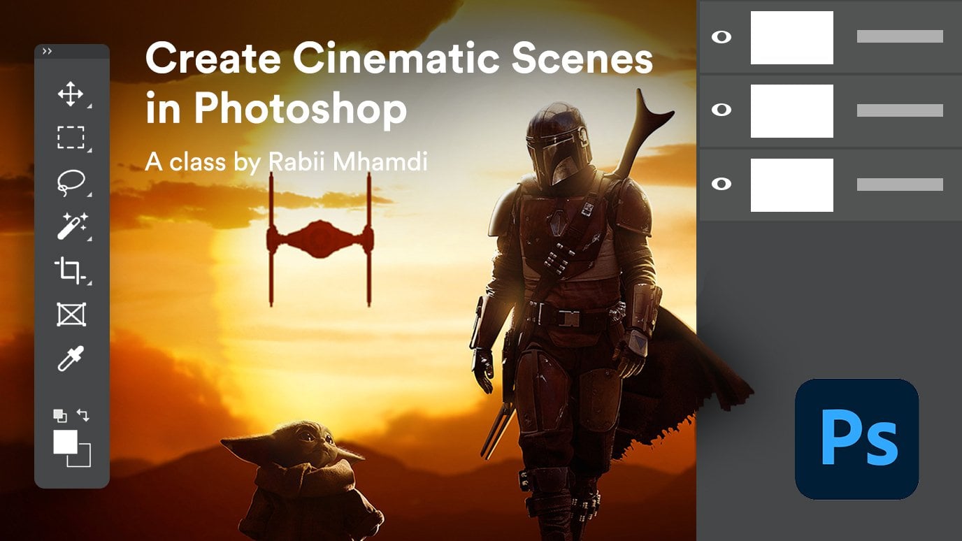
1. introduction: Welcome to Photoshop
compositing how to match the subject
with the background, where he will learn how
to composite and match any subject with any
background in Photoshop. My name is Robin. I'm the
founder of retards studio.com. And I've been doing
Photoshop compositing and retouching projects
for a long time now and I'm excited to teach you my secret techniques of realistic Photoshop
from positive. I designed this course for photographers or anyone
who wants to learn Photoshop compositing
if struggled to replace the subject from a photo or adding it to another background and can
get it to look realistic. Because in this course, I'm going to show you
exactly how to do that. By the end of it,
you'll be able to composite and match your subject with any background and make it look realistic. Every time. We're gonna start with a
quick introduction and talk about what to look for
when choosing your images. And Y1 photo may work
better than another. Then I'm going to
show you how to match the perspective and test
your composite to see if your subject is going to work with the
background and look realistic before you do any commitments or
time-consuming selections. After that, we're going
to match the luminosity. And you will learn how to get your lights and
shadows matching with the background using luminosity check layer techniques
and adjustment layers. Once the perspective and the
luminosity are matching, we're gonna move to
match in the color. And you're going to
learn several techniques to automatically
match color fast. And also how to use some powerful color check
layer techniques to get your color matching with
your background every time. Lastly, we're gonna go even further and you
will learn how to enhance your
composites by adding new realistic camera
depth of field effect. Using the powerful
depth mathematics. You will also learn how to paint lighting effects and apply
a color grade to an image. The ideal student
for this course is an existing photographer or
anyone who wants to learn Photoshop Composite thing as
the basic understanding of Photoshop and wants to take his compositing skills
to the next level. And if that sounds like you, then you're gonna
love this course. So feel free to take a look through the
course description. And I'm looking forward
to seeing you inside.
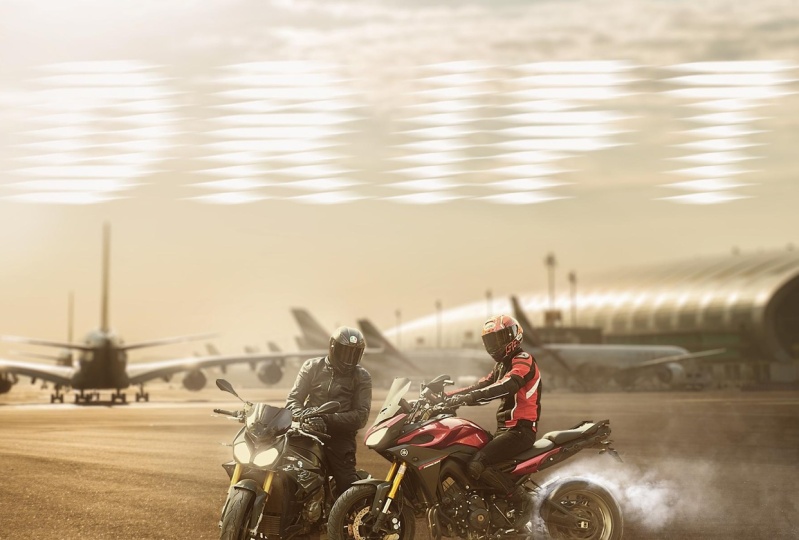
2. Choosing the Right images: Hey guys and welcome
to the first lesson of this Photoshop
compositing course. And in this lesson, I'm going to talk about
the essential elements that we need to look for in an image in order to make it believable and
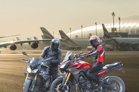
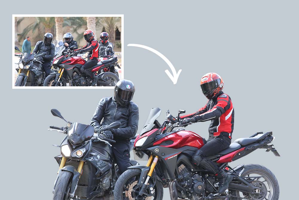
realistic composite. This is the image
that we're gonna be using as our background. This is the image that is
going to be our subject. And we're going
to composite them together and show you how
to match the lighting, the perspective, how to match color and make
it look realistic. And hopefully you're
going to learn some solid skills
that will help you match and composite any subject with any background
in the future. One of the many things that we need to look for in order to composite two images together
is the lighting conditions. You need to make
sure that both of your images have similar
lighting conditions. For instance, if we look
at our background image, we can see that this image was probably taken on
in an afternoon, on a relatively
bright sunny day. And we can tell by looking at
these sunlight coming from this guy and the reflections
on the shiny surfaces. And also the position of the sun is on the
top-left corner. Similar to this image. This was also taken in an afternoon on a
bright sunny day, and also the light is coming
from the top-left corner, which makes it perfect
for this composite. Now, I'm using the
keyboard shortcuts to cycle between tabs. But if you want to compare
the two images side-by-side, you can go to Window, Arrange, and choose to add vertical to tie the two
images side-by-side. Also, if you have enabled
in the Preference tab, you can use the hand
tool to move the canvas. If both of the images are
moving at the same time, That's because this
option is checked. I have it unchecked. But if I check it again, you can see now that both of them are moving
at the same time. That's a tip for you if you want to move them individually. You can also hit Tab on your
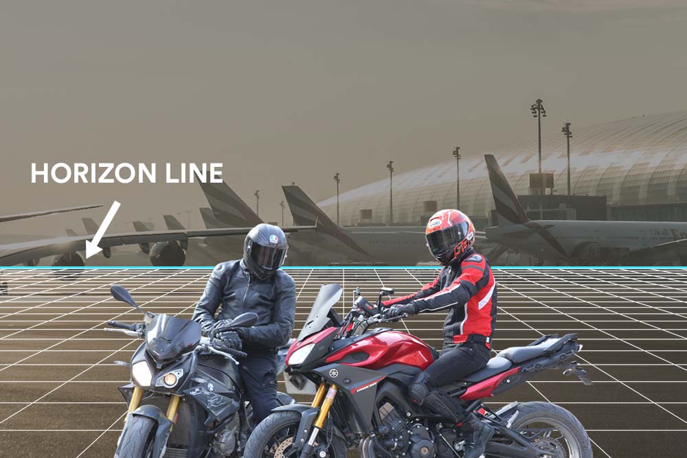
keyboard to hide all panels. Okay, so the other
important thing that we need to match is
the horizon line. We need to make
sure that both of our images have the
same perspective. And if you look at
our background image, we can see that the horizon
line is right about here. I'm going to use
the ruler and grab a horizontal guide and align it where the
horizon line is. And that's going
to help us match the subject with our background. I'm going to also grab another guide from
the other image. And in this case, the
horizon line is not clearly visible like
the background image. But we can make a guess and say that is probably
right about here. It doesn't have to be perfect, but we can get it as close as possible and we are
going to be fine. Now that we have determined
what the horizon lines are. Now we need to match
them together. And as you can see,
the horizon line on the right-hand side image
is a little bit high. That means we need
to scale it down it to match the horizon
line of our background. I'm going to go to
Window, Arrange, then choose Consolidate all tabs to go back to the normal view. Now I'm going to click and drag this image to the other
document using the move tool, we need to resize it. So click on Control T to
get to the free transform. By the way, I'm using
Photoshop CC 2019. And in the latest
version of Photoshop, we no longer need to hold Shift while resizing to
maintain the proportion. But if you are using
an older version, make sure to hold
Shift while resizing. Now, it's only a
matter of matching the subject with the horizon
line of the background. If you remember,
the horizon line of the subject was worried
about his shoulders. And so we're going to
resize the image until it matches with the horizon
line of the background. If you follow this rule when you are making your composite, you're going to make sure
that it's always going to look realistic rather
than eyeballing it. And you end up with
a subject that is looking so big or so small. Now, obviously we need
to cut this subject out of the background before
we do this procedure. But I wanted to show you how to use this technique
to this and see if your composite is going to look realistic before we do any
time consuming selections. We can also use the
blending mode, Multiply. And that's going to give
us a better view of how it's going to look like with
the background extracted. All right, so now that we are happy with what we're seeing, now we can go ahead and start extracting our subject
from the background. And that's what I'm going to
be doing in the next lesson. So stick around and I'm going
to show you how to do that.
3. Extracting the Subject from the Background: In this lesson, we
are going to be extracting our subject
from the background. And for this type of image, we are going to be using the pen tool to
make our selection. Now because this image
is a bit complicated and there's so much going
on with the background. It's hard to use the other selection tools like
the Quick Selection Tool, for example, to
make the selection. So we are going to be using the pen tool to make
a green selection. And it's very powerful
and flexible tool to use. If you're not familiar
with the pen tool, I'm going to show you how
to use it in this video. We want to zoom in to see the
edges a little bit better. And the keyboard shortcut
for the pen tool is b. And you want to click and drag
to create an anchor point, and click again to
create another one. Now you can see
that it's given me a preview before I
create the anchor point. And this feature is
called rubber band. And you can enable
it by clicking on this gear icon and checking
the rubber band checkbox. And I find it very helpful
because it gives me a preview of where the anchor point is going
to be before I click. Now, keep in mind that
even if you didn't do a good job with
the previous points, you can go back and edit them by holding Control
or Command and clicking and dragging
on this handle to reposition it
wherever you want. You can also do that when
you're making the point. For example, when I click
and create an anchor point, you can keep holding the mouse, then hold Alt and click and
drag to move the handle. Now when you reach E tight
curved like this one, you can again hold assault, move the handles to change the direction, and
then continue. Again. Right here we have
a curved edge. So hold Alt while creating the anchor point to
make a curved line. And you can also go back to the path that
you have created and move any anchor point by
holding Control or Command. Now the selection is going
to take a little while, so I'm going to fast-forward
the rest of this part. And I'm going to also providing this image for you to download already masked out
for you so you don't have to go
through this process. Okay, so now we have created
a path around our subject. And when you reach the
end of your selection, you want to finish
the path by clicking on the very first
to close the path. Now we want to convert this
path into a selection by right-clicking inside the path
and choose Make Selection. In this dialogue box, you can choose how much you want to February
the selection. And I'm going to feather it by just one pixel and click Okay. Good tip to see the
selection better before we create
the layer mask is by switching to the
Quick Mask mode by hitting Q on your keyboard. And this will allow us to see the selection better
and decide if you want to go back and fix any unwanted parts
that we have missed. This case, we did a pretty
good job with the selection. And I'm going to click on Q again to go back
to the selection. What you want to
do next is click on this icon to
create a layer mask. I'm going to also create the solid color
adjustment layer. Then I'm going to drag it
underneath the subject layer. And this will help me see any imperfections
of the selection. But I think the selection
is pretty good. And I don't need to do
any refinements for now. Okay. So there's still
more parts to be removed. And again, I'm going to use the pen tool to
make the selection. And once you finish
your path, again, you want to right-click inside the path and choose,
Make selection. And I'm going to keep the
one pixel feather and click. Okay. Once the selection is active, you want to make sure that
the layer mask is selected. And what you want to do is fill the selection with
black to hide it. In this case, black is
my background color. So I'm going to use
the keyboard shortcut Control plus Backspace to fill
the selection with black. Now I'm going to
quickly go through all of the parts that
needs to be removed, like here on the wheels
and this part over here and go back when I
finish the selection. Alright, so I have
extracted the subject from the background and I took my time to cut out
the little details. Now we're going to import this
image into our background. Hit V for the move tool, and then we're
going to click and drag it into the other document. Another helpful
keyboard shortcut is while you are on the
free transform mode, you can hit Control Plus space to zoom the
document in and out. And also we can hold Alt while transforming to resize
from both directions. I'm going to drag a guide to help us see the horizon line. We're going to do the same
thing as I showed you before and scale
the image down and match the horizon line right about there. And I'm going to also drag
it a little bit to the left. I also want to crop the background image because
it's a little bit big. And I want to bring the
focus to the subject. I'm going to stick with
the rule of thirds and keep my subject a
little bit to the right. When you are done, you can hit the check mark to
accept the changes. Another important
thing to remember is do not let the
cropped pixels. You can go back and
resize the crop at anytime by unchecking
this option. Once we have that
option unchecked, now we can go back at any
time and adjust the crop. Alright, so that's
it for this lesson. And in the next
lesson we're going to start matching the subject
with the background. And I'm going to show you
how to match the luminosity.
4. Matching Luminosity: We have our composite in place. Now we are ready to start matching the subject
with the background. And in this lesson I'm going to show you how to match
the luminosity. The first thing
that I want to do is temporarily eliminate color from our image by adding a black and white
adjustment layer. So we can focus only on the luminosity and not
get distracted by color. Once we have the
luminosity matching, we can focus on
matching the color. And once we do that, we can clearly see
that the problem with the image now because
the light source is coming from the
top-left corner and our subject is not facing
direct sunlight. The subjects should
be a little bit darker and we need to darken
the shadows a little bit. So for that I'm going to select the subject layer and then add the curves adjustment
layer on top of it. And now going to put the cursor between the subject and
the adjustment layer, hold Alt or Option and click
to create a clipping mask. And that's going
to make sure that this adjustment layer is
only affecting the subject. Now we need to click and drag to the bottom to add shadows. And you can see that the
image is looking much better when I turn the curves
adjustment layer on and off. Now in this case we apply the adjustment layer
to the whole image. But in some cases
you're not exactly sure how and where you need to
apply the adjustment layer. And for that we can use the another adjustment
layer to help us check and see the
luminosity better and determine where we need
to apply the adjustments. That is the threshold
adjustment layer. Once we apply the threshold
adjustment layer, it's going to give us a
luminosity map that will help us see how is the light is traveling
throughout the image. With the slider, you can
drag to the left to make the highlights lighter and to the right to make
the shadows darker. And I usually drag this
slider all the way to the right and start
adding highlights slowly. Now that we did that, we can see where the
light is coming from. And that is the brightest point of our image, which is the sun. I'm going to continue dragging
the slider to the left. We can see how the light is traveling throughout the image. And starting from this guy, which is usually the
brightest part of the image, then it starts to reflecting on the shiny surfaces until
it covers the whole image. At this point, our
subject should still be dark and only the highlights
part are visible. But in this case,
we don't have to make extreme changes
to our subject. As you can see now, the light is starting
to hit the ground and starts traveling
throughout the image. And at this point, our subject should
start to get lighter. Now I'm going to turn off the
threshold adjustment layer. And now the luminosity
for our subject is matching with the background and it's looking much better. Now if you don't want
this adjustment layer to affect the highlights, we can use the blend if to make this curves adjustment layer not visible in the highlights. We can do that by
double-clicking on the Adjustment Layer. And in the Blend If options
under the underlying layer, we want to drag the
right slider to the left to make it not visible
where the highlights are. And you can see that
it's starting to fade away from the highlights. Now we want to hold Alt
or Option and click on the slider to split it in
half and make a transition. I'm going to also
reduce the intensity of the curves adjustment
layer just a little bit. Also keep in mind that this black and white
adjustment layer is also affecting the
luminosity and not just color. And to avoid that, we can use another
technique which is creating a solid color
adjustment layer. And then drag the color
picker all the way to the left so that the hue and the saturation values
are both at 0. And that will give us
a neutral gray value even when I'm dragging the
color picker up and down. But if I bring it to the right, it starts to add saturation. So make sure the
color picker is all the way to the left
and then click Okay. Then we need to change the
Blending Mode to Color. And now this solid color layer
is only affecting color. And with that, I'm going
to end this lesson here. Now that the luminosity is
matching with the background. And the next lesson we're going to start matching the color.
5. Matching Color: In this lesson, we are
going to match the color, and I'm going to show you two different techniques
that will help you match color using the automatic adjustment algorithms of curves. And also, I'll show
you how to use the color check layers
to really help you see the difference
between your subject and the background and help you
match the color. Very easy. Now that we have
matched the luminosity, we no longer need these
adjustment layer. So I'm going to select them
all and then delete them. In some cases you want to match the background color
to your subject, but in this case we
are going to match the subject color
with the background. And I'm going to show you
the easiest method first, which is matching
color using curves. Create the curves adjustment
layer at the very top. And as always, make sure
to create a clipping mask. So it's only affecting the subject by right-clicking on the layer and choose
greatly clipping mask. You can also use the
keyboard shortcut Control Alt G. Now in order
for this to work, you need to make sure
that you are selecting the layer itself and
not the layer mask. Then hold Alt or Option and
click on the Auto button. This will bring the auto
correction options. And in this case, we
are going to choose the enhanced per channel
contrasts algorithm. Then click on shadows. And now what you
want to do is sample a color from the darkest point
of the background image. I'm going to sample
a color from here. And once they do that, photoshop will automatically
apply that color to the shadows of our
subject. Click. Okay. Now we want to sample
the second color, which is the mid tones. For the mid tones,
you want to sample a color that is supposed
to be neutral gray. Now makes sure the
eyedropper is sampling five-by-five or
11 by 11 average. That will make sure
you are sample in average color from the
place you clicked on. And not just one pixel. I think this color
is close enough. And I'm going to click Okay. The last one we need to
sample is the highlights. And I'm going to sample a
color from the sunlight. And you can of course change the color from the color picker. When you are done,
you can click okay. And once you do that, photoshop will ask you
if you want to make this color as the default
color for curves. And in most cases you
don't want to do that. So I'm going to click now. As you can see, there was an automatic adjustment or
is it applied to curves? And now the subject is
looking much better. Now keep in mind that this curves adjustment layer is also affecting the luminosity. And I like to work on the luminosity and
color separately. So I'm going to change the
Blending Mode to Color. And now it's only
affecting color. As you can see, that
was very easy to do. This is the before and
this is the after. And in most cases, it's going to help you
match scholar very fast. Sometimes it doesn't
do a great job, but you can always go back and modify the curves
to your liking. Alright, so that was how to
match the color with curves. I'm going to show you
now the second method, which is using the check layers. First I'm going to turn off the visibility of the
curves adjustment layer. You are going to create a solid color adjustment layer again, but this time you want to drag the color picker all the way
to the top-right corner. This time the saturation and the brightness values
are at a 100%. It doesn't matter if you change the color from
here in the right. Just click Okay. And now you want to change the blending mode to saturation. As you can see,
this will give us a color map of our image and we can clearly see that the subject has a
blue color contrast. Now if in your case the color
is not visible like this, what you can do is double-click
on the solid color and then change the color until they have a better view
of the color map. Now that we know
we need to remove blues and add reds
to our subject, you can use your favorite
adjustment layer to change the color. And in this case,
I'm going to use the color balance
adjustment layer, then create the clipping mask. And now it's just a
matter of changing the color until it matches
with the background. I'm going to add more
yellows and reds. You want to do that
in the shadows, the mid tones and
the highlights. Remember that you don't have to exactly match it
with the background, just match the color
as close as possible. And then during off the check
layer and see if the color is matching with the background because sometimes
it can be overdone. Alright, I'm going to
turn off the check layer, and that's the adjustment
we did to our subject. And I'm going to also change
the blending mode to color. We can also use both the curves adjustment
layer and the color balance. Like obviously this is too much, so I'm going to reduce
the opacity accordingly. You can also change the values
of the adjustment layers. All right, so this is the
before and this is the after. This is also what all
the adjustment layer that we did so far. Okay, So at this point, our subject is looking pretty good and it's matching
with the background. But we're not done yet. We can still do so much
more to the composite. And we're going to continue
in the next lesson.
6. Enhancing the Subject: In this lesson, we will continue matching the subject
with the background. And we are going to do some enhancements
to the subject by adding a little bit of fog to add some atmosphere
to the image. I'm going to start by deleting this Check layer because
we don't longer need it. The first thing that I want to do is enhance the selection of the subject by removing the edge freezes caused
by the selection. And because we still
have our layer mask, we can go back and view or hide any part of our selection
that we don't need. What I'm going to do is load the layer mask as a selection by holding Alt or Option and clicking on the layer
mask thumbnail. Now we need to contract
the selection and then remove the axis to get
rid of the edge fringes. So once we have our
selection active, go to Select, Modify,
then contract. And because the resolution
of this image is low, I'm going to contract the
selection by just one pixel. Now this is the opposite
of what we need. We need to invert the selection. And you can do that by using the keyboard shortcut
Control Shift I. Or you can go to select inverse. You can hit U to see the
selection in Quick Mask Mode. The red part is the area that is not selected and
that's what we need. We need to paint outside
of the selection. What we did here is pushed
the selection inside and left just one pixel outside of the selection
to be removed. And I'm going to click Control H to hide
the marching ants. And now we need to
use the brush tool to hide that one pixel edge fringe. Make sure black is
your foreground color. If I hold Alt or Option and click on the
Layer Mask thumbnail, you can see that I'm
only removing that one pixel adds that interacted
from the selection. And now we need to paint on any area that has the
fringe to hide it. All right, so once you're done, click on Control H again to
bring back the selection, then Control D to de-select. The next thing that
I want to do is fix this broken front headlight by copying the one
from the left. Take the lasso tool
or the pen tool. In this case, I'm going
to use the pen tool and then I'm going to make a selection around
this front light. It doesn't have to be accurate. Once you are done, click on the first to close the selection. Again, you need to right-click
choose Make selection. And now we need to
copy this part of the image on a new
layer by clicking on Control J that will break the clipping mask of
the layer above it. So make sure to create
the clipping mask again by holding Alt and
clicking between the two layers. Now we'll just need to rotate
it and transform it to fit. I can also right-click
and choose Warp and then try to work with
to cover the broken light. Alright, so now I want to
lighting the background just a little bit because it
doesn't look very realistic, especially in this area. So I'm going to click on
the background image layer and then create the curves
adjustment layer on top of it. Then I'm going to add just
a little bit more light. I don't want this to
be visible everywhere. I'm going to invert
the layer mask by clicking on control I. Then I'm going to
take the brush tool, make sure it's soft and the
background color is white. And then I'm going to reveal
this adjustment layer by painting with the brush tool on the area where I want
it to be visible. Okay, that's looking good. Now I just want to move the subject a little
bit to the left. I'm going to select the layer and all the
adjustment layers above it. And then take the Move tool and click and drag it a little bit to the left holding Shift to keep the vertical alignment. Now that I did that, I want to also lighten the
crops just a little bit more. Here's where the delete cropped pixels checkbox will
come in handy because now I can adjust the
graph or enlarge it and the information
is not lost. I find myself always going back and forth with
my adjustments. That's why I work
non-destructively. And speaking of
non-destructive workflow, I'm going to click
on this curves adjustment layer and then change the blending
mode back to normal and also increase the
opacity a little bit. We change the Blending
Mode to Color before, so it's only affecting color, but I want to add
a little bit of that color to the shadows. And we can reduce the
opacity if we need to. And as you can see, that looks a little bit better and it's matching better
with the background. All right, the last thing
that I want to add in this lesson is a little bit
of fog to the background. I'm going to create
another layer on top of the background
image layer. And then I'm going to take the brush tool and
switch to the fog brush. I created this process in
the previous tutorial. And if you want to
learn how I created it, provided for you to download along with the tutorial link. Now I'm going to make sure the opacity and the
flow are very low. And sample a color from the
background and start painting some fog to add a little bit
of atmosphere to the image. Also because in a future
lesson we are going to make the wheels spinning and we're going to add smoke
to the wheels. Let's create another layer
on top of the subject. And I'm going to be
painting more fog on top of it to help it blend better
with the background. Make sure you don't overdo
it and paint too much. And if you feel like
you're doing so, you can always
reduce the opacity. You can also create a layer mask to the fog layer and then paint with black with the same brush to reduce
the effect of default. And that's what I'm going
to do here because I painted a little bit
too much in this area. That's it for this lesson. And in the next lesson we are
going to continue enhancing this composite by adding more
smoke and lighting effects. So I'll see you in
the next lesson.
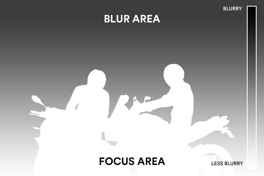
7. Creating the Depth of Field Effect: I want to add blur to the background in this
lesson that is going to simulate the depth
of field of a camera. And I'm going to show
you a great technique to achieve a very
realistic depth fulfilled effect using what's
called the depth map in the lens blur
filter in Photoshop. I'm going to start by
selecting the subject layer and all the adjustment
layers above it, group it. And you can do that by pressing Control G. I'm going to name this group bikers and also group these layers
and call it background. Also this layer and I'm
just gonna call it fog. Alright, so we're going to use the lens blur filter to achieve the depth
of field effect. This filter is destructive. That means we can apply
it on the smart object. What we can do to work
non-destructively is make a copy of the background
layer by hitting Control J. That way we have a
backup of this layer. Now we need to go to Filter
Blur, van lens blur. You can control how
much you want to add the lens blur from
the radius slider. And if it's slowing
down your computer, you can switch to faster. But in this case I'm going
to use more accurate. The source allows you to use the channels as the depth map. And that's what I'm going
to show you in a bit. But for now, we
are going to apply the blur filter to the whole image just to show you how it's
gonna look like. The brightness
slider allows you to increase or decrease the specular highlights
on your image. I'm going to choose the radius
of about 18 to 20 pixels. You can also use the
preview checkbox to see the before and after. I'm going to click Okay. Now this will apply the
blur to the entire image. And as you can see, it doesn't look realistic, especially at the
bottom right here. That's because this
area is closer to the camera and it shouldn't be less blurry than the background. In order for it to
look realistic, we are going to
use the depth map and it's actually
pretty easy to create. I'm going to click
Control Z to undo that. And we're going to use channels
to create the depth map. Right next to the layers
tab, click on channels. We need to create a
new Alpha channel. Then I'm going to take
the gradient tool, make sure it's black
to white gradient. Then you want to
click and drag to the top to create
a smooth gradient. We want the gradient to be black at the bottom and white at the top because the lens blur is going to use this
as the depth map. And it works just like
the layer mask to show the blur on the white areas and hide it in the black areas. Now that we did that, make sure to click on RGB
to go back to RGB mode. Remember this channel that
we created is called Alpha. Now let us go back
to the Layers tab. And with the background
layer selected, let's apply the lens
blur filter again. I'm going to increase the radius to see the effect a
little bit better. Now in the depth map source, I'm going to change it
to that Alpha-1 channel that we created before. Now as you can see, it is using that map to
apply the blur and it starting from the bottom and gradually increasing at the top. And that's exactly what we need. And you can see that even better when I
increase the radius. Now don't worry about
the edges for now. This is just the cropped
areas of the canvas. I'm going to decrease the radius to about 18 to 20 pixels. And that looks natural
in my opinion. I'm going to click Okay. And as you can see, this looks much better than
the last time we did it. The blur is minimal closer to the camera and it's gradually increasing in the background. And if you don't
like the results you've got in the first try, you can always go
back to channels, take the gradient tool and redo the gradients to
get a better result. Then go back to RGB mode. And now you can create
the another copy of the background and redo the
lens blur filter again. But in this case, I'm pretty happy with the
results that I have. That's it for this lesson. In the next lesson, we're
going to make the wheels spinning and add some smoke
and lighting effects.
8. Adding Smoke to the Wheel: Getting mapped to our
image. Now, we're gonna go ahead and make the backward
look like it is spinning. Then we're gonna be
adding smoke to the wheel and in the background and
make it look realistic. Now this step is optional. You can leave it as it is. It looks natural, but I
want to show you that it's possible and how far you can take a composite in Photoshop. As always, I want to
work non-destructively. So I'm going to convert the subject layer
to a smart object. And that's going to
allow us to apply feel smart filters and change
the value at anytime. And now we want to go
to filter this time, go to filter gallery and
choose the Spin Blur. This blur is very
useful in many cases, especially in this case, is going to mimic the blur
of something moving fast. And it's going to make the wheel look like it is spinning. You can press the spacebar
to switch to the hand tool and control plus spacebar
to zoom in and out. And you can resize it by clicking and dragging
from the edges. And these points will allow you to control the
range of the blur. I'm going to align it and match the size of the wheel and
keep the range in height. And you can control
the blur angle from this middle wheel. From the slider on the right. I'm going to choose a
radius of about 12. And then click Okay. As you can see, this filter
is applied as a smart filter. And it gives us this mask. And it's very important because we are going
to use this mask to hide the blur from the areas that are not
supposed to be spinning. So make sure the smart
filter mask is highlighted. Then we can take the brush tool, choose the relatively soft brush and make sure you are
painting with black. You can hit D on your
keyboard to reset this swatch and X to toggle
between black and white. Now we are just going to mask
the blur from these areas, but we don't want it
to be visible in. All right, so now that we
added the blur to the wheel, we are going to be
adding some smoke now. And I have some stock images that we can borrow
the smoke from. And I think it's going
to look more realistic this way rather than
painting it manually. Okay, so what we're going to do is click and drag
it to the document. As you can see, it created the clipping mask because the
subject layer is selected. So I'll make sure
the top layer is selected so that the image will be pasted on the very top. Now going to change the
blending mode to screen. And the screen blending mode is going to hide the shadows. And with the Free Transform, I'm going to make sure to
align it with the wheel. You can also right-click
and choose flip horizontal. If it's going the
wrong direction. You can reduce the opacity
to see the layer beneath it. I'm going to bring the
opacity back to 100. And now what we can do is click on Control L to bring levels. And now we want to
darken the mid tones. The dogs become invisible and we are left only
with this milk. Then hold off and click on the Layer Mask icon to create
an inverted layer mask. And that will hide
the layer altogether. And nowadays you can do is thick the smoke brush with the
white foreground selected. Then we're going to
slowly start revealing the smoke on the areas where
you want it to be visible. You can use shift to
disable the layer mask. And that will help you
see where to paint. If I'm going to use another stock
image this time, we're going to do the same
thing as we did before. A quick tip for you. If you
want to see the Layer Mask, you can go to the
Properties panel and reduce the density
of the layer mask. That way you can see the layer mask while
you are painting. And make sure the layer mask is selected in order for
this panel to be visible. Lastly, I'm going to bring this image and I'm just going
to reveal it at the edges. There are some black
areas in the smoke. And that's because I didn't change the blending
mode to screen. So I'll make sure all the layers are at screen blending mode. Then I'm going to select all the layers and click
Control G to group them. And I'm going to call
this layer, we'll smoke. I'm going to add another
layer this time. And I'm going to take the smoke brush and paint some smoke
manually at the edges. That's looking really good. I'm just going to
leave it like that. Now what I want to do is add some lighting effects
to the front light of the bikes and also enhance the sunlight
coming from the left.
9. Adding the Light Effects: Now that we have finished
our composite and the subject is matching
with the background, it's time to do some color
grading and also paint some lighting effects that will really bring the image together. I'll start by adding
some lighting effects and we are going to be painting it on top of the subject and the front
lines of the bikes. And that will blend the subject with the background even better. Inside the bikers group, I'm going to add a
new layer at the top. Then I'm going to
take the brush tool, make sure it's soft, and then I'm going to sample a bright orange
color from the sky. We are going to use
this color to paint some lighting effects to the
front light of the bikes. And I'm actually not going
to use this color like this. I'm going to change
the blending mode to soft light that will make the color brighter and
look more realistic. We also need to paint
with the low flow and opacity so we can
build up the effect. I'm going to click on
Control a to select everything and then press
Delete to remove that part, just paint it and start again. Now just going to
paint on top of these lines to enhance
the lighting effects. I'm going to create
another layer. And this time I'm
going to paint with the bigger brush and decrease
the flow and the opacity. Let's add one more layer. And I'm going to
decrease the opacity just a little bit more. Now I'm going to paint at
the edges of the subject. And that's just going to add the effect of the
sunlight coming in from the left and help them blend more with
the background. All right, that's
looking pretty good. This time I'm going to
paint here at the edges to enhance the light of the sun
crown coming from the left. I'm doing this in
multiple layers. So I can have control
to reduce the opacity of a particular layer or
remove it altogether. If I wind up not
liking the effect without having to redo
everything all over again. I'm gonna make sure
I'm painting with a screen blending
mode on all layers. Also, here's what you can
do if you are more like me and keep forgetting to
change the blending mode. I'm going to bring
it back to normal. You can group all
layers and instead change the blending mode of the group itself to soft light. Now I can add as many
layers as I want inside the group without worrying about the
blending mode. And it will have
the same effect. You can also change the blending mode of
the brush itself. I think I painted a
little bit too much here. I'm just going to
reduce opacity. That's pretty much it for
the lighting effects. I'm just going to rename
this group to light. What I want to do now is
increase the opacity of this curves
adjustment layer just to bring back some of the
color of the background. And I think that will help the subject blend better
with the background. Now we can move to
color correction, and we're going to apply a color grade that will
bring the image together.
10. Color Grading and Sharpening: In this last lesson, we are going to do some
color correction that will help our subject blend
better with the background. Then we're going to finish our image with some sharpening. I'm going to start by
adding a selective color. And you can use curves or color
balance if you'd like to. But I chose the selective color because it gives us
control over cyan, magenta, yellow, and black
over all the color channels. So starting with
the red channel, I want to reduce the reds
from the cyan quite a bit. And also from the
magenta and yellow. I want to increase
the read quite a bit. And also in black. This will give us
a nice contrast. But I think this
is too much red, especially in the
jacket and the bike. But we are going to
target that color later individually with another
adjustment layer. Now in the yellows channels, I want to decrease
it in cyan and increased in magenta,
yellow, and black. Let's go to the greens now. This image does not
have much green. Changing these sliders won't
make much of a difference. Now in science. And same thing, this image
also does not have much cyan. I'm just going to skip blue and magenta and go
directly to white. Here I want to increase IN to reduce the magenta
from the sky. And also add a
little bit of yellow with the yellow and
the black sliders. Next, I'll go to the neutrals. And here you want to make a very subtle changes as it will introduce
color to shadows, mid tones and highlights. All right, so I decreased the
cyan and the magenta just a little bit and
added yellow and black to enhance the contrast. This is the before and
this is the after. You can see that this
adjustment layer has increased the read quite
a bit on the subject. So what we can do is add a hue saturation
adjustment layer, then click on the
targeted adjustment tool and then select that read. And to see the selected
range a little bit better, we can temporarily increase the saturation all the way up. And then from here we
can control the range of the selected color by
pushing the sliders inside. You can also change the hue
to see a little bit better. And I need to increase the
range just a little bit more. Now we can reset the
value and I'm just going to decrease the
saturation a little bit. All right, that's looking good. And this is all the adjustments
that we did so far. I want to also change
the color of the smoke a little bit just to blend it
better with the background. I'm going to create a color
balance adjustment layer above the small group and then
create the clipping mask. And I'm just going to increase the red and yellows
in the highlights. Now we're going to finish the image by doing
some sharpening. And for that we need a copy
merged of all visible layers. And you can do that by pressing Control Alt Shift E to create
a stamp visible layer. I want to also
desaturate the image by person on Control Shift U. Then go to Filter
Other high-pass. Because this is a
low-resolution image, I'm going to go with the
low value because if I increase the value to
more than one pixel, you can see that it starts to introduce some halos
around the edges. So in this case, I'm just going to keep the value 2.8 pixels and click Okay. You can go with a higher value or depending on your image size. Now what do you want
to do is change the blending mode
to Linear Light. This will hide the
50% gray values and we are left only
with the details. You can see how much details this high-pass filter has
brought back to the image. I don't want this
high-pass filter to be affecting the background. I just wanted it to be
visible on this subject. What I'm going to do is load the subject layer
as a selection. And you can do that by holding
Control or Command and clicking on the layer thumbnail to load it as a selection. Then I'm going to select the high-pass filter and
create the layer mask. And that will load the
selection into the layer mask. If you hold Alt and
click on the Layer Mask, you'll be able to see it. All right, That's
looking really good. Our composite is
almost complete. I just want to add one last
thing to finish the image. And I'm going to take the type tool and
type in some texts. I also want to make
the illusion of the texts look like it
is behind the subjects. To do that, we can borrow the layer mask of the
high-pass filter. And you can hold Alt or
Option and click and drag the layer mask to the text
layer to create a copy of it. At the moment plus the
opposite of what we want. So we need to invert the layer mask by
pressing on control I. Another tip for you,
if you want to move the text layer inside the mask is by clicking on this chain icon to release
the layer mask link. And once you do that,
you'll be able to move the text layer without
moving the layer mask. But first you need to make sure that the text is highlighted, not the layer mask. I'm going to decrease
the text size just as a little bit because I want to title the crop a
little bit more. Now I can hit C to get
to the crop tool and I'm just going to re-size the crops so that it
fits with the text. Alright, that's all
there is to it. This is the end result. Now I want to show you
the before and after of what we've been doing to
the composite so far. I'm going to make a copy
of the background and the subject layers Control
J to duplicate the layer. I'm just going to drag
it to the very top. We also need another copy
of this subject layer. Drag it to the very top. I'm going to disable
the smart filter as well. The moment of truth. Now, this is the finished image
and this is the original. That's a massive difference. We've come a long way
to get to this result. Let me show you that you again, this is the before.
This is the after. Alright, I hope you enjoy this course and you
have been following along with me so far and applying the techniques that
I've been teaching you. If not, now's your
time to showcase your work and posterior
image after this video.
11. Your Class Project: We have reached the
end of this class, and I hope you
learned a ton so far. Now's the perfect time
for you to create something with the techniques
you've just learned. Your class project is
to create the composite with the provided
images, or even better, you can also use your
own images and share your work with the community by submitting your
class project. Next, we can give you feedback and answers
to your questions. Remember to follow
the class steps that you'll learn to create
the realistic composite. Number one, find the right
images to work with that are similar in luminosity and light direction to
get the best results. Number to start by
removing the background of the subject using your
favorite selection tool. Number three, match
the scale and perspective by matching
horizon line number for match the luminosity using the threshold adjustment layer and the curves adjustment layer. Number five match
the color using color check layers and the auto adjustment
algorithm of curves. And number six, you can add the final adjustments that suits your image like
lighting effects, depth of field, sharpening,
and color grading. I can't wait to see what
you can come up with. Thank you so much for watching and good luck with
your class project.
 Rabii Mhamdi, Online Instructor | Digital Artist