Transcripts
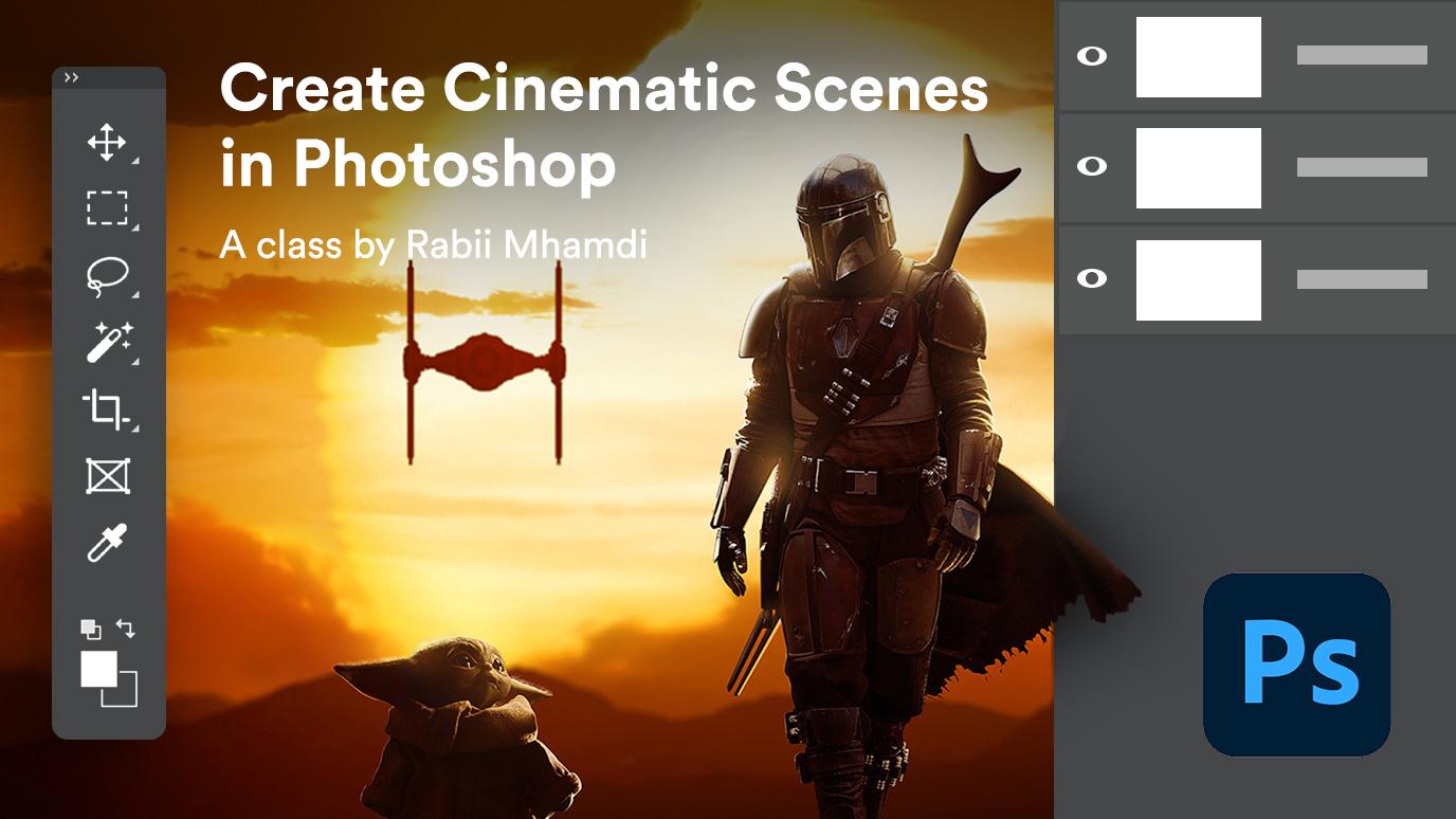
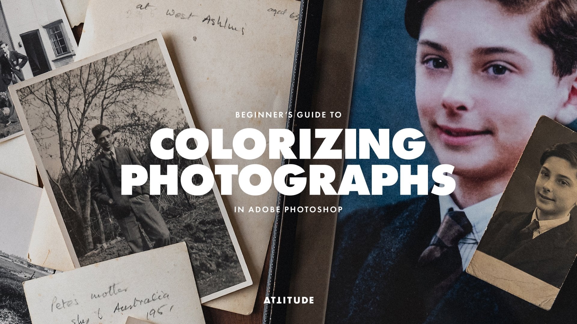
1. introduction: Hey guys and welcome to this Photoshop compositing
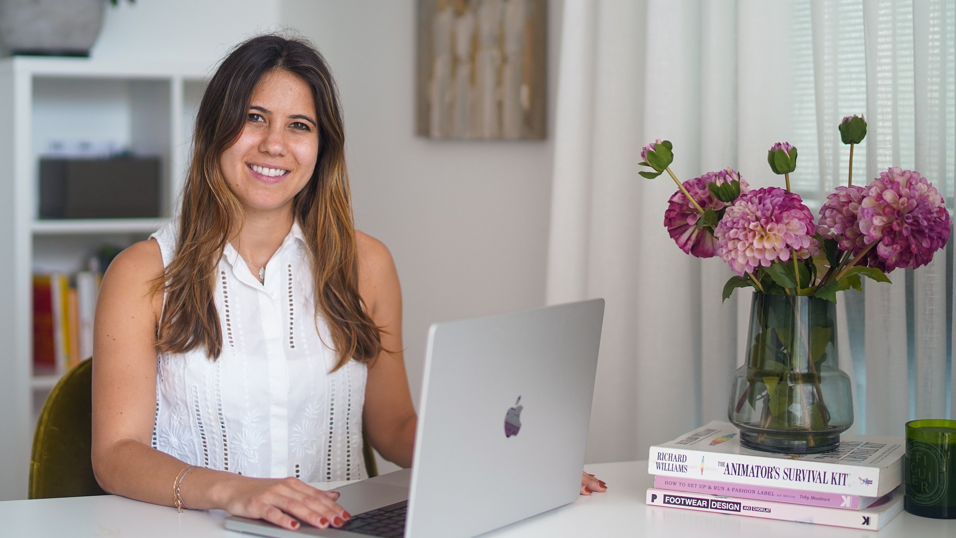
course, The Mandalorian. My name is Robyn and I'm gonna be your instructor
in this course. In this course, we're
gonna be recreating a cinematic sunset
scene from Star Wars. And you're going to
learn how to create an amazing edit completely from scratch using stock images. To achieve the
composite like this, we're gonna be using many tools and techniques in Photoshop. You're going to
learn how to create the sky from scratch to create the fakes on and make it look realistic by applying
layer style to it. Painting realistic lighting
effects on top of that, and applying heat distortion
using displacement maps. Then create the
seamless guide by using different cloud images and
blending them together. You will learn how to
realistically blend multiple images together
using different techniques. And this can help
you become more creative and
uncomfortable and solving problems and
approaching challenges differently when you're
doing heavy exact, It's you need the process
of creating this composite. You're also going
to learn how to use different methods to
remove backgrounds faster and more effectively and make changes a
lot more easily. Using a non-destructive
workflow. You will learn how to match
color and luminosity and create depth using advanced and beginner
friendly techniques. Lastly, you're gonna learn how to paint lighting
effects and rim light that will make your composites miles better
and lot more realistic. This course, for,
this course is for anyone that does compositing
and photo editing. Familiar with
Photoshop tools like layer masks and
adjustment layers, and wants to level up
his compositing skills. This course comes with all the project files and images that you need
to follow along. If you're ready to take
your Photoshop compositing and skills to the next level. And I'm looking forward
to seeing you inside.
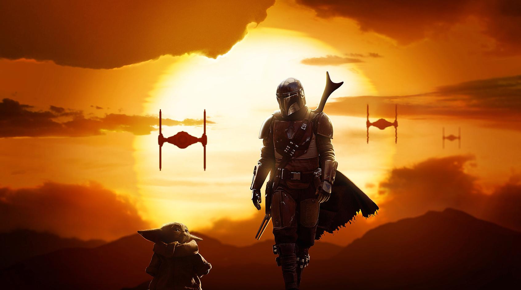
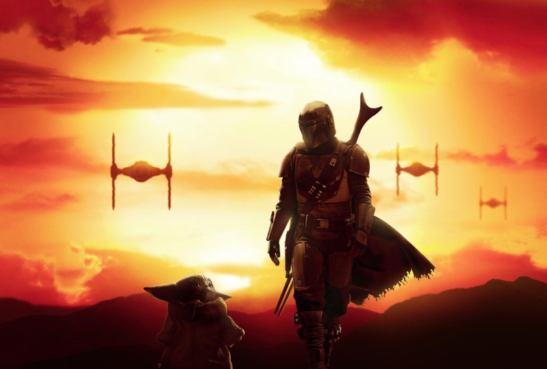
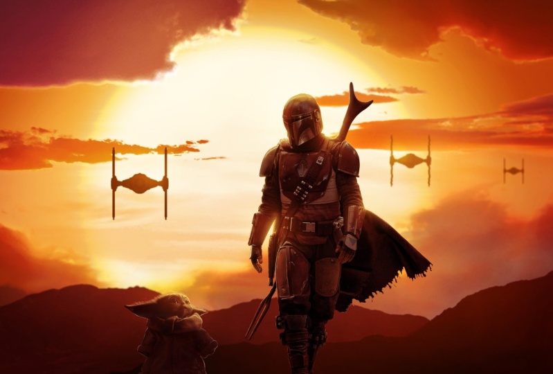
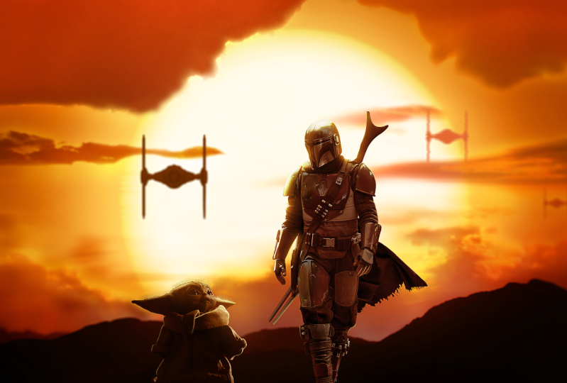
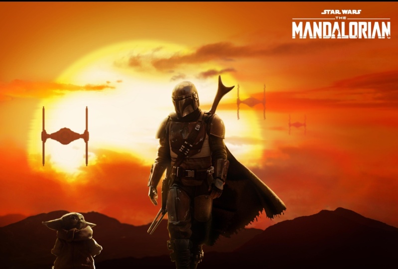
2. Creating The Sky and the Sun: Welcome to lesson one of this compositing course,
The Mandalorian. This is what you're gonna
be creating in this course. I am very excited to
show you how to create the composite like
this from scratch. And you're going to be learning a lot of techniques
in this course. In this lesson, we're going to be creating the background, and that includes adding
the sun and the mountains. I hope you already downloaded
the project files. If not, make sure to download them now and follow
along with me. Okay, So without
any further ado, let's get started on creating the background
in this lesson. I'm going to start by
creating a new document. And the dimension is
going to be 4200 by 2300. And I'm going to click Okay, the first thing I
would like to do is create the solid color, which is going to be the
primary color of the sky. I'm going to choose any color for now so I can see what I'm doing because we're gonna be creating the sun on top of it. To create the sun, you're just going to take
the ellipse tool. Then choose the very
bright orange color. I'm going to click Okay, and then just create the
circle in the middle. You can hold the Shift
key while drawing with the Ellipse Tool to
maintain the proportion. And also while you are
still holding the mouse, you can use the space bar
to move the shape around. The sun is going to be
big in this composite. Scale, it up to right
about this size. Okay, so we're gonna be adding layer style to this shape
to make it glowing. First, I'm going
to double-click on the shape and give it
a little bit of color. Next, I'll make sure
it is centered. So click on Control a
to select everything. Then use the horizontal
alignment tool just to make sure
it is centered. Then I'm just going to push
it a little bit to the left. Now we'll reduce the opacity of the shape layer so I
can see the background. Then I'll double-click on the solid color to bring
the style dialogue box. And I'm going to add
the gradient overlay. You can see the gradient
is visible behind the shape layer and you can click on the canvas
and drag around. I'm just going to drag it to the center and align
it with his son. And I'm actually going
to reduce the opacity of this shape layer to see the gradient in a
little bit better. Then I'll go to the Gradient
Overlay Layer Style, and I'll start by
increasing the scale. Then I'm going to change
the color on the left, too bright orange color. I'm going to make the right
one a lot more darker. That's gonna make the effect of the light source in the center. All right, I'm going
to click Okay, That's the first layer style. I'll bring back the opacity
of the sun layer to a 100%. Then what I'm going
to do next is paint more lighting effects
behind the sun. We're going to be doing
that on a new layer. Then I'll take the brush tool
and make sure it is soft. By the way, you can hold Alt or Option and click and drag with the right mouse button left and right to make it
bigger or smaller. And you can also drag it up and down and make it
softer or harder. I'm going to take
a big soft brush and reduce the
flow to about 10%. The color is going to be
a bright yellowish color. Then change the blending
mode to screen. Then I'm just going to paint
at the edges to create the lighting effect and make the sun look
like it is glowing. Okay, that looks good. I'm just going to
need to paint a little bit more at the edges. We can also make the
background color darker later to make the
effect more prominent. The other thing I
want to do is add an outer glow layer
style to the sun. Again, double-click on the
layer and choose outer glow. This time. I'll change the
color to a bright yellow. Increase the opacity and also
the size all the way up. You can change the blending mode to screen if you want to. But that's not gonna
make the big difference because the background
is not that dark. Next, I'll also add an
inner glow layer style. This time the color
is darker yellow, and I'll increase the
size accordingly. This is actually a
close representation of how the sun will look
like on his sunset. And you'll see how
it's going to look like when we finish
the composite. You can also look at
some reference images if you want to help
you with this process. That being said, I'm gonna be doing one last
change to the sun. And that is blurring the
edges a little bit with the Shape Layer selected and
inside the Properties panel, click on this icon to
see the mask properties. And from here you're
going to increase the federal a little
bit to blur the edges. Four pixels is fine for now. And we can always change
that in the future. Then I'm going to select these
two layers and group them. I'll rename this group to sun. Also group this one and
call it background. That includes this lesson. Make sure you are
following along with me and your project looks
exactly like mine. And in the next
lesson we're going to be creating the mountains
in the foreground.
3. Creating The Mountains: In this lesson, we're gonna be creating the mountains
in the foreground. And we will do that by combining multiple images
together to create a seamless mountain
scene and match the luminosity and the
color along the way. Let's start by
importing the images. So go to file open. And you can see that we have the keyboard shortcut
Control or to import. So I'll be using the shortcut
throughout this tutorial. I'm going to start
with this image selected and click on Open. I'll import the second image, which is this one. The last one is going to be
this picture of a sunset. We'll start working on this one. We're gonna be
using this part of the mountain and extracted
from the background. But first we need to remove
the girl from the image. And we can easily do that
with content aware fill. What you will need to do
is take the lasso tool, then make a rough selection
around the subject. Like so. Then hold Shift backspace to bring
the field dialog box, then choose Content Aware from the drop-down and click OK. And that's going to
fill this selection by taking information from
the rest of the image. Now selecting the mountain
is also very simple. You can take the
Quick Selection Tool and simply make a selection
around the mountain. It's gonna be easy to
select because we have a clear contrast between
the sky and the mountains. You can also hit Q to enter the Quick Mask Mode View and
double-check your selection. I think that looks very good. And I'm just going to
create a layer mask. Only this image
like this for now. And we will move on to
extracting the other images. So for this one, it's pretty much the same thing. I'm going to take the Quick
Selection Tool and make a selection around this
bottom area of the mountain. Use Q to check your selection
in Quick Mask Mode. And if you find any area that needs to be included
to the selection, you can hold Shift
and paint with the Quick Selection
Tool to add that area. I'm just going to double-check my selection again
with Quick Mask Mode. And it looks like we need
to exclude this area. And you can do that by
holding Alt or option. And this time you will see
the plus becomes minus. I'm just going to
create the layer mask again to mask the background. And we need to copy this
image to our main document. Select the layer, click on Control C to copy it
to the clipboard. Then go back to the document and click on Control
V to paste it. Close this file and I'm
not going to save it. We're not going to be
needing this anymore. Then I'll copy the other image. And based inside the document. We will also going
to need this one. So Copy and Paste. Now we are ready to blend
these images together. As you saw in the
original images, the further away the subject is, in this case the mountain, the more hazy it's
gonna be darker. So we're gonna make sure
that applies to this composite and
rearrange the layers to be from the darkest
mountain in the foreground and slightly becomes less
darker than the background. And we will use adjustment
layers if we need to. Before we do that, I'm going to convert each
layer to smart object because I want to keep my resolution high when
I scale them down. Now I'll turn this layer off. And this one, we're going to
start with this mountain. And it's a little bit big, so I'm going to scale
it down a little bit. This one is going
to be behind it. I'm going to flip
it horizontally actually and drag it
to the bottom like so. And maybe make it a
little bit smaller. I'm just gonna make sure to hide the edges of this
mountain by rotating it. The last image is going
to be at the very bottom. It needs to be way smaller. So I'll scale it down. I'm just focusing on that out-of-focus part of
the mountain in the back. Now I'm going to add an
inverted layer mask. And you can do that by holding Alt eruption and clicking
on the Layer Mask icon. And now I'm just going
to take the brush tool, make sure my foreground
color is set to white. And I'm just going
to reveal this area. You can use X to toggle between the foreground and the
background colors. And now I'll switch to black. I'm going to also
reduce the flow. And I'm just going to use the big soft brush to soften that edge and blend
it with the background. That looks if for now. And we're going to be adding clouds and adjustment
layers on top of it, so that edge is not
going to be visible. I think I'm going to
make this mountain a little bit more bigger. I can use my arrow keys
to nudge it in place. We're going to go with
this composition. And now we need to match the
luminosity and the color. Before I do that,
I think I want to make the sun also a
little bit bigger. Remember the objects
that are closer should be darker than the
ones in the foreground. I'm going to start with
the mountain in the back. And I'm going to add the
levels adjustment layer. Then create the clipping
mask by holding Alt and clicking
between the two layers. That's gonna make sure this adjustment layer will only affect the image below it. And I'm going to need to drag the mid tone slider to the
left to make it lighter. Let's add another adjustment
layer on top of this layer. Create the clipping masks first, and this layer is
going to be darker. Then one last adjustment
layer for this image. I'm gonna do the same thing. Okay, so now let's start match the color of these mountains
to the background. And I always like to
convert my image to black and white to
check the luminosity. And I usually use the
check layer to do that by greeting is solid color. Then choose 50% gray
from the color picker. The hex code for that is 808080. Click Okay, and now you need to change the blending
mode to color. This will convert the
image to black and white. And using this solid
color technique will not affect the
luminosity of the image. And now we have eliminated
color and we can focus only on the luminosity and fix the contrast because
colors can be perceiving. But this way, you make sure the luminosity is right before you move on
to fixing color. I think the contrast
is looking good. Now, I'm going to
turn this layer off. And one more thing
before we fix the color. Let me zoom in to show you. There's a little bit of
fringing here at the edges from the selection and
I want to remove it. The way we can fix
this is simple. We need to add the layer
mask to this first. So hold Control or Command and click on the layer thumbnail to load it as a selection and
then create the layer mask. Now we want to select the
area that has the fringing. You can use the
Lasso tool for that. Now we need to go to
filter other minimum. This filter is going to push the layer mask
boundaries inside. And you can see that when
I increase the radius, I'm just going to
push the mask inside, just buy one or two pixels. You have the preview checkbox to see the before and after. And I think two pixels is fine. And I'm going to click Okay. Now that fringing
is no longer there, I'm going to
double-check if there is any area that has fringing, but it looks like
clean enough for me. Alright, so let's move
on to color correction. And I'm going to be adding the color balance
adjustment layer on top of levels and create
a clipping mask again. Then I'm just going to add the yellow and red to the shadows, mid tones and highlights. I'm gonna be doing that for the mountains at
the top as well. One important thing that
you need to know is that these color adjustment layers
also affect the luminosity. And let me turn on the Check layer to show you
what I'm talking about. And this is where we check
layer come in handy. If I turn this color balance
adjustment layer on and off, you will see how it is
affecting the color. In order to avoid that, we can turn its
blending mode to color. Now this adjustment layer
is only affecting color. And I'm gonna do that for the other adjustment
layers as well. Alright, so that's gonna
be it for this lesson. We're going to continue
working on the sky in the next lesson by
adding the clouds.
4. Adding The Clouds Part 1: In this lesson, we're going to continue working on this guy by adding the clouds to
create the sunset scene. I'm going to show you
different ways to extract clouds from
the background. First, I want to organize these adjustment layers by
grouping them together. So select the first
layer, hold Shift, and select the last one and
group them together using Control G. And I'm going to
call this layer of mountains. Let's start by
importantly images. I'll select the first image, which is this one. Choose it and choose open. As you can see, I
chose images with the similar lighting conditions
to my compositing goal. And that's very important
because the lighting and the color is going
to match a lot easier. And it's gonna be
easier to blend the images together with the
fewer adjustment layers. I'm going to actually copy
this image and paste it inside my document because I
want to see how it's going to look like with
my background active. I also want the clouds to
be behind the mountains. The goal here is to remove the background and
keep only the clouds. And to me I found that the easiest way to do
that is by using blend. If to access blend, you need to double-click
on the layer. And right here at the bottom, you have the Blend If options. Because this guy is lighter than the clouds in this image, we can tell Photoshop
to hide everything in this brightness level by dragging the right
slider to the left. At the moment, the
edges are very harsh and we need to do
something about that. So what you can also do
with Blend If is make the selection
software by splitting this slider using alt or option. Now you can make a transition and make the selection smaller. Now we are able to bring back a lot more details at the edges. I'm also mostly focusing
on the big cloud at the top because that's
what we're gonna be using for the moment
to create this guy. Now we can click Okay, when you are happy
with the selection. This already looking very good, but I want to flip
the image vertically because you're gonna
be adding more clouds. And I need that light in the
clouds to be at the bottom. I'm just going to drag
it here at the bottom. I'm going to rotate it a
little bit to hide that edge. On the left. I can use the
arrow keys to move it around. Now, what I'm going
to do is create an inverted layer mask by
holding Alt or Option. And I will use the Brush
tool and paint with white to reveal only the
area that I'm going to need. I'll make sure the flow
is low and I'm going to start revealing the
clouds here at the bottom. If there's any area that
you want to remove, you can switch to
black by hitting eggs. Now you are doing the
opposite and hiding the unwanted areas by
painting with black. I want to fill the
area on the right. I'm just going to duplicate the layer by clicking Control J, alternative the layer by shift clicking on
the layer mask. And I'm just gonna move it
a little bit to the right. Flip it horizontally to align
it with the other clouds. You can also reduce the opacity to see a
little bit better. That looks good. I'll bring back the opacity and I'm going to also fill the layer mask with black and do the same
thing by painting with a white brush to only reveal the ground on the
right-hand side. Okay, So I need to fix the edges because they
are a little bit harsh and I can double-click again on the layer and modify
the Blend If options. Now even if I did that, I still don't like the edges. What I'm going to do is add a levels adjustment
layer on top of it. Then I'll try to increase the contrast to hide
that white fringing. I don't want this to
be visible everywhere. It's all invert the
layer mask and use my brush tool to only reveal this adjustment
layer at the edges. We're gonna be
adding more clouds. I'm going to duplicate the original cloud layer and I'm going to
drag it to the left, alternate off the layer mask at the moment so I
can see the image. This time. I'm going
to fill the left area. Just the same as I did
with the other grounds. Fill the layer mask
with black and use my brush again to review
it here on the left. Now to avoid these clouds look in the same when
we duplicate them, we can change their
shape using Liquify. To do that, make sure
to select the layer and not the layer mask and
then go to Filter Liquify. What I'll do first
is I'm going to increase the pressure
a little bit. Then down here in
the View Options, you want to make sure
to check show image. Also, you can check
show backdrop so that you are able to see
the layers underneath it. I'm going to use the
Forward Warp tool to stretch the edges and change
the shape of the cloud. Now I'm going to
accept the changes. And as you can see, the cloud is looking a little
bit different than before. And here's the before and after. I'm going to also create the levels adjustment
layer on top of this, create the clipping mask. And I'm going to add a bit
more contrast to the edges. All right, so it's
still going to need to add more clouds to the sky. So I'll end this lesson
here and we can continue adding more clouds in
part two of this lesson.
5. Adding The Clouds Part 2: Let's continue adding
the clouds to the sky. And in this lesson
we're going to explore different techniques to extract the clouds from the background. I have the same image we used
before on another document, and this time we will be using a different
part of the Cloud. I'm gonna take the lasso
tool and I'm going to make your rough selection
around this cloud here. And I'll show you
what we're gonna do with it in a second. So now what I'm
going to do is copy this part of the image
using Control or Command C. Then I'm gonna paste it to
my document using control V. And I'm going to place
it on the left-hand side. We will start by using blend
F to remove the background. And I tried this before. And using Blend If is
not gonna be enough to fully extract this
cloud from the background. And I'll show you another method to further enhance
the selection. That's as far as I
can go with Blend. If without destroying the
details of the cloud, I'm going to click Okay
and accept the changes. And as you can, It's still have a lot of the
background left. So what I'm going to do first is make a copy of this layer. And I'm going to convert
this layer to smart object. The reason I converted it to
smart object is by doing so, we turn the blend if
changes to transparency. And now I can control click on the thumbnail to load
it as a selection. What I'm going to do
next is double-click on my first layer and then
remove the blend if changes. Now with the selection active, am going to add the
layer mask to it. Now if I Alt click
on the Layer Mask, you will see how it looks like. We still going to need to work a little bit more
on this layer mask. What you can also do is take the brush tool and then change the blending
mode to overlay. Make sure the foreground
color is black. Then you're going to
paint at the edges with the low flow to remove that fringing left from
the sky at the edges. The overlay blending mode
is only going to remove the areas that it's
not a 100% white. I'm going to also add a
levels adjustment layer. And then I'm going to increase the contrast to enhance
the Cloud is a little bit. If I Alt click on the
Layer Mask again, you will see that
the clouds are not a 100% white and you still
see the transparency. And so what I'm going to do
is take the brush tool again. This time I'm going to paint with white to enhance the Cloud. We need to hide this
background area here so you know what to do, switch to black and mask it out. What you're going to do is paint with a black at the edges to remove the background and with white to enhance the Cloud. Continue going back and
forth between black and white until we have
the Cloud extracted. You want to make
sure to paint with a low flow so we
have more control. This cloud is green now we're going to keep on
adding the clouds. And this time I'm going to take the lasso tool and copy
this part of the Cloud. By the way, you can
use Shift to add to the selection and Alt to
exclude from the selection. Now click on Control
C to copy it. Then go back to the
document and paste it. Okay, We're going to do the
same thing for this one. I'm going to double-click
on the layer. And then with the
Blend If options, I'm going to try to hide the background and remove
as much as I can from it. I'm going to stop right here
and I'm going to click okay. Now again, we're going to make a
copy of this layer first, then convert it to
a Smart Object. Then add the layer mask
to my original layer. We're going to be
doing the same thing, this cloud as well. You will use the
overlay brush technique to hide the background. For the sake of keeping this
part of the tutorial short, you will see me
speeding up some of the redundant tasks after I
explain it to you, of course. Most of these
better parts are me just doing the same thing
over and over again. Even if I speed it up, you'll be able to
see exactly what I'm doing. I finished cleaning. This cloud. And just like what
I did with the first one, I use the overlay brush
to clean out the edges. And I also added the
levels adjustment layer on top of it to enhance the
contrast a little bit. What I'm going to
be doing now is add more clouds and I will
import this one next. I'm going to copy and
paste it to my document. And I'll use blend if, again, to hide the background. And I need this one to
be at the very bottom. I'm actually going to flip
it horizontally and try to find the best part of these clouds to add
them to my composition. I like this part of the clouds. I'm going to accept the changes. And then I'm going to
invert my layer mask by holding Alt or Option and clicking on the Layer Mask icon. Then with my brush tool, I'll change the color
to white to reveal this part of the cloud by
painting with a low flow. I like the composition so far. We're not going to worry about the color not matching
for the moment. We will match the color when we finish putting
everything together. I'm just going to
import the next image. And it's going to
be these clouds. To extract these clouds, I'm going to use the
different method this time. First I'm going to
take the lasso tool and select the left
part of the Cloud. Then I'll copy it and paste
it into my document again. Now I'll take the quick
selection tool this time. I'm just going to
make your rough selection around the clouds. Then create the layer mask. And this time we're
going to use select and mask for this image
to refine the edges. Now you're going to use the
Refine Edge tool to paint around the edges door store some of the details
of the cloud. The refine edge tool is
actually pretty good for masking all kinds
of complicated edges. And not just where. I'm going to make sure my
output is set to layer mask. Then I'm going to click Okay. This is how the layer
mask looks like. And I'm going to
drag this one to the job to fill up
this area of the sky. I don't like the shape of
the cloud at the moment. So we can use the
liquify filter again to warp the clouds and change
its shape a little bit. First, I want to convert
this layer to smart object, and then we need to
go to Filter Liquify. I'll take the Forward Warp tool. I'm going to choose
the big brush size and I'm just going to work the edges like we did before to change the shape of
the clouds a little bit. I'm going to go back
to the cloud image. And this time I'm going
to take the lasso tool and copy this right
part of the Cloud. Again, I'm going to use the same techniques to
this cloud from this guy. I'm going to speed
up this part also. What I did next is I was
experimenting with the clouds by flipping them vertically and horizontally until I find
what I'm looking for. I also ended up copying this cloud from the bottom
and placed it at the top. Use the liquefy tool
to change its shape. All right, so that's going to be it for this part of the course, which is adding the clouds to this guy and also this lesson. And in the next lesson, we're going to start matching the color of the
clouds with this guy.
6. Color Correcting The Clouds: In this lesson, we're
gonna move on to color correct in the clouds to
match them with this guy. And also we'll be adding some lighting effects to
enhance the sunlight. As you can see the color
and luminosity or off, we will be adding some
adjustment layers to bring them all to the same color
and luminosity tone. I'm going to start by adding a color balance adjustment
layer to this cloud layer, then create the clipping mask. What I'm going to
do, it simply add more red and yellow
to the shadows, mid tones and highlights to match it with the
color of the sky. The next one is this cloud, and it's a little bit dark. So I'm going to click on the
Levels Adjustment Layer. And I'm going to decrease
the contrast a little bit. Then I'll also add a color balance adjustment
layer for this one. Again, I'm going to add more
red and yellow accordingly. For this cloud in
the background, I'm not going to add
the color balance because I want to also
change the luminosity. Instead, I'm going to add a hue saturation
adjustment layer and create the clipping mask. What I'm going to do is check colorize and then
increase the saturation. And the hue slider. I'm going to change
the color to orange. And also with the lightness
and saturation sliders, I'll try to match the color and the luminosity with the
rest of the crowds. In this case, I want this
cloud to be less visible. I can increase the lightness to reduce the luminosity
a little bit. All right, The next one
is this cloud at the top. And as you can see, there's a little bit of
fringing out the edges. And to fix that, we can select the layer, then change the blending
mode to Multiply. I can see that I missed part of the Cloud with the layer mask. So I'm going to
take the brush tool and paint with white
to restore that part. Okay, So at the moment
the Cloud is a little bit dark and that's
not a problem. We have complete control
with adjustment layers. What we can do is add the
Levels Adjustment Layer. And then I can reduce
the contrast a little bit by dragging the mid
tone slider to the left, and also make the darks a
little bit less darker. That's pretty much
what we need to match the color of the
clouds with this guy. But what I would like to do
next is enhanced the light on the clouds by adding some
rim light at the edges. If you take a look at some reference images of
clouds on his sunset, you will see that they will
have some glowing light at the edges because of the
backlight from the sun. In order to do that,
what I'm going to do is select this cloud
and then I'm going to make a copy of it
by holding Alt or Option and clicking and dragging to make a
copy underneath it. Then I'm going to move it
a little bit to the top. And you can use the
arrow keys to do that. Now I can change the
Blending Mode to Color Burn. And as you can see with the
color burn blending mode, the Cloud was during to
a bright golden color. Now we need to soften
the edges a little bit, and we can do that by adding
a little bit of blur. First, I'm going to
convert this layer to Smart Object and then go to
Filter Blur, Gaussian Blur. I'm just going to
increase the radius until those details fade away. As you can see, that makes the cloud and the sun look a lot
more realistic. Now going to be doing this, the rest of the clouds. And also this is going to be only visible near the
center where the sun is going to be using
layer masks whenever I need to hide the effect from the areas that it doesn't
need to be visible. And you can also experiment
with other blending modes. I used the color
dodge blending mode for some of the clouds. For the clouds at the edges, I use the layer mask to
reveal the light underneath it with the smaller brush size
to paint a thin rim light. The edges. And that's what it's going to make the
clouds look realistic. Take your time on this step to paint
the lighting effects. And I hope you are following along using the source images. And we will resume
in the next step. Alright, so I just
finished painting the lighting effects
or the clouds. And hopefully you've
been following along in your projects looks
similar to this. The color and the lighting on the clouds are now
matching together. And now we need to
paint more light in the front that
comes from the sun. I'm going to start by enhancing the light on the
edges of the sun. Remember that we added in Inner Glow Layer Style for that, I'm going to find
that layer style. I'm going to
increase the opacity of the outer glow a little bit. Next, I'm going to also modify the layer style of
the background layer. And I'm just going to darken
the edges a little bit. Emphasize the light
in the center. The good thing about
non-destructive workflow by working with
layer style and in Smart Object is that we
can go back at any time and make changes instead
of re-creating the effect. Alright, so that's
all I wanted to change for the Layer Style. Now we're going to be painting
some lighting effects. The center, I'm going to create a new solid color layer inside the background group
and underneath the sun, I'm going to pick a
bright orange color. We need to invert the layer
mask first using control i. Then you're going to
take the big soft brush, change the foreground to white
and also reduce the flow. And slowly start painting some soft light to create
the halo behind the sun. You're gonna need to be
careful not to paint too much. Because if you do, the sun will start to blend with the sky and we don't want that. But if that happens to you, you always have the ability
to reduce the opacity, change the color, or make
the background darker. That's the light we have
been painting so far. I'm gonna be adding
more in the front. I'm going to duplicate
this layer and drag it to the top and also change the
blending mode to screen. Then I'm going to reset the mask by filling
it with black. This time I'm going to paint
some lighting effects, mainly on the top of
the mountains and the clouds to create that
glow in light of the sunset. Feel free to change the
color if you need to. And I'm gonna make the
color a little bit darker. Be it for the lighting effects. And as you can see, it also enhances the
light on the sun. Okay, I'm gonna end
this lesson here and we also just finish it
creating the background. We're gonna move on to the
next part of this course, which is adding the
characters in the foreground.
7. Adding The Tie Fighters: Now that we have finished
creating the background, we'll start adding the
foreground elements and the characters. In this video, we're gonna
be adding the TIE fighters. And then we're gonna match their color and luminosity
with the background. I'll start by importing the image and we're
gonna be using this one. It's the front-facing 3D
render of a TIE Fighter, and it doesn't look
that realistic, but it's going to be barely
visible and out-of-focus. And you will see
how we are going to match it with the background. We're going to need to
remove the background first. The easiest way for this image is to use the magic wand tool. And you just need to
click on the background once and it will be selected. You can also click on Q to enter the Quick Mask mode and
double-check your selection. And then we can just create the layer mask to
hide the background. You can see that there's a little bit of
freezing at the edge. And that happens in
Photoshop sometimes when you add the layer mask
to get rid of it, you can take the
Rectangular Marquee Tool and make a selection
around the whole image. Then to exclude the TIE Fighter, you're going to hold Alt or option and make a
selection around it. Now we have only the edges excited and we just need to
fill this area with black. All right, so now that we
have removed the background, let's start by matching
the luminosity first. Since this TIE
Fighter is backlit and there's a strong
sunlight behind it, it should be much more darker. So I'm going to add the levels adjustment
layer on top of it. Then we need to create the clipping mask to
this adjustment layer, so it's only affecting
the layer beneath it. Then what you need to do
is make the whites much more darker by dragging
the slider to the left. Now we need to match
the color and I'm gonna add a hue saturation
adjustment layer. Usually I use color balance, but this image doesn't have
any color information. So we're going to
use a hue saturation and check the
colorized checkbox. I'm going to just increase the saturation and change
the hue to orange. I can also increase the
lightness and thus going to add the haze effect to give the illusion that it's
back in the distance. We're gonna make
it smaller later. Now I'm going to click
on Control or Command T and make this TIE
Fighter smaller. I'm going to also make
two more copies of it. I'm going to select
the layer and all the adjustment
layers above it. And then click and drag using
Alt or Option to copy it. This one is going to be smaller. I'm going to make one
more copy and make this one even smaller as well to make it look
like it is far away. It looks like I missed
the part of the fringing. I'm going to select
it and remove the fringing by film
this area with black. Now I'm going to select all of these layers and
group them together. Then I'm going to call
this group type II errors. You're going to need to make
the TIE fighters in the back less darker because
they are further away. So I'm going to modify
the adjustment layers accordingly and increase
the brightness. I'm trying to increase the
brightness on this one. And at the same time not to blend into the clouds
in the background. I'm going to increase the
brightness on this one also. And it's going to
be even lighter. I'm going to add one last
step in this lesson and that is adding e curves adjustment
layer at the very top. I'm going to add
some contrast by increasing the highlights
and darkening the shadows. As you can see, this
adjustment layer added a lot of red to the image. And that's because it's also affecting color and not
just the luminosity. To make sure this
adjustment layer only affects the luminosity, you can change the blending
mode to Luminosity. Now we don't have to worry about this adjustment layer
affecting color. And I'm actually going to make the darks a little
bit more darker. That's going to be
it for this lesson. And the next lesson
we're gonna start adding the characters
in the foreground.
8. Adding The Mandalorian Part 1: In this lesson, we're
gonna be adding the Mandalorian in
the foreground. So let's import the first image that we are going to
be working on today, which is the Mandalorian. We're going to remove the
background using the pen tool, which is the most
accurate tool to cut out the background
for this image. I'll show you how to use the pen tool if you're
not familiar with it. Unfortunately, we don't
have an image that shows the full body
of The Mandalorian. We're gonna be using
another image of a high-quality action
figure to blend the two images together
with layer masks. This is the perfect
opportunity for me to show you how to blend multiple
images together seamlessly. So let's start by
removal the background. And I'm going to
take the pen tool and I'm going to zoom in to see the edges a
little bit better. To make a selection of
anything using the pen tool, you're going to click and
hold to add the point. You have this handle that you can control and move the path. Then you can add the next one. You can see that
I have a preview of what the path is going to be. This feature is
called rubber band, and you can enable
it by clicking on the Pen Tool Settings here and checking the rubber
band checkbox. To add another point, you just going to
click and drag again. You can see I'm still
holding the mouse. And this way I'm still able
to move the path whenever I want to align it with
the edge of my subject. When you reach an area like this one where there's a curve, you can hold Alt or Option
to bend the handle. And you will be able to change
the direction of the path. If for some reason you lost
the connection of the path, maybe you accidentally clicked
away using another tool. You can always switch back to the pen tool and click
on the last point. You created two
reconnected with a path. Just like I showed you, you're going to go
all over the edge of your subject to make a
selection around it. Another thing you should
know is while you are creating the point and you
are still holding the mouse, you can hold space
along with it. And you'll be able
to move the bath and align it with the
edges of your subject. Alright, so now that you know
how to use the pen tool, I'm going to save some
time here because I already extracted the
image from the background. I have it in another document. And I will also be
providing this for you to download as the
transparent PNG. I'm going to select this layer, click on Control C to copy it. I'm going to paste
it in my document. We no longer need this path, so I'm going to select
it and then delete it. Now we're going to need the
bottom part of our subject. Let's import the second image. I also removed the
background of this image, and I'm going to also copy it and paste it in my document. This image is a
little bit smaller, so I'm going to scale it up and match the two
images together. And it's okay to scale
it a little bit as long as we scale up to much
till it gets pixelated. I'm trying to align the edges
together and you can use the arrow keys to nudge it and perfectly align
them together. There are some areas that
are not perfectly aligned, and I'm going to
show you how we can fix that in a little bit. I'm going to accept
the changes for now. We're going to be
blending the two images together using a layer mask. And I'm going to keep
this mask intact. So instead I'm going
to group the layer. And then I'm going to add
an inverted layer mask to the group to hide this
image altogether. Then I'm gonna take the
brush tool and paint with white to review only the
bottom part of this image. I think they are not
aligned quite yet, so I'm gonna click on Control T again and rotate
it a little bit. We need to align the
edges of the clothes together and we're gonna be
using Liquify to do that. First, I'm going
to right-click on the layer and convert
it to smart object. Then I'm going to go
to Filter Liquify. You're going to take the
Forward Warp tool and use it to work the edges and
align them with each other. Make sure to also keep
the pressure low. And another important
thing to do is to check show backdrop. This will allow you to
see the layers underneath it and makes your
workflow easier. And you can also control
the opacity from here. Before we start warping though, I'm going to take the
freeze mask tool. And this tool is going
to allow you to paint on the areas that you want
to predict from warping. And I'm going to paint on top of the shield to keep it intact. Then I'm going to switch back to the Forward Warp tool and
start warping the image. Photoshop won't allow you to use the Forward Warp tool when
the opacity is at 100. So I'm going to reduce
it a little bit. I'm going to take the
freeze mask tool again and paint around the
other side of the shield. You can also hold Alt to
remove from the area you paint it. That should do it. And I'm going to align this area as well with
the background image. Now we can click Okay
to accept the changes. And as you can see, the edges are now
aligned because we convert the image to
Smart Object before. We have the liquify
filter as a smart filter and we can double-click on it and make any changes we want. I'm going to zoom in and also align this area of the
stitching together. Let's blend the two
images together. And now I'm going to add a
layer mask to the top layer. Then take my brush tool again. And I'm going to also
paint with the low flow. I'm going to reduce
the opacity even more. And painting with a low flow and opacity is going to allow you to slowly blend the two images together without having
some hard edges. I'm actually going to remove
this area altogether. So I'm going to take
the pen tool and make a selection around
this area of the shield. Once you have your path, Great. If you're going to right click
and choose Make selection. You can also click on Control
H to hide the selection. And then just take
the brush tool and mask this area by
painting with black. Now I'm going to keep on
masking the edges with a brush draw and blending
the two images together. That should do it
for the layer mask. As you can see, we still need
to match the luminosity and also remove that bottom part of the shield of the
image in the back. What I'm going to do is select that layer and I'm going to create the
new layer above it. Then I'm going to take
the clone stamp tool and we're gonna be using
it to remove this area. To ensure that we only
paint on top of the image, we can load the layer mask
load as a selection by holding Alt or Option and
clicking on the mask thumbnail, then you can click on Control
H to hide the selection. Now you can take the
clone stamp tool and make sure the
edges are soft. And also in the tool setting, make sure it is set
to current and below. So to sample an area, you're going to hold Alt or Option to sample from
the original image. You can see the preview the clone stamp tool
gives us and we can use it to align the area we just sampled
with the original. Then start painting
to fill that area. And it will keep on sampling
from the same area. If you see a repetition
in the texture, you can sample from
it another area, align the textures together and paint and paint on
top of it to fix it. Another thing you should not be doing is cloning big areas. You should clone small areas
and continuously sample from different areas so you
don't get repeating texture. Now it's important to sample from similar areas
to get this to work. For example, to remove this part if a shield
you need to sample from the dark area underneath it and then paint on
top of it to remove it. Now I'm going to
keep on sampling and painting until I get all
of this area removed. Okay, We pretty much have the two images blended together. Now we only have to
match the luminosity. I'm going to use a levels
adjustment layer for that. And I'm going to move it on
top of the group and then create the clipping mask because I want to affect both layers. Then I'm just going to darken
the whites until I get about the same luminosity
of the original image. All we have to do now is
invert the layer mask. And we can use the
Brush tool to reveal this adjustment layer only
on the top area of the legs. All right, now we have the
two images blended together. We still need to fix a few things and
match the luminosity. And that's what we're gonna be doing in part two
of this lesson.
9. Adding The Mandalorian Part 2: In this lesson, we're
going to continue working on the
Mandalorian character. And we're gonna be
adding the cape, fixed some areas using the
clone stamp tool and also fix the luminosity by removing some of the
highlights in the front. I'm going to start by selecting all the layers of the
character and group them. And I'm going to call this
group The Mandalorian. That done. I also want
to reduce the size a little bit. By doing so. As you can see, we
have a little problem. The area where we apply the liquify filter before has changed because of the scaling. Let me show you how
we can fix this. If that happens to you. First, I need to
undo the last step. Then you need to go to
the layer where you apply the liquify filter and convert that layer
to smart object. Once you do that, you
can scale the group again and that problem
won't happen again. What I would like
to do first is go back to the image of
the action figure. And this time I'm going to
take the lasso tool and copy this part of the cape from this image to add it
to our character. Now, with the layer selected, click on Control J to
copy it on a new layer. And again, we're going to copy and paste it in our document. I'm going to put this
in the right side and I'm going to need to
flip it horizontally. And also I'm going
to scale it a little bit and match it with the image. This layer needs to be below
the Mandalorian group. Before we put the cape in place, we need to remove the
background first. And the best tool to select complicated edges like this
is the magic wand tool. So you're going to click on
the background to select it. And if you want to add
more to the selection, you need to hold
Shift and select more areas until you get
everything selected. Of course, you can click on see two anti-de Quick Mask Mode. And it looks like we also
need to add these areas. So I'm going to keep on adding
these areas using shift. We pretty much have
everything selected. Now, I'm going to add an
inverted layer mask using alt or option because we
have the background selected and we need to
select the opposite of that. Now, I'm going to take
the brush tool to remove any unwanted
area on the edges. You can also use other
selection tools along with the Magic Wand tool
to refine the selection. And I'm going to use
the pen tool to make a better selection of
this area of the gate. In the mask properties here, I'm going to increase the
feather a little bit, just the smoothing
those hard edges at the bottom and match the
sharpness with the subject. Now, I'm going to use
the move tool to place the cape underneath the subject
and align them together. This position will work, but I need to remove the
hand from the image. And we can also use the
clone stamp tool to do that. I'm going to create a
new layer on top of it. And I'm going to take the
clone stamp tool again. Just like I showed you before. You need to sample
from similar areas and align the edges to remove
the unwanted area. If you have some areas left from the background
like I do here, you can take the brush tool
and paint with black with the small price size to remove any fringing that is
left in the game. The last thing I want to fix, this missing area on the
right side of the cape. And for that I'm going to
take the pen tool and just draw a small area of further the end of the
game should look like. Then you can right-click
and choose Make selection. And now on a new layer, you can take the
clone stamp tool and just sample an area from the bottom edge of the
cape and fill that gap. We also sample the background
alongside with it. To remove it, we can also
use the magic wand tool to select that area and fill
the layer mask with black. I will also group these layers and I'm going
to call the group cape. Now that the group is added, I'm going to go back to
the action figure image. And the next thing
I want to import is this bottom part
of the blaster. And I also have it masked out. So I'm just going to copy
and paste it in my document. I'm going to paste it
underneath my subject. First, we need to
flip it horizontally. And actually I'm going to
drag it at the top here and use this part of the
blaster to match the ankle. Also, I'm going to
scale it a little bit and move it to the right side and
match it with a subject. Let's fix the missing
part of the plaster. And we can also use the
clone stamp tool for this. What do you need to do first is create a new layer at the top. Then take the pen tool and just draw a shape of how this
part is going to look like. Like so. Now I'm going to close the path and convert
it to a selection. And we can take the
clone stamp tool, use a small brush size. And we can also hide the selection to see
a little bit better. Use the clone stamp
tool to sample from the edge and paint inside
to create that shape. All right, Let's continue on. And I want to fix some of the
highlights problems here, like the one you
see on the shield. And we shouldn't
have highlights on these because the
subject is backlit. So what I'm going to do is create the levels
adjustment layer. And I'm going to move
this layer on top of the group and create
a clipping mask. And I'm simply going to make the highlights a
lot more darker. As always, we need to invert
the layer mask first. We're going to use
the brush tool. And I'll make sure the
opacity and the flow Arlo. I'm just going to pick on any area that doesn't
suppose to have strong highlights like this
left part of the shield. We also need to fix
this area as well. But first, I want to remove this harsh shadow line so we can blend the adjustment
layer a little bit better. On a new layer if you are going to take the
clone stamp tool. And this time reduced
the flow a little bit. As you can see using a low flow, I'm able to soften the edge of the shadow and the
blended to the image. Then we can darken the rest of the area where the adjustment
layer like we did before. Now I'm going to turn the
levels adjustment layer back on and I'm going to use my brush tool again
to darken this area. I'm also going to use this
small brush size to darken this area and only leave a
small highlight at the edge. This is before and after
the adjustment layer. And we were able to fix those highlights with
just an adjustment layer. I'm going to also reduce the
luminosity on this area too, by painting on the
same adjustment layer. The last thing I want to fix
is the blaster behind him. And for this, I'm
going to select that layer and add a levels adjustment
layer on top of it. Also, I'm going to darken
this layer and match it with the rest of the image
by darkening the highlights. I'll make sure to create
the equipment mask for this adjustment
layer so it doesn't affect any other layer below it. Alright, so that's all for
the Mandalorian character. Of course, we need
to fix the color, but we need to add
Baby Yoda next. And that's what we're gonna
be doing in the next lesson.
10. Adding Baby Yoda Part 1: Let's continue adding
the second character, which is Baby Yoda. And we will be merging multiple images for
this character as well. These are the two images, and let's start by importing this image first and
remove the background. Make sure your image
is Smart Object. Before we scale the image. For this one, we're
only going to use the body and replace the
head with another image. I'm going to use my
pen tool to quickly select it and I'm gonna get
back to you when I'm done. Okay, now I'm going to right-click and choose
Make selection. I want to feather
the edges a little bit in four pixels is okay. Now I'm going to
add the layer mask. And I'm going to move my subject a little bit to the bottom. And if you watch the
series is very small, so I'm gonna make sure to scale my image to about the size. Let's import the next
image, which is this one. Again, I'm going to
use my Pen Tool to only select the
head of this image. And I'm going to
quickly get back to you when I
finished doing that. If you've noticed that I selected a little bit
more because it's gonna be easier to blend this part with the
rest of the body. I'm going to right-click
and make selection again and add the layer mask. So I did not pay
attention on the hair because we're going
to be painting that using a custom brush. And I'm gonna show you how
to do that in a little bit. But you can still restore
a little bit of that hair. And if you click on the Select and Mask button to enter the Select and Mask panel, you can take the
Refine Edge tool and start painting at the edges. And Photoshop is going to try to restore some of
that hair back. I tried this before but I
didn't like the results. I'm going to do it anyway
and we're gonna be enhanced in that by painting
more hair on top of that. Just go over the edges and try to restore as much as
you can from the hair. I'm going to show you how
we're going to create a custom hair brush to
paint hair on top of this. As you can see, the edges
are not that great, especially on the left side. But we're going to fix
that in a little bit. Make sure the output
is set to layer mask on the right-hand
side. And click Okay. You can also Alt click on the layer mask to see the
edges a little bit better. And as you can see, we need
to clean the edges a little bit more before we paint
some hair on top of this, I'm going to take my brush tool. I'm just going to review some of the lost edges with
the white brush. Now I'm going to change
my brush to overlay. I'll go back to the
Layer Mask view. Just going to paint with black here to remove some of that freezing at the edge and make
sure the edges are clean. Okay, so as you can see, I fixed the edge of the left ear on purpose
with the pen tool. I can use my clone stamp
tool to fix that layer. I'm going to Control click on the Layer Mask to load
that into a selection. Then I'm going to take
the clone stamp tool, click on Control H to
hide my selection. Then I'm going to
create a new layer. And just sample from the
inside to fix the edge. Okay, so let's start
fixing the hair. And now I'm going
to show you how to create the custom hair brush. We're going to do
that on a new layer. I'll click on Control N
to create a new layer. And the document is
going to be 500 by 500. And it could create will
take the brush tool. We're going to make
sure the opacity and the flow are a 100%. And I'm going to also choose the hard brush in
pressure enabled. If you are using
a graphic tablet, you can click on the
Brush Settings here. Click on the Shape Dynamics and make sure to enable pen
pressure room here. You'll be able to
tell by looking at the Edge in this
preview panel. Make sure to turn it on. And I'm going to
create a new layer. And I'm going to take the
very small brush size. Just going to make a
stroke to create the hair. If you are using a mouse, it's gonna be hard to
make the good stroke. You can get you a little
bit better results by increasingly
smoothing from here. This will help you
make a smooth strokes. Then you're just going to be a stroke that looks like a hair. I'm actually going to increase
the size a little bit. And I'm gonna make
the stroke that is about the same size
of this document. I'm going to stop here
and I like this one. Now we can convert this
one as the brush presets. In order to convert
it, make sure your background is white and the actual stroke is in black before you convert
any brush preset. Once you do that, go to
Edit, Define Brush Preset. Then you'll see the preview
of your brush year. Then you can rename your brush. I'm going to name this one
to hair brush and click. Okay. This is how it looks
like for the moment. If I try to paint with it, it looks like this. It's not exactly how we
want it at the moment. And now I'm gonna show
you how we can modify the brush settings to get
this brush to look like here. I'm going to close
this file and we're not going to need this anymore. Now let's create a new layer and let's start
modifying this brush. The first thing you can
check is scattering. And this slider will
allow you to scatter the individual strokes left
and right or up and down. The count 0 is going
to allow you to increase the amount of strokes. I like the count to be all the way down so I can
have more control. You can also control
scattering using pen pressure. And it's going to increase the scattering when you
press harder on the pen. The next thing I'm going to
check is color dynamics. And this will sample the foreground and the
background colors. And that's going to help us
to get a realistic result. I'm going to also
check transfer. And from here you can control the opacity and the flow Jitter. Basically this will
paint these strokes in different opacity
and flow levels. And it's going to add depth and make it a little
bit more realistic. Alright, I'm gonna
also check build-up. And the last one is
shaped dynamics. The shape dynamics. It's going to paint these
strokes in different sizes. And you will see that in the
preview here down below, when I increase or decrease, besides, for me, I'm going to choose something in the
middle to about 50%. For the minimum diameter, I'm going to keep this one lobe. You can also increase the angle jitter and that will rotate
them left and right. And they are going to look
a little bit randomized. This is how the brush
looks like at the moment. What I'm going to do next is I'm going to change
the control of the Angle Jitter to
direction. When I do that. What will happen now is
when I paint with my brush, it's going to follow the
direction of my movement. And this is going to be very helpful when we start
painting the hair. That's all these
settings we need. I'm going to stop
this lesson here. And I'm gonna show you in
part two of this lesson, how are we going to blend
the two images together?
11. Adding Baby Yoda Part 2: First, I'm going to take
advantage of color dynamics. I'm going to first sample a light color here
from the hair. Then for the background color, I'm going to sample
a little bit darker color from the image. This way the individual hair are gonna be slightly
different in colors. And it's going to use the colors of the foreground
and the background. All right, so now let's choose a relatively small brush size. And you can just start painting some hair here on top
to fill this area. If you don't like the area
like what I'm getting here, you can click here on
the brush tip shape. And you can change
the angle from here. As you can see, just by using the same colors and want to
find the brush settings, we can get the very realistic
results with this brush. Now I'm going to
quickly finish painting the hair all over
the head and ears. Alright, so I spend
some time to paint some hair on top of
his head and ears. And as you can see, there is the ugly fringing
that doesn't look great. And I want to remove that
with the normal soft brush. But before I do that, we need we need to save
this hair brush as the brush presets so we
don't lose the settings. I'm going to show you how
you can save this brush as a preset so that you can
use this in the future. To do this, you're going to
click on the top right menu in the brush panel and
choose New Brush Preset. From here, you can
rename your brush. You can choose to capture
brush size or color, or not gonna choose those. We only need the tool
settings for this one. I'm going to rename
this brush to hair brush tool and click. Okay. Once you do that, you'll find the New Brush Preset at the bottom of
the brush panel. And you can use this in the future with the current
settings you saved. I'm going to take a
normal soft brush. I'll switch my foreground
color to black. And I'm gonna select
the layer mask. Then with the low-flow brush, I'm going to start removing
that fringing on the edges. Alright, so this looks
much better now. Now I'm gonna quickly continue painting the hair on
the right-hand side. Okay, so that should
do it for the hair. And now what we're gonna do is blend these two images together. What I'm going to do is select all of these layers
using shifts. And then I'm going to group this layer and
call it Baby Yoda. Now using the move tool, we can drag the whole group and align it with
the original image. I'm just going to use the
Free Transform tools to perfectly resize and
align the edges. And then we can
use the Layer Mask to blend the edges a
little bit better. You can also reduce the opacity
so you can see the edges. It looks like it is
perfectly aligned. So I'm going to
accept the changes. So what I'm going
to do is select the layer mask of the top image. And then I'm gonna take a soft brush with my
foreground color to black. Make sure to use the low flow. Then you can just
start slowly blending the edges with each other. Now, don't worry if they
look not blending well, that's because of the contrast. We're gonna be using
adjustment layers for that to blend the contrast. Okay, that looks good. All we need to do now is
select the layer of the body. And then I'm going to create the levels adjustment layer on top of that and create
the clipping mask. All we need to do now is make the mid tones and the
highlights a little bit darker until we get the same contrast
with the top image. That's before and after. That's it for all the components
of the front characters. What we need to do now is blend the luminosity
and the color. And that's what we're gonna
be doing in the next lesson.
12. Color Correcting The Subject: Now that we've
blended the images together and everything
is in place, we can start
matching their color and luminosity with
the background. I'm going to show
you how you can use check layers to match color. Let me show you how
you can do that. We're going to create our
Check layer on the very top. I'm going to create
the new solid color like we did before. But this time you're going to drag the color picker
all the way to the top right corner
so that you get the saturation and the
brightness values to 100%. And that's very important. Then you're going to drag the
hue slider all the way to the top or the bottom so
that the hue value is at 0. Then you can click Okay. Now we're going to change the blending mode to luminosity. Once you do this, you're gonna get the color map of your image. This will help us see where
the color is focused and we can match the subject with the background using
this technique. As you can see, our subject
has a little bit of blue and the background
has a lot of orange. And all you have to do now is add your favorite
adjustment layer. So I'm going to start
with demand Laurene, and I'm going to add the color
balance adjustment layer on top and create clipping mask. Now I'm going to start
adding some red and yellow until I get the same color or a little bit of close
to our background. As you can see, the color
is now a little bit better. If I turn off the check layer, you can see now the
subject looks much better and it's matching a little bit better with the background. Let's turn the Check
layer back on again. And let's do this again
for the Baby Yoda group. I'm going to create the
color bands, just new layer. And I'm going to create
a clipping mask. Then again, I'm going to
add a little bit of red. I'm going to add
some yellow as well. And this one does not need
that much yellow and red. I'm going to keep the
value low for this one. This is before and after. This technique will
help you a lot, especially if you
are just getting started with compositing. And I personally rarely use this technique because I
did this for so many years. And I don't need to use
check layers all the time. I use it only when it's a little bit hard to match the color. And I want to see a color
map of my whole image. You can use this technique as the base for your
color matching. And then you can turn
it off and adjust the colors accordingly
to your liking. It should also mention
that you can also add a hue saturation
adjustment layer on top of the check layer and
increase the saturation to enhance the color map so we
can match the color easily. Also, don't forget that these adjustment layers
will affect luminosity. In this case, my subject
become a little bit lighter. You're going to have
to adjust them. Or you can change the
Blending Modes accordingly. I'm going to select this color
balance adjustment layer, and I'm gonna change
the blending mode to color to make sure that
it's only affecting color. Then the levels adjustment layer and change its blending
mode to luminosity. The layer order is
also important. So if I move my levels
adjustment layer on top of this color
balance adjustment layer, you will see how it is
affecting the color. I'm going to change
the blending modes for these adjustment
layers as well. I'm going to move
the, the levels adjustment layer on top. This is before and after
the adjustment layers. And we might have to modify these in the future
because we are going to be painting more
lighting effects and rim light on top of this. And they will
brighten the image. I'm going to do next
is I'm going to add a hue saturation
adjustment layer on top of demand,
the Lorine group. I'm going to create
a clipping mask. I'm just going to shift
the hue a little bit. And these saturate the
image a little bit. This is before and after. And it's just the minor change. That's gonna be it for
matching the color. In this lesson, we will
move on on painting some lighting effects
and finishing off the background in the
upcoming lessons.
13. Finishing The Background: Now that we've finished matching the color of our subject
with the background, the next thing is to
add some highlights and paint some rim
light to our subject. But before I do that, I want to finish the
background first. And we're going to be painting even more highlights and add some blur to the background so I can bring focus
to the subject. I'm gonna start by going to the sun group and I'm going
to disable auto glow. The reason I did this space because I'm going to be painting some highlights and I don't want the sun to
blend with this car. You don't have to do
the same thing as I do. You can mix and match different techniques and see what works best for your image. What I'm going to do next is I'm gonna select the sun layer. I'm gonna go to the
mask properties. And I'm going to increase the
feather a little bit more. About seven pixels
is going to be okay. We're going to be
doing next is add some heat distortion to the Son and to the TIE fighters
in the background. In order to achieve this, we're going to use the
displacement filter in Photoshop. Let's start by converting
the layer to Smart Object. Because we are going
to be able to use smart filters when we
convert it to smart object. In order to apply
the displace filter, we need something called
the displacement map. I have my displacement
map in another document. I created this
displacement map by just adding some
horizontal paths. I just made multiple
copies in different sides. Then I created these
ten visible at the top, and I duplicated them and
made them different sizes. We can randomize the
shapes a little bit. Just like how layer masks work, the displacement filter
is going to be applied on the white areas. We need. It'd be a little bit
more randomized, so we don't get the same
shapes in the displacement. I'm going to select
the first layer, and I'm going to
create another stamp visible at the top by
clicking Control Alt Shift E. I'm going to convert
this layer to smart object. I'm going to go to
filter, filter gallery. You need to go to
the sketch folder and then click on Chrome. This is going to apply
IE Chrome filter. And this way we are able to randomize the shapes even more. You can play around
with the details and the smoothness to get the
result that you want. And then you're
going to click Okay. What I'm going to do next
is I'm going to go to filter blur and I'm going to apply a Gaussian blur just to smooth the
edges a little bit. Next, I'm going to scale my layer to make the lines
a little bit bigger. Now we can save the
file and it saved in the Projects
folder as a PSD file. Now we can go back
to the document. You need to select
your layer and then go to Filter Distort, Displace. We're gonna start with ten value in horizontal and
vertical scale. You're going to
choose stretch two it and repeat edge pixels
and then click. Okay. Now Photoshop is going to ask you which displacement
map to choose. You're going to choose that
displacement map PSD file. Then click on Open. As you can see, the
displacement now is applied at the
edges of the sun. And it looks exactly
of how the sun is going to look
like on a sunset. Because we use the smart object. Now we have the
smart filters mask. And we can paint
on this mask with the brush tool to hide this
effect on certain areas. And I want this effect to be only visible at the bottom area. I'm going to take my brush tool. Make sure my foreground
color is black. I'm going to paint here to
hide it from this area. We can also double-click
on the displacement map, and we can change the value
if you want more distortion, we can choose 15 this time. Click Okay. We need to choose the
displacement map file again. Now as you can see, the effect
is a little bit stronger. I'm going to undo that because
I liked the effect subtle. I want to also blur the edges of the sun a little bit more. So I'm going to double-click
on the smart object. From here. I'm going to increase the feather a little bit more. Now I'm going to close
and save the file. And we are ready to
do the next step. If you don't like the
effect in the first time, you can go back here and
change the file from here. You can flip it horizontally
to get a different effect. You can scale it even more. Then save your file and reapply the
displacement map again. We can double-click on the
displacement filter again. I'm going to click Okay. And we're going to
choose the file again. Actually going to increase my vertical scale a little bit. I'm gonna try 20. Yeah, 20 pixel is a
little bit better. Let's move on. And now we're going to need
to blur this guy. First. You're going
to need to turn the Mandalorian Annie
Baby Yoda groups off. Then we can create a stamp
visible of the background. First I'm gonna go to
the TIE Fighters group. I'm going to make this
a little bit smaller. Now I'm going to select this
Curves Adjustment Layer and click on Control Alt Shift
E degree the stamp visible. Now we have an image of the background and we can turn the Mandalorian and the
baby older groups are. And again, I'm going to right-click on the layer and I'm going to convert
it to Smart Object. Now you're going to
need to go to Filter, Blur Gallery and
choose field blur. If you don't see
the blur handle, you can click on Control
H to show or hide it. This blur filter is going
to allow you to add multiple points and control the amount of blur
on each point. We have this point
in the center and we can click on it and
drag it wherever we want. So we're going to start
with this TIE Fighter and we're gonna choose in small amount of
blur for this one, because this one is in the foreground and
should be less blurry. Now we're going to add
another point here. This one should be
a little bit more blurry because it's further
away in the background. You get the idea. We're going
to add another one here. And this one's going to be a lot blurry than the ones
in the foreground. Something like
that should do it. Now I'm going to add
another one here. Then I'm going to add
another one here. And this mountain is
going to be a little bit less blurry than the
mountains in the background. I'm going to add
one last one here. And the value of this one is
going to be two to three. Now we can click Okay
to apply the blur. With that done, I'm
going to also apply heat distortion to this TIE
Fighter in the background. If we go to Filter, Distort and apply the
displace filter again. You can see that
the displacement is very strong on this TIE Fighter. And what we need
to do is to make the lines in the
displacement a lot smaller. I'm going to undo this. And then I'm gonna go
back to my document. I'm going to scale
this layer to make the lines in the displacement
a lot more smaller. Let's save the file and try to apply the
displacement again. Let's try a little bit
smaller value than before. I'm going to choose
seven and click Okay. It looks like 70
is still strong. I'm going to double-click again. This time I'm going
to choose four. In order to make this only
visible in this Thai fighter, we're going to click on Control
J to duplicate the layer. I'm going to disable this, the displacement
map on this layer. Then we're going to add an inverted layer mask for
this layer to hide everything. And then we're going to
paint with the brush tool only in this area
to make it visible. The last thing we can do now is paint some lighting
effects to the background. I'm going to create
the solid color. I'm going to click Okay for now. And then I'm going to
invert my layer mask. This time I'm going to choose the darker color than before. I'm going to choose
a reddish color from here, from the clouds. I'm going to click Okay. I'll disable my layer mask for
a moment to see the color. And I'm gonna change
my blending mode to color dodge this time. You have an idea of how
the color is going to be. You can reduce the opacity
to see before and after. That's the color
we're going to use to paint the lighting effects. I'm going to take
my brush tool now. Make sure my opacity
and flow or low, I'm going to choose about
20% opacity and 10% flow. Now we can start painting
some lighting effects here at the clouds and at
the mountains at the bottom. In fact, I'll choose
10% opacity and flow. Let's do this again. When I paint a little bit
here on top of the mountains. I'm also going to add
a little bit of flight here on top of the thigh fire. This color will give us a
little bit better highlights. That's before and after. You can always reduce the opacity to reduce the
intensity of the effect. Alright, so that's
all we need to do. We have finished
the background now. In the next lesson
we're gonna be adding some lighting effects and paint some rim light
to the subject, and then we can
finish the composite. So I'll see you in
the next lesson.
14. Painting Rim Light: Finally, at the last steps of finishing off our composite. In this video, we're going to be painting the rim light
to our subjects. And I'm going to show
you different ways on how to paint rim light. In this video, we're
gonna be using adjustment layers to do that. You can use your favorite
adjustment layer. I personally like to
use hue saturation. We're going to start
with the Mandalorian. I'm going to add a hue
saturation adjustment layer on top of everything. I'll create the clipping mask. What I usually do is
I check colorize. I increase my lightness and
saturation all the way up. And then I can match the hue with the color of
the environment. In this case, I'm going to use the bright orange hue and
match it with the background. That looks okay. What
I'm going to do now is invert the layer mask
by clicking on control. And the easiest way
to paint rim light if you're not experienced
with using the brush tool, is that you can use blend if
so, here's how to do that. I'm going to turn off the
layer mask for the moment. You can double-click on the hue saturation adjustment layer to get to the Layer
Style dialog box. From here, we want to hide
this adjustment layer on the shadows and make it only visible in the highlights. You can drag this
underlying layers slider to the right to hide this adjustment
layer from the shadows. And then you can use Alt to
make a smoother transition. Here's before and after. You can also change the
blending mode of this layer. And I can change the
Blending Mode to Color Dodge or Linear Dodge. Then you can simply
take the brush tool, choose the white brush, and just paint at the edges. I usually work
with the low flow, so I'm going to reduce
my flow to 40%. Then I can continue painting on the edges to paint the
base of our rim light. If you want to change how
the highlight would look, you can always double-click on the adjustment layer
and change the blend. If sliders from here. I'm going to quickly
finish beating on the edges to add
some highlights. This is the highlight
I've been painting so far with the hue
saturation using Blend. If now I'm gonna do the same thing for the
Baby Yoda character. And what I'm going to do is I'm going to duplicate this
adjustment layer using Alt on top of the baby or the group and
create another clipping mask. Now I'm going to fill the
layer mask with black. Now I'm gonna start painting
at the edges here as well. And it looks like
we need to change the hue saturation
value a little bit. For this one, I'm going to double-click on the
hue saturation. I'm going to make the highlights less visible on this one. Okay, so what I'm
going to do now is I'm going to add another hue
saturation adjustment layer. I'll create the clipping mask. And I'm going to
do the same thing. I'm going to check colorize. I'll increase my
lightness, unsaturation. This time I'm going to choose the little bit saturated
color than the first one. That looks good. I'm going
to invert my layer mask. We're gonna be using
this adjustment layer to paint some thin rim
light at the edges. So we're not going to use
blend if for this one. And before we start
painting the rim light, usually when I paint
the room light, I switched between a soft
and hard brush a lot. So what I'm going to do
to speed up this process, I'm going to open up
the brushes panel. And we're gonna be switching
between these two brushes. We can use keyboard shortcuts to speed up this
process illnesses, rather than increasing and
decreasing the hardness. So you can use the less
than and greater than keys, the switch between brushes. The less than we'll go back and the greater than
we'll go forward. This is the soft brush. When I press the greater than, it's going to switch
to the hard brush. And this will make our
workflow a lot faster. Let's first start
with the soft brush. I'm going to choose the
very small brush size. From here, you can reduce
the previous size. We can make the pen or smaller to get some
room to work with. What you're going
to do now is take a small brush size and start painting some thin rim light at the edges to paint
the room lights. Don't be afraid if
you paint too much because you can always switch back to black brush and remove any areas
that you don't like. Keep in mind that you don't need to paint
this everywhere. You only need to be this
when it makes sense. So for instance, most of the light is
coming from the left. So we're going to be painting the rim light
mostly on the left. It's always a good idea to zoom back and see what you've
been doing so far. We're going to continue adding some rim light at the
edges here as well. On an area like this, we can the hard brush. What you're going to
do is click once here, then hold shift, and
click at the edge, and that will add the
straight line of highlight. This way it'll be easier
to paint straight lines. Now I can switch to black
and remove this area. We can do that
also here as well. I'm going to click once here, hold shift and click at the end. Then we can switch back
to a soft brush or big brush and make the
edges a little bit softer. Now I'm going to keep
painting the rim light at the edges with
the soft brush. When you reach an
area like this, it's gonna be hard to paint the rim light within
angle like this. What I like to do is use the Rotate tool and
you can hold on to rotate the image to get
an easier angles to paint wet paint highlights
on an area like this. You're going to start with the soft brush and then paint
some highlights like this. Then you're gonna switch to a hard brush, switch to black. And then you're going
to mask the edges to make them a
little bit harder. Then you can switch back
to a software brush, make the brush a
little bit bigger. You're going to make
the highlights fade away a little bit like so. It's going to be
easier for you to start with this area and then you can continue painting on this area and paint
the highlights. Once you do that, you're going
to take a big soft brush. Then mask the edges to
make them a little bit 3D. Now I'm going to continue doing the same thing on the
edges here as well. Okay, So this is all the
highlights we've been painting on the Mandalorian
so far, as you can see, it makes a drastic difference
that the character, hopefully by following me now, you will learn how
you can do this. Now I'm going to continue
painting the highlights on the Baby Yoda character. And I'm basically going to do the same thing for this one. What I'm going to do
is I'm going to copy this hue saturation
adjustment layer to the baby or the character. Create the clipping mask. I'll fill my layer
mask with black. Now I'm going to start painting highlights on this one as well. That's gonna be it
for this lesson. And the last lesson we're gonna be doing the last color
correction for the image. Bring the focus to the center
and add some sharpening.
15. Last Finishing Adjustments: Welcome to the last
lesson of the course. And in this video, we're gonna be doing
the last adjustments and finish the composite. I would like to start by turning the blending mode of
this layer to normal. Because if I zoom in, you will see how it is changing
the color here to white. And I don't really like that. I'm going to turn the
blending mode back to normal. Now this looks a
little bit better. You can also enhance the
rim light a little bit more by duplicating
the adjustment layer. Then create another
clipping mask. Then you can make this layer
visible anywhere you want. For me, I don't like this
to be visible everywhere. I only want it to be
visible in this area of the arm and the
top of the helmet. What I'm going to do,
I'm going to take my lasso tool and then I'm going to make a selection
around the helmet. Then if you want to
add to selection, you can hold Shift and
then add to the selection. Now we can invert this selection by clicking on Control Shift I. And then we're going to select the layer mask and fill
that area with black. This way. It will be only
visible in these two areas. What I want to do now is I want to add more
light coming from behind him because we have a massive light
source behind him. We should have some light leaks, especially on these areas. In order to achieve this, we can use the same technique of the solid color we used before. I'm going to create the solid
color on top of everything. We're going to click
Okay, for now, I'm going to create
the clipping mask. Then we can choose a bright orange color from
the background. Now going to change the
blending mode to Linear Dodge. Then we can modify the
color to your liking. We're going to go
with this color and we can change this
later if we need to. Now we can invert
this layer mask. Then we can take the brush tool. We can choose the very
low flow and opacity. I'm gonna go with 20%
flow and opacity. Then I'm going to start painting here with the small brush size. You can see how that adds some really nice golden
highlights at the edges. And it also enhances the rim light that
we painted before. We can paint the light
also in this area. On the right-hand side as well. Alright, that looks really nice. If you don't like the color, you can always double-click on the solid color and make the color more
or less saturated. So I'm gonna make it
a little bit less saturated towards the white. That looks good. Now I can take a little
bit bigger brush and I'm going to add
some wider light areas. Then what we can do is
duplicate this layer, create another clipping mask. I'm going to fill my
layer mask with black. Zoom out. And then I'm
gonna take a bigger brush. And I'm going to
paint the wider area of light at the edges. Like so. As you can see, this really takes the
image to the next level. This is before and after. As I said before, these
adjustment layers will make the image a
little bit lighter. So what we can do is at the bottom we can click on
the Levels Adjustment Layer. Make the image a
little bit darker. That looks really good. Now I'm going to
do the same thing for the Baby Yoda character. We can Alt click and copy the same adjustment layer
to the Baby Yoda group. Then I'm going to create
the clipping mask and fill the layer
mask with back. Again, I'm going to
take my brush tool and start revealing some light
at the edges like so. You can see how this adds some really nice dreamy like
highlights at the edges. I'm going to make this a
little bit towards the orange. I like that. Now
what I'm going to do for the last steps is I want to add some
vignetting at the edges. On the very top of everything. I'm going to make
a selection with the Elliptical Marquee
Tool, the center. Like so. And now I want to
blur the edges a little bit. So click on Q to enter
the Quick Mask mode. And then we can go to
Filter Blur, Gaussian Blur. Then you're going to add
the very generous amount of radius to make the
edges very soft. So above 100 pixels
is going to be good. You're going to click Okay. And now we can go back to the normal mode by
clicking on Q again. And then we want this
to affect the edges. So we need to invert the selection by clicking
on Control Shift I. Now we can add the curves
adjustment layer or levels. I'm going to choose GRS. And I'm gonna make the
image a little bit darker. This is before and after. This also is
affecting the color. So I'm gonna change my
blending mode to luminosity. All right, so the
last thing I want to do is add some sharpening. I'm going to turn off this adjustment layer for the moment. I'm gonna click on the
layer underneath it. And I'm going to
create a stamp visible by clicking on Control Alt Shift E. Now I'm going to change the blending mode of
this layer, linear light. I'm going to zoom in
a little bit more. Then what you're
gonna do is go to Filter Other than high-pass. This is the sharpening
filter and what basically do is add contrast to the
highlights and shadows. If you add too much radius, you'll start to see some
halos around the edges. Depending on your image size. For me, I found that one
pixel is the sweet spot for this image without having
some halos at the edges. Now we can click Okay. As you can see, this will enhance
the image contrast and bring the focus and enhance
the highlights as well. Then we can turn back the
curves adjustment layer on. That's basically the
composite is now done. Usually what I do
at the end is I add some color
adjustment layers, or sometimes I use a
camera raw filter. But because we focus on matching the color and the
beginning of the tutorial, I don't think that
we need to add more adjustment layers
to enhance the color. You can try that for yourself. You can try adding a
camera raw filter. And you can do this by adding another stamp
visible at the top so we can turn off the Curves Adjustment Layer
and the sharpening layers. And we can add another stamp visible by clicking
on Control Alt Shift E. First you're going to convert the layer to Smart Object so
you can get smart filters. Now we can turn back
these layers on and you can go to Filter,
camera Raw Filter. From here you can try playing
around with these sliders. You can change the temperature, you can change the tint, the exposure, the
contrast, and so on. But for me I like the way it is. I'm gonna click on cancel. So I really hope that you guys enjoyed this tutorial
as much as I did. Make sure to submit your
work in the community. And I'm looking forward
to see your work.
 Rabii Mhamdi, Online Instructor | Digital Artist