Transcripts
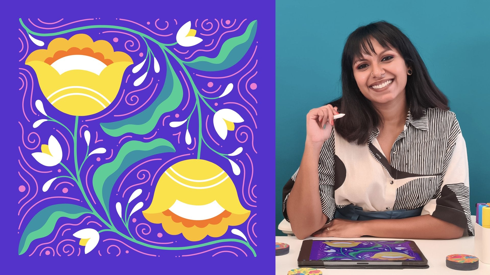
1. Intro: Patterns are everywhere around us. From your bed sheets to your notebooks and even your socks, everything around you has some form of surface design, designed by a person. Now, you can be that person behind some gorgeous patterns too. I'm Vinitha Mammen, a fashion designer and pattern maker by profession, a self-taught illustrator and lettering artist, and a top teacher on Skillshare. Did you know that you can create stunning patterns that perfectly tile up infinitely right on your iPad, all within the Procreate app? Ever since I discovered how to create seamless repeat patterns on Procreate, I've been hooked. They're so efficient because all you need to do is create one block and you can tile it up indefinitely to fill up a canvas of any size. Anything that simultaneously looks stunning and saves you time and effort has got to be a big win. Besides, if you're looking at building a career as a surface pattern designer, then knowing how to create seamless repeat patterns is a skill that will give you a definite advantage. They are perfect to go and all kinds of products from device cases and apparel, to fabrics, stationary and wallpaper. But if commercializing patterns is not your jam, then how does the idea of creating your own custom holiday wrapping paper sound? Whether you want to keep patents for a living or just for fun, you've come to the right place. Seamless repeat patterns are fun and exciting, but they can also be tricky and even frustrating if you don't have a smart and organized process and that is what this class aims at solving for you. I'll show you exactly how I create a floral pattern from scratch, but you can use the same basic process to create patterns around any subject you like to illustrate or even adapt it to use your existing artwork as motifs. By the end of this class, you'll not only create a fully functional, fully color editable, full job, seamless repeat pattern in multiple color combinations but you'll also have a template file setup in Procreate that you can repurpose over and over again to create all the patterns you ever want to create. This class is for anyone who wants to master an organized approach to creating seamless repeat patterns on Procreate in multiple [inaudible] even if you've never created a pattern before. However, a basic working knowledge of Procreate is ideal to take this class so that you can follow along with me comfortably. If you're completely new to Procreate, you might want to hop onto my previous class on Procreate Floral Illustration before diving into this one. So if you are ready to play with some fun seamless repeat patterns on Procreate, I'll see you in class.
2. Class Project: Your project for this class is to create a flow job seamless repeat pattern on Procreate. Together we will explore how to create a pattern tile on the Procreate app that can be tiled up infinitely to create a seamless pattern of any size. I'll be demonstrating the concepts and steps behind the process by creating a floral pattern as an example. However, you're welcome to follow along by creating motifs around a subject matter of your choice or even use your existing artwork as motifs. We'll first look at some basics around seamless repeat patterns, and then move on to set up a Canvas on Procreate with some pre-loaded selections that will massively aid our pattern creation process. You can also keep a copy of this file as a template to create more patterns in the future. I'll take you through some guidelines on the key elements that go into a baton design irrespective of what motifs you choose to illustrate before taking you through my process of creating the floral elements that I'll be using in my pattern. Once we have our pattern elements ready, we'll start putting our repeating tile together, focusing on the outer edges first and then filling up the central area of the tile. We'll then test our pattern to see if it indeed tiles up seamlessly and is spatially balanced before moving on to our final step of exploring different color palettes for our pattern. I want to welcome you to follow along with me as I do every step. By the end of this class, you'll have created your own seamless repeat pattern in multiple color combinations. Don't forget to export these as images and upload them to the project gallery so that we can all have a look at your creations. All you need to take this class and complete your project are the Procreate app, an iPad that supports it, and a stylus like the Apple Pencil, and brushes. Procreate comes with several sets of default brushes along with the app and we'll mostly be using these brushes to create our pattern elements. Except for the spot stamp brush that I custom created, that massively speeds up my process. I've included this brush as a free download for you in the resource section. Please download it into Procreate before moving onto the rest of the class. Also, I took some of the colors that I find myself using the most and curated some bright and fun color palettes around them. These are also available for you to download from the resource section. If you download them from your iPad, you will be able to directly import them into Procreate from there. You are more than welcome to pick any of these palettes to use in your patterns in this class and in your future projects as well. Are you all set to embark on this pattern journey with me? Let's dive right in by looking at some basic stuff about seamless repeat patterns.
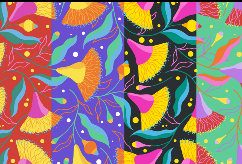
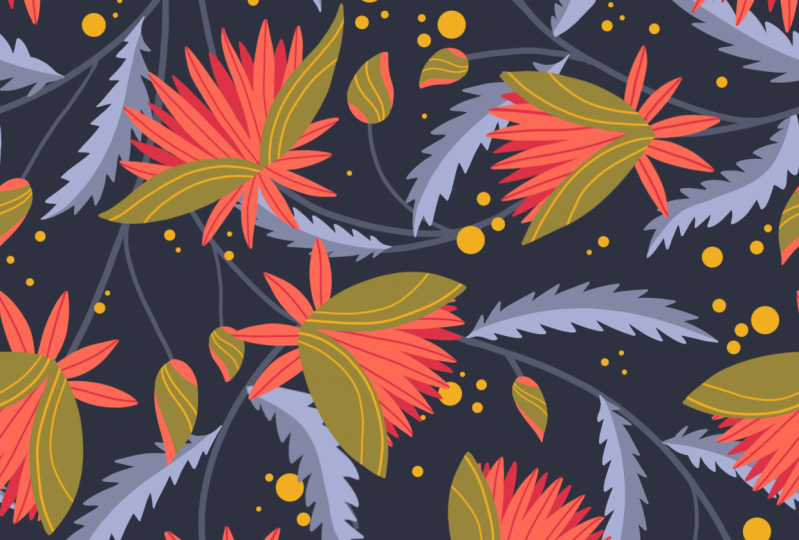
3. The Basic Stuff: Before moving on to actually creating our pattern, let's get some basics out of the way. In this lesson, I'll give you a quick look at what repeat patterns are and how they differ from non-repeating patterns, what are some types of repeat patterns? What makes a seamless repeat pattern truly seamless? Firstly, what do we refer to as a pattern in the context of surface design? A pattern is an arrangement of multiple elements or motifs placed around each other. Now, a pattern is called a repeat pattern when there is some regularity in the way the motifs repeat within the pattern as opposed to a random spread of motifs that follow no specific configuration, which is the case in a non-repeating pattern. Each basic arrangement that is repeated multiple times to create a repeating pattern is called the pattern tile, pattern block, or pattern repeat. Depending on how the pattern block tiles up to form a seamless design, repeat patterns are categorized into different types, like full drop, half-drop, brick, mirror, diamond, etcetera. Of these, full job patterns are when the tile repeats perfectly along both vertical and horizontal lines, and these are the most straightforward to create. In this class, this is what we'll be learning to create, a full drop repeat pattern. Irrespective of what kind of repeat pattern might be, there's one important feature that makes a patent seamless, meaning the repeats tile up without any visible bricks or boundaries between them. Or in other words, everything along the edges of a tile match up perfectly with those on the edges of an adjacent tile. For this to happen, every element on one edge of the tile needs to continue over on the opposite edge. This is the fundamental feature that makes a seamless repeat pattern seamless. This concept is at the core of our entire pattern creation process. Are we ready to begin? In the next lesson, we'll start creating our pattern by setting up a suitable Canvas on Procreate.
4. Canvas Setup: Now that you have some basics of seamless repeat patterns down, let's set up our canvas to start creating one. First of course, let's open up our Procreate app, so the gallery of all our previous artwork canvas shows up. Let's open up a new canvas by going here to this, plus icon and tapping it. There are a lot of preloaded canvas sizes that come with Procreate. You can also create your own custom canvas settings as well, which is what we'll be doing here. In order to create a custom canvas within this new canvas window tap on this, plus icon. This window shows up where we can choose the right settings for our custom canvas. Now, the most straightforward way to create a repeat pattern is, to do it on a square canvas. I'm going to create a square canvas that is 2000 pixels by 2000 pixels. We'll keep the DPI at 300, and with these settings we get a maximum of 113 layers, and that is a good number of layers for us to work with. If we start with a bigger canvas, we'll end up with artwork that can be scaled up a little bit more, but we'll lose out on layers. For instance, let me show you, if we go for say 3000 pixels instead of 2000, the number of layers has reduced to 55. But we need a considerable number of layers for the kind of workflow that will be following. After a lot of trial and error, I found that the 2000 pixels square offers a good balance for me. Three hundred DPI resolution works out well for most applications, and 130 less should be enough for us. I find it more comfortable to have a few extra layers at hand, than not. Of course, there are ways to work around it if you don't have a lot of layers, like duplicating canvases and merging layers down as you go. But I just prefer to keep the process less disruptive by starting off with a good number of layers, if I can help it. So these are our canvas settings; 2000 pixels by 2000 pixels, DPI at 300, and we have 130 less to work with. Then, just tap "Create" and we have our new canvas. As you know, in a seamless repeat pattern everything on one side of the pattern tile needs to continue over on the opposite side, to get that seamless effect. This is achieved by dividing the square canvas into four quadrants, and then transforming the artwork within those four quadrants. This is what we'll do next, we'll divide our square canvas into four quadrants and we're going to set up some pre-loaded selections for each quadrant, so that our canvas is all set to build our patterns on. To do this, first, we need to pick a color. Any color will do it doesn't matter because it will not show up in the final pattern. Now, if we look in the layers panel, we have the background layer and the first drawing layer. This is how canvases open on Procreate by default. We don't need to change anything at this point, we just need this one layer to do all of the setup. Once you've selected a fill color, just drag and drop it into the canvas, so our entire layer is now filled with that color. What we need to do is tap on this arrow here, this is our transformation tool. We need to go over here and make sure that both Snapping and Magnetics are turned on. This will help us to get nice and perfect selections and transformations. It's very important that you ensure these are both turned on, to get a proper seamless pattern. Also, to be on the safe side, we'll make sure that, "uniform" here is turned on too. This is what will maintain the proportions of your object as you transform it. If we divide our canvas into four, this is quadrant 1, 2, 3, and 4. The first selection that we're going to make is for quadrant 1, we need to start with a corner that is diagonally opposite to the quadrant. In this case, we'll go over to the lower right corner and drag it over to the middle of the canvas, and because we have snapping turned on, see how it snaps to the center point here? These golden lines here indicate the middle of the canvas, the vertical, and horizontal center of the canvas. As we drag this, we need to make sure that the edges of the blue square snap to these golden lines. This point of intersection of these golden lines is the center of your canvas. Basically, what we're doing is dragging the lower right corner of this square to the center of the canvas, making sure that it's snapping to these golden lines. Once you're sure it perfectly snaps, lift your stylist from the screen. This blue square now represents our first quadrant. You can tap the arrow once again, to release the transformation tool. Now what we need to do is select the contents of this layer, so for that go into the Layers panel, tap on the "Layer" click, "Select". Since in this layer the only object is this blue square, the selection comprises of only that. The rest of the area is shaded off and is not part of the selection, or in other words, only our first quadrant is now selected. Next, we need to save this selection, for that see this option called, Save & Load, tap on that, and then tap on this, plus icon. Now, our selection shows up here as selection 1, and it's now saved there. This selection one corresponds to our first quadrant on the canvas. You can go ahead and release the selection by tapping on this selection tool icon here. Now, all we need to do is repeat the same steps for the other three quadrants. Once again, just drop the color in here to fill up the rest of the layer. Then again, tap the transformation tool, Snapping and Magnetics are are already turned on and so is uniform, so you don't have to do it each time. Our aim is to create a selection for quadrant 2, we need to drag the lower left corner now to the center of the canvas. Again, our golden lines are activated, which means the corner is now at the exact center of the canvas. Release the transformation tool, go into the Layers panel, tap, Select. Our quadrant 2 to is now selected, go into, Save & Load, tap on the "Plus icon" Selection 2 corresponding to our second quadrant is also now loaded here. Just keep repeating the same steps, you don't need to open up a new layer for each quadrant selection, just the same layer works. Fill the layer, tap the transformation tool, this time since we're going for quadrant 3, we'll drag the opposite corner, the top right corner over to the middle till it snaps to our golden lines again, and release it. We'll select the contents of the layer again. There's another way to do this as well, use two fingers to touch and hold over the lay here and it will do the same thing. Quadrant 3 is now selected, Save & Load, tap the plus icon, and done. Finally, we have our last quadrant, fill the layer once more, transformation tool. This time drag the top left corner over to the center making sure it snaps to the center point of the canvas. Then in the layers panel, select the contents of the layer in whichever way you prefer, Save & Load, Plus icon, and we have Selection 4 corresponding to our fourth quadrant. We don't need this layer anymore, so we'll just swipe left over it and clear it. Even though this lead is empty, if we go into the selection tool here and go into Save & Load, the selections we made are still there. This is our basic canvas setup for creating a seamless repeat pattern. I'll go back to the gallery view, tap on this to rename it and I'll call this canvas, Pattern Tile Template. So we're going to use this canvas to create our pattern tile in. But we can also make a duplicate version of the same canvas so that we can use it as a template to create all your future repeat patterns, without having to do all the steps that we did in this lesson each time. All of these just needs to be done just this one time. That's it, our canvas setup is done. In the next lesson, we'll look at choosing a Color Palette for your pattern.
5. Color Palette: Before moving on to creating our pattern element, we need to decide on a color palette for our pattern. As I mentioned, we'll be adapting a workflow that will allow us to change colors at any later stage. You must be wondering why we need to pick a color palette at this point. Even though we can change the colors at any later stage, I feel it helps us to start off with a set of colors that we find pleasing. We still need a cohesive set of colors to work with while putting our patterns together so that we can create a nice visual balance within the pattern, and it keeps us inspired during the process. It also comes in handy when we want to create a collection of patterns, since color is something that ties a collection together. For this class, we're going to try and work with a limited color palette because firstly, a pattern using a limited color palette has a lot more visual harmony than one with too many colors. It's more pleasing to the eye and feels more intentional. Secondly, there is the practical benefit of more easy layer management. We're going to be working with a lot of layers. Ideally, we'll have at least one dedicated layer for each color that we use per element. The more colors we have as we make multiple copies of our elements, we may end up with too many layers which can become a challenge to manage. I would recommend that you restrict yourself to a limit of 4-6 colors as you're making your color palettes, excluding the background color. The background color is easy to play around with without having to add many layers, so we can keep that open. Pick a color palette of 4-6 colors. I've put together some color palettes and I hope you've downloaded them from the resource section and imported them into Procreate. I took some of the colors that I find myself using the most and curated some bright and fun color palettes around them. If you don't feel up for creating your own color palette, you are more than welcome to pick any of these palettes to use in your patterns in this class and in your future projects as well. You'll see that some of them have six colors, some five, and some four. You have multiple options to choose from. I've decided to start creating this pattern using this color palette called Summer Camp. Then we'll of course play with different color options in the end, including some of these other palettes I've created. Now, whichever color palette you choose to go with, out of these ones, or if you create your own, for example, you decide to go with passion sorbet, click on "Set Default" so that you'll have easier access to it every time you come to your color palettes. Now that you've set it to default, if you go to any of these options within the color menu, you'll see passion sorbet right here. Since I'm going with summer camp, I'm going to set that as default. We're all set to proceed. In the next lesson, we'll take a quick look at the key elements that make up a pattern and the hierarchy between them.
6. Elements And Hierarchy: Irrespective of what motifs you use to create your patterns, there are some key elements and a hierarchy between them that brings in a visual balance to the pattern. These are not rules by any measure, they are just suggestions or guidelines based on my experience with creating patterns that may help make pattern creation a little less overwhelming for you. Firstly, in any pattern, we have some statement motifs or hero elements that are the main focus of the pattern. These are ideally nice and big and more detailed than the rest of the elements to draw the eye of the viewer straight to them. In the case of a floral pattern, the flowers themselves might be the hero elements. Houses, cars, animals, fruits, planets, anything can be a hero element so long as they are big and eye-catching relative to the other elements in the pattern. Our second category of elements is complimentary elements, which as the name suggests, complement our main hero elements. For example, leaves and other foliage are the most commonly used elements to complement flowers. You can also incorporate other elements like clouds, road signs, paw prints, fashion accessories, and other smaller, simpler elements that are closely or loosely relative to the subject of your pattern as complementary elements. Finally, we have filler elements. The main job of these is to fill up any bald spots in the pattern and balance everything out. But in my opinion, they also bring in an extra touch of whimsy to the pattern and hence are my favorite additions. These are usually very small and very simple elements like little dots, sparkles, stars, squiggles, hearts, lines, and even tiny geometric shapes. Here's a pro tip for you, include some motifs with just an outline and no fill to create added interest. These outline-only elements are great way to fill up empty spaces without suffocating the pattern. Now, if you've taken my class on Procreate floral illustrations, this lesson may have sounded pretty familiar to you because I have a similar approach to building a floral composition too. In this class, we're only looking at an overview of how to create each floral element that goes into our pattern since the focus is on creating the seamless repeat pattern itself. If you're looking for a deep dive on a super organized system for taking inspiration from the natural world to create some stunning botanical illustrations, my Procreate floral illustrations class will be perfect for you. In the next lesson, we begin creating our elements for our pattern, starting with our hero elements, the flowers.
7. Flower Elements: In this lesson, we kick-off drawing the different elements that make up our pattern, starting with flowers. We've already duplicated this template canvas so just open any of them, and we can get right to it. I'm going to first pick up a dark blue color to do my sketching. Just because I'm used to sketching in blue now, and we also need a brush. I'm using this one called 6B pencil that comes by default with the app in the sketching category. Now I've gone ahead and pulled up an inspiration image from Pinterest of the flower I want to illustrate. It's this interesting but simple little flower called the Gumnut flower. We're not going to try and make our flower look exactly like this, or get every detail to match, we'll just be trying to break down the shapes and capture the essence of the flower in our illustration. Shall we get to sketching? Let's start off by drawing a simple line like this for the stem, and then we move on to this triangular pedicel. Something like this. Just go for it. You do not have to be precious about it, we're just laying down the basic shapes at this point. Now the petals, this flower doesn't exactly have petals, but we're going to just put down the overall shape that the little stringy stuff collectively forms, and if you look at it, it's this fan-like shape. Let's do that, starting with the two extreme sides of the fan and then join the two with a curve. Just like that. I want to reduce the angle of this here. So I'll just erase this bit and draw it again. I want to do a little highlight area here, just to make it a little bit more interesting, and to give it some dimension instead of being completely flat, and that should do for our sketch. We can bring in the rest of the details as we illustrate the flower in color. Now, I want to do one more flower. We're sticking to just one type of flower for this pattern between the two variations of it. Just to keep things a little bit more interesting and less monotonous in the pattern. We'll do that in a new layer and once again start off with the stem and then the pedicel. The subtle differences that come from drawing this flower again will add to the visual interest in the final pattern. I'll just move this down a bit to make some space for the petals. This time, I want to do a slightly more open version of the flower, a more open fan. We'll angle the ends of it more. Is that too wide? Maybe it's a tad too wide. I'm tapping with two fingers to undo and let's draw it slightly less angled. Also, another tip, you can get a nice smooth curve if you press and hold at the end of the stroke before lifting the stylus off the screen, and finally blocking out that little highlight area as well. That's both of our flowers sketches done. Now let's move on to illustrating them in color. We'll first work on the first flower. I'll turn off the sketch layer for my second flower. Open a new layer and move this layer below the first sketch layer. I also want to reduce the opacity of this sketch layer itself so that we can see what we're doing in the new layer more clearly. Then come back to this new layer that we just created, and let's get started. Now the brush I like to use the most to illustrate my florals is actually here in the calligraphy section, and it's called monoline. This brush also comes by default with the Procreate app, and now the colors. As you know, I'm working with this color palette called summer camp. Within this color palette, I'll first pick the yellow for the petals. We can adjust the brush size here and test it anywhere on the canvas to see if it's suitable for what's read about to draw. Somewhere around here looks good for me. I'll once again start off with the sides of the fan. Here instead of going with a smooth curve, I want to do a random wiggly line just to keep things more interesting and fun. Then we'll close the shape off. This spot will not be visible. It'll go behind the pedicel. You don't need to be specific about the shape here. Once your outline is done, we can drag and drop color into the shape. Next, we'll do our triangular pedicel. I'm going to select this darker pink color and open up a new layer above this. We want the pink part to cover the edge of this yellow shape. So we'll add the new layer above the yellow layer and outline the shape. Every time we add a new color, we want to ideally do it in a new layer so that we can change the colors easily at any later stage if we want. Outlines done. Now just drop the color. Now when I'm illustrating these elements, I don't include the stem because I find it much more efficient to add the stems later as we fill up our pattern tile. I sketch the stem because it helps me to place and direct the flower as I'm sketching it, but I'm not illustrating the stem at this point. So now all we have left are the details. Let's start with the highlight area on our pink pedicel. We'll go on and add a new layer, select the lighter pink. Now, I'm going to take help from a very powerful feature called the clipping mask. To activate this, go to the new layer you just created, tap it, and tap clipping mask. Now what this does is it creates a mask that clips whatever your draw and confines it within the active area of the layer directly under it, which in this case is the darker pink shape. So anything that I draw on this layer outside of this shape will actually be included in the layer. You can see it here, but it will not be visible on the canvas because this layer is clipped to this layer, which means, anything that you draw in this layer gets out of cropped within the shape of the layer below it. Only the stuff you draw that's directly above the shape will be visible. If you draw something here, it'll be visible, but it'll get cut off right at the edge of the previous layer. This is just a convenient way that I use to add details over existing shapes efficiently without having to carefully trace over the edges again and try and recreate the shape. This way, you can just draw a blob. All you need to intentionally create is this side of the highlight, and the rest of it will be taken care of. For this reason and many more that you'll see soon, I absolutely love using clipping mask. All right. Similarly, I want to create some squiggles here to represent some of the stringy stuff that we see in our image. For that, I'm going to open up a new layer right above this layer, and again, I'm going to turn on clipping mask. I'm picking this light orange color from the color palette, and then just go completely nuts with this and draw some wiggly lines just like that. Because I'm using the clipping mask on this layer, I don't have to take extra care to stay within the shape. I can just draw freely. This is just one of those things that looks better the more you let go. It's perfect to do it with a clipping mask on. Finally, we're going to add some loose dots along this edge of the petal shape. I'll pick this blue color for this, so I'll add a layer above this, but we're not using clipping mask on this layer, because I don't want to confine the dots to the petal area. I want some of them to just be freely floating around outside as well. Now my favorite way to create this kind of spots is to use my spot stamp brush. I trust that you've gone ahead and downloaded this brush. In my case, it's here, but yours would probably have ended up in the imported folder of brushes. So just find it and pick it up. The fun part about this brush is that depending on the pressure that you apply on your stylus as you tap, you can end up with different sizes of spots. So if I apply more pressure, I get a big blob, that's when I tap hard. If I tap lightly on the other hand, I get much smaller spots. Naturally, when you tap away like this, there will be a variation in pressure, and that results in a nice organic size variation in the spots, which I think keeps it more fun and interesting. Also, you can change the size of this brush just like any other Procreate brush. For example, if you make it smaller, now the biggest spot you can get with high pressure, is much smaller, and if you go higher up, the biggest spot would be gigantic. So using the size slider helps you control the range of sizes that you end up with. I got too excited and created a mess of this layer. Let me show you a quick and easy way to to the layer. Use three fingers and just scrub anywhere on the canvas and the layer will be magically cleared. Now let's do the spots. Just sprinkle them in and your hands will naturally create that subtly pressure difference to achieve the random sizes. Do some of them inside the yellow petals and some just floating around nearby. Basically, we loosely following the edge of the petal shape that we drew, but we're also keeping a few loose ones, both outside and inside the edge, just to add some extra fun and whimsy to our flower. That's it. We can turn off the sketch layer here, and this is our flower. Now, I like to do one extra step. We'll select all of these layers. So swipe right on each of them to select multiple layers at the same time. Now, all of these layers are selected. We'll tap here to group them. Now everything is in one group just to keep things more organized. I'm also going to rename this group as Flower 1. That's going to really help us when we make multiple copies of each element as we build our pattern. Let's move on to our second flower now. Turn on the sketch layer first, add a new layer. Underneath the sketch layer, reduce the opacity of the sketch, and once again, do the exact same steps. Starting off with yellow for the petal, doing the outlines again with my monoline brush, nice and squiggly edges, close the shape, and drop color. Then open a new layer above the yellow layer, drop in color, and do the pedicel, drop color. Now the highlight, add a new layer right above it, turn on clipping mask, select the lighter pink and start blocking it out. Now if you just draw this line and drop color, the entire thing is going to get filled. Because it's just a line at this point, it's not a closed shape yet. Even though we can't see it, we need to close it like that. Now if you see it's a closed shape, and now we can fill color just within this shape. Then we'll add a new layer right above the yellow layer, turn on clipping mask again, select the light orange and draw a squiggly lines within the petal. You can even get some of them to randomly overlap with each other. Finally, one more layer to do the spots, no clipping mask this time. Select blue for the dots, and using our spot stamp brush, sprinkle away, varying the pressure on your stylus slightly as you go, and then we'll select all these layers and group them. Rename the group as Flower 2. Now that we're done with the flowers, we can, in fact, go ahead and delete the sketch layers, because one, we don't need them anymore and two, every layer is precious as we move forward. So just swipe left and tap delete on both the sketch layers. There we have it. We're done with our two flower elements for this pattern. In the next lesson, we'll create our foliage elements in a similar manner.
8. Foliage Elements: We've finished creating our flowers. Let's now move on to our second element, foliage. For this, we're just going to do some very simple leaves. The gumnut flower grows on a type of eucalyptus tree. So I'm thinking I'll do something similar to eucalyptus leaves. But I'm not using a specific inspiration or reference image for this. I'm just going to do something simple off the top of my head. I will, however, show you exactly how I go about this. Just like in the case of the flowers, we'll do only one type of leaf. But we'll do three variations of it because we'll have a lot more leaves in our pattern than we had flowers. So more variation means less monotony. Let's start with sketching these leaves. First of all, we need a new layer, of course, so let's open one. We're using the same 6B pencil brush for sketching. We'll go on and sketch out our leaves in this space here. Wherever you have some empty space on your Canvas is fine. Now, when I'm drawing these leaves, I first start off with a line like that. Just a quick and dynamic line to just guide the direction and movement of the leaf. Then just draw some wavy lines like this on either side of that line and that's it. We just need to do two more like this. Next one, on a new layer, again, draw a line like that and then create a wavy leave shape around it and that's our second leaf sketch. One more just like that. Just let your hands flow as you do this and don't try to be precise about it. It's okay if it touches other elements on the Canvas since it's in a different way altogether. Now we have our sketches. I want to just move them around a bit so they're all together and even adjust the sizes so that all three of them are in a similar scale and that's it. We're ready to move on to illustrating our leaves in color. We'll start with the first leaf. Turning off the other two sketch layers, reduce the opacity on the sketch layer, open a new layer below it. I'm going to use two colors for these leaves, this green, and blue. I think it's best to just stick to two or maximum three colors for the leaves. With the green color and our monoline brush selected, draw the outline of your leaf like that. You don't have to follow your sketch exactly, just use it as a general guide and then drop color. Now, open a new layer above it, turn on Clipping Mask and select your second color. In my case, it's this blue. We're going to do one half of our leaf using this second color. We don't have to follow this line exactly. This was just to guide the dynamics of the leaf. It's not necessarily the middle vein, although it can be. I like to do a more wavy, flowy line in the middle. It does not have to be parallel to either of the sides of the leaf or anything like that. Just go with the flow and do a nice, curvy line like that down the center of the leaf. Now at this point, it's just a line. We want to fill one side of the leaf with a blue color. Similar to the case of the highlight detail in our flowers, if we drop color in right now, it will just fill up the entire leaf. Basically, the entire leg gets filled up, but because Clipping Mask is turned on, it fills up the entire leaf and that obviously does not do us any good. Instead, we will start off like this at one end of the middle vein, bring it over to the other end, join it like that. Now it's a closed shape and we can fill it up. I'll just go on and delete the sketch layer right away since we don't need it anymore and we'll group these two layers and call it leaf 1. You can also do L1 if you want to save a few microseconds. Turning on our next sketch layer, reducing the opacity, opening up a new layer underneath it, and going back to my green color. We'll do the exact same steps to do this leaf. Start off by outlining the leaf. I feel like this leaf could use some more curves so I'm adjusting the shape a bit. Feel free to do this. Nobody is going to see your sketch. If you feel like something needs to change, just do it. New layer, clipping mask, second color. Draw a nice, curvy line down the middle of the leaf like that. Close off any one side and drop color. Deleting the sketch layer 2, then group these two and I'm going to rename this as leaf 2. Next leaf, opening a new layer. Again, reducing the opacity of the sketch and with my green color again, outlining my third leaf and dropping color. New layer, clipping mask, second color. Draw the middle vein, close off one side and fill it. That looks good. I'll just delete the sketch layer and once again, group these layers. We'll call this leaf 3. Now let me give you a tip. One of the things I do when I'm drawing these kinds of leaves is I intentionally keep both ends pointed like this and this helps me to create more versatile leaves because I can attach them to the stem on this side or this side of the leaf. That way I'll have more variety. I'll be able to do more mixing and matching. Of course, it may not be possible with all kinds of leaves, but whenever the shape allows me to, I like to do this. That's it. These are our three leaves or foliage elements that will go into our final pattern. Wasn't this super easy? If you cannot get the hang of this, don't worry. These kind of flowy lines can take some getting used to. But I promise you that if you keep practicing, you're going to slay it. In the next lesson, we'll look at our filler elements.
9. Filler Elements: Now we have our last type of elements to create, which are the filler elements. For this, we'll be doing a couple of simple flower buds. Since the fillers are going to be small and will be duplicated several times across the pattern tile, I want to do two different types of buds to add more variety to the mix and this time we'll just do one variation of each. For our first type of bud, I'm taking inspiration from the bud of our very own gum nut flower. Just as a side note, there is no rule of pressure whatsoever to have every element in a floral pattern come from the same plant. We're not creating scientific illustrations. You can totally go on and mix and match elements from literally any kind of botanical being. In this case, I just happened to have been inspired by different buds of the gum nut tree. Like I said, this image is going to be my inspiration for the first bud we'll create. We're going to dive right into sketching it. Let's open a new layer and go back to our sketching settings with your choice of pencil color and our trusted 6B pencil for sketching. Find some clear space on your canvas and we'll start by laying down the shapes. Here, instead of just doing a simple line, I want to do a squiggly line. You know I love my squiggles. I think this end can be a bit more tapered. I'll redraw this, that looks good enough for the sketch. Since we're doing two different types of buds, let's move on to illustrating this one and we'll work on our second bud right after that. With my yellow color and the monoline brush selected, I start by outlining this largest section of the bud. Then drop in the color. Now open a new layer underneath it to draw this bit. I want it to look like it's this bulb coming out from inside of the yellow casing. Let's go with blue for this part, we'll start slightly away from the edge so that again, it looks like it's peeping out from inside its little yellow hole. Close the shape off, fill it in. You can get rid of the sketch layer. I think it'd be nice to add in some shadow areas over this. I'm just going to add a new layer, clipping mask, pick up a light orange color and we'll just go in and block out the [inaudible] parts so they appear like they're in the shadow. Just like that. I think we're good to go on this one. I'll just rotate it so the bud faces up like the flowers. I'll also make it a bit smaller in proportion with the size of our flowers and leaves. I think it does not need to be bigger than this. That's done. Let's delete this sketch layer and group these together. We can rename this group as bud 1. Now, I'm just going to wing it with this second one. I want it to be even simpler than the first. On a new layer, I'll start off by putting down a little elongated teardrop-like shape, and I think it'd be nice to do something similar to this casing. Drawing from that concept, let's pull out like this from the sides of our teardrop to make a casing and connect the two sides like that with a squiggly line. I want to also round off this pointy end a bit. I'll just get rid of these bits that we don't need. This is our second bud design. Very simple, but full of life. Now, let's add some color to it. Reduce the opacity of the sketch, new layer underneath this layer, this time I'm going with the light pink for the casing. Go in with your second color. I've picked the yellow and draw a little egg in there. That looks pretty good to me. I do not think we need any more details on this. Let's delete this sketch layer. Group these together, and let's call this group bud 2. These here are our two flower buds, which we'll use as fillers throughout this pattern. Besides these two, we'll also be doing some loose spots around the pattern using our spot stamp brush. Those will be our third filler. Now that we're done with creating all our floral elements for the pattern, we'll move on to doing some prep work on our pattern tile in the next lesson.
10. Prepping Your Pattern Tile: We've created all of our main elements that we'll use in our floral pattern, and now we can start building our pattern tile by placing these elements across the tile. Almost, we have a little bit of prepping to do before we start laying down the elements so that's what we'll do in this lesson. Now, we have our canvas here with our floral elements. Let's just go back to the Gallery View for a bit. At this point, I want to duplicate this canvas and keep a copy of it just so that we have all of our elements in the original unedited state here before we start moving them around, cutting them up, resizing them, so that if at all we want to go back to this state at any point in our process or even if we want to reuse these elements for a different pattern in the future, it's all there, untouched. I'm also going to rename this canvas as Pattern Elements, and I'll just keep that there. Again, to make things even more organized, if you look at my Gallery, you'll see that I have canvases related to the same artwork stacked together. A stack on Procreate is basically just like a folder. So I have a separate folder for this artwork, another for this artwork, and so on. I'll just go ahead and select these three and tap Stack to stack them together. Now, all our canvases for this class are in one place here in this stack. You can also rename stacks. I'm going to call this one Gumnut Pattern. Let's go into our Gumnut Pattern stack. Our pattern elements canvas is right here. We're not going to touch it at this point. Let's open the other copy. First thing I want to do here as a little bit of reorganization of the list. I want my flower layers on top, followed by the buds, and the leaves at the bottom so that if there are any overlaps, the flowers and buds are all still visible, and parts of the leaves are what might be hidden. For this, I'll just select both my flower layers and then just drag them both over to the top. Now my flowers are here, buds are here, leaves are here. Everything is in order. Next, I want to make a copy of each of our element groups. Again, this is so that we have a copy of each element in their original state right within this canvas, in case we want to pick it up, and we will need to pick it up at later points in our process because we are going to do all sorts of crazy transformations to these elements, including cutting right through them. So we will have multiple occasions where we'll need to come back and pick up these elements in their original states. Let's duplicate each of these groups. Swipe left and click duplicate on each of them. Next, we'll select one of each element group. Now, we have one of each selected. We'll just drag them all, all the way up here, and the ones in the bottom can be our backup layers. We can turn off visibility on all our backup layers. In fact, we can turn all the layers off right now because we don't need to see any of our elements just yet. Now, when we fill up our tile with elements, we need to go about it in an organized fashion to get the best results. First, we'll start off by populating just the central area of our tile, so along the vertical and the horizontal center of the canvas. It's going to be a lot easier for us if we can see these center lines as we fill up the tile so that we can focus just on the right areas. For this, click on this wrench icon, go into the Canvas tab, turn on Drawing Guide. By default, this 2D grid is what shows up as the drawing guide, and that's not what we want. We'll go into Edit Drawing Guide Symmetry. This vertical symmetry line is what comes by default. But we want this line and this line, so in to Options here, tap Quadrant. Quadrant symmetry divides our canvas into four quadrants and also gives us these vertical and horizontal center lines. We're not going to create a symmetry pattern here. We're just going to use these central crosshairs as a visual guide. Tap Done, and we have our guides ready. Now, we can finally start laying down our elements, which is what we'll do in the next lesson.
11. Building Your Pattern Tile: Our tile is prepped and ready for us to build our pattern on. Like I mentioned, we're going to start by filling up the central areas of the pattern, focusing on the vertical and horizontal center lines. First, I'll turn on the visibility on our flower layers. I'm going to reduce the size a bit so we can have a few more elements in the tile. Somewhere around here should be a good size change for us. For our second flower, just make it a tad smaller. Now remember, it's okay to go smaller, but if you go bigger than the original size in which they were drawn, you'll end up with some pixelation. Going bigger is not a very good idea. These sizes look good for us. Uncheck this one. We'll start by deciding on a spot for our bigger flower. Pick your biggest elements first. When I do this, I like to keep both Snapping and Magnetics turned off, so that I can move my elements more freely. It doesn't snap to anything, and it's not restricted in any way. Let me start off by putting one of these right here in the middle. Rotate it a tad. You don't necessarily have to place your first element right in the middle always. But I find that it helps to start from the center of the canvas. I'm just playing around with it a bit, and placing it somewhere around here. Let's get our second flower. Maybe we can tilt it like this. It's nice to vary the angle, vary the sizes, and orientations of our elements. That's what gives us all the visual interest in such randomized patterns. Now one very important thing we need to make sure here is that we're not going over the edge of the canvas at any point. We're going very close to the edge, but we don't want to go past the edge, or even touch it. You'll see why. For now, just get as close to the edges as you can without touching them. Another thing you want to think of when you're placing, specifically these side of side profile flowers, is the direction of the stem. In this case, the stem is probably going to go this way. In this case it'll probably be like this. You want to try and visualize this as you place the flowers, so that we don't end up with all the stems pointing in the same direction. Now we need copies of these elements, so we'll start duplicating them, and placing them around in other positions near the center lines. Maybe this one can go around here like that. Similarly, just keep duplicating the flowers and give them a place to be. Rotate them, reduce their sizes. You can also flip them horizontally or vertically. Do what you need to do to add a nice touch of randomness and visual balance. This entire thing is a trial and error. We are going to keep going back and forth in this process of filling up our tile to accommodate other elements. There are no rules to go by. All you can do is watch out for similarities in nearby elements and try to break that up. By creating more patterns, you'll start developing an intuitive eye for this. For example, I don't want this to be in the exact same angle as this. I want to mix things up, so I'll go like this, and I'll add one more flower down here. The stem on this one can go like that. This one's stem would probably come here or here. I think this position works out for this flower. Now we have our flowers spread out along the cross hairs. What's going to happen as we move forward, is that our canvas is going to get cut along these lines. Once it gets cut, we cannot go back and add any more elements over the center line and adjacent areas safely without creating any seams in our final pattern. We'll try our best to cover these middle areas at this point. If you see, we have some more spaces here along the center lines, but we can use our other smaller elements to fill them up. We want to place the leaves next, but we need to first add some stems to these flowers so that we get a better idea as to where to place the leaves. Let's open up a new layer. We'll do all our stems in this layer. With my green color and the monoline brush selected, I'm just going in and adding some simple curvy lines as stems for my flowers. Again, make sure that you don't touch any of the edges of the canvas. All our flowers have stems now. Let's add some leaves next. We'll just make leaf one visible and find a spot for it. It takes some moving around till you feel like it belongs, so just play around and have fun with your elements. That looks good there. We need to add some leaves on this side too, but we cannot touch the edges. We're going to leave it for now. We'll get a chance to adjust these areas later. Only the middle parts that are going to get cut are the parts that you will not get a chance to change safely later. Let's create more copies of the leaves and place them similarly on multiple spots across the canvas. I want the leaves to look like they're curving out from the stem. That's one of the factors that helps me decide on the angle at which they need to go. You can also let the leaves overlap with the flowers in some areas. These areas around the center lines are slowly getting filled up. At this point, I think we can start placing our buds. We'll have to keep coming back and forth anyway, because remember, this is a back and forth process, not a linear process. Let's again start by drawing some branches for these buds to go on. This time I'll reduce the size of the brush a bit, because I want these branches to be a little bit thinner than the main stems. Just look out for empty spaces where you can have buds and draw a little stem there. Like here, this space over the center line can get a little bud here. Let's start placing our buds now, and we'll see where it goes. We have bud one here. Move it over here, turn it around, make it a bit smaller, rotate it so it aligns with its branch. Let's do another bud one here. I haven't done the branch for it yet, but we can add that later. Something like that. Let's take our bud two. I want one of them to be here. I put it here, smaller, and line it up with the stem, and another copy can go up here, like that. There's also some space here which can be very difficult to fill up later. Let's address that right now by adding one of these buds here. But we cannot add a stem for it at this point because it's too close to the edge. Make sure the pointy end faces away from the center line so that you can add a branch to it later on. We can do the same thing for the little space up there also. Again, making sure the pointy end faces away from the center line. Next, we can add some more little elements to fill up the rest of the little spaces that are still bold around the cross hairs. Remember I said we'll be adding some spots and some outline leaves. We can add some of them right now. Let's go on and make a new layer above the stem layer for our outline leaves. I'm going to do them in this pink. Just go in and add a simple squiggly leave like that. See how these are great to take away that boldness without blocking our giant areas of solid color. That's why I like using a few of these outline-only elements in my patterns. Here, let me show you. I'm just putting down some very simple random squiggles to form leaf-like shapes. Let me add one more of these right here, and I think that should do for now. Let's open another layer to do some loose spots. I'm going to do these in yellow. Back to our spot stamp brush again, find a good size, and find these small bold areas on and near our center lines, and drop a spot. You can even do a little cluster of spots like this. At this point, we're mainly focused only on the bold spots around our center lines. Not only on the lines, but close to the lines also. The rest we'll take care of later. I think that's about it. Closely look along both center lines and make sure that all the little spaces look well-balanced, and we're good to go. In the next lesson, we'll take what we just did and transform it to arrive at the outer edges of our pattern tile.
12. Outer Edges Of The Tile: In the previous lesson, we filled up the central areas of our pattern tile. In this lesson, we're going to take all the elements we laid out in the center and shift them to the outer edges of the tile by flipping our quadrants. I love doing this. It's a very satisfying step in the process and it is also the key step that makes our patterns seamless. Ready? Let's get right to it. Now, in our pattern so far, there's different kinds of irregular shapes happening. There are leaves, there are birds, flowers. All the shapes are irregular. If we select them all, we'll get a collective irregular shape. But what we want is a square with straight edges. For our method to work, we're relying heavily on perfect squares that snap perfectly with each other along the straight edges. For this reason, the first thing we need to do is add a fill layer. We'll add a new layer just below all of our element layers, above all our backup layers. Then pick any color that we haven't used so far. I'm going to go with this dark gray. You can pick literally any color outside of the color palette you use for the elements. Now, drop the color into the Canvas. Before releasing the pen, we need to pay attention to the color drop threshold. We need to drag our stylers all the way to the right so the color drop threshold is a full 100 percent. Because we need to make sure that the color fills all the way to our edges. We want the entire Canvas to be filled up. We don't want any of our pixels to be left out. Once you've ensured that, release. Now we have a perfect square layer. We don't need our guides anymore. So I'm just turning that off. Next, we need to select everything, everything that's visible on the Canvas right now. All of our element layer, including the fill layer we just created. Swipe right on each of them to select them. You're all selected now. Come out of the layers panel. Next, we're going to isolate the elements in each quadrant and flip them. With all those layers still selected, tap on our selection tool. Remember we made some quadrant selections early in this class and saved them here. This is where they're going to come to use. Tap here on Save & Load. They're all still here. Tap Selection 1. Now, first quadrant alone gets selected. Everything else is shaded away and not part of the selection. Now tap on the transform arrow. You can see the bounding box of our quadrant one selection. Now, we want to move everything that's in the middle to the outer edge of the tile. We want what is along the vertical center to move over to the left edge, and everything along the horizontal center line needs to move over to the top edge. It might sound scary, but we have a super easy and quick way to do this. First, we Flip Horizontal. Now, what was along our vertical center has moved over to the outer edge. Then Flip Vertical. What was along the horizontal center has moved over to the top edge. Easy. Now we just need to repeat this on our remaining three quadrants. First we'll release this by tapping once again on the transformation arrow. I know it looks bored and ridiculous right now, but it will all make sense very soon. Let's move on to the next quadrant. We're not changing anything here. Our selections still remains, so we can just continue. Again, tap the selection tool, Save & Load, Selection 2. Our second quadrant is now selected. Transformation arrow, Flip Horizontal, Flip Vertical, release it. Now, third quadrant, Selection, Save & Load, Selection 3. This quadrant is now selected. Transformation arrow, Flip Horizontal. It look like our clipped details have disappeared, but no need to panic. That's just temporary. Once a transformation is set, it'll all show up like it did in these other quadrants. Don't freak out when that happens. Cool. Flip Vertical and don't touch anything else as you do this, don't tap anywhere. If you tap somewhere, then it will nudge the selection over to that side. Be extra careful not to touch anything else. Because even if something moves by a single pixel, a pattern is not going to be seamless. That's something to keep in mind during all of these transformations. Do not touch anywhere else on the screen. If you accidentally end up touching or moving something, it's best to undo and start over with that quadrant. Now, our final quadrant. Once again, Selection, Save & Load, Selection 4. Tap on the transformation arrow, Flip Horizontal, Flip Vertical, and release. There you go. All of our elements that were along the center lines have now moved over to the outer edges of our pattern block. If you take a closer look, you can see we've cut through our elements to move them to these new positions. Now this flower continues over here. Similarly, this, the pedestal of this flower continues up here. A stem that starts here, continues here. These are all going to line up perfectly if we did a good job. This is what's going to make our pattern seamless. The fact that you can see elements from one edge continuing seamlessly on the opposite edge. This is how we achieve a seamless pattern. In the next lesson, we'll fill up the now empty center areas of our a pattern tile to finish it up.
13. Center Of The Tile: Our pattern tile now has an outer frame of floral elements with an empty center. In this lesson, we'll fill up these empty areas in the middle by laying down more elements. This time, however, as you can see, some of our elements have been sliced up. This is where our backup layers come in handy. For example, both our flower groups have been cut up and distributed all over the edges. We'll create new copies of both flowers from our backup layers, and take them both over to the top because we want all our flowers to be on top. Take them all the way up here. Now you can proceed with laying them down just like we did earlier. Play with their sizes, positions, angles, and orientations till you find a good fit. Again, think about where the stems will go, the overall color balance within the tile, and break up any unintentional regularities happening. If you look here, there are more flowers on this side, and this part is a little bit empty in terms of flowers. That's why we're going to put a nice big flower right here. Then we want to draw stems for these flowers. Go back to the same stem layer that we created earlier. Pick up our green color, and using the Monoline brush, join the stems. One here like that. This one may begin coming from here. I like that. Now we can start placing some leaves. Look out for areas that are not so leaf-heavy and focus on those spaces first. You can also let parts of leaves go under nearby flowers. We don't have any Leaf tools intact. They're all split up. See? We'll have to pick up a new copy from our backup and bring it up here to where our other Leaf 2 layers are, and we're good to go. We'll add one of these in here. That looks good for now. Let's add some little branches for the buds. There's a lot of leaves over here, so I'm thinking instead of this leaf, maybe we'll do one of these buds here. Let's get rid of this leaf, and instead of that, we'll add a middle branch here for the bud. Our buds are both intact, so let's make some copies and add them in. Remember, there's one here and one here that don't have stems. So back to the stem layer, and do little stems like that for both. Now let's draw some outline leaves. Go to the layer where the previous outline leaves are, pick up the pink color, and put down some squiggly leaves. We're also looking out for areas where [inaudible] [inaudible] we feel there's not enough pink, like here in this area. It's a lot of green and blue. Let's mix it up with some pink leaves. If you see a long part of the stem that has nothing on it, you can add these leaves there. That looks good for now. We can always come back and add more later if we need to. Now let's do the spots. Find the layer with all the spots, and with our Spotstamp brush, throw in some spots in the remaining empty spaces. When we add all these little fellows also, we're going to try and stay away from all the edges. We're not going to add anything to our edges now. The edges are done. Cool. We get nice and close to the edges, but we will not touch them. That looks pretty good to me. We might just be done with our pattern tile. We'll find out if we are in the next lesson when we test our pattern to see if it tiles up seamlessly.
14. Testing Your Pattern: The moment of truth is here. We're going to test our pattern by tiling it up to see if the tiles fit together seamlessly and everything looks nice and well-balanced. We're about to find out if we did a good job so far. Ready? First, let's go back to the gallery view, and within this stack, we'll open up a new canvas. This is the last size we created. Procreate remembers settings and we don't need to change anything. We have a new canvas, just leave it there for now. Go back to our pattern tile. We need to take this over to the new canvas now. Instead of moving it layer by layer, or exporting the whole thing as an image. Since we're just testing our pattern now, we can do something quicker. Use three fingers and swipe down. Then the copy and paste menu shows up. In this menu, tap "Copy All." That means everything that is currently visible on your canvas is now copied to your clipboard. Go back to the gallery and back to the new canvas that you created. Do the same thing again. Use three fingers, swipe down and this time do paste. Our entire pattern tile shows up here in this canvas and it's all in one single layer. Now we want to make copies of this tile. We're going to test this pattern by tiling up four repeats, one on each quadrant. Let's duplicate this layer to create four of them. Select one of the layers, tap on your transformation arrow. Now make sure that "Uniform," 'Snapping" and "Magnetics" are turned on. This is very important to ensure that our tiles snap perfectly to each other. Now it's time to scale down each tile to fit within each quadrant. We'll drag this bottom right corner, to the center of the canvas just like we did in our very first step when we set up the canvas. We can't see any change here because we're transforming the lowermost layer right now. You can work on any layer, doesn't matter, but we can still see the bounding box so that works out for us. Once the corner snaps to the center, release. Even in the layers panel, it doesn't look like anything has happened because you've just changed the size but you'll see it soon. Now we'll do the same thing to the next layer. Drag this corner over to the middle. Then the next layer, drag the top right corner down to the center, make sure it snaps to the golden lines, release. Finally, our last one. Hopefully, now we'll see everything come together perfectly. Top-left corner over to the center and release. Voila, looks good overall, but let's take a closer look. First thing I would look for is if there are any visible seams as the patterns tile up. Basically, along the edges of the tiles, we want to zoom in and make sure that there are no seams. I don't see any. Now if you do see any seams, the first thing I would check is the background fill. I would go back to the pattern tile canvas and do the background fill again, making sure that the color drop threshold is definitely a full 100 percent because that's a very likely cause for the pattern not tiling up seamlessly. Upon testing the pattern again, if you still see seams you may have accidentally moved one or more elements that are around the edges of the tile at some point. So you'll have to identify which one and start over, replacing that. Chances are if you've done all the steps up until now carefully and systematically, you'll be just fine. Once you've ensured that the pattern tiles up seamlessly, you just need to take a good look at the whole thing. Make sure the colors are all looking visually balanced and the spaces between the elements look even throughout. If you see any problems, just go back and add or remove some little elements from the central area of the tile, accordingly. Now, everything here looks good to me. Our pattern has passed the test. In the next lesson, we'll go back into our pattern tile and reorganize all our layers on the basis of color.
15. Reorganizing Layers By Color: Now that our pattern tile is ready, we can move on to exploring different color options of the pattern. But before we dive into color plane, we need to do a little bit of reorganization of our layers. Because at this point, if we want to change the colors, we have way too many layers happening and things are a little bit all over the place. We need to bring some order to this. At the end of this process, our layers will not only be organized by color, we're going to end up with a much smaller number of layers, which in turn means a smaller file as well. Overall, it's going to be a lot more manageable. Let's get to it. Again, we will not be touching any of our backup layers. We will be leaving them as it is. Now, our stems are already in one layer, so are our outline leaves and our spots. That's fine. Nothing to do there as of now. What we need to do next is put all of our leaves together, not in one layer, but in two layers because we have two colors in the leaves. We'll put all the green leaf parts in one layer and all of the blue parts in a separate layer, and all our leaves are in different groups right now. We need to first put them all in a single group, and how we do that is tap on the group and do "Combine Down," not Flatten; Flatten will merge the layers into one layer. That's not what we want. We'll Combine Down. So those two layers get combined into the group directly below it. Just keep doing that. Keep doing Combine Down till we have all our leaf layers in a single group. You can expand this group now, and you'll see we have a bunch of these green layers and a bunch of blue layers clipped onto the green layers. Let's select all of the layers in any one color. I'm doing the blue now for instance, and that's all of them selected, and then just drag them all together over to the top. So they're all together here. Don't freak out over what you see here. That's because after we did this, all of these layers have gotten clipped to this one leaf. That's why the rest of the blue has disappeared, but it's only temporary. Everything is going to fall back into place very soon. What we'll do is, we'll remove the clipping mask on this layer. All of these clipping masks will disappear. Now it looks even crazier here, but that's okay. Next, we'll merge these layers by pinching them together like this, and all our green layers have come together now, since we moved the blue ones away. Now, we just need to pinch these also to merge them into a single layer. Now in this group, we have two layers, one green layer, and one blue layer. Now, all we need to do is reactivate the clipping mask on the blue layer, and everything is perfect. We can rename this group as leaves, and that's nicely organized over there. Now we just need to follow the same process for our other elements too. Let's do the buds. Since we have two different kinds of buds in two different color combinations, instead of putting them all together, I want to make two separate groups for the buds. One group for Bud 1, and one for Bud 2. Let's combine down all the Bud 1 layers. Expand the group. We have three blue layers, three yellow layers, and three orange layers clipped to the yellow layers. Let's gather all our orange layers. Drag them over to the top, release this clipping mask, and then merge them together. Select all the yellow layers, drag them over here, merge them, and then merge the blue layers. Now, remember, our orange layers will clip to the yellow layers. Just reactivate the clipping mask and everything is now in place. We're not renaming this group, we'll leave it as Bud 1. Now, Bud 2: start combining down from the topmost group. We don't have any clipped layers in this group. So all we need to do is gather our pink layers together, pinch them together, and then pinch all of these yellow layers together into a single layer, and done. Finally flowers. I don't think we need to separate these flowers as Flower 1 and Flower 2 groups because they are essentially the same kind of flower. Just like we did our leaves, we'll put all our flower layers in a single group. Let's just start combining down from the topmost group again. All of our flowers are now in this group, open up the group. The light pink is clipped to the dark pink, remember that, and we have the orange clipped to the yellow. Same drill again, selecting all the light pink layers, drag them up to the top, release the clipping mask, and merge them. Next, we do our dark pink layers. Drag them all to the top here, right below the light pink layer, merge them together, and we can go on and activate this clipping mask right away. Similarly, we'll do our blue layers, the orange layers, and finally, the yellow layers, and reactivate the clipping mask on the orange layer. Done, we'll rename this group as Flowers. Everything is nice and organized. You can also go ahead and rename these layers if you like, to be even more organized. This layer can be called Spots. This can be renamed as Outline Leaves. This is our Stem layer, and this is the background. Everything is neatly organized and good to go. This takes a little bit of work, but it can go a long way in making your patterns completely flexible in terms of color exploration. You've done all of this work in the previous lessons, and if you just take out a little bit of time to do this one step, you'll be able to generate your pattern in multiple color layers that are completely different from each other. It's going to be totally worth it. Cool. Now we're all set to start playing with different color variations in the next lesson.
16. Color Play: In this lesson, we're going to have some fun with colors. I'll take you through some ways in which we can explore different colorways of the pattern we created so that you can get the same pattern to appeal to multiple moods, applications, and audiences. I've renamed this finished canvas as final pattern tile so that we can identify it easily. Now, let's go on and keep this as it is and make a copy of it. This color palette was called summer camp. Let's rename this new copy as summer camp pattern tile. Now, we don't need any of these backup layers, so select them all. We're going to create a new copy of this canvas for each color combination. If you want to save some space on your iPad, you can get rid of all these backup layers by deleting them. They're all still safely kept in our final pattern tile canvas should you need them at any point. Cool. Now, the first thing we'll do is play with the background color. Just doing this alone can change the entire look and feel of your pattern instantly. When I created this pattern, I just randomly picked this dark create to fill up the background, and I love how it looks. This is definitely an option I want to keep. But I would like to see how it looks with some other background colors too. Right above this background layer you can add a new layer, and drop a new color into the canvas. Similarly, you can try out as many different colors as you want to. Just remember to add a new layer for each color. You can keep the ones that you like and delete the ones that you don't. You can turn the visibility on these layers on and off to activate any particular one of these background colors. I don't bother keeping a separate file for each background option. I just keep all of them within the same canvas. That's one way to quickly and easily change the look and feel of your patterns by keeping everything else the same and changing only your background color. Now, let's look at how we can take it further by changing the colors of our elements themselves. We'll first make another copy of this canvas. Let's try out a different color palette altogether. Let's see. How about we go with this? Our passion solve a color palette instead of the summer camp that we used before. I'm going to switch up all the colors in the pattern to these new colors. For example I'll change our pink pedicies to purple now. I'll pick up the lighter purple first to replace all the light pink parts. Then if we were to drop color into each element like this, it's going to be a nightmare. It's definitely not the most efficient way to add colored multiple elements. It's going to drive you a bit bonkers and probably will give you a nice full round workout going back and forth like this, trying to get every element individually. Imagine doing that for all of the spots all the outlined views, it's going to be absolute nuts. Fortunately for us, we do not have to do that. There is a much better way to do it. In comes Alpha Lock. Procreate has this feature called Alpha Lock which is similar to clipping mask, but not quite. Let me show you what it does. I'll just turn on the Alpha Lock here for this layer and you can see this checkerboard appears in the layer icon indicating that Alpha Lock is active on this layer. Now everything other than what is already on this layer will be locked off. Actually let me demonstrate this on a layer that does not have a clipping mask. Now I'm Alpha Locking this dark pink layer. Then if I try to draw, nothing shows up till I cross over the dark pink areas. It's like having a clipping mask over this but not exactly. You're still joining the same layer but whatever you draw is confined within the pixels that are already active in that layer. That's what Alpha Lock does. This comes in very handy when you want to change the color of an entire layer. When you have multiple elements on a single layer and you want to add a new color on all of them in bulk, this is the most efficient way to do it. I'll pick up this darker purple here. I've already activated the Alpha Lock. Now, all I need to do is tap on the layer icon and tap fill layer. Everything in that layer has now turned purple. I'll show you again. Say you want to change the color of all the elements in this layer, select the new color that you want to replace this with. Go back to layers and tap on this layer, Alpha Lock it, again tap on it, fill layer. That's it. This is how we'll try out all the different color combinations that we want to, and this way we can quickly and easily change every color that we've used in our pattern. Of course we can still play around with our backgrounds to see if any of these look good. Try out new options. Keep the ones you like. We can also give this canvas a name based on the colors you use. In this case, we use the color palette called passion sorbet, so I'll put that in the name. As you can see, the possibilities in this case quite literally are endless. Now, I want to show you one more approach, and this is for you if for some reason you do not have the luxury of splurging on so many separate layers. But if you started off with motifs that were previously drawn and flattened down into a single layer. In those cases, you cannot of course change colors of each element independently like we just did. But that doesn't mean you're stuck with just that one color option. You can still achieve different colorways with some limitations. For the sake of demonstration, I'm going to flatten all my layers except the background into a single layer. Again, we can try out different background colors just like before. That's still an option if you keep the background color alone on a separate layer from the rest of the elements. Now, for the pattern itself, we have the entire pattern type in one layer now. Select that layer that has all the pattern elements in it, go here to this magic wand, tap hue saturation brightness, and then layer. Now, you can move these sliders around to change the color of your pattern elements. Moving the hue slider changes the proportions of different colors in your layer. Similarly, the saturation slider. If you want to reduce the saturation of your colors, go more muted or pastel. Or if you want to bump up the saturation all the way here and go neon, you can do that too. Also the brightness, you can go all the way to the left to get very dark motifs and all the way to the right to go full white. Again, you can get the pattern to look completely different just by moving some sliders around. But of course you are changing the colors and all the elements simultaneously. You cannot change the colors of different elements independently of each other this way and that is a major disadvantage of this method. For instance, if I like how the leaves are looking right now but I don't like how this neon green is looking, there's very little I can do about that because whatever changes I make will affect the entire layer. However, if you don't have a lot of layers to work with, this is still a valid way to generate a few more color options for your patterns. I want to encourage you to take a little time, get into your zone and have a blast with colors. Use whichever of these methods that works best for you and create a bunch of color options that you like for your pattern. Again, feel free to use any of the color palettes that I've provided you with in this class or any other colors that you prefer. Whenever you're ready, proceed onto the next lesson where we'll look at how to export your new patterns for use on canvases of any size.
17. Exporting Your Patterns: Now that you have your final pattern tile and some color variations of it ready, we can go on and export them and use them to fill up a canvas of any size. Let's see how. First, open up the pattern tile canvas. Now to export this, go over here to this wrench icon, tap it. Then here in the Share tab, you'll find all the different formats that you can export it as. I usually go with the PNG format. Just tap on that and do Save Image. That's it. It'll get saved to your photo gallery. You can also save the image as a JPEG, but PNG is a more lossless format so I just prefer that. Now if you want to export it with one of the other background colors, say I want to go with this color, just turn on the visibility on that. Our previous background layer is below this, so it'll not be visible. Whatever is on top and is checked on is what will show up here, and whatever shows up on the screen is what will get exported. Just because it's checked here, it won't necessarily show up in the final exported image. Only if it's visible on your screen will it get exported. Wrench icon, Share, PNG, Save image. Similarly, you can do that with whichever background color. Now, if I want to save it with the red background, if I turn on the visibility, nothing changes on my screen because this blue layer is above it and is still visible. If you uncheck this, the red one shows up and you can export this also in this same way. Similarly, you can go on and export any of your color variations in the exact same way. That's it with exporting. Now let's see how to use these pattern tiles. We know that we can tile them up infinitely to fill up a canvas of any size, so let's try that. We'll open up a new canvas. This time I won't even use a square canvas. Let's do a rectangle. Maybe we'll do this A4 size and see how we can use this pattern to fill up this A4 size canvas. Now to bring in the tile, again go into this wrench icon and do Insert a photo. You'll see all the tiles that you just exported right here. Tap on whichever color palette you want to go with, and it shows up here. I always keep a copy of this in its original size without any transformations, just as a backup. Go to the copy you created, tap on the transformation arrow. Again, we want to make sure both snapping and magnetics are turned on so that the tile snaps perfectly. Now move it over to the corner of the canvas. Make it snap right to the corner. See the golden lines? This means the tile has snapped perfectly to this corner. Once it snaps, release. You can also reduce the scale of the pattern if you want to, just like that. Remember, it's okay to scale down, but scaling up can cause some pixelation. I would not scale it up beyond the original size of the tile, but you can always scale down. Then back here, make a duplicate of this layer, transformation arrow. Our copy is right above this tile at this point, so just drag it over to this side. We don't want it to snap here because this is the center of your canvas. We want it to snap to the edge of this tile. Once it snaps release. Now you can either do the same thing by duplicating this again and dragging it down till it snaps here, or you can select both of these layers, so both these tiles, merge them together so it will form one rectangle like that, then duplicate that. Select the copy you just created, and drag it down till it snaps to the edge of the upper rectangle. Release it. Cool? That's it. This is how you fill up a rectangular canvas with your pattern tile. Similarly, you can do this to fill up a canvas of any size with any color variation of your pattern tile. In the next lesson, I'll sum up everything that I'd love to see in your project uploads.
18. Sharing Your Patterns: Just like that, you've created your very own seamless repeat patterns on Procreate. Now, it's time to share your work with us through the project gallery. Let me give you a little checklist of things to upload. Firstly, the elements or motifs that you used to build your pattern. Whether you created them from scratch for this class or repurposed existing art, it would be lovely to see these starting points. Then, we have our star outcome, the final pattern tile you created along with me. Please include a two-by-two or bigger repeat of your pattern tile to show off that exciting, seamless repeat pattern that you just created in all its glory. Finally, also show us your pattern in 3-4 of your favorite collaborations that you came up with, either just the tile or in repeat. In each of these cases, all you need to do is export it as an image, a JPEG or PNG file, and upload it to the project gallery. I've uploaded my versions of these as a separate class project. Please feel free to visit my project if you'd like a closer look at everything. I seriously cannot wait to see the patterns you created with me and I'm pretty sure your fellow students would also love to see what you came up with, so don't forget to take a little time out to do this one last step. I'm more than happy to give you constructive feedback on your work and answer any questions you may have. Let's catch up in the next lesson for some final thoughts before we wrap up this class.
19. Final Thoughts: I'm so proud of you for sticking around and getting to the finish line. But this is just the beginning. You have an entire sunny and exciting future of pattern design ahead of you, and I hope this class has been perfect spot to ignite it. We've covered so much right from what makes a seamless repeat patterns seamless, to setting up a re-usable template file on procreate, the key elements that go into a pattern and a hierarchy between them, creating a pattern elements from scratch, building a pattern block and testing it, to finally exploring multiple color combinations of your pattern. In the end, what I hope you've discovered to this class, is your new gluteal method of creating seamless repeat patterns on procreate that inspires you enough to keep creating more. I'm beyond excited to see all the different creative ways you and I want to apply what you've learned with me on this class. Do connect with me on Instagram and don't forget to tag me in your posts when you share your seamless repeat patterns. I will be thrilled to re-share student projects in my stories and stay in touch with you. I would be ever so grateful if you can take a moment to leave an honest review on this class and also give a shout out to me on social media, so that other creators can discover me and my classes and learn to create with me. If you'd like to learn my super organized system of creating stylized botanicals on Procreate, my previous class on Procreate further illustrations might just be perfect for you. Or if you want to explore some traditional mediums, I have two exciting classes on Negative Space Lettering with Watercolours. Stay updated on my future classes by hitting the follow button on my Skillshare profile page and don't forget to also follow me on Instagram, if you'd like to tag along on my creative journey. Big thank you once again for staying with me until next time. Bye.
 Vinitha Mammen, Illustrator | Lettering Artist