Transcripts
1. Intro: Hi everyone and welcome to my skill share class on transforming an enemy styled sketch into a semi realistic digital painting. I'm a self-taught artist and drawing is my passion. Through the years I've developed an enemy style and a digital painting style, and I find myself working in both. In this class, I'll be showing you an interesting process on how to paint over a pre-existing enemy sketch and transform it into a digital painting. Perhaps you have something in enemy style, but you wanted to look just a little bit more realistic. This class is designed for intermediate to advanced artists. I don't really recommend this for beginners because it's a bit complex in nature and an understanding of concepts such as facial proportions would help pinto over techniques to transform an existing enemy sketch to digital painting. Basic shading for digital painting, how to paint detail such as hair, eyes and eyelashes and my brush setup increase that you can use any software for the class, the technique will be the same. We will not be learning how to draw anatomy, how to draw the enemy sketch, or how to use digital software in depth. This class is not a substitute for proper study on anatomy or painting and should serve more of a guide on how to experiment your way into trying different styles. I hope this class will be both interesting and insightful. Let's get started.
2. Brush Set-Up for Digital Painting: Let's talk a bit about brushes. Every artist has their own brush setup that they're familiar with. If you don't have one yet, I'll briefly explain what I'll be using for this tutorial. For this demonstration, I'll be using Krita, a free open-source painting program. But the same techniques apply to most drawing software on the market today. I'm using just the default brushes as I think they're fantastic already. I'll be going through I normally use when working in Krita as well as their equivalents in other software. Firstly, hard round brushes and erasers are staple drawing software. I'll be using these to draw and small details and create hard edges. Pick one with pressure so that you can get both thin and thick lines out of them. The eraser I've selected is also hard edged and is mostly used for clean up. Air brushes are basically round brushes with their hardness set to 0. They're really fluffy and soft and great for shading. Here I've picked one that responds to Penn pressures like it have more control over it. There's a bit of a stigma. Air brushes and digital painting. But if you don't attack your canvas with the airbrushed, it'll be fine using moderation. Next, painting brushes are the brushes that we'll be using most during this tutorial. And Krita, I've selected a few default brushes of various hardness. You'll notice that there's a bit of an overlap and slight blend to them. In Photoshop, this is a brush with the transfer setting turned on and clips studio paint, open canvas or psi. These are labeled watercolor brushes. You can create an entire painting using just one painting brush if you'd like. They're super versatile. It can be easily adjusted. Blenders are used to blend colors together and digital painting to smooth out the transitions between colors. There are a few different blenders from texture to digital and feel. My personal favorite is this one that looks like a Q-tip in Photoshop. This tool is the smudge tool with the scatter setting turned on. Other software such as clip studio paint, side and open canvas have built-in blenders. Texture brushes are used to finish pieces. I normally don't use these until the very end of painting when I'm adding details. You can use these for hair, pours, natural textures and anything that requires a little bit more detail. I tried to use these in moderation too, since it's really fun and can get out of hand. Luca fires are fantastic tools that really take advantage of digital art and you can make some pretty cool things with it. I like to use liquid fires to nudge my, the fixed wonky areas. And generally as a quick way to edit my paintings where I would otherwise have to do a lot of free drawing. Note that some software do not have this functionality. You can use other tools such as free transform tool or warp Transform tools to get a similar effect. So these are the brushes that I'll be using. This is a pretty basic set, but it serves its purpose well. I'll also be using things like the lasso tool to create selections, but I'll be mostly painting free hint. Next, we'll actually see them in the context of creating a digital painting.
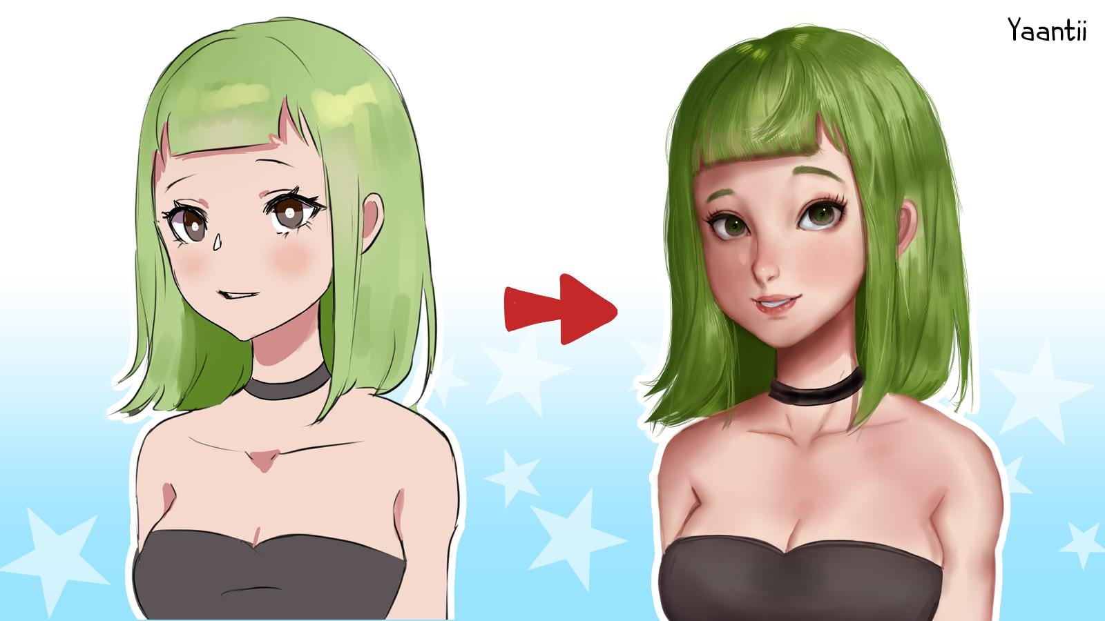
3. Stage 1: The Pudding Phase: I call this first phase the putting phase. Why? Because our character is going to look like a putting for awhile as we break down the line work and set the foundation for painting will be working on a single layer and covering most of the line work. A little disclaimer. Things are gonna get really hideous in this section. It has to look a lot worse in order to get a lot better. I'll start by picking a little bit of her hair color and using a painting brush. I'm just gonna go cover up the line art that I see. The style of digital painting them going for. It doesn't include lines. So I'm gonna try to cover them up and make it seem more 3D. At this point, I'm not really concerned about keeping everything neat and tidy. I'm just adding brushstrokes over my line art and not even blending them out. In the putting phase, you can be as messy as you want. But the rule is you have to go back and clean it up later. I was inspired to try this method. And while I was watching a pre-recorded livestream of a Chinese teacher doing critiques on Billy Billy.com. And he painted over someone's enemy drawing, turning it into a painting. It seemed perfect for me because I find it hard to stick to just one style. In a way that seems like a pretty neat trick to turn something you already have into something completely new. And to also experiment and learn and continue to paint over the hair using the dark shadow color. I'm just sampling these colors using the eyedropper tool. If you don't know how to use it, alt on your keyboard or select it from the tools. Hold Alt and click on the color that you want to sample. It's much easier than using the color wheel every time. Once the hair is done, I'm going to do the same for the skin. I'm going to use eyedropper tool to take this color under her chin and just simply outline on top of the line work. I'll adjust the width of my brush from time to time just to make sure that it's not too large. I'll sample the color of her shirt and her choker, making it a little bit darker and use that to cover the line art for her clothes. Her chin is a little bit to point t and two enemy like so I'm just gonna go and extend her job. Now here's where the putting part comes to play. I'm going to cover all of our facial features using that dark skin color because I'm going to be redrawing the ice. I'll erase her nose, highlight and add in some white and people. And just using one of the painting brushes and gain this quite messily. I'll go back and fix it later. I'll also give her nose because she's missing her nose. Her face is starting to look a little bit unnerving, but also a little bit familiar. I'll mark out the general location of her mouth and keep going. So at this point, are putting has slightly more realistic features, but she's still really, really flat. So I'm going to go and pick the airbrushed using the Shadow Color and I'm going to airbrushed around her. I'll do this for both the skin and the hair. Let's say the light source is coming from the right. So I'm going to paint on her, laughed. As they get ready to do her hair, I'm going to click the preserve opacity button in the layers. This basically means that once you press this button, you can paint anywhere on the canvas, but it won't actually paint unless you already have something there before. For example, this hair. I'll clean up the eyeball which got a little bit of air brush on it. And then I'll give her some islet so she's a little bit less creepy. I'll use a dark red color to outline her nose and a little bit under her chin. Just to try to give it some depth. I'll start to put a little bit more shadow under her bangs, around her face and on her arms. This doesn't necessarily mean that's how the light sources, I'm just giving it a little bit of contour. I'll use the airbrushed once more around her chest to give a little bit of depth. And then I'll resize my air brush a little bit smaller and do the same on her face. The last thing I'll add is some lips and some eyebrows. I did her eyebrows and a dark green and I tried to keep the shape similar to i did with the enemy dry. And that pretty much the putting phase. In the next stages, we're going to refine this and make it look more human.
4. Stage 2: Fixing Proportions: So we've got our line art covered. But her eyes are really far apart. She reminds you of someone I don't particularly like. So now we're gonna go in with our luca fires and just nudge things until they look a little bit better. The same thing can be achieved by painting over or using Transform tools if your program does not support the qualifiers. The first thing we're gonna do is push her eyes much closer together. You'll notice I'm very gentle with the liquefies because I don't want things to go too crazy. That takes me multiple brushstrokes just to get the shape right. Next, I'm going to flip the canvas to make sure it looks okay the other way, this is a great way to check that your image is not too lopsided when looking at it the other way. I'll continue to push and pull up the eyes and around the face just to make it a little bit smaller. Then I'll flip it back and keep going. I have the reverse canvas horizontal saved as a hotkey because I press it quite often. Every few minutes I'd like to flip the canvas around and make sure that it looks okay. At this point, I'm just pulling and pushing and trying to find something that I like. I've heard there's a bit of a stigma around using liquid fires as well. As if you're not a real artist, if you're using the liquefy tool. But the way I see it, if it's there, it's meant to be used. I've heard all sorts of weird things from myself teaching journey. And that one is one that I really don't agree with, that you should avoid the liquid. Well, at this point I'm going to go and make the shoulders a little bit wider. The reason for doing this is I found my characters when I draw animate, their shoulders are very narrow. And if I wanted to look more realistic, I need to make the shoulders wider. I'm using a smaller brush to try to get the eye shape as close to wildlife as possible. And the rest I'll just paint Later. I notice there's a little green smudge there, so I just painted the skin over it. Now, depending on how realistic you want it, you can keep the eyes much larger than they are on a realistic person. Sometimes I would leave it at this stage, but I think I'll go just a little bit further and make her eyes just a little bit smaller. I find the eye size has a lot to deal with how realistic your character looks. When I tried to keep the people similar to my enemy drawing, she looked a little bit cross-eyed. Some point to repaint Her pupil, to look a little bit to the right. The last thing I'm gonna do is make the head a little bit smaller. Her hair's a little bit too goofy. Now, after this stage, I won't be doing much more liquefying because I find that it's sometimes blurs the pixels. So this is a last stage where she'll be having intense plastic surgery. The rest will all be reliant on painting. Once you're happy with the proportions and it's time to move on.
5. Stage 3: Painting: In this stage, I'll be working on the bulk of the painting, building off on what we already have. This is similar to what I usually be working with if I'd started making a painting from scratch rather than a paint over. I start by using a blending brush and blending out all the thick brush strokes that were used to cover up the liner. Also patch up areas that need a little bit more work. Actually recorded this a few days after the first part, so my eyes are refreshed and I can spot mistakes more easily. And the type of inpatient person who likes to sit and try to work through an entire painting in one sitting. So it's good to take breaks. In general, this blending step is quite relaxing and mind-numbing. It's good to put on some background noise and let yourself zone out. All we're doing is blending and adding more brushstrokes and blending. Again. Here I go and blend the hair that might look a little bit excessive right now. A little bit of a sloppy mess. But I hope that this will contribute to the complex texture of the hair has later on when we add the details, I'm still keeping everything on one layer at this point. And I'm just going based on intuition. There are no such things as mistakes at the moment and anything you do can be painted over and redone later. Make sure to relax. I'm going to go ahead and blend out the skin the same way that I did the hair. Anytime I see those thick outlines from covering the line art, I'm just gonna go and blend them out. Don't worry if you lose a lot of your edges here, you can add them back in later. It might get a little bit patchy and a little bit weird colored in some areas like here under her chin. It looks like she might have a four o'clock mustache, but that's okay. I'm gonna do the same kind of blending with the body and the arms. And I'm gonna make sure that the preserve opacity button is checked. That way, my brush strokes and my messy blending will never actually leave the silhouette of the character. An alternative to blending things out like this would probably be using the air brush and just airbrushing. Color around the shadows. The reason I like the blending brush though, is just how quick it is. I jump around a lot when I paint, as you can see, I'm working on the face again. This is so I don't get fixated on one part for too long. I felt that it got a little bit too blurry and a little bit to putting like again. So I'm just gonna go and add a few hard length. Something looked like it was missing here. So I went in and drew in her collarbones. There's slightly more realistic than the sketch on the left. But they don't have to be over complicated either. So just a few lines will suffice. I'm going to zoom out and flip the canvas to make sure everything looks okay the other way and zoomed out. This is because sometimes you're painting might look really, really good when you're zoomed in. And as soon as you zoom out, it just doesn't look right. So always be sure to check while you're working. If you find your image looking kind of flat, doll or muddy, increase your contrast by making darker shadows. Haven't really touched the clubs yet. So I'm gonna go ahead and blend those out too, using the same method we've been doing with the hair and the skin. This still looks quite flat. So I'm going to use my air brush and just add a little bit of shadow at the bottom. I wanted to make the shadow under her chin a little bit more obvious. So I'm going to take a hard brush and I'm just going to draw in the shadow. Once I feel like my eyes have gotten used to seeing it flipped this way, I'm just going to go flip it back. I'm going to take a look at the hair again. This time, I'm going to draw more brushstrokes and blend them out. As you can see, this is pretty much all there is to the stage. Refining your drawing by blending and adding more brushstrokes. Here I'd like to add a shadow on her hair where her big melon head would be blocking out all the light from it. After a few failed attempts using my brush, I'm gonna go in with the last Sue tool and select that area. And I'll do the same for the one on the right side. I'm using the lasso to select just that one area so I can paint in it and make sure it's not getting everywhere else. I found the lasso tool a little bit jagged and finicky sometimes in Krita. But other software should have no problem with this and probably just need to fiddle with my settings a little bit. A brush on the shadow with any brush. And then I'll go in and fix the jaggedness. I'll continue to refine the painting using increasingly smaller brushes. Up till now, I had been ignoring her nose because noses are difficult to draw. So I'm going to go and pay some attention to it by blending out those stripes that I had placed before. It seemed like it was missing something. So I'm just going to add the Nostra on the side. Since this is a painting, I wanted to just have a little bit more volume as it still looks like it's quite flat like a sticker. So I'm going to take an air brush with a shadow color and brush the left side of her head. Do the same on her shoulder. I feel like this around out the forms. A little bit. Weird digital painting and you want to consider that everything should look, or at least mimic 3D. Once I'm fairly happy with how everything else is progressing, our work on the face. I don't like to start with the face first just because I feel like once that's done, I'll probably want to stop painting altogether. I'm going to give it a quick zoom out just to make sure everything looks okay when it zoomed out. Even if it doesn't, I can always go and fix it later. I like to pick at small areas and just keep refining them even before I'm adding details. At this point, I still haven't added any details. I want the whole piece to develop at the same time. So I'm keeping things around the same level of detail right now, which is not much. Next, I'll start working on the facial features. I'll zoom in a little bit so I can actually see what I'm looking at. I find that you can do this zoomed out as well. But zooming in just makes everything bigger and easier to see. If you have poor eyesight like me, it's a godsend. For the mouth. A simple line going from left to right is a good place to start. Here. I made a mistake, so I'm just gonna control Z it away, pretend it never happened and keep going. I use the second line to give it the appearance of an open mouth. I'll borrow the color of her skull era for the teeth. Just so that my Whites are not too different from each other. I'm going to shape the lips and make them a little bit more prominent. I'd like to take my time and fiddle with individual facial features for awhile. Just fixing things here and there until something looks correct. I found that our lips were a little bit too pale and weren't really standing out. So I decided to take a darker red color and shade them slightly. And making a gradient effect on our lips by selectively using the airbrushed and only airbrushing the middle. I'll zoom out to see if this looks okay. Next, I'll select the color that's almost black. And I used the airbrushed, add some detailing and just some shape to the eyeballs, eyeballs around. So I go ahead and I'll make a small brushstroke on either side. This is really simple, but it gives off the appearance of the eyes are spheres rather than stickers paste it on her head. I'll do the same for her pupils. I'll take a dark color that's almost black and I'll shade just the tops. This next step is more of a personal choice, but add a limbal ring to her. That basically means that outline between her IY and her pupil. It does exist in real life where people have this separation between their sclera and the cornea. But when I drag characters, I find that it really brings out the pupil. So most of the time I'll add it in with the eyeball coming together. I'm just gonna go ahead and pick a small brush, usually black or black, and start laying in her eyelids. Instead of using one big breaststroke, I use very, very small brushstrokes, similarity to how and draw them in enemy. I find that layering them makes them a little bit more delicate than just making one thick line. I think of this as the character wearing some eyeliner. So I'll try different widths. Usually I like to make this quite thick. I did the same on the other. I try to keep them fairly symmetrical and try and avoid any gaps between the eyelid itself. It looks a little bit sparse, so thick it enough. What's the same brush? And once the eyelid is done, I'll go in and add a crease using the same brush, pressing very lightly and just simply make one line. Now do the same on the other side. You can experiment with different shapes of these lines to make different islands. But for now I'll do the most basic. I'll shade a little bit around the outside corners of the eyes just to give them more depth. Unless I have a character wearing heavy makeup, I won't press very hard. And I'll do this very sparingly. I'll add a very small shadow underneath her eyebrow. Her faces coming together nicely. Now, we're going to take the liquefy air and just do a little bit of balancing. And notice there are something a little bit uneven. Perhaps her cheek was two chubby are something about her eye distance. I don't know what it was, but I took the liquefy tool and I tried to make her look a little bit more proportionate. I'll continue picking out individual features to try to make them look better. I want to fix the shape of the eyes here and maybe make her pupils little darker because I can see a gap between her coupons and the eyelid. The right people is also much too large. So just use my painting brush and resize it slightly. I'm still not quite happy with the shape of the eye. So just go and tried to make it look better using liquid fires. I find that this stage takes a lot of patients and a lot of trial and error. I tend to do a lot of adjusting, repainting, sometimes completely redoing entire parts. While it's kinda frustrating, you do end up learning a lot about what you like and what you don't like, and what looks good and what doesn't look good. In the end, even if you have to repaint your entire piece from, let's say this point, at least you've learned something on the way. There are probably more drawings in my recycle bin than there are in my actual drawing folders. Here I'm experimenting with mine. I currently have two separated lines from the nose. And I wondered if it would look better if I just connected those two lines. I don't always do this as it looks weird on some characters. But each case seems to be different. As I'm jumping around, I'm going to shift my attention to her mouth. There's just something about it that doesn't look right. It kinda looks like it's sticking out a little bit. Or maybe it's just too narrow. I'll first paint the left side a little bit to give it a little bit of shadow. And then I decided, I think it's the teeth. So I went ahead and added some shadow. Again using the same colors that I was using for her eyes. From personal experience, I learned not to try to outline every tooth because ends up looking ridiculous and a little bit creepy idea, the bare minimum, one line for shadow. Still not impressed, I decided to liquefy it to be a little bit wider. I wanted to keep her mouth fairly small because of her enemy influence. So I think this is about the maximum width. Next, I want to enhance the shadows on her face. When you zoom out, you can still see that she's quite doll and low contrast. So I'm gonna go ahead and take my air brush with a slightly darker color and I'm just going to brush around the face. I had another shadow where her hair is touching her skin using a hard round brush because I want a hard edge shadow. At this point, I'd completely forgotten that she had ears. So just call, add a little bit of shadow to those two. From here, I'll just keep picking little areas and then adjusting them slightly. I'm doing this stage much slower than the other stages. This is because as we get further towards the end, we want to pay more attention to details and making sure things look correct. I can spend hours just tweaking little things until it comes together. The best part about painting is that you can cover up anything that you've painted. There's no line art that you have to adhere to. And there really isn't any coloring behind any lines. While I'm painting this, even at this stage, I still haven't thought about little details such as hair strands are eyelashes. But I'm looking to get is a very nice, very smooth base on which I can add those details later. I'm going to use the airbrushed should just add a little bit more shadow. I feel like you can never get enough. But the same time you want to be careful with your shadow. If the contrast between your shadows and your lights are too far apart, then it kinda feels like your character is not made out of skin, but she's made out of chrome. And then she'll have a very burnt, crispy look. So that's one thing I'm always, constantly avoiding. The mouth here, still bothering me a little bit. So I'm gonna make it even wider. Little adjustments like these may take a lot of time, but I'll make your final product look better. I think that after completing the base painting, as I like to call it, you should take another break. The longer we look at our own work as we're working on it, the more we're willing to ignore mistakes because we notice them. But to someone else who's seeing it for the first time, it might be something really jarring. So always flip your canvas walkaway for a bit and come back later. And getting ready to complete this stage of painting. Now, I'm not really adding anything new. I'm just going around and cleaning things up. I'm gonna go and finish off what I call my base painting by cleaning up the edges, just using the hard eraser, going around the hair and the arms. And basically the silhouette of the whole character and making it just a little bit cleaner. I don't want any wildly lines overflowing, airbrushed or any flyaway brushstrokes. Once this is done, I can finally move on to painting the details.
7. Class Project: The class project for this class is to create a painted over, take a preexisting sketch and enemy or cartoony styles and use the techniques we learned to transform it into a digital painting. Along the way, I hope you'll learn something new about your own painting process. Perhaps you'll come to realize what you really like or don't like to see in your own work. I hope you find the class project fun and I'd love to see what you create.
 Pigliicorn, Drawing is Fun!