Transcripts
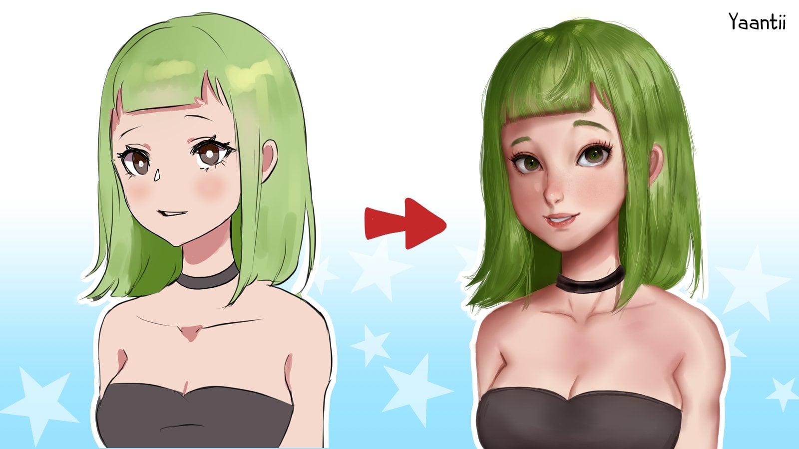
1. Class Intro: Hi everyone and welcome to my skill share course on how to draw an enemy girl and three-quarters view. I'm a completely self-taught artists, insomniac and occasional freelancer and dry enemy characters has always been one of my passions. I'm currently creating classes and resources that I wish I had when I was first starting out. In this tutorial, I'll be going over how to set up a foundation to draw faces in three-quarters view and apply it. How to create a good sketch that can easily be lined later. How to line your sketch whose clean, crisp lines. And as a bonus, how to do a simple cell shading on the entire piece. I'll be taking you through all the steps in real-time, explaining each step as we go and giving you some of my own personal art tips, we will not be learning how to draw males as a setup is a bit different. How to draw anatomy, as we will only be focusing on the bus and how to use digital art software. I hope you enjoyed this class. So let's get started.
2. Tools and Materials: For this tutorial, I'll be using clips, studio paint, and drawing on my slides directly. But you can use any software that you're comfortable with. You can also use a pencil and paper, which I recommend over digital. If you're just starting out, you won't be needing any specific brushes or software or anything like that. Whatever you have on hand should be more than enough. If you're doing this digitally and you don't have a software that you're comfortable with. Here are my recommendations for people who are using a PC. Psi. Psi is by far my favorite drawing software of all time. It's super lightweight and could run on a twice baked potato. The interface is clean and non-intrusive and the line work is buttery smooth. Psi would be my software of choice if I could choose no others. It is the most beginner friendly open canvas. It's a program that's similar to psi and also optimized for making enemy and manga illustrations for selection of brushes is quite small, but it gives you more than enough if you're just starting out or a beginner. I had a little trouble with the cursor being in the wrong place while recording this. But once I stopped recording, it went back to normal Credo. And it has many of the features that paid art software has is incredibly versatile for both drawing and painting. It's great for both line work and coloring and constantly gets updates that improves its features. Put studio pink. This is another software optimized for making enemy illustrations and comics. I have the edX version. It's got a ton of features though. So if you're a complete beginner, this might be overwhelming. I will be using this for the demo, but I will only be using the bare minimum tools. Accidentally started a software collection because I was curious as to if it really affected the outcomes. And I've pretty much tried every software out there these days. I can create the same level artwork in each. It's more about you and your familiarity with the software and your skill level. There are some horrible buggy software out there that you should really avoid. But generally you should find one that you're comfortable with and use that as your primary software.
3. The Basic 3/4 Shape: So first, before you build a house, you need to build a foundation. Let's talk about how to create a symbol foundation for drawing a face in the three-quarters view. To begin, simply sketch out a circle. I usually do this free-hand, but you can use the circle tool or a compass it okay, that's a little bit bumpy and lop-sided. If it gets too messy and make sure you use an eraser to clean up your edges. Next, margarita small line underneath the circle to mark out the chin. I tried to do this intuitively. I rarely measure this out, but if I were to eyeball it, it should be about a third or a quarter of the size of the circle for reference. Next, connect this line on both sides to the circle. Make sure to make the side he's facing show a little bit of cheek. Make this larger if you'd like chubby cheeks or smaller, if you'd like thinner cheeks, it's all down to preference. Draw a curved line slightly off to one side from the middle, facing the way that you want your character to face. You might find that it's easier to draw facing one way over the other. For this example, let's have a character facing left. The further from the center you place this line the more the face turns. So let's keep it fairly close to the middle for now. Let's also add a horizontal line to indicate where the eyes will go. This will be roughly in the middle of the entire shape, maybe a little bit lower depending on your personal preference. Finally, this is an optional step, but you can add ears. These will be below or through the horizontal line and made previously. If you're not a fan of ears, go ahead and skip this bit. The basic shape is complete. You can tweak the shape however, we want to see a different characters. Perhaps you want super pointy chins for a giant five heads. It's up to you and your staff. You can also rotate the shape to have heads looking in different directions. Be sure to experiment with these shapes.
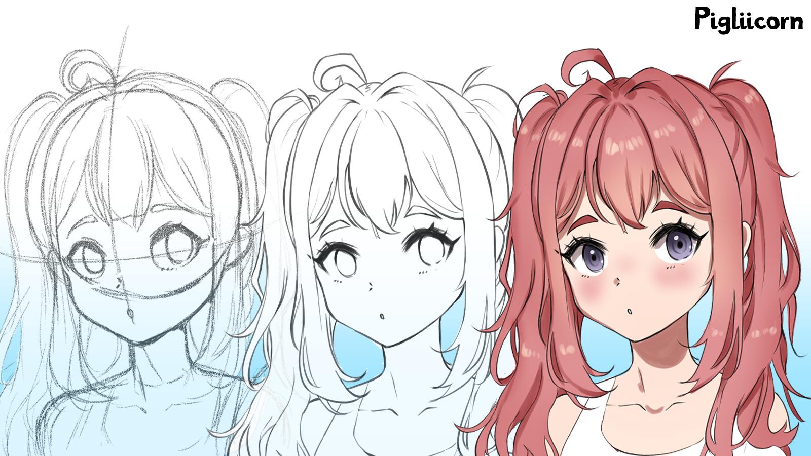
4. Demo 1 - Sketch - Rough: Let's start sketching a character. First, we will quickly review the basic shape. We start by loosely drawing a circle. Any free hand circle will work here. So we mark out the chin and connect the lines to the circle. We add a curved line, you slightly favoring the side that the characters facing. Then a horizontal line a little under halfway to show with i's will be. And then finally we add some years. And for our neck and shoulders, simply draw two and the top of a rounded square won't be going into the body in this tutorial, so we can keep it simple. I don't have a clear idea of what the final schedule look like. So I'm just going to improvise a random character. I'm going to resize the sketch and make it a little bit larger, so we have more to work with. Now, I'm going to start working on the face. I'll draw two circles on the horizontal line that we drew. The line should bisect at the center of each circle. These will be the eye sockets for the character. Don't worry about neatness at this stage, any circles will do. Note how one i is also smaller and narrower than the other. This is to create a sense of perspective, to really convinced the viewer that this is three-quarters view, rather than being a straight on feeding. The rest of the facial features are pretty simple. A place, uh, nodes on the left of the central vertical line and a mouth directly online. Eyebrows can be expressed by simple curved lines. Or if you prefer, tapered tap hole like shapes. Consider this part as a blueprint, serving as a guide for where to place your facial features. The shapes don't have to be perfect, but try to keep the proportions looking good before proceeding any further. Let's draw the eyelids. All we have to do in this stage is to go over the circles we drew previously. Kinda of like applying a layer of eyeliner or mascara. You can also experiment with changing the shape of the islet. I'd love to add a few eyelashes, at least one giant eyelash, and a few smaller ones. Make sure that you have the I shaped set before you leave the sketch stage. Adding the Irises using some simple ovals. You can also use rounder oval circles or even squares for this, depending on your character. I recommend ovals and circles as those are more true to realize, let's make her look off to the right. If it gets too messy and a little bit difficult to read, make sure that you're cleaning up with eraser. The next step is to add some pair. As we're just improvising, we can draw whatever comes to mind. This character might look cute with some pigtails, so let's give that a try. This is definitely my favorite part in drawing any character. Because it gives a character so much personality. I won't go into great detail about drawing hair, as I already have an entire separate video course on this. If you want to know a bit more about my method of drawing hair, I recommend watching that to. The main concept that we need to be aware of is using larger shapes first, then adding smaller shapes, strands and Flyways. Don't draw individual strands right away and keep the hair flowy and not too stiff. I'll always start with the front of the hair and the banks before moving on to any other parts of the hair such as the pigtails. Notice I have most of the large shapes done before detailing. And I'm trying to keep everything loose but not pressing too hard on my tablet does not only stops me from stiffening up this sketch, and also keeps the lines from getting too thick or too muddy. When I move on to sketching out the pigtails, the same concept applies. I used the larger shapes first before moving on to smaller shapes and details. I'll add little hair pieces coming off of the pigtails. I call these flyways. They're pretty bad in real life. But for animate characters, it really boosts their cuteness. When doing this, just relax and draw any shapes you want. There's no right or wrong way to do this. As you continue working on your sketch, you'll start to notice some mistakes. Places that don't look quite right, focus areas that are generally ugly. This is normal and this is why we sketch before creating our final language. Just like catching shop lifters, it's best to catch these early on and deal with them before moving forward. You'll often see beginner drawings where people ignored the lumpiness and just did the line work without fixing it. They tend to end up with a wonky final piece to make sure to flip your canvas a few times because that will make the mistake super obvious. As your best friend, I speak from personal experience. This is what happened many years ago before I got into the habit of checking everything. If you still have trouble noticing the flaws in your own work, put it away for now and take a look at it again in a few days. I mostly like her pigtail girls coming along, but I will adjust in small parts, such as making the iss less drained in the head less wide. This is a great opportunity to flip the canvas and see how the image looks facing the other way. Here you'll notice her chin is slightly off-center and a little bit weird looking for need to fix as let looks good from both ways. The eyes also look a little bit too big when the character is facing this way. So I'll go ahead and resize them. This is about as detailed as we need the sketch to be. If you're not confident in your sketching or your lie market, who might want to do a second pass, which means lowering the pacing of this sketch and doing a cleaner sketch on top before doing a library. Basically just creating a cleaner sketch for this demo. I think that we kept the sketch fairly neat and fairly legible. So we should be ready to move on to light work.
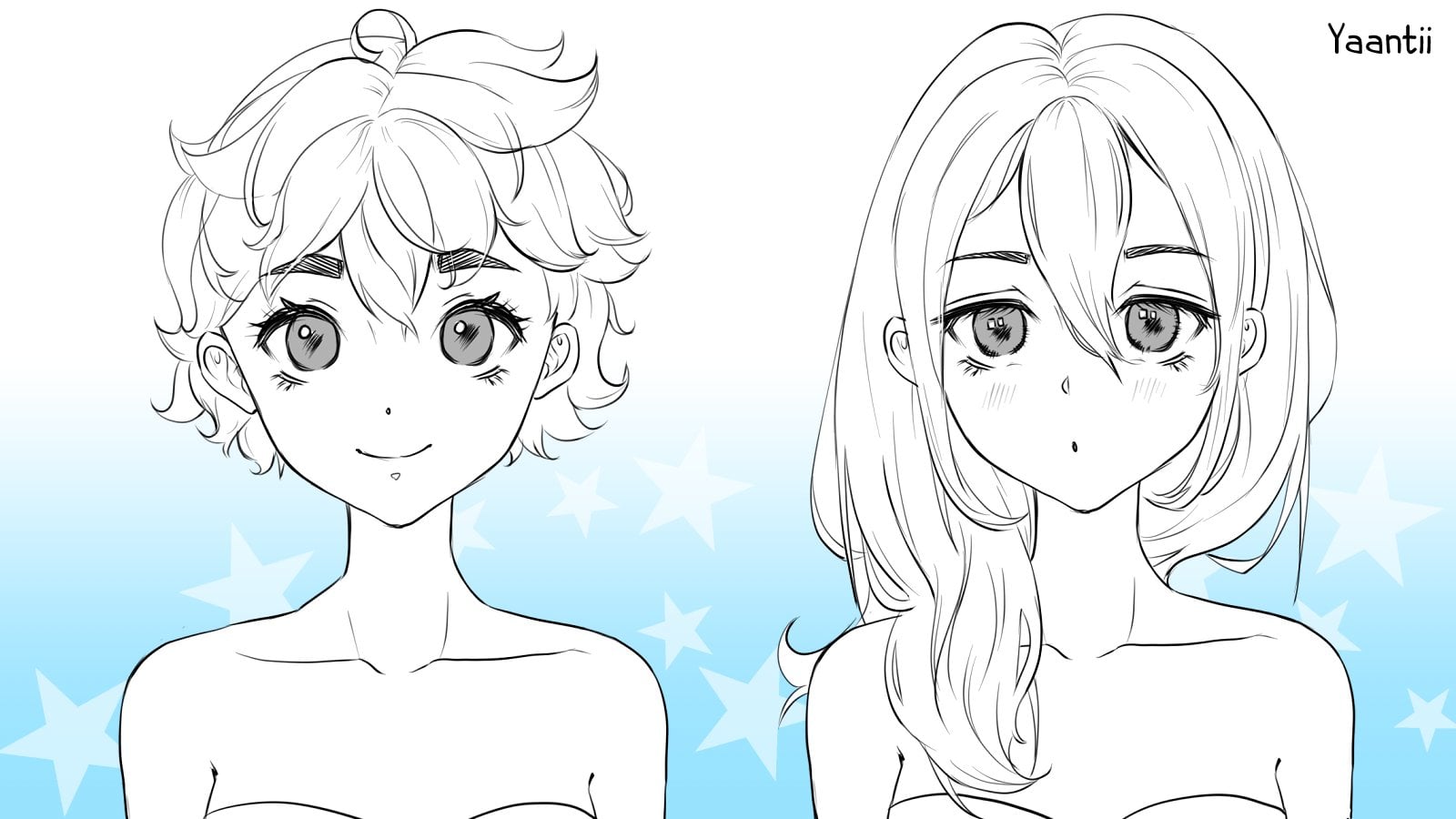
5. Demo 2 - Sketch - Applying what We've Learnt: In this next demo, I'm gonna be showing you how you can easily apply what we've gone over up until this point. But be sketching fairly quickly, but the video will still be in real time. Creating sketches like this is also a great way to warm up Alba reiterating quite a bit since we've already been through most of these concepts. But this is basically just to show how the same concept works at different angles or for different expressions. This first sketch will be a pretty basic three-quarters view, looking to the left. As always, the method for creating the basic foundation remains the same. Always starting off with a circle and adding the chin, the line, the ears, followed by the eye sockets. From there, you can fill it in with whatever details and hair that you like. The detailing is exactly the same as we did with our other sketch. I think I'll try a variety of expressions with these. The first one can be angry because angry or quite q. This is a great way to also experiment and see what works and doesn't work in your style. I'm not really sure what I want these characters to look like. So just improvise and draw random hairstyles on them. The first sketch was a little smoke, so make the next one larger. For my second character, I want to show how this method still works for heads. They're tilted up or down. I'm going to keep her facing the left. But this time I'm Marco chin off to the left and higher than normal, and then connect the lines from the chin factor pet. The guidelines are then added in the same way we would if she didn't have her head tilted. Okay. If you want to try and angle like this, but you have a hard time connecting the chin when the head is tilted, you can draw it in a normal angle and rotate the image. But practice here is key to getting it all angles. The same rules that apply to the shape of the head and the details no matter how you're drawing it. I decided that this character will also be angry just because. For this character, I chose a very loose employee hairstyle. Imagine since her head is so tilted for hair should be flowing downwards because of the gravity pulling on it. Just like in the previous video, I sketch from large to small and I don't get caught and adding small details as I'll add those later in the line work stage. I just want to get a general feel for the character and then move on to the next one. For my third character, I thought I would demonstrate the same process with the character facing the other way. The steps are exactly the same as if you were to draw it facing left, except she's facing right. The guidelines are also placed in the same way, except that they will curve to the right instead of the left. The I now closer to the viewer will be her right eye instead of her left. It might be harder to draw characters facing one way versus the other. Good to practice both from time to time. For the longest time I only ever drew characters facing one way. And when I tried to draw them the other way, it looks wrong in strange. I decided to make this character a confused little cat girl. Across. I'd look, I'm giving her and large wide eyes really bring this character together. I want this character to have quite a bit of personality. So adding cross eyed expression isn't necessarily a bad thing. I'll quickly drawn the hair in the same way that I always do. And then I'll add the ears. When creating sketches like bees outspend no more than five minutes on each. Try not to get attached to any of your sketches no matter how cute they are, even if they're super cute, still try to hold back on the detailing during the sketch phase. You can always line in color it later. For my fourth and final sketch, I will draw character with her head tilted slightly down. My favorite expression to draw this angle is a teary character who was crying oversized tears. As always, the foundation is the same, except this time I'm bringing in the line of the chin to the right and then connecting to the back of the head. The guidelines then follow the shape that is created from connecting the head back way. Notice that all of our three-quarter view heads have followed the same process so far. Details like the eyes of the hair come after setting the foundation. Notice how even when I draw, I draw them very loosely and I don't add any detail. All I want is for my sketches to be somewhat legible, either to me or to other viewers. And just set a foundation for what I'm gonna do next. There's so much else to say about this method of sketching and creating simple and quick drawings. But I highly recommend that you practice drawing heads like this just very freely. You don't need any fancy tools or setup. Just take some time to practice. With that said, we are now competent and we can create any kind of head we want.
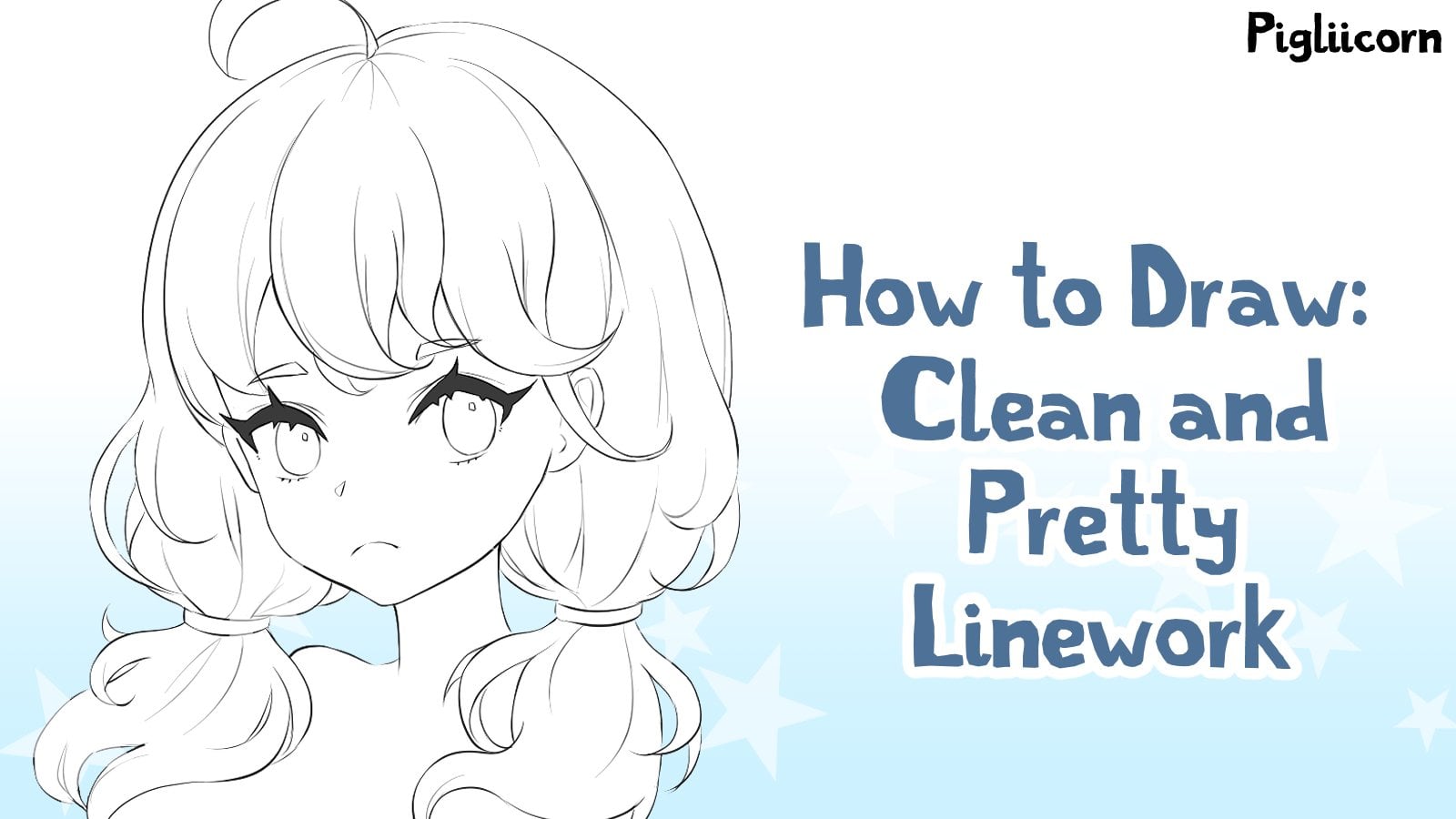
6. Demo 3 - Sketch - Linework: The next step is line work. This means we're going to make a new version of our drawing with as clean lines as possible. It's a little bit more than just tracing the sketch, but we'll be using our sketch underneath for the most part. This is why we had to make sure that it was legible in the previous parts. To start lower the opacity of your sketch and create a new layer on top. If you're working traditionally, you can use a kneaded eraser to reduce the lines down or put another piece of paper on top of your sketch. There are two main points that I'll be demonstrating here. The first being working from the center outward and also completing the frame before doing the pace. Kind of like when we were sketching and one from large shapes to small shapes. The size or specifics of the brush you use aren't really important here and are really subject to your own personal style. Contrary to popular belief, a single brush won't change your ability to mine. You should pick one that you're used to and comfortable with over any gimmicks. As for line thickness, some people prefer both declines and some people will prefer thin, delicate lines. I personally have gotten used to a middle ground that suits both my poor eyesight and my style of my lines aren't super, super thin, but they're still quite soft and delicate. The size of your lines is really determined by the size brush that you are using. You will notice that I'm sticking to a size ten brush. For consistency, I will stick to size 810 brushes, and I will only use a single brush for the entirety of the line work step. You might find it hard to control or even see what you're doing when using smaller sized brushes. This is common and I struggle with it sometimes too. If you find it impossible to control a size ten brushed, started size 40 and work your way down. Once you perfect your dexterity to creating perfect size 40 lines, move down to size 35, then size 30 and so on. Try to force yourself to using slightly bigger canvas as well. Warming up before your line work with multiple sketches is also a great way to have a bit more control over your lines. Take your time with your lines and don't worry about having to undo or erase parts as you strive to have the cleanest and nice as lines possible. I personally do line are slower than most, even when I'm trying to be fast. So don't worry, it's better to set some more time aside for yourself to do it at a snail's pace, rather than to quickly turn out something that looks incredibly rushed and sloppy due to a time constraint. Trust me, everyone can tell when you fresh something. Let's outline the hair the same way we sketched it during the inside, such as bangs in front. First. This is really a personal preference of mine and pretty handy in a served me well. So I hope you've tried to other methods have heard of including the whole outline first, then filling in the middle, going top to bottom, or just doing whatever. And whenever. As you do this more and more you'll find a method that suits you. We aren't going to touch the face for awhile, flooded NORC for now. If you find that you have a lot of trouble getting your lines to look good digitally. You can use stabilizers to help you. Some are built-in such as Pip studio paint and psi, and allow your computer to help you smooth out your lines as you drop. There also software that completely lack this feature. There's even software out there that can stabilize and all other software. But since it's just a stabilizer software, it you'll have to get your drawing software sold separately. Since I'm unable to see your workspace or your setup in person, I can only point you to Google for the solution, research and experiment with stabilizers and software. If you feel like your line art has too many shapes in it. At the same time, always improve your manual dexterity and try to train your hand to be more steady. At the start of the video, I said there's more to doing line work than simply tracing your sketch. I'll go into that a little bit more now. You'll notice that at some points on a line or two that weren't in the sketch. I call this ad living. And it's basically DB off EarSketch to make very small changes such as in the hair. There's nothing wrong with doing this, and it's not a super secret technique. The purpose of our sketch is to help us create the line work, but we aren't married to it. And it's not set in stone. While working on the line work, it's good to improve the image as a whole rather than using the sketch as a stencil. And as your endl. Remember, the sketch is disposable like a napkin with someone's phone number on it. The line work is a piece of art. Doing this also train your eye to be able to infer an improvised by greeting lines that aren't actually there. But your intuition is telling you that these will look good. The more you practice this, the more sense it will make. A good way to compare is to turn the sketch layer on and off occasionally so that you can see what the line work looks like without the sketch. Later, I'll show comparison of the two so that we can see where the deviations occurred. I rarely deviate the placement of the facial features unless a sketch when critically wrong, and I didn't notice it earlier. In such a case, out erased the wonky part of the sketch, and sketch it out completely before attempting to line it. Again. If you find that you can't add live at all and drum lines without a sketch look messy and horrible. Don't worry, it all comes with time and practice. Make your sketches super clean. And maybe try adding a bit more detail into your sketch so you get used to lining details. In the beginning, I had personally done the opposite a lot. I skip the sketch stage a lot. And then I had the audacity to wonder why my artwork looks so cricket and hideous. Things self taught has been an interesting journey, but some people also find it very rewarding. As I continued to ad lib these hair pieces of flip the canvas back and forth just to make sure the pig tails are not uneven on both sides. Always have the Eraser tool ready for both cleanup and changes that you might make her and don't be afraid to be dropped. The frame of the line work is almost complete. The next step is to turn off the sketch and fix the lines as they are without the distraction of the sketch. Here's some questions to ask yourself. Are all of my lines smooth and legible? Do most of my lines connect to other lines? Is the amount of detail enough for my taste? Are the lines in a similar size without some being too wide or too thin? If you said no to any of the above questions, maybe consider redrawing the lines that have troubles or fixing them up. Clean up the sketch, and add as much as you'd like here. While the lines don't need to be perfect, they should be clear and they should not be fuzzy. If you plan on coloring this later, having clean lines now will make it much easier later. Let's take a look at how this line where it could have gone horribly wrong. Here's an example of the same sketch, both incredibly bad line work. I'm exaggerating of course, but this showcases some of the mistakes that I've seen in actual beginners, such as hairy, fuzzy line, using too many brushes at once. And just something that screams, I don't know what I'm doing. Try to avoid this unless it's your style, in which case you go right ahead. Alternate between having your sketch on and off so you can compare your line work. Next, we will finally work on the character's face, starting with the easiest parts first, eyebrows, mouth and nose are just trace from the sketch and should take no time at all. The reason I did this last is because I want to focus on it specifically to make sure it looks good. You can also do it first or in any order that you like. When drawing the eyes, use your discretion to see how much of the sketch you should trace coal mines for the eyelashes and don't be too rough or press too firm. And we'll usually solidify my characters eyelashes here and add a few more. You might find that your eyes don't look perfect when lined versus when they were sketch. So don't be afraid to adjust and make changes. Do the same. I on the other side, draw in the irises. For this, I will just trace off the sketch. Here. I turned to sketch off again. I want to see how the face reads without the distraction of the sketch behind it. When the sketches turned off, immediately drawn to the eyes and how much I don't like them. So I'll go in and add a little bit more to the islets to book them up. I like really thick eyelids and eyelashes. So felt a little bit lacking for me. I'll go back in with my liner brush and darken the islets a bit further. Make sure you base any changes on your own style and preferences. You may need to adjust the other features too. As removing the sketch can sometimes give you unexpected results. Once that's done, the rest of the line work stage is just going in and fixing. Don't be afraid to completely rework areas. What I'll often do here is erased the places where lines overlap one another. This is an optional step, but all you have to do is take an eraser and manually erase the places where you see overlaps. Speaking of overlaps, I noticed a mistake that I made on a piece of hair to the right. Had I had the sketch on, I would have never seen this. So now I'm gonna go in and fix that and make sure that it looks good. But towards the end, always double-check with your sketch to make sure that you haven't missed anything. If you have quickly line it back in. This is pretty much all there is to creating line work. Most of it is just a lot of practice and working very slowly to get closer to the results that you want. You can keep going as much as you want, adding, erasing, and fixing until you get to a point where you are happy with your piece. You could also delete it and start over. I think this is about enough for me personally, so I will stop working on it. Here's a comparison of the sketch we started off with and the line art that we ended up with. You can see that there are quite a few differences and quite a bit has been added to improve the piece as a whole. The liner is now ready for whatever plans you have for it.
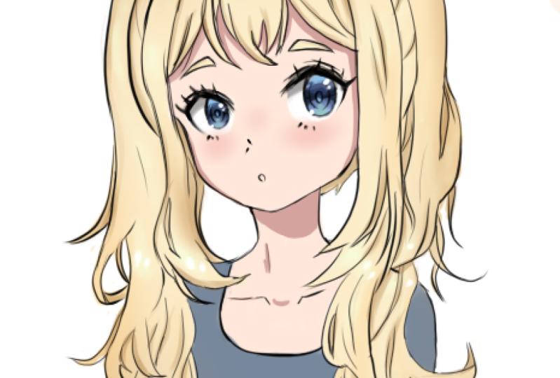
7. Bonus Demo - Easiest Cel Shading: As a bonus, I'll show you a quick way to achieve some cell shading style coloring. This is simpler than my usual style of coloring, but it's quite quick and also very effective. It should be fairly beginner friendly. However, I don't recommend this section if you aren't already familiar with digital art software as explaining, all of those concepts would be too much for a single course. To start fill in all of the flat colors. This just means coloring under all your lines to avoid white gaps and making sure that all the line work also as color underneath it. The method I'm using here is super-simple. And making an outline manually with a standard round brush under the line work layer and then filling the centers in with the fill bucket. This is a kind of a slow method compared to the others. And I find it's quite relaxing to do this after a stressful day at work, and it gives you a lot of control. You can also use the selection tool and paint bucket or whatever you're comfortable with. The colors I'm choosing r does random colors I like. For example, I love the colors pink and purple. So give my characters pink and purple hair probably nine out of ten times. Since we're improvising on an original piece, you can use whatever colors come to mind for this piece. I think pink hair and purple eyes would work well. For this tutorial, we will only be using very basic brushes. We'll be using one hard round brush, one watercolor or shading brush, and one airbrushed. These brushes are standard on all drawing software for the lighting. We'll keep it simple and have it coming towards her head on. That means a shading will be more subtle and not to biased in any direction. I do most of my color picking directly from the color wheel above. Some software also come with pre-existing swatches of color that you can use for your artwork. These are extremely handy when you're just starting out or if you're just too lazy to pick your own colors. You can also save your own palettes for later use. When coloring underlining. Keep all the colors on their own layers. You can lock the transparency of the layer to prevent coloring outside what is already felt. Experiment with your software and see how this works. Don't worry about coloring outside the lines of using the same method of manually coloring and filling. We can always go and with an eraser and clean up the edges when you're done. This process is going to take awhile. So quickly skip to the part where it's done. A using airbrushed next to give it some depth. And the airbrushed tool will work. Starting with a larger breadth-first, I'll take a color that's a darker version of the hair color. Note how I can select this by going down and to the right from the color wheel. For the best results. Use varying pressure but don't press too hard. Try and avoid picking colors that are too dark for this step as well. It should complement the hair color, but not make it look burnt. Using the same method. I also like to add a bit of orange or skin color to places like the banks and around the face. This is a show a bit of translucency where the hair is making contact with the skin, as well as being a stylistic choice for XM. If you picked a very light skin tone, use orange instead of the skin color. You can also use this airbrushed to make the tips of the hair lighter or even a different color. It's all up to you. Use an airbrushed to make the top of the iris darker than the bottom. This gives the eyes a lot more depth in. The next step is where the bulk of the shading comes together and it finally starts to look more and more like cel shading is a hard watercolour brush to add the shadows. A good place to start would be next to the lines and in places that would be. I'll put this all over the hair and the skin in varying widths. For the sake of this tutorial, I will not be using any blending brushes or tools. Do so that I can demonstrate how easy it is to create shading using just the most basic tools. If you were to blend out some of these hard strokes, you would end up with a very beautiful soft shake. If you're not sure where to shape, tried to imagine where the light is coming from or stick to the outlines. But don't shave every outline as this will give you a very flat image in the end. This is called pillow shading. Gradual acts and placed a shading very loosely and without being too perfect. Areas behind her head, such as behind her pigtails and behind those two side pieces of hair should be completely in shadow. So go ahead and fill those incompletely. You can also improvise an ad lib some shadows where there weren't any previously, for example, on these banks here, I felt that they would look a little bit better with a few strokes added. I use the overshoot and try to add shipping lines everywhere as much as possible. Nowadays, I try to find a happy medium of shading and leaving some areas blank to give it some room to breathe. Always try experimenting and not sticking to one specific format. Next, let's add highlights the hair. This is probably the most important part of shading the hair. It gives it a really nice shine. I'll be using random brush strokes to achieve the highlights, but you can use whatever fits your style. For example, some people draw a halo. Well, other people use triangles or stars. Use the same brush at a larger size to add the shine to the hair. You can use any color that you like for highlights. I'll be using a color close to her skin tone. The only color I don't really recommend using here as white as it can make your shading look more washed out than shiny. Try to follow along with the shape of the head. Notice how it's not flat but slightly curves because her head is rapid. I'll also add some pigtails as those would be shiny too. Adjust the opacity to adjust the brightness until you like Catholics. When cell shading skin, there's not much that you need to do. We will only use one additional color for the shading and we'll use it quite sparingly as she's not in any harsh sliding at some shadow on the skin below the banks to make it seem that the banks are in front of the skin. For the scan are painted simple triangular shape using the color created by darkening skin tone like we did with the hair. Then I'll fill that in. I like to add a little spot of shading on the nose and on the clavicles as well. I found the eyebrows to be a little bit too light. So on ahead and use the shadow color to fill them in a quickly detail the iss by drawing a black circle in and then adding a white highlight. You can add even more details to die depending on your staff. Some ideas are to add sparkles, reflections, specs, and color gradients. For the sake of simplicity, I'm just doing the bare minimum. The next thing I'll do is add some blushed her cheeks. This step is completely optional and can be skipped. If you don't like characters with blushing cheeks, use an airbrushed to lightly dab her cheek and the bridge of her nose to create a blush about, I'd recommend using a red color not too far away from her skin tone and definitely not too dark or saturated. Finally, I'll darken her skull areas a little bit to bring out her eyes. And that's all we need to do for the simplest cell shading. The coloring is now complete with the same concept. You can eventually evolve your own coloring and shading style that gets more complex over time.
8. Class Project: The project for this class is to draw three heads and three-quarters view. Try to make them as different from one another as possible in terms of expression and overall look. And have one facing the opposite direction. Come up with completely new characters from your imagination, draw your original characters, or create some artwork of your favorite popular characters. You can line and color them. Or if you're only confident in your sketches, you can simply create a sketch, do what you're comfortable with, and do it in your own unique style. And look forward to seeing what you can come up with.
 Pigliicorn, Drawing is Fun!