Transcripts
1. Class Introduction: I love painting with gold.
Have you ever tried? Hi. Hello, and thank you for being here.
My name is Irina. I'm an artist and designer behind the brand Binsym Studio. In this class, I'm inviting
you to join me in one of my most favorite
illustration activities painting with gold. I'll show you the
techniques I use to create gold foil texture,
glitter texture, and as always we guide
you step by step through the process of adding gold
elements to an illustration. The project of this
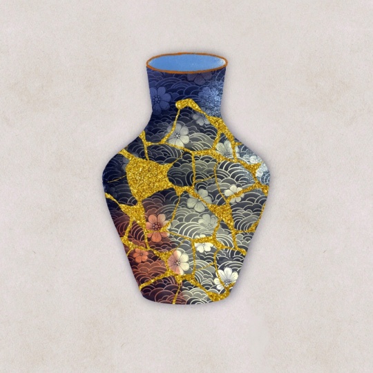
class will be to create this cracked vase
mended with gold to celebrate the
Japanese art of Kinsugi. I'll show you some
other ways you can apply gold painting to
your illustrations. And, of course, all the
necessary resources for this class are
provided for you. Are you ready to shine? Then grab your iPad, your pencil, and let's begin.
2. Tools and Materials: The tools and
materials you'll need. You will obviously need an iPad. I use an iPad Pro with 12.9 "
diagonal, sixth generation. You will need an Apple pencil. I use Apple Pencil
too, and of course, you'll need Procreate
updated procreate of the latest version
installed on your iPad. As for additional resources, we'll be using a
sketching brush. I suggest that you pick any brush from the sketching
group default brushes. I personally prefer either
peppermint or HB pencil, but you can choose any
sketching brush of your choice. And you will need resources that I provide especially
for this class. You can download them from down below this video
in the resources section, which contain paper texture. This is an optional thing, an optional resource to use. I will obviously show you how I use the paper texture
for my artwork. You will need procreate brushes installed that I provide
together with this class. They are called um KinzugiGld. I will talk about
these brushes now. There are a few thicker brushes. One is called liquid gold, the other thicker sketcher. We will need them when we create details in our
illustration, gold details. There is also brush
called shimmer. We will need it for
creating litter texture, sparkle which is also a brush from brush for
creating glitter texture. There is also some brushes from my sets of brushes that I
create myself and sell. It's the semi semi wet filler. That's our main brush that
we'll be coloring our vase, our vessel, our
main illustration that we're going
to work on today. There is a color blender. It's the brush I specially created to use in
the combination with the semi wet filler to
blend colors nicely together. Thick sketcher, by the way, is also the brush from Winter
Imaginarium collection, same as semiwt filler. And also b living beings, it's a pattern brush that is part of my Japanese pattern
brushes collection, and I will also obviously
show you how to use them. You will need these brushes downloaded and installed
in your procreate. You can also find the guy how to download and install
procreate brushes in the resources section, you will need also a
couple of color palettes, which I provide with this class. But again, you don't
have to use those. You can use sorry, you can use the colors
of your choice. These are the two color palettes that come together
with this class. One is called gold kinsugi. The most of them will
be using to create our vase and this one
is Kinsugi metallics. These ones I've created to use for our metallic
textures and details. So if you want to follow
my class step by step, I suggest that you
need both of them. How to install color palettes, color satches and you procreate is in the
same PDF document as the guide for brushes installation in the resource section
of this class. So that's all you'll
need for this class.
3. Creating Gold Foil: In this lesson, I'm
going to show you how to create a gold foil in Procrey which you can save and use later for your gold work and
your illustrations later. We're going to start with
clicking this plus icon, and we're going to
choose screen size. What's important to note
here that if you want your texture to be larger
and of high resolution, you need to make sure that you either create a
custom canvas with at least 300 DPI or amend the settings
in the existing canvas. If you go here, Canvas, crop and resize settings, you can change DPI from
132 to at least 300 DPI. However, I prefer to
create my textures like normal screen size
resolution because you can always dial if you need for bigger canvases and mask the
seams between the textures, I explain and show that
technique in details in my texture magic to class where we
create the still life. So if you've not seen
that go and make sure. But we'll not need this
technique in this class. We've created our canvas. We're on the new layer and
what we're going to do, we're going to go to adjustments you can see the drop down menu here with
different adjustments types, and we're going to select noise. You can see that it
opens the panel with different noise options and
what we're going to do, I'm just going to track my
pencil along the screen, and you can see it showing
me percentage of the noise. And I'm going to
make sure that I've got 300% of noise
so it's on maximum. But don't switch it off yet. We're going to go to scale option and I'm going to increase the scale of my noise
to approximately 65%. That was the first step. Next, we're going to go again to adjustments,
and this time, we're going to
choose Gaussian blur and with the same way, swiping the pencil
from left to right, I'm going to increase the blur. See, you can see the
percentage here to 15%. I've just blurred
the rough edges. Next thing, I'm going to add
some noise on top of this. Again, I'm going to
go to adjustments. I'm going to select noise. I'm going to swipe the
pencil from left to right. But this time, I'm just going to increase the noise
level to only 15%, just a touch to give it
this shimmering effect. So that's the base for our
full texture is prepared. Next thing, we're going
to create a new layer, and we're going to fill
it with solid color. I'm going to use the color from my metallic palette,
which is this one, and here I'm just going
to put the value of it, and I'm just going to drag and
drop it on top of my base, and I'm going to change
the blending mode. To color. You can see already that our texture looks very
much like cold foil. But let's add some
extra shyness. I'm going to add a
new layer between our base and the solid
color on this new layer, I'm going to go to
adjustments again. I'm going to select
noise again and I'm going to increase the noise
to approximately 25%. And I'm going to change
the blending mode to either screen or add. It creates extra shyness. I think I'm going to choose screen mode and just
leave it like this. I'm going to flatten my texture. To save it, to export it, we're going to go
to the range icon. We're going to select Share
and I'm going to save it as GPEG in my camera
roll on my iPad, or you can save it in the
files of your library. Instead of gold,
you can also create silver or rose gold or
copper, metallic texture. For that, you just need to
use corresponding color. For example, if I
cancel the flattening, you can see that I've
got yellow here. If you go to Kensugi
metallic palette and choose, for example, this color and drag and drop it, you can see that it created
nice rose gold color. Or if you choose one
of the silver options, creates nice silver color. You can create as
many textures like gold foil or metallic foil
texture as many as you want, and save them in your library. By your library, I mean your own specially
created folder in your preferable
file destination. For example, I save mine on my iCloud usually
so I can easily access my texture from all my devices where I
create my illustrations.
4. Creating Glitter Texture: Now, let's create glitter
texture and procreate. For that, we're going to
select this plus sign and create a screen
size canvas exactly like we did in the previous
lesson with gold foil. The first thing I'm going to do, I'm going to fill the empty
layer with this gray color. You can see the
value here and it's also in my Kenzugi
metallic palette. In the middle row, the very first color swatch
from the left. I'm going to drag and drop it. It creates a solid color layer. Next thing is I'm going to go to adjustments and
I'm going to choose noise and I'm going to
swipe with my pencil from left to right to
approximately 110%. You can see the percentage here. Let's scale to
approximately 50%. But don't leave this area yet. We're going to increase
octaves to max. You can see the octaves
option here and I'm going to increase it to MX you can see there
are three options here, clouds, Bellows and regs. I'm going to select Bellows and now you can leave this area. Now we're going to
create a new layer, again, adjustments, noise. This time, I'm going to add
noise of approximately 55%. And I'm going to increase
the scale to around 35%. And I'm going to change the blending mode of this
layer to linear burn to create a little
bit more contrast and give our texture
this glitter effect. Now I'm going to duplicate
this newly created layer. But this time, instead
of linear burn, I'm going to change the
blending mode to add. Next thing, I'm going to
create a new layer on top and I'm going to fill it with solid color
from the palette. I'm going to fill it with
the same yellow over used for the cold texture, and I'm just going
to drag and drop a solid color on top
of all my layers, and I'm going to change the
blending mode to color. Our glt texture is almost ready, but I would like to create
some extra sparkling. For that, I'm going to create
a new layer and I'm going to select the Shemer
brush from the brushes, kenzukiGld group that I
provide with this class. The color I'm going to
use is pure white color. I'm going to
increase the size of this brush and I'm just going to gently Go over. And I'm going to change the
blending mode to either add, or I think I'm going to change it in my case to linear light. It looks invisible, but
if you switch it off, you can see that it's
definitely there. It adds this little SHImr. You can duplicate this layer for even extra SHI MR
effect if you want. Now let's add some sparkle. On the new layer, I'm going
to grab my sparkle brush from the group with the same bright white color,
pure white color. I'm just going to maybe reduce the size a little
bit to approximately 30%, but again, it depends on how big you want your
sparkles to be. I'm just going to add little
sparkles here and there. I'm going to change the
blending mode to luminosity. There you go, our glitter
texture is ready. With the colors, again, you can change the color
to whatever you want. You can create as many
different options as you want, whether it's shades of
silver or champagne gold, or copper, or even purple, blue, green, whichever you like. And to export our texture, which we will use later, we go to Ring icon. We're going to select
JPEG and we're going to save our
file in our library.
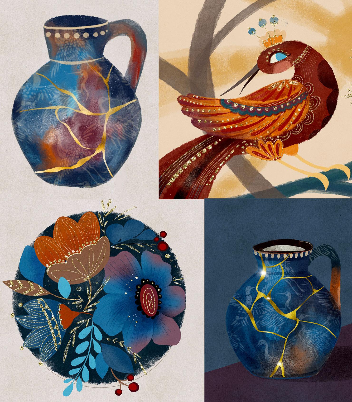
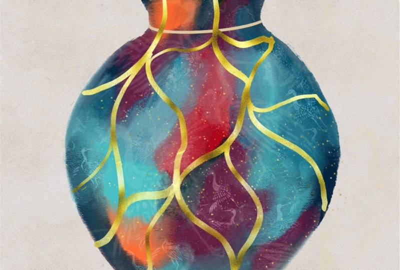
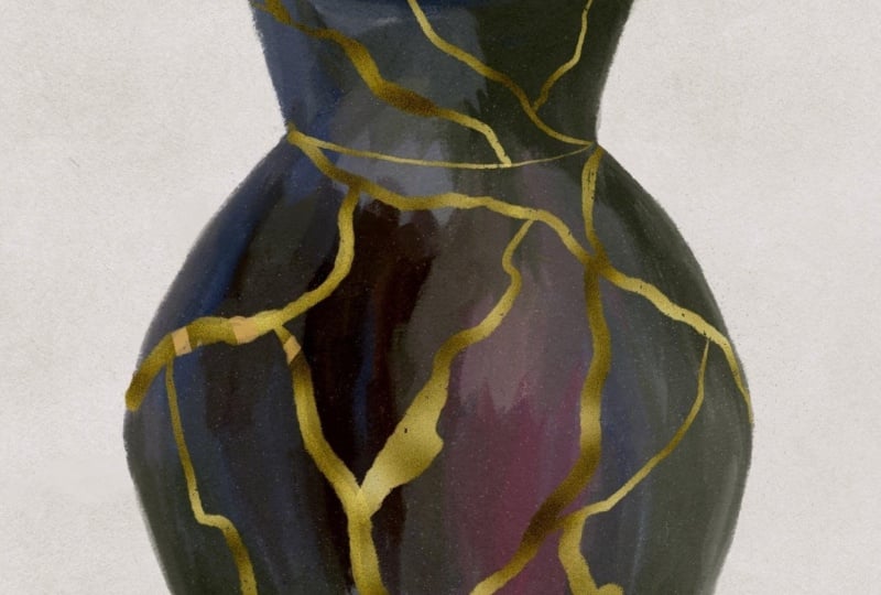
5. Japanese Art of Mending: Kensugi is a traditional
Japanese art of repairing broken pottery using lacquer mixed with powdered gold,
silver, or platinum. Rather than hiding the damage, Kensugi highlights the
cracks and imperfections, turning the piece into something even more
beautiful and unique. Rooted in the
philosophy of Babisabi which finds beauty and
imperfection and impermanence, Kensugi is both a physical and spiritual practice
celebrating resilience, transformation, and the
history of an object. I've selected this topic not only because it features
gold on the surface, but also because I love the concept of not being
broken by hardships, but becoming something more
special and beautiful. Let's illustrate a
kenzugiPiece and procreate.
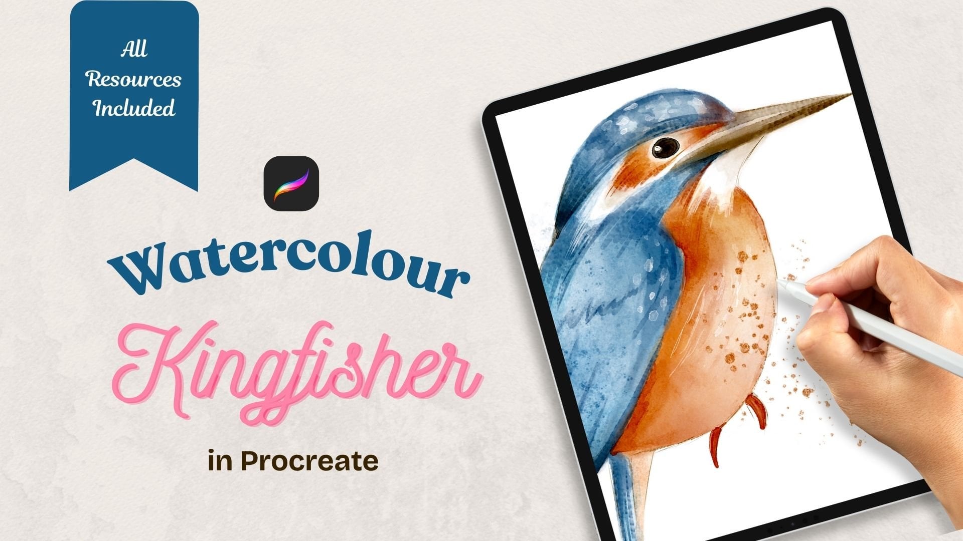
6. Sketching the Vase: Now, let's create our
Kenzugi vase in Procreate. For that, I'm going to choose
the plus icon and then I'm going to choose screen
size to create a new canvas. Next step is
completely optional, but I'm just going to
show you the way I like to play with my textures
and my illustration. I usually would like to
add some subtle texture, and for that, I'm going
to go to the range icon. I'm going to choose Add
and I'm going to choose insertifle and I'm going to add the subtle paper texture that I provide with this class. See, I just dropped
on top of my canvas. It's got a slight shade
of grayish cream. What I'm going to do, I'm going to leave this layer as it is. I'm going to duplicate it, and this layer I'm going
to change to color burn. What I've just done,
our bottom layer, paper texture layer
will be our background, and our top layer
will be our overlay, which will give our
illustration slight texture. You can lock both layers, so you don't accidentally
draw them and all our artwork will be happening sandwiched
between these two layers. All in between them. Now,
let's sketch our vas. I'm going to change my canvas
from landscape to portrait, and I'm going to choose a sketching brush which
is default and procreate. I will be using HB pencil
and the color I'll use is you can choose any color from the palette,
some neutral color. Yeah, quite happy with that. How do I usually
sketch my vases? First of all, I'm
going to create a squished ellipse and that
will be the top of my vase. What I'm going to do next? I'm going to duplicate this ellipse and I'm going
to reduce the size of it. Maybe 60% of my previous one. I'm going to drag it
underneath the top ellipse. That will be the
next of our vase, let's duplicate
the circle again. And let's drag it directly underneath
and the very bottom. That will be the
bottom of our vase, and I'm going to duplicate it again and I'm going to drag it somewhere in between the neck
ellipse and the bottom one, and I'm going to increase the
size approximately twice, twice bigger than
our initial circle. That will be the widest
part of our vase. I'm going to pinch all
the circles together. And I'm going to join
all the ellipses with a curved line only on one side and I will show
you why in a minute. I'm going to create
a curved line here between the
top and the neck. The curve here joining with the widest part and
one curve with the bottom. See, that's what we've got. Now, to make sure that this
line is exactly the same, on the other side, I'm going
to duplicate my layer. I'm going to select
the arrow two, and I'm going to flip it horizontal and maybe even move it slightly to
make my vase slightly. There. There you go. That's my symmetrical
vase created. I'm going to pinch it together
and on the new layer, I'm going to sketch the handle. It's just a simple
curve. It's optional. You obviously don't need
to create it at all, or you can put it
on the other side or on two sides, up to you, and I'm going to
pinch it together, and I'm going to grab
the eraser tube, and I'm going to erase all the invisible lines
that I don't need. The guidelines ellipsis. And that's how vase sketched. I use these techniques to sketch different types of vessels. Like, for example, you depending on the number of circles and depending
on the size of them, you can create different
types of vases, jugs, bottles, teapots,
teacups, mugs, bowls dishes. It's all about the
number of ellipses, their size, and the curves
you join them with. All that.
7. Colouring the Vase: You see that I
flipped my iPad to the portrait possession just
to fill the screen better. What we're going to do now, we're going to reduce
the opacity of the sketch just to leave
barely visible guidelines. You can rename this layer
sketch if you wish. And I recommend that you
lock it so you don't accidentally draw on it and later on we'll be
getting rid of it, either switching it off
or even deleting it. Now I'm going to create
a new layer underneath the sketch layer and I'm going to start coloring our vase. I'm not going to
super complicate it because that's not
the point of this class, but I'm going to show you some techniques that how I color my illustrations in most cases. In KinzukiGld brushes group, I'm going to select
the semi wet filler. Again, you can use
any brush you want. I'm going to be using
semi wet filler from my winter
Imaginarium collection. The reason I've chosen it is because it's got the
right level of solidity. I like how solid the
degree of solidity it has. I also love the texture. Show you. They love
the texture of it. But you can choose any brush of your choice
from your own collection, from the full
procreated brushes. My only recommendation would
be that it should preferably be on a more solid
side because gold, which we'll be decorating
our vase with later, will stand out based on
darker solid colors. So I grab my semi
white fill of brush. I'm going to make sure
that opacity is 100%, and I'm going to choose the
most comfortable size for me, and I'm going to start filling my vase with different colors. I will be using
different shades of blue because it's more
traditional Japanese colors, and I think gold
works best on them. But also, I will be mixing
in some brown, some gray, and a little bit of
this plum purple color. I want my vase to be obviously in beautiful
different shades. That's why I'm going to add patches of different
colors here and there, which I'm going to blend in a short while and I'm going to show you
how I blend them. But this technique gives you
this nice variety of color, transitioning, how I call it, a little bit of bright blue, but not too much, just a little bit
because I want my as to be more on a darker side, a little bit of brown
to represent the clay, which I think is quite nice
and this plump purple color. I filled my vase roughly with different patches of color and
now I'm going to blend it. So looking at it right now, I think it looks quite good
already, quite quirky. But I'm going to show you how
I normally blend my colors. I blend them with a smudge tool, but it's important
what brush you use to create this
smooth transitioning. I've created especially
color blender brush, which will help you nicely
and gently mix the colors, blend the colors together. I'm going to grab this brush, probably keep the
opacity to 100%, and the size select the
comfortable size for you. And very gently, I'm going to start blending the
colors together. I hope you can see
that it creates this nice texture
between the colors. Even in certain areas, I just use this tap
tap tap motion. That's it, I'm just going to blend all these colors together. What's important
to remember here about blending colors
with the smudge tool is that the color you are
currently pushing, sorry. The color you're
currently pushing will be blending into
the neighboring color. For example, if I'm
on this purple, it will be blending, it will
be spreading into the blue. However, if I'm on
the slide blue, I'm going to spread that color
into the neighboring one. A Here is my colors are blended and I
also wanted to show you what this overlay
of paper does. See if I switch it off. The colors, you can
still see the texture, but the colors are a
little bit more flat. However, once we
add this texture, it brings this more saturation, more depth to our colors, and that will be perfect
for our gold crags. Mended cracks. I filled and
blended all the colors in my vase and I can see that
I probably need to tie it a little bit before I add
a little bit more details. I will be operating with
two tools to tide it up. It's my semi wet filler, but with reduced size, and the eraser tool, which will be exactly the same as my drawing
tool, semiwt filler. I'm going to be adding
and erasing the edges. Yeah, quite happy with that. And at this stage, I'm going to get rid
of my sketch layer. I don't need it anymore.
You couldn't see it anyway. And now I'm going to
add a few details to my vase just to make it a little bit more interesting
because at the moment, it looks way too flat. I'm going to create a new layer and I'm going to use
this clipping mask. I'm going to literally add some details with
thicker sketcher brush. I think I'm going to just
go for some lighter color. I'm going to choose
this creamy beige color and I'm going to maybe reduce
the opacity a little bit. I'll just make different details here and there around the neck just a tiny bit of detail and I'm going
to create a new layer. And this time, I'm going to add some Japanese pattern
to my vast because it's like the tribute
to Japanese kinsugi. So the brush I'm going to use is living beings brush from my Japanese pattern
brushes collection, and I'm going to use
lighter color but try and experiment with different colors
and planting modes. What I'm going to do
with full opacity, I'm going to draw these
Japanese greens on the vase. I could leave them like that
because it's quite nice. However, um, I don't want them to interfere
with my gold cracks, which is the main point
of my illustration. What I'm going to
do, I'm going to select this layer with a
pattern brush and I'm going to increase the size to
make the cranes bigger, and I'm going to
grab the eraser too, and I'm going to erase the pattern from the
inside part of the vase. You can even erase them from
the handle, if you wish. Again, I think at the moment the pattern is a little
bit too intense. I don't want to compete
with the gold cracks, so I'm going to play with different blending mode and
decide how I want to keep it. Look how pretty it is with
overlay blending mode. Softly. Hard light light. I think I'm going to
keep them soft light, barely visible because I want the mended gold cracks to be the signature
feature of this vase. I'm just going to leave it
like this, and that's it. Our vase is now ready
for mending with gold.
8. Kg mending: I'm going to flatten all
the layers of my vase, and now the main part, let's draw gold cracks. This is very important guys
because it's important to remember the techniques
because at first, if you don't know
these techniques, it can be quite confusing. What I'm going to do,
I'm going to create a new empty layer,
and next thing, I'm going to add
our gold foil layer that we created in one
of the previous lessons. For that, I'm going to
go to the range icon. I'm going to use
the add option and I'm going to insert a file or a photo depending
where you saved it. I saved mine in camera roll
and I'm going to add it. You can play around
with a scale. I think I'm going to
keep it like this. Next, I'm going to create an empty layer underneath
my gold texture. I'm going to clip
the gold texture as a clipping mask to
my empty layer. This is the type of mini stack
you've got in your layers. You've got an empty
layer and the gold texture clip
to it as a mask. And we're going to make sure that we stay on
this empty layer, not on the texture layer,
but the empty layer. And the brush I'm
going to use is liquid gold and
the color doesn't matter because I will be
drawing with gold on my vase. I'm going to reduce
the size a little bit. The opacity will be 100%, and I'm going to start
drawing gold cracks. See? It looks like I'm
actually pinting with gold. You can use a Kensugi
piece as a reference. Also see like a tip for you. I can immediately see that this texture is slightly
darker to my liking, maybe it will work
for some artworks, but for this one is a
little bit too dark. I'm just going to go to the texture layer to
the gold texture. I'm going to go to adjustments and I'm going to choose
curves and I'm going to play around with
curves and you can immediately see how it changes right away
the brightness of it. Again, once you've
adjusted the gold, make sure you go back on this empty layer where you were drawing with
your liquid brush. If you don't like
the liquid brush, use a thicker sketcher, which is quite nice
brush as well, but I would make sure that
the opacity is at 100%. I'm just going to draw this
random cold crack creating the effect of the broken vase that has been mended with
gold and this Japanese sug it if you want to take it
a little bit further, you can of course use
some shimmer brush, for example, just to add a
little bit of extra gold. But that's already depends
on what you want to create. You can make so many
different effects with this, but it's just
important to remember these techniques, empty layer, that's how it will
look just with color, but that's how it look with
the texture clipped on it. Basically, I've talked about clipping mask a lot in my
classes and my tutorials, and this is in essence, it's the same techniques. It's a mask, a texture
clipped to a layer. The only difference is that you first clip it and
then you paint on it, and in essence, you
paint with texture. That's our us ready. I showed you the basics and you can take it as far as you want. It will be interesting to see your project in the
project section if you upload your artworks. It will be nice to see how creative you're going to
get with these techniques.
9. Extras: Other Ways to Paint with Gold: This technique is so versatile. You can use it in so many
ways in your designs and illustrations that only your
imagination is your limit. Similar to the gold cracks, you can decorate your
illustrations with gold. It always adds this magic touch and brings your art
to a whole new level. I love folk art,
and I believe that gold is a perfect
match to this style. It's also a great
addition if you work on Christmas and
festive illustrations. I also find gold texture working great with
pattern brushes. Simply use the same technique
of clipping the gold to an empty layer and use a pattern brush on
that empty layer. Or perhaps instead of
creating subtle details, you'd like to use gold for
painting the main object of your illustration or do
some nice lettering. So this technique
is so versatile. You can use it for
so many things, and I'm going to show you
different ways to use it. So as we learned in the
previous lesson before, you can use a brush to create different
details on objects. Like, for example, in
this illustration, I used glitter texture to create these details on this rb. There are other nice
brushes that you can use literally like
texture brushes or object brushes you
can use to create different gold effect like adding some gold and
shimmer to your artworks. Se different brushes,
create different effects. So you like painting with
glitter, but in fact, you're painting with
some texture brush, and the glitter
texture automatically applies because it works
as a clipping mask. Also, I find that golden glitter work beautifully with
pattern brushes. And they also work create
with various border brushes. Or maybe instead of
creating details, you would like to create
a whole object made of gold or silver or any other metallic
texture, for example, I strongly encourage
you to try all of the above and find out where gold and your imagination
will take you.
10. Final Words: Thank you so much for
washing my class. I used to worry if I'm adding too much gold
to my illustration. And then I realize that there's no such thing as too much gold. So I encourage you
to experiment, to try to add as much gold elements
and details as possible. And please make sure
you upload your art because I'm dying
to see where you can bring your imagination and your creativity
with this technique of painting with gold. And there's always follow
me on social media. Here's my Instagram, follow me on YouTube one more tutorial. Hope you enjoy. See you later.
 Irina Young, Busy May Studio