Transcripts
1. Welcome To The Class!: Hello and welcome to the
world of watercolors, where creativity
knows no bounds. If you've ever wanted
to bring a touch of the Arctic onto your canvas,
you're in for retreat. Because today we're painting
Penguins with passion. I will Elliston and it's my absolute pleasure
to be your teacher. Today we'll start
with the basics. Exploring watercolor
techniques that bring your penguins to life, from bold washes to
delicate strokes. You'll gain the skills to make your artwork truly stand out. I've been a professional
artist for many years, exploring lots of
different subjects, from wildlife and portraits to city scapes and
countryside scenes. I've always been entranced by the possibilities of watercolor, but when I started, I had no idea where to begin
or how to improve. I didn't know what
supplies I needed, how to create the
effects I wanted, or which colors to mix. Now, I've taken part in
many worldwide exhibitions, been featured in magazines, and been lucky enough
to win awards from well respected
organizations such as the International
Watercolor Society, the Masters of
Watercolor Alliance, Windsor, and Newton,
and the SAA. Watercolor can be overwhelming
for those starting out. Which is why my goal is
to help you feel relaxed and enjoy this medium in
a step by step manner. Today, I'll be
guiding you through a complete painting
demonstrating a variety of techniques and explaining how I use all
my supplies and materials. Whether you're just starting out or already have
some experience, you'll be able to follow along at your own pace and improve your watercolor skills if this class is too challenging
or too easy for you. I have a variety of classes available at different
skill levels. I'd like to start off with a
free, expressive approach, with no fear of
making mistakes as we create exciting textures
for the underlayer. As the painting progresses, we'll add more details to bring it to life and
make it stand out. I strive to simplify
complex subjects into easier shapes that
encourage playfulness. Throughout this class, I'll be sharing plenty of
tips and tricks. I'll show you how to turn
mistakes into opportunities, taking the stress out of
painting in order to have fun. I'll also provide you with
my watercolor mixing chart, which are an invaluable tool when it comes to choosing
and mixing colors. If you have any questions, you can post them in
the discussion thread. Down below, I'll be sure to read and respond to
ever think you post. Don't forget to follow
me on Skillshare by clicking the follow
button at the top. This means you'll be the
first to know when I launch a new class
or post giveaways. You can also follow me on Instagram at Will Elliston
to see my latest works. So let's get started with
learning fun and exciting watercolor techniques
and how we can use them to paint your own
captivating Penguin.
2. Your Project: Thank you for choosing to be part of this artistic
journey with me. It's truly an honor to
have you in this class. The composition in
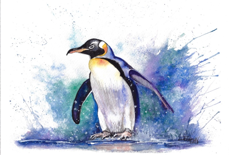
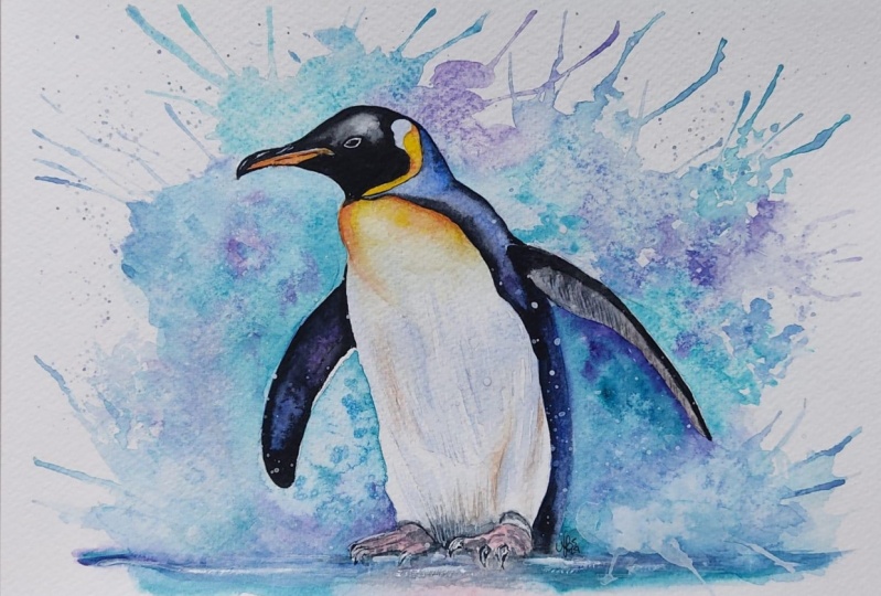
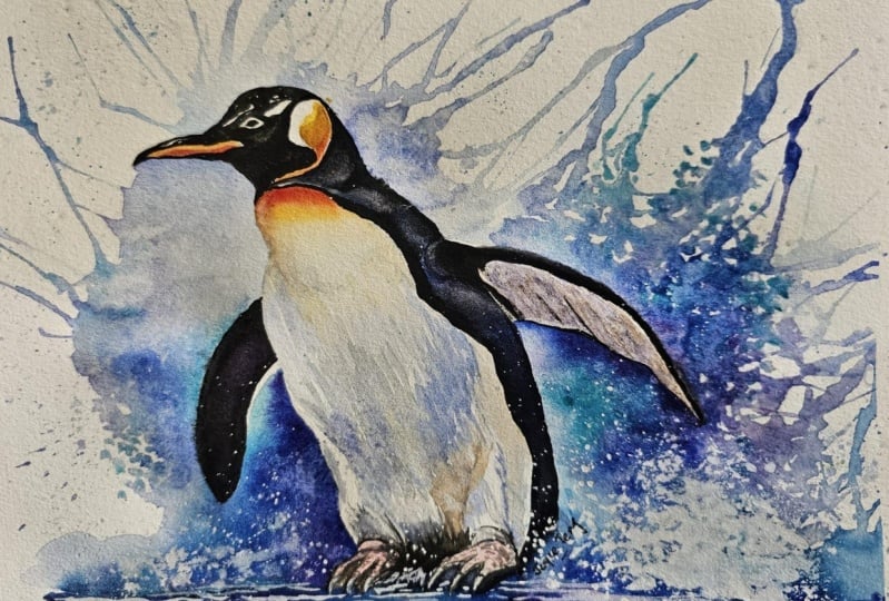
this painting is an exciting one because of the large wave crashing
into the penguin. It isn't just a
background element, it's a dynamic force that adds energy and movement
to our painting. We'll use a straw to create some fun expressive textures infusing our own artistic
energy into the painting. In the resource section, I've added a high
resolution image of my finished painting
to help guide you. You're welcome to
follow my painting exactly or experiment with your own composition
as we're going to be focusing on the painting
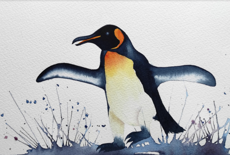
aspect of watercolor, I've provided templates
you can use to help transfer or trace the
sketch before you paint. It's fine to trace when using it as a guide for
learning how to paint, it's important to
have the underdrawing correct so that you can relax and have fun learning the watercolor
medium itself. Whichever direction
you take this class, it would be great
to see your results and the paintings you
create through it. I love giving my
students feedback. Please take a photo
afterwards and share it in the Student Project Gallery under the Project
and Resource tab. I'm always intrigued to
see how many students have different approaches and how
they progress with each. I'd love to hear
about your process and what you learned
along the way, or if you had any difficulties. I strongly recommend
that you take a look at each other's work in the
student project gallery. It's so inspiring to see
each other's work and extremely comforting to get the support of your
fellow students, so don't forget to like and
comment on each other's work.
3. Materials & Supplies: Before we start the painting, let's go over the materials
and supplies I use. Having the right materials can greatly impact the
outcome of your artwork. I'll go over all the supplies I use for
this class and beyond. They're very useful to have at your disposal and we'll make it easier for you
to follow along. Let's start with the
paints themselves. Like most of the materials
we'll be using today, it's a lot to do
with preference. I have 12 stable colors in my palette that I
fill up from tubes. They are cadmium
yellow yellow ochre, burnt sienna, cadmium
red, alizarin crimson, ultramarine blue, cobalt blue, cillian blue, lavender,
purple, dian black. At the end of the
painting, I often use white guash for tiny highlights. I don't use any
particular brand. These colors you can
get from any brand, although I personally
use Daniel Smith, Windsor, and Newton
Holbein paints. Let's move on to brushes. The brush I use the most is
a synthetic round brush, like this Skoda Pla brush
or this Van Gogh brush. They're very versatile because
not only can you use them for detailed work
with their fine tip, but as they can hold
a lot of water, they are good for
washes as well. They're also quite affordable, so I have quite a few
in different sizes. Next are the mop brushes. Mop brushes are good for
broad brush strokes, filling in large areas and creating smooth
transitions or washes. They also have a nice tip that can be used for smaller details, but for really small details, highlights, or anything
that needs more precision. I use a synthetic
size zero brush. All brands have them and
they're super cheap. Another useful brush to have is a Chinese calligraphy brush. They tend to have long bristles
and a very pointy tip. They're perfect for
adding texture or creating dynamic lines
in your paintings. You can even fan them
out like this to achieve fur or feather
textures as well. And that's it for
brushes onto paper. The better quality
of your paper, the easier it will be to paint cheap paper crinkles easily
and is very unforgiving, Not allowing you to
rework mistakes, it's harder to create
appealing effects and apply useful techniques
like rubbing away pigment. Good quality paper, however, such as cotton based paper, not only allows you to rework
mistakes multiple times, but because the pigment
reacts much better on it, the chances of
mistakes are a lot lower and you'll be more likely to create
better paintings. I use arches paper because that's what's available
in my local art shop. A water spray is
absolutely essential. By using this, it
gives you more time to paint the areas you
want before it dries. It also allows you to
reactivate the paint if you want to add a smooth
line or remove some paint. I also have an old
rag or T shirt which I used to clean my brush. Cleaning off the paint
before diving it in the water will make the
water last a lot longer. It's always useful to
have a tissue at hand whilst painting to
lift off excess paint. Also, you never know when an unwanted splash or drip might occur that needs
wiping away quickly. I also have a water dropper
to keep the paints wet. When you paint, it's
important to have them a similar consistency to what
they're like in the tubes. This way it's easier to
pick up sufficient pigment. A hair dryer is useful
to have for speeding up the drying time and controlling the
dampness of the paper. Lastly, masking tape. And this of course, is just to hold the paper down still onto the surface to stop it sliding
around whilst painting. Also, if you plan on
painting to the edge, it'll allow you to create a
very crisp, clean border. That's everything you
need to paint along. I encourage you to experiment and find out what
works best for you. Now let's get ready to
start the painting.
4. Blocking Out The Drawing: I'm going to show
you how to block off the main shapes for the drawing and the painting if
you're not using the tracing template I supplied. Now the first thing I'm
going to do is find the center and work
out from there. I'm thinking of the
background first, so I'm just going
to softly add in lines where the water
will be spraying out. And we'll use a straw
technique to do that. I think I enjoy planning
my painting while some drawing because I
can think about what techniques
I'm going to use. It's like a star with all these angles pointing
into the middle. Then at the bottom here,
we can have the base. I haven't stuck it
down to a board because after I've
finished the drawing, I'm going to scan it in and turn it into a
template that you can use to trace if you don't
want to do the drawing yourself to get a good idea of how do I just rough non descriptive shapes. So I'm using circles at the moment just to fill in the space and then we
can use corrections later. I'm using the side of my pencil so that I'm
not indenting the paper, so that I can rub it out if
I feel like it's incorrect. So we need to get
a bit bigger here. I think I'll take my time off camera just to make sure the lines
are very clear, pointing out all
the important lines for you to trace along. But if you want to draw, this is how I go about
it to begin with. I think that's as
far as I'm going to go with the drawing
demonstration. I'll come back to you once I've scanned it all in and stuck the paper with masking
tape to my painting board.
5. Using A Straw: We're going to
start this painting by painting the wave crashing in to the Penguin
as the background. This will be a fun opportunity to get all expressive
right from the get go. We're going to use a
straw to help us with these exciting textures.
Have a straw ready? First of all, I'm going
to mix my colors and it's going to be a mixture of blues. Blue will be the base color, and then we'll have green and possibly purple
in there as well. But blue will be the base color. Just mixing blue and just thinking about
what I'm going to do while I'm mixing it
a bit of purple there. Just to have it prepared if I want to use a
bit of that later, may be in this side
a bit of green. Maybe we can use a bit of
ultra marine blue too. I think Serilian is the blue
that I'm going to go for. But before we start, we need
to be careful which areas we're able to paint over and which areas we're not
allowed to paint over. The areas that we're going to
paint over black later on. It's fine to go
over at the moment, but there's some
little areas here, here and here which will need to maintain the whites the penguin. Make sure you have reference and you have a
look at what you're going to paint before you
put the brush to the paper without further ado. I'm just going to start by
just applying some water. We can actually go
over these bits here because that part safe and
you also have a tissue, your hand ready for any
mistakes that might happen. Now, I want to use
the straw up here. I'm just going to make
it extra full of water. Who splits, can use the straw. Blow it out like that. We just leave it alone. Now we can move on to the next section. I'm going to stick
with that same blue, maybe a touch of purple. Just for a bit of
excitement again, I notice how as I'm going across changing the direction
of my straw, making sure I don't
go over the penguin. You can see a subtle
change of color, makes it a bit more exciting. But if you're not confident, if you still count
yourself as a beginner, you don't need to risk that yet. If you think it's
a bit too weak, you can dab a bit
more pigment in there and add a bit more. Likewise, you can do it
the other way around. You can take a clear brush, use the tissue to draw
out the liquid and then just suck out that
liquid from there. Had a few flicks, by tilting the brush
right onto its side, you can even help it out by doing going the exact
direction you want, then going back with a straw to give it a more
natural, organic look. It's such a fun technique to do, it's actually quite easy to go overboard with it and
do a bit too much, so I'm trying to contain myself and not get too over excited. We have a stronger pigment there influencing a few
different colors now.
6. Painting The Background: If you want to be adventurous
and you have salt handy, just put a little bit in
there, but you don't have to. Just because I'm using
it, doesn't mean you have to maybe have this bit, a bit more turquoise up here when you merge that into the blue
that's coming down here. Another technique you can try. I'll show you getting
cleaning your brush and having water just flicking it onto the paper as is
completely by itself and then adding color to those splats, just
connecting them. Go back to the straw again. And you can use
your hand to guard off some of the areas that you don't want to be affected that's a
bit too strong. So I'm going to use a
tissue just to suck out some of that spray. Oh, that's a lovely color, That's ultramarine
blue mixed with that green to that serilian. Merge it with it down here. It's all like creating
lovely effects, mixing together in
a nice organic way. I'm going to try and
avoid painting this wing because it's gray and I want to maintain
some of the whites. So I'm just going to keep a
nice clean border right here. Another bit of salt. Why adds the texture? Trying to move down bit by bit, keep a little more abstract
for the time being, so flats again. Now for the time being, I'm going to leave this section
and merge it a bit later. But as some of these areas
are starting to dry, I'm going to try and
add a bit of interest by plunging some darker pigment
in some of these areas. I'm going to add some salt, and I'm just going to
let that dry naturally. You need to wait for the salt
to dry naturally for a bit, because otherwise it
won't melt, so to speak, into the water and create those lovely effects
we're looking for, the hair dryer
speeds up too much, but if you're not using salt, if you just want to practice other techniques,
then that's fine. Do what you want to do.
Why that is drying. We can continue around
this side of the painting. I'm just going to wet this area. I can go over this
line but as soon as it connects to that
line I can't go over, just re, engaging
that part there. It looks like it was
connected all along. Add a bit more liquid,
then back to the straw. Then in the middle just to put a blob of blue just
to keep it interesting. And then maybe on the very edge, we can add a bit of blue too. Ultra marine blue
here on this side. Loads of water here, loads. Keep it nice and
controlled though. Keep it very close to the paper and then interact with it a bit. Come on with green
on the other side, just some of that blue back
just for the sit up here. Now, taking a bit more green flick, a bit of the screen down
there when it's trying again, when we reach the
bottom of this wing, you can cut it off
and it's a bit of a check mark like
we did over here. You can join the two sections.
7. Adding More Textures: Before we do that,
I'm going to use a little bit of red Cadman red, and just paint the under
layer for the penguins feet. And you can see red
when it's diluted. A lot actually looks like pink, which is what is
intended in this case. Maybe a bit of salt on this side helps create
the granular effect. Now I'm just emphasizing
these lines here because I don't want to lose them in the next step because we're going to paint quite dark. It might be quite difficult
to see after we've painted on some of these lines have got quite light because I don't want them being visible. But in situations like this, I have to paint a bit darker. This is going to be a
similar thing as before. The only difference, just for a variety to show you
different techniques, I'm going to pre wet this
area first for water, start by using that green again, the same color as
the other side. So it helps unify it a bit. Then as it comes down, it can blend into this
serilian blue color. You can actually
paint over this bit because this fin is dark, or this wing rather this wing. Then it's going to go
quite dark right here. And careful not to go over
the line on this bit. I want there to be a
nice strong contrast. Maybe we can involve
a different color here that was brave,
but that's okay. War color is about being
brave, spontaneous. That's where the
excitement comes. I want it to be extra dark here. I'm just applying quite thick. Pigment doesn't matter
really what color it is because it's not so
vivid, it's just dark. Then we can bring it out here. Again, it doesn't matter
what color you're using. And I'm going to be careful over this pencil line because I don't want to bring up the
lead and make it very gray. So I'm just going to put one
line over there and that should be enough then pure
water at the very end there, so that it fades out to nothing. Mixing the purple with the green here to create
a bit of interest, do a strip of purple and then a strip of green on top of it, maybe more blue to
balance it out. You can see how this
pigment is a lot darker. So that's why he went
back to the pencil.
8. Connecting The Background: Actually here, I think I'm going to get a
bit of this red. I'm just a bit a bit there. And that almost looks a bit like a reflection of those feet. Same thing on this
side, strong pigment. Notice we worked down to this area and now we're going
to work up to this area. So we're starting with a
thick pigment on this side. Get I decided I want it to be even thicker here. So I'm just going to go again
with this thick pigment. Just drop it in there. A very thick pigment in here. And I'll come back to it
in a bit once it's melted, can do the same with purple. That should drop
a bit of purple, thick purple right here. Put some really
thick pigment down here straight from the tube. Purple just under fair. It may be the same
with a Serilian to just every now and again just dropping
some pigment in there. Now, I don't know what the
result of this will look like. I've got an idea because I do this very often not
adding thick pigment, but all I can do is set it up and let the water
do what it wants to do. Now I'm going to interact with
it by connecting them all. I'm only touching the edges of these thick blobs and I have loads of water
swishing about. It's time to connect it
with the above section.
9. More Straw Textures: Now I can add two layers
of these swirls actually. And you can tilt it a little
bit to move it around, and as it dries, we can interfere with it to
create even more texture. It's ironic that in the pursuit to create
interesting textures, you have to do the opposite
of what you usually do when trying to create
nice clean washes. You have to splash
it with water, mix colors when
they're almost dry. And almost try and make
it as ugly as possible. And then that ugliness
when contrasted with the nice clean lines
of the penguin, actually make it look
quite attractive. We can actually clean our
palette now of these blues, because the blue
part is now done.
10. Painting The Beak: And to the Penguin. I'm going to do a bit of underlay,
starting with the beak. I'm going to take some
yellow to start with. Just go along that line. When painting orange is
easier to start with yellow because red is often too
powerful, too potent. Then you can go
in with some red. It's not too important about going over the
lines in this one, because again, we'll go
over with black later on. This is an important
section here. We're going to have
it quite light here. Even though it's
quite intricate, we do have to make sure we stay within the lines
on this section. It's just pure in
yellow at the moment. And then down here
had a bit of orange. Same again up here, paint the top bit yellow, making sure you're
staying in the lines. It's pre wetting the
area there but not connecting it because there is a very slight yellow
tinge to the fur up here. I'm going to use
yellow Oka for that rather than cadmium yellow. And then just softly touching the edge so that it's not a hard
edge but a soft edge. Again using the yellow och
rather than cadmium red. Cadmium yellow. Because the cadmium
yellow is too vibrant. Where as the yellow Oka
is a bit more golden, then I can introduce some
orange up at the top. Stabbing it and letting
it fall off my brush, making sure it's wet enough. There's a bit of a
shadow coming down here.
11. Shading: I give it mix a bit of
this ultra marine blue, a tiny bit of purple, and that's a nice complimentary
color to the yellow. And we can very gently lend it in having a bit of shadow. Yeah, I'm just using the tip of my brush and zig zagging
to mimic that texture. Remember zig zagging and trying to follow the
form of the penguin, and it comes down
to about down here. She gets some of the orange very lightly and mix it in as a, as it's a complimentary color, it grazes it out a bit. The leave that section white. A leg white. If it's looking to
orange, add more blue. If it's looking to
blue, add more orange. Can you even add a
bit of burnt sienna? Has a lot on there because burn sienna is an
orange as well. Burnt orange looks
way to orange. So take a bit more blue, put it on top, and
it neutralizes it. Now while that's drawing a,
but I'm gonna go back up to here and paint a bit
more of that shadow. And it can be endless
padding details like this. Whenever you feel like
you've had enough, move on to the next section, just a few more and
then we'll be on to painting the darks. Now I'm quickly go to paint fun little under here mixing a few
different colors. I want it to be
distinguished from the under the background rather.
12. Painting The Head: Now I'm loading my brush
up some black paint, and I'm going to make
sure that the tip of this brush is completely pointy and make sure that the
consistency is strong enough. By strong enough, I mean, when it starts to dry, when you're filling it out
and the water gets thin, it shouldn't be gray. It should still be black
even when it's dry. If it starts to go
gray, it means watery. There will be some areas where we do want it to
be a bit grayer. I'm going to paint
the eye right now. This painting, the
inside to begin with, see, I don't have to change to a smaller brush to do this. As long as your brush
has a nice fine tip, you can do everything
with this brush, the paint, the
outside of the brush, outside of the eye, rather. Unfortunately, one of the
most important things in water color is patience. And that's one of
the things that holds people back the most is taking the time to
do things properly. Wanting to take the time to do the details
absolutely correct. Again, I think it comes back to a fear aspect of getting
it wrong or committing so much time and energy on concentration to something that might not even look
right at the end. I don't personally
see it like that. I feel like give it all anyway. Take the time to do
it as good as you can, put your heart into it. Even if it does end up being
a failure in your eyes, there will be some
good things about it. There'll be things
that other people like about it that you don't
see or you might put it away and come back to
it in a couple of months time like I do often and I
see it in a different light. If you didn't like the
painting even then, the most important
thing is that you actually had the right
mindset when you did it. You put your heart into it, which is the best mindset to
have you learnt something valuable and trained yourself to think in that way which
is much more positive.
13. Colourful Greys: Around here, it starts to get a bit lighter.
A bit more gray. I might actually add a bit
of blue into the black, to gray it out so that
it's not a full on gray, but a colorful gray. I'm going to go in there with a gray tone,
a lighter tone. And just interact
with it like that. Because as it starts interacting with the
rest of the black, it'll get gray down. Anyway, some purple directly on there. That, that looks pretty bold. To just go and do that. We're going to do that
with some blue too, but you'll see that because we're using some black in here. Anyway, all those colors
will merge into the black and give the black
a bit more life than if we were just to paint it pure black back. I'm gonna rotate around so
that you have a better angle. But what I'm doing,
it's a bit more water. I'm going back in with
a pure brush just to mix it all together. Pure water brush, sucking some water out from the
bottom onto my brush. I'm taking it up there. I think we can have a
bit more color in there. Actually, black, always dry, lighter than it looks
like when it's wet. This is a good opportunity in practice to see how
dark you can paint. I would be happier to see your projects going too
dark with this black in the areas it's meant
to be than too light.
14. Conveying Form: Now back up to this area. You're going to take a
Serilian blue again, as an area in between
these white bits. I'm just going to
wet with water, being very careful not to
interact with that yellow yet. I'm just going to fade
it out so that it starts right and just blends into here. Then up at the top of the top, hold your breath and
it is painted in it, down it more. Maybe we
can make that bit a bit darker, the very edge. Get it even darker, soften that edge,
bring it in a bit. Remember we're placing
that bit black, so it's okay if we
go over that a bit. So that bit could
be a bit fiddly to try and get the nice blending, but I think it creates
a nice effect. I think it's good practice where has a hard edge like that. First of all, go with
quite a dry brush, a brush without so much water and then go back
clean your brush, dry it again, and keep on going back and
forth between taking the liquid out and
then going back. As it goes down here,
it gets very dark. That's not black. It might look dark without just pure purple pigment
and ultra marine.
15. Using Black: I'm gonna go back to the black, carefully come along here and gradually will blend
it down into this purple. Now with as much
precaution as possible, I'm applying a thin black line that goes along
the border between the yellow and the blue is a. So I'm missing some of the
pencil lines here, so I'm able to work
it out of the brush to turn it around just so
that I can analyze the point.
16. Painting The Feet: Now it's time to paint the feet. So to start the feet, I'm going to paint
above the feet. Actually the ankles, so to speak. I know they're not
actually ankles, just, I don't know what to call them on the
bird, maybe they are ankles. I feel more texture
as well and that's it lying on those
text as bus. I can now back to the feet just implying some
of the clauses bit too dark there. So I just gonna use tissue to draw out some
of that pigment. I don't want to put too
many, many details in, I just want to basically
do as little details as possible while still
conveying that their feet, they don't have to
look like feet, they just have to be
understood as feet. This is when we're
talking about patients, this is where my weaknesses. I should really spend
time to make sure these feet are as
detailed as they can be, but I don't have the patience to really go in and do all
those fine details.
17. Adding Highlights: Paint a few little highlights, the claws on the feet. I'm going to soften
this bit here. This edge. So I'm
reactivating it. Just softening it
like that. We maybe right there just dropping
in some dark black. Now I'm going to get loose
again and split some water, clean water onto paper. Even getting my fingers and
flicking someone there. Now, just going to
wait a few seconds for it to reabsorb
into the paper. Now that it's reabsorbed, hold, hold it down firmly and rub. Now I'm going to experiment
and extra daring. You can call the painting
finished like this if you wish. For those of you that might want to take it a bit further, I'm going to experiment with some white pigment,
some white splats. I just feel it needed a
little white highlight there. I'm actually going to put
white paint quite thickly here where that pencil line was before it's going to paint a kind of ground surface.
18. White Splats: Really applying thick white
paint here and then dropping in some water splatting. Even though it's not
meant to be snow, it's got the feeling of cold weather maybe make one of these drops even bigger. You see what I mean?
It doesn't matter so much about the details
on the feet anymore. We can even be daring
and get the straw back. I think we'll call that done.
19. Final Thoughts: Congratulations and welcome
back, fellow artists. We've reached the end of our
watercolor Penguin journey, and I hope you've
had as much fun as I did Before we conclude, let's reflect on our
creative adventure together in this
exciting composition where our bold penguin
stands resilient against the crashing waves through
layers of water color, we brought life into the canvas, capturing the spirit and
charm of our penguin friend. Watercolor is a wonderfully
unpredictable medium, and those happy accidents often lead to the most
beautiful results. It's in this process
of creating that we discover new possibilities
and refine our skills. Remember, watercolor painting is not just about technical skills, but also about expressing your creativity and
personal style. I encourage you to continue
exploring, experimenting, and pushing your
boundaries to create your own unique
watercolor masterpieces. As we come to the
end of this class, I hope you feel
more confident and comfortable with your
watercolor painting abilities. Practice is key when it comes
to improving your skills. So keep on painting
and experimenting. I want to express my gratitude for each and every one of you. Your passion for watercolor
painting is so inspiring. And I'm honored to
be your teacher. If you would like feedback on your painting, I'd
love to give it. So please share your painting in the Student Projects
Gallery down below. And I'll be sure to
respond if you prefer. You can share it on Instagram, tagging me at Will Elliston
as I would love to see it. Skillshare also loves seeing
in my student's work, so tag them as well at Skillshare after putting
so much effort into it, why not share your creation? If you have any questions
or comments about today's class or want any specific advice
related to watercolor, please reach out to me in
the discussion section and you can also let me
know about any subject, wildlife or scene you'd
like me to do a class on. If you found this class useful, I'd really appreciate
getting your feedback on it. Reading your reviews
fills my heart with joy and helps me create the best
experience for my students. Lastly, please click
the follow button up top so you can follow
me on Skillshare. This means that you'll be
the first to know when I launch a new class
or post giveaways. Keep painting, keep exploring, and most importantly, keep
enjoying the process. I look forward to seeing you
all again in future classes. Until then, happy painting.
 Will Elliston, Award-Winning Watercolour Artist