Transcripts
1. Introduction: Hello. Welcome to my art studio. My name is Rebecca Wilson. I am a watercolor artist based in beautiful
Nova Scotia, Canada, and I am here to teach
you how to do these really fun and beautiful,
colorful forest scenes. I've got a couple more
here using mixed media. Now the project that we're
going to complete today is a forest scene with
a little house in it. There's a lot of
different colors and textures going on here, and you are going to
have a lot of freedom to create a piece that suits
your style and your taste, as well as the tools that
you have at your disposal. So whether you want to
use watercolor paints or acrylic paints, squash, colored pencils,
pastels, markers, whatever, it is
totally up to you. All good. I'm going to
show you what I'm using, but I will explain
different options on how you can use
other tools as well. Started creating these
paintings as a bit of a warm up exercise before I did what I considered
my real painting. But the more I did
them, the more I realized that they
were turning out really fun and people were having a great response to them. So I actually just make these as some of my main art
now, and it's really fun. But I still think it is
a great way to warm up, especially if you are used to doing art that is
really particular. If you are, like, a
fine artist that does, like, detailed
sketches or paintings, and you're working with a
lot of tiny brushes and having to hold your
breath while you make art. I've
certainly been there. This is the antithesis to that. We are doing cky
shapes and colors, and there's a lot of scribbling, and it's really
fun and cathartic. So whether you're doing this to create a finish piece or just to build a new practice for your warm ups
or your sketchbook, we're going to have
some fun today, and I'm really excited
to share this with you. If that sounds like
a good plan to you, then let's get started, and you can head into
the first lesson and join me for some
art making today.
2. Materials and Tools: Let's first talk
about the supplies that we're going to
use for this class. So first of all, with paper, this is the paper I prefer to use for these
sorts of projects. So this is watercolor paper. It's made by Fabriano, but I'm not particularly
partial to any brand. The important part for this is that this is hot press paper. So with watercolor paper,
when it is being made, it can use a hot press
or a cold press to basically iron the paper
when it's being made. A hot press means
that they used heat. So that just means the paper is going to
be extremely smooth. There's no texture here, whereas a cold press
watercolor paper has that ripply texture that
you may be familiar with. I really love a cold press
paper for most paintings, but for anything where
I'm doing multimedia, especially with colored pencils, I prefer the hot press
because it gets it really smooth and the
finish looks better. So if you only have cold press, you can still totally do this. But if you're not super
happy with the finish, just consider that
maybe in the future, you want to try hot press paper. Now, for our base colors, I'm going to be using
watercolor crayons. These are sort of
a newer tool in my repertoire. I
really love them. They are really fun and
loose to work with. So it works kind of
like a waxy crayon. You just scribble on the
paper, as you will see. Then when you add water, it
melts into watercolor paint. However, you don't
have to use these. You could also use
watercolor colored pencils, if you have those and
prefer them or just simply use actual watercolors
like what I have here. This is a pan of watercolors. This is what I use
for work. So, again, just activate with water
and paint like that. But even furthermore, if you
don't have watercolors or want to use a
different paint like an acrylic or something
or a gouache, by all means, you can do that. It's really less
about what materials you're using and more about
how you're using them. I also like to pull in some
craft paints like these. These are basically sort
of liquidy acrylic paints. This one I got from
the Dollar store. This one is from
Michael's, I believe. So just like, slightly more
expensive, but not very much. They're pretty
inexpensive paints. They're not necessarily
high end paints, but I think they're really fun for these kinds of projects. They're also super opaque, so they work really well
on the very top layer. But if you wanted to use
them as your base layer, too, that's okay as well. I also have colored
pencils here. I keep them in this little dish. These are prisma
colored pencils. So as you can see,
that's the brand. Sorry, it might be
at a focus, but that's the brand
is prisma color. Now, I'm not usually a big stickler for particular brands, but I do think a high quality colored pencil makes a
big difference here. So again, if you only have just some random ones laying around, that is perfectly fine. You can play with those. But if you find that you're
not getting the result you want or they're not as
vivid or showing up as well, you may want to try
even just getting one or two from an art store
in a color you like, a little bit more
expensive colored pencil just to see how
the difference is. In terms of brushes that I use for these
sorts of projects, I like to use a variety of tips. So I'll just lay them out here. So I have some really thin ones right here that I
do for detail work, like adding little
leaves or vines. And then these bigger ones
are for more blurring out the watercolor crayons or using the watercolor paint to add
more big spacious details. I really like a big
fat brush like this, partially because it
just does a good effect, but also because when it's damp, it really goes
into a fine point. So you can actually do
quite fine detail work even with a thicker
brush like this. But also, I find that working large to start and
going smaller the further you get in the
piece is a good method because then you sort of get the base down
without overthinking it, and then you can
refine over time. Generally, I think
that is the best approach for this type of art piece is to start broad, start messy, and just refine
as you go through the steps. Of course, you can have other paint tools
here if you want. These are just
completely optional. I have some toothpicks here to help with dots and texture. I have drawing
gum, which you can use to do, like,
resist techniques. I probably won't do that
today, but that's an option. I have my pencil sharpener. I have this little
water dropper bottle that I got at $1 store. I use it to add water to my palette so you can play
around with dropping water. I have my water cup, which is sort of green because I was painting the green earlier. Some paper towels. I have
painter's tape as well. You can use this to
either secure down the edges of your piece to your surface as you're working, or you can use it to do
resist techniques as well. And I think those are the main things that we're
going to be using today. So at this point, I'm going to tidy up my workspace
a little bit, and we will get started
in the next lesson.
3. Painting the Base Layer: The way that we're going to
do this particular piece of art or warm up art, however you want to
frame it, is that we're going to first do the
base layer on this page, and then it's going to
go dry for a little bit. When I'm working
on these pieces, I like to usually do
like two or three at a time because
I like to set them aside for the
watercolor layers to dry before I do
the top markings. So we're going to do our
base layer in this lesson. Then we're going to do
a lesson talking about mark-making and some options for decorating the top
layer of the piece, and then we'll go in and do our additions and make
the piece look complete. I'm going to warn you 100%
of the time when I do this, after I do the base layer, I think this looks really bad. There's no way I'm
going to redeem it. So we're going to do
a base layer now. I expect and maybe even hope that you look at it
and go, This is really bad. I'm not going to be
able to redeem it. I'm going to ask you to still push through and
finish the piece. And even if you don't
like it in the end, you're probably going to
like it more than you did during the base layer phase. So just requires a little bit of faith
in your art for this. Now, like I said,
I'm going to be using the watercolor crayons, but you can use whatever medium you want for your base layer. My only tip would be
to not use something waxy as the base layer,
so not a crayon. Even a colored pencil
is a little iffy, just because the other mediums like paint or colored pencil or whatever else you're using doesn't always sit nicely
on top of a waxier layer. So I would just say like
an acrylic or a watercolor or a watercolor pencil or
whatever water soluble medium. It's probably better here
or a gouache or something. Um, or you could use ink, too. That's another idea. So,
I'm going to get started. Now, I just take a bit of an
intuitive approach to this. And when I want to do a piece, I'm generally doing
trees at the top. I usually like to do a
little house in the middle. Then there's some, like,
plants around the bottom. It's not a very
complicated formula, but I do find that the
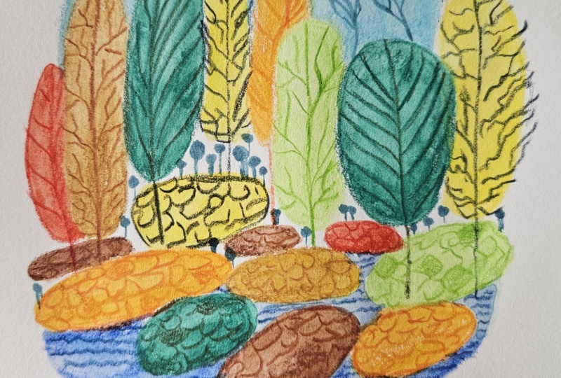
more of these that I do, the more interesting they get, the first piece that I ever did, actually, I can show you. Before we get started,
let me show you the first piece I
did in this style, and then a secondary
and then a third. Okay? So this is the first
one I did. I think it's fine. I think it's cute, but this
was on the textured paper, so you can see that
the colored pencil is a little bit patchy. So that was fine.
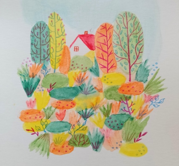
It was fun to make. But then my second
attempt was this. Which was on smoother paper. You can see I started
to figure it out more. I was trying different shapes
and different techniques. I think this one's
really pretty. And then my most recent
attempt was this one. It actually has a
Pika Chow in it. It's for a show
I'm being part of. So, literally, this
was three days worth of doing this
activity every day, and I just got to this
point where I felt more competent in my shapes
and my techniques. So in this sort of span, you can see that
practice really does make perfect. There you go. So with that in mind, let's get into doing our shapes. This is my favorite
color. It's olive green. I think it's the
prettiest green color. So I do love to use it first. So I'm going to just do
sort of a round tree here, and I just fill it in. This is, again, the
water soluble crayons. So it's basically
just watercolor paint in stick form, is
what it basically is. Then I'm sort of going
to add some blobs. I am going to do
a little house in the middle of this one, so, um, I will leave a little bit of an empty space in the
middle because I like to paint the house in
with the actual paints. And mostly I'm just
doing these two shapes. I'm doing like blobs and these
sort of fan type things. And I think this is just
because when you add water to this particular type of
medium to shape them out, these are the two shapes
I find most fun to paint. If you're just going in
with straight paint, then you may want to
do a couple layers, or the watercolor will
blend into each other, but that's also a
good look, too. Now, I am going to
kind of visualize what I want this piece
to look like in the end. And like I said, I do want
to put a little house here. It's probably going
to be pretty small, just given the
scale of the trees. But I also like to do tree trunks that I do
in colored pencil. So I'm kind of just
going to add some of this really light
color to the base of the tree area just
because I don't want that area to be
white necessarily, but I don't want it to have such a dark texture that I can't put or dark color that I can't
put the tree trunks there. So sometimes I'll just fill
in the gaps with This is a ochre, like, a
light yellow color. Now, there are lots of
greens in this set, and in general, I would say, the more pieces you
do in this style, you kind of find your
palette and I like to use a lot of different varieties of green just because it is
sort of a nature scene, and I like to add warm
colors in with it. And I save the blue
basically just for a little bit of sky and maybe a little bit
of water detail. I don't do too many pieces
with water, but, you know, that's personal preference,
not because it's not fun. Even this cooler tone
green is kind of pleasant. It's okay if they overlap
a little bit, as well, because once you wash
them out or add water, it all kind of blends
together in a pleasant way. And I certainly don't mind
if there's overlap of colors in my finished piece. These are sort of earthy tones. I kind of have those
done. Now I'm going to go with a couple more
punchy colors. I like to do some orange, which does look a
little bit close to that salmon pink color.
Is that the one that was? Yeah, that was the salmon pink. And then when it's a
little bit more full, I just go and fill in the
gaps with a bright color. Find that adds a little bit of fun texture and lightens
the piece up a little bit. So there's a little bit of room for a house tucked in there. And I think I want to
add a little bit of red, maybe just a tiny
bit here and there. You can really just scribble
it in, wherever works. And then finally,
I'm going to add a little bit of
sky, not too much. I'm just using a light blue, but you can do light whatever
blue shade suits you. And just roughly
put it in there. I'm not going to drag
it down too much. Again, trying to leave a
little space for the house. We'll put a little bit of
blue on this side as well. And I'm going to call that Dt. So this is the start
of our base layer. The next step is to
go in with some water and just to activate
all these colors, they look like paint. So we'll use apologies
my murky water. Again, I was just
using it for green, but that's what we're
about to do again. So if you are using a medium
like I am, which is, like, something that's
watercolor dissolvable, I would just recommend
going light to dark as the order in which
you blend these out. So I will probably start
with the ochre color, which is this big tree here. You just add some
water, swirl it around. The more water you add,
and the more time you spend swirling with
this particular medium, the more the marks from the drawing stage
kind of disappear. And I'm not afraid to use a lot of water with
these, as well. This is why it's
preferable to use an actual watercolor
paper to just, like, a standard writing paper or something just
because it can hold up better to the scrubbing
and to all that water. Also, just a little tip. If
your paintings do buckle when you use watercolor paint as
they are very frequent to do, my favorite technique, I mean, you can do the traditional
one of you can get to spray the back with
a little sprits of water, if you have a spray bottle,
then put it between some books and just let
it flatten that way. But I also have had success
ironing my paintings just on, like, a really low iron setting. You just put on my ironing board with a tea towel over it, and honestly, like,
you have to take your time and check it
constantly, but, like, I've had no problem with colors fading as a
result of ironing them, so just be careful
if you do decide to tackle it that way. But I do so many
paintings that pressing them between books just wasn't
very practical anymore. Most of my paintings, I
don't size the paper, so that means adding water and stretching it with, you
know, mounting it down. It's just not really I
don't really enjoy it. It's not fun for me,
so I don't do it. But it is more of a fine art
technique if you want to, like, prime your paper before
you start painting on. Okay, so as you can see, here, the colors did run into each other, but I
think it's really pretty. I don't mind, especially
at this stage, if the colors are
blending a little bit. So next we're going to
move on to the orange. Then we'll do the yellow after. Again, you can see
the colors kind of blend, but I think it's nice. I like the look of it. And when I'm kind of
spreading out these blobs, I do just try and push them into the corners of the
spaces near them. But you can keep them
round if you prefer. I love the yellow in this set. It's very vibrant and I think
adds a lot to these pieces. Every time I show someone
one of these paintings, they always comment on
how vibrant they are. So I think the colors I've chosen are
having a good impact. So now that we've sort of
done the lighter ones, I will do the red, which is sort of in between and vibrancy. You do want to wash
your brush in between, just because the orange
and the green will sort of muddle together if you have
the same water on your brush, and it'll sort of turn it
more brown, which is okay. I have done these with lots
of brown in them before, but that's just not
what I was going for with this particular piece. When it comes to the blobs
at the edge of the piece, sometimes I will go in with
a little extra water just at the very edge with
a cleaner brush just to make that
border a little softer. Like right down here,
it's a harsh edge. But I think that's also nice. It's just, you know, I like to mix it up and especially
with my blues, I don't want to have a big
blue puddle at the top. But that is just
personally my choice. You can see why this bigger
brush is kind of helpful here because I'm not being too fussy and getting into
the details too much. And that's helping
this base layer be nice and loose so that we can be creative and more
restrained on the top layer. And just right here where
the house is going, I'm just going to add a little more water
to soften that edge. It's a little blue down here. Mixing with that orange to
make it purple, which is nice. You can sort of see the
texture in the blue here, but I also think the texture
is really nice to see. And last but not
least is our greens. So we'll start with
the lighter one. At this point, some
of the earlier colors we did are a little bit drier, like the salmon pink, so they don't blend as much, but we just send that tree up into the sky, which is okay. I think a big part of
this kind of painting and this sort of painting
style or warm up activity, however you want to treat it,
is just about having fun. Crazy, I know, doing art and
actually having fun with it. But it is a little bit of I find it really helpful to challenge
my perfectionism. Some of the paintings that I
did, especially last year, I found were, like,
really restrained. They're very high detail
and very focused. Like, I was using a tiny brush, and my hand was so
tight around it, and I was feeling really I mean, I was really proud of
the work I was creating, but it definitely come
at a higher cost, like, physically, even just because I was fatiguing my wrist more. So I think this kind of
painting is really good to break out of that pattern
of doing really tight, really detailed work and also having a sense of play
when I'm making things. Because that is ultimately
how I personally nourish my creativity and have more ideas for more things
I want to do in the future, because if I'm not
having fun and playing with it, it
just feels like work, which it technically is for me, but I don't think anyone wants their work to feel like work
if they have the choice. There we go. So now, do you see what I meant about
how you may be feeling, like, This isn't very
good at this stage? That's how I felt
about all my pieces, even the ones more
recently that are a little bit more
finesse, let's say. So, um at this point, I'm
going to put this aside. I'm going to end this lesson, and then I'm going
to bring you back. Once this is dry, we'll
talk about more things. But in the meantime,
if you want to set this aside and start a second one, you could
definitely do that. Just don't overwork it.
Like, at this stage, you may be looking
at being like, Well, but if I do a little bit of
this, it might look better. Don't worry about this
stage looking good. Look, my tree is in the sky. This trees in the sky, too. All the oranges have
muddled into each other. But in a way, I think
it's very beautiful. It's very loose
and unrestrained. We still do have an opening
for a little house in there, which I think is gonna
be very charming. Again, it's about having fun. It's about process. And
after we're done this, then you can go do
your really technical finest if you choose. So I'm going to
leave this one here, and I will see you in the
next lesson when this is dry.
4. Developing a Mark-Making Language: Okay, we're back, and
our piece is dry. So as it dried, it did some different things. We can see the top of this tree went really wild.
But you know what? We're just going
to roll with it. So before we get to
working on this, in this lesson, we're
going to cover sort of the language of shapes
that you are using. So let me pull up another one of my older pieces before
we get into it. I guess this isn't an older
piece. I just made this one. This is actually for a little gallery show
themed around nostalgia. So that's why I put
a peek at you in it. It's a representative
of my childhood. So, as you can see,
there's lots of different shapes mixed in here. But if you were to put them
separately on another sheet, it's just a very simple language of shapes that I'm using. One of the ways that you
can kind of make this style your own is creating your
own language of shapes. It's pretty straightforward
and simple. So we're just going to break it down on this blank
sheet of paper. This is just a regular
sheet of printer paper, and I will do it with
a pencil just to show that it's not really
about the color necessarily. The color is another
tool you can use, but it is more about the different shapes
that you develop. So first, of course, we have
Poka dots. Very simple. You can vary them in
sizes and in grouping. You could also do
oval type poka dots. You could do them in a
different direction. And even though these
are all pretty similar, they do do different
things, especially as you layer with
different colors. You also have lines. So you could do this, looks
more like kind of grass. Being loose with
it, and by that, I often mean holding the pencil near the end rather
than near the front. Like, if I do near the front, I can do very precise
little lines. But if I'm holding the
pencil near the end, you kind of make them
a little looser, and it's a little
more free feeling. So you can play
around with that. No, the sun's coming
out. Apologies if the lighting changed on you. Now, these kind of
markings are really just the basis of
these pieces for me. They're very simple.
But then you can add in more
complicated things, maybe create your
signature iconography. So for me, doing
leaves on a stick like this are very common
motifs in my art. That's obviously a
very rough version. But, you know, you can do
a lot of versions of this. You can do just a couple leaves, something's very simple, or
you can do them much thicker. You can also switch out
the leaves for dots. So you could do like
even just a ball on a stick can be sort of a
botanical, organic shape. You can do some arms and
create little bushes. I'm being really
rough with this. So don't judge my lumpy
drawing too much. You don't have to make
these symmetrical, as well. You can do asymmetrical, which is also a fun look.
Maybe a little one. And then you don't
have to do balls. You could do a different shape. Maybe we're doing
like a mushroom top. So these are just some
different botanical shapes you could pull into
this kind of drawing. And then additionally,
there comes the trees. So the way that I've
drawn my trees are this oval shape for the top,
but you could also do, like, a round shape, or you could
do a mushroom top shape tree. And then you can decide how
you want to do your trunks. Again, these are just examples. You can do long trunks that
are a little bit thicker. You can add a branch in, just make sure they sort of
get wider at the bottom. You can do like that. Or
what I like to do is to draw the tops and all the
branches on the trees on top. It's just a stylistic method. It's not really realism.
It's just more playful. And then you can kind of keep adding on to the tree itself. And then sort of
like this or this, I like to add additional
branches that stay within the
boundary of the leaves, which is the round oval. Then you can add other
little branches in there. You don't have to have
a straight trunk, so it could be maybe we're
going around like this. Just lightly fill it in because I would do this in a color. And then you can
decide to also keep going and have it be visible. Again, you could
do some branches. Well, that's what
attaches something. There you go. So these are
just some examples of, like, the common shapes that I like to use in these drawings. You can add in whatever you
like. You can do geometry. You can do lettering. You could do actual flowers. Some people might
prefer to do, like, just simple flower
doodles in clusters. If you change up, you know,
the shape, you can do that. So circles in it, maybe some dots in there to be
flowers as well. The idea of building this
visual language with mark-making is
really about play, again, like I talked
about earlier. There's something very
childlike and simple with it, but I think the difference
between making this and a child's drawing is really about the intention
you have behind it. That's not to say
that children's art doesn't have
intention behind it, but it's probably a little
bit more loosy goosey than the intention
you might have as an adult or whatever
age you may be. Because you're able to harness
tools like composition and scale and also tonality and contrast and different
things like that. So as you apply these to
the background drawing, as you apply principles of art, then it becomes a little
bit more finished looking, maybe a bit more intentional. But, you know, I love kids' art, too, so there's no insult there. Okay, so now that
we have an idea of some of the rough shapes, we're going to go
into this piece and start playing around on the
top layer in the next lesson.
5. Adding Botanical Marks: Ready to start drawing on top of our background. This
is nice and dry. Also, I find sometimes there's a bit of dust that comes
off of the pastel, so you can just brush
it off. Nice and clean. Now, I'm going to get
started with pencils first. I like to go with my colored
pencils just because, um, I guess just
because I like to, I don't really think there's
maybe that much of a reason. So now when I'm selecting them, I tend to have really
warm colors of pastel or colored pencils just because that's the
palette I usually work in. So there's not too
much differentiation from the colors on
the palette here. However, when I am choosing
colored pencils to use, I'm looking for contrast. So I'm also creating
rules at the same time. So, for example, I've got the olive green here and I've got olive green
here and here. Is that all green?
I don't remember. But I'm going to create the rule of what color goes with it. So I like to do high
contrast personally. So, for example, this red color would look nice with
the olive green. Maybe this blue. I think I
might give this purple ago. I think that's probably
the one I'm looking for. I'm just going to sharpen
this really quickly. So I like to start with the trees just because
I think they're a good place to get
organized mentally. And like I showed in the
visual language example, I'm just going to do the trees in the sort of way
I normally like to. I'm going to stop here because that sort of creates
the border of where the foreground
starts and all of this and considering
the foreground, which means the part
that's closest to you. So I'm going to extend
this and create this as the trunk and fill it in. Again, this is not an
exercise in perfection. It is just an exercise in play. And I'm going to
add another branch. Maybe it goes up to here. Maybe that has
another branch there. You can do another
offset one here. And I'm just sort of smoothing the connections between
the lines to make them look more like organic
tree branch shapes. I put one there. So that's the base of the tree. And now I will just sort of go where I see the
boundary of the circle. It is obviously a loose
boundary because we use watercolor and lots
of the colour bled. But I'm just going to
kind of ignore it, I think it's
interesting and fine. So I'm just going to add
in additional branches, using the shapes I
generally like to draw. And the shapes I like to
draw do evolve over time. I'm not always going
to be doing trees exactly the same
way, I don't think. There's also different kinds
of trees I like to do. If I was doing a pine tree, for example, or an evergreen, I wouldn't draw it this
way. So there we go. There is actually
it kind of looks like I can't remember
the name of the lettuce. There's a kind of leafy
green chard, Swiss chard, maybe, that has, like, a purplish reddish stem
and the green leaf. So I think that's looking good. And then to continue
my visual language, I'll keep using
this purple color other places that
I see the green. Now, down here, I could
switch to a different shape, but I think I'm sort
of deciding that the olive green
color is a leafy, branchy, shrubby
tree type thing. So I'm going to just
continue treating it like that and doing some
more like mini trees. You know, when, like,
trees grow on the side of the highway and they're just
like little shrubby ones, but it's still
technically a tree. Let's add some of those in. And it's okay if they overlap
into other colors as well. It's not really about staying inside the lines as much as just getting into the
right general area. I don't remember
if that was one. I think it was, but it bled
into these two colors. Let's just add one nice
purple tree stock here. You can kind of blend in there. So that's our first one. Next, I will pick
a different color. This is basically the process
for the colored pencils. I just sort of choose
the ones for the trees and then find them down below
and add some detailing in. So for this sort of
what color was that? It's the lightish ochre, maybe. I think I'll do
the blue. You can see how vibrant this
colored pencil is. It's just because it's
the prisma color. I have some others in here that are a little less vibrant. If I use them, I'll show you so you can
understand the difference. I still think
they're good to use. It's just that you have
to understand you're going to get a
different outcome. And just adjust your
expectations accordingly. And this one, I did the
tree branches all meeting up kind of at these
little nodes together, but this one I'm
going a little bit off book and making
them not touch. Again, just kind of enjoying
the process of this. It's actually a
lot of fun I find, especially when I'm used to doing paintings that
are very detailed. I recently did a line
of greeting cards that were sort of like a
medieval style script, which were really fun to do, but you do feel quite a
lot of pressure on yourself when you're
trying to make everything line up
and match each other. Especially with
lettering. This is a Laurentian brand,
colored pencil. And I'll be honest with
you, this colored pencil, I don't even know if they
still make Laurentian brand. They probably do. This was probably from elementary
school for you. So this is likely a 20 plus
year old colored pencil. Still looking good. I
found it somewhere. But I don't find that these are as nice as the prisma color, so I'm just going
to use it maybe on this orange tree. It's not bad. Like, I'm not saying this
is a bad color pencil, but I would have liked it
if it was a little bit more buttery smooth,
like the other two. I'm having to press a
little bit more to get the red to pop as much. So still not a bad option, something different and
maybe just something to consider especially if you're looking to buy new
colored pencils. You can see it's
just a little paler. I'm not sure maybe it doesn't
come across in camera, but just so you know that is why they do look
a little different. So I think you get the idea
of how I do the trees. I'm going to skip ahead a
little bit and just finish filling out the
trees with different colors using this technique, and then we'll do
the next pattern. Alright, so that is about it for the colored pencils
for the trees. Next, I'm going to go
in and do some dots, and I'm going to pick
sort of my color way. We're gonna do the little
house feature last. I think I'm going to try
maybe maybe this orange. I'm going to do some dots
on the yellow sections. I think I will just do sort of, just some, like,
ovly kind of dots. I like to do them in odd
numbers, if possible. I think it just has the best
kind of visual harmony. But I also like to do
them beyond the bounds of the edges of the paint a little bit, if you
see what I mean? It kind of makes the piece
feel a little bit more alive. Parla geese my hands are going to cover as I do this side. But when you're right handed, it's hard to not cover
sometimes when you're filming. Okay, so that, I
think, looks good. Next, I want something high
contrast for this green. I did brown on it
for some trees, but I decided to
leave some of them. So maybe we'll do red for those, and I'm trying to do a little
rounder dots for this one. Maybe we'll do a couple here. I'm like, pretty closely following those visual
rules be set up about color and
where the matching the colored pencil
to certain colors. But, you know, it's also fun to break your own
rules a little bit. Now, you can go in with pastels. You can use any of
your other tools. You could try marker
or pen and ink. But I'm going to move into
watercolor just to do a couple pieces of detail. Again, apologies, the
sun has come out, so the lighting has
changed slightly. Let's pull my palette down. Now, I use this little water
dropper bottle to activate. I'm going to be using
this red color. It's one of my
favorites right now. It's, I believe permanent light red is the
name of the color. And I'm going to go in
with my very tiny brush. I think you probably can see this is just an itty bitty one. This is a zero brush, so it's one of the thinnest ones they usually have
at the art store. And this is where I'm
going to be doing some of these shapes because these
are some of my favorite, and it's a common
motif in my art. But you could go in with
whatever shape you want. This is all pretty optional. I'm just showing
you how I do it, and you can decide
what parts of it you like and what parts you
want to do differently. Once the paint is activated, now, this is a
very opaque paint. Some watercolor paints
are very transparent. You can actually
tell on the tube. Do I have any of the tubes
here? Just a little tip here. I have a bag full of So, these are some examples
of tubes of paint I have. I'll put them on the screen
if they are not visible. But these are professional, you know, nice quality paints. They have little
squares on them, and the squares indicate
how transparent they are. So this is like an empty square. It means it's
pretty transparent. This is a half, which means it's like half transparent,
half opaque. And if it was filled in, like, the black square, that
would be an opaque paint. See if I have any
that are opaque. Yeah, so here this
titanium buff color, which is like a beige off
white is fully opaque. So it just means it is, like, more solid
versus transparent. Anyways, carrying on. So I have got my
permanent light red, and I'm just going to
pick, sort of, again, a pattern of where I want
to put these little leaves. I think I'll put them,
coming out of this green, and I'm just going
to draw the stems on very lightly first. Sometimes some of these watercolor crayons I
use are a little waxy. I find the yellow to
be a little waxy. So the watercolor does
break up a little bit, but I actually
like how it looks. So that's not really
a problem for me. So I'm going to make sure
the stems are looking good. Then I will just add these
very gentle little leaves. Super fine. I'm using, like, the lightest
hand possible. And even with the
intention to do that, sometimes I go
overboard and we get a thick leaf. That's okay. I like doing these leaves on top of these pieces because I find the contrast with the delicacy to be
very interesting. One of the reasons
that these pieces can look a little bit
more polished is when you use high contrast
in terms of fins. So like the big blobs
versus these, like, very tiny detailed
little leaves. I think that contrast
shows an intentionality in the playfulness of
the overall piece, as opposed to just looking
like, you know, I guess, looking more like a true
warm up or just like a casual little exercise can make it look a little bit more like an actual painting. So there, I think that
looks really cute. And I'm just going to take a second and add a couple more. You don't have to watch me do that you've seen me do it once. Alright, Dad and a couple
more clusters of leaves. Sometimes I like to do them
in a different color as well, but I think this picture is
already looking pretty full, so I'm not going to do
anything else there. So I'm going to call it here for this lesson because I think this is sort of the middle
stage of the piece, and next, I'm going to be doing a little house and
then probably adding some texture with
some dots using the acrylic craft paints. So we'll do those
in the last lesson, and that'll be like
the finishing touches, and then we'll be
done our piece.
6. Focal Point and Finishing Touches: Okay, we have gotten through
the basics of this piece, but we are ready to
add our focal point, which is going to be
for me a little house. I like to do little houses. Now, in this picture,
I did, like, this Pikachu as the focal
point using resist technique. But in this piece, I did a
little red roofed house, which is sort of a signature in paintings in my series lately. So I'm going to do
another red roofed house. In order to make this match, you can see I did
some red over here and here and here that
are all the same tone. So in this piece, I've got
the red in the leaves, and I'm going to use the
same red for the roof. Only tip for making your
focal point kind of blend in with the
rest is just choose a color for it that you've
used somewhere else as well. It doesn't have to
be a major color, but maybe you can do, like, if you did a little house
with a blue roof and you want to do some dotted
blue flowers in a corner, just for some visual
balance and harmony, if you're picking a color that you haven't used elsewhere, then just add it
in somewhere else. It doesn't have to be
big, but I do think that it makes it kind
of fit the scene a little better if
there is some sort of follow through in the color. So I'm just going
to go in free hand, but if you wanted
to sketch using your pencil, you absolutely can. Additionally, you don't
have to do a house. Other things I thought
about, you could do, like, a little truck in the
background to show that's, like, maybe there's a
country road back there. You could do I was going
to say a lighthouse, but I guess there's obviously no water in this imminent scene. Any kind of building could do you could also do an animal. I've seen pieces
with, like, you know, like a deer or a stag or a horse or maybe just some
birds flying in the sky. I did did a couple of birds in the sky of this one, which I think is quite cute. And that I just did with pencil. So you don't have
to make a house. I just think it's an easy shape. And when I'm doing a
piece like this that has so much reference to childhood
drawings with, like, simple trees and simple shapes, I think doing a
little house is very, like, on theme, if
you know what I mean? Make sure this is good. It's all dry. So I just do
a little V for the roof. Just kind of staying in this
area that is mostly white. And I want the bottom of the
house to kind of disappear. So I'm going to
do a longer roof. And it can kind of disappear
behind the trees as well. And I'll do a straight line
for the top of the house. And then parallel to
this line is the back, and I'll pull a straight line. There we go. It
does kind of hide behind that yellow a little
bit, but that's okay. I also don't mind when
these lines are a little dipped in the middle
at the top and the bottom, 'cause it looks more like an old cottage that started
to sag in the middle. And I do think that's charming. I do love painting
little cottages. Now, I've done some of
these where I added a chimney. It's up to you. I mean, the chimney is fun
if you want to add, like, a puff of smoke
coming out of it, but the colors I've used aren't really giving fall or winter. It's giving late
summer, I think, so the chimney wouldn't necessarily have anything
coming out of it, but let's just add
one just for fun. Just a little rectangle
right at the top. There we go. Oh, I think
that's really cute. So if you wanted to do more
of, like, a minimalist look, I would just leave it as is, but I usually can't help myself, so I'm
going to add a window. And I'm going to
just have it cut off slightly just to show that it's hiding behind this dune. There. I literally
that's all I'm gonna do for the house. I
think that's really charming. I don't usually add sidewalls, but if you wanted to
do something that looked a bit more
shading in depth, you could keep this
wall white and make this little triangle of wall sort of an off white color just to show a bit more shading. But that's not
what I'm gonna do. I'm gonna leave
that exactly as is. So I'm very happy
with that. You can see that it doesn't
take much to make the image kind of fun
and have a story there. Now, as a finishing touch, I mean, I kind of
leave it as is. But I do like to go in
with the craft paints. So I think we're going
to do the white. What other colors should we do? Maybe I'll grab This
is olive green, which I already told you is
my favorite shade of green. So I just put these on my watercolor palette
in a little corner. And then we'll do I'm just
doing the tiniest amount because you really
don't need very much for the technique
I'm going to do. And I'm going to grab
these toothpicks. Now, you could use the
end of a paint brush. You could use a pinhead, whatever, like,
small tool you have. These are, are they like
cocktail toothpicks, Elegance toothpicks?
I don't know. But they have point on one end, and they're flat on the other. So maybe more, like a skewer or a dowel. I just
like this flat end. I think it's like a good
little dotting size. So find something
that you can do a little dot with. I'm going
to start with the white. Just a little bit of that
acrylic paint on there. And then just sort of without
thinking about it too hard, just pick a spot and
dab a few times. Every time you dab,
it's going to make a smaller dot because you've
got less paint on there, and I like to kind of play
around with adding these in. I don't know. They kind
of just seem a little whimsical. They're
sort of fun to make. In one of the pieces I did, I'm not sure where it went now. I did one of the colors of
trees to have the white dots. I think it almost looks
like little blossoms. So I think maybe
we should do that. Which tree should have dots? Maybe the red one in the back
there just to be different. I guess putting one on the trunk didn't really make
sense, but that's okay. You can see every time I add
a little bit more paint, the dots are a little bigger and then they get smaller
the more I dab. I think that's so cute. And then just noting that that
was the red tree. So maybe this is the red shrub. I'll do some dots on it as well, just to show that
there is, like, some logic behind the
randomness of the designs. There we go. Okay,
so I'm just going to wipe off my toothpick. Going in with the green dots, I'm going to just
try and stick to the green areas just so that it's a little bit
more harmonious. And these are obviously
a bit darker, too. So I like that we're bringing in some contrast with the white being really light and the
green being a bit darker. I also don't mind
going near each other. Like, you know, the same
patches have both colors. So I'm pretty happy with this, and I think I'm going
to call it there. One of the things I
know I didn't do. I didn't do any of these,
like, line textures, but I still think the piece
looks pretty full, as is. If you really want it to, you can go in and
keep adding more. But I think one of the fun things one of
the fun challenges about this is knowing when to stop because you can
keep adding more, and the piece can get
fuller and fuller, which also can be a good look. Like, don't let me
tell you when to stop. But I think it is
a fun challenge to see how you can play with restraint as well as
all the techniques. So that's it for my piece. In the next lesson, I'm
going to go over this as the class project and just
outline the different steps so that you can kind of remember what they are and
how to go through them as you are making your piece, and then
we'll wrap up from there.
7. Class Project Overview: So for our class project, I would love to see your version of this particular piece. And just so you remember how
we walked through the steps, the first step was to
find your materials, so you can use
whatever materials you like, whatever
you have on hand. You don't have to go buy
new things for this, but if you have a
good collection of art supplies, you have
lots to play with. The next step is to
make your blobs. So I like to do a
selection of tree blobs at the top and smaller
shapes at the bottom to be this sort of
foreground foresty area. You can have a little bit of sky if you want, play around. Do whatever landscape
you want, as well. You don't have to
be restrained to this sort of forest
scene that I've done. If you want to do one
that has more water in it or more of an open field, you know, let your
heart guide you. The second step is to create
your visual language. So you can also do
it on a sheet of paper if you want to
do it like this first, or you can just dive right in. I'd recommend choosing
at least three to four elements
just to add variety. So my elements are the tree
kind of shrubby shapes. I have the watercolor
red leaves. I have the dots done in colored pencil that are
more of the oval shape, and I also have the dots done using the toothpick and
the acrylic craft paint. So once you've added in all
your decorative elements, you also need to add
a focal feature. So this could be a little
house, like I did. If you want to keep
it super simple, you could do a little animal, a different kind of building, something nestled in among your subjects so
that the eye has somewhere to go and it kind of creates context
for your piece. Once you've done all of
that, then here you go. You have your
wonderful, colorful, fun piece of art ready. And whether you treat this as a warm up or a finished piece,
it's totally up to you. For me, this is feeling
a little bit more on the finished piece
side because I'm really proud of it, and I
like how it turned out. So when you're all done, I would love it
if you would take a picture of your art and upload it to the class
project so we can see. I am super curious how other people are going to
interpret this project and what you're going to do
differently or what steps you're going to pull from mine.
So I would love to see it. And if you have any questions
or comments as well, you can pop those in the
class discussion or leave them in your project when you upload it, and
I will take a look. I'll do my best to answer
whatever questions you have, and we'll probably just
encourage you to be creative. Alright, let's wrap this
up in the final lesson.
8. Wrap-Up and Final Thoughts: Thank you so much
for joining me in this class and spending
some time with me. I hope you enjoyed the project. And so you can see I'm really vibing with this
style right now. I'm having a lot of
fun with it, and there's a lot of different
ways you can do it. You can be more restrained, over here, you can
be more extra, like over here, you can
do resist techniques, so you can do little subjects
or more defined ones. It's a lot of fun. So if you want to see more
from me, first of all, I have other classes and
other art classes available, as well as graphic design and some other stuff
that I've done. So you can always
check those out as well if you want
to learn more with you just want to
see more of my art, I have an Instagram account
as well as a portfolio. My Instagram account is at Lucky Sprout Studio. I
will put it on the screen. You can see my feed, I'm constantly posting there, so you can see what I'm
working on currently. I also do lots of textile art, so that's going
to be there, too. I have a portfolio, which
is Rebecca wilson.ca. If you want to see more
of my professional stuff, links to stuff I've
published and whatever. I also have a YouTube
channel where I post less techie and more just hang out with me and make
art kind of content. I'll put all of that on the screen if you
want to find me. And finally, if you enjoyed this class or if you had
any thoughts whatsoever, I'd love to hear
them as a review. It means a lot when you leave a review for a class
like this because it not only helps other students know if this is a class
they'd like to take, but it also tells the platform that this was something that
people were engaging with, and it is worth spending more
time with me as a creator. I hope you have fun.
I hope you make lots of paintings and have as much fun as I have been with this technique and have a
really great creative day. Thanks so much for
being here. Bye.
 Rebecca Wilson, Artist