Transcripts
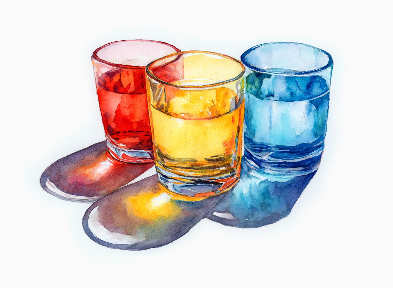
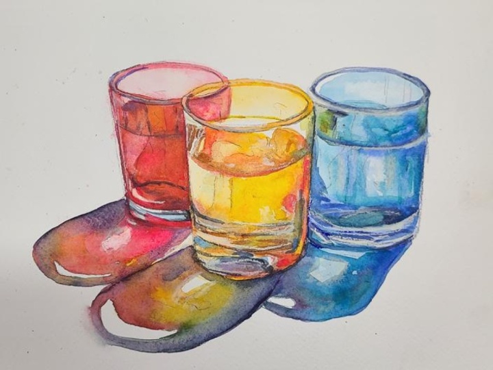
1. Welcome To The Class!: M llo everyone. My name's Will Elliston. And today, we're painting a luminous still life of glasses and reflections
in watercolor. Glass is a perfect subject
for learning how value, edge, and color temperature create the illusion
of transparency. We'll use the primary colors, red, yellow, and blue. So you can clearly see how
light travels through colors, bounces inside the glass, and spills into tinted
shadows and little flares. Expect calm glazing,
selected lifting, and plenty of clean
paper for sparkle. I've been a professional
artist for many years, exploring lots of different
subjects from wildlife and portraits to cityscapes
and countryside scenes. I've always been entranced by the possibilities of watercolor. But when I started,
I had no idea where to begin or
how to improve. I didn't know what
supplies I needed, how to create the
effects I wanted, or which colors to mix. Now I've taken part in many
worldwide exhibitions, been featured in magazines, and been lucky enough
to win awards from well respected
organizations such as the International
Watercolor Society, the Masters of
Watercolor Alliance, Windsor and Newton, and the SAA. Watercolor can be overwhelming
for those starting out, which is why my goal is
to help you feel relaxed and enjoy this medium in
a step by step manner. Today, I'll be guiding you
through a complete painting, demonstrating a variety
of techniques and explaining how I use all
my supplies and materials. Whether you're just starting out or already have some experience, you'll be able to
follow along at your own pace and improve
your watercolor skills. If this class is too challenging
or too easy for you, I have a variety of classes available at different
skill levels. I like to start off with a free expressive
approach with no fear of making mistakes as we create exciting textures
for the underlayer. As the painting progresses, we'll add more details to bring it to life and
make it stand out. I strive to simplify
complex subjects into easier shapes that
encourage playfulness. Throughout this class, I'll be sharing plenty
of tips and tricks. I'll show you how to turn
mistakes into opportunities, taking the stress out of
painting in order to have fun. I'll also provide you with
my watercolor mixing charts, which are an invaluable tool when it comes to choosing
and mixing colors. If you have any questions, you can post them in the
discussion thread down below. I'll be sure to read and
respond to everything you post. Don't forget to follow me on Skillshare by clicking the
follow button at the top. This means you'll be the
first to know when I launch a new class
or post giveaways. You can also follow me on Instagram at Will Elliston
to see my latest works. So let's get started and turn simple glasses into
glowing color and light.
2. Your Project: Thank you so much for
joining this class. I'm very happy that you're
here with me today. Think of this study as an interaction between
color value, and edge. The primaries form a
bright, balanced cord. The glasses are just cylinders
with readable silhouettes. The magic comes from
color bouncing inside the glass and drifting
into overlapping shadows. Keep the palette limited and the washers spacious
so the paper can glow. Let warm and cool notes
meet where glasses overlap and save a
few crisp highlights to carry the vocal points. Paint all three or
just one your choice. Aim for clarity, clean shapes, and a relaxed, confident
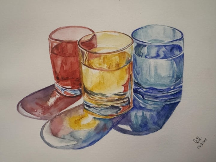
sense of light. In the resource section, I've added a high
resolution image of my finished painting
to help guide you. You're welcome to
follow my painting exactly or experiment with
your own composition. As we're going to be focusing on the painting aspect
of watercolor, I've provided templates
you can use to help transfer or trace the
sketch before you paint. It's fine to trace when using it as a guide for
learning how to paint. It's important to
have the underdrawing correct so that you can relax and have fun learning the
watercolor medium itself. Whichever direction
you take this class, it would be great
to see your results and the paintings you
create through it. I love giving my
students feedback, so please take a photo
afterwards and share it in the student project gallery under the Project
and resource tab. I'm always intrigued to
see how many students have different approaches and how they progress with each class. I'd love to hear
about your process and what you learned
along the way, or if you had any difficulties. I strongly recommend
that you take a look at each other's work in the
student Project Gallery. It's so inspiring to see
each other's work and extremely comforting to get the support of your
fellow students. So don't forget to like and
comment on each other's work.
3. Materials & Supplies: Before we paint these glasses, let's go over all the materials and supplies you'll
need to follow along. Having the right materials can greatly impact the
outcome of your artwork. So I'll go over all the supplies I use for
this class and beyond. They're very useful to have at your disposal and we'll make it easier for you
to follow along. Let's start with the
paints themselves. And like most of the materials
we'll be using today, it's a lot to do
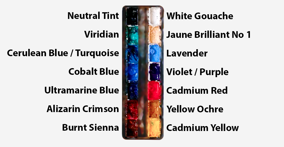
with preference. I have 12 stable colours in my palette that I
fill up from tubes. They are cadmium
yellow, yellow ochre, burnt sienna, cadmium
red, Alizarin crimson, Opramarne blue, cobalt blue,
serlean blue, lavender, purple, viridian, black, and
at the end of the painting, I often use white gouache
for tiny highlights. I don't use any
particular brand. These colors you can
get from any brand, although I personally
use Daniel Smith, Windsor and Newton,
or Holbein paints. So let's move on to brushes. The brush I use the most is
a synthetic round brush like this escodaPol brush or
this Van Gogh brush. They're very versatile because
not only can you use them for detailed work
with their fine tip, but as they can hold
a lot of water, they are good for
washers as well. They're also quite affordable, so I have quite a few
in different sizes. Next are the mop brushes. Mop brushes are good for
broad brush strokes, filling in large areas and creating smooth
transitions or washes. They also have a night tip that can be used for smaller details. But for really small details, highlights or anything
that needs more precision, I use a synthetic
size zero brush. All brands have them,
and they're super cheap. Another useful brush to have is a Chinese calligraphy brush. They tend to have long bristles
and a very pointy tip. They're perfect
for adding texture or creating dynamic
lines in your paintings. You can even fan them
out like this to achieve fur or feather
textures as well. And that's it for
brushes. Onto paper. The better quality
of your paper, the easier it will be to paint. Cheap paper qwinkles easily
and is very unforgiving, not allowing you to
rework mistakes. It's harder to create
appealing effects and apply useful techniques
like rubbing away pigment. Good quality paper, however, such as cotton based paper, not only allows you to rework
mistakes multiple times, but because the pigment
reacts much better on it, the chances of
mistakes are a lot lower and you'll be more likely to create
better paintings. I use archers paper because that's what's available
in my local art shop. A water spray is
absolutely essential. By using this, it
gives you more time to paint the areas you
want before it dries. It also allows you to
reactivate the paint if you want to add a smooth
line or remove some paint. I also have an old rag or t shirt which I use
to clean my brush. Cleaning off the paint
before dipping it in the water will make the
water last a lot longer. It's always useful to
have a tissue ate hand whilst painting to
lift off excess paint. Also, you never know when an unwanted splash or drip might occur that needs
wiping away quickly. I also have a water dropper
to keep the paints wet. When you paint, it's
important to have them a similar consistency to what
they're like in the tubes. This way, it's easier to
pick up sufficient pigment. A hair dryer is useful
to have for speeding up the drying time and controlling the
dampness of the paper. And lastly, masking tape. And this, of course, is just to hold the paper down still onto the surface to stop it sliding
around whilst painting. Also, if you plan on
painting to the edge, it'll allow you to create a
very crisp, clean border. And that's everything you'll need to follow along
in today's class. Now let's get on and
sketch out these glasses.
4. Preparing The Composition: So as always, we
want to break down this subject into simple shapes, and I start with
the little ovals, the ellipses at the
top of the glasses, just to map out
the spatial area. And we've got to keep in mind the shadows of the
glasses as well. And these ovals can be
quite difficult to draw. So I do suggest you use
the template I provide in the project and resource section because with a
subject like this, still life, the drawing
really does matter. The reason is that this painting relies heavily on the illusion
of three dimensional form. If the structure is
off at the beginning, it becomes much harder
for the painting to feel convincing later on. With something like glass, we are already dealing
with transparency, reflections, refractions,
water lines. We've got some of the thick
bases that we've marked out, the curved surfaces, all
these subtle distortions that can be quite
challenging to paint. So if the underlying
drawing is inaccurate, then all those beautiful
little effects have a less solid
foundation to sit on. Even if the color is lovely and even if the brush
work is expressive, the object can
still feel slightly wrong if the structure
underneath is not working. That's why I think it makes sense in a class
like this to remove one layer of difficulty and allow us to focus more fully
on the painting itself. So you're more than
welcome to use the resource, the template. The aim is not really to
test your drawing ability, although you can
practice that on a separate piece of
paper if you want to.
5. Starting The Yellow Glass: I'm going to start off painting the yellow glass in the middle, and I'm not sure why, but it just feels right
to start that way. I don't know if
there's an actual reason or benefit for that. I'm sure we could start off with the red one
if we wanted to, but I'm feeling like the yellow one in the middle
is a good starting off point because we can control the vibrancy and
strength of the yellow maybe, and then we can balance
the red and the blue after we've
painted the yellow. So I'm starting at the
top of this yellow glass. The bit that isn't overlapping the red glass and it's not
even overlapping the blue, so we can put a light
bit of yellow on that red side because that will eventually
make orange color with the yellow on
top of the red. We're using a light yellow
to begin with and we can build it up gradually rather than starting too strong. Notice how I'm not painting
all the way to the top. I've left this little
abstract line, this white gap of the paper before we reach
the rim of the glass. Likewise, where the surface of the water kind of comes up
above the rim at the bottom, I'm allowing a little
bit of white there to These aren't necessarily
important details. You can go over that
and maybe at the end, you can use white
guash to recover it. But it's these
little things that build up this idea of realism. Anyway, we're going down into the main area
of the glass now. I started with that same
pale tone on the left, but in the middle, the
pigments a bit stronger. This is cadmium yellow, but so many of the yellows
you can use nice and vibrant it doesn't matter, and I'm not yet mixing
it with any other color, pure camium yellow
for the time being. If I'm finding the
yellow is too strong, I can use my tissue to
just blot it out a bit, or I can just repurpose the yellow pigment somewhere else rather than taking
it from my palette. There's little areas of
white that I've preserved just above the surface
area on the left. You can see I've left
a little bit of white. Some sections I've
painted straight across. This is why having
an accurate drawing really helps out because there's little sections that
you can just leave and it's a bit like painting with numbers except
there's no numbers. Going a bit stronger
with the pigment here. There's a kind of sweet
spot with any pigment, but with cadmium
yellow in particular, if you go too strong, you kind of lose that vibrancy. So to the point where you
reach maximum vibrancy, and then after that,
it kind of goes dull. You need that translucency, that brightness of the paper to come through to
really make it pop. And sometimes I get that wrong, and I have to go over again with a few layers or sometimes I have to take it away
if I've gone stronger. So it's always a bit
of give and take, and each pigment has a
different sweet spot.
6. Yellow Shadow Underlayer: Now we're moving down the
glass to where the base is, and with all these glasses, they're going to give a shadow. And within that
shadow, there's going to be a kind of spectral light that's illuminating the color of the liquid inside, the
color of the glass. So, of course, the yellow one, there's going to be a
kind of yellow glow in the shadow that I
want to work on. And I've roughly
drawn it out with a pencil just to give you
an idea of where it is. The closer the shadow
is to the glass, the harder the lines will be. And then as it spreads out, the shadow will become softer. So this is just an
underlayer to begin with. We'll do the main part
of the shadow later, but we're going to
paint each glass independently and then connect the shadows at the very end. I'm going back to the main glass area because I've given it
time to dry a bit, so we can achieve a different kind of
effect with the pigment, as it's dryer, the
shape holds a bit more. It doesn't spread
out quite as evenly. The area of the glass that has water in it will
be a bit darker, even though we're
using a light color, this yellow glass will be the lightest of
the three glasses. At the moment, we haven't
really added much details. We've just filled
in the first wash, leaving a few select whites
of the paper to be preserved, and we've used wet and wet to add a bit more tone
into some areas, but we haven't used
double layers yet. In order to achieve
that feeling of free D, we'll have to use
multiple layers. So once we've done
this first pass, we'll let the watercolor
dry and start adding a few more reflections and
refractions using again, that wet and wet technique
in the shadow as well. I these shadows are
mainly going to be gray, but this underlayer is going to have that
yellow warmth, like I was saying before. I want to fade
this yellow out to the edge without any hard edges, just a kind of
smooth transition. And because it's wet
in the middle here, I can apply this thick pigment and it'll blend out smoothly. I don't need to worry
about hard edges, even though it's
very thick pigment. I can use my brush to manipulate
it to that pencil line. That pencil line in the
shadow is just a rough guide. I'm not being overly
loyal with it. Likewise, with all
these pencil markings, it looks very specific. And of course, it has to be specific for it
to be a good guide. But when it actually
comes to painting it, I'm not going to
overstress if I go over some of these lines or
I just forget some of them. The illusion will
still be there if we follow certain principles
which I'll get into later. I'll get into areas
because a lot of this is rendering and there's only so much I can say about how I'm applying
the brushstrokes without repeating myself. I can say I'm using
thick pigment here and thin pigment there and
it's all cadmium yellow. I thought it would
be useful to go into some concepts
of painting glass, achieving that illusion of
reflection and transparency. At the moment, of course,
it's all been cab and yellow, but these colors aren't
independent of each other because the red will be influencing this yellow and the blue glass will influence this yellow, too. So there'll be a
kind of crossover in these reflections and the transparency
that we'll get into. So that's why I've chosen the primary colors
for these glasses, red, yellow, and blue to
see how they intermingle. Really, nothing too precious
down here in the shadow, as long as you've got that glow of the whiteness of the paper, and then it goes a
bit darker and then it blends out towards the edge.
7. Adding Yellow Ochre: Now, I've tested the
surface of the paper, and I can tell for the most part that it's close to drying now. So it's safe to go back up to the top and achieve some hard lines without
it fully blending out. So let's go up to
this top section, and I'm actually
using yellow ochre now because it still has
that golden feeling, but obviously, it's much
darker in value and tone. You can tell the paper isn't
actually fully dry because even those brushstrokes are
starting to soften out a bit. That's okay. I like the range. I like to make the most of the whole drying
process from very, very wet paper where we get complete smooth washes to
halfway dried paper where you get this soft edged and then eventually
completely dry paper where we can achieve
dry brush marks. I'm not sure whether we'll need dry brush marks in this
particular painting, but sometimes we still want
to have very hard edges. We'll definitely want that
for some of the reflections. A lot of these lines, these brush marks are
following the kind of curvature of the
object we're painting. So you can see at the base, they're kind of horizontal, but they've got a
horizontal curve as they go around on the side, we've got some verticals. They'll become a
bit clearer later. And then when the surface
reaches the edge of the glass, also, there's a curve
there obviously, too. And then when we're looking
at the surface from the top down, it's
quite abstract. It's a bit darker on the sides, but you could paint this
1 million different ways, just kind of creating
this kind of abstract mix of thick pigment blending
out to thin pigment. When you look at a glass, when you observe it, you can see that they're just
abstract shapes, really. There's nothing actually
easily readable in them. So that's all we need to kind
of convey these random kind of lines and shapes. I'm now introducing a
bit of cabium red now because once yellow comes
so concentrated and dark, it actually has
this warmth to it, this depth that not even
the yellow can reach. And of course, we could use yellow ochre for
that and we did. But we have this red glass next to us that is
influencing it.
8. Light Muted Tones: Now we're going to start
painting the base of this glass, and there's no color in
the base of this glass. So although there will be
some influence of yellow, a lot of it is just going to
be this kind of gray tone, and rather than just
putting a boring gray, I'm putting some blue in there, some serlean blue
or turquoise blue. But it's hardly
readable as blue. It's just a cool gray, really. And again, I'm looking at
my pencil lines as a guide. Really, I want to
create some hard edges here so that we've got
some gray right next to some of the vibrant yellow
leaving some white areas. Using a tissue just to
blot away some areas. I'm not painting it all out. When you add a muted tone
or a gray next to a color, it actually makes the
other color much more vibrant because you've got that contrast between
dullness and vibrancy. So if I were to choose a vibrant brown or a
vibrant red right now, it would actually kill the
vibrancy of the yellow, but adding this
grayness here just makes that gray makes
the yellow even pop. Whilst those areas
are still a bit damp, I'm going to drop in some more it's a more
concentrated wash. It's still very watery.
Maybe we can add a bit more pigment to get some nice blending
lines in there. It's Cerlean blue. And I don't mind if
these brushstrokes intermingle with the yellow to make a green because naturally, that's what would happen if
you've got a yellow glass and a blue glass and the reflections are crossing over each other. In some areas, it will make
a kind of green color. These shapes, these abstract
shapes that I'm painting in, they help give the glass
a bit more form as well. Not only do they help that illusion of
transparency and reflection, but they describe the shape. That's why the sides of these shapes follow
the kind of plane, if you know what I mean, they follow the curve and the shape. So they're quite arbitrary and random the placement of them. But where they exist,
they fit geometrically. Just darkening the side here.
9. The Yellow Rim: In order to keep the
colors quite harmonious, rather than mixing a different
color each brushstroke, I look at my subject
and I separate it into those certain colors. So I start off with that
yellow wash that we did, and I cover everything that I could see that's in that color, and I vary the tones for that. And then I use the Yellow Ochre, and I look around and apply it wherever I see that
kind of Yellow Ochre color. And then we moved
on to that blue, and there wasn't much of it, but I tried to fill in all the areas where I saw
that grayish blue color. And likewise, I'm doing
that with the red now. I'm not jumping in between the Yellow Ochre, the
blue, and the red. I'm doing them one by one. And then bit by bit, the detail just kind of brings itself together
without even thinking about detail necessarily just thinking of the color
relationships and the tones. And then taking each
pass as it comes. So now I've finished
that kind of light red. So what's missing, I'm
thinking, Okay, well, we need a bit of a stronger
red in this section, it doesn't quite match the tone. So I need to make it
a bit stronger there, and how do I make it stronger? Is it kind of warm stronger
or is it a cool stronger? Here, it's a warm stronger, a very strong area. So that's why I'm
using camium red to really boost this section here rather than a Yellow Ochre, which is technically cooler. Well, it is cooler
than a red, obviously. It's not necessarily
a cool color, though. I'm just painting what's
missing bit by bit. And it's not necessarily
a strict order either. At the moment, I'm
painting this rim, but maybe I'd want to focus
on the base a bit more first. There's no right or
wrong way about it. It just happens to
be what I notice in the moment and just tackling
it in small check marks, checkpoints, breaking
it down into small steps rather than becoming overwhelmed with everything that's
in front of me, just observing what I can and what I already
have on my paper. I'm just going back and forth, assessing the color, the toe. Again, don't worry if
you paint over some of the white preserved marks
because I've done that too, and at the very end, all we'll need is a few
well placed touches of white gouache and it'll
really bring that illusion of sheen and reflection. So I think we can go on
to the next stage of this and darken the tones even more because we've worked our
way up from light to mid. So now I'm going
a bit darker now, and this is just a gray color. It's not important
what kind of gray. It's just a muted dark color.
10. Building Up The Tones: Building up those
tones bit by bit. I think this is, again, that kind of bluish gray. But because we have
that yellow down there, it's got this kind of
green feeling to it. And by the way, the
brush that I'm using, the size of it is perfect
for this painting, and in fact, I think I'll
use it for the whole of the painting because
it's not too big and it's not too small. So there's no large washes
that we really need. Maybe for the shadows, at the very end, we can
swap to a bigger brush, but it's not like we're
painting big vast skies or big bodies of water and reflections,
like in different glasses. And I don't need to go
any smaller because this already has
a very fine tip. The base of glasses can vary so differently depending on the light and the type
of glass that you have. I'm using quite a lot
of sharp lines here. You can see there's
a range of edges. We've got some hard lines, but there's also lots
of soft lines here. So maybe your glass is
a bit more diffused, don't be too rode if you can't achieve all
these hard lines. I've gone a bit stronger here in the very base of the glass where
there's no liquid. I'm using a very strong
kind of cool color. It's purple. But there's
also some blue in there. It looks quite strong now, but when it dries off, it'll of course become
lighter because that's the nature of
watercolor with dark pigments. They look much stronger and
darker when they're wet, and then they lighten up again. So don't be surprised if this first glass takes you much longer
than the other two, because it's the first
one we're painting, so we're just getting used
to the idea of reflections, and because we don't have
anything else to compare it to, we can maybe overwork
it a bit more. But that's okay because
it's the central glass. It makes sense that
it's the vocal point with a few more details, and it means we can be a bit looser and frio of the other
two we're about to paint.
11. Starting The Red Glass: So now we're moving on to the red glass for
the time being, I think we've done 90%
of the yellow glass now. So even though it doesn't necessarily look so
realistic or detailed, we'll come back
to it at the end. You don't need to get
complete perfection before we move on to the rest. Again, we don't want to overwork or over define what we're doing. So the red that I've mixed for this glass is a sarin
crimson and cadmium red. But really, it's so light at this stage that it
really doesn't matter. The reason I've mixed
the two is because well, I'm going to incorporate both
those reds into my glass because it's nice
to mix a warm red, which is the camion, because it's slightly
a bit more orange, and a sarin crimson is slightly shifting
towards the purple side. So even within color
family is like red, you get a cool red
and a warm red. And using that same red wash, we're going to paint over the yellow glass where it overlaps. There's not actually
much difference, but that yellow
still exists there, even though it's not
very perceivable, whilst it's still wet, I'm going to get my
tissue and just blot out the bottom bit of this wash. I was just a bit
too strong there and then I'm going to soften out the edge a bit there. Where the surface of the water makes its way into the yellow of
the glass here. I'm just adding a bit
of a stronger pigment here, some cadmium red. Cadmium reds are much
more vibrant color than the lizar and crimson. I use the Elizar crimson to get the kind of darker
tones of the red. And then I use the cadmium red for the areas that I really
want to pop with vibrancy.
12. A Burst of Red: In a similar way to how we
painted the yellow glass. I'm now going to paint the
main kind of body of water in there using that
cadmium red this time. And there was still a
little bit of a is and crimson that was mixed
in to my palette, but from now on,
I'm just taking it basically purely from
my palette color. And, of course, red now
is a much stronger color. Like I was saying with yellow, there's a sweet spot to reach its full saturation,
its vibrancy. With red to reach
that full saturation, you have to go quite a lot
thicker, as you can see. The pale red is
actually quite muted. But this red that we're
painting now is very bright. I'll dry, less
vibrant than this, because also watercolors look more vibrant
when they're wet. I don't want to leave too
many hard edges here, but we're basically filling out this main water section right up to the edge
of the yellow glass. This one will be
easier to paint than the yellow one because
we're just blocking it all out to begin with and almost half of the glass is already obscured
by the yellow one, it means less area to paint. On this side, I'm
just pouring in pure water to create
some organic unevenness. A nice way to create
that illusion of detail is to allow the watercolor
to create its own fun marks. I'm even dropping in
a very small amount of cadmium yellow. It's not perceivable, at
least not consciously, but it influences it. Maybe the yellow glow is reflecting back to it or just
keeps things harmonized. Now I'm using my purple. But really, you could
even use ultramarine blue because that will make
purple when mixed with red. Just dabbing a little
bit at the top there. Then using this same red to
paint the rim of the glasses. But as it gets closer
to the yellow glass, I'm mixing more yellow into it. Preserving a bit of that white
rim from the yellow glass. Following it around
the other side. This is what I mean
when I was mentioning how you don't have to paint
things in a specific order. With the yellow glass, I
painted the rim quite close to the end and painted
the base first. Now, it's the other way around. I'm painting the
rim on this glass first and the base
will come next.
13. Red Shadow Underlayer: Using this red as a
kind of base color. And then you can influence
it whichever way you want. You can add purple, a bit of yellow in there,
a bit of blue in there. You can experiment a bit. We're not trying to
override the red color. Just creating a little
bit of interest by not having it all red. I'm just going to apply a few abstract brush marks just
the top corner here, connecting it to the main
area of water below, using hard edges, really, and to define the edge of
the glass a bit better. Very fine line going to the top. The base of this glass will be a lot simpler
than the yellow one. Similar in principle, though, we're drawing in
lines and shapes that follow that
curvature of the glass, and they don't need to be
super accurate or clean. They can be slightly
distorted because that's the nature
of reflections. They distort things, like we added yellow to
the shadow area, we're going to start doing
the same thing here, but with red, of course. Having the lines
quite sharp and hard edged as they touch the base. Then we can use pure water to spread out this pigment
in an organic way. Leaving that white of the
paper in the very center, that'll become a very
important aspect later. But if we do happen to
paint over that white gap, like so often the case, it is. We accidentally over paint and paint over our
white preserves, we can use white gouache
to restore it later. So you don't want to jeopardize a nice wash just to preserve a white if we
can come back to it. Following that curve
all the way to the edge where the
yellow glass begins.
14. Starting The Blue Glass: So we haven't finished
the red glass, but we've done a lot in a short amount of time
compared to the yellow one, and it's enough to move forward onto the blue
glass now so that we have a nice balance because we could keep on going
over and over that red one and add unnecessary details. But if we move
onto this blue one now with the same kind of guide
and principles as before, starting off with this
light area at the top, maybe adding a bit more
tone to the sides. This blue one will be quite fun, I think because if you
look at my palette, I have three different
types of blues, Cerlean blue, cobalt
blue, ultramarine blue. Even beyond my palette, there's a whole range of different blues you can
have and play around with. We can explore all
these different types when playing around with
the different tones. So I'm using serlean blue now, but as some students
have mentioned before, some serleans are quite muted. So I do add turquoise in
there to bring it out a bit. I was looking at my
color charts and also Manganese blue is a nice vibrant blue that
you can use if you find that your serlem is a
bit too muted as well. I personally haven't
bought that color yet, but I have a Daniel
Smith color chart where I can see all the
pigments that they sell, and it's a very
bright pigment if you want to have a
nice vibrant blue. Also iridescent electric
blue is a nice one, too. Bringing this light
wash all the way down, leaving a few areas
of white preserved. And now we can go back whilst
it's wet on wet and just drop in extra tone. And now we're pretty
much going to repeat what we did with
the other two glasses. But of course, this
one were blue. So it gives a good
opportunity for me to talk about how to paint
transparency in watercolor. Because really, one of the
most fascinating things about painting glass is that
in a strange way, we're not really painting
the glass itself. We're painting what
the glass does. We are painting what it allows
us to see, what it bends, what it reflects, what
it distorts or catches, and what it magnifies. That's why transparent objects
can feel so challenging at first because the mind wants to simplify them
into a basic symbol, a rim, a side, a base, maybe a bit
of color inside. But when we actually
look closely, transparent objects are much
more mysterious than that. Glass is never just
a neutral outline. It's constantly interacting with light and with
whatever surrounds it. It borrows color
from nearby objects. It catches reflections
from the environment. It bends shapes
that sit behind it. It becomes darker
in some spaces, lighter in others, sharper in some passages and
softer in others. So if we try to paint glass by thinking of it as
a simple object with a fixed color
and fixed edges, usually ends up
looking quite flat.
15. Deeper Reds: The real key is to stop
thinking of it as an object in the ordinary sense and start thinking of it
as a kind of lens, a surface, and a
structure for light. That to me is really the heart of transparency
in painting. Transparency is not emptiness. It's activity. It's full of visual events. It just happens that those
events are more subtle or sometimes more
surprising than the ones we expect in opaic objects. When people first
begin to paint glass, I think one of the biggest
mistakes is trying too hard to describe
every contour evenly. We might see the rim, the sides, the base and want to trace
all of it very clearly. Of course, that's
important as a guide, but Glass rarely reads well when every single
edge is treated the same. So it doesn't matter if
it bleeds sometimes. In fact, that's what
we want to encourage. Some of the most
convincing passages in glass are often the ones where the edge
nearly disappears. Then somewhere else,
perhaps at the rim or a reflected highlight
or the thicker base, there is a strong accent, a darker note or a sharper line, and it's that variation. Is what makes the object feel transparent
rather than outlined. So useful way to think
about transparency is that it often depends on
contrast and selectivity. We need enough information for the viewer to
understand the form. That's why I saying
it's useful to have a guide for us
to give us a pathway, but not so much that
we imprison the object inside heavy contours or shapes. We want the glass to feel as if it belongs to the
light around it. We don't want to cut it
out from that light. That's one of the
reasons watercolor is such a beautiful medium for
transparent subjects rather than acrylic or oil because watercolor already
understands transparency. It already has that
luminous stained quality. It already allows the white
of the paper to act as light. When we paint glass
in watercolor, we're working with a medium that naturally
suits the subject. But of course,
that also means we need to respect its freshness. If we overwork transparent
objects in watercolor, they can lose that
sparkle quite quickly.
16. Conveying The Structure: So when I approach
a study like this, I try to think in a few main
layers of understanding. First, the structure
of the object, then the big value patterns, then the color relationships,
then at the end, the sharper accents or the distortions that make
the transparency believable. The structure matters because even though glass is
visually slippery, it still has an
underlying geometry. These glasses are
still cylinders. They still have rims, bases, vertical sides, ellipses,
thickness and symmetry. Without defining those things, all the beautiful
reflections and colors in the world will
struggle to save it. So I do want the
foundation to be strong. In particular, the ellipses,
the ovals at the top. Those are quite
difficult to get right, and it takes a lot of free hand. It's taken me years
and even now, before I start painting
as a kind of habit, first thing I do
when I wake up on a spare piece of
paper is to practice ellipses at different angles because although they're very
obvious in this painting, they're also useful in
so many other things, painting portraits
specifically drawing a heads at different angles, even though you don't
directly see it, being able to manage
to draw ellipses is such an important factor
in my landscape as well. I do these exercises, also having to draw boxes
as well because if you can draw a box at any
different angle and understand the
perspective of that, you can draw anything
inside a box as well. Just a little side note there.
17. Defining The Base: So the ellipses need
to feel convincing and also the sides
need to feel upright. With this composition,
this layout, with the three glasses, the way they're positioned,
they kind of go outwards. So although we don't
have a central line that is perfectly
perpendicular or upright, you can see the side of
the yellow ones bend out as glasses most
frequently do. And then as the glasses on
the side are further apart, their tilt is the same. But even that we can
take a pinch of salt. I haven't placed these
glasses perfectly. The yellow and red one overlap a bit and the blue one just
touch rather than overlap. And also, I haven't painted the red glass
behind the yellow glass, even though in reality, there
is that transparent nature. I've found that overcomplicates it and isn't actually necessary in order for
it to be convincing. Anyway, that structure
is what allows the more fluid and
expressive aspects of the painting to become
more believable. But once that
structure is there, I don't want to become
obsessed with that outline. In fact, with the transparency, the outline becomes much less important than the
shapes inside. And this is such a useful
shift instead of asking, how do I draw the glass? I start asking, what are the light and dark shapes
that make the glass visible? Often, it's not
the outer contour that describes
transparency best, but the inner reflections, that waterline, the
dark bands at the base, the distortions when we see
fruit to the background, and the small changes in
tone across the surface. That's why I often say that transparent objects are really painted through value first. You could try painting this
in monochrome, actually, if you don't want
to experiment with color or you can choose
any color you want. You don't have to paint
red, yellow or blue. Because before color
becomes convincing, the value pattern
has to make sense. We need to see where the
strongest darks are where the brightest lights are and where the quiet
middle tones sit. Even through painting
this myself, I'm surprised by
how dark parts of the glass can actually be
so dark and concentrated, even though it's just
light we're looking at. It's just somehow the way
light and shade works, it creates those
sharp, dark areas. It's easy to assume
that glass should always be pale just
because it's transparent. But that really is naturally true when we come
to observe things. Transparent objects often
contain very dark notes, especially where shapes overlap because they get doubled
on top and layered, especially where
the glass thickens, where reflections
are concentrated or where the interior turns away from the light. Oh
18. The Blue Rim: So one of the first
things I try to do is simplify the subject
into larger value ideas. I do with all my paintings. Where are the broad light areas? Where are the darker bands? And where is the
strongest contrast? What part feels luminous
and what part feels heavy? All those kind of
questions help stop the subject from becoming
too fragmented earlier on. We're looking at
the bigger picture in a way where all the
elements relate to each other. So even that first wash we
did with the light yellow, I'm not looking at
that independently. I'm looking around
the whole composition and deciding how it relates. And then once we
figure that out, that's when color becomes more relevant when it
enters the conversation. This is where
transparent objects become really exciting
because class does not only transmit
light, it transforms it. So a red glass or a
red liquid does not simply sit inside a glass
as a flat red area. It glows in some
areas, it deepens. I stains the lower
parts of the object. It then influenced
the shadows as well and reflects it into
the nearby surfaces. The same with the yellow
and the blue, too. Each glass is not
carrying its own color, little bits that are affecting
the space around it. It's why I'm adding a little
bit of green into this wash now because it's
picking up some of that yellow from next door. And the rim of the
yellow glass has some blue from the
blue glass, too. So an exciting way
to think about it is that we're not simply painting
three colored glasses, we're painting light
passing through the color. And that creates a completely different visual experience and a different frame in our minds with how to observe
a subject like this. The yellow glass, for example, does not just look
yellow in itself. It creates a yellow light, and we've added that
yellow reflection. The warm notes will add
into the shadows later. And that sense of
glow feels very different from the
red and the blue. The blue glass will cool
everything around it, and the red glass will warm and intensify its own
side of the composition.
19. Painting The Surface: This is where color relationships
become very important. If the colors are painted two separately without
acknowledging how they influence one another, the painting can
feel a bit literal. But if we notice how
the colors bleed into reflections a
bit, the shadows, the edges, then the
whole still life starts to feel much
more unified and alive. Another really important part of transparency is distortion. And this is perhaps one of the most useful
things to remember because glass is not convincing just because
we paint it clearly. It becomes convincing
when we allow it to distort what is behind
it and within it. Of course, this is a
relatively simple composition in that it's plain background. There's nothing going on except a white
background and also, there's no objects in the
glass other than water, no teaspoon or
anything like that to obscure it more or fruit, like in the other still life, where we have some summer fruits cider glass drink and a straw. This one's a bit more simple, but that doesn't
mean it's easier. It's a good exercise
to practice. I say it's simpler, but actually the principles
are still the same. Whether we had a
teaspoon, a straw, fruit, whatever in there,
the principles are still the same,
even if it's empty. That water line is also something
quite convincing how it creates kind of lip as the
water kind of comes upward, it concentrates itself and
creates that kind of line. And it kind of
shifts what we see. The curved space or the
curved surface bends shapes. The thicker base
refracts and magnifies. That's why the light is so concentrated there and
I wanted to try and preserve the whiteness of that paper especially when we
add the gray shadow later, it's going to have
that illusion of a bright shining source of light that's magnified through the base
into the shadow. Sometimes a straight line behind the glass might
appear broken or moved. Sometimes the color
appears stronger at the edge and lighter
in the center. That's how it is
with this blue one. You can see how
we're going darker on the sides and
lighter in the middle. These are the kind of things
that make glass feel real. So when painting transparency, I try not to only ask what
color is in this area. I also ask what is happening
to the shape here? Is it being stretched? Is it being squashed,
compressed, bent, doubled even, or
interrupted somehow. And those little distortions
are incredibly important. And without them, the
glass can just look like colored plastic or
just a tinted outline. It's those little details those little distortions
that makes it feel optical.
20. The Blue Base: That's also why painting transparency can teach us a lot about observation
in general. That's why still
life's more practice because it forces us to
let go of assumptions. We can't rely on a
symbol of the glass. We have to generally
look we have to notice that a bright highlight might sit right next to
a dark interior band, especially at the base. That the far side
of the rim might be stronger than the near
side or vice versa, that the liquid
line might create a completely
different value shape from the glass around it. Or the cast shadow that
we'll paint in a bit might be actually full of color
rather than just gray. Transparent objects teach us that seeing is not just
the same as naming. And again, even
though this might be a class about painting
glasses or still life, these observational skills are applicable to anathk
even more so with portrait painting because
we look at the face and we label things because we understand a nose is a
nose, an eye is an eye. But actually, we don't think about the
relationship of the light, the color, and the
abstract shape of it all, which is actually what makes it convincing in
the first place. And that's really,
if any, think, the most valuable lesson
in painting generally. And you can go back and forth. So if you want, you can paint these shapes
quite rigid and hard lined like I'm doing now and then go back to soften them later on. And likewise, if you're finding your lines are a bit too soft, you can sharpen them.
21. Red Shadow: So I'll repeat or at least summarize that I think
what makes glass believable is the kind of relationship between
hard and soft edges. The hard accents create
that clarity and structure. Yet the softer passages create light, air,
and believability. And beyond painting glass, a principle I touched on
close to the beginning is how vibrant colors
can be boosted even more by having them
contrasted with muted grays. So at the moment, yes, these glasses look colorful. We've got bright red, bright yellow, and bright blue. But we can even make those more beautiful by using
grays in the shadows. So that's what we're
going to move on to now. And we're not just
going to do flat grays. We're going to add some
warmth or coolness in them. I'm using actual purple. But because of the vibrancy of that red, it
looks quite gray. It's like a warm gray. Anyway, now that I'm
painting the shadows, this is a really good
moment to talk about how shadows are so important in transparent objects
because with glass, the shadows are
doing much more than simply grounding the
forms onto a table, like it would be if it
was an opaque object. They're not just dark
shapes underneath. They're actually a kind of
extension of the glass itself. They tell us about the
direction of the light, the transparency
of the material, the color of the liquid, and even the kind of thickness and curvature of
the object itself. So we're not just
painting a flat, distorted glass
shape on its side. We're thinking about
the transparency. We're allowing
that little lip at the bottom or at the
top of the glass, but at the bottom of the shadow. Because that lip of the
glass is concentrated, so less light will come through, so it enhances the shadow. And then as we move
towards the center there, we're gradually
transitioning to red. Again, we want to try and preserve pure white
in the very middle. So we have to be
delicate with that. We have to have a tissue in hand to blot it if it's ever close. Is ever too watery, you can just undo very quickly before it
stains the paper. And we can take our time.
We don't need to rush it. We don't need to overload
it with lots of water, bit by bit, dropping
in more pigment, taking away pigment,
evening it out again. It could feel very tense. I understand that
feeling when we're doing details or doing a part that
needs a bit of precision. It is slightly time sensitive. But once you get a
kind of understanding, you can release the pressure. It doesn't have to
be so time sensitive because we know we've
got a tissue where we can blot out and we can re wet it if it starts
to dry too quickly. And it doesn't matter if
there's a bit of unevenness, because again, that's the
beauty of watercolor. That spontaneity,
those happy accidents. We don't want it to be exactly how we want it and see
it because ironically, that will take a lot
of the magic away.
22. Creating Glowing Shadows: With opaic objects,
we often think of a cast shadow as a
fairly simple thing. It helps anchor the object. It explains the light
source, the direction, and it gives us some
sort of sense of depth. Of perspective or freiness. But with transparent objects, the shadows become
much more interesting because the light is not just
simply being blocked off. It's being filtered, bent, concentrated, strained
and redirected. And that means the
shadow is no longer just the absence of light. It becomes an active expression of what the light has
traveled through. And that's why these
shadows are so fun to play with because they're
full of information. They contain soft grays
as a kind of principle. See in that section,
I've overpainted it, so I'm scrubbing it away
with a hard brush I've got, not a soft brush just to help
recover those areas back. Anyway, yes, I was saying, they contain soft grays as
a kind of principle mix, but I'm adding purples
and reds on this section. On the blue glass, I'll add cool tones, cool gray as it gets closer
to the yellow glass, notice how I've added a
bit of yellow actually where it's reflecting that
color of the yellow glass. And these brighter concentrated areas where the light
gathers itself, it almost seems to flare up, and that's the kind of
illusion that I'm trying to convey and play with. So when I paint
the shadows here, I'm not thinking of them
as something secondary. They're very much part
of the main subject. And in fact, although when we paint normal scenes or things
outside of still life, we have to think about
the focal point and what captures the interest
first and primarily. But with a still life, it's a bit more of a kind of technique or a
study, a practice. I'm not necessarily
thinking about a direct focal point of this. It's all about observation and working out how to turn
that observation into technique and because I'm not worrying about
that focal point, it doesn't matter which
area has the most attention and this kind of flarey area where it's
magnifying the light. I kind of think that's more
exciting than the glass itself to create that
luminous feeling. In fact, one of the
easiest ways to weaken a painting like this is to treat the
shadows too casually. If the glass is very carefully observed and
refined and rendered, but the shadows are just
reduced to this flat, kind of gray shape, then a lot of the
magic disappears. So now we can start moving
on to the yellow shadow.
23. Yellow Shadow: Now, you can easily connect
it so that it's seamless. But I'm going to over
fuss about that. Is the same principles before. The previous shadow
might still be wet. So if it blends a bit,
that's perfectly fine. But if it doesn't, as I said,
it's not too important. We already have
that yellow base, so basically all we've got to do is blend it together,
soften it out. What makes this subject feel luminous is not just
the object itself. It's the way the lights
continues beyond the object. And transforms the
surface around it. So the shadows here are evidence, if you
think of it that way, they're evidence of a
transparent material of the colored liquid, of the curved glass. The evidence of light being altered rather than simply
blocked out or stopped. And that's the key difference with glass and
transparent objects. And that's where this kind of flare effect or magnifying
effect comes quite exciting because that bright
concentrated light that appears beneath
or sometimes beside the glasses is one of the most exciting aspects of these reflections
and shadows. I am, of course, actually
using my artistic license, and it almost looks too
dramatic to be real at first, but I don't mind
that, of course, the effect itself is natural. If you hold a glass or put a glass down with a light source directly coming through it, the glass will
magnify that light. What's happening is that
the curved surfaces of the glass and the water are
acting almost like a lens, and they're bending
and focusing the light instead of the light
spreading evenly. So it gets redirected and concentrated into
those certain areas. And that's why we get those
intense glowing shapes, those little flares
of brightness. And those little patches where the light suddenly becomes stronger
rather than weaker. In a normal opaque object, this will actually be where the darkest part
of the shadow is. Of course, there's
masters in oil who can achieve this kind
of feeling of light, but I think they're especially effective
in watercolor because watercolor can
preserve that sense of glow so beautifully, if
we're careful about it. Usually these brightest
areas depend on a lot of preserving the white of
paper, as I mentioned before.
24. Blue Shadow: And you can take a moment
to look at the tones in these shadows and see that
they're definitely not flat, and they're not even
that clean at all. They're quite messy and organic. They shift constantly. Some parts are softer
and more diffused, especially further
away from the glass. Some parts become
darker where the forms overlap or where less
light gets through. As we're starting to curve
around to the blue side now, we're adding a bit
more coolness, a bit of blue as it's
shifting to that area. And then, of course,
we can see now that the red is so much more warm than the yellow
area we're painting now. The yellow shadow
has a bit of both. We've got warm on the left side and
coolness on the right, so that's, if
anything, a challenge. And it doesn't matter if
a little bit gets green because that's how it would
blend anyway in real life. So even with one cast shadow, there's often a
whole little kind of world of variation going on there and ways to play around. That's why I'm trying to
make these shadows feel very rich and not
like dead zones. They're full of a sense of
movement within themselves. And that's the kind of thing
that stops a still life, ironically, from feeling static. Of course, the objects
may be standing still. Even the liquid
inside could be well, not standing still,
but be still water. But the life itself is alive. It's always moving even
if we don't see it. It's moving through them,
around them onto the table. And the shadows become almost like a map or an expression
of that journey of light. That's why I think of them
as belonging to the glasses, not just seeing them
sitting underneath. And when I paint them, I'm trying to balance observation as well
as editing because there's often an enormous amount of visual complexity
in these shadows, but I don't want to necessarily paint every single
little tiny detail and tiny little change.
25. Some Refinements: And the same is
true of highlights, one of the easiest
temptations with glass is to overdcorate it with too many white streaks
and shiny marks. That's why I'm not so concerned for you to paint over those
preserved whites because you can always come back and
redo them if we happen to go over them because we
don't want to overdo it and leave too many big
white marks around. Highlights only feel
bright when they're well placed and supported
by what's around them. It's not just a white shape. It's a contrast relationship. Actually, observing my
painting at the moment, I don't feel it's actually
necessary for me to restore any white highlights
with the white guash. I've already got enough of those contrast
spectrals that I need. But you're, of
course, welcome too. If you're copying along and seeing if you're missing any of those white marks
that I have on mine, you can use whitewash
quite easily to do that. The white of the
paper is often one of the good tools we have, not just for the highlights, but if we preserve
it intelligently, especially in those
brighter sparkles or the transmitted light areas, the painting can feel luminous without us
having to force it. But even then, the
white wash is so opaque that it can convince us the same way.
It's not cheating. It can allow us
the freedom to be expressive during
the painting without having to limit
ourselves just to hold a little white mark in the
middle of an expressive wash. It allows light to be built
rather than just taken away. If you know what I mean,
we can restore it. Because most of the
time with watercolor, we build lights using omission. By that, I mean, we're creating light by not painting over the
whiteness of the painting, but we are perfectly
allowed to add white on. I don't see anything
wrong with that. And now we're reaching
the end of the painting. I'm in fact adding a few extra dark areas
just to bring out the full tonal range to really add those births of dark to give it that feeling
of clarity and realism.
26. Final Thoughts: Welcome back and
congratulations on completing this watercolor class on
painting glass and reflections. We saw how strong ellipses
and simple values carry form, how gentle glazing builds
depth without weight, and how colored light creates lively flares
in the shadows. Edges did the storytelling, soft for turning planes, firm for rims and accents, while the primary palette
kept everything harmonious. Remember, watercolor painting is not just about technical skills, but also about expressing your creativity and
personal style. I encourage you to continue
exploring, experimenting, and pushing your
boundaries to create your own unique
watercolor masterpieces. As we come to the
end of this class, I hope you feel
more confident and comfortable with your
watercolor painting abilities. Practice is key when it comes
to improving your skills, so keep on painting
and experimenting. I want to express my gratitude for each and every one of you. Your passion for watercolor
painting is so inspiring, and I'm honored to
be your teacher. If you would like feedback on your painting, I'd
love to give it. So please share your painting in the student projects
gallery down below, and I'll be sure to respond. If you prefer, you can
share it on Instagram, tagging me at Will Elliston, as I would love to see it. Skillshare also loves
seeing my students work, so tag them as well
at Skillshare. After putting so
much effort into it, why not share your creation? If you have any questions
or comments about today's class or want any specific advice
related to watercolor, please reach out to me in
the discussion section. You can also let me
know about any subject, wildlife or scene you'd
like me to do a class on. If you found this class useful, I'd really appreciate
getting your feedback on it. Reading your reviews
fills my heart with joy and helps me create the best
experience for my students. Lastly, please click
the Follow button Utop so you can follow
me on Skillshare. This means that you'll be
the first to know when I launch a new class
or post giveaways. I hope this class sharpened
your eye for values, edges, and color bounce. I look forward to
seeing you all in future classes until then Bye
for now and Happy painting.
 Will Elliston, Award-Winning Watercolour Artist