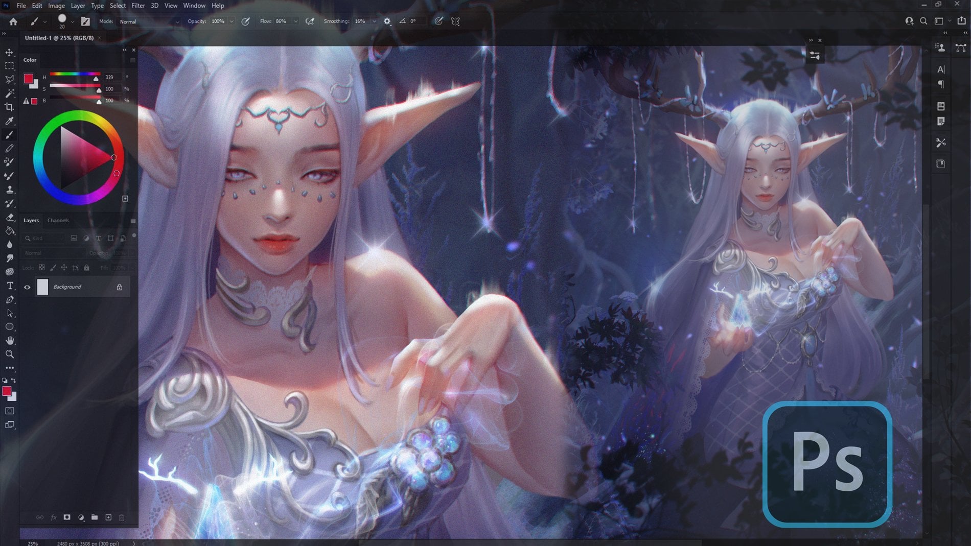
Transcripts
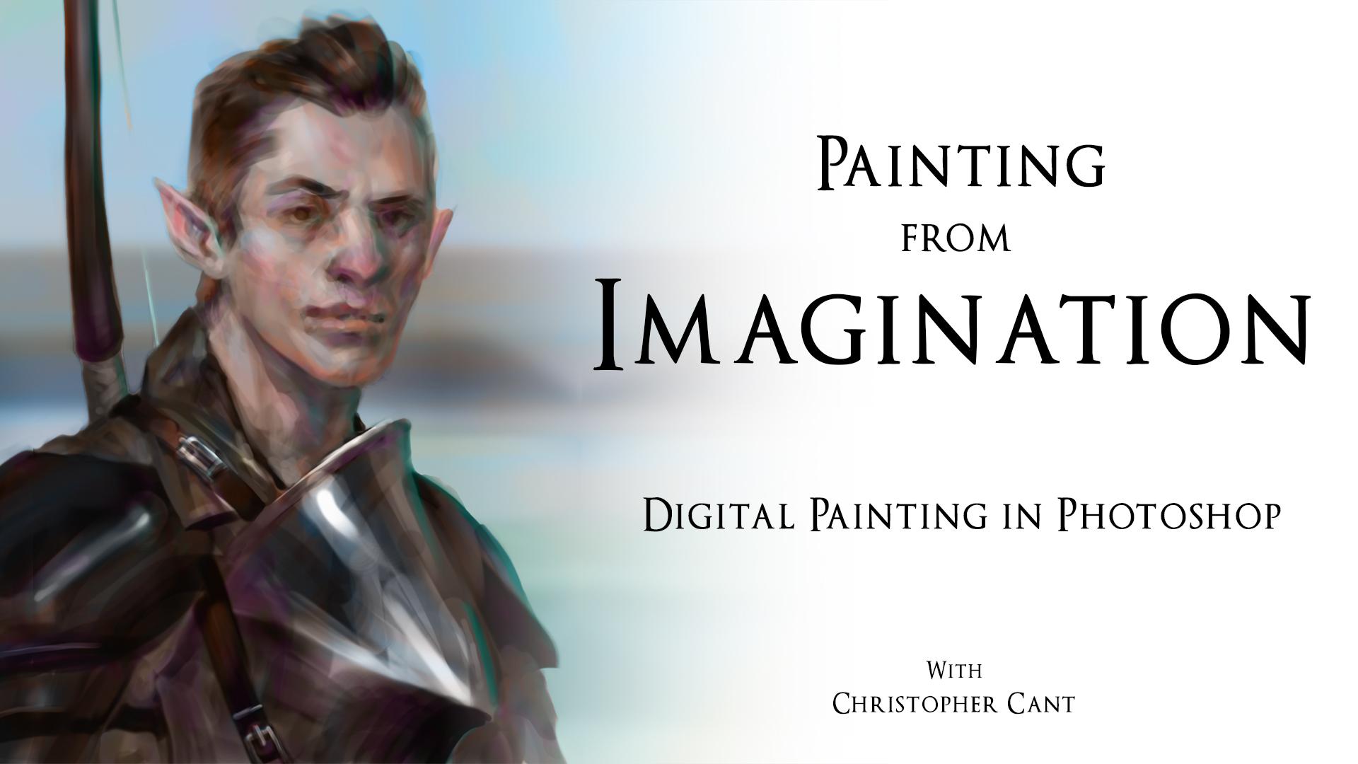
1. Introduction: Hey, guys, what's going on? I'm Christopher Can't for those that don't know me, I'm a professional illustrator working within the entertainment industry. I'm the creator of the Knitting Legacy and of self employed artist. In this class, I'll be breaking down my process for painting from imagination in Photoshopped to quickly go from a blank canvas to a finished, realistic portrait without the use of references. This class really condenses a lot of information into a fairly short time, so I'm confident you'll find value in it, whatever your skill level. So before we begin bust out your tablet, open up your is let's go for it.
2. Class Outline: we'll begin with some simple exercises. First will be painting simple forms from imagination, then deconstructing a photograph and finally constructing ahead from imagination. Using those simple forms when we move on to the portrait will start with exploring and sketching. Once we're happy with our sketch will fill in the gaps well, then design characters face for it by designing his clothing. When we're happy with his design, you will tidy up a bit. Clean up the edges. We'll cut character around. Give him a simple background at color. It's what Crace school I spent some time rendered and finally just delighted.
3. EXERCISE 1: Painting Simple Forms: Okay, so, Well, we'll begin is with simple Ford's. There are four different kinds. Simple forms, cubes and Q voids, spears, cylinders and lastly cones. Now, first off, I know this doesn't see very exciting. It looks good. It's quite dry, Um, that this is foundational to everything you'll paint prime imagination. It's all built upon these basic, simple forms, so ensuring that you have a solid understanding of these is is vital on the next two exercises will be based upon these fundamental volumes. This practice right here, building portrait from imagination again based upon these simple volumes being a painted from imagination in correct perspective on bond with correct light understanding. Call shadows cast shadows. It's all it's all necessary. So, uh, please to try to paint a couple of these from your head. You don't have to spend much time on them. You don't have to punish them, but they do need to be correct. You do need to understand it. So as you can see, very simple cute. The light coming from the right concept accosted left Dr Plane on the left bit of a highlight across the edge of the Cube. Don't looks reasonably actor student, right? These Ah, I'm working on another. Yeah, I'm gonna do three of each through these brilliant. I'm gonna do them all slightly from variations side, different shape, slightly different angles, different perspectives, lightening from different angles as well. Just to make sure I didn't have gaps in my knowledge, like a body stressed. I don't care what it is you intend to paint from imagination. Whether it's portray, it's just like an issue. Toro. Whether you plan on painting, landscapes, architecture of vehicles, animals, aliens, it's all gonna be based upon these things. If you wanted to have. Really? If you're fine without realism, then I guess, yeah, you can make do with no being able to do this. But if you want imaginative realism, this really is foundational. Okay, moving on. So I'm not going to teach if you don't understand how to do this to some level. I'm afraid this tutorial is not going to teach it. It's This is intended to teach how to use this knowledge to create something further from your imagination. If you are interested in learning form on light and perspective, then I will give me some feedback. If there's enough feedback, then I guess I will look into making its U tour for that as well. Um, there's already a lot of knowledge out there, but yeah, if you like me to cover, then with enough feedback with enough requests, I'll consider it you perhaps notice. I'm just using a single brush for this. My favorite brush Teoh 75% Hartness default round brush comes with photo shop. Yeah, it's just a default around change. The hardest 75% capacity stays at 100% but is tired to be pen pressure of my tablet. Nothing else attached to the pen pressure. It'll no, no size, just no, no color dynamics, nothing fancy, no flow. It's all its just capacity, which means the brush is quite easy to control. Um, it's very easy to control the edges on its very easy to blend with. The only down side of having a brush that doesn't change size of pressure is that you end up with a lot of farm, very similar restaurants, Um, that I think that's, uh, for this kind of exercise. That's fine, went after sexy brochures here. We're just trying to build sexy volume Instead, I also don't use meant multiple layers. Everything is on a single. If you feel more comfortable painting your volume on one leg and then a second layer underneath to pain cast shadows, you know, go for it. Um, it's just not my preference. And this brush on one layer is how I start all of my paintings. I prefer not to mess around looking for the right brush for the right brushstroke or messing with layers. What was journeying up to the right side of photo shopped to try and grab the right layer to work on? I much prefer just simplifying that it becomes about just color picking and put it out brushstrokes. Not nothing more complicated than that at the beginning. Speaking of color picking, I've set up my canvas to be 75% of white on the background of fellow shop to be. I think it's 97% black, so 3% way this means that I can like you can see color pick back and forth from canvas to black. When I want to switch values, I calibrate the black to build it, build a shape, um, and then calorific the gray of the canvas Teoh carve away at its at its silhouette. Then, um, use the grey against place down some highlights If I want to add shadows covered with black again. It's just an easy way going back and forth. I don't really have to think very much. I know what a color pick to get the values I need Because of the way the capacity of the brush works, you can be very subtle, even though I'm color printing black. I can be very subtle, adding just slightly darker values on top, you know, just darkening down a little bit. And, yeah, I use this to stop every painting. Um, very simple set up. I always start with the same black background, great campus, single layer color picking back and forth. This 75 round brush doesn't matter from doing a portrait landscape. It Z just a really nice brush for exploring for carving out shapes. It's ah, it's soft enough to be a blend very slightly hard enough to be a cut edges and create less graphic read. So yeah, great for planning out compositions and even getting quite firing toe into a painting. Okay, I don't really have any more to say at this stage. Um, like I say, I hope you, uh just paint a few of these. Um, no matter your level that might be You might saying. You know what damn mission. I did this a few years ago. Um, I can definitely handle this. That do. You might hit upon a bit of a snag during maybe painting cones or something. You forget how to light them properly. It happens. Trust me. On DA. Yeah. You'll be glad that you, uh you came upon it and you fixed any gaps in your knowledge. Um, this is actually being painted in real time. Um, feel free to skip through the rest of this. I think I'll leave. It's real time. But again, Like I said, I've got nothing more to say. But yet feel free. If you want to continue watching me construct these, please do. If you'd like Teoh, just move onto the next lesson and, uh, follow me. That's good.
4. EXERCISE 2: Deconstructing a Photo: Okay. Second exercise will be deconstructing a photograph into simple, primitive forms forms that we painted last time. So, as you can see, start off grabbing the black of the background, building a spear and adding in jaw. Um, and then the gray, using that to highlight the sphere in the jaw to try and make into a three d feeling the volume and just called me a little bit, cutting it into the right kind of shape. I'm no looked looking to catch his lightness. I'm looking at the photograph and trying to analyze the basic forms. I start off as you as you saw with a very simple sort of egg shape. So there's largest shape that's going on ignoring over his features Now I'm trying to capture the general shape of the features carving into this fear to capture those the eye sockets and, uh, adding that knows on I'm imagining, I've sort of added a wedge to the front of the spirit and desert shadow being cast under it . Like I say, I'm not trying for accuracy on the photo. I'm trying to use the photo to inform the kinds of volumes that I'm going to have to lay down on, uh, the order in which I should lay them down. So I'm observing him and using that as a guide for building ahead from imagination. Um, just adding, but if a body on them sticking the Iran right now, as you can see, a think it is a very simple form. First of all, a kind of a disc attached to the side of his spare ical head. And now we're carving minor forms into it and sort of packing on new forms to the outside of it. Teoh increase the complexity like a se a lot like like if you were sculpting this the hair , I'm just throwing the Atlanta and then I'll be adding it on again. I'm not particularly trying for accuracy copying the photo. The values are going to be off. Um, the likeness is not going to be there, too. It's gonna be weird, inaccurate, copy. But that's not the intent. The intent is to analyzed the forms that air in an actual human face and replicate something similar. Uh, i'll be a very simplified. The reason we do this is, um, to try and help us memorize thes forms so that when when we are working without any reference whatsoever, we can try and recall the order in which we put these forms down. All right, So spirit Joel carpets, the eye sockets at the nose had a muzzle for the mouth, then neck shoulders is hair. Um, yeah, we're about what we're trying to do here is hopefully we'll retain some of the knowledge that we're picking up here for the next exercise. And, uh, for many years that come, This is an exercise you probably have to repeat quite a few times to really take on board. Um, this exercise and the next one, I expect you to be doing this fairly regularly analyzing life, deconstructing it into simple forms and then working. The next exercise will be working from imagination trying to reconstruct these forms roughly in the same kind of border and create something convincing no matter what it is. Your, um, advise that kind of process. We're trying to make cars from your imagination. First, get a couple of photos of cars, deconstruct them into simple shapes, first deconstructed it into the simple shape you can, And then, um, slightly more complex shapes carved into it. Add on to it. Increase the complexity of these simple forms to capture a simplified version of a cup and the purposes so that later, um, you can recall these simplified shapes help you build the car from imagination with reasonable accuracy with enough experience. But right now what we're doing is we're recording reality. That's what I like. I like to think of it as you want to become a printer, and you want to print something out. First, you have to scan it in with scanning information in, um, so yet you can see I'm getting down into the really minor. It's smaller forms just correcting like cast shadows that the areas of where light is hitting, where it isn't smaller forms around the mouth and the nose. Just making sure planes are roughly accurate again doesn't need to be. It doesn't need to be comprehensive, but it needs to be enough information so that if I made this from imagination, I would be happy with it. It would feel like achievement, and we're, ah, stomach to get there. He's looking again. It looks like a human. It doesn't like him, but it looks like somebody which is, uh, which is a good son. Right? Is relatively symmetrical, is a bit deadpan, but what he looks like he's a is ah, study, which is exactly what he is. So yeah, just a minor minor corrections on him. Oh, I got this photo from a free stock side, so I think I can add this to the class resources. If you'd like to study this particular photo if you if you'd rather study a different player, should be fine. But if you did study this one, you might be auto. Compare your results with mine. You might even get up. Copy my process a bit more accurately. If you use a different photo, you have toe make all kinds of your own interpretations or some exercise definitely recommended. Perhaps if this is your first time, used the photo that I'm using that compare your results to mind. Compare your process to mind if you've already got some experience doing this, you know, finding your own photos, the kinds that you prefer. Maybe women maybe. Well, ruggedly handsome men may be ugly men. Whatever your preference, whatever it is you're trying to get better at painting. Portrait's up from imagination. Go with that. Okay. Definitely minor stuff right now. Just putting a bit of ah, the color on Just zooming out to check if I'm unhappy. Um, no. What makes, um, uh, small that It's o yet the temple on the it is looking a little bland around the eye. The temple, it's not looking anywhere near this complex is the photo. I really simplified a lot. Don't don't spend too long on this. Maybe if you're brand you half an hour will be long enough for you capture enough simple forms. But most people should go to do this 10 to 15 minutes. Don't try to get perfect. It's really unnecessary.
5. EXERCISE 3: Constructing a Head from Imagination: okay and thief. Third of final exercise for Imagination Again we're starting with same process sphere. What first cover clicking the black, then put down a sphere, adding on the jaw color. Picking the gray, building this up into roughly a shape that we're pleased with, right looks vaguely skull shaped and adding a highly where we wanted like to come from sticking and neck down there. A nice basic cylinder again adding a highlight. Now writing a tor set, this is a lot more structured than I will be working in the in the actual portrait. Later on, you'll see. And then in the next video, it would be much more like intuitive this. I'm going for something very structured so you can see the simple, primitive forms that going into this. So we've got a kind of ah, a spear with with some an extra where's attached to the bottom as Joe, we've got similar for a Meg from again, a wedge shaped for the shoulders and chest, adding a car shadow, just judging from the angle of the light where I'd want to cash out it to be. And yeah, I'm trying Teoh before for moving on too quickly, and I'm tryingto have each form feel three dimensional feel very simple, but volumetric, you know, accurate, adding, adding shoulders on. So I hope you can see that the primitive, primitive forms really is like the foundation of this exercise right here. Knowing how to paint a cylinder is extremely important. I had a paint cube, comb, spear. It's all like foundation off that this right here. Um, it might take you time to get it. Do this intuitively. It might take you quite a lot of exercises. You know, that failed attempt, uh, to paint, even like a a relatively well proportioned, simple mannequin like this one. Um, but with eventually becomes intuitive, it really does proportions become just second nature. Perhaps you weren't always executed perfectly the first time, but you can only pick out Paris and issues with proportions and stuff pretty classed with experience. Now, um, I'm cutting the eye sockets into the head just like we did with the deconstruction trying Teoh, trying to the front of the face, looking reasonably after trying to get the forms to feel wrong again. Cutting coming, the eye sockets out. It means then we have a upward facing plane for the cheeks again. Like I said, this is ah, normally this deliberate and, um constructing each form when I make an edit, they're not reconstructing the form. Normally, I'm, like, throw down the shadows for the eye sockets, the shadow for the nose and then the shallows for the lips on the gym all at the same time . But for this demonstration, I really want, um, highlight the process. You know, the order in which I'm constructing this guy so yet again, just like in the deconstruction that painted a disk to represent visit here and then added the minor forms again, cutting away at the disk to create the right shape. So this really is the same process as we were just deconstructing from the the photograph. We're trying to build the same shapes, but there's a variation on their size, but generally it's the same primitive forms on its constructed in around the same order as well. So now I wasn't in the mouth again. Create a bit of a Muslim? Yeah, And you just quickly you try to get the basics down as quickly and as early as you can for the furnace this part of the face, then refined. Don't forget to flip campus as well from your campus will help you see errors, especially in symmetry. But also each of us tends to have a slight lean depending. I think, on whether your rifle left handed with a slip lean to the way we would create our artwork. You may have seen traditional antes looking at their work in a mirror. You, you might have. You might have seen digital painters. People isn't fellowship tipping their work all the time. It's because your brain again, like I say, you should have a slight lean to the way you paint and dropped, and you're your brain. Will could really close over Harris in your drawing, clipping it. Fix that. You know it will be leaning against your natural lean, and it will really issues We'll just jump out at you. Um, it also, sometimes there are big errors in a painting that aren't to do with the lean. It's just something that you they looked and you're just gonna usedto looking at it. So you felt even able to recognize the error of your painting. Sometimes you know, another artist will point something out that is incredibly obvious, once pointed out. But it was completely invisible to you a second ago. Or maybe, you know, you've experienced that you, uh, you think something's finished? You decide to share it online or share it somebody. And in the process of sharing of showing somebody, when you look at it, you realize there's a massive, glaring mistake again flipping the canvas. Comm point out these issues without you having to go through the embarrassment. Um, using the last little to just move his head down, fitting that his neck was looking a bit too long. So I hope you can see that we built this out of simple forms. Is still quiet. That quite apparent as faces gained complexity. Center liquor for human. Very, very basic human, perhaps, but convincingly, in my opinion, a convincing man. Um, right at the next. Full his hair. Don't worry again. Like I say, values no super important. The way they relate to each other is important. You want, you know, a lit area and a shadow and half turned to be convincing. They got to relate to each other fairly convincingly but getting accurate values for a skin tone or for hair colors really unimportant during this exercise. I think that just made his head, doc. I was actually intentionally trying to make everything at the same value range to serve. It looked like it was built out of form and just no different materials, you know, like a sculpture or something. So it's all made out of clay or something like that. But I guess it's just my natural inclination. Teoh pain hair darker. Um, so that's what I've ended up doing yet now, just working really minor things, like car shadow under the I'm taking a second just to look, See if there's anything glaring Don't said it. You can see It's really, really small shapes the roundness of the nostril towards cheek just refining the edge of the hair. So this is really minus stuff. Yeah, we're very happy with what we made here. This is a very worthwhile exercise. I mean, this is this is painting a portrait from imagination, right? This is what you're here for. And, uh, I heard there's some insight come from this. You, uh you do a few of thes See what you learn. This really shared gaps. in your anatomical knowledge. There's nowhere to hide. When you trying to do this purely from imagination. If you don't know the forms of the air, this is really gonna show you. Um And you know, your lack of knowledge will really confront me during this exercise. Um, OK, that's the last of the exercises. Let's move on to the actual order, shall we?
6. Phase 1: Sketching and Exploring: Okay. Phase one. Sketching and exploring exactly the same process. I'm making sure my brushes correct the right color. Um, capacities. Right. So we started with that spirit of most black Spear put in the highlight car about to shake the jaw added, but also really quickly. See, what I'm trying to do here is throw down the basic forms for the whole character quickly and then carve into it and add the highlights that I need tryingto really trying just the rough shapes for the whole piece. Put them down first, and then we go, just like in the previous exercises. We call about the eye sockets, um, refined the shape of the head at the nose for the highlight on the floor head, um, the jaw. So you can see I'm kind of picking back and forth. Yeah, I'm adding a maybe a hilt. Just call it looking back and forth from the grave, the campus, the black of the background and using the to to just quickly throw down the shapes that I'm gonna need. I just had extra like the hair using that black. I had it with the ears. What? Using the black toe? Add elements and the gray to carve into the black and to light it so the black is for is for adding Thea. Grabbing the gray of the canvas is there to subtract and to light. The black will also be there to add shadows like we did with the eye sockets with the nose . So that's the That's what I used those two values for reasonable, like rule of thumb, creating a shape. First, the black carbon into it with the gray. Then, um, light with the gray as well, and then add shadows with the black. It's a reasonable process there, so this face it's been built up with the same sort of process. Start, obviously, the sphere job. Also, once we're ready to move on to the final details of the face, its eye sockets, nose mouth is hair governor, it tends to be the same older each time. It just, uh, it starts from big shape status. Small right. Once we're happy with the features of the face is but everything he needs, right? He's got all the speeches. Now it's back onto the torso establishing decided to put a pointed breastplate so there's some amount of materials coming through and this this will take practice. You may find that you when you sketch everything, there's no difference between materials when you're sketching, that's that's why does, I think very, very normal. To go through that, and Teoh to define the materials later in the process will just take more been more experience to capture form and light and material all of the same time that stress.
7. Phase 2: Fill out the Sketch: okay. Place to once. You're not being with your sketch. Um, well, you want to place to throw it on it. And you there, this is. So we're gonna start editing the sketch. We're not gonna be adding we're gonna be editing. So I like to throw down a new there, just in case. I don't like something done. I can I can easily check where our sketches now to You know, the moment was that when I when I enjoyed it, just in case It's something I've ruined about it, to be honest, So here I'm just sort of defining his expression of it better. So the first face was really about establishing, getting all the forms in that, you know. What's this character going to be? Um, what's he consisting off? This phase is about filling in the gaps. Like giving him an expression, um, giving a more interesting hair. As you see, I'm trying out something here. Not very fund of it. Decide to do it. We change the help that was on his back off a sword. Perhaps changed that into a boat wedding sideburns here. So, as you can see, this is all about taking the sketch to be established in the first place. Onda, um, just refining the ideas in it, keeping, keeping the same ideas. But just, uh, you know, adding a little bit of interest to them, that pushing the shapes that we're using. Um, here I am using the liquefy tool. I decided he's a little yeah, looking. He looks very young and inexperienced. I'd rather character who's slightly more experience looking, you know, slightly more experience to worry. Yeah, this is the vehicle vital, the extremely useful. When you don't really want to repaint something, you just want to make slowly move something over a lot like a little transforming. It's just a yet another tool in photo shop surpassed them. So yet he looks a bit more experienced, a bit more masculine. There'll older, jump happy with. So here I'm trying to sort of Ah, what we're doing is we're defining the edges of objects, right? We've been defining the edge of the hair, like adding sideburns with defining his hilt into a But here we are just cleaning up, so we're sort of defining where each object begins and ends. You know, Teoh, it's the short of pet figuring out where there the shoulder pad begins and ends. Had overlaps with the rest of his torso, giving one arm. There's, ah, a bit that was missing. He didn't have any arms. So yet another arm flipping, of course, all the time. Really, really useful toe helps you figure things out. Helps you figure out like air is parts that you wrote looked. And like I said, I'm working a bit on materials as well. I want this to be a metallic pointed breastplate. So I want to be reflective, especially of the sun. So we'll just flip back from object to object refining as things jump out of us that need to be a to be worked on, as you can see is a long one layer. Just added a second because I decided I want Teoh try adding a strap from the breastplate that would cover over the shoulder. So I thought, I don't want to do this on the same layer I want to go to compare with outside with strapped down. So yeah, you live for I recommend that kind of work left when you want abs and new element and you're you want to easily compare with the new element without throw it out of you like it's Photoshopped. You can put as many glasses you feel like when he lands is your ram can handle. So when it down new life, you can always merge them down later on. Okay, so he's skinning that there's a few areas, is called and needs cleaning up his back. This is the thing that poorly defined and the inside of the press split interacts with his chest. This is undefined but clearly audible. So, yeah, that was that space to we, uh, making sure that we have all the elements down face one is about capturing an interesting sketch. Suddenly, like face to is about completing that sketch. Really? Just, uh, making sure. I'm just double checking. There's nothing that is missing. So here we are, like I'm saying, um, merging the sketch with the new improved sketch. Just a double check have I am actually improved on it, you know? Is there anything that I've I've ruined about the original sketch in in my attempt to improve
8. Phase 3: Design the Face: on to phase three. So we have a complete sketch. We're happy with it. It's got all the elements implied that we need. So next we we begin refining a so you can see starting off with the face, especially the eyes, the eyes of, Ah, character at the eyes and the photographs, uh, massive, like conveyors off the character's personality. So they just have extra love. Extra attention of the mouth is also obviously an important communicator, but it's the eyes. The eyes really do community. A lot of personality. As you can see from this sketch, his eyebrow is called, The Iraq is basically conveying his whole personality at this point in his, uh, he's confident, maybe even slightly cookie, but definitely a confident young man. So you at this point, this is where we're no longer looking to feud. Thes is simplified. Primitive ships were trying to render them up into more realistic forms. This exercise of doing fetid studies, we're probably if you struggle with this would really help. It could be hard to try to replicate reality, try to paint something from imagination that looks really when you've no deeply studied reality through painting, painting from photo is painting from life as a step full. It's kind of like your when you're painting from from observation. It's like you're scanning information in when you're painting from imagination. You're printing that information out. You can't print out information that you have scanned in. If you haven't done enough observation off Rheal Man's face, what the forms is actually better from actually looks not your impression of what a man looks, what they actually look like through, like dedicated observational study. It's gonna be really tricky when I take a lot of trial and error to end up with a realistic portrait. You're much better off spending the time during the hard work of observing reality properly so that you can replicate it more accurately. Be ahead. I'm concentrating on the near side of his face. You know this this by that's facing us, his his ear decided mouth beside the nose inside of the forehead. Um, because onto design like pleasing features, and then once I'm happy, I can then attempt to get symmetry. Symmetry will take a while for you to a nail on. You don't want toe, get the symmetry correct, and then realize you don't really like the features that you've given him. Instead, design one you know, one side of his face to be praising and then try to replicate like a symmetrical face on the other side. So you can see here. I'm working a lot with his I sometimes he's looking a bit angry, sometimes a bit sleepy. Um, I wouldn't I'm not yet happy with it. So I'm not going to try and get symmetry down until I'm happy with the I that I've given him, which is, uh, which is right now. So now that I am at with the, um, I'm working long, just we're finding it a little more and a capturing symmetry, and I'll be doing that for the rest of the face as well as I. As I work on a feature one side of the future, I'm happy with it, uh, replicated to the other side. It's just a bit smarts too, by the way. Otherwise, you'll end up repainting twice as much, so you can see a lot of color picking a lot of flipping the canvas, occasional zooming out and, um, sometimes even hiding the current lair. I'm working on just to make sure that I definitely improving upon the peace A C C. I put down a new lab for these eyes. Oh, because then you know, I was happy with the previous player, happy with everything we did in there. So I want to create you. Laugh. Put the eyes on it so I can easily just hide on hide layer and see why. Edits? We've made, um, still working on these eyes. Like I said, the eyes I was really important. Probably the most important part of a portrait of East of l. You know, humanoid. Maybe, maybe if you're painting something that's inhuman than the guys are that important, but definitely of a humanoid characters. Three eyes, Extremely important. Like I said, they communicated personality of the captain, trying to get a good personality in his mouth as well, having it slightly cooked up a bit of a a slight smile There. Still, I like the idea that he's is a confident man. I don't want him to look too cocky, but I do want it to the continent. Correcting the lighting on these phones is really important. That's what we're doing. We're No one of drawing features. Here we are. What, sculpting them? We're building forms, carving in two forms. Um, and if there's a form that doesn't read properly, the light feels inconsistent on it. The highlight is poorly placed. Commit for committed face Looks strange. It should really jump out at you because they were painting with light. Right? So if you place ah highlight incorrectly, it makes the form read strangely. So if a part of the face read strangely, then you know it's lit strangely. So it's this eyes, this back and forth, usually color picking. You did the like great that background or the black. They have a better shot background. The window background Also sometimes color picking from the portrait itself if I want. You know, if I want to extend a shadow that I've already painted much easier. Teoh Color pick The shadow just extended out, carving into the face here for the cheekbones, building the minor forms of the using the forms that we studied in the previous exercises to inform thes forms, right, we're basing everything we're doing here on the previous exercises. Comparing what we got was happy with the ice for emotional dance that people slash Um yep. It's to say that could compare what we've made with what we had in the sketch. Getting symmetry down at these ears. Small refinements. As you can see, it's a predictable process. The the beginning face is where the magic happens after them. It's all about cleaning up your forms, cutting the edges, right, getting the materials to read properly. Minor things like the the nostrils wrapping around, done near the end of the process. Corners of the mouth near the end of the process is well, we really concentrating on big picture, slowly working away down Teoh minor shapes like this, the shape of the industrial, you know, the natural cavity comparing what we've done with what we have before. And I'm hiding our layer now. I'm having a bit of ah, a bit of an experiment. I know I want his mouth to show you some personality, and I'm Mr trying out pushing it in a few different directions. So I'm making a little more serious, some with snarly. Um, now he looks very unimpressed, but slightly doesn't. It's not a very convincing, um, expression with the Matthew looks injured. So yeah, decide we're not keeping that This is the time to experiment that this is the time Teoh destroy things that you don't be trying to change his expression later from this. This is what you want to establish. Okay, I think we're getting very close to the end. Yep. Just looking over my work is considering fighting and hiding. Really? Deciding. Is this good enough to move onto the next stage? I'm happy with this man's face. I don't quite still that corner of the mouth yet. That's why that's why we have all these layers so that I can raise some of my work out and get back the old quality of his mouth talking down the nose and we're done.
9. Phase 4: Design the Clothes: next we do these same, but for his costuming for his clothing, we tried toe Ignore his face for a while, even though it's very fun to work on way Need Teoh made to refine the rest of the peace? So first off, beginning making the breast play really feel metallic getting those like strong violence? In the lot of contrast metal, I find it's best to paint very like this business, a metal buckle that I'm adding to, uh, strap so again yet, um, at a very bright highlight, um, a reflection of the light source. In this case, I imagine it's the son, but it's our yeah, it's a strong reflection of the light source that we're adding on its placed a ziff. This metallic surfaces there is in there, not you. Don't the way you would like a Matt surface would be. That would be brightest on planes that are facing the light source, but on a metallic surface, you want to add the's like hot spot. Speculum highlights at the angle of incidence like like a mirror, so it's a reflection it's not. But the plane that's facing the sun, it's pretty common mistake. Once you grasp it. It's very simple, though. It's just imagine this is a mirror looking at it. Imagine you have to be able to understand the forms. Your painting need to better understand how this form turns to be a convincingly place. This highlight, but with a good understanding of nearest Onda, for you can do this easily and eyes. That's the majority of painting like nice looking metal. In my experience, the other parties contrast, so you can see under that highlight there's a duck, a duck section, perhaps a reflection of something. I've done the same on the underside of the breast plate. You can see there's a za highlight that runs along the edge. Um, if this breastplate right to the point under that highlight under the point, there's a really dark area I find just adding contrast like that, um helps to communicate. This is metal, so I'm working on the Imagine It's a za leather jacket, perhaps. Look at Matt leather, not like a shiny board leather. Um, so this is very quiet, unreflective. There's small highlights down near the buckle near the strap, but it's a fairly unreflective material. I've left it quite quite mad so, yeah, As you can see, we were trying to fill in. The gaps were trying to clean up like the edges of the different parts of this costume. The color, the strap, putting it. Buckle on the making. Sure the edges of the bow are readable. There's a string sitting, of course, always flipping thing, the campus buzzing things down when we're happy you layers to try new things, Working on the face a little bit cheeky, just caught that his his cheekbones were convertible to shop on the edge off the like, catching his neck. Felt court shop was, Well, oh, just working on the next line. Cheeky shouldn't be doing that. Should be working on the costuming. But, you know, it's just, uh, sometimes you can't resist. Sometimes it's hard to rein yourself in. Often, I'm working sort of work from top to bottom, so I start, you know, review refining the face, starting with the eyes and then the nose and then the math down to the neck and the color on the tip of the top of the breast plate. The buckle. You see, I like I work from top to bottom. The bottom of the campus is basically untouched since the since completing the sketch. Since filling the gaps you know of no, I have not touched a talk. It's, um, concentrating on the elements around his face. Since that's the focal point of the piece, I find, you know, the focus. The main focal point is that I that is closest to us. So that deserves the most attention, the most love to look the best team in the most interesting part of the peace. It's where we want attention to go and everything that's third of from that. We probably will spend less on less attention on it, perhaps like the around areas like the buckle. Andi highlights on the breastplate. They draw attention, so make sure they look pretty decent as well. But like a sex, it's that by this the focal point. We want everything Teoh be subordinate to that. We don't want anything. Teoh pull more attention than that ideas. So here I am. I was happy to show up at the one nearest to us, wasn't happy with shape. Then I tried to achieve symmetry on the other side, just like we did with the features of his face. We're doing the same with his costuming once we're happy with the near side and it feels correct. Try to achieve a symmetrical shape on the other side Comparing our oldest catch before he made these edits with the new trying a few things It's not quite working you. Sometimes you have to feel your way there. You try a few things, doesn't quite get it across all. Perhaps it does get it across. But you've ruined something that was pleasing just like that. I've just a raised some highlights that I tried to paint in. I didn't really enjoy them found, even though it looks nice and rounded. Um, it wasn't a pleasing is the previous version of sketch so decided to instead paint a, uh, a different highlight. Um, did implies a different shape to the shoulder pad. Okay, I think our costuming is ready
10. Phase 5: Cleaning Shape Edges: but Phase five, please defined his features were to find his costume, all the elements of their. So now we tied it, hold up. We try to get everything looking clean up. There's, ah, a lot of places, especially the further side of his face, further side of his body that needs work. We're gonna be again concentrating on its face first. It's It's the focal point, the eyes, the very first thing we work on, making sure that they they look human. They look intriguing, the various personality, probably on the forms. They don't need to be perfectly symmetrical. People's faces generally are not perfectly symmetrical. Might be slightly alien to look at a person who does have a perfectly symmetrical face. So you just want forms that look like they belong together. You know, the bags under the eyes. They don't need to be identical, but they definitely do need to look like they belong on the same face. So this really is just cleaning out these forms. It's This is very, very small changes. None of these are gonna be administration changing changes. As you can see, they're really, really small that it's, um we don't want any of this to change the peace too much that any big changes should have been taken care off earlier in earlier phases. You know, this is the phase where, like, we're happy with everything is in the piece. Um, now it just becomes a case of cleaning it. I'm making it presentable. Yep. Hiding, hiding layers on hiding anything. I'm not fund off. Used the razor. Teoh. Just get rid of that part of the layer. Brady. Really minor shape. But the full head does project slightly above brown. So it is trying to capture that small shapes above his notes. Was if he borrows his eyebrows occasionally, browns a little bit. You just captured that very slowly. Fast out of his face. Doesn't need a lot of love. Doesn't need as much love as the near side of his face there. The new side of his face is like I say, it's the focal point. It needs most of the attention is going to draw almost the attention of the viewer. So it requires most of your attention. The painter, I recommend, uh, regularly taking time to just lean back. Look, take your whole piece. Um, just check if as a whole piece, how it feels. That's how it will probably be viewed Eyes as a whole piece. I know that. You know, you're an artist. You see a really cool painting that you're into You, uh you'll zoom right in, right? You live it up, zoom in on particular characters looking for brushstrokes may be trying to figure out that process by zooming right in. See if they've used less you tool or what kinds of brushes they use. But, you know, most of the people consuming your work wouldn't be doing that. They will be taking a piece as a whole. So, um, I feel like art should always painted with that in mind. At least my work. I always paint with that in mind. The whole the whole piece. I try not to zoom in a tall janitors. Ooh, I tried. Always have the canvas visible at all times. If possible, I do work on a only a 13 inch screen set that does make large ministrations basically impossible to work that way. That I still do my best to do my best because big pieces, small pieces matter. Most people are gonna do it as a whole painting. They're not going to zoom in on particular elements. As you can see, this really is about just refining, making sure each element is identifiable the edges off of each object they're easy to find . Should this strap shows against against this jacket? What I will do is push values to their belief to make some areas more readable. Like the strap. I've made the form as it turns around, and it's his back. It's extremely doctor. It's black, which is perhaps I'm realistic because that would be facing this guy right? You'll be catching a little left in the sky, but it makes the that shape much more readable against the grey of his jacket. I guess I could go the other route on, lighting up the strap and dark and the gray of his jacket. But then I've got an issue with the dark, uh, almost black of his shoulder pad against his his leather jacket. So it's always it's about alternating values to make sure shapes irritable when you when you want them to be readable, I realized that there's a they're straps missing. I mean, I could we could assume that they're below the campus. They're just not visible, but it seems unlikely that this breastplate would be held on with a single strap over the shoulder. I decided to have a imply. A second strap that goes under the shoulder promptly is the very same strap. Perhaps there's a sort of a cross by on his back. Straps sleep around over under his arm. Enjoy the other side of the breastplate. While most off of this, this very so far has been about cleaning up edges. There's also some cleanup of of lighting as well, like certain areas like underneath underneath the chip to feel like the car shatter. It was the correct value. War too dark, Um, adding the color is showing. But aside, just peeking out there behind his neck, getting the rim of the breastplate readable. Like I said, that does draw the attention that highlight there, so making sure that it's a pleasing area to look at. So this face we've actually been using. The second brush, the It's a study softer than the 75% around, and flow is also affected by the temperature. This makes it a little easier to blend with. It's not as good to create hard edges. But it's but it's Ah, it's edges a softer on blend easier. So yep, rendering is a little easier with this brush. I recommend that once you're happy with your sketch, you established the sketch with the 1st 75 around I recommend. Then, once you're ready, Teoh start rendering defining your piece. Better switch over to this Sarto brush. It's around 50% about this. As you can see, though, it can still define some edges decimal enough large brush strokes would be very hard to get cottage much better off searching up to Arte Brush again. Once you're happy with one side, then try to get symmetry. The breastplate is the team convincing? Um, just checking over, you know, checking every everything we've done. I made good edits that's in. That's important to my work like definitely like hiding what we're currently working on, checking against what we used to have because it's so easy in this process, because we're making it up as we go along, right? We don't have a sketch like a line sketch to go to. We can't We don't have boundaries. We could do whatever we want it means, uh, we can deviate quite easily, end up creating something completely different from what he originally intended. That's where the sketching phase is so important for this process. We really gotta make sure in the first 15 minutes that you, uh, you got something solid. It's much better to just start again. And during the sketching face, if you spent 10 15 minutes, you know, happy to start again it zoning. 15 minutes more work. If you try to bully a bad sketch into becoming a good painting, you'll spend much, much longer than 15 minutes. So it's just about the use of time trying Teoh Transit Manipulate on If he sketched to a decent painting again, formatting a another strap over the breastplate. Um, I really I wanted to communicate that this this is a breastplate. This is some armor attached to his chest. Um, if I think it felt slightly confusing, it could be mis read, but decided putting this strap really, you know, seals the deal. It was a house with shoulder pad, it short of had otherwise looks like it doesn't really connect to the body whatsoever. There's no indication of how it was attached to it. Um, this extra strap, uh, implies that the shoulder pad is not bound 12 So I think just looking at things, checking ever zoom out. I still want to work on those eyes. They're very, very important. It was the is the shadow, the shadow cast by his further. I didn't didn't feel correct. So I'm not going to move on from this until his face really feels complete. The next phase is Teoh Color, so I really want to make sure that in grayscale he's feeling ensuing done. A century. It's a you know, it's expressionistic. It's no hyper realism, but I wanted to feel like a finished impressionistic portrait. Try out bedding, Samo. Some reflections in the It's a Little Not to My Taste That's my taste. There's a little over the top I like it is Personality is coming through in both ei brown in the mouth. Yeah, just taking time, making sure I'm happy. The material love his but no communicated well whatsoever. So I'm gonna spend some time on that. I wanted to be crushed. Leather strap, you know, Or some fabric wound around around 100. I want the material to feel different from the wood off this boat. I've spent time making the wood of his Butterfield convincing it is. I didn't feel like it's necessary, really. I think, uh, we understand that it's about I don't think people will be, ah, right First, ever not being identifiably, would him? It rains will just fill in the gaps. You know, they'll see it's about the services of Flanders. A character on their brand would say, That's probably made of wood. It's an important part of compositions. Well, it's and it's important leading line, but it's not designed to grab attention is designed. It's designed to leave the I into, you know, the focal points and to stop the I leaving the canvas off that after that side. So adding extra detail to it would probably be counterproductive. It would just cause the I to be drawn to it. One, really. It's supposed to lead the eye away from it. Okay, smaller. Just highlight something edge of the shoulder pads just really, really small adjustments at this point, just trying to get the whole portrayed to read Nice thing from a distance, anticipating adding color that I've seen the throw down a couple away. Um, I've realized I should should merge this all together. All these layers were put down with Paris. Elements were working on just, uh, merging them down. Just double checking. Comparing what we've done is anything that I should raise out. I have seen perhaps a little bits. It's designed Brown's far about. Made it a bit strong. Destructive. Yeah. Looks like the progression is pretty good looking all right.
11. Phase 6: Add a Simple Background: before we can color, we need to just at a simple background behind so groups the character into a single folder . I'm using the quick, select tool Just a crab, All of our brushwork it's gonna be than mine shapes. Doesn't seem to want to grab his here very easily. Keeps catching the background at the same time as you can see. Frustrating. Um, I tried a few times. Eventually give up and try to do with the last little there was no two useful toe. Really useful tool You can quickly just casual if you brush work. It's a little faster than China manually miss you things if you're not as stubborn as me Where was less? Devin? I could have done this. It could be finished by now. Home. See if you could finally did it. I'm just marrying less suit. A few bits. A pair is, um the purpose with this is we will copy control shift see for copy Everything visible from all layers within this selection. And then we can hit control V to paste it on to you. Okay. So I can hide. Yeah, stuff want to because even go one last without character on it, and he's separate from the background instead of Ah, I'd rather work this way. You know, not worry about layers. Just throw down everything I want and then cut the character out and put a background behind him instead of trying to anticipate what I might need at the beginning of the peace . So you can see really simple self brush just quickly throw some hazy values down. And, uh, yeah, we already have, like, a convincing enough background. He separated from it. Just tidy up his edges a little. Especially this, uh, this bow string. It doesn't look so good. So we're gonna just clean that up. Been nice. Very quick way separating character. Still not happy the angle, the uncles, Or just take time to check. Okay, now, we already caught up.
12. Phase 7: Add Colour: phase seven fun bit, but in color. So your character separate from the background that correlate we made early. I've clipped it to him. So a sweeping um well, here's in it will stay within his syllable, So I'm just quickly adding a kind of muddy brown. I love tiu like to add this money brown first, generally to my pieces. Um, it's kind of a sepia tone, and I tend Teoh concentrate it on planes that face the ground, as if they are reflecting the brown with the very slightly. I want Teoh blue to the background here, and I'm confused about why it's not working. This will happen to happens to May. It'll apple to you. You'll be trying to paint on. Something will be off. In this case, it's that the clipping is Ah, he's not working very well because it's clipping Teoh brushstrokes, and there aren't very many brushstrokes on the that background, so it's not so much to clip to, so we unclip it. It's making sure the background is convincing enough doing it too saturated. As you can see, I just painted in intuitively, I'm not. I'm not using by using Grady and maps so payback or anything like that. Um, I find it gives it a more natural feeling. Quality. That's digital feeling a few different hues again. It feels kind of natural to me. It feels less That's the less organized, bit disorganized. It's I just find it well pleasing. Um, just the way I like to do it. If you want your are looking a little bit more orderly there. Now, of course, you could use a paint bucket or music rating. Mapple, something Now Autumn Day have clipped another color there to the silhouette of the character, and I'm putting a similar blue to the background on three man upward facing planes as if just like with the brown facing the ground as if the planes of his face Sarah, reflecting this guy very slowly. I again like more so in the in the metal of his breastplate in the decided shiny shoulder pads, a love confession plane. So I put a bit do in there, and you can see that it's not to bring up the it's time. I feel a little bit more three dimensional, adding these colors in now The trick I like to do is a kind of ah teal science on planes that face left and right, face the sides of the the piece, as you can see, like right on the edge of his neck and of the press play on the edge of his shoulder pad. Um, registries, like a reflection. I just find it pleasing. Do these on separate layers as well. Each color has his own separately that so that I could use control you, which will then Now I can edit the hue, saturation value of the color I can edit a more independent. Another trip, along with the science on the side facing plane is, uh, people in the shadows. It's been a little touch of careful shadows in areas like the eyes, the tip of the nose, the lips, areas that will have a lot of blood flow again, I find it's easier. I mean, it communicates blood flow. But the reason you know I picked local I don't know. I just like the like the harmony of the of the colors blue with beige, with this tier with purple. I just find it kind of pleasing palette. Um, is that it's the power that I use for a lot of my personal work because he has really de saturated here. We'll be working on saturation later. Right now, we're just trying to get the right kinds of Hughes in the right kinds of places. I decided that I want his his jacket and this never. It's like boiled leather shoulder pad to be slightly purple. So we're putting it in. Just as as we feel, you know, areas that I feel. I wonder what it looks like. They're trumpeting some down. Don't like it, raise it out. That's the beauty of having just this this purple on one layer. And if you know, if you wanna get extra experimental, make another laugh. The purple You know it's going to one for the stuff you're confident in another layer for just trying extra. You know what if I get really Saturday to a little something So here I am, adding, um, being more deliberate about the blood flow idea tip of the nose cheeks, the lips. I think some red in there. Second feel alive. I'm not too worried about being super after it with this just quickly, you know, brushing it in lightly, using the razor to work it back, just working back and forth. I find it creates it doesn't feel digital If it was less digital to me. When I work like this, it feels more he feels a life using to a plastic When you can see some of the that's science on the right of his face. The purples in the shadows, that blue. Yeah, different things, Different issue variation. It has life, right? Really getting there. He's definitely de saturated. That's very normal for this process at this stage. Um, yeah, I'm just taking it with them, Just double checking that I'm happy with my color land. There are some areas that I feel that really de saturated more so than the rest of the face . Some was catching them, really? You know, sitting back, taking it all, then looking for areas that need work. I decide. I want this to be, you know, like a brown leather. So it is not really coming through time with strap. It's not really showing through the Mrs Brown leather, you know? So throw some brown in that I'm putting it, um, focusing on areas where the former is turning in this case, I find having thes rules for where you put your college like I, you know, at the beginning, around the whole thing, but concentrated on planes facing down, then blew on planes facing up green on planes facing too. Decide purple in the shadows and now writing more brown in. And I'm generally pretty here, um, on the leather materials, but specifically where the form is beginning to turn away from us. Not on planes facing us necessarily, but as the form is turning away, not in the shadows, either. That's prophecy reserved for purple again on the edge it up that boat. As the form is turning, try a little bit in the face. This is very much a upset. The word a few times intuitive process hit goes on. Good but feeling, um, I've done this many times. There's also a few rules to it, such as, um, being like de saturated around the jawline, uh, around the mouth, being face being more red around the center, where you know the nose. Three eyes is and yellow on the forehead. Hero Upton is at a vibrant slayer, and then I went to the the saturation up in that vibrance like So this is where being de saturated earlier was, Um it was too much of a worry, because we can use this adjustment layer to increased saturation environments, just trying to find something that feels good playing around with these sliders. I find the vibrance adjustment that better than this saturation saturation could feel in the video, I guess, because Vibrance compared it play with both saturation and vibrance, for some reason, a saturation adjustment layer. The saturation slider was completely different to the saturation slider in the vibrance adjustments that I hope that makes sense. Some reason they're both very different, even though they're both called saturation. I much prefer the vibrance adjustment. If he was less digital, it feels more natural, which is I enjoyed digital workflow, but I guess I want a slightly traditional feeling result. So now, just using the mosque that came with that adjustment lab musky on areas that away too saturated, just going over with the razor, cooling it down a little bit because that adjustment there was clipped to his silhouette, duplicated it so that it cannot put it behind it. So what? So that its effects just the background. So now we've got the same adjustment happening separately. One for him, more to the background when I had some. Just a little bit of yellow spit of warmth. It's complying, some warm from the sun. It was, Ah, portrait. It was a little cold in places said, just adding some wolves to it to balance it out. Concentrating on this leather jacket, obviously. What about his hair? And, like I mentioned earlier, some yellow on his forehead. Okay, looking good.
13. Phase 8: Rendering: now we had back to rendering again. So we're gonna throw down luminosity layers this time. They work very similarly to a normal life, but they only effect the values. So that color that we spent the last phase getting right. Now, if you just work with luminosity and not touch color whatsoever, values will change. Hue and saturation will not which this this means Ichan kala. Pick from the portrait, um, and refine it without muddying anything without removing all these deliberately placed colors. So I could just color pick from anywhere if I need a dark color when it rather adopt. Found you I could just pick from a dark spot on the painting. I don't need to worry about the color on picking just the value that really simplifies the dis refining. Um, like I say, you spent time getting a color, right? We don't want to mess that up. So this is gonna be about using a soft brush on, um, just working up the forms even more. After putting color down on top of values, you prove the notice. Some, uh, insufficient areas. Some, like, perhaps poorly considered values. Now, you know, once colors added it really makes the value read differently. Maybe it makes the material um, parte Teoh interpret the form, perhaps doesn't read Buckley. Now, there's color on it. Um, perhaps, uh, that color doesn't interact well with the value given it such as, like, deep reds have a much darker value. Then you'd, uh you'd expect so often if you do a the Grace girl painting and then add vibrant red to it , such as, uh, fabric for a dress or a cloak or something like that. Um, the red will just just not translate very well, because your values are probably too light for seal. Realize you have toe darkened the values again. And using luminosity is is great for them. So, as you can see, it's just thes its most like the polishing phase. Earlier, it's small edits, But now, with color in mind, again, I'm keeping the whole portrayed in mind. I'm trying my best not to zoom in on the area working on this is Ah, this is a small screen. So I am working. This is very small, you know, Teoh sport about five or six inches, but the most on my screen any time. So I am working course small, which which is good. It keeps it, keeps the whole, keeps the composition, the whole composition in mind. I don't get caught up trying to work on specific detail, making that that highlight on the nose read perfectly. And then when I zoom out and take the whole piece in, realize that the highlight reads Beverly. But it throws off the composition, and I've got toe repaint it. That kind of thing can happen to me very easily for human. Um, I'll make changes that don't serve the painting as a whole. They only serve the area in which I'm currently looking to. This is this is a lot of very small refinements, making sure things read one. Making sure that his sideburns readers hair is he alone, the forms of zero hopes coming through the small final touches. There is much for me. As for the Observer, much of this the casual observer probably wouldn't look at this painting long enough to know the difference between the painting before this on the painting. After this face some, you know, those that really enjoy this peace. Other artists, perhaps we're trying to analyze it on myself would, um, take out time. We had to tell. But most people never pick out the differences. So yes, as I've said very, very minor, especially working on the edge since we used the the easy selection toe to cut out the character. The edge is, Ah, little shop. Um, so it's worth Spanish in time, suffering up in areas some areas where it's shop, we can keep that sharpness. It's unimportant, but some places it's a little distracted. So we're trying. So adding highlights hair certainly clean. It was like a clean chap, so everyone has had to feel reflective, shiny, maintained. So much of most of my process, the actual painting. It's very similar along the way through just just getting small, low, smaller with my brush on the forms that are building. But I'm still I'm still building forms here. It z same principle, building forms, lighting them properly. Just now, we're working on very, very small ones or altering our existing forms by small amounts, just nudging them around, trying to get everything to read well. And that's the way the process has been since the sketch. Since we started sketching Thea. The interesting parts of the delay moods using the different lay emerged Teoh, too. You have a simplifying the process to just get a paint. I'm not worried too much about Leia Management brush management even where we color pick, you know, this whole process is is designed to allow me to just color pick as easily as possible. Just carpet off the peace and throw it brushstrokes down. And no have to think too much about as a, um, other parts of the painting process. I could just concentrate putting the right value in the right place. Um, when I was young, it was always I was always drawing. I never painted, and I feel that that's had quite a big part in me, knowing more about value than color. But I find this process allows me to spend time walking on the couple, getting it right and then go back to what I'm best at, which is painting in value come well there. When I was young, like I say didn't paint it all, since taking a digital painting is so I do and I really draw anymore, I much more enjoy. It's pure painting, the lines between drawing and painting get blurry, especially with a rush this small. When I was working the hair, you could argue that I'm drawing strands. Um, that would be sad. The line definitely gets blurry, but I definitely feel like more of a painter, then a drop. So, yes, you can tell very, very small, and I'm using the brush very lightly right now. It's very small and amusing very lightly, and it's just tiny, tiny adjustments to the lighting to the values. Considering the peace very important flipping. Often, as I've said throughout this whole tutorial, flip often Suman often really taking the peace zoomed out quite far. Can I really want to see how its impact is in thumbnail? You know, quite often people be browsing social media, perhaps, or print store or even maybe a gallery. If I had a all this stuff in a gallery amongst other people's work, I want to make sure my paintings have impact when they're seen very small. It's very important, and like I say, especially on social media, everybody's gonna be browsing on that phone. Your piece will be in amongst those of pieces. You make sure you have a really nice read to your work when it's small. It's even more important nowadays than I think it's ever been again. Checking what we've done. This is what we had before the space. Just checking. Everything will turn out fine of it that is approved. The peace, not detracting from it. When I find something that I'm not that fond off the small, that it's intense three with a razor that I raised just the offending parts out. It's very self Lee. It's probably more like a middle ground. I was probably attempting something that went too far, so I raise a little bit back in achieving middle ground and I'm happier.
14. Phase 9: Lighting Adjustments: and the final phase for this portrait. This is gonna be using overlay layers to to make lighting adjustments. Value luminosity. There's very good for everything. Values overly also very good for editing values, but in a slightly different way. It's more like a wash. Luminosity layers. It's like using a normal there. You know, it's very pick. You can completely repaint something overlay. Like I said, it's like glazing doing a wash of your piece. It could be good for bringing out forms of it better, which is what I've done with these. Buckle have used overlay, and the black, which have color pit from the background, tend to use overlay with either black or white. I don't tend to do overlay with with color. It's black or white because I'm changing the lighting, Um, pushing the lighting on a full. So now I've got black again. Very, very soft. Brush something up and putting on the edges off the form, his face around his breastplate around and shoulder pads done, I'm tryingto accentuate the edges. You know what darker value around the edges of forms to really to make him feel rounded, like they wrap around, um to check my work, so I think quite well, especially on his face. It's really it's really helped it feel more three dimensional. And again I'm doing up on the other side as well, to push there's forms, just push it as far as I can. It's easy to go too far, but again, this is on a separately. I try to do as much as I can on separate layers. I try not to get back over previous lands, but on what I'm currently working on, but on a separate land. So it's easy to use the A razor toe work back. You can go too far overlay. It can't be easy to go too far and get to contrast it so another you overlay layer. Like I said earlier, I'm using black and white. This time it's what? So I'm I'm kind of doing the compliment. So what I did with the black? This is strengthening the highlights. So the black was to was on the edges of forms to tryto push that form to feel grounded. This is in the the center of forms where the highlights would be to really push the islands . The goal of these overly last is, too. It's to really push the three dimensionality of these floors. I'm just experimenting with reflections on the breastplate. You know, Pat and this base and the previous space using luminously layers using overly last, I will frequently go back and forth. Um, you do the luminosity thing, refining them realize I want to edit the lighting instead of anything that forms editing lighting more generally with this big soft brush, I'll make overly lays once I'm happy, and I want to work more on the forms. Put down you luminosity layers on just the rinse and repeat up to the level of polish that I'm looking for. Sometimes I will also put down new color layers if I want to tidy up the color because the color was put down fairly quickly and I go, I said at the time, intuitively, um, if you if you zoom in if I decided I wanted this to be an incredibly well polished painting and to zoom in on it, Um, if you zoom in, you'll see that the color bleeds over objects. For example, his skin tone is probably bled over to his jacket, the jacket, the yellows, that I put in the jacket might have bled over onto his neck, wouldn't be that obvious when seen as a whole, and actually will be quite pleasing and feel natural And like it's a bit of comics and going on. Um, but up close. Exactly. And that concludes that you tutorial. Please do consider starting a project for this tutorial on Show me your work doing the fundamental exercises as well as constructing a portrait of your own based on these ideas, if you have any feedback very open to hearing it. If you have requests for further tutorials, were explaining something I've mentioned here more in depth, also very open to hearing about that stuff that Ah, I'll see you in the next one.
 Christopher Cant, Illustrator and Concept Artist