Transcripts
1. Welcome: Hi there. Welcome to class. In this course, I'm going to
demonstrate how to transform an ordinary cardboard container into a beautiful gift box, giving it a new but still
functional purpose. This class is great for beginners
and craft lovers alike. Whether you're decorating
for your home, gifting or just enjoying
a relaxing art project. If you've taken my
beginning acrylics class, florals with a
painterly approach. This course will
piggyback on that one, changing up the surface
used and for a fun way to utilize the skills you learn to create
something delightful. However, there's no
previous experience needed, your creativity and love
for sustainable crafts. In a nutshell, I'll demonstrate how to
prepare the surface, some basic brushw, color
blending and other techniques and how to protect your artwork
for lasting durability. I hope this piqued your
interest to join me in the next lesson for more information on
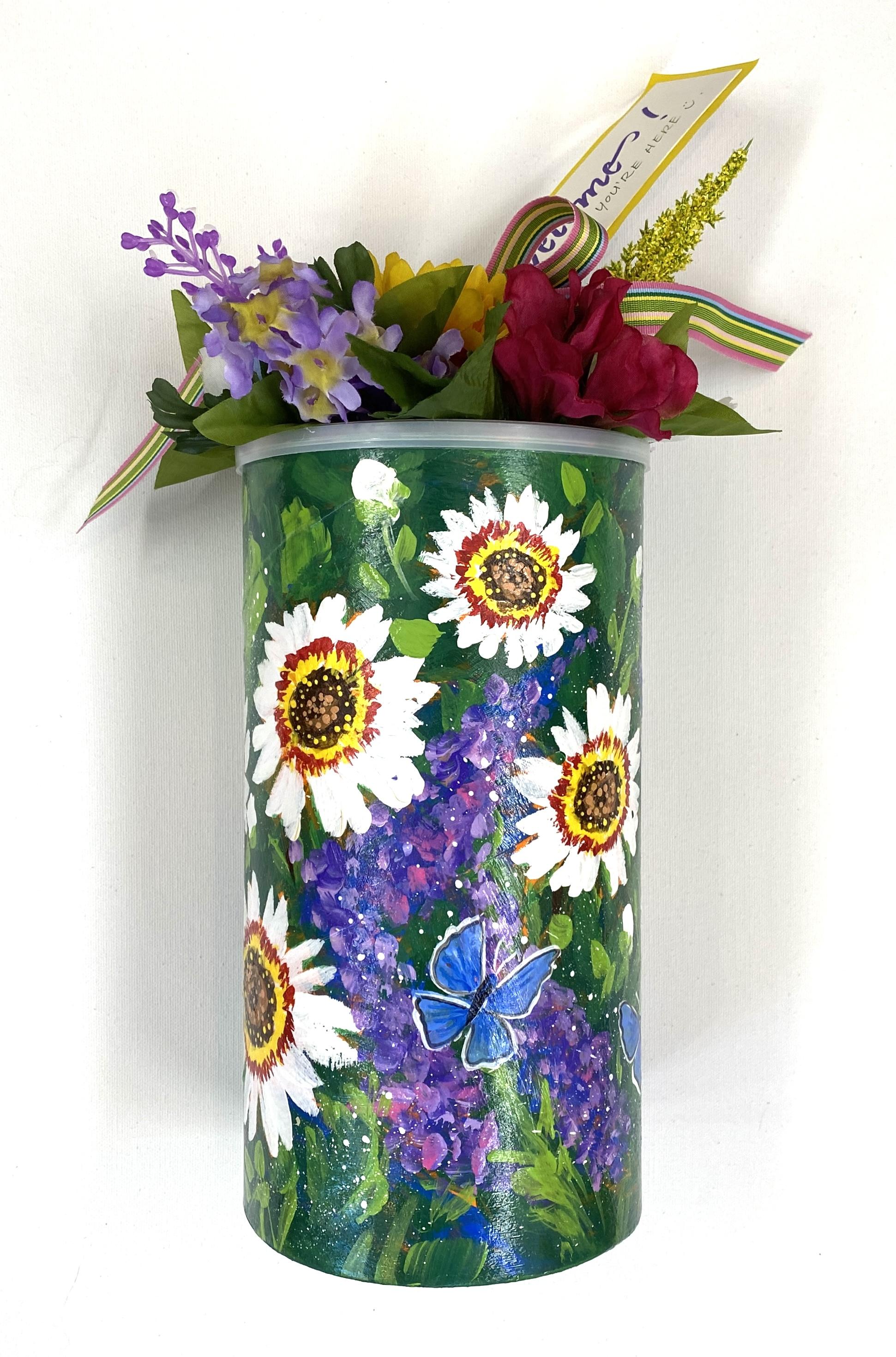
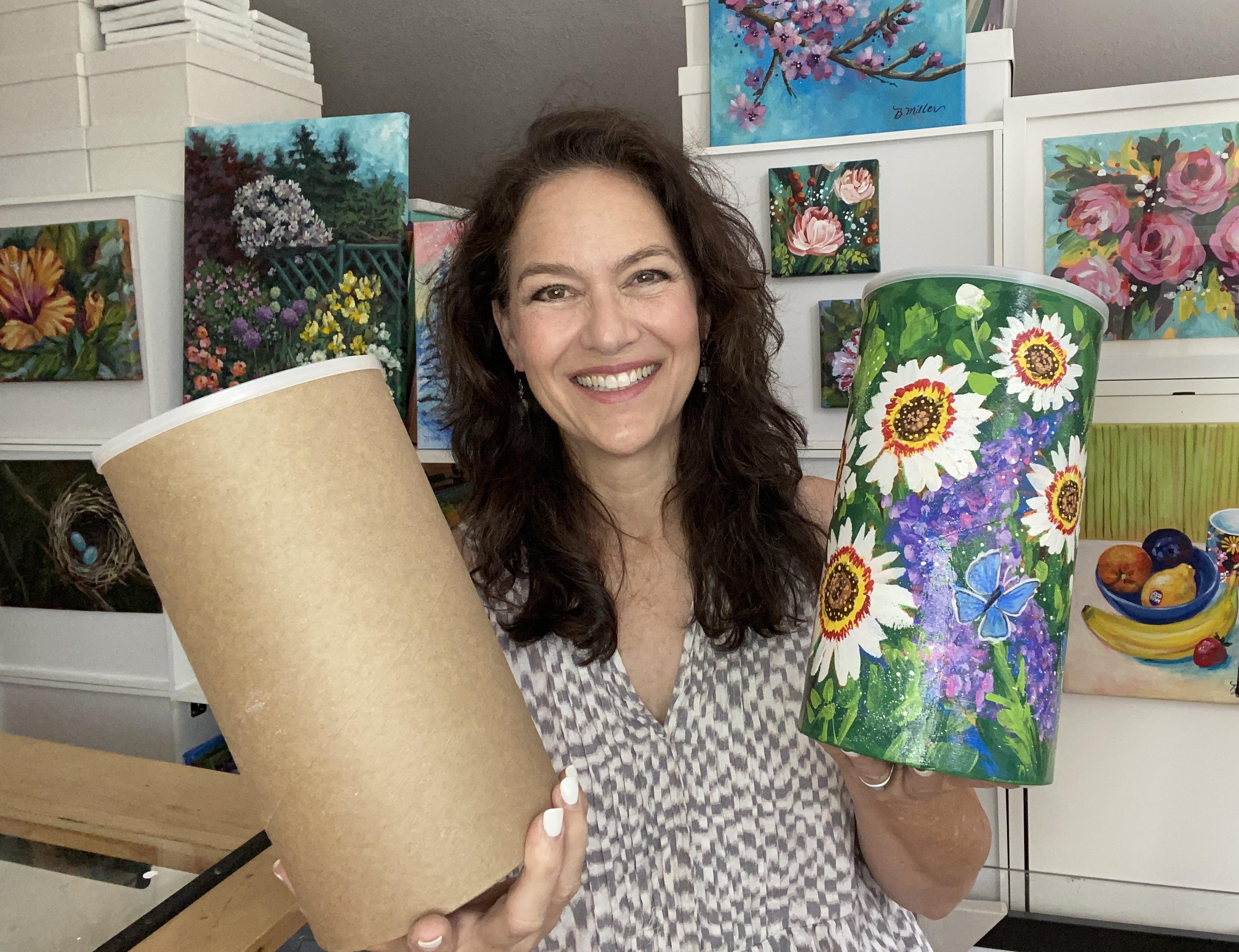
the class project, where we'll turn this
into this. See you there.
2. Class Project Details: For the class project, I'll demonstrate how to paint a cardboard container
using acrylic paint. Using the paint techniques
covered in this class, you'll be able to
upcycle a container into a decorative piece that's both sustainable and
visually delightful. The goal is to
celebrate creativity, eco conscious crafting and personal expression through
a nature inspired design. You'll need to obtain a
reusable cardboard container and gather up some
supplies like paint, rushes, a palette,
water and paper towels. I have created a downloadable materials list for
your convenience, and it's located under
the Projects and Resources tab below this video. I'll take you step
by step to create your project, and
when you're finished, I'll ask you to snap a
photo and upload it to the project gallery for all those taking a
class to see and enjoy. It's there. You'll also
see others projects, and you'll be able
to comment and share ideas with everyone in
the discussion area. Are you ready to turn what some consider trash into treasure? Join me, and I'll guide
you to make this craft, and together we'll save our planet one container at a time. In the next section, I'll go
over the materials you'll need for class in more
detail. See you soon.
3. Materials Needed: To complete the
classroom project, you'll need some materials, many of which you
probably have on hand, especially if you're
a regular crafter. I'll go over all the
materials in this lesson. But if you'd also like a list, I included a downloadable under the Projects and Resources
tab found below this video. First, you'll need a
cardboard canister, box, paper mache container, anything that's cardboard and
we'll take acrylic paint. I recycle my oatmeal
and chip containers. I just can't throw
these useful containers away if they can be repurposed. It's that whole trash to
treasure thing that is so much better for the environment and
the pocketbook, too. If there's a label,
I just peel it off. Sometimes it seems as if the labeling is printed
on the cardboard itself, and in that case,
it won't come off. So I rough up the surface with sandpaper so the primer
will adhere better. For this project, I used
an oatmeal container. But choose any size
you have on hand. They're super fun to
make as sets, too. I especially like
containers with lids. You'll need some gesso to prepare your surface for
the painted designs. Iso is a primer first coat that makes the acrylic paint
adhere to the surface better. You'll also need craft
paint in several colors. Craft paint usually
comes in 32 ounces, eight ounce or two
ounce bottles. For this project, the
two ounce bottles will cover several containers. Specifically,
you'll need orange, green, blue, light green, white, yellow, dark brown, deep or dark red,
purple and bright pink. I usually use the raft Smart brand, but any
brand will work. Some require a couple of
coats to get good coverage. I also use paper plates for a palette and to practice
some techniques at times. So having several on
hand would be ideal. I used five different
size brushes. From large to small, I used a three
quarter inch flat, five eighth inch flat, number eight round,
number one round. And a number two liner brush. I also used a toothbrush for
the spattering technique and a chalk pencil or a sidewalk chalk to
map out the designs. For little dots, I
used a dotting tool, but you could also use the wood end of a paint
brush or a stir straw. Anything that you can dip
and paint and will yield a dot when you've applied it to the surface will work
for that technique. You'll need to rinse
your brushes in water. I usually use two containers. This container has
two compartments where I use one for
rinsing my paint out of the brushes and one
where I keep the water clean in case I need to add
water to thin my paint down. In addition, you'll also need disposable kitchen
towels or rag. After you complete your designs
to protect your artwork, I recommend clear coating with a water based varnish like
this one by liquid techs. This is a gloss finish. They also make a map
finish if you prefer. I also use a hair dryer
to speed the drying time. If you'd like to
decorate the lid with some faux flowers, you'll
need some flowers, a suitable wire cutting tool, and some glue that will adhere
to plastic like E 6,000. Lastly, I also added
a tag and ribbon. So if you'd like to do the same, you'll need some
decorative paper, ribbon, and a marking pen. Once you've collected
everything you need, meet me in the next
lesson to start the class project. See you soon.
4. Prime, Underpaint & Sketch: The first step in making over this container is to prepare
the surface with gesso. This will accomplish two things. This will make the
cardboard less absorbent and provide
a barrier to prevent glues and other substances
within the cardboard or leftover from the label from seeping through the surface
of your paint over time. It will also smooth
out rough areas, giving you a more uniform
surface to paint upon. I usually apply two coats, allowing a few hours
in between the coats. If you like a smoother finish, you can even sand
between coats as well. In between coats, you can use a hair dryer to speed
the drying time. I usually save a bunch of containers and then prepare
them all at once with gesso, then store them for when I'm
ready to paint the designs. Once they're coated twice
and completely dry, I underpaint them with a solid acrylic color, usually orange. I like underpainting
because if I miss a spot while painting
the foliage and flowers, the color of the underpainting
will peek through, and the orange looks better
than the white gesso. I usually use orange because the garden designs have
a lot of green in them. And orange is a great way
to offset the cool green. Sometimes they paint over a
lot of the underpainting, and sometimes I let more
of it peek through. This is just a style thing. Of course, you don't
need to underpaint. But if you like this look, try different colours
and you never know. It might become part of
your painting process and become a kind of signature
to you as an artist. After I finish one
or two coats of the desired underpainting
color, I dry thoroughly. Then I can map out the
design loosely with chalk. In this step, I sketch
where I would like to place my main flowers or the
largest ones in your design. Don't want them to
line up perfectly. I like them to look random, just like when they're growing
in a real garden setting. I probably sounds odd
to plan to be random, but to paint realistically,
it takes a plan. Sort of like a florist
arranging a bouquet. This sketch is very loose. I don't need a lot of detail, just the general
idea of where I want them and the basic
shape of the flower. If you need help with sketching, there's lots of sketching
classes here on Skillshare. Once you're finished
with these three steps, we'll then begin the
background foliage. See you in the next lesson.
5. Background Foliage: For the background,
you'll need green, light green, and blue or any colors that you
like for greenery. Using the three quarter
inch flat brush, paint around the flowers
that you sketched earlier with green and blue like
I'm demonstrating here. Leave as much of the orange underpainting show through
as you would like. Ah. After all the areas around the flowers
are covered loosely, then pick up a little of the lighter green
and use this more sparingly to add more
defined but still loose, leafy shapes over the top of some of your green
and blue areas. Y In my beginning acrylic series, I have a class called florals
with a Painterly approach, and in Lesson nine
of that class, there's an exercise where I demonstrate many
types of greenery. If you feel like you want more practice or
options for greenery, you may find that section very
helpful for this project. I use the edge of my large
brush for tapered leaves and long grasses and the broadside
for the larger areas. No. Remember that leaving a little of the underpainting
color can add to the expressive and loose
nature of this flowery design. So be free and try not to feel like you must cover
everything everywhere. Please note it will look
messy at this stage. But as you continue
to define and layer, the design will reveal
itself beautifully. Once you have all the background covered with your
greenery strokes, dry it thoroughly and meet me in the next lesson to
start the main flowers.
6. Main Flowers: For these fun daisy like
flowers, you'll need white, yellow, deep red, and dark brown or burnt umber
on your palate. I'll be demonstrating with a
five eighth inch flat brush. Starting with white, I
use the brush edge and pull from the outside edge of the flower to the
middle of the flower, two strokes per petal. This will give me
the scalloped edge that you see on the
very tip of each petal. I adjust my hand to
get the angle of the petal always pulling in
at a slight diagonal. So the petal tapers
into the center area. Adding a small.in the
center of your flower may help guide you to pull toward the center each time
you add a stroke. Shortening the strokes
on one side will make the flower appear as if it's turned more rather than
a straight on view. Before I paint more flowers, I dry the paint
thoroughly to prevent smearing as I turn the canister. I add a few large white
dot like strokes with the corner of the brush to
indicate the flower buds. If you prefer, you could also use the number eight
round brush for the buds. After I'm done with the
white flower parts, I dry it thoroughly. Then with the
number eight round, I paint in the middle
of the flowers, referring to my photo for
accuracy in size and shape. I leave the edges uneven. For the color in the
middle of the flour, I make a mix of
yellow, dark brown, and a little of the dark red to make a lighter
brownish color, and I add it to each of the dark brown centers
I just paint it in. If it's not dry completely, it may mix as you're
adding it over the dark brown,
changing the color. If you don't like this, just dry your dark brown before adding
the lighter middle color. Next, I rinse out my
brush and then go into yellow for the ring
around the dark brown middle. I use the very tip to dab small tapered
strokes all around. For the flower
that's a side view, I only go about
halfway around as those petals would obscure
the view of the yellow. Then I rinse out my
brush again and do the same technique for the red ring around
the yellow area. Next, I'll mix that
lighter brown color again. And with the wood end
of the brush this time, I'll tap into the paint
and dot around the very middle to mimic the
look of the real flower. You could also use a
fancy dot maker tool. They come in sets of several different sizes like this one. After this step, I'll add some yellow dots in the
darkest brown area, and that will complete
the main flower. Remember to clean your
tools when you're finished and dry your
project thoroughly. Next lesson, I'll demonstrate
the purple flowers.
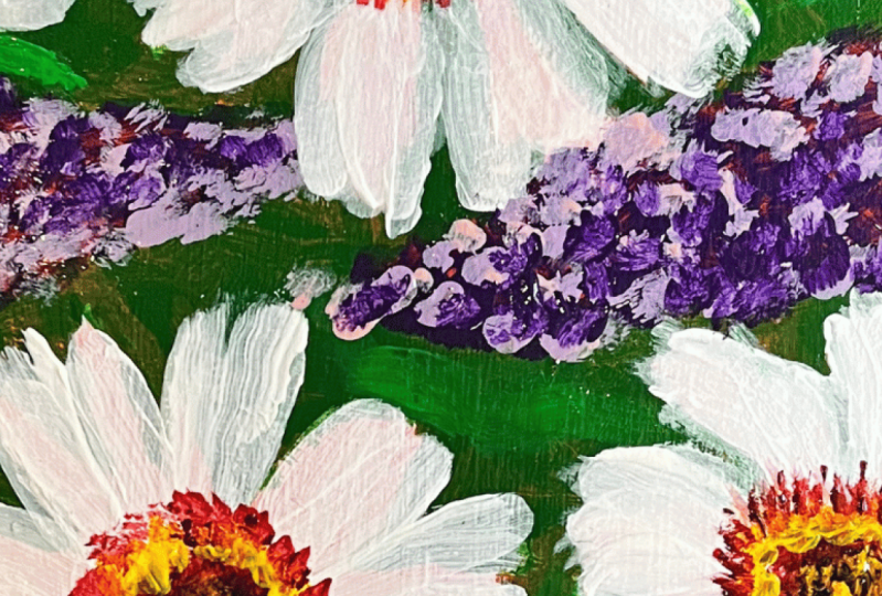
7. Purple Flowers: In this step, for these flowers, you'll need purple
and bright pink, and I added a little
blue and white, too. I'll be demonstrating with
the 58 inch flat brush, but you could also use
the number eight round. To keep it loose and expressive, I try to use the largest brush I can and still get the shape
of a flower I desire. Do what looks and feels good to you and you
won't be wrong. The basic shape of the flower is long and slightly
tapered at the top. Is just one type of flower that butterflies
are attracted to. If you're painting a lilac
or a butterfly bush, the blossoms might be fuller
and shorter than these. So here again, do what you like. It's hard to get it wrong when
there's so many varieties. And remember, you're the artist, and you can do
whatever you want. I'm not needing for these
to take center stage. They're more for just
filling the background with a little color and interest
as a supporting role. So I'm not adding
a lot of detail. With the corner of the brush, I add purple and pink and
tap onto my canister, where I mapped out the flowers. Oh I establish the main shape first. Then I dab a little
darker blue or purple to the left side to
further define the shape. Then I add a lighter
value to the right side, either pink mixed
with white to make a light pink or just
use the bright pink. I'm still dabbing with the
corner of the brush to define where the individual flowers
would be on these blooms. After I've got those in, I
add a little more foliage in the spots that may need more defining with
highlights and details. For grasses, I just dip into light green and using the
edge of my brush lightly, bring it across over the
surface to make thin lines. When you lift at the
end of the stroke, the line will taper
like grasses. After adding more foliage, I add a few more buds in white with the number
eight round brush. Then I add bright green
stems and leaves to those by tapping and pulling up quickly to make
shorter leaf strokes. Lastly, I like to spatter a little white to give it
a more organic look. For this technique, I use a toothbrush with a little paint that's been thinned
a little with water. Then I dip my toothbrush in, but before I add
it to my project, I make sure to have a moistened
rag or paper towel at the ready to erase any spray that gets in areas
that I want to avoid. For a fine spray, dip into the thin paint and
pull the bristles towards you while aiming at your
project. Then let go. I like the fine spray of paint that the toothbrush
technique provides, but I also like bigger dots. So I just add a few with the
dotting tool I used earlier. Or a toothpick also works
well to add tiny dots. Alright, these flowers
are now complete. Dry it thoroughly,
and we'll move on to the butterflies. See
you in the next lesson.
8. Butterflies: For the butterflies,
I first sketch the shape onto the project
with a chalk pencil free hand. If you're not comfortable
with sketching, you can make a copy of the
butterflies and trace them, then transfer them
using carbon paper. All the reference photos used in this class are
available for you to download and can be found under the Projects and Resources
tab below this video. I give a detailed demonstration of the transfer
method that I use in my Peacock butterfly class from my acrylic painting series. If you'd like to view that, it's in Lesson seven of that class. I like using a chalk pencil for my sketching because the craft
paint will fully cover it. And if there's any that's not covered after your
design is dry, you can wipe the chalk off
with a moist cloth easily. M oh. After the butterflies
are sketched or traced where you want them, use the number eight
round brush and some blue paint mixed with
white to paint in the wings, pulling your strokes
from the edge of the wing to taper
into the body area. Acrylic paint is opaque, so it's great to be
able to go right over the designs with
these butterflies. It takes about three
tapered strokes per wing. After you've finished with
all the wings, dip into blue. Then with the very tip of
the brush, add the body. I start the stroke at the head, pull the stroke down and
up to taper at the tail. To give the butterfly
more dimension, add some smaller tapered
strokes emanating from the body to the mid
area of the wings with blue. Next, using the number
two liner brush, thin a little white paint and add a line around the wings. I brace my hand on the edge of the canister to keep
from wobbling my stroke. I also purposely scallop
the outer edge of the wing slightly by wiggling the
stroke as I outline. If you have thin line
acrylic paint pens, you could also do
this step with those. I like the sharpie brand, water based acrylic markers. A adding a line on the right side of
the butterfly's body will highlight that as well. After this, I use
black or dark brown using the liner brush to add
further detail to the wings. You could also do this with
a permanent black marker, if that works a little
better for you. Again, I thin the paint
with a little water to help the paint glide off
the liner brush more easily. This will give me
a very thin line. Then I place the stroke just
inside the white outlines. Refer to your reference
photos for placement. Painting thin lines
takes a lot of practice, and you may not get what you
want on the first stroke. Make sure you have a
moist cloth at the ready so you can remove
any unwanted marks. Then make certain
the surface isn't too wet and give it another go. For the feelers, I use thinned white with the
line of brush, too. I tap where the
feeler will end and pull the stroke towards
the head as I lift. This will give me a
thin tapered stroke. Here again, remember to have a moist paper towel handy
for redos if needed. Now that the butterflies
are complete, your project has
only one last step. Make sure to dry
it completely and meet me in the next lesson
for the finishing touch. Ah.
9. Clear Coat: For protecting your artwork
from dirt, scratches, and fading and also to
enhance the colors, I recommend using a varnish. They have many to choose from at art supply stores and online. Look for features
like water based, non yellowing, and water
resistant when dry. They also make clear coats to prevent fading from
ultra violet light. For indoor projects, I use liquitex professional
gloss medium and varnish. To apply, I use
my largest brush, and I paint slowly
to prevent bubbles. I also do not overbrush because this can
result in fogging. If it's hot where you are,
like over 75 degrees, it may dry faster
than you can paint and or the surface
may be too warm, and this can make the product turn cloudy and opaque as well. Other than those cautions, it's easy to apply, and I think it adds a beautiful
finish to your artwork. I like to add two or three
coats to my projects, allowing about four to 6 hours to dry or cure in
between the coats. Per an even more finished look, you may want to paint
the underside, as well. I'm gonna paint the
underside green to match the colors I used
in the foliage earlier. I'll paint two coats drying thoroughly in between
each application. Then dry it thoroughly. Now your project is complete. You're ready at this
time to submit it to the Projects gallery for
A D Enjoy. It's there. You'll also be
able to see others projects for ideas
and inspiration. Meet me in the next section, and I'll go over how to upload a photo of your project
here on Skillshare.
10. Uploading Class Project: Now that you're finished
with your project, you could submit
it to the project gallery here on Skillshare. To do this, once you
snap a photo of it, click on the Project and
Resources tab below this video. And to the right, you'll see a blue
submit Project button. Once you open that
page, you'll see another button that
says Upload Image. That will go to your
photos where you can select one for your cover image. Then you can give
your project a title, describe your process and
the description area, and add any other
information and photos that you'd like to share with those
taking the class. After you're finished
at the top right, click on publish, and that will load your
project onto Skillshare. This is a great way to
get feedback from me and others and also catalog all your progress
here on Skillshare. For me, it's the best part. I love to see the projects, and I love to see the
progress my students are making as they learn
the skill of fainting. I can't wait to meet you there, see your project, and hear about your experience
taking this class. If you'd like to leave a
review, you're very welcome. Just go to the Reviews
tab below this video. If you can spare a
minute or two on that, it's very helpful to
me as an instructor. Also, let me know if there's anything you'd be
interested in me teaching. I consider all
suggestions I receive. Next up, to conclude, I'll share some more ideas for these containers in the wrap up. Thanks for taking the class.
11. Wrap-Up: To wrap up, I'd like
to show you how I decorated the lid and how
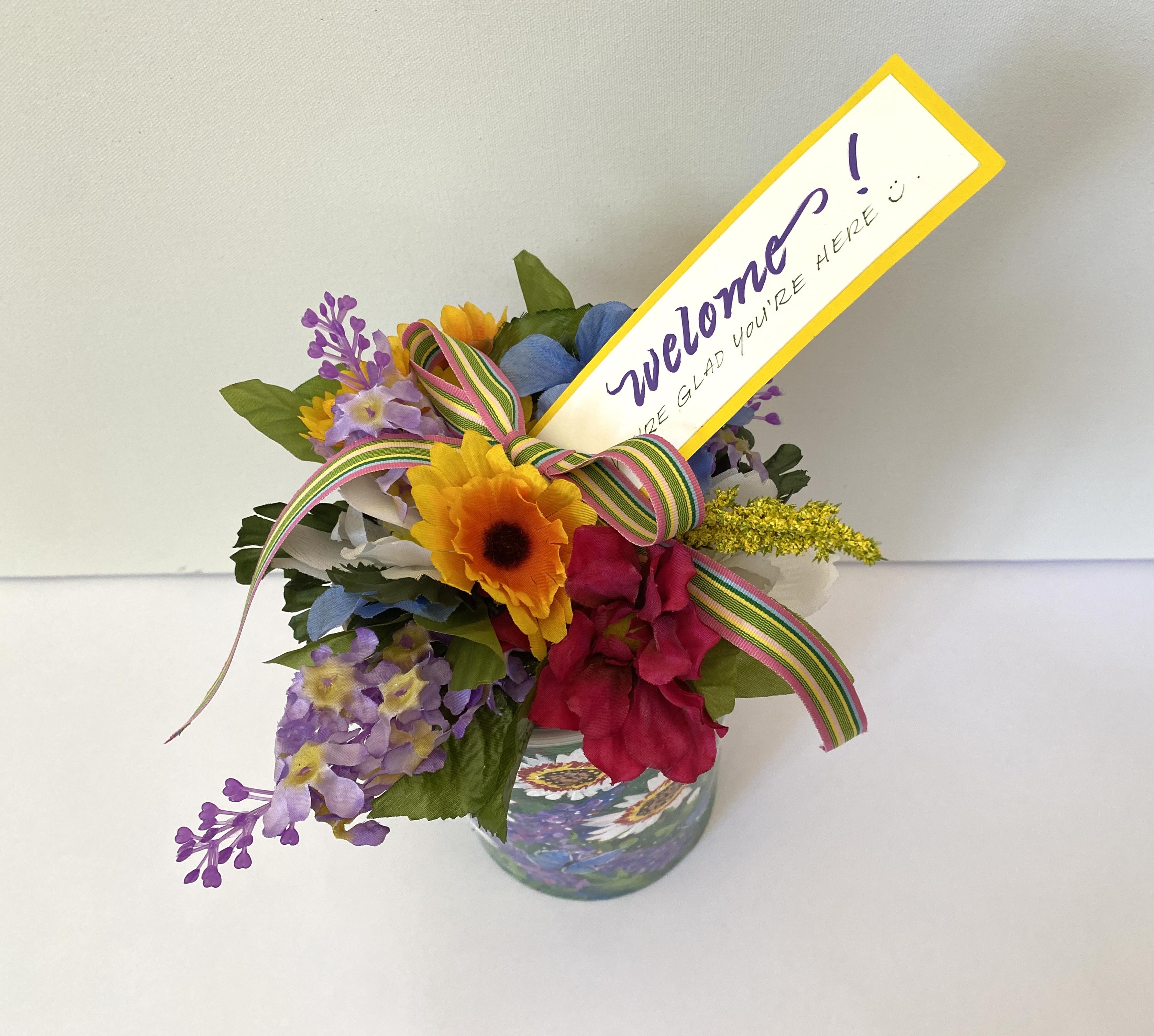
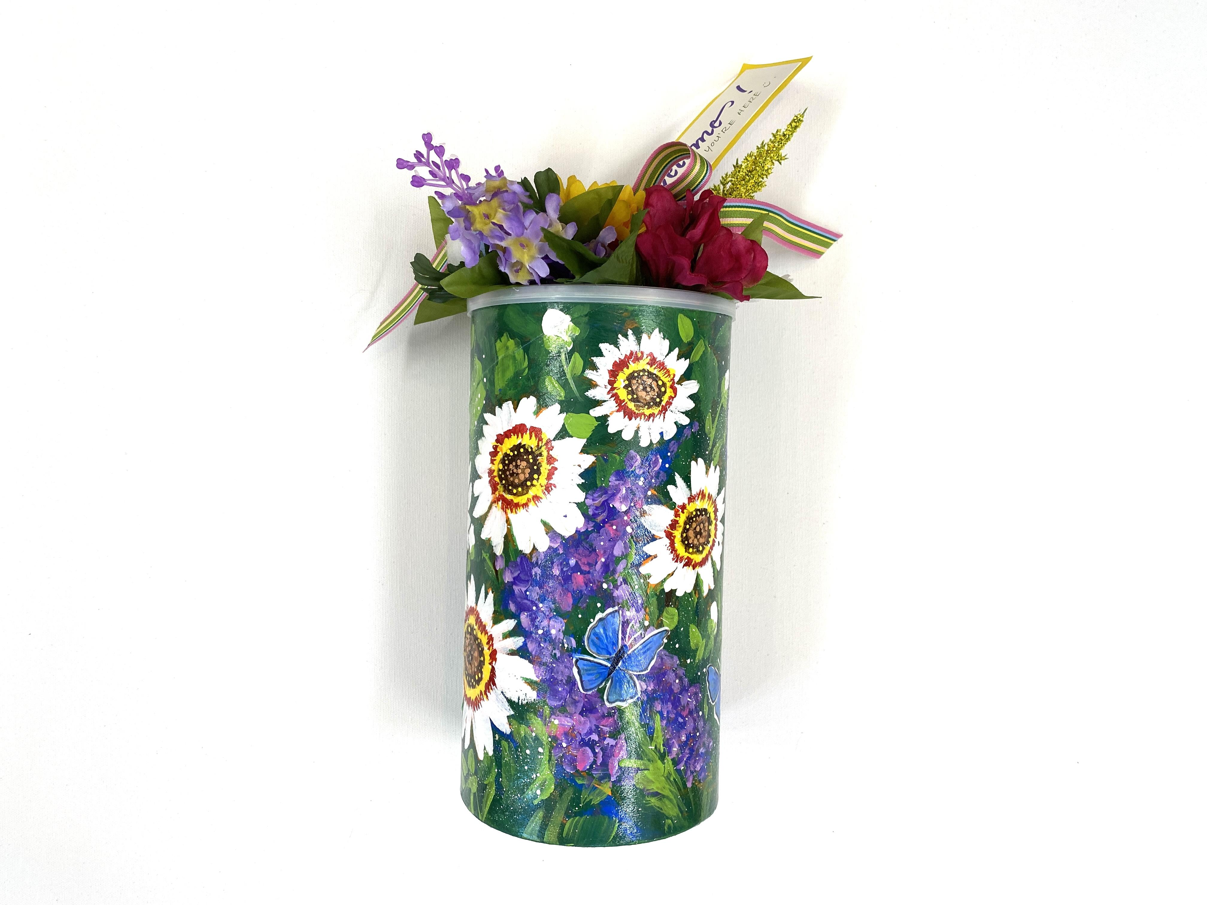
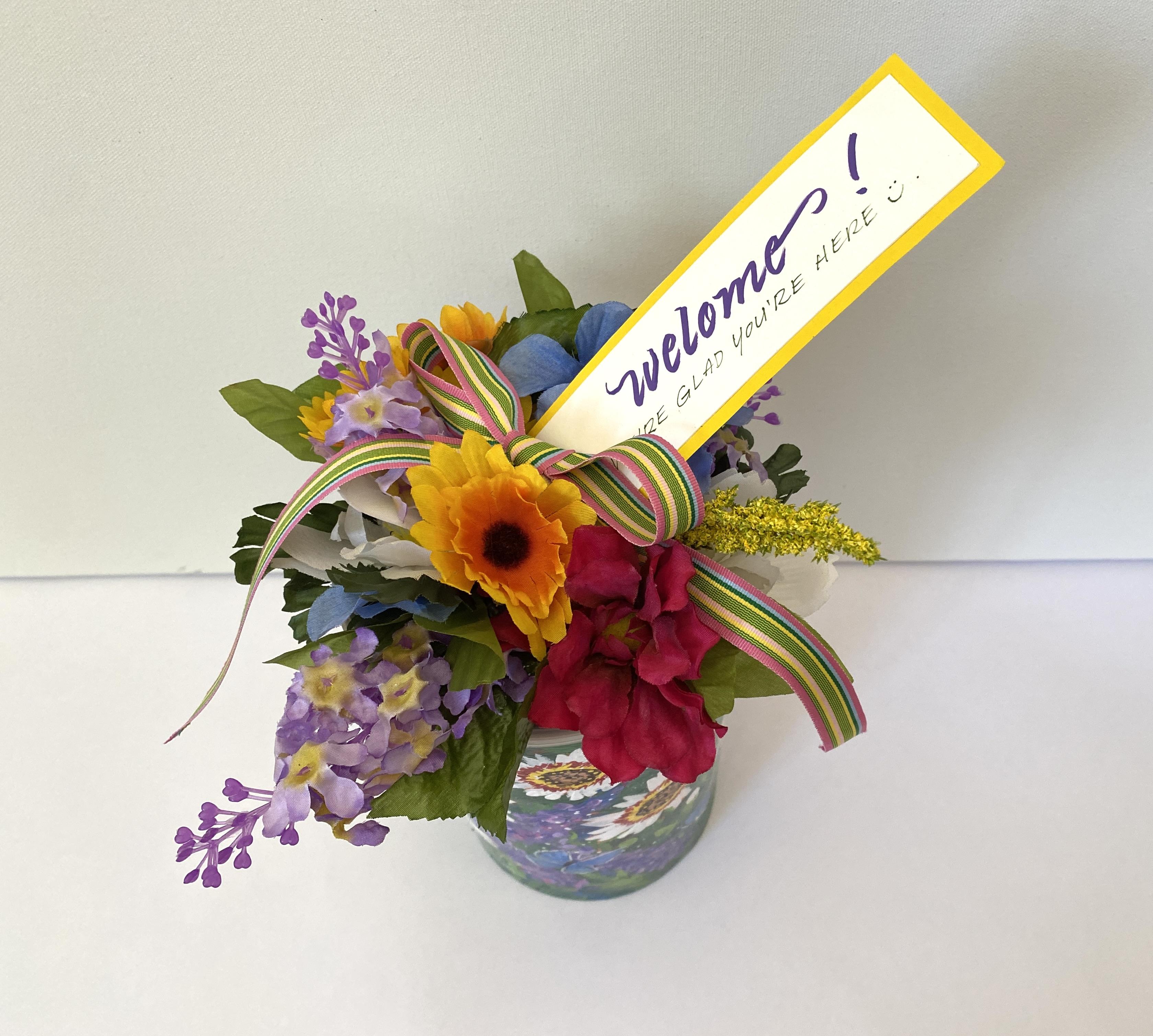
I plan to use my canister. I also have a couple other ideas for other flower canisters. For this one, I wanted to
continue the garden theme, so I glued a small array of flowers and added a
ribbon and a tag. I used E 6,000 to adhere the
flowers to the plastic lid, and I used a glue gun to adhere
the ribbon in the label. I then filled it with
gardening goodies, and I planned to give
it to my new neighbor to welcome him into
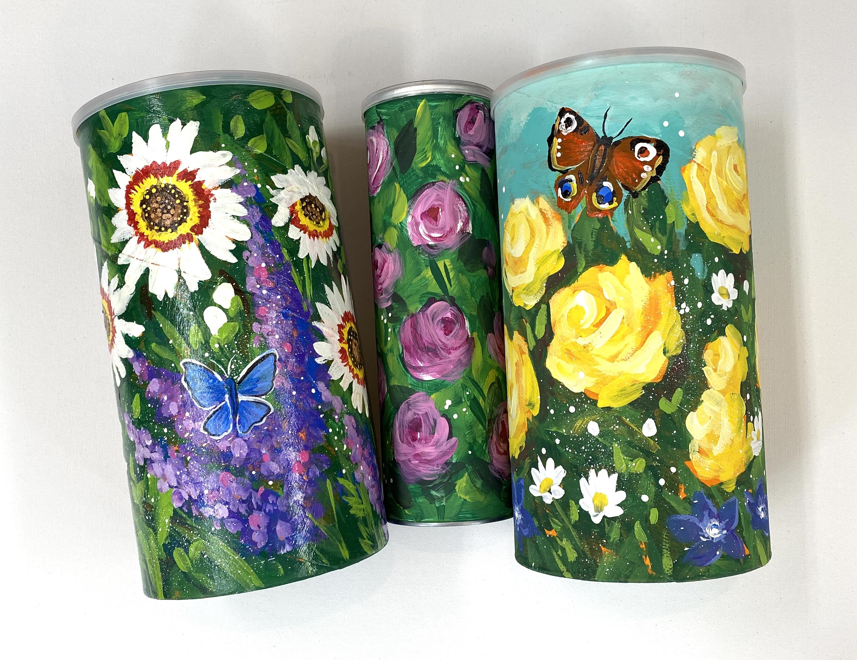
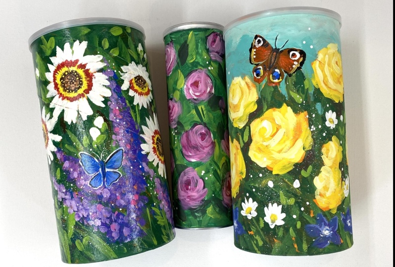
the neighborhood. For another idea, here's a rose garden version painted
on a potato chip canister. If you like this one,
you can check out how to paint this design in my
class beginning acrylics, florals with a
painterly approach. For the lid, I added a
rose sticker by snapping a photo of one of
my painted roses and uploading it into
my document software. Then printing it on a sticker paper and cutting it out with a three
inch circle cutter. It's the perfect
size to adhere to this plastic lid for an
added decorative touch. It would also look
great with a rose bow. Imagine this as a gift
box for handmade, individually wrapped rose shaped soaps or chocolates
for your sweetheart, or shortbread cookies
for a thoughtful gift. For this design, I painted a yellow rose garden on a oatmeal container and
just added a simple bow. I filled it with candies
and a gift certificate, and I'm gonna give it to
my niece for her birthday. I hope this inspires you
to think about how you can turn trash into treasure
with the skill of painting. It's a great way to spread
joy and save the planet, one container at a time. Feel free to show me and
others taking the class. Any other containers you've upcycled from taking this class. It's fun to see all
the ideas and get inspiration in the student
gallery. Well, that's a wrap. Thanks so much for
taking the class, and as always,
happy painting. Oh.
 Brigitte Miller, Artist | Creatively B