Transcripts
1. Welcome To The Class!: Hello, everyone. My
name is Will Elliston, and today we're painting a
coastal boat scene watercolor. What makes the subject so appealing is its
sense of openness, the soft coastal light, broad areas of wet sand, gentle reflections, and a sturdy blue boat
acting as the focal point. This class is less
about rendering every detail and more about understanding what really
makes a scene work, shape relationships,
value contrast, selective edges, and where
to leave things unresolved. The reflections, the
boats in the distance, the tiny birds, all of them support the mood without
demanding too much attention. I've been a professional
artist for many years, exploring lots of different
subjects from wildlife and portraits to cityscapes
and countryside scenes. I've always been entranced by the possibilities
of watercolor. But when I started,
I had no idea where to begin or
how to improve. I didn't know what
supplies I needed, how to create the
effects I wanted, or which colors to mix. Now I've taken part in many
worldwide exhibitions, been featured in magazines, and been lucky enough
to win awards from well respected
organizations such as the International
watercolor Society, the Masters of
watercolor Alliance, Windsor and Newton, and the SAA. Watercolor can be overwhelming
for those starting out, which is why my goal is
to help you feel relaxed and enjoy this medium in
a step by step manner. Today, I'll be guiding you
through a complete painting, demonstrating a variety
of techniques and explaining how I use all
my supplies and materials. Whether you're just starting out or already have some experience, you'll be able to
follow along at your own pace and improve
your watercolor skills. If this class is too challenging
or too easy for you, I have a variety of classes available at different
skill levels. I like to start off with a free expressive
approach with no fear of making mistakes as we create exciting textures
for the underlayer. As the painting progresses, we'll add more details to bring it to life and
make it stand out. I strive to simplify
complex subjects into easier shapes that
encourage playfulness. Throughout this class, I'll be sharing plenty of
tips and tricks. I'll show you how to turn
mistakes into opportunities, taking the stress out of
painting in order to have fun. I'll also provide you with
my watercolor mixing charts, which are an invaluable tool when it comes to choosing
and mixing colors. If you have any questions, you can post them in the
discussion thread down below. I'll be sure to read and
respond to everything you post. Don't forget to follow
me on Skillshare by clicking the Follow
button at the top. This means you'll be the
first to know when I launch a new class
or post giveaways. You can also follow me on Instagram at Will Elliston
to see my latest works. So let's get started and bring this peaceful shoreline
to life on paper.
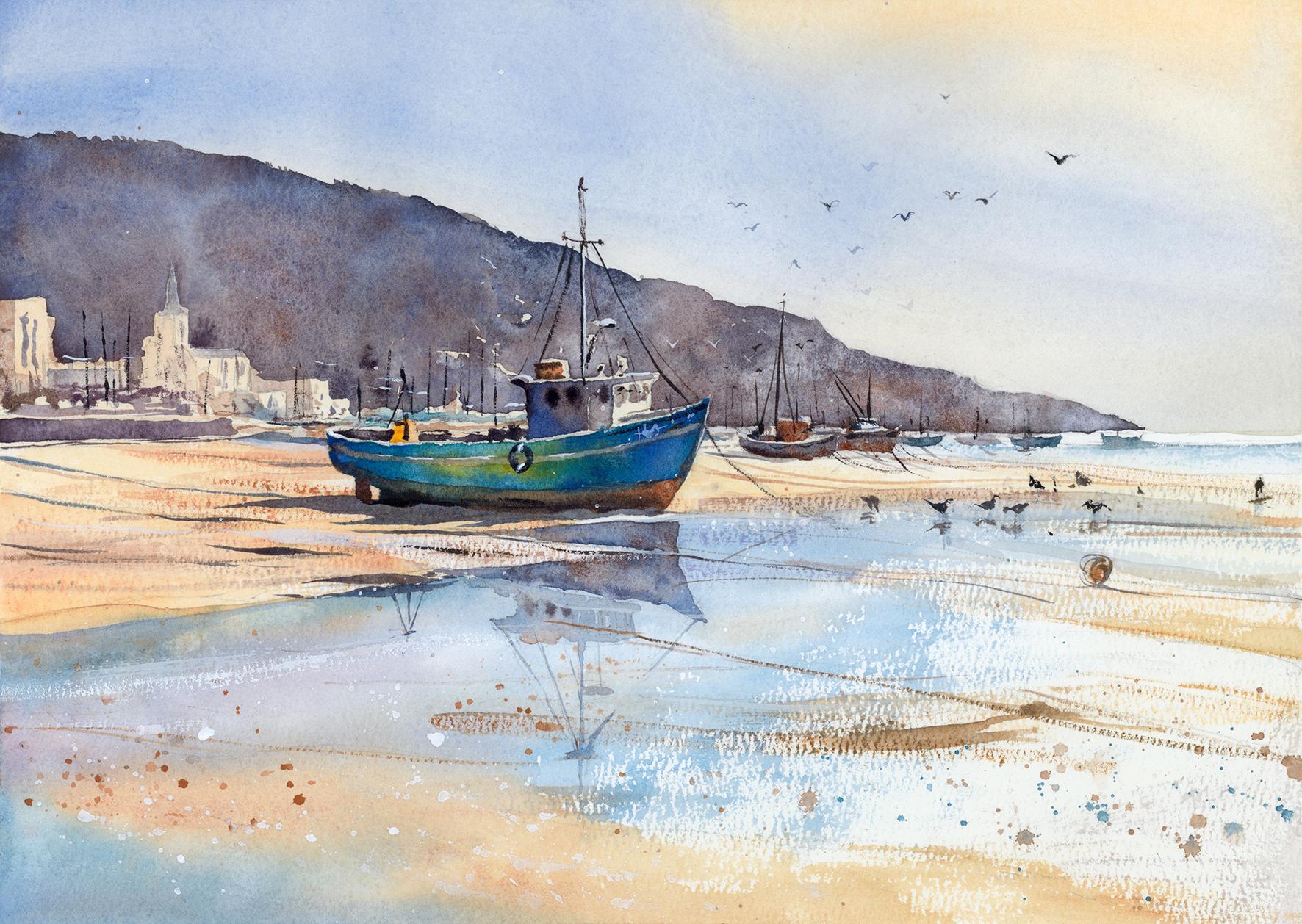
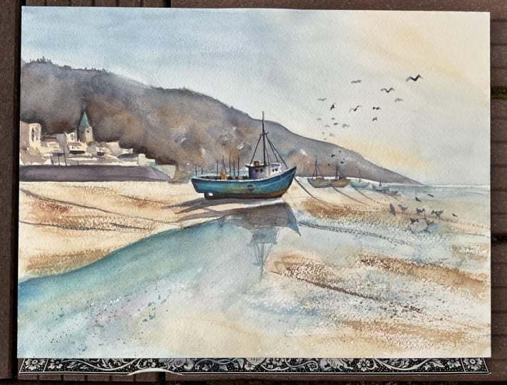
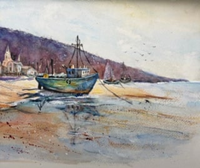
2. Your Project: Thank you so much for
joining this class today. This project is a
great opportunity to explore how a painting can feel full and complete without being crowded
or overworked. The foreground reflection
gives us space, and the distant land and building creates context
without stealing the spotlight. The beauty here lies
in the editing. We're not trying to
paint every rope, plank, ripple, or bird with
equal importance. Instead, we're choosing what to emphasize and what
to let dissolve. The result is a painting
that feels breezy, balanced, and full
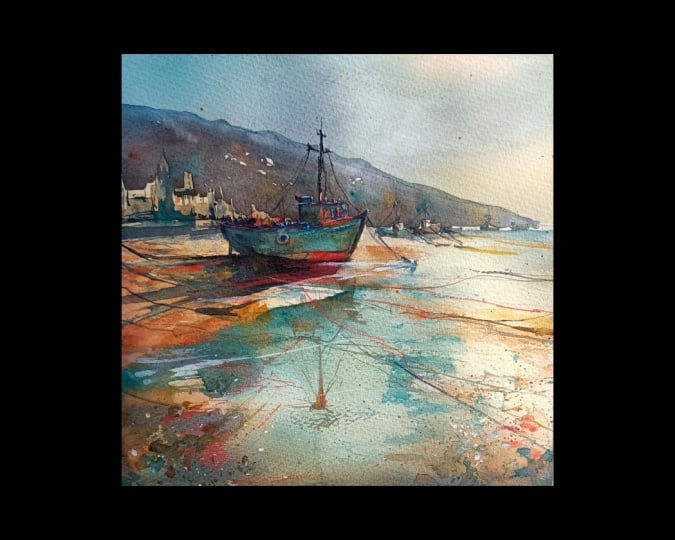
of quiet confidence. In the resource section, I've added a high
resolution image of my finished painting
to help guide you. You're welcome to
follow my painting exactly or experiment with
your own composition. As we're going to be focusing on the painting
aspect of watercolor, I've provided templates
you can use to help transfer or trace the
sketch before you paint. It's fine to trace when using it as a guide for
learning how to paint. It's important to
have the underdrawing correct so that you can relax and have fun learning the
watercolor medium itself. Whichever direction
you take this class, it would be great
to see your results and the paintings you
create through it. I love giving my
students feedback, so please take a photo
afterwards and share it in the student project gallery under the project
and resource tab. I'm always intrigued to
see how many students have different approaches and how they progress with each class. I'd love to hear
about your process and what you learned
along the way, or if you had any difficulties. I strongly recommend
that you take a look at each other's work in the
student project gallery. It's so inspiring to see
each other's work and extremely comforting to get the support of your
fellow students. So don't forget to like and
comment on each other's work.
3. Materials & Supplies: Before we draw this scene out, let's go over all the materials and supplies you'll
need to paint along. Having the right materials can greatly impact the
outcome of your artwork. So I'll go over all the supplies I use for
this class and beyond. They're very useful to have at your disposal and we'll make it easier for you
to follow along. Let's start with the
paints themselves. And like most of the materials
we'll be using today, it's a lot to do
with preference. I have 12 stable colors in my palette that I
fill up from tubes. They are cadmium
yellow, yellow ochre, burnt sienna, cadmium
red, Alizarin crimson, Opramarne blue, cobalt blue,
serlean blue, lavender, purple, ridian, black, and
at the end of the painting, I often use white gouache
for tiny highlights. I don't use any
particular brand. These colors you can
get from any brand, although I personally
use Daniel Smith, Windsor and Newton,
or Holbein paints. So let's move on to brushes. The brush I use the most is
a synthetic round brush like this Escoda Purl brush
or this Van Gogh brush. They're very versatile because
not only can you use them for detailed work
with their fine tip, but as they can hold
a lot of water, they are good for
washers as well. They're also quite affordable, so I have quite a few
in different sizes. Next are the mop brushes. Mop brushes are good for
broad brush strokes, filling in large areas and creating smooth
transitions or washes. They also have a nice tip that can be used for smaller details. But for really small details, highlights or anything
that needs more precision, I use a synthetic
size zero brush. All brands have them,
and they're super cheap. Another useful brush to have is a Chinese calligraphy brush. They tend to have long bristles
and a very pointy tip. They're perfect
for adding texture or creating dynamic
lines in your paintings. You can even fan them
out like this to achieve fur or feather
textures as well. And that's it for
brushes. Onto paper. The better quality
of your paper, the easier it will be to paint. Cheap paper crinkles easily
and is very unforgiving, not allowing you to
rework mistakes. It's harder to create
appealing effects and apply useful techniques
like rubbing away pigment. Good quality paper, however, such as cotton based paper, not only allows you to rework
mistakes multiple times, but because the pigment
reacts much better on it, the chances of
mistakes are a lot lower and you'll be more likely to create
better paintings. I use Arches paper because that's what's available
in my local art shop. A water spray is
absolutely essential. By using this, it
gives you more time to paint the areas you
want before it dries. It also allows you to
reactivate the paint if you want to add a smooth
line or remove some paint. I also have an old rag or t shirt which I use
to clean my brush. Cleaning off the paint
before dipping it in the water will make the
water last a lot longer. It's always useful to
have a tissue at hand whilst painting to
lift off excess paint. Also, you never know when an unwanted splash or drip might occur that needs
wiping away quickly. I also have a water dropper
to keep the paints wet. When you paint, it's
important to have them a similar consistency to what
they're like in the tubes. This way, it's easier to
pick up sufficient pigment. A hair dryer is useful
to have for speeding up the drying time and controlling the
dampness of the paper. And lastly, masking tape. And this, of course, is just to hold the paper down still onto the surface to stop it sliding
around whilst painting. Also, if you plan on
painting to the edge, we'll allow you to create a
very crisp, clean border. And that's everything
you'll need to follow along
in today's class. As always, I encourage
you to explore whatever you want that will help you express
your own vision. Now, let's get on it and
draw this scene out.
4. Preparing The Composition: The good thing about
drawing a scene like this is that it doesn't have
to be absolutely perfect. It's not like a portrait
or animal where the slight misproportions
make obvious differences. No, with this, we can
rearrange things. We can get a few of
the shapes different, and it will still make sense. So I'm starting off, as I always do with a very soft lead pencil, just mapping out
the general shape of things, the arrangement. And I'm using the
pencil so lightly that I can easily rub out back
to pure white paper again. I go over the lines
multiple times. So I just get a kind of sense of the spacing
and the arrangement. Now I switch to a finer
pencil like I have done now and I'm going back
over this composition, we have more clear
lines that I can use as a guide for
my watercolor. Now, the good thing about
sketching out a painting like this way is that when
we arrange the piece, we can use multiple
different references. So this scene doesn't
actually exist in reality. I'm looking at the basic hills
and the town on the left. But there was no
boat in the scene. So I found the boat
in a different photo, and I can just mimic little
boats in the background too, add some birds in the sky, and then the shoreline is just
a kind of abstract shapes. It's an arrangement of shapes, a way to exploit watercolor
in an interesting way. So that's how we can build up a composition the way we want to using our
artistic license.
5. Painting The Sky: Now, the first
thing we want to do is pre wet the paper
because we're going to start off painting the sky and the distant mountains
and a lot of that area, we don't need to
preserve the white. I'm painting all the way
down to the horizon line, the shoreline or the
bottom of the mountains, getting the paper
fully saturated. I'm making sure I'm not
painting any of the sea actually going right until
the horizon of the sea. I'm using a mix of cerrillan
blue and cobalt blue, but I'm also tapping a little
bit of black in there or neutral tint just because I don't want it to be so vibrant. You can make it vibrant,
you're welcome too. I just find that adding a
little bit of muted tones in the sky will really
make the warmth stand out in the sand and
also make the boat pop. If we painted the
sky very bright, then the boat won't pop. We need to mute some
tones to do that. That's why I've chosen
not a very vibrant blue. But before we even use the
blue, although we've mixed it, I'm just using pure yellow
ochre onto this wet wash. And just applying it as a
kind of underlayer, a base. This is going over the boat,
the distant buildings. I'm not covering the whole sky. You can just see
I've only touched the top section of the sky. And you can roughly see where I've stopped at the
bottom of the boat, and it curves along
the left to the right. We're doing, of course,
wet and wet painting now that allows us a bit of freedom and to create those
atmospheric brush marks. It's not a very
strong mix at all. It's quite pale. And now we can start incorporating
the blue.
6. Deepening The Sky: So very, very gently bit by bit. We don't need to rush when
it's wet and wet like this, incorporating a bit more of this muted blue,
the grayish blue. But you can see the pencil
line for the mountain. I'm not exactly painting
over the mountain. I'm kind of using my soft brush marks to avoid painting directly
over the mountain, but it doesn't really matter because we're going
to be painting over that mountain with a
darker pigment anyway. I'm using the tip of the brush to make sure I'm going all the way to the edge of that horizon
on the sea on the right. I don't want to go over
that because that's how we will create that feeling of light reflecting
on the distant water. So I want the white of the paper preserved there on
the right hand side. Now I'm going back with
that yellow ochre, but I've included some
burnt sienna in there, too to give it a bit more warm because having these warm colors contrasting with
the cool colors in the sky creates this
kind of contrast, this interest. It's very subtle. I'm not keeping it
complex. It's wet on wet. And these brush marks
will smooth it out, and they certainly won't
steal the interest. The sky is not something unless you're purposely wanting
that to be the focus, I'm not forcing the
sky to be interesting. I want it to be, of course, pleasant to look at, but I don't want to steal the attention. So we've got just a
mix of two colors. We've got warm and
cool colors in the sky and soft gradients is what we're aiming for.
Nothing too harsh. You can see that my paper is starting to curl
because it's so wet and that most probably will happen to you unless you're
using very thick paper. But it shouldn't be
a problem, really. Shouldn't see how I deal
with it in a minute. I don't agitate
it straight away. I'll wait until the
paper's a bit more dry, and then I kind of
take that pool of water that's in the
valleys of the paper and disperse them to even out again. I'm using the same blue
right where the sea is now, so we're painting to
see the same color, preserving that
white little strip on the right, as you can see.
7. Distance Buildings: Now I've completely
dried it off with a hair dryer and you can see how simple that sky really is. We've got the warm underlay
for the mountains and the cool blue list of the sky fading to a
warm on the right. It doesn't need to
be exactly the same, but you can roughly
follow along until this stage and then dry the paper off and then
continue as we're doing here. I've mixed a muted brown
color and I'm just going to carve out the silhouettes of
the background buildings. These are very suggestive. They're not strict details. What I like to do
for these buildings in the distance is to
keep it a mid tone, so not too dark
and not too light. I have one brown mix of
color which you can mix from burnt sienna and a little bit of black because I don't
want it a bright brown, I wanted a muted brown
and also muted blue, a bit like the blue that
we use for the sky. And I just use those together, that brown and that blue. And each time I go
back to my palette, I pick up one or the other. For this building, this
church kind of Spire tower, I'm using a bit more of that
yellow ocha mix I had there. But I dropped some
brown into there, some blue into there, anyway. So it all becomes harmonized. And, of course, whilst we're
painting this section, we might feel like we need to add more details than
we actually need to because it stands out because nothing else has
been painted except the sky. But believe me, this will just be a minor area of interest by the time
the paintings finished. The main center of
interest will be the boat. So as you can see, I've just taken two or 3 minutes just to
paint these buildings. I'm not spending much
more time on that. You can even do it a bit looser. I'll also add that this is
technically an underlayer because we're just adding the base colors of
these buildings, and then later on, we're
going to carve them out using dark pigment
for the hills. So we're going to
use negative space to carve and model
these buildings. So you can easily paint over the pencil lines when doing the underlayer for
these distant buildings. I'm also connecting
it as we go along. It's all basically one wash. We've got a few dots that are
separated for the windows, but all the way from the
left where we start with that brown building
transitions into blue, yellow ok now bright blue again, turquoise blue, which is
defining the top of the boat. It's all technically one wash. I'm not separating it. That's another good reason
to work quickly because it keeps everything connected
and harmonized and unified. When everything's
bonded together, it visually looks better
as a composition. Working fast helps that even
if it can look a bit messy, it's fine to look a bit messy.
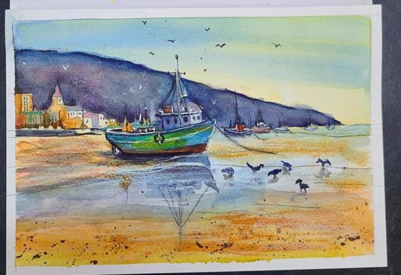
8. Sand Underlayer: Now I could get
the hair dryer and completely dry this section that we just painted
on the buildings. But I want to make use of
the different drying times. At the moment, it's
still very wet. But when it becomes about
80% wet or 80% dry, I mean, when it's
very close to drying, I want to drop in a few more darks that will
blend out nice and softly. If I drop those darks in now, they'll spread out completely. So whilst I'm waiting
for that to happen, I'm just going to add
a few dry brush marks. Or just brush strokes in
general onto the sand area. But I'm not going
to complain if they are dry brushing
marks because that will convey the feeling of sand of soil of dirt of
ground, basically. And these marks are very horizontal to convey that
feeling of perspective. It also grounds the painting They can be slightly
crisscrossed or zigzagged. There's a lot of zig zag or S shape elements to
this composition, which is a very strong
compositional tool when it comes to
painting landscapes. It'll be clearer
to see at the end or if you look at
the final image. But you can see there's
a lot of zigzags. If you look from the
top left of the hill, it'll come down towards
the right on the horizon, then the horizon goes
back across to the left, then we follow the boat downwards onto the right
and it just keeps on zigzagging down and it's
these elements that really are on purpose
because they lead the eye. Wherever the eye lands
on the painting, it's got somewhere to
go. It tells a story. It makes it more
captivating, hopefully. And it helps us come up with a composition because
without elements like that, we can get a bit lost
with where to put details and what to
put in the painting.
9. Painting The Distant Hill: So now I can wait or
dry the painting again. But I'm going to take a bit of time to mix these
colors for the distant hills. So I don't need to use the
hair dry, I don't think. I want very strong pigment because we're going to
use quite a lot of it. And you can see how I've mixed my own neutral colors here rather than just
going straight to black, I'm using blue and brown, and when using those
together very strongly, you can just see how dark
they get on the palette. We're a bit closer to
blue at the moment, which I don't mind
because having blue in the distance creates that feeling of
distance of atmosphere. Usually cool colors like blue recede into the distance.
So I'm going to start off. I'm using a bigger
brush now obviously, so it holds a lot more water, but it still has a nice tip so I can get a clean edge because I want to clean
edge for this distant hill. So I apply that first stroke, and I kind of assess
what it looks like. And I feel that it's
a bit too dark, so I apply a bit more water, and then I think it's
a bit too muted, so I had a bit more
blue to brighten it up. Then I swizzle the tip of
my brush randomly just to get a few bits of the
white paper in there. But organically, I'm really
not focusing on it too much. I just I know I want a few bits of the white
paper to be preserved. But I'm not too cautious
about where exactly they are. Now, it's a bit too blue, so I want to balance that
by adding some warm colors. So I'm mixing this
kind of purple, this isarin crimson in there. Now some brown burnt sienna. If you look on the
bottom left of my palette, I have ultramarine, sarin crimson, and burnt sienna, and I view those colors
as a kind of trinity. They work very well together. And whenever I'm mixing dark pigments or even
sometimes light pigments, I try to use those altogether
different quantities, I experiment because they make a pure black together,
a pure neutral. This might sound silly, but don't be afraid of really wetting and
saturating the paper when painting this
distant hill because the last thing you want is it to dry before you've completely filled
out the whole area. So I keep the
painting quite flat, so I'm not worried about
it running across. So I really want it to be a
big thick puddle of wetness. And that can make
it look very dark. Like, it does look very
dark now because there's so much water and pigment
in there, but believe me, once it's dried
out, the pigments don't go as dark anymore. They lighten up. So you've got to consider when you're
painting big washes like this, they're always
going to dry a lot lighter than they look
when they're wet. You can see now
how I was talking about the blue at
the top of the hill, and then it transitions down to a more muted browny color. That also helps with that
atmospheric perspective because the tops of the hills
are going to be further away than the bottom
of the hills. So I'm deciding how
to leave some of those white gaps in
there, and, of course, I'm chiseling away and
modeling the top edge of the boat and being careful of how far down I want to paint. So we're negatively painting the buildings and
the top of the boat. It's quite an odd thing to
play around with initially, especially if you're a beginner. This idea of negative spaces, negative shapes and
positive shapes. A nice way to think of it
is like a cookie cutter. If you roll out some dough, cookie dough and you want
to cut some shapes out, the positive shape will be the cookie that comes out of it, and the negative shape
will be the space, the hole that's in the
middle of the dough. And it takes a little twist of the mind to do, but
it's good practice.
10. Extending The Wash: Now we're starting to extend this distant hill wash.
Every now and again, I go back to it, but I'm making sure
I'm not creating a hard edge as I paint along it. So I don't mind about the
hard edge at the top, the silhouette of the hills. But on the right hand side of the boat where I'm
starting to paint now, I can't leave it too long, otherwise, there'll
be a hard edge. I'll dry and it won't connect. That's another reason
why I make sure large washes like
this are so wet. I found for so long, when I was practicing
and learning how to paint that well, I didn't realize it at the time, but I'd find that my washes would dry
too quickly before I finished painting them and they wouldn't be
connected or united. And I couldn't understand why. But through time, I just worked out that you just need to add more water, more pigment. That's why it helps having
a palette sometimes because it can be hard to work it out just going
straight to the paper. But it still is
technically possible, actually, to do
without a palette. You just have to fill it
with pure water to begin with and then balance the pigment to water
ratio a bit more, which also can be
a good practice in working out how to
figure out these ratios. Although we've got a lot of different colors
involved in this, it's purely
experimentation and fun, nothing too strict, so you don't need to follow me exactly
if you don't want to. You don't have to drop
the red exactly where I drop it because I'm not doing
it for any specific reason. And the tones in this wash
are quite flat, actually. They're all pretty much
the same mid tone, and any other differences
is purely by accident, not because I'm forcing
it to be that way. Of course, I don't want
it to be completely flat. I want it to be I want the
variety to exist to create that feeling of interest and bring out that
texture of watercolor, which will ultimately mean
it's not completely flat. I like the way the pigments land on the grain of the paper and interact with each other in their own
organic natural way. So it's not something
I'm forcing, but try and allow the
pigment to do itself. So as I was saying,
at the moment, it's basically
quite a flat wash. Maybe it's a little too dark on the right hand
side and the distance, but I'm not going to
tamper with it too much. I feel like it's better
to wait for it to dry. And then if I want to lighten it up later in the painting,
I can just do that. The good thing about watercolor
is we can rework it, we can reactivate it and
lighten it up with a tissue. We can scrub away. I'm just
using a tiny brush just to creates a little bit of unevenness on the
top ridge of the hill. Maybe it's distant trees. Maybe some areas
are a bit lighter. Maybe some areas
are a bit darker. Again, creating that bit of
variety, not so important. If you're in a bit of a rush, you don't have to spend
all the time doing that. There's a bit of
a valley, again, where the wetness of the
paper has curved the paper. So there's a bit of a pool on this area
where the small boat is, so I might have to repurpose it. And now I'm using a
tissue, like I said, to blot it a bit and lighten
that area up because again, it helps that feeling of
atmospheric perspective. The distance will always be lighter because
of the atmosphere and particle in the air. Dabbing away here too. Now we
can dry it off completely.
11. Sand Textures: Now I can move on to the
next stage of the painting, which is to create some
textures on the sand. I'm just going to clean
my palette because it was all dark blue
areas on my palette, and I, of course, want the sand not to be blue. So I'm just cleaning
that palette now. When working out a composition, I'm trying to think
about the best order to do it in, of course, and I know that
I'm going to paint this boat afterwards
because it's dark pigment. So we're going to
paint on top of it, paint on top of the sand below. So when I paint these
expressive brush marks that I'm planning
to do right now, I don't really mind if I go over top of the boat
because I know I'm going to paint the boat on top of
it anyway to cover them up. I've got a tissue in
my hand when I do this because I want to use it to create a bit more
texture because if you think about sand, it
does have texture. Instead of using the tip of
our brush to paint 1,000 million grains of sand or the texture that
you find on the beach, maybe some rocks, pebbles, I can just use the
dry brush effect. Of course, for dry brush, you need to of course have
pigment on your brush, but you need to suck out all
the excess water on that so that when you glide your
brush over the paper, it just touches the teeth
of the paper rather than the grooves, the
valleys underneath. I have a tissue of
just the side of my painting that I'm dabbing it to make sure I can
achieve that texture. If you're finding that you
can't achieve that texture, just go thicker
with the pigment, less water in your mix. And you'll have to use a
tissue to do that, or a towel. It's always best
to push yourself. It's better to push for more
texture than more watery. It's another weird one that
took me a while to figure out because I just couldn't
achieve these dry brush marks. And it was purely because
I wasn't allowing the pigment to be thicker
and drier than it has to be. And also the paper makes
a big difference too. If you've got smooth paper, it's almost impossible to
create that dry brush effect. You need rough paper ideally like this or cold press paper, it's called not for
some reason, NOT. I'm not sure why
it's called Not, but it's mid rough paper, still works fine, but smooth paper would
be very difficult. Hot press paper would be very difficult to
achieve this mark. So these brushstrokes aren't
perfectly horizontal. They're kind of diagonal. They're going with the
flow of the painting. They kind of match the direction of the
hill going downwards. They're kind of diagonal. So it's again zigzag. We've got the zigzag from
the hill to the horizon, then it goes flat
horizontally back again, and then diagonal down again. Because these are leading lines. And then I use a
tissue or splats of water to just create
unevenness and variety. So bits are bit darker. So bits are more burnt sienna, some bits are more yellow ochre.
12. Adding Some Shadows: And there's a bit of a
range in the dry brush, which you can play around with. Some bits are very, very dry brush and don't even really hold much shape
of the brush at all, and other bits are just
on the edge of dry brush, basically just a normal brush. So I'm experimenting with
what can be achieved. And then once that's
pretty much dry, we can start connecting the
background to the foreground. So this looks like black because it's wet and
it's, of course, dark, but it'll
dry a lot lighter, especially when we add water. What I tend to do is start
with a strong brushstroke, and then I don't need to go back to my palette
for a long time. I can just repurpose that strong pigment on my paper just by adding
more and more water. So you'll see that's
what I'm doing here. It looks very strong
at the moment, I'm going to use that pigment everywhere until
it gets too light, and then I can go back again. It's like I was saying before, when pigments are wet,
they look very dark. But they'll light up
again. No problem. These brush marks are
quite horizontal, so they're not the diagonal ones that we did for the sand. They're more
structural man made. So it kind of supports
or grounds the image. And when I add little
marks like this, I try to preserve little areas
of the underlay painting, little strips of underlay, little gaps in
between the lines. Now maybe there's
a little rope or something that's coming
from off the screen, off the canvas and
connecting to the boat, even though we haven't
painted the boat yet, of course, starting to paint a bit of a shadow
for the boat, as well. Using that same kind of wash, kind of muted blue. For shadows, I like to
create a kind of point. So they're like little
arrows or little spikes, sideway spikes, but they
waver a little bit. So you can see the
points are on the left. They squiggle a bit and they get thicker and thicker as they
connect to the objects, which is casting the shadow. Again, using the
point on my brush to preserve some little
strips of the underlayer. Because if you look
at these shapes, they're not too detailed. They're just quite fine. But they're not precise. You could paint these little
strips anyway you want to. You need to use the
tip of your brush and gradually get a bit thicker, but it gives the illusion of preciseness and detail really. And I'm quickly going
to go back to the sea and reinforce that
little white gap.
13. Top of The Boat: You can see how quickly we've
actually started to build up the scene without
doing too many details. Of course, it might seem like a overwhelming painting for
a beginner, but actually, we're still breaking everything
down into clear shapes and even the shapes within themselves are quite simple or abstract the
distant buildings, for example, if you actually
look at the details, they're not that realistic. They're just suggestive. Likewise, with the boat
that we're doing now, we're just chipping
away at it and these details aren't highly
specific or well designed. They're just enough to make
it somewhat believable. So they're not distracting, but fit with the aesthetic, the feeling of the painting. Starting off with
the underlayer, using that burnt sienna
yellow ochre kind of mix. The main body of the boat, I'm going to use a
kind of greenish blue. But I feel like I need to
add a little bit of underlay before we paint the main shapes. So I'm looking at, I don't know the anatomy
of the boat or the parts, but you've got the body
of the boat underneath. And then on the deck,
you've of course, got bits and bobs, more things going on on the
deck of the boat. So I'm painting up until the body of the
boat at the moment. I'm not going past
into the main body. And I'm basically, if you
look at what I'm doing, painting little rectangles
in various shapes and sizes. In fact, now I'm just connecting them all into one
kind of brushstroke, a kind of strip of dark pigment. Again, allowing little white
strips the underground of the paper underneath to
separate certain sections. So it might be very fine, but there's a little white gap. We can always go back with white gouache later if we need to. I'm playing around
with tones as well, so I decided on the left
hand side of this boat, we're going to have
some light areas contrasted against background. But for this main kind of cabin area that I'm
painting with blue, it's actually going
to be darker. It's going to be darker
with the mountains. And I guess in hindsight, maybe I should have painted the mountains or the
distant hills a bit lighter, so it increases that contrast without us having to
paint too dark right now, but I think it should be fine. If not, we can always
lighten it up. The most important thing for me, no matter how a
painting turns out is to try and keep
having fun with it. I don't want to lose that
sense of play fun of energy because then the painting I don't see the
painting as excessive. I'm not having fun with
it. That's the main idea. Like, I'm not aiming
to do a masterpiece because that just puts too
much pressure on myself. But if I keep the goal
to just have fun, then ironically,
it's more likely to end up being good painting
because the fun intended.
14. Hull of The Boat: So now we've painted the
top half of the boat. See how I've kept
it dark on the left and lighter on the
right hand side. Now we're going to paint
the body of the boat. I feel like I want
to say the hull, but I've never looked
up the anatomy and I have sketched
out reference photos, so I'm not an expert of
the things that I paint. I just look at the shapes. I don't see them
as what they are. I'm just looking at the balance and organization of shapes. So in a minute, we're going to paint the
main body of the boat. I'm just finishing off
dropping in a few darks for some windows, some
soft marks there. A and now I'm going to mix straight
on the page. I'm not going to
use my palate tool. So I'm using Bidian green and turquoise blue
or Ceridian blue because I keep them in the
same pan in my palette. And I'm very careful now. The most important
thing is not to touch the dark pigment
we just painted before. So there's a little gap between the top of the boat and this area
that we're painting now. At least to begin with, I don't want any of the areas to touch. In a minute, maybe we can choose selectively and
consciously where we want those little pathages
to work their way across so that they're in unity and
are, in fact, connected. But at the moment, I'm
trying to avoid that. Some areas are going
to be a bit greener, some areas are going
to be a bit bluer. Blocking that shape
of the boat in. It's my favorite
color, actually. This turquoise
carillon blue kind of color, the cobalt teal. Going a bit stronger
at the top of the boat here. The front of the boat. Keeping a nice gap there,
a tiny little gap. Again, if we happen
to paint over it, you can always go back
with a little bit of white gouache at the end, just to add those
little accents. Now we can start connecting
it to the shadow underneath. Dropping in a bit of
yellow right in the center there too, felt right. Again, there's no rhyme or reason to why I choose
my colors sometimes. The reference of the boat
that I'm looking at. I'm looking at multiple
different boats. I just type boats
into Google and just come up with a
mishmash of them all. But none of them are this
color in particular. It's more the tones
that I'm looking at. You can start to
see how I've kept my most vibrant colors for this boat because it
is the focal point. It is the center of interest that I want the eyes to land
on and to circulate around. There was a bit too much
liquid going on there, so I used a thirsty brush to just pick up some of that
pigment and wash it off. Likewise, up there, too. It was a bit too much
yellow in the end. So now that it's blended in,
it looks a bit more green. Back to putting in a few kind
of I want to say scripture, a bit of calligraphic
marks at the top. So I less think about the
details, more scribbles.
15. Distant Boats: You might notice that I've left a little gap at the
bottom of the boat there. And that's because
I want amongst all this wet and wet and
these cool colors, we've got blue turquoise green blending
together in that boat, I want to contrast
that with a hard edge. So I'm not sure what color I'm going
to pick for that yet, maybe a red or a warm color to contrast with that blue or
maybe just a lighter blue. But for the time being, I'm leaving that little gap on purpose whilst I'm painting
these background boats. And notice how again, I'm not using any color for
these background boats. I don't want them to compete
with the foreground. So I'm starting off basically
with that gray we mixed. And just the silhouette of boats And as we painted
the mountains before, I left the little
white gaps at the top to give us room to play around with the
design of the boats. I call them design. It's just
a very simplified design. On top of that gray, we can drop in other colors like
I did on the left, a little bit of blue and a little bit of warmth
on the right one. Very subtle. Now, I've got a bit of that brown,
that burnt sienna. It's basically just a box, painting a little box on top, filling it in, and allowing
that little white gap. You can see how many of the
little white gaps we've left and that gives the
illusion of detail. Casing little white
gaps like that. Making a bit darker
at the bottom. I think I'll add a
couple more boats, maybe one in the water. I'm using my pencil
as a little guide, but I don't feel fully
committed to it. If I feel like I want to
change the composition slightly now that I can see all the tones and the arrangement
of the other elements, I don't need to
copy it precisely, these little boats in
detail in the distance, they're not highly detailed. Just quick markings that suggest boats without having to put
in a lot of effort, really. It's a way or a compositional tool to connect the distant hills
with the foreground, so it's not bare and empty. Also creates that feeling
of depth because, of course, know the
general size of a boat. So having one in the foreground this side and then
gradually getting smaller into the distance creates that feeling of
depth of immersion. I use the little pols on the boat. I should
really look it up. The mast, of course,
I use the masts of the boat as strong
vertical lines to connect, of course, the
ground and the boats to the distant hills in the sky. Of course, these boats are in land or at least
the main ones are in land, so I haven't painted
any of the sails, but that can also be a
fun thing to do to paint. I do have another class of painting a boat with
its sail out on the sea, if you look at my back catalog.
16. Boat Rigging: So keeping with my small brush now and just using
any dark pigment, I'm placing little rope lines from the tip of the
boat down to the sand. Just a very fine line as
fine line as you can get it. So use the very
tip of your brush, and now I'm painting the
mast of the main boat. Using any dark color, it
really doesn't matter. It's all about the tone
rather than the color. Note, I'm purposely not
making the lines super clean. I'm adding a little bit of
agitation to them and then connecting some kind
of rope from the mast to the top just quite
randomly, actually. Just connecting it all
together because it's nice to have a little range of textures. We've got linework,
we've got washes, we've got dry brush,
some rough textures, smooth textures, lines. All these things add different
elements to a painting, makes it a fuller composition, and connects things
together, too. A few more fiddly bits that they're not necessarily
details of things. They're just creating
a bit more interest in this area, this region. I'm not going to add details
like this everywhere else. I call it a bit like staccato, a bit more scribbly calligraphy in areas where we might
want a bit more detail. Maybe there's a
few boats on land up out of the sand area
in the distance there. So adding a few
more vertical lines gives a feeling of groundedness. It settles it because there's
a lot of diagonal lines, a lot of abstract shapes. We've got a few
horizontal lines, but these vertical lines
really ground the composition. So painting these masks
now, you could, of course, use white gouache to paint these masks so that
you don't have to have black lines. In fact, we might do
that later anyway. We'll see how we feel. See what it feels once
we're 95% of the way done. But we've done basically everything above
land at the moment. We've still got to paint
the rest of the boat. A.
17. Boat Details: So now we've given it a bit of time for the body of the
boat to dry, the hull. We can start going back in
there with a few more details, especially that bottom section
at the front of the boat. To start with, I like to add
a little streak or stripe of color going just
underneath the top. So I'm using pure
water at the moment. There's no pigment on my brush. Just going straight
along there, and I give it time to
reactivate the pigment, and I have a tissue
and just scrub away. And you can see lifting off
the pigment like that already creates a organic kind of shape design that we
didn't even have to paint in. We were just taking away some of that pigment and working
with tone rather than color. It was a bit too strong,
so I went back in with a bit of burnt
sienna there. And now we can start
painting the bottom section. I'm going for a warmer
color, of course. I'm using this burnt
sienna to begin with, starting at the bottom and working where, of
course, of course, when we paint over the blue, it goes a dark kind
of gray color. But when we go over
this patch that we left behind, goes a bit brighter. I don't want the
edge to be too hard, so I am agitating it a bit so that it transitions
into this section. But still, there's a
nice little contrast between the blue above
and the brown below, almost like an orange,
really, really makes it pop. I'm going to add another shadow
whilst it's wet and wet. Just go to add a
little shadow where the boat meets the ground. Of course, it's in the shadow, but I'm going to emphasize the shadow almost like a
shadow within the shadow. An extra dark light
that blends outwards. There's a little
keel that I left a little fin like structure
underneath the boat. I think that's what it's
called at the back there too. I left a little gap of the
light coming through there, increasing the
shadow on this end. These are not very
important details. And if you want a
more basic painting, you don't need to spend
all the time to do this. I just have the
feeling to do it. If I see something there that
I think might improve it, I just decide to do it anyway, but oftentimes it doesn't really make any big statement to the general idea
of the painting. Also, I'm going to
add a little ring, kind of, I guess, you'd call it, I'd say a rescue
ring or a life boy, usually orange, but
I'm just keeping it black because I don't
need extra vibrancy. So we've done a lot of the
riggings on this boat. Most of the details are done
on this boat actually now. I think soon we can start working on integrating
that boat into the water. So we've painted the sand. Underneath the boat, we want a bit of water
to play around. We make use of
watercolor textures, so we'll do that next.
18. Dry Brushing Water: So now I've swapped my brush and it's a larger
one because I want my brush strokes to be fuller and we're
painting a larger space, so just using a larger
brush will help with that. To start off with though, I'm going to be quite expressive and create organic marks. Just working bit by bit. You can see I'm testing
out the dry brush, being quite minimal to begin with and gradually
going over top of it until I feel like
the texture is enough. I'm going to be
doing this drybush section where I think there's going to be some ripples or where the water
transitions to sand. And then we can gradually blend it into a full body
of water to the left, as you can roughly see what we're doing
now at the moment. It's very difficult to get a complete transition from
dry brush to a full on wash. But it doesn't have to be
because we're mimicking nature anyway and
nature is quite random, so I don't have to be
too precise with it. I have a tissue in
my hand that I'm dabbing the brush with
every so often to suck out that extra
water to make it easier to achieve
those dry brush marks. And of course, the more
I go over the same area, the more the dry brush marks will turn into a
full brush stroke. In this bottom left hand corner, I'm using that same sand color, which is burnt sienna
and yellow ochre. So this body of water is like a little pool or this little dip in the
sand where maybe some of the waves come
in during the tide and some of the water remains even though
the tide has gone out. I want that water in the
middle because ideally, I want to add a
reflection for the boat. Of course, there'll be reflections on water
but not on sand. I'm starting to influence
other colors into there, so putting a bit of purple
very subtly into there. And now you can see how
on the left hand side, it's very wet on wet. And on the right hand side,
it's full on texture. So we've got that variety and that contrast that
we're playing with. I decided to go quite
bold with that brown, but I'm starting to think it's a bit too
strong, so that's okay. We can rub that away a bit or soften it
out or come back to it. That's the beauty of watercolor. We can always reactivate
it even when it's dry. I'm using slightly concentrated
pigment up at the top here at the top of this wash
so that it blends downwards. There's a nice clean
line from where the water reaches the sand. So we've got a nice hard
line at the top and a line soft texted
line at the bottom. Then again, we can add
more dry brush marks. When I try to achieve
dry brush marks, also, I'm not using the
tip of my brush, I'm gently pulling the brush
along the paper on the side. Trying to leave
little white gaps that are not always
easy to achieve, but those little sparkles
make it look a bit better.
19. Some Splats: In the wet and wet section, I'm finding it's a bit
too clean and tidy, so I'm going to agitate it a
bit as it's starting to dry. Go to splat some water in there. I do particularly like
the way we've got the light brown stroke merging and blending in between that purple and blue area. So with wet on wet, we don't
need to agitate it too much. It'll blend by itself. That's how we achieved
that clean blend. I also applied some
darker blue up at the top there because it
just didn't seem right having it
completely brown, but to be honest, it
doesn't seem right at the moment, adding that blue. So I think I will have to sort that out a bit later
when the time comes. I'm also dry brushing
some brown now on top of the blue to make a few darker strokes because ripples not
only have white lines, but they also have
darker lines, too. So mainly, we're using
this water area to make the most of
watercolor techniques and textures that
we can achieve. So we're just using
it to play along with and also it
helps guide the eye, the lines and brush directions. They're all pointing towards the central focal point,
which is the boat. Then I'm wetting my brush and adding some splats
on there, again, because trying to convey
a sense of energy, not trying to get
anything realistic. But those splats
increase feeling of mood and depth and movement. So yeah, I'm getting the
tissue and just smudging out that bit of brown
and blue we had it before because it was a
bit too strong and dark, so softening it up makes
it a bit less distracting. Adding a bit more blue there so that it's just a clean line going all the way up
diagonally to the boat.
20. Boat Reflections: Now I've let it completely dry because I want to
integrate the shadow or rather the reflection
and the shadow of the boat into the water
and the sand below. I'm thinking in simple shapes. So I'm simplifying it,
of course, and again, I'm using that kind
of arrow technique where that shape is
basically an arrow. It's pointing, thinner on the left or thicker
on the right, and it's like a
very thin triangle. And there's a little strip
of the color beneath separating that shadow
area and the boat. Because the sand is reflecting
the light from the sky, but the reflection is like a mirror reflecting
the boat, of course. Adding a bit of
brown because we've got a bit of brown
in the boat there. The tip connecting it there. So we have a lot of arrows and guiding lines in
this composition. Rocking some more
pigment in there. This reflection
doesn't have to be a perfect mirror
because in reality, it's all distorted anyway. Even adding the rigging ropes and the mast into
the reflection. It's this reflection fact that
was the main selling point or the main idea of this painting because it
adds a feeling of depth. And when painting that mask
line in the reflection, there's actually a very
strong grounding feel with the verticals and
coinciding with the horizontal line as
well, the horizon line. There's a few dabs
of brown in there. You can see the
little cabin area is a little lighter than
the hull of the boat. Putting in that mask, connecting it to the
rest of the reflection. Then we can start adding a
bit of rigging the ropes that come down from the mast
into the actual boat itself. I've decided to use the same blue brown mix that I like to experiment with
most of my paintings. Not only are they good colors
and complimentary colors, but it fits the whole color
scheme of the painting. As you can see,
the main colors in this painting are
brown and blue. We have a few other influences. We've got a green on that boat and a bit of purple
in the distant hills. But those are just
tiny little accents. If I were to paint
this reflection as green or purple, it
wouldn't look right. So that's what dictates
my color choices. Once I've got a
color scheme going, I try to keep everything
fairly in line and then only straying from that color to create a bit
of variety and interest, not a huge statement. Darken the line here. A little bit and bob at the back of the boat that you
can barely see, but again, helps
with the interest.
21. More Textures: So we've painted the
water and the sand, but I want to add a few
more directional lines, few compositional tools
just to help lead the eye even more and give it a sense of
movement and direction. So I'm going to pretend there's
some boys in the water. Of course, if they
were underwater, they'd be in the water, they'd be floating, but the
tide is out at the moment, so they're just
resting on the sand. And I'm just going to suggest
them with a few squiggles. I'm not even going to
define them as boys. That's BUOYOf course. Then a few fine lines, which might be rope. Maybe there's a boat
just behind us out of the picture that these ropes and riggings are connected to. It doesn't really
matter because I'm just using it as a
compositional tool. Again, to lead the
eye and to connect everything and to help with
the perspective as well. But the important thing is
to make sure it's a clean, organic line, not a
kind of hesitant one. You need to be quite
confident with your strokes. Whether they're dry brush, ideally dry brush because they have that extra
feeling of texture. Even if they're thin,
you don't want them to be webby wobbly, if that makes sense because
these are directional lines and they're meant to be confident for a reason
because they're grounding. Now I'm flicking some of that burnt sienna
yellow ochre mix in the foreground area
to contrast with the blue flicks we have
on the right hand side. So we've got brown flicks and blue thick flicks
on both sides. When it comes to flicks,
I use a very soft brush, soft haired brush so that there's less resistance when it comes to tapping the brush. If you use a hard bristle brush, you have to flick very hard, and by the time it
flicks that hard, the brush the splatters are going absolutely everywhere not just where
you want them to go. A few more lines just
to connect everything. Even if they don't
exist in reality, it's very useful to
connect everything. You can use, again, any color you want that fits your color scheme that I'm using a whole variety and
the whole spectrum between blue and brown and there's so much to
work with in there. You could do this whole painting just using two
colors if you wanted to burnt sienna and
ultramarin blue. Now I'm using pure white
to do some splats. You might have to experiment
with the consistency. Try and get the consistency
as thick as you can whilst still being able to flip because there'll
be a point when it's so thick that you can't even flick it off your brush anymore. But if you water down
white guash too much, then although it looks
very white when it's wet, when it dries, it'll be too faint and basically disappear. So I'm dabbing my own fake
splatters at the moment. Of course, I'm doing
this on the left hand side where
we've got pigment, it wouldn't make much
sense doing it on the right hand side where we've already preserved a lot of
the white of the paper. Because reflections
using dry brush with the white gouache creates a feeling
of ripples as well. We don't need too many of those, but we're restoring some of the white of the paper
that we painted over.
22. Distant Birds: Of course, the main
subject is the boat. But these reflections, even though they're
not the main subjects, they convey and describe the feeling of light
and atmosphere. They describe the scene. They make it much more interesting despite not
being the focus point. In fact, you can see it's actually very abstract
these brush marks. You can paint it
1,000 different ways. I don't need to place the lines exactly where I'm placing them. Agitating it a bit more where this body of water reaches
the top mid section. I don't think I've
done a painting where I've used so much
dry brush marks, actually. But it's a very
good technique to have in your arsenal
to practice. That line was a bit strong, so I'm just using a tissue and a bit more water
to soften it out. A few more leading
lines connecting the boat to the bank at
the back of the beach. To lighten that area up
again. Seeing the whitewash. I don't use much
of the whitewash, just using it quite sparingly. To increase the contrast
and the feel of light at the top of the
ripples and reflections. A lot of these lines
are quite diluted, so they will just be a little suggestion rather
than anything too important. It's coming to the
part of the painting where I'm feeling it's
very close to finishing, but I still have to assess and see what's
actually required and what's not required because
I could go on and on doing these little details
now and it doesn't actually necessarily
improve the painting or help communicate the main
message of the painting, which is simple boat with the reflection and
the feeling of light. So when it comes to that point, we can start tying it all together and
preparing for the end, seeing if there's
anything that sticks out. I felt like the rigging on this main boat doesn't
have enough contrast because we've already got
a dark background for the hills and the
rigging is dark too, so I decided to go back with a whitewash just
emphasize those ropes. Adding a few of these
white accents on the hull of the boat too to
emphasize that little line. But again, you don't necessarily have to
if you don't want to. Also, I'm going to use this whitewash to just pop a few more highlights
in the background, and then I think that's enough. We start painting
and painting in the birds that also
help the feeling of depth because we're
going to paint them at different sizes and
different tones. Some of them are
going to be lighter, some of them are
going to be darker. Of course, we know generally
how big a seagull is. So when we look at
a scene like this, we get a feel of the depth and
the openness of the scene. These birds are just two
curved lines, basically, and you can curve them either
way to make them a bit more dynamic and varied.
23. Foreground Birds: Of course, I use dark pigment
for the ones in the sky. And then if there's some
maybe not with this scene, but if we have a
darker background, like maybe a harbor scene or there is some darkness
where the hills are. We can use whitewash to
paint some white birds in. So the ones that are
closer, obviously, I'm going to make a bit darker,
so I'm going over those. Maybe make them a bit
more defined, too. And then the ones
in the distance are obviously smaller
and a bit lighter. And where the two lines
meet the body of the bird, where the wings
meet in the middle, I just make a
little thick rivet, just to suggest the
body of the bird. But it's easy to get over excited with
painting these birds. It always feels like you
should add one more, and then you realize
there might be too many. So it's not uncommon to want to scrub some of them out
afterwards like I'm doing now. And that's why sometimes
it's also best to step away from your painting. If you've reached 80%
or 90% of the painting, even though it feels
so close to finishing, just disconnect for
an hour or two. When you come back
with a fresh eye, you'll see if it's
actually necessary to do these things because
often it's not. Even sometimes if
you see something that is quite important to do, at least it feels
important in the time. It actually takes away
from the painting. Many times I look at
paintings I've done years ago and I see
errors in them, but of course, it was
a different time. It was two years
ago. I don't want to restart painting or make edits to painting that long ago because it's all about
having fun in the moment. I look at my paintings as a little time capture of where I was what I was
listening to at the time. So it's more about
the process of having fun painting rather than aiming for a masterpiece
all the time. I'm just jotting
down a few birds standing in these
little shallow areas. Maybe they're looking for
a few crabs or shells, trying to do them
quite abstract, but at the same time, making them quite clear
that they are birds. I think the mind can make sense that they are
birds because what else would they be these
twisted triangle shapes. Just a few finishing
touches now. I go to paint in some soft
reflections for these birds, just trying to think
of vertical symmetry. I'm basically trying
to match those shapes, but the other way around
vertically, of course. I think those are quite
convincing as birds now. Even though they're obviously
not photorealistic, we understand them
as birds through visual communication
and simplification. I feel like adding a bit of a stronger brush mark
here does something. It's hard to explain
it's too light, so it needs a bit of accent, a statement down here. Dry brush mark as well. I'm thinking maybe I can lighten up the background because on the right hand side
of the background, it's just a tad too dark, so I think I'm going to
lighten that up a bit. A bit more texture and dry brush just off to
the right of the boat, too, and I think we
can call that done.
24. Final Thoughts: Welcome back and
congratulations on completing this coastal
boat scene in watercolor. In this class, we looked
into how to compose a painting using a
main focal point, how to use open space as
an active part of design, and how soft atmosphere can make a scene feel expansive
and believable. We also explored how
small supporting details, when carefully placed, can add rhythm and scale without
cluttering the painting. These are incredibly
useful ideas for coastal scenes
and far beyond them. Remember, watercolor painting is not just about technical skills, but also about expressing your creativity and
personal style. I encourage you to
continue exploring, experimenting and pushing
your boundaries to create your own unique
watercolor masterpieces. As we come to the
end of this class, I hope you feel
more confident and comfortable with your
watercolor painting abilities. Practice is key when it comes
to improving your skills, so keep on painting
and experimenting. I want to express my gratitude for each and every one of you. Your passion for
watercolor painting is so inspiring and I'm honored
to be your teacher. If you would like feedback on your painting, I'd
love to give it. So please share your painting in the student projects
gallery down below, and I'll be sure to respond. If you prefer, you can
share it on Instagram, tagging me at Will Elliston, as I would love to see it. Skillshare also loves
seeing my students work, so tag them as well
at Skillshare. After putting so
much effort into it, why not share your creation? If you have any questions
or comments about today's class or want any specific advice
related to watercolor, please reach out to me in
the discussion section. You can also let me know about any subject wildlife or scene you'd like me
to do a class on. If you found this class useful, I'd really appreciate
getting your feedback on it. Reading your reviews
fills my heart with joy and helps me create the best
experience for my students. Lastly, please click
the Follow button Utop so you can follow
me on Skillshare. This means that you'll be
the first to know when I launch a new class
or post giveaways. I hope this encourages
you to trust simplicity and openness
in your landscapes. I look forward to seeing you in future classes until then, happy painting bye for now.
 Will Elliston, Award-Winning Watercolour Artist