Transcripts
1. Presentation: Have you ever been so
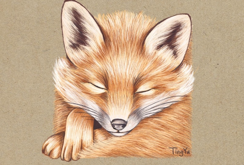
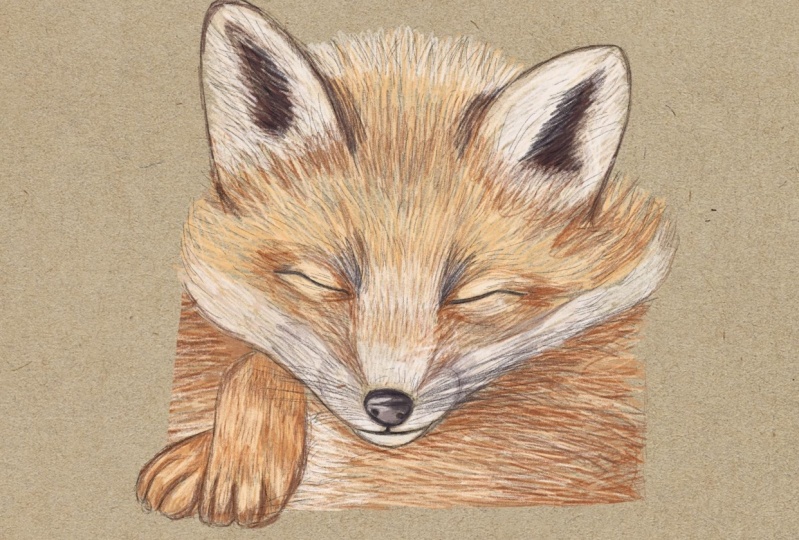
captivated by a moment in nature that you wanted to create an illustration of it? I had such an experience in my own garden where
over the season, I had the pleasure of watching a group of fox cuts grow up. Seeing these foxes
boasting around, playing, and having a lot of fun
while the mother was out hunting was a truly
fascinating experience. Hello, everyone. My name is Maurice De Angelis, and I'm a professional
illustrator living in London. I'm particularly
happy to present this class because over
the last few months, I worked on a
significant project that involved illustrating
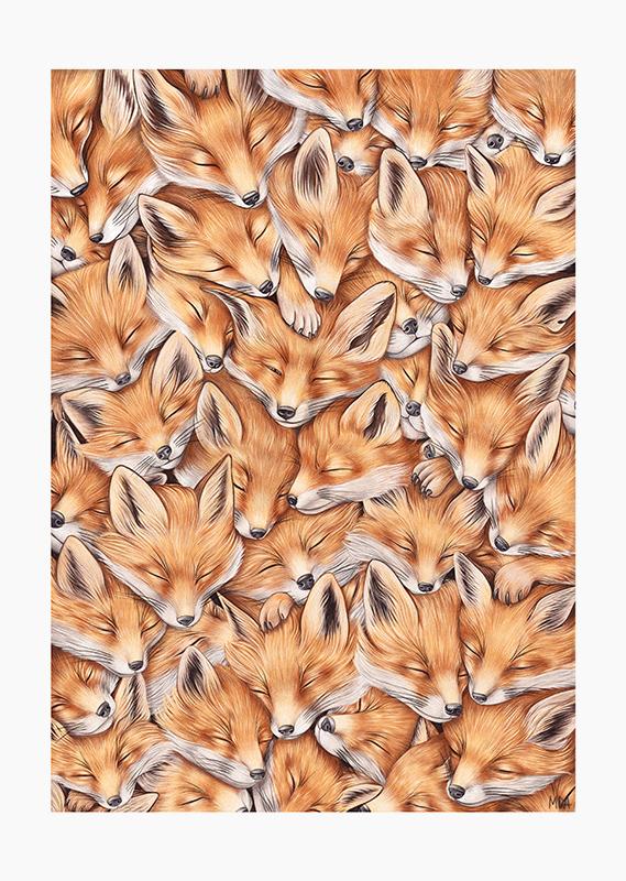
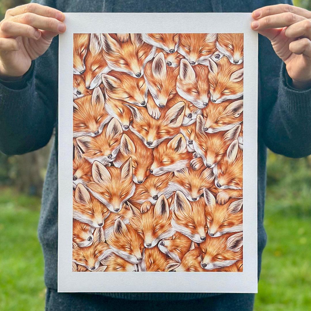
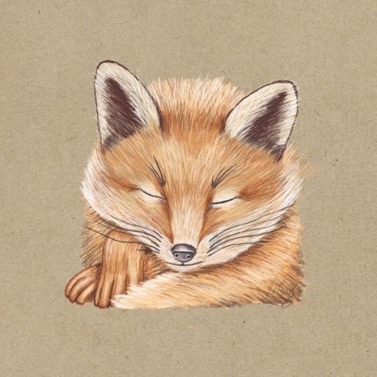
43 sleeping fox caps, which took me an eternity. Having created a
print of this work, I thought it would be a great
idea to show the process of making such an illustration using the Peppermin
brush appropriate. So let's have a look at how
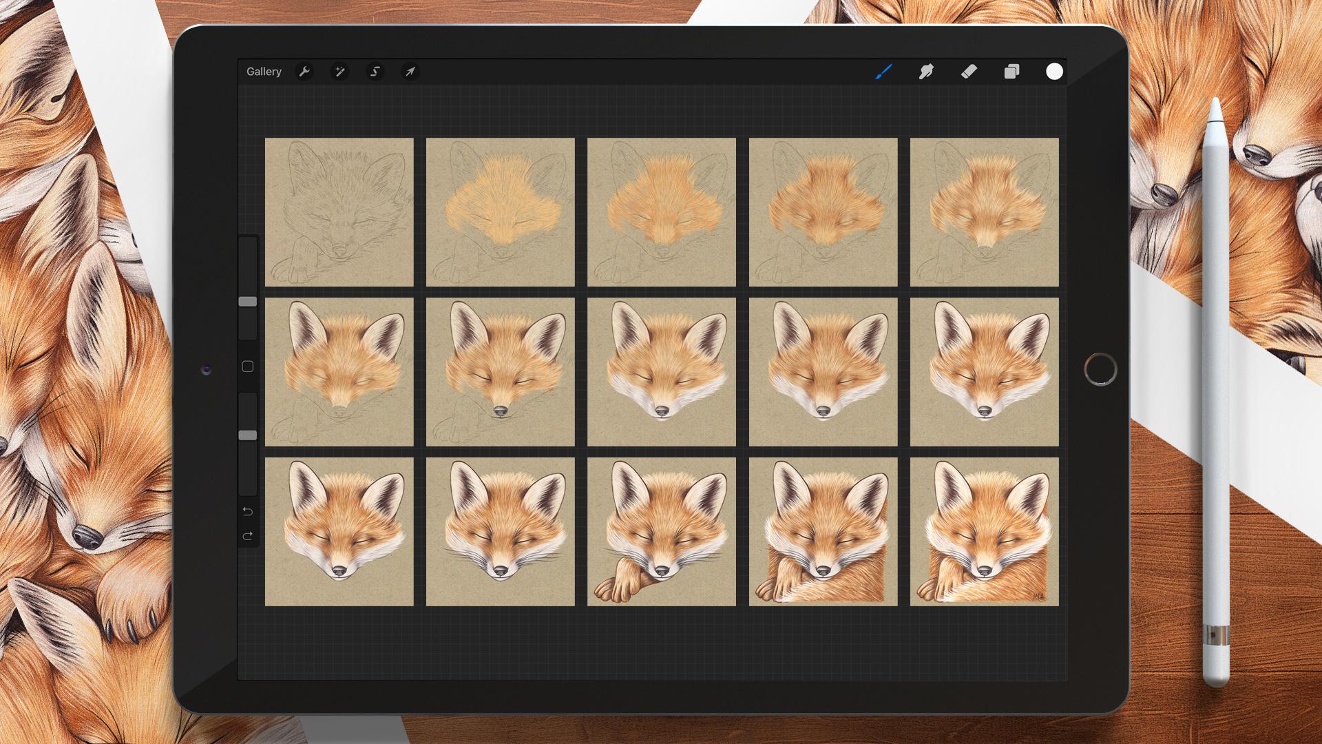
this class is organized. We start by setting
up the canvas and tweaking the brush slightly to get the stroke that we want. Then we create the undercoat by slowly building
up the shades, adding details throughout,
and defining the highlights. Next, we'll paint the ears, the nose, then the muzzle. After that, we'll increasingly
refine the illustration, adding the whiskers, the paws, the tail, and finally
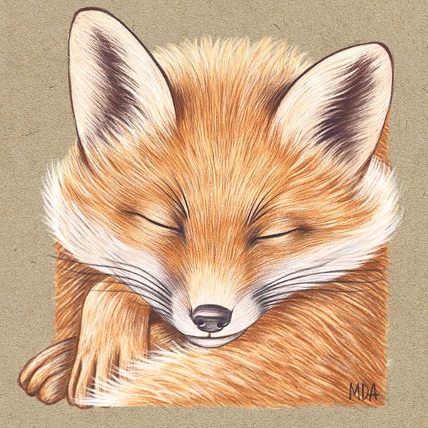
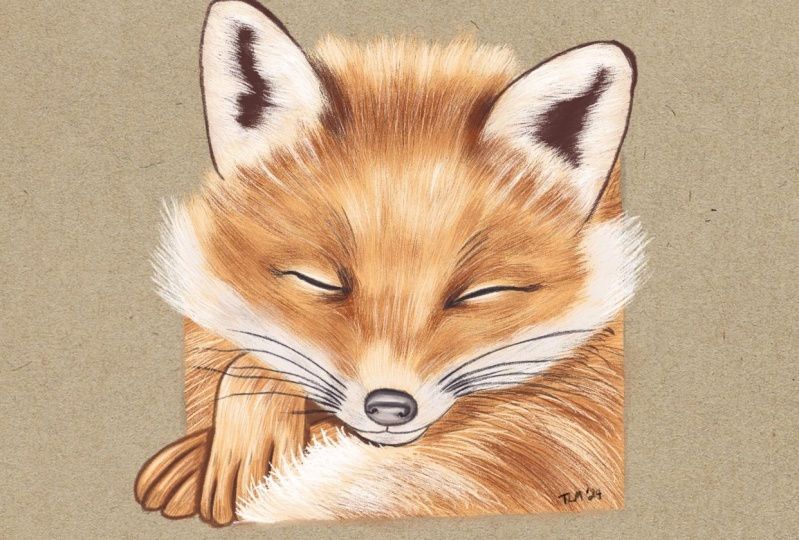
sun color corrections. And here we have our Fox
camp Peaceful living. Whether you are beginning
just starting out with digital painting or
an experienced artist looking to expand the skills. These classe is designed to be accessible and
enjoyable for everyone. So let's bring this gentle
beauty to life on our camps.
2. Setting Up the Canvas: Okay, let's have a
look at what we've got. We have the paper. We have the drawing, and
we have the color palette. We want to use the fur palette for the upper part of the face. The ears obviously
for the ears as they are a different
color to the main fur. Finally, the snout palette for the lower part of the face. Now we want to select
the Peppermin brush, which is under the
sketching library. We click on it to
access the settings. The brush is doing
something like this. First of all, we're going
to click on drawing pad and do resette
or brush settings. This we resette the brush
to its default settings, so we show that we are
starting from the same point. Then we go down to
the Apple pencil tab and we want to turn
off the tilt effect, and to do that, we have to
set all these values to none, and then we click Done. I want to test the
brush so I can choose a random color
from the palette. I also want to reduce
the brush size to 30% while keeping
the opacity 100%, and now I can test the brush
on a newly created layer. This is exactly the
effect that I want. But before we move on and officially start our
fox illustration, I just wanted to let
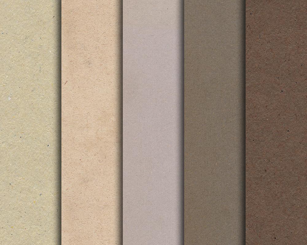
you know that if you like these kinds of tone papers, you can download them for
free from my website. If you connect to my
website and go to classes, you can request the papers
using this form here. These vintage and slightly
distressed papers are excellent for a wide variety of work and I use
them all the time. Last but not least,
if you would like to buy the Sleeping
Fox Cp print, you can connect to
my shop where you can find all the print details, and for Skillshare students, I'm offering a free
delivery discount. Yeah. Okay. In the next lesson, we'll fisher restart
our Fox Illustration.
3. Fur - Colour no. 2: Now we're going to
create a new layer and select color number two
from the fur palette. With this color,
we're going to make the initial base of the
upper part of the fox phase. We want to create individual strokes that
follow the pencil drawing. You can actually use
the pencil drawing as a guide to see where
the hair is flowing. And because the
direction is very specific with some
and some longer hair, we want to pay attention to the directional shift
closer to the eyes, the nose, and towards
the top of the head. We can say that this
step is quite simple. Again, we want to create a base for the upper
part of the face, not including the
ears or the snout, as we would be using a separate
palette for those parts. Now, we can move on to the eyes, and we want to pay
particular attention to the fact that the direction
of the hair is very specific, and also that the fa is shorter here compared to the
other parts of the face. As you can see, the first
round is not that complex, but maybe the tricky part is to follow the flow of the had. That is the aim of this lesson
to follow the main flow to create an initial
base from which we can confidently build
all the other shades. So this step is now done. We have created the base
with color number two, and we'll continue with color number three
in the next lesson.
4. Fur - Colour no. 3: Now it's time for number three, which is the second
color we're going to use on the Fox face on exactly the same layer
as we don't want to create too many
layers for this project. We want to start by adding the second color
closer to the eyes, and as we do this, we want to focus on the cases
and the corners. As you can see, it's a
very light treatment, and we're going to apply this first code as
I'm showing here. Because we established
the flower of the hair in the
previous lesson, we can now be more confident in following the main
direction of the hair. Now closer to the eyes, as you can see, I'm being very gentle with this treatment. I'm not exaggerating or doing
anything too noticeable. What I'm doing is a
slow build up of tones. You can see that these brush
strokes are nested closer to the eyes and towards the top of the head and closer to the ears. But the nose is
untouched because that are is going to be lighter
compared to the main fur. You can see that these strokes are going to the
side of the nose. Now, I lead a bit
around the ears. And this lesson is now complete. This is more than enough
for the second color. In the next lesson, we'll
use color number four.
5. Fur - Colour no. 4: In this lesson, I'm going
to use color number four, which has a reddish tone to it. It's more intense than the
colors that we used before. Just as I did before, I want to start
nesting these hairs. I want them to mix with
the existing colors, always following the flow. Again, our job is to slowly build up all the
shades so that there are no parts that are more significant or less
treated than others. We want to treat
the area without exaggerating or doing
anything too drastic. Now, closer to the eyes, you can see that I want
to emphasize the cores of the eyes and slightly shade
the upper part of the nose, which appears flatter as
the bone gives the shade. Now we can close out
to the ears again. Now the other ear. Closer to the cheek. Then closer to the eyes again. Just to reinforce those corners that you might
expect to be darker. This is it. I think
that's enough. In the next lesson, we
use color number one.
6. Fur - Colour no. 1: In this lesson,
we're going to use the lightest color that
we have for the fur, which is color number one. We're going to start
from the nose, which is the lighter area for
the upper part of the face. We can see that this
lighter color is blending in with the colors
that we put down before. It's a very light treatment, as you can see, as we did in
the previous three lessons. We are building up all the tones and shades, and in the end, it would be this multitude of strokes that would
create the illustration. Can I continue in this way, highlighting the different
parts of the Fox phase? Now, it's time for the eyes. Obviously, we don't see much of the pupils because
the fox is sleeping, but we still want to perceive the volume of the
eyeballs behind it. Now we're going to define
the right side of the face, closer to the ears. And towards the shakes. Okay, this is now done. In the next lesson, we're
going to paint the ears. Oh.
7. Painting the Ears: In this lesson, we're
going to pay in the ears, and we're going to start
with color number four. So we can see that the
inside of the ear is quite dark while the outside
is of a list tone, as you can see in the
reference picture. I want to start by
adding this dark color, and we can see the direction of the head going from the
inside to the outside. I can do the same
for the other ear. We want to start with
this darker color because we're going to draw the
lighter hairs on top. Now that we have
the first color, we can choose the darkest color for the ears, which
is number five. I just want to emphasize this darker area
a little bit more as I want to add some darker strokes to the
base of the first color. I can do the same
for the other ear. And also, with this tone, I want to add some more color
to the corners of the ears. Now I can choose
color number two. And as I said, the sides of
the ear have this light, so I want to add this color. You can actually see
the difference between this lighter color and the
one that we use for the fur. This is a bit more
reddish and brownish compared to the warm
color of the main coat. I'm basically adding
this color towards the outer part of the ear and
I'm continuing in this way. You can see the difference
between the tones I did for the ear compared
to the main coat. Then I can do the same
for the other ear. Now I can choose color number five again because I want you to find the darker cavities
inside the ear at better And also closer to the corners. Again selector number four. And again, I want to shade
and blend these strokes. And I do the same
for the other ear. Now it's time for
color number one, which is the lightest color
we have for the ears. With this color, I want to
define the tips of the hair, which are basically against
the darker part of the ear. I'm I going to do the
same for the other ear. You can actually
see the individual as against the black cavity. I want to make those
hairs as well. Now, color number five, again, because the edge, the perimeter of the ears are, I'm going to use this color
to define these edges. Also the tip of the ear has this area that makes
the animal distinctive. So I'm going to do that
for the other ear. You can actually see the
difference it makes. Immediately, the treion
is more present, more contrast, and that makes the illusion
more appealing. I think that is enough
for this session. In the next lesson, we're
going to do the nose. Oh
8. Painting the Nose & Eyes: In this lesson, we're
going to paint the nose. We're going to start
with color number four from the snow palette. I want to apply this color sparingly as we did with
the first coat of fur. Now we can choose
color number five, which is a darker shade. Are we're going
to start applying these shades slightly towards
the lower part of the nose? And also towards the
side of the nose as we want to give the impression
of a cylindrical shape. We can now select
color number three, because I want to start
adding some highlights, some reflections
around the nostrils. Now we color number six. Again, I want to increase
the level of details, trying to give a
cylindrical shape. Now I can select
color number two, and I want to highlight the
lighter part of the nose, create a sort of
reflection because I also want to imagine that the
nose is a little bit wet. So it's a different kind
of texture to the fer. Now I can select color number five to better define
this shape here. Now I select color
number three, and again, I want to add this shade, blend the colors together. We color number five, I can define the mouth, the opening of the mouth, as it is connected to the nose. Now with color number six, which is the darkest
color palette. I want to define the eyes, the opening of the eyes. Working out the corners. And I'm going to do the
same for the other eye. I'm probably going to add this darker tone just
around the eyes. I think that's enough
for this process. In the next lesson, we're
going to paint the muzzle.
9. Painting the Muzzle: In this new lesson, we're
going to paint the muzzle. As you can see in the
reference picture, the lower part of the
fox face is white. To do that, we're going to
choose color number three, because we want to create the base color as
we did for the fur. On top of that,
we're going to use a lighter color and
then a darker color. It's always good to start
with a mid tone color. I want to get
closer to the nose, and Along this area, the hair is quite short. Then I also want to blend the longer hair with the
existing brownish hair. Then I can do the same for
the other side of the nose, and I can create
this base color, and I can also immediately see the difference
in color between the area of the lower part compared to the part
that we painted. Now, the chin, which has
some very short hairs, and it's also a
quite small area. Now I can choose
color number two, so I want to go lighter in tone. With this color, I want to basically define these
area of the muzzle. And you can actually see that
just by using two colors, we have made such a difference. Now approaching the nose. Now on the other
side, I'm going to do this side of the face
in a very similar way. I want to paint some longer hair towards the bottom
of the cheekbone. Then as you get
closer to the nose, the hair gets shorter. Now I can select color
number four because I want to start adding
some darker shades, painting the chin,
around the mouth, and then I can continue. Same thing on the other side. Now it's time for
color number two. I just want to add
a few more strugs. Maybe I can hide the drawing
at this point because I just want to concentrate on
the actual illustration, I don't think I need
the drawing anymore, so I can just hide it. Then I want to make
the hair longer. It's just a matter of crossing these strokes so
that they blend. A little bit at the
top of the nose. Just to create a transition, too much, and this is it. In the next lesson, we're going to add some reddish tones.
10. Fur - Colour no. 5: In this lesson, we'll
add a reddish toone to the fur so that we can
select color number five. This reddish toone will
be used sparingly, particularly around
the corners of the eyes and in a
few specific areas. Some foxes are very red with yellowish orange
and brownish tones. So I think this color
is quite fascinating, and I think it gives
the illustration a very nice and warm feeling. Just a little
closer to the ears. You can see the
difference between the eye that we painted with a reddish stone
and the other eye that has yet to be
painted with this color. This color is more
around the eyes or to the corners of the ears, and then some bits
here and there. Towards the whitish fair. Also defining a little
bit towards the nose, and coming back to the eye. Finally, an area
that can connect the two years with
some final strokes. I mean, this coloring
makes a huge difference. This is it. In the next lesson, we're going to paint
the highlights.
11. Adding the Highlights: In this lesson, we'll
add the highlights. But first, I'd like to
show you a trick for making your illustration
stand out on paper. To do so, we can
duplicate this layer, so I swipe left and
select duplicate. Now when I togo the layers
visibility on and off, you can see the difference. I think it makes a
huge difference. I'd like to create a new
layer for the highlight. I can choose color number
one from the snout palette, which is the brightest
color that we have, and with this color, I want to begin adding some highlights. And this will create a
reflection or an area of sheen. I'm doing this on a new layer so I can control the level
of the highlights. I might want to
duplicate these layers as well or perhaps
reduce the opacity. It's a good idea to do the highlights on
a separate layer, so you have more control. I particularly want
to focus on the on the ears because the fur is very bright and
light in color. Well refine these illustrations
in the next lesson, but for now, it's a good idea to begin adding
these highlights. You can actually see
that I'm painting single as against the
dark area of the air. Now it's time to
the few highlights around the nose
and the nostrils. Now to the top of the head. And I think this is
enough for this lesson. As I said earlier, in
the following lesson, we'll refine the illustration.
12. Adding Details: This class is all about refining and adding details
to the illustration. I can choose Cal number six because I feel
like I want to better define the opening
of the eyes as well as the corners and
the surrounding areas. What I'm doing is quite subtle, that might not be as
obvious on the screen, but I'm definitely
adding details. Now I'm going to paint the overall head with
the same color, and some hair on the
top of the head. I'm going to choose color number five from the snout palette. This is because I want to
better define these area here. And also the muzzle. As well as the chin. And
also the other side. I want to add some shadows
around the cornes of the ice. Then it's just a mass
of moving back and forth between the elements
that we already painted. It's more a gap feeling
when you want to add some extra detail as this step is not
really set in stone, it's more about
personal choices. I can now clean up
around the nose. Maybe I want to choose
color number two from the snow palette
because I want to make this area
clearer and lighter. Then I'm going to pick number
six from the snout palette. I also want to clean up the nostrils and the
overall shape of the nose. Then they are the eyes, which are the most important
part of a face. They're usually the
most attractive part even when they closed. And then I'll define
the parts of the ear. I just want to give
it a sense of depth. And with this color, it
makes such a difference. You know, we can perceive
that it's getting der. And then I clean up
the edge of the ears. Finally, back to the muzzle. Just to clean up here and there, a little bit more, but overall, I'm quite happy
with this process. So in the next lesson, we're
going to paint the whiskers. Oh.
13. Painting the Whiskers: For this lesson,
we're going to paint the whisker so we can
create a new layer. We can select color number
six from the snow palette. We want to reduce the
brush size to about 10%. This process can
be a bit tricky, but you can undo as
many times as you need. But generally, we want to a three or four short hairs
simulating the fox eyebrows. I'm not entirely sure if
there can be eyebrows. So as you can see, I'm not
just doing one stroke. There's a series of strokes that create an individual hair. Again, it can be a bit
tricky. You can undo it. You can delete the
layer entirely and start again.
It's quite normal. But you want the tip
of the hair to be slightly shaded,
slightly tapered. So the tips of the whiskers are less intense than the roots. Now we can do the
actual whiskers. The come out of the snout, and here you can see that I have created three very light guides, and then I would with a
more decisive stroke, better define the
actual whiskers. And you can also make
some a little bit longer and some a
little bit shorter. So you want to create
that sense of dynamism. And when are you
happy with that? You can go to the other side. And then the last whisker. I think I want to modify
these whiskers here and probably increase the number a little bit and just
emphasize the root, making it a little bit darker. Quickly fixing the chin. It's just that I
feel like I want to make this part a
little bit clearer. Now, what we can do is to go to the adjustments, select liquefy, and at about 30 or 32%
of the brush size, we can move the whiskers
around a little bit. If you think they are too stiff or if you think they
need some adjustment. Liquefy is a great
tool for slightly moving the elements
of your composition, and I think it works
really well in my case. I'm quite happy with
that. I think I can fix the ones on top
of the eyes a little bit, but in general, this is fine. Here we go. So for
the next lesson, we're going to paint the polls.
14. Painting the Paws: The first thing I
want to do is to show the drawing because we need
the drawing as a guide. I can put it at the bottom
of the layer stack. I just want to tidy up the
composition by renaming the layers so I can select
this layer and rename it fur, rename the highlights
layer to highlights. And finally rename the two. No apri. Now, everything
is nice and clear. We can create a new layer. We can select color number two, and we're going to do basically
what we did for the fur. I just want to make
these base color with color number two. This is exactly what we did for the upper
part of the face. We should follow the flow of
the shape that we painting. I'm now painting vertically
because the hair is flowing down and for the
paw in the background, which is on horizontal plane, I would paint horizontally,
if that makes sense. Now I can select number three, and I want to add this color. I can select color number four. I'm just going to start adding this color to simulate
the shadow that would be cast by the chin and
also by the paw in front. I also want to define the
toes better in this way. Now I can sell number six, and I basically want
to redo what I've just done, reinforce some areas. And also the toes, the shape of the toes, and also this more
triangle area here. Now I can hide the drawing because maybe it's
a bit distracting. Now it's time for
color number one. I can add these
additional color here. And you can see that the
paws are taking shape. Now I'm going to select
Cal number seven. And again, I want
to define what's going on around these area here. And also the kind of
perimeter of the pole. Now I'm going to do exactly the same thing for
the other pole. As I did before, I want
to duplicate this layer, but maybe this time I'm going to reduce the opacity to about 60%, and I'm going to merge them
by pinching the two layers. Now I can create a new layer. I'm going to choose color number one from the snow palette. With this color, we're
going to do the highlights. Finally, color number six, which is the darkest
color in our palette. You just want to
define a little bit the shadows that might
be between the toes and under the chin and the
pow in the background. Now I can the layer
to highlights. And this layer to pause. And this is it. In the next and final painting
lesson, we'll do the tail.
15. Painting the Tail: In this final lesson, we're going to be
painting the tail. It's not going to be
too different from what we did for the fur or the pause. We can create a new layer
and we can just sketch a square because we want to frame the illustration
within this pace. Then I can reduce the opacity because I don't want it
to be too destructive, and I can just rename
this layer to drawing. And I can probably put it
at the bottom of the stack. Now I can create a new layer to go on top of the
pause highlights. I can probably want to
move the color palette, and I can select
color number two. Once again, I'm going to
make the base for this part. I'm going to select
color number three, and I want to start adding these darker shades to
be just below the face. So it's going to simulate a cast shadow coming from there. Then color number four, which is the reddish
stone, again, starting from the darkest part, which could obviously
be underneath the face. As you can see, I'm also
changing and shifting the direction from time to time because I don't want
something too uniform, but instead dynamic and. Fox tails are soft and fluffy, and we want to
convey that feeling. Now I can try to
duplicate this layer, and I think it's fine. This is going to
save me some work. I can create a new layer. Select color number
one from the palette. I want to add this
brighter color to this side of the tail, painting slightly in
a will shoot out. So you can see
it's getting a bit fluffy and he's covering
up a bit of pause. Now we can choose
color number five, and with this color, I want to emphasize the reddish
tone of the fox. Now color number one, because I think it was
getting a bit too dark, and I want to bring
back some of the light. Now en, which is really, actually the de col for, I also want to give a
cylindrical shape to the tail. Now I want to add
some highlights, so I'm going to
pick color number one from the snout palette. And I can rename these layer to tell these into te highlights. And I can try again to
duplicate the tail layer. But this time I want to move it, so I can switch to the move to, and I think it's fine here. The rest of the cell is
hit them behind the face, but I just want this
part to be visible. Now I can select col number six because I want
to make these area. Then I'm going to duplicate detail and duplicate
detail highlights. Then select them both and move them to the bottom
of the layer stack. Then I'm going to select the
move to, it flip horizontal. I'm simply trying to
see what looks best. I can probably make it
slightly bigger and move it here to create
a square illustration. Now I can select
color number one. Again, I want to add some highlights on
this side because I'm visualizing the light coming from the left just a tiny bit. Now I want to select
color number seven because I want to make
it darker around here. Now, I think I can merge these two layers together as they don't need
to be separate. I can reselect the
highlight for the bain fur. Now I just want to extend these hair here with
this very light color. And I also want to hide a little bit what's
going on behind it. Same thing on the other side. I just want to make this longer. And overall, I think I'm happy with what
I've done so far. I can call the
illustration finished, but in the next lesson for the very last step is to
do some color correction.
16. Colour Correction: In this last lesson,
we're going to do some color correction and
finish the illustration. The first thing we want to
do is create a new layer, and with the usual brush, we can just make a
line and then put a finger down to constrain
it along the vertical axis. Then we can duplicate
this layer to make it a bit more
visible and merge them. Now I can duplicate it again and just move the line
to the other side. I can duplicate this
again and then rotate it 90 degrees and move it
to the bottom of the image. And I'll do the same for
the top of the image. At this point, we have a guide. Now, what you want to do
is go back to the gallery, swipe left, and press duplicate, so you have a safe
copy of the document. At this point, we want
to merge the layers relates into the fox by
pinching them together. I can also clean up
the layer stuck, so I end up with
the illustration of the Fox and the
square guideline. At this point, I can play around with liquefy because I basically want to change the illustration to fit within the square space. I'm going to make quick
changes as needed. Now I can hide the guides, and as all the layers
are now flattened, I want to increase
the saturation and brightness of the image. Here, I want to increase the saturation value
a bit, not too much, maybe around 58%, and
also the brightness, just a tiny bit to about 52%. Now, the very last
thing that I want to do is to create a new layer, but we can simply
sign our masterpiece. In my case, I just want
to add my initials, which are MDA and move it
or skelet if necessary. That's it. This is the
final illustration. In the next video, there will be a recap and some final thoughts.
17. Recap: Here we are at the
end of this class. We started by setting up
the canvas and painting the first code using color
number two as a base, then going darker, with
color number three, then color number four, and going lser, with
color number one. Then we painted the ears, the nose, the eyes, the. We apply a shade of reddish fur to the
hole of our fox face, defining the highlights and adding more details throughout. Then we painted the
whiskers, the paws, the tail, Finally, we made some color correction to
finish our illustration. With this very
traditional technique, you can paint anything you want, and you can also make
prints of your work. Making prints is the perfect
gift for family and friends, and you can also sell them
online and ship them, like I do with my own prints. If you enjoy this class, you can also check
my other classes where I cover everything
from painting fruits and vegetables to animals and reproducing
master paintings. I hope you enjoy this
class and I look forward to seeing you in the next one. Thanks for watching. Good bye.
 Maurizio De Angelis, Scientific Illustrator and 3D Modeller